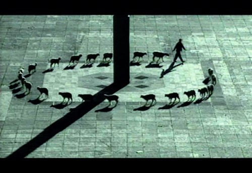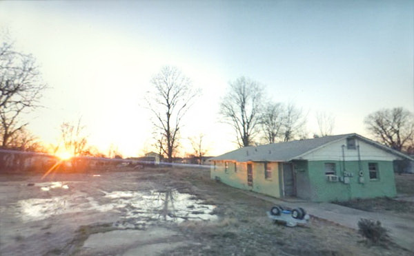
Doug Rickard, Helena-West Helena, Arkansas, 2008, “A New American Picture,” via bremser
Thanks to Joerg, I’ve had it in my browser tabs for almost a month now, meaning to write about it, but the TL;DR version is, Wayne Bremser’s essay on his blog It’s Never Summer is one of the smartest things I’ve read on Google Street View and fine photography.
“How to Photograph the Entire World: The Google Street View Era,” looks at work by GSV photographers like Michael Wolf, Jon Rafman, and Doug Rickard in relation to the greats of earlier generations of like Lee Friedlander, Robert Frank, William Christenberry, and Larry Sultan. [Bremser doesn’t mention, and I just thought it while typing this list, but The Google Gaze is apparently male. Maybe the giant camera stalk with the big balls was the first clue.]
Anyway, Bremser’s analysis is excellent in itself, but his premises also illuminate the contours of the gap that somehow persists between photography and art. Or more properly, between fine photography and contemporary art. At this point, I am coming to see these differences in religious terms: they’re formative, deeply held, esoteric, easily lost on outsiders, and laughable to an atheist.
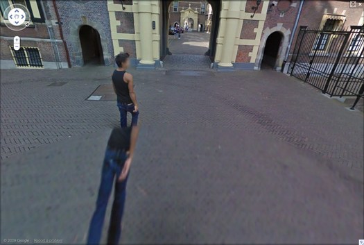
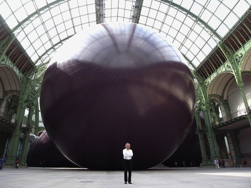
Walking Man – The Binnenhof, 2009, via greg.org
Though his title hints at more audacious possibilities, Bremser focuses on GSV as a tool for human artists:
As a camera, GSV is used by a photographer to rotate around, frame, and click to grab an image. The images that we see on the screen are raw data, gathered by the drivers; these images do not become photographs until a photographer frames them.
So, framing.
Also, I’m happy to take GSV’s ambition to “photograph the entire world” at conceptual face value, and go from there. By the time the Bechers began exploring the futility of documenting typologies of disappearing, industrial manmade structures, astronomers had already begun their second attempt to photograph the entire universe.
From Bremser’s photographer-centric beginning, it’s logical to say that:
One important process-related issue with GSV images that end up as photographs on a gallery wall is this: they are not screen grabs, but photographs of a screen.
Which, hmm.
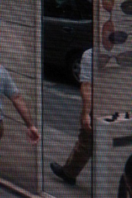
Michael Wolf, Paris, 2008
But it is compelling and awesome to see the moire patterns and magnified pixels of Wolf’s pictures of his computer screen [above] in the context of photographers taking on the tectonic media shifts of their day, such as Lee Friedlander’s “Little Screens” series [below], photos from the 1960s that captured fleeting images on television sets.
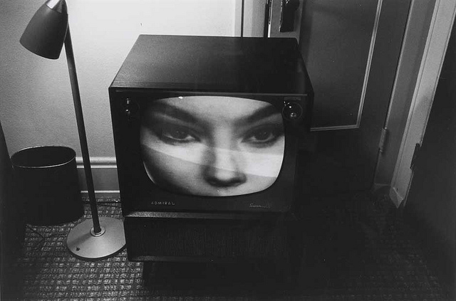
Lee Friedlander, Florida, 1963, via bremser
And then there’s this:
Regardless of how photographs are sourced, it’s still essential to see photography in books and on walls. How do these look in the gallery?
Which, again, hmm.
I have used screenshots from both Google Maps and GSV to make both prints and books, because the screen, or the browser window, or Google Earth, is Google’s native image format. [Technically, that’s not true; Google presumably has much higher-res versions of their imagery which they do not make publicly available.] But I guess this is a distinction between using at Google’s imaging as source, and examining at it as subject. The fascinating, mind-blowing process around here isn’t Wolf’s [or for that matter, mine] but Google’s.
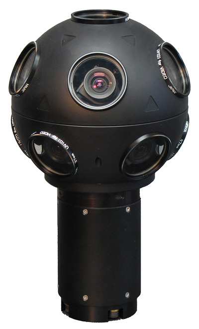
Even though it’s not his point, Bremser still moves the aesthetic ball forward. I’m embarrassed to say for all my Street View obsession, I never bothered to identify the camera system Google uses. Or used, since they seem to have replaced Immersive Media’s 11-lens, Dodeca 2360 pano camera [above] with an even awesomer camera ball [below].
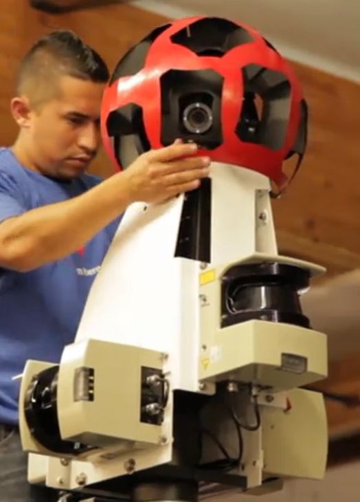
Or maybe they’ve just added the optimized housing. I don’t know, but I should. Because this equipment is not Google’s secret sauce; it’s available. You can take a Dodeca 2360 out to make your own panos or sequences. The Street View aesthetic can now be yours! At least in theory. I suspect I’d find that shooting with a Dodeca 2360 wouldn’t make me Google any more than using a Red would make me Steven Soderbergh.
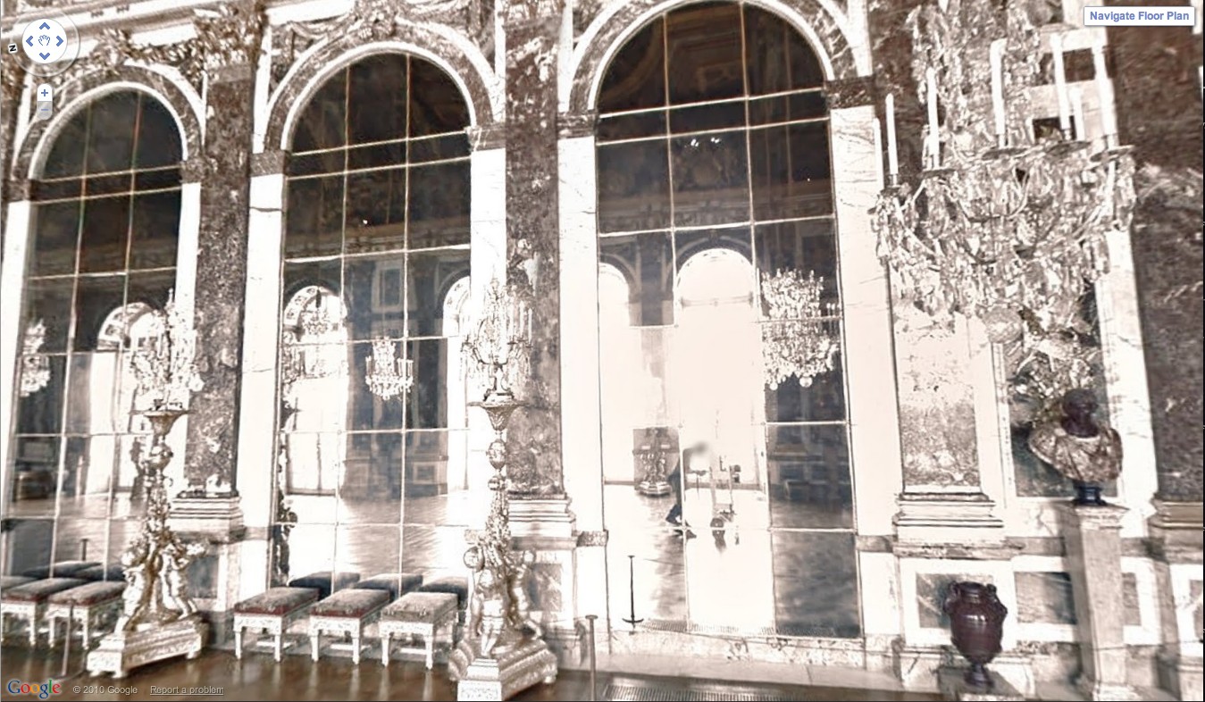
Google Street View camera guy in Versaille’s Hall of Mirrors, via [Google’s] Google Art Project.
Bremser concludes–and I agree–that GSV is rich and varied enough “that Michael Wolf can make photographs like Michael Wolf, Doug Rickard like Doug Rickard.” And Google like Google.