The Great Letterpress Of The United States

During some recent archive dives, I’ve come across a ton of different letterheads. Apparently, people used to write letters to each other all the time, can you imagine? Must’ve taken forEVER.
Anyway, one I particularly ilke is the United States Information Agency, which used to organize international tours for art exhibitions. [The USIA also took over sponsorship of the Venice Biennale from MoMA in 1964, the year Alan Solomon curated a group of Pop and abstract painters, including Rauschenberg.] Anyway, there are variations for USIA offices in embassies, but the basic format is the one seen below. This is actually from a 1965 American filmmaker-related memorandum, something to do with the secret plan to enlist Stanley Kubrick to fake the moon landing. Anyway:
usia_letterhead_kubrick65.jpg
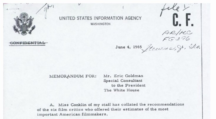
That’s it, just the agency name, and WASHINGTON, with a pared down version of the Great Seal of the United States there on the left. It’s a basic, agency-wide format used by many government agencies. So clean and presumptively powerful.
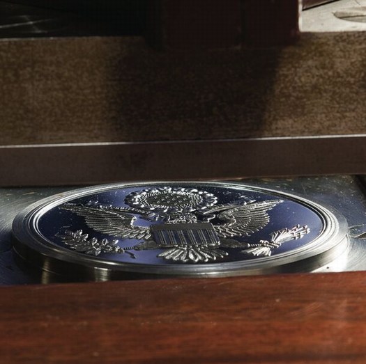
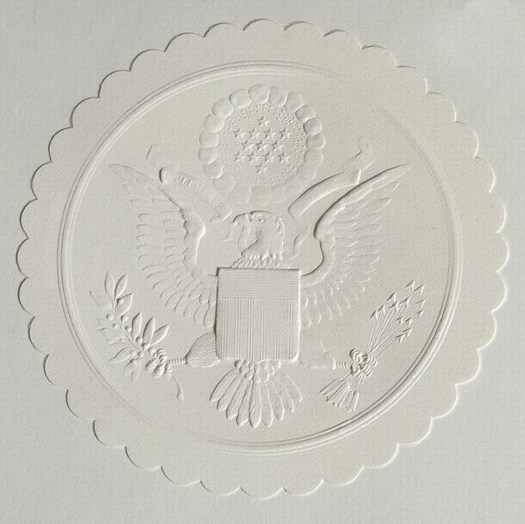
I had absolutely no idea, though, about the Great Seal, its history, and how it is still used today. Between Wikipedia and the State Department [pdf], though, there’s a fascinating tale. The current die is the fourth version of the original text description–or blazon, to use the heraldic term–approved by the Continental Congress in 1782. It was designed by James Horton Whitehouse of Tiffany & Co. in 1885, and replicated by Bailey Banks & Biddle in 1904. In 1986, the Bureau of Printing & Engraving made a master die from which the current and future operational dies will be created.
great_seal_press.jpg
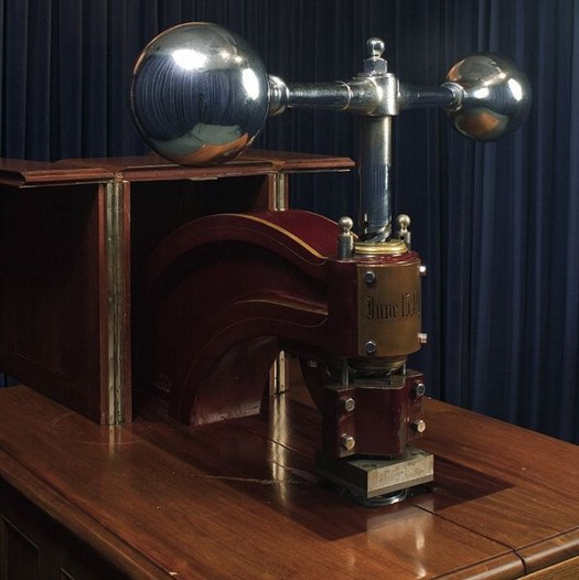
The die is for the front of the Great Seal, the eagle side; there has never been a die made for the back, the pyramid side. The setup since 1904 has the Great Seal affixed to a giant, counter-weighted, brass and mahogany press in the State Department. The Seal is used 2000-3000 times/year, for treaties, ambassadorial appointments, and a bunch of other official, ceremonial communications.
great_seal_counter-die.jpg
Here’s how it works:

Sealing of Documents
In the Department of State, the term “Great Seal” has come to include not just the die, but the counter-die, the press, and the cover, or cabinet in which it is housed, as well. These stand in the Exhibit Hall of the Department, inside a glass enclosure which is kept locked at all times, even during the sealing of a document. The mahogany cabinet’s doors also are kept locked, and the press is bolted and padlocked in position except when in use. The seal can be affixed only by an officer of the Department of State, under the authority of its custodian, the Secretary of State. When there are documents ready for sealing, one of the officers carries them to the enclosure where the Great Seal is kept and prepares them for impressing.

great_seal_wafer_bef.jpg

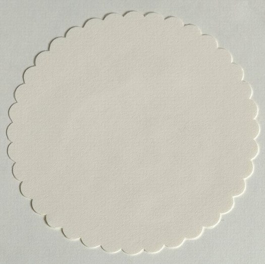
First, a 3 3/4-inch, scalloped, blank paper wafer of off-white linen stock is glued in the space provided for it to the left of the document’s dating clause. If ribbons are used in binding the document, they are run under the paper wafer and glued fast. Second, the document is inserted between the counter-die, with the wafer carefully lined up between them. Third, the document is held in place with the left hand and the weighted arm of the press is pulled sharply forward with the right hand, from right to left. This drives the die down onto the wafer, document, and counter-die, which impresses the seal in relief. The die is then raised, releasing the document and allowing for its removal. When an envelope containing letters of credence or recall is to be sealed, the wafer is impressed first, and then glued to the sealed envelope, leaving the envelope itself unmarked.

In other words, letterpress.
great_seal_wafer_after.jpg
Great Seal of the United States [wikipedia]
The Great Seal of the United States [state.gov, pdf]
Related/who knew?: Historically, great seals are signs of sovereignty, while seals and the deliberate ritual of making them have had added legal significance.

Richter’s Balls, Regrets

So I’m reading along in my new copy of Gerhard Richter: Writings 1961-2007–which is pretty awesome, and which does appear to supersede the artist’s previous collected writings, The Daily Practice of Painting, which is good to know, but really, what to do with all this information?–and I come across this discussion of glass and mirrors and readymades in a 1993 interview with Hans Ulrich Obrist, and I’m like, holy crap!

When did you first use mirrors?
In 1981, I think, for the Kunsthalle in Dusseldorf. Before that I designed a mirror room for Kasper Koenig’s Westkunst show, but it was never built. All that exists is the design–four mirrors for one room.
The Steel Balls were also declared to be mirrors
It’s strange about those Steel Balls, because I once said that a ball was the most ridiculous sculpture that I could imagine.
If one makes it oneself.
Perhaps even as an object, because a sphere has this idiotic perfection. I don’t know why I now like it.

Richter’s mirror Steel Balls? Whew, never mind, they turn out–I think–to be Kugelobjekt, 1970, these odd, little postcard-sized objects, three steel ball bearings suspended in plexiglass in a shadowboxed photo of a staircase.
richter_steel_balls_1970.jpg
Kugelobjekt I, 1970, image: gerhard-richter.com
And anyway, on the next page, Richter explains how all the work on the dimensions and framing and installation of 4 Panes of Glass meant it’s “not a readymade, any more than Duchamp’s Large Glass is,” when he goes,

At one point I nearly bought a readymade. It was a motor-driven clown doll, about 1.5 metres tall, which stood up and then collapsed into itself. It cost over 600 DM at that time, and I couldn’t afford it. Sometimes I regret not having bought that clown.
You would have exhibited it just like that, as an uncorrected readymade?
Just like that. There are just a few rare cases when one regrets not having done a thing, and that’s one of them. Otherwise, I would have forgotten it long ago.

And I’m like, the clown! the clown! I swear, I’d written about it before, but I can’t find it anywhere. And then I realize I’d written about it for the NY Times in 2005.
Previous most ridiculous sculptures I could imagine: The International Prototype Kilogram or Le Grand K, and the Avogadro Project
UPDATE:, uh, no. Richter has more balls than I thought.

MIchael Wolf Wins World Press Photo Honorable Mention For Google Street View Photos

michael_wolf_world_press.jpg
Michael Wolf thought he would be provoking a heated response when he entered four of his series of Google Street View photos in the World Press Photo competition, and he was right. The “A Series of Unfortunate Events” project was awarded honorable mention in the Contemporary Issues category, and some folks are kind of freaking out about it.
At least that’s how the issue is being framed by the British Journal of Photography, who spoke with Wolf:

The work, he tells BJP, is his own. “I use a tripod and mount the camera, photographing a virtual reality that I see on the screen. It’s a real file that I have, I’m not taking a screenshot. I move the camera forward and backward in order to make an exact crop, and that’s what makes it my picture. It doesn’t belong to Google, because I’m interpreting Google; I’m appropriating Google. If you look at the history of art, there’s a long history of appropriation.”

I love that: “The work, he tells BJP, is his own.”
wolf_worldpress_copyright.jpg
Appropriation’s all well and good, but the art history of rephotography is hardly controversy-free: folks like Sherrie Levine and Richard Prince have both faced the IP wrath of their subjects’ original photographers.
But it’s interesting that Wolf finds his ownership and authenticity in such a contested process as rephotography, though, considering that it was not previously stated or clear.
And when he praises the World Press jury for making “such a conceptual leap,” he’s not referring to this appropriation strategy, but to recognizing “someone that photographs virtually.” Except that he’s so emphatic about not photographing virtually.
I’m sure it’s bold, and I’m sure it is a lot of conceptualism for the photojournalism system to handle, but it sounds like Wolf wants it both ways. He insists his finger on the button preserves his photojournalistic credibility, and there’s no doubt that the Series of Unfortunate Events images he submitted have powerful composition, content, and emotion. As I said before, they look

like archetypal on-the-scene photojournalism, only stripped by any news or context other than place. Though Wolf himself eliminates any place specifics or links, leaving each image to stand on its own.

By completely decoupling these images from their context, from their most basic metadata, even, Wolf is not creating photojournalism, he’s subverting it. He’s finding the images photographers would die to shoot, and then tossing out even the incomplete scraps of geospatial information Google provides for them. Even as he delivers the compelling visual goods, Wolf has obliterated not just the idea that these photographs “mean” something; he’s undermined the photographer’s traditional authoritative role as a witness to the events in his images.
What Wolf is doing is not photojournalism, it is art, art that calls the whole construct of photojournalism into question. No wonder the shutterbugs are pissed.
I’m still surprised to not hear more critical awareness of Google’s role here. If anything, Matt Lutton’s defense of Wolf’s photographic chops seems to wilfully ignore the aesthetic and conceptual implications of Google’s project:

Since everything is photographed in Google Street View, nothing is. It’s a mirror with no intention, art, journalism, or perspective. The photographer, by choosing what he makes a screenshot of (and we’d be fine with this winning if he only made screenshots, by the way) is making the photographs, framing them, choosing what to show. Google did none of those things. Even a screen-grab, if you are composing and choosing a moment, is a photograph.

Anyway, kudos to Wolf, sympathies to the photojournalists, I’ll just be on my way.
World Press Photo: Is Google Street View photojournalism? [bjp-online.com]
Some thoughts on Google Street View and World Press Photo [dvafoto.com via @nancyproctor]
Michael Wolf’s website [photomichaelwolf.com]
my Google Art Project, part 1
Previously: Michael Wolf, Street View Photographer
White House News Photographers Upset At Staged Photos They Don’t Take

From Robert Rauschenberg’s 1968 Autobiography

rauschenberg_broadside.jpg
A couple of weeks ago, while stopping by the symposium attached to the National Portrait Gallery’s “Hide/Seek” exhibition, I saw a huge, intriguing Robert Rauschenberg work, Visual Autobiography, in the lobby of the Patent Building auditorium.
rr_broadside_ladder.jpg
I noticed it immediately because, hello, there was Bob rollerskating with the parachute/umbrella contraption on his back, just like he’d done at the Pop Art Festival in Washington in 1963.
But I’d also recognized the project from mentions in the various Rauschenberg-related archives I’ve been diving into lately; Visual Autobiography was made in 1968 by Broadside Art, Inc., a company the artist co-founded with Marian Javits [wife of Sen. Jacob Javits] to bring big, billboard-sized print technology into the service of artists.
rr_broadside_at_home.jpg
The brochure for Visual Autobiography, which consists of three 4×5′ offset lithographs, shows them installed in various, improbable ways that might have pointed out the limitations of the market: vertically, with Bob, dressed like The Music Man, standing next to them on a ladder; vertically, in a pre-war apartment, where they obviously don’t fit, crawling up the wall and onto the ceiing; and horizontally, likely the only way they’d ever make it out of the tube.
The prints were published in a signed edition of 2000 [!] for just $150/set, $50 more for canvas backing “so it can be hung just as it was at the Whitney Museum,” and sold via direct mail by Rand McNally. [Even today, they provide a lot of Rauschenberg bang for your buck; a full set sold at Christie’s last December for just $5,000.]
rr_broadside_jj_flag.jpg
Anyway, though it’s called Visual, the center panel consists of a textual bio of the artist, spiraling out from a family snapshot. To read it through requires an odd/amusing bobbing and swaying that must have pleased Bob the Dancer. But right in the center, top of the circle, as easy to read as it’s gonna get, it says, “Jasper Johns lived in the same building and had just painted his first flag.”
UPDATE: The Broadside Art venture’s debut at the Whitney, which is the ladder photo above, was covered in the New York Times; Hilton Kramer hated it. He also predicted that the market-baiting stunt would succeed wildly. As in so many other things, though, Kramer was mistaken. If Broadside ever did another edition, I can’t find it. And Mrs Javits still had copies of the print to give away in 1977, almost a decade later. For all that, though, it turns out Milton Glaser and Clay Felker were also partners in the company. So much light, so little heat.
Here’s a detailed writeup of Autobiography from a 2009 exhibition at Kean University [kean.edu]

Goodbye Janette Laverrière

I’d say, “Adieu” or “Au revoir,” but Janette Laverrière was as fierce an atheist as she was a communist, designer, and artist. So I’ll just say I’m slow and sad to learn that Laverrière died last month at the age of, what, 101?
laverriere_rockers_rago.jpg
I first learned of Laverrière’s work way too late, too; I saw some wrought iron furniture she’d designed in the 1930s at auction about six years ago. She was a remarkable, politically committed designer in an antagonistic, elitist French decorating world, where men and the richest clients set the agenda.
laverriere_commune.jpg
La commune (hommage à Louise Michel), 2001
The 2001 work, La commune (hommage à Louise Michel), includes a cherry-shaped mirror fragment in a rosewood box, with an iron lid peppered with what appear to be bullet holes.
As Laverriere plumbs history for her references, history is catching up, slowly, with her legacy. In 2008, the Iranian artist Nairy Baghramian collaborated with Laverrière on a very subtle exhibition at the 5th Berlin Biennial, where Laverrière’s sculptures were installed in Baghramian’s carefully calibrated architectural space. Baghramanian also included Laverriere’s mirrored sculptural works in a 2008 exhibition at the Kunstverein in Aachen.
Laverrière discussed the switch from design to sculpture in a 2009 interview with Vivian Rehberg in Frieze:

VR Is there a link between utility and uselessness?
JL Of course. It’s useful to have useless things.
VR Precisely – I agree.
JL So, I started anew by thinking about the oldest thing I could remember being inspired by. When I was 17, I really loved Jean Cocteau; I read a lot of his works. In 1989, I wanted to pay homage to him on the centenary of his birthday. So there I was in bed, thinking: I am not going to do anything useful anymore, I do not want to, I cannot, so I will do useless things. All of sudden, a new world opened up for me

And the Pompidou has acquired an interesting piece from 1952, a suspended secretary, made from steel and Formica, which is currently on view in Elles, an exhibition of work in the collection by female artists.
Centre Pompidou /// Univers Industriel /// Janette Laverrière
Secretaire suspendue, 1952, image via batir au feminin’s flickr
Bhagramian’s obituary for Laverriere [frieze.com]
Rooms No One Lives In, Katarina Burin’s review of the Biennial show [thehighlights.org]
Use Value | Laverriere talks to Frieze [frieze.com]
short video: Portraits de Femmes Artistes – Janette Laverriere [ina.fr]

Exodus, 1997, Steve McQueen

exodus_steve_mcqueen.jpg
One of my absolute favorite Steve McQueen films is one of the first ones I saw, a one-minute super-8 called Exodus.
But until now, I’d never heard the making of story of this found scene. According to Carol Kino’s profile of the artist last winter, McQueen became interested in film at Goldsmith’s:

On the advice of a teacher he took to carrying around a Super 8 camera. But because film was so expensive, he rarely used it; he only shot a single, three-minute piece, part of which showed two black men carrying potted palms along a crowded East London street.

The Times incorrectly dates the piece to 2007, but it was included in McQueen’s first US show at Marian Goodman in 1997.
Just a beautiful piece of seeing.

Any Ignoramus In The Universe

bryanthepainter_picasso.jpg
Wall Text from MoMA’s Picasso Guitars show, via @bryanthepainter
I’ve been loving Bryan’s tweets of the various pullquotes in MoMA’s incredible Picasso Guitars show, but none more than this one from Andre Salmon in 1919, where Picasso apparently invented and ignored the kind of instruction-based art that Moholy Nagy’s Telephone Paintings–and Judd’s outsourced fabrications–would later become famous for.
Here’s the full quote:

I have seen what no man has seen before. When Pablo Picasso, leaving aside painting for a moment, was constructing this immense guitar out of sheet metal whose plans could be dispatched to any ignoramus in the universe who could put it together as well as him, I saw PIcasso’s studio. [It was] more chimerical than Faust’s laboratory. This studio, which certain people may claim contained no work of art in the old sense, was furnished with the newest of objects. All the discernible forms surrounding me appeared absolutely new. I had never seen such new things before. [Before that] I did not know what a new subject could be.

Picasso Guitars: 1912-1914 opens this weekend at MoMA [moma.org]
Related: “Idiots can do what I do.” – Gerhard Richter

[2022 update: non-functioning twitter links removed, link to MoMA show archive added.]

Spies Like Us

SimonMenner_Stasi.jpg
Demonstration from a STASI disguise workshop, via Simon Menner
If Germany’s a little touchy about Google’s Street View panopticon, maybe it has something to do with how, for the last half of the last century, half the country was obsessively spying on each other.
At Conscientious, Simon Menner writes about his utterly fascinating look at the visual and photographic legacy of the STASI.
Things Magazine on Menner’s project: “The aesthetic appreciation of banality is very much a luxury of free democracy.” Ouch.
Simon Menner | Images from the secret STASI Archives [jmcolberg via c-monster]

Which Flag Story? Which One Do You Know?

johns_flag_moma.jpg
Flag, 1954-55, via moma
The creation myth for Jasper Johns’ Flag is well-known, and well-told. Like Leo Castelli’s story of discovering Johns’ groundbreaking oeuvre, fully formed, while he and Rauschenberg were raiding the icebox, and how Johns’ first show in 1958 got on magazine covers, sold out to MoMA, destroyed Abstract Expressionism and ushered in Pop Art. MoMA’s wall text for Flag [which Alfred H. Barr had Philip Johnson purchase from that show] begins:

“One night I dreamed that I painted a large American flag,” Johns said, “and the next morning I got up and I went out and bought the materials to begin it.”

It came in a dream. It’s a protean story, quintessentially American, slightly romantic, and beyond the reach of anyone but [Freudians, Jungians, and] the artist himself. And that’s the key: because unfalsifiable is not the same thing as definitive, or even true.
In the opening of her 1975 dissertation, published in 1985 as Jasper Johns’ Paintings and Sculptures, 1954-1974, Roberta Bernstein takes a researcher’s step back:

When asked about the sources of Flag, 1954-55, Johns answers that he dreamt one night of painting a large American flag and then proceeded to do so. He has said this several times and will offer no other explanation for the appearance of this remarkable painting.

In the footnotes, Bernstein cites Alan R. Solomon’s catalogue for Johns’ 1964 Jewish Museum show, as well as several personal retellings.
But check out this transcript of Solomon interviewing Johns in 1966 for National Educational Television’s USA Artists Series. Then tell me if it doesn’t sound like there could be another story–or several–for the origin of the flags?

Continue reading “Which Flag Story? Which One Do You Know?”

Mientras Tanto En Mexico,

While poking around online about Tate Modern’s version of the Gabriel Orozco retrospective, I found this rather incredible letter from 2009, written, apparently by Orozco himself, to his dealer Jose Kuri. The letter is an ostensibily-but-not-really private round in an ongoing, public, critical battle for some kind of primacy within the Mexican art world.
Orozco defends and praises his own success and innovation–to his own dealer–while slamming both other artists [cough, Santiago Sierra, Francis Alys] and their critic/curatorial champions [Cuauhtémoc Medina, who I will be adding to the greg.org art pronunciation list shortly.]

Anyway, this kind of veiled subtexts with an apparent academic impartiality and a deficient documentation, derive from a cheap historicism, where the talent of the individual to understand his/her moment, and to do the things that he feels like it and with it finding new art for life and for the work, will never be the reason for his success. If anything, it can seem incredible to those Mexicans, that a co-national has innovated and influenced other artists in the world, which, although is not mentioned -in the breakdown of the ingredients for my success-, is a measure and perhaps the main reason for the success of my work in this years. Novelty, not exoticism, is what makes fortune. And the one that makes something before the others becomes an essential reference point. Success came after the creation of something new… which was successful.

Wow, OK. I have been a diehard fan of Orozco’s work for almost 20 years now; I still see him as having a formative influence on my eye, and on the whole way I see the world in relation to art. Or to his art. And maybe I just don’t/can’t appreciate the nationalist/politicized context in which this debate is occurring.
But I’m trying to come up with examples of other artists who aren’t Julian Schnabel who take such on the record personal affront. I guess Rob Storr loves to deal out the smackdowns, too. Anyway, the Centre For The Aesthetic Revolution has the whole thing. Definitely check it out.
GABRIEL OROZCO ‘THE SECRET OF HIS MIRACULOUS SUCCESS’ A LETTER TO HIS GALLERIST IN DEFENSE OF SOME OF HIS CRITICS [centrefortheaestheticrevolution]
Also from the Centre For The Aesthetic Revolution, word that the Hotel Palenque has finished the renovations, and is open for business. This apparently happened some time between Robert Smithson’s drunken slide lecture about it in 1972 and the arrival of the Google Street View coche.

Yves Klein, Ex-Voto Ex-Monastero

klein_ex-voto_cascia.jpg
Sister Andreina holding Yves Klein’s ex-voto for Santa Rita di Cascia in 1999, photo: David Bordes
I get the sense that in the contemporary art world, an artist’s religiosity or spirituality is often perceived as an obstacle, an eccentricity to be indulged when they’re around, but to be politely ignored in serious discussion. That goes for John McCracken, Anne Truitt, Marina Abramovic, a bunch of others, I’m sure, and the one who made me think of it just now: Yves Klein. When the artist’s widow Rotraut Klein-Moquay spoke at the Hirshhorn Museum’s retrospective last spring, it was clear that she was operating on a different, more spiritually attuned plane than the show’s clearly uncomfortable curator, Kerry Brougher. [Though watching Brougher, his co-curator Philippe Vergne, and the Klein Archive’s David Moquay at the Walker a few months later, exasperated interruption may be the only way to get a word in edgewise with the rambling Moquays.]
Anyway, Vergne takes it all in stride. In an interview with the Walker’s Julie Caniglia, he tells about securing the loan of one of the most interesting and unusual pieces in the retrospective, a 1961 ex-voto which Klein left at the monastery of Santa Rita di Cascia. It’s like a little retrospective in a box, a boite en valise.

Julie Caniglia
Speaking of striving, you literally went out of your way so that Ex-Voto would be a part of the exhibition. Can you talk about how this loan was carried out?
Vergne
Klein made an extraordinary gesture with this artwork and that’s reflected in how it’s treated by the monastery. I don’t think the Mother Superior would have allowed it to leave the convent without a meeting with one of the exhibition organizers. She was basically saying to us curators, “If you really want this work of art, you’re going to have to come and tell me why. It cannot be treated as one more object. You’re not going to just send a loan form, you’re going to have to come and sweat a little bit because this object is extremely important.”
On the other hand, she was kind enough to meet me at a cloistered convent in Rome so I wouldn’t have to make the long drive to her convent at Cascia. We were in a little room accessible to visitors, but divided wall-to-wall by a table: one side for guests and the other for nuns. They brought me coffee and cookies. Through a translator, we entered this conversation talking about Klein’s work and how important it was to have the Ex-Voto in the exhibition. Then we read the entire loan document word for word, all of the details about insurance and transport, everything. It was really like a ritual. Then we had a conversation about immaterial sensibility.
I also got to tell her a story about the well-known Leap into the Void photo–how the house that Klein leapt from outside Paris later became a church dedicated to Saint Rita, through absolutely no relationship with Klein. I thought this was extraordinary, but she said, “No, it’s normal.” I thought she meant for Klein, but she said, “No, for him,” pointing her finger to the sky.
Before I met with the Mother Superior I got to see a part of the convent closed off to the public where some absolutely gorgeous 13th-century frescoes were being restored. That, too, became part of the Yves Klein exhibition for me. I see it as an example of Klein’s immaterial sensibility: I am made of all these little layers of experience, which came together in the making of the exhibition.

Saint Rita is known as the patron saint of lost causes, and was a favorite object of Klein’s devotion and ritualistic interest. He apparently made the ex-voto while experiencing something like painter’s block, and he left it during one of several pilgrimages to Cascia. It was only discovered in 1980, during a renovation at the monastery following an earthquake. It was included in the Centre Pompidou’s 2006 retrospective, but it will return to Cascia after the Klein exhibition closes at the Walker this weekend. Pilgrims, your time is running out.
Yves Klein and the patron saint of lost causes [walkerart.org, thanks to Matt at RO/LU]

Google Art Project: The Making Of

tate_google_art_cctv.jpg
Now we’re getting somewhere. James Davis was Tate Britain’s pointman for the Google Art Project, and he gives an interesting behind-the-scenes account of getting locked in the museum with the Street View Cart overnight:

[It] seemed to me to be a marvellous combination of garden-shed and cutting-edge.
The trolley was not simple. It had lasers and cameras and GPS and all sorts. You could not stand in its view, for fear of being captured. Yet it could see you, left right, up down, back and forth and everywhere in between. So it must be operated by a squirrel (a trained man with a perfectly shaped back) who hides in its visual wake and guides it through the rooms.

Of course, Davis accidentally [sic] found his way into a shot. He’s the one with the blurred head.
Google Art Project: Behind the Scenes
Trolleys in the Gallery
[blog.tate.org.uk]
Previously: Street View and “accidental” self-portraiture

Noguchi Akari Lamps: The Making Of

Isamu Noguchi’s Akari lamps have been manufactured at the Ozeki Lantern Company in Gifu, Japan since 1951. They are contructed from paper and bamboo using the traditional techniques for which Gifu’s lanternmakers are famous. In Japan. [via @freduarte via @langealexandra]

This is so awesome, watching this process makes me want to use it somehow.
Also, I lived in Gifu for a while, just after Noguchi exhibited his Akari lamps in the US Pavilion at the 1986 Venice Biennale. Not that I knew what a Biennale was at the time, of course. The Noguchi Museum re-created the Venice installation in 2009.
From the Ozeki site, it looks like there was a massive, room-filling Akari sphere at Venice? I can’t tell, but none of the other photos I can find seem to show such a thing. The largest size for sale these days is the 120A, which is around 4′ [or 120cm?] in diameter. Which looks smaller than the Akari in the stairwell of the Noguchi Museum, right?
noguchi_apt_akari.jpg
And smaller than the one in Noguchi’s own apartment, which he set up across the street from the museum, an interesting-sounding private space that was mostly dismantled, but not irreparably destroyed, when Fred Bernstein called for its restoration in 2004. Waitaminnit, Jonathan Marvel of Rogers Marvel is Buckminster Fuller’s grandnephew?
Noguchi’s Unknown Home [interiordesign.net]

Google Ramp View, Or My Google Art Project, Part 2

Thumbnail image for greg_binnenhof-40.jpg
Sometimes I can’t tell when something is obvious, or when it’s just obvious to me.
But whichever this was, the idea came to me as soon as I figured out that the unidentified guy who was photographed at least 62 times in Google Street View’s mapping of the Binnenhof in The Hague was almost certainly a Google employee and not, in fact, a tourist who happened upon the Google Trike, figured out what it was up to, and followed along, quietly but persistently inserting himself into the company’s massively ambitious effort to map, photograph, and simulate the entire world.
Obviously, someone should quietly but persistently insert himself into the company’s massively ambitious effort to map, photograph, and simulate the entire world. And if the algorithms that stitch those panoramas together are going to erase everything but the top of that guy’s head, it might as well be me.
Thumbnail image for kasteeltuinen_wm_2cu.jpg
Google Trike and Google Guide at Kasteeltuinen, the Netherlands
Not to say that the Binnenhof Walking Man didn’t plan and execute his awesome portrait series–an inside job–but just to make sure, it’s important to re-create it by following a Google Trike somewhere. But where? Google’s been using the Trike as a non-threatening promotional tool, running contests to gin up excitement about where it should roll next. So anywhere the company would be likely to go on its own is already, by definition, a somewhat compromised artistic context.
And just angling to get your picture on Street View’s no good, either. There are plenty of people who ambush the Street View camera, or who react to or engage it, whether as an act of protest or “Look, ma, I’m on TV!” giddiness.
streetview_wave_smh.jpg
man with panda puppet, others waving at the Street View car in Sydney [via smh]
So it would need to be an art context. That’s a Google Trike no-brainer, or at least Google Trike-compatible. Ideally, it’s interesting in its own right, spatially, architecturally. If it had some spiraling and doubleback elements that could help replicate the atemporal incongruities of Walking Man’s walk around the Binnenhof. Is it obvious yet?
brant_orbits_gugg_nyt.jpg
Henry Brant’s “Orbits” performed in the Guggenheim rotunda in 2009 [via nyt]
The real problem I saw for taking the Google Trike into the Guggenheim and up the ramp was neither logistics nor permissions. The Google Trike’s first outing was offroad, on far rougher, steeper terrain than Frank Lloyd Wright’s rotunda would offer. And the Guggenheim has obviously made itself available for artists’ productions, from Matthew Barney to Vanessa Beecroft to Francesco Vezzoli.
guggenheim_blurred.jpg
via newyorkinfrench.net
Even curatorially, the obstacles did not seem insurmountable. In 2010 Nancy Spector launched Intervals, a site-specific projects series that was inspired by, among other programs, Hans Ulrich Obrist’s Migrateurs projects at the Musee d’Art Moderne in Paris. In a 2009 interview Spector did with Sarah Hromack, she tapped one of my formative memories of the Museum:

SH: It’s a compelling space. Frank Lloyd Wright tucked many interesting details into the museum’s tertiary areas; they are so easily overlooked.
NS: The triangular staircase, for instance, is a beautiful space. It has been rarely used by artists-in fact only twice if I recall correctly: in theanyspacewhatever exhibition Douglas Gordon installed his phrases in the stairwell. And Felix Gonzalez-Torres installed one of his light strings in 1995.

She went on to describe Intervals as interesting artistic responses to “situations that could be perceived as marginal.” Forget marginal; there’s nothing more marginal than not appearing in the museum in the first place. I figured that the best way to execute Walking Man was to not exhibit it at all, but just to let it appear, and be found organically on Street View itself. No announcement, no press release, no opening; one day it’s just there to be discovered.
And that is where I was confounded. The biggest obstacle I saw was persuading Google to ever be interested in adding the interior of any building–even one as awesome and iconic as the Guggenheim–to Street View.
guggenheim slope
via keithbradley’s flickr
When I went to the YouTube Play event at the Guggenheim last fall, I’d discussed a bit of this with Spector, and later, when talking about the Binnenhof series with a Google PR, I floated the idea of bringing the Trike up the ramp. In retrospect, now that I know the Google Art Project was well under way, and Street View images from 17 museums were already in the can, her bemused and slightly cagey responses make more sense.
Guggenheim Museum
via rhino8888’s flickr
So now the idea’s out there, but the context is somewhat changed. Seeing the Guggenheim’s rotunda on Street View would now generate less surprise than it would have a couple of weeks ago. But the modernist, curved abstractions and planes would still make for the most spectacular interior on Street View. Better than Versailles, you ask? Well, let’s put the Gugg on there and find out!
streetview_versailles.jpg
Oh look, there’s the guy pushing the Street View camera through the Hall of Mirrors!
And it really is and should be about the space. The other idea that seemed crucial to me was shooting the rotunda empty, focusing on the architecture [and avoiding the rights clearance issues that blurred half the artworks on MoMA’s Street View foray.] That means mapping while the rotunda is closed for deinstallation of a show. Have it full of crates, or workers–populate the panos with the staff themselves, make it a [blurred out] portrait of the Museum as an organization and a network as much as a space.
Anyway, that’s the idea.