
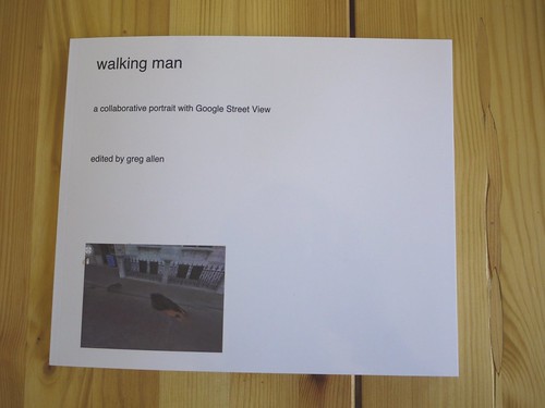
Here’s the introductory text I wrote last Spring for Walking Man – A Collaborative Self-Portrait With Google Street View. I made some proofs, but I’m still figuring out the best size. If I do decide to publish it, I may polish up the title a bit.
And I’ll probably revise it. Street View’s imagery and technique seems to me to turn a lot of critical thinking about photography on its head, but as much as the theoretical implications fascinate me, every time I start writing about them, I feel like a poseur.
As ongoing enhancements and even promotional stunts like Google Art Project affirm, Google executives are working to make Street View the primary tool for us “visual animals,” a browser for the physical world. Robert Smithson wrote about studying massive infrastructures like dams to discover “unexpected aesthetic information.” Google is creating the most massive visual infrastructure project right now, and it is chock full of unexpected visual information.
Author: greg
My Google Art Project, Part 1
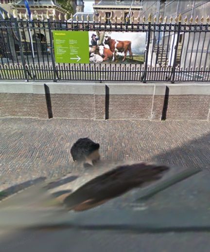
Last February, I realized that the subject of this awesome, distorted Google Street View portrait was not just a random pedestrian. Hundreds of thousands, if not millions, of people around the world have been photographed once by Google’s roving, robotic cameras. This guy appears at least 63 times.
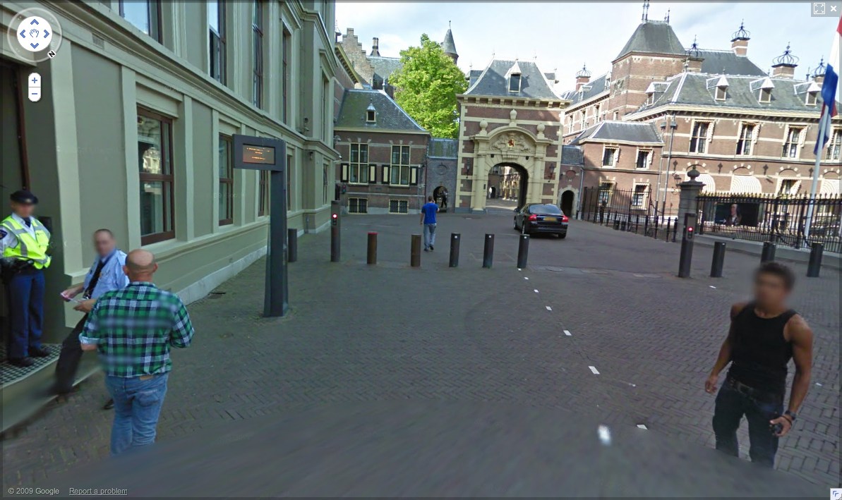
binnenhof 01, all images 2010
Happy Birthday, Gertrude Stein
May your wife have a cow every time.
Your Uprising Has Consequences

Hannibal Hanschke/dpa/picture-alliance/newscom via tpm
Believe me, I’ve tried, but I can’t look at this photo of protestors under a sodium streetlamp in Cairo and not see Olafur Eliasson’s 2003 Turbine Hall installation, The Weather Project.

image via mark barkaway’s flickr
I don’t often hear Olafur’s work discussed in political or ideological terms. After all, there’s plenty else to say about it, whether its about aesthetics, perception, experimentalism, geometry, decorativeness, even the market. When his work’s theoretical underpinnings are mentioned, it’s pretty easy to nod them away as curatorial rationalization or as quaint indulgence that’s somehow dissonant with the work’s beauty.
It’s probably indicative of art’s debased compartmentalization in the public sphere: art is a commodity, a luxury good, a genteel entertainment, a diversion, anything but a valid or viable or even important or vital participant in matters of power, politics, and culture. [The fact that half the presentations at the College Art Association conference next week will be about art in relation to precisely these forces confirms the larger-scale marginalization of art as much as the live TV broadcast of the Turner Prize announcement.]
But there’s a deep, critical aspect to Olafur’s practice–I hesitate to call it a foundation, because it seems more intertwined, more pervasive. His exploration of the constructs nature and culture, of the function of institutions, and of subjectivity and individual responsibility are almost radically democratic.
Though I haven’t finished it yet, I took the title for this post from Olafur’s 2006 exhibition catalogue Your Engagement Has Consequences, where he argues that time and individual autonomy, a combination he rolls up as “Your Engagement Sequence,” are largely missing from but central to the discourse of art and modernity–and to the construction of reality itself. I guess I’ll read up and report back.
On a more fundamental level, though, I think of how crucial context is to underscoring, altering, or neutering a work’s political implications. I try to imagine restaging earlier [i.e., pre-Sept. 11] Olafur works like Green River, where the non-famous artist dumped, unannounced, fluorescent dye tracer into various urban rivers. It just seems impossible. [The Cleveland-based blogger at Critic Under The Influence writes very nicely about Green River and its context of uncertainty. Can you even imagine the firestorm if you staged Green River on the Cuyahoga? Maybe firestorm is not the best word.]
Previously: Olafur & Dada: What he really wants to do is not direct
‘Much To See But Not Much Shown’
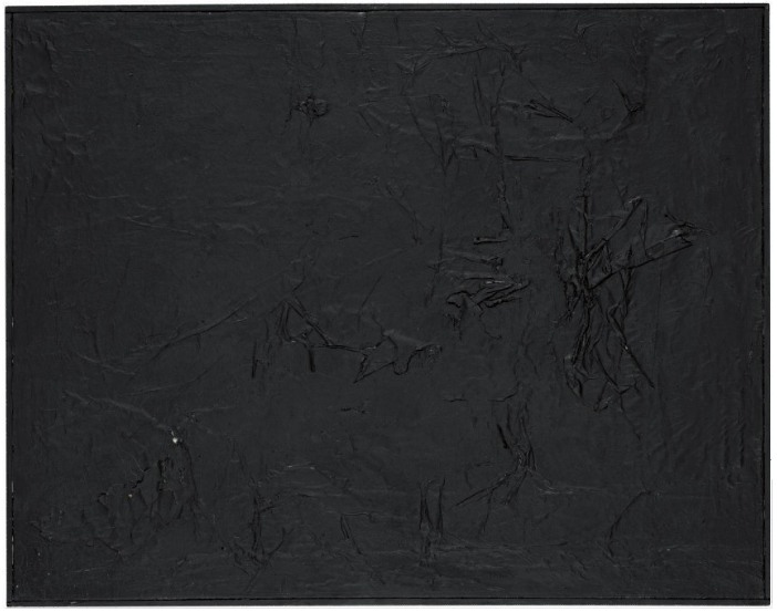
I took the kid to see Merce Cunningham Dance Company’s Legacy Tour the other night. And as I’m reading up on the funding of the Trust that will oversee Merce’s choreography after the company disbands, I found a mention of Robert Rauschenberg’s No. 1, a 1951 black painting which was sold after Merce’s death in 2009. Fascinating and, as I look at Bob’s unusual collaborative combine from a few years later, newly complex.
No. 1 was a gift to John Cage, which sounds simpler than it was. Cage had seen Rauschenberg’s first one-man show at Betty Parson’s Gallery in May 1951, and had asked for a work. As Christie’s catalogue entry put it, “The price, he said, was unimportant as he couldn’t pay anything. It was in this way and in this form that this painting first entered Cage’s possession.” As Carol Vogel put it in writing about the auction, Rauschenberg didn’t give the painting to Cage until “some years later.” But that can’t be right, as we’ll see below.
What No. 1 looked like at that point, no one is able to recall. Whatever it was, Rauschenberg had actually painted it onto a painting by his wife, Susan Weil. Vogel notes that Weil’s signature, and the date, 1951, are on the back of the painting, as is Rauschenberg’s. [Christie’s catalogue description only mentions the latter.]
This may have been an economic move as much as, if not more than, a collaborative or negating one. At the time, Rauschenberg and Weil were broke, using cheap blueprint paper to make photograms in the bathtub of their basement apartment on the Upper West Side. Here’s his recollection of the situation from his 1976 Smithsonian catalogue:
This period was exciting and prolific even if quality was erratic. We were both doing a minimum of five works a day. Clyfford Still came to the house to select a show with Betty Parsons. I was so naive and excited that by the time of the opening several months later, the selected show had been painted over dozens of times, and was a completely different concept. Betty was surprised.
Surprise became the operative mode for No. 1. After Cage got it, Rauschenberg was staying at Cage’s apartment while his loft was being fumigated for bedbugs, and he surprised/thanked the composer by painting over No. 1 with black enamel and collaging it with black-painted newspaper. According to Michael Kimmelman’s obit for Rauschenberg, “When Cage returned, he was not amused.”
Christie’s says this happened “a year or so later,” but Kimmelman says “As Mr. Rauschenberg liked to tell the story,” it was right after the Parsons show, which closed June 2nd. Rauschenberg and Weil’s son Christopher was born in July. And according to his 1976 chronology, he/they went to Black Mountain College in the “early part of the fall.”
But the Black Paintings, which seem to have followed the White Paintings, are dated as late 1951-1952. [Kimmelman reverses them, but Hopps’s catalogue quotes an October 1951 letter from Bob to Parsons talking about them as faits accomplis. I thought Kenneth Silverman’s John Cage bio Begin Again might help, but it is hopelessly inaccurate about dates for Rauschenberg’s works, and he doesn’t seem that interested in chronologies, either. He jumbles events from several years into single paragraphs, or omits dates altogether. And he doesn’t mention the bedbug thing at all. But anyway. I think the Black Paintings come to a hard stop in 1952. Rauschenberg was back at BMC in the summer when his white paintings were included in Cage’s formative Theater Piece #1 and subsequently contributed to Cage’s composition of 4’33”. Then he left for Europe that fall with Cy Twombly, leaving his soon-to-be-ex-wife and son behind.]
And so, perhaps unsurprisingly, the details and reported dates and circumstances of paintings created during this rather complicated time are themselves rather complicated.
A comment the artist made to Calvin Tomkins in 1980 about the Black Paintings seems apt:
“I was interested in getting complexity without their revealing much. In the fact that there was much to see but not much shown.”
But wait, there’s more!
This famous painting was subsequently again modified in 1985, when, it had become in need of some restoration. Rauschenberg chose to paint it completely all over in black again and bestowed upon it an accompanying note referring to the, by this time, historic and continuing dialogue that Cage and Rauschenberg had then enjoyed in both their art and their lives for over thirty years. The note reads: “This is part of the history of this single canvas – I hope the dialogue continues for many more years. I will if John dares, love Bob Rauschenberg.”
While it’s tough for the collector–or the auction house–who wants their 1951 painting to look old, the conception of a canvas as a constant site of activity, dialogue, and collaboration is pretty fascinating.
As Rauschenberg said of Short Circuit in 1967, when he showed it for the first time in over a decade:
This collage is a documentation of a particular event at a particular time and is still being affected. It is a double document.
Double and then some. Short Circuit, of course, included a program from an early Cage concert [which I’m trying to identify, btw] and a painting by Weil, though in 1967-8, the painting was hidden behind a nailed-shut cabinet door. [There was also that Ray Johnson collage, which contains a reproduction of a Renaissance nude.]
Anyway, I would think that with current imaging technologies, it would be possible, if not trivial, to examine Rauschenberg’s No. 1 for traces of the three paintings it used to be. Perhaps such an investigation could be combined with a closer reconstruction of the pivotal period in which it was created. As Rauschenberg himself put it, there is much to see, but not much shown.
‘The Excess of Unimportant Information’
Though to a guy making something called Atlas in his spare time it still probably feels pretty empty and limited, Gerhard Richter’s website is pretty expansive. Via Twitter, we learn that his web elves have just added a quotes section, most of which is taken from Gerhard Richter: Text. Writing, Interviews and Letters 1961-2007 (2009), the UK edition of the artist’s second collection of writings, both of which were edited by Hans Ulrich Obrist.
I was about to bit the bullet and buy the expensive, out-of-print The Daily Practice of Painting: Writings 1962-1993 when the new edition came out, and I’ve hesitated, waiting to see how or if the two volumes overlap. So far, I’ve seen nothing; I guess I’ll have to pigeonhole Hans-Ulrich at the next global 24-hr art lecture marathon.
Meanwhile, I went ahead and bought Gerhard Richter: Writings 1961 – 2007, the US edition, so I’m just a couple of days away from seeing whether this awesome quote about blurring from 1964-5 [!] is, in fact, on page 33:
I blur things to make everything equally important and equally unimportant. I blur things so that they do not look artistic or craftsmanlike but technological, smooth and perfect. I blur things to make all the parts a closer fit. Perhaps I also blur out the excess of unimportant information.
We Are All Google’s Art Project
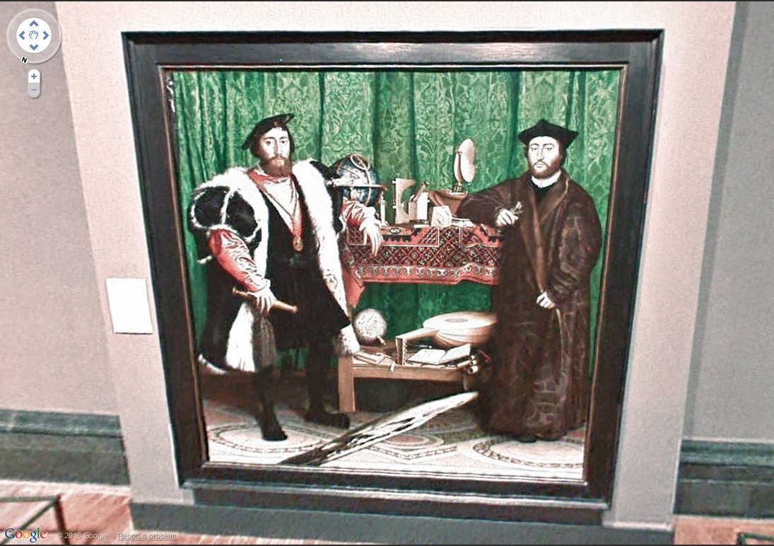
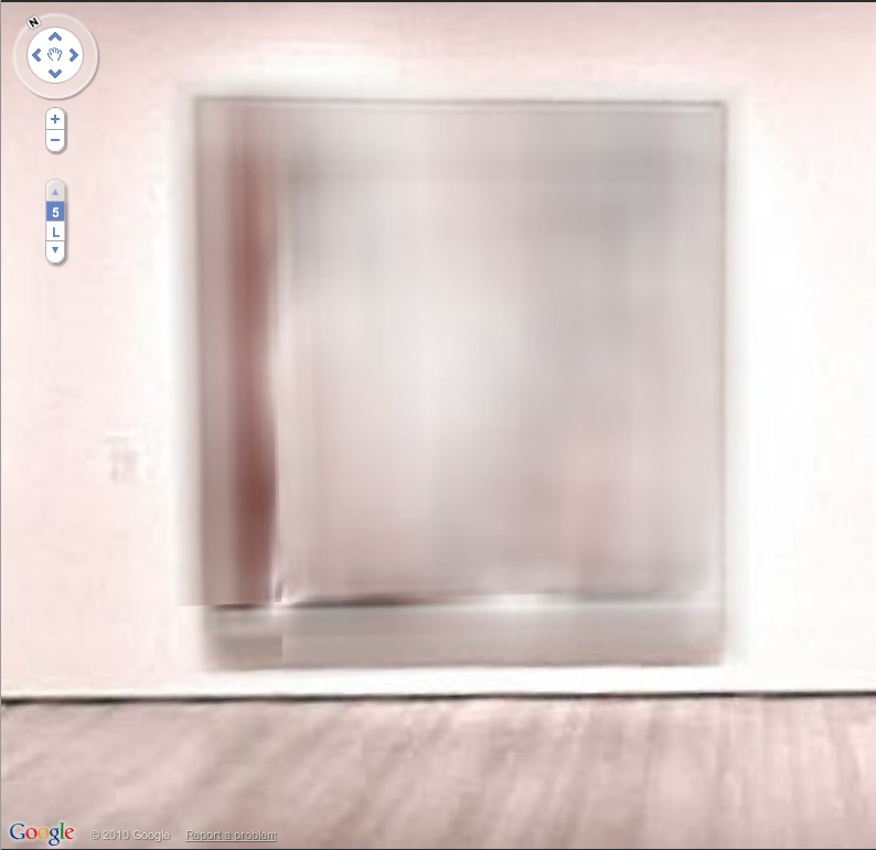
Nice, someone on the Google Art Project has a sense of art historical awareness, or at least a sense of humor. The gallery included in the British National Gallery contains Hans Holbein the Younger’s painting The Ambassadors, which is famous for containing an anamorphically distorted skull in the foreground.
Which is similar to the distorting effects created by stitching panos together in Google Street View. They can launch pictures of paintings in virtual museums all they want, but the truth is, we’ve been living in Google’s Art Project for quite a while now.
Previously: “Google’s Cubist-meets-Robert Lazzarini-meets-Julia Scher-meets Hans Holbein the Younger portrait style.”
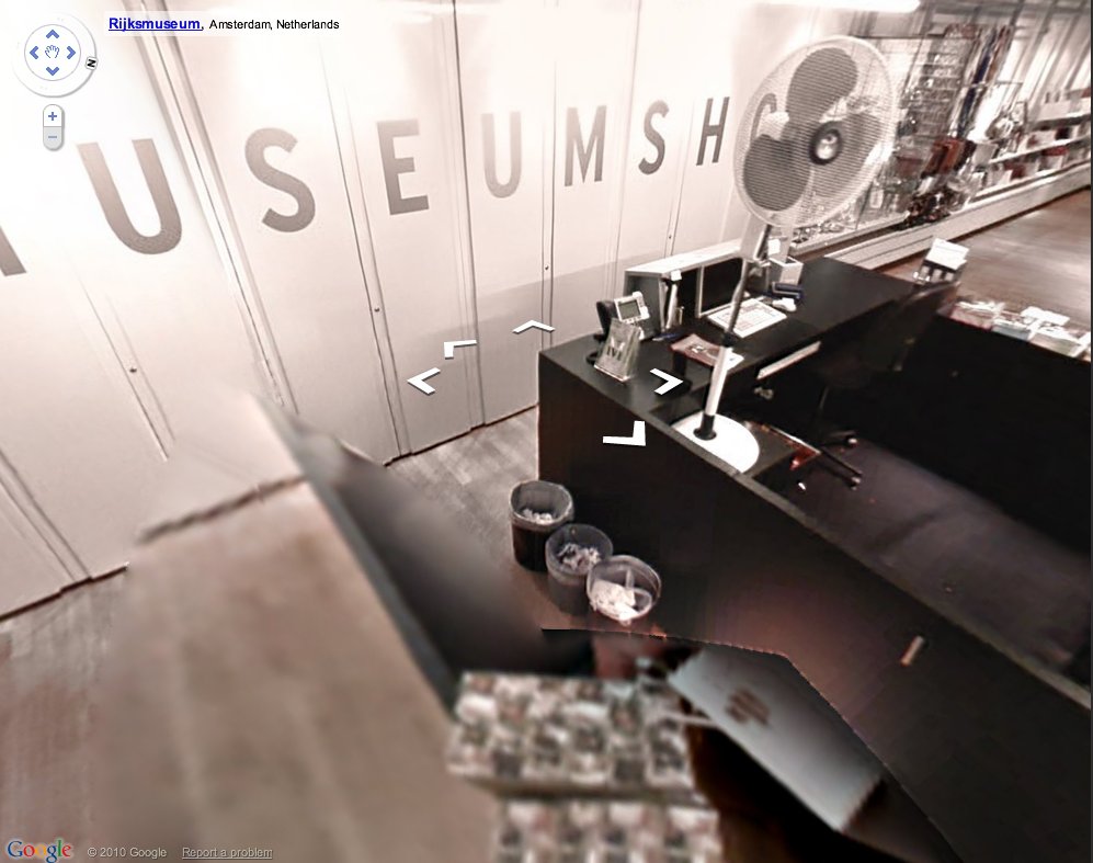
UPDATE: Oh boy, it looks like I could surf this all day. The Rijksmuseum’s selection for Google Art Project is the gallery with Rembrandt’s Night Watch, which is like the National Painting of The Netherlands or whatever–and the museumshop. Where Google’s distortive effects only enhance the absurdist tableau. I half expect to see Dali and some flying cats.
Alright, getting creepy now. Tate Britain’s gallery shows an installation about “Art and The Sublime.” It’s like Google’s stalking me. Is this some hypertargeted web content 3.0 beta? Can anyone else actually see this Google Art Project, or is it just me?
Les Blurmoiselles d’Avignon
Alright, this is kind of killing me right now, not just with its awesomeness, but because I have been planning to do a very similar project, and also because like half my blog these days could be called Google Art Project, and well…
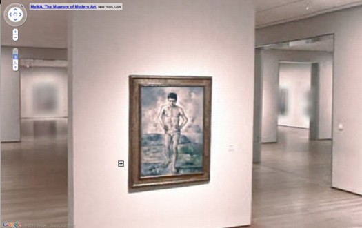
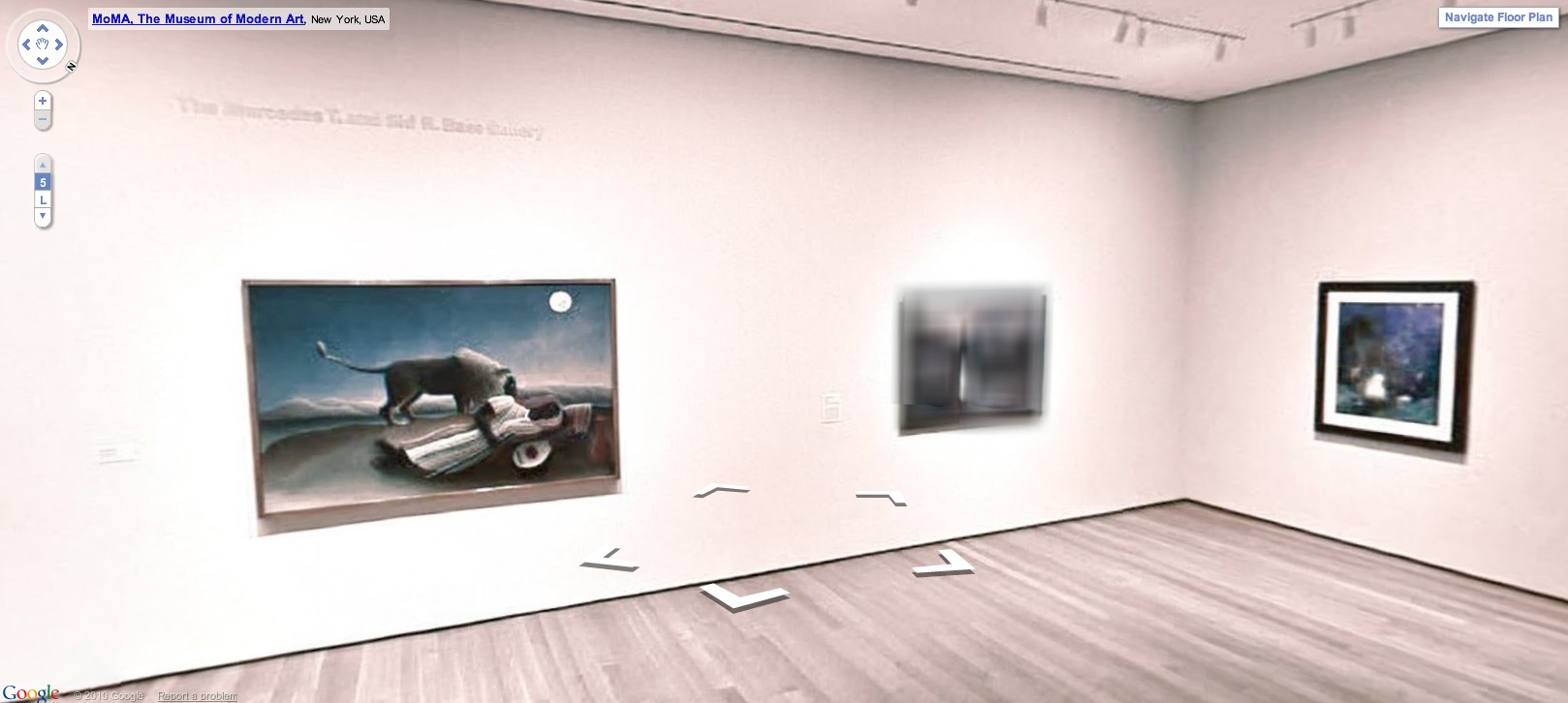
But let me agonize in private while we first praise the awesome. Google has released Street View-style navigation for galleries in seventeen major museums around the world, including the Museum of Modern Art. MoMA’s only got the lobby and one room on there, the first gallery on the fifth floor, which contains Cezanne’s Bather and Starry Night.
The resolution and color look awful, frankly, but who cares? It’s Starry Night as you’ve never seen it before–in an empty gallery. But still. Check out the background, what they had to do to all the artwork in the adjacent galleries, the stuff they didn’t clear the rights for:
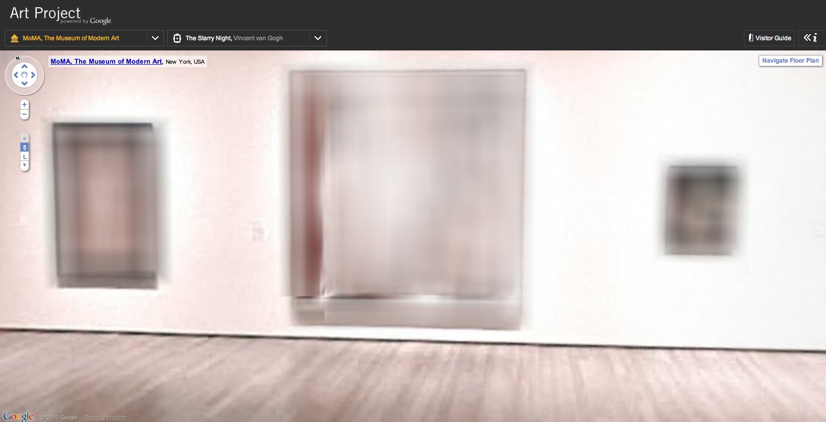
That’s Les Demoiselles d’Avignon there in the middle:
Which makes this, Picasso’s Boy Leading A Horse:
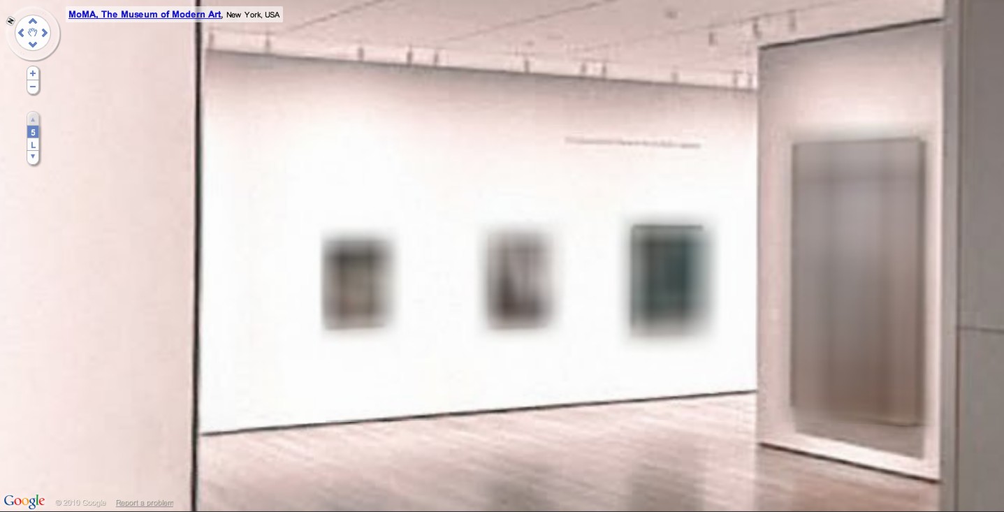
What’s crazy is that whatever’s hanging next to Rousseau’s Sleeping Gypsy is blurred out, too. By definition, it has to be in the public domain, right? 19th century? What is it?
The shoot for The Googlecam Was Present seems to have taken place almost a year ago; in the lobby, Marina’s still listed as “coming soon.” And they’ve rehung Gallery 1, there, so it’ll take a little flickrdiving to figure out what that was.
UPDATE: Thanks to MoMA scout Dan Phiffer, the work is identified as Edward Munch’s 1893 painting, The Storm.. [Munch died in 1944, so depending on which copyright regime applies, it may not enter the public domain until 2014. The image of the painting on MoMA’s website is rather boldly claimed to be copyright 2010 by the Munch Museum.]
But meanwhile, I’m prowling the other 16 museums for more blurred material. Richter must be so pissed right now.
Previously: Blurmany and the pixelated sublime
Sherrie Levine’s Meltdown series
Color Me Interested
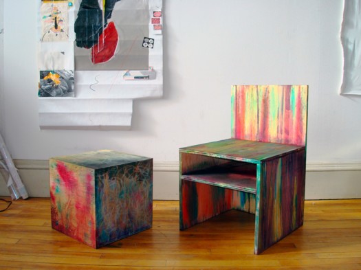
Not sure what this psychedelic Juddy chair/sculpture colabo they’re doing with Eric Timothy Carlson is about, but anything RO/LU does has my undivided attention, even if they didn’t quote my favorite Joe Bradley review. [via rolu]
[2020 update: RO/LU alumnus Matt pointed out that Frieze has deleted Chris Sharp’s 2008 review of Joe Bradley’s CANADA show, so here it is, exhumed from the Internet Archive [CW: offensive ableist slur]
This will be a very un-politically correct piece of art criticism. The faint of heart are encouraged to stop reading now. That said, I was recently impressed to hear a New York artist criticize, with distinctly un-PC disdain, a fellow artist for producing work that was ‘not retarded enough’. ‘Retardation’ being the acme of advanced art and any un-self-conscious betrayals of earnest intelligence an act of philistinism, it is as if, over the course of the past five years, a kind of compulsory Dada has integrated itself into the fabric of a good deal of New York art-making. The higher the ‘durr’-factor, the better, apparently, the art. And with this exhibition at CANADA, entitled ‘Schmagoo Paintings’, Joe Bradley has thrown down the ‘durr’ gauntlet. Because it doesn’t get much more retarded than this.
Departing from the slightly less ‘durr’ primary-colour minimalist figures he showed at the Whitney Biennial this year, Bradley has produced an exhibition of seven mid-size ‘paintings’ on unprimed canvases (all works 2008). Six of the seven works bluntly feature stick figures, grease-pencil drawings which can be read as: a human figure, a fish in an open mouth, a cross, a Superman symbol, the number 23, and a line towards the bottom of a canvas (a deadpan mouth?) – while the seventh, titled Untitled (Schmutz Painting), bears nothing but the dirt from the floor upon which it was stretched. There is, incidentally, a lot of schmutz, for the same reason, on the other works as well.
One thing that can said about Bradley’s work is that it responds to the art-fair attention-span of our time. It can (and should) be consumed in no less than the time it takes to walk in, chortle, and walk out of the gallery. When Martin Barré (a very generous reference) did just as little with white canvases and black spray paint in the early 1960s, it was radical and even beautiful. But here and now with Bradley it is just plain dumb, though that is the point. Whether I, or anyone, likes it or dislikes it is actually beside the point. Which is also very much the point. This kind of work wields the uncanny ability to render all who enter its orbit complicit. It’s a kind of 2008 Lower East Side counterpart to Jeff Koons – though rendered much more poorly. Squarely operating within a paradigm of post-sincerity – it is neither sincere or insincere, having transcended such issues – its mere existence acts as a cerebral black hole, engendering critical paralysis. Any possible reaction you may have to it has been foreseen and theoretically integrated into the work, such that reacting is vain. Whether you like it or not, you’re a fool. And if you profess indifference to it you’re likewise a fool, because such painterly antics require a stand that no one can make. It’s like a work of high modernist fiction – Borges, or Cortazar perhaps – in which you realize that you are part of the plot, but by the time you do – standing in front of the painting or reading this review – it’s too late.
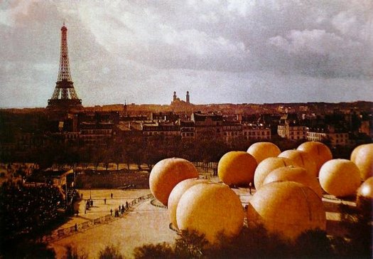
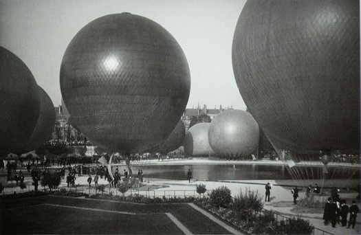
Les Ballons de Léon Gimpel
Last week in my interview with Mike Maizels for Pinkline Project, I’d mentioned how the Grand Palais in Paris would be an acceptable art venue for exhibiting my satelloon project. Not only was the grand nave one of the few spaces in the art world that could accommodate a 100-foot diameter inflated aluminum sphere; but historically, it was the site of major, early air shows, and it has held giant balloons before.
As new greg.org reader Erik points out in this awesome color [!] photograph, which was taken in 1909 by Léon Gimpel.
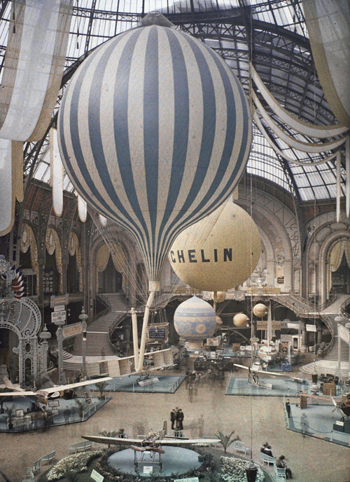
I didn’t know Gimpel, but the Musee d’Orsay says I should be as familiar with his work as with his Belle Epoque confreres Lartigue and Atget. They staged a retrospective of Gimpel’s pioneering photography in 2008. Apparently, he experimented with distorting mirrors, perspectival compositions, and color photography. He published the first color news photo, using the Lumieres’ autochrome technology [the same as above] just days after they introduced it. And though I can’t find examples of it yet, his aerial photography sounds pretty sweet:
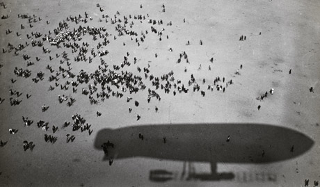
From 1909 onwards L’Illustration commissioned photo reports directly from Gimpel. He stood out from other photojournalists by producing unusual images. At the first major air show, held at Béthény in August 1909, he went up in an airship and so was able to photograph the progress of the aircraft, not from the ground like the other photographers, but from the sky. So, thanks to Gimpel, readers of the magazine had a stunning view of the pioneers of aviation.
From this date, the photographer started to exploit this bird’s eye view in order to set himself apart from other reporters and to seduce the press.
[update: found some via fantomatik]
Fortunately, there’s a catalogue. Unfortunately, it doesn’t look to be readily available in the US. Judging from the cover, though, I could probably ask Ricci Albenda to lend me his copy.
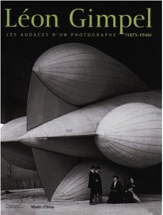
Léon Gimpel (1873-1948), Les audaces d’un photographe [musee-dorsay.fr via ck/ck, the equally awesome tumblr of Swedish designer Claes Källarsson, thanks Erik]
More Gimpel images: La guerre des Ballons de Leon Gimpel [fantomatik]
I’m Sure There’s A Product Here Somewhere
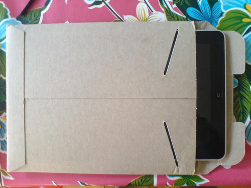
Yesterday I was looking around for something to take my iPad on the train, and I saw that it fits perfectly in the thick cardboard envelope my Cabinet magazine came in.
I love the idea of a found, cheap, repurposed iPad case that provides a decent amount of protection. But I also wonder if this could work even better in a slightly more advanced material. Maybe Kickstart a development plan, test out some small batches in various Kevlars and polycarbonates and whatnot.
Or maybe low-profile, recyclable cardboard is where it’s at. You could subscribe, and they’d send you a new iPad case when they start to wear out, maybe every quarter. And maybe entice you with a free magazine inside.
$31/100ct is a pretty good price for 9×11.5 inch kraft mailers. [esupplystore.com]
Amazon’s got 100ct for $49, which is alright. [amazon]
Having A Cow
After dropping in on the National Portrait Gallery’s daylong symposium [it’s still going on, in fact] connected to Hide/Seek just now, and though I only saw two presentations, whoa–I feel like a cigarette.
Jonathan Katz, co-curator of Hide/Seek, titled his paper: The Sexuality of Abstraction: Agnes Martin, and he rather amazingly addressed Martin’s embrace of the substantive stasis of Zen as an alternative to the more prevalent and problematic model of the closet for not addressing her lesbianism. Which she at once did and did not do in some of her formative early New York work, and which she very much did not do when she wrote and talked so extensively about her work.
One particular work, a 1961 drawing titled Cow, for example, has been traced to an illustration in her D.T. Suzuki book, where an oxherder and an ox contemplate a circle in a square. And then Katz read a quote from the artist’s statements from one of Martin first shows in NYC, in which she quoted a famously, directly erotic Gertrude Stein poem–but stopped right before the hot parts. And–who knew? not I–he read some other famous-among-lesbians poem where Stein rather rhythmically builds up, and up, and up, to the moment of climax–which is symbolized by a cow. Suffice it to say, Katz’s phrase, “Stein’s orgasmic cows” is now right next to Gorky’s “cosmic vulva” in the modernist discourse. [Holy smokes, I just Googled “cosmic vulva” and Gorky and came up empty. Have I not told that story? My apologies. Let me rest up, and then I’ll get right back into it. I’m not 19 anymore, you know.]
Anyway, hot on the heels of Martin’s Zen sex koans, Dominic Johnson presented work from his forthcoming book on Jack Smith’s 1963 film Flaming Creatures and what he calls the “burden of disgust.”
I’d heard the general story of the obscenity controversy around Flaming Creatures, prints of which were seized by police, and became the basis for several criminal obscenity cases and appeals. But I had no idea that when Lyndon Johnson was nominating Abe Fortas to be Chief Justice of the Supreme Court in 1968, conservative senators, led by Strom Thurmond, raised Fortas’s criticism of the Flaming Creatures convictions as evidence of liberalism’s inherent perversity.
And that to make his point–are you sitting down? You really should be sitting down–Thurmond organized a Senate screening of Flaming Creatures during the Fortas hearings. And he sandwiched Smith’s avant-garde piece between a random strip-tease film, and a couple of run-of-the-mill straight hardcore porn flicks. At the Senate. Charles Keating apparently told Newsweek that the film was so disgusting, it didn’t even arouse him. This he told to Newsweek.
Sometimes it feels like you think you know the world you’re living in, and sometimes, wow, you just don’t.
WOW, HAS IT BEEN TWO YEARS? UPDATE I was searching to see about Johnson’s Jack Smith book, and I found the videos of the “Hide/Seek” symposium presentations, so I added them here. Good times.
Meanwhile, the book, Glorious Catastrophe: Jack Smith, performance and visual culture, was released last summer. I haven’t seen it, or any reviews of it, which seems unusual.
Pebble Beach Pollock Revealed! Or Scenes From A Boston Marriage
So much history-making postwar art missing, so little time!
The Pebble Beach Art Heist had gone cold for a while, but now, thanks to a new website [“made on a Mac”!] it is flaming back to life. And for the first time, we get to see a photo of what is surely one of the Most Important Missing Paintings In The World: the Pebble Beach Pollock.
Continue reading “Pebble Beach Pollock Revealed! Or Scenes From A Boston Marriage”
Haven’t Found Tacita Dean’s Sound Mirrors Yet
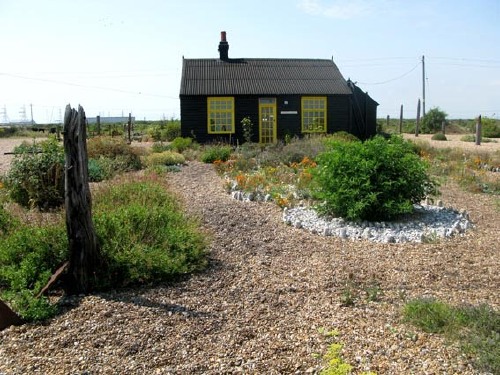
Maybe it was me looking for Tacita Dean’s Sound Mirrors that brought me there, but David Williams’ 2009 post at Skywritings about Dean, Derek Jarman, Dungeness, gardens, Tehching Hsieh is pretty wonderful:
Everything here has been found, salvaged, re-cycled from this sea-edge place, and is both displaced and quite at home. A manifest testament to qualities of patience, economy, playful invention and a quiet contemplative thusness. For the garden stages a deep acceptance of being here in all modesty and attentiveness. Taking time to make space. Slow time, still moves. A bricoleur Picasso meets the Zen garden.
Jarman bought the house in 1986 for £750; he was scouting for bluebells with Tilda Swinton and Keith Collins for a film shoot. He called it his ‘paradise at the fifth quarter’, a place where he could walk in the ‘Gethsemane and Eden’ of his garden and ‘hold the hands of dead friends’ (Garden).
(Once, when my mother was very ill in hospital, she told me that her mother had just visited her, what a shame I’d missed her. She had knocked on the window, told her that she should ‘come out into the garden’, it was good out there, and it was time. Her mother had died more than ten years beforehand).
Still looking for that Sound Mirrors piece. I suppose I should just go to the gallery.
In fact, skywritings is good all over. [sky-writings.blogspot.com]
An Avalanche Of Awesome

I’ve been kind of busy, and I didn’t want to get fingerprints all over the signed edition, and my few original issues are in storage somewhere, so I’m really only now getting a look at Primary Information’s beautiful facsimile copy of Avalanche magazine. I’m on page nine and I’m tempted to blog my way through the whole thing. Just so much going on. Here’s a taste from Avalanche No. 1, Fall 1970, from Rumbles, the front-of-the-book, which reads like the alumni news section of Conceptual Art University:
James Turrell, 27-year-old LA sculptor, who has not formally exhibited since his only one-man show of projected light works organized by John Coplans at the Pasadena Art Museum in 1967…In April 1969, Turrell and Sam Francis made a sky drawing using two World War I biplanes, radio-controlled from the ground, as part of Easter Sunday in Brookside Park organized by Oliver Andrews, Judy Gerowitz [!] and Lloyd Hamrol, who participated with elemental outdoor projects…
…
Work began this summer on Paolo Soleri’s Arosanti, a rural housing complex for two thousand inhabitants on a seven acre site seventy miles north of Phoenix, Arizona…
…
The Museum of Conceptual Art opened on Wednesday, March 18 in San Francisco’s Market Street district with a participatino piece in which buckets of paint were given to the guests to paint the walls white….MOCA’s latest show, Sound Sculpture As a one night presentation of successive sound events by ten Bay Area artists, was held on April 30…Allan Fish‘s piece was performed by Tom Marioni. Perched atop an eight foot ladder, he pissed into a galvanized washtub. As the tub filled, the sound dropped in pitch. He was followed by Terry Fox, who scraped a shovel across the linoleum floor and vibrated a thin plexiglas sheet very fast. Jim McCready paraded four girls wearing shiny nylons down a 3×9′ long rug. As they rubbed their thighs together a swishing sound was heard….
…
Andy Warhol…now has financial backing for his first Hollywood-based film, Specimen Days, the story of Walt Whitman’s experiences as a Civil War male nurse. With shooting set to begin around mid-October in New Orleans, the regulars are ready but the lead is still to be cast. Allen Ginsberg, Mick Jagger, and John Lennon have all turned it down.
…
After his recent New York visit, LA based artist Terry O’Shea has returned to California and plans to execute a large-scale ecological project involving fast-growing plants.
…
The Japanese police detained San Francisco artist Paul Cotton for wearing a pink bunny costume to the Pepsi Pavilion at Osaka’s World’s Fair. John Perreault gave Marjorie Strider his old Iowa summer teaching job so that he could concentrate on his first book for Abrams, Andy Warhol
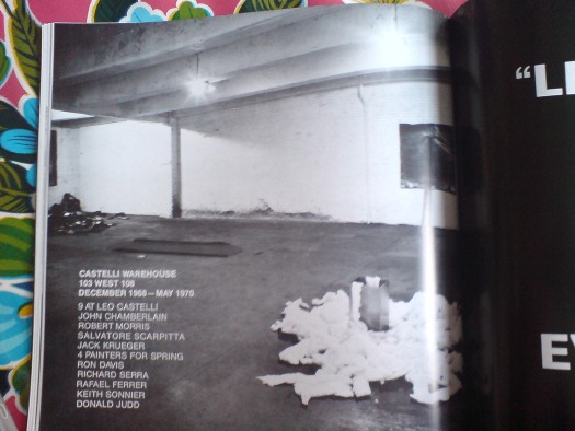
Ooh, an ad for 9 at Leo Castelli, the seminal show Robert Morris curated at Castelli Warehouse–which was not the Castelli Warehouse from which Jasper Johns’ Short Circuit flag painting was taken, but still.
Ooh, a big picture of the misty Pepsi Pavilion surrounded by moving sculptures in the ad for Robert Breer’s show at Galeria Bonino? Where is Robert Breer these days, btw? That’s not a rhetorical question, either.
The trade edition of Avalanche is under $100 at Amazon. The first nine pages, at least, are highly recommended.