Compared to Germany’s digital scrim effect, the Italian Google Street View opt-out regime is extraordinarily, even romantically, naturalistic.
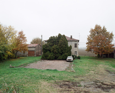
Haha, no. It’s a photo from Elmar Haardt’s careful and unassuming project documenting Bondeno, a seemingly unremarkable small town in Ferrara. [via the incomparable mrs deane]
Category: art
The Four Color Process Manifesto
One of the first Japanese sayings I learned was “Chiri mo tsumoreba, yama to naru,” “Pile up dust and it becomes a mountain.”
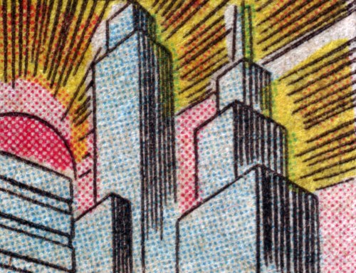
At his incredible blog Four Color Process, John Hilgart continues to mine the gap between comic book art and comic book printing. Looking back over his year’s collection of images, often tiny details pulled from the seemingly insignificant corners and backgrounds of old comic book frames, he’s come up with an excellent and expansive essay. He doesn’t, but I’ll call it the 4CP Manifesto:
Gone are the page, the frame, the plot, and localized contextual meaning. What remain are the color process and what are generally called the “details” of comic book art. These are the two lowest items on the totem pole of comic book value – poor reproduction and the least important, most static elements of the art itself. Our proposition is that these elements are important and aesthetically compelling.
Who is responsible for this art? At the level of a square inch of printed comic book, no one was the creative lead. 4CP highlights the work of arbitrary collectives that merged art and commerce, intent and accident, human and machine. A proper credit for each image would include the scriptwriter, the penciller, the inker, the color designer, the paper buyer, the print production supervisor, and the serial number of the press. Credit is due to all of them, to differing and unknowable degrees, for every square inch of every old comic.
[image: Gotham Dawn, via 4CP]
In Defense of Dots: the lost art of comic books [4cp.posterous.com, thanks city of sound for the heads up]
Previously: Four Colour Process [greg.org]
What I Looked In 2007 & Again Just Now: Myron Stout
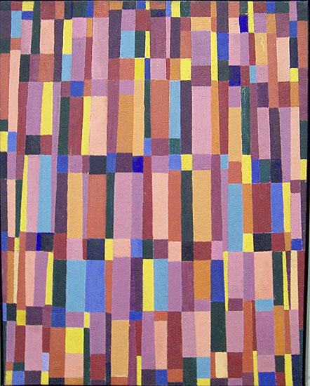
Doug Ashford ended the 2009 presentation I just posted about, “Abstraction as the onset of the real,” with a slide of this beautiful painting, Untitled, 1950 (May 20) by Myron Stout.
Washburn Gallery had a sweet little early Stout show in 2007, which I’d completely forgotten about. Back when he was still writing about art, NY Times chief art critic Michael Kimmelman reviewed the show:
…his mentor remained Hans Hofmann, who helped him see how to construct a purely abstract picture, while his great inspiration was Mondrian, about whom Stout observed that “the tangible and sensational world was still the raw material for the universality which he would create for himself.” In other words, Mondrian, like Stout, remained firmly connected to nature and the real world.
Things that happened in 2007 can seem so long ago and far away. I need to hustle up some Stouts to look at, pronto.
‘Art Directly Builds Who We Are – It Engenders Us’
I’m still trying to figure out quite what he said, but whatever it is, Doug Ashford said the hell out of it. Forget speaking or writing like this, I wish I could even think like this. Brains back on, people! Vacation’s over!
Over all, our efforts in the Democracy project were to try to see how democracy happens at the site of representation itself, not just where information is transferred or built, but rather at the very place we recognize ourselves in performing images, where we have the sense we that we are ourselves, feel a stability that is hailed and recognized by others. A radical representational moment, whether collective or not, is one that suggests we can give ourselves over to a new vision through feeling, an experience linked to contemplation and epiphany. In this way no public description of another, in frame or in detail, can be presented as politically neutral. So when Group Material asked, “How is culture made and who is it for?”, we were asking for something greater than simply a larger piece of the art world’s real estate. We were asking for the relationships to change between those who depict the world and those who consume it, and demonstrating that the context for this change would question more than just the museum: a contestation of all contexts for public life. In making exhibitions and public projects that sought to transform the instrumentality of representational politics, invoking questions about democracy itself, Group Material presented a belief that art directly builds who we are – it engenders us.
From Doug Ashford’s “Group Material: Abstraction as the Onset of the Real,” an adapted paper presented in 2009 at the “New Productivisms” conference at Museu d’Art Contemporani de Barcelona, as published online by the european institute for progressive cultural policies [eipcp.net via @mattermorph via @joygarnett]
‘On Kawara’s Last Piece!’
Maybe it was the news, or those long family car rides over Christmas with his cousin’s evangelical radio station going the whole way. But Frank Wick has of late been considering The Big Questions of Life, questions such as, “When The Rapture comes, will On Kawara have enough time that day to finish his painting?”
I guess the answer has been there all along in Kawara’s audio piece, Kawara’s Four Thousand and Four Years, B.C. and Two Thousand and Eleven Years, A.D.. He that hath ears, let him hear.
What I Looked At Six Months Ago: Douglas Coupland’s Roots Paintings
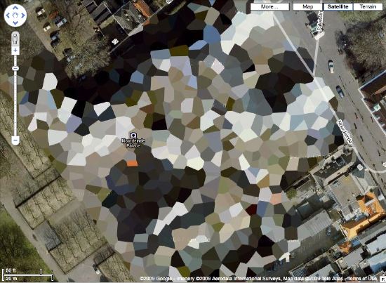
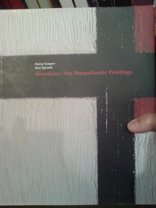
Holy smokes, it’s been 15 months since I found the Dutch Camo Landscapes on Google Maps; just over a year since I started systematically screengrabbing them; a little less than a year since Google’s particularly beautiful Delaunay triangulation distortion was replaced by a more typical pixelation algorithm; and about the same time since I last posted one of the “What I Looked At” installments, where I tried to figure out how to approach painting these things by studying the techniques of other hybrid, found, hard-edge, geometric digital, photographic, reductivist, surveillant, abstract, or Dutch Landscapes. Folks from Albert Cuyp and Picabia to Arthur Dove and Sheeler to Mondrian to Sherrie Levine [below].
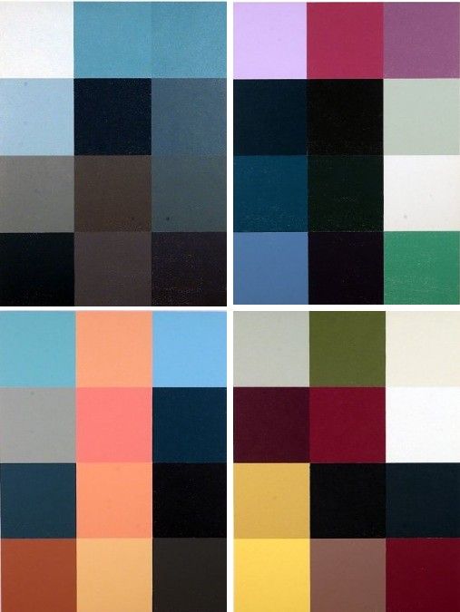
The longer I take to think about how to paint without actually trying to paint, the more I keep accumulating and questioning potentially resonant work. And I wonder: what would it mean to consciously appropriate someone else’s technique? if I taped my edges, would there be more of a connection to Odili Donald Odita? If I made little polygonal stencils and squeegeed, would it be too Brillo? Is there an implication in the kind of precise painterly edges of Mondrian as opposed to the surprisingly tentative edges of Sheeler, or the just-fill-it-in forms of Dove? Should I skip the paint, and just blow those bad boys up and print the hell out of’em on the biggest canvas/paper I can find?
It [basically, obviously] boils down to some ongoing uncertainty or doubt or skepticism or insecurity or whatever over whether these things should exist. Emphasis on things and should. Does everyone who makes stuff feel that? It’s like Baldessari’s classic fortune cookie of a painting, “I will not make any more boring art,” but with the make in flux as much as the boring. I just remained unconvinced about the justification for these images as objects. [On the “bright” side, like the unshot film in the director’s mind, the unmade artwork does remain perfect–for me, anyway.]
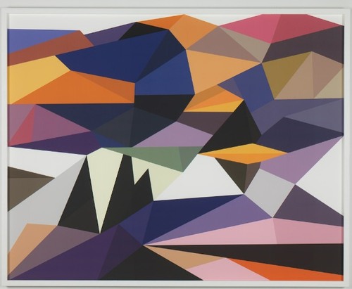
Anyway, all this comes to the fore because last summer, I saw images of some polygonal abstracted landscape paintings by Douglas Coupland, which were part of, or inspiration for, or somehow connected to, the Fall/Winter clothing and home furnishings colabo he designed for the Canadian retailer Roots. They were exhibited and for sale in Coupland X Roots pop-up stores in Vancouver and Toronto.
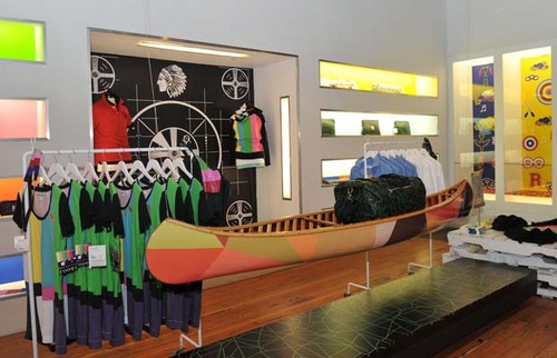
There was zero info online, so last summer and fall, but I deduced that they were digital reductions of iconic paintings by the Group of Seven, the early 20th century landscape painters who rather self-consciously set out to create a national cultural and visual identity for Canada via its landscape. Coupland’s Roots collection was an extension of that national branding project, only he referenced the unifying forces of electrification, television, and moose logos.
At least that’s what I gleaned from the web and press releases. I tried in vain to get any information on the paintings from Roots, Coupland, or his galleries, but it was total radio silence. So I ignored them back. Only now, as I check back, do I find that “culture guru” Coupland has a show up of the paintings, through this week, at Monte Clark Gallery in Vancouver. Faux-encrypically titled G72K10, the paintings turn out to be exactly what I thought they were.
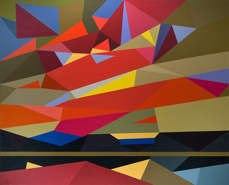
“Thomson (Sunset), 2010, Oil on canvas, 58 x 72 inches” image: monteclarkgallery.com
To a point. Because though the captions say things like “oil on canvas” and “acrylic and latex” and “unique pigment print” it is completely unclear whether the images on the dealer’s website are of the objects themselves or of their digital sources. Maybe it doesn’t matter to Coupland. Here’s how the gallery describes them:
By digitizing the likeness of specific works, Coupland has produced large-scale hard-edged paintings on canvas, presenting his own vision of the Group of Seven in 2010.
Doesn’t sound like he’d use something as retardataire as a paintbrush for a forward-looking project like that. Though it’s hard to tell from the jpg, the date on this unidentified type of limited edition print being auctioned next month by the Writers’ Trust looks earlier than 2010. Or not.
So while I still can’t decide if my painterly obsession is a vice, Coupland’s project is at least makes clear that materialist indifference in the pursuit of digitized aestheticism and conceptual slickness is no virtue.
Untitled, By The Pachinko Ginbasha Master Of Amakusa
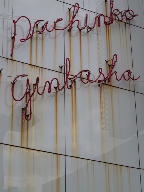
A dismal, depressing subject can be made enjoyable by great writing. And the spirits can be lifted by an awesome photo at the end. These are my takeaways from Richard Hendy’s travel/history/economics/politics/apocalyptic decline essay on Amakusa, a hardscrabble group of islands near Kyushu, Japan.
Hendy’s blog Spike Japan documents the underside and overlooked, and Amakusa certainly sounds like it’s had the short end of the stick since forever, basically, and all they have to show for it is a 15-year-old, $120 million Bridge To Nowhere–designed by Renzo Piano.
But this incredible photo gives me hope. I’m transfixed by this pachinko sign. I mean, just look at those lines. The neonya-san who made that is literally drawing with light in space here. Is there a kanji-based, gestural tradition within the Japanese neon signmaking industry? Have Zen brushstrokes been translated or reperformed and fixed in 3D glass tubing? Or maybe it’s Action Painting, frozen in time and space instead of dropped onto the canvas in the barn in Springs?
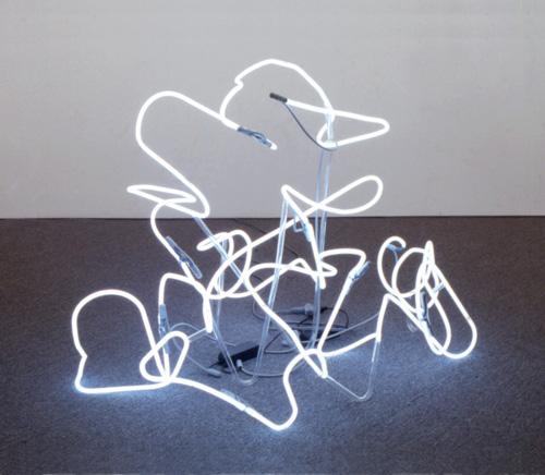
Perhaps Peter Coffin’s 2004 sculpture, Untitled (Line after B. Nauman’s The True Artist Helps the World by Revealing Mystic Truths) 1, isn’t abstract at all, but documentary. Perhaps the topic could be addressed by a panel discussion at a future symposium, after Amakusa’s calligraphic lighting sector has been revitalized, and the island has claimed its rightful place as the Japanese Marfa for the neon arts.
1 which, hello, is now in MoMA’s collection.
‘Someone May Have Located The Stolen Painting’
It’s exactly the kind of scribbled note I dug through five boxes of Smithsonian archival material hoping to find: “Someone may have loc. stolen ptg. So Charles will talk to Bob about it.”
Well, I talked to Charles about it. The artist Charles Yoder worked for Robert Rauschenberg for five years, until around 1975-6. So I called him, and unfortunately, he had no idea where the Johns flag painting was, the one which had been removed from Short Circuit in the mid-60s [Michael Crichton says before 1965.] He did say there was “scuttlebutt,” at the time, a general awareness that there was a Johns flag painting on the loose. But it never went beyond the, “I heard some guy was trying to sell it on the Bowery,” type urban legendry.
But though I didn’t find any smoking guns, or burned flags, in the records from Walter Hopps’ 1976 Rauschenberg retrospective at the National Collection of Fine Arts, I did learn some more interesting details about Short Circuit and its complicated history.
Like, for one thing, the 1955 combine was not actually shown in Hopps’ retrospective.
Continue reading “‘Someone May Have Located The Stolen Painting’”
Browser Tab Cut Or Run
So much to blog, so little time. I may have to institute a new practice of dumping my interesting-looking browser tabs if I don’t write about or use them within a month, or blogging about them.
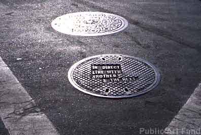
For example, ever since seeing a Le Corbusier manhole cover from Chandigarh sell for almost EUR18,000, I’ve been meaning to take this list of locations for Lawrence Weiner’s 2000 Public Art Fund project, and see which of his 19 downtown manhole covers looks the most lootable. But you know how it is with scheduling, holidays, pangs of conscience, snow, &c. &c…
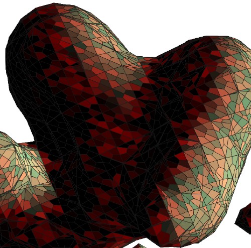
So via Zelkova’s long essay on interactivity and digitization, I find this intriguing 2003 project, C & C, from the Lyon design studio Trafik. Joel, Pierre, and Julien all responded [merci, fellas!] to explain that C & C began as an exploration for a method to create designs for a handmade carpet. So they created a program in C that used the 3D coordinates of shapes created in Autodesk 3ds Max [above] to generate a 2D vector graphic [below].

Needless to say, I like the translational aspects of the project almost as much as I do the Dutch camo landscape-like polys.
One nice consequence of my recent Short Circuit research is seeing and reading up on Sturtevant. From Bruce Hainley’s Aug 2000 essay in Frieze:
As Sturtevant puts it: ‘Warhol was very Warhol’.
This is a complicated statement. How did Warhol get to be ‘very Warhol’? How does one come to recognise – see, consider – a painting, film , or anything by Warhol once he and everything he’s done are slated only to be ‘a Warhol’? It is Sturtevant who knows how to make a Warhol, not Warhol. It is Sturtevant who allows a Warhol to be a Warhol, by repeating him. Copy, replica, mimesis, simulacra, fake, digital virtuality, clone – Sturtevant’s work has been for more than 40 years a meditation on these concepts by decidedly not being any of them.
I’m kind of disheartened by how interesting Chris Burden’s post-minimalist undergraduate work sounds in this fully illustrated repro of Robert Horvitz’s Artforum cover story from May 1976 [volny.cz]
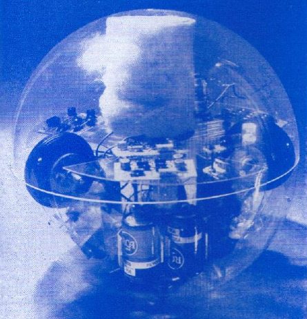
Via the awesome cyberneticzoo.com comes Toy-Pet Plexi-Ball a the 1968 artist/engineer colabo sculpture by Robin Parkinson and Eric Martin, which was included in Pontus Hulten’s MoMA show, “The Machine: As Seen at the End of the Mechanical Age.” The light-and-sound-activated Toy-Pet rolled around the gallery following viewers, until you put it in its fake fur bag. Which made it look like a tribble. Which can’t be a coincidence, can it, Pontus? If you have an engineer collaborating with an artist a year after the Star Trek episode airs?
Awesome kinetic/robotic artist James Seawright was one of the six artists–along with Aldo Tambellini, Thomas Tadlock, Allan Kaprow, Otto Piene, and Nam June Paik–who contributed to WGBH’s groundbreaking TV show/happening The Medium Is The Medium. Which is right in front of my face. And I’ve been staring at everyone but Seawright and Tadlock for a year. At this rate, I’ll be fawning over Tadlock sometime next summer.
Since my Google Street View Trike book project is entirely about the subject, I suspect I’ll keep Olivier Lugon‘s November 2000 Etudes Photographiques essay, “Le marcheur: Piétons et photographes au sein des avant-gardes,” open a little longer. Along with the Google translation.
Whither Washington, Post-Gopnik?
You know, some things have just been bugging me about this Blake Gopnik/Washington Post situation. I deeply don’t care about Gopnik in a gossipy way. I suppose if I were pressed, I’d be generically glad for him now that it has been reported that he’s going to work for Tina Brown in New York as a “special correspondent, arts,” even though the I could also imagine that gig could/would be utterly irrelevant, and the specifics of it could be excruciating. Fortunately, that’s not my problem.
I’m more interested in what his departure says about art-related writing and criticism in Washington, DC. In other words, what does it reveal about state of the Washington Post, does it have any implication for Gopnik’s replacement?
Because, this:
It hasn’t been two weeks since Tyler Green wrote that Gopnik “has been doing the best work of his career on the Smithsonian fiasco.”
I’d say that’s a bit of a low bar, but I have to agree; Gopnik came out quickly, clearly, and strongly in defense of art, Wojnarowicz, and curatorial independence. And before that, he’d already given the National Portrait Gallery’s “Hide/Seek” an excellent and strong review.
Fine.
But here’s the thing: we know now that when he wrote this “best work,” he was either interviewing, auditioning, or negotiating for his new gig.
Badass LEGO Instruction Manuals, Vol. 2
Did I mention that I got a copy of the 316-pg instruction manual for Lego Set 10179-1: The Ultimate Collector’s Millennium Falcon? It is worth every penny. It is a thing of beauty. And gigantic, the first coffee table LEGO instruction manual.

But not the only awesome LEGO instruction manual. There is another. Martin Hudepohl, a German composer and programmer who works under the moniker Xubor, just released Badass LEGO Guns, which includes detailed instructions for creating five working guns from stock LEGO Technic pieces.
It’s not clear, but Badass may overlap with Xubor’s 2009 manual classic, WEAPONS for LEGO LOVERS. Both feature variations on the THRILLER LEGO crossbow, for example. I assume the compleatist will acquire both on principle.
Badass LEGO Guns: Building Instructions for Five Working Guns
Lucienne Bloch’s Muralphotos
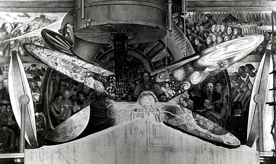
I didn’t realize how closely the Modern’s 1932 Murals and Photomurals exhibition and the anti-communist controversy it provoked dovetailed with the far better known confrontation over Diego Rivera’s rejected and destroyed commission at Rockefeller Center.
Rivera had a hugely successful one-man show at MoMA in 1931. Lincoln Kirstein’s exhibition of murals by American artists was, as he said in the catalogue, “Stimulated in part by Mexican achievement, in part by recent controversy, and current opportunity.” The recent controversy, it turns out, was a January 1932 protest by art students from the New School, who objected to reports that John D. Rockefeller Jr. had selected foreign artists, Rivera and Jose Maria Sert, not Americans, to paint murals in Rockefeller Center. Check out this incredible NYT headline:
WANT NATIVE ART IN ROCKEFELLER CITY; Students Protest on Hearing A Report That Rivera and Sert Are to Paint Murals. ARTISTS NOT YET CHOSEN Architect Promises Citizens Will Have an Equal if Not Better Chance for Commissions. FOREIGNERS CRITICIZED Class at School for Social Research Declares Selection of Any Aliens for Building Here “Inconsistent.”
Which means the Modern’s show, which came together in a matter of weeks, was more an attempt by the Rockefellers to blunt nativist criticism in the wake of a Rivera lovefest as it was a helpful promotion of the work of American artists for anyone who might find himself in the market for a few thousand square feet of murals. [And for the record, ascribing this decision to the Rockefellers and not the Museum per se is fine; the show originated in the Advisory Committee, headed by the 23-yo Nelson Rockefeller.]
But this also means that trustees’ objections to anti-capitalist-themed works, and the ensuing threats of a protest and boycott by a dozens of artists in the show, did not happen out of the blue; they occurred in the context of the Depression, where anti-foreign sentiment was as readily expressed as anti-capitalism. And more to the point, it happened in and around a Museum founded by the family that was the symbol of capitalism, who was in the middle of one of the largest building projects in history.
And sure enough, that fall, Rivera was announced as John D. Rockefeller’s pick for a fresco in the complex’s flagship, the RCA Building. It can’t have been a naive decision. The day after Rivera arrived to begin work on the Rockefeller Center mural, his just-finished mural cycle at the Detroit Institute of the Arts, Detroit Industry, came under attack for “blasphemy.” [The DIA had invited local religious leaders to comment on it, and because one small panel in the upper corner depicted a swaddled baby being vaccinated by three wise scientist men, some clerics demanded the work be destroyed. Go figure.]

The Times kicked off its play-by-play coverage of the project by “the fiery crusader with a paint brush,” by noting “DIEGO RIVERA is again the centre of a raging controversy. and his new job at the RCA Building in the Rockefeller Center is likely to provoke another.”
And sure enough, less than three weeks later, after it became clear that that was no random baldheaded, goateed man in the center of Man At The Crossroads with Hope and High Vision to the Choosing of a New and Better Future, but Lenin himself, Nelson Rockefeller was called in to persuade Rivera to genericize the figure. Rivera refused, and he was quickly paid off and barred from the premises. Eager to not have the nearly-completed work photographed, the Rockefellers first covered it with drapery, and within a day, had covered it with canvas. After unsuccessful attempts spearheaded by Abby Aldrich Rockefeller, John D’s wife, to salvage the mural, perhaps to put it in the Modern, it was destroyed. Which prompted workers to protest anew in April 1934.
Now I knew it was a controversy, but I had no idea how heated and seat-of-the-pants the whole situation was, nor what a spectacle. It was on the front page of the Times for days, weeks, even. I also didn’t realize how incredible it was that Lucienne Bloch managed to take the only photos of the mural before it was covered up. Bloch began working as Rivera’s assistant after she was seated next to him at the Modern’s 1931 opening dinner.
The whole photo drama was retold [with perhaps a bit of anti-capitalist gloating?] in Bloch’s obituary in 1999:
Lucienne Bloch, an acclaimed muralist whose most significant contribution to art may have been a series of surreptitious photographs she took in 1933, died on March 13 at her home in Gualala, Calif. She was 90.
She was the photographer whose sneak pictures taken behind enemy lines on May, 8, 1933, are the sole visual record of the great Diego Rivera’s ill-fated Rockefeller Center fresco with its doomed depiction of Lenin.
At a time of economic distress, when capitalism itself seemed vulnerable to competing currents of social change, if anybody was going to pin Lenin on a capitalist wall it was Diego Rivera, the fiery Mexican muralist whose artistic acclaim was matched only by his reputation as a fiercely committed, if renegade, Communist.
If anybody was going to stop him it was John D. Rockefeller Jr.’s son, Nelson A. Rockefeller, who had commissioned Rivera to paint a 1,000-square-foot fresco, ”Man at the Crossroads,” in the great hall of the new RCA Building, the soaring Rockefeller Center capstone now known as the G.E. Building and at the time an especially potent symbol of capitalism.
Rivera used Bloch’s photos to recreate the Man at the Crossroads later in Mexico City.
Ant Farm 20:20 Kohoutek Letterpress
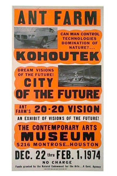
I’ve been deep in the commercial letterpress lately, and neglecting my Ant Farm. Fortunately, Mondo Blogo is there to bring me back in line, with this awesome poster the Farmers made for 20:20 Vision, their show at CAMH.
20:20 featured a Dollhouse of the Future named Kohoutek, after a comet that was supposed to crash into the earth or something, sending hippies into an apocalyptic panic, but it missed, bumming everyone out. In Kohoutek’s Living Room of the Future, naked Barbies lounge around on biomorphic sofas watching a live data feed from SkyLab, seemingly unaware that they’re being raised as food for the comet-surviving ants.
According to a review in Architectural Forum, there were 20:20 t-shirts as well as posters for sale. I’m dispatching my army of Houston vintage pickers forthwith.
And even though Houston was the first place Ant Farm unveiled their plans for the Dolphin Embassy, I think my favorite part is there at the bottom:
“Funds granted by the National Endowment for the Arts… A Govt. Agency”
ant farm: sex, drugs, rock & roll, cars, dolphins & architecture [mondo-blogo, thanks andy]
Previously: Cue the Dolphin Embassy [greg.org]
MoMA’s Murals By American Painters And Photographers, 1932

New York, montage photomural, Berenice Abbott, all images via moma’s 1932 catalogue
I’ve been meaning to post this for a couple of months, but with museum censorship battles and political mural controversies in the news, what better time, right?
When I started researching the history of photomurals–or more precisely, the photomurals of history, since I was mostly just posting various photomurals I’d discovered–I was interested in their context, in the exhibitions and expos they were created for, and whether they were considered or treated as art.
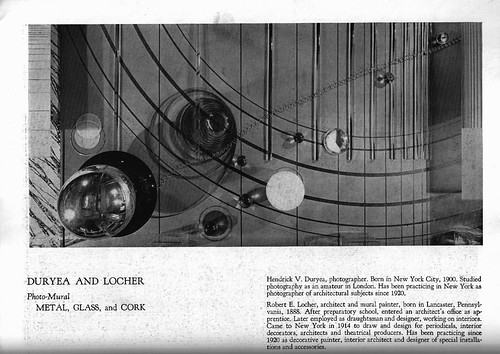
Metal, Glass and Cork, Hendrick Duryea and Robert Locher
Continue reading “MoMA’s Murals By American Painters And Photographers, 1932”
The Gala As Art As Slideshow
The Gala As Art, greg.org, at #rank 2010 from greg allen on Vimeo.
Here’s the narrated slideshow I did at #rank during Art Basel Miami Beach.
Many thanks to Jen and Bill for inviting me, to Magda for instigating, to all the SEVEN galleries for hosting, and to Michelle Vaughan for sharing her sharp gala insights. And a huge thanks to Jean, whose advice helped structure a drive-by blog post into a more coherent [I hope] argument. And who insisted I go do the talk, even though it meant celebrating our tenth anniversary early and late.
Thanks, too, to the artists and photo sources, including, in random order as I think of them: Andrew Russeth/16miles.com, Artforum.com, Andrea Fraser, MoCA, LACMA, the Rubell Family Collection, Jennifer Rubell, Kreemart, Christoph Brech, Getty Images, Patrick McMullan, the daily truffle, billionaire boys club, Vernissage TV–don’t these credits make you just want to hit play right this second??
The audio’s rough, the aspect ratio wonked out at the last minute, and I’d do better to just rebuild the whole thing rather than adapt my Keynote slides. And while there’s no gift bag at the end, I did manage to edit out a whopping 12 minutes of um’s, pauses, and “wait, I want to go back to the previous slide”s. I guess media training is NOT like riding a bike.
