I was in the back seat or maybe the jump seat of a Tesla, going to the pool. A public radio host was driving, but he didn’t look or sound like Scott Simon; I can’t figure out who it was, maybe 40? dark hair? My mom was in the passenger seat; he was doing and saying things to impress her. We drove through a subdivision under construction. A couple of houses had unfinished sculptures of OSB in the center of their circular driveways. Angled, wedgy, like a thick version of the lightning bolt emoji, Pikachu’s tail, or that knot of brushed steel powerpoint arrows in the traffic island in Rosslyn. Or maby they were more like riffs on the In ‘n Out sign.
Turning the corner, another house’s sculpture was in the process of being covered with gold-colored bronze sheet, hammered and nailed like a vintage-look trunk, but the kind you see in Restoration Hardware, or maybe World Bazaar. Actually it looked more like that spec house being built on Old Chain Bridge Road, which has had gold-finish panels uncovered for months. I keep waiting to find out they’re the protective coating of something else. I’ll get a picture one of these days.
Anyway NPR guy turns into a parking garage, and I’m like, are we taking a short cut through the parking garage? He takes the ticket; day care center-style rooms are seen on the same level, like the garage is now the lobby. MVRDV did that one bldg for VPRO where everything was a ramp, like they’d adapted a parking deck, but this wasn’t like that. He turned, and started heading down the giant statement staircase, babbling something. I hopped out, like I’d been in a rumble seat, but really like I was a first-person video game character, even though I don’t play video games. The car went bounding down the stairs like a Mini in The Italian Job, except that it bounced so high it flipped over, at which point I startled awake.
I am not a dream rememberer, much less a dream journaler, but after deciding I didn’t have any anxiety about my mom’s safety, I felt like documenting the unommonly vivid sculpture visuals. Even though, as I type them out and reflect on them, they really do sound bad and perhaps better forgotten.
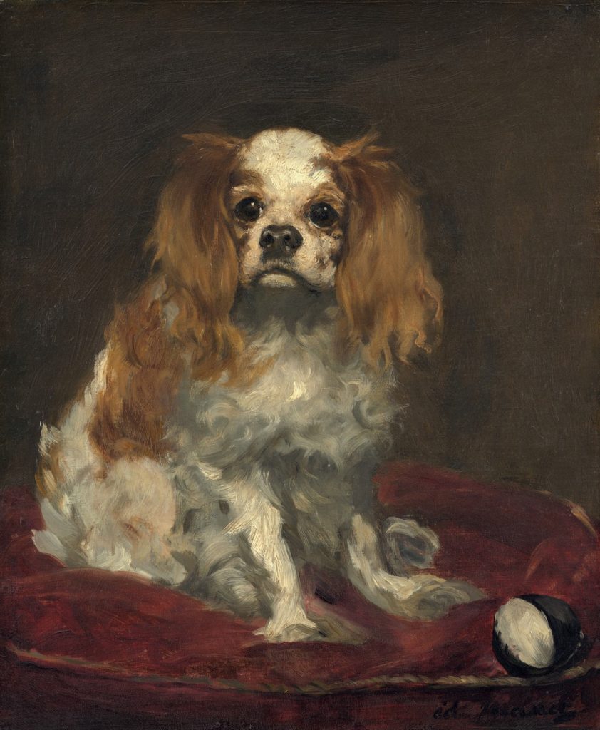
Edouard Manet, Tama the Japanese Dog, 1875, gift of the Mellons to the NGA
I visited the National Gallery as soon as it reopened because I could. On the last day before everything shut down in March, I debated rushing down to see this kind of minor-seeming show of European plein air painting, but I passed. Except for Degas, it was the only show open, so I saw it, and was buoyed by these small paintings, most of them basically sketches in oil, with a freedom and looseness that would come to be associated with the Impressionists only decades later. These were minor, low stakes paintings, mostly by minor, and sometimes even unknown artists, and they communicated the simplicity and directness of their making.
Which is all fine, but on the way to the exhibition, in a gallery most everyone was just passing through, there were small French paintings from the collection, including four Manets. After unexpectedly weeping in front of a late arrangement of flowers in a crystal vase, I turned to see the National Gallery has two Manet portraits of dogs. Two!
Edouard Manet, A King Charles Spaniel, 1866, gift of Ailsa Mellon Bruce to the NGA
The National Gallery has seventeen Manet paintings, and two are of dogs. What’s more remarkable, statistically, anyway, is that Manet only painted eight dog portraits, and the NGA has a full quarter of them. In the fifty years since Manet’s catalogue raisonée was updated, only two others have been reproduced in color. Others don’t appear to have been seen since at least 1932; some have no history at all beyond their original owner 140 years ago. Manet’s dog portraits are not considered important; in fact, they’re barely considered at all. But I am now fascinated with them.
Absolutely love this double exposure photo by Yayoi Kusama of her and an Infinity Net painting, c. 1960, via the MoMA catalogue.
If 4000+ words on Yayoi Kusama leaves you wanting more, here are some of the many sources I found useful in trying to understand and write about the artist and her work:
“SKY Unveils Artworks by Yayoi Kusama New York City, USA – 05.04.16 Photo – J Grassi” For a long time I worked to get the article to land on this photo, of two real estate developers unveiling their fresh, new Frieze Fair Kusama in the prop library of their huge rental building on 42nd and 11th or wherever. They have the only bronze pumpkin on public view in New York in the motor court, too.
At the end of February/the beginning of March, just as the Covid-19 pandemic started impacting the US, I was asked to make sense of the increasingly broad and intense interest in Yayoi Kusama and her work. As someone who’s looked at her work and tried to get smart about it for more than 25 years, I had tried to stop being surprised at how popular Kusama’s work has become–and I repeatedly failed. I just could not account for it. But I welcomed the challenge to figure it out.
Fortunately, there has been a surge of recent historical and academic interest, and a huge blind spot where Kusama’s Japanese career is concerned. So as museums and library shutdowns loomed, I dashed around town, taking snapshots of every Kusama-related publication the Smithsonian had: more than 1,500 pages, and then I started reading, and contacting scholars and curators and dealers, some of whom were very responsive to my inquiries. For their time and insights, I am very grateful. For those who did important work and never responded, I guess thanks for your work. For the unexpectedly large number of folks who did not respond at all, my interest is piqued.
The resulting article was published in the Summer issue of ARTnews, and is now available online. I’m fairly pleased with it, and am especially grateful to the editors at the magazine who helped guide and shape this look at an artist whose ambition and tenacity are absolutely unparalleled; Kusama has made transcendent, groundbreaking artwork while overcoming immense obstacles, both from within and without. I think her work holds a mirror up to the art world and how it’s changed in her 70+ year career.
Because I’ve been researching Duchamp’s earliest days in New York, I looked for Ruckstahl’s take on the 1913 Armory Show, where Nude Descending a Staircase was famously shown, or the 1917 Independent Exhibition, where Fountain famously wasn’t.
The short answer, that this outspoken critic of modern art had nothing to say about the most influential artist of the modern era, is worth bookmarking for later, when thinking of how art/information travels, and how history is constructed. Because The Art World did publish scathing commentary on the Independent, but it was so preoccupied by the travesties perpetrated by every “aesthetic insanity from cubism to futurism” against the ideal beauty of the female nude, it missed its greatest scoop.
Kasimir Malevich, Black Square, 1915 version 79.5×79.5cm, collection: State Tretyakov Gallery, Moskow
Speaking of black squares and racism, I was surprised to not see anyone try to sneak Malevich’s Black Square into their #BlackoutTuesday posts. But then, I was offline and only did catch up to it all after the fact. Which is good, because it probably would’ve been me; I’m a sucker for a monochrome.
It did make me wonder whether Malevich has been canceled since 2015, when the State Tretyakov Museum announced they found a caption-like text on the face of the painting that reads, “Battle of the Negroes…” The gist of their announcement, and reporting at the time, was that Malevich had at some point–it was written in pencil on dry paint–titled his most important work after a French poet’s 18-year-old monochrome April Fools’ Day joke. Thus the foundational work of abstraction, Suprematism, and Modernism was actually racist satire, joke’s on the century of art snobs who fell for it.
Alphonse Allais, from Album primo-avrilesque, 1897, image: wikipedia
Maybe we were all a little bit too trusting of the Russians in 2015, argued Aleksandra Shatskikh in e-flux journal 2017. Shatskikh, a leading expert on Suprematism, dismissed the Tretyakov’s definitive attribution of the text to Malevich, who would never tell such a lame joke:
[Tretyakov Malevich expert Irina] Vakar drew her information about the creation and existence of the work A Battle of Negroes in a Cave at Night from the internet, most probably from Wikipedia…When they declared the inscription on The Black Square to be “authorial,” neither Vakar nor the collective as a whole felt even a shadow of doubt that Malevich could have thought of his BlackSquare as a banal illustration and written a title explaining its subject in the white margin below the black “illustration.” This was precisely the approach taken by Paul Bilhaud [in 1882] and then Alphonse Allais: an “illustration” and its humorous title. Allais replicated Paul Bilhaud’s discovery, and the jokers at the Moscow Academy of Painting, Sculpture, and Architecture replicated the replication—permit me to note in passing that witticisms are only authentic when fresh; afterwards they become plagiarism and cliché.
Ouch. Shatskikh also criticized the museum’s analysis. Based on the amount of time needed for the paint substrate to dry, and the multiple (ignored) instances of Malevich’s controversial Suprematist works being vandalized, Shatskikh is sure the painting was scribbled on by an unoriginal realist with a terrible sense of humor.
[DG:] The fundamental issue, to me, is that someone like Allais could get away with making what he thought of as a little joke, about Negroes in a cave being black, because his audience consisted essentially of white Europeans like himself. But our expectations of more ‘serious’ modernists are higher, and their own imagined audience was larger. We demand them to be emancipators, to work on progress in thinking. After all, it is only another decade or so until the demands of Du Bois for a ‘Negro art’, when he called for culture to help humanity to transcend what he called the ‘color line’, but also, to gain ‘the right of black folk to love and enjoy’ art, if necessary, through propaganda.[13] Like Du Bois, we expect Malevich to be both serious and on the right side of history.
This is why the discovery threatens to undermine the supposed sanctity of modernism itself. And yet, it is perhaps also an opportunity to develop a more critical understanding of many modernists’ own posturing in history.
Allais (or Bilhaud, or Malevich) is not less racist because he also made other monochrome jokes about pale girls in the snow or whatever. As Gusejnova points out, his world was basically European, white, and male. And it doesn’t really matter who wrote the text on Black Square; it successfully punctures the Suprematist myth that abstraction could exist apart from the real world of objects, people, ideologies, and racial conflict. 2015 was as good as year as any for everyone to get that message.
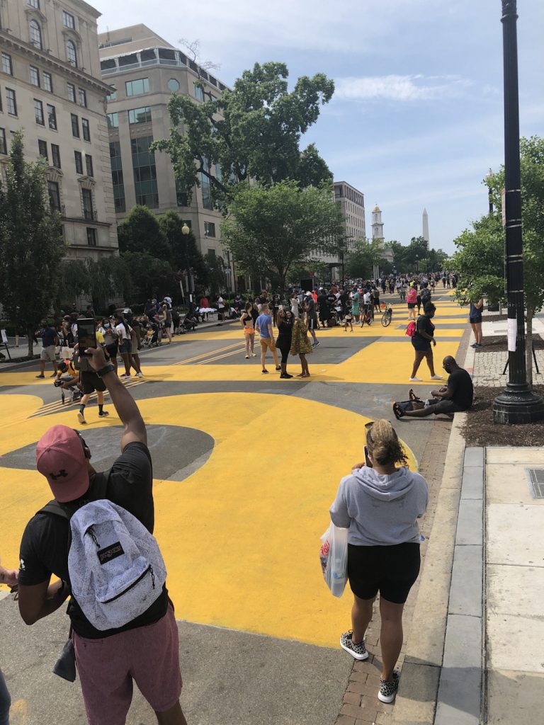
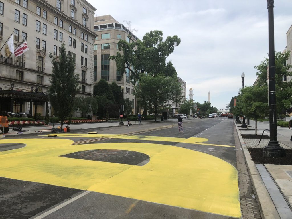
[UPDATED, SEE BELOW] Muriel Bowser’s newest work, BLACK LIVES MATTER (2020) is the best painting I’ve seen in months. It was realized Friday morning on 16th Street by the Department of Public Works in collaboration with some local muralists and passersby who volunteered to help paint.
It measures approximately 35 x 850 feet, the full width of a city street and most of the length of two blocks. It is made largely of DOT Highway Yellow paint (FedStd 13538) on asphalt and thermoplastic crosswalk and lane striping, with highlights and details in DC Gray (FedStd 16099) [see below.]
After the Washington Monument and two occupying troops were struck by lightning last night, Washington DC woke up to the biggest painting project in the country: BLACK LIVES MATTER being painted, from curb to curb, on 16th Street leading up to the White House. It starts at K Street, in front of the St. Regis Hotel, and I expect it will go right up to the fence around Lafayette Square. Prince of Petworth has photos and updates.
artist’s rendering
It will be big enough to view from military surveillance planes circling the District, and from Google Maps, but it is not visible from the bunker of the White House.
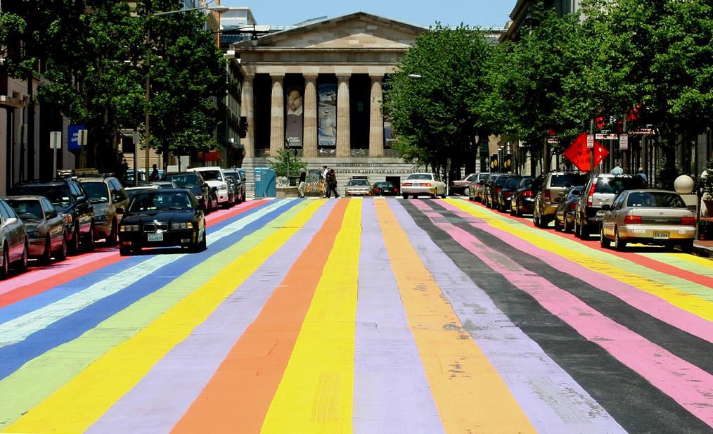
Davis-esque: 2007 street painting on 8th St NW south of the SAAM. Image: wikipedia via smithsonianmag.com
The last massive street painting the District government realized was a fake Gene Davis painting to celebrate the anniversary of the Washington Color Field movement in 2007. That painting, concocted by a former studio assistant, was a block long, and in front of the Smithsonian American Art Museum, which holds Davis’s estate, and really should have known better.
So yes, this is a vast improvement.
See the completed painting this afternoon at 5:45 when you join a peace vigil organized by the houses of worship along 16th Street NW.
#BlackLivesMatter
— Muriel Bowser #StayHomeDC (@MurielBowser) June 5, 2020
UPDATE: The Artist is present, and tweeting her pano from the roof of the closed Hay Adams Hotel. When I made my rendering I did not anticipate it would include the DC flag. greg.org deeply regrets the error. Also she has officially named 16th street in front of the White House Black Lives Matter Plaza.
[2022 update: the video above is from @murielbowser’s tweet, archived here and at the internet archive]
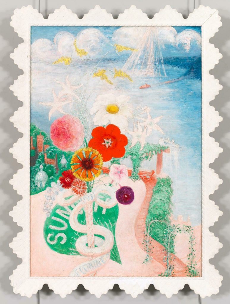
Max Mara created the Whitney Bag in collaboration with the Whitney Museum’s architect Renzo Piano to echo the facade of the new downtown building.
The Stettheimer Collection of Whitney Bags, image: maxmara.com
To celebrate its 5th anniversary, the cult bag has been revived in a special edition version dedicated to the American painter Florine Stettheimer who boasts an important presence at the Whitney. A feminist and activist ante-litteram (1871-1944), Stettheimer’s work “Sun”, created in 1931, inspired the bag’s five new color variants and the design of the floral printed lining. [via]
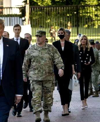
Nevertheless when she needed a Whitney Bag to carry a bible across a tear-gassed public park for her father’s photo opp, Ivanka chose white.
Ivanka chose white. image detail: doug mills/nyt
Because of course it is, the tear gas police fired to clear peaceful protestors out of the park was manufactured by Defense Technologies, which is owned by ex-Whitney trustee Warren Kanders.
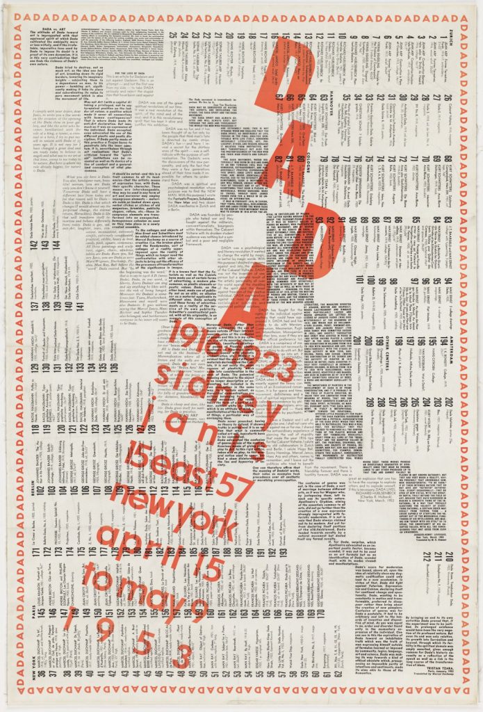
The times I was interested in the content of Marcel Duchamp’s exhibition poster/catalogue/checklist for the Dada exhibition he organized at Sidney Janis’s gallery in 1953 never managed to coincide with the times I had one readily at hand to study it, or to the times when one turned up on the market that I wanted to drop a few thousand dollars for. [Duchamp encouraged visitors to crumple this 38×24-inch poster into a ball and throw it in the trash when they entered the exhibit, so even fewer survive than you’d hope.]
And every time I tried to research it online—the show was a landmark, and influenced people like Jasper Johns and Robert Rauschenberg tremendously, so that happened a lot around here–I was surprised that A) no giant images of it existed online, and B) none of the text in this all-text document for this historic show seems to have ever been published. [After transcribing the entire thing, I now see that is not the case; at least one of these essays was published in the collected writings of its author, but I can’t remember which. And it won’t matter now.]
So right as the pandemic closures loomed, I jammed down to the Hirshhorn Museum, where a Dada exhibition poster hung peacefully among the Duchampiana promised by the Levines, and I photographed the whole thing. When I was stuck or exhausted by other writing–or by lockdown life in general–I’d take a few minutes and just type the stuff in.
Now I am pleased to release this historic text for the first time. It is available both as an edition of Better Read, where a computer-generated voice reads texts by Sidney Janis, Tristan Tzara, Richard Huelsenbeck, Jean Arp, and Jacques Levesque, plus Duchamp’s own text contribution. The essays are also available as a pdf.
The 212-item checklist is currently available as a spreadsheet on my Google Drive. If this lockdown situation continues I may end up reading it myself. But having it read by a computer was such a mess, Zombie Tzara himself would have risen to smack the Dada right out my mouth.
One day later update: So I’m reading Kenneth Goldsmith’s new book, Duchamp Is My Lawyer, and suddenly I’m like, d’oh I bet Monoskop has this damn poster. And of course he does, but just as a giant (finally) legible jpg. So anyway. Dada.
“. . . in a matter which so closely concerns the wellbeing of the human race, no decision shall be made without all the knowledge which a little analysis and calculation can provide.”
—Daniel Bernoulli, 1760
According to the National Museum of American History, “Inspired by the allure of the space age, many Americans of the 1960s took great interest in mathematics and science.” Included among these was Crockett Johnson, a well-known cartoonist, book illustrator, and children’s author best remembered for his Harold and the Purple Crayon series.
From 1965 until his death in 1975, Johnson painted what he described as “a series of romantic tributes to the great geometric mathematicians from Pythagoras on up.” Initially, Johnson drew inspiration from figures he found in James R. Newman’s book The World of Mathematics (1956) and other mathematics books but later began to develop his own geometric constructions. He completed more than 100 of these distinctive paintings of layered, precise geometrical shapes during the last decade of his life.
Critics and art historians have noted that Johnson showed little interest in the technical details of painting. Eschewing convention, Johnson instead preferred to use house paints from a local hardware store and to paint on the rough side of small pieces of Masonite instead of canvas—though he did on occasion both use the smoother side and complete some larger works. Although other contemporary painters such as such as Piet Mondrian, Josef Albers, Alexander Calder, Richard Anuszkiewicz, and Ad Reinhardt (who was a close friend) also used mathematical ideas and geometric shapes, Johnson differed from them in that he linked his geometric paintings with specific mathematicians and he delved into researching and understanding the mathematical ideas that he found inspiring.
Among the earliest of these paintings is this month’s cover art, Mystic Hexagon (Pascal), which Johnson based on a theorem devised by 16-year-old Blaise Pascal in 1640. In essence, Pascal had postulated that if the opposite sides of an irregular hexagon inscribed in a circle are extended, they meet in 3 points that lie on a straight line. In his depiction of Pascal’s work, Johnson positioned the circle and cream-colored hexagon near the center of the painting. Overlapping wedges of green, blue, and gray form the different pairs of lines. He did not paint the line that would serve to join the 3 intersections (now dubbed the Pascal Line), but the right edge of the painting fulfills that function.
Pascal, like Johnson, was intrigued by numbers, and he made notable contributions to mathematics and science. He is credited with laying the foundation for probability theory through a series of letters he exchanged with Pierre de Fermat. The pair pondered a problem related to expected outcomes in a dice game that vexed an acquaintance who gambled professionally. That correspondence is credited with developing a fundamental theory of probability—the branch of mathematics concerned with analyzing random, or seemingly random, phenomena—with its roots in Pascal’s “Treatise on the Arithmetical Triangle.”
Similar to Pascal’s geometrical extrapolations as depicted in Johnson’s painting, mathematical extrapolations of data have long provided essential information to aid public health officials with decision making. An early example is that of Daniel Bernoulli, who in 1766 used the then relatively new method of calculus to estimate that smallpox elimination via routine vaccination would reduce the risk of death by age 25 years from ≈57% to 50%. Ronald Ross’s model on malaria transmission, first introduced in 2 reports published in 1908 and 1911, is a particularly important example of such modeling for public health decision making. Versions of that model are still used today to inform critical public health decision making regarding malaria control.
Today, mathematical models have become essential tools for public health officials, providing estimates of disease burden, potential impact of interventions, and duration of disease outbreaks. They are particularly useful in situations for which little or no data exist, such as estimates of number of cases of disease in the future, or potential impact (benefit) of a yet-to-be-licensed vaccine. In such situations, mathematical modelers typically use data from different sources, along with assumptions about the underlying transmission, to build (or extrapolate) models to provide estimates for the current problem. Such mathematical models have, with the advent of more powerful and cheap computing capabilities, become ever more diverse in methods and degrees of complexity. Mathematical models of infectious disease can now range from the simple, such as the two-dimensional representation found in Johnson’s painting, to large multidimensional models that simulate the daily contacts between individuals within a community and the resultant risk for onward transmission of infectious disease.
He’s been a fellow blogger, an editor, and a hero to me for more than a decade, but I’m always glad when Andrew Russeth writes. And that goes double for this moment when it feels like we as a people are on a precipice.
Andrew looks around, backwards, and forwards, and sees the importance of maintenance, unsung labor, the often invisible work that is so necessary for making everything go:
In language that startles today, [Mierle Laderman] Ukeles argues that “avant-garde art, which claims utter development, is infected by strains of maintenance ideas, maintenance activities, and maintenance materials.” (Emphasis mine.) She chides Process art in particular for obscuring that fact, but maintenance is in operation everywhere in contemporary art, once you start looking. It is the hidden force that makes so much—in art, and in the world—possible.
And it’s the kind of work–art and labor–we’ll need to get through this.
The current pandemic also makes me think of the AIDS epidemic, and the lessons it holds for us now. There are people who did not survive the malice and indifference and inaction of governments–and there are people who did, and who made a difference in peoples’ lives and in the entire world. We should seek them out and learn from them.
The title alone makes me think of David France’s 2012 documentary about the AIDS activist movement, How To Survive A Plague. A good place to start
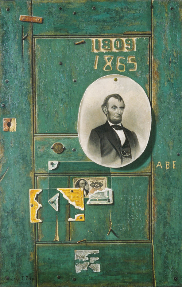
John Frederick Peto, Bowie Knife, Keyed Bugle and Canteen, 1890s, collection Brandywine Museum of Art
In the late 1800s, artists like William Harnett and John Frederick Peto manifest the nostalgia for the Civil War and its dying veterans through trompe l’oeil paintings of war artifacts or pinup photos of Abraham Lincoln.
This is not that.
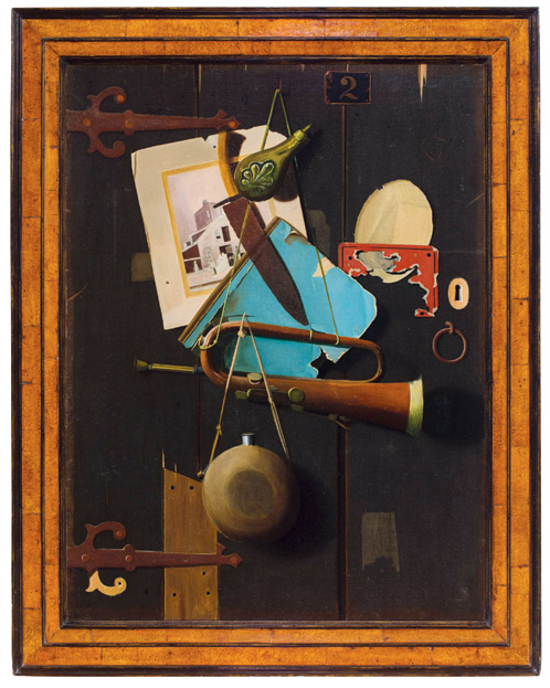
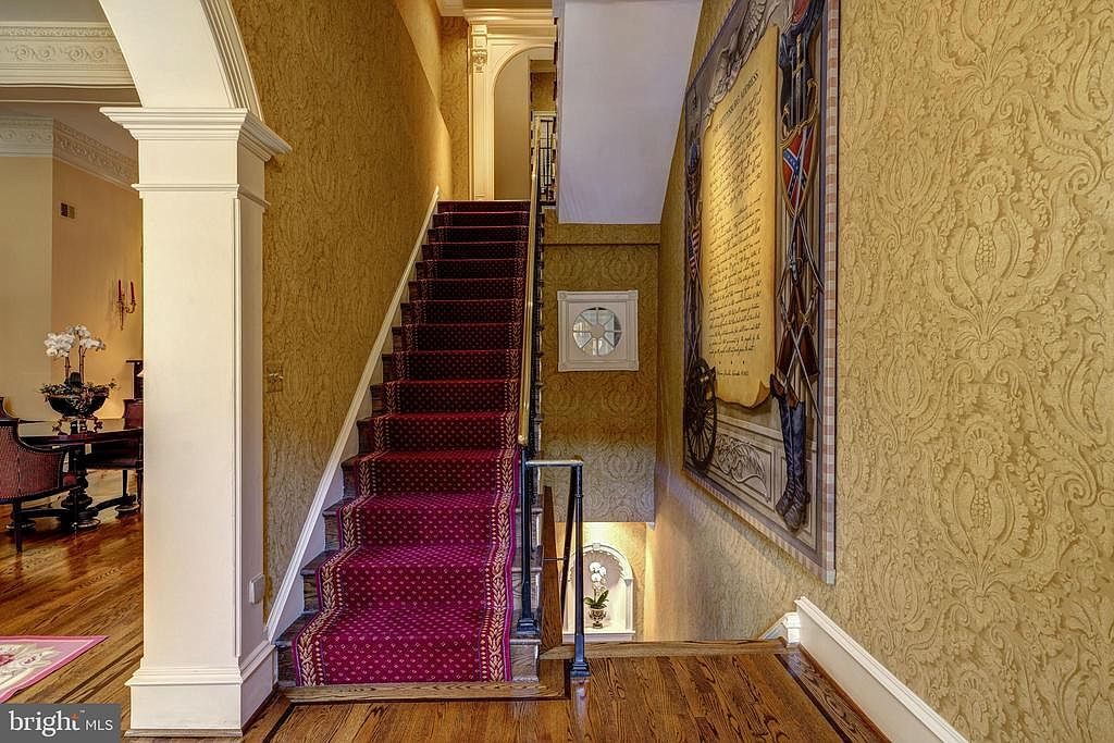
Installation shot, Untitled (Gettysburg), 2020
An eight-foot square painting of the Gettysburg Address is installed in the stairwell of an 18th century townhouse in Georgetown. The manuscript appears gigantic, filling a trompe l’oeil wall above carved wainscotting, flanked by stylized heraldic shields of the Union and the Confederacy. A well worn pair of riding boots on the Southern side seems almost as big as the cannon on the Northern side. A flying eagle sits atop the whole thing. It is surrounded by a frame (or painted band?) of alternating light and dark grey squares, which lends the whole thing a 1990s vibe. I have not asked if the painting conveys when the house is sold, but maybe it’s there to up the appeal to someone from the administration.
Late last October I saw an exhibition of George W. Bush’s paintings of veterans at the Reach, the new Kennedy Center annex designed by Stephen Holl. With all due respect to Verrocchio, it was the most significant painting exhibition in town last fall.