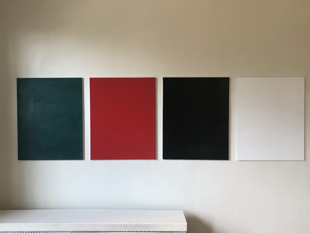
Gonzalez-Torres Forbidden Colors, May 2021

the making of, by greg allen

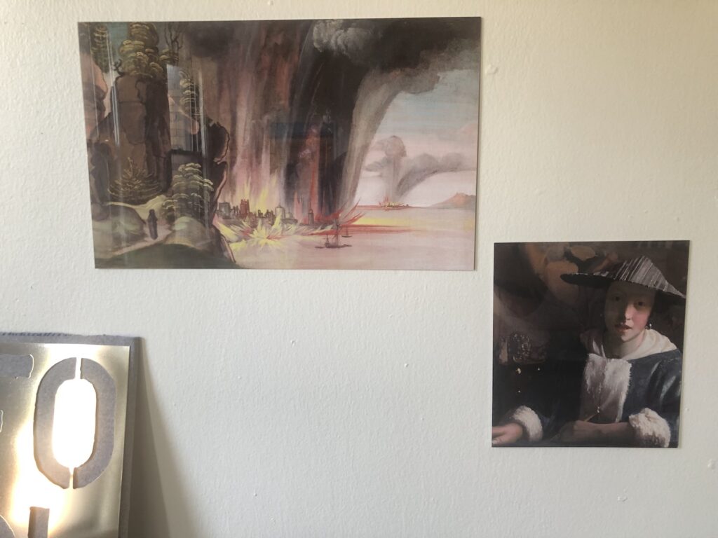
News from the Facsimile Objects front: barring any exceptional developments, the National Gallery in London will reopen on Monday (5/17), and so the Dürer there, the heavenly phenomenon on the back of the St. Jerome, will be visitable again. At that point, of course, the corresponding Facsimile Object (D1), will no longer be needed, and so will become unavailable. Get one while you can, I guess. The Karlsruhe agate-like painting on the back of Dürer’s Sad Jesus will, sadly, still be available, while Germany’s COVID numbers remain so high.
Recently I made a couple of Facsimile Objects related to works in the National Gallery in Washington, DC, which has been closed for several months. They will not be issued in any numbers, partly because the NGA just reopened. In fact, we were there yesterday, the first day back, when the shipment of test FOs arrived in the mail.
As you can see from the installation photo above, though, they look nice. Other than their uselessness, I’m pleased with how they turned out.
Continue reading “Facsimile Objects Update”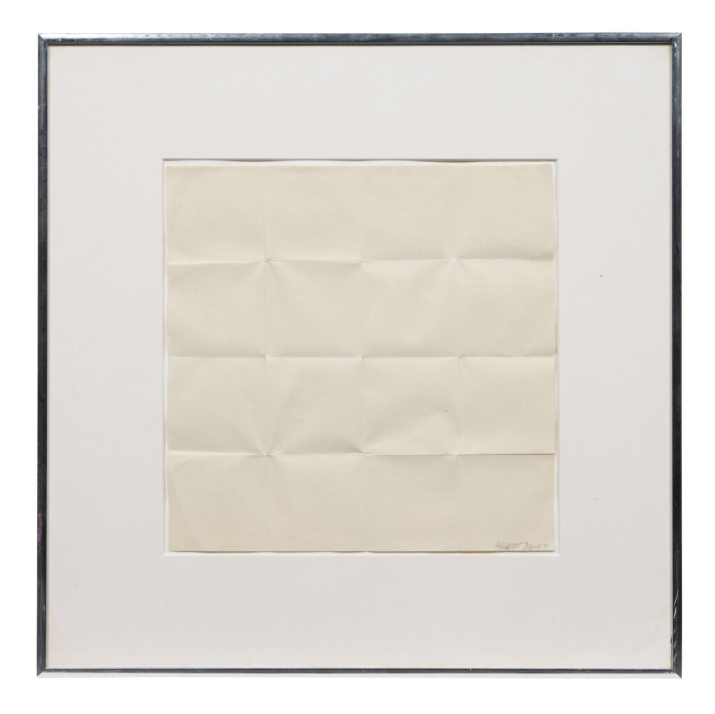
Without access to museums or galleries, I notice I have been looking at far more art via auction sites than is typical. I am OK with this.
Especially when it surfaces objects like this, a piece of square paper creased into sixteen smaller squares, by Sol LeWitt. It is signed and dated March 1971 on the front, 1972 on the Max Protetch label on the back, where it is called “Fold Piece” instead of “Folded Paper Piece,” an insignificant difference magnified in our Google-based world.
Continue reading “Sol LeWitt Fold Piece, 1972”[October 11, 2022 update: the National Gallery returned this cock to Nigeria today, in a repatriation ceremony conducted along with the Smithsonian and RISD. The Art Newspaper reports that the decision to return this Benin bronze was approved by trustee vote in 2020. Excellent and quietly done, I guess this means nevermind!]
Benin bronzes have been in the news lately, and finally for a good reason: museums are finally starting to acknowledge their culpability in holding the thousands of Benin bronze sculptures and other royal artifacts that all made their way out of Africa the same way: via the British imperial troops’ so-called “punitive expedition” that destroyed the capital of the Kingdom of Benin, in present day Nigeria, in 1897.
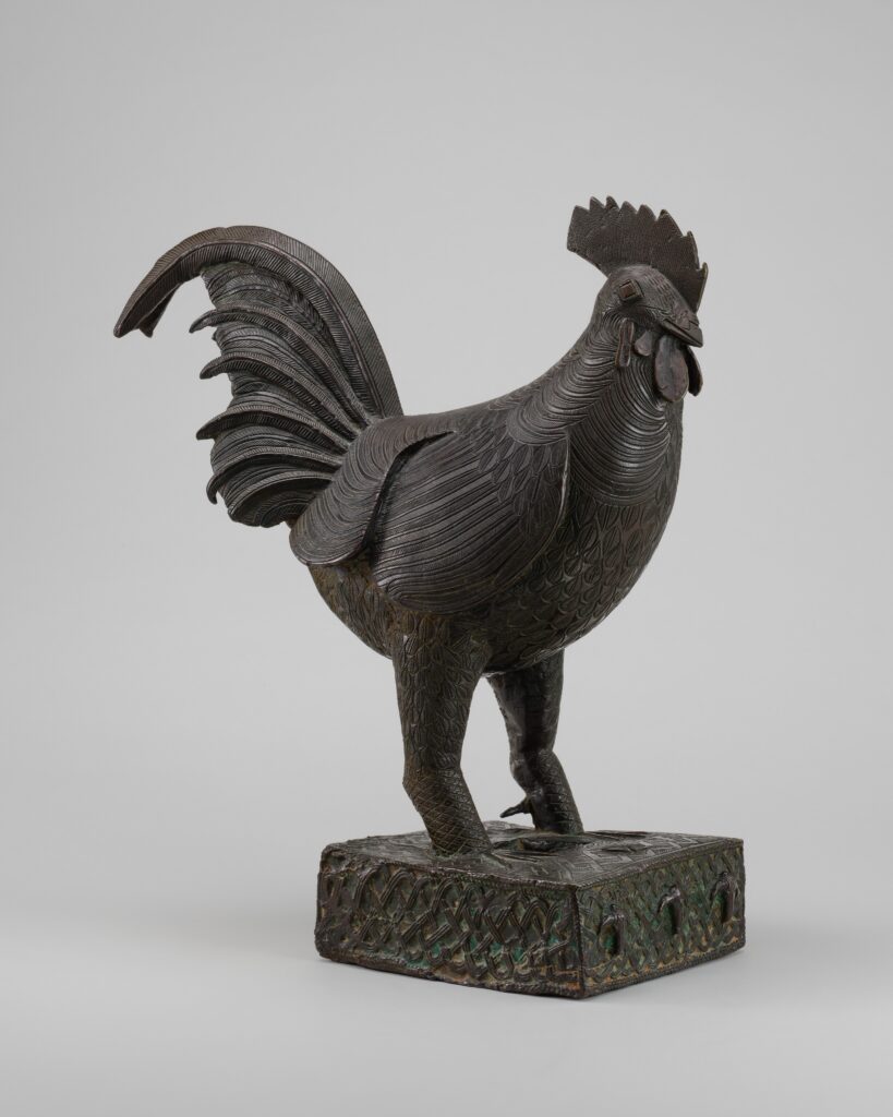
The British Museum and the Metropolitan each have hundreds of objects frankly labeled as the spoils of this massacre. Very unusually, and for absolutely no reason that I can find, the National Gallery of Art has exactly one: this c. 18th century Benin bronze rooster. Every couple of months for the last couple of years I’ve tried to uncover how this object got to the National Gallery, and why an African object would even be accepted, never mind kept, by a museum with no African art–and with almost no art beyond the European and American tradition. All I can figure is that this Benin bronze sculpture doesn’t belong at the National Gallery of Art, even if it weren’t stolen.
Continue reading “Why Does The National Gallery (Still) Have This Benin Bronze Sculpture?”It feels like a good time to be looking for lost Jacob Lawrence paintings. The publicity around the Metropolitan Museum’s show of his 1942-43 series The American Struggle has so far helped surface two of the original 30 works. Three more remain unlocated, and one of those is known only by its title.
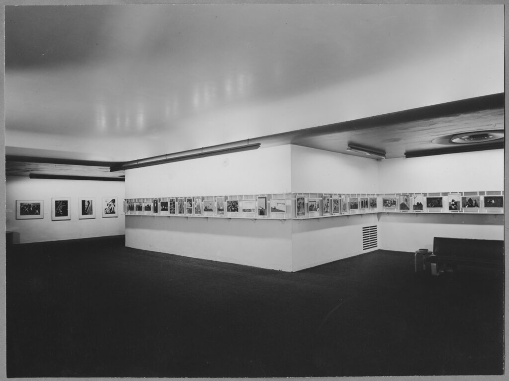
Which is still more information than is known about the works Lawrence made next, in 1944-45, while serving as a combat artist for the US Coast Guard. Tallies differ, but Lawrence painted either 17 or 48 paintings in the Coast Guard, and all but three are lost. Images exist of twelve more, including the eight shown at MoMA in 1944. And except for a few mismatched titles, that’s it. Until now.
A group of 14 publicity photos for Lawrence’s 1944 MoMA show is up for sale at Swann Galleries next week in New York, and it includes pictures of four previously unknown Coast Guard paintings. Along with one photo that was first published in 2015, that makes five paintings which don’t appear in the artist’s 2000 catalogue raisonné. According to Swann, it appears none of the five were included in MoMA’s show.
Continue reading “Find The Lawrences: USCG Painting Photos @ Swann”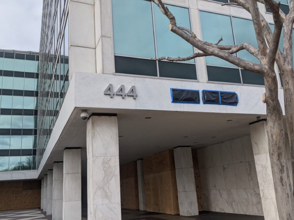
Seeing this work installed for the first time, I am reminded of earlier works, like Untitled (Protestors’ Folding Item) of 2014, an LRAD cover installed on an LRAD;
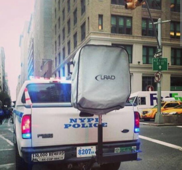
Installation view: Protestors’ Folding Item (LRAD 500X/500X-RE), ink on Cordura, nylon webbing, LRAD, 2014, Collection: NYPD Order Control Unit
and the series of black monochrome on plywood pieces from 2016 titled Untitled (Trump Plaza Black),
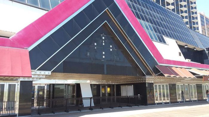
Untitled (Trump Plaza Black) Nos. 4 & 5, 2016, paint on panel, each in two parts, collection: Trump Entertainment Resorts/Carl Icahn, installation photo via Press of Atlantic City
which were hastily installed during the 2016 campaign over the dingy palimpsest of Trump’s name on the facade of the abandoned and bankrupt casino in Atlantic City.
And it reminded me that it very much mattered to the works that they were in the collections of the NYPD Order Control Unit and Trump Entertainment Resorts & Carl Icahn, respectively.
So when this piece went up on the facade of the Fox News studio facing the US Capitol building, in between the white supremacist insurrectionists’ attack on vote certification slash barely thwarted massacre of politicians, and the hastily militarized inauguration, where troops are literally–I hope–protecting the elected president and vice president from the paramilitary mobs of the current/outgoing president, it feels very important to point out that Fox News absolutely owns this.
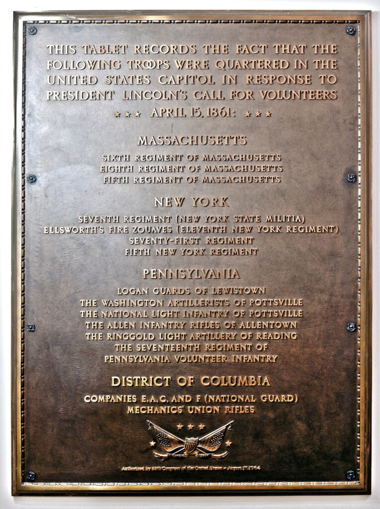
On April 15, 1861, following the attack on Fort Sumter, SC, President Lincoln issued a call for 75,000 volunteers to serve in state militias for three months and to defend the Union:
Whereas the laws of the United States have been, for some time past, and now are, opposed, and the execution there of obstructed…by combinations too powerful to be suppressed by the ordinary course of judicial proceedings, or by the powers vested in the Marshals by law…I appeal to all loyal citizens to favor, facilitate, and aid this effort to maintain the honor, the integrity, and the existence of our National Union, and the perpetuity of popular Government, and to redress wrongs already long enough endured.
A Proclamation by the President of the United States, April 15, 1861
The headcount, militia structure, and time limit were written into law in 1795 and had not changed, because the US did not have a large, standing army before the Civil War. By 1861, large numbers of officers in the small US Army had already begun leaving their posts to join the Confederacy. Governors from Tennessee, Kentucky, Virginia, and Arkansas refused, and began seceding.
Volunteers from Massachusetts, New York, Pennsylvania, and the District of Columbia who responded to the call billeted in federal buildings, including the US Capitol. The first troops to arrive, from Pennsylvania, pushed through a mob in Baltimore to reach DC by train on April 18th. They headed straight for the Capitol. As more forces arrived, they fanned out across the District, in buildings rapidly converted to military use.
In the Summer of 1964, Congress passed the Civil Rights Act, strengthening Black Americans’ right to vote. The FBI and members of the US Navy searched the swamps outside Philadelphia, Mississippi for missing voter registration activists John Chaney, Andrew Goodman, and Michael Schwerner. Local media and white supremacist politicians dismissed their disappearance as a publicity hoax. During the two month-long search the bodies of seven other murdered Black men and one Black boy were found in the swamps of Mississippi. Five have not been identified. After receiving a tip, troops found the young men’s bodies buried under an earthen dam on August 4th. Local members of the KKK, the county sheriff, and the Philadelphia police department were all implicated in the kidnapping and killings.
On August 17th, the US House of Representatives passed a resolution to install a plaque inside the Capitol to commemorate the quartering of volunteer troops at the outset of the Civil War. $2,500 was appropriated for the plaque in 1966.
A week after an insurrection beginning January 6, 2021, which was instigated and led by the president and abetted by congressional representatives from Arizona, Colorado, Georgia, Missouri, New York, and North Carolina, plus others currently unknown, and which resulted in the storming of the Capitol, the killing of at least two police officers, four mob deaths, and the failed attempted rapes, torture, and public execution of multiple elected officials, and the failed attempt to stop the constitutionally mandated certification of the results of the presidential election, National Guard troops are once again quartering in the Capitol building, as the outgoing president and his collaborators continue to threaten violence against the country and elected leaders. Only this time they’re doing it under this plaque.

If the 103-year gap between the quartering and the commemorating teaches us anything, it’s that it’s probably good to give it at least a minute, history-wise, to see which side everyone ends up on.
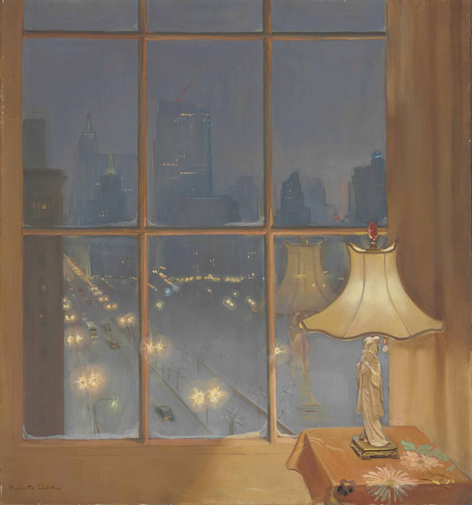
Wow, just when I thought we were having something very special when considering the implications of portraiture and erasure in a found real estate listing photo of a laundry dungeon in an epically gross American University flophouse–and I don’t mean to imply I’m not grateful for The Discourse–but anyway, y’all* were apparently also fine with letting me go yet another year without knowing that forgotten heiress recluse who kept up her sprawling Fifth Avenue co-op and Santa Barbara mansion like she’d be back any minute but actually checked herself and her doll collection into a midtown hospital room and only left decades later when she died in 2011 at 104 Huguette Clark made paintings?
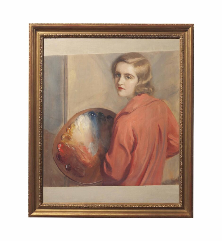
And that except for a few included in a two-week show at the Corcoran Museum in Washington in Spring 1929–four years after her father’s death and the bequeathing to the Museum of 800 artworks and a Clark Wing–they were only first seen publicly in the jumble of an estate sale at Christie’s in 2014, where they sold for not that much money? Anyway, seventeen paintings by Clark were included in that sale, and she had some moments, mostly that window above, with the geisha lamp reflected in it. [Another four signed paintings, plus a couple of attributions, some prints, and an album of reproductions of her paintings, were auctioned in New Jersey in 2017, leftovers from Christie’s cataloguing. A highlight was this painting of a Dutch doll, which checks a lot of Clark boxes.
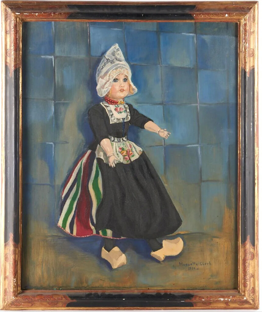
Also, though her teacher Tadeusz Styka specialized in painting portraits of socialite women, and once painted Clark appearing to paint a nude man, many of Clark’s surviving paintings are of Japanese women.
Continue reading “Huguette Clark Paintings??”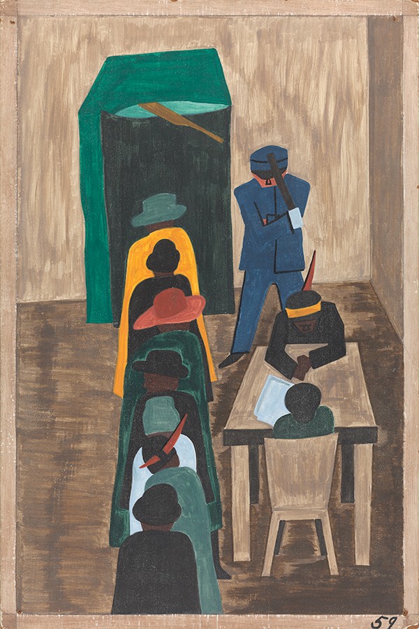
North, South, East and West, please vote.
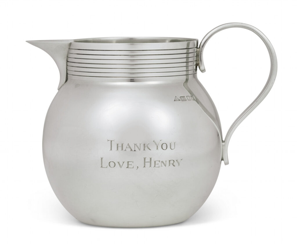
In conjunction with the third volume of his memoirs, Years of Renewal, covering his post-Watergate tenure as both Secretary of State and National Security Adviser in the Nixon and Ford administrations, which was published in 1999, Henry Kissinger created little thank you gifts for his influential friends.
Sterling silver milk pitchers 4.5 inches high, with a machine turned collar and reeded handle were engraved with the book’s title on one side and
THANK YOU
LOVE, HENRY
on the other. Their stamp identifies them as the c. 1995 work of smith J.A. Campbell, whose assortment of sterling silver gifts, including engravable silver lids for marmite or Heinz Ketchup, but not these little milk pitchers, are (at present) sold online at The Silver Company.
The Rockefellers’ jug sold for $5,265.
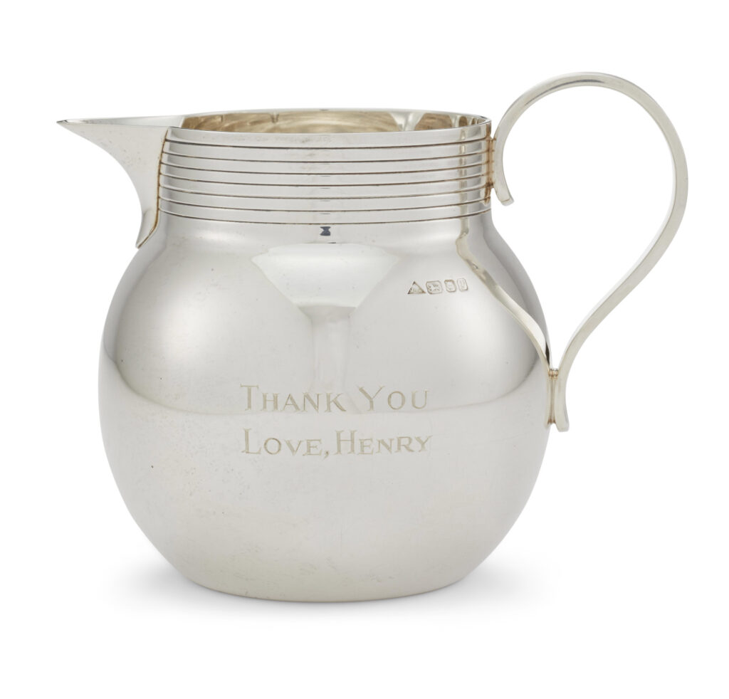
Another example from what is now an edition has appeared in public, in the sale, ending tomorrow, of the personal collection of Mrs. Jayne Wrightsman, the socialite and French furniture and bookbinding connoisseur who was an extremely influential trustee of the Metropolitan Museum, as well as being in Nancy Reagan’s cabinet.
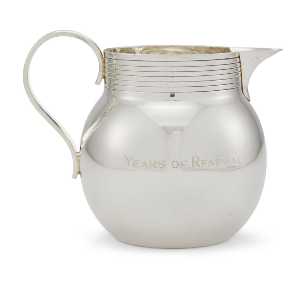
With less than 18 hours to go, Mrs. Wrightsman’s jug is currently at $1,100. [update: it sold for $4,000.]
This edition will trace the strategic social relationships Kissinger cultivated in the New-York-socialite-meets-consultant-elder-statesman-who-eschews-travel-to-certain-Geneva-Convention-signatory-countries phase of his career. Or it might just map to the acknowledgements in his book, which could be the same thing. Either way, just as with the reflections of the lightboxes in the photos of the respective jugs, the circumstances of this work’s making will gradually come into clearer focus.

15 Oct 2020, Lot 574 AN ELIZABETH II SILVER PRESENTATION MILK JUG, est USD 400-600, sold for USD 4,000 [christies]
11 May 2018 Lot 1445 AN ELIZABETH II SILVER PRESENTATION MILK JUG, est USD 200-400, sold USD 5,265 [christies]
Kissinger, a longtime Putin confidant, sidles up to Trump [politico]
Previously, related: Unrealized Rockefeller Diptych, (1650–2018)
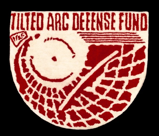
While we’re on the subject of writing quickly on matters of significant art that happened in the part about which I had absolutely no idea, please direct your attention to the Boot Boyz Biz, an anonymous bootlegging collective which has, since 2015, been publishing major art and design content, primarily in the medium of deeply researched and highly synthesized, extremely limited edition t-shirts. Which is the only reason, besides my willful neglect of the instagram platform, that I can come up with for my sleeping so hard and so long on them.
Anyway, the t-shirt drops are somehow surpassed only by the non-t-shirt drops, two of which I will highlight here:
One: last summer the Boot Boyz made a Tilted Arc Defense Fund tufted wool rug. I might say it’s more of a mat, but what matters is, it exists at all, unlike the Richard Serra sculpture it evokes, obv. It captures the view from the haters’ offices down to the plaza below, in tufted wool, tastefully tinted to evoke the fundraising poster that Serra and Friends put out.
For the 7 billion-plus of us who did not cop the rug, the sidebar of historical and theoretical research will have to suffice.
Tilted Arc Rug [boot-boyz.biz, thanks @stottleplex!]
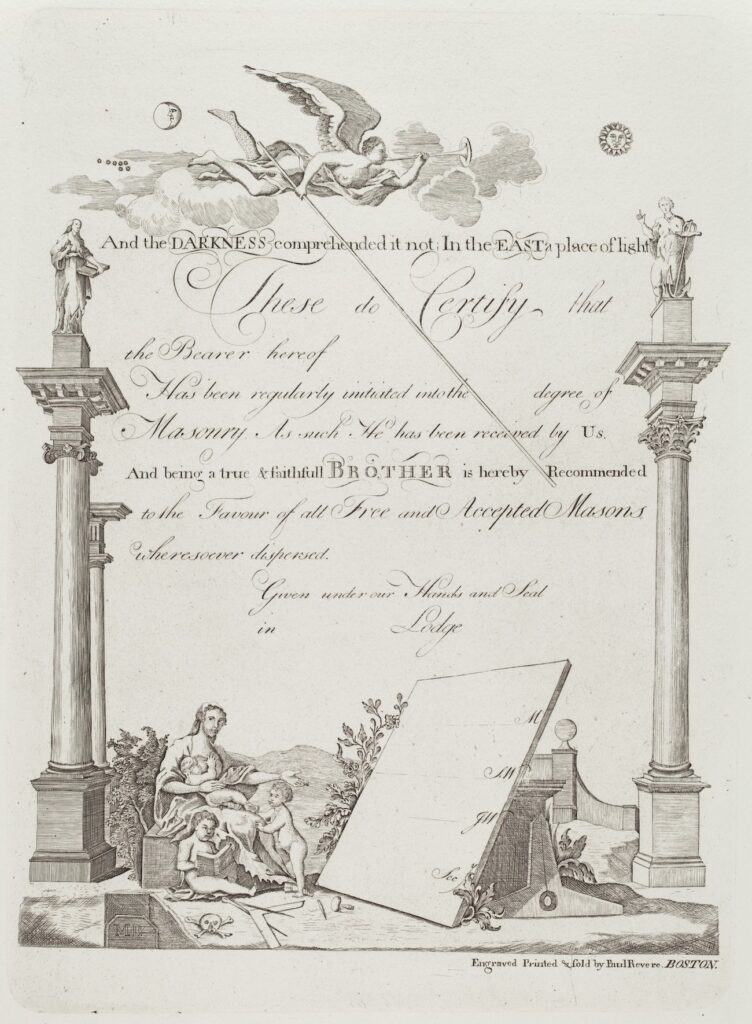
Before Sears scion Lessing Rosenwald donated the copper plate engraved on both sides by Paul Revere to the National Gallery of Art, he had around 24 copies of this Masonic certificate made. One sold in 2014 for a couple of hundred dollars.
But this print was made from the plate in 1954, the year after the National Gallery acquired it. And it came from the Rosenwald Collection, but not until 1980. So I guess Rosenwald wanted one more copy on the way out the door. When you’re a founding benefactor donating 22,000 objects, they let you do it.
Anyway, I want to make some, too. But for the moment, I’d settle for seeing the plate. The drawings are wonky, but the script is absolutely gorgeous.
Paul Revere, Masonic Certificate, restrike print by Herbert Pasternack [nga.gov]
Paul Revere, Masonic Certificate [verso], engraved copper plate [nga.gov]
Previously, very much related: Paul Revere (attr.), Time Capsule Plaque, silver, engraved text, c.1790
Hop, skip, and a jump to: Untitled (Andiron attributed to Paul Revere, Jr.), 2014 (sic)

Richard Serra makes a lot of prints, and a lot of them are published as polit..ical fundraisers. They are collected here, mostly from Serra’s Gemini GEL page, where a lot of them are still available, even long after their specific election has passed.
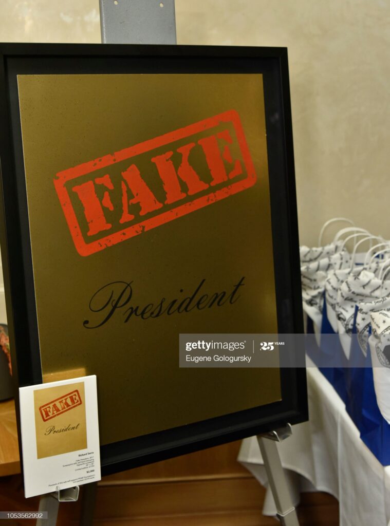
The most recent, published in October 2018, is the most atypical. Fake President commemorates Norman Lear’s 95th birthday, and was one of several works created to raise money for the People For the American Way, which Lear founded. The reflection in the Getty Images pic from the drop party–just two weeks before the election, so riding the wave, not making it, I guess–looks like a bronze plaque, or at least metallic foil, which would be weird and awesome. The force behind these prints, often part of portfolios, is Gemini G.E.L., which I assume means Sidney Felsen.
Continue reading “The Political Prints Of Richard Serra”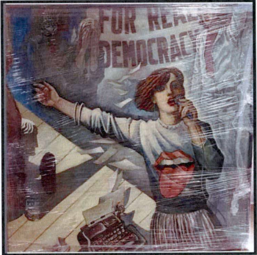
I’ve been tracking the trouble #painting has been getting itself into for a while now. I’ve always imagined sitting down and sorting them out some day, when there weren’t pandemics or multinational criminal enterprises masquerading as governments running amok. Of course, #painting didn’t want to wait.
In Volume 5 of the Senate Select Committee on Intelligence’s bipartisan report released today [pp. 373-78], paintings turn up at the center of the secret meetings between the Trump family and campaign and Russian intelligence agents during the 2016 presidential election. In June 2016, the day after Emin and Aras Agaralov, a pop singer and his real estate oligarch father, respectively, arranged a meeting at Trump Tower, they gave a giant painting to Trump as a birthday present, with a handwritten note attached. Four days later, on Trump’s birthday, the Washington Post reported that the DNC servers had been hacked; Guccifer 2.0, the Russian operative working with Roger Stone to release the stolen DNC files, dropped Hillary Clinton’s opposition research on Trump the next day. Two days after that, Trump sent the Agalarovs a note thanking them for the gift, and the best birthday ever.
Continue reading “Trumptych”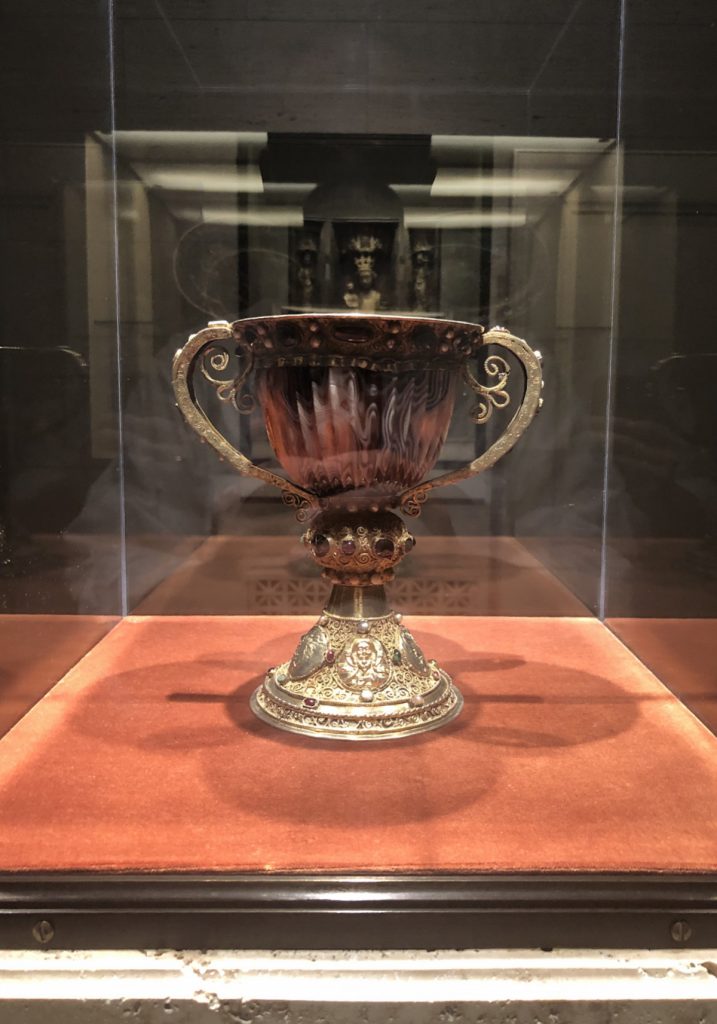
When I went back to the National Gallery the other week, I didn’t just see some little paintings. I visited the empty medieval galleries to see the one thing that has been considered a literal treasure for longer than anything else in the museum: the chalice of Abbot Suger of Saint Denis.
During Power and Pathos, the epic 2016 exhibition of Hellenic bronzes, Getty curator Kenneth Lapatin talked about these rarest of all antiquities in their contemporary context. Turns out, even when bronze sculptures were made of heroes by the most celebrated sculptors of the day, they were not considered valuable, or even necessarily important; such bronze sculptures literally lined the streets and crowded the grounds of every temple in town. And of course, when their metal was needed for spears, or helmets, or the next big wrestling star, they were readily melted down. They’re rare today precisely because they weren’t valued as more than scrap.
Lapatin looked at what the rarest, most precious objects of the Hellenic Age were. What did they spend their biggest money on? What conveyed the greatest social status? What were the most completely extraneous and frivolous and conspicuous luxury purchases that influenced the political and social forces of the day? What, in other words, was their Art?
It was blingy dishware, but not just gold, which was also quickly reduced to its metallurgical value. The pinnacle was carved hardstone in exotic patterns from far away or unknown sources. Records show cups of porphyry that sold for more than a villa. The delicately fluted and translucent sardonyx cup in the chalice is one such cup, made 2100 years ago in Alexandria, and then transformed 900 years ago for the sacramental use of the kings of France.
In whose private chapel it remained until the revolution, when it was nationalized, then–lol wow ok–stolen in 1804 and smuggled to England via Holland inside a plaster cast of the Laocoön, whence it circulated in the market until it was bought in 1922 by Joseph Widener, who ended up donating it to the National Gallery. Sounds like its roughest time was the last 200 years. But then, Abbot Suger never said where it came from or how he got it, so who knows.
Chalice of the Abbot Suger of Saint Denis [nga]
Uses and Abuses of the Luxury Arts, Symposium Lecture [nga]
Medieval treasures catalogue going deep on the history of the chalice [nga/pdf]