
I found a beautiful and odd book the other day, Reflections: The Story of Water Pictures, published in 1936 by Marion Thayer MacMillan.
While vacationing in the Indian territories surrounding Georgian Bay on Lake Ontario, soon after the end of World War I, McMillan discovered a Rorschach-like phenomenon where still waters would occasionally produce perfect mirror images of the craggy coastline.
Over 15-plus years studied and photographed perfectly mirrored reflections along the coastline of Georgian Bay, Lake Ontario. [She tells of teaching herself photography in order to capture these ephemeral landscape images.]
MacMillan began showing her photos around, first to the local population and Indian craftsmen, and she came to the conclusion that such visual phenomena were apparent to centuries of canoeing Indians, who drew inspiration from them for their myths and artifacts. She particularly saw radially symmetric totem poles as permanent representations of these phenomena.
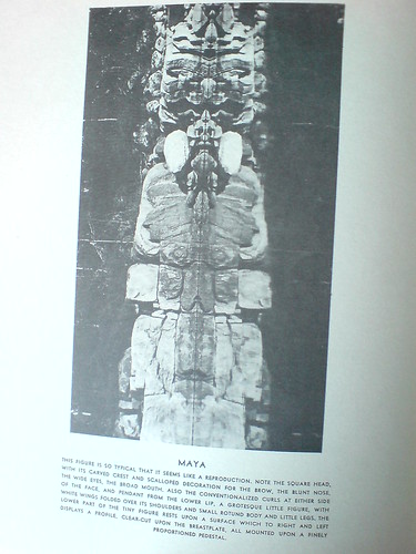
Eventually, she began giving slide lectures of the photos at museums, universities, and art societies, where she drew connections between this “primitive” visual language, which was surely a common thread among all “savage” cultures, and the most advanced modernist, abstractionist movement being put forward in the art world of the day.
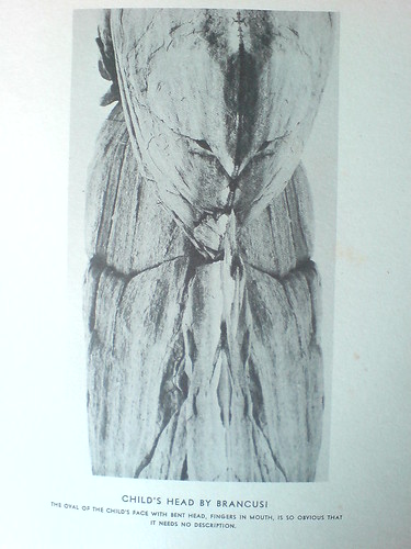
And so the caption on her photo, titled Child’s Head by Brancusi, reads, “The oval of the child’s face, with bend head, fingers in mouth, is so obvious that it needs no description.”
Many, or really most, of her photos are similarly titled and labeled; in her search for meaning in this optical, perceptual phenomenon, MacMillan repeatedly found “obvious” representations of artistic, literary, and religio-spiritual subjects. Which only temporarily distracts from the beauty and now-historically tinged aesthetic of the images themselves. I imagine there are some sexy, old prints out there somewhere.
The art and anthropology worlds seem to have been politely intrigued but largely unaffected my Mrs. MacMillan’s work or discoveries. Though she does mention a photographer she’d introduced the effect to had taken some accomplished Water Pictures of her own, which she showed at Julien Levy’s gallery, to generally positive reviews.
Basically, as long-lost art goes, MacMillan’s book doesn’t feel like a masterpiece, or even that important. In one way, I feel a bit implicated, as I sit here, finding or creating world-changing images and rewriting art history, in my little blog canoe. But then, it was important to her, and maybe it’s enough to recognize that.
Reflections: The Story of Water Pictures is usually available on Abebooks, though my $20 inscribed copy seems like an outlier [abebooks]
I posted a couple more images in the gregorg flickr [flickr]
Category: inspiration
Charline Von Heyl Is Reading Your Blog
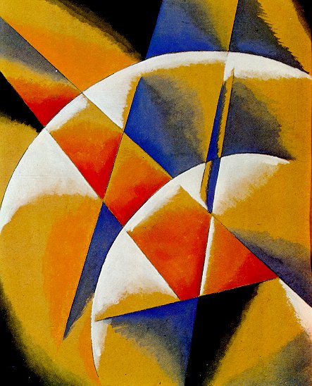
Von Heyl-bait: Spatial Force Construction, 1921, Lyubov Popova
A couple of weeks ago Charline von Heyl made a refreshingly badass presentation on painting at the Hammer Museum. [It was organized by UCLA’s art department.] The tenor was quite different, it quickly became one of my favorite artist talks since Thomas Houseago’s Public Art Fund lecture at the New School last year.
Von Heyl talks a lot about her sources and tactics, including design, folk and indigenous art, and overlooked and bad [Bad?] painting. Rather than narrating a trajectory for her work, or elaborating on her technique, she focuses on how she looks, and on how central that is to what she does eventually turn out.
So obviously, this from the q&a:
I find the idea of time in painting super-interesting in every respect, you know, the speed of the brush, the way the backwards/forwards thing goes, the time of the paradox, which is probably my idea of irony, the material thing that switches things around.
And so all those things really feed into each other, and the time of looking is constantly feeding into it, constantly. And it’s really–one of the first things I do when I go to the studio is to get different books and check different things out.
And for me, the whole blog thing is a godsend. If I put in one of my favorite paintings, some weird Popova painting or something like that, and go to images and blog, there’s a kindred soul, you know, somebody who has the same taste. And from there, you find other blogs because he’s going to go somewhere, And I think books have been so important for me, but now, blogs, painters’ blogs are, I mean, there are a lot of people who are super smart when it comes to looking, and it’s really fun to look at it. I use that a lot, too.
A follow-up question asked what blogs she looks at, and she balked; she can’t name her favorite books, either, she said, because she doesn’t know the titles. It’s a result of being immersed in “this community of images.” So it makes sense that the one blog she did manage to namecheck is Bibliodyssey. [She also said she does read Notes on Looking, too.] Richars Serra’s work, and especially his drawings and sketches, have a pretty foundational place in my art worldview. So I’m stoked to see the Met’s drawings retrospective, especially after Brian Dupont’s process-oriented perspective on the work and the show. What is the point of books if you’re just going to store them out of sight? Pepsi Pavilion Signed or not, I have to track it down. I recently found a poster for a Pontus Hulten exhibition at Moderna Museet called “Utopier & Visioner, 1871-1981,” which I think may have come from Billy Kluver’s own collection. 1. What will the rents be like? Maybe I do want to know Kenzo Tange’s opinion on neckties, but frankly, it’s almost interesting enough to think that in 1971, people were seriously expecting dramatic changes would sweep through society. I mean, sure, Twitter and all, but still. Pills! Frieze’s 20-year retrospective of itself continues apace, and wow, it’s like running into an old flame on a train platform. From a Heideggerian perspective IKEA best sellers such as ‘Billy’, ‘Ivan’, and ‘System 210’ do not represent a corruption of everyday life, but have merely formalised what is already there; the IKEA catalogue only makes the tendency towards uniformity more conspicuous. Heidegger’s global ‘levelling’ is not a critique of the common forms of everyday life as such, but of their passive acceptance. At the end of metaphysics, levelling is complete – no one questions the catalogue. Obviously–well, now it’s obvious, anyway–my own Ikea X Enzo Mari mashup project has its origins in the critical perspective of the company and its ideology which Birnbaum mapped out 15 years ago, and which I absorbed. Actual size photograph of an Actual bus. Love that so much, I want to start silkscreening and double-taping life-size photos of things.
UCLA Department of Art Lectures: Charline von Heyl [hammer.ucla.edu, thx
Posted on Categories art, inspiration, interviews
On Looking Into Tarkovsky’s Mirror
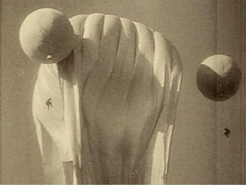
I just watched Tarkovsky’s 1975 film The Mirror for the first time as an adult, basically; when I saw it in college, I had no clue and was bored out of my gourd by it. In fact, for a long time, I’d conflated it, burning houses and whatnot, with The Sacrifice.
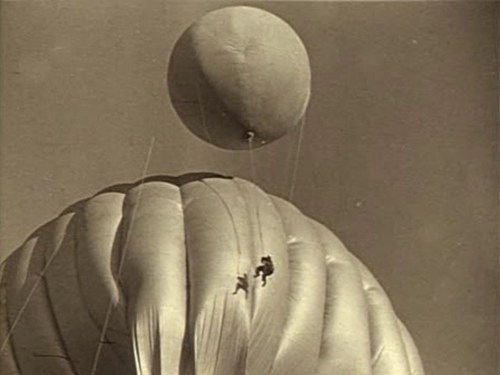
Anyway, the largely plotless, highly autobiographical film is a memory-like collage of documentary footage and vignettes set in disparate time periods. When I say, plotless, though, I mean it’s a movie about a guy who spent ten years trying to make a movie about his childhood purely as an excuse to show the awesome scenes of a Soviet military balloon from the Spanish Civil War. At least that’s how it looks to me now.
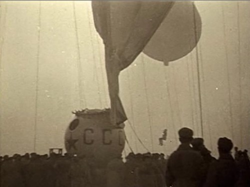
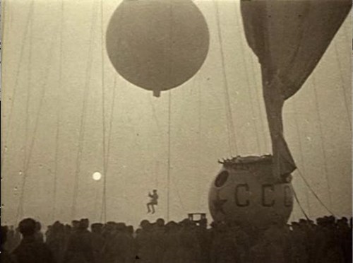
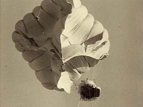
Previously: an image of a guy on a balloon inspecting Echo II at Lakehurst, NJThe Artist Presently Known As Man
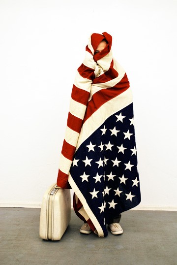
Not quite sure what to make of this, but this image showed up this morning on the golden livestreaming page for Man Bartlett’s piece, #140hBerlin.
And though maybe he wasn’t even born when it came out, it immediately made me think of… Sandra Bernhard’s 1990 performance film, Without You I’m Nothing
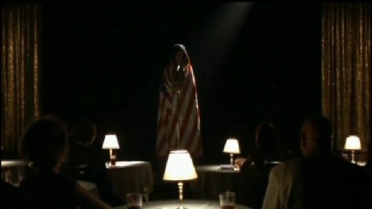
So yow, I just watched that clip on rutube.ru? Which, while it might offer Man some programming, if not costuming, ideas, also ties into Berlin’s own history.
And wow, I just listened to Bernhard’s cabaret cover of “Little Red Corvette” for the first time in maybe a decade, and damned if it isn’t one of the most American things about America this American has ever heard.
#140hBerlin runs for 140 hours through May 17. [manbartlett.com]Richard Serra Drawings: The Making Of
I get really wonked out thinking about Serra’s process and have tried to imagine how to capture the conception and fabrication of his steel sculptures in a show–or in as visceral a way as his corner splash pieces do. Besides the rare chance of seeing Serra’s sketchbooks, I think Brian makes a good case that the large oilstick drawings embody their own making as much as anything Serra’s ever done.
Intent or Artifact: Richard Serra’s Drawings. [briandupont]Source Material
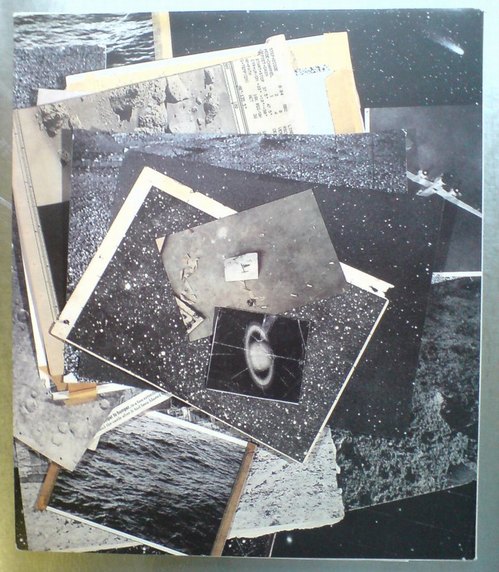
I mean, just look at the back cover of A.R.T. Press’s 1992 interview of Vija Celmins by Chuck Close. If only I’d had this book somewhere besides my storage unit all these years, I might’ve realized sooner that what I’ve been doing, basically, is reconstructing the pile of photos on Vija Celmin’s desk.ペプシ館 EXPO’70 Poster
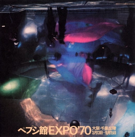
image via Morioka Yoshitomo’s online syllabus of Art & Technology
I don’t collect posters, I really don’t. I just buy some. And then some more.
But when I saw the description of this poster in the Getty’s E.A.T. archive finding aid, I knew I had to add it to the list:
printed in Japan, Shunk-Kender photograph of interior of the mirror dome. It shows a rehearsal of the work by Remy Charlip, “Homage to Loie Fuller,” performed at the opening ceremonies. The photograph is printed upside down to emphasize the three-dimensionality of the real image the concave mirror dome produced. Signed by all artist/engineer participants, unnumbered.
E.A.T.’s Pepsi Pavilion still kind of blows my mind, several years after I first fixated on it. And it only belatedly occurs to me that though the project was officially a failure, which E.A.T., Kluever, and Whitman were left trying to make the best of, there is a Japanese domestic perspective on it that remains largely unexplored, at least in the English-speaking world. I will have to look into that.
Meanwhile, it’s almost enough to know that the Japanese term for Pepsi Pavilion is ペプシ館, pronounced Pepsi-kan.
Also, Remy Charlip’s “Homage to Loie Fuller”? Do we even have a complete list of all the artists, happenings, programs, and performances that went unrealized when Pepsi cut off the cash?
Also, Shunk-Kender? Those guys really, really got around. Have we already done shows or books or something on them? Art History, I’m talking to you.
UPDATE WHOA, and I have heard back from Art History. At least I got her voicemail. Stay tuned.
Previously: E.A.T. it up: the Pepsi Pavilion at Expo 70 in Osaka
Q. was the Pepsi Pavilion art?What Did People E.A.T. In 1971?
There’s not much information online about the show with that title, but the Getty mentions it; they hold the archives for E.A.T., the art & technology collaborative Kluver founded with Rauschenberg and Robert Whitman.
Turns out “Utopier & Visioner” was the site of one node in E.A.T.’s project, Telex: Q&A, an early attempt at networked communication. E.A.T. set up public telex machines in Stockholm, Tokyo, New York [at MoMA] and Ahmedabad, India, and invited people to ask each other questions. Hulten’s show provided the theme; the dates in the title referred to the Communards and to imagining what the world would be like ten years into the future.
1
Questions about the future would be daisy-chained along to the different venues to give people a chance to read and respond. [The connections were not real-time; data was only transferred 10 minutes/day.] And to prime the pump, “wise men” in each city were invited to offer their answers as well.
E.A.T. was planning to publish the resulting conversations, but I can’t see that they ever did. The Getty has several folders stuffed full of telex strips collated into roughly chronological order. It might be interesting to look through them.
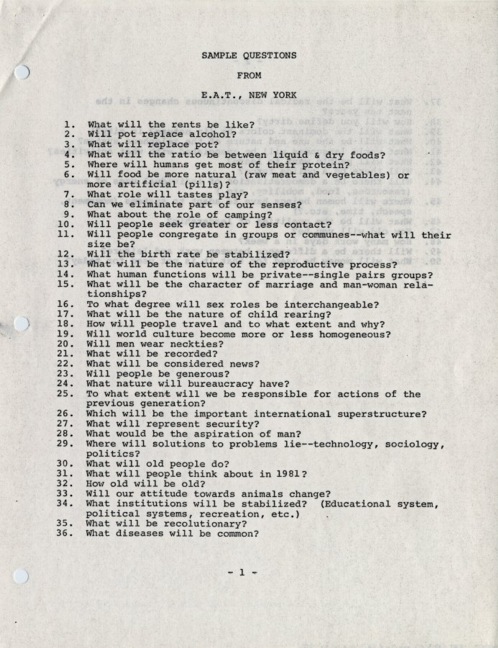
Or maybe, uh, not. The Daniel Langlois Foundation in Quebec has digitized some materials from E.A.T.’s archives, including the original press release for Telex: Q&A, which contains sample questions:
2. Will pot replace alcohol?
3. What will replace pot?
4. What will the ratio be between liquid & dry foods?
6. Will food be more natural (raw meat and vegetables) or more artificial (pills)?
20. Will men wear neckties?
24. What nature will bureaucracy have?
29. Where will solutions to problems lie–technology, sociology, politics?
49. Will there be a difference between work and leisure?
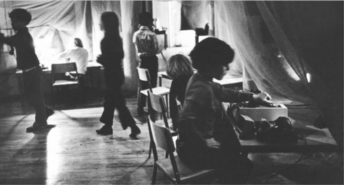
Telex: Q&A was closely related to another E.A.T. project in 1971, Children and Communications. Led by Robert Whitman, E.A.T. set up kid-sized labs in the various boroughs of New York, and connected them via fax and telex, and let kids loose in them to communicate with each other.
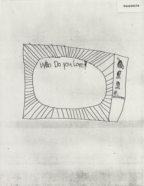
Langlois has some of those documents up, too; it’s kind of hilarious, in that except for a tictactoe game, and an attempt at an exquisite corpse-style story, most of the interaction is about the interaction itself. Just like Thaddeus S.C. Lowe’s first telegram from a balloon to like 90% of cell phone calls today [“I’m calling from the train.”] My favorite is this drawing, which pretty much sums it up, a screen asking the kid, “Who do you love?”:
Related, interesting: Tokyo Terminal documentation for Telex: Q & A [fondation-langlois.org]Fractal, Pixel. Pixel, Fractal.
![]()
“Our lives are spent trying to pixellate a fractal planet.” – A. King in Society. [via mathowie]OG Fujiko Nakaya Fog Sculpture

I may be too late to see the Getty Research Institute’s exhibit on postwar Japanese art, but I think it’s also past time I hotfoot it out there and start digging through the E.A.T. archives.
If there are more photos like this of Fujiko Nakaya’s fog sculpture at E.A.T.’s Pepsi Pavilion at the Osaka ’70 expo, I should be booking my study carrel right now.
Pepsi Pavilion with Fog Sculpture, Japan World Exposition ’70 [getty.edu]The Drawing Machine As Seen At The Beginning Of The Digital Age
Before I talk about Microworld, the 1976 industrial film made for AT&T by Owen Murphy Productions, let me just state the obvious, and get it out of the way:
We are long, long overdue for a comprehensive, scholarly retrospective of William Shatner’s spoken word pieces. The mandarins who keep our cultural gates should not be able to just drop a masterpiece in our laps on their own whim, not we who have known “Lucy In The Sky With Diamonds” for decades. I give you three months, and if I don’t see any movement, I’m taking the curatorial matters into my own hands.
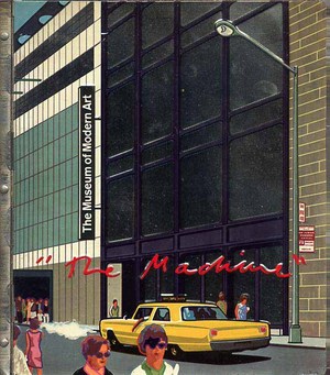
OK. Microworld. Holy crap, who made this thing? Owen Murphy Productions, who made several other films for Bell Labs over the years, including Incredible Machine (1968) which screened as part of the film program [PDF] at “The Machine As Seen At The End Of The Mechanical Age,” Pontus Hulten’s 1968 exhibit at The Museum of Modern Art. [that’s the show with the exhibition catalogue with the crazy, stamped metal cover.] Owen Murphy probably needs his/their own retrospective, too.
[11/2011 UPDATE: Thanks to Robin Edgerton, who has been working on the AT&T film archive, for pointing out that the correct title was Incredible Machine, not The Machine, as MoMA’s press release had it. You can watch Incredible Machine online.]
That will give us a chance to appreciate the backlit photomurals
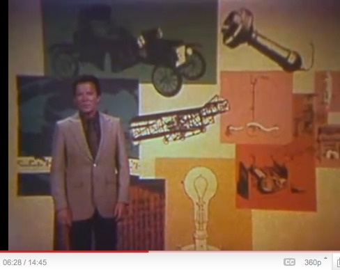
and the rather incredible prop circuitboard dioramas. [I left the timestamps in for easy reference.]
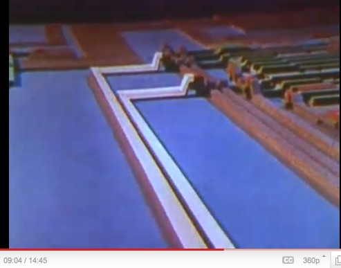
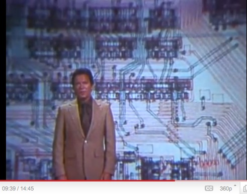
Shatner marvels for us at the minute intricacy of circuitboards reduced to eye-of-a-needle-sized microchips. Microchips which are apparently still designed in large-format, paper schematics.
Which are drawn. With a pen. By a [computer? punch card? stencil?] controlled mechanical printer.

Holy crap, people, this is a drawing.

Turned into a backlit transparency, but whatever. A DRAWING.
Jean Tinguely’s Metamatics drawing machines, we know. Olafur Eliasson’s studio folks set up that acoustic drawing machine at Tanya’s in 2008. [Wasn’t there also a thing with pulleys that drew on the wall? Who was that?]
Anyway, just saying, there are–or were–amazing drawing machines creating amazing, massive drawings, in the service of America’s most advanced scientists and engineers–who apparently didn’t bother keeping them? Where are they? What are/were they? Do any survive? What else could they be used for? I think I must find the answers to these questions.
UPDATE: ASKED AND BEGINNING TO BE ANSWERED
Thanks to Beau [aka @avianism], who points me to pen plotters and their adaptation and creative deployment, apparently in the last few years, by artists such as Douglas Repetto, whose drawing below, is part of the chiplotle group on flickr.
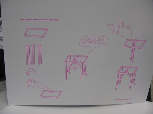
Chiplotle is a Python library created by Repetto and Victor Adan at the Columbia University Computer Music Center which allows you to code for and operate pen plotters from a laptop. The future of the past is here.
UPDATE UPDATE And whaddya know, via @johnpyper, there is a show of the Spalter Collection of computer code-generated art right now at the deCordova in Lincoln, MA, which includes, of course, Stan VanDerBeek, who worked on early animation and computer graphics languages at Bell Labs.Richard Prince’s Spiritual America
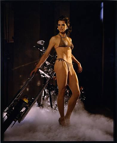
Holy smokes, Richard Prince, Patrick Cariou, Larry Gagosian, Judge Batts, Bob Marley, Richard Serra [! I know, right?], Brooke Shields, $18 million in artwork, the fate of appropriation, the implosion of the gallery system, copyright apocalypse, there’s so much mayhem to discuss, where to start?
Let me cut to the chase here, and focus on the single most important takeaway of the Cariou v. Prince & Gagosian Canal Zone case: he won’t be suing me.
During a deposition, Cariou’s lawyer Daniel Brooks asks Prince about his 2005 work Spiritual America IV [above], for which he appropriated Sante d’Orazio’s photo of an adult Brooke Shields re-staging the 1975 Gary Gross photo of a 10-year-old Shields which Prince rephotographed and showed in 1983, in a temporary storefront gallery he rented on the Lower East Side and called Spiritual America:The Second Meeting With The First Meeting Of The Erik Satie Society

I totally remember seeing John Cage’s The First Meeting of the Erik Satie Society in the summer of 1994. An unbound version was on view at the Fuller Building on 57th Street. Susan Sheehan Gallery. It was on during Cage’s phenomenal retrospective/exhibition/performance, Rolywholyover: A Circus, at the Guggenheim SoHo. [I followed that show around the country like a Phish head, from MoCA, to the Menil, the Guggenheim, to the Philadelphia Museum. The PMA show coincided with my graduation from business school, and I had a couple of weeks where I was able to go every day, and watch the museum’s art handlers perform their I Ching-generated list of reinstallations. A formative experience, one of the absolutely greatest museum exhibitions ever, and probably the greatest catalogue I own. Reproductions of works, poems, and texts are packed loosely in a mirrored aluminum box. It’s a good segue to the Satie Society, and ‘m going to go pull it out right after I post this.]
Anyway. The Merce Cunningham Dance Company just sold a copy of The First Meeting of the Erik Satie Society at Christie’s last week, and I’m a little surprised at how vague the description is. Apparently, Cage’s box set of artist books, drawings and prints was supposed to be an edition of 18, or 9, but then the edition of 9 is described as unrealized, plus an “unbound” edition of 6… Sounds a bit of a mess.
The gist of the piece is that in 1992 Cage invited artists to a birthday party for the French composer who influenced him so profoundly, and the gifts are the artworks, which Cage combined with his own Satie-themed mesostic/acrostics based on writings he admired, too. It’s basically an exercise of homage, inspiration, collaboration, and transformation. Folks like Johns, Rauschenberg, Sol Lewitt and Robert Ryman contributed works, and Cage used texts from the likes of Joyce, Duchamp, Thoreau and McLuhan. The whole thing came in a steel-framed, broken-glass valise, a reference to Duchamp’s famously cracked Large Glass.
I’m going to guess that the version I saw was unbound, because the elements were mounted between freestanding glass panels around the gallery. So there’s one. How there could be ambiguity about work produced by this constellation of major artists just a few years ago–holy crap, almost 20 years ago–is a mystery to me.
Sale 2441, Lot 177: The First Meeting of the Erik Satie Society, by John Cage, est. $90-120,000, sold for $116,000 [christies.com]
Holy crap, $500? Rolywholyover: A Circus on Amazon [amazon]
Previously: Richter’s 4900 Colours and Cage’s Rolywholyover via sippey‘Do-It-Yourself Existential Individualism’
I hadn’t thought about Daniel Birnbaum’s 1996 essay, “IKEA at the End of Metaphysics” in years, but wow, it’s just all flooding back.
Also, I’m reminded how I miss Jason Rhoades.
IKEA at the End of Metaphysics [frieze.com/20/ via ronald jones]Bus, 1967, Mason WIlliams
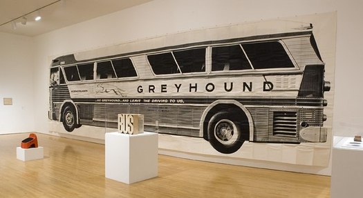
A 1968 NY Times review of Robert Rauschenberg’s giant Autobiography edition by Hilton Kramer was titled “Art: Over 53 Feet of Wall Decoration.” And the abstract mentioned simultaneous installations at the Whitney and MoMA, so I was interested to see what else Kramer hated. Turns out it wasn’t a Rauschenberg or a Broadside Art project at all: it was Mason Williams’ Bus.
Mason Williams’ Bus is one of the most awesome photomural/artist book/oddball objects of the Los Angeles 1960s. I love it. It is a life-size photo of a Greyhound bus, folded up and put into a box. It was made in an edition of 200, but existed primarily as a joke, or a poster, or a decoration, and only rarely has it been perceived as an art object.
Which is hilarious–and hilariously wrong–because Williams is a childhood friend and longtime collaborator/co-conspirator with Ed Ruscha, whose deadpan artist books were busy not being recognized as art–or as proper books–at the same time.
This lack of critical appreciation may have something to do with Williams’ primary occupation, which was TV writing and composition; he was the head writer for The Smothers Brothers and wrote “Classical Gas.” Bus was an irreverent stunt, though he took it very seriously.
[For a rare, serious look at Bus, there’s no place better than Design Observer, where Lorraine Wild wrote about it in 2008; Michael Asher had donated his copy of Bus to MOCA, and the museum had just installed it. Wild has Williams’ making of story, the hilarity of which is only hinted at in the parodic text Williams included with each numbered edition:
10 ft. 3 1/2 in. x 36 ft. 2 in.)
Weighs 10 pounds, 7 ounces.
Conceived by Mason Williams.
Photograph by Max Yavno.
Enlargement made from a 16×20 print of a 4×5 negative. Printed on billboard stock in 16 sections by silk screen process. Printed by The Benline Process Color Company of Deland, Florida and Pacific Display of Los Angeles, Califfornia. [sic] Hand collated, rolled and transported early in the morning by three people (two men and one woman) in one car over a period of several days. Each copy individually hand assembled by three people, using hands, feet, tape sissors [sic] and a Barlow knife. Assembled with 120 ft. (per copy) of Scotch Brand double-faced tape (No. 666).
Folded by hand and foot by three people.
Assembled and folded quietly on television sound stages on Saturday mornings in Los Angeles, Califfornia [sic]. Assembly time, nine man hours per copy.
Cover concept by Bob Willis. Designed from a box found under his bed by his wife. Cover constructed of corrugated fiberboard, 200 lb. test, #1 white. Printed and fabricated by Nehms Company of Los Angeles, California.
Published on the 24th of February, 1967 in a limited edition of 200 copies.
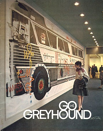
Anyway, MoMA installed a copy of Bus in the lobby in Jan. 1968, and then invited graphic designers participating in the Museum’s upcoming poster show to tag the bus with graffiti. Here’s a photo of the result, as seen on the cover of Go Greyhound magazine.
100%, Lorraine Wild [designobserver]
Art Projects by Mason Williams [masonwilliams-online]
Awesome LIFE Magazine photo of Bus at Reference Library
