
image: nymag
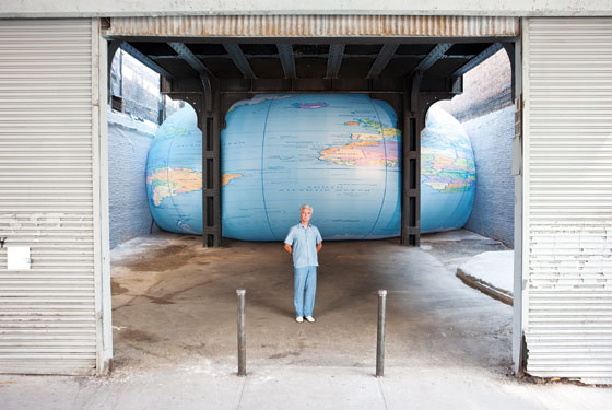
The awesomeness of David Byrne’s giant, inflatable globe shoved under the High Line gives us a good chance to look back.
To remember David Byrne’s pioneering show of PowerPoint Art at Pace in 2003.
And also to hope that Joshua Foer’s got someone updating his “A Minor History of Giant Spheres,” which is, of course, my too-infrequently cited source of inspiration for my satelloon fixation.
Category: inspiration
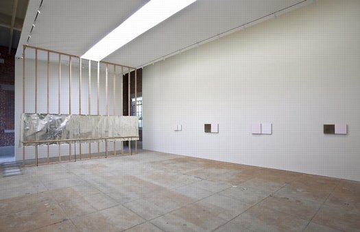
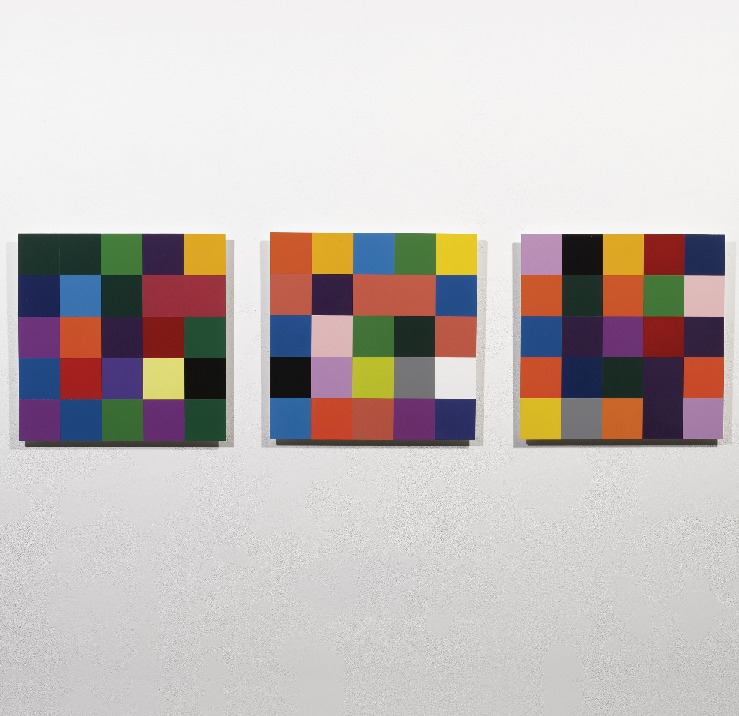
What I Look At Many Days: Gerhard Richter Colour Charts
I am aware of the work of Pablo Neruda Gerhard Richter.
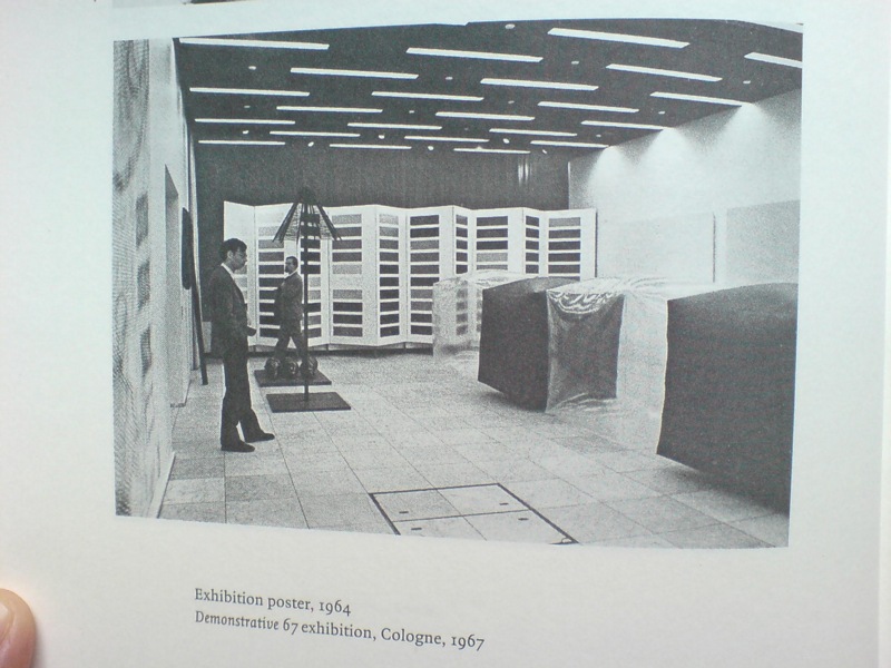
I have not been reading Gerhard Richter: Writings 1961-2007 straight through, of course, but it’s been with me a lot lately. And it’s kind of annoyed me that there is not really anything about this incredible photo, showing part of the installation of Demonstrative 1967, Galerie Heiner Friedrich’s weeklong exhibition at DuMont Publishers, down the street from the inaugural Cologne Art Fair, from which he had been excluded.
In addition to Richter, the display included works by his Capitalist Realist cofounders Sigmar Polke [I think that’s a raster bild there on the left] and Konrad Lueg [the inflatable cube structures], as well as by Blinky Palermo, Reiner Ruthenbeck, the British painter John Hoyland–and Cy Twombly.
Now about that Richter. That giant color chart painting which looks like a folding screen. For a while, it threw me off precisely because it looked like a folding screen. Considering 1967 was also the year Richter started working with glass panes and doors and other materials that related to a painting plane but were not, I was wondering if this painted, free-standing panel object embodied some lost chapter in the color charts’ “pop meets abstraction, quietly upends both” story.
Orrrr maybe, the painting was just too big to go on that wall, and Blinky needed that other wall, and Lueg’s balloons block everything anyway, and what the hell, it’s a week, and an art fair.

Ten Large Colour Charts/ Zehn große Farbtafeln, 1966, via gerhard-richter.com
Because there is no color chart folding screen. That work is Ten Large Colour Charts (1966), a ten-panel painting in the K20 collection in Dusseldorf. It is one of the earliest color chart paintings Richter ever showed, but it’s probably the first that many German art worlders ever saw. [Eighteen Colour Charts was the first first shown, in Richter’s one-person show at Friedrich’s Munich gallery in May 1967.]
Anyway, point is, or one point is, I think, that looking at Richter’s color chart paintings, and his 4900 Colours grids before that, and his Cologne Cathedral stained glass window before that, and so on, changes the way you look at the world. And by you, I mean, of course, me. It changes the way you look at color samples, whether in the paint store, or at the moment, in a grid laid out on a governmental stylebook website.
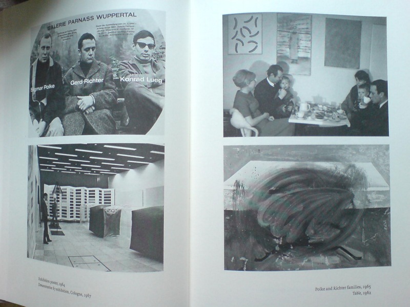
And it’s not just a matter of this looks like that, or not entirely. Because there’s also the context in which Richter painted his color charts–and the larger biographical/political context that shoots through Richter’s entire practice. That Demonstrative 67 photo is in a spread with what may be my favorite snapshot in the Writings book: on the right there, not Table, 1962, CR-1 [!]–which, if Christopher Wool can take up painting with that thing already in the world, color charts are not gonna hold me back–the one on top, with the caption, “Polke and Richter families, 1965.”
Oh, just drinking some tea with the kids and Uncle Rudi.
Flip Books, Floats & Photomurals: More On Robert Breer
So wonderful. William Smith writes about visiting Robert Breer’s home studio as part of Triple Canopy’s publication in residency last Winter at MOCA Tucson. Which sounds like the awesomest boondoggle ever, btw:
Breer famously composed most of his films one frame at a time by photographing individual drawings he made on index cards. Thousands of these drawings were filed away in his Tucson studio in what looked like old card-catalogue cabinets. As we asked about his films he would reach into the files, pull out a sequential handful of cards, and make an impromptu flip book, animating a short clip with his hands. The setup recalled the earliest days of cinema, when filmmakers would submit still prints of every frame of a movie to the Library of Congress for copyright purposes and, eventually, preservation. One can only hope that Breer’s trove of drawings will find such a home.
Meanwhile, from another dormant browser tab, here’s a screengrab of a video from 2003, an exhibition of E.A.T. at NTT’s ICC, the Inter-Communication Center, a multimedia arts space in Tokyo.
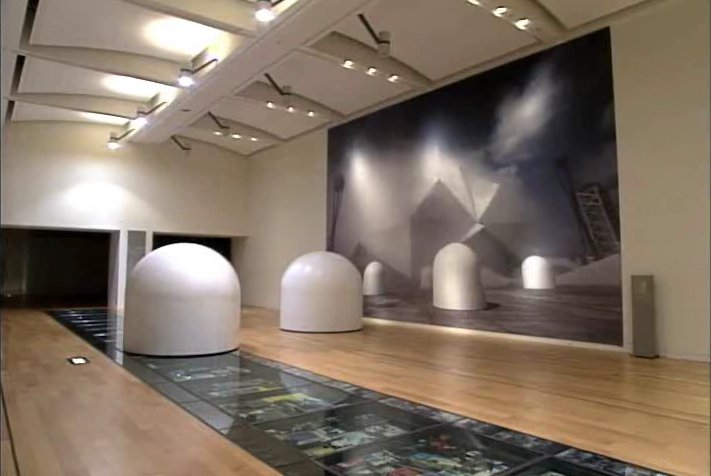
I love the kind of unabashed way the giant-but-not-lifesize photomural of E.A.T.’s Pepsi Pavilion relates to Breer’s full-size Floats. I’d assumed these floats were refabricated for Tokyo, but maybe Pepsi has kept them all this time. I think they’re at the Baltic Center retrospective now. Maybe someone could find out and let me know.
Float on: Robert Breer, RIP [canopycanopycanopy]
◎ E.A.T.─芸術と技術の実験 [ntticc.or.jp]
View Of New Amsterdam
I’m not sure why I’m so fascinated with the Netherlands, or more precisely, why it’s the source/site/subject of so much of my art/object/image/culture interest. Maybe it’s because of New York, which has always felt to me of a piece with Amsterdam in some way. Whatever, maybe the particulars are not that important right now.
But I’d like to see more thinking and writing and reporting like Steven Erlanger’s NYT piece on immigration, religious tension, politics and Dutch identity.
The sometimes violent European backlash against Islam and its challenge to national values can be said to have started here, in a country born from Europe’s religious wars. After a decade of growing public anger, an aggressively anti-immigrant and anti-Muslim politician, Geert Wilders, leads the third-largest party, which keeps the government in power.
Wow, I just re-read the 2010 post I wrote about remembering Laurence Wechsler writing on Vermeer. It’s the same things. And you know, maybe these particulars are important right now.
Amid Rise of Multiculturalism, Dutch Confront Their Questions of Identity [nyt]
Previously: What I Looked at in 1995: Vermeer’s View of Delft
On Robert Breer, Floats, Rugs & Flags

I’ve had Michelle Kuo’s interview with Robert Breer [artforum, nov 2010] open in my browser tabs for months now, ever since Steve Roden posted about his incredible little toy Float, which was sold at MoMA’s gift shop in 1970, at the same time one of Breer’s original Pepsi Pavilion Floats had been liberated from Expo’70 in Osaka and set loose in the Abby Aldrich Sculpture Garden. [A PDF of The Modern’s Aug. 25 press release for the piece, titled Osaka I, said the toy Floats would be sold for $7.95, or two for $15,” in the Museum’s Christmas Shop.]

Kuo’s is one of the best interviews I’ve seen with Breer; most never got past the basic, “how did you get into animation?” “So you lived in Paris on the GI Bill?” chestnuts. With what is now a terrible lack of urgency, I’d made a few attempts to track down Breer this year, in hopes of following up with him about what he’d probably consider the least important aspects of his creative practice: the commercial work and product design and TV animation [including still unidentified segments on The Electric Company] he would bring up–and then insist be kept separate.
Because Breer’s consistently innovative filmmaking and playfully minimalistic/animalistic sculptures–and the fact that he did his most monumentally awesome art work for Pepsi–hinted at the potential relevance of the work he kept in his commercial closet.
Which, amusingly, is not really the point, except to say I want to find a Float of my own, please.
No, the immediate point is, wow, how awesome is Breer’s 1966 sculpture, Rug? This was the work that introduced Breer’s sculpture to me, at a show that also opened my eyes to the revelatory breadth of his filmmaking. It was recreated for the first time in decades in 1999 at AC Projects. Their small second floor space in off-Chelsea was creeping and crawling with little Breer sculptures, while the Mylar Rug slowly shifted around in place. The other works felt alive, droid-like. Rug‘s movements were creepier, more ominous, like something was alive underneath it.
Good for the Walker, it looks like they acquired the mylar Rug [there are others, in other colors/materials] just this year.
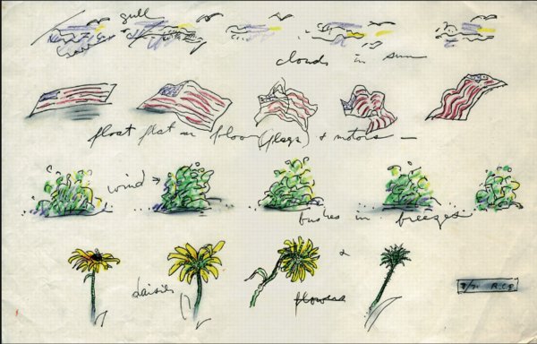
Anyway, while poking around GB Agency, Breer’s Paris gallery, I came across this sketch, dated 8/71, which includes an incredible proposal for a Rug piece made from an American flag. [The text underneath reads, “float flat on floor (flags) + motors”.] The storyboard-like drawing not only ties Breer’s sculptural and animation projects together nicely; the other three sequences–“cloud in sun,” “bushes in breeze,” and “daisies”–help site Breer’s work in observation, duration, and the natural world. Which may have mitigated the political implications in 1971 of something lurking under a crumpled US flag.
In any case, I expect, if not exactly look forward to the day when, this work will be realized for a future Breer retrospective.
On Being Karl Lagerfeld
Everyone was so hyped up about the extraordinary, long New Yorker feature detailing the hunting and killing of Osama Bin Laden, that well, obviously, I couldn’t post about it at the time. But I was so pissed at Helmut Lang for shredding his 6,000-piece clothing archive and turning it into mediocre sculpture, I knew I had to put things into context. See the bigger picture. Figure out what’s really important. I had to go back and re-read John Colapinto’s extraordinary, long New Yorker feature on Karl Lagerfeld from 2007. Specifically this scene:
The fitting model strutted forward in a new outfit and posed in front of Lagerfeld. He scrutinized her through his dark glasses and frowned. He said that he did not like the way the assistant had arranged the neckline of the sweater the model wore. Several assistants converged on her and began to tug uncertainly at the fabric.
“Non, non!” Lagerfeld said.
He uncapped a black marker and, rings clacking, made a quick sketch on a pad in front of him. Lagerfeld derisively describes many of his colleagues as “playing the designer,” because they drape fabric on a model or a dummy; he conceives his collections at a kind of platonic remove, in multicolored drawings on paper, and only rarely touches fabric. The picture he produced–a swift hash of lines suggesting a soignée woman–reflected his skill as an illustrator. (His work has been published in numerous books and magazines.) An assistant looked at the drawing and hustled to the model to make adjustments. Lagerfeld ripped the drawing from the pad, crushed it in his hands, and tossed it into a large wicker hamper, which, over the course of the evening, filled with similar small masterpieces. “I throw everything away!” he declared. “The most important piece of furniture in a house is the garbage can! I keep no archives of my own, no sketches, no photos, no clothes–nothing! I am supposed to do, I’m not supposed to remember!” He smoothed a gloved hand over the empty page in front of him and visibly relaxed.
The whole piece is just a mutant rollercoaster ride of journalism, down to the last “hmm?” Here’s another awesome scene:
Finally, Lagerfeld stopped talking and agreed to give a tour of the house. After warning, “You will think I’m a madman,” he led the way up a grand curving marble staircase. The second floor is composed of huge rooms with soaring ceilings, ornate plasterwork, wood panelling, and fifteen-foot-high mirrors. The furniture, a mixture of antique and modernist pieces, was almost impossible to see, hidden under hundreds of magazines, CDs, photographs, promotional brochures, and books, which lay in heaps spilling on every surface, including the floors. Scattered through the rooms were dozens of iPod nanos of every hue. Each one was loaded with songs that Lagerfeld listens to when designing his collections, which he does, he says, usually in the mornings, while dressed in a long white smock. Surveying the scene through his black glasses, Lagerfeld said serenely, “Normal people think I’m insane.”
He says that again later, after visiting his dressing area and the room with his five hundred suits, and then, “He shrugged. ‘I don’t know what ‘normal’ means, anyway.'”
In Colapinto’s telling, Lagerfeld’s voracious excesses of cultural consumption are designed to stave off boredom. The sustained investment in financial, human, and emotional capital required to keep Karl Lagerfeld entertained–and entertained enough to produce a new mountain of luxury goods year in and year out–is staggering.
And in a way, a good way, boredom was part of Lang’s stock in trade. His clothes felt like an antidote to relentless fashion stimulation. At least they did at the time. For a customer. For Lang, though, who can say? He may have had some issues with the whole thing. Here’s what I wrote about his first artwork, a giant disco ball which was exhibited in 2007 as “found,” but which actually came from Lang’s shuttered SoHo boutique:
Which completely changes the question of the disco ball from, “Where the hell’d he find it?” to “why the hell’d he keep it?” A glittering symbol unceremoniously yet sentimentally hauled out and dumped on an 18-acre beachfront estate in East Hampton and left to weather away in over-fabulous isolation. With a 4-foot disco ball in tow. [ba dum bum.]
Ultimately, Lang’s problem maybe is not boredom, or not even that he’s too normal, whatever that is, but that he’s not Karl Lagerfeld. And for that, I imagine Lang is thankful.
On Jacob Kassay And Collaboration
image: portlandart.net
I confess, I was as taken as the next guy by the Shiny Object-ivity of Jacob Kassay’s electroplated solo debut at Eleven Rivington in 2009. Next guys like Portland Art’s Jeff Jahn, who wrote the show felt “more in touch with the unsettled world of 2009.” And Andrew Russeth, who nailed the charred & mirrored monochromes as “look[ing] like elegantly abused luxury goods.”
And I had a big setup here, which I just deleted, about how I’m really not trying to add to the burgeoning body of Kassay concern trolling, articulated most clearly by Sarah Douglas, about the risks of overnight market success on the emerging artist.
But then I read Ed Schad’s earnest attempt to strip the market hype preconceptions from his review of Kassay’s current show at L&M Gallery in Los Angeles. And I have some issues.
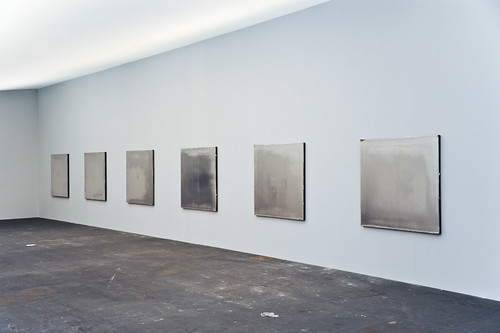
On their face, Kassay and his silvered paintings seem almost too perfectly suited for the Art World’s Next Top Model cautionary tale. It’s like they’re a trap, paintings perfectly calibrated to separate the most narcissistic collectors from their dough. The installation of silvered paintings at Art Basel [below] didn’t help, and neither did Kassay’s dealers’ assertion that the paintings, a suite of eight, would only be sold together–and to a museum–for somewhere around EUR250,000.
It’s hard to counter this narrative; or to wonder how much discourse around Kassay’s work is critical backfilling prompted by dealers or other vested interests. And I think Schad captures the difficulty well, questioning the conceptual underpinnings of Kassay’s show in the face of his monochromes’ unambiguous, materialist beauty:
I get the impression that the center of L&M’s show, a large work on paper placed on rough 2 x 4 studs with a ballet barre positioned in front, is Kassay’s attempt at giving us what may be a position, although that its orientation towards giving the show a conceptual reading also does a disservice. The work is ineffective, pitching a now typical rough D.I.Y look that is often misconstrued for sincerity and humility. Work like this neither sincere nor humble, but instead uses tropes of sincerity and humility as a cop-out for rigorous thinking. I have to admit, that Kassay’s center piece looks grad-school and virtually destroys the mood of refinement and elegance created by the smaller works.
I can’t fault Kassay entirely for this. After all he is young, and perhaps the impulse is to bring a little resolution and a little art history positioning to a practice that is probably more at home in explanation-less experimentation and straight ahead aesthetics. With the ballet barre, suddenly we are allowed to think of performance, of metaphor, of the history of Rauschenberg, his performative collaborations, and his white paintings, the idea of a monochrome as blank surfaces or “landing strips” for dust, light and shadow
Schad’s identification of the monochrome as Kassay’s field of bold engagement is right-on, but I think his skeptical de-emphasis of the artist’s reference to Rauschenberg, the conceptual and the collaborative is a mistake. These may turn out to be central elements of Kassay’s practice.
From the L&M press release:
This installation conceit engages Kassay’s interest in artist collaborations such as Rauschenberg and Johns designing sets for Merce Cunningham performances and an abundant history of multi-media collaborations. It evokes these ideas, but also takes into consideration the gallery as a place for practice, repetition and the natural gradients provided by the light, the white walls and the work itself.
Which, hmm. There’s a crossed up analogy there–sets and performance vs barre and practice–which effectively conflates gallery show with studio practice [all puns presumably intended].
I didn’t want to be all Johnny one-note, but since he/they mentioned him first, I can now point out that the paradigm Kassay’s debut on the art world stage most closely resembles is not Ryman or Klein, or even Rauschenberg, but Johns. Rauschenberg’s 1953 Stable Gallery show of white and black monochromes was more scandale than succes, and he fought the unserious bad boy image for many years, while Johns’ work was hailed–and sold–right out of the gate. And while flags and targets might stand out, most of Johns’ earliest exhibited works [1957-58] were monochrome paintings.
And though Rauschenberg’s reputation as a dance collaborator is well known, somehow Johns’ image of painterly solitude persists [at least for me], even though he was deep in the mix. Here’s a quietly remarkable comment Johns made in 1999, while discussing the creation of the artists-for-artists-oriented Foundation for Contemporary Arts, which he still heads:
In 1954 I had helped Bob Rauschenberg a bit with his Minutiae set, his first for Merce Cunningham, and I continued to assist him with most of his stage work through 1960. We were friends with Merce and John Cage and saw them frequently. In 1955 there was an evening of Cunningham/Cage performances at Clarkstown High School in Rockland County where we met Emile de Antonio. In 1958 de, as he was known, Bob and I formed Impresarios Inc. which financed and produced the 25-year retrospective concert of John Cage’s music at Town Hall in New York.
I guess this is all an aside, but the Walker is preparing Dance Works I: Merce Cunningham and Robert Rauschenberg, a show this fall of their Cunningham archive holdings which, at least in the title, doesn’t consider Johns’ collaborative role. Not that the Walker ignores Johns’ dance work; they have his Duchampian set structures for Walkaroundtime, after all.
henry codax, installation view, via carriage trade
So what’s this got to do with Kassay? Are his only collaboration references in his L&M show? In fact, he’s apparently got another show up right now which takes the model collaboration and the issue of individual artistic creation and authorship head-on. Andrew Russeth reports that Carriage Trade’s current show, an exhibition of monochrome paintings by the fictitious artist Henry Codax, is actually a joint project of Kassay and the minimalism-inflected French Swiss conceptual artist Olivier Mosset.
And now that you mention it, in May 2010, before any of the auction madness, Kassay opened his show in Paris with a collaboration as well. Iconic minimalist trumpter/composer Rhys Chatham performed at Art Concept, with a pair of Kassay’s silvered paintings as a backdrop. Watching video of the gig [Here are parts 2 and 3, total runtime is about 55 minutes.], I’m struck by how the paintings function as screens, reflecting the movements of the small, otherwise invisible crowd.
For the two previous summers, at least, the Paris-based Chatham loomed large in New York. His landmark composition, A Crimson Grail, an orchestra for 200 electric guitars, was rehearsed and rained out at the last minute in 2008 as part of Lincoln Center’s Out of Doors series. It was finally, triumphantly performed the next year. Andrew Hultkrans recounted the euphoric experience for Artforum.
In September, Primary Information is releasing a limited edition LP of the Kassay performance, with an additional work, under the title, Rêve Parisien. And in October, Kassay is having a show at the ICA in London, which is apparently still operating. For the moment, Eleven Rivington is surprisingly not mentioned in ICA’s brief bio of Kassay.
UPDATE Ultimately I’m glad I ended so abruptly; maybe it was enough to spur Andrew into action. He reminded me of the collaboration I’d forgotten, the one which had finally pushed me over the colabo-writing edge. From Karen Rosenberg’s NYT review of this year’s so-called Bridgehampton Biennial, where the backyard is strewn with Lisa Beck’s satelloon-lookin’ sculptures, and the front yard features a 1964 Ford Galaxy awaiting “an ‘artist’s renovation’ by Servane Mary, Jacob Kassay and Olivier Mosset.” Those shiny silver balls’ll throw me ever’ time. [Of course, this show also brings up Bob Nickas’s role in launching Kassay’s work into the discourse. This is at least the third Nickas-curated show to include Kassay. Dance with the one who brung ya.]
The Unfinished Business Pavilion, By Leo Lionni
What’s the opposite of writer’s block, the thing where you have so much damn good stuff to write about, you’re paralyzed into inaction? Because that’s what I’ve got, and August vacation voids or not, I just can’t help it; I’m gonna blog it all and let Google sort it out.
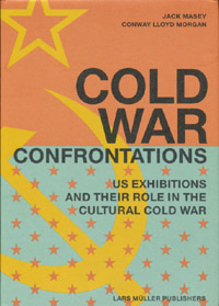 For example, for all the dome- and Expo-loving going on around here, you’d think by now I would have gotten my hands on a copy of Jack Masey and Conway Lloyd Morgan’s 2008 book, Cold War Confrontations: US Exhibitions and Their Role in the Cultural Cold War, but no.
As the longtime design director for the US Information Agency, Jack Masey was basically the client, or the producer, of the expo-related architecture, art, media, domes, pavilions, exhibitions, and propaganda that folks like Buckminster Fuller, Shoji Sadao, the Eameses, and George Nelson became famous for.
Cold War Confrontations is a fantastically surfable book, a thick, highly visual memoir of the USIA’s greatest hits. It’s based on the premise that the structured, official propaganda pageants of world expos, culture exchanges and trade shows, played pivotal roles in the course of post-war world history:
At Expos, however, the teams are not playing games; rather, they competed by presenting to the world examples of a nation’s best architecture, technology, arts, crafts, manufacturing, and performing arts. And in so doing, they sometimes, somehow, change the world. [p. 110]
There were many people who believe[d] that to be true. I sort of want it to be true, at least in the same sense that I’d rather see street gangs settle their differences by breakdancing instead of drive-by shootings. Maybe it’s better to see these expos as reflections of the cultures that produced them, or of their aspirations. Because the views expressed therein do not, it turns out, necessarily represent the opinions of the United States of America as a whole, or of their elected representatives and/or government officials.
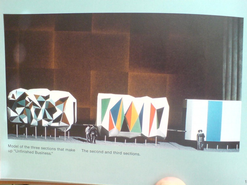
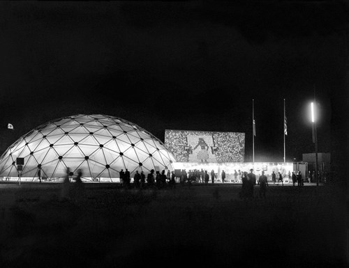
Case in point: The “Unfinished Business” pavilion, designed by Leo Lionni [!] for the 1958 Brussels World Expo. Holy Smokes, people.
Masey tells a longer version of the story in the book, but here’s a condensed version: in 1956, a team that included Boston ICA director James Plaut consulted with MIT economist Walt Rostow on the contents of the official US pavilion, which was being designed by Edward Durrell Stone. The idea was to emphasize the US’s people and cultural accomplishments. Rostow’s team also called on the US to be frank and self-critical in recognizing its “unfinished business,” by which they meant “soil erosion, urban decay, and race relations.”
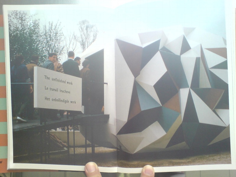
Somehow, though the giant, donut-shaped pavilion had room for a Vogue fashion show on water; a proto-Pop, pseudo-combine street sign streetscape; and a giant, aerial photomural of Manhattan installed in a half-pipe [WTF!? I don’t know! We’ll come back to it!]; there wasn’t room to “address ‘the Negro Problem.'” And so somehow [?] Henry Luce’s Fortune magazine became the State Department’s partner/sponsor of a smaller garden pavilion devoted to “Unfinished Business,” and the magazine’s creative director Leo Lionni designed it.
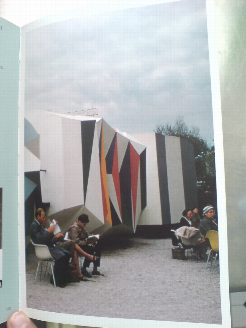
That’s the model above, and it looks pretty damn close to the real thing. Lionni conceived of three linked, raised pavilions, each about six meters long, as a frankly allegorical timeline, in which America’s problems get literally smoothed out. Or as Masey put it, “the content of the interior was also to be conveyed through the exterior.” Which means that the somber, “chaotic crystal” of the past had already given way to the much brighter, Family of Man-colored present. A little more ironing and the square, orderly, utopian future was just steps away. That was the concept, anyway, but that’s not exactly how it turned out.
[to be continued in the morning]
Buy Cold War Confrontations: US Exhibitions and Their Role in the Cultural Cold War on Amazon [amazon]
Gerhard Richter Drop-Shadow Redux
I’m looking into ways to paint on aluminum, and so I’ve come back to Gerhard Richter’s 4900 Farben, which is made up of 196 Alu-dibond panels, each with 25 lacquered [aluminum?] squares mounted onto them. Whatever the exact process, they are definitely painted objects, not just paintings.
Which is partly why, when, in a Snowpocalypse-bound frenzy, I wrote rather obsessively about the Serpentine’s 2008 exhibit of the work, particularly how the images in the catalogue were actually not of the work itself, but a digital facsimile. Which included illusory drop-shadow effects.
So you can guess what the first thing was when I saw the image of three related 25 Farben panels in Sotheby’s day sale last spring:
I mean seriously, just look at those shadows. Horribly lit, sure, but at least you know they’re real; and I suspect a CG rendering wouldn’t bring $200k apiece for those panels.
11 May 2011, Lot 412: 25 Farben [Three Works], est $300-400,000, sold for $590,500 [sothebys.com]
Richter’s 25 Farben paintings are nos. 901- and 902-, all 2007 [gerhard-richter.com]
Previous greg.org 4900 Colours coverage starts here and ends here. The discussion of facture and faking the fabrication is here, followed by the drop shadows and diagrammatic abstraction diatribe.
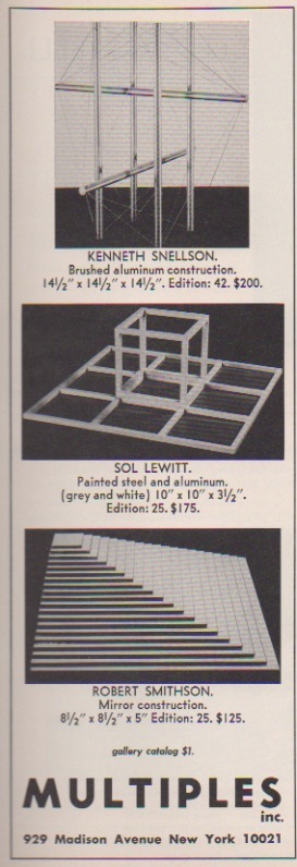
Mirror Construction, Mirror Stratum, Robert Smithson
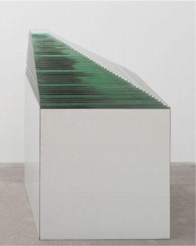
Mirror Stratum, 1966, Robert Smithson, image via moma
Robert Smithson’s Mirror Stratum is a longtime favorite of mine. These crystalline and strata sculptures are like abstracted geological or topographical structures, which is awesome enough. But these mirror [there’s at least one Glass Stratum piece, too, and a glass-and-map Stratum] stacks have this material simplicity, like a found object, that I really like.
MoMA has one [above] that’s 44 decreasingly smaller square mirrors, the largest of which is 25.5 inches on a side, all stacked on a pedestal. MCA Chicago has one, too, I see, with 32 mirrors, which sits closer to the floor. And it looks a little beat. Let’s call it a patina.
But my favorite favorite Mirror Stratum, which I’ve only ever seen once, is not designed to sit on a pedestal, but on a desk. It’s an adorable little stack of 20 mirrors, just 8.5 inches square and 5 inches high, which looks like the top half of the larger, earlier versions.
And in the Jan/Feb 1968 issue of Art in America, I found a great ad for it. It was made by Multiples, Inc., Marian Goodman’s editions publisher, in a stated edition of 25. Though it’s not clear to me whether the entire edition was actually produced. One of these days I should check. What I do know, is that I wish I’d picked one up back when they were $125 [or an inflation-adjusted $808].
Site Specifics: Why I’m Bidding On The Lease For The Spiral Jetty Site

I’ve begun speaking to enough people on the ground that it wouldn’t have gone unnoticed for much longer, but now word’s got out that I’ve established a foundation to bid on the site of Robert Smithson’s Spiral Jetty, a 10-acre parcel of State-owned lakebed in Great Salt Lake. In the simplest terms, I’m bidding for the lease because it seems irresponsible not to.
Several weeks ago, it was reported that the Dia Foundation’s lease had expired, and it was not immediately clear that the Utah Department of Natural Resources would grant Dia a new lease as a matter of course. When I called the Department to ask to be notified if the State decided to open the lease for competitive bidding, I was told I’d be added to the list. At that moment, it occurred to me that parties other than Dia were expressing interest in the lease.
As weeks passed, with no resolution, the possibility that Dia might not automatically get a new lease grew, along with the uncertainty of Spiral Jetty‘s fate. Once I received assurance that submitting an application would not automatically trigger an open bidding situation, I felt the responsible thing to do was to present apparently undecided State officials with the most constructive, credible set of choices: the status quo, or an independent, locally based institution whose purpose is to manage the site and collaborate with the artwork’s owners as they fulfill their own missions.
Let me underscore their continued involvement, because it was also important, whatever the status of the lease or the site, that there was an acknowledgement in the process of Dia’s undisputed ownership of the Spiral Jetty artwork, and the Smithson Estate’s ownership and control of the intellectual property rights associated with it. Any responsible proposal, I felt, should endeavor to support and facilitate Dia’s stewardship of Spiral Jetty, not usurp it.
In trying to craft the most effective alternative to the status quo ante, the importance of local engagement came quickly and repeatedly to the fore. There are many significant issues that directly impact Spiral Jetty in its site. To constructively address them, increased local engagement seems critical: environmental, land use, and lake management initiatives; economic development, tourism and energy issues; and art and cultural institutions within the State.
The Jetty Foundation’s mission is three-fold:
- Support the wise stewardship of Robert Smithson’s Spiral Jetty artwork in accordance with artist’s vision.
- Facilitate informed, productive engagement among Spiral Jetty stakeholders, including the artist’s Estate and the Dia Foundation; State and local government entities; lake and land use, tourism, economic development, environmental and community organizations; and arts, museum and cultural institutions within Utah and beyond.
- Support and encourage a greater appreciation of Spiral Jetty in the specific context the artist chose for it: in Utah, in Great Salt Lake, at Rozel Point.
If lease evaluations or bidding proceeds, the Foundation will expand its board to include leaders and stakeholders in Utah as well as recognized figures from the larger art and museum community.
If the State awards The Jetty Foundation the site lease, the board will have responsibility for managing the lease and for identifying and addressing issues that affect the site, in collaboration with the owners of the artwork, who would remain the key stewards of the artwork itself. The details of the board makeup and how the Foundation would support and work together with Dia and the Estate are all things to be figured out if or when it’s necessary.
As for the no-doubt invigorating conceptual implications any such arrangement might entail, I will not speculate. It was precisely the recognition that the administrative uncertainty surrounding Spiral Jetty called for more action and less sideline rumination that compelled me along the current course.
If the State decides that administration of the site by a locally engaged institution is preferable to the previous set-up, I want to make as certain as I can that such an organization operates wisely, effectively, and with respect for Dia’s and the Estate’s standing regarding the artwork. Should the State decide to award Dia a new lease on the site, I would hope that the Foundation’s role will be constructive and catalytic in bringing the importance of site and local engagement to the fore for the decades ahead.
Stay tuned.
Meeting Cy Twombly Changed My Life
In the Spring of 1991, I was about nine months out of school, and six months into a new job. After striking up a conversation with a documentary film crew from NHK at Tennessee Mountain in SoHo, I’d bailed on a hard-won banking job right before my analyst training started. I began doing research and pitching and packaging projects. A few months in, I began working on producing a multi-part documentary on the history of the oil industry based on Daniel Yergin’s book, The Prize. I went off by myself to Houston to try and persuade oil company executives, particularly Aramco, Saudi Arabia’s US operation, to participate. I’d put in some calls and send out some faxes, then basically wait by my hotel phone, hoping a PR or some other contact would call me back. It was at once heady and exhilarating, ridiculously inefficient, frustrating and boring, and ultimately pointless.
Before heading back to Houston one week, a friend in New York suggested I use some of my downtime to find the Rothko Chapel. I knew Rothko from sitting in on the modern/contemporary art history class my last semester, and from MoMA of course, but I hadn’t heard of any Chapel.

[via]
The concierge at the hotel didn’t know it either, but she gave me directions to Sul Ross, which turned out to be very close by [I was staying at the Wyndham.] With no idea what to look for, and not seeing anything particularly chapel-like, I circled around the bungalow neighborhood in vain, until I came upon a long, low, windowless, warehouse-shaped, grey clapboard building. There was no sign. Looking into the glass entry, though, I saw something else from my contemporary art class: a Cy Twombly chalkboard painting.
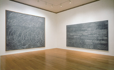
it was Untitled, 1967, on the right. image: menil.org]
If they had a Twombly, I figured, these people might know where the Rothko Chapel is. So I pulled over and went inside to ask directions. A charming lady with her white-hair in a bun at the desk happily pointed me back down the street. And then I asked if that was, in fact, a Twombly painting over there. Yes. Would she mind if I went to take a look. Of course.
As I was standing there, marking the many differences between an actual painting and a slide lecture, a tall, elderly man came out of a set of doors to my left, and joined me in looking. I looked at him briefly, and then the painting. And then back at him, because he was looking unexpectedly familiar.
“Excuse me, but are you Cy Twombly?” I asked.
“Yes,” came the reply.
I rambled something about really liking his work, and studying it in school, even though my emphasis was Italian Renaissance, and this being the first time I’d seen one in person while he smiled and nodded and said thanks. He asked where I’d gone to school. And if I had seen other pieces in the museum that I’d liked?
Which stumped me, because I somehow still hadn’t realized I was in a museum. I was a little embarrassed and said I’d been looking for the Rothko Chapel, saw his painting through the window, and stopped to ask directions. Twombly, amused, maybe pleased, said well, it’s really not like the typical museum, and then he suggested I really should see it, I’d enjoy it.
I said I would, and thanked him, and then he left. Some time later, when the catalogue for Walter Hopps’ show of Rauschenberg in the 50’s came out, I noticed the dates in a footnote and realized that Twombly had been at the Menil that day to be interviewed. So maybe, I thought, he had the formative art experiences of youth on his mind when he gave me one of mine.
The experience of meeting Twombly in front of his painting completely changed my understanding of artists and art and artmaking. Art was not just history; it was now. And it was being made by people you could meet and talk to. If you happened to bumble along in the most implausible way and fall in with some of the most important and visionary and generous people in the art world, like Dominique de Menil, but still. It was in the realm of the possible. At least until yesterday.
I was going to write how meeting Twombly turned me inexorably toward art made by living artists, even as the impetus for writing is the artist’s death. I’d thought about this after Leo Steinberg died; I’d met both him and Dominique that week, too. Maybe it’s being involved with art of our time–of my time–that came into focus that day. The artists whose work we admire, the people whose ideas influence us, are around for a while, and we can engage them. And then at some point, they’re gone, and we’re left with just their works and their words. And with our own experiences and memories.
John Cage’s Lecture On The Weather
I’ve always considered John Cage’s politics to have been those of conscious non-engagement, but that’s because I have really not known anything about “Lecture on the Weather,” a text/sound/film/stage performance commissioned by the CBC for the US Bicentennial in 1976.
Cage had twelve performers read chance-selected texts from Thoreau’s writing, “On Civil Disobedience,” combined with projected images and a weather-related soundscape. Ubu’s own poet-creator Kenneth Goldsmith posted the text of Cage’s remarkable preface to the Poetry Foundation’s website a few years ago.
[It was a couple of years after Goldsmith published his own Cage-inspired work, “The Weather,” which consists of transcriptions of a year’s worth of Manhattan weather reports from 1010 WINS News, which as Marjorie Perloff wrote about at length, is more fascinating and unexpected than it might first seem.]
In this post on the John Cage Trust’s blog, Laura Kuhn writes about a remarkable 2007 restaging of “Lecture on the Weather” to mark the transfer of the Cage archive to Bard College. The slideshow below has a recording of Cage reading his preface and photos of the rather amazing collection of Thoreau readers.

As of last year, the Trust was waiting for some “angels” to fund the release of a recording of the Bard restaging. Maybe they should do a Kickstarter campaign or something.
On Tacita Dean’s Photographs
As I mentioned the other day, I’ve been going through our storage space, getting these time capsule-like pops of memory from old files and boxes and stuff. One of the more unexpectedly unexpected encounters: print photos. I just don’t have envelopes of photos or snapshots sitting around anymore, not like I did in the 1990s.
And in that way, at least, I am like Tacita Dean, an artist whose films I’ve long admired, but whose work in photographs I haven’t really thought of much until now.
For her 2003 show at the Kunstverein Dusseldorf, Dean excavated a set of forgotten negatives she shot while living in Prague in 1991. As Catrin Lorch put it in her review of the show for Frieze:
[Dean] printed almost all of them to make a series of black and white, small-format photos. The almost forgotten scenes reveal a cross-section of the early years of post-communist Central Europe: broken-up cobbles, blurred, speeding trains, gracefully curving stairwells suffused with the crumbling charm of Eastern European modern architecture. A woman’s fat legs in black tights; a friend at the breakfast table. Looking at these photos arranged in open wooden boxes on a small table was like opening a message in a bottle.
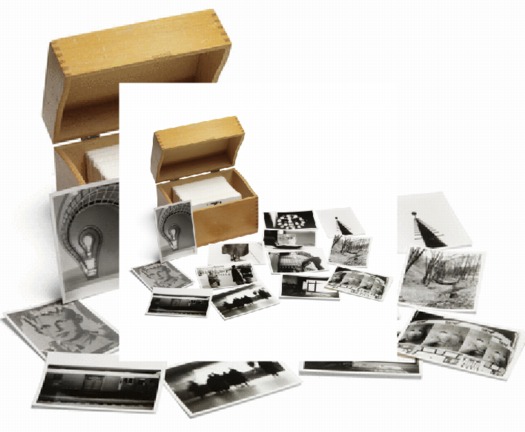
In 2008, Sotheby’s sold a set of Dean’s Czech Photos, which she’d published in a small edition, for a remarkable 3,750 GBP. [Sotheby’s flash-based e-catalogue site, where this screwed up double image comes from, is a web-breaking disaster,, btw.]
And then this morning, the lately irascible Jonathan Jones [h//t modernartnotes] mentions Dean’s “ambitious prints derived from photographs,” which he calls “her most powerful creations.” Well, which, what?
Sure enough. And ever true to her analogue roots, they’re photomurals. And overpainted photomurals to boot.
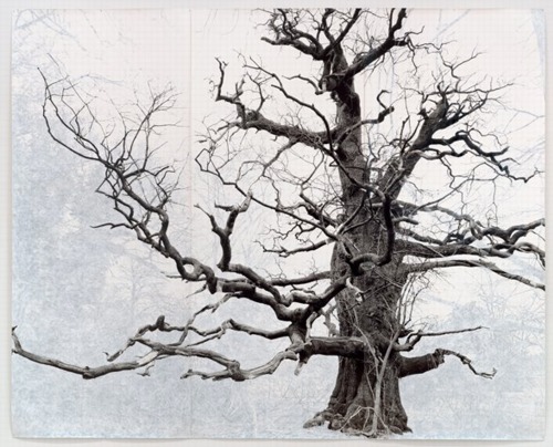
Beauty, 2006, 3.6 x 3.75m, collection sfmoma
Dean showed these large-scale works in her 2007 show at Frith Street Gallery in London, titled Wandermüde, which is the little-known corollary of Wanderlust. She made what are essentially portraits of the oldest trees in Southeast England, printed them on a large scale–using Steichen-style photomural-as-wallpaper technique–and then painted out the non-tree elements of the photo with gouache.
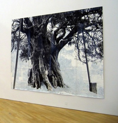
Crowhurst, 2007, 3x4m, collection: moma
That’s one in SFMOMA’s collection up top. Above is Crowhurst, from MoMA’s collection. I like how the oblique view clearly shows the work’s materiality, its seams and curled edges. MoMA’s website says they showed Crowhurst in 2007-8, but I confess, I don’t remember seeing it. I hope I didn’t mistake it for a Ugo Rondinone tree drawing and keep on walking.
Dutch Camo Domescapes
I love it when a plan comes together. Or at least when several subjects of interest converge unexpectedly.
It seems the Dutch art world is about to be decimated by sudden and substantial government funding cuts and reorganizations. [for angry details, check sven lutticken’s recent post; for plaintive, possibly resigned reaction from the affected institutions, try the open letter at the Dutch public arts organization, SKOR.]
If the proposed changes really do take effect, and the status quo of one of the most highly developed state-sponsored ecosystems for the arts is actually dismantled at a stroke, I think it’s really important to requestion every comfortable assumption of the involvement between art and politics. It has a lot of obvious problems and weaknesses, but the Dutch system, at least as perceived from abroad, has always seemed like the apotheosis of certain ideals of cultural industrial policy, which, Lutticken argues, now “don’t seem to be worth a penny.”
Anyway, not that they saw them coming, but SKOR tried to understand the political shifts that precipitated these cuts in the December 2010 issue [#20] of their excellent journal, Open, which examines populism and the persistent need for narrative and myth in the democratic process.
Dutch populism seems to center on–surprise–issues of immigration, assimilation, and Muslim vs. Christian cultural influence. As it turns out, one of the contributors in Open 20 is Foundland, a graphics, art, and research group that seems part collaborative, part design firm.
In 2009, Foundland created CACHÉ ÉXPOSÉ, an investigation into the remote, largely invisible, and unreported system of detention and deportation facilities in the Netherlands. The majority of the people imprisoned in the facilities or subjected to the system seem to be immigrants and refugees from largely Muslim countries.
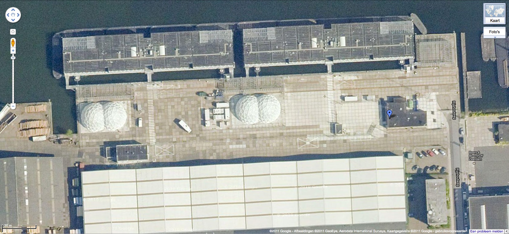
When I read the description of the project, I wanted to see if, like the intelligence- and military-related sites, these politically sensitive detention sites were obscured on Google Maps. Fortunately, Foundland had created a Google Maps list as part of the CACHÉ ÉXPOSÉ project.
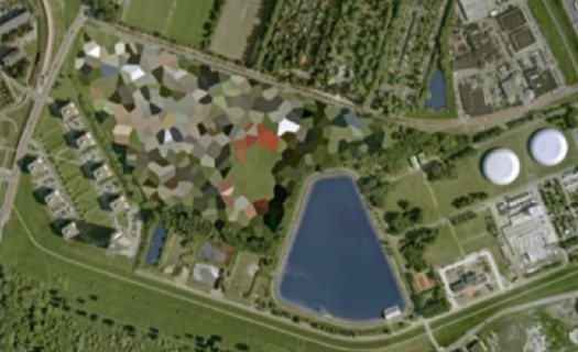
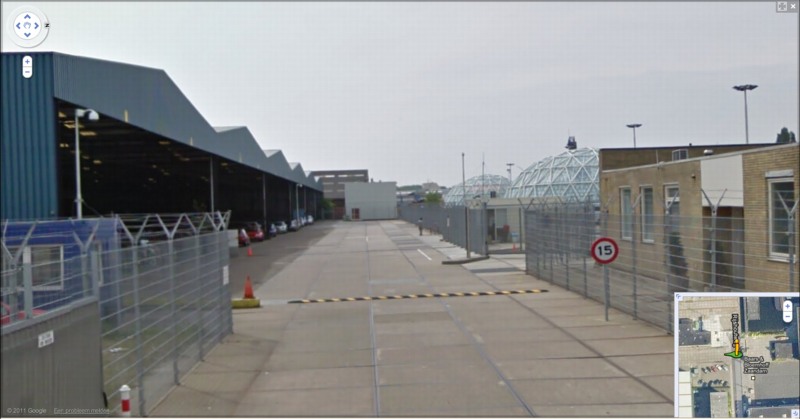
And the short answer is no. Their industrial anonymity is camouflage enough. But then hey-ho, looking at the waterfront detention center in Zaandam, a commercial city northwest of Amsterdam, what do I see? Awesome-looking domes.
Double geodesic domes of unknown purpose, but which look to be at least somewhat transparent or translucent from Street View. What a wonderfully open society the Netherlands must be that in can allow the Google Street View car to drive right up into the middle of its immigrant prisons. Oh wait.
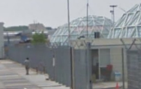
What strikes me, besides the lone figure standing outside the double barbed-wire fence? Is irony the right word to see a geodesic dome, a form which was once erected to great fanfare in Afghanistan, where it served as a symbolic center of friendship, trade, democracy, and political cooperation with the west, being deployed in a back alley prison in Europe filled, presumably, with impoverished immigrants from the Middle East?
Then again, Afghans in 1956 apparently did see the US’s Kabul Dome pavilion as representing The Future. So.