
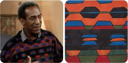
“Season 3, Episode 3: ‘Golden Anniversary'”
This is epic. Painting the key sweaters of The Cosby Show, one episode at a time, in chronological order. Which is awesome, not because it charts the evolution of the Cosby Sweater; any punk with a tumblr could do that. But because it’s fun to imagine Thomas Nozkowski’s reaction, as the seasons progress, and he hears the footsteps behind him, getting ever closer. And an occasional spastic, growly laugh.
The Cosby Sweater Project [thecosbysweaterproject.com via I wish I could remember]
Category: inspiration
Considering The Eameses As Artists
A few months ago, I was asked to write something about Ray and Charles Eames by the folks at Humanities Magazine, published by the National Endowment for the Humanities.
The NEH had provided some funding to Jason Cohn and Bill Jersey’s documentary, Charles & Ray Eames: The Architect and the Painter, so a straight-up review wouldn’t really work. But I was encouraged by the documentary’s title, and its exploration of Ray’s role in the duo’s collaborative process, and so I decided to float the idea that there’s a lot to learn by considering the Eameses as artists:
Throughout their own careers, whether making architecture, furniture, toys, annual reports, or films, the Eameses presented themselves as designers. And despite their forays into education, computing, and international diplomacy, that’s how they are typically seen. But calling the Eameses designers while trying to account for their polymathic legacy can be problematic, particularly if we’re picturing the designer as a lone, heroic genius: Charles Eames as the Howard Roark of American consumer capitalism. It invites many esoteric and academic questions about process, context, gender, and collaboration, which are interesting but hard to resolve. When considered from an artistic perspective, however, many of these complications evaporate. Accepting Ray and Charles Eames as artists and their studio work as art gets us away from the arbitrage over who did what and how. Plus, it enriches and deepens the contemporary understanding of their role in the culture of their time.
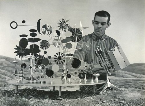
That’s John Neuhart up there, by the way; he built the Eameses’ greatest object besides their house, and one of the greatest unsung, unrecognized artworks of the modernist era, the Solar Do-Nothing Machine.
Modern Love, Humanities Magazine, Nov/Dec. 2011 [neh.gov]
What I Looked At Today: Anne Truitt
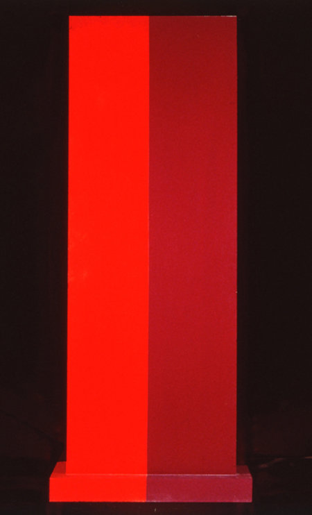
Insurrection, 1962, image: corcoran.org
I needed to see some hard-to-find Chris Burden catalogues–more on that later, but soon–and the quickest place I could find them was the Corcoran School’s library. I called ahead, and they had them waiting for me, so I was in and out of the library in no time.
Which left me with a little time to wander. And there is a very nice gallery with a nice, old Ellsworth Kelly diptych, and this wonderful Anne Truitt sculpture in the center of the room.
Insurrection was installed very dramatically with Hardcastle, another 1962 work, in Kristen Hileman’s Truitt retrospective at the Hirshhorn. Hardcastle confronted you head-on through the doorway, while Insurrection was turned sideways; on edge, with only the slab’s thinness and wooden brackets visible. It was only as you moved around it–following the contours of those unfortunate Karim Rashidian raised platforms–that they switched out: Hardcastle’s heft gave way, and Insurrection widened, revealing that they shared the same structure.
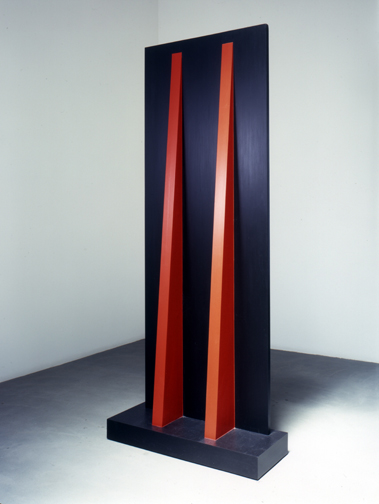
Hardcastle, 1962, via annetruitt.org
The install of Insurrection at the Corcoran, meanwhile, is much less enigmatic. There are off-center approaches from three different sides, so the sculpture is what it is when you see it. Moving around it is an experience, not a discovery. [The full frontal orientation faces the Kelly, Yellow with Red Triangle, from 1973.]
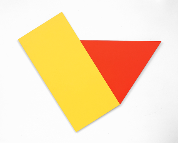
Yellow with Red Triangle, 1973, image corcoran.org
Even though they’re the same shape/structure, I remember Hardcastle‘s monochrome face felt more massive–and then artificial, as its red brackets popped into view. Insurrection’s two-tone reds make it feel more like two volumes immediately, which turn out to be one.
Back down on the floor where they belong, Truitt’s larger sculptures always feel like a presence, in space, and yet they’re paint[ings?] [ed?] And yet there is paint. Maybe 1962 was before her reportedly vigorous sanding and multiple coats kicked in, because Truitt’s surface is most definitely painted with a brush. Kelly’s surface, meanwhile, is only disturbed by the weave of his canvas; I’m going to assume he used a roller. But wow, there’s a brush going around the edges. And how. Just slapped right on there.
I’m trying to better understand the sense of paintings as objects, of the picture plane as nothing of the sort. I didn’t plan today to see these two artists’ works–Truitt’s and Kelly’s–which explore this very idea, in the form of painting/sculpture, but here they were. I still have to look some more, but basically, I came away thinking I might be really knocking myself out too much over my smoothly brushed-on painting surfaces.
previously: many Anne Truitt posts on greg.org
and a little on looking at Ellsworth Kelly
Intergalactic Lens Flares

i love that the headline on this story, “Hubble Directly Observes The Disk Around A Black Hole,” has to be followed immediately by, “but it’s not that disk.”
The spectacular patterns and rays in the photo above of the double quasar known as HE 1104-1805 are apparently imaging artifacts from the Hubble Space Telescope, They’re caused by the circular aperture and the structural elements of the telescope itself.
Meanwhile, the accretion disk is only visible at all because HE 1104-1805 is subject to gravitational lensing, distortions in the light caused by the gravitational pull of an intervening galaxy.
I can’t quite articulate it yet, but there’s something here about the appeal and limits of opticality; the utility and limitations of the narrow, visible part of the spectrum; and the documentation and characterization of distortion that I find very interesting. And then there’s the inextricable relationship between the instrument and its object; which then collapses as the universe itself–the galaxy-as-lens–becomes the instrument for viewing itself.
Hubble Directly Observes the Disc Around a Black Hole [spacetelescope.org, via]
What’s That Strange Disk Around That Black Hole? [discovery.com]
Luminous Canvas, Sham Paris
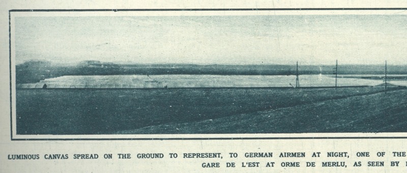
Sweet, near the end of World War I, Paris planned and began construction on a “Sham Paris,” decoy trains, stations, avenues and factories, to confuse German aerial bombers.
Above, a detail from the photo, “Luminous canvas on the ground to represent, to German airmen at night, oneof the great Paris railway stations: The Camouflage Gare de l’Est.”
Like the 1920 editors of The Illustrated London News, I would have liked some aerial photos of the deception.
A Paris Made to be Destroyed–Sham Paris, 1917/18 [ptak science books]
Suspiciously related: Maskelyne’s Sham Alexandria, or The Greatest Camo Story Ever Told
Transactional Aesthetics, Or The Highly Collectable Rirkrit Tiravanija
I’ve been writing this post in my head for months, years, even, but so many pieces have piled up in my browser tabs, it’s slowing my computer down. And plus, this weekend MoMA announced that they acquired and will exhibit Untitled (Free/Still), the original [sic] free-Thai-curry-in-a-gallery work, so it’s time to step back and look more closely at Rirkrit Tiravanija’s art practice. First, by starting with what we are fed. Here is a small sampling platter of familiar statements by and about the artist and his work:
“It’s part of what has been called ‘relational aesthetics,’ ” said Ann Temkin, chief curator in MoMA’s department of painting and sculpture. “Joseph Beuys created social sculpture; it’s the act of doing things together, where you, the viewer, can be part of the experience.”
That’s from MoMA’s press release in the NY Times.
You could say his art is all about building “chaotic structures.” Then again, it’s about lots of things; his work is so open-ended and departs so radically from the art market’s orientation toward precious objects, that it’s earned many labels, many – like utopian or chaotic – that only tell part of the story. But one that’s stuck, for better or worse, is French theorist-critic Nicholas Bourriaud’s “relational aesthetics,” the idea of judging the social relationships sparked by an artwork instead of merely considering the object.
That’s Paul Schmelzer, now/again of the Walker Art Center, an early and frequent supporter of Rikrit’s work, writing in 2006.
Tiravanija’s art is free. You only need the experience. In fact, the essence of his work resides in the community, their interrelationships, and chance. Make art without objects, their purpose is a complaint against the possession and accumulation.
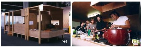
The Museo de Arte Contemporáneo de Castilla y León, which owns Untitled (Caravan), a 1999 plywood model of a camping trailer, with kitchen, above.
Rirkrit as quoted by Bruce Hainley in Artforum, 1996:
“Basically I started to make things so that people would have to use them,” he has said, “which means if you [collectors, museum curators, anyone in these roles] want to buy something then you have to use it. . . . It’s not meant to be put out with other sculpture or like another relic and looked at, but you have to use it. I found that was the best solution to my contradiction in terms of making things and not making things. Or trying to make less things, but more useful things or more useful relationships. My feeling has always been that everyone makes a work – including the people who . . . re-use it. When I say re-use it, I just mean use it. You don’t have to make it look exactly how it was. It’s more a matter of spirit.”
And here’s Faye Hirsch in Art in America this summer, perfectly teeing up her making-of story for Untitled (the map of the land of feeling), [above] an extraordinary 84-foot-long print edition Rirkrit has worked on for the last three years with students and staff at Columbia’s Leroy Neiman Center for Print Studies:
Rirkrit Tiravanija has never been known as a maker of elaborate objects. In a market-riven art world, he has remained, since the early ’90s, a steadfast conceptualist whose immaterial projects, enmeshing daily life and creative practice, have earned him a key role in the development of relational art. At galleries and museums around the world, he has prepared meals and fed visitors, broadcast live radio programs, installed social spaces for instruction and discussion, set up apartments–where he or visitors might live for the duration of a show–and dismantled doors and windows, leaning them against walls. At two of the three venues for his 2004 retrospective, the “display” consisted of a sequence of empty rooms referencing (in their proportions and an accompanying audio) his selected exhibitions over the years.
When Tiravanija does make objects, they are generally of a modest nature–most often multiples and ephemera connected with exhibitions. At his show this spring at Gavin Brown’s Enterprise in New York, for example, he set up a room where an assistant screenprinted white T-shirts with his signature terse, block-print headlines, ranging in tone from vaguely political (LESS OIL MORE COURAGE) to hospitably absurd (I HAVE DOUGHNUTS AT HOME). They cost $20 apiece.
Ah yes, the t-shirts. Not sure if I ended up being the only one, but I was apparently the first to order a complete set of all 24 shirts. So there’s that.
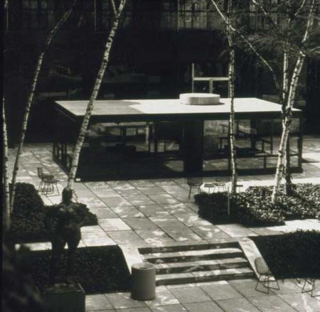
I have been an admirer and follower of Rirkrit’s work since his earliest shows at Gavin’s, and Untitled (Playtime), the awesome, ply&plexi, kid-sized replica of Philip Johnson’s Glass House he built in MoMA’s sculpture garden in 1997 [above] bought him at least a decade of good karma in my book.
And so it’s only very recently that I’ve started to watch and wonder if I’m the only one who– See, this is why Faye Hirsch’s quote is so perfect: because it encapsulates exactly how people talk and write and think about Rirkrit’s work, and it’s perfectly and exactly wrong.
I’m sorry, that’s the overdramatic hook in this post. What I really mean is, as his social, experiential, ephemeral practice, his “art without objects” has taken off, Rirkrit has also been making some of the blingiest, sexy-shiniest, most ridiculously commodified luxury objects around. I love them. Why can we not talk about them more?
Continue reading “Transactional Aesthetics, Or The Highly Collectable Rirkrit Tiravanija”
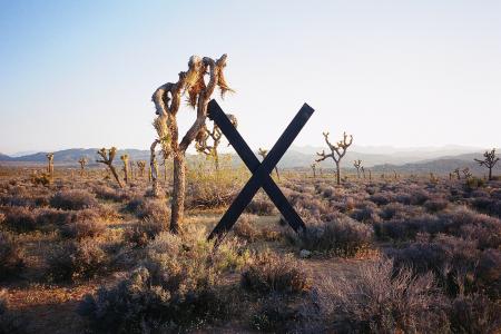
#OccupyMarkdiSuvero
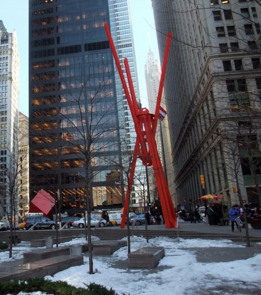
Joie de Vivre, Mark di Suvero, Zuccotti Park, detail of image via ourtravelpics.com
Or maybe #OccupyJoiedeVivre, then? Either way, please tell me I’m not the first or only one to think of this. Actually, please tell me someone’s already working on it.
Mark di Suvero’s giant steel sculpture, Joie de Vivre was built in 1997 and stood for several years in the exit plaza for the Holland Tunnel, then at Storm King, and in 2006 it was installed in its new home, Zuccotti Park. Whether its art historical significance is fully appreciated, or whether it’s called “The Big Red Thing,” di Suvero’s sculpture has become an icon of the Occupy Wall Street protests.
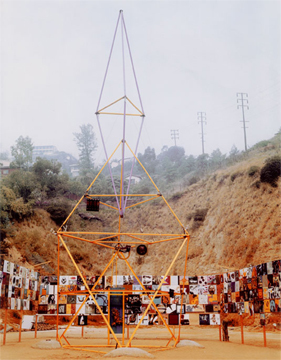
The Peace Tower, 1966, image via newsgrist
Which is good, because di Suvero himself is an icon of artistic involvement in political action, activism, and social justice. In 1966, along with Irving Petlin and others, di Suvero designed The Artists’ Tower of Protest, also known as The Peace Tower, one of the earliest and largest artist-organized protests against the Vietnam War.
The Peace Tower stood on a vacant lot on the corner of Sunset and La Cienega Boulevards in Los Angeles, which Petlin’s Artists Protest Committee rented for three months. They solicited 2×2 art objects from 400 artists, which were installed onsite. Documentation of The Peace Tower is currently included in Pacific Standard Time at the Getty.
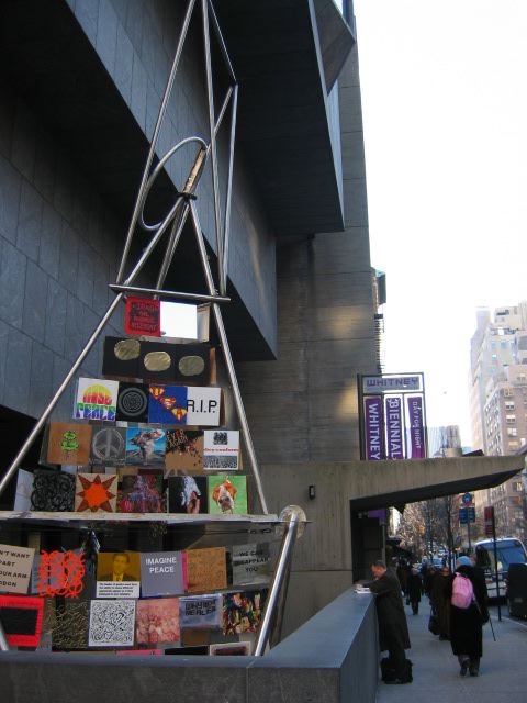
Peace Tower @Whitney Biennial, 2006, image via wjff
In 2006, Rirkrit Tiravanija worked with di Suvero and Petlin to re-create The Peace Tower as a protest to the Iraq War as part of the Whitney Biennial. The new tower was festooned with 180 2×2 panels created by invited artists, including many artists from the LA original. [And Joy Garnett, hello!]
So it would seem to me, that when you’re organizing a global protest against injustice at the foot of a Mark di Suvero sculpture, shouldn’t you organize it on the Mark i Suvero sculpture? And shouldn’t you do that, NOT by climbing the sculpture and demanding cigarettes be delivered to you by police cherrypicker, thereby precipitating the fencing off of said sculpture and the park space around it, but by tracking down the artist himself and enlisting him in a call for artists to create 2×2 panels that will be installed on Joie de Vivre itself?
And though it might be hard to measure–or identify, for that matter–the impacts on policy of the war protests in 1966 and 2006, circumstances almost seem to demand an incarnation of a protest tower in 2011-12. And at the very least, art people, doesn’t this make 10000x more sense than marching on the Frick?
Related: Jeffrey Kastner’s remarkable interview with Irving Petlin, Mark di Suvero and Rirkrit in the March 2006 Artforum [artforum via findarticles]
On Gerhard Richter And Comdr. Edward Steichen
See, this is why I wonder about whether Gerhard Richter, “shocked” by seeing Edward Steichen’s MoMA exhibit Family of Man in West Berlin in 1955 while he was a student, ever went on to research Steichen’s earlier photography exhibitions, such as the 1942 Road To Victory.
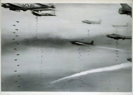
Because all around the life-size photo cutout of a GI on Corregidor is a whole series of giant aerial photos of US bombers and fighter planes at work. Over the skies of Germany.
And though Atlas shows Richter took a specific image from a newspaper for his first airplane painting, it does look very much of a type–and of a scale–that Steichen was using, too.
Bombers, 1963, image: gerhard-richter.com
And then this one which, like the one behind the cutout, is clearly taken from the ground–and, just as clearly, from the business end of a bombing run:
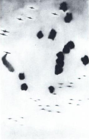
Airplanes, 1963, image: gerhard-richter.com
Loads of death, tons on tons of annihilation, out of
the sky and down down down on the enemies of
the free world–killers with wings–dropping
polished cylinders to let loose tornadoes of hell
and ashes on the hideouts of the “New Order.”
Carl Sandburg’s rather plush poem/captions for Road To Victory sound a little different in this context.
In comparing photography’s postwar cultural positioning to the prewar modernist era in relation to the work of Bernd and Hilla Becher, Blake Stimson wrote,
Photographers once again assumed a special role for this reconstruction, this production of a new, new vision and new, new man. Such was the mission adopted programmatically by Edward Steichen for The Family of Man, for example,
So whatever Family of Man‘s photographs may have told Richter “about modern life, my life,” once he came West and started painting, I’m not so sure he was still buying it.
Gerhard Richter On The Family Of Man
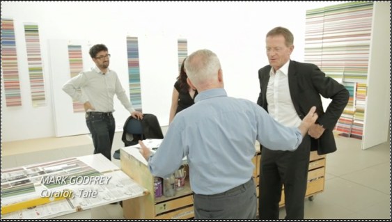
The Tate video of Nic Serota and his team in Gerhard Richter’s studio is nice for many reasons: it includes some squeegee action scenes from Corrina Belz’s Gerhard Richter Painting [which I’m trying to get a copy of; Is there anyone in London who can pick up a DVD for me? Or in the UK anywhere who can accept a shipment and forward it onto me?]
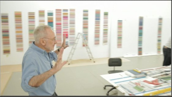
For filming, they moved the model of Tate Modern’s galleries into the main studio room, which was full of strips of the Strips series [and hey-ho, a bent strip too, what’s up with that?]
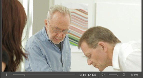
But the most interesting thing to me, anyway, is this exchange from Serota’s interview of Richter, about leaving East Germany:
GR: We had also the possibility to go every a year at least twice to West Berlin, to saw movies and exhibitions. It was the first time I saw the wonderful Family of Man
it was a famous exhibition.
NS: This was the exhibition made by Edward Steichen
GR: Uh-huh, and this was a real shock for me, this show.
NS: Why?
GR: Yeah, so, to see these *pictures,* and I only knew paintings, I was very interested. And they showed so much, and they told so much, these pictures, these photographs. They told so much about modern life. my life.
NS: So was this the moment when you discovered photography? Or the power of photography?
GR: Let’s say the power, yeah, of what photography can do.
 Serota delivers that question with an intensity that makes it feel like a scoop, and I don’t think his reaction is [just] for the camera. I haven’t found any previous mention of Family of Man either by Richter or in relation to his work. Steichen isn’t in the index for the collected writings. There’s no mention of it in Christine Mehring’s study of Early Richter. And though Elger’s bio for the period in question–Family of Man opened 17 September-9 October 1955 at the Hochschule für Bildende Künste–mentions Richter’s trips to West Germany during what was his last year studying mural painting at the Academie in Dresden, there’s no mention of the photo exhibit itself.
As for Richter’s nascent interest in photography, the artist did tell Rob Storr that he received copies of Magnum magazine from an aunt in the West. And Elger notes that his family photo album was “one of the few belongings Richter would take with him when he fled to the West.” But the artist now adds Family of Man to the list of his early photographic influences. It makes me wonder what the show actually showed Richter about photography’s power, and whether the artist went on to study Steichen’s other MoMA photo exhibits, the ones that didn’t travel to Berlin.
Image above: Edward Steichen in the Berlin installation of Family of Man, 1955, via moma.org
Tate Channel | Gerhard Richter (21:58) [tate.org.uk via @aodt]
Previously: The Family of the Family of Man: Steichen, Miller, Rudolph, Stoller
Guggenheim Color by Fine Paints of Europe
Karen Meyerhoff, Managing Director of Business Development at the Guggenheim Museum, and my new hero:
People come to an art museum in part to be inspired by the works of art on view there. And we develop an emotional relationship with those works of art and with the artists that created them.
So much of that emotion is evoked from the imagery and the colors that the artist uses to create that imagery. Color can be…an unconscious communicator. And when we use that color in our living space, we share that emotion with anyone who enters the space.
In creating this second collection, we used our permanent collection at the Guggenheim as inspiration. The permanent collection at the Guggenheim spans from the late 19th century all the way to the present, and we decided to focus on the early part of the 20th century for this purpose.
We had an exhibition on view of–called, “Great Upheaval,” of works from Cezanne all the way up to Kandinsky, and we spent hours and hours in the gallery, working with these paintings, drawing colors out of them.
One of the things that became interesting about that process was that certain colors kept repeating. Not just within canvases by a single artist, but from artist to artist. So it became clear that there was a commonality to this early 20th century palette.
We call the collection The Classical Colors from the Classical Modern period in a sense. And when we had the opportunity to lay these colors out, finally, on a table together, it was very clear that there was this very rich, soft, elegant, classic palette that represented the paintings on view at that time.
These are very complex colors. And we relied heavily on Fine Paints of Europe and their unique tinting system to accurately match those colors and recreate that classical modern palette.
I am nerding out on this so hard right now. The Guggenheim Museum, in “an exclusive licensing arrangement with Fine Paints of Europe, Inc. of Woodstock, Vermont, will introduce two paint collections suitable for residential and commercial use in October 2011.” The “second collection” Meyerhoff refers to above, in a video intro which I transcribed from the website for Guggenheim Color by Fine Paints of Europe, is Classical Colors, “a set of 150 wall colors drawn from much-loved paintings in the Guggenheim’s permanent collection.”
Beyond the concept itself, which is obviously golden–no, wait, it’s conceptually golden precisely because of the art that was chosen, why it was chosen, and how it is being packaged and presented.
Cezanne, van Gogh, Delaunay, de Chirico, Kandinsky, Modigiliani, Gaugin, Pissarro, Franz Marc, whose Stables provides the illustrative detail above. I suspect these artists’ primary commonalities–besides their “very rich, soft, elegant, classic palette,” are being in the Guggenheim’s collection and being dead long enough for any copyright and trademark claims to evaporate.
What makes the Guggenheim Color Collections superior to run-of-the-mill museum merchandise is that it’s actually paint, the stuff the art is made of. Or at least that’s what it’s meant to evoke. Great word, evoke. There’s ample scholarship and conservation data, dissertations and grant-funded research projects galore, on what paints artists actually used. Technology exists to analyze the paint’s spectral and chemical properties with great precision and match it to historical manufacturing information.
None of that seems to have been brought to bear here. In addition to Fine Paints of Europe’s “unique tinting system,” the Collection was “refined.” “Refined in consultation with exhibition designers to ensure the colors are appropriate for a variety of architectural settings.” and “further refined” and “fine-tuned” for a variety of “lighting situations, to precisely match each hue.” These are not recreations, but evocations, and each color “relates to the painting from which it was derived and the artist who created it.”

This is distinct from other collection, Gallery Colors, which is–students of The White Cube, rejoice!–actually based on the Guggenheim’s archives of wall paints used in the galleries “by generations of Guggenheim Museum curators, artists, and designers-including Wright himself.” And Jean Nouvel. Up in the middle of the fan there is the charcoal-black he used in the Rotunda for the Brazil exhibit. “These fifty hues,” FPE’s website says, “are intended to guide homeowners and designers in the presentation of art.”
Guide on, Fine Paints of Europe, and art will follow.
Previous Fine Paints of Europe coverage on greg.org, because hello, it’s an officially licensed manufacturer of Pantone Matching System paints: Rijksoverheid Rood
Here Is The International Prototype Kilogram Again
Ever since Wired’s article on the history of the International Prototype Kilogram, or Le Grand K, and the debate over its replacement, I’ve been thinking I’d write something about them again. So I went back to reread my 2009 post thinking about the kilos as both minimalist objects and conceptual constructs, and the occasional appearance of the IPK in other art contexts. And then this one looking at some of Walter de Maria’s early shiny metal objects.
So far, though, the only result has been having this guy and his silicon orb popping into my face a couple dozen times a day as I switch browser tabs.
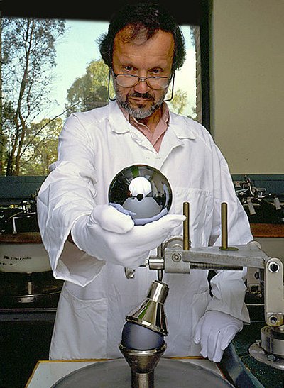
Not nothing, but no great breakthroughs yet. I’ll keep you posted.
On John Neuhart, 1928-2011
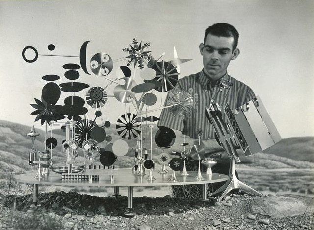
I was very saddened to learn that the great designer John Neuhart passed away last month. He and his wife and fellow designer Marilyn were early and influential colleagues of Ray and Charles Eames, and have been heavily involved in documenting and propagating the history of the Eameses and the Eames Office.
I have long admired Marilyn Neuhart’s work with Alexander Girard, but I most wanted to meet John someday and ask him about his first and [to my mind] greatest project for the Eames Office, creating the Solar Do-Nothing Machine [image above via the scout]
In 2000, Neuhart told the LA Times the story of the making of the Solar Do-Nothing Machine:
I was hired as a graphic designer in the summer of 1957 and was immediately put to work building the mechanical motion displays for the Alcoa solar energy toy, christened the “Do-Nothing Machine.” (Part of a national ad campaign forecasting future uses of aluminum, the Eames Office contribution was one of many solicited from designers nationwide.) Past experience building model airplanes, bookshelves and learning to cut metal in my jewelry class at UCLA had hardly prepared me for what I faced. And the pressure was on; several starts and attempts had been made before I arrived, and the office was facing a looming deadline. We were experimenting with new technologies for which there was little existing experience to fall back upon, adding pressure to the project.
I battled my way through four months of ad hoc, trial-and-error attempts fraught with anxiety. Would I still have a job if this fails? Would my 7-month-old marriage survive the all-night sessions and constant stress? Would I ever get back to graphic design? Was Parke Meek’s ulcer contagious? Finally, I seemed to be on the brink of success. I managed, with advice from co-workers Don Albinson, Parke and Charles, to arrive at a workable system that harnessed solar energy through photovoltaic cells to drive six small electric motors that set in motion a series of decorative pinwheel shapes mounted on an elliptical aluminum platform. We had enough to produce the desired end result–the photograph that would appear in national magazines. My next lesson about the Office was that no one was allowed to even contemplate basking in the glow of success (or to expect praise). It was always on to the next project–in this case, shooting the photograph, wherein I was destined to learn the answer to the age-old question: What did Ray Eames actually do?
At noon one day we started to set up the solar machine and the lights, and by 3 a.m. the next morning we had it placed on a mound of dirt and rocks in front of a sky backdrop that suggested a desert scene. We were all exhausted and irritable by the time Charles started shooting the 8-by-10 images. After a couple of hours, he was on the last sheet
of film. Suddenly Ray screamed, “It isn’t shining!”
Charles emerged from under the camera’s black hood, his hair standing up like a cock’s comb. We all groaned. “What isn’t shining?” he yelled at Ray. “The diamond isn’t shining,” she moaned. “Does anyone know what she is talking about?” growled Charles. “I do,” I said. “She means the diamond-shaped intermittent wheel at the upper part of the machine.” There was stunned silence. Getting it lighted meant more scrambling onto ladders and readjusting the lights. “OK,” said Charles, “If you can get a light on it within 10 minutes, we’ll do another shot.” I ignored the exasperated looks from my fellow staff members and climbed to the top of the ladder to maneuver the light around until Ray shrieked, “It’s shining! It’s shining!”
Charles made the last exposure and we all went home. The next day, when we looked at the six sheets of developed film, you can guess which one was chosen–the one with the shining diamond. I had just passed another rite of passage and now understood Ray’s position in the Eames equation: shining. And, yes, I had a job, my marriage survived and, after more tangential trials by fire, I finally did get back to graphic design. Parke had surgery for his ulcer and made Charles pay for it.
And here is a very nice interview from last year, when Marilyn released her encyclopedic reference book, The Story of Eames Furniture:
Hirayama Masanao Mylar Ghost Master
If I’ve accomplished little else with my grandiose ambitions for my satelloon fetish, it has at least turned me into several people’s go-to guy for odd projects involving shiny balls and/or large amounts of Mylar.
So thanks Michael Dumontier of Stopping Off Place for passing along this video short, Masanao Hirayama Memory Master, which is thoroughly awesome.
Hirayama is a Tokyo-based zine artist, and from the timing and the decor, I would guess this was made as part of Hon to Sakuhin (Books and Works), his just-closed exhibition at Pantaloon, a design/event firm in Osaka. The show traveled the Japanese art book circuit, starting out at Edition Nord and Utrecht in Tokyo.
The un-Google Translate-able single jpg website for the Pantaloon show mentions a transformed cafe, video, and “movie-like sequences,” but has no mention of silent Mylar spirits.
Hirayama Masanao’s website, HIMAA [himaa.cc]
Hirayama Masanao show at Pantaloon, 8.20 – 9.25.2011 [pantaloon.org]
What I Looked At Today: Gerald Murphy
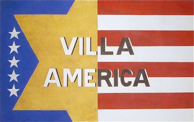
Sometimes I really just am slow to put things together. I mean, I’ve written at length, ad nauseam, even, about the history of Mark Cross. Mondo-Blogo had a huge post months ago about what Superfreaks they are. There’s the whole F. Scott Fitzgerald thing. [Which, truth be told, is probably why I’ve willfully ignored them so long.]
But it’s only now, while reading Calvin Tomkins’ 1962 New Yorker profile on Gerald and Sara Murphy [thanks @maudnewton!] that I’ve taken a first, real look at Gerald Murphy’s paintings.
Well, that, and the fact that MoMA actually has their Murphy, Wasp and Pear, on view for the first time in years. It’s certainly the first time I’ve ever remembered seeing it.
The Murphys fled their uptight, US, 1920s socialite life for France, where they proceeded to invent some combination of summer, the Riviera, and modernism. Under the initial tutelage of Diaghilev designer Nina Goncharova, Gerald took up painting alongside his friends Picasso, Braque, Man Ray, Picabia, and Leger. He stuck with it for seven intense years, then abandoned it completely when his son came down with tuberculosis. Tomkins quotes him as saying that discussions with Picasso led him to realize “I was not going to be first rate, and I couldn’t stand second-rate painting.”
Which, wow, just does not make sense. It sounds like ex post facto rationalization, or dealing with grief over his son’s death, or something but it completely ignores the fact that Picasso himself was often second-rate. I think you just never know until you do. And maybe Murphy did, and knew, but still.
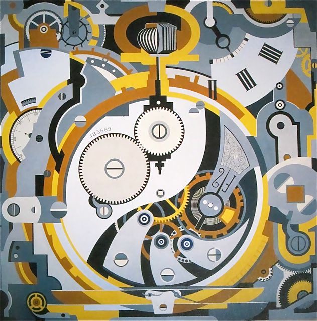
The few paintings that survive [8?] of the few he made [14?] are all pretty great. The Dallas Museum has several, including Watch (1925), an amazing precisionist abstraction that measures an awe-inspiring 6×6 feet. No Sunday painting there.
I’m waiting for the catalogue from the DMA’s 2008 ominously subtitled show, Making It New: The Art and Style of Gerald and Sara Murphy. Which better have photos of Villa America, the Murphys’ pioneering modernist-ized outpost in Cap d’Antibes referred to in my favorite extant Murphy painting [top].
And which also better have more info and more photos of what is now my favorite missing Murphy, Boatdeck: Cunarder, an 18×12-ft masterpiece which took over nearly the entire American section of the 1924 Salon des Independants. Seriously, what Modern was painting 18 feet high in 1923? That is just nuts.
[update: MacAgy originally had Cunarder in the title, and the painting was originally reported to be based on the Aquitania, but Rubin says Murphy said it was the Olympic and the Paris]
Cady’s Got A Gun
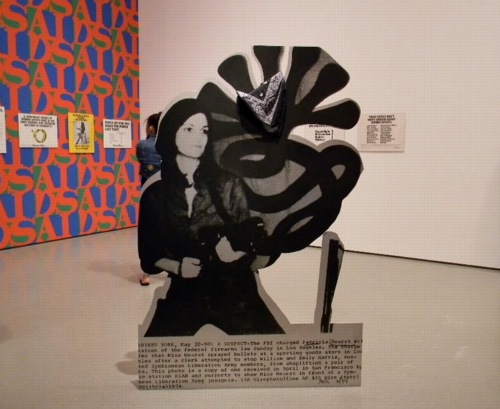
Cady Noland’s Tanya as Bandit, 1989, General Idea, and Guerrilla Girls at MoMA, 2010, image via greeds
Welcome to another installment of Things I’ve Been Meaning To Post For Months. Only this time, the longer I wait, the more examples I see, and so the easier it is to rationalize not having posted these things the first time.
So photo cutouts. These things that blur the line between photograph and sculpture, or object. It started, at least for me, with Cady Noland. She’d do those cutout screenprint on aluminum news photos of folks like Lee Harvey Oswald, or Patty Hearst. Kathy Halbreich installed the latter in MoMA’s 2nd floor galleries last summer.
The image above [via last greeds’ sept ’10 art diary entry] shows Noland’s Tanya as Bandit, 1989–which turns out to be a 2007 gift of Kathy and Dick Fuld, very thoughtful and generous of them–in the politicized polemic gallery, with the Guerrilla Girls, and General Idea’s Indiana-inspired AIDS wallpaper.
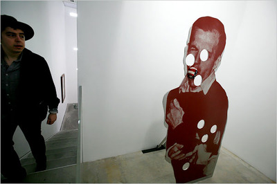
Cady Noland, Bluewald, 1989, Dakis Joannou Collection at the New Museum, image: nyt
And Jeff put Dakis’s Cady of the photo of Jack shooting Lee in that show at Lisa’s place last year. Which is another great/awful tie-in of violence, photography, media and history.
[One of the things that’s held me up was finding something up-to-date to say about Cady Noland’s work, which I admire more and more, but which I didn’t really click with at the time. And reading back on the 1990’s media-centered, post-modernist, white trash America discussions of her work, it all seems a little, so what, you know? Lane Relyea’s 1993 Artforum essay [something something Easy Rider, Land Art, lost American Dream] is good, I guess, maybe a little lyrical. Oh, those simpler times. So I’d really like to find some interesting attempts to engage with her work, and not just wistful wonderings of whether her current withdrawal from the art scene is hardcore late-Duchampian or full-on Salingerian.]
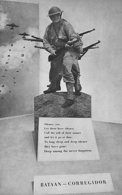
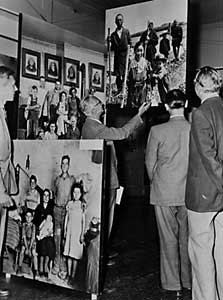
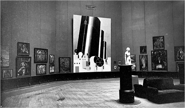
But this gallery was stuck in my head, with Patty’s gun pointing at my brain, when I finally saw the installation shots for Edward Steichen’s propagantastic 1942 MoMA exhibition, Road To Victory in February. It’s a landmark in my little hybrid art history of photomurals. But there’s also this one corner:
image: moma bulletin, oct. 1942, I think
With a giant, life-size photo cutout of Our Boys at Corregidor. I went through the archives for Road To Victory this spring, so when I find my notes of all the photo credits, I’ll add this photographer’s name here. I believe this was a news photo, like Noland’s, but Steichen drew most of his images from the US Navy photo unit he led and from the Farm Security Agency’s photo archive.
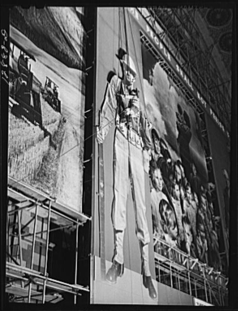
image: loc.gov
The FSA, of course, had already created the giant defense bonds photomural in Grand Central Station in 1941, which also had as its central elements two giant soldier photo cutouts:
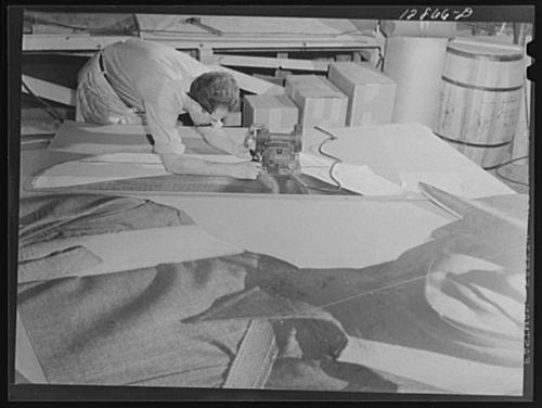
image: loc.gov
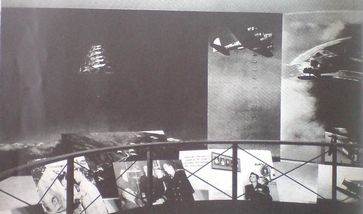
And then by 1942, the FSA had become the OWI, the Office of War Information, where it designed and created propaganda both domestically for civilian consumption, and abroad, as part of Allied military operations. And in the Spring of 1942, they were programming the Channel Garden at Rockefeller Center with these incredible wartime exhibitions, which were basically chock-a-block with giant photo cutouts:
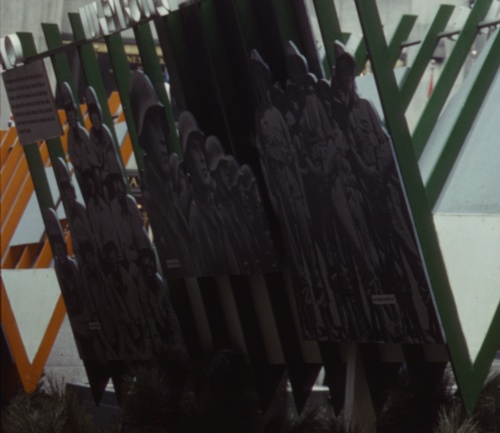
I’m not sure that I have a specific point here, either, except that these cutouts share a context–propaganda, exhibition, war, military, politics–with photomurals; they’re ways to put photography to work, to push and expand it beyond the newspaper, or the book, or the album, the slideshow, or–occasionally–the gallery, wherever it had been hanging out until that point. And at these scales, I suspect photography was taking a lot of its cues from cinema, moving pictures.
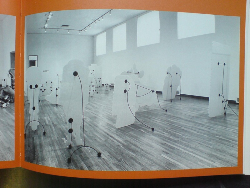
Multiverse, image via kclog
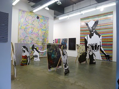
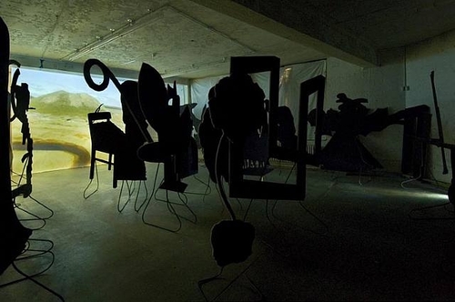
Whatever photomurals are to painting, the cutouts are to sculpture, I figured. Until I saw Matt Jones’ show, Multiverse last Spring at Freight + Volume. Jones’s plywood cutout works are photo, painting, and sculpture all at once, or in turn.
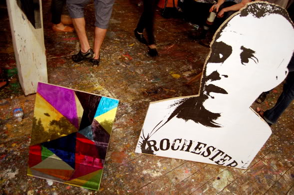
Matt Jones works at HKJB, June 2011, image: 16miles
And then at Control Alt Delete, the one-night studio show organized by HKJB in June, Jones just collapsed the distinctions completely. This pairing in a photo by Andrew Russeth is just so awesome. There’s a screened/painted cutout with a screened/overpainted painting propped next to it. HKJB has a nice photo of the backside, too.
control alt delete installation shot via hkjb
I wish I’d seen it in person, because it looks more effective than the F+V show, which felt a bit dense. Or maybe they’re just different spatial/sculptural experiences.
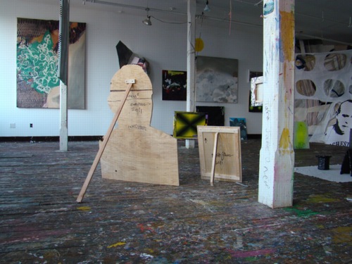
Wade Guyton’s piece at High Desert Test Sites 2, 2003
It didn’t occur to me while looking at the work, but now that I see the F+V press release mentions “Peers of Jones, such as Wade Guyton, Kelly Walker and Josh Smith,” which, OK, it reminds me that Wade used to do these leaning, cut-out, painted sculpture works back in the day. I always really read them as sculpture. I remember one at Kreps in 1998 or so, a big, black rhomboid thing, which appeared to present the spatial gestalt of peer of Guyton Robert Morris, until you walked around back. Photo illustration-derived Potemkin Minimalism. The X’s always seemed like sculpture, too, and graphics, obviously. But they turned out to be paintings. [I listened to Wade this 2006 Frieze Fair talk, “Conceptual Painting,” again while I was painting the other day. Interesting, but it didn’t help.]
Which felt different at the time, though I can see the similarities, from Peter Coffin’s Sculpture Silhouette Props series of 2007. [Saatchi’s got a ton of them here.]
And now that I think about it, and look at the back of that little Jones propped up there, I remember walking into Larry’s office once, and he had this insanely pristine, little, lead prop piece, just beautiful, by peer of Jones Richard Serra. It was so adorable, so domestic, like Labrador-size. And seriously, it must have been stored in a velvet-lined vacuum chamber for the last forty years, how was that surface in that condition even possible?
That silvery lead square propped up on that unbent roll was as much a painting as anything peer of Serra Jacob Kassay has ever done. Or would eventually do, really, because this was probably 2004, since I distinctly remember quietly despairing how, even if I could come up with the money, there’s no way I could get that Serra, or should, because a heretofore unblemished, kid-sized, lickable lead slab sculpture precariously balanced on the floor of a house with a new kid would just end badly for all involved.
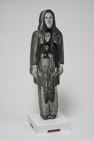
Dale Quarterman, Marvella, 1969, image via cherryandmartin
But anyway. Into the middle of this–my mulling over photo cutouts, that is, which only develops this tangent about prop pieces as I finally blog it out–comes “Photography into Sculpture,” which just opened at Cherry and Martin, in sync with Pacific Standard Time. The headline image is above, Dale Quarterman’s decoupage-y cutout, which reminds me a bit of that Homage to Muybridge series photo Lewitt did around the same time. These cutout/shaped/contoured works seem like examples of the working-over photography got at the hands of conceptualism. Interesting, if not entirely satisfying. [I’d originally said convincing.]
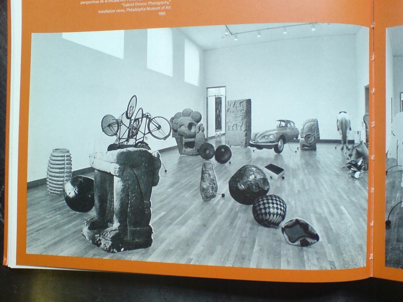
But if it helped till the soil that somehow led to Gabriel Orozco’s 1999 show at the Philadelphia Museum, then it’s fine. The icon, understandably, of Ann Temkin’s show is Black Kites, Orozco’s geometric pencil drawing on a human skull, which is flashy and awesome and all. But it also suffers in a way, as the precious, covetous acquired object of the PMA’s affections. Like Hirst’s skull writ small.
both images via the 2000 moca catalogue
Which is exactly the problem Orozco’s photo cutouts, which made up the bulk of Photogravity, don’t have. These flat, 3-D depictions of elements of his own works, mixed with photos of the Arensberg’s collection of Pre-Columbian artifacts, were slight, obviously derivative, didactic, ephemeral. They were photographic sculptures of photographs of sculptures. Yet they seem to be nearly invisible online. The only Google Images result for them is an art history slideshow at SDSU, where they’re labeled, of course, as “installation.”
[Update: Talked to GO’s people; it’s a single work, and it was shown at MOCA, which I did not remember, and was considered for Tate. So now we know.]
Which doesn’t exactly bring me back to where I started, which was this unexpected or overlooked formalist and subject context for Cady Noland. Or maybe it’s the inverse: Cady Noland as an unarticulated context for this cluster of later [or sometimes nearly concurrent] work. I guess if I’d figured it out more, I would have written it sooner.