
OK, this is quite good. Tom Murphy 7 just released ARST ARSW, all the dialogue of STAR WARS Episode IV: A New Hope re-edited into alphabetical order.
I just watched the whole thing while clearing my inbox, and it is surprisingly interesting. Surprising, I guess, because the concept’s instant graspability seems seductively complete. You think you get it.
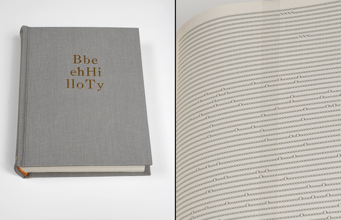
Tauba Auerbach’s Alphabetized Bible (2006) [above] is a bit like that. By alphabetizing the letters instead of the words, Auerbach atomizes not just the meaning of the text, but any hope of meaning at all. It becomes an object made of symbols, signifying nothing.
But that’s not what Tom 7’s film turns out to be. Even chopped so finely, the text, plus the film image and sound, still carry a lot with them. And since the fulltext of Star Wars saturates people more fully than the fulltext of the Bible, the experience of watching ARST ARWS is one of constant recollection and recognition. It feels like watching an actual movie, even though its structure has been obliterated. Not obliterated, but replaced. And that structure turns out to have surprises, tension, and meaning of its own.
To be honest, it starts out slow and kind of muddled with “a,” a word that barely gets its sound right in 201 citations. The first real drama, as Kenny Goldsmith noted, comes with the 20 mentions of “Alderaan.”
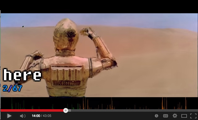
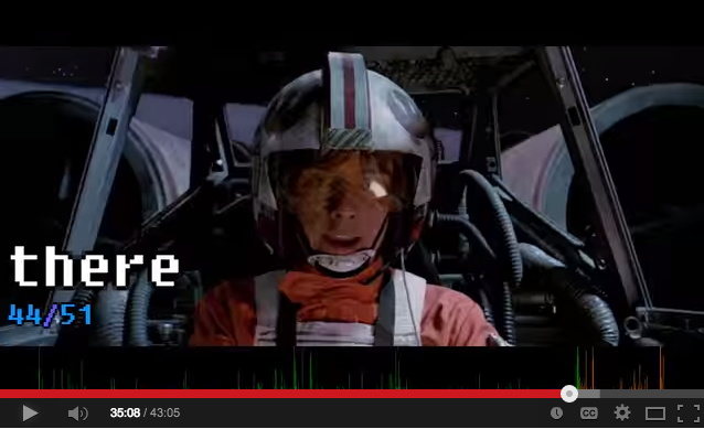
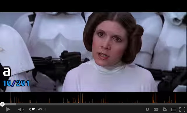
I did not expect it, but “hey” [19], “here” [67], and “there” [51] were very exciting, appearing in scenes of recognizable cinematic immediacy.
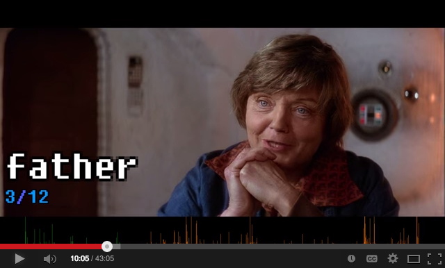
“Father” [12] was almost always said with unhurried purpose, which makes sense, but not with any systematic foreshadowing, which would have been brilliant. [And not beyond notice. According to Wookieepedia, Lucas tweaked the audio in a line of Aunt Beru’s for the 1997 Special Edition: “The line ‘Luke’s just not a farmer Owen. He has too much of his father in him.’ There is a slight pause before she says father and the word “father” is changed to sound more worrisome.” There are, however, no pauses in ARST ARSW, so this change is difficult to register here.]
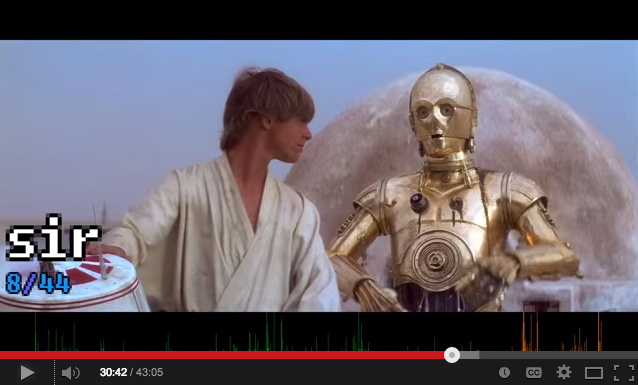
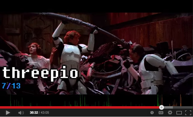
And there are a couple of standout solos [no pun]: C3PO’s “sir” [44] aria gets a response a few minutes later when mostly Luke mostly screams “Threepio” [13]. And though it’s only said once by anyone, Han really makes “worshipfulness” count. Tom 7 himself notes that “lightsaber” also only appears one time. “Death Star,” meanwhile, is two words, and so it dissolves into “Death” [6, but at least one is “death sentence” from the cantina], and “Star” [11].
Like any good film, ARST ARSW leaves you wondering how it was made and eager to see what comes next. The project has yet to appear on Tom 7’s site, but I expect the making of involved some tricky data scrubbing to sync each word with each clip. I’m guessing the subtitle file was used, but anything beyond that’s still in the movie magic category for me. [update: YOW, in the YT comments, Tom says he labeled all the words manually using purpose-built software!]
What I would like to see, though, is the data. Now that every word is synched to every clip, it can be released for remixing. Turn Star Wars into a database for generating whatever text you can imagine.
This has already happened, of course, with news footage, where there’s a whole genre of YouTube videos of remixed presidents saying things they didn’t originally say. The ultimate example for me is still Dan Warren’s 2011 breakthrough, Son of Strelka, Son of God, a mythical epic woven out of Barack Obama’s audiobook recording of Dreams of My Father.
If Tom 7’s process for turning movies into words can be scaled, we won’t need to stop at Star Wars; we could turn every clip of everything into the raw material for anything.
ARST ARSW: Star Wars sorted alphabetically. [youtube]
Son of Strelka, Son of God, by Dan Warren
Category: making movies
Wade Guyton And Anxiety In The Age Of Mechanical Reproduction
Personally, the thing I remembered about Carol Vogel’s puff piece a couple of weeks ago for Loic Gouzer, organizer of “If I Live I’ll See You Tuesday,” Christie’s Edgy Sale, was that she’d used the word “seminal” twice in one sentence. But if I were an artist whose painting was being used as Exhibit No. 1 to illustrate it, I could see how the headline might catch my eye, too: “For Those Who Can Afford It, Christie’s Is Selling Anxiety”.
The sale was supposed to be a “mould-breaking auction,” a “risky operation” meant to “shake things up” with artworks that “capture the raw angst” that the current “generation of rich embryonic collectors” are all hot for.
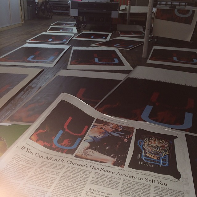
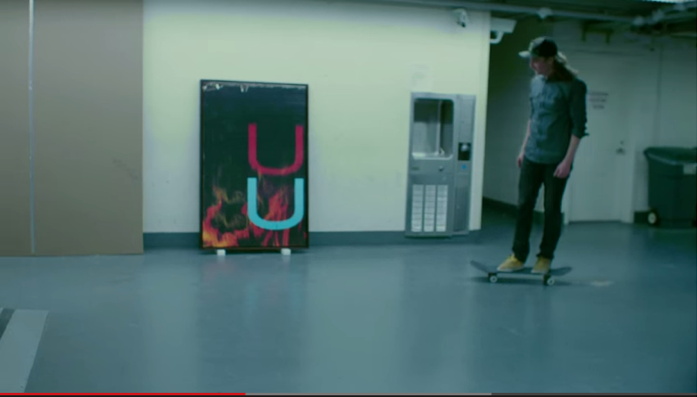
image: burningbridges38/s IG
Christie’s own idea of raw shakeup: a promotional video skateboarding video, showing skate pro Chris Martin tooling through the galleries and the back of the house, passing works and staff along the way. It was the most brilliantly ridiculous thing ever. For a day. Then someone pointed out embryonic auction star Parker Ito’s own YT videos of his skateboarding around his studio. And someone else ran the numbers and realized that many lots were presold via third-party guarantees/irrevocable bids, so the actual angst of the evening’s outcome depended entirely on one’s own market ignorance.
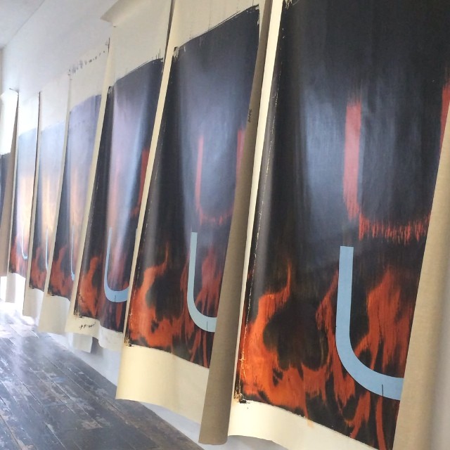
image: @burningbridges38’s IG
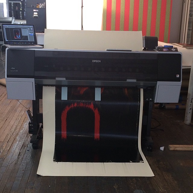
Until Wade Guyton entered the game. Wade’s 2005 painting Untitled (Fire, Red/Black U) had a starring role in the sale, the video, and the Anxiety article. And last week, as the video racked up views and scorn online, Wade introduced some real anxiety–by making more than a dozen new paintings, identical to the one at Christie’s, using the same digital file. He then posted the images to Instagram. They stream out of his trusty Epson inkjet printer, are strewn across the studio floor, and flutter in the breeze like a fiery curtain on the wall.
When she declared a slightly bent & restored aluminum painting destroyed last year Cady Noland reprogrammed all her remaining work, instilling collectors with the fear that the tiniest nick or bump might render their precious object unsaleable. Similarly, by revealing even the hypothetical existence of infinite digital replication–so far, all he’s done is post pictures of canvases to Intagram–Guyton has stripped away the presumption of uniqueness, and has seized his work back from the outsized speculative frenzies that swirl around it. And the greatest part is that he did all this just days before the big sale [where he doesn’t have anything to win, and much, potentially, to lose].
As Jerry Saltz wrote, “Whatever happens tonight, I admire an artist willing to tank his own market by flooding it with confusing real-fake product.” And except that there doesn’t need to be anything fake at all about the resulting works, I completely agree. This is awesome. [Even though it didn’t slow down the sale one bit: Untitled sold for $3.5 million, a record. So win-win, depending on what actually qualifies as a win here.]
36 Links From My Life With Ubu
I’m really stoked to contribute a top ten list to UbuWeb this month.
When Kenny Goldsmith invited me to submit a list, I first tried to come up with some new, revealing, conceptual strategy for generating it. I thought of the top ten most viewed items, and then the ten least viewed. But then I learned that Ubu doesn’t keep logs. I thought of the ten largest files, but then figured it’d just be the longest movies, and big whoop. I thought of a top ten list of top ten lists. And when I worried that I would just be mirroring some taste or trend, I thought of identifying the ten items most frequently included in other peoples’ lists. Several more ideas were patiently disabused out of me, and I began running through my chance operations options.
Then I realized I’d already begun making my list, starting back in 2002, when I linked to ubu.com from my blog for the first time. Ubu at that point was still quite mysterious, and much smaller–mostly ancient and arcane concrete poetry reprints I frankly hadn’t heard of. But I kept coming back. A huge collection of video and audio appeared, Kenneth Goldsmith came out from behind the curtain, seeming much older and august in my mind than he turned out to be–I imagined he was a survivor of this lost underground scene, not an explorer.
Anyway, I assembled my list from twelve years links here at greg.org, highlights from my life with UbuWeb. They’re roughly chronological which has become an indispensable collaborator, not just a source of discovery and inspiration.
International Jarman Blue

I am so stoked to see Derek Jarman’s Blue in the 2nd floor galleries at MoMA. It is truly one of the most formative film experiences I’ve ever had, and it changed the way I thought of both movies and monochromes. And it captured and collapsed art and film and a moment of outrageous, despairing history, when the personal and cultural toll from HIV/AIDS seemed almost beyond hope. Which is a lot for any film to carry, much less one as unusual as Blue.
The last year and a half or so, whenever the radio gets too cloying or annoying, I’ve taken to listening to the soundtrack for Blue sometimes in the car. It’s weird that an angry elegy against indifference, AIDS, and death would be so pleasant. Maybe emotionally satisfying is a better term. But I can easily recall the first times I saw Blue, at the NYFF in October 1993, and then at the New Yorker Cinema during its release.
But enough about me, because there are important things that I still didn’t realize about Blue precisely because my own intense personal encounter with the film blinded me [sic] to them.
Like I knew that Jarman had chosen Blue‘s blue for its reference to Yves Klein, but I did not realize that Jarman had been contemplating a monochrome IKB film for Klein as early as 1974, as sort of a cinematic answer to the painter’s Symphonie Monotone. Blue went through many titles and Klein-centered iterations before becoming what it finally was: a poetic documentary of Jarman’s own life and illness. [A lot of this stuff comes from Rowland Wymer’s 2006 Derek Jarman biography, which is a good read, even if “colour field” doesn’t mean what Wymer thinks it means.]
It very much became a film about Jarman’s losing his sight, and the effective end of his career, even though that’s not at all what it had been before. Because before also meant before all that went down. Blue‘s unchanging monochrome field was able to accommodate whatever content changes Jarman brought to it.
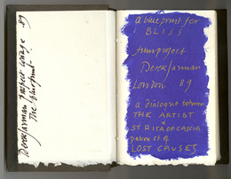 When Blue was still called Bliss, back in 1987, and was a Klein-related companion film to The Last of England, Jarman filled a notebook with dialogue, poems, and IKB monochrome paintings. The Bliss Book and other Blue-related preparatory and archival material will be in “Almost Bliss,” an exhibition next month at Chelsea Space, London, England.
Blue really took its finished form beginning in 1991, not as a film, but as a performance/event. Jarman and Tilda Swinton first performed Bliss at a charity fundraiser for his hospital, sandwiched between a performance of Klein’s Symphonie Monotone and a screening of The Garden. [Which must’ve been quite a night: the Klein’s supposed to be 40 minutes, and The Garden‘s an hour and a half.]

A still of Klein’s IKB 71 (Californie), 1961, which, I have no idea what his film loop looked like, but this one seemed appropriately cinematic. It’s in a private collection, but was at the Met a few years ago.
At first Jarman used a film loop of a Klein monochrome. When the film jammed, Jarman switched to a blue gel. I don’t quite know why, but I find this easy passing between media and image to be fascinating. Bliss‘s blue began as a film of an object, but then the object disappeared, replaced by a light effect. Later, when Blue was complete, and aired simultaneously on Channel 4 and BBC radio, listeners were invited to send for a monochrome blue card they could stare at during the broadcast. A broadcast image replaced by an object.
The project evolved and funding came through in 1992, and Jarman’s own stories became the central theme. All along I figured that Jarman maybe didn’t film anything, that the blue was a chemical aspect of the film print itself. But Wymer’s book says the blue was “electronically produced.” I confess, I find this something of a letdown, even if it means MoMA’s probably OK to show Blue on digital projection rather than film. And it makes me want to do something around or to Blue and its visuals. I don’t know what yet.
#53 Almost Bliss: Notes on Derek Jarman’s Blue, curated by Donald Smith, 29.01.14 – 15.03.14, Chelsea Space [chelseaspace.org]
buy Derek Jarman (2006) by Rowland Wymer [amazon]
JUNE 2014 UPDATE In Issue 165 of Frieze (May 2014), Paul Schütze talked with Simon Fisher Turner about his longtime musical collaborations with Jarman, including the making of Blue.
Turner says they probably did six or seven live concerts of Bliss/Blue before the film. I wonder if any of them were recorded? Also this bombshell:
Derek and I had really big arguments about Blue, because at one stage people wanted to put images into it and I said, ‘You’re mad!’ By then my relationship with Derek was really good. I’d say, ‘Listen, this is really what I think.’ Then he suggested that it would be great to have some gold drifting down amidst the blueness, because he loved gold, or the occasional shadow of movement. I objected and said, ‘Please NO! It has to be pure.’
Yikes.
Olga (2007/2009-)
Recently 20th Century Fox asked me to make a short film to promote the upcoming release of The Secret Life of Walter Mitty. It would be about following your dreams or something, I don’t remember the details too well; there had just been a hurricane in the Philippines that was really bumming me out. So I said sure, dug up a short film no one’s seen yet anyway, and pocketed the entire budget myself.
And so, Olga of 67th Street. I made this short film several years ago, but it’s never really been seen by anyone except the subject, Ms. Olga Bogach. I happened to meet Olga in 2007, and I rough cut the footage together in 2009. I just pulled it off the old hard drive where it had been stuck, and decided to put it online.
Olga was for many years a muse, model, and secretary to artists living in her building on the Upper West Side of Manhattan. I really don’t want to say too much about the video at this point. Partly because it might get reworked a bit, but also because I’m really kind of swamped with other stuff. But mainly because I think the piece is a little complicated, and it hangs together [assuming it does, of course] by the slightest of threads, and to presplain it all would ruin its chances. Olga’s story and especially her telling of it, is so refined, so precise, I still find myself fascinated with listening to her every detail. The Calendar Artist.
Anyway, I do want to thank Olga, and my father-in-law, who invited me on very short notice to accompany him on his visit.
Olga of 67th Street (21:37), 2009-
On Untitled (Beauty Love)
There is beauty in this painting. But the beauty is not what makes you love it.
It’s the emotion of what it says, in very simple means about life. And where we all go.
I don’t know why I get chills from Tobias Meyer’s little promo video for Silver Car Crash (Double Disaster), but here we are.
I matched the audio to Michelle V. Agin’s photo from the Times this morning.
And then after reading Ian Bogost’s McRib essay again, I realized it was the most persuasive explanation I’ve seen of Auction Week. So
untitled (where we all go)
Balling Art In Harlem USA
Oh hi, no, NBD, just a video of David Hammons making a basketball drawing in a skylit stairwell. Shot probably in 2000-01 by EV photographer Alex Harsley.
If you’re one of the three other people in the world who’s seen it on YouTube, let me know. 3 VIEWS, PEOPLE.
And here’s the gang hanging out on the stoop at 4th Street Photo Gallery in, what, 1994? just talking art. There’s the timestamp, Sep.24.1994. Hammons, Herb Gentry, a couple of folks I don’t recognize. From just before Phat Free/Kick The Bucket. “11 views”!
[Sept 2014 Update:Thanks to Mary Anne Rose for correcting me. That’s not Herb Gentry in the fedora after all. Listening to the video again, it turns out he’s named Junior. Also, Rose identified the painter Gerald Jackson in the light blue cap.]
Herb Gentry: “Listen, if you’re an older guy, you should be ahead of that by now.
Hammons: “Not necessarily.
HG: Well, where’re you gonna be?
DH: You can be anywhere. You can be wherever you want to be. This is one of the last places that anything still should go. And it still goes, but nobody’s going with the anything. Everyone has slipped into some category-some formula. And they’re waiting for their formula to show up on the chart. And it ain’t gonna show up.”
Balling Art in Harlem U.S.A. [photodirect’s youtube channel]
Bucket Party [same deal]
Hito, Alexander, October & Yves Peintures
Hang with me, there’s a lot here, and I don’t really have the bandwidth to go into it right now, so I’m just going to slap it up here for now:
Walker Art Center curator Bart Ryan recently talked with Liam Gillick and Hito Steyerl about writing as part of their/art practice.
It’s part of 9 Artists, Ryan’s show about, well, I’m sure the title says plenty. Until I read the 28,000-word catalogue essay, I’m just going with the title. Steyerl’s 2007 work Red Alert is in the show, though. It’s three redscreen monochrome monitors mounted in landscape, a gesture she describes as “the logical end of the documentary genre,”

Pure Red Color (Chistyi krasnyi tsvet), Pure Yellow Color (Chistyi
zheltyi tsvet), Pure Blue Color (Chistyi sinii tsvet), 1921, each panel 24.5 x 21 or so
in a similar way to Rodchenko declaring his 1921 three-panel monochrome, Pure Red Color, Pure Yellow Color, Pure Blue Color represented the logical end of painting.
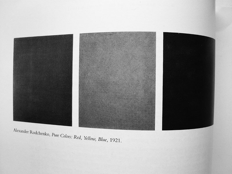
image of October reproduction of Rodchenko monochromes via e-flux
Which paintings now always remind me of a 2010 e-flux journal article about October magazine, which it turns out I’d misremembered a bit, but that’s OK. Bernard Ortiz Campo wondered about art writing and why October only printed black & white images of artworks:
In the spring of 2000 in an article on Nikolai Tarabukin, the journal reproduced three monochrome paintings by Alexander Rodchenko: Pure Red Color, Pure Yellow Color, and Pure Blue Color. These three paintings, reproduced in black and white, resulted in three rectangles showing different shades of gray. As I looked at them, I found myself asking whether it made sense to reproduce them at all. I even entertained the possibility that the reproductions weren’t images of the actual paintings, that perhaps they had been “rendered” by the journal’s photomechanical process, and that the only thing that identified them as paintings by Rodchenko were the captions. I intuited that this extreme case could offer a reason for the black-and-white reproductions–hypothetical, of course, for being the fruit of my speculation, but a reason nonetheless.
I remembered this as imagining that the Rodchenko monochromes themselves didn’t actually exist except as illustrations. And black & white ones at that.
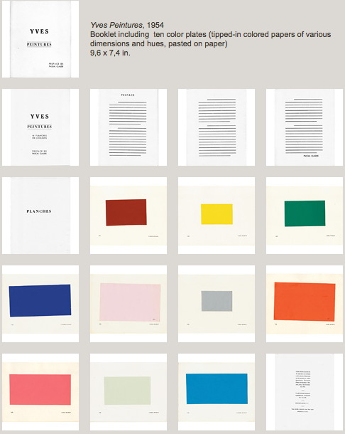
Yves Peintures, 1954, image: yveskleinarchives.org
Which reminded me of one of my absolute favorite Yves Klein works, a book, or maybe it’s a portfolio? More a catalogue. Yves Peintures bears the mind-bogglingly early date of 1954. The Klein Archives lists it as “his first public artistic action.” It is a looseleaf booklet with ten color plates of monochrome paintings that don’t exist.
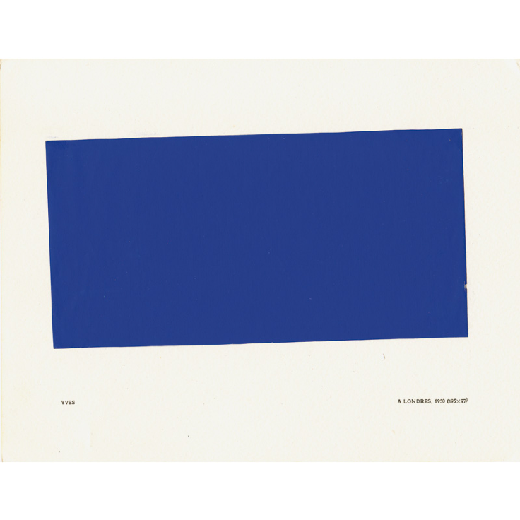
They are commercial samples of colored paper, tipped in and given arbitrary dimensions and locales/titles: a Londres, 1950 (195 x 97); a Tokio, 1953 (100 x 65), &c. The accompanying text, credited to Pascal Claude, is entirely strikethroughs, assuming it was ever any less fictional than the paintings. [Speaking of writing, Philippe Vergne loves Yves Peintures even more than I do; he goes nuts for it in this 2010 essay about how Klein basically started and ended everything ever.]
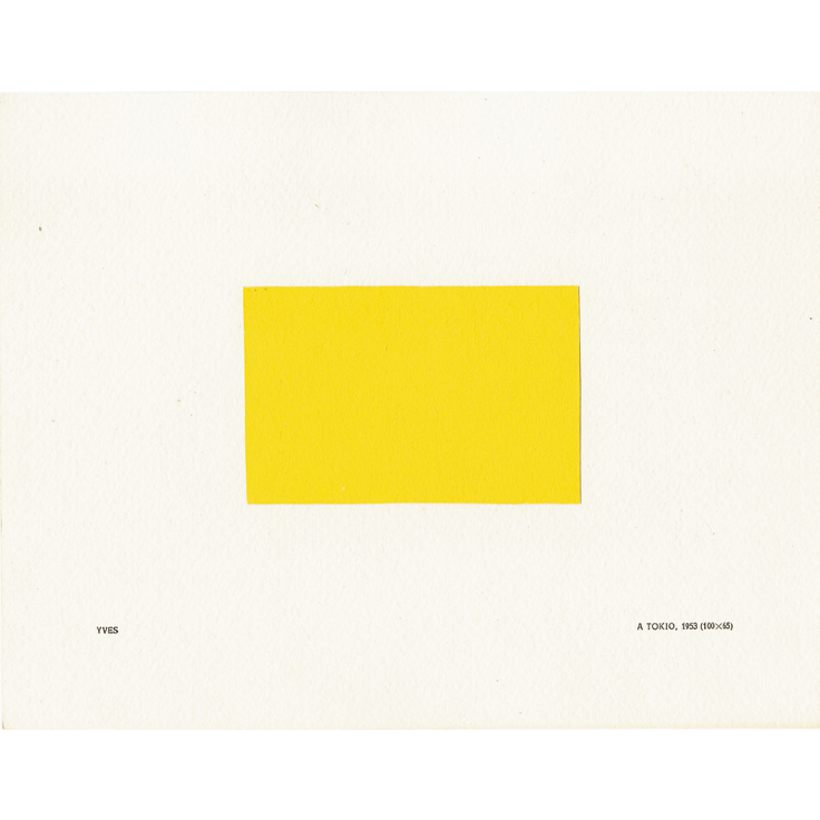
I’ve never been able to figure out quite how many copies of Yves Peintures exist, much less how I will get my hands on one. The Archives illustrates five examples, each different. [Actually the colophon says it was published in a numbered edition of 150, but less than 10 are thought to have survived.]
The Archives has also authorized a facsimile of Yves Peintures, produced by Editions Delicta, in an edition of 400. I don’t know how many variations are in that one, if any. I will guess none. The obvious solution is to make one myself, as the logical end of fictional monochrome artist book making.
Guantanamo Bay: The Hunger Strikes, by Jonathan Hodgson
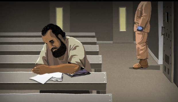
the blue gloves
The Guardian commissioned this animated short by director Jonathan Hodgson about the ongoing hunger strikes by prisoners in Guantanamo. The content and text are all based on testimony of five men who are still imprisoned six years after being cleared for release.
The disturbing treatment depicted in the film is largely dictated by the US military’s standard operating procedure regulation manuals for handling prisoners and administering force feedings.
Guantánamo Bay: The Hunger Strikes – video animation [guardian]
Previously, related: Standard Operating Procedure
On Dennis Johnson’s November
On and off for the last several months, I’ve been soaking in an extraordinary piece of music, and trying to get up to speed on the series of minorly monumental circumstances that are bringing it out of obscurity.
In 1959 Dennis Johnson, a college friend of LaMonte Young, composed November, a six-hour piano piece that basically gave birth to the minimalist music movement as we know it. Young, never shy about his own importance, credits November as the source and inspiration for his own ur-minimalist composition, The Well Tuned Piano. It was all there in November first.
But except for a rough 2-hour recording from 1962, Johnson’s work had faded from consciousness, discussion, performance, and history. And Johnson himself had disappeared from the music landscape. Until musicologist Kyle Gann began investigating it, and reconstructing the score. Then R. Andrew Lee recorded it. And it got released last spring on a 4CD box set.
I found November through musician Ben.Harper’s blog, Boring Like A Drill. The unfolding of November‘s story across several years of posts is convoluted, but really wonderful. Here’s a bit of his description of attending a live performance of November by Lee, timed to the CD release:
Over five hours, the music works a strange effect on the listener. The intervening decades of minimalist and ambient music have made us familiar with the concepts of long durations, tonal stasis, consistent dynamics, repetitions, but November uses these techniques in an unusual way. The sense of continuity is very strong, but there is no fixed pulse and few strict repetitions. The slowness, spareness and use of silence, with an organic sense of rhythm, make it seem very similar in many respects to Morton Feldman’s late music. The harmonic language, however, is very different. Johnson’s piece uses clear, familiar tonality to play with our expectations of the music’s ultimate direction, whereas Feldman’s chromatic ambiguity seeks to negate any feeling of movement in harmony or time.
The semi-improvised nature of November adds another element to a performance. It was interesting to watch Lee relax as he moved from the fully-notated transcription of the piece’s first 100 minutes, into the more open notation that made up the next three hours of playing. He seemed to go into a serene state of focused timelessness, perfectly matching the music he was playing.
November reminds me of a CD by Gabriel Orozco titled “Clinton is Innocent,” on which the artist improvised some random one-handed note clusters that were meant to evoke memories of the piano music of his childhood home. I used some of Orozco’s music in my first short film, Souvenir (November 2001), but for these months now, the coincidence of Johnson’s title has had me rethinking that score.
Late November [boring like a drill]
Gann talking about November on WNYC’s Spinning on Air last August [wnyc.org]
Buy R. Andrew Lee’s recording of Dennis Johnson’s November from Irritable Hedgehog [irritablehedgehog.com]
UPDATE AN HOUR LATER: D’oh, there I go again, I just listened to the WNYC show again.
On Peter Coffin At The Hirshhorn
I’m surprised to not be hearing or reading more about “Here and There,” Peter Coffin’s show at the Hirshhorn, curated by Kelly Gordon.
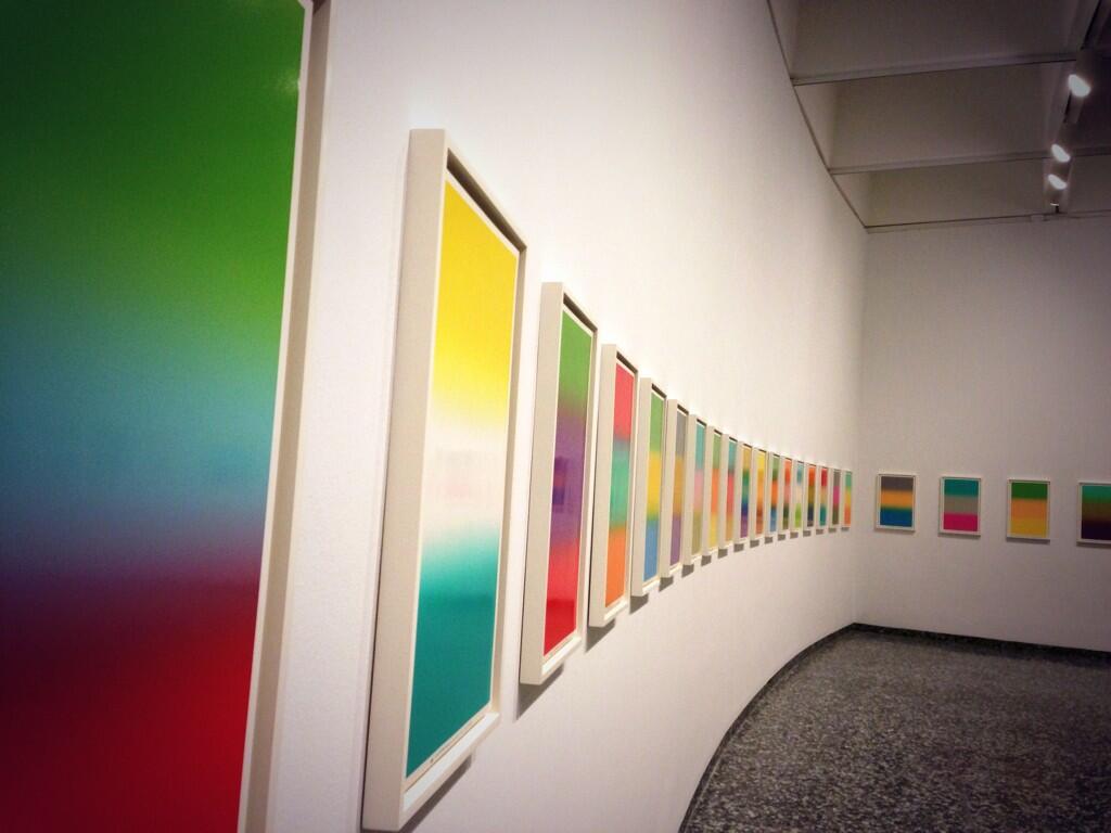
Hirshhorn installation view via @bluelikechagall
Maybe it’s the show’s unusual format; with seven works, it’s bigger than a project, but smaller than a mid-career retrospective, and Coffin’s works are dispersed throughout the museum (and one online). Jane Holzer’s copy of the eyecatching Untitled (Spiral Staircase) is in the courtyard. And my absolute favorite of Peter’s work, Untitled (Designs for Colby Poster Company), is on view, all 80 posters, in the elevator landing. [The Hirshhorn apparently bought Colby Poster in 2008, which was definitely the right time to get it, but the checklist and walltext says these particular examples are Collection of the Artist. I hope there’s a trivial explanation for this, especially now that Colby Poster Company is gone. (RIP). Also, has it ever been shown in the museum before? I don’t think so. I would’ve put that thing up at the end of Warhol’s Shadows instead of that Estate Edition Flavin wall. Just sayin’.]
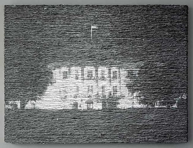
Donald Moffett, Aluminum/White House Unmoored, 2004, image via marianneboeskygallery
Anyway, the big news is the center of the show, a [commissioned?] project, Untitled (Smithsonian Hirshhorn Museum), 2013, a 12-minute animated projection/installation on a dozen or so works from the collection. It’s not so much site-specific as institution-specific and work-specific; each projection is timed and tailored for a particular painting or drawing.
When Donald Moffett first showed projected still video landscapes on paintings in 2003 (above), his silver and gold monochrome canvases served as uneasy, even dubious screens. Coffin, though, has selected a wide mix of figurative and abstract work onto which he projects Jeremy Blake-like animations that overlay their own representational/abstract painterly arguments.
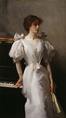
For Jasper Johns’ pastel 0-9 (1962), for example, Coffin articulates each collapsed digit in turn, rendering the illegible temporarily legible. For Sargent’s portrait of random London shipping heiress Catherine Vlasto (1897) [left], Coffin highlights different elements of the picture, including the piano keys, her décolletage, and the gilt frame, referencing the viewer’s own reading process, the very museum experience that has been digitally usurped.
I’ve watched the program through several times, and I got to where I can identify and anticipate favorite passages, moments where the original artwork and Coffin’s projected images work well together (or against each other.) The last 5 seconds or so of the video clip above, for example, where Coffin makes de Kooning’s painting seem to blur in and out of focus, is a standout that deftly addresses the painting’s abstraction.
Overall, though, Coffin’s various animations don’t seem designed for contemplation. Instead they fall under the rubric Gordon calls, “serious fun,” a new, different, and “subversive” way of looking at traditional artworks. I imagine that for many viewers, especially those who wander in from Air & Space, Coffin’s 12 minute loop will be several times longer than they’ll spend strolling through galleries where they can actually see the paintings. In that sense, they’re the apotheosis of a certain kind of entertainment-centric museum-going experience, just what the curator ordered.
Peter Coffin: Here & There runs through Oct. 6, 2013 [hirshhorn.si.edu]
Mao Hope
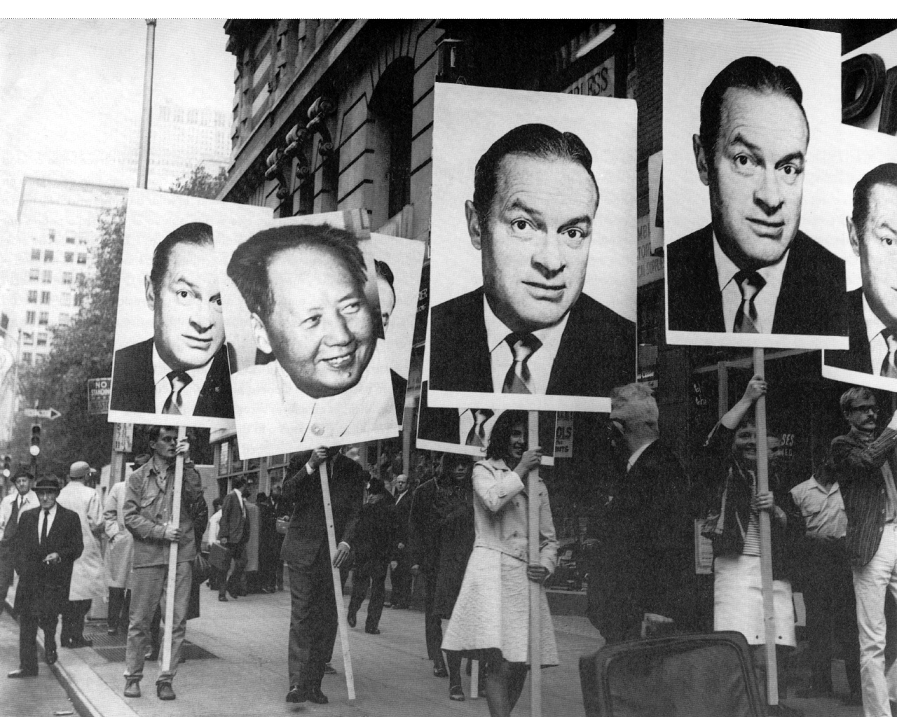
I shouldn’t have to explain, but it’s just really important that this photo get out there even a little bit more. That it should be here. Because seriously, it’s a 1966 march through New York City by people carrying giant head shots of Bob Hope, and one of Mao Zedong.
I’ve been kind of fascinated by different aspects of Öyvind Fahlström’s work lately, so seeing this photo, a still or documentation from Mao-Hope March, on grupa ok reminds me of how few dots I’ve connected yet.
Fahlström was a contributor to 9 Evenings: Theatre and Engineering, the ambitious-but-mixed-but-historic series of happenings, performances, music, and events organized by Experiments in Art and Technology. Folks like Rauschenberg, Whitman, and Billy Klüver kind of soak up much of the E.A.T. limelight, and John Cage and Bob loom especially large, in the remembering of 9 Evenings.
Which is all a way to say that I’ve never really paid attention to Fahlström’s contributions to the program. The Langlois Foundation has a fairly detailed account of the 100-minute performance, titled, Kisses Sweeter Than Wine, which strikes me as one of the most politically charged elements in 9 Evenings.
Performers in Kisses carried Mao and Hope placards live, but Fahlström also showed a short film of a Mao-Hope March shot on Fifth Avenue. No explanation for the demonstration was given to passersby, and none was made in Kisses. But New Yorkers were interviewed by a popular WBAI radio announcer on the scene about whether they were happy. That’s it. [Fahlstrom.com has a complete transcript.]
Mao, of course, was the Communist hegemon looming over Vietnam, while USO veteran Bob Hope was the aw shucks face of the US military. Both, then, stood in for but were at least one degree removed from the actual war. But the associations and allegiances were clear enough that, even if the demonstration’s agenda was not clear, people could easily, reflexively take sides. Me, I am mostly just in awe of the bold and gripping and ambiguous content of those placards.
Some years later Fahlström showed Mao-Hope March as an independent work. MoMA acquired the film in 2009.
Mao-Hope March,1966 [fahlstrom.com]
Öyvind Fahlström | Kisses Sweeter than Wine (performance) [fondation-langlois.org]
A 20-second clip of Mao-Hope March playing at the Pompidou [youtube]
film.factory and Satantango: The Making Of
Jonathan Rosenbaum taught a seminar on American independent film at Bela Tarr’s film.factory, the 3-year graduate film/filmmaking program he’s begun in Sarajevo. How’s that going?
I soon discovered that one of the main reasons why film.factory wasn’t a school was that it was much closer to a film shoot, something Béla knew and understood a lot better. This meant that everything, my screenings and lectures included, was subject to last-minute revisions due to weather, equipment, health, sudden inspirations and other variables. And bearing in mind Orson Welles’ definition of a film director as someone who presides over accidents – along with the dawning realisation that the same vicissitudes might even apply to film historians, and therefore to what we all know as film history – an important part of my own education over my 18 days in Sarajevo was learning how to roll with all the punches.
One good thing about being Bela Tarr is you’re never at a loss for ways to fill a sudden gap in the schedule:
a screening of Béla’s 450-minute Sátántangó one Saturday (the first time [f.f program mgr] Sunčica and nearly all the others saw it), introduced by me. This was followed the next day by Béla lecturing for four-and-a-half hours about how he made it, shot by shot and take by take, using a sort of post-it storyboard as his narrative thread. (As with the film itself, there were two intermissions.)
The workshop before Rosenbaum’s was led by Carlos Reygadas. The one after was by Tilda Swinton, a Socratic dialogue about performers, and it sounds fascinating. Seriously.
a personal report on an adventure called film.factory [bfi via keyframe daily]
On Jack Smith, And Also Agnes Martin
While huh, wtf? investigating the backstory of this tweet this morning, I was reminded of the time Strom Thurmond screened Jack Smith’s Flaming Creatures at the US Senate in 1968:
Some mailboxes that were confiscated by police when Jack Smith mailed his Beautiful Book. Collection, Fulton Ryder. [pic missing]
— Richard Prince (@RichardPrince4) February 2, 2013
Which, wow, has it really been two years since “Hide/Seek”? I found videos of the symposium presentations I was stunned by in 2011:
Jonathan D. Katz on Agnes Martin, abstraction & sexuality, and Zen [“and though she was not a practicing Buddhist, she did her best to both look and sound like one,” strikes me now as a heckuva hook, but keep watching.]
Dominic Johnson on disgust and Jack Smith’s Flaming Creatures, and the context for the Senate hearings and screening, which had been “confirmed” by the courts as obscene.
I assume Johnson’s book Glorious Catastrophe: Jack Smith, performance and visual culture, includes more information on the Thurmond screening. No reviews or discussion of the book yet? Really?
UPDATE With this recollection of that paragon of traditional virtue that was the late segregationist senator from South Carolina, we note the passing of Ms. Essie May Washington, 87, Strom Thurmond’s secret daughter, who was born to his family’s 16-year-old African American maid when Thurmond was 22.
Indie Game: The Movie: The Case Study
Lisanne Pajot and James Swirsky’s story of the making of Indie Game: The Movie is almost as awesome as the movie itself. They’ve done on an epic scale what I’d envisioned doing when I started this blog 11 years ago–and they’ve done much, much more.
And now they’re in the middle of recapping their experience making, marketing & distributing IG:TM, and the tools and platforms they used to do it.
Indie Game: The Movie (IGTM) is very much a product of our times. This film could not have been made & released the way it was five years ago, heck, not even 2-3 years ago. The film, and us, are hugely indebted to the technology, tools and evolving audience attitudes that made all this possible.