A Brief History of Blogging About America Imprisoning Children, 6/X

Everything’s bigger in Texas, including the family prisons. image: ICE

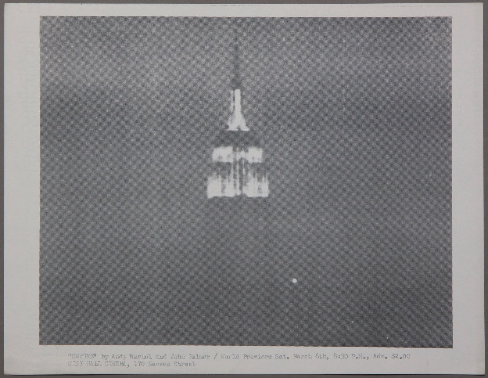
I’ll be honest, when I first heard that the ICE immigrant family detention centers full of Central American refugee kids and moms had animal-themed cell blocks like red bird and blue butterfly, I imagined they were using Eric Carle drawings, and I got a dark, blogging thrill.

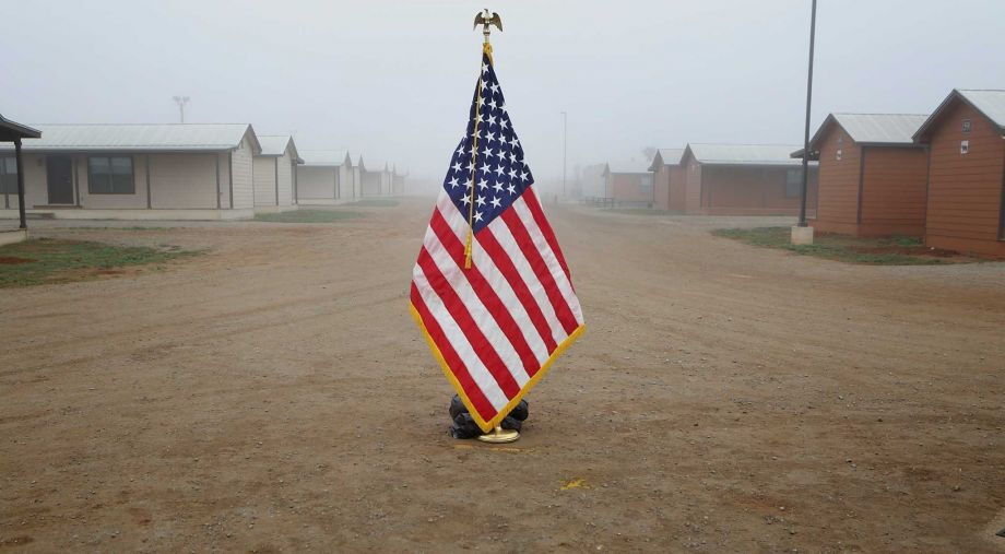
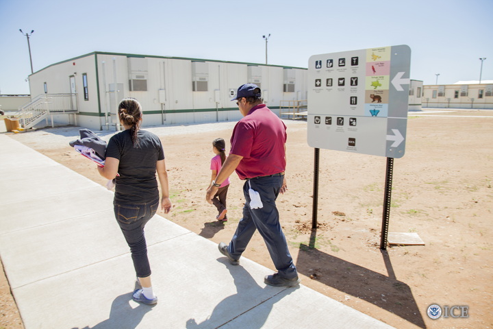
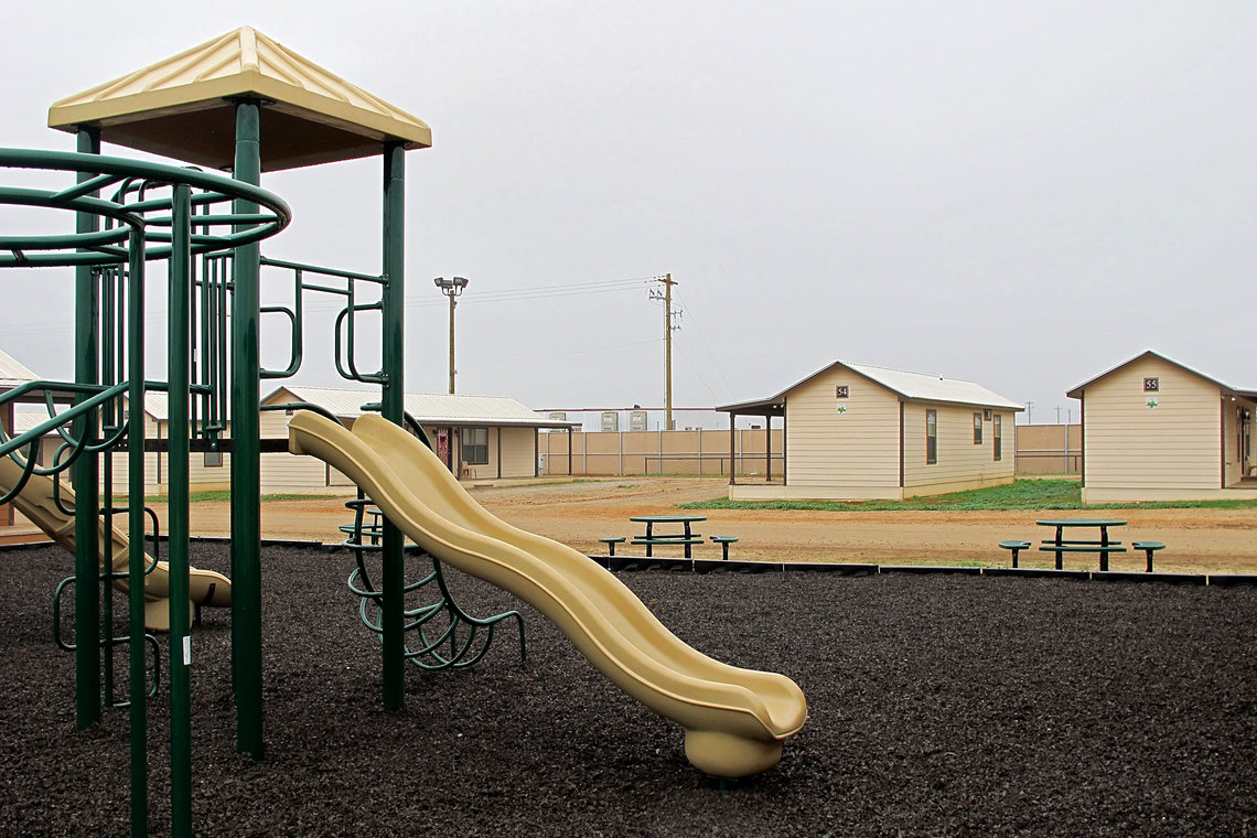
But no. The South Texas Residential Center in Dilley, the largest family detention center in the world, run by the for-profit prison contractor, Corrections Corporation of America, was too cheap to license Carle’s work, and just used random clip art instead.

ICE, ICE, babies.

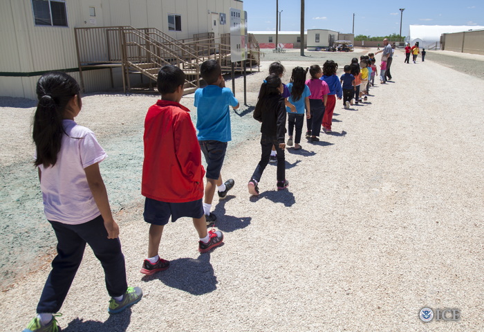
Also, the government’s punitive detention of these people is shameful, and it can’t end soon enough. Most of these families are fleeing war, violence, and abuse in their home countries and have already qualified for refugee hearings the US, but remain in these remote prisons, guarded by actual prison guards, temping in khakis and polo shirts, as a feeble deterrent to other refugees.

Home of the free, land of the brave. image: Bob Owen for San Antonio Express News

I resisted comparing ICE’s outsourced prisons to the desert detention centers Japanese-American families were forced into during WWII, even when I saw Bob Owen’s photo in the San Antonio Express News, which is a damningly straight-up evocation of Dorothea Lange’s photos of the War Relocation Authority’s internment camp at Manzanar, California.

Dorothea Lange, flag and barracks at Manzanar internment camp, July 1942

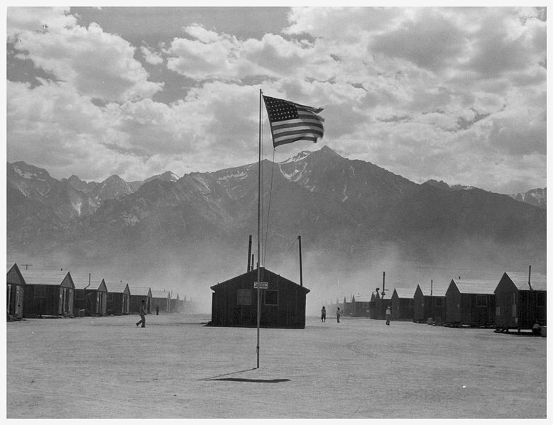
Ansel Adams also took photos at Manzanar, which he published in a book, Born Free And Equal, alongside a text that reads today as disturbingly upbeat in its praise of the gumption and loyalty of American citizens forced into desert prisons. I’ve always viewed Adams’ project as a protest, a condemnation of the injustice visited upon Americans because of the racist fears of their neighbors and political leaders. But that is over-optimistic hindsight. Re-reading Adams’ text now is pretty depressing. To think that it’s all the Constitution and fundamental principle that wartime white America could handle at the time.

Dilley want to build a playground? image: Will Weissert/AP via themarshallproject.org

At least it helps make sense for how this country could get so cross-wise with its own professed ideals today; we really have not changed that much at all. And when I tried to put some evolved distance between the ironies of Adams’ treacly government-reviewed-and-approved fluffing and this account from inside Dilley, I couldn’t. So here it is:

While children wait for their mothers to talk to lawyers and legal aids, they are usually watching kids’ movies dubbed in Spanish, namely Rio or Frozen. The children of Dilley, like children everywhere, have taken to singing Frozen’s iconic song “Let It Go.”The Spanish-language refrain to the song “Libre soy! Libre soy!” translates to “I am free! I am free!” It’s an irony that makes the adults of Dilley uneasy. Mehta recalls one mother responding to her singing child under her breath: “Pero no lo somos” (But we aren’t).

Do you know the chorus of “Let it Go” in Spanish? I did not, but it is one helluva song for kids to be singing in a corporate prison in 2015:

Libre soy, libre soy
No puedo ocultarlo más
Libre soy, libre soy
Libertad sin vuelta atrás
Y firme así me quedo aquí
Libre soy, libre soy
El frío es parte también de mí

I am free, I am free
I can’t hide it anymore
I am free, I am free
Freedom without turning back
And I’m staying here, firm like this
I am free, I am free
The cold is also a part of me

‘Drink more water’: Horror stories from the medical ward of a Texas immigration detention center [fusion.net]
which is basically a re-reporting of this: Immigrant families in detention: A look inside one holding center [latimes]
Ansel Adams, Born Free And Equal, 1944 [loc.gov]
Related: Translating “Frozen” into Arabic [newyorker]
“Let it Go” in 25 languages [youtube]

[Originally published on Daddy Types on July 23, 2015 as Libre Soy, Libre Soy]

Destroyed Derek Jarman Capes: Are There Any Other Kind?

derek_jarman_loft_skycapes_1971.jpg
It’s an accident of timing that I’ve kept thinking of Derek Jarman as a filmmaker with a painting hobby. He was still alive when I saw my first Jarman film, Edward II, and when Blue blew me away. And I felt I knew his story, so I’ve been slow to read his early autobiography, or other books about him; my job was to just catch up and see all his earlier films. It didn’t help that I didn’t really like the paintings shown after his death. His notebooks were more relevant.
But I just saw this photo which changed all that. I wasn’t 100% wrong, but I was close: Jarman’s painting was more formative and influential-and interesting-than I realized. The photo’s from 1971, and it is captioned in Jarman’s dramatic hand:
“The Skycapes 1971 blue pigment on canvas
destroyed in the fire in 1979”
Skycapes has been a Google dead end, or rather a cul de sac for this caption. But capes, capes is where it’s at. In his 1999 biography of Jarman Tony Peake traced the form and concept of the cape to Jarman’s theatrical work, particularly his ideas for a production of The Tempest:

Capes are both practical and sensual, especially when cloaking nakedness. They are geometric: if hung on the wall, they form a half circle. They have mythic overtones: by donning a cape, the wearer can effect a transformation. These qualities, particularly the latter, had considerable potency for Jarman, who now set about working and reworking this new possibility until the capes he produced-and began to hang on the walls of his studio-no longer resembled design, but approached the condition of painting or sculpture.

Now the timing’s a little confusing, because Jarman made a film version of The Tempest in 1979. But Peake notes the project had interested Jarman for years. And Jarman made a clear, laminated cape scattered with dollar bills [or pound notes, maybe?] for the 1969 production of Peter Tegel’s surrealist play Poet of the Anemones. Peake said the two met at Lisson Gallery.
And the walls of Jarman’s riverside loft were lined with extraordinary capes when filmmaker Ken Russell visited and asked him to design the sets for The Devils, a project that consumed most of Jarman’s waking hours in 1970. Exhausted and dissatisfied by the film project and wary of commercial film industry entanglements, Peake wrote, Jarman “chose to concentrate on his capes, some of which he now began to paint, in two main colours, black and blue, but mainly blue: ‘simple sky pieces to mirror the calm.'”
That quote’s from Jarman’s own 1984 memoir, Queerlife, which was published in the US with the title Dancing Ledge in 1993:

1971. The Oasis
The intervening year was spent painting a series of blue capes, which hung on the walls at Bankside. They were simple sky pieces to mirror the calm that returned after the frenzied year of The Devils. That summer was an idyll, spent sitting lazily on the balcony watching the sun sparkle on the Thames. When I wasn’t painting I worked on the room and slowly transformed it into paradise. I built the greenhouse bedroom, and a flower bed which blossomed with blue Morning Glories and ornamental gourds with big yellow flowers. On Saturdays we gave film shows, where we scrambled Hollywood with the films John du Can brought from the Film Co-op- The Wizard of Oz and A Midsummer Night’s Dream crossed with Structuralism. There were open poetry readings organized by Michael Pinney and his Bettiscombe Press. Peter Logan perfected his mechanical ballet, and MIchael Ginsborg painted large and complicated geometrical abstracts.

An oasis paradise indeed, replete with all the essential elements of Jarman’s subsequent accomplishments. Which is, at least, how he himself saw it when he looked back from 1984.
undergroundinteriors_derekjarman_loft_obertogili-2.jpg
Here is a 1971 photo by Oberto Gili of Jarman’s amazing Bankside loft, the top floor of a 19th century wheat warehouse. Which had the floors, the ceiling, the views, the space, but not the plumbing or the heat (thus the greenhouse bedroom). There’s the hammock from the first photo, and a laminated cape which had tools, weeds, and detritus retrieved from the abandoned waterfront. [How far do the similarities go between Jarman and other gay pioneer artists like Robert Rauschenberg? Jarman would’ve spit at the comparison; in a 1984 interview at the ICA he slammed Jasper Johns for being a tool of the CIA. #freequeerstudiesdissertationtopics]
matisse_vence_chasubles_helene_adant.jpg
Henri Matisse cutout designs for priests’ chasubles for Vence Chapel, 1951, photographed in his studio surrounding a Picasso painting, by Helene Adant. image: tate.org.uk
In Ken Russell’s telling of their first cape-filled visit, Jarman “was getting ready for an exhibition called “Cardinal’s Capes.” It’s a phrase which turns up nowhere else, but which makes me think of Henri Matisse, who designed amazing chasubles for priests to wear in his chapel at Vence. They began as cut-outs, and were translated into fabric, and changed with the seasons.
In 1970-71 Jarman had two solo shows, including capes, at the then-new Lisson Gallery, but he grew to disdain the gallery system. He also hated Pop and bristled at working in the long shadow David Hockney cast over the London art scene. He opened his studio for his own damn show in 1972, which Peake says was disappointing [though he sold some work and celebrities turned up for the opening, so what greater success could art hope for?]
He included new capes made from black lacquered newsprint [Rauschenberg?] in a 1984 mid-career exhibition at the ICA. [He was 42.] And in that public talk, he described funding his early features by selling paintings and raising money from his painting collectors.
Anyway, are there any Jarman capes left to be seen? I can’t find any. In 2015, the ICA screened Jarman’s super8 documentation of his 1984 show for the first time, but there’s no visual trace online. And as the caption to the original photo mentions, his earlier capes, including what he called his Skycapes, were destroyed along with Jarman’s and others’ studios in 1979.
By retrospectively titling them with the sky, and using the term “blue pigment” instead of paint, Jarman also seems to be linking the capes to one of his clearest references, Yves Klein. Klein the outrager who said his first artwork was signing the sky. Whose International Klein Blue appeared throughout Jarman’s notebooks in the 80s. Jarman filmed an IKB monochrome painting and projected a loop of it for a 1987 live poetry/music performance event he called Bliss, which became his last, greatest film, Blue, in 1991-3.
klein_uecker_marriage_1962.jpg
Here is Klein at his wedding on January 21, 1962. Rotraut Uecker is wearing an IKB crown, and he is wearing a cape emblazoned with a Maltese cross. They are processing through the raised swords of the Chevaliers of the Order of St. Sebastian. So at least I know what my dissertation will be about. But first we have to solve the problems that there are almost no Jarman Super-8s online; that Klein’s wedding was filmed, and that’s not around, either. And then, of course, all these destroyed capes. There is a lot of work to do.
Previously, 2013: International Jarman Blue
2004:
It’s not just Derek Jarman’s Blue
2002?:
As I lay typing

Richtersgarten

gerhard_richter_garten_sothebys_floor_sm.jpg


Part of me wants to make this post about auction houses shooting coverage, or about editing-generated hype for off-season auctions of off-peak squeegees. But I think I really just wanted to register my disapproval that such videos of such sales of such paintings are now a sufficient hook for attention from the Times. Which even I don’t care about at this point. So it must be the very existence of this video. But that is enough.
[sotheby’s via nyt]

Untitled (I’ll Be Your Mirror), 2016

bill_cunningham_mirror_recto_block_stairgal_105927.jpg
Untitled (I’ll Be Your Mirror), 2016, 70 x 46 in., feathered mirror by Bill Cunningham
The end credits for Richard Press’s documentary Bill Cunningham New York run over Nico and the Velvet Underground’s langorous, “I’ll Be Your Mirror.”
In the 1950s, before he took up a camera and changed the world, Cunningham designed hats for his own label, William J. He also created some unknown number of objets d’art and furniture. Well, at least one piece is known. The fashion illustrator Kenneth Paul Block considered this feather-covered mirror by Cunningham to be one of his most prized possessions.
It is large, 70 x 46 inches, and has an extraordinary patina. It holds the wall like a 50s Bruce Connor or Rauschenberg. I put #painting in there, but maybe it’s #combine instead. Oh wow, I just found this photo of Merce Cunningham dancing Aeon (1961) in a pair of feathered chaps Rauschenberg designed.
merce_rauschenberg_chaps_aeon_sogetsu_walkerart.jpg
Merce performing Aeon (1961) in Tokyo in 1964, photo: Yasuhiro Yoshioka/Sogestu Foundation, via walkerart
Block passed away in 2009 and his partner of over 50 years, artist and textile designer Morton Ribyat, died in March. If you’re interested in buying this work, email or call me whenever you’re ready. If you’d like to take physical custody of it, though, you’d better move fast. UPDATE: And have more than $13,000. Wow.
INFLATION UPDATE As of 2017 we know where the mirror is. For sale here for $60,000.
Sept 23, 2016, Lot 377: AN IMPORTANT FEATHER-MOUNTED MIRROR, DESIGNED AND CREATED BY BILL CUNNINGHAM [stairgalleries]
Previously, related: Untitled (Joan Collins Toile de Jouy), 2015

Untitled (redbox), 2016

redbox_wtf_cady_noland_rgay.jpg
Untitled (redbox), 2016, altered redbox dvd rental kiosk, ratchet nylon web straps, chain, padlock, aluminum tape. installation view via @rgay

Can you claim a work if you have no idea where it is? Writer Roxane Gay snapped this great piece and posted it to Twitter this morning. The web straps immediately made me think of the straps on the previous, Untitled (Shenanigans) piece. There’s menace and violence, but it’s less political here. More Hollywood. The chains are what really make it for me.
Gay is a professor at Purdue, and that brown brick looks familiar, so maybe this was outside a McDonald’s in West Lafayette somewhere. I don’t think it’ll be up for long, but it’s enough for the CV, at least.

THERE IS A TRAILER FOR DEKALOG


Janus Films is releasing the remastered version of Krzysztof Kieślowski’s Dekalog in theaters before Criterion releases it on disc. Here is the trailer.
Seeing Dekalog in theaters in the early 1990s was one of the formative cinematic experiences of my life. I may have to do it again. The kids can find their own way back to school.
‘Dekalog’ Exclusive Trailer: Krzysztof Kieślowski’s Magnum Opus Returns To Theaters This Fall [indiewire]
Pre-order Dekalog (The Criterion Collection) for Sept 27 release [amazon]

EMPIRE ‘by Andy Warhol and John Palmer’

mekas_warhol_empire_premiere_flyer.jpg
Well this looks very nice. It’s an original flyer for the premiere of Andy Warhol’s film Empire, being sold by (or at least with the approval of) Jonas Mekas. It will be signed and shipped with a personalized letter of authentication. Which is a nice touch. Otherwise it’s not clear to me what the going rate is for such ephemera, whether $1,300 for an 8.5 x 11 handout is ripoff or a steal.
Empire was made on July 25, 1964, but didn’t premiere until March 6th, 1965. It was a Saturday, and the screening began at 8:30. [Does that mean it ran in real time? Not quite. Filming began at 8:06 and ended at 2:42. Screening the film at 16fps draws it out to 8h5m.]
What’s interesting to me is the credit, “by Andy Warhol and John Palmer.” Palmer was an assistant to Jonas Mekas, and he is credited with the idea for Empire. [The 18yo had been using the Bolex his mom bought him to shoot the newly lit Empire State Building from the roof of Film Culture‘s offices on Park Avenue South.] Mekas pitched the project to Warhol and eventually helped run the camera, but it was Palmer who made the movie possible by securing the office in the Time-Life Building and the high-capacity camera needed to shoot nonstop for 6.5 hours.
Palmer’s early equal billing on Empire has not survived the Warholian glare. MoMA’s collection entry for Empire namechecks Mekas, but not Palmer; the film is credited solely to Warhol. It would be nice to straighten that out, History.
In her Screen Tests catalogue raisonné, Callie Angell wrote that Warhol “gave” Palmer co-director credit “because it was Palmer’s idea to make a film of the [newly] floodlit skyscraper, because Palmer worked on the film, and also because his mother, Mary Palmer, donated money to get the film out of the lab.”
john_palmer_screentest_253_angell.jpg
ST253, John Palmer, 1966, image: Screen Tests catalogue raisonné
He posed for Screen Tests along with his then-wife, Factory star Ivy Nicholson. Their daughter Penelope was three months old in 1966 when she became the only baby to sit for a Screen Test.
Though he went on to co-direct the tragicomic Edie Sedgwick film Ciao, Manhattan, Palmer’s subsequent IMDb credits are primarily as a camera operator. I wonder if there are stories to hear, or perhaps more uncirculated flyers to procure.
UPDATE: Oh, it always gets better. greg.org reader Terry Wilfong sent a heads up for Palmer’s interview with Steven Watson in Factory Made: Warhol and the Sixties. They talked about making Empire, including the lab’s refusal to return the film without payment in full:

[Palmer] called Warhol from a phone booth. “Ohhh, John, I don’t have any money to pay for thaaaat,” he said. “It will just have to stay in the lab.” Palmer suggested he could try to get the $350 from his mother; if so, he would have to appear on the credits as codirector. The phone went silent for fifteen seconds, Palmer recalled, and then “Andy, in a voice I never heard and will never forget, said, ‘Now you’re learning.'”

very rare original World Premiere bill for Andy Warhol’s EMPIRE 1964 [ebay]

Libre Soy, Libre Soy

dilley_flag_bobowen_saexprnews.jpg
Based on this photo at the opening of the world’s largest family detention center in Dilley, Texas last January, I’d say San Antonio Express News photographer Bob Owen is very familiar with Dorothea Lange’s photos from the Japanese American detention camp at Manzanar, CA. It’s almost like the only thing that’s changed in this country since WWII is now the government outsources its illegal, immoral detention of non-white children to a giant, for-profit prison company.
manzanar_flag_barracks.jpg
And what do kids do in Dilley, besides get dangerously incorrect vaccinations and medical treatment?:

While children wait for their mothers to talk to lawyers and legal aids, they are usually watching kids’ movies dubbed in Spanish, namely Rio or Frozen. The children of Dilley, like children everywhere, have taken to singing Frozen’s iconic song “Let It Go.”
The Spanish-language refrain to the song “Libre soy! Libre soy!” translates to “I am free! I am free!” It’s an irony that makes the adults of Dilley uneasy. Mehta recalls one mother responding to her singing child under her breath: “Pero no lo somos” (But we aren’t).

Do you know the chorus of “Let it Go” in Spanish? I did not, but it is one helluva song for kids to be singing in a corporate prison in 2015:

Libre soy, libre soy
No puedo ocultarlo más
Libre soy, libre soy
Libertad sin vuelta atrás
Y firme así me quedo aquí
Libre soy, libre soy
El frío es parte también de mí
I am free, I am free
I can’t hide it anymore
I am free, I am free
Freedom without turning back
And I’m staying here, firm like this
I am free, I am free
The cold is also a part of me

‘Drink more water’: Horror stories from the medical ward of a Texas immigration detention center [fusion.net]
which is basically a re-reporting of this: Immigrant families in detention: A look inside one holding center [latimes]
Ansel Adams, Born Free And Equal, 1944 [loc.gov]
Related: Translating “Frozen” into Arabic [newyorker]
“Let it Go” in 25 languages [youtube]

For The Archive: Untitled (#rank Gift Bag), 2010

rank_gift_bag_lips_detail.jpg
This post is for the archivists out there, and is inspired by putting away sweaters and Paul Soulellis’s Rhizome post about zip files.
In September 2010 I wrote about what I called the Gala-as-Art Movement.
gregallen-lecture-MED_hyperallergic.jpg
installation image of Untitled (#rank Gift Bag) via hyperallergic
In December I presented an expanded history of Relational Aesthetics For The Rich at #rank, Jen Dalton and William Powhida’s Art Basel Miami Beach follow-up to #class. Both #rank and #class were done for Ed Winkleman Gallery. #rank was actually part of Seven, the independent satellite exhibition. I later put a poorly edited audio/slideshow version of the Gala As Art on Vimeo. I expect I will edit the transcript and images into book form as well.
rank-gregallen-schwag_hyperallergic.jpg
I decided at the last minute to create an edition for the #rank event, and that the most appropriate form was a gift bag. I was reminded of how, staying true to its gift bag nature, I had not explained the edition, and had not identified it as an edition per se, even though, if you looked, there were clues. Up until now, this Hyperallergic photo of Veken and Jesse Lambert was the only public documentation of this edition.
Then I was putting some sweaters away this weekend, and I found a bag of leftover parts from editions that had gone uncollected after the event. I will now describe the edition, its elements, and its development.
The impetus for an edition was the gold-leaf chocolate lips dessert edition created by Kreemart for Marina Abramovic’s The Artist Is Present after-gala. I put edible silver leaf on red wax lips, and repackaged them. I also bought edible gold leaf, which, having never bought it before, I found unexpectedly expensive. I tested with the silver and found it satisfying, but I did not return the gold.
rank_gift_bag_contents.jpg
The lips alone were insufficient, however, and thus the gift bag idea was reached. The color theme came from the silvered lips, which, as the colors of a Diet Coke can, also evoked the autobiographical. I wanted to add a tchotchke, like a LIVESTRONG bracelet, but the lead time was killing me.
rank_gift_bag_contents_detail.jpg
I decided to publish the supporting media for the project the way Doug Aitken had made an artist book for his MOCA Happening. I thought of burning a bunch of DVDs, but I didn’t want to get all designy. I thought of a customized USB stick, but again, I had too little lead time. These two objects merged into one, though, when I found a silicone bracelet with USB memory embedded. I signed and numbered the band, and named each drive with its edition number. I remember after the event, hearing people not realizing it was a USB stick, and thinking oh well, no one gets it, and no one will ever see it.
gala_art_art_gift_bag_usb_scr.jpg
In the few minutes between finding these USB bracelets and opening one again, I imagined publishing the whole thing as an e-book, or a PDF. I’d remembered more texts and fewer videos. Which is why Soulellis’s zip file art publishing stuck in my mind. But that’s the beauty of zip-based publishing: it can take anything. And so they’re here, as Gala-as-Art_Gift_Bag.zip. The contents are as seen in the screenshot above.
The bag also contained a card, in the format of a gala invitation, in which all the artists mentioned were listed as benefit committee members. I have not found the leftover stack of these cards, which were hastily and unsatisfyingly produced on the ground at some Kinko’s in Miami Beach. But when I do, I will document it here.
The bags are similarly suboptimal, looking nothing like their pictures in the Oriental Trading Co. catalog. The silver mylar, however, is just right, and should be properly considered by future historians of the exhibition history of satelloons.
Untitled (#rank Gift Bag) is the second time I’ve introduced an artwork in the context of a presentation. Instead of site-specific, they’re situation-specific. In each case, I took Cary Leibowitz’s practice to heart, and signed something “so you won’t throw it away.” And yet even considering fluxus and James Lee Byars and the stuff I’ve got socked away in storage, I expect that few if any examples of either piece have survived in the wild. I also expect that it doesn’t matter.
So while this doesn’t reconstitute the works, and I’m not inclined to do anything with the leftovers, when it comes to ever discussing the works and their experience, I have changed my position on whether you really had to be there.
Gala-as-Art_Gift_Bag.zip [dropbox greg.org, 254mb]
Previously: An Incomplete History of The Gala-as-Art Movement [greg.org]
The Gala As Art As Slideshow [ibid.]
The Gala As Art, greg.org, at #rank 2010 [vimeo]
Why Ed Winkleman did #rank at the Seven Miami Art Fair [hyperallergic]

Webdriver Torso As Found Painting System

What you need is a system. To keep you going, to avoid artist’s block, to keep the pipeline filled.
I think Lewitt’s cubes were less a system than an idiom. Flavin’s fluorescent tubes, too.
mccollum_shapes_cookie_cutters_petzel.jpg
Shapes from Maine, 2009, image: petzel.com
Allan McCollum’s got a few systems going. Systems are his medium. Define some parameters, calculate the total set, start producing, and don’t stop till you–or your market–drops. The Shapes Project, started in 2005, has 31 billion possible permutations, enough for everyone ever to be born on earth to have one. Personally, I’m largely unmoved by McCollum’s results, but I respect their jawdropping systemic integrity.
on_kawara_date_zwirner.jpg
But On Kawara’s Today Series, now that’s a system I can get behind. It’s a bonus when your system is conceptually tight, also when it can carry you out of this world.
hirst_lying_spot_nyt.jpg
As that Kawara link above mentions, Hirst’s spots are also a system, which operates autonomously and, he’s even hinted, which could continue posthumously. [Kawara’s date paintings and Hirst’s spots were up in NYC at the same time in 2012, and Karen Rosenberg said one series was about time, and the other was about money. I love that.]
Anyway, you want to make sure you don’t get trapped by your system. Flavin had a helluva time with that, especially towards the end. So keep enough irons in the fire, throw a system or two into the merchandise mix. Like Richter’s new Strip paintings; he’ll be able to pull those off the printer till the very last. And he could leave the print queue open in his will, even. [I wish him all the continued health and happiness and look forward to seeing his show at the Beyeler.]
richter_strip_mgp.jpg
One would want a system to be ambitious, to stake a large claim, but to be doable, sustainable, saleable over the course of its realization. When Bruce High Quality Foundation announced their project to recreate all 17,000 objects in the Metropolitan Museum’s antiquities collection in Play-Doh, it seemed daunting. I guess you could say they’ll probably have product available as long as they’re able to keep selling.
PAF_DanhVo_WeThePeople_JamesEwing-0915.jpg.jpg
Danh Vo, We The People, 2014 installation at Brooklyn Bridge Park, Public Art Fund, image: James Ewing
Danh Vo’s We The People project to recreate the Statue of Liberty as 250 separate panels, meanwhile, has a finite end, even though the ridiculously awesome scale of the project seems impossible. On a purely physical object level, this has to be one of my favorite art undertakings ever, a confluence of abstraction & representation, metaphor & literalism, presence & absence. As soon as I get to Vo’s pieces on view in City Hall Park and Brooklyn, I’ll try to write more about it.
From Kawara [solo] to Hirst [factory] to McCollum [vector files] and Richter [digital] we can see a diminishment of the artist’s hand in inverse proportion with the expansion in scope, approaching capitalist nirvana, an industrial-scale infinity.
This is all nice and terribly important, but it’s also prelude to what might be the most ambitious readymade art generation system ever, which I’m totally calling dibs on: Webdriver Torso.
webdriver_torso_screenshot.jpg
Webdriver Torso is the largest of at least four related YouTube accounts which have been uploading randomly generated videos [the pace is currently two videos ever 8-12 minutes] since mid-2013. Webdriver Torso has nearly 80,000 videos now; on all four accounts there are more than 130,000 videos total. Webdriver Torso’s channel now has more than 38,000 subscribers. Where a few weeks ago, almost all the videos had zero views, or maybe one, now videos of seemingly nothing immediately get several dozen views. [The other channels still have mostly zero views.]
Since being discovered and publicized a few months ago, various websites have speculated on the purpose and origin of Webdriver Torso, calling it an alien communications tool, or a crypto-spy numbers station, or a test channel for some video software developer. The most persuasive explanation I’ve seen so far is Italian blogger Paolo B.’s theory that the Webdriver channels are connected with a YouTube uploader development initiative for 3D videos or multiple videos, run out of Google’s Zurich office.
Each video is eleven seconds long and contains ten slides, each with a composition of blue and red quadrilaterals. That’s 1.3 million possible compositions, with more being added at an average rate of one every six seconds. And they all look more or less like a Malevich, or Lazslo Moholy-Nagy’s Telephone Paintings.
moholy_nagy_em3.jpg
So obviously turn them into paintings. It seems impractical to sort through all the videos, looking for some “best” composition. Better to stay true to Webdriver Torso’s random nature, and grab a few. Or even grab one and use it [all], make nine paintings at a crack. Or maybe use the slides in the most recently uploaded file from the moment you make a sale, or the moment you place the order with Chinese Paint Mill. Then it becomes an indelible, but meaningless, marker, an index of its own creation. Like On Kawara’s date paintings, they can be made in various sizes. Maybe you get a giant hard edge monster to anchor an important wall. Or maybe you get a smaller, complete set and grid them up, a la Olafur.
A web storefront that offers paintings in only the compositions from the last few minutes of uploads wouldn’t just reward quick purchase decisions: it would demand it. Out with this fair-wandering nonsense of, “Oh put it on hold for me, I’ll let you know.” and in with Buy It Now. Of course, what’ll happen is that someone will sit there and hit refresh all day, in eternal hope that the next batch of nine will have the Webdriver Torso Mona Lisa in it. [Just a second, gotta check Twitter.]
webdriver_torso_tmpK89znn_00-02.jpg
webdriver_torso_tmpK89znn_03-05.jpg
webdriver_torso_tmpK89znn_06-08.jpg
Ooh, tmpK89znn, which just went up, has some really nice ones in it:
webdriver_torso_tmpK89znn_09.jpg
Let’s see how those turn out.
A timeline of Webdriver Torso [botpoet via @soulellis]
the truth about Webdriver Torso [ventunosu21]

36 Links From My Life With Ubu

I’m really stoked to contribute a top ten list to UbuWeb this month.
When Kenny Goldsmith invited me to submit a list, I first tried to come up with some new, revealing, conceptual strategy for generating it. I thought of the top ten most viewed items, and then the ten least viewed. But then I learned that Ubu doesn’t keep logs. I thought of the ten largest files, but then figured it’d just be the longest movies, and big whoop. I thought of a top ten list of top ten lists. And when I worried that I would just be mirroring some taste or trend, I thought of identifying the ten items most frequently included in other peoples’ lists. Several more ideas were patiently disabused out of me, and I began running through my chance operations options.
Then I realized I’d already begun making my list, starting back in 2002, when I linked to ubu.com from my blog for the first time. Ubu at that point was still quite mysterious, and much smaller–mostly ancient and arcane concrete poetry reprints I frankly hadn’t heard of. But I kept coming back. A huge collection of video and audio appeared, Kenneth Goldsmith came out from behind the curtain, seeming much older and august in my mind than he turned out to be–I imagined he was a survivor of this lost underground scene, not an explorer.
Anyway, I assembled my list from twelve years links here at greg.org, highlights from my life with UbuWeb. They’re roughly chronological which has become an indispensable collaborator, not just a source of discovery and inspiration.

Continue reading “36 Links From My Life With Ubu”

Lead & Glass

kiefer_high_priestess_afno.jpg
The High Priestess/Zweistromland, 1985-89, collection: astrum fearnley museet, best photo ever is actually here at kunstkrittik.no
I fell hard for Anselm Kiefer’s impossible but seductive lead books back in the day. I was in college and just making my way from religiously/symbolically loaded Italian Renaissance to contemporary art, when I found the lush catalogue for Kiefer’s The High Priestess on a visit to Rizzoli in NYC. [NY was then still in the wake of a big Kiefer retrospective, which I’d missed.] It was like the guidebook to the historically saturated, emotionally fraught world Wim Wenders had just captured in his 1987 angels documentary, Wings of Desire.
high_priestess_bythebook.JPG
The High Priestess, 1989, photos by the artist, image of a signed copy available from bythebooklc in Phoenix
After a few years, I cooled a bit on Kiefer, got a bit more context, began to recognize and be [a bit] skeptical of my own susceptibility to the allure of superlative materialism. So the show at Marian Goodman in 1993, which consisted of the contents of the vanished artist’s abandoned studio in Germany–a teetering stack of once-valuable, ruined, dirt-encrusted paintings, and a long table strewn with semen-splattered ledger books–didn’t hit me as hard as it did some folks.
kiefer_books_schjeldahl2-12-1.jpg
20 Jahre Einsamkeit/20 Years of Loneliness, 1971-1991, image via schjeldahl/artnet
[Re-reading it now for the first time in 20+ years, I realize that Jack Flam’s 1992 NYRB essay on Kiefer’s work and the euphoric literature it spawned was the source of my unconscious reboot. I basically internalized Flam’s argument in its entirety; I must have been a hit at parties, parroting that thing.]
Anyway, the point is, I guess, is I have a long and conflicted relationship with artist books, especially the most physically luxurious and sublime ones. I know this. I live this. I make books myself with as little aestheticizing consciousness as possible because of this.
olafur_ivorypress_scr1.jpg
And yet, here I am, swooning like an undergrad at the amazing video of Olafur Eliasson’s A View Becomes A Window, an edition of nine handblown glass-and-leather books produced for Ivorypress, which is on view in Madrid through this week:

Seeing the colored glass samples stacked up around his studio for the last several years, AVBAW seems like the most normal, logical extension of Olafur’s recent work. Which is just the cool, analytical inevitability it needed to get past my sublime defenses.

On Hilma Af Klint


In the era marked by the discovery things like electromagnetic waves, radio, and x-rays, invisible realities beyond visual perception, Hilma af Klint sought to depict the higher/spiritual/imperceptible world in paintings, drawings, and writings that she largely hid from public/male view during her life. It all seems like the future, though, by which I mean the present. It’s uncanny.
Anyway, here’s a documentary where curator Iris Müller-Westermann talks [in Swedish] about the work and practice of Hilma af Klint. The retrospective she organized at the Moderna Museet closed today. It will be in Berlin in June and Malaga in October. [via and a half]

Frank O’Hara And Alfred Leslie’s Lamp

UPDATE: Make that Alfred Leslie and Frank O’Hara’s Lamp [see below]
UPDATE UPDATE Just to be clear, let’s make that Alfred Leslie and Frank O’Hara’s Lamp by Larry Rivers

Obviously the best part of Richard O. Moore’s 1966 WNET profile of Frank O’Hara is the poet reading “Having A Coke With You.” But 2nd and 3rd best are a tossup between footage of New York back in the day, and this totally bonkers, homemade floor lamp in Alfred Leslie’s studio. That’s how awesome that lamp is.
alfred_leslie_studio_lamp.jpg
UPDATE
Thanks to Maureen O’Hara for pointing out that this scene was actually shot in Frank’s loft, and that the lamp was his, made by Larry Rivers.
Though I did wonder how Alfred Leslie’s range included figurative portraits and the large abstract painting behind them, I didn’t wonder hard enough to realize it wasn’t by Leslie at all. [It’s by Mike Goldberg, the subject of O’Hara’s 1957 poem, “Why I Am Not A Painter.”]
Anyway, clips from Moore’s film, as well as other Frank O’Hara interviews and readings are at frankohara.org.
And now that I know a bit better what to look for, here are a couple of additional photos of the lamp in O’Hara’s loft, taken, I believe, by Mario Schifano in 1964:

ohara_southgate_koch_lamp.jpg
l-r: Kenneth Koch, John Ashberry photobomb, Patsy Southgate, Frank O’Hara, lamp

ohara_lamp_berkson_schifano.jpg
l=r: Southgate, lamp, Bill Berkson, O’Hara (seated), Ashberry, Koch (seated)

This bottom one is almost clear enough to reconstruct the lamp, if need be. Oh, wait, yes, Schifano, as seen in Homage to Frank O’Hara, Berkson and LaSueur’s 1988 Pinterest board-avant la lettre, and tumbld by poets.org. So basically, I could take Lamp with Poets here to Canal Hardware and walk out with a complete lamp kit:

foh_lamp_schifano.jpg
And for additional context, here’s at least one other lamp/sculpture Rivers made, this one from 1966.
larry_rivers_blue_lamp_w20.jpg
Blue Lamp looks like a spray painted construction of welded metal scraps and industrial hardware, with a “studio label” and a stock number on the bottom. Acquired directly from the artist, it didn’t sell at Wright20 in 2011, because est. $5-7,000.
USA: Poetry: Frank O’Hara (1966) [youtube via VNY via @jameswagner]
Frank O’Hara – Video [frankohara.org]

Flaming Creatures Not ‘Sanpete Appropriate’

I swear I did not know about this when I put up the last Jack Smith/Flaming Creatures post.
The Central Utah Arts Center has filed a federal civil rights lawsuit against the City of Ephraim in Sanpete County and its mayor, alleging official censorship and discrimination. CUAC was evicted last summer from the city-owned building it had restored and occupied for nearly two decades, and its city funding and school-based programs were canceled after various public officials complained about offensive content in at least two art exhibitions.
The one that started the censor ball rolling, it seems, was a 2011 traveling exhibition which included Jack Smith’s Flaming Creatures. In CUAC’s court complaint, they quote an email where the mayor of Ephraim calls the showing not “Sanpete appropriate.” The City Manager and Economic Development Director of the City then emailed “to share my disgust with the ‘art’ on view.” “I know there are places in the world where smut like this is tolerated but the last place I expected to see it was in Ephraim.” And there it was!
The city had filed suit against CUAC after evicting them, and approved turning the building over to a newly formed arts group, one which promised not to show “abstract ‘contemporary art’ that many residents found esoteric and difficult to understand.”
CUAC is seeking damages, restitution, and attorneys fees, as well as to be reinstated in its former premises. This, even though the organization and its director Adam Bateman have fled to that notorious den of permissiveness, Salt Lake City.
Ephraim art center founder says censorship behind eviction [sltrib via artforum]