Untitled (Avoidable), 2018–

Each of the five elements in Tony Smith’s sculpture Wandering Rocks (1967) has a name: Smohawk, Shaft, Dud, Slide, and Crocus.
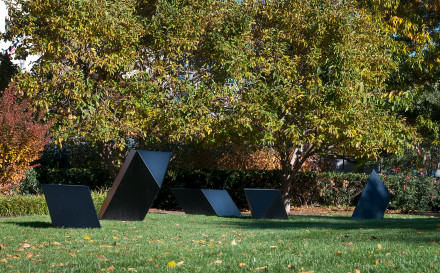
Wandering Rocks National Gallery of Art installation view, image via nga.gov

Of the edition of five, at least one Wandering Rocks is installed indoors. The National Gallery’s is on the lawn [above]. The Seattle Art Museum’s Olympic Sculpture Park’s, which is the artist’s proof, was previously installed on and around a woodchipped path [below].
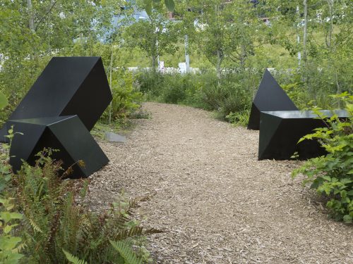
Tony Smith’s Wandering Rocks Olympic Sculpture Park 2012 installation view, image via seattlepublicart.com

Wandering Rocks has since been moved.
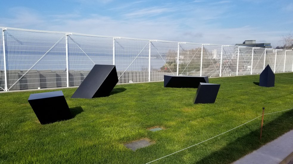
Wandering Rocks, OSP 2018 installation view, image via: tylergreendc

This installation seems a deliberate mockery of the plaque at the OSP, which is a quote from Smith:

What is my intention? It is a new measure of man, in forms of free space, in terms of space that is defined but not enclosed, in terms of measurable space that flows so subtly into the infinite that it is impossible to know where the boundaries of art and nature lie…”

Placing art is hard. Placing sculpture in public is harder still. So many decisions can detract from the experience of art, or can thwart the artist’s intentions. With close looking and self-awareness, it is often possible to overcome these environmental obstacles and appreciate what the artist has accomplished. Additional benefit can be gained by understanding what the curator’s intentions might have been, too, whether or not they achieve them.

For the experienced art viewer, it is a special challenge to appreciate the work and understand its context while identifying the flaws, errors, or shortcomings that mar its presentation. A wonky spotlight. No benches. Audio bleeding from the video installation two galleries away. One or two of these, we can let slide. When such seemingly avoidable distractions pile up, though, and threaten to ruin an art experience, perhaps a conceptual artistic exercise can help.

To deal with unnecessarily problematic encounters with art, I propose to turn the third most egregious or annoying thing about it into a new work of its own. It may not solve the problems you identify, but maybe you’ll get some relief from art’s power to give significance and meaning to your annoyance. Maybe the thrill of discovering installfails and the interpretative exercise of ranking them will become a reassuring relief, if not a delight, when you look at art.

the creative act is not performed by the artist alone; the spectator brings the work in contact with the external world by deciphering and interpreting its inner qualifications and thus adds his contribution to the creative act.

Wrote Duchamp, who could not have imagined a work whose form–indeed, its entire existence–is predicated on the spectator’s decision to conjure it through affront.

Now, I don’t want to uncritically gamify your museum visits. Being compelled to contemplate an artwork about your connoisseurship of annoyance could become infuriating if it begins to intrude on. Every. Freaking. Poorly glazed. Painting. In the place. But it could also lead to an awakening, a liberation from the burdens of the imperfections of the external world, which in turn fosters deeper encounters with the art in front of you. Deciding not to conjure the work by deciding not to log more than one or two annoying things in an encounter is a valid, and powerful, option.
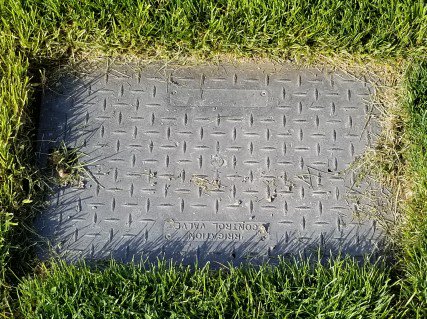
Untitled (Avoidable), 2018, dimensions variable, the third most annoying thing about an art installation or encounter, image: tylergreendc

And so in honor of the eagle-eyed spotting of the sprinkler cover sitting in the lawn next to Wandering Rocks, between the otherwise unremarked-upon stanchions and the steel cheese grater fence, I have designated this work Untitled (Avoidable).

May it be ever at your service. Send pics.

Previously, slightly related:
On Tomason, or the flipside of dame architecture
Tomasons and Akasegawa Genpei, translated

Not Untitled (Sold Out)

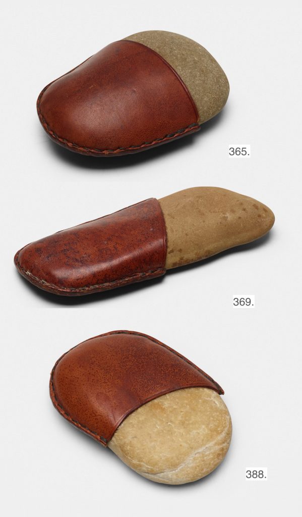
Lots 365, 369, and 388 in Wright20’s art & design sale, 19 Apr 2018

A pre-emptive note: I have seen Carl Auböck’s 1950s-era stone and leather paperweights coming up for auction at Wright20 in a few weeks.

Though they bear a superficial formal resemblance, they do not quality as editions of Untitled (Sold Out).  If you submit them for authentication, please be assured that I have logged their dimensions, patina, and images, and I will know immediately that you did not buy them at a Nordstrom’s Christmas 2016 pop-up shop, so please save me the hassle and you the certain public embarrassment.

19 Apr 2018 Lots 365, 369, and 388: Carl Auböck II, Paperweights, est. $1000-1500 each [wright20.com]
Previously, related but not: Untitled (Sold Out), 2017, Leather-wrapped stone from Nordstrom

Gursky Street View

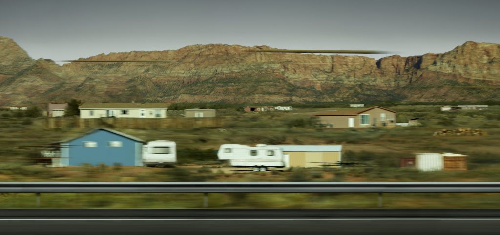
Andreas Gursky, Utah, 2017, at the Hayward Gallery, London, thru Apr 2018

Whether it heals all wounds, time does cool all hot takes. When the Gursky show opened at the Hayward Gallery in January, I was immediately set off by this kicker from Laura Cumming’s review in The Guardian:

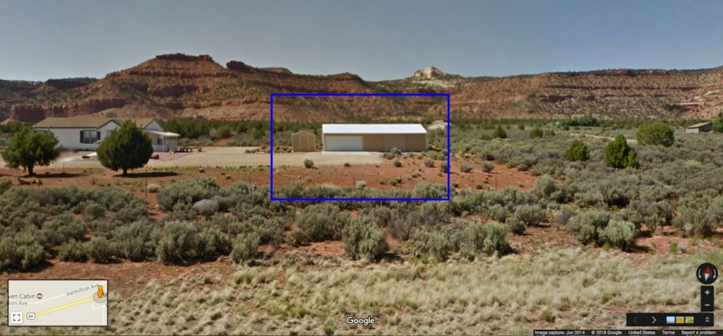
But the show’s masterpiece is unlike almost anything Gursky has made before. It is a new work, a single shot of some prefab houses skimmed on a mobile phone while driving through Utah. The photograph registers the speed of the car racing through the landscape – and modern life – in all its random glitches and blurs. At the same time, the houses look perilously ephemeral against the ancient mountains behind them. This fragile little thing, a spontaneous and disposable shot, is enlarged to the size of a cinema screen – a monumental homage to the mobile phone and the outsize role it plays in depicting our times.

Not just Gursky using a phonecam, but Gursky doing something new? Now that is news.

In addition to the phone and all its quotidian implications, what caught my attention was the subject: Utah. I had, just a couple of weeks before, driven along the very road in southern Utah as Gursky. I was also in the middle of a two-month mess on my server, which necessitated rebuilding my blog and its underlying software and databases. But that could wait until I identified the precise stretch of highway Gursky had captured. So I set out again, on Google Street View.

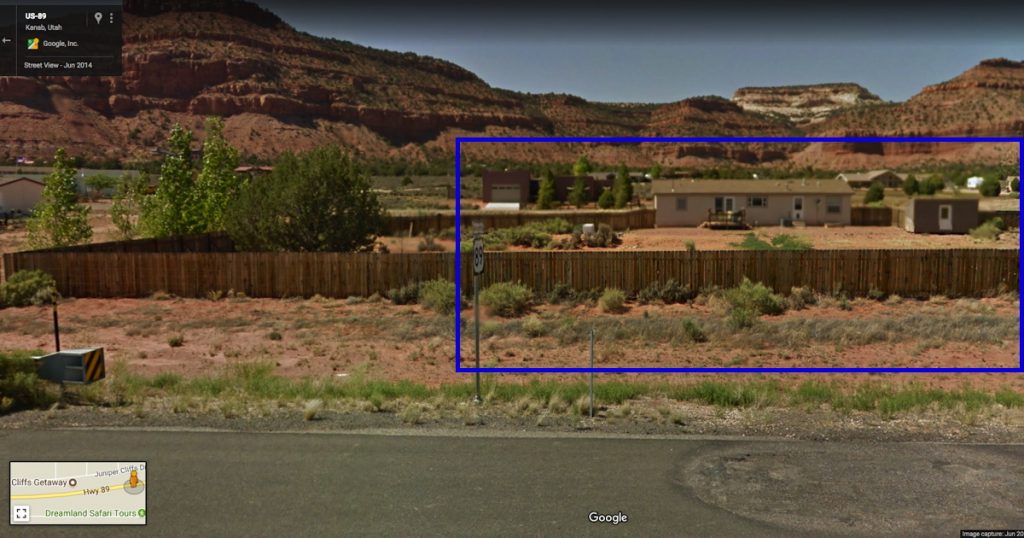
From the geology and the development, it was possible to narrow down the site of Gursky’s photos to the roads around Zion National Park, and east from Zion and Kanab, toward Grand Escalante and Staircase National Monuments. The sections of this rural, two-lane highway with guard rails and fresh blacktop were even fewer. And none of it matched.

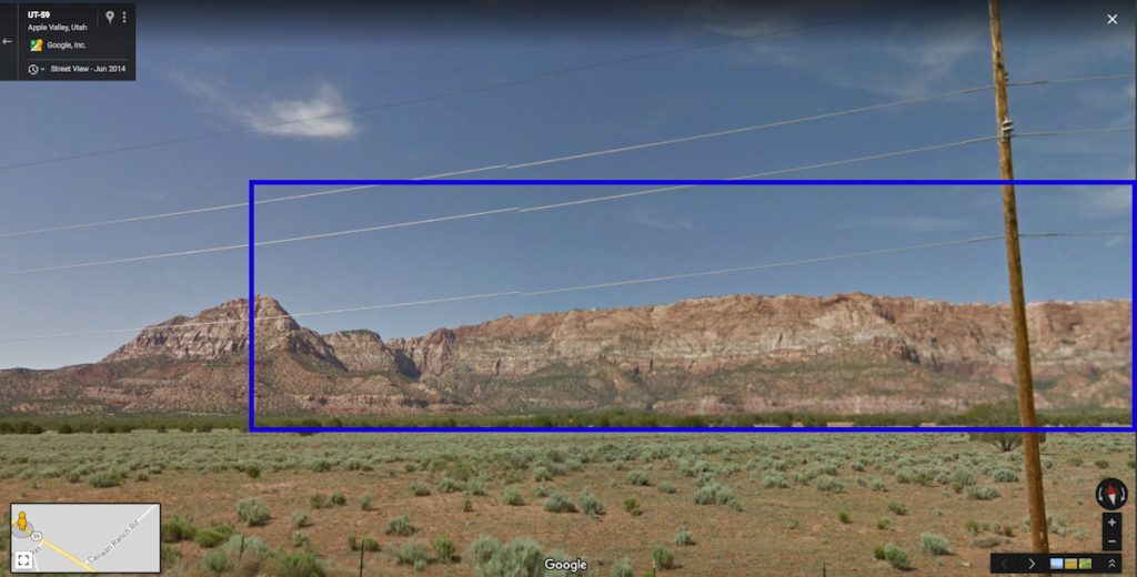
This section of Utah is very sparsely populated, and very few roads cross it at all. So the options dwindled very quickly. But on the road between St George and the border-straddling polygamist towns of Hildale, UT and Colorado City, AZ,  I recognized the striated mountain range immediately. But there were no houses at all.

outside Hildale, UT, image: gsv

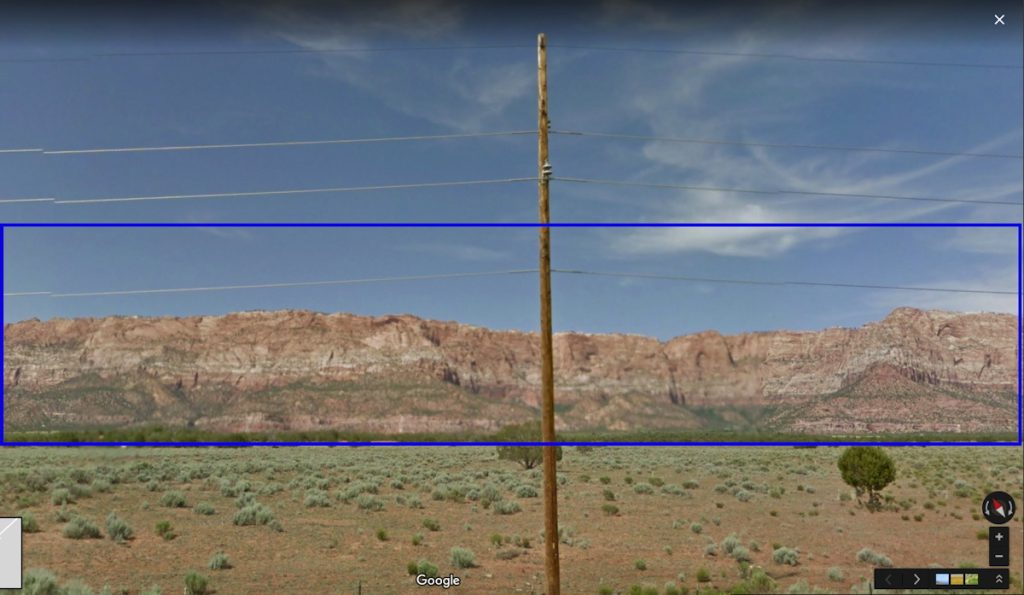
Which, two things: it’s now obviously a composite. But before that, those poles. Gursky’s original image is full of blurs and artifacts, including what are apparently some disembodied pole fragments. These artifacts, coupled with the disparate blur on houses, patios, guard rail, etc., led me to assume Gursky had experimented with an iPhone’s panorama feature from a moving car. That he was exploiting the stitching algorithm of the phone, a source of found digital manipulation.

Google Street View saw what Gursky saw, or vice versa

But of course, this turned out not to be the case. What hit me during these first few days was that this Gursky was being presented as a single image when it was now obviously a composite.

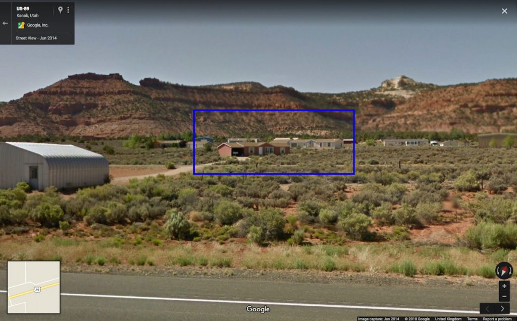
And so I set out to find the site of the other, lower half. Which, with every Streetviewed mile, was turning out to be an entirely fictional, constructed composition. While trying to rebuild my webserver I wandered the highways again, finding this or that house; meanwhile the more accurate version of Gursky’s process emerged: that he’d taken photos with a phone, and then returned to reshoot sites with his regular camera, and–like always–he just fixed the whole thing in post.

So my Gursky bust turned into a Guardian factcheck. And I was left dissatisfied, again, by Gursky’s view, even as I grew intrigued by Google’s. I found myself indexing the differences: vantage point, height, date, blur, glitch, and stitching. I imagined Streetview’s rooftop, panoramic compositor, and Gursky’s passenger driveby–which turned out to be a tripod on the shoulder. And I tried to imagine what it’s like for a maker of ambitiously scaled images to work in a world where giant companies are constantly taking a picture of the entire earth. Maybe the better digital analog for Gursky’s practice isn’t Google at all, but etsy.

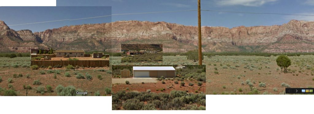
Gursky Street View, v.1, 2018 –

In good etsy form, I have knocked off Gursky’s image by collaging the elements I’ve found. If/as I find more, I’ll add them until…until what? I don’t know, I guess until it’s done, or I get bored. If you see something say something.

Minus Object, Plus-Sized

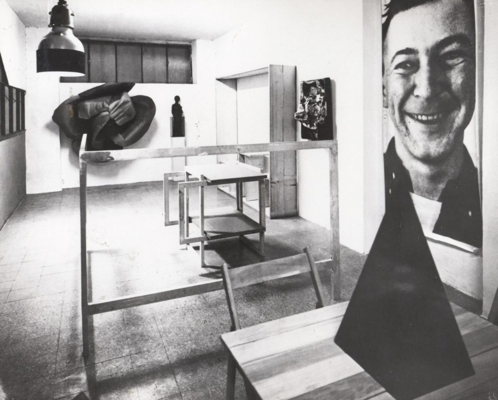
Michelangelo Pistoletto’s Minus Objects installation in his live-in studio, 1965-66; photo: Brassa via Flashart

Thanks to grupaok, I’d been looking at Michelangelo Pistoletto’s Minus Objects a lot when my server ran into trouble last December.

Partly because I’ve been long contemplating tables as a platform for paintings, and Pistoletto made a table out of paintings.

Partly because Minus Objects was Pistoletto’s attempt at breaking [or “dismounting”] the capitalist system that rewarded/demanded artists produce in a recognizable style, and all he did was jump off his own market, and confuse his dealers. [Though curator Germano Celant caught on quickly, and made Minus Objects a critical foundation for his proposition of Arte Povera.] Partly because that whole concept is LMAO now that his selfie-friendly mirror paintings have roared back into vogue, anchoring art fair booths around the globe.

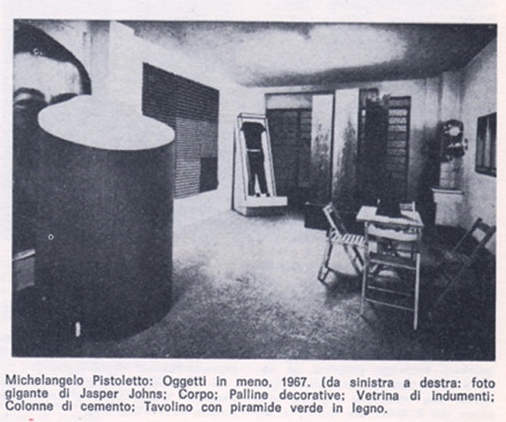
Where’s Jap? A Minus Objects installation shot from the 1967 print edition of Celant’s Arte Povera essay in Flash Art

But let’s face facts, it’s really because of that awesome, giant, unmounted photo of a slightly demonic Jasper Johns.

It looks very different from our post-Struffsky vantage point, but I’d imagine this object was especially problematic for the art context of its day. Just as tables & chairs and cardboard teetered on the functional and material boundaries around art, respectively, this headshot was thwarting the idea that it was just information.

In a conversation with Celant in 2014 [5:00], on the occasion of Luhring Augustine’s capacious restaging of the Minus Objects show in Bushwick, Pistoletto sounded very interested in the space between art and life:

I decided to be directly transforming a feeling or an idea into an object. Being in that condition, the dream of the night became part of the daily life. Because I was living in the studio, in that place, and the work became part of my life. It was like a living activity.

Burnt Rose, 1965, image: luhringaugustine.com

And I had a dream that I was looking around for cardboard, and was cutting cardboard, it was like a recipe to make a rose, that I had in my dream. And getting up in the morning I decided to realize this recipe that I was dreaming in the night. I find the cardboard in my studio, and I did exactly what was the dream, and the work was done.

At the end of the dream I was giving the fire to the center of the rose, and I did it.

Very Johns & Rauschenberg both. Anyway, as he later explained [46:00], the photo of Johns came about in a similar way:

Because I was living the occasion of the moment, and getting up in the morning, the mail arrived. There was an envelope, and inside a catalogue of Jasper Johns, a square catalogue with Jasper Johns, he was smiling. In the morning, I see this face smiling to me, and I say, “OK, I will blow up it.”…I thought this the morning The Smile arrived.


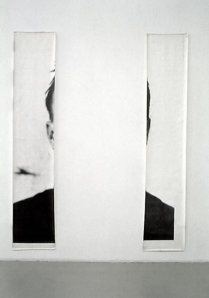
The Ears of Jasper Johns, 1966? 250 x 250? cm, 80 cm each

The installation photos show the single, giant photo.  And I always thought the cutout version, with The Ears of Jasper Johns came later. But Pistoletto says his idea was to make a 2×2 meter photo of The Smile, and that his printer only had meter-wide paper. The two sections are listed as each 80 cm wide. Everything’s 250cm tall. So there are some rounding issues, maybe, and the single pic is listed as 125 cm wide. Whether there was cropping or reprinting or both, I don’t know.

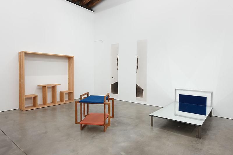
Minus Objects, 2014 installation view at Luhring Augustine Bushwick

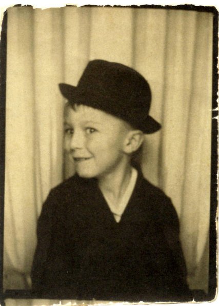
In any case, I was taken with the idea of tracking down the original photo–I assume it’s in the square catalogue for the 1964 Whitehall Gallery show–and making a giant Smiling Johns myself. But I guess sometimes it’s good to wait? Because in the mean time, the press around the show at The Broad helped surface this photo of Johns:

4yo Jasper Johns in a South Carolina photobooth, image probably the artist’s, via nyt , now also Study for Foto di Jasper Johns, 2018, 200x280cm, digital inkjet print

And oh my gosh, now I want to make 2-meter wide versions of this in an edition of a million and hang them everywhere on earth.

Previously, slightly related:
How to make a giant, Steichen-style photomural
How to make an Ansel Adams photomural/folding screen

There Is Another Sheeler Photo Of Baroness Elsa’s Duchamp Portrait

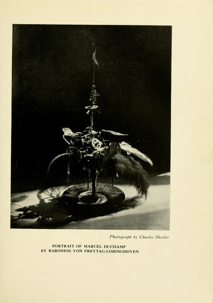
Baroness Elsa von Freytag-Loringhoven, Portrait of Marcel Duchamp, 1920, photo: Charles Sheeler, published in the Little Reiew, 1922. image: brown.edu

After 6 years and 72 issues, I am sure glad Margaret C. Anderson hung in there to publish one more issue of her avant-garde poetry magazine The Little Review in the Winter of 1922. Because it includes a different Charles Sheeler photo of Baroness Elsa’s Portrait of Marcel Duchamp.

The one that’s been floating around, via Duchamp dealer Frances Naumann, mostly, is a more clinical, perhaps Sheeler-esque photo [below].

Charles Sheeler
The Baroness’s Portrait of Marcel Duchamp, ca. 1920
Gelatin silver print
9 5/8 x 7 5/8 inches, via francesnaumann

But besides the dramatic lighting, the Little Review version actually reveals more of the cocktail of feathers, gears, and flywheels that filled Baroness Elsa’s glass. Also it’s sitting on a plate.

All of this matters to me because this, my second favorite portrait of Duchamp after Florine Stettheimer’s, is lost, destroyed. And so this kind of documentation will help make a reconstitution of it truer to the original, and less of an inspired-by approximation.

Brown University and the University of Tulsa have digitized The Little Review as part of their Modernist Journals Project [brown.edu]

Previously, related Elsa-iana: In The Beginning

Untitled (No Evil Befall Thee), 2018

Untitled (No Evil Befall Thee), 2018, latex paint and crayon on door (if I ever refabricate this it’ll probably be written by my dad? idk) , trash bags, installation shot by @JacobGarchik

Vintage wood chopped in half, Biblical evocations written on architecture by anxious parents, folks on Twitter wondering aloud about “exorcism gone wrong?” Sounds to me like New York City’s caught a case of Danh Vo Fever!

[s/o to the OG Twitter Garbage Sculptor Jayson Musson]

44 America: David Hammons’ House Of The Future & America Street, 2007-2017, 2018

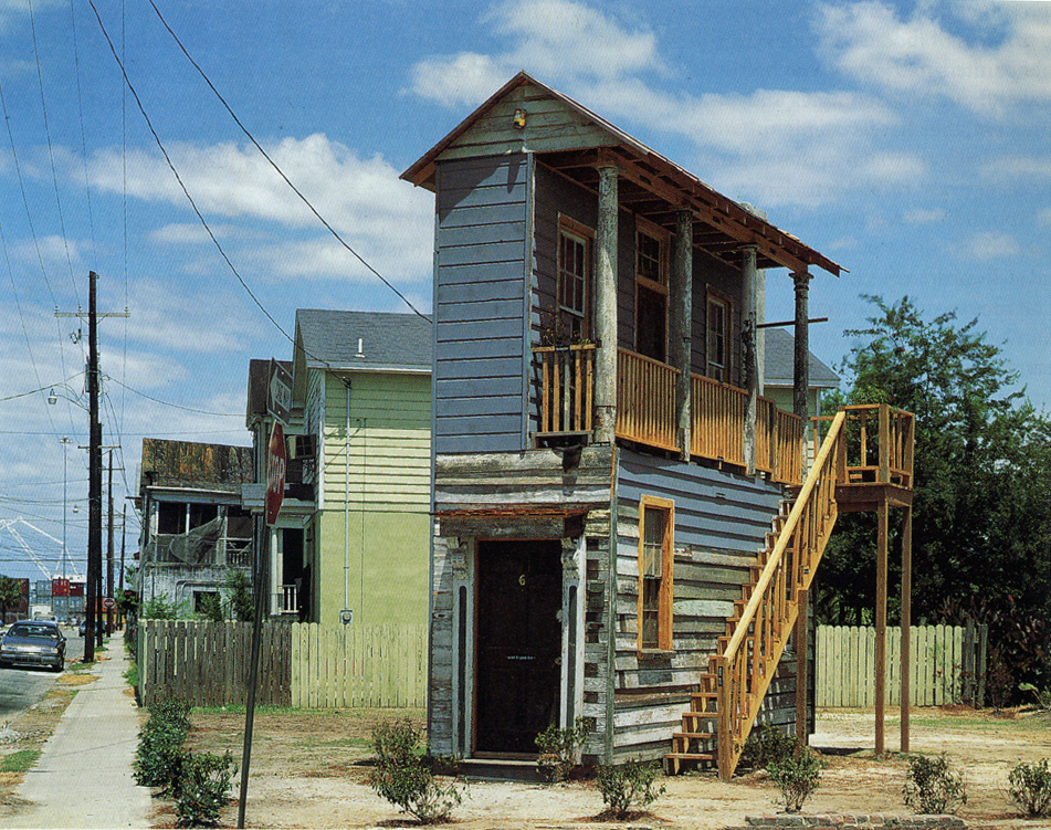
David Hammons & Albert Alston, House of the Future, 1991, photographed in 2006 by ksenia_n

In 1991 the artist David Hammons was invited by Mary Jane Jacobs to create a site-specific work in Charleston, South Carolina for a new, visual arts program linked to the Spoleto Festival. Jacobs had patterned the exhibition, “Places With A Past”, after the Skulptur Projekt Münster. Spoleto founder Gian Carlo Menotti hated the whole thing; the exhibition divided the board and got the director fired (he came back a couple of years later, after Menotti quit), but the show’s art historical reputation has only grown.

That said, Hammons’ is the only one of 61 installations left standing, thanks in large part to his early decision to collaborate with Albert Alston, a local builder, who seems to have maintained and championed the work over the ensuing 27 years.

Hammons and Alston built House Of The Future on a vacant, city-owned lot on Charleston’s segregated East Side using architectural fragments and materials from renovation and demolition projects nearby. It is a 6×20-foot teaching model of Charleston’s signature style, with labels for each component. At some point, a young, local artist used the ground floor as studio space, and Alston oversaw other public programmatic uses. On the back of the House, Hammons painted a quote from African American writer Ishmael Reed:

The Afro-American has become heir to the myths that it is better to be poor than rich, lower class than middle or upper, easy going rather than industrious, extravagant rather than thrifty, and athletic rather than academic.

[Though Reed gets–and takes–credit for the quote, it seems that it actually originates with musician/composer/sociologist Ortiz Walton. Reed quoted Walton’s critical history of cultural exploitation, Music: Black, White & Blue in a 1973 review for Black World Magazine. Reed & Walton seem to have been frequent collaborators and interlocutors, so maybe this is one more of those Hammons/Alston situations. In any case, the quote itself was criticized by some in the community, and it has disappeared and reappeared from the wall of House Of The Future with various repaintings. According to an unrelated 1995 lawsuit by a disgruntled muralist, though, it was integral to the community’s embrace of the installation that helped preserve it after the Spoleto Festival ended.]

Oh, say, can you see?

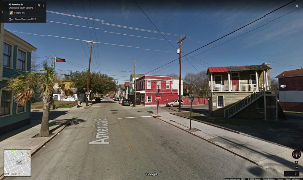
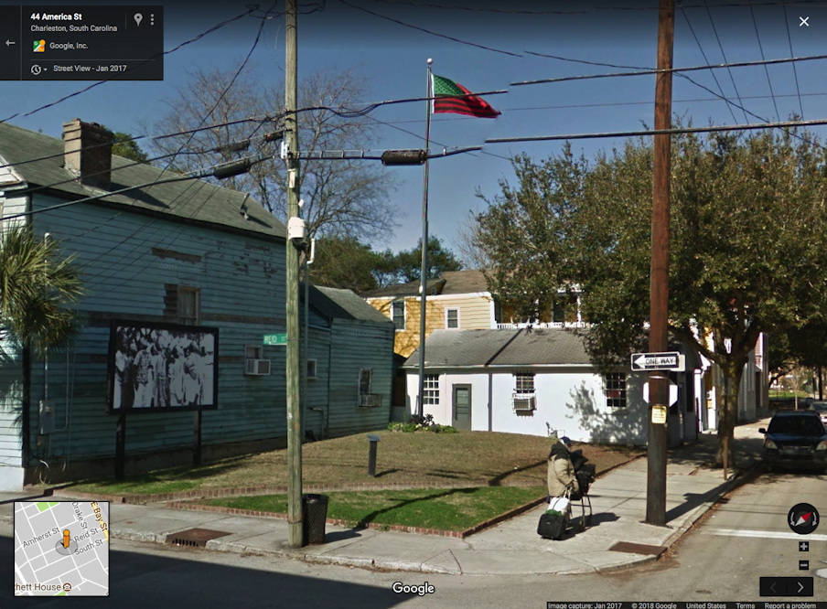
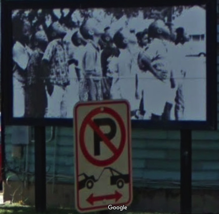
At some point after the May 1991 opening of “Places With A Past”, Hammons’ second element was realized kitty corner from House of The Future. America Street is a small, grassy bump of a park on another vacant lot, where Hammons’ iconic African American Flag flies from atop a 40-foot pole. A black and white photo of a group of children looking up, as if at the flag, filled a sidewalk-scale billboard that had previously featured ads for liquor and Newports. From this 1996 account of the Spoleto fallout over “Places With A Past”, it sounds like the works survived some entropy, if not straightup neglect. But both the flag and the picture have been replaced over the years.

Hammons’ America Street, January 2017
Detail of David Hammons’ America Street, 1991, a billboard photo of local kids looking up, img: gsv, jan 2017

I have not visited Hammons’ piece(s), except in Google Street View. The first thing I noticed was they differed in appearance from the historical photos. I realized GSV’s own decade of historical imagery is useful here, for marking the changes this tiny house and its neighborhood have undergone.

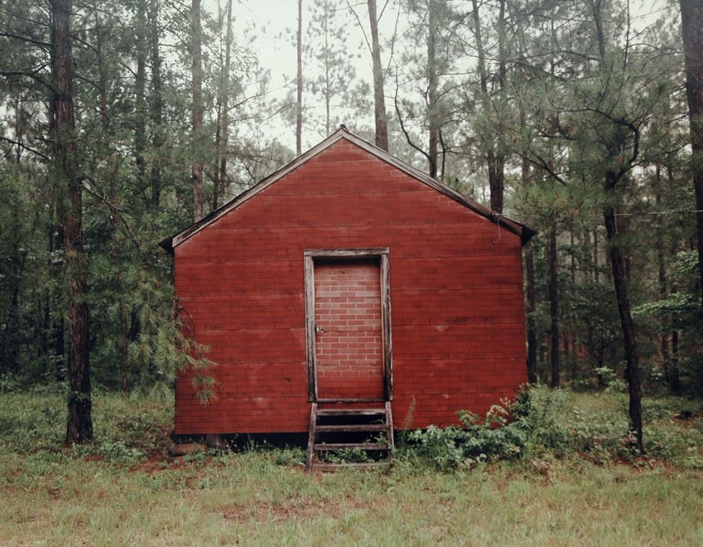
Clicking through the changes wrought by time on a piece of Southern vernacular architecture, I immediately thought of the work of my late neighbor, the photographer William Christenberry. He would travel back to his native Alabama year after year for decades, photographing the same houses, churches, and stores, usually documenting their deterioration and subsumption by kudzu.

William Christenberry, Red Building in Forest, Hale County, Alabama, 1983, image: Hemphill

What I was seeing in Hammons’ and Alston’s piece was the opposite: a structure built from the castoffs of renovation and gentrification, surviving thanks to a small but persistent maintenance effort. And through it all, year in and year out, no matter the storms or racial strife that battered some other flags in South Carolina, Hammons’ star-spangled banner is still there.

In the spirit of Christenberry, I decided to make some historic GSV printsets [prints of screenshots; GSV is a screen medium] of Hammons’ and Alston’s House Of The Future and America Street. I’ve followed Christenberry’s format, but I’m skipping the traditional photographer’s approach of making editions of a bajillion in a thousand sizes. Each set of 7-9 images is printed small (8×10 in.), in an edition of 2, plus 1 AP: one for you, one for the museum, one for me. Because srsly, why overthink it? If anyone actually wants to buy them, I turn into some kind of crazed Amazon artworker pick&packing prints all day? Hard pass right now, thanks. If you don’t move in time to get it, just make your own.

All the pics are after the jump.

Continue reading “44 America: David Hammons’ House Of The Future & America Street, 2007-2017, 2018”

Revisiting Works At The Metropolitan Museum

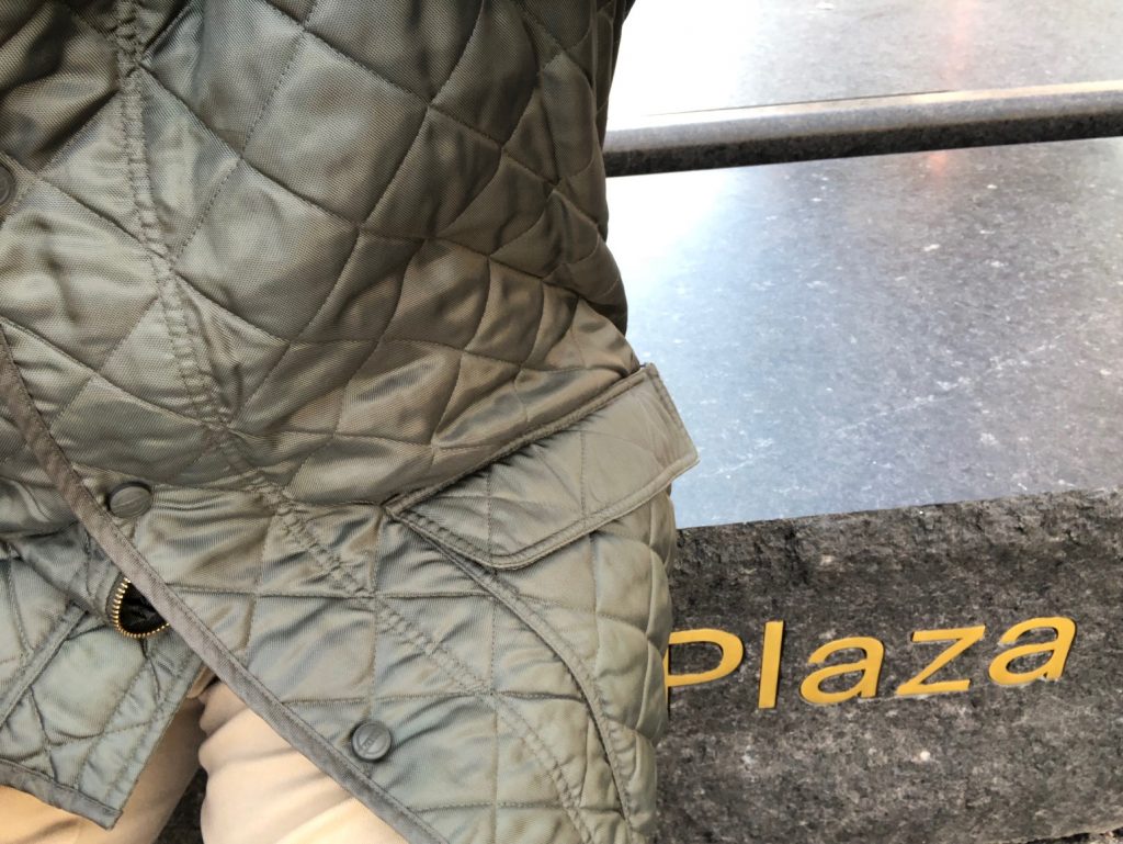
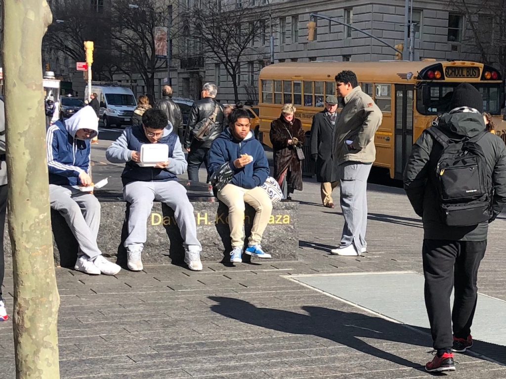
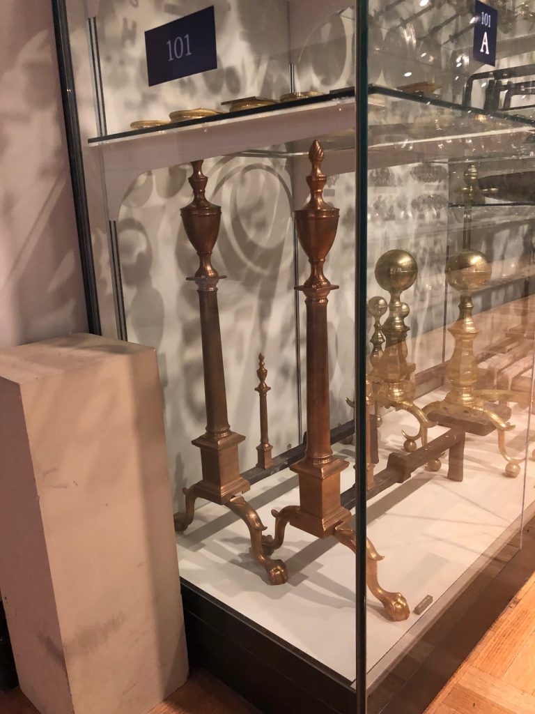
On a visit to the Met this week to see Michelangelo, I also surveyed the status of three works there. As I approached, I figured I’d better perform Untitled (Koch Block) myself, in case no one else did.

I needn’t have worried. The kids are alright.

The #andiron is standing strong. I put in a request to view the photographs in the collection by Mrs. Flora Whiting, the donor of the andiron and many more objects; the appointment is not for several weeks.

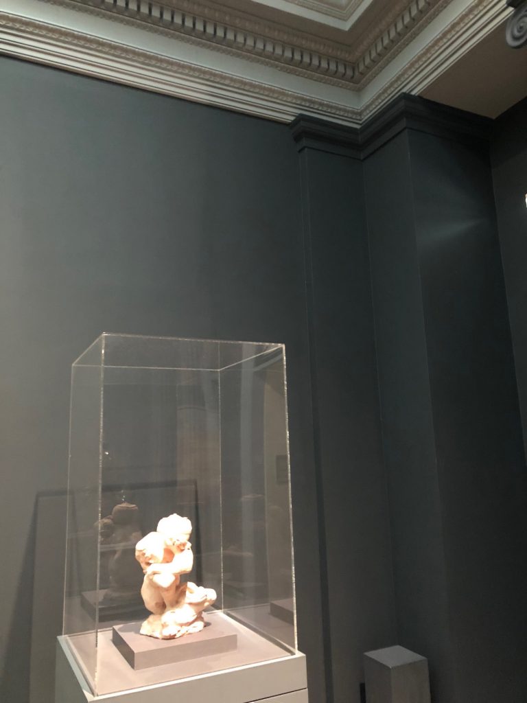
After visiting Anne Truitt sculptures so much lately, I can’t stop staring at the little climate control stele. Maybe I’ll sneak a new coat of paint for it.

Speaking of painting, the Proposte monocrome, gris has been accepted. I’m not sure I agree with the choice, but it was really out of my hands.
I am now doubly intrigued by the stele again, which in this light seems to have been painted a different grey than the wall or the moulding.

Previously, related: :
Untitled (Koch Block), 2014 –
Untitled (Andiron Attributed To Paul Revere, Jr.), 2014
Proposte monocrome, gris, 2017, as photographed by @bshaykin

Untitled (Painted Wall), 2018

greg.org, untitled (painted wall), 2018, installation view
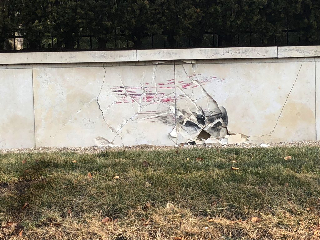
Untitled (Painted Wall), 2018, enamel paint and rubber on limestone, diptych, est. 48 x 144 in., installation view, Jan. 16, 2018, Arlington, Virginia

Once again I am able to take comfort, of a sort, in at least knowing how I am different from Jasper Johns, who, when he once caught a glimpse out the window of a car of a wall painted red and black, did not pull over immediately, and photograph it. We stand on the shoulders of giants in the middle of the street.

previously, related: Untitled (Unpainted Wall), 2017

Our Guernica Cycle – EB-5, 05.06.2017

guernica_cycle_eb-5_1400px.jpg
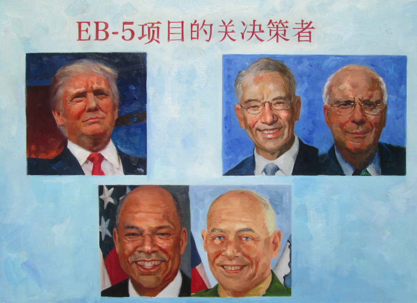
Our Guernica Cycle – EB-5, 05.06.2017, in the style of George W. Bush, 2017, oil on canvas, 50x80cm (20×28 in.)
On May 6, 2017, The New York Times reported, Jared Kushner’s sister met with potential investors in Beijing, trying to raise $150 million for the family’s Jersey City real estate project. She was promoting the EB-5 visa program, which essentially sells US green cards for making a $500,000 investment. Her PowerPoint slide showed photos of “EB-5 Visa Key Decision Makers,” including Senators Grassley and Leahy; DHS Secretaries Jeh Johnson (ex-, obv.) and Gen. John Kelly (now ex-, too, obv., and White House chief of staff); -and her brother’s father-in-law (and boss) Donald Trump.
Jared Kushner still owned major stakes in his family’s business at the time, having transferred only some of his holdings to his other family members when he became a White House employee. He would subsequently revise and refile his financial disclosure forms repeatedly to include previously undisclosed conflicts, contacts, and investments.
Kushner had tried mightily during the transition to secure Chinese investment in his company’s overleveraged flagship property, 666 Fifth Avenue. His efforts failed, and his partner, Vornado, has since declared that their ambitious plan to redevelop the office building into a multi-use megatower-and refinance it at a much higher valuation-was no longer feasible. The property is on track to go bankrupt as early as 2018, putting the Kushner’s equity at risk.
Our Guernica Cycle – EB-5, 05.06.2017 is the second painting in an ongoing series. I now see the Our Guernica Cycle as proceeding in roughly chronological order. It is November, and the outrageous Guernica moments since May are obviously piling up like leaves in the gutter. But the pace of disaster puts us all at risk of forgetting or acquiescing to the obvious wrongs of just a couple of months ago. If painting can do anything at all, it should be able to recalibrate our narrative clocks a bit.
So here is a painting, and a pyramid of prints, of the US president’s family hyping his political power to sell visas in exchange for investing in their private real estate company.
While it is similarly painted in China, in the attempted style of our still-most-relevant painter,
George W. Bush, EB-5, 05.06.2017 obviously differs from the Ivanka / Merkel 03.17.2017 work in several ways. For one thing, it’s done before you decide to buy it. I honestly cannot imagine how this helps. But then, given what we all knew going into it, I could not imagine why anyone, including me, would want to have an awful painting of Ivanka & Merkel in my life, either. Even more than before, this is a case of urgency, of feeling the need for an image of a moment of a crisis to be produced, disseminated, and preserved, even while the crisis continues. To bear witness, to #neverforget.
This work is further complicated by having the actual picture of Trump in it. Could it be any tougher of a sell? On the bright side [sic], the execution of the image is, I believe, more skillfully Bushian than ever. So at least it’s a good bad painting of a corrupt cabal. Right? And anyway, the gradient is probably the best part.
The Modified Kinkade Pyramid is in effect, and all prints will be available in the identical sizes and editions as the first work. However, blighting the image by hand will only take place upon request. So please make a note if you want more blight. The print was made available first to original Kickstarter backers, and now it is available generally, for a limited time. It is discounted 10% because y’all are all VIPs to me, but also to take into account a better sense of actual production and shipping costs. As before, any surplus will be turned back into producing the next images in the Cycle.
Literally no one has asked, but it is possible that the first print, Ivanka / Merkel 03.17.2017 could be made available as well.
Thank you again for your engagement during this ongoing disaster.

Select Print/Edition Size

[via paypal]
Previously: UPDATED: Our Guernica Cycle – Ivanka / Merkel 03.17.2017

UPDATE: Our Guernica Cycle – Ivanka / Merkel 03.17.2017

our_guernica_cycle_ivanka_merkel_gregorg.jpg
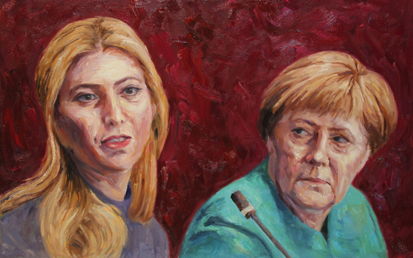
Our Guernica Cycle – Ivanka / Merkel 03.17.2017, 2017, 50x80cm, oil on canvas and associated print editions, greg.org
Happy apparent Birthday, Ivanka!
I’ve been staring at her distorted portrait for so long, it took the shock of the news yesterday to make me realize I have not actually, officially, gone public with the results of the first picture I Kickstarted. “Our Guernica, by Our Picasso,” an historic painting to mark the moment last March when Ivanka Trump turned up in a White House meeting with the leader of the free world, Angela Merkel, executed in the style of George W. Bush.
In the course of production of the pyramidful of print editions, plus some canvases, the project became Our Guernica Cycle, and Ivanka/Merkel 03.17.2017 became the first image, unfortunately, and not the last. I’ve now lived with these images for almost six months. All but two of the project backers have received their merch [the last two canvases are staring at me right now, set to be shipped before the opioid crisis is solved.]
And a new image is complete. It is a moment for reflection. Also a moment to celebrate getting these things out of the house. And I’m still asking the question I started with: what is art supposed to do? What is a painting for? The image I ended up with is terrible. In the process of applying the Kinkade-ian custom “highlights,” I realized they could only and ever make things worse. I started calling them “highblights,” or just “blight.” I gave backers the choice between “more blight!” and “it’s bad enough!” and they split almost evenly. With the last works going out the door, I am still undecided.
What does it mean, too, for an artwork to be experienced only [or largely] privately, by its purchasers? It is the antithesis of a Guernica; it’s My Own Private Guernica. Our Guernica.
The greatest outcome from this project has to be the show of support, the collective, shared outrage combined with an open-eyed engagement with art, even knowing it will not solve the horrible problems looming all around us. 59 people bought prints that didn’t exist of an image that hadn’t been created yet, in order to see it happen. And that is amazing, and I am very grateful. Maybe the real Our Guernica is the friends we make along the way.
Six months later, though, we’re obviously not through this. The world has not ended [I’m writing this at 11:39 on Monday night. Oh, I’m just about to publish it at 1PM on Tuesday.] The world has not ended, but our town square is still being strafed by Nazis. So Our Guernica is Our Guernica Cycle. What does that mean?
Chapman_Insult-to-Injury_Great-deeds-against-the-dead-2003.jpg
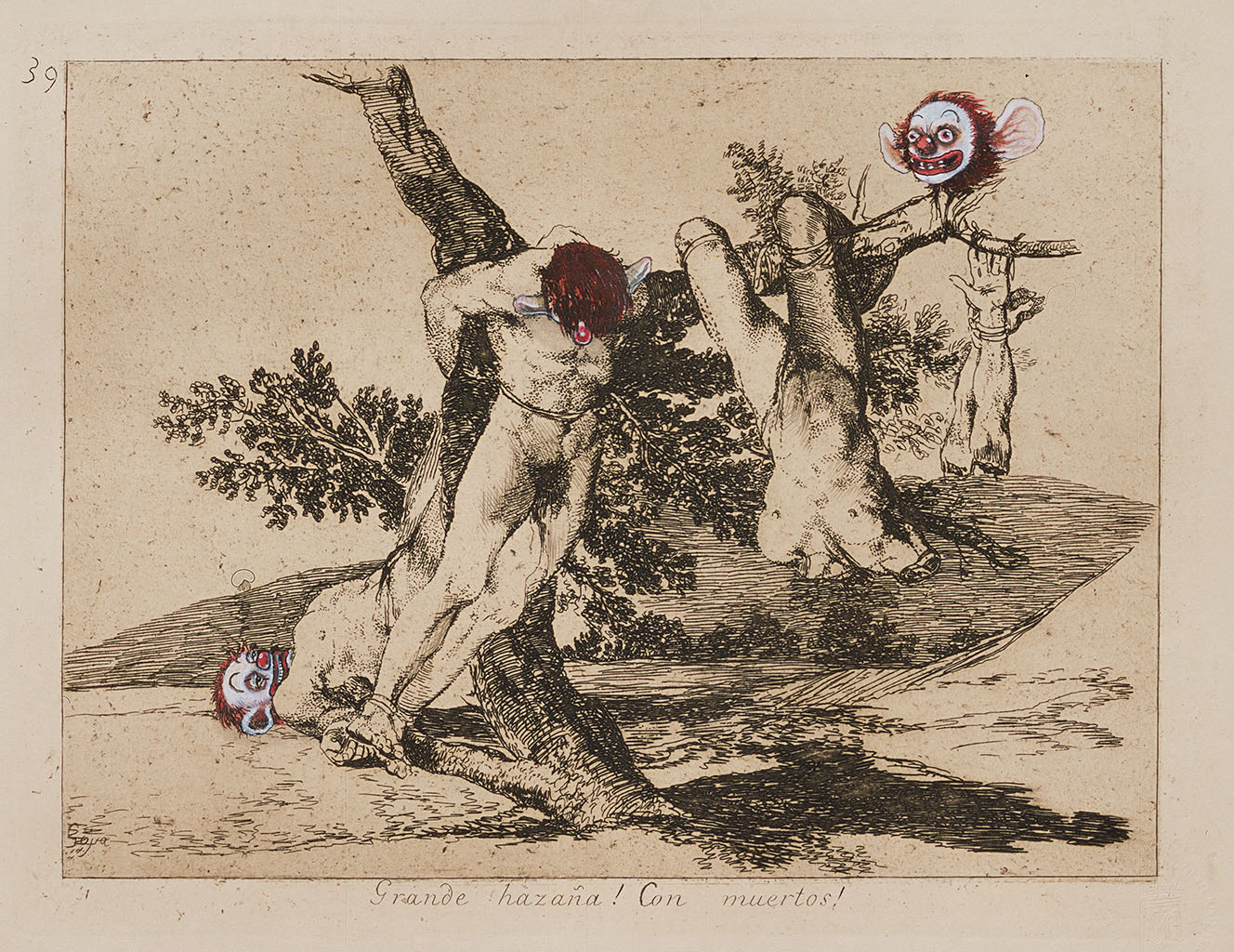
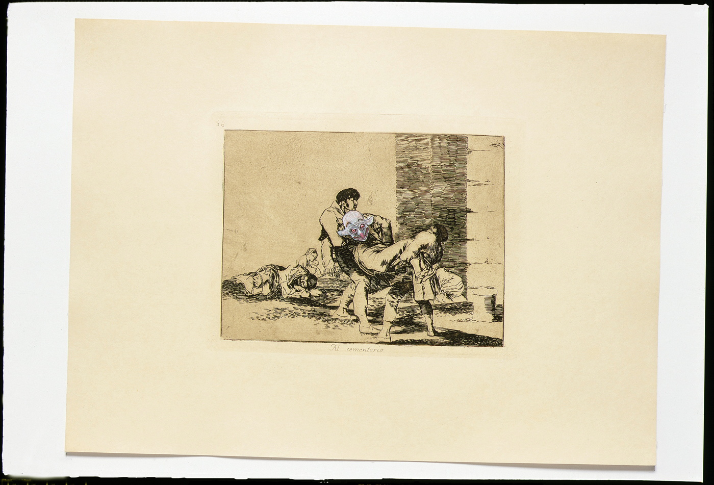
In the spirit of #thisisnotnormal, I’ve been working my way through images and possibilities, with the goal of accurately witnessing and capturing the political horrors and threats that surround us. Even more than Guernica, I’ve been thinking of Goya, whose Disasters of War series, 80+ prints whose creation occupied decades, and which Goya did not anticipate publishing in full in his own atrocity-rattled lifetime. I’ve especially come to appreciate the Chapman brothers’ Insult to Injury project, [above] where their clownish embellishments of a Goya Disasters of War portfolio condemned the folly of Bush & Blair’s Iraq War. [Called it, obv.]
So I expect this series will go on a while. After the backers were taken care of, I used the rest of the Kickstarter project funds to commission the next painting. It, too, has arrived. I think I will invite the original backers to order one first, but it should be available soon. It, too, was created with instructions to look like George Bush had painted it. The Chinese painters I’m working with seem to have gotten a little better at this bad style. Perhaps that will be when we know the Cycle is complete: when the #ChinesePaintMill system designed to industrialize Gerhard Richter’s paint-from-photo tactics can successfully reproduce the clumsy expressionist facture of the man who is still, alas, America’s most relevant painter. So stay tuned.
Our Guernica, After Our Picasso [kickstarter]
Previously, related: On Coming Around on Insult to Injury

On Coming Around On Insult to Injury

Chapman_Insult-to-Injury_Great-deeds-against-the-dead-2003.jpg
Insult to Injury, 2003
I did not like Jake & Dinos Chapman’s work to begin with, so I was not inclined to like their project Insult to Injury, where they drew animal and clown faces on a suite of actual Goya etchings, when it debuted in 2003. And I haven’t thought much about it, or looked at it since.
But I have come around. Working on the Our Guernica Cycle project has sent me looking back at Goya’s big Fifth of May paintings, and their influence on Guernica, and that inevitably brings the Disasters of War prints back into the mix.
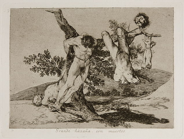
Goya_Los_Desastres_de_la_Guerra_-_No._39_-_Grande_hazaña,_con_muertos.jpg
Plate 39 – Grande hazaña! Con muertos! (A heroic feat! With dead men!)
Things I didn’t really pay attention to stand out now. Like Goya making prints during a war and a famine when materials were so scarce, and the situation so uncertain, that he had to reuse and destroy the copper plates from other prints. And making a series of 80+ prints over the course of years, which he finally expected to never publish in his lifetime. And which were only published decades after his death. And which were then republished over and over again, in seven editions, over 70 years, including a “final” edition in 1937 to support the Republic in the Spanish Civil War, nearly 1,000 sets in total, plus hundreds of proofs. [That’s the one the Chapmans bought to use.]
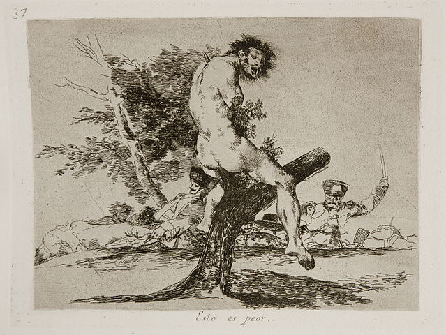
Goya_Los_Desastres_de_la_Guerra_-_No._37_-_Esto_es_peor.jpg
Plate. 37 – Esto es peor. (This is worse.)
Things like Goya drawing such devastating connections between revered fragments of classical sculpture, like the Belvedere Torso, and the tortured and dismembered bodies of the war’s victims. Neo-classicism was hot at the time, in the Napoleonic era, and Goya impaled it on a tree.
chapman_insult-to-injury_2003.jpg
And then there’s the Chapmans, whose project was sparked by the Bush/Blair Iraq war machine which marched in front of their already Goya-soaked practice. Here is Fiachra Gibbons writing about Insult to Injury in The Guardian:

Although they are both against the current war, the Chapmans say they are not making a statement about it. Insult to Injury is more about the inadequacy of art as a protest against war. Art can’t stop wars, they insist, just as Picasso’s Guernica was a “pathetic” statement in the face of the oncoming second world war.
“Not to be too glib, but there’s something quite interesting in the fact that the war of the peninsula saw Napoleonic forces bringing rationality and enlightenment to a region that was marked by superstition and irrationality,” Jake Chapman said. “Then you hear George Bush and Tony Blair talking about democracy as though it has some kind of natural harmony with nature; as though it’s not an ideology.”

I was not this pessimistic in 2003; maybe I just needed some time.
And now to look at Disasters of War again, and Insult to Injury again, and more closely, and as I “embellish” my own prints I’d once expected were “finished,” I realize the Chapmans were right. The reflexive disapproval of their alteration of another artist’s work is specifically misplaced and unnecessary. Even Jonathan Jones is right about something. It’s all a pretty big shock, tbh. And even when it feels necessary, art still doesn’t make these disasters any better.
Insult to Injury, 2003 [jakeanddinoschapman.com]
The 2004 Steidl edition of Insult to Injury is pretty remarkable, actually [amazon]

Untitled (Koch Block), 2014 –

kochblock_sailingfanblues_2014-09-20.jpg
Close, but not quite: Study for Untitled (Koch Block), image by @sailingfanblues
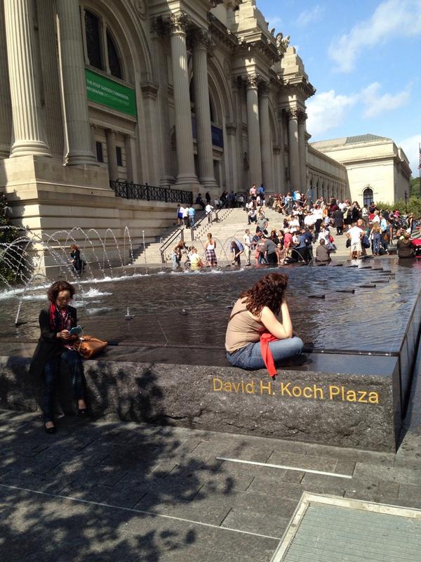
First conceived in September 2014 in response to a tweet by Zachary Kaplan, Untitled (Koch Block) is a collaborative public artwork situated permanently at the Metropolitan Museum of Art in New York.
It comprises an endless succession of volunteers who sit on the edges of the fountains in front of the museum in a manner that obscures the engraved name of the museum trustee, David Koch. The work includes the engravings on both fountains, and so is ideally performed by two or more individuals at any time. While a sitter’s personal items such as a stroller, wheelchair, shopping cart, or backpack might be placed in front of the engraving for extra-wide impact, no permanent alteration, damage, or obscuring of any kind should take place, at least not as part of this artwork.
Any one individual or group should feel free to sit and block public view of the name for as long as they wish, but all should be mindful of others who might also wish to participate. The Artist Is Present-style marathons are discouraged. Instead, try taking turns, coordinating, and/or making arrangements onsite to continue the work. Formalized schedules or shifts should also be avoided, even if this means the work is not persistently instantiated.
It’s true that awareness of the work could be facilitated by people posting photos on social media using a hashtag like #KochBlock. My concern, though, is that viral messaging might run counter to the essential nature of the work, which is to deplete the mindshare and social capital that typically accrue from such purportedly eleemosynary naming opportunities. Still, such efforts are obviously beyond my control, and if the 7 million visitors to the Met each year decide they all have to post #KochBlock selfies, well, we’ll re-evaluate.
The ideal state of the work is for the names to be permanently blocked from view through uncoordinated but widespread acculturation. At any moment in which a sitter finishes blocking and rises from her spot, another individual naturally and un-self-consciously takes her place. Some folks will undoubtedly make a point of visiting the fountains to participate. Some might make it a routine. People might come to recognize the faces of other regulars. Eventually, Koch blocking should become an ingrained behavior common to sharing civil, public space, as obvious and natural as dodging slow-moving tourists or jaywalking. [s/o @man for reminding me this needed to be formally auraticized.]
UPDATE: Just realized this is my third piece at the Met. Thanks for the support!

Untitled (Adidas Art Basel), #001, 2017

adidas_art_basel_kicks_det_miadrian10.jpg
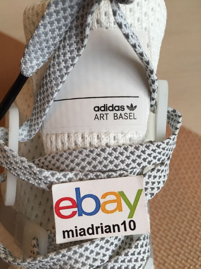
Study for Untitled (Adidas Art Basel), 2017, nylon and ink on Adidas EQT shoe, image: ebay seller miadrian10
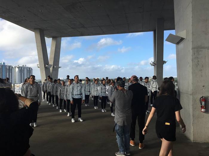
Art Basel is suing Adidas for trademark infringement over these kicks. A thousand pairs were given away at a string of branded flashmobs in Miami on November 30th, two days before the opening of the art fair they had no official marketing agreement with. Is there a term for astroturfed flashmobs? Is there any other kind these days? Did you know Adidas been hypin’ kicks at #ABMB since at least 2010? Does a viral flash mob still count if you have to Google it?
adidas_abmb_flashmob_parking_taetalent.jpg
image: taetalentagency
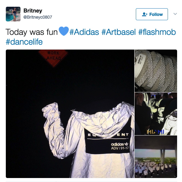
Anyway, 2016. According to hype groupies like high snobiety and World Red Eye, a mirror-wrapped school bus drove 48 performance artist/brand ambassador/whatevers around town. Stops included a high school in the Design District, HdM’s parking garage, and some millennial-branded Hilton in South Beach.
adidas_flashmob_britneyc0807.jpg
screencap from @britneyc0807
They were decked out in #monochromatic reflective gear. They stood in formation, Vanessa Beecroft-style. They did some dance moves. Ideally, their gear did its retroreflective blast out thing when it was photographed.
adidas_dash_school_mob_worldredeye.jpg
image: worldredeye
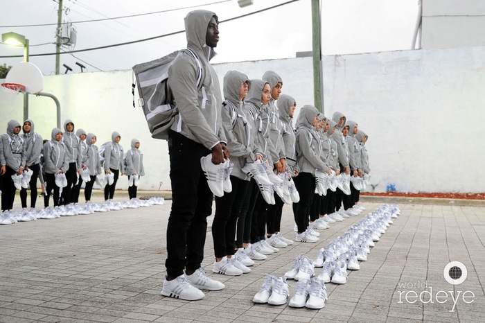
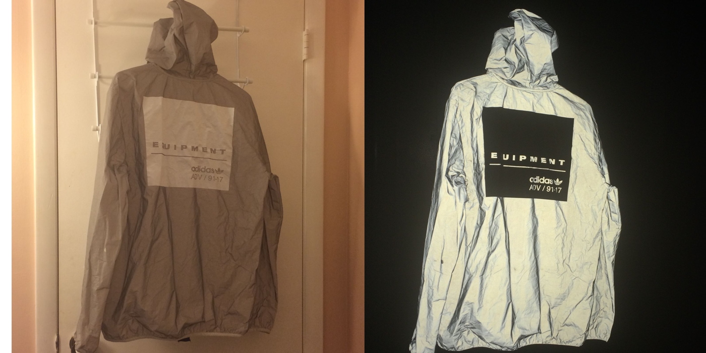
Then they unloaded their loot, lined it up like a freakin’ Eleanor Antin street team, and, I guess, handed it out to the ‘gramming masses like rations off the back of a UN truck. Then everyone started flipping their swag on eBay. It’s hard to say where the stunt’s brand impact actually landed the hardest: on the 1st-to-know sneaker chasers, the day-of hashtaggers, the eBay resale remoras, or now, on the so-DGAF lawsuit bad bois.
adidas_art_basel_flashmob_jacket_ebay.jpg
images: ebayseller sorry, lost it
Art Basel is suing over the tongue tags on these free sneakers, and in addition to brand damages, is demanding Adidas destroy all the infringey sneakers it still has. If you budget for ex-post trademark settlements, is it actually a bootleg?
adidas_art_basel_study_700px.jpg
Study for Untitled (Adidas Art Basel), 2017, retroreflective paint and ink on panel, 50x50cm
Untitled (Adidas Art Basel) is a series of 1,000 numbered paintings based on this tongue tag composition, made in various sizes. Or should I say they will be made. Might be. Conceived to be.
adidas_art_basel_study_invert_700px.jpg
Study for Untitled (Adidas Art Basel) photographed, 2017, retroreflective paint and ink on panel, 50x50cm
I know what I’ve written about artists having a successful system, but honestly, it’s debatable whether the world needs 10 more paintings at all right now, much less 1,000. Of these. Can you even imagine having a thousand of these paintings lying around? You literally could not give them away, lawyers or no. Or maybe you can? Just put a few hundred super-shiny posters in a stack and BAM, you’re in Venice.
Ima get to work on one, see if it delivers that retroflective kick the study’s promising. Then I’ll let my estate sort out the rest.
Art Basel is Suing adidas Over its Limited Edition ‘Art Basel’ Shoes [thefashionlaw via artforum, thanks @kyle_petreycik]
Here’s How You Can Get 1 of Only 1,000 Pairs of adidas’s “Art Basel” Limited Edition EQT ADV [highsnobiety]
Adidas Flash Mob in the Miami Design District [worldredeye]
Previously, related: Webdriver Torso as Found Painting System
When Form Becomes Content, or Luanda, Encyclopedic City

Untitled (Unpainted Wall), 2017

untitled_unpainted_wall_2017.jpg
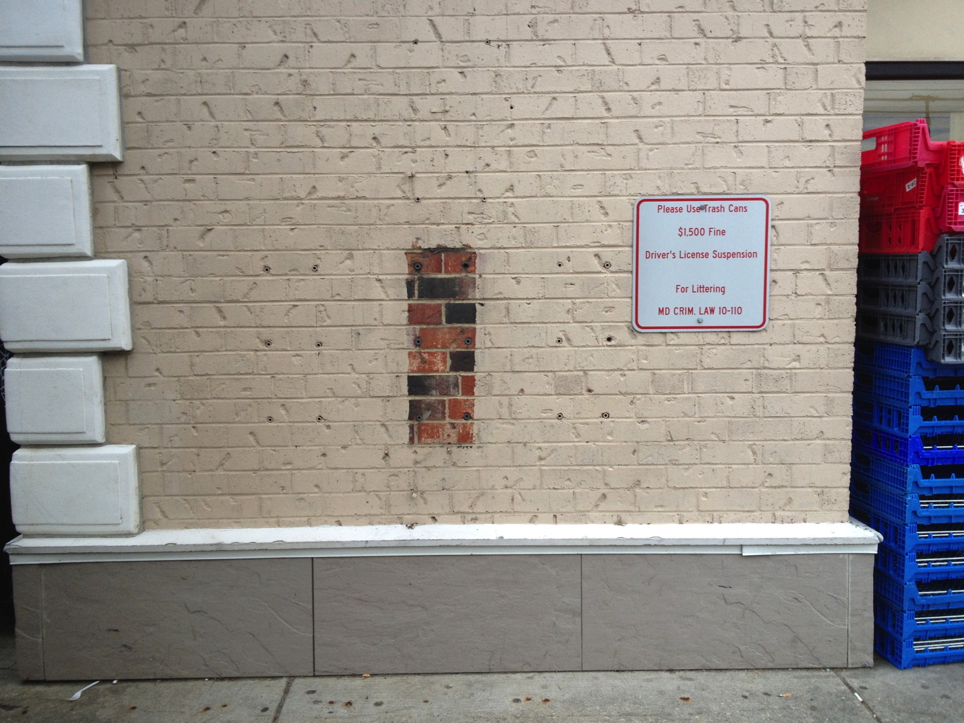
Untitled (Unpainted Wall), 2017, brick, concrete, 18 lag shields, exterior latex paint. Installation view, Chevy Chase, Maryland
In his 1977 Whitney catalogue, Michael Crichton wrote about the origin of Jasper Johns’ 1967 painting Harlem Light:

It has a peculiar background. Johns was taking a taxi to the airport, traveling through Harlem, when he passed a small store which had a wall painted to resemble flagstones. He decided it would appear in his next painting. Some weeks later when he began the painting, he asked David Whitney to find the flagstone wall, and photograph it. Whitney returned to say he could not find the wall anywhere. Johns himself then looked for the wall, driving back and forth across Harlem, searching for what he had briefly seen. He never found it, and finally had to conclude that it had been painted over or demolished. Thus he was obliged to re-create the flagstone wall from memory. This distressed him, “What I had hoped to do was an exact copy of the wall. It was red, black, and gray, but I’m sure that it didn’t look like what I did. But I did my best.”
Explaining further, he said: “Whatever I do seems artificial and false, to me. They-whoever painted the wall-had an idea; I doubt that whatever they did had to conform to anything except their own pleasure. I wanted to use that design. The trouble is that when you start to work, you can’t eliminate your own sophistication. If I could have traced it I would have felt secure that I had it right. Because what’s interesting to me is the fact that it isn’t designed, but taken. It’s not mine.” [p. 54-55]

And that, my friends, is how I am different from Jasper Johns: I got the picture.

Previously typed this in, related: Driving Taxis Through Heavy Neighborhoods To Look At The Paintings