
Just got back from a 2-week trip to Japan. Though we spent a lot of time in familiar places in Tokyo and Kyoto, we also took a 2-day trip to Takayama, a small city in the mountains of Gifu-ken, an extraordinary 2.5-hr train ride north of Nagoya.
Takayama retains many Edo-era buildings and streetscapes, which were really great to visit. The Kusakabe Mingei-kan is a large minka, in this case a merchant house in town, originally built in the early 19th century, and then reconstructed after a fire in 1896, is one of the best in town.
While visiting Takayama and neighboring Hida and Shirakawa during a summer break from college, the late great architecture photographer Yukio Futagawa was inspired by the anonymous, vernacular architecture of minka. In the mid-50s, he set off on a multi-year, cross-country trip to study and document these Japanese homes which were rapidly disappearing in the postwar reconstruction boom.

Kusakabe House was turned into a house museum in 1966. The large public area of the house [above] was for conducting business and receiving guests. Those beams are sick.
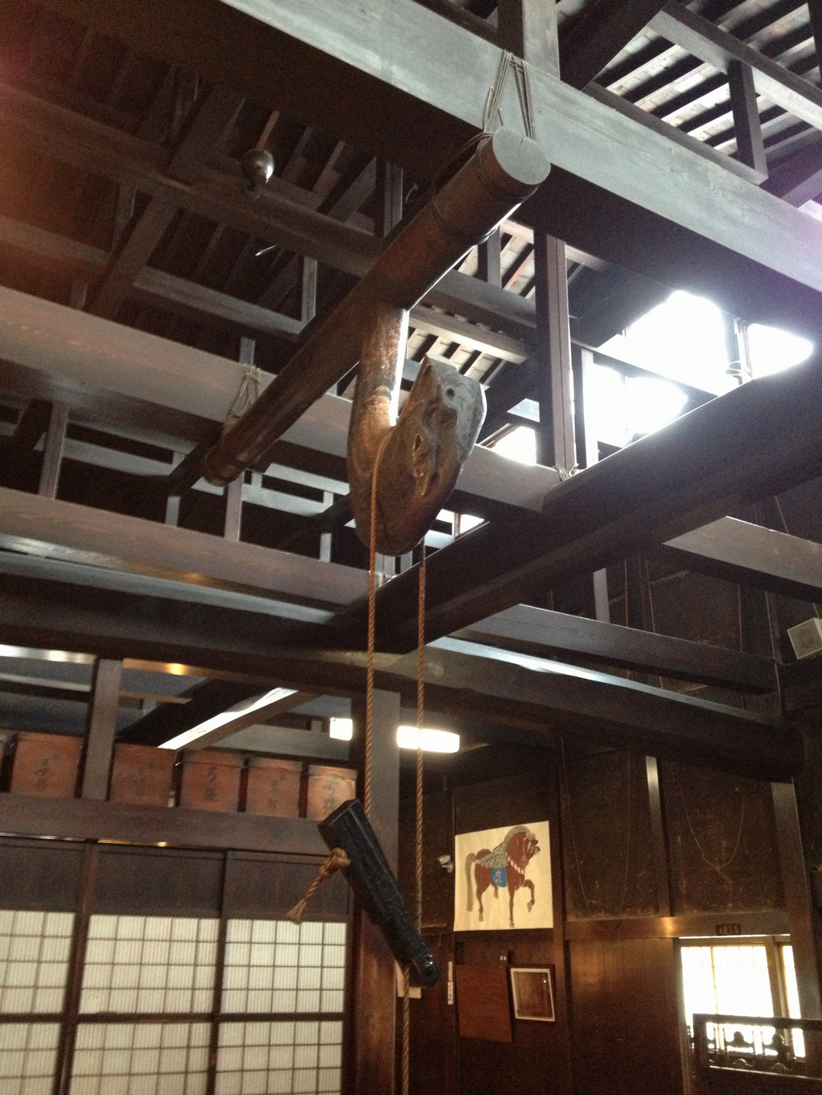
The kitchen is in the rear of this public-facing area. A fire was constantly maintained in the sunken hearth, or irori; the heat and smoke helped preserve the wood from insects and moisture damage. That crazy, gnarled hook is called a jizaikagi.
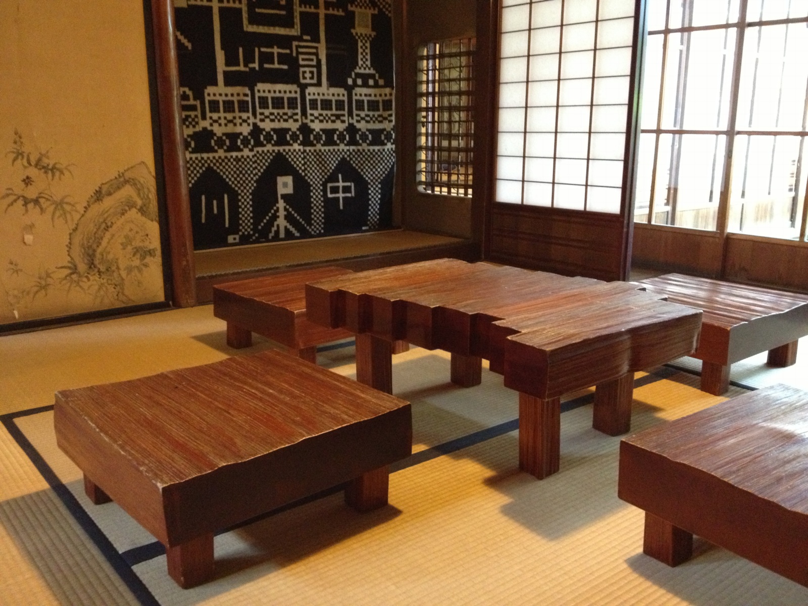
Pivoting 180 degreess from the top photo are the more private rooms of the house, including this amazing block table and chair set.
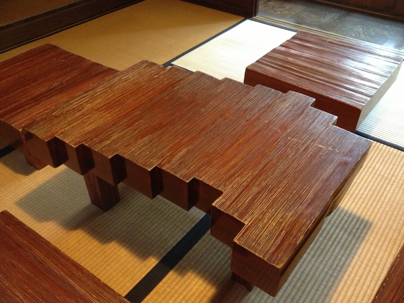
Do want. Or do want to make.

There are a couple of small gardens and these corridors. I took this looking back toward the streetside of the house.
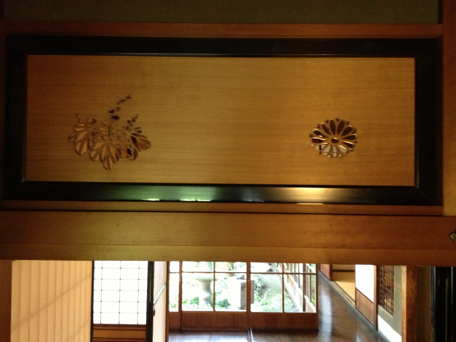
Above the fusuma sliding doors, where I’d call it a transom, are these thick hinoki boards with flower and leaf motifs sawed out. They had to have been done by hand. Aha, they’re called ranma, which means the space between columns. These turn out to be pretty simple designs, as far as ranma carvings go.

The second floor and the 2-story storehouse in back have collections of mingei: lacquerware, basketry, tansu–and Sori Yanagi’s Butterfly Stool.
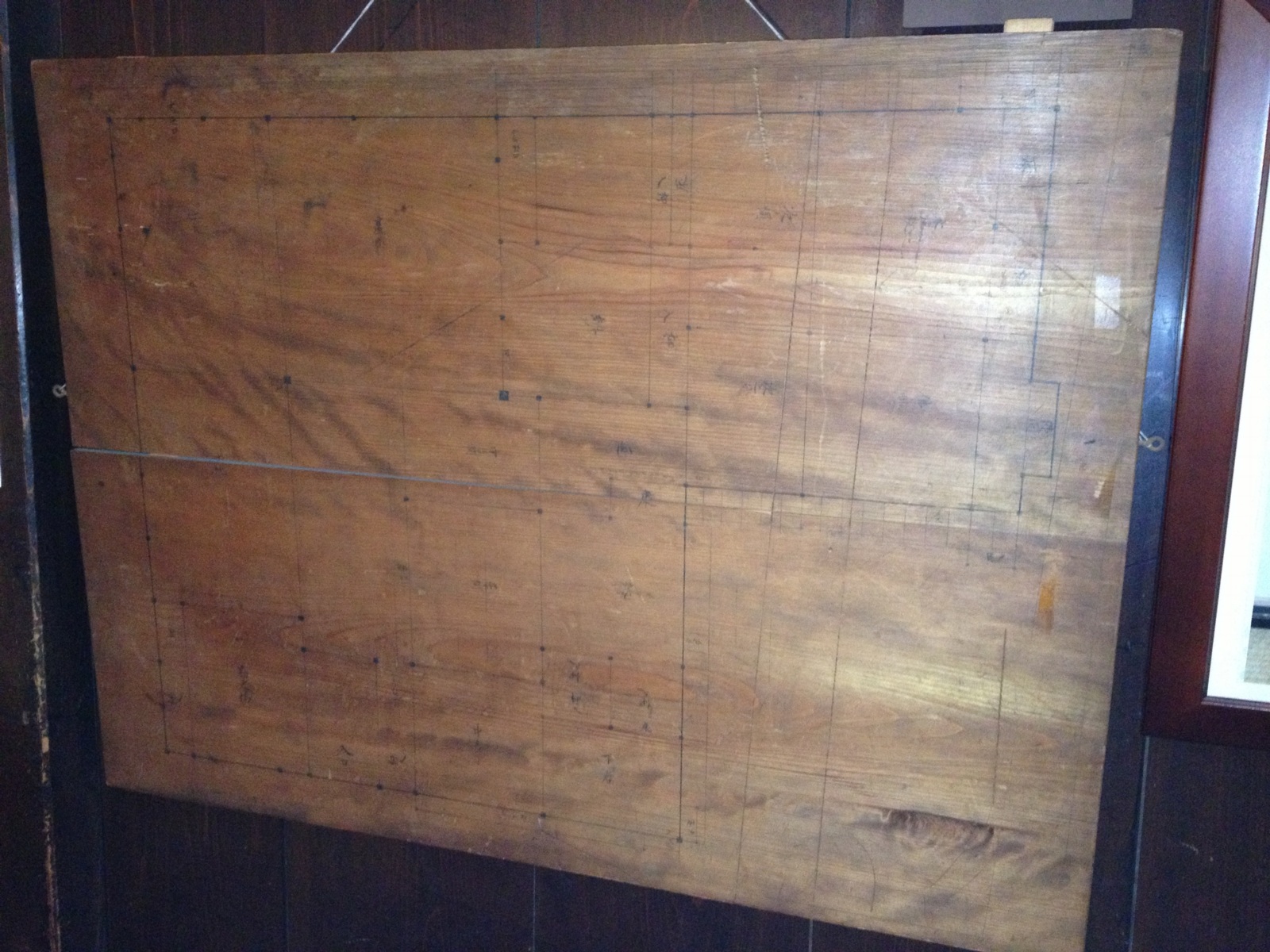
On the way out I noticed this panel, which I thought was blank, but which turns out to be the builder’s blueprint for the house. It’s also visible in the background of the irori picture, under the horse.
Laserpointer Pyramid
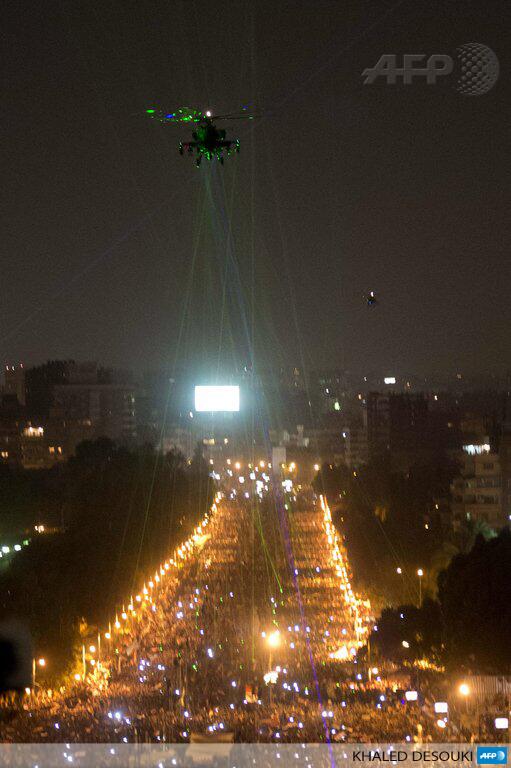
Khaled Desouki’s extraordinary photo of crowds in Cairo tonight forming a pyramid of laserpointers trained on a military helicopter [AFP].
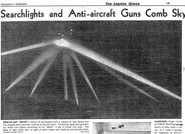
Reminds me of the searchlight wigwam converging on nothing over the skies of a frightened Los Angeles, 1942:
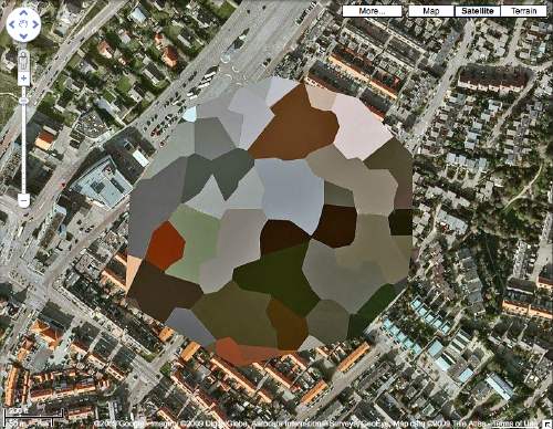
Called It: Facebook For Google Maps, By Frank Gehry
From 2009, The Roof as nth Facade, about Google Maps-optimized architecture:
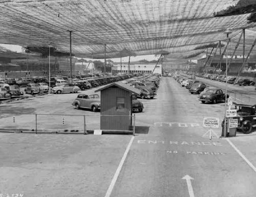
Maybe the next Bilbao Effect, sure to appeal to striving cities in these difficult budgetary times, will be to commission grand architectural designs purely for the benefit of the Google Maps audience. Like the rural streetscape camouflage which was applied to the roof of the Lockheed airplane factory in Burbank to thwart Japanese bombers during WWII, cheap, easy, flexible Potemkin roof structures could really put a town on the map, so to speak.
It seems so long ago, but in architecture terms, I guess four years is pretty quick. I just didn’t think it’d be Mr Bilbao Effect himself, Frank Gehry doing the camouflaging. And of course, it’s not the city, but a giant corporation, Facebook, the Lockheed of identity, that’s doing the hiding.
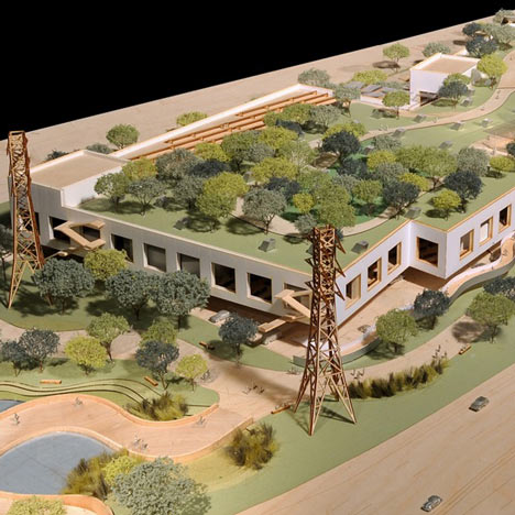
Here is a detail of a model of the Menlo Park building Facebook asked Gehry to design. From Dezeen in April:
Early proposals for the campus, which was given the go-ahead by Menlo Park City Council last week, envisioned a bold, curving facade reminiscent of well-known Gehry buildings such as the Guggenheim Museum in Bilbao.
“They felt some of those things were too flashy and not in keeping with the kind of the culture of Facebook, so they asked us to make it more anonymous,” said Craig Webb, a partner at Gehry’s practice.
“Frank was quite willing to tone down some of the expression of architecture in the building,” he told the Mercury News, explaining that they plan to disguise the white stucco building with a rooftop garden: “Our intent is that it almost becomes like a hillside, with the landscape really taking the forefront.”
Or at least the appearance of landscape, on the roof of your 400,000-sq ft. relationship processing facility.
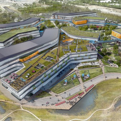
It’s worth noting that this green-roof-as-park approach is being used by NBBJ for their new office complex–for Google. Google is hiding from Google Maps, too. As Sam Jacob writes at Dezeen, “Though its appearance is closer to an average business park, it too has its roofs littered with green stuff.”
There are obviously many environmental and energy-use-related benefits to a green roof. But they also serve to mitigate the appearance gap between the “average business park” and the powerful technology companies inhabiting them. Invisibility through greenery, melting into the landscape, these are time-tested tools for managing an architectural first impression, as in bucolic renderings designed to mollify local land use and governmental constituents, or the landscaped, sculpture-filled approaches to the corporate HQs of the 1960s. Now every visitor’s first encounter with the buildings is when they look them up on Google Maps. And now they’ve got those covered.
And though I didn’t grasp it at the time, it’s no surprise that these particular companies are the clients trying to become “more anonymous through these hillside camo roofs:
On the one hand, it seems obvious that this vast, global audience [on Google Maps] should be factored into the creation of architecture. But on the other, it seems absolutely insane to design a structure, a space, for people who won’t be anywhere near it, but sitting in front of some screen on the other side of the world.
Because the target of their disappearing act is their own users. Just as malls hide acres of parking lots behind roadside shrubbery, Google and Facebook are hoping their park-like roof facades will keep us from noticing the extent of their corporate footprint, and their relentless sprawl across our online landscape.
Previously: Heads Up: Roof as nth Facade [greg.org]
images via Sam Jacob’s Dezeen op-ed, ‘Cities are being redrawn according to Google’s world view,’ which, right? you’d think, but ends up going in a completely different direction. [dezeen]
If You Haven’t Seen It, It’s New To You
Mishka Henner, 2011:
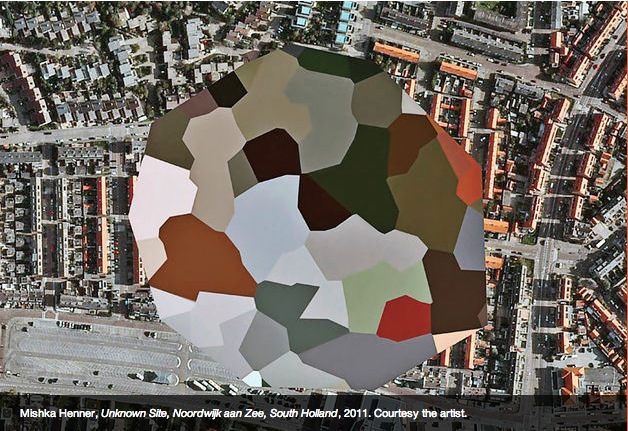
image via ICP Triennial 2013, curated by Kristen Lubben, Christopher Phillips, Carol Squiers, and Joanna Lehan.
greg.org, 2009:
“Dutch Landscape Paintings”
The population of Noordwijk, its visitors, and users of Dutch Google Maps since 2006:
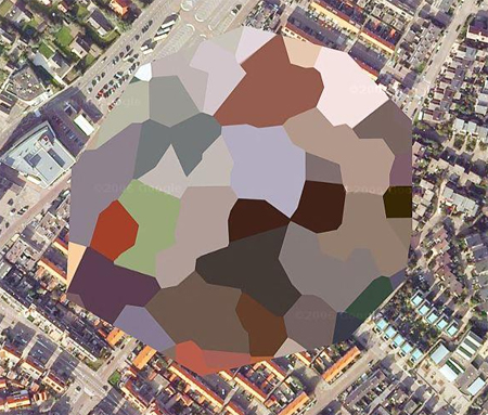
image via gridskipper.
Peter Halley, 1980:
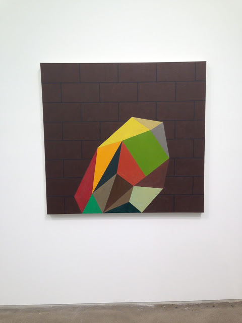
Jacob Wrestling With The Angel, 1980, as seen in Jew York, at Zach Feuer Gallery, image via Joshua Abelow’s Art Blog Art Blog. Which I had never seen.
On James Bridle At The Corcoran
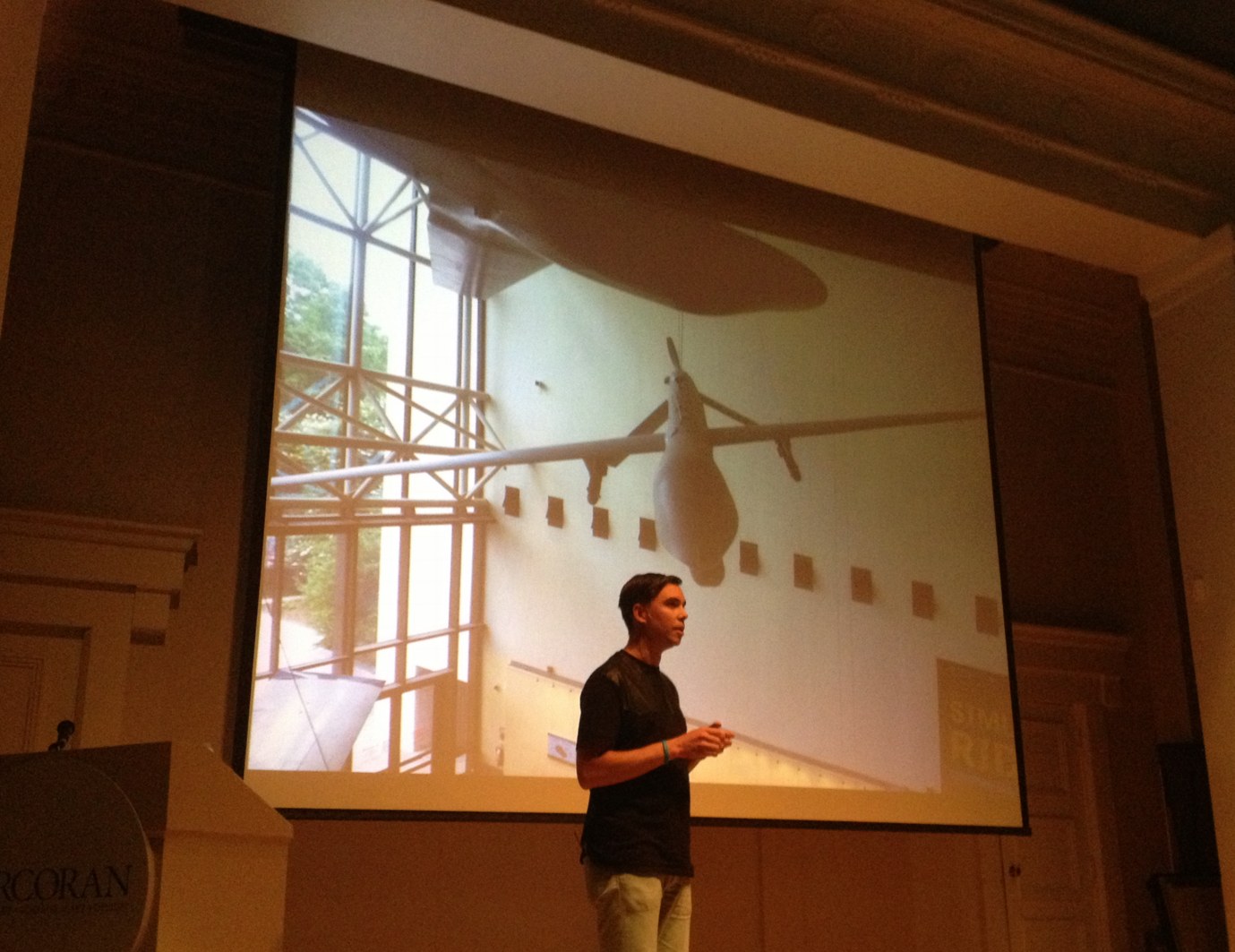
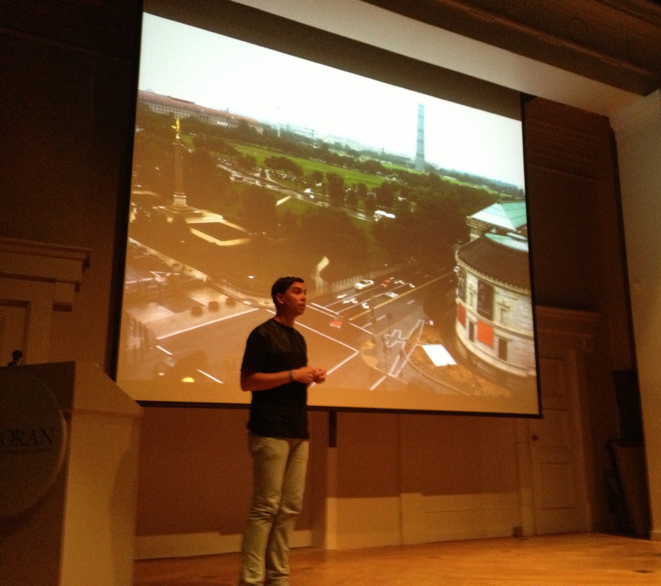
James Bridle of the New Aesthetic and Dronestagram Bridles opened a show at the Corcoran this evening, and I attended. It was the first time James and I have met in person, after several years of blogging at each other.
The show itself is small and drone-centric, containing a grid of Dronestagram images and Google Map dronespottings, but also video, a 10-volume printed excerpt of a UAV-related webcrawling database project in development, and Bridle’s classic drone identification kit [below].
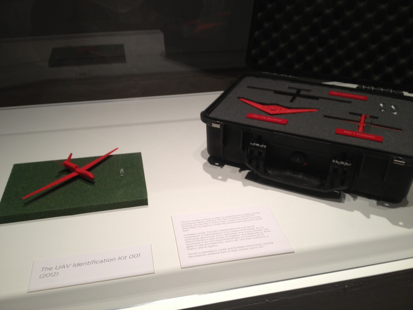
The most stunning and disturbing image in the show is a realization Bridle made of the “Light of God,” a nightvision goggle-eye view of a targetting laser descending from the heavens. It’s based on a drone pilot’s commentary in an Omer Fast video, and it’s gorgeous, eerie, and chilling as hell.
During his talk in the adjacent auditorium, Bridle began by mentioning how he is compelled to make physical the things he studies. His most powerful piece, the life-sized outline of a drone drawn on the ground, is an excellent example of this.
In answer to one of the last questions, about materialist formalist dialectic, Bridle noted how he often found himself making an object of something from the network, in order to photograph it and reinsert it into the network. The Corcoran show feels like this: a physical instantiation of digital content.
The idea for the show, or particularly, for Bridle to be the go-to guy for such a show, more than just The New Aesthetic Guy, but certainly that, came from the Corcoran’s IT department, said the curator who introduced the evening. I will choose to take this as evidence of the Corcoran’s cross-disciplinary innovation and flat organization, not as a sign of a vacuum at the top of the institution. Anyway, the whole affair seems closely linked to the school side of the Corcoran, i.e., the still-functional side. The crowd was crowded, and felt student-heavy.
Anyway, James Bridle. Bridle noted that we in Washington are lucky to have a real Predator drone in our midst, right there at Air & Space Museum. It is exceedingly rare, he said, and he would know, to be able to be in the presence of an actual drone. They’re either largely invisible, or they’re bearing down on your village. And there’s one hanging on the Mall.
And now there is the shadow of one, the outline of one, really on the sculpture pad of the Corcoran. That’s how it’s described, as being sited on the sculpture pad. Obviously, it doesn’t begin to fit on the sculpture pad. It’s painted on the pad, the rocks, the curb and sidewalk, with white paint of some no doubt temporary kind.
It is much bigger than you might imagine, which is exactly the point. That, and imagining it being overhead and casting a shadow on the ground, the thing a Pakistani wedding party might see right before the missile hits.
Bridle noted as to how not many people will get to see this privileged view from above. I would note that White House staff in the Eisenhower Old Executive Office Building will get to see it every day, and that right there is quite something.
But he’s right, and it underscores his point, that the drone outline reads quite differently from the ground. It’s not Nazca Lines different, but that’s the sense of it.
I asked James later how he’d decided which way to point the drone. There was really only one good way to fit it, he said, and also, he knew he didn’t want to aim it at the White House. Which is understandable. When he installed his first drone drawing in Istanbul, Bridle similarly made sure not to aim the drone at Mecca. In consciously not aiming at the White House, Bridle’s drone ends up feeling like it’s coming directly from the White House. Which probably intensifies its critical position a bit. It worked for me, at least.
In between these moments was a cogent, timely, and depressing talk about technology as a tool of control and a reflection of the political and social systems that foster and use it. If it was recorded or streamed, I will try to find a link.
Meanwhile, as I walked around the drone on my way home, I did think of one piece missing. Not to tell James how to do his job or anything. But it occurs to me that the sound of drones is distinctive and terrifying. Perhaps a sound element to recreate the perpetual presence of drones in the vicinity of the Corcoran, would provide a visceral experience. Who knows, it might even wake the neighbors.
Indeed: Corcoran College of Art & Design: Quiet Disposition by James Bridle, through July 7, 2013 [corcoran.edu]
Mari X IKEA: autoprogettazione by greg.org (2010)
Three years ago, I was thinking about what to do with the posts I’d written about the project I’d begun six years ago. Which I guess means it’s time to release the results.
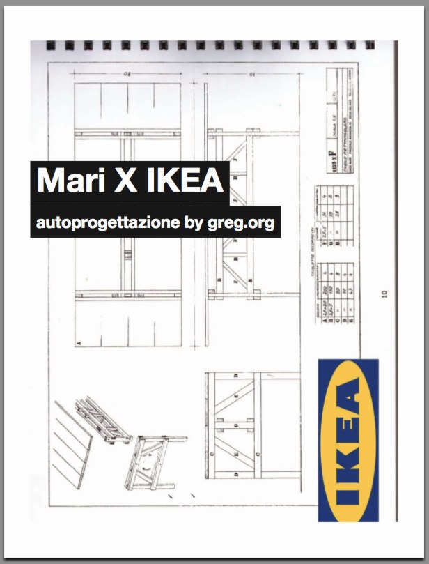
So here’s Mari X IKEA, a PDF compilation I made in 2010 aboutfmy 2007-09 project to construct an Enzo Mari autoprogettazione table out of Ikea furniture components.
I was not entirely pleased with the way it read all together, and so I didn’t publish it back in the day. But I realize now that my inner archivist and inner editor will never agree on things, and I/we are becoming OK with it. So the tabloid-style publication contains all the original blog posts and images documenting the project, and that includes a fair amount of recapping and repetition. Meanwhile, my inner publicist wants to emphasize that this is not a bug, but a feature, like the catchy chorus of a song.
I’m still quite stoked about the project–and the table, for that matter, which I am using at this very moment–and it continues to influence and inform my thinking about stuff: art, design, originality, authorship, authority, appropriation, systems, craft, utility. So I’m very happy to get information on the project out there in a more easily consumable format.
I should also give a shoutout to The Newspaper Club, the amazing publishing company, then just starting out, where I had originally contemplated printing Mari X IKEA in 2010. This PDF was made using their easy publishing/layout tool. And though I ended up not pulling the trigger on this particular project, they regularly make me want to turn this blog, and many other things, into a newspaper.
Mari X IKEA: autoprogettazione by greg.org, 2010 [PDF, 2.8mb]
Hot Favela Messe: Basel Riot Police Raid Protest Party In Tadashi Kawamata Cafe
How is Tadashi Kawamata’s Art Basel Favela like a real favela? It’s built on public land, gets inhabited by people who don’t have legal permission to be there, who are tolerated or ignored for a while, and who then get attacked and dispersed by riot police when someone with power decides it’s time for them to go.
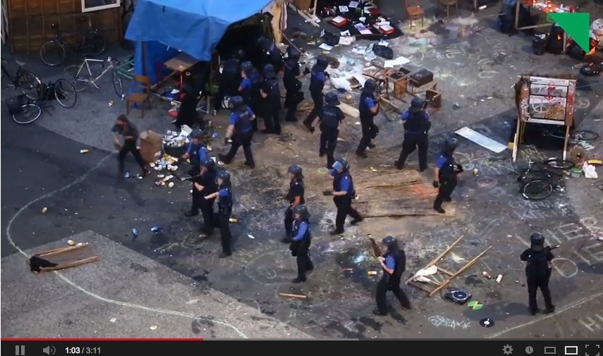
The details are still not clear to me, but Tages Woche reports that on Friday night, Basel police raided an outlaw party that had occupied Kawamata’s Favela cafe, firing tear gas and rubber bullets into the small crowd.
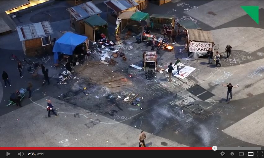
It appears that an event organizer had erected a favela DJ booth of their own, and were presumably protesting Kawamata’s use of favelas to serve luxury falafel [at “reassuringly exclusive prices”] to visitors at Art Basel last week.
The event, or happening, or protest, seems to have been low-key. According to Tages Woche, Kawamata’s collaborating architect Christophe Scheidegger met with the protestors, and they were allowed to stay for a while. Police and Art Basel officials decided to clear them out at 10pm, declaring the noise levels illegal, and that continued occupation of the favela–in the public platz, which had been rented by Art Basel–would be considered trespassing.
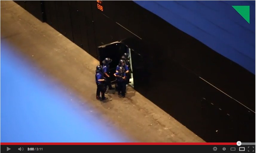
And that’s when, holy shit, it looks like they sent an assault force straight to the DJ favela to end the music and scatter the crowds with pepper spray and rubber bullets. Police established a perimeter, ended the party, kicked a few people on the ground, and then retreated back into the new Herzog & deMeuron Messe [above].
Tages Woche has a video of the attack shot from the parking garage [The embed above is from LiveLeak, but it’s on Vimeo, which won’t embed, and on YouTube, which, honestly, someone put an age-related content warning on? Is this an anti-viral video tactic?], though it’s edited in a way that does not make it so clear what exactly preceded, and may have precipitated, the use of violent crowd control tactics. [The editors and reporters wrote a followup post addressing the circumstances of shooting the video.]
But this unedited YouTube video posted by Gab Kae tracks around the entire platz, and captures the police raid from within Kawamata’s own favela. [It comes at around 2:20.] If there’s anything at all that justifies such an attack, I can’t see it. For these people hanging out in front of Art Basel, abuse of power came as a baffling surprise.
UPDATE greg.org reader Arthur points to another Tages Woche video, uploaded yesterday, which was taken on the ground, right next to the police, and which shows preparations for their assault on the party/protest.
In addition to the donkey, which had been part of the initial protest, the video features this nice, white-haired lady drinking a tallboy who, upon consultation with the officers, decides it best to move her chair out of the way.
After literally receiving their marching orders the Basel police head straight for their target. Which, this video makes clear, is the thumping sound system. Just watch that amp skittering out across the platz at 1:40. Obviously, the music demanded a forceful response, and any human casualties, injuries, or abuses, must be considered collateral damage and entirely unintentional. You know how it can be when techno dirtbags crash your party and won’t leave.
Video: Gewaltsame Polizeiräumung am Messeplatz [tageswoche.ch]
Basel Favela Occupation [artreview]
The Xerox Book, Infinite Loop
I have restaged one of Seth Siegelaub’s most influential shows, the 1968 The Xerox Book, as a series of animated GIFs [my 1st through 6th animated gifs, btw]. If only Seth could’ve been on infinite loop, too.
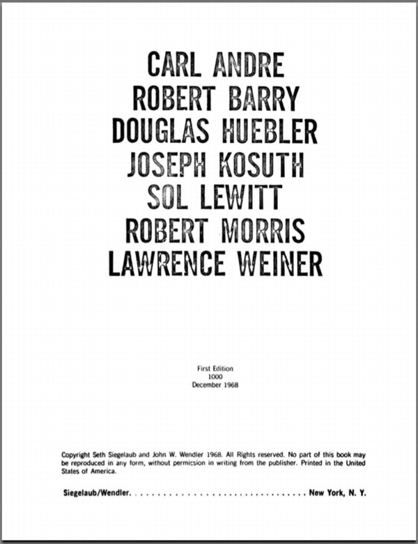
Frontispiece of The Xerox Book, 1968, organized by Seth Siegelaub and John Wendler
Primary Information has made an incredible collection of publications from Seth Siegelaub’s archive available online. That’s where The Xerox Book images came from. [pdf]
Serra Things Happening At Gemini GEL
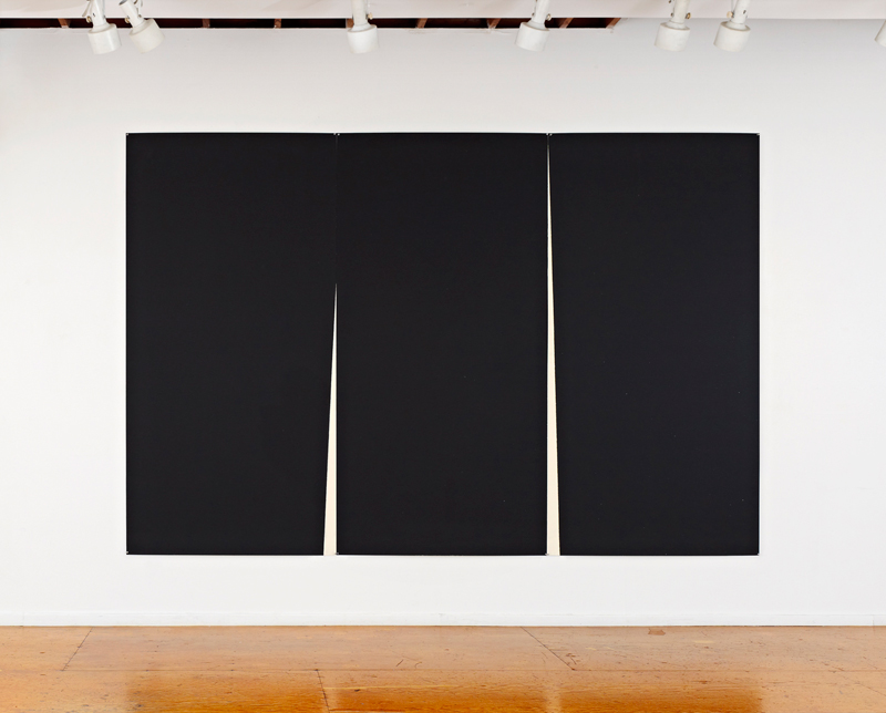
Double Rift I, 2012, by Richard Serra, published in an edition of 12 by Gemini GEL
When we last visited the Gemini GEL webstore, I couldn’t help but gape in awe atRichard Serra’s massive, new etchings, a series known as Rift. There are at least four Rift-related works, diptychs and triptychs, plus a related single plate print, Mandala, all released within the last year or so. Each section is made with a full 48×94-inch copper plate. The crucial gaps in between each section remind me of the Weights and Measures drawings Serra made in 1989, several of which were reunited in 2011 for Serra’s drawings retrospective.
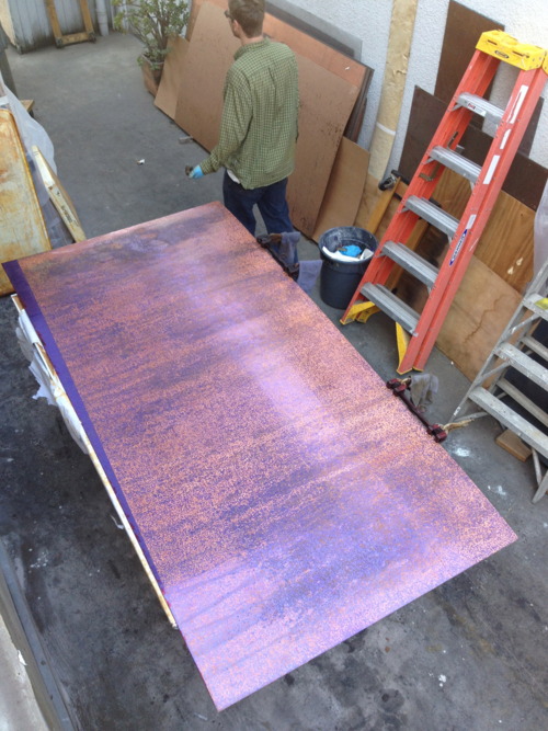
Rift etching plate in process, Gemini GEL, image: xavierfumat.tumblr.com
Anyway, the indie printing foundry Gottlund Verlag points to a couple of posts on a quiet tumblr called Richard Serra at Gemini GEL, which shows the making of the Rift plates and proofs. It’s pretty crazy stuff.
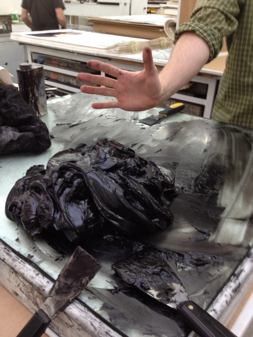
“10-12 pounds” of strained, modified etching ink, Gemini GEL
Things Happening At Gemini
Proofing triptychs
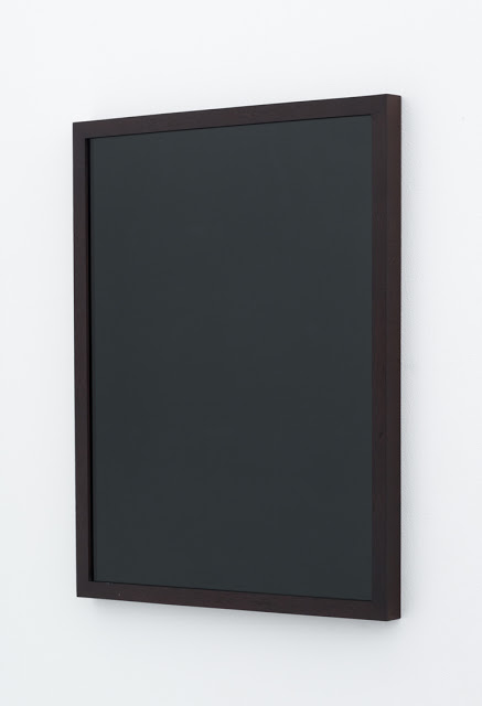
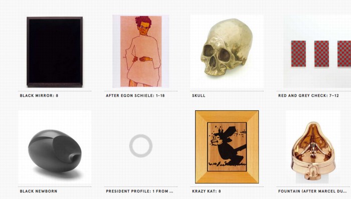
What Do We Know About Sherrie Levine’s Black Mirrors?
So Joshua Abelow posted this yesterday, Black Mirror, 2004, by Sherrie Levine. It was included in a group show that just closed at Joe Sheftel, Paint Hotel. But that doesn’t really shed any light on this particular work. Paint Hotel’s announcement opens with an Yves Alain Bois quote from Painting: The Task of Mourning and Joan Didion, and it
seeks to destabilize fixed theoretical and genealogical narratives. The point is not to be anti-theory, but rather to allow for an immediate experience.
Which, is part of my question. Because I can sure appreciate an immediate experience of Black Mirror; it’s an elegant, ambiguous object, a 16×20 black-painted sheet of glass in a sleek mahogany frame. As an autonomous object, it makes its own case. But of course, it didn’t just appear out of nowhere; it’s a Sherrie Levine, and we’re paying attention to it, or it’s entering this particular context, because it’s a Levine. And that’s what I wonder about. Why, and what?
installation view via paula cooper gallery
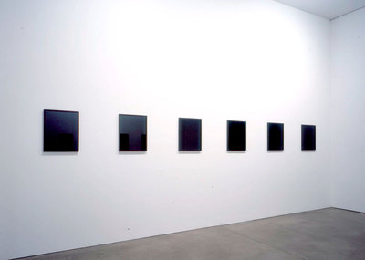
The readily available discussion of Black Mirror seems to be thin-to-nonexistent. There were originally twelve identical black mirrors exhibited at Paula Cooper in late 2004. The show was titled “Mourning Mirrors.” Here’s what we know:
Here, as with much of her sculpture, Levine’s interest lies foremost with the physical presence of the object and the sensual quality of the materials used. The mirrors’ dark gleam has the elegiac feel of funerary or memorial sculpture. With their frame and color, as well as their status as generic objects, the mirrors also maintain an ambiguous relationship to both monochromatic painting and the readymade.
For years, Levine’s work has raised critical questions about authenticity, the function of tradition and the relation of reproduction to original, questions central to artmaking today. Of her work, she says: “I try to make art which celebrates doubt and uncertainty. Which provokes answers but doesn’t give them. Which withholds absolute meaning by incorporating parasite meanings. Which suspends meaning while perpetually dispatching you toward interpretation, urging you beyond dogmatism, beyond doctrine, beyond ideology, beyond authority.”
So Levine’s interest here is in the physical presence of the generic object, which, sure, but the entire second paragraph feels unrelated, or unsupported by these objects.
I don’t mean to imply that I don’t like them; I do. And I like Richter’s mirrors and backpainted glass works, too. And any host of other artists who use mirrors and monochromes and readymades and paintings and originals and, just consider my buttons pushed. But I still don’t get it.
I mean, I guess Levine’s gotta make something. And she’s gotta show something. And this is what it is. But then we are looking at this thing because it’s a Levine, because of the brand, and the practice, and the history, not for the “generic object” itself. Let’s be real here. Paula showed this work because she believes in Levine and supports her in her practice, wherever it leads, and she trusts her.
just a few of the Levines at the Walker
And the Walker Art Center accepts Paula’s gift of a Black Mirror straight out of the show and into their collection because all of the above, plus they have made an institutional decision to collect Levine’s work in depth, including buying a bunch of work in 2002. So it’s a sign of a good relationship, if not a thank you, or a free gift with purchase.
Black Mirror makes the most sense to me in this context, of an artist’s work, over time, and the relationships and dialogues that form, and move from show to show and work to work.
And someone squeaked out a sale of a Black Mirror last year at Phillips for $60,000, a final bid of $48,000 against a too-hopeful estimate of $70-90,000, because, well, that’s a bit of a mystery to me. Phillips’ catalogue text is the only other text I’ve found online besides the “Mourning Mirrors” press release, which it quotes, and then muddles and contradicts completely:
The reflective surface exudes the elegiac severity of a funerary or memorial sculpture. The rich brown frame surrounding the sleek and cold glass lends the work the status of a generic object and maintains a relationship to both painting and the readymade.
…
Black Mirror: 4, 2004, appears disarmingly simple, yet there is something naughty lurking behind its smooth and lustrous surface. A mirror is intended to reflect the world around it; however, upon peering into Black Mirror: 4, 2004, a sense of mischief and secrecy pervades. The world appears not in its picture-perfect state, but doused in black ink, void of color, clarity, and precision. But instead of leaving its audience with a sense of impending doom, it is out of this precise bleakness that a gleeful mischief prevails.
Yes, gleeful mischief. Because what Debbie Downer’s gonna pay $90,000 for cold, funerary, generic, mournful, bleakness? This looks more like the auction house’s reflection than Levine’s.
Anyway, the point is, I love duality, and I kiss ambiguity’s feet. And I am always glad to be confounded and challenged to wrestle with contradictory notions in my head. But for some reason I’m really having trouble with Levine’s Black Mirror purporting to be a generic object when it’s really/also a branded good.
G8 Pop-Up Prison
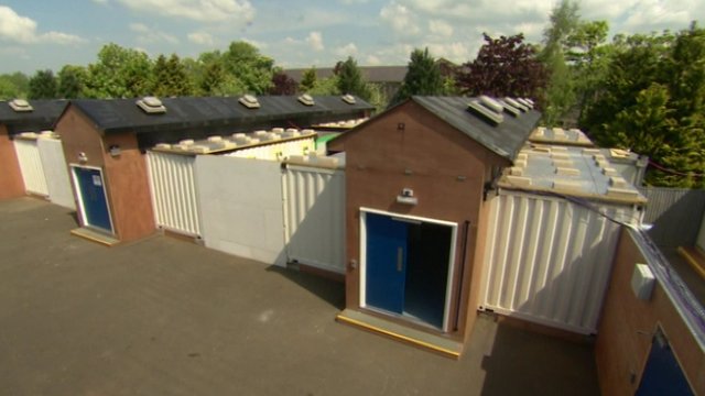
Here I am thinking that 12 years into this blogging thing, there’s really no reason to keep shipping containers as their own category anymore, when BAM, up pops a sweet, containerized pop-up prison for G8 protestors in Ireland.
You may remember, or maybe you don’t, that in 2002 Camp Delta, the prison annex to Camp X-Ray at Guantanamo, was quickly built from shipping containers to handle the influx of prisoners from the GWOT.
If there’s a difference between the GTMO container cells and the Irish ones, it’s that the G8 cells are reportedly highly temporary, and that the police are promising that protestors will be arrested, processed, charged, and properly incarcerated in record time, just “a matter of hours.” Europe. It really is the little differences.
G8: Courts ‘can deal with 260 protest arrests a day’ [bbc]
Man With A Pano Camera
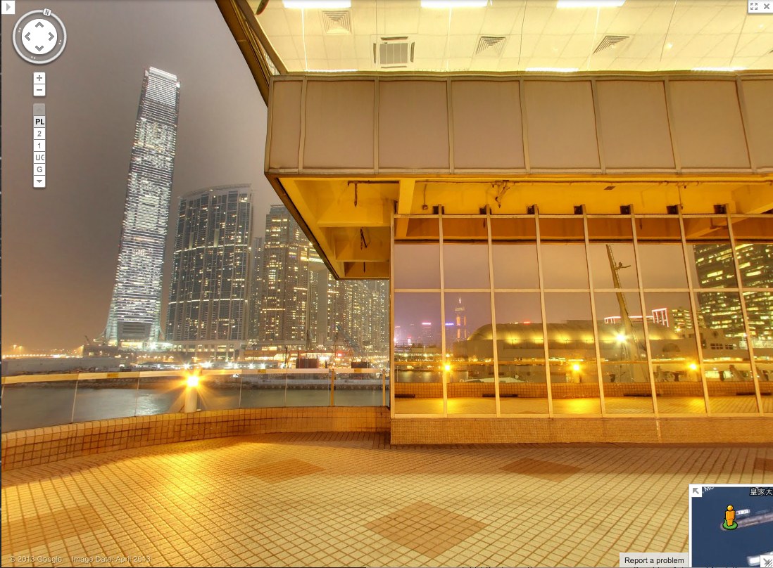
Yesterday @MattBucher noticed this uncommon night-time imagery on Google Street View of Victoria Harbour in Hong Kong. It’s the promenade on top of the China Ferry Terminal, on the west side of Tsim Sha Tsui in Kowloon.
As I do, I immediately began looking for Street View’s evidence of itself: the distortions where panoramas are stitched together, and the traces of the photographers who make it. It’s information Google is apparently just as interested in eliminating. The promenade includes three mirrored buildings, but every pano is perfectly sited to exclude the Google cameraman. Whether selfies are considered distracting, extraneous, or just undesirable, Google is trying not to photobomb itself.
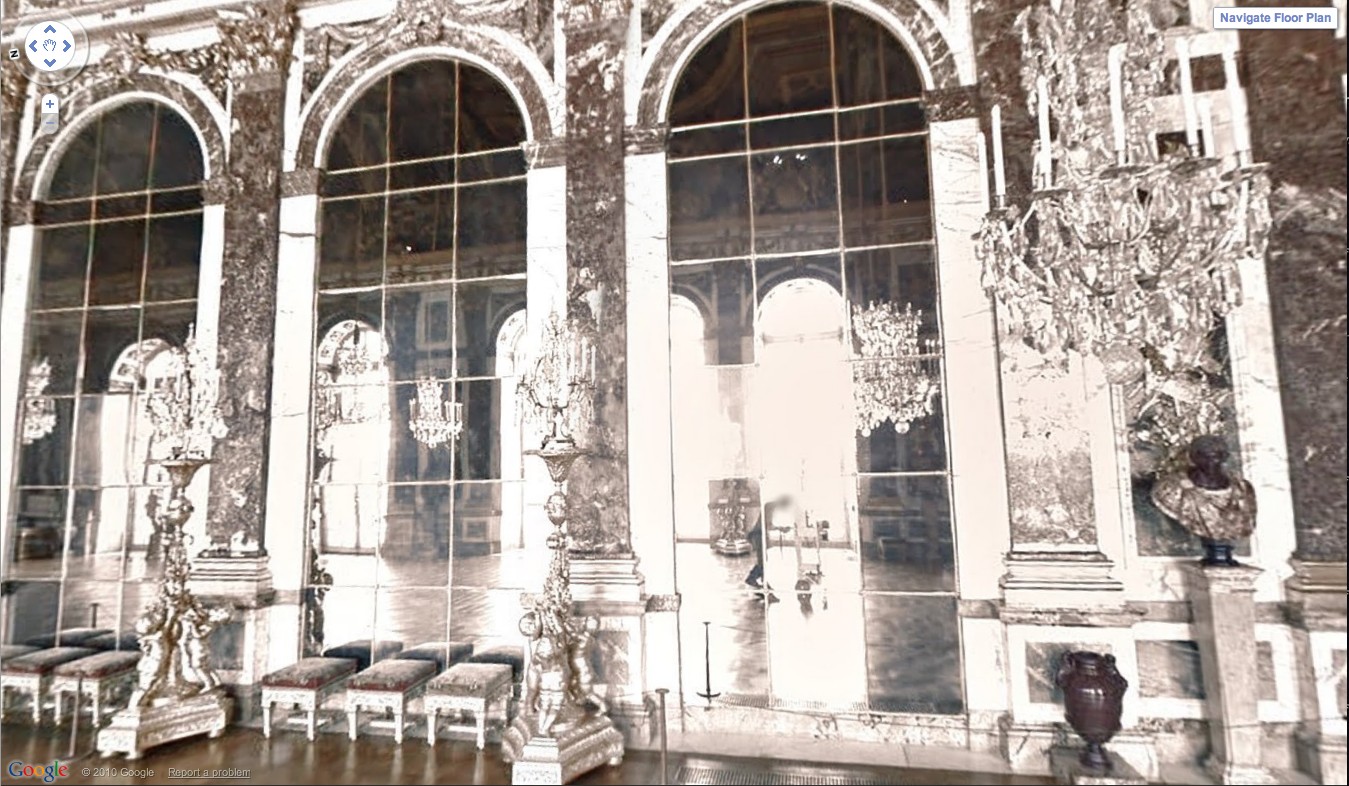
At least not anymore. Remember back in 2011 when the Google Art Project launched, and we got a little glimpse of the camera operator pushing his cart carefully through the Hall of Mirrors at Versailles? That feature has been eliminated.
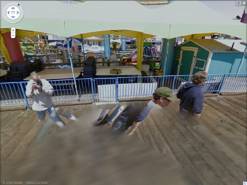
And when Google Trike was first tested four years ago on the Santa Monica Pier, its handlers not only appeared on camera repeatedly [including one pano, since removed, where they posed as civilians and flashed the peace sign], it also attracted attention.
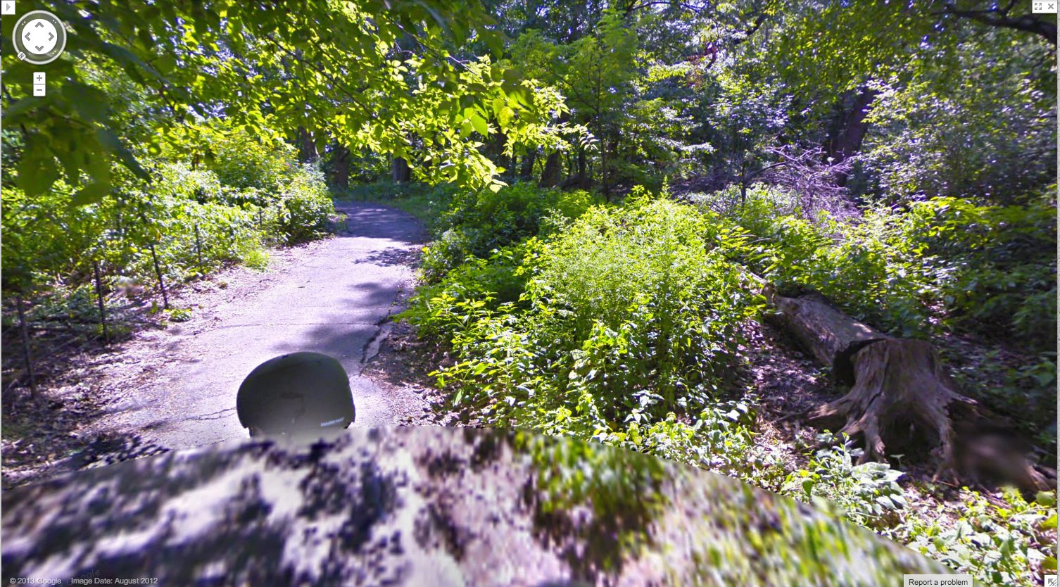
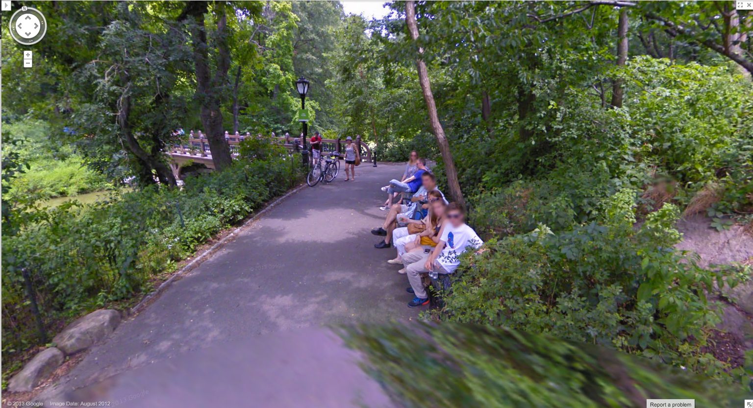
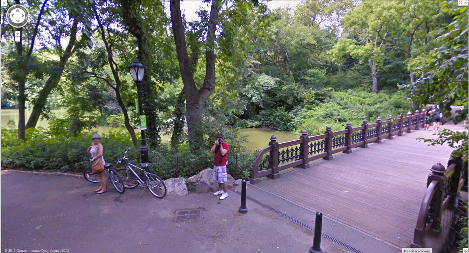
As recently as last summer, this was still the case. Here are some screencaps from a Google Trike expedition in Central Park, which someone linked to just last week. [here’s an Engadget story.] I couldn’t see any evidence of an attendant, like the guy I dubbed Walking Man, who appeared in almost every pano of the Google Trike’s first European outing, scanning the Binnenhof, the Dutch Parliament, in the Summer of 2009. But there were the occasional shots of the back of the Trike driver’s head.
I love this sequence, partly because it’s an actual moment in time, a person–the driver–moving through space. It’s a narrative, and a narrative of its own making. And that upsets the usual assumptions of Street View, in which the user internalizes the camera’s eye as his own.
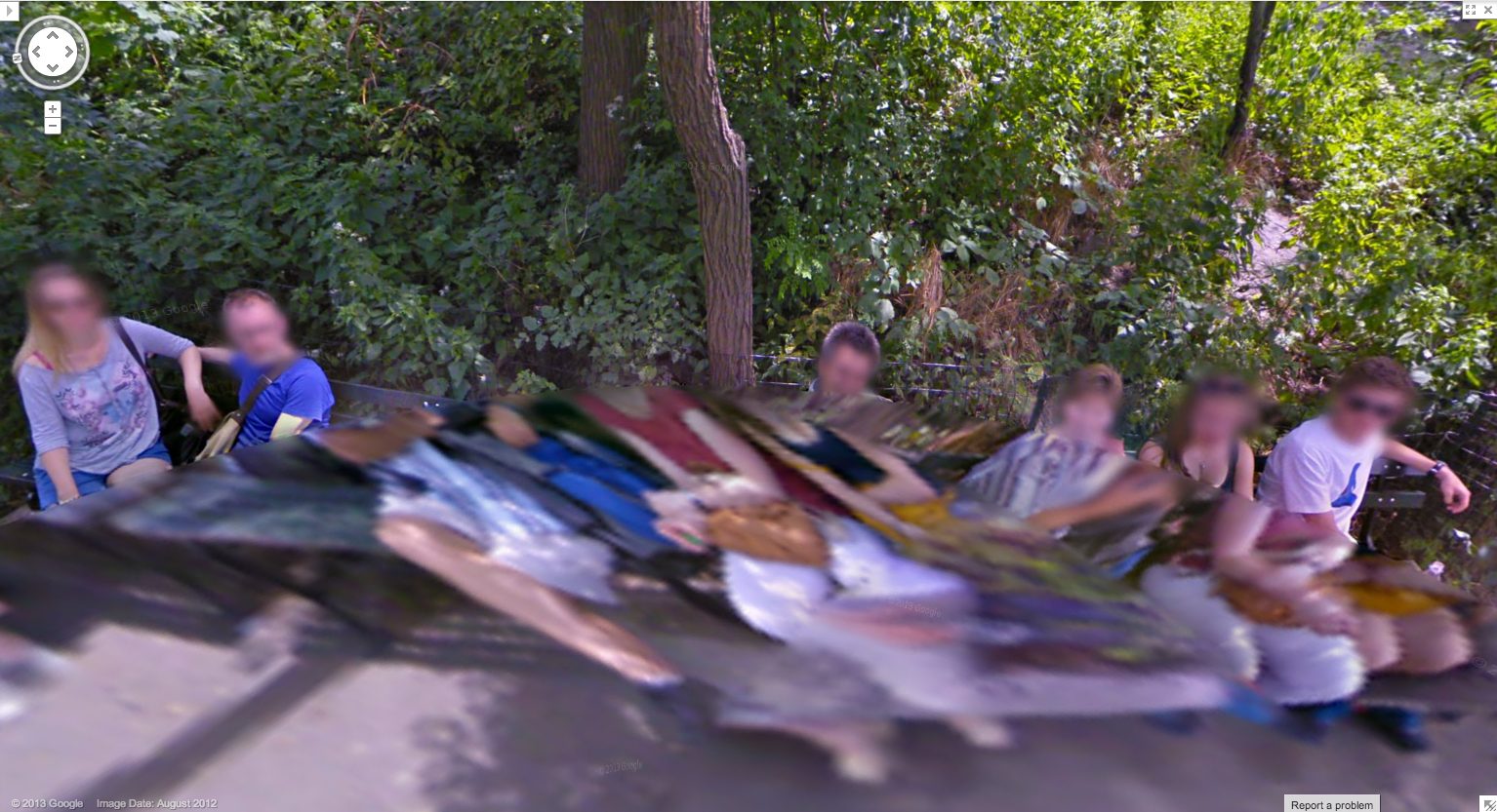
Plus, I just like the cubistic pano distortion aesthetic. I’ve grown accustomed to GSV’s blurred face.
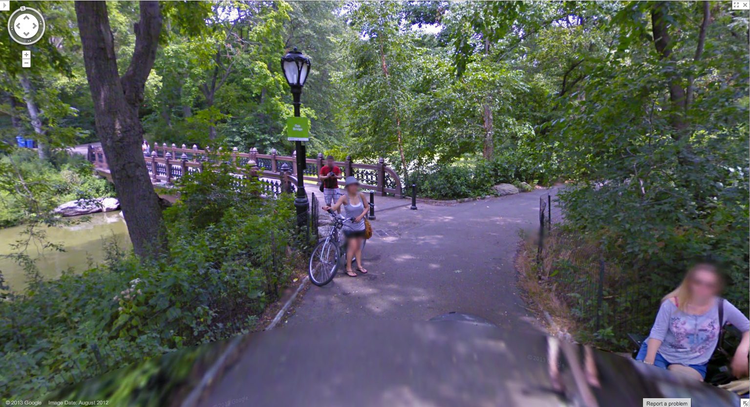
And as you can see here, the Google Trike and the camera are a recognizable feature now. A tourist attraction, even. That gets covered in the local news.
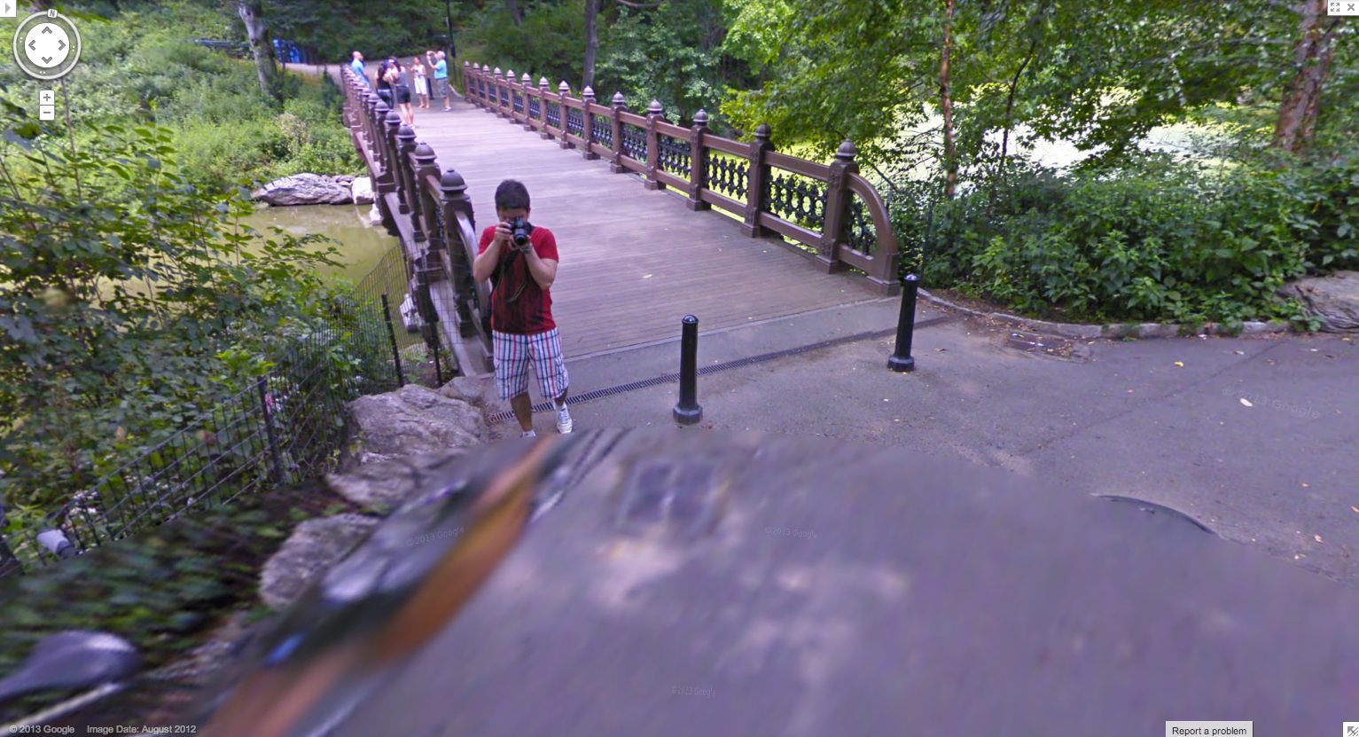
These people have probably been waiting months to see if/when their pictures show up on Street View.
Yes, well, that’s how Google used to do things. Those days may be numbered, and these images may soon be out of date, totally 2012. These Hong Kong panos were taken in April 2013, just weeks ago, and now they’re live. Not only has the processing time been shortened, but the stitching quality has improved significantly. There is a new Street View aesthetic, and it is the ghost. We have become the blur. Google Spirit View.
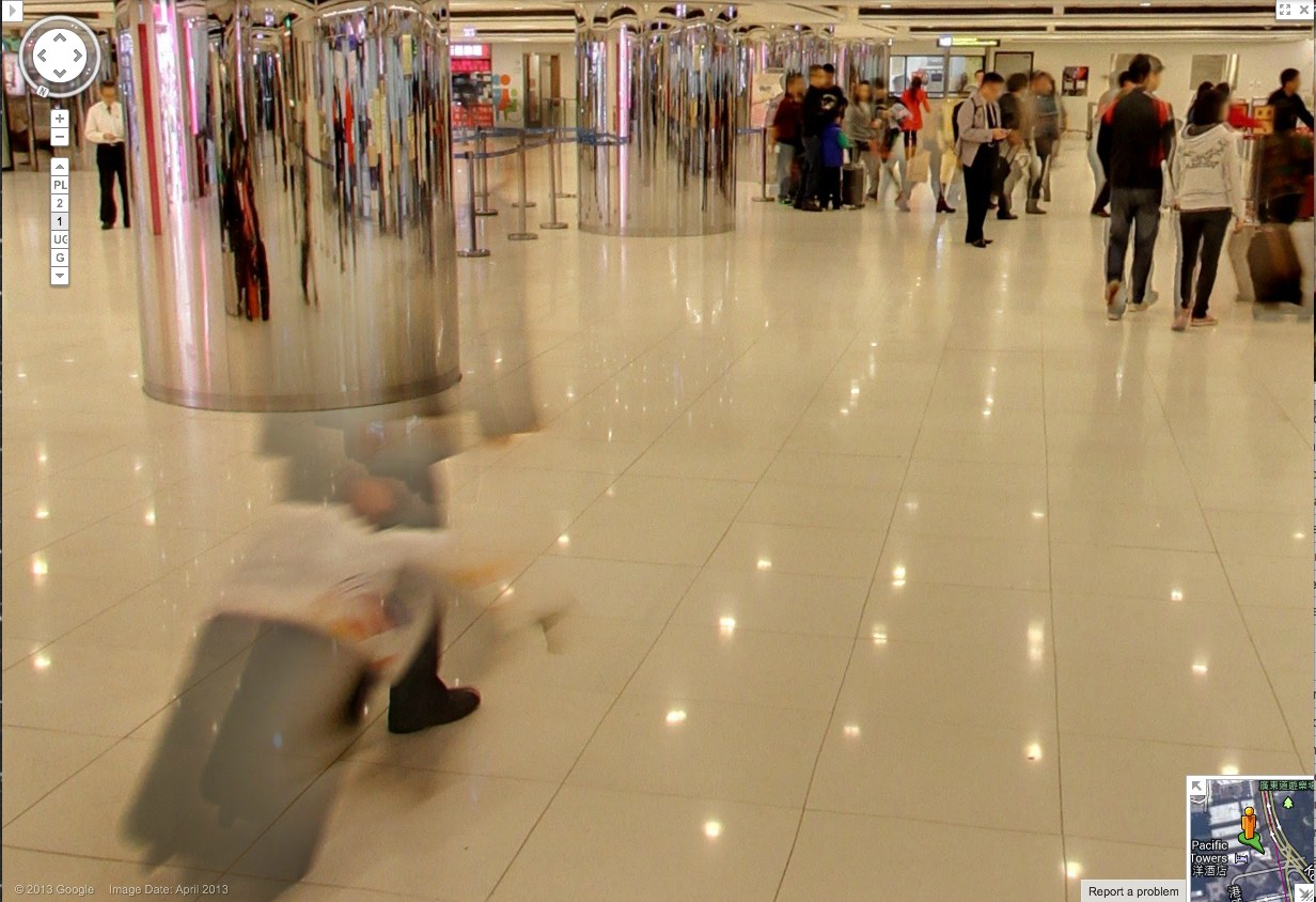
Check out this guy and his wheelie, almost gone. Also, it should be mentioned, these are interior panos, Google Art Project Everywhere. The Hall of Mirrors of the 21st century is a panoptic Kowloon ferry terminal/outlet mall with an LED grid reflected in the polished stone floor.
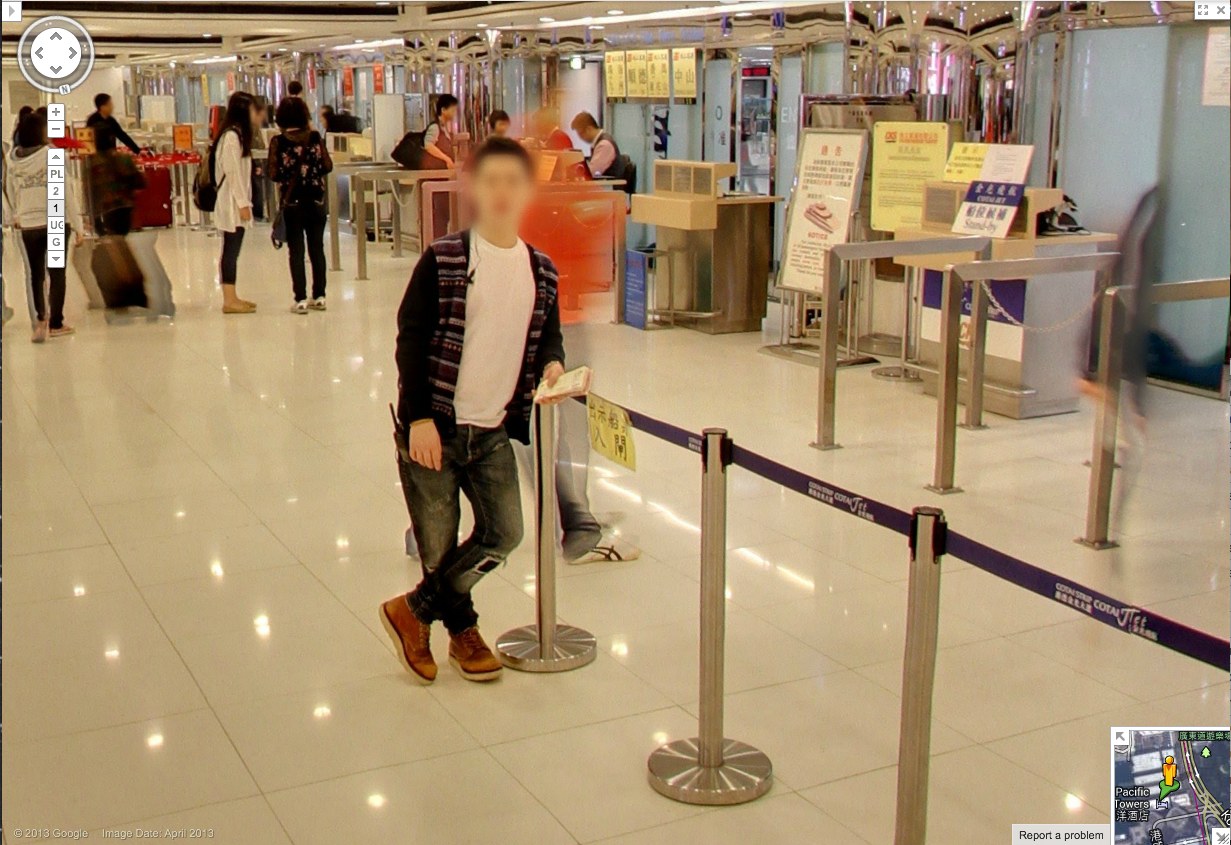
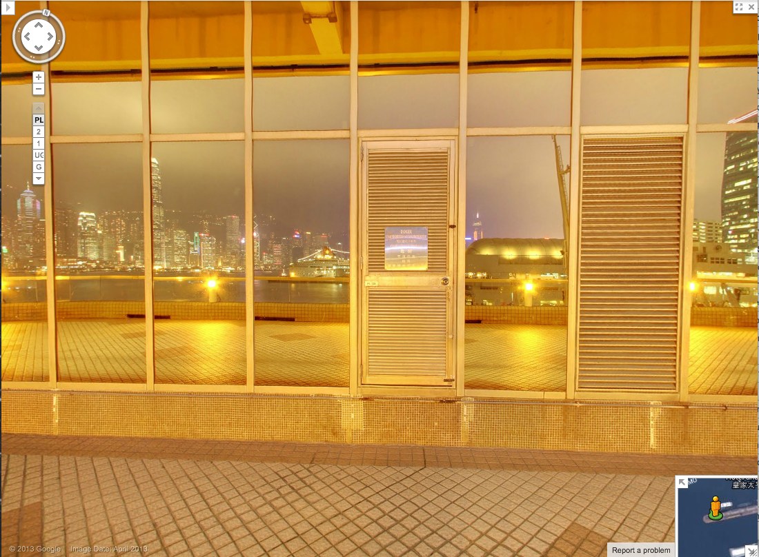
So compare the classic GSV civilian, face blurred, with the guy behind him–see him there, in his ASICS? His red jacket is just a haze through which the camera now neatly interprets the check-in counter further back.
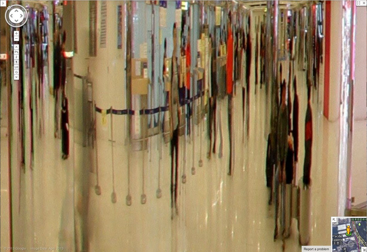
Spin around 180-degrees in this 1st floor pano, and the guy in red shows up more clearly reflected in the mirrored column. And in the mirror we also see someone who wasn’t there: the guy in the center, with the grey t-shirt and backpack. With a faint tripod visible in front of him. This is the Google Cameraman. His camera is the small black box above his head. Static but portable. [I love these attenuated, Giacometti-esque figures, btw. So first instant of perception.]
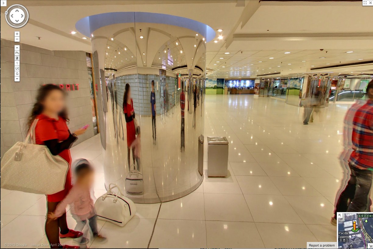
And here’s another one, from a less crowded shot on the 2nd floor. First admire the nice blur motion on the guy to the right. Then note the guy who doesn’t show up in the pano, except in reflection.
His superthin tripod does seem to have attracted the attention of the mom on the left, but no one else. They’re looking at each other as he shoots. His blue T-shirt says elgooG.
Is there a Street View equivalent of Moore’s Law? Because Google’s scanning setup is getting smaller, lighter, and more invisible, and their data turnaround time is dropping. It is now easy to see the convergence of Google Street View and Google Glass, where all the Google-powered devices we wear, carry, and use relay information back to the Server in real time. We will be Google Drones surveilling ourselves and each other within a few years, and most people won’t even notice it.
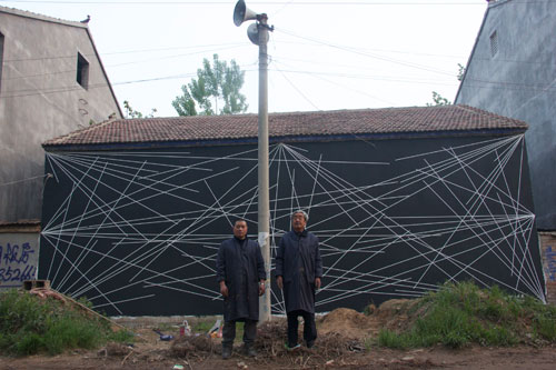
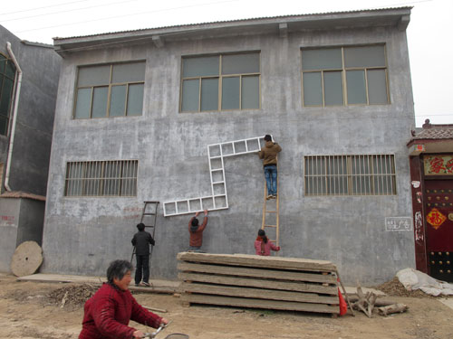
Shanzhai Van Abbemuseum By Li Mu
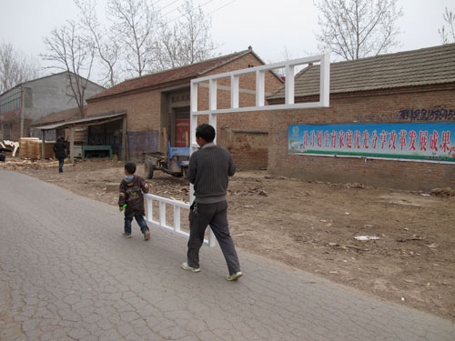
Suzhou-based artist Li Mu has established a public library and installed a collection of contemporary artworks from the Van Abbemuseum in Qiuzhuang, the small village in Jiangsu Province where he was born. Qiuzhuang Project: A dispersed museum project includes works by Sol Lewitt, Richard Long, Andy Warhol, Carl Andre, Dan Flavin, Ulay & Marina Abramovic, Daniel Buren, and John Kormeling. With the exception of the video pieces, all the artworks in Qiuzhuang Project have been or are being fabricated on-site.
Here are Mu and an associate creating one of two of Lewitt wall paintings [images via iamlimu.org]:
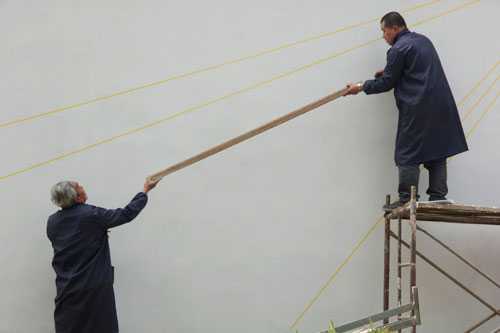
Earlier this year, after the library was up and running, Mu began fabricating copies of Lewitt’s Untitled (Wall Structure) (1972) and distributing them to villagers, mirroring FREE SOL LEWITT, a 2010 project by SUPERFLEX, which sent full-size Lewitt copies home with museumgoers in Eindhoven. It’s not clear whether the Qiuzhuang Lewitts are considered Lewitts, SUPERFLEXES, or Mus, but they look fantastic:
And that points to a complicated question. The Shanzhai (山寨) in the title usually implies a knockoff, a cheap or poorly made copy, ingenious perhaps, but an inferior or even illicit substitute for an authentic original. But none of that really applies to the art being made or shown here. From the Western or art-savvy perspective, at least, it’s the context that’s 山寨, not the work, specifically, the incongruity of seeing iconic contemporary artworks in this rural Chinese village setting. Which is pretty much the exact inverse of the project’s primary audience, the residents of Qiuzhuang.
I wonder what the impact of the project will be? The library, we’re told, will be permanent. But will Qiuzhuang experience an influx of art-related tourism for the show? How will that go? Or if not, what will that mean?
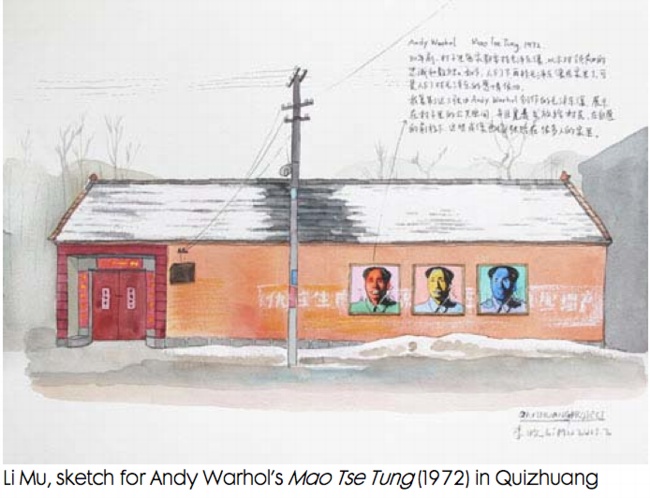
Is there a visitor guide? A map? Will the grocery store be thrilled, annoyed, or disappointed by daytrippers coming to see Ulay & Ambramovic’s bow & arrow video? How much of the contemporary art/culture/ museum/ economic development paradigm is actually being transplanted here? Will speculators descend on the town and try to buy up the Lewitt/SUPERFLEX/Mu sculptures? Will Mu be able to exhibit Mao paintings that were censored when they were by technically by Warhol?
The Van Abbemuseum is one of the more sophisticated institutions when it comes to engaging such questions. And Li Mu seems fairly well-attuned to the subtleties of both his art and his hometown. It will be interesting to see what unfolds as the Qiuzhuang Project continues.
I Am Li Mu [iamlimu.org]
ArtHub Asia is a sponsor of the Qiuzhuang Project [arthubasia.org]
The Van Abbemuseum seems not yet to have a permanent page for the Qiuzhuang Project [vanabbemuseum.nl]
Previously: Fau Sol Mio: FREE SOL LEWITT by SUPERFLEX
Ghetto Erased De Kooning Drawing
[See the note about Ghetto vs Shanzhai at the bottom of this post.]
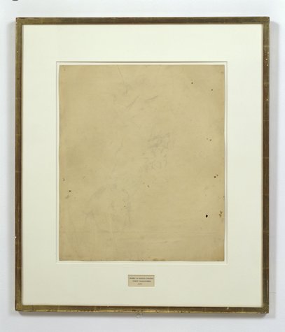
I’ve explored and written quite a bit about Erased de Kooning Drawing by Robert Rauschenberg & Jasper Johns. And I started to wonder if anyone else had ever erased one, too. If so, who and when, and if not, why?
Was it really a gesture that only needed to–or only could be–done once? Yes, there’s an audacity to Rauschenberg’s gesture, but the work is also, rather definitively, not a destructive act. Rauschenberg correctly saw erasing as an affirmative markmaking technique, one that de Kooning himself used quite skillfully.
So why not do it again?
I think the obvious explanation is that one more erased de Kooning drawing in the world would mean one less de Kooning drawing in the world, and that’s a seen as a problem. De Kooning’s pre-eminent stature as an artist, combined with his being dead, the finite number of works by his hand, the urge to preserve them, the conservation imperative of not making any irreversible alterations to an artwork–and of course, the economic folly of it, it just don’t add up.
On the other hand, it would offer an invaluable insight into Rauschenberg’s own experience and process in erasing de Kooning. Remember how he said it took him a month and a whole bag of erasers or whatever? Now we could find out.
Because Christie’s just posted an online-only auction of de Kooning works on paper collected over two decades by his longtime physician and friend Dr Henry Vogel. There are 33 works in the online Vogel sale, and some of them are nice, and even interesting. Let’s also say that there are several works available whose artistic character, historic importance, and sales estimates completely upend the calculations that have prevented a restaging of Rauschenberg’s act. They are highly erasable de Kooning drawings.
Lot 10, a diptych, is the first of nine drawings in what me might call de Kooning’s Notepad Series, which juxtapose his expressive markmaking with the rigorous geometry of lined paper:
He drew on everything from bags to grocery receipts, but it was paper–smooth, permanent and hard–that he favored most. Any kind of paper could suffice, even the torn out pages of a notebook, like with these two pieces.
The current bid is $2,600, with an estimate of $4-6,000. [update: sold for $3,250]
Christies’ specialist hints at the mysteries locked into Lot 11, above:
De Kooning often used the female figure as a starting point to explore abstraction, obsessively and tentatively probing the boundaries between the two forms. In drawings like this, only the faintist hint of the female form emerges–and even that is open to interpretation.
The starting bid will be $1,000 against an estimate of $2-3,000. [update: sold for $2,750]
But the most promising candidate for erasure may be Lot 12 (starting bid, $1,500, est. $3-5,000, [update: sold for $1,875], which not only features images that de Kooning himself crossed out–a double negation!–but which has not only been seen, but commented upon by John Elderfield himself:
“There’s one of these yellow pad sheets where he seems to have drawn a lot of forms and crossed them out,” said John Elderfield, a [sic] former curator at MoMA, describing this piece. “And it’s hard to quite know what he’s up to. […] But with de Kooning, there always is something.”
Just like a palimpsest, there always is something.
Which highlights another major difference between Rauschenberg’s Erased de Kooning Drawing and this, for lack of a better term, Ghetto Erased de Kooning Drawing: you could buy it. Rauschenberg held onto his for decades, until he sold it with a group of foundational, early work, to SFMOMA. But if having an authentic, erased de Kooning drawing of your very own is something you’ve always drramed of, well, the auction ends June 19th. Drop me a line. We’ll make it happen.
Willem de Kooning Works on Paper from the Estate of Dr. Henry Vogel, online auction ends June 19 [christies.com]
[NOTE: Though the use was more common at the time, I grew uncomfortable with the racist origins and implications of the colloquial use of “ghetto” for these works. I changed it to “shanzhai,” a Cantonese term which originally described unabashed counterfeit consumer goods; this usage has since shifted toward a hackier, scrappy innovation, but for these works, the original meaning pertains. I have kept the original uses of ghetto rather than delete them to acknowledge the blinkered social context I was also complicit in.]
Unrolling: Ghetto Gursky Rhein
[See the note about Ghetto vs Shanzhai at the bottom of the post.]
When I undertook this Ghetto Gursky experiment last week, immediacy felt important: to use just the best image I could find online rather than scanning a catalogue, for example. And printing with the quickest, point&clickiest online service I could find. The constraints would then be the focus: the “accuracy” and veracity of the image that circulates freely [approximated here by resolution]; and the ability to instantly print large-format photos in the dimensions that were once so startling and rare, they were only available to, well, Gurskys.
Literally, though, no sooner did I place my order than I realized this generated complications. Printing at 5×6 feet, the rough dimensions of Gursky’s Rhein (1996), is actually beyond the capacity of most instant printers, at least those of the vanilla consumer variety. [It’s trivial to print a vinyl banner at that size, though, but this wasn’ what I wanted.]
Which is all a long way of saying that the Ghetto Gursky test print just arrived today. It turns out that my immediate vendor choice meant it was printed in California and groundshipped. But it came rolled nicely in a large tube, and it made it perfectly intact. So that’s all good.
First impression: ghetto fabulous. Turns out high-production photography has an uncanny valley effect, too. It’s on thick photo paper, with a nice finish. The colors are true [to the JPG I used, anyway]. Standing in front of/over it, the similarity to a Gursky is surprising.
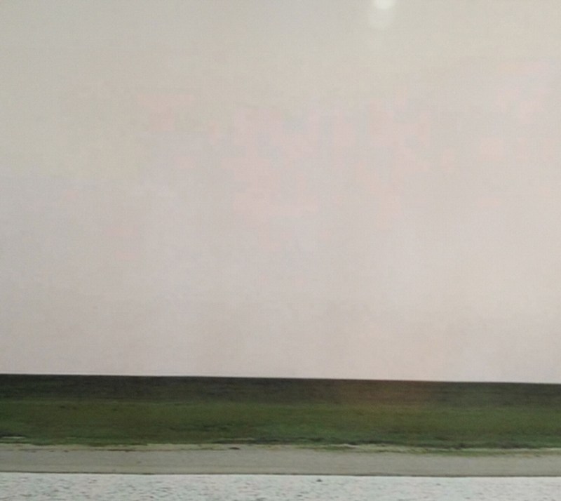
Looking closely, though, yields its expected rewards, just the way Hito Steyerl likes it: “resolutely compromised: blurred, amateurish, and full of artifacts.” Without algorithmic smoothing or some kind of image-massaging resolution upgrade, there are pink, pixellated passages in the sky [above].
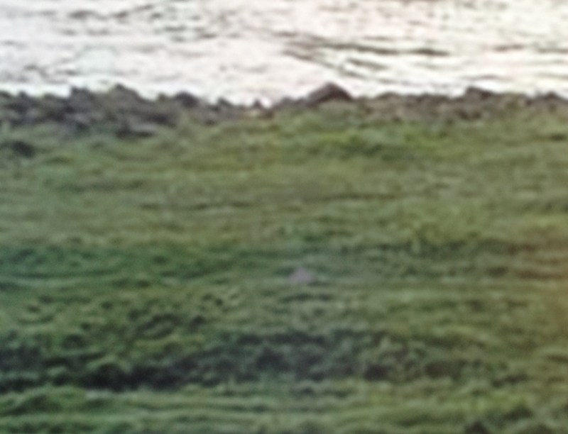
And there are a couple of greyish digital artifacts floating in the grass as well. I was going to say that the Ghetto Rhein does not have any of the crisp focus of Gursky’s original, but I don’t actually know that to be true. I haven’t stood up close with Rhein lately, but I’m not so sure that mid-90s C-prints actually have the grainless clarity I see/imagine in my memory. As with Prince’s Untitled (Cowboy) and the life-sized Untitled (300×404) print, I’d really like to see them side by side.
But the other issue, which popped up immediately, by which point it was too late, is mounting. There was no obvious, immediate, self-serve online place for facemounting a print that size on plexi. So now it’s up to me to track someplace down, and get it done. At which point, I’ll be schlepping a 5×6 print around. And soon enough, it’ll be basically 6×7 framed. And then it gets a crate, and then it’ll need a Sprinter van, and then it’s practically a Gursky, alike in every way except its street value.
[NOTE: Though the use was more common at the time, I grew uncomfortable with the racist origins and implications of the colloquial use of “ghetto” for these works. I changed it to “shanzhai,” a Cantonese term which originally described unabashed counterfeit consumer goods; this usage has since shifted toward a hackier, scrappy innovation, but for these works, the original meaning pertains. I have kept the original uses of ghetto rather than delete them to acknowledge the blinkered social context I was also complicit in.]