
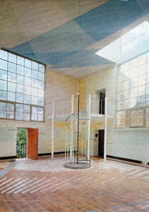
I have no willpower. I was going to hold off posting about this incredible project found on an incredible blog until I happily scored the book, but I couldn’t wait. Now I can only hope that my post will somehow bring a copy of the 1974 exhibition catalogue, Le Volume Bleu et Jaune into my clamoring hands that much more quickly.
A Young Hare is a new blog by Nicolas Allinder, aka “nic the intern”, who used to contribute to Ro/Lu. Nic posted about this rather insane project at l’Academy de France, where a group of anonymous architecture students petitioned to study a single room, their studio at the Villa Medici in Rome, for two years. The result: a 1974 installation in the studio in which the traces and volumes of light moving over time were inscribed on the surfaces of the space. Somehow, the exhibition was transferred to the Jeu de Paume in 1975.
Espace Tiphaine Bastille [now Edition Tiphaine put on a show dedicated to the project in 2003. The catalogue shows up in numerous library catalogues, but no inventories, and no scanned versions. Please, francophone web, get to work with the scanning and/or selling.
Le Volume Bleu et Jaune [ayounghare via ro/lu]
Previously, unnervingly related: on an unrealized art project
John Cage’s Lecture On The Weather
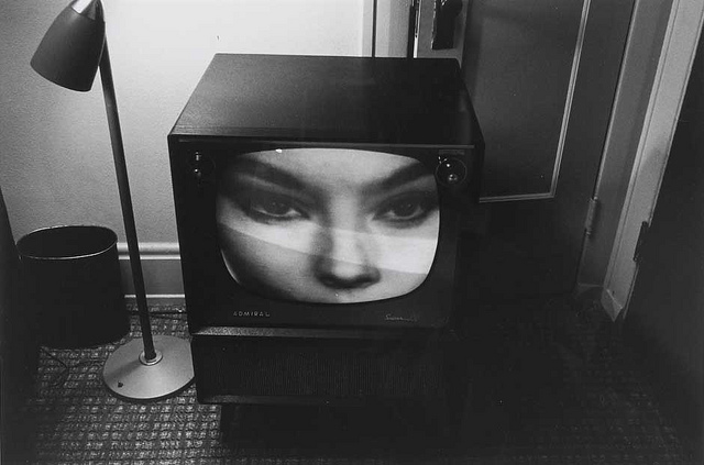
I’ve always considered John Cage’s politics to have been those of conscious non-engagement, but that’s because I have really not known anything about “Lecture on the Weather,” a text/sound/film/stage performance commissioned by the CBC for the US Bicentennial in 1976.
Cage had twelve performers read chance-selected texts from Thoreau’s writing, “On Civil Disobedience,” combined with projected images and a weather-related soundscape. Ubu’s own poet-creator Kenneth Goldsmith posted the text of Cage’s remarkable preface to the Poetry Foundation’s website a few years ago.
[It was a couple of years after Goldsmith published his own Cage-inspired work, “The Weather,” which consists of transcriptions of a year’s worth of Manhattan weather reports from 1010 WINS News, which as Marjorie Perloff wrote about at length, is more fascinating and unexpected than it might first seem.]
In this post on the John Cage Trust’s blog, Laura Kuhn writes about a remarkable 2007 restaging of “Lecture on the Weather” to mark the transfer of the Cage archive to Bard College. The slideshow below has a recording of Cage reading his preface and photos of the rather amazing collection of Thoreau readers.

As of last year, the Trust was waiting for some “angels” to fund the release of a recording of the Bard restaging. Maybe they should do a Kickstarter campaign or something.
On Bremser On Google Street View
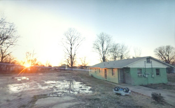
Doug Rickard, Helena-West Helena, Arkansas, 2008, “A New American Picture,” via bremser
Thanks to Joerg, I’ve had it in my browser tabs for almost a month now, meaning to write about it, but the TL;DR version is, Wayne Bremser’s essay on his blog It’s Never Summer is one of the smartest things I’ve read on Google Street View and fine photography.
“How to Photograph the Entire World: The Google Street View Era,” looks at work by GSV photographers like Michael Wolf, Jon Rafman, and Doug Rickard in relation to the greats of earlier generations of like Lee Friedlander, Robert Frank, William Christenberry, and Larry Sultan. [Bremser doesn’t mention, and I just thought it while typing this list, but The Google Gaze is apparently male. Maybe the giant camera stalk with the big balls was the first clue.]
Anyway, Bremser’s analysis is excellent in itself, but his premises also illuminate the contours of the gap that somehow persists between photography and art. Or more properly, between fine photography and contemporary art. At this point, I am coming to see these differences in religious terms: they’re formative, deeply held, esoteric, easily lost on outsiders, and laughable to an atheist.
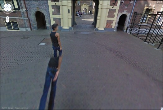
Walking Man – The Binnenhof, 2009, via greg.org
Though his title hints at more audacious possibilities, Bremser focuses on GSV as a tool for human artists:
As a camera, GSV is used by a photographer to rotate around, frame, and click to grab an image. The images that we see on the screen are raw data, gathered by the drivers; these images do not become photographs until a photographer frames them.
So, framing.
Also, I’m happy to take GSV’s ambition to “photograph the entire world” at conceptual face value, and go from there. By the time the Bechers began exploring the futility of documenting typologies of disappearing, industrial manmade structures, astronomers had already begun their second attempt to photograph the entire universe.
From Bremser’s photographer-centric beginning, it’s logical to say that:
One important process-related issue with GSV images that end up as photographs on a gallery wall is this: they are not screen grabs, but photographs of a screen.
Which, hmm.
Michael Wolf, Paris, 2008
But it is compelling and awesome to see the moire patterns and magnified pixels of Wolf’s pictures of his computer screen [above] in the context of photographers taking on the tectonic media shifts of their day, such as Lee Friedlander’s “Little Screens” series [below], photos from the 1960s that captured fleeting images on television sets.
Lee Friedlander, Florida, 1963, via bremser
And then there’s this:
Regardless of how photographs are sourced, it’s still essential to see photography in books and on walls. How do these look in the gallery?
Which, again, hmm.
I have used screenshots from both Google Maps and GSV to make both prints and books, because the screen, or the browser window, or Google Earth, is Google’s native image format. [Technically, that’s not true; Google presumably has much higher-res versions of their imagery which they do not make publicly available.] But I guess this is a distinction between using at Google’s imaging as source, and examining at it as subject. The fascinating, mind-blowing process around here isn’t Wolf’s [or for that matter, mine] but Google’s.
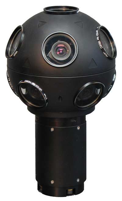
Even though it’s not his point, Bremser still moves the aesthetic ball forward. I’m embarrassed to say for all my Street View obsession, I never bothered to identify the camera system Google uses. Or used, since they seem to have replaced Immersive Media’s 11-lens, Dodeca 2360 pano camera [above] with an even awesomer camera ball [below].
Or maybe they’ve just added the optimized housing. I don’t know, but I should. Because this equipment is not Google’s secret sauce; it’s available. You can take a Dodeca 2360 out to make your own panos or sequences. The Street View aesthetic can now be yours! At least in theory. I suspect I’d find that shooting with a Dodeca 2360 wouldn’t make me Google any more than using a Red would make me Steven Soderbergh.
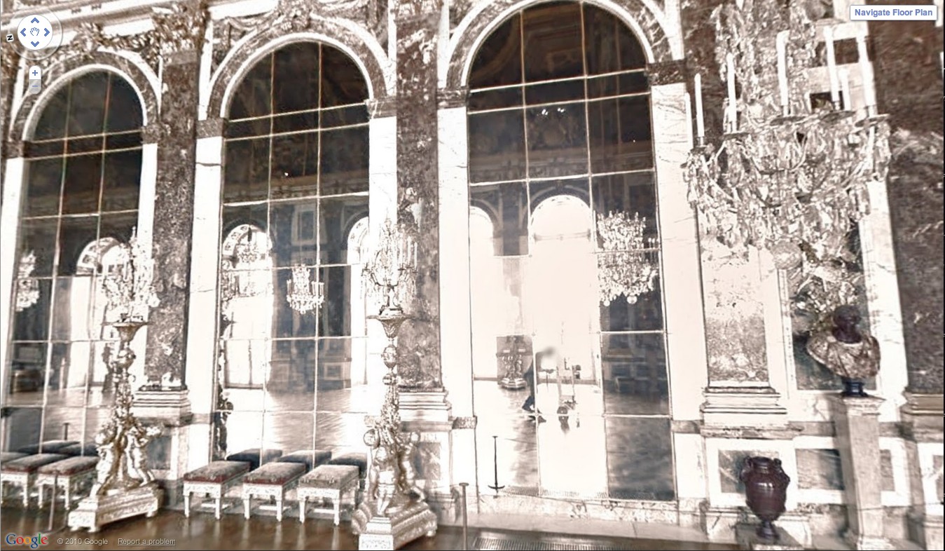
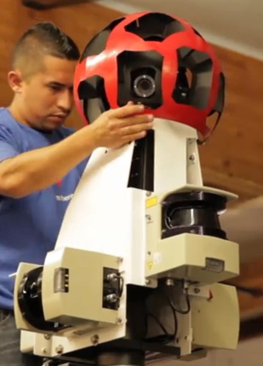
Google Street View camera guy in Versaille’s Hall of Mirrors, via [Google’s] Google Art Project.
Bremser concludes–and I agree–that GSV is rich and varied enough “that Michael Wolf can make photographs like Michael Wolf, Doug Rickard like Doug Rickard.” And Google like Google.
Earthworkers
Andrew pulls a great quote from this 1969 New York Magazine article by Rosalind Constable about buying the new-fangled, dematerialized art. But it’s the section right before it that caught my eye.
Constable’s writing about earthworks, particularly Walter de Maria, is a good reminder of the Conceptual context from which these works emerged:
Walter de Maria is generally conceded to have been the first artist to have used the desert for his canvas, and in so doing, to have reversed the usual art process: the work itself is ephemeral–or inaccessible–and the photograph becomes the art.
There’s like five kinds of quaint here, including the immediate invocation of the traditional metaphor of the artist and his canvas. There’s the conflation of ephemerality and inaccessibility, even as notions of remoteness and inaccessibility disappear. Site becomes as irrelevant as experiencing the work in person. Knowledge of the work is derived from seeing a photo, or from hearing or reading a description. The apparent novelty of a site-specific artwork in the remote desert is surpassed only by the idea that a photograph could be a work of art.
But what really gets me is the discussion of Smithson.
Robert Smithson is known as an earthworker (Heizer prefers the terms “landforms” or “exteriorization,” and Oppenheim prefers “terrestrial art”), but other earthworkers would exclude him. Smithson is currently showing his latest collection of rocks at the Dwan Gallery, and it is precisely because he brings them into a gallery ambiance, rather than leaving htem where he found them, that they disown him.
This seems like a pretty hefty oversimplification of the emergence of Land Art. In the battle for linguistic dominance, “earthworks” was Smithson’s coinage; other artists could reject the term, but it seems unlikely they’d claim Smithson wasn’t an “earthworker.” It also ignores the broader critical round-up by folks like Willoughby Sharp, who’d curated a foundational “Land Art” show the year before. And the “Earthworks” group show at Dwan that preceded the Smithson non-sites that were the subject of Constable’s sources’ scorn.
Still, it feels directionally accurate, in that from almost the beginning, the art world discourse of earthworks has generally privileged the convenient and collectible–including mere photographs–over the physical realities of the works.
Though this has changed in the last 15 or so years, with the emergence of a contemporary Grand Tour, the lingering critical effects of this devaluation of site can still be felt.
Projecktions
In May, Steve Roden wrote very nicely about Fionn Meade’s “Time Again” show at Sculpture Center, especially the conversation between one of his paintings and a little-known photograph of Projecktion, a Blinky Palermo project from in 1971, in which a painting was projected onto the facade of a building.
palermo’s “projektion” seems to shift certain conditions of an existing architecture through the addition of color and light, while my painting was the first that i have made that was directly influenced by the existing architectural conditions within which it was made (i.e. i could not have been made the painting anywhere else as its visual motif was built through my conversation with specific visual qualities of the space). in this way, palermo and i begin to talk about both painting and architecture in relation to ideas of site specificity, and in particular, i believe that as these works create a kind of conversational ouroboros around architecture and painting, where blinky imposes a painting upon an architecture, while in my own work an architecture is allowed to impose itself upon a painting.
That rather indelible Palermo image has turned up again, this time at CCS Bard’s show, if you lived here, you’d be home by now, which pairs it with similar, architectural/cinematic projections by Palermo pal Imi Knoebel. On the Sculpture Center. Knoebel’s Projection X was a video collaboration with Gerry Schum. In writing about these works on the SC website, Meade promises more to come. So stay tuned.
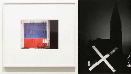
On Tacita Dean’s Photographs
As I mentioned the other day, I’ve been going through our storage space, getting these time capsule-like pops of memory from old files and boxes and stuff. One of the more unexpectedly unexpected encounters: print photos. I just don’t have envelopes of photos or snapshots sitting around anymore, not like I did in the 1990s.
And in that way, at least, I am like Tacita Dean, an artist whose films I’ve long admired, but whose work in photographs I haven’t really thought of much until now.
For her 2003 show at the Kunstverein Dusseldorf, Dean excavated a set of forgotten negatives she shot while living in Prague in 1991. As Catrin Lorch put it in her review of the show for Frieze:
[Dean] printed almost all of them to make a series of black and white, small-format photos. The almost forgotten scenes reveal a cross-section of the early years of post-communist Central Europe: broken-up cobbles, blurred, speeding trains, gracefully curving stairwells suffused with the crumbling charm of Eastern European modern architecture. A woman’s fat legs in black tights; a friend at the breakfast table. Looking at these photos arranged in open wooden boxes on a small table was like opening a message in a bottle.
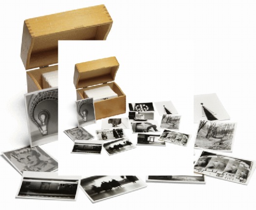
In 2008, Sotheby’s sold a set of Dean’s Czech Photos, which she’d published in a small edition, for a remarkable 3,750 GBP. [Sotheby’s flash-based e-catalogue site, where this screwed up double image comes from, is a web-breaking disaster,, btw.]
And then this morning, the lately irascible Jonathan Jones [h//t modernartnotes] mentions Dean’s “ambitious prints derived from photographs,” which he calls “her most powerful creations.” Well, which, what?
Sure enough. And ever true to her analogue roots, they’re photomurals. And overpainted photomurals to boot.
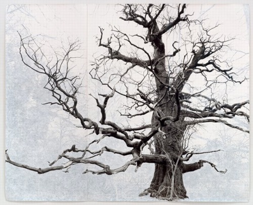
Beauty, 2006, 3.6 x 3.75m, collection sfmoma
Dean showed these large-scale works in her 2007 show at Frith Street Gallery in London, titled Wandermüde, which is the little-known corollary of Wanderlust. She made what are essentially portraits of the oldest trees in Southeast England, printed them on a large scale–using Steichen-style photomural-as-wallpaper technique–and then painted out the non-tree elements of the photo with gouache.
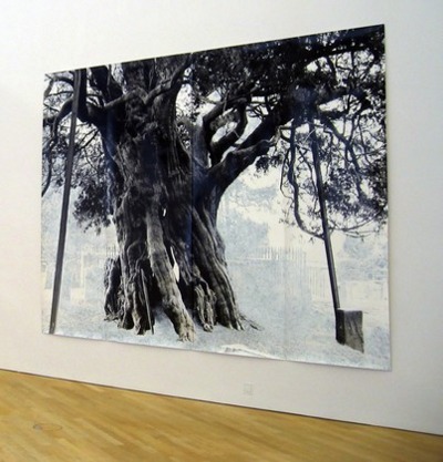
Crowhurst, 2007, 3x4m, collection: moma
That’s one in SFMOMA’s collection up top. Above is Crowhurst, from MoMA’s collection. I like how the oblique view clearly shows the work’s materiality, its seams and curled edges. MoMA’s website says they showed Crowhurst in 2007-8, but I confess, I don’t remember seeing it. I hope I didn’t mistake it for a Ugo Rondinone tree drawing and keep on walking.
Unlikely Twitter Juxtaposition Of The Day

1994 Calling: Spiral Jetty
We’re consolidating storage spaces between New York and Washington, and it’s given me a chance to reorganize a bit. I found a couple of boxes my 1994 self apparently just threw stuff into, sealed up, and shipped off, almost like Warhol-style time capsules.
At least, that’s the positive spin on them. I’m sure Hoarders has a different take.
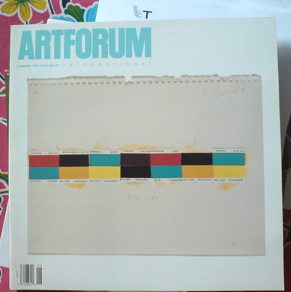
Anyway, one of the things I found was a stack of old Artforum magazines, including this one, from Summer 1994, which was something of a Donald Judd tribute issue. The cover image of a Judd study for a 1985 wall work collaged from paint chips jumped right out of the box at me.
The next thing I noticed when I picked it up was how thing and light it was: just 120 pages, plus a 32-page Bookforum inset. Adorable.
And then, flipping through it, I saw this:
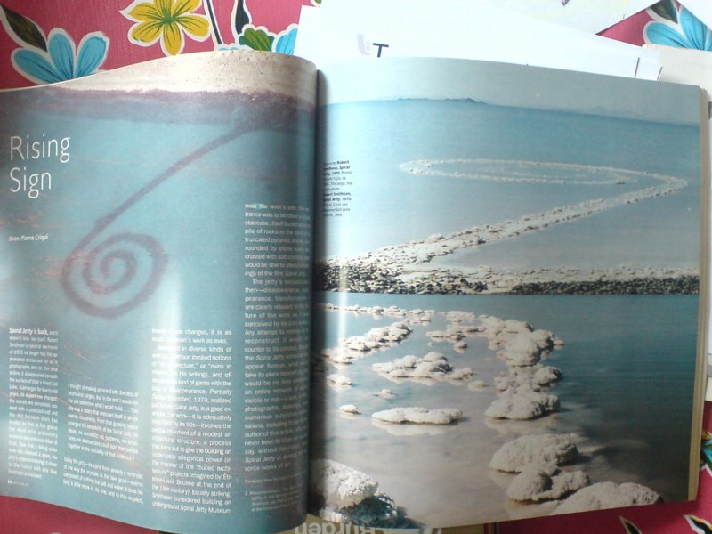
A two-page photospread, dropped into the issue in the Artforum equivalent of breaking news, which announced to the art world the re-emergence of Robert Smithson’s Spiral Jetty. Summer 1994, people, just like I said it did.
The 1993 aerial photo on the left is by Atsushi Fujie; it’s hard now to remember the time–even though it was most of the Jetty‘s first two decades of existence–when the only way to really see it was from the air. [Whoops, Fujie’s photo is dated here from the 1970s.]
In any case, the two contemporary photos on the right are by Carol van Wagoner of the Salt Lake Tribune, the paper which first published news of the Jetty‘s appearance in the Spring of 1994, before the snowmelt, when Great Salt Lake was at its low point.
The brief text by Parisian art historian Jean-Pierre Criqui, which opens “Spiral Jetty is back, and it doesn’t look like itself,” is a nice time capsule, suitable to mark the transition in the Jetty‘s history. The moment when the archetypal work of Land Art stopped being just a sign of itself–a concept, a state of mind, really–and reasserted its massive physical presence, and its inextricable link to its site:
The jetty’s vicissitudes, then–disappearance, reappearance, transformation–are clearly relevant to the nature of the work as it was conceived by its (co-) author. Any attempt to restore or to reconstruct it would run counter to its concept. Should the Spiral Jetty someday disappear forever, what would take its place beneath its title would be no less powerful: an entire network of signs, visible or not–a text, a film, photographs, drawings, and numerous subjective elaborations, including those of the author of this article, who has never been to Utah yet would say, without hesitation, that Spiral Jetty is among his favorite works of art.
As one who drove out to the Jetty for the first time that Summer, I can say without hesitation that it’s among my favorite works of art, too.
Meridith Pingree’s Got Your Catenaries Right Here, Boys
Meridith Pingree —– Blue Curtain
Meridith Pingree’s in a show right now at Freight + Volume. Thanks, Anaba for the heads up on this fascinating-looking work.
It reminds me a bit of Rebecca Horn’s work, which, frankly, I haven’t seen much of since her jaw-droppingly weird retrospective in the Guggenheim rotunda in 199…2? 1993. Wow, feels like yesterday, but it was so long ago.
Pingree’s kinetic sculptures seem a little less menacing, maybe? Or maybe it’s just watching them on video feels safer.
Previously: speaking of catenaries…
Sgarbian Backdrops
The near-universal consensus from the VIP opening was that the Italian Pavilion exhibition curated by art critic/Berlusconi apparatchik Vittorio Sgarbi was an unalloyed, over-politicized disaster. Yet so far, I have seen very little substantive criticism or engagement with it. Rome-based art theorist Mike Watson’s column in Frieze is a so-far-rare exception:
…the show appears to have resulted unwittingly from the congruence of a cultural elite who lack political power and a political elite who lack culture, highlighting the negative aspects of both – although ultimately it is the clumsy Berlusconian presence which comes off worse here.
In Italy, a country with a deep cultural heritage, the fine arts are the final refuge from a philistine tendency that affects everyday life with an alarming pervasiveness. Yet it appears that the systemic contradictions which plague the Italian political and cultural sphere – and which serve to keep the powerful grinning their stricken grins – have now invaded the fine arts.
Oddly, when I first started liking this quote last week, it was partly because I’d read it as “the fine arts are the final refuge for a philistine tendency,” an Italian play on patriotism as the last refuge of scoundrels. I imagined a demagoguing, pseudo-populist media mogul’s flailing administration wrapping itself in a fresco at Venice. But apparently not.
Instead, Watson maintains the notion of art as a “refuge from,” a world apart from the [real] world. Watson says this philistine affront occupying “the centre of the most prominent cultural event in the art world’s calendar,” demands “an appropriate response.” But what? A sternly worded petition? Some scathingly derisive remarks over dinner in Basel? Art world folks can tweet their outrage all they want, but when the smoke from Sgarbi’s stinkbomb of a show clears, they’ll still be inside their gilded cage refuge.
The Physiognomy of a Nation [frieze]
Rauschenberg Currents Event
Robert Rauschenberg’s massive 1970 silk screen edition, Currents sure is hard to miss. And not just because it’s 18 meters long.
MoMA’s copy from the edition [of just six] has been wrapped around the corner of the second floor galleries for a while now. Which may have helped coax Peter Freeman into bringing out another of the screenprints last week for Art Basel.
But it’s also at the end of the Rauschenberg’s segment in Emile de Antonio’s documentary, Painters Painting [above], which I rewatched recently. Bob unfurls it with a slightly soused, earnestly glib voiceover about how, even though there’s so much information packed into a daily newspaper, most people don’t read it. But if someone spends $15,000 on the info, the artist can get him to pay attention. Or at least not wrap the fish in it and throw it out.
Which is ironic, I guess, because I’ve found that the size and visual uniformity has caused me to stroll by Currents without ever even slowing down. I register it as reworked newspaper content, on a giant roll, just like the real newspaper itself–but I don’t slow down to look closely. I mean, really, at that scale, how much of my time does Rauschenberg really think he’s gonna get?
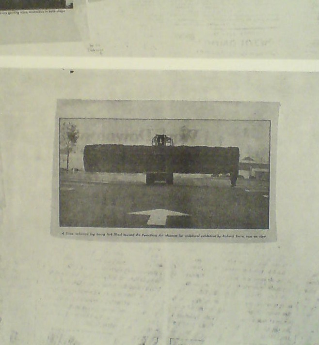
So maybe it was because I’d just run into Richard Serra moments before in the atrium, or because I came at the work head-on this time, instead of from the side. But I’d never noticed, for example, that there is a news photo of a frontloader bringing a massive fir tree trunk to the Pasadena Art Museum for Serra’s 1970 work, Sawing: Base Plate Template (Twelve Fir Trees)
Above it and to the right, I’d swear that row of tract houses is a Dan Graham photo.
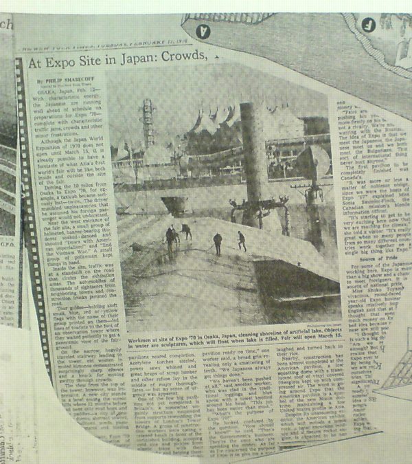
And hey, there’s a story about construction progress on Expo 70 in Osaka, where E.A.T., the collaborative Rauschenberg founded with Billy Kluver, was creating the Pepsi Pavilion, and where Rauschenberg was still thinking he’d show his own work, a plexiglass cubeful of bubbling drillers’ mud called Mud-Muse, which he’d developed with Teledyne for LACMA’s Art & Technology show and the US Pavilion.
If I can spot these now-obvious contemporary art references in Currents, what else must be lurking in there? Was incorporating other artists’ images Rauschenberg’s way of tipping his hat to artists and work he liked, or was he assimilating and subsuming it in his own, sprawling scroll? Was he engaging in a dialogue with the Conceptual and post-minimalist kids coming up or putting them in their place? Or trying to put himself in theirs?
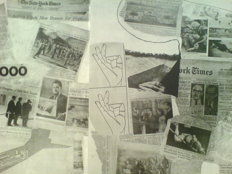
The most intriguing references now, though, turn out to be a little trickier. There are multiple instances of diagrams showing hands throwing the OK sign which remind me of nothing so much as the sign language woodblocks used in the prints at Jasper Johns’ latest show at Marks.
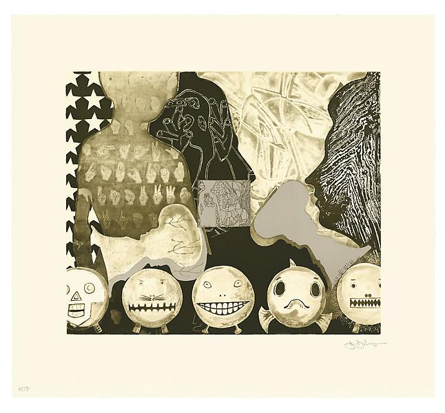
Shrinky Dink 4, 2011, intaglio print, image via
I remember thinking immediately of Rauschenberg when I saw the mirrored newspaper transfer appearing in the upper left of this Johns drawing, Untitled, 2010.
Rauschenberg began using the technique in the mid-60s, and it’s all over Currents. Remind me again how long MoMA’s had their print on view?
Ro/Lu Lo/Go
Ro/Lu is en fuego these days, in case you didn’t know, and I’ve been lucky enough to get warmed by their fire.
First off, they’ve been doing this Simple Chair project, an exploration of how and where our stuff is made. It’s making its second appearance at Mass MOCA. I was planning to just write about it more when I saw the publication [to which I contributed a brief article of my Enzo Mari X Ikea table project], but Ro/Lu just keeps on doing stuff, so I can’t sit silently by.
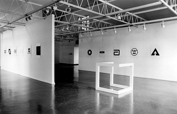
And then, as if reading my mind–or my blog drafts, or maybe communicating telepathically with me through the minimalist/modernist/design/art ether–they posted a link to an awesome-looking 1980 exhibition at The Renaissance Society in Chicago, “Objects and Logotypes: Relationships Between Minimal Art and Corporate Design”.
Whoa. It’s fascinating to see how Minimalism, modernism, and corporate branding were perceived and presented thirty years ago. They all feel digested and processed now, but I get the sense that what curator Buzz Spector is talking about in his essay is not quite the same thing we use those terms for today.
Which may be a way of saying I take issue with many of Spector’s definitions and points, but I’m not quite able to articulate why I think he’s wrong. I mean, I can say that I think Greenberg’s Minimalism-as-“mannerism” does not seem related at all to the principles of usage in corporate visual design. Or that the ubiquitous, homogenizing proliferation of a corporate logo seems like the diametric opposite of Robert Morris’s sculptural gestalt, not its twin.
But Spector’s show still seems like an interesting, important first step for the coming revisiting of Minimalism. And siting avant-garde art practices in parallel to mid-century corporate marketing is pretty compelling to think about. And I really like the idea Spector hangs his show on, that these designers and artists are alike in conflating form and value, i.e., that they “reflect a common faith in the efficacy of form as a means of restructuring society through public exposure to works executed within particular systems of use.”
As I sit here in the middle of a mild obsession with the Netherlands government’s new, painting-inspired rebranding and centralized visual identity system, this idea feels as relevant as ever.
So thanks, Ro/Lu!
Working In The Medium Of Vinyl Wrap Art Car
Last year about this time, after seeing Jeff Koons’s BMW Art Car, I tossed off the idea that artists could be cranking out vinyl wraps as artworks.
Which I will happily assume is why designboom and Porsche had this contest last winter to create vinyl wraps for the Cayman.
Which, hrm. Even as I randomly take full credit for the idea, I gotta say, it’s just as likely it’s entirely wrong.
Sheep Parade
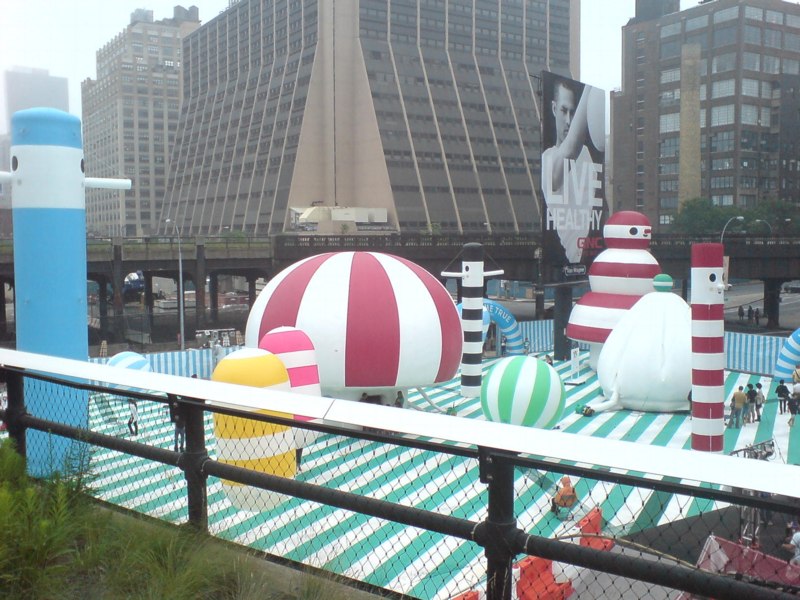
After hipster bouncy castles and food truck happy hours, and shuffling like giddy commuters along a packed, 10-block-long sidewalk the size of a lesser tunnel passageway at Penn Station, I was forced the other night to contemplate the cheery, civic absurdity of the High Line.
Which fortunately turned out to be mostly novelty; the crowd thinned out noticeably on the older, wider section south of 23rd St. I was early for dinner, so I pressed on, keeping a hopeful eye out for Euan as I passed under the Standard; running into him would mean his long, weary nightmare of being stuck, laid over, at Charles de Gaulle had ended. [Alas, he tweeted, it had not.]
Though you’d think it might, entertaining the possibility, however remote, of seeing my most authentically Austin Powers-ish friend did not prepare me for the marching band.
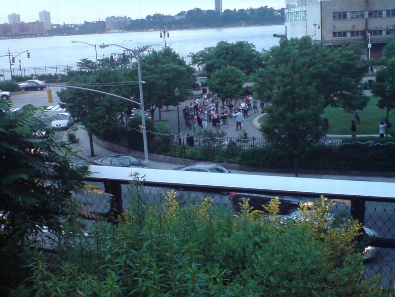
Their music, obviously was heard first. I was coming towards them, or–how thick are these reedy plantings?–perhaps they were coming towards me. Somehow, it was neither. The band remained well within earshot, but largely out of sight to High Liners who didn’t want to stand in the bubbly water feature section above the gas station on 15th St. Wade in, though, and you could see them marching in a circle–yes, there they go, taking another lap–around the oval green of 14th Street Park.
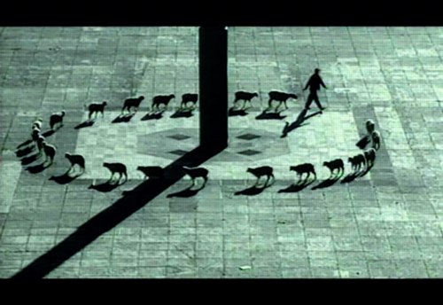
And thus, I was compelled to think again–twice in one day!–of Francis Alys, whose video works, Rehearsal I, of a futile trip made to the accompaniment of a brass band, and Cuentos Patrioticos [above], in which a shepherd leads his flock in a beautifully improbable circle around the Madre Patria in Mexico City’s Zócalo, are the best things in his MoMA exhibit, not counting the skillfully executed vitrines and pedestals. [image via]
Up Newtown Creek, Or This, Anish, It Don’t Stink
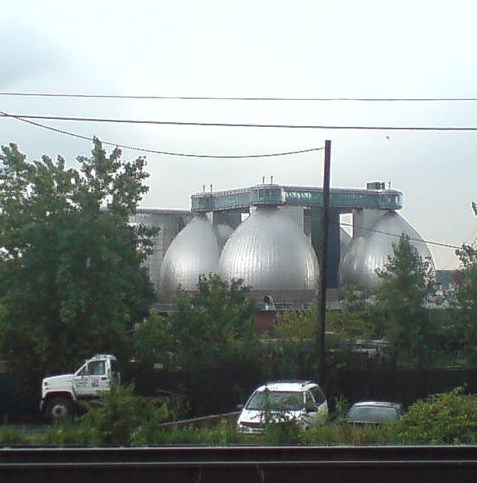
I’ve been moving art and life at our storage unit in Long Island City several times the last couple of weeks, and it’s given me time to really look. Look across the water to the most spectacular structures built in New York City in the last five years: the massive, stainless steel egg-shaped digesters at the Newtown Creek Waste Water Treatment Plant.
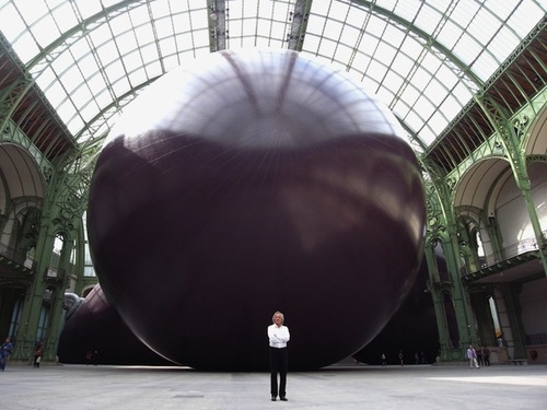
I mean, really. I refuse to be swayed or disheartened [too much] by it–it’s totally different, I say. I really want to put mine in the Pantheon anyway, I say–but several thoughtful folks have expressed their sympathies upon seeing Anish Kapoor’s Leviathan at the Grand Palais photographed from its more satelloonish angles.
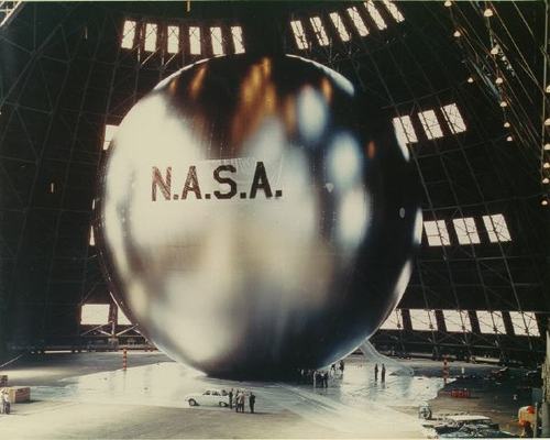
But you know what they say in the sewage treatment business, what goes around comes around. If Kapoor has the intestinal fortitude to keep working after the opening of these unsurpassable 145-foot tanks, I can certainly forge ahead with replicating a satelloon.
If anything, it’s even more relevant and imperative than before. Because Newtown Creek is actually designed by Polshek Partners [now Ennead], who also designed the Rose Center at the American Museum of Natural History, an early inspiration for my Project Echo project.
In a way, then, the idea for putting a satelloon in a museum space was hatched from the eggs of Newtown Creek. In another way, though, no, gross.
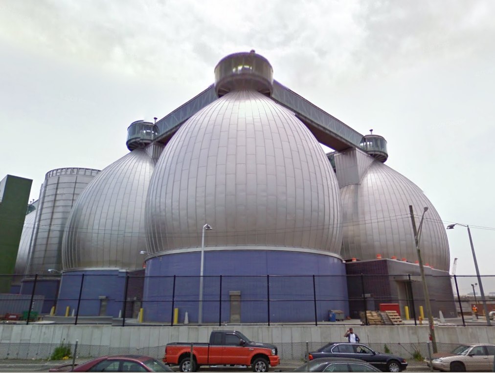
Newtown Creek Waste Water Treatment Plant digesters up close and symmetrical on Google Maps [google]