
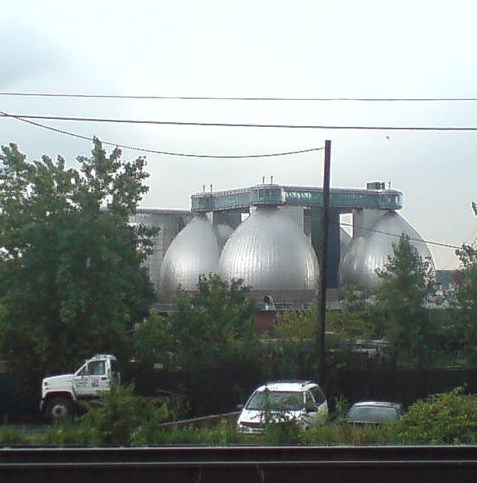
I’ve been moving art and life at our storage unit in Long Island City several times the last couple of weeks, and it’s given me time to really look. Look across the water to the most spectacular structures built in New York City in the last five years: the massive, stainless steel egg-shaped digesters at the Newtown Creek Waste Water Treatment Plant.
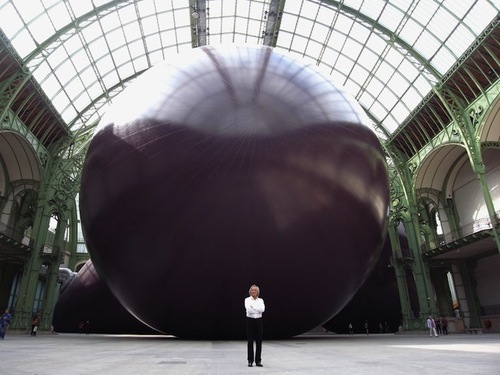
I mean, really. I refuse to be swayed or disheartened [too much] by it–it’s totally different, I say. I really want to put mine in the Pantheon anyway, I say–but several thoughtful folks have expressed their sympathies upon seeing Anish Kapoor’s Leviathan at the Grand Palais photographed from its more satelloonish angles.
But you know what they say in the sewage treatment business, what goes around comes around. If Kapoor has the intestinal fortitude to keep working after the opening of these unsurpassable 145-foot tanks, I can certainly forge ahead with replicating a satelloon.
If anything, it’s even more relevant and imperative than before. Because Newtown Creek is actually designed by Polshek Partners [now Ennead], who also designed the Rose Center at the American Museum of Natural History, an early inspiration for my Project Echo project.
In a way, then, the idea for putting a satelloon in a museum space was hatched from the eggs of Newtown Creek. In another way, though, no, gross.
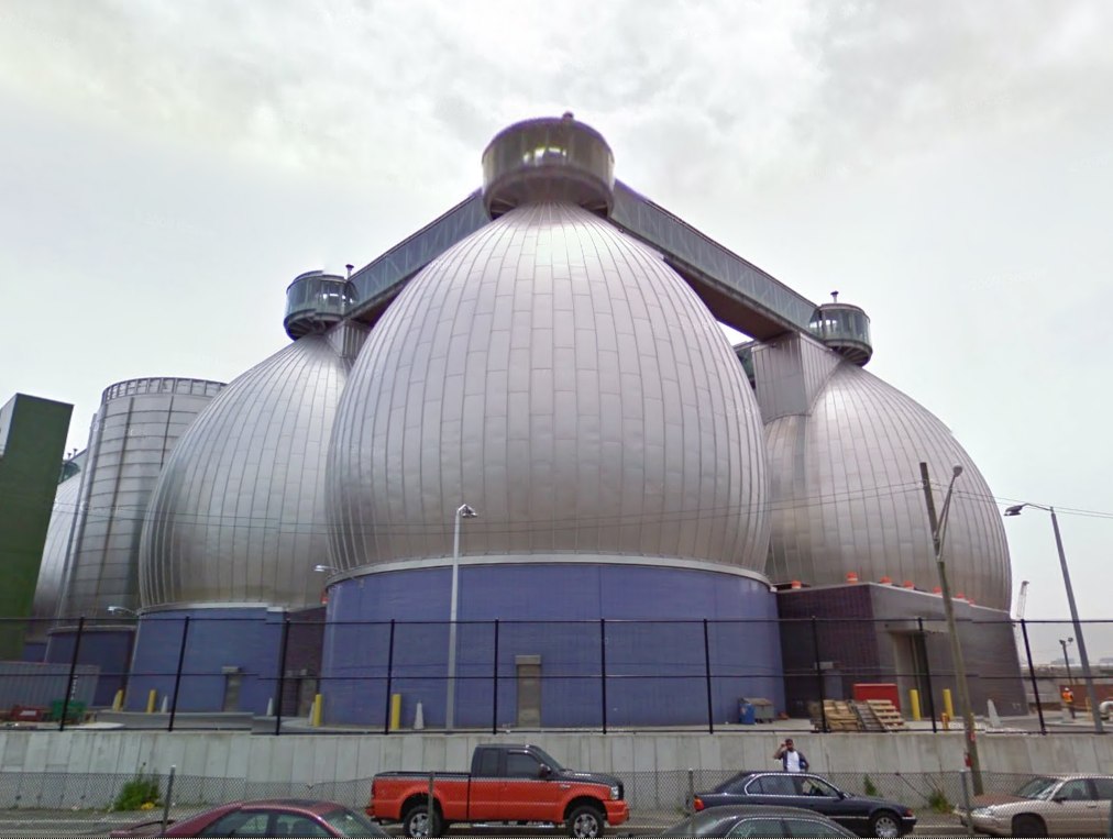
Newtown Creek Waste Water Treatment Plant digesters up close and symmetrical on Google Maps [google]
I Copy Therefore I Am Superflex
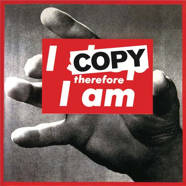
I’m always thinking of the Danish artist collaborative Superflex in terms of media or information, action or activism. But they sure can make some fine-looking, seemingly commodifiable art objects, too.
A few years ago, as part of their Copyshop franchise project, Superflex had made T-shirts with Barbara Kruger’s iconic painting altered to read, “I copy, therefore I am.” But this year, their Copenhagen dealer Nils Staerk had a full-scale [111×113-in] printed vinyl version on view at Art Basel.
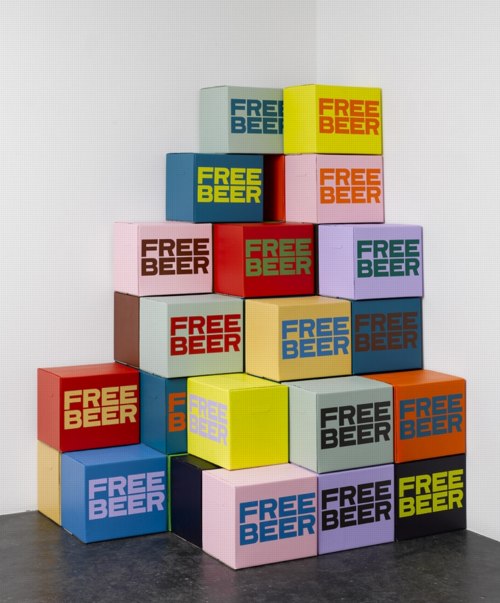
In addition to their videos, Staerk’s site has some other graphic works and objects, including this pleasantly Brillo-esque corner pyramid of FREE BEER cases from 2007. [Which is far more resilient than, and not to be confused with, Cyprien Gallard’s recent pyramid of free beer at KW-Berlin.]
Out Of ‘Out Of Practice’
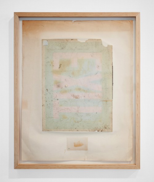
Away | Out, 2010, Seth Adeslberger via
Seth Adelsberger’s evocation of Erased de Kooning Drawing in this work on found paper manages to be both calculated and offhand. It was one of my favorites in “Out of Practice,” Baltimore gallery Nudashank’s sweet show about studio and process in Joshua Abelow’s temporary Art Blog Art Blog space. It closes today, so hop to.
Out of Practice, through June 18 [artblogartblog.com]
Nudashank is an awesome Baltimore gallery [nudashank.com]
Seth Adelsberger portfolio site [sethadelsberger.com]
ABC & POD at Printed Matter Thursday Night
So when I first published the Richard Prince Canal Zone YES RASTA book in March, I got some nice responses from people, including a couple of folks who suggested I look at joining ABC, the Artists’ Book Co-operative. ABC is an interesting-looking coalition of artists and photographers who come together to support and discuss print-on-demand publishing and to bring attention to their projects.
As it turns out, Printed Matter is hosting a reception and conversation tomorrow night with active members of ABC, which is in conjunction with an exhibition of ABC/POD titles that runs until June 30th.
It should be positively informative and delightful, and I look forward to going, to meeting some of the folks there, and to possibly seeing a greg.org reader or two as well. At this point, I think I will not endeavor to join ABC, but to continue to admire them from a distance.
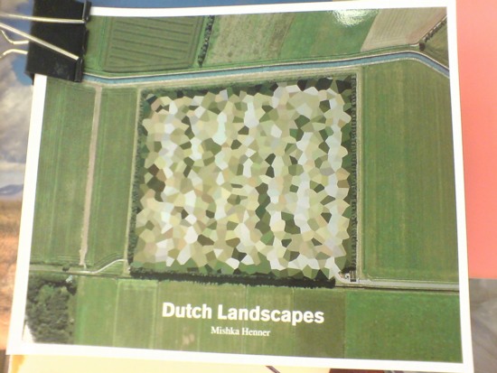
Seeing as how they already have at least one guy who copies jpegs of Richard Prince cowboy photos in volume, and another who just released a collection of Google Maps images showing of the peculiarly aesthetic polygonal camouflage technique used to obscure sensitive sites in the Dutch landscape, maybe a little more distance would be better for all concerned.
ABC Artists’ Book Co-operative conversation and reception, Thursday, June 16, 5-7 PM [printedmatter.org]
Sportsdomes: Refugee Prison Barge Domecage By Customr
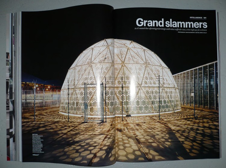
Well here’s one Dutch immigrant detention center that’s not invisible! Just the opposite.
That’s the Sportsdomes DJI up there, by architect Willem van der Sluis, featured in Wallpaper* Magazine in 2008, the same year the project won a Dutch Design Award for his Amsterdam firm Customr.
Just like the Kabul Dome the US Government ordered from Buckminster Fuller in 1955, Customr’s Sportsdomes were designed on a tight budget; in a hurry; using the latest modular manufacturing technology; so that they can be erected, dismantled, and moved with minimal skilled labor; primarily in arguable beneficence toward brown people.
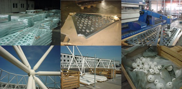
Their gradated, perforated metal skin creates an indoor/outdoor space that is meant to offer a pleasant ambiance to detainees for a couple of hours of free play during each of their last weeks in the Netherlands, while protecting their privacy/ hiding their identities from the outside world.
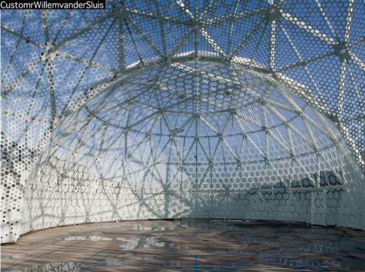
While they were points of contention among the neighbors, the Zaandam domes proved so successful that their patron, the Ministry of Security and Justice, ordered another “domecage” in 2008. Did I say “domecage”? I meant sportsdome.
CustomrWillemvanderSluis [customr.com via design den haag]
Previously:
Dutch camo domescapes
Welcome to the Kabul Dome
De Rijkshuisstijl & The 1 Logo Project
As part of their project Caché-Exposé, investigating the Netherlands’ largely invisible detention and deportation system, the Amsterdam art & design collaborative Foundland documented obscure, anonymous detention sites around the country. Then they used a highly official, public system to distribute their images: design-it-yourself postage stamps.
What with the domes, the minimalist/industrial architecture, these stamps, and–hello, this awesome flag they shot in 2008–I can’t help noticing how beautifully designed the Dutch immigrant prison system is. So thoughtful.
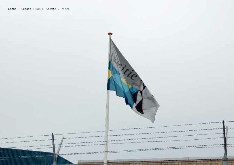
That is the Ministry of Security & Justice flag there, flying over the Zaandam waterfront dome prison. The biomorphic shape is a perspectival view of the scales of Justice, a fragment of the Ministry logo, which is an abstracted, blindfolded Justice.
![]()
Is, or was. Because on Google Streetview, the flag is different. Much simpler.
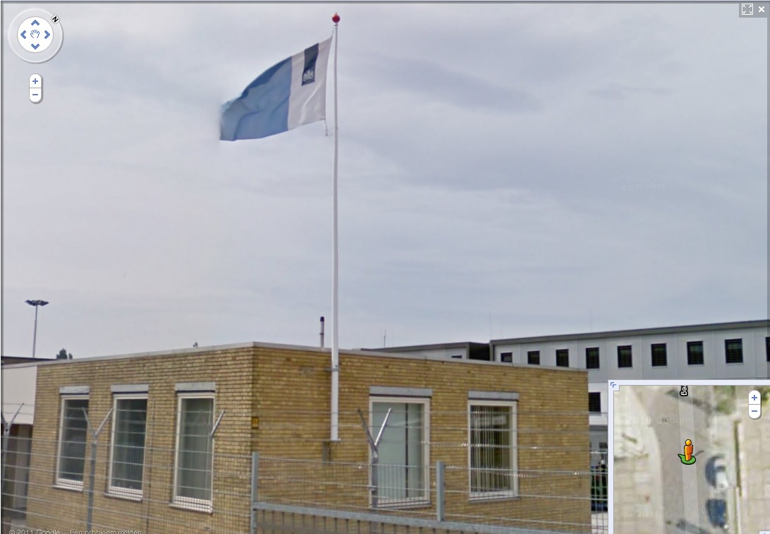
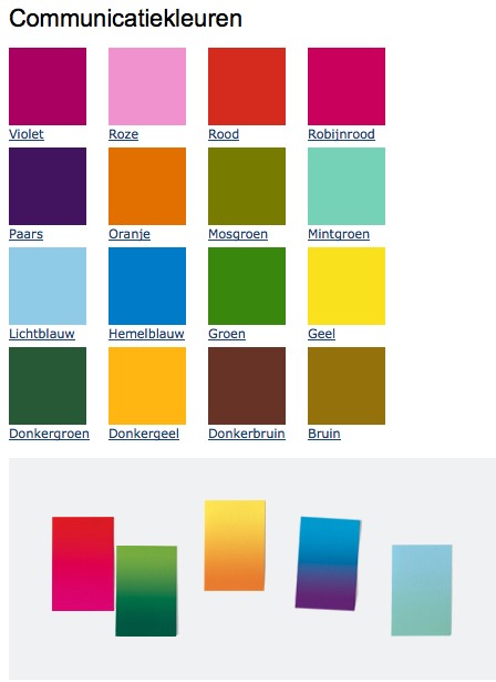
That is the new Rijkshuisstijl, which is officially called the Central Government Visual Identity, but which I gladly transliterate as the State House Style, a four-year effort begun in 2007 to centralize and redesign the Dutch government’s corporate identity. Part of that initiative was the 1 Logo Project, a replacement of 125+ separate ministry and agency logos with a single logo, the national coat of arms on a vertical blue bar.
Ah, I’m told it’s a ribbon. Here’s the English version of the style guide.
Oh, man, the color palette, 16 colors “inspired by the colorful Dutch landscape painting,” plus five gradients. Get me Colby Poster on the horn.
I am kind of geeking out over this. On the one hand, it’s a normal redesign gig, tastefully done, but typical to the point of banality. On the other, because it’s the state, I can’t help but read every platitude in the mission statement and objectives, every justification of every design decision and element, through a politicized filter. Without knowing really anything about the details or shifts in Dutch poltiics beyond recent surges of right-wing populism, I can’t help but interpret the identification of problems the Rijkshuisstijl was intended to fix as criticism of the parties and governments then in power.
Partly, it’s the Rijkshuisstijl’s incredibly bold assertions of design’s importance and function. And the grand assertions of meaning:
“The symbol exists of a blue ribbon with the coat of arms. Subtle and unpretentious, an authority without being authoritarian.”
The color of the logo is Rijksoverheid Blue. Inspired by the Dutch skies and Dutch light. Blue for calm and reliability. Blue for tradition and enduring values. Blue for harmony and balance.”
“The wide variety of logos previously used by various government organisations made them less recognisable, causing confusion among the public and business community. People were no longer able to see the wood for the trees. Central government organisations seemed to be competing rather than cooperating with each other. This approach compounded the widely held view that central government was fragmented.”
“The mission statement and the motto both underline what central government stands for. They give the central government logo (Rijkslogo) real meaning.”
And then there’s the irony of context, the subjective happenstance of discovering the Rijkshuisstijl while looking at an exposé criticizing the Netherlands’ unjust treatment of immigrants, a project which I’d discovered in turn while reading about the current populist government’s massive cuts to the country’s arts infrastructure. Is this what modernism and Good Design signed on for? Because it’s what they got.
Oh, and there was a symposium, and a book, De stijl van het Rijk/ Style and the State, produced last fall by the Stichting Design den Haag.
Foundland [foundland.org]
Rijkshuisstijl guide in English [rijkshuisstijl.nl]
UPDATE: So the work was actually done by Studio Dumbar in Rotterdam, announced on their site in 2007 [studiodumbar.com]
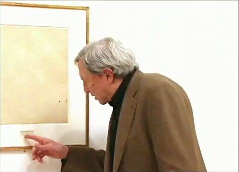
What I Looked At: Sol LeWitt Structures
I finally made it down to City Hall Park to see the Public Art Fund’s installation of Sol LeWitt structures. Which, first or now, you must watch the discussion of working with LeWitt at the New School. Go ahead, I’ll wait.
OK.
So along with the general admiration and pleasure of seeing so many LeWitts, the first thing I think is: picturesque.
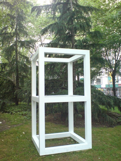
Double Modular Cube, 1969
Lewitt introduced human proportions into these modules, which may somehow account for why it feels like an idyllically sited pavilion or garden folly. But it’s definitely activating something in the landscape, too.
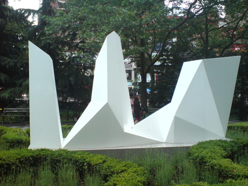
Then there is Complex Forms, 1987:
Which, I know, I know, every algorithmically-generated polygon around here gets tied to Dutch Camo Landscapes. But:
For the Complex Forms, the artist drafted a two-dimensional polygon and placed dots at various locations within it. As the form is projected into three dimensions, those interior points are elevated into space at different heights. The elevated points dictate the seams of the object’s multi-faceted surface.
So these things turn out to be topographies “projected” from two dimensions into three. Maps. So it is not a stretch.
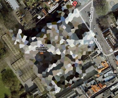
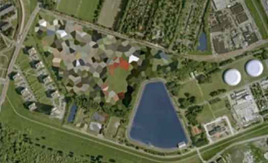
The way I found the Dutch Camo Landscapes in the first place was through architecture. They were 2D patterns generated from photos of 3D structures, which read as 3D structures themselves. As camo deployed against aerial surveillance, I’ve also imagined them as crystalline structures or surfaces, topographies, installed above whatever site is being obscured.
It’s to the point that last fall, I actually went to the Noordeinde Paleis [above] in The Hague, not *really* expecting, but kind of hoping, to see it sitting, safe from terror or whatever, under a giant, polychrome, polygonal tent. It was not. I’ll add that to my project list, though. [note to self: call Queen Beatrix.]
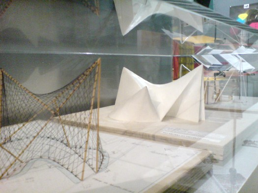
It also reminds me, even more explicitly, of Le Corbusier and Iannis Xenakis’ 1958 Philips Pavilion in Brussels, which, as these two models I found displayed shoved into a corner at ARCAM in Amsterdam one night show, was similarly constructed from 2-dimensional curves and points projected into space.
“The Complex Forms introduce irregularity into LeWitt’s work,” we are told, “which is further explored, for example,” in the Splotches. Which, again, two-dimensional drawing projected into structure via formulas for generating color and height. I can really dig these things, except–I didn’t photograph it, didn’t want to be a crank, but holy crap, I can’t stop staring at that seam.
Splotch 15 [with giant $#)%ing seam], 2005
It was not like this when it was exhibited on the Met’s roof garden in 2005, was it?
No, I do not think it was. What gives?
The next thing is how lush and classical City Hall Park is. Since this incarnation dates from 1999, I guess historicist is the right word. I don’t remember noticing this as acutely as I do now.
Maybe because so many LeWitts are installed along the park’s radial axis, lined up with that replica fountain just so.
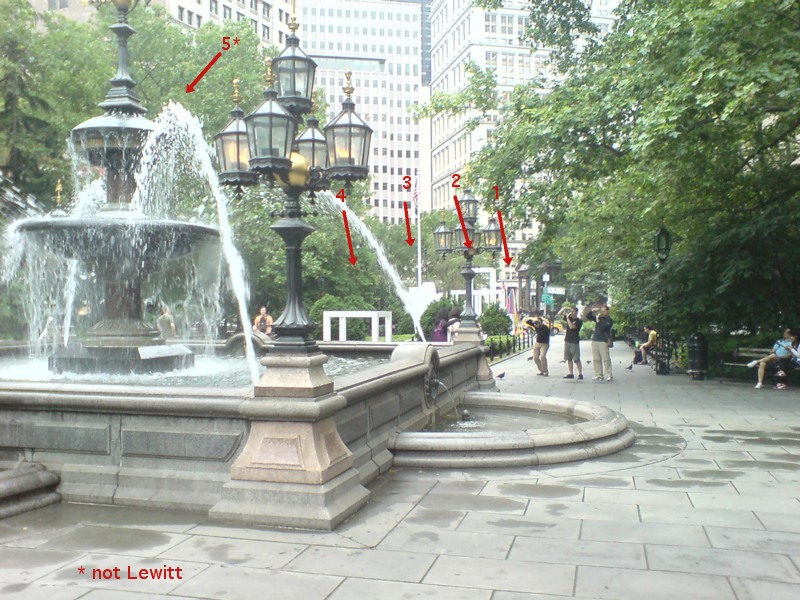
In his opening remarks at the New School, Nicholas Baume described the Public Art Fund’s program as “looking back at radical practices dating from the 1960s and registering their contemporary resonance.” He goes on to cite the appeal of seeing “the interesting juxtaposition of natural landscape [sic], New York City skyscrapers, and the architectural and decorative elements of the park,” which “provide a fascinating and rich context.” But now this installation, I get less sense of juxtaposition, and more assimilation. Radial historicism: 1. Radical practice: 0.
As I’m walking around, trying to figure out how to process this situation, I suddenly looked at the Complex Structures head-on, i.e., the “wrong” way.
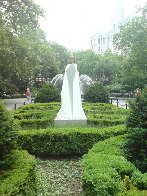
And it turns out to be radially symmetrical itself. A mirror image. And I remember writing about laughing at first at Chinese tourists who didn’t “get” the Iwo Jima Memorial, and who posed for photos at the head of the statue, only to realize they didn’t have the same LIFE Magazine photo-mediated historical context as Americans.
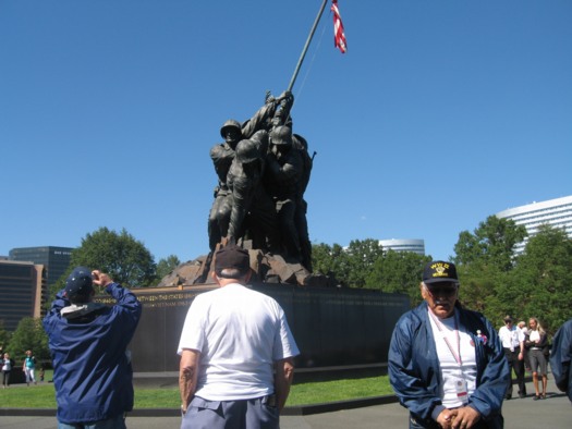
Connecticut veterans at the front of the Iwo Jima Memorial, image: ct.gov
Which, suddenly, LeWitt’s practice of projecting a 2D image into a 3D structure has an entirely new, complicated legacy which I’ve never seen addressed before, but maybe this City Hall Park is a good place to start.
Pastoe Cabinet With Desk By Cees Braakman
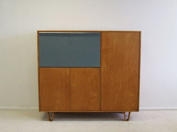
They may not be able to create an art ecosystem that can withstand the whims of populist demagogues, but I tell ya, back in the day, the Dutch sure could make the hell out of a birch writing cabinet.
Cees Braakman for Pastoe writing cabinet, birchwood cabinet with original colour-painted flap door (scratch), EUR1300 [vervlogenjaren.nl via anambitiousprojectcollapsing, also previously, reflib]
Dutch Camo Domescapes
I love it when a plan comes together. Or at least when several subjects of interest converge unexpectedly.
It seems the Dutch art world is about to be decimated by sudden and substantial government funding cuts and reorganizations. [for angry details, check sven lutticken’s recent post; for plaintive, possibly resigned reaction from the affected institutions, try the open letter at the Dutch public arts organization, SKOR.]
If the proposed changes really do take effect, and the status quo of one of the most highly developed state-sponsored ecosystems for the arts is actually dismantled at a stroke, I think it’s really important to requestion every comfortable assumption of the involvement between art and politics. It has a lot of obvious problems and weaknesses, but the Dutch system, at least as perceived from abroad, has always seemed like the apotheosis of certain ideals of cultural industrial policy, which, Lutticken argues, now “don’t seem to be worth a penny.”
Anyway, not that they saw them coming, but SKOR tried to understand the political shifts that precipitated these cuts in the December 2010 issue [#20] of their excellent journal, Open, which examines populism and the persistent need for narrative and myth in the democratic process.
Dutch populism seems to center on–surprise–issues of immigration, assimilation, and Muslim vs. Christian cultural influence. As it turns out, one of the contributors in Open 20 is Foundland, a graphics, art, and research group that seems part collaborative, part design firm.
In 2009, Foundland created CACHÉ ÉXPOSÉ, an investigation into the remote, largely invisible, and unreported system of detention and deportation facilities in the Netherlands. The majority of the people imprisoned in the facilities or subjected to the system seem to be immigrants and refugees from largely Muslim countries.
When I read the description of the project, I wanted to see if, like the intelligence- and military-related sites, these politically sensitive detention sites were obscured on Google Maps. Fortunately, Foundland had created a Google Maps list as part of the CACHÉ ÉXPOSÉ project.
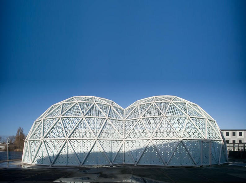
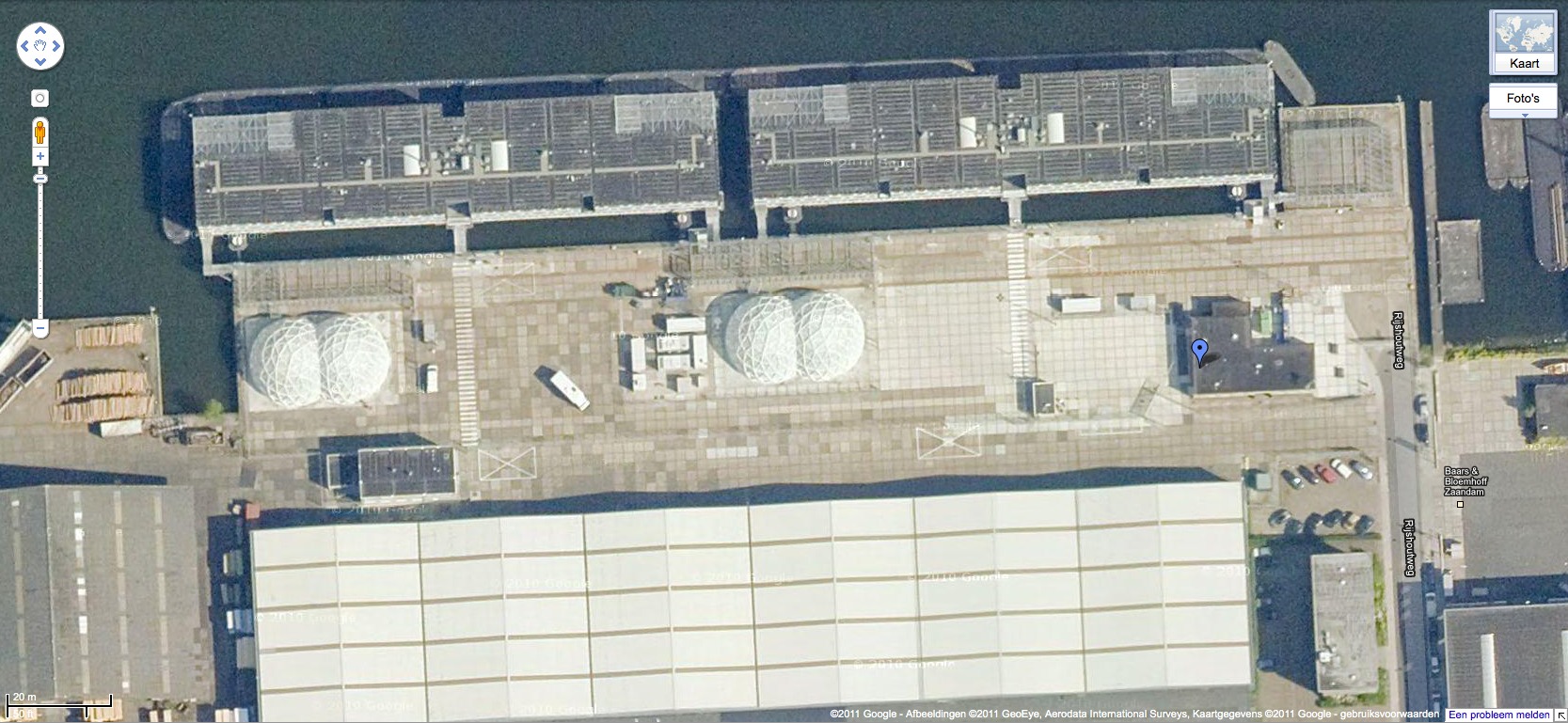
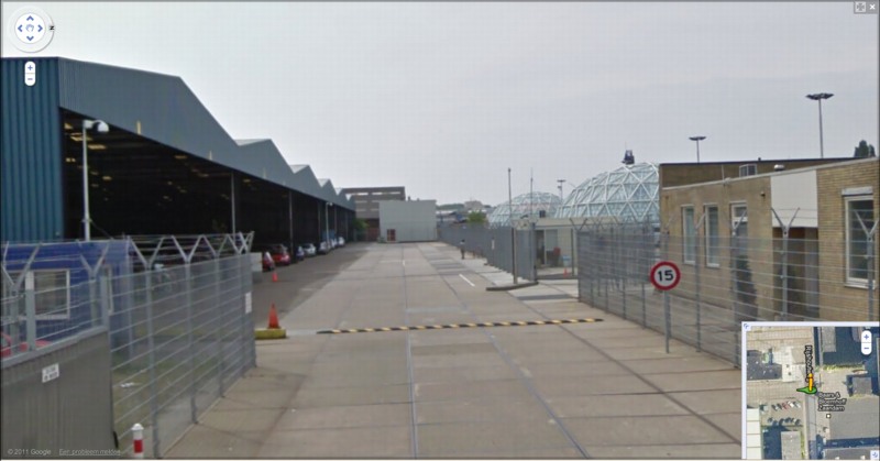
And the short answer is no. Their industrial anonymity is camouflage enough. But then hey-ho, looking at the waterfront detention center in Zaandam, a commercial city northwest of Amsterdam, what do I see? Awesome-looking domes.
Double geodesic domes of unknown purpose, but which look to be at least somewhat transparent or translucent from Street View. What a wonderfully open society the Netherlands must be that in can allow the Google Street View car to drive right up into the middle of its immigrant prisons. Oh wait.
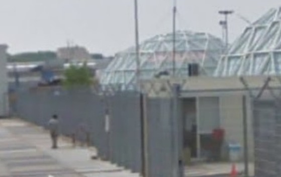
What strikes me, besides the lone figure standing outside the double barbed-wire fence? Is irony the right word to see a geodesic dome, a form which was once erected to great fanfare in Afghanistan, where it served as a symbolic center of friendship, trade, democracy, and political cooperation with the west, being deployed in a back alley prison in Europe filled, presumably, with impoverished immigrants from the Middle East?
Then again, Afghans in 1956 apparently did see the US’s Kabul Dome pavilion as representing The Future. So.
Hey-Ho, The Art Institute Bought Short Circuit
Short Circuit, Robert Rauschenberg, et al, via the estate/VAGA
I always [well, for a weekend or two last December, anyway] figured I’d find the original Jasper Johns flag painting that was inside Rauschenberg’s Short Circuit before the Combine was sold, so that it could be presented to its eventual owner in its original, art history-upending state.
Yeah, well. Turns out the missing flag was not a dealbreaker for the Art Institute of Chicago. Carol Vogel just released the news that James Cuno orchestrated the Museum’s purchase of Short Circuit, Sturtevant flag and all, from the estate, for an anonymously sourced price of $15 to $20 million.
In her piece, Vogel mentions the flag, and the Susan Weil painting, behind the cabinet doors. But then she says something I’ve never heard or seen anywhere: that though both were invited, neither Ray Johnson nor Stan VanDerBeek actually contributed pieces to the Combine VanDerBeek we knew, but Johnson?
I’d always understood that Johnson was in, and I’d assumed that the collage in the center of the lower half, with the Abe Lincoln and Venus postcard, was Johnson’s. If it blended so seamlessly with the rest of the Combine, and with the rest of Rauschenberg’s oeuvre, well, all the better. Johnson was famously sanguine about his collage work, and loved if his artist friends tweaked or reused it. Or so I’m told.
I like this reproduction of the piece, too, with the doors barely ajar. I’ve heard a story from a couple of people now, that when Johns went to Gagosian to see the show, he mentioned that the doors on Short Circuit were supposed to be closed. This image kind of finesses the door, concealing just enough so that the first thing you say when you see the piece is, “Holy smokes, that’s a Jasper Johns flag three years before he showed it anywhere!”
Prime Rauschenberg at Chicago Art Institute [nyt]
Previously: Until I get some tags, this is how you find all the Short Circuit-related posts around here
WTF SPIRAL JETTY PAPERWORK MAYHEM
Holy smokes, this is like something out of Land Art Kafka. Tyler Green points to a just-published report by the Salt Lake Tribune’s Glen Warchol: the Utah Department of Natural Resources is claiming the Dia Foundation’s 20-year lease on the 10 acres of state land under the Spiral Jetty is not being renewed. Dia was “tardy” in making its $250 lease payment, and that the Foundation had not responded to an automatically generated notice of the end of the lease sent in February.
Dia’s deputy director had no idea about the situation when the Tribune reporter called for comment. Yet the report also includes multiple sources from the state, and other local experts familiar with state land leases.
The story is just flabbergasting, the dismissive quotes in particular. Oh, and the land use attorney who finds the non-renewal “unusual” and who notes that it’d be “unheard-of” for the state to fail to renew a mineral extraction company’s lease.
Robert Smithson leased 10 acres of sovereign land at Rozel Point to build the Spiral Jetty in 1970. The original payment was $100/year. The artist’s estate gave the Jetty to Dia in 1999, which implies that the estate had renewed it at $250/year around 1990.
Reading the report again, this paragraph jumps out at me:
The Spiral Jetty would continue to be protected as state land and the public access would remain the same, [Forestry and State Lands spokesman] Curry said. “Dia’s not holding the lease is not going to change anything regarding the Spiral Jetty.”
On the one hand, it could sound like an attempt or decision by the state to take control of the Jetty itself. On the other, neither Warchol nor the state spokesman seems too steeped in the nuances of ownership and authorization of an artwork. [Which obviously happens to be site-specific, but still.]
It’s an early report of a fragment of a complicated situation with [literally] monumental consequences.
Control of iconic sculpture Spiral Jetty in dispute [sltrib via @tylergreendc]
Water Pictures, by Marion Thayer MacMillan
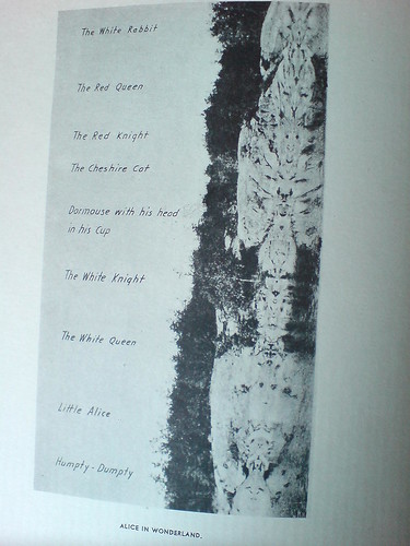
I found a beautiful and odd book the other day, Reflections: The Story of Water Pictures, published in 1936 by Marion Thayer MacMillan.
While vacationing in the Indian territories surrounding Georgian Bay on Lake Ontario, soon after the end of World War I, McMillan discovered a Rorschach-like phenomenon where still waters would occasionally produce perfect mirror images of the craggy coastline.
Over 15-plus years studied and photographed perfectly mirrored reflections along the coastline of Georgian Bay, Lake Ontario. [She tells of teaching herself photography in order to capture these ephemeral landscape images.]
MacMillan began showing her photos around, first to the local population and Indian craftsmen, and she came to the conclusion that such visual phenomena were apparent to centuries of canoeing Indians, who drew inspiration from them for their myths and artifacts. She particularly saw radially symmetric totem poles as permanent representations of these phenomena.
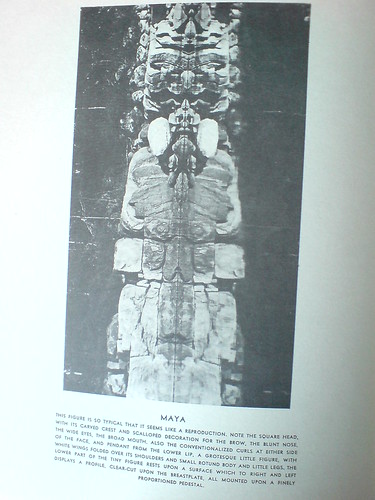
Eventually, she began giving slide lectures of the photos at museums, universities, and art societies, where she drew connections between this “primitive” visual language, which was surely a common thread among all “savage” cultures, and the most advanced modernist, abstractionist movement being put forward in the art world of the day.
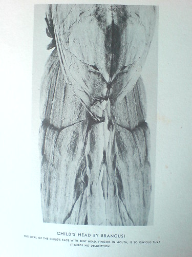
And so the caption on her photo, titled Child’s Head by Brancusi, reads, “The oval of the child’s face, with bend head, fingers in mouth, is so obvious that it needs no description.”
Many, or really most, of her photos are similarly titled and labeled; in her search for meaning in this optical, perceptual phenomenon, MacMillan repeatedly found “obvious” representations of artistic, literary, and religio-spiritual subjects. Which only temporarily distracts from the beauty and now-historically tinged aesthetic of the images themselves. I imagine there are some sexy, old prints out there somewhere.
The art and anthropology worlds seem to have been politely intrigued but largely unaffected my Mrs. MacMillan’s work or discoveries. Though she does mention a photographer she’d introduced the effect to had taken some accomplished Water Pictures of her own, which she showed at Julien Levy’s gallery, to generally positive reviews.
Basically, as long-lost art goes, MacMillan’s book doesn’t feel like a masterpiece, or even that important. In one way, I feel a bit implicated, as I sit here, finding or creating world-changing images and rewriting art history, in my little blog canoe. But then, it was important to her, and maybe it’s enough to recognize that.
Reflections: The Story of Water Pictures is usually available on Abebooks, though my $20 inscribed copy seems like an outlier [abebooks]
I posted a couple more images in the gregorg flickr [flickr]
‘A Sort Of Collaboration’
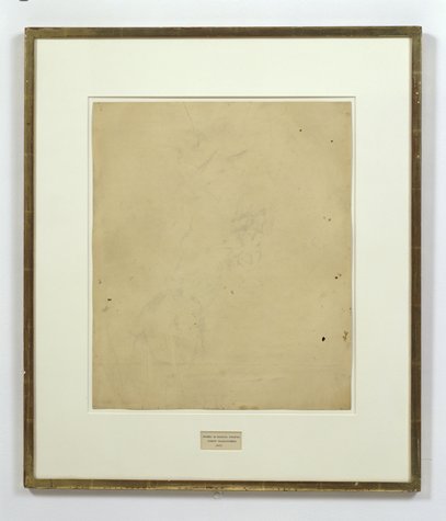
Erased de Kooning Drawing as of 1999 at SFMOMA
When we last left Erased de Kooning Drawing, the late, great Leo Steinberg had finally told his story about getting Rauschenberg on the phone in 1957 in order to sort the damn thing out. Steinberg’s conclusion was that, far from a “Neo-Dada” prank or Oedipal negation, Rauschenberg had offered de Kooning “a sort of collaboration” of erasure. The plausibility of this interpretation was inspired by the equally collaborative combine painting of the same period, Short Circuit.
Erased de Kooning Drawing, without present matboard, c. 1970, via Emile de Antonio’s Painters Painting
So to recap quickly: EdKD is a collaborative work. In which erasure-as-drawing is the subject, or the strategy. Each artist with his different markmaking method. And it is inscribed, labeled, by hand, with a flatly descriptive title and claim of authorship. And though it had been unmatted at some point [above] rendering the inscription and the drawing as one collaged work, it was matted in a way that obscured this unity, and it was [eventually] presented as a framed, presented object. A conceptual work, realized. A concept of a drawing erased. Hold all that in your head. Am I missing anything?
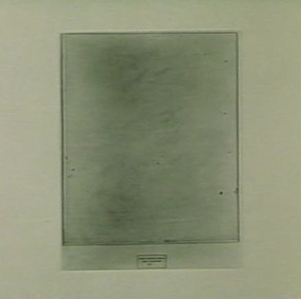
Erased de Kooning Drawing, detail, c. 1970, via Painters Painting
Anything besides the small detail that the inscription, the text, the third instantiation of the concept, the generative inverse of the erased drawing itself, was made by Jasper Johns?
For the crucial period of EdKD‘s uptake into the art world’s discourse, Rauschenberg had always claimed that he had written the inscription. That he’d “signed” it. That’s what he told Emile de Antonio on top of that ladder. That’s the only way anyone talked about it. But it is not true.
Vincent Katz has made one of the rare references to the importance of the work’s collaborative creation in Tate Magazine in 2006. But others credit Calvin Tomkins with breaking the news of Johns’ involvement in EdKD in his 2005 New Yorker profile of Rauschenberg:
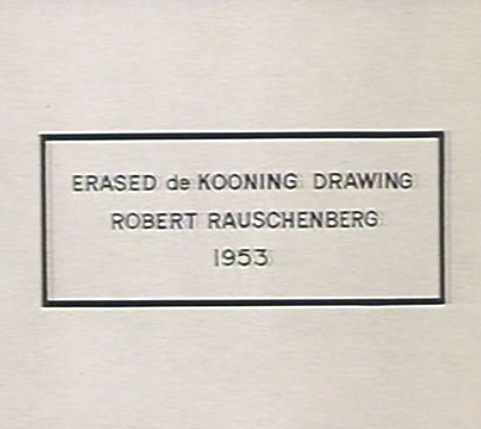
Johns gave Rauschenberg the title for “Erased de Kooning Drawing,” which came into being in 1953, when Rauschenberg persuaded de Kooning to give him a drawing which he would then erase, to see whether a work of art could be created by the technique of erasure; Johns also did the precise lettering for the title, on the framed matte below the very faint, wraithlike ghost of the erased image.
The title, of course, is not on the matte, but under it. It was originally of a piece with the drawing, until the matte separated it, demoted it, even. Which may intensify the implications of difference between pre- and post-matted drawing.
[Tomkins does not identify the source of his revelation about Johns’ involvement, even though he wrote in the same piece that “Johns recently told Joachim Pissarro, a curator at MoMA, that he thought the term ‘combine’ had been his suggestion.” The latter was a memory Rauschenberg apparently did not share.]
Tomkins may have been the first to publish it, but claim of Johns’ collaboration was first made at least six years earlier, by a seemingly unlikely source: Robert Rauschenberg.
In a 1999 video interview about the newly acquired EdKD, Rauschenberg told SFMOMA curators,
So when I titled it, it was very difficult to figure out exactly how to phrase this.
And, uh, Jasper Johns was living upstairs, so I asked him to, to do, the uh, the writing.
And they say you never get to know your neighbors in New York. Sometimes you make historic works of art together with them.
Except that on Pearl Street, as Castelli famously told it, Johns was downstairs. And Rauschenberg was upstairs, in the loft vacated in the summer of 1955 by Rachel Rosenthal, who had found the building in the Spring of 1954. Rauschenberg was certainly around–and living around the corner–before then. They’d met early in the winter of 1954, began and he and Johns had already created and shown Short Circuit by then. So either Rauschenberg was referring to a time before they moved in together, Or Johns didn’t add his pieces to the drawing before mid-1955. Either way, it sounds like the drawing, to use Tomkins’ odd phrasing, actually “came into being” after 1953, the date Johns wrote on it.
Part 1: ‘FRAME IS PART OF DRAWING’
Part 2: Erasers Erasing in Painters Painting
Part 3: Norman Mailer on Erased de Kooning and other ‘hopeless’ and ‘diminished’ art
Parts 4&5: Leo Steinberg on EdKD and how it’s a collaboration
Part 6: A 3-Way Collaboration, that is, with Jasper Johns. Oh, that’s this post. Just one more, I think.
iIkea: Furniture In The Cloud
An aside from Dan Hill’s extended examination of physical retail:
a conversation earlier today, spiraling out of the fact that we have some Ikea furniture (a bed) in a shipping container somewhere, traveling from Australia to Finland, and the thought occurs that Ikea could replace that physical shipping by simply sending a copy of the bed from the Espoo store, and picking up the old one in Sydney. A form of fabrication possible with their already distributed network of components.
On Retail [cityofsound]
Blue Memory By Gabriel Orozco
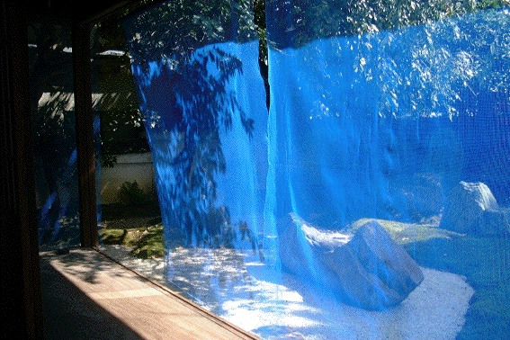
Looking back at some of the other projects of FREE SOL LEWITT co-curator Daniel McClean, I have basically concluded that we have been walking in a weird parallel in the art world for ten-plus years, without ever actually meeting.
In 2000, when we were still buying a fair amount of his work [i.e., when it was last affordable enough for us to buy, or to buy more than one thing], McClean curated an installation in Japan by Gabriel Orozco.
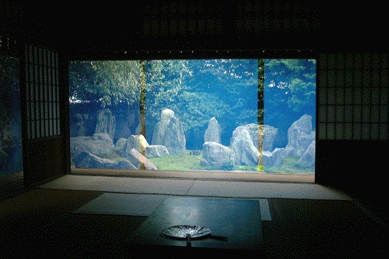
Called Blue Memory, Orozco hung a screen of fine, blue netting/fencing on the edge of the eaves of Kyoto garden designer Shigemori Mirei’s house, where the bamboo sunshades usually go. It’s classic Orozco, a transformative effect produced with modest, found or offcast materials.
See more images at Shima/Island, a series of four temporary installations and artist/curator-led seminars in 2000-2001 about the Japanese landscape. [hi-ho.ne.jp]
Artistic License: Daniel McClean on Contracts and Aesthetics [bombsite]