
An interesting curatorial pairing where you’d least expect it: deep in the middle a random, Sunday afternoon print sale at Phillips de Pury.
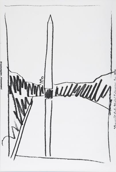
Lot 327: Washington Monument, is an unnumbered edition sliced up from a wallpaper Andy Warhol made in 1974 for an unknown commission, but apparently never installed. Dia had 322 rolls of the stuff, which it gave to found the Warhol Museum.
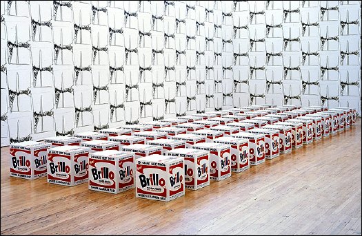
With a few takebacks, I guess, because the Warhol let Dia Beacon install a whole roomful of the stuff in 2005. It looks kind of nice and abstract, a nice background for those Pasadena Brillo Boxes. [image via nyt]
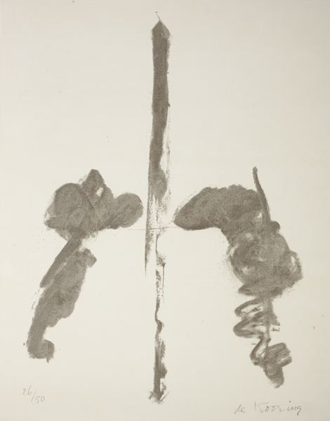
Meanwhile, Lot 328 [above], was Washington Monument, a properly signed and numbered lithograph by Willem de Kooning, published in 1970. The composition’s almost identical to Warhol’s, as if both artists used the same photo or postcard for a source. Or as if Warhol used de Kooning’s print, which would be pretty unusual. Several of these have come up at random auctions this year: #13/50 at Bloomsbury; #14/50 at Swann.
An abstract representation of an abstract original, de Kooning’s Washington Monument is uncontroversial enough to be displayed in a wide range of otherwise complicated settings.
The Phillips version is #26/50, and it was sold by the defunct law firm Dreier, LLP, which was implicated in a massive securities trading fraud sideshow to the Bernard Madoff scandal.
And two related, slightly larger charcoal drawings, dated 1969-70, are on loan from the Estate to the US Ambassador’s residence in London [pdf].
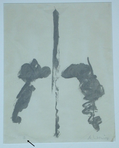
The drawings are untitled, but every numbered lithograph I’ve found is titled simply, Washington Monument. But a Connecticut antique dealer once had a signed, proof, which apparently came from a close friend of the artist. The title of the work, the friend said, is actually Washington Monument Peace Sign, and in the bottom corner, in place of an edition number, de Kooning put a little peace sign.
Blurmany: The Dortmund School
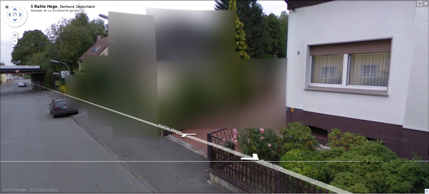
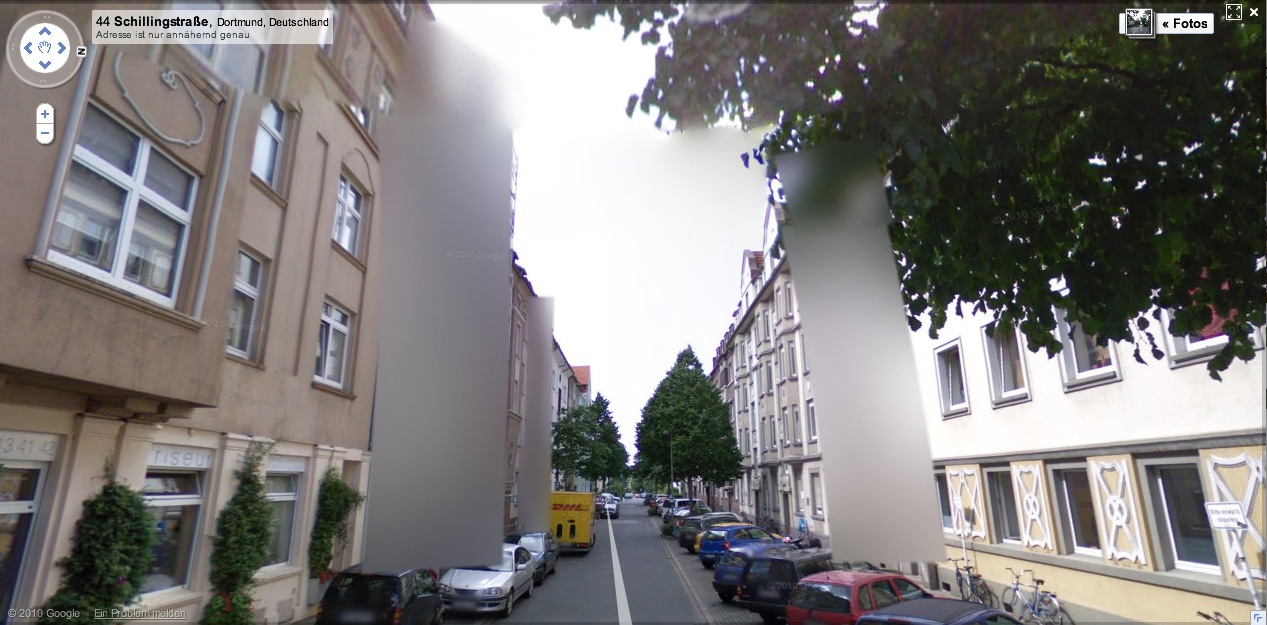
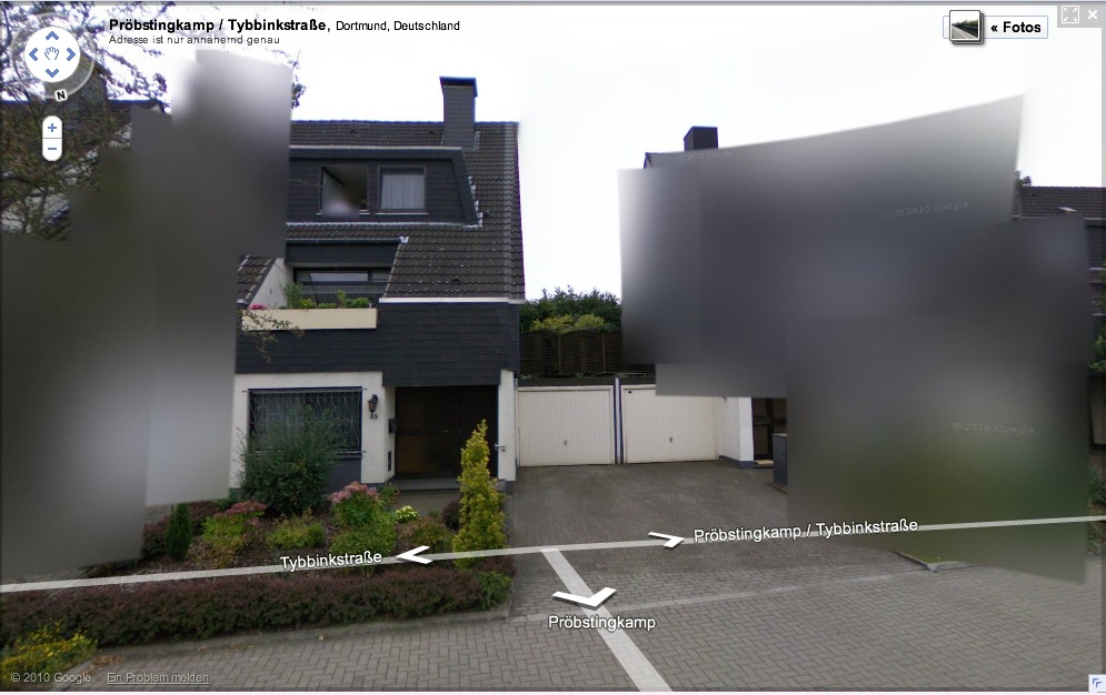
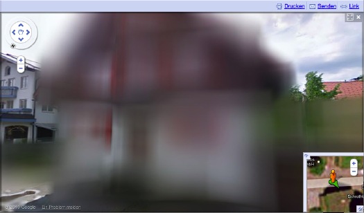
More of Germany is appearing on Google Street View, and we can start to see what 240,000 blurred out residences looks like in a country of 8 million-plus: a lot. Far from being a marginalized fraction, the blurred structures pop right out; they’ll be the prominent, even the defining feature of Google’s virtual German landscape.
[How ridiculously cursory is this opt-out scheme, by the way? Does the blur go with the house, or the owner? Can an owner take his Street View privacy with him when he moves? Will blurred residences have an easier or harder time selling? Who gets to decide to blur a multi-family apartment? The landlord? A majority of the tenants? Whatever else they think of it, Germans should recognize that this blurring is unsustainable as it stands, and that Google is certainly treating it as a transient fix for getting through the immediate political situation.]
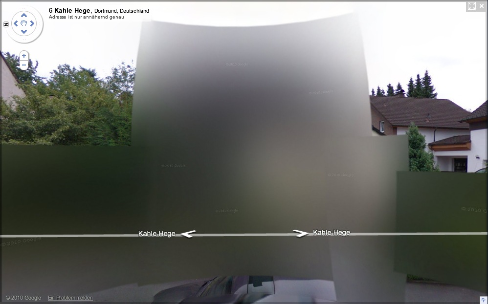
And in just a matter of days, it seems that the algorithm Google is using to blur out the houses has changed. The result, as seen in this completely random collection of houses I just surfed up in Dortmund, is all blur and no pixel.
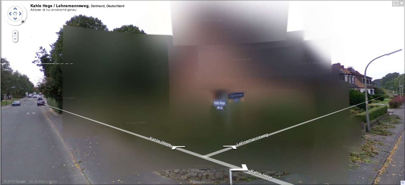
It’s also distinctively planar, with large, overlapping, color-averaging tiles, like looking through scrims or through a construct of semi-opaque glass. If they’re still Richters, they’re the glass paintings,
![]()
as assembled in space by Helio Oiticica.
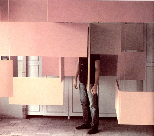
At least that’s what I’d probably use to reconstruct the blur structures in real life. Probably set up a very slight scaffolding of polycarbonate sheets, experiment with the films and filters to get the right optical effect. And then rephotograph the whole site.
Without searching through the German web, I’ll naturally assume that I’m the first to think of this brilliant artistic idea. But I’m just as sure someone on the ground will beat me to the execution. And as Germans acclimate to this Street View, I’m sure that the Blurman landscape will begin to creep into the aesthetic consciousness in a whole host of ways.
Previously: Blurmany and the Pixelated Sublime
Cage’s 4’33” For Orchestra
The most striking thing about this AbEx show is how cheery and bright many of its paintings seem – as cheery as Gorky’s “Garden [in Sochi]” – given that the movement is so often associated with gloomy existentialism, post-war angst and the dark Freudian unconscious. Could it be that its true roots are in the post-war boom and a country, and a city, coming into their own as cultural and economic hot spots? (But if so, why is Gorky having fun in paint in 1941 already? Or could it be that painting is an inherently affirmative, cheery act, and that painters can only ever mimic gloom, with the risk that silver linings may show through at any moment, in any work.) Fun in paint? I’d have gone with, “tortured nostalgia for the garden his family had to flee during the Armenian genocide, during an attempt to blot out the horrors of the forced refugee march where his mother died of starvation, but not before instilling in her young son a desperate ambition which became the altar upon which a perennially destitute, lying, insecure Gorky sacrificed his own family and which, after abandonment, cancer and a debilitating car wreck, led him to hang himself from a tree.” But if you see “fun in paint,” I guess that’s… Some years later, after Johns had become famous, the little flag painting mysteriously disappeared from the mother-work. Later still, a dealer brought a small Johns flag into Leo Castelli’s gallery and asked if Leo could identify it–he said it had been offered to him by a third party. Castelli recognized it immediately as the missing element from Short Circuit. He told the dealer it had been stolen, and said he did not want it to leave the gallery. The dealer refused to part with it. He took the little painting away, and nobody has seen it since. Nice, but not true. At least two people have seen it since: the dealer, and the perp. If they fenced it elsewhere, you can add a third or more. You stay classy, art world! Huh, a good question from a British reader, who sent along an amusingly embarrassing story from the Daily Mail about some poor chump reporter’s attempt to authenticate a glaringly obvious Johns forgery he bought for a hundred pounds on Portobello Road: has this Short Circuit flag ever been registered as stolen? Because it sounds like Scotland Yard hasn’t heard of any missing Johns. Ausgezeichnet, this is so awesome. Amidst a fierce, ongoing, politicized debate, Google has released the first Street View panoramas for Germany. To assuage privacy concerns, the company is allowing homeowners to assert their Verpixelungsrecht, that is, their Right to Pixelation. Some 240,000 locations are thus set to be blurred out. From what I can understand, though, the rollout is still in its early stages, and so only a handful of blurred buildings have gone live. This is not a matter of privacy. And don’t tell me it has a damned thing to do with the Nazis and Stasi; that’s patently absurd. If anything, the Stasi would have exercised their Verpixelungsrecht to obscure their buildings from public view, taking advantage of the cloak of secrecy the idea provides. That’s the danger of this. Well, who’s Stasi now, because that is exactly what is happening next door in the Netherlands, where the Intelligence and Defense Ministries actively distort the Google Maps imagery and block Street View access for dozens of sites they have unilaterally deemed sensitive. [Search greg.org for “Dutch Camo” for details, such as they are.] Ugly, isn’t it? As someone in the audience said when I spoke on the topic at a meeting of the Green party in Berlin a few weeks ago, it is as if they are digitally bombing the German landscape. Actually, no it isn’t, and–holy crap, wtf?–no it isn’t. refers not to the visual plenitude and truth that we usually associate with photography, but rather to its moments of representational inadequacy, to photographic blur and lack of focus that results in deliberately obscured imagery. It’s worth noting that Richter began his blurred photo-painting series soon after fleeing East Germany. Christoph Brech is the master of the meaningful tight shot. In Sea Force One, he focuses in on a pair of workers in a small boat who are scrubbing the hull of Francois Pinault’s black yacht in front of Punta della Dogana during the 2009 Venice Biennale. We do not know who was on board the yacht – possibly François Pinault himself, the famous French luxury goods entrepreneur and primary investor in the new Venetian exhibition area. Brech has turned his camera on a moment that would otherwise have gone unnoticed, deliberately choosing not to record the sumptuous affirmation of wealth of the yacht. It is the contrast between the size of the latter and that of the small boat, or between the black hull of the yacht and the evanescent white of the soap and of the reflections upon the water, that brings out the greatness of the vessel, the actual size of which we do not grasp. The artist succeeds in moving beyond the façade of power and wealth by stopping at its surface. He seems to be suggesting that the strategy for the construction of an image of power may lie in its antirepresentation: i.e., the “myth” of power is created by veiling or concealing the identity of those who hold it. –with the artist’s own: The yacht Sea Force One is anchored in front of a museum at the Punta della Dogna in Venice. The waves of the lagoon are reflected in the black varnish on the ship´s hull. At first read, I thought Brech’s focus on the formalist, painterly abstraction was notably less political than the Florentine curators’ interpretation. And damned if it doesn’t, in fact, look like a negative inversion of a making of film shot in Franz Kline’s studio. I’m glad that this question came up. I realize again how successful ideology is and how easy it was for me to fall into that trap, calling this socio-political art. All art and all cultural production is political. I guess it’s the curator’s job to overexplain things [?] but Brech’s title and his discussion of the work in terms of abstraction is plenty political in itself. We go to History with the culture we have, not the culture you want, or might wish to have at a later time. If you plan to print the building instruction, please be sure to download the correct version: http://cache.lego.com/bigdownloads/buildinginstructions/4525430.pdf [via things magazine, so this might be the A4 formatted file, fyi] Remind me again where I got the idea to buy Susie Linfield’s new book, The Cruel Radiance: Photography and Political Violence? I don’t urge either naive acceptance or cynical rejection of photos of political violence; the book makes a plea for us to use photographs of atrocity as starting points to engage with very complicated histories and very specific political crises. If we want to construct a politics of human rights that isn’t merely an abstraction, we need to look at these photographs of suffering, degradation, and defeat. We need to think clearly not only about the relationships among these images, how they function and what they communicate in aggregate, but about the specific conditions each one depicts, no matter how disturbing, shaming, and bewildering an experience that may be. But it ends up I’d ordered it three days earlier. So fantastic. When I started digging around a bit on its history, I just assumed Jean Tinguely’s kinetic masterpiece, Homage to New York, would itself be the most interesting find. Not quite. Forty years ago Tinguely’s grandadas thmbed their noses at Mona Lisa and Cezanne. Recently Tinguely himself has devised machines which shatter the placid shells of Arp’s immaculate eggs, machines which at the drop of a coin scribble a moustache on the automatistic Muse of abstract expressionism, and (wipe that smile off your face) an apocalpytic far-out breakthrough which, it is said, clinks and clanks, tingles and tangles, whirrs and buzzes, grinds and creaks, whistels and pops itself into a katabolic Gotterdammerung of junk and scrap. Oh great brotherhood of Jules Verne, Paul Klee, Sandy Calder, Leonardo da Vinci, Rube Goldberg, Marcel Duchamp, Piranesi, Man Ray, Picabia, Filippo Morghen, are you with it? I am, Brother Alfred, I am! Say amen, somebody! There are times in human history when the things men have been accustomed to doing and have long accepted as a part of the established order erupt in their faces. This is the situation right now–the universal crisis is forcing us to redefine our cultural values. We are like the man who is astonished to discover that the suit he has on does not fit him any longer. Religion, ethics, and art have all transcended themselves, especially art, which, instead of being art as we know it, has come to demonstrate man’s attitude toward his basic problems. So it is senseless to ask whether or not Tinguely’s machines are art. What they show in a very significant way is man’s struggle for survival in a scientific world… He goes on to call Tinguely a Meta-Dadaist, which is quite nice. And to someone who lived through the horrors that produced it, it makes more sense than being nostalgic for Dada. Jean Tinguely – Homage to New York (1960) “It’s one of the most exciting things I’ve seen in the art season in New York.” Our stop at the Stedelijk over the weekend gave me On Kawara on the brain. The purity of the consciousness in question thus could be seen as the children’s perfectly beautiful indifference to the spectacle of exhibitionism before which, be they never so fully alive and absorbed in the round of their activities, they could not even begin to know how to react, how to become present. It is this radical failure in the know-how of response, this “blindness” before the panopticality of artworks raised on high, this easeful neutrality, that the archival project On Kawara: Pure Consciousness at 19 Kindergartens aims to invite its own “beholders” to consider and, perhaps, to emulate–no doubt with the same unwitting theatricality and slight desperation that the sophisticated adult always betrays when attempting to rediscover within herself what Friedrich Nietzsche called, in Beyond Good and Evil, the seriousness that one had as a child at play (den Ernst . . . , den man als Kind hatte, beim Spiel). That is one helluva sentence. Looking at objects and vintage photos in isolation, it blows my mind that Enzo Mari is somehow not a famous, formative artist, but only [sic] a designer. How did that happen? Did he make all his work in secret? Did he never try to show it? Did he just never sell it? Or enter an art dialogue? Did he get muscled out by Fontana and Manzoni for the parochial art world’s Seminal Sixties Italian Artist slot? Continue reading “Why Enzo Mari Is Not Your Capitalist Art Market Stooge”
The only thing cooler than this 2006 televised [!] performance of John Cage’s 4’33” by the BBC Orchestra is the fact that at least 1.5 million people have watched it since. [via
Author Posted on Categories inspiration
Fun In Paint
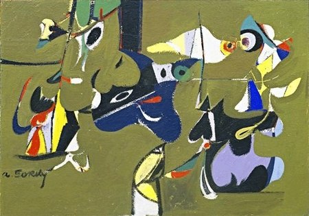
I don’t know why I do it either, but here is Washington Post arts blogger Blake Gopnik ruminating on just what it is that makes Arshile Gorky’s paintings so upbeat, so appealing:
Anyway, the Garden in Sochi paintings are more properly considered surrealist, transitional, or proto-AbEx, similar to early the figurative/narrative/symbolic work by the other two members of the Fun In Paint School, Pollock and Rothko.
An interview with Gorky’s wife Agnes Magruder, conducted on the occasion of Tate Modern’s Gorky retrospective. She seems far more interesting than the subject matter lets on. [tate.org.uk]
Related: Gorky was an expert camofleurHave You Seen Me? Jasper Johns’ Little Short Circuit Flag
The Rauschenberg show at Gagosian is pretty incredible, but then again, I’ve had Walter Hopps’ incredible show of Rauschenberg’s 50s work imprinted on my brain from day one.
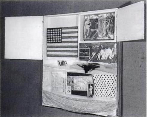
Anyway, here’s a little art history mystery about one of the great 50s pieces in the show, Short Circuit, 1955, which, in addition to a Ray Johnson collage and a Susan Weil painting, originally included a small flag by Jasper Johns, the first one he ever exhibited publicly.
The flag that’s in there now is by Sturtevant [above], because, as Calvin Tomkins put it,
So what’s it like, when did it get lifted, and more importantly, where is it?
Thomas Crow’s history makes it sound like the Short Circuit flag was straight [sic] oil on canvas, and that Johns only later switched to the more laborious, anti-painterly medium of encaustic, which he showed in 1958. [uh, or maybe it was encaustic after all. see below.] Either way, Sturtevant’s flag certainly looks more Johnsian than Johns’s flag.
Short Circuit stayed in Rauschenberg’s own collection, which would necessarily limit who had access to the work. Sturtevant’s first show, in 1965, included Johns Flag, which only puts a starting date for when Rauschenberg might have had the work replaced, but provides no help in figuring out when Johns’ own flag went missing.
Let’s try and nail down some of these dates, though, and then see who might have been around Bob’s place at the time, shall we?
update:
1997 [whoops, 2005], the catalogue for Paul Schimmel’s MoCA Combines show is calling the flag an “Elaine Sturtevant replica.”
Off The Wall: A portrait of Robert Rauschenberg [excerpt via google books, thanks art unwashed]Blurmany And The Pixelated Sublime
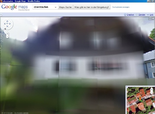
And the hunt is on. The few opt-out houses spotted so far have fed the media firestorm anew, and the examples cited by Der Speigel or FAZ [Google Translate] from Oberstaufen, the tourist village which first invited Street View to town, have been removed by Google “for review.”
At the center of the debate is my old blogging 1.0 buddy Jeff Jarvis, whose rather hyperbolic post on the subject, “Germany, what have you done?” was translated and republished by FAZ. [thanks greg.org reader/cinematographer Sanne Kurz, who tweeted about Jeff’s column.]
Sanne had referenced Germany’s complicated history of a giant state surveillance apparatus that elisted millions of citizens to spy on each other. Jeff’s having none of it:
While obscuring active military bases or the royal palaces may be justified for security reasons, the Dutch government’s Google Maps pixelation program also renders maps of entire villages and town centers unusable as it hides abandoned NATO weather stations–or nothing at all.
The state needs to be held accountable in its efforts at information control and censorship, but I can’t disagree more strongly with Jarvis’s unnecessarily extreme, incendiary language to criticize the individual assertion of some control over his own data. Referencing the Street View pano above:
Google’s German Street View blurring looks utterly fantastic. And for that matter, fantastically German. By which I mean, of course, that it looks like a Gerhard Richter painting.
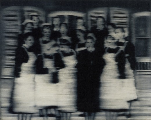
Nurses, 1965, image: gerhard-richter.com
Richter’s signature blurring technique calls into question the status, context, and veracity of the photographs that are his source material. Richter, Rosemary Hawker has argued,
I would think that the persistence of a few deliberately obscured images on Google Street View will serve as a useful corrective to the convenient, info-rich panorama’s seductive call, and will help remind users that they are, in fact, not in “the German Landscape,” but in a corporately controlled, commercial, and contested simulacrum of it.
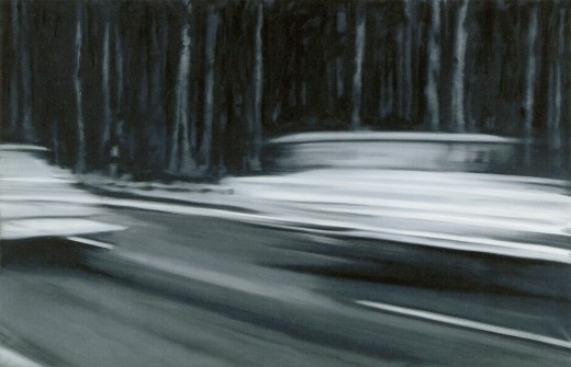
Two Fiats, 1964, via gerhard-richter.com
Far from “bombing” the supposed digital public sphere, the people who exercise their Verpixelungsrecht are asserting the individual’s right to virtual protest, to engage the digitization of his entire world on his own terms.
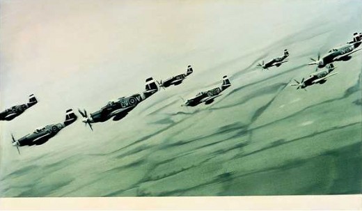
Mustang Squadron, 1964, image: gerhard-richter.com
Google has filed for patents to place advertising, “virtual billboards,” within Street View, reserving for itself the right to control and alter its ostensibly objective representation of the world for its own reasons, including, but not limited to, its own commercial gain. If someone painted their URL on the front of their store, would there be an outcry if Google threatened to blur it out unless they got a piece of the action?
Jeff argues that it’s folly for politicians to restrict innovation like geo-tagged facial recognition that, who knows, might be useful in locating Katrina victims. But who’s to say that, when our reality gets augmented to death with advertising and tracking, opt-out blurring isn’t where the real value will be? It’s the unlisted number of the future.
Or the vanity phone number. As an inadvertent-but-eager connoisseur of Google Map pixelation techniques, I could just as easily envision a premium Street View image management business emerging out of this controversy. In fact, it’s already started.
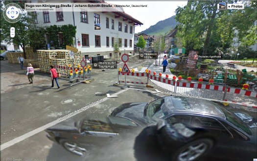
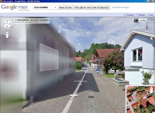
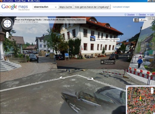
Just look at the unsightly street closure and construction project right in front of the Tourism Office of the otherwise-scenic Oberstaufen. Sheesh, no wonder they baked Street View a cake. Now check out the screenshot Spiegel got, where an embedded photograph from Panoramio helps clean things right up, mostly:
The Street View we see now is a mere shadow of the virtual world–or the virtualized real world–to come, and I’d like to think that when it comes to building and designing that world, digital citizens will be able to vote with more than their wallets.
At the very least, when people start paying Google to decorate their Street View houses with Blingee crap and animated gifs, mark my words: we’ll be grateful for the visual respite these Richterian Street View sites will provide.
Related, actually from over a year ago: Gerhard Street ViewSea Force One
The work is included in “Portraits and Power: People, Politics & Structures,” at Strozzina in Firenze. It is interesting to compare their writeup of the piece–
From a small boat nearby, workers are cleaning the yacht.
A painting emerges from the broad, white trails of foam on the ship´s dark surface, visible only for a short while until erased by cleansing streams of water.
Once again the reflected waves dapple the yacht.
Which immediately reminded me of the interview Felix Gonzalez-Torres did with Rob Storr, which I’ve reprinted and referenced here several times over the years.
I’ll just give you an example. When you raise the question of political or art, people immediately jump and say, Barbara Kruger, Louise Lawler, Leon Golub, Nancy Spero, those are political artists. Then who are the non-political artists, as if that was possible at this point in history? Let’s look at abstraction, and let’s consider the most successful of those political artists, Helen Frankenthaler.
Why are they the most successful political artists, even more than Kosuth, much more than Hans Haacke, much more than Nancy and Leon or Barbara Kruger? Because they don’t look political! And as we know it’s all about looking natural, it’s all about being the normative aspect of whatever segment of culture we’re dealing with, of life. That’s where someone like Frankenthaler is the most politically successful artist when it comes to the political agenda that those works entail, because she serves a very clear agenda of the Right.
For example, here is something the State Department sent to me in 1989, asking me to submit work to the Art and Embassy Program. It has this wonderful quote from George Bernard Shaw, which says, “Besides torture, art is the most persuasive weapon.” And I said I didn’t know that the State Department had given up on torture – they’re probably not giving up on torture – but they’re using both. Anyway, look at this letter, because in case you missed the point they reproduce a Franz Kline which explains very well what they want in this program. It’s a very interesting letter, because it’s so transparent. The Ultimate Collector’s Book Of The Millennium

316 pages. 136 Mb PDF download. Not including the copyright notices, well under 1,000 words.
I can’t quite put my finger on why, but I feel that, at least when The Future looks back on us, here, in this moment, in this culture, in the–as the flight attendant unexpectedly put it when he announced our arrival at Schiphol–in this, the 2,010th Year of Our Lord,
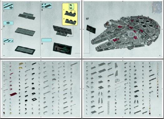
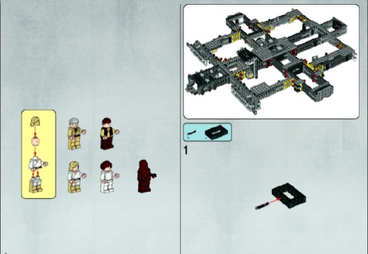
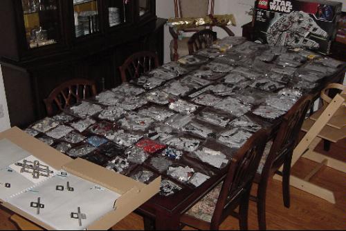
the instruction manual for the 5,000+piece Lego Set 10179-1: The Ultimate Collector’s Millennium Falcon may just end up as the touchstone, the most meaningful book, the best we managed to do. It is certainly the pinnacle of something.

During the unboxing, a giddy Amazon customer notes: “The bound instruction book weighs almost as much as the completed model! Almost. It’s huge!!!”
Seriously, I’m thinking it should be sold as a stand-alone. On the shelf next to The 9/11 Commission Report. And published in a limited edition art book version, on archival paper. Or at least given a fighting chance by being uploaded onto blurb.com.
I mean, it’s allowed, right?
# Building instructions labeled “NA” or “V39” may be printed on US standard letter size paper (8½ in × 11 in, 215.9 mm × 279.4 mm).
# Building instructions labeled “IN” or “V29” may be printed on EU standard A4 paper (210 mm × 297mm, 8.3 in × 11.7 in.)
UPDATE: Lego does have the Instruction Manual available for sale separately. It is $53, plus shipping. [lego.com]The Cruel Radiance, Or What Are You People Thinking?
I ordered it two weeks ago, but it just arrived yesterday, which turns out to be too long after the initial recommendation/one-click-order impulse to remember where I saw it.
At first, I assumed it was Brian Sholis’s interview with Linfield for Artforum:
Anyway, whoever you are, Influencer, thank you! I suspect I’m in for a grimly invigorating read.Tinguely’s ‘Black Tie Dada,’ Or Worlds Collide In MoMA’s Sculpture Garden
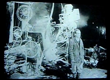
After making a name for himself in Europe with his “meta-matics,” automatic drawing machines, Tinguely came to New York in the early winter of 1960 and spent three weeks building Homage in the Sculpture Garden of the Museum of Modern Art. Billy Kluver helped him build the self-destructing sculpture from parts scavenged, thanks to multiple trips with curator Peter Selz, from the Newark dump.
Homage was performed? exhibited? destroyed? before an invited audience of around 250 on the evening of Thursday, March 17, 1960. I haven’t figured out who was there, but in a 2008 Brown Bag Lunch Lecture on the work, Columbia art historian Kaira Cabanas said someone referred to it as “Black tie Dada,” which might have just earned it a mention in my history of the gala-as-art movement.
The popular story is that the piece somehow malfunctioned, caught fire, and prompted NY firefighters to intervene just 30 minutes into the 90-minute event. Actually, even the Museum’s description of its own artifact from Homage says this. But it also has the incorrect date for the event, March 18, so perhaps not.
March 18 is the stated publication date for the Museum’s press release [pdf], though, which said the machine would be “set in motion” and “shown” only from 6:30 to 7:00. So it’s possible that everything went as planned.
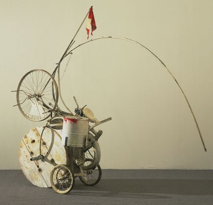
[Also, people apparently picked through the wreckage for souvenir fragments, but I can’t find any mentions of them surfacing. Besides MoMA’s conveniently self-contained hunk, above, the Tinguely Museum has a few manageable pieces.]
But really, the press release and the pamphlet/handout prepared for the event, is a gold mine of quotes and commentary. I double dog dare you to think of Alfred Barr the same way after reading his statement:
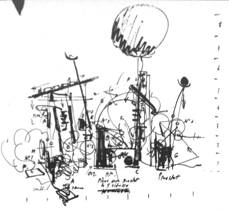
Ahem, also, did you see that weather balloon that was part of the piece? Here’s the sketch from the brochure:
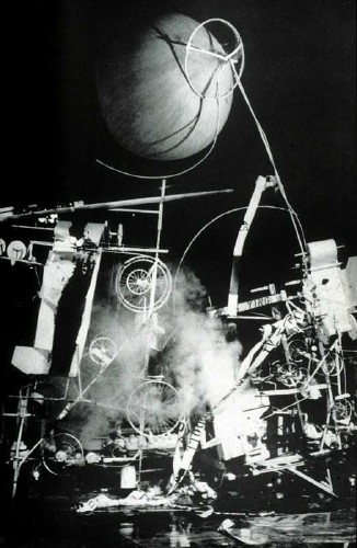
And here it is, atop another performance photo, probably, again, from David Gahr:
The brochure quote from original Dadaist Richard Huelsenbeck adds back some of the fatalistic frisson that can be lost in a nostalgic, artifact-centered look back at a troubled historical moment:
Anyway, Robert Rauschenberg was an early fan of Tinguely’s, and soon became an exhibition collaborator. Last winter the Tinguely Museum in Basel had a show about their working friendship. Which featured this awesome photomural of Homage To New York:
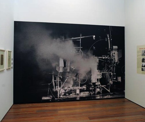
It’s probably from one of the performance images David Gahr shot for Kluver and MoMA. I don’t think it’s archival in any way, but it’s a great way to evoke the physical presence and scale of the assemblage.
I can’t find it now, but someone wrote how Tinguely kind of announced the Kinetic Art movement with Homage To New York, and then declared its end with “a similar” installation in front of the Duomo in Milan in 1970. Which cracked me up, because, hello, have you seen what Tinguely put in front of the Duomo in 1970? And was that similar to what Homage to New York was? Because I doubt it, but if so, wow.
Actually, let’s go to the tape. Or the film. Because D.A. Pennebaker shot the event, and made a documentary short, Breaking it up at the Museum, which features Tinguely previewing the piece, some details of the machine in motion, the takedown, the crowd, the applause, Tinguely’s curtain call, and a couple of audience member reactions:
“Why?”
“Well, it was something new, and visually, it was marvelous.”
“I felt like being in ze Twenties again.”
As Patrick said, a time machine.Is That An On Kawara Boardbook? Yes, Please.
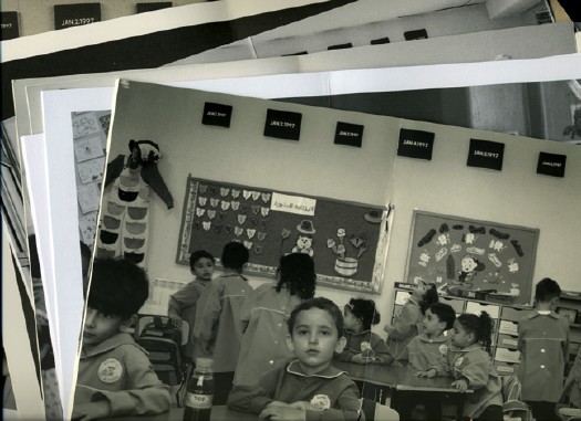
Which makes me sad to have missed the San Francisco Art Institute’s show this summer, On Kawara: Pure Consciousness In 19 Kindergartens. It was about a project where Kawara installed a week’s worth of his date paintings in kindergarten classes around the world. [It’s not new; I first heard of it in 2003 at an Ikon Gallery show.] Because just look at this tasty documentation. Is that an artist’s book? Or better yet, an artist’s boardbook? aha, a box set?
From the gallery site: George Catlin’s Bird’s Eye View
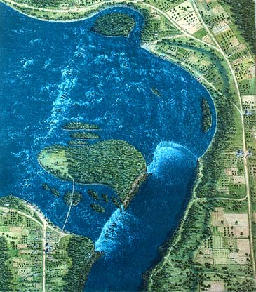
Now I knew George Catlin did some bird’s eye views, but I did not realize he also did some Bird’s Eye Views. This is one of the latter, an 18-inch gouache from 1827, Bird’s Eye View of Niagara Falls.
He got it pretty close, too. Did he use a map or something?

Announcing A Landscape Show I Will Be Curating At The Smithsonian
I am aware of the argument that because a) I have never spoken to anyone at the Smithsonian1 about this show, it follows that, b) the specific venue, date, and funding for this show being, to say the least, TBD, my announcement of it is premature.
There is another argument, however, that a) it’s been over ten years since I first conceived of it, and in the intervening years, and b) the artists and works in the show have remained both stable and intriguing, and c) no one else seems to have made a similar curatorial investigation, my announcement is, in fact, long overdue.
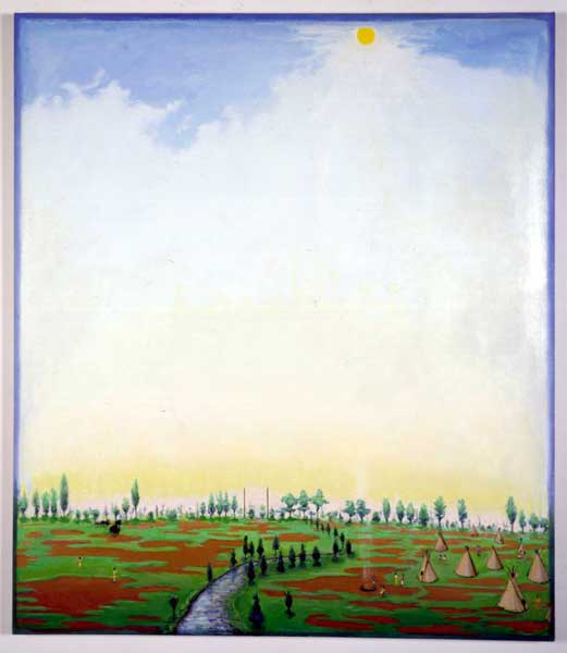
And one could argue that, with George Catlin’s American Indian Gallery now deinstalled at the Renwick, seemingly permanently, there’s no better time than the present. Or the future.
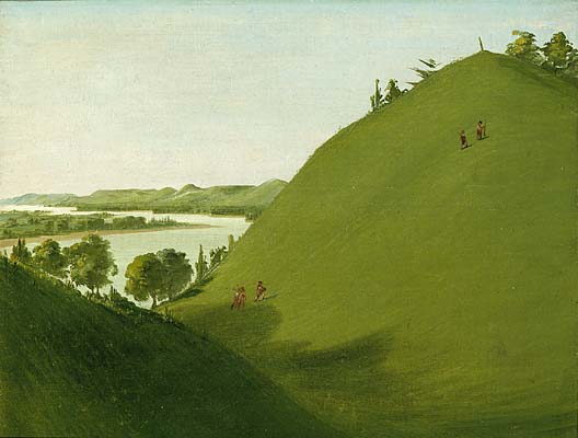
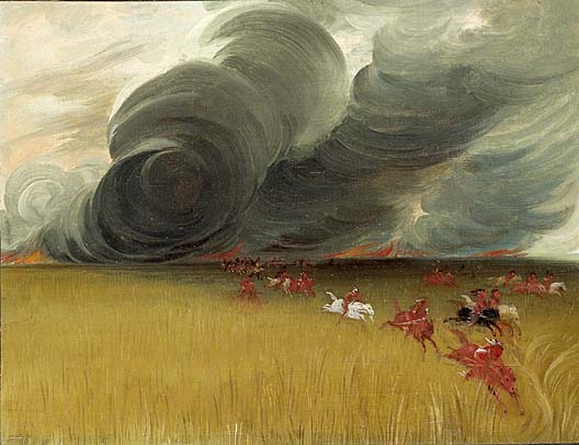
Anyway, They’re understandably overshadowed by the portraits, but I’ve always thought there was something fascinating and proto-photographic about Catlin’s landscapes. Catlin’s whole Plains Indian project was documentary, a function of painting that was soon to be usurped by photography. The landscapes feel like the most direct account of what Catlin actually saw on his road trip [and boat trip] to Indian Country.
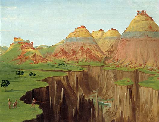
Unlike the epic landscape painting of, say, the Hudson River School or Caspar David Friedrich sought to capture the sublime and the overwhelming, transcendence or romanticism of Nature, Catlin’s landscapes seem content to have captured a moment. They’re like snapshots, with all the freshness, immediacy, and banality that entails.
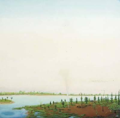
And seen together, the landscapes, like Catlin’s paintings of Indian scenes and ceremonies, reveal both typologies, and the artist’s own pictorial and compositional modes.
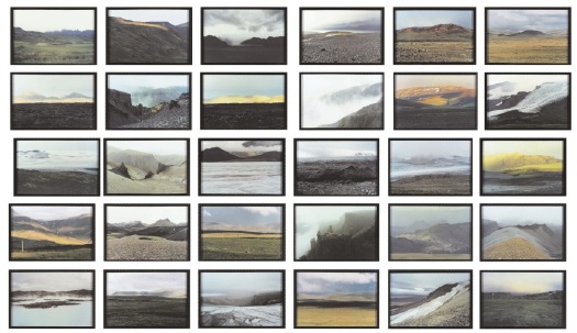
Olafur Eliasson’s The Landscape Series (1997) stood apart from most of his photogrids up to that point; instead of cataloguing a feature in the landscape–cave mouths, or lighthouses, or glacier boulders–it catalogued views, the very idea of a Landscape.
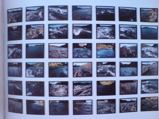
In the following years, Olafur added another strategy to his photography, which resonated even more closely with Catlin’s process. The Walk Series (1999) and The River-Raft Series (2000) are comprised of photos taken along a journey. They document the artist’s passage through and perception of the landscape.
Verne Dawson, meanwhile, is a vital conceptual link between these two otherwise disparate artists. Especially in the late 1990s, Dawson was painting in what might be called an enlightened retro vernacular style. His self-consciously simplistic technique and subject matter felt like it might have come from the Catlin era, but for two factors: his fantasist scenes featuring both Indians and airplanes collapsed or distorted time [or History, really]; and their savvy embrace of abstraction betray Dawson’s existence on the near side of 20th century painting. The skies on some of his paintings remind me of a less depressed Rothko.
And yet. Dawson’s mythologies underscore the exoticism, stereotyping, and subjectivity that Catlin’s project could ultimately not escape. And the quick, sketchy, painterly reductivism of Catlin’s landscapes have an abstract quality that feels impossibly modern.
Once you lay out the discussion between painting and photography, abstraction and landscape–and by you, I mean me–then I’d want to bring folks like Liz Deschenes into the show. And if they give me some more rooms, I’d probably put the original Western photographers in there, too, like O’Sullivan, maybe coupled with Mark Rudewel, or Trevor Paglen.
Catlin set out to document and preserve a world that he knew was being lost. Dawson imagines a world that seems like it might have been, but wasn’t. And Eliasson reveals how the reality we each construct is continually disappearing as we pass through time.
Or something like that. I think I still have a little time to work out the details.
1 Of course, it doesn’t have to be at the Smithsonian; I was just trying to make it easier to get the Catlins.
[images via si.edu, gbe, and wherever]‘General Landscape Scene’
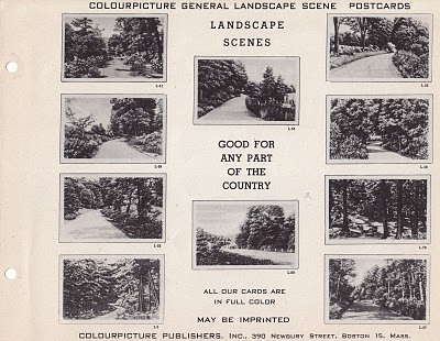
“Good for any part of the country.” I love it.
And not just because it reminds me of one of my favorite Olafur photogrids:
The Landscape Series, 1997, horribly hung in an image by Christies.Why Enzo Mari Is Not Your Capitalist Art Market Stooge
But you know what, he was a famous artist, or at least he showed his art for a long time in a series of prominent places, in exhibitions that were considered important and are now considered historic, even. And yet even as some of those events are being revived, revisited, and reemphasized, Mari’s involvement in them is not.
I was going to solve this mystery, and find the answer, using the two dozen or so browser tabs I’ve accumulated in the last 24 hours. But you know what, I think I’m just going to cut ‘n paste my links and let the info sort itself out.
Thing is, there probably ARE people who know exactly how or why Mari the Artist’s career or influence is the way it is; and it’ll be easier to try and track them down rather than engage in armchair speculation. Or I’ll just pigeonhole Hans Ulrich in Miami, either way.
So here’s what I’ve got: