2017 screenshot of New Posters on Richard Prince’s IG grid [via]
Early in 2017 I wrote about how Richard Prince was using the Instagram grid to gang images and to stage temporary exhibitions. One I screenshot was of a set of photos he called New Posters; it was made of vintage ads for Marboro Posters, alongside his own blurred Trump poster.
Richard Prince, Untitled (Poster), 2016-17, 98 x 68 cm, ed 25+5AP, via MOREpublishers
Somehow, even though I considered the possibility of IRL posters at the time, I only just now realized Prince did make a New Poster. Untitled (Poster), 2016-17, was published as a small screenprinted edition by MOREpublishers of Belgium.
an installation view of Open Group’s Repeat After Me II (2022, 2024), from the Polish Pavilion of the Venice Biennale, 2024, photo: Jacopo Salvi via 601Artspace
Somehow the Ukrainian art collective OPEN GROUP’s powerful installation from the Polish Pavilion at Venice last year is being restaged in New York City, starting tomorrow, Thursday May 8th. The somehow is impresaria Magda Sawon, who has arranged with 601Artspace’s David Howe to showRepeat After Me II (2022, 2024), and Untitled (2015 — ongoing), two works that relate to the ongoing impact on Ukrainians of the fight against the Russian invasion.
OPEN GROUP was a last minute addition to the Biennale, after Poland’s rightwing government was ousted, the Polish Pavilion’s rightwing curator and artists followed. Curator Marta Czyż rapidly invited OPEN GROUP instead.
After the opening Thursday, Czyż and Sawon will give a public walkthrough of the show, in two adjacent 601Artspace spaces, on Friday evening. There is also a talk planned for Saturday the 10th, with Czyż, OPEN GROUP, and Columbia professor Mark Lila. [Obviously it will not be at Columbia.]
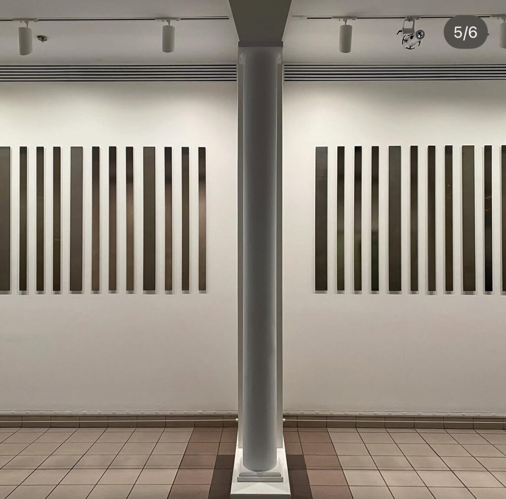
Jonathan Monk X Vier5, The Billboard Book Project (Paris), 2010, ed. 40, installation view at Three Star Books
Jonathan Monk’s Billboard Book Project with Three Star Books has at least four iterations. It is a billboard entirely about the making of itself, both as a billboard and as a book. The first iteration’s billboard appeared in “Week 47 of Year 2009” in Paris, while the limited edition book, made of cut down billboards—and documentation of an installed billboard—is dated January 2010. Which makes the subthemes project management and the hermeneutics of verb tenses.
Also:
Jonathan Monk X Vier5, The Billboard Book Project (Paris) – The Green Book, 2010, ed. 15, the colophon with signed photodocumentation, via Three Star Books
Three Star Books announces an immediate and surprising sequel to “The Billboard Book Project (Paris)”…During Monk’s recent sojourn for the launch of this project, the artist noticed that posters in the Paris Métro were occasionally covered with green printed paper during the interval between commercial advertisements.
Jonathan Monk X Vier5, The Billboard Book Project (Paris) — The Green Book, 2010, 26.5 x 43 cm, ed. 15, via Three Star Books
The Billboard Book Project (Paris) — The Green Book is a companion book—though in a much smaller edition, so a companion to only a fraction—of offset printed monochrome green billboards.
There were The Billboard Book Projects in London and New York after this, and I’m happy for all involved. But it’s no disrespect to say—and I’m sure the fifteen people or institutions who own both Paris volumes will back me up on this—The Green Book is the project’s greatest aesthetic success.
In the instagram post at __artbooks__ it says On Kawara wrote this “personal chronology” on stationery from the Downtown St Louis Holiday Inn, “some time between October 16 and 20, 1973.” The timing is based on the assumption that he didn’t just grab the stationery for later use, but instead wrote out this list while he was staying in St. Louis. It’s also possible that another sheet stapled under this one—these are photocopies, and were not known to the One Million Years Foundation that handles Kawara’s estate—continues with all the places he’d been, ending with Pittsburgh and Indianapolis, the places he’d visited before arriving in St. Louis.
A postcard of the Climatron at the Missouri Botanical Garden, sent by On Kawara to Sol Lewitt on Oct 18, 1973, published in I GOT UP, 2008 by mfc-michèle didier, digitized at TamaBi
In mid-October Kawara and his wife Hiroko Hiraoka were barely a week into a three-month road trip across the United States, making art along the way: Date Paintings, I Am Still Alive telegrams, I Got Up postcards, and I Went maps. The postcards for the four mornings he woke up in the St Louis Holiday Inn were all sent to Sol Lewitt. Between the postcards and maps in the On Kawara Database at Tama Art University and Duncan MacLaren’s extraordinary reverse-engineered narrative, it’s possible to reconstruct the form of Kawara’s life, if not the substance.
This chronology, sort of an I’VE BEEN, is only loosely related to the I WENT project. Every day from June 1, 1968 through September 17, 1979, Kawara traced the path he traveled on a photocopy of a local map. It hints at broader documentation of his life alongside his work, if not for it. But it also shows Kawara looking back, a perspective that rarely surfaces in an art practice so thoroughly grounded in the moment of its making.
It reminds me of a glimpse into the evolution of Kawara’s project that I read recently on MacLaren’s page reconstructing the first year of the Date Paintings, 1966. Among the photos of Kawara’s 13th St studio I’d seen many times before, is this image of the largest date painting to-date, Sept. 20, 1966. McLaren points out, though, that Kawara does not record making a painting on the 20th, nor on the 21st, 22nd, 23rd, or 24th. Yet there one is.
This giant painting, then, was perhaps the first one Kawara could not finish in a day. And so it was almost nine months into his project, and only after completing and photographing his biggest painting ever, that Kawara decided a Today Series painting must be made on the day, or it had to be destroyed.
The September 2020 zoom panel for Judd, MoMA’s mononymous Donald Judd retrospective is already a fascinating document of its moment. For a show that was closed for four months by COVID restrictions, there was much discussion of the people, and the physical experience of Judd’s work. Spatial qualities, social distancing, the reflectivity of its surfaces, the subjectivity of seeing one’s masked self seeing.
Rachel Harrison’s mesmerizing photos of details of the work and Leslie Hewitt’s discussion of how photogenic it is drew insights from curator Ann Temkin about how much she’s learned from watching visitors photograph the show, and how they’d debated whether it was safe to allow photos at all, and how much our relationship to photography has changed since even the last major Judd retrospective at Tate Modern in 2004. Harrison pointed out the historical shift in Judd photography, citing James Meyer’s catalogue essay, about Judd’s first show is documented by just two black & white installation photos by Rudy Burckhardt.
John Waters’ Visit Marfa, 2003, six-color screenprint by Globe Poster Co., 30 x 22 in., ed. 100, on the cover of the Summer 2004 issue of Artforum, as sold on eBay
Jeffrey Weiss’s last comment was to suggest Judd saw people–and museums— as things to be avoided, not courted, though, which is why he kind of withdrew to Marfa and set up his own spaces. When Temkin said we’ll end thinking of Marfa, Harrison piped up to say, how about John Waters instead? And his great poster, which she paraphrased fondly as, “Welcome to Marfa, the Disneyland of Minimalism,” inviting everyone at home to Google it.
It is actually, The Jonestown of Minimalism,” of course, but the misquote was a clue, probably, of what Harrison was reading up on for her Judd panel. Waters’ 2003 poster was on the cover of the Summer 2004 issue of Artforum, which was largely dedicated to the first major museum exhibitions historicizing Judd and Minimalism. It included articles by Temkin [on Judd conservation], Weiss [on artists’ writing], and Meyer [on scale]. Waters’ poster is the lede for a spectacularly grumpy review by Yve-Alain Bois of three museum shows—including Judd at Tate:
“Take the Whole Family to Marfa, Texas,” exhorts the broadside, beneath a Li’l Abner–style middle-class family, grinning like they’ve just won a vacation to Disney World. A bubble on the poster advertises “The Jonestown of Minimalism,” mocking the tenacious cliché of the movement’s “spirituality” by likening it to a senseless sect.
Bois’ review, the whole issue really, including the lengthy back & forths in the letters, reads very much as of its moment, when the entire art world was talking to itself in the magazine of record [sic * 3 obv]. When I’d go back and read my blog posts from the early 2000s, I used to think my self-referentiality and -importance was insufferable, but now I realize I was soaking in it. It really did be like that sometimes.
So some art world things and faces are the same, but what’s changed? For one, you actually can fly to Marfa now—and some of us [sic] did. In April 2020, the early freakout days of the COVID shutdown, Nate Freeman reported that a private jet flew from Teterboro to Marfa with three passengers. Who quarantined at addresses of the Chinati Foundation, and a studio compound owned by Christopher Wool & Charline von Heyl.
But I think the most salient—and terrifying—development is revealed in Harrison’s prescient malapropism. Does anything capture our dire cultural moment more clearly than the conflation of Disney World and Jonestown?
Ellsworth Kelly, Study for Blue Yellow Red V, 1987, 4 1/2 x 4 in., oil on canvas, selling at Phillips 14 May 2025 [update: or not]
You get a taste of that Ellsworth Kelly brushstroke, and suddenly it’s all you want and all you look for, and you’re desperate for another fix, even if it’s a literal scrap of canvas.
Ellsworth Kelly, Blue Yellow Red V, 1954/1987, 246 x 190 cm, oil on three canvases, the Meyerhoff Collection, promised to the National Gallery as recently as 2020, but they 404’d the slideshow, which feels ominous. but it could be nothing.
This extraordinary 4.5 x 4 inch work is being sold as Study for Blue Yellow Red V, presumably after the number of brushstrokes it contains. The way it has pencil marks along the edge where it was cut off. The way that patch of yellow feels extraneous but is obviously not a dealbreaker, because the work is signed an assigned a spot in the artist’s catalogue raisonné (EK 761B). The way it references a monumental, triple canvas, double-dated painting which the Meyerhoffs are hanging onto for dear life. The way it was acquired directly from the artist by Henry Persche; 1987 was the 20th year since he began working as his studio assistant—was this an anniversary gift? Or just a little something to match the rug?
Ellsworth Kelly, Henry Persche, graphite on paper, Feb. 7, 1967, 23 x 29 in., a gift from Persche to the Brooklyn Museum
Persche was 26 in February 1967 when he lounged for Kelly for this sketched portrait. He donated it, along with three other drawings, to the Brooklyn Museum in 2010. The rug, from a declared edition of 20, of which only four were ever realized, he also got in 1967-68. He only sold it in 2019.
I’m trying to modulate the moral, ethical, and spiritual effrontery associated with the upcoming auction at Sotheby’s Hong Kong of a collection of around 300 sacred Buddhist relics which were extracted from the bones and ashes of a person believed to be Siddhartha Gautama. They are being sold by the descendants of the British colonist who excavated the Piprahwa Stupa in Uttar Pradesh in 1898, an Ashokan-era gravesite that some scholars argue was created to hold the eighth portion of the Buddha’s remains given to his Shakya clan after his cremation.
The Buddhist practice of relic, or śarīra, worship holds that visiting relics of the Buddha gives merit, but also that offerings of carved and natural gems, beads, gold, and other precious objects become “contact relics” by being mixed in with the Buddha’s remains. The Sotheby’s lot essay reads like a legal brief arguing for these objects’ unparalleled religious and historic significance, while also laying out the case against the extractive colonialism that stripped them from their religious context:
The first contact relic to be revered was the clay pot retained by Brahmin Drona after the subdivisions. Gem relics donated as relic offerings by Buddhists seeking merit, became contact relics after being mixed in with the bone relics of Shakyamuni Buddha. For Buddhist pilgrims, to visit the sacred landscape of places where the Historical Buddha had passed through and lived was also as much a part of this cult of relic worship as the veneration of relics themselves.
Danh Vo, We The People (Detail), 2011-16, hammered copper [and?], 110 x 338 x 229 cm, selling 16 May 2025 at Sotheby’s
We’ve all been reading the condition report every day, and We, The People are in rough shape at the moment. But if I were bidding, I’d ask for a condition report for this fragment of We The People (detail), too. Because in one of the Sotheby’s photos, the Statue of Liberty’s face looks fine, and in the other it looks like there’s some delamination going on under the copper sheeting.
As far as these things go, this is a really great fragment, but ngl, Danh Vo’s project felt a lot better when it was more conceptual and less documentary.
Ellsworth Kelly, Green and Red, 1964, oil on Arches, 30×22 in. or so, selling [UPDATE: or not] 16 May 2025 at Sotheby’s
I liked it well enough for itself, but after arguing with the Sotheby’s essay in my head over what’s actually going on in this Ellsworth Kelly oil on paper, I love it even more.
It mentions “a single, vibrant and amorphous green form set against a flat, saturated red ground,” and says “The green shape, defined by sweeping, confident brushstrokes, floats within the field of red with a quiet, commanding presence.” Yet it feels like there is neither a ground or a field to float on. These two colors and the forms they make are side by side on a sheet of paper.
The visible brushstrokes absolutely do reveal how Kelly made the picture, how there might be a bit over overlap of green on red paint along the right side, but also how the vertical strip where the slightly angular green neck goes was narrowed with red. Rather than surrounding a form, or coloring in a void, it feels like Kelly made the picture as a whole.
It’s got borders like a print, too, which echoes the series of lithographs he was making for Galerie Maeght at the time. It also seems Kelly held onto this until 2007.
SLA Group Photo with Floating Head, 1991, paint and silkscreen on aluminum, 75 1/2 x 60 5/8 in., formerly of the Sammlung Goetz, yet another private museum which started offloading stuff, illustrated in what is now being used as Cady Noland’s de facto catalogue raisonné
Instead of posting an artist disclaimer on a work for sale, Sotheby’s just cites its appearance in the artist’s book, and the four three museums, public and private—and whatever Peter Brant is doing—which hold other variations on the work. Whatever else is going on in the world, we do live in a Golden Age of Cady Noland Marketing.
This is the fifth year that Hellman has put together a collection of artist-designed plates whose sale benefits the Coalition for the Homeless in NYC, and it is remarkable. Once the APP began debuting the plates at art fairs, they’ve taken on a wild, competitive philanthropic eshopping energy.
This year there are fifty plates, each in an edition of 150, with the first 100 reserved for the opening day of Frieze NY. The rest will go on sale the following week at Artware Editions. The plates are just $250 each, about the price of a lunch at an art fair. [Artware also has some previous years’ plates, including individually signed plates, and a couple of complete sets, no waiting.]
Jasper Johns, Untitled, 2001, pastel on paper, 25 1/2 inches diameter, via Matthew Marks Gallery
What’s wild about Johns is not that he did it, but that he had a tondo drawing ready for instant plate adaptation. Johns had used both the Picassoid head and wife/mother-in-law optical illusion in many works for years; having them sprout surreally from a tree branch, in a round pastel? Not so much. But he showed this picture in the 10th anniversary drawings show at Matthew Marks at the end of 2001.
Oh wait, actually he did not. That is an entirely different work—same motif, different object. When the Marks drawing turned up at auction in 2015, it had an uncharacteristically full essay, especially for a day sale, with a surprisingly full discussion of Johns’ references.
In the latest Irving Sandler Essay in The Brooklyn Rail, artist Alexi Worth lays out a fascinating theory about the revulsion contemporary critics expressed about Manet’s Olympia when they first saw it at the Salon in 1865: they were confounded by Manet’s depiction of full frontal lighting. Worth extends his observation from a 1971 essay about the “lantern gaze,” in which Michel Foucault reads Manet’s paintings as lit from where the viewer—and before that, the painter—stood:
Why was frontal light invisible—or uninteresting—to scholars? One reason is simple: Manet himself never “authorized” the topic. A secretive artist, Manet left few records, and never said a word about his reliance on frontal light. But Manet’s silence is only half the explanation. Perhaps more important, frontal lighting just seems unremarkable. Familiar. Normal. All of us, scholars and non-scholars alike, are habituated to bright frontal light. We see it all around us: in the faces of fashion models and TV anchors, in images by Andy Warhol or Nan Goldin, or for that matter in any flash-lit photograph.
“You could say,” Worth goes on, “to put it too simply, that frontal lighting looks like early Manet.” I’ll try to remember this the next million times I can’t unsee the ring lights reflected in the eyes of every youtuber and influencer.
James Lee Byars, no title, no date, lacquered bronze, 5 x 10 1/2 x 9 1/2 in., image via Wright20
As I was thinking of ephemerality, handmade paper, and Japan, and artists who should have been asked to make an Art Kite for Lufthansa in the 1980s, who should drift into view but James Lee Byars.
And as I was looking to see if Byars ever made a kite, I stumbled upon this sculpture of lacquered bronze. It’s melon-sized, 10 x 9 inches, but only half that high, flattened, like a giant Junior Mint. In a sculptural oeuvre full of marble, gold leaf, handblown glass and giant spheres, it is not the most remarkable object.
But what a history. It has been around. It was in the collection of Robert Mapplethorpe. Then in 1989, while the AIDS crisis and rightwing attacks on the arts—and on Mapplethorpe—raged, it was sold at Christie’s by the artist’s estate. And it was acquired by the American Medical Association. What its existence was like at the AMA is a mystery. Was it in the president’s office? On a pedestal? In a nook? In a closet? What we can know, presumably, is that after a couple of decades, someone looked at this giant, bronze Junior Mint and decided the organization would rather have $10,000. So they sold it at Wright, the local auction house in Chicago—where it actually brought in $31,250. Which probably left them feeling pretty good about their decision. No word on it since.
There is a book. I did not know there is a book. I’ve visited the Felix Gonzalez-Torres show at the National Portrait Gallery & Archives of American Art multiple times and have written about it even more, and I did not know there was a book. I fixated on Felix’s “Untitled” text portrait in both its installed versions, and wondered how the Smithsonian’s curators made them, and I picked through the history of this and other text portraits, and wrote a whole-ass blog post about it, and I didn’t know there was a book.
Reader, there is a book, and it is literally about all of that. In Felix Gonzalez-Torres: Final Revenge (A Workbook), co-curators Josh T. Franco and Charlotte Ickes wrote a whole essay on their experience and process of creating the versions of “Untitled” they’ve showed. Along the way, they fill out many key aspects of Felix’s work, from its changing history to its changing present.


![a black and white 1966 photo of on kawara's loft studio with two rows of date paintings along the wall: the smaller ones are hung in a line, and the medium sized ones are lined up along the floor. a giant date painting, perhaps 6 by 9 feet, of sept. 20, 1966 rests on blocks on the floor in front of the rows of smaller paintings. [spoiler] it was later destroyed, presumably because it had taken longer than a day to finish it.](https://greg.org/wp-content/uploads/2025/05/on-kawara-studio-1966-sept20.jpg)