
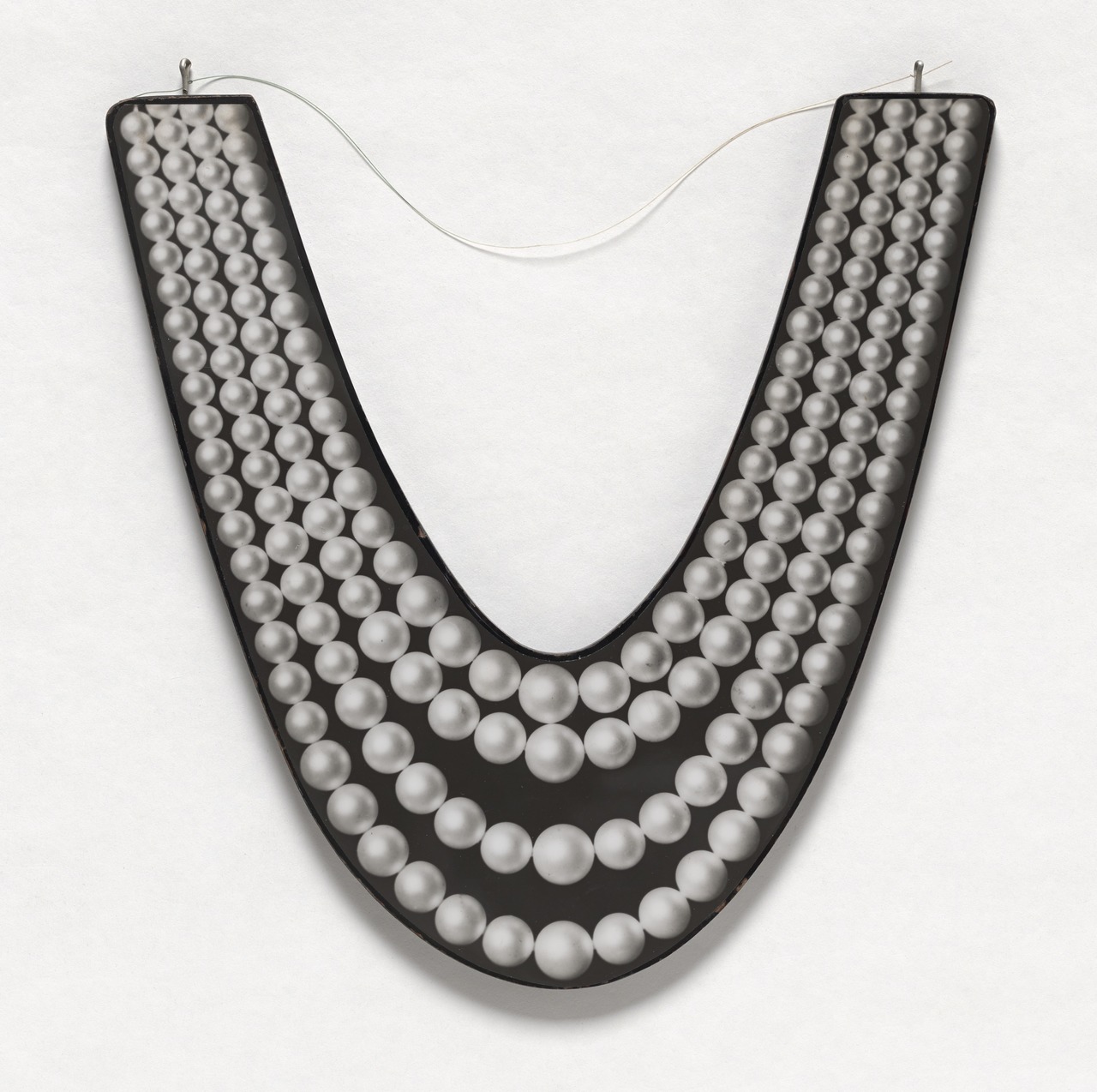
I looked at a lot of Robert Watts while researching and writing about his friend Aaron Kuriloff. I really liked it. MoMA has some very nice and interesting chrome Watts pieces on view right now in the 1960s hang of the permanent collection galleries, but I have never seen this in person. Pearl Necklace is a 1:1-scale photo mounted on wood. The wire makes me think it had to have been designed for wearing, which is awesome. In 1967 Kuriloff had his last show, of 1:1-scale photos of office furniture and equipment he called “photo-factuals.” He’d been making them for a couple of years, and I’m pretty sure he and Watts were up on/involved in each other’s work. I, for one, would like to know and see more.
Robert Watts, Pearl Necklace, c. 1967, acquired 2008 from the Silverman Fluxus collection [moma.org]
Which, yes, My dive into the history of Aaron Kuriloff is in the Spring 2017 issue of ArtNEWS [artnews]
Previously, related: More Aaron Kuriloff, Please
#exstrange: Curated eBay-as-Art-Platform

jodi, eBay shopping bag (#exstrange edition), screenshot: ebay
#exstrange is an art project of, on, and about eBay. Curators conceived and launched #exstrange by inviting artists to create “artworks as auctions” that use “the entire listing (descriptive text, images, pricing, and categories) as material to build the artwork.” Occasionally some of those artworks even involve objects.
Marialaura Ghidini and Rebekah Modrak began the #exstrange exploration, and they are involved in the website and book [forthcoming] documenting and discussing the project. But by its nature, #exstrange also exists-and eventually disappears-on eBay, as a hashtag/search term that is ultimately beyond the curators’ control.
There is no shortage of art on eBay, nor of conceptual stunts, often designed for shock or novelty that, it is hoped, will generate interest and a sale. While there are immediately appealing objects, too, like a stamped eBay shopping bag edition by the net collective Jodi, some of #exstrange’s most interesting works are designed to exploit the parameters of eBay’s system and the expectations of its users.

Joana Moll, Google trackers in North Korea official webpage, 2017, image: exstrange.com
In her listing Joana Moll pitched “Google trackers in North Korea official webpage” as “living proof of US colonization over the Asian country.” The opening bid was $30. But because the Barcelona-based artist used the US site, her sale was subject to US law, which prohibits trade of North Korean goods. And so the listing was canceled by an embargobot which couldn’t discern the nuances of selling a screenshot of a txt file showing Google Analytics code embedded in the DPRK’s (presumably homegrown) html. No problem, though, because the delisting is part of Moll’s piece.

Lloyd Corporation, Bankrupt. Bulk Buy. Liquidation. Repossession #exstrange, 2017, exstrange.com
Lloyd Corporation, meanwhile, appropriated the texts and images from listings by a bankruptcy liquidation specialist, and sold inattentive bargain hunters boxes of junk that nevertheless literally met the listing’s descriptions and caveats. Don’t worry how it turned out, though: the angry correspondence unraveling the sale became part of the work.
As the project propagates, others are jumping in and glomming on. Whether the curator-controlled website follows the free-range hashtag or diverges from it remains to be seen. #exstrange could remain an esoteric label, or it could follow the arc of “eames era” as a genre-specific default search term that dilutes its specificity to homeopathic levels of uselessness. In the mean time, I will definitely be courting some of those conceptual art bidding’ eyeballs by throwing it into my title description of my next eBay sale,. To paraphrase Rauschenberg, “this is an #exstrange if I say so.”
#exstrange, co-curated by Marialaura Ghidini and Rebekah Modrak [exstrange.com via someone one twitter, thanks! probably regine/wmmna]
Previously, related: eBay Test Prints: DO NOT BID OR BUY
DO NOT BID OR BUY Meets DO NOT LIST OR SELL
We’re Not All Chris Burden Now
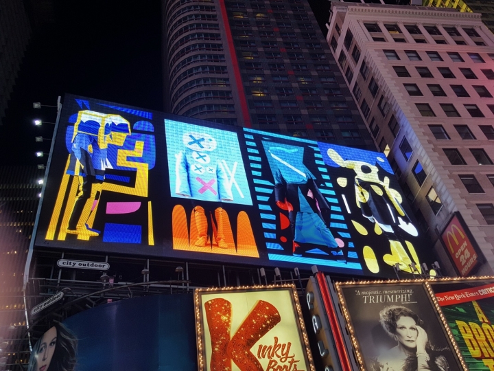
Brian Bress, Consonance and Dissonance in Four Parts for Times Square, in Times Square for Public Art Fund, image: hyperallergic
Recently Seph Rodney wrote for Hyperallergic about the Public Art Fund’s Commercial Break series, which places “interruptions” by 23 artists within the advertising programming of large-scale public screens in NYC. The project ended last weekend, but from Rodney’s account, you probably wouldn’t have noticed either way:
the project’s images are not so much a break as a pause — in some cases, by my count, a four-second interlude in which I’m not even sure what I’m looking at and not sure it’s all that different from what came before and what comes after.
It turns out to be difficult for an artist to create a successful art experience entirely within the visual context of a cacophonous commercial cityscape.
Rodney cites several historical antecedents, including Marilyn Minter and Chris Burden’s TV commercials, Creative Time & MTV’s artist spots in the 80s, and PAF’s own Messages To The Public (1982-1990), which inserted artist messages on a billboard in Times Square. Oddly, there’s no mention of Creative Time’s 59th Minute (2000-07), which did the same thing on the same spot, but with the new screen sponsor, Panasonic.
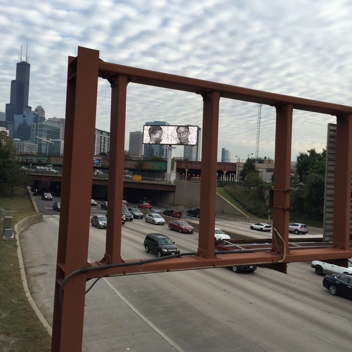 Vik Muniz, George Stinney, Jr. (2016), seen on a billboard for OVERRIDE, Expo Chicago, image: Meg Handler/Artnews
Context is hard anyway, but advertising is especially unforgiving. It all reminded me of the problematic billboard Vik Muniz made last year for Override, the public art program of Expo Chicago. Dushko Petrovich dug into it for Art News. Everyone who ever contemplates making or curating ad-related art for the public sphere needs to read about this mess.
Expo Chicago had invited several artists to submit images of works to be broadcast in rotation on electronic billboards around the city during the art fair. Muniz’s George Stinney, Jr. was a still photo from a video piece he’d made in 2015 that told the story of the youngest person ever executed in the US. That moving backstory was lost, though, to passersby who just saw the mug shot of a 14-year-old African American boy flash across a billboard.
None of the Override works were presented with any kind of introduction or identification to distinguish them as art. This lack of framing allowed the other works their surprise and titillation. But with the Stinney mugshot, mystery presented a problem: if viewers didn’t know it was art, how were they supposed to know it was a critique? What did it mean to see this image without preparation or context?
Thousands of random people were seeing it all over Chicago, but there was no way to identify these unwitting viewers, much less talk to them.
Well, Facebook. Dushko spoke with Chicago residents who were baffled, disturbed, and angered by the Stinney image; it didn’t help, but it’s worth noting that this sounds very close to Muniz’ own reaction when he first discovered Stinney’s story.
In 2010 I said that Google’s nascent AdWords-style market for buying TV commercials should be a boon for artists. “We’re all Chris Burden Now,” I said. Well, I was wrong, and it’s probably for the best that we all didn’t take my advice, because the blunders would have been off the hook. But if you’re going to make ad-related public art, just give it some thought, mkay? It’s tricky in the best of times, and these are not those times.
Aiming to Disrupt Ads in New York City, Artworks Instead Blend In [hyperallergic]
In the Context of No Context: A Digital Billboard in Chicago Raises Questions About Art in the Public Sphere [artnews]
Previously, related: We’re All Chris Burden Now
Starting With Chris Burden’s TV Ad, Through The Night Softly
I Just Remembered I’d Wanted [To Make] John Cage’s Table
I am not sure why, but I just remembered that I once wanted John Cage’s table in a totally non-venerating way, or, barring that, that I wanted to make it, and had thus recorded the score [sic] for the table on a bar napkin at one point.
Previously: Scoring John Cage’s Table
Why Not…
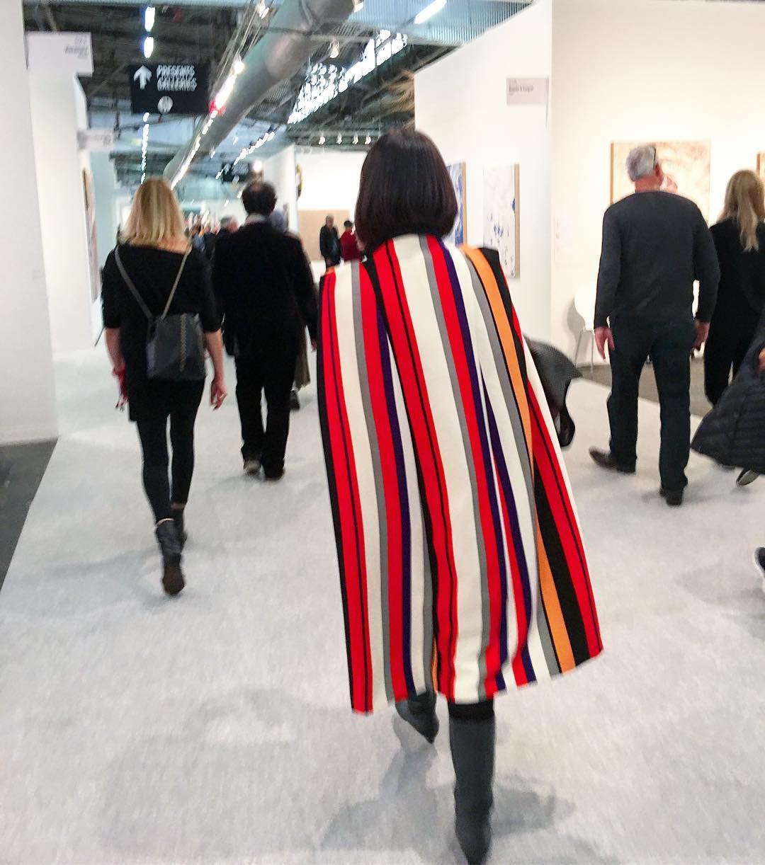
“@klausbiesenbach recommended dress code for #armoryartsweek comments please”
throw your bought-in Fredrik Vaerslev over your shoulders like a cape and shop it around the pier in the afternoon?
Untitled (Picture Light), 2017
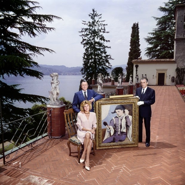
Untitled (Picture Light), 2017, picture light, gilt frame, Picasso, installation view, 1989. image: Chema Conesa via The Art Newspaper
In 1989 Baron and Baroness von Thyssen-Bornemisza brought a dining chair out to the terrace of Villa Favorita to sit for a portrait by photographer Chema Conesa. The Baroness sat. The Baron stood, with his right hand on his wife’s shoulder. Someone seems to have had the idea to add Picasso’s Harlequin with a Mirror to the composition.
It it not clear where the 1923 painting was hanging, but it was. A white-gloved manservant apparently took it off the wall and marched it outside. He holds it on the right corner as it rests on the bare brick ground. The Baron stabilizes the other corner by resting his left forearm on the frame. The brass picture light is still attached.
The Baron bought Harlequin with a Mirror in 1979. X-rays show that Picasso originally painted a self-portrait, possibly as a Cupid/Eros combo, before replacing his face with the mask-like stare of the harlequin. William Rubin and Pierre Daix linked the early state of the harlequin to Picasso’s 1923 frustrated infatuation with Sara Murphy, of the Cap d’Antibes Murphys. The series marked the end of Picasso’s so-called Classical phase. It is currently unclear when, where, or why the Baron bought it, though.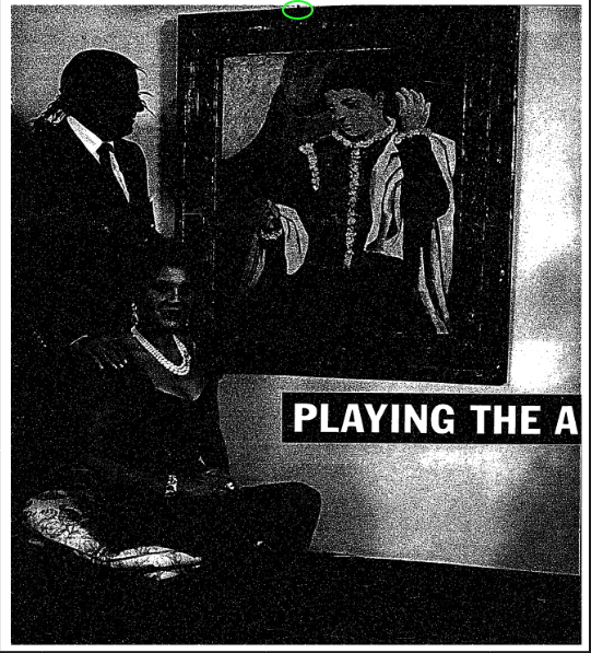
The Thyssen-Bornemiszas at home in Madrid with Harlequin with a Mirror and possible picture light detail, 1992, image via NYT
By 1992, the Thyssen-Bornemiszas had decamped to Madrid, anticipating the opening of the Museo Thyssen-Bornemisza across the street from the Prado and Reina Sofia, to which they had loaned (or rather, rented) more than 800 works, not yet including Harlequin. From the opening of a NY Times Magazine profile:
Baron Hans Heinrich Thyssen-Bornemisza is pouring himself another drink in front of a Picasso on the living room wall of his Madrid mansion. He is making the point that he has always been a tough businessman, the kind who won’t let anything get in the way of a good deal.
From the Baroness’s posture to the Baron’s hand, to the Harlequin photobomb, the Times’ image lacks only an art handler to complete its homage. A tiny black spot at the edge of the page gives me hope that the Harlequin made the trip from Lugano to Madrid with his picture light intact. It did not, however, survive the trip into the Museo.
So whether it overlooks Lake Lugano or the Paseo del Prado, this sculptural situation of a picture light on a Picasso sitting nonchalantly and unmediated on a terrace is exceptional, and will likely never occur again. So this work probably exists only in retrorsum in memoriam. Still gives me chills, though.
[May 2024 update: I was thinking of this work again, still marveling at it, and decided to reach out to El Pais photojournalist Chema Conesa, who made this image. Before doing that, though, I found this lecture he gave in May 2023, where he talks about the extraordinary and mundane circumstances that led to this scene.]
Pablo Picasso, Harlequin with a Mirror, 1923 [museothyssen.org]
Playing The Art Game For High Stakes [nyt mag, 04 Oct 1992]
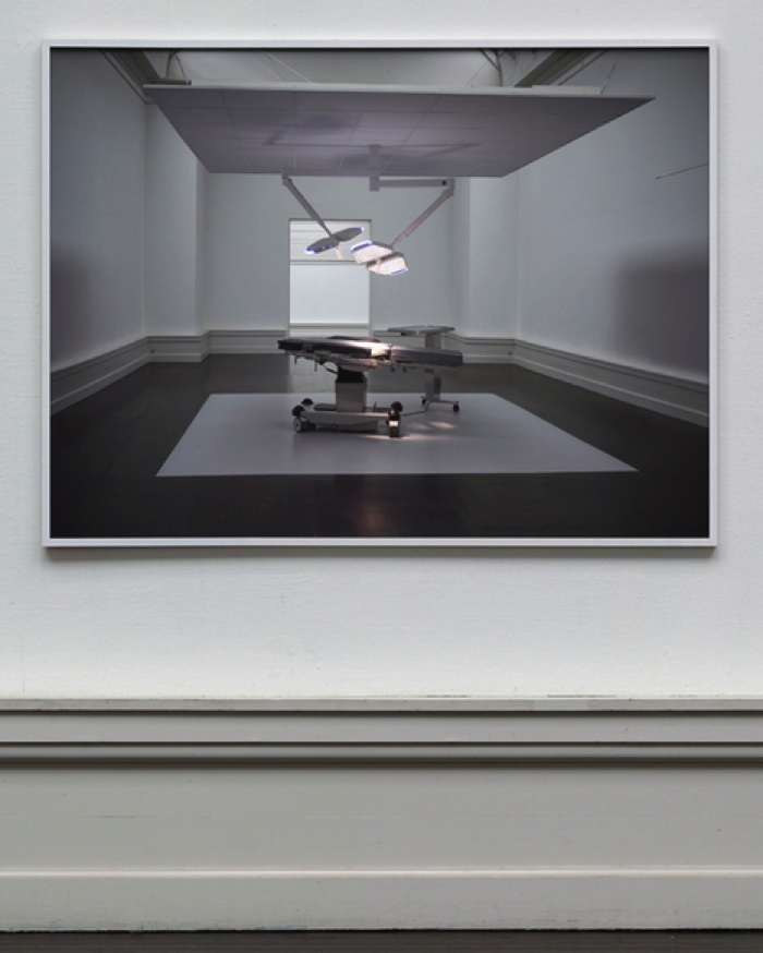
SUPERFLEX’s ‘Hospital Equipment’: Context Is Everything
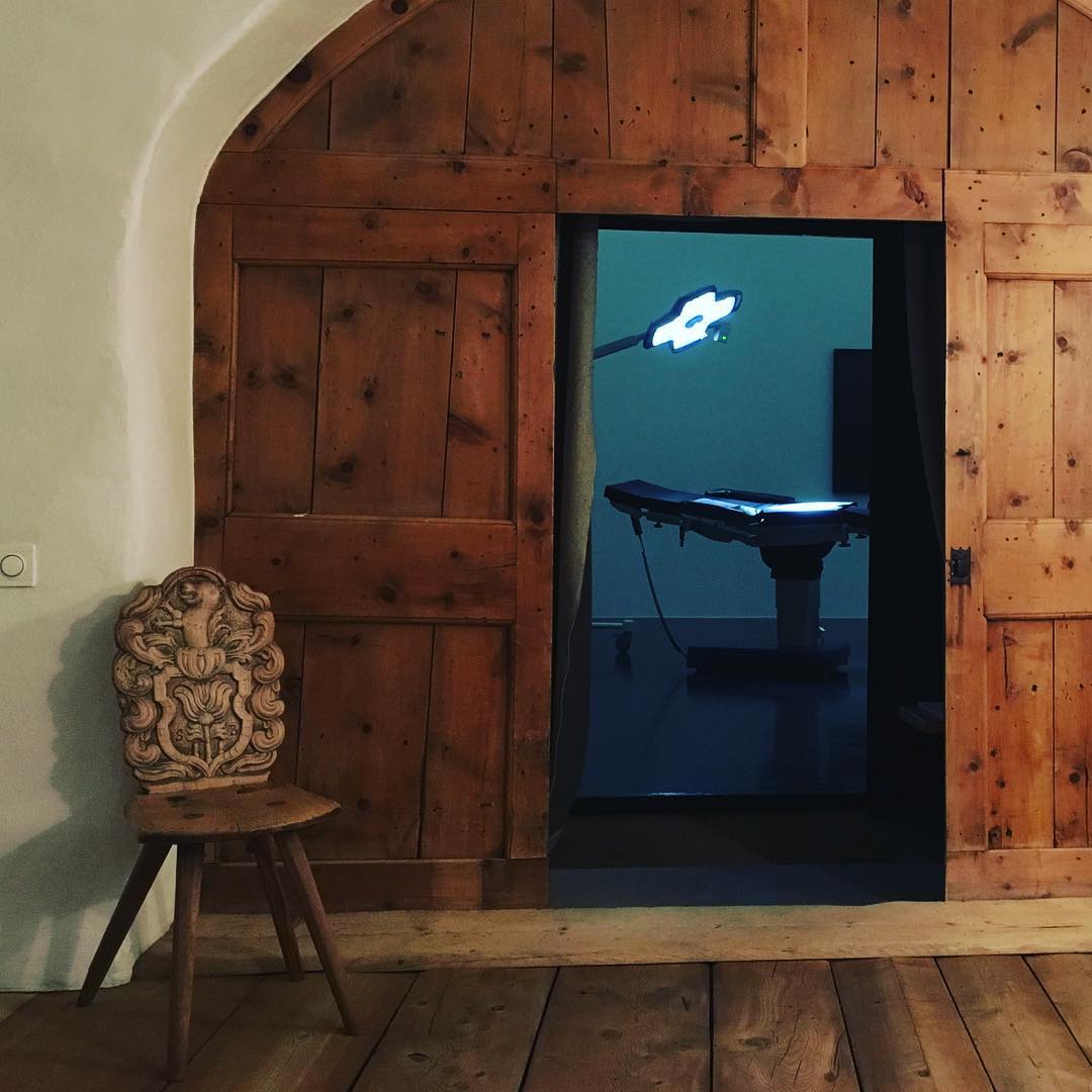
Superflex, Hospital Equipment, 2014- , von Bartha S-chanf installation shot via ig/superflexjakob
“Sometimes context is everything,” SUPERFLEX’s Jakob Fenger wrote, as he Instagrammed a photo of the latest installation of Hospital Equipment in von Bartha’s hyper-rustic gallery in the Swiss skiing village of S-chanf. [pronounced as it’s spelled, it turns out.]
The Danish collaborative calls Hospital Equipment a “readymade upside down,” because it pulls objects into an art context, only to send them on their way to a new context, as functional objects. The objects are surgical tables and operating room equipment, and their post-readymade destination is a hospital in a Middle East conflict zone. The first iteration of Hospital Equipment in 2014-16 was realized at a hospital in Gaza. This time, the work will be realized in Syria.
Collectors of the $90,000 work–Superflex calls their things tools rather than artworks or projects–receive a photo and a certificate for the privilege [sic, which] of funding the object’s purchase, travel, and installation in a place where it’s actually, not just symbolically useful.

ceci n’est pas un readymade non plus: Hospital Equipment‘s equipment installed at al Sharif Hospital, Gaza, Palestine, 2015-16. image: superflex
von Bartha’s exhibition announcement identifies a lot of issues:
The work questions not only our divergent reaction to the heavy stream of media and humanitarian fundraising campaigns involving the Syrian conflict, it also challenges the concept of contemporary art practice, collections and ownership. SUPERFLEX refers to the work as a ‘readymade upside down’. Transitioning from a Duchampian ‘readymade’ to a potentially lifesaving medical instrument, the equipment oscillates between artwork and functional object, highlighting the role of context in the definition of artistic practice – and the will of the individual mind to make direct change in the world we are living. The equipment consists of a state-of-the-art surgeon’s table, a mobile surgery lamp and a surgical instrument table, that has been carefully selected for the Salamieh hospital. Hospital Equipment is an act of exchange.
“We want to challenge collecting itself. Do you have to have the object, or can it be just as valuable to you that it be activated somewhere else?” said Bjørnstjerne Christiansen last year.
Superflex Hospital Equipment, 2014- , installation shot of the photo of the installation at den Frie, Copenhagen. image: superflex
For some objects like operating tables, and some places like much-covered conflict zones in which your own society is somewhat implicated, there is value in knowing that your effort or expenditure helped activate something somewhere else. But a photo is an object. A COA is a marker of value. The art world is a context that confers that value. Engagement with art as a maker, seller, and collector also confers social value. Let’s acknowledge that but continue to consider the questions Superflex is raising. But, “Is the money spent on an art object better spent somewhere else?” ends the exercise too quickly.
Given Superflex’s constellation of privilege, money, access, attention, prestige, moral authority, relationships, aesthetics, entrepreneurialism and relationships, and the particulars of the platform and situation they faced in 2014, what is an appropriate response?
Because in 2014 Superflex was awarded the Carl Nielsen og Anne Marie Carl-Nielsens Legat, a biennial prize for Danish sculptors which includes an exhibition at Den Frie Centre in Copenhagen, and a prize of 600,000 kronor (then $US105,000.)
Superflex realized Hospital Equipment in collaboration with PalMed, a EU-based NGO for Middle Eastern doctors, who helped pick the equipment and identify and coordinate with the hospital; the WHO, who helped with logistics; and a Danish training tech firm called Area9, whose founder was the only collector of three to be publicly identified. Thus through the jiu jutsu of the readymade, the transformation of an operating table into an art object and back again is incidental to the leveraging of art capital and its trappings for international humanitarian philanthropy.
And now it is happening again, this time with Syria. And a private gallery on the road to Gstaad. Will the media streams and aesthetic impulses and capital flows align again so that Superflex can make some more direct change in the world? I guess we all hope so.
But the financial and logistical convolutions involved in Hospital Equipment strike me as an inefficient and ultimately unsustainable way to meet real medical needs. They’re the geopolitical conflict equivalent of Americans trying to stave off medical bankruptcy via a GoFundMe campaign. Faced with a real, looming crisis, I can’t say these efforts shouldn’t happen; they’re imperative, though they often fail, and leave the systemic contextual problems intact. Superflex’s Hospital Equipment may succeed again; it has certainly achieved a high level of awareness, or publicity. Is that the extent of its conceptual reach, though? Does the readymade transubstantiation really only need to occur in the mediated image of the project? Or even only in our minds? Maybe its greater impact should be exposing the tenuity of the art world’s own self-reinforcing system, whose currency, increasingly, can only be exchanged for the occasional self-congratulatory gestures of a handful of aesthetically inclined multi-millionaires seeking the approbation of an even smaller coterie of hedging billionaires.
SUPERFLEX Hospital Equipment, Feb 16 – Mar 18, von Bartha, S-CHANF, Basel [vonbartha via artnet]
Hospital Equipment, 2014 [superflex.net]
Carl Nielsen og Anne Marie Carl-Nielsens Legat 2014 [denfrie.dk]
Better Read #012: In The Domain Of The Great Bear, By Mel Bochner & Robert Smithson
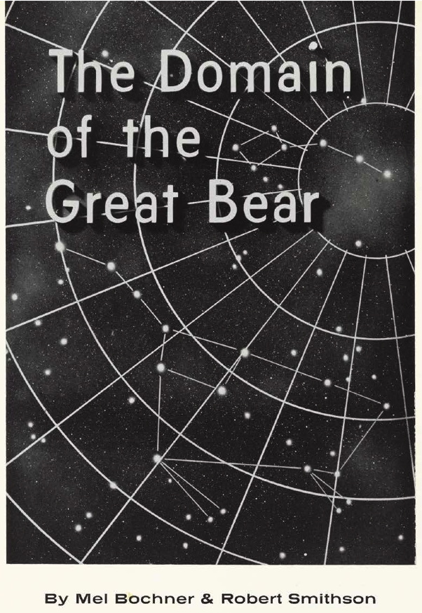
Reading a Dan Graham interview transcript about magazine articles as artworks, and contemplating the [so far] failed campaign for Giant Meteor ’16, I thought of Mel Bochner’s and Robert Smithson’s In The Domain Of The Great Bear, published in the Fall 1966 issue of Art Voices. This edition of Better Read is two excerpts from that work, which I imagined as a diptych.
PDF scans of In The Domain Of The Great Bear can be found in various places online [pdf]. The version I like is on Mel Bochner’s own website [pdf], because it preserves the appearance of the work as originally published. Bochner spoke about Domain at a 2005 Smithson symposium at the Whitney Museum. I was at that symposium, but the New York-centric historian who said visiting the Spiral Jetty site doesn’t matter, the film is enough, and Nancy Holt’s nonchalant comments about adding more rocks to the Jetty have obliterated all other memories of that day. Fortunately the talk was later adapted as “Secrets of the Domes” and published in the September 2006 issue of Artforum.
serendipitous update: I happened across the John Wilmdering Symposium at the NGA from last Fall, where art historian Justin Wolff talked about Rockwell Kent’s End of the World lithographs, which were made for Life Magazine. For a story, though, about a very popular program at the then-new Hayden Planetarium, where scientists would speculate on the many ways the earth could be destroyed. So this was not just Smithson; it was a Hayden thing. Great [End] Times. [oh, spoiler alert?]
Download Better_Read_012_Bochner_Smithson_Domain.mp3 [9:36, mp3, 13.8mb, via dropbox greg.org]
Podcast: Play in new window | Download
Subscribe: RSS
Cucula: Lampedusa Autoprogettazione X Refugees
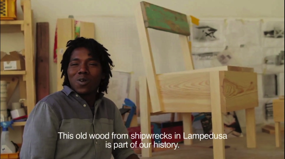
I do not know how this slipped by me all this time, but Cucula is a Berlin organization that works refugees to make furniture. It started in 2013 by making Enzo Mari’s Autoprogettazione designs out of the wood from refugee shipwrecks on the Italian island Lampedusa.
Lampedusa, of course, became synonymous with the first widely publicized tragedies of massive refugee deaths in perilous transit. Cucula, a West African word meaning, basically, colabo, was started by designers Corinna Sy and Sebastian Daeschle, first to help Nigerian and Malian refugees fleeing war in Libya to stabilize their situation in Germany. Actually, their first idea was to help the refugees build furniture for their rooms; the refugees said they’d rather have jobs, danke.
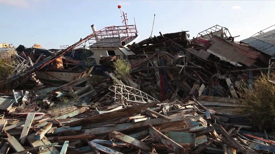
The first products were Mari’s Sedia I, and were apparently called Lampedusa Stuehle. On the webshop now, though, they’re called the Ambassador. Whatever the nuance of the shift, it makes me think of how time, geographic shifts, and the exponentially worsened plight of refugees has kind of swamped the Lampedusa brand.
Actually, what it really does is make me uncomfortable by aestheticizing and productizing the deaths of so many people. I fully support the mission of Cucula. I will not be shaken in my support of efforts to help refugees, especially those who have been through so much and have traveled so far at such great danger. I am a longtime admirer of Enzo Mari, and applaud his support for Cucula’s use of his designs beyond their original, DIY-only context.

But the transformation of wrecked ships into premium, virtue-signaling, small batch designer furniture gets rightupthisclose to Ai Weiwei levels of disaster pornsploitation for me. The only thing that makes it work, imho, is that it’s actually refugees learning the skills, doing the work, and reaping the benefits. I hope. [Curbed reports that Mari’s license stipulates that only refugees can make the furniture, which in this case adds to the layers of complication, partly because the refugees cannot officially be classified as employees who earn wages.]
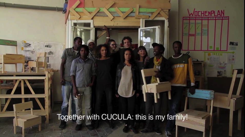
How many kinds of complicated are there again? Because it feels like a couple of designers stepping in to fulfill a moral obligation we all [should] feel, and doing it in an impossibly, obviously, unscalable way. And the rest of us, our role is to shop.
No. I don’t mean no, don’t shop. I mean, no, the rest of it. Why not take Cucula as an imperative, an example of the value of individual and collective care and involvement in building communities with and for refugees? If a designer can organize a workshop that supports a team of refugee craftsmen by building esoteric furniture, there is something you can do, too.
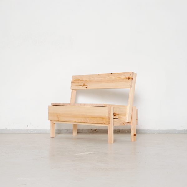
Meanwhile, maybe the Cucula solution is two-fold: first, get some stock-standard Autoprogettazione furniture made from regular pine. None of it is particularly expensive, considering, and the Bambinooo extended mini-chair with built-in storage bin is especially nice. Also go full Lampedusa-meets-Piet Hein Eek, and get a custom chair made entirely out of wreckwood. Then start inviting some refugees to dinner.
CUCULA [cucula.org, h/t monique]
Meet CUCULA, the Berlin Furniture Company Seeking to Empower Refugees [curbed]
Previously, related: Enzo Mari X Ikea Mashup, Chaper: The Last [or not, obv]
Olafur Eliasson: An Early Painting
Untitled, 1993, 70 x 190 cm, image: bruun-rasmussen.dk
Olafur Eliasson painted this in 1993. It’s apparently one of six roughly door-sized paintings in a series or group. I’ve seen a couple of early Olafur paintings, and I am puzzled by them.

This is another painting from 1993, which apparently did not sell at B-R in 2011. It also has atmospheric and landscape-ish fields of color behind traced elements of domestic architecture.
Beauty, 1993, installed at the Long Museum Shanghai in 2016, image: olafureliasson.net
1993 was also the year he made Beauty, which he first showed in a garage, I believe. I’d say he was exploring a lot of different directions in 1993 and chose one.
Frakkastigur, 1996, from a suite of five photogravures produced by Niels Borch Jensen
But then, that painting also reminds me of a couple of collaged image photogravures Olafur made with Niels Borch Jensen, which have always puzzled me, too, and those are from 1996.
the rest, image via nbj
Other prints from the suite have probably gotten more attention for how they seem to map out Eliasson’s project going forward, but I keep wondering about the collagey ones.

Vestmannaeyjer street covered with ash with lava fountains behind, 1973, image: usgs
A few years ago I found some stunning and very similar-looking photos of a January 1973 volcanic eruption on Heimaey, an Icelandic island where a third of the fishing village Vestmannaeyjer was buried in lava and ash.

image via heybehappy
The USGS published a booklet about how the destruction was minimized by fire fighters hosing down the face of the wall of lava with seawater as it advanced through the town, slowing it down. Olafur would have been 6, and I imagined the incident would have been formative. And I started re-considering his work through an unexpectedly autobiographical lens. When I proposed this to him, though, he didn’t buy it.
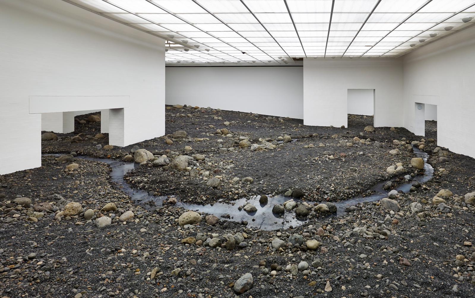
completely unrelated: Riverbed, 2014-15, installed at Louisiana Museum, DK, image: Anders Sune Berg via olafureliasson.net
I still wonder, though. And I do wonder about Olafur’s early work, including those paintings. If no one’s gonna look into it, maybe I will.
Mar 7, 2017, 870/752
Olafur Eliasson: Untitled, 1993, est. 200-300,000 kr [bruun-rasmussen.dk]
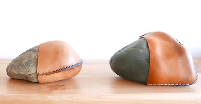
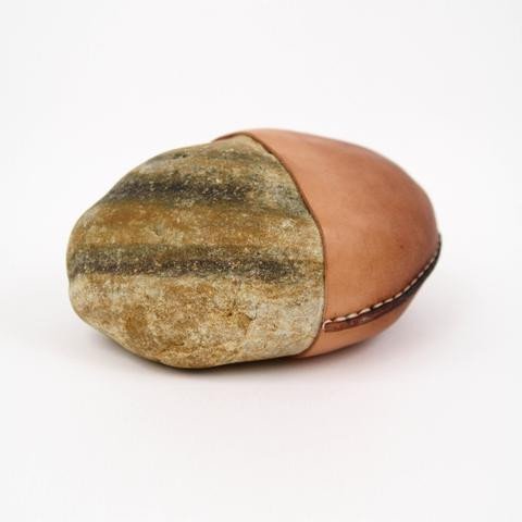
Untitled (Sold Out), 2017, Leather Wrapped Stone from Nordstrom
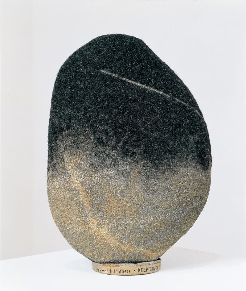
David Hammons, Rock Head, 1998, image via: hairisforpulling
In 1992 David Hammons took clippings from the floor of a barber shop in Harlem and affixed them to the crown of a melon-sized stone from Harlem. He brought the stone back to the barber shop for a haircut alongside his friend and muse, the Lower East Side poet John Farris. The performance is known as Haircut. Hammons has made several similar sculptures of black hair attached to stone, then trimmed and cut with tramlines, which have been titled Rock Head or Stone Head. They are inspired by history and their surroundings. Black living is at their core. They honor uniqueness and celebrate the individuality of each piece Hammons creates.
“Made Solid is a collection of leather products designed and handmade in Los Angeles by Peter Maxwell and Mia.
Our design is inspired by our history and our surroundings. Western living is at our core.
We honor uniqueness and celebrate the individuality of each piece we create.
“The name Made Solid references the connection we create through our creative process and the end result of our labor. Making a solid connection between the raw leather our hands touch and the well used pieces our friends love is our constant goal.
…
“We are connected to our surroundings, bringing natural elements to our work. Ocean, sand, stone and sky are referenced.
“We bring our lifestyle to our work.”
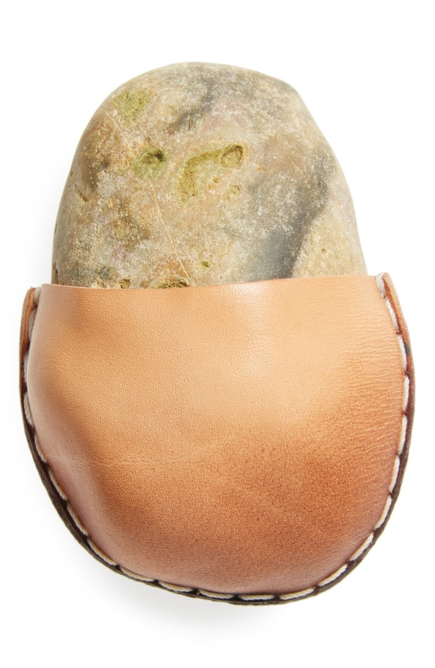
In 2013, Maxwell and Mia conceived “one of their most popular and recognizable pieces” in collaboration with “one of their oldest friends,” Los Angeles designer Cristy Pitoc. Their Leather Wrapped Stones are sourced locally, “selected for shape and color,” and vegetable tanned leather is stretched around each stone with the wet molding technique used in saddle making. The edge is stitched, beveled and burnished by hand. “The leather is bound to the stone for life.”
“Use as a paper weight, worry stone, doorstop, art object – whatever it is to you.”
Wrapped Leather Stones have been featured in design-appreciative blogstores, literarily themed artisanal and locally sourced menswear emporia, and well curated home and lifestyle shops to, I’m sure, appropriately contemplative acclaim.
For the Holiday 2016 season Made Solid Leather Wrapped Stones were also curated into the Love, Pop-In Stores at select Nordstrom locations and at Nordstrom.com:
A paperweight? A conversation piece? A work of art? It’s up to you, but this smooth Los Angeles-area stone–wrapped in rich, vegetable-tanned American leather secured by sturdy contrast backstitching–is sure to draw attention wherever it rests. A traditional hardening process gives the leather a beautiful ombré effect. Like all Made Solid leather pieces, this one is cut, shaped, sewn and finished by hand in artist Peter Maxwell’s Los Angeles studio. Using vintage leatherworking tools and traditional saddle-stitching techniques, Maxwell aims to create beautiful designs that embody both simplicity and functionality, and that develop rich character and patina over time.
The collaborative contributions of Mia and Pitoc went unmentioned, but the availability of a leather wrapped stone did not, and Nordstrom’s Leather Wrapped Stone went viral in December as an object of superficial, reflexive media mockery and superfluity, the diametric opposite of their creators’ intentions. It appears they also sold out, but at what must be considered too high a cost, or too low a return; at the moment no Wrapped Stones are available in Made Solid’s online store.
Earlier this week Nordstrom confirmed they would no longer carry the licensed merchandise of Ivanka Trump, citing poor sales. Yesterday Ivanka’s father tweeted in outrage over the haters’ and losers’ slights, and the White House press secretary literally said Nordstrom’s decision to discontinue stocking Ivanka was an attack on the president’s policies and family. Discount clearance stores TJ Maxx and Marshall’s also both dumped the toxic, failing brand. Today as I type this, the other White House flack is violating federal law by literally declaring a commercial promoting Ivanka’s brand and telling people to go buy it.
Untitled (Sold Out) (2017) consists of things that actually did sell at Nordstrom, namely a Made Solid Leather Wrapped Stone. So whatever it is to you, it is now also a declared, limited edition inspired by [our rapidly unraveling] history and its surroundings. Though I will endeavor to pin it down, the size and location of the edition is presently unknown. Both small and medium Made Solid Leather Wrapped Stones purchased from both seasonal appearances at Nordstrom are included, but Made Solid Leather Wrapped Stones purchased elsewhere, are not, no matter what their size.
Fakes already abound, but if you believe you have an example of this artwork, please provide images and appropriate documentation of the provenance, and I will gladly issue a signed certificate. Requests for confidentiality will be honored.
1971: The Year In Andirons
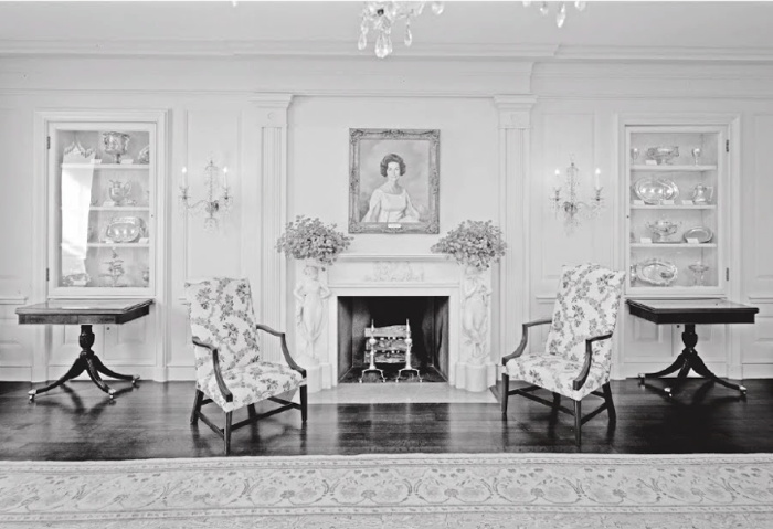
The Vermeil Room in the White House as redecorated by Pat Nixon’s plumbers, photo c.1992, LOC via Phillips-Schrock
The White House needed renovation and redecoration, and the Nixons were determined to put their mark on the place. By 1969, the French interiors commissioned by Jacqueline Kennedy were worn from use. Also they were detested by politicals as reminders of a martyred rival. H.R. Haldeman and new White House curator Clement Conger set out on an aggressive fundraising effort to remake the White House and its collections, a campaign publicly led by the First Lady Pat Nixon. The period room-style appearance of the White House to this day largely reflects Mrs Nixon & co’s work.
Based on my Google Books previews of it, this story of “the Dismantling of Camelot” is meticulously told by Patrick Phillips-Schrock in his 2016 book, The Nixon White House Redecoration and Acquisition Program: An Illustrated History.
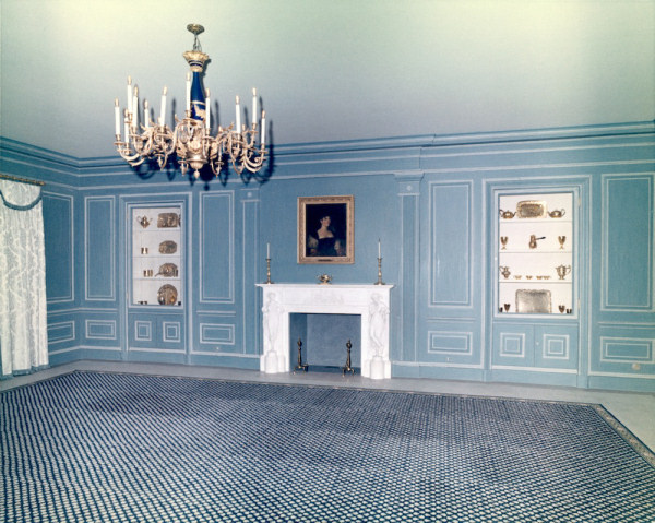
Vermeil Room a la Boudin, c. 1964, image: whitehousemuseum.org
Phillips-Schrock’s account of the 1971 redecoration of the Vermeil Room on the ground floor of the White House is representative. From a caption of a photo of Boudin’s Kennedy-era design: “The room was expensively finished in painted surfaces in blue and white with vitrines lined in white silk. Conger found it offensively French…” [p.74]
From an interview with Conger: “What we have done in ‘face-lifting’ the Vermeil Room is to change the room from a very dark blue–which is rather depressing–to a light green-gray, the appropriate color as the background for vermeil, which is gold. You use blue with silver, but never such a dark blue!” [p.76]
The room was reconceived as an early 19th century sitting room, with a table at the center “attributed to the workshop of Duncan Phyfe, it was on loan until a donor could be found to purchase it.”
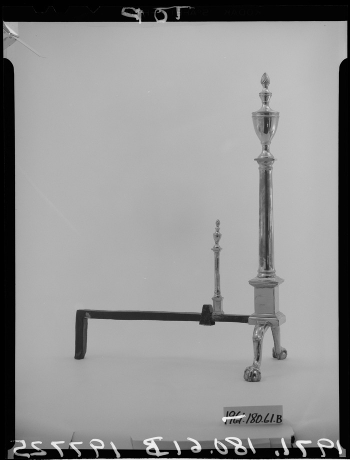
An 18th century lighting fixture in crystal with 10 lights replaced the Kennedy chandelier of bronze and blue tole. Further lighting was supplied by four matching sconces and by two candlesticks given by Mrs. Marjorie Meriwether [sic] Post, which were placed on the mantel. The fine Louis XVI marble fireplace was acquired and installed in 1962. [not too offensively French, I guess. -g.o] Within the firebox were a pair of valuable brass andirons, obtained from Israel Sack of New York. When the room was opened to the public, Conger related, “These are American andirons, so called ‘in the Paul Revere Manner’ with the flame and diamond lozenge–except they are a little more petite and narrow than the heavier ones of this same design one generally sees.” [p. 77]
The andirons abide.
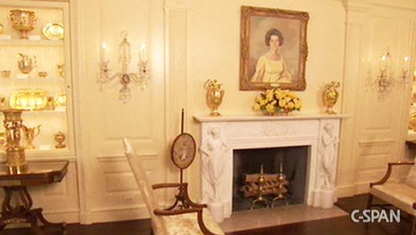
American Andirons in the Vermeil Room, c.2008, image: CSPAN via whitehousemuseum.org
I mention this because I just googled across it. And because 1971 was a busy year for well-provenanced, Paul Revere-ish andirons. It was the same year Mrs. Giles Whiting bequeathed her Paul Revere (Attributed) andirons to the Metropolitan Museum. Interestingly, Mrs. Whiting’s Revere-ian andirons did not have a diamond and flame, but an urn and flame finial. Actually, I don’t know if that’s really interesting at all. Maybe what’s interesting about andirons is not the things themselves, but the complicated narratives into which they are enlisted.
Previously, related: Untitled (Andiron Attributed To Paul Revere Jr.), 2014 [greg.org]
The Compleat Publications from the Gerhard Richter Archive Dresden
When I saw a 2-year-old book titled “Volume 13” I realized I had no idea how much the Gerhard Richter Archive has been publishing. Or what. And at the moment, it turns out to be non-trivial to find out.
They are not all published in English, or in every market, so they are called, variously, Schriften des Gerhard Richter Archiv Dresden, Band whatever, Writings of the Gerhard Richter Archive Volume whatever, and Publications from the Gerhard Richter Archive Dresden, Volume whatever. Yet specific web searches prove insufficient. And the Archiv’s director Dr. Dietmar Elger is himself too prolific and accomplished to be of much help in narrowing things down.
Somehow I can find no single list of titles*, so I have made one here. I expect it will be rendered obsolete some day by a database update to the artist’s website. Or by a page compiled by the archive itself.
Until then, though, a seemingly brazen SEO ploy feels right at home on a site that, at one point, literally published a weekly index of New Yorker Magazine articles because the New Yorker did not. So greg.org is proud to present The Compleat Publications from the Gerhard Richter Archive Dresden, in chronological order.
Ah, I think I see the problem.
Schriften des Gerhard Richter Archiv Dresden; vol. 1
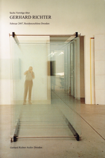
Sechs Vorträge über Gerhard Richter. Februar 2007, Residenzschloss Dresden (2007, Walther König, Köln)
Documentation of a six-lecture symposium organized on the occasion of the artist’s 75th birthday.
ISBN 3865602991
amazon [us] | amazon [de] | gerhard-richter.com
Publications from the Gerhard Richter Archiv Dresden, Volume 1
Volume 1:

Gerhard Richter Text 1961 bis 2007. Schriften, Interviews, Briefe (2008, Walther König, Köln)
The collected writings, interviews and letters, 1961-2007, in German.
ISBN: 9783865601858
amazon [us] | amazon [de] | gerhard-richter.com
UK English edition (2009, Thames & Hudson, London) | US English edition (2009, DAP, New York)
Continue reading “The Compleat Publications from the Gerhard Richter Archive Dresden”
Marboro Man: New Posters by Richard Prince
New Posters, via richardprince1234
There’s a new gang in town. Over the last day Richard Prince has uploaded a series of images to Instagram he’s calling, “New Posters.” I take New Posters to be a show. New Portraits went from Instagram to IRL. New Posters goes from IRL to IG. It’s not the first time, either.
After getting wiped for nip slip a couple of times Prince has taken to treating his Instagram feed as a temporary space; nothing lasts forever. Images go up, and they come down, like a gallery, or a booth in an art fair.
Last May Prince announced a temporary Instagram show of “Ripple Paintings,” presented through his book joint, Fulton Ryder. [I emailed to see if they were available somehow, but got no response. No/too slow?] Ripple Paintings were images of watercolored-over cartoons torn from old Playboy magazines. New Posters has a Playboy angle, too, but the show’s tightest, most relevant connections are to Prince’s own early practice, which he is clearly revisiting.
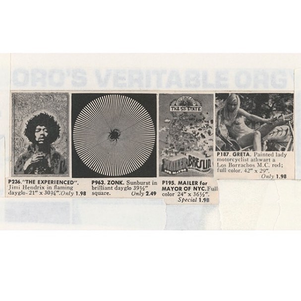
Right now there are seven New Poster images, and a video and four images (two identical) relating to Donald Trump. [update: I woke up to three. Prince says one was removed by Instagram.] The New Posters are of vintage duotone ads for posters, cut and cropped and masked into various configurations. The image above includes a poster of Jimi Hendrix; an Op-Arty sunburst; a Mailer for Mayor campaign poster; and a very Princey, bikini-clad girlfriend named Greta, straddling a motorcycle. Scraps of white paper and strips of tape mask and frame the composition, occasionally creating palimpsests like, “ORO’S VERITABLE ORG[Y].”
We are all Ryers now: New Posters, via richardprince1234
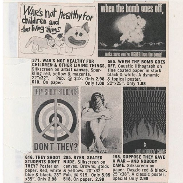
Other poster groupings up the political ante significantly, like this set, where a nude guy named Ryer huddles surrounded by anti-war and protest posters:
Suppose they gave a war and nobody came
When the bomb goes off, make sure you’re HIGHER than the bomb!
War’s not healthy for children & other living things
They shoot students, don’t they?
From the Vietnam War to Woodstock to Kent State, the cultural context of the late 60s and early 70s has been a regular feature in Prince’s discussions of his work. The work itself, meanwhile, is grounded in images circulated in magazines, and ads. Prince has written about “ganging” slides of rephotographed magazine images, “DJ’ing” them into various arrangements and printing the grid of slides on a single sheet. “The ‘girlfriends’ from the Biker’s Magazine were the first ‘gangs,'” he wrote in 2014. “The ‘gangs’ were mounted and framed. It was like having a whole show of a particular subject matter in one frame. Instead of having a whole room of ‘girlfriends’… I could have a FRAME of girlfriends.”
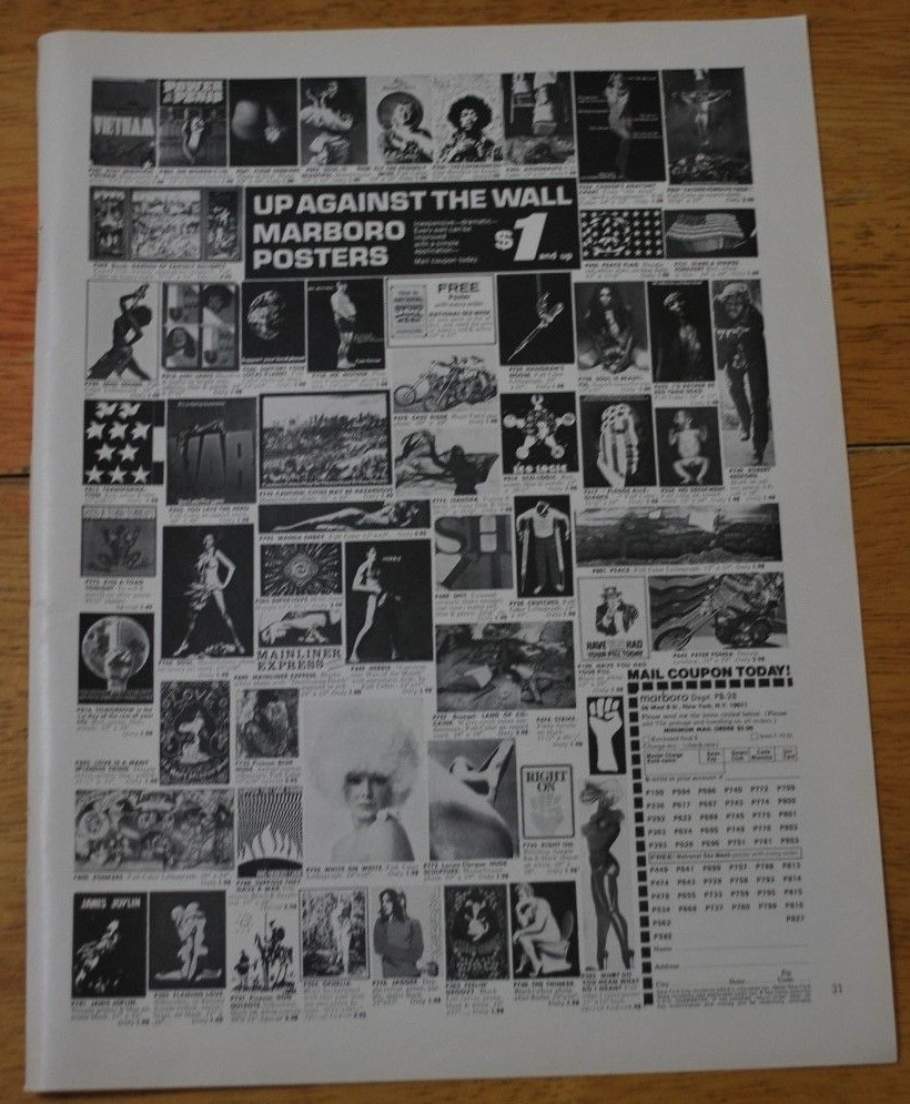
“Up against the wall: Marboro Posters”, image of ganged anti-ware fare in a Playboy tearsheet, c. 1971, via ebay
But there’s no sign of Prince ganging within these images: these poster abutments are found, composed by cropping from of a larger grid. The poster ads come pre-ganged. They turn out to be from a mail order company called Marboro Posters, which ran full-page ads in the backs of magazines, including Playboy. Also Saturday Review and Psychology Today. Each ad was a different shuffle of posters; ganging was Marboro’s process. Optimizing each ad for the demo of the magazine it appeared in, like merchandising. [Marboro tracked ad response by adding “Dept. PB-15” or whatever to their mailing address.]
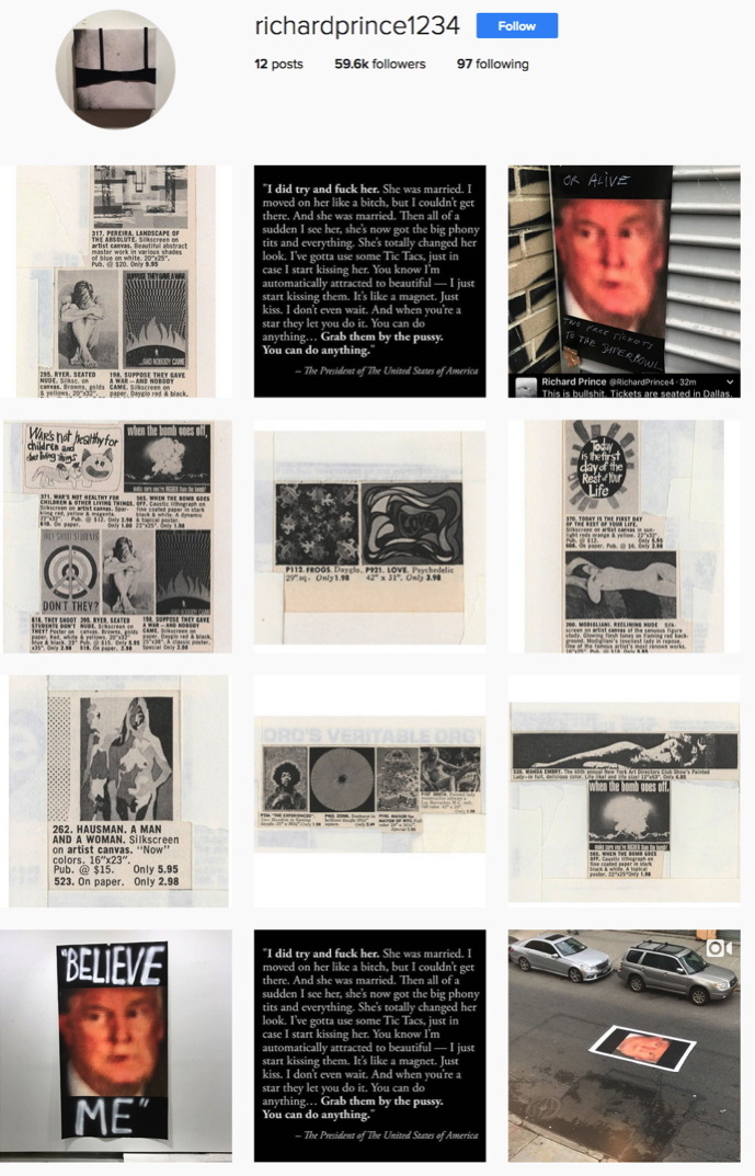
New Posters screenshot 2/1/2017, image: richardprince1234
Prince wrote of ganging slides on his giant lightbox. And of his iPhone, with a camera, Twitter, and Instagram, becoming his studio. And Instagram is where he’s ganging now, making a whole show of a particular subject in Instagram’s frame. And that subject appears to be the Trump-induced return of the apocalyptic terror Prince describes feeling after Kent State. In a birdtalk for a 2013 show of his 90s Protest Paintings at Skarstedt, Prince wrote,
But the Kent State shootings were different. That got to me. The shootings pissed me off and I found myself wandering around the campus trying to come to terms with the murder. Nixon and Agnew were shitheads and already dead people to me. I really thought they were going to try to stage some kind of coup and take over the government. I was ready to pack it up and retreat to the upper parts of the Adirondacks… put a hold on “beauty” and work out and get in shape, stockpile supplies, turn on the ham radio, do some reconnaissance, get camouflaged and ambush, (hit and run)… and guerrilla the shit out of the republican army.
Instead…
Instead, he said, he staged an impromptu protest gesture by lowering a flag to half mast on campus, which, he says, spiraled into a full-scale demonstration as students and police became aware of it. It’s an account of Prince’s history that I don’t know how to account for, whether it happened, or happened the way Prince said, I can’t say. But given our current presidentially induced crisis, I think the relevance of Prince’s 2013 text is prescience, not retrospection.
The blurred, saturated closeup of Trump has been reverberating in Prince’s social media like a fugue since the election, and I haven’t known quite what to make of it, except to find it very disturbing. Now images of Prince’s new posters of it, along with Trump’s dismal quote to Billy Bush, are members of this New Posters Instagang. IG and IRL are feeding each other [though whether these New Poster images will make a jump back to physical, printed form is not clear], and history’s all in Prince’s grille going, “Hey DJ, play that song again.”
richardprince1234 [instagram]
Richard Prince – Birdtalk [richardprince]
Previously, related? If He Did It [It being making Bob Dylan’s paintings, that is]
View Source: Richard Prince’s Instagram Portraits
Richard Serra Copped Circles
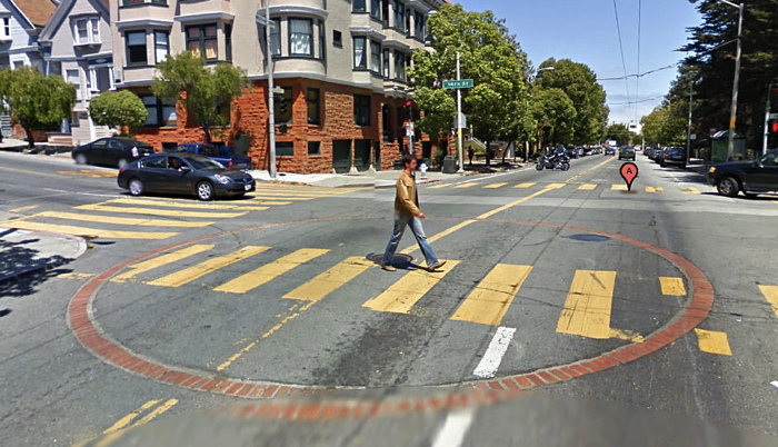
Google Street View image of an AWSS cistern at 14th & Castro, via 99pi
After water systems broke down during aftermath of the 1906 earthquake, San Francisco created the Auxiliary Water Supply System (AWSS). It includes over 170 giant cisterns beneath streets all over town. Large circles of bricks set into the street mark the outlines of the cisterns, hinting at hidden systems. In the words of 99 Percent Invisible’s Kurt Kohlstedt, the circles are a “surface expression of something much larger below.”
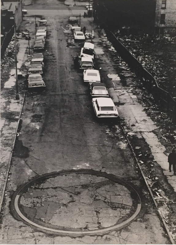
To Encircle Base Plate Hexagram, Right Angles Inverted, 1970
Richard Serra grew up in San Francisco. His first public sculpture was a pair of 26-foot diameter arcs of L-shaped steel, like a manhole collar, set into the middle of a soon-to-be-razed-and-redeveloped block of 183rd Street in the Bronx. One arc pointed up, the other down. To Encircle Base Plate Hexagram, Right Angles Inverted (1970) was included in the Whitney Annual, though Serra complained that no one in the art world went to see it. It was later purchased and given to the St Louis Museum. It’s installed in their driveway.
I’m sure Serra would say there is absolutely no relationship between these two structures. But they’re there in the street nonetheless.
Decoding Rings: Beneath the Mysterious Brick Circles on San Francisco Streets [99percentinvisible.org]
Hunting for a Richard Serra sculpture in the Bronx [16miles]