
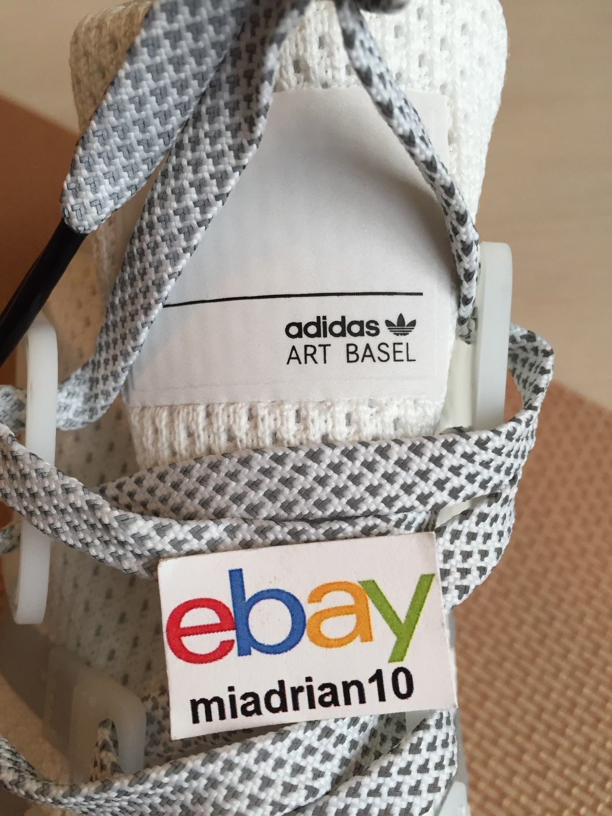
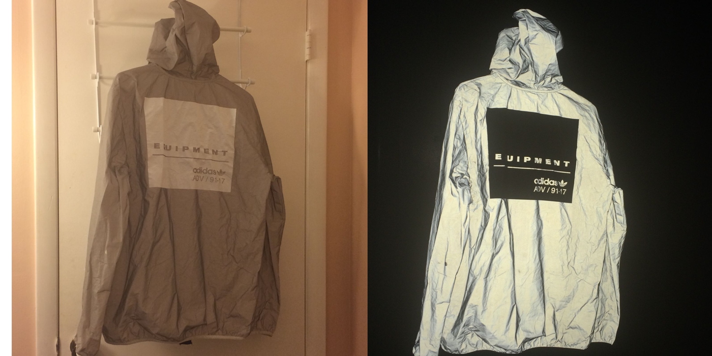
Study for Untitled (Adidas Art Basel), 2017, nylon and ink on Adidas EQT shoe, image: ebay seller miadrian10
Art Basel is suing Adidas for trademark infringement over these kicks. A thousand pairs were given away at a string of branded flashmobs in Miami on November 30th, two days before the opening of the art fair they had no official marketing agreement with. Is there a term for astroturfed flashmobs? Is there any other kind these days? Did you know Adidas been hypin’ kicks at #ABMB since at least 2010? Does a viral flash mob still count if you have to Google it?
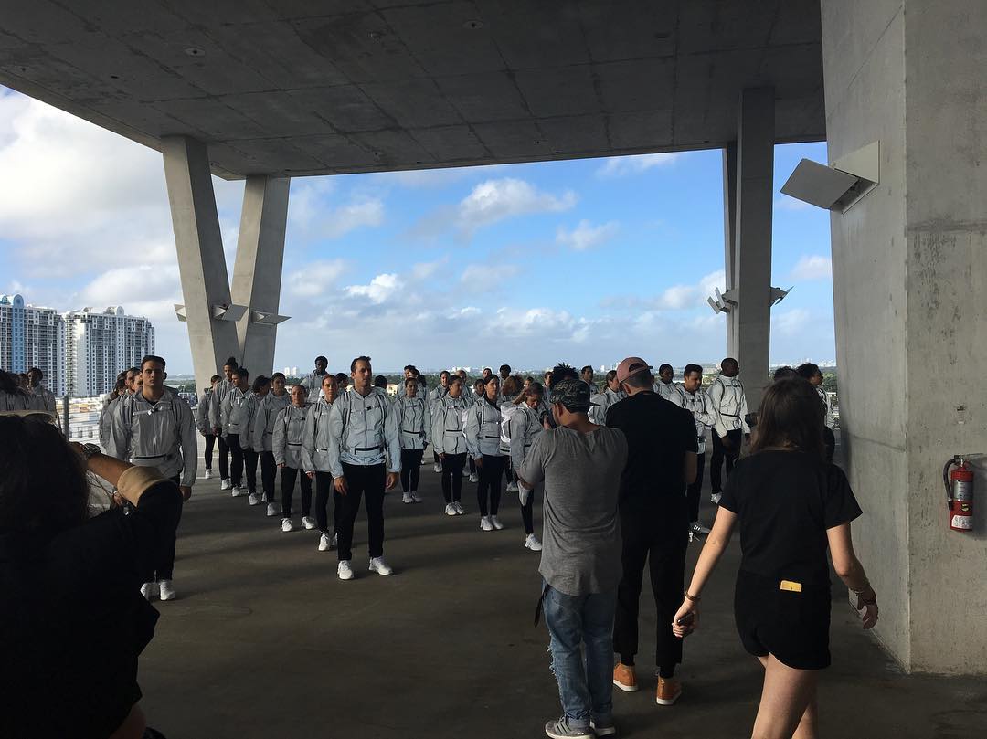
image: taetalentagency
Anyway, 2016. According to hype groupies like high snobiety and World Red Eye, a mirror-wrapped school bus drove 48 performance artist/brand ambassador/whatevers around town. Stops included a high school in the Design District, HdM’s parking garage, and some millennial-branded Hilton in South Beach.
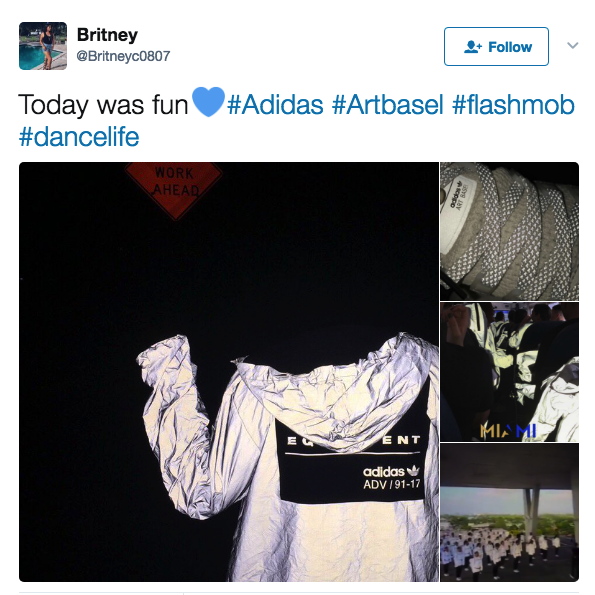
screencap from @britneyc0807
They were decked out in #monochromatic reflective gear. They stood in formation, Vanessa Beecroft-style. They did some dance moves. Ideally, their gear did its retroreflective blast out thing when it was photographed.
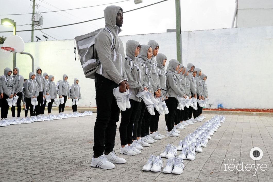
image: worldredeye
Then they unloaded their loot, lined it up like a freakin’ Eleanor Antin street team, and, I guess, handed it out to the ‘gramming masses like rations off the back of a UN truck. Then everyone started flipping their swag on eBay. It’s hard to say where the stunt’s brand impact actually landed the hardest: on the 1st-to-know sneaker chasers, the day-of hashtaggers, the eBay resale remoras, or now, on the so-DGAF lawsuit bad bois.
images: ebayseller sorry, lost it
Art Basel is suing over the tongue tags on these free sneakers, and in addition to brand damages, is demanding Adidas destroy all the infringey sneakers it still has. If you budget for ex-post trademark settlements, is it actually a bootleg?
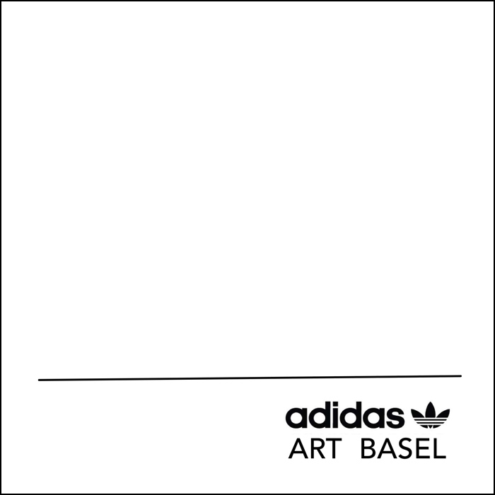
Study for Untitled (Adidas Art Basel), 2017, retroreflective paint and ink on panel, 50x50cm
Untitled (Adidas Art Basel) is a series of 1,000 numbered paintings based on this tongue tag composition, made in various sizes. Or should I say they will be made. Might be. Conceived to be.
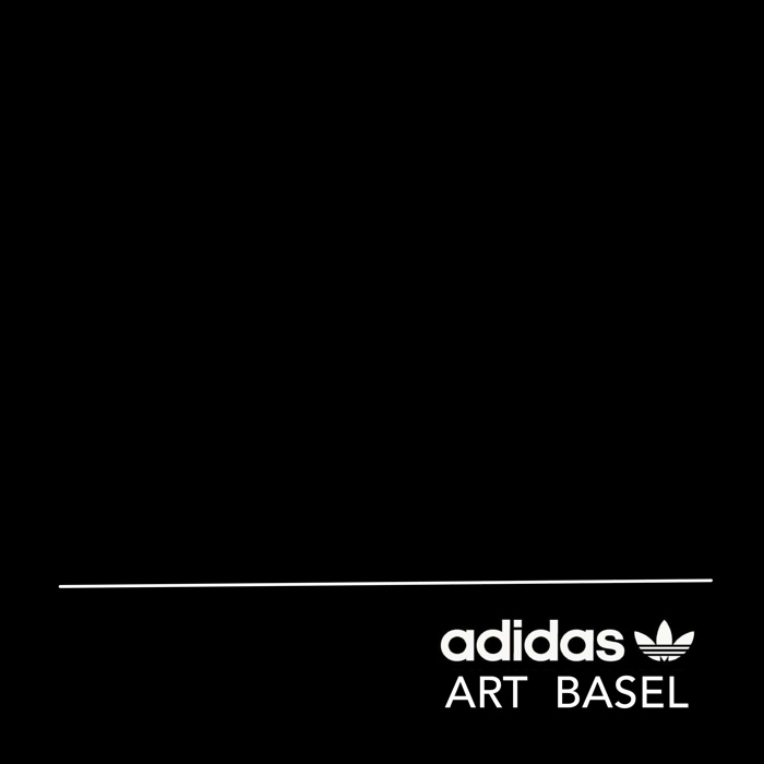
Study for Untitled (Adidas Art Basel) photographed, 2017, retroreflective paint and ink on panel, 50x50cm
I know what I’ve written about artists having a successful system, but honestly, it’s debatable whether the world needs 10 more paintings at all right now, much less 1,000. Of these. Can you even imagine having a thousand of these paintings lying around? You literally could not give them away, lawyers or no. Or maybe you can? Just put a few hundred super-shiny posters in a stack and BAM, you’re in Venice.
Ima get to work on one, see if it delivers that retroflective kick the study’s promising. Then I’ll let my estate sort out the rest.
Art Basel is Suing adidas Over its Limited Edition ‘Art Basel’ Shoes [thefashionlaw via artforum, thanks @kyle_petreycik]
Here’s How You Can Get 1 of Only 1,000 Pairs of adidas’s “Art Basel” Limited Edition EQT ADV [highsnobiety]
Adidas Flash Mob in the Miami Design District [worldredeye]
Previously, related: Webdriver Torso as Found Painting System
When Form Becomes Content, or Luanda, Encyclopedic City
Untitled (Repressed Memory X Raf, Fall/Winter 2013-14)
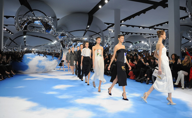
Untitled (Repressed Memory X Raf FW2013-14), 2017, mylar satelloons, Magritte-ian floor, unidentified trauma, installation shot from Dior F/W2013-4, image: thesartorialist
Oh hi! What do you remember from 2013? More than me, I bet! Take Feb/March 2013, for example. I’m only now realizing I was so busy putting the finishing touches on “Exhibition Space,” the satelloon show I was opening the next week at apexart, that I completely forgot-and obviously forgot to hype-my colabo with Raf Simons. The one where I stuffed a bunch of satelloons onto the runway of the Dior Fall/Winter show.
 Dior F/W2013-4, image: not thesartorialist
Fortunately The Sartorialist was there to document it, or I might never have remembered. To be honest, it’s still all quite hazy. Was I even involved? Why would I have scooped my own show?
“Warhol also echoed in the silvered spheres suspended in the room (like the artist’s iconic ‘clouds’)”, said Vogue, shadily.
Does this mean Raf read my blog? Or that I’m friends with Sterling Ruby? Holy crap, Peter Marino soundbite? It’s all a work now, but if this really happened to me, I can see why I’ve repressed the memory. (thanks, random Russian LJ)
Dating Sturtevant
When you go to the Rauschenberg show at MoMA, take your opera glasses.
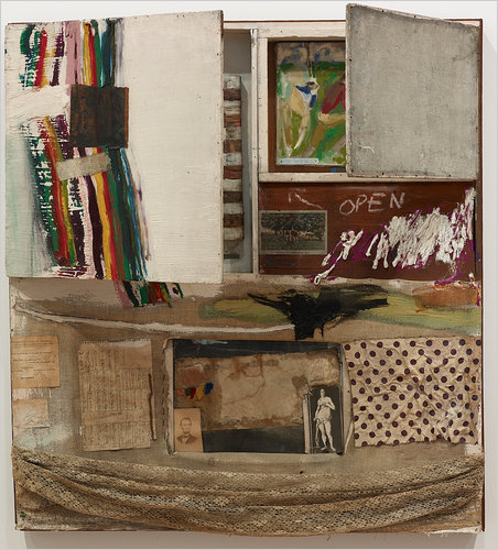
A question I was never able to figure out was when, exactly, Sturtevant’s Johns Flag took the place of Johns’ Johns Flag after it was stolen in 1965.
When they split, Johns & Rauschenberg made an agreement that Short Circuit, or perhaps Construction with J.J. Flag, as it had also been known, would not be exhibited. Presumably, with Johns’ Flag gone, Rauschenberg felt free to include the work in a collage-themed group show at Finch College in 1967.
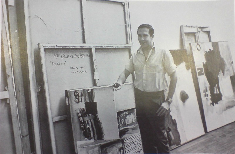
He posed with the work [above], holding the cabinet door ajar to obscure the space where Johns’ Flag had been, and in his artist statement, he said, ” Elaine Sturtevant is painting an original flag in the manner of Jasper Johns’ to replace it.” Is painting, present tense.
Did she finish in time? It’s not clear. All published accounts of the exhibition mention the openable doors with paintings behind them-but also that they were nailed shut. So who knows? Sturtevant’s Johns Flag is like Schrodinger’s Cat, both alive and dead, both in there, and not.
detail of Elaine Sturtevant’s Johns Flag in Rauschenberg’s Short Circuit
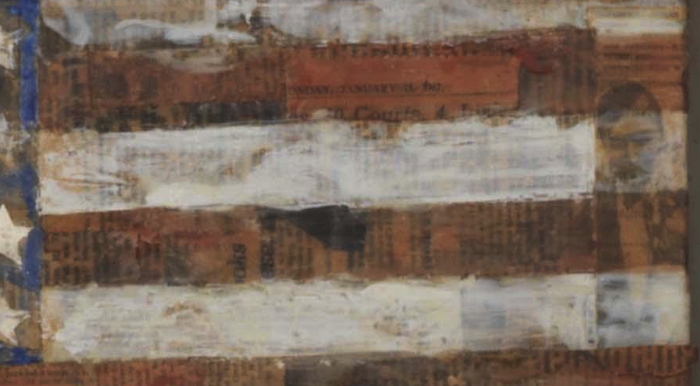
But. If you take a close look at Short Circuit‘s Sturtevant Johns Flag at MoMA, you might be able to see a legible scrap of newspaper on its surface. Actually, you can see many, but one has a date: Sunday, January 15, 1967. And a typeface that looks like the Times.
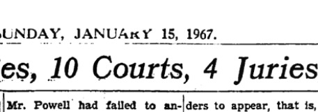
image: nytimesmachine
And sure enough, it is. Page 69. The headline: “Powell Case, in 6 Years, Has Involved 80 Judges 10 Courts, 4 Juries, 15 Lawyers and congress.” The story: a full-page recap of a convoluted lawsuit brought against Rep. Adam Clayton Powell, Jr., involving defamation and allegations of police corruption.
The Finch show opened on March 9th, so it is at least possible that Sturtevant finished her painting in time to put it in. I mean, it can’t be ruled out [the way a scrap of newspaper visible in Johns’ own MoMA Flag dating from after the 1955 exhibition of Short Circuit almost certainly means that the Short Circuit flag was the “first” flag.]
What’s more interesting, though, is to the right. Doesn’t that look like Johns? In a tuxedo? Perhaps attending an opening? I’ve only done the most cursory search so far, and I can’t find a source for that image from 1965-67. Would Sturtevant have kept a party shot clipping from Johns’ Jewish Museum show in 1964? Would Rauschenberg?
Previously, related: Art in Process: Reading Finch College Museum
Jasper Johns’ first Flag
Untitled (Unpainted Wall), 2017
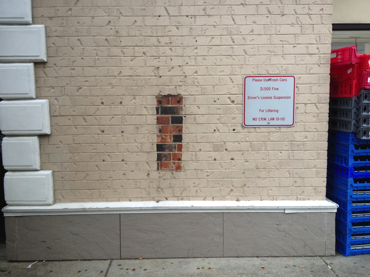
Untitled (Unpainted Wall), 2017, brick, concrete, 18 lag shields, exterior latex paint. Installation view, Chevy Chase, Maryland
In his 1977 Whitney catalogue, Michael Crichton wrote about the origin of Jasper Johns’ 1967 painting Harlem Light:
It has a peculiar background. Johns was taking a taxi to the airport, traveling through Harlem, when he passed a small store which had a wall painted to resemble flagstones. He decided it would appear in his next painting. Some weeks later when he began the painting, he asked David Whitney to find the flagstone wall, and photograph it. Whitney returned to say he could not find the wall anywhere. Johns himself then looked for the wall, driving back and forth across Harlem, searching for what he had briefly seen. He never found it, and finally had to conclude that it had been painted over or demolished. Thus he was obliged to re-create the flagstone wall from memory. This distressed him, “What I had hoped to do was an exact copy of the wall. It was red, black, and gray, but I’m sure that it didn’t look like what I did. But I did my best.”
Explaining further, he said: “Whatever I do seems artificial and false, to me. They-whoever painted the wall-had an idea; I doubt that whatever they did had to conform to anything except their own pleasure. I wanted to use that design. The trouble is that when you start to work, you can’t eliminate your own sophistication. If I could have traced it I would have felt secure that I had it right. Because what’s interesting to me is the fact that it isn’t designed, but taken. It’s not mine.” [p. 54-55]
And that, my friends, is how I am different from Jasper Johns: I got the picture.
Previously typed this in, related: Driving Taxis Through Heavy Neighborhoods To Look At The Paintings
Erased Twombly Drawing
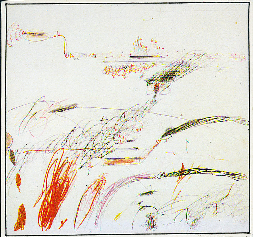
Untitled (Delian Ode), 1960/61, pencil, ballpoint pen, and grease crayon on paper, image: peter freeman
I mean, can you even imagine doing it? I admit it, I can, and I just cannot. De Kooning said he wanted to give away one he’d miss. And one that’d be hard for Rauschenberg to erase. If there’s any other kind of Twombly drawing, I haven’t seen it.
We’ll put this one in the “Think about it”/”Unrealized” category.
Previously, related, badly titled: Ghetto Erased de Kooning Drawing
John Cage’s Stony Point House
After he was booted from his white-on-white-on-white loft when the Bozza Mansion was torn down, John Cage kind of drifted for a while. Apparently it was hard to find a good deal on a great space in Manhattan in 1954 [when you had no money.]
So for a while, Cage moved to The Land, one of the names for the pseudo-commune/art colony started by Paul & Vera Williams on 116 acres in Stony Point, Rockland County, NY. Paul was an architect friend of Cage’s from Black Mountain College, and he’d purchased the property after inheriting some money.
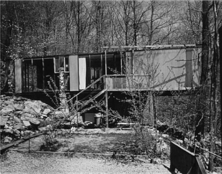
I don’t know why, but I’d always assumed Cage and the other The Land folks lived in little cottages. Not quite. It turns out Williams, a student of Breuer, created some classically modernist boxes.
The first pictures I’ve ever seen are in Brendan W. Joseph’s 2016 book, Experimentations: John Cage in Music, Art, and Architecture, which goes into some detail on the development of The Land and its surprising impact on Cage and his work.
Cage shared a building, a duplex, with the Williamses. He lived in 1 or 2 rooms on the left in the image above, separated by a stone wall he and Vera built. It looks quite nice, if simple, a bit like the Black Mountain College buildings everyone built together. Indeed, from Joseph’s account, it sounds like Williams was hoping to recapture some of that BMC mojo with his co-op experiment.
Night In Front Of The Museum
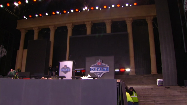
The NFL Draft is being held tonight at the top of The Rocky Steps. Which is another name for the courtyard of the Philadelphia Museum of Art. Which has a giant Greek temple facade. But which apparently didn’t work for the NFL folks’ shot, so they built a replica of a piece of the museum facade into their set, in front of the museum.
I just finished reading some Sturtevant repetition and simulacrum a few minutes ago, and there’s surely plenty to say about mediated images in circulation. But I think the real takeaway here is the NFL’s Sforzian backdrop lighting game is flabby and weak.
THEY BUILT A FAKE ART MUSEUM ON THE NFL DRAFT STAGE IN FRONT OF THE ACTUAL PHILLY ART MUSEUM [csnphilly, h/t @briansholis]
Untitled (I Can See Russia From My House), 2017

Installation shot: Untitled (I Can See Russia From My House), 2017, 15′ x 10′ x 6′, dye sublimation printed carpet, bolts, washers, lumber.
I’m psyched to announce the public installation of a new work, Untitled (I Can See Russia From My House), in Warrenton, Virginia. It is a dye sublimation print on carpet, mounted on a wood support.
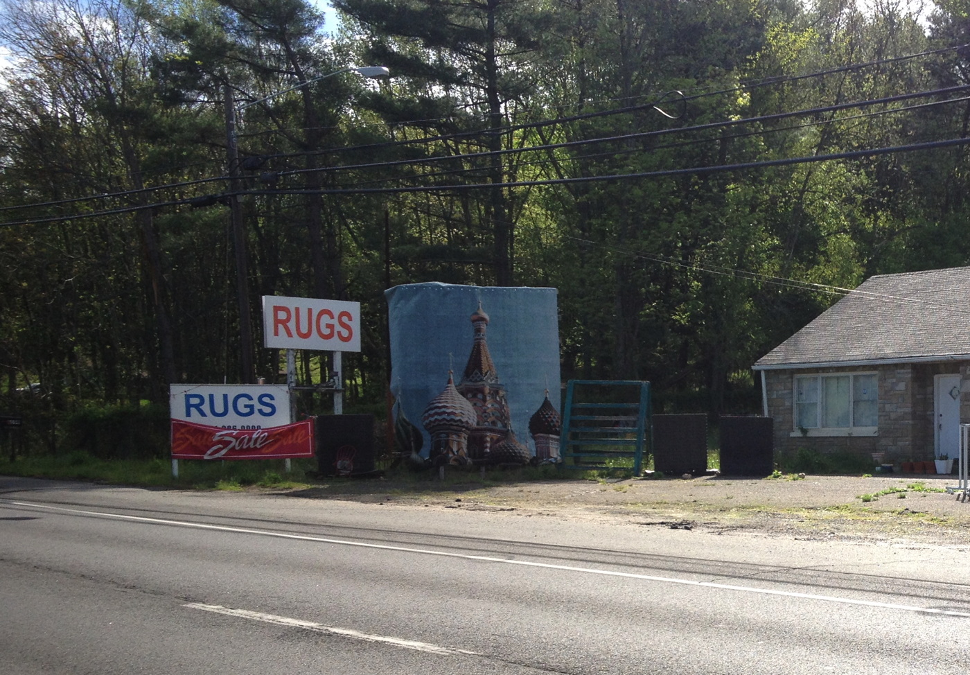
I suppose it could also be installed indoors, but it would lose a lot of the impact; it really is a piece that is best come upon in the course of daily life.

Untitled (I Can See Russia From My House), 2017, washer and bolt installation detail
The carpet is affixed to the support using bolts and washers [above]. Longtime Kremlin watchers will note that the image, of the south facade of St. Basil’s Cathedral, is here reversed.

Although an installation shot from December 2016 shows unrelated works installed nearby. It is the artist’s intention that this piece be viewed and appreciated on its own. Despite what you might assume, it is currently not for sale.
Better Read #013: Modern Art Shackled To Communism, by Congressman George Dondero
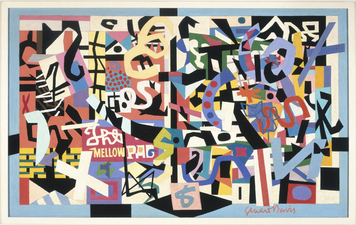
The Mellow Pad, 1945-51, by Stuart Davis, co-founder of the American Artists Congress in 1936, image: whitney.org
This edition of Better Read features a speech delivered by Michigan Republican congressman George Donderos on the House floor on Tuesday August 16, 1949 titled, “Modern Art Shackled To Communism.” I came across quotes and excerpts from this speech while researching the American Artists Congress, the group that brought Picasso’s Guernica to the United States for a fundraising tour in 1938.
Dondero made several fiery speeches against modern art during this, the McCarthy era, repeatedly accusing modernism and all its subsidiary “isms” of being a vile foreign-led Communist plot to destroy American art and values.
Near as I can tell, this is the first time Dondero’s complete speech has been available outside the Congressional Record, which turns out to be a lot harder to get ahold of than I expected. I am currently preparing a compilation of all Dondero’s art-related speeches, and the responses they engendered from the accused, the threatened, and even, surprisingly, the nominally allied. Because even I have a hard time listening to a robot for 26 minutes, the complete text of Dondero’s speech is included after the jump.
Download Better_Read_013_Dondero_Communist_Shackles_20170417.mp3 [26:49, 39mb, mp3 via dropbox greg.org]
Continue reading “Better Read #013: Modern Art Shackled To Communism, by Congressman George Dondero”
Remember, Remember, The Grift Of November
The first draft of history. History written by the victors What even is it? The barrage of nonsense comes so fast and thick and is so full of bullshit that the very notion of history feels out of date. Which is probably someone’s point. Or at the very least, in someone’s immediate interest.
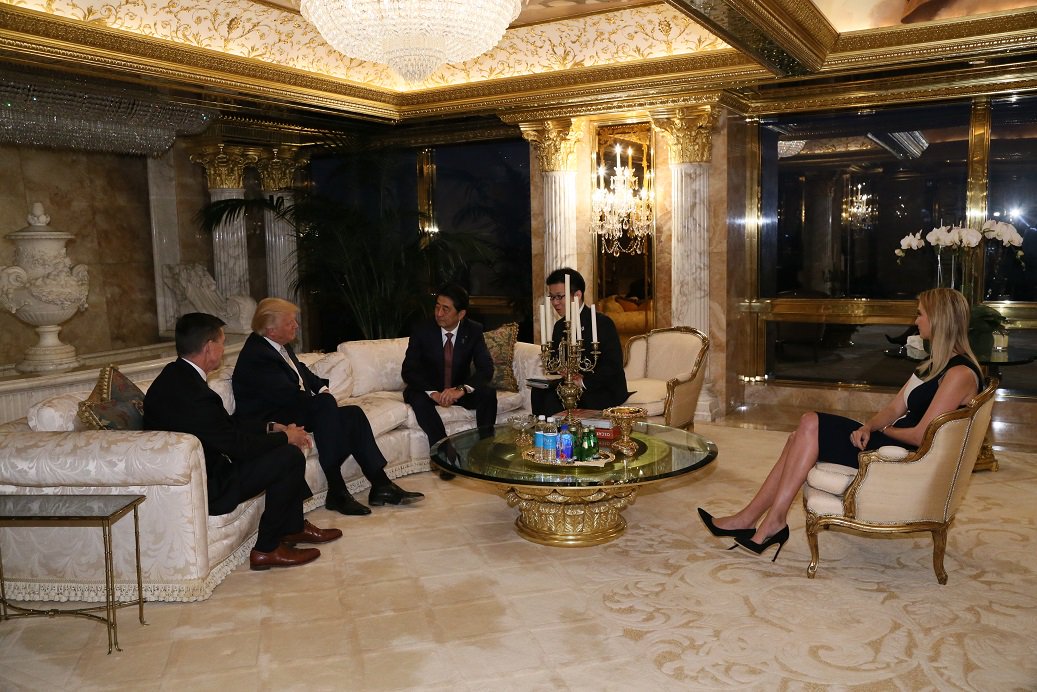
Do you even remember the outrage when the Japanese Prime Minister’s Press Office released publicity photos of Shinzo Abe meeting Donald Trump at Trump Tower on November 17th, which revealed that Ivanka and Jared were sitting in on the meeting?
And then like two weeks later, the Times kind of buried the lede that at that very moment, Ivanka’s fashion label was negotiating a licensing deal with a Japanese apparel conglomerate whose majority shareholder is a development bank owned by the Japanese government.
Oh, hands were wrung, potential conflicts of interest were ruminated upon, denials and assurances were floated. And it all turned out to be bullshit, and that was also the same time Jared and Ivanka were in fact preparing to take up offices and jobs in the White House.
So maybe that’s a power of a painting: the ability to slow things down, even just long enough to have an impact, to make something stick, to give some context. It rewards the exercise of looking, looking longer, and looking back.
Campaign Ends April 26th: Our Guernica, After Our Picasso: A Kickstarter
Our Guernica, After Our Picasso: A Kickstarter
I’m not saying we should commission GWB to paint this, but I’m not saying we shouldn’t [deleted twitter url to a pic of angela merkel giving side-eye to ivanka trump at a white house mtg]
— gregorg (@gregorg) March 17, 2017
I swear, I tried not to do it, but the image was too strong. In the days since I started drafting this Kickstarter campaign, I quit several times. And then history kept catching up to this image. In fact, history started lapping it.
So yes, we need to mark this moment, this look on Chancellor Merkel’s face, on all our faces, when it was still possible to not believe what was happening before our eyes. And there’s only one painter who can do this moment justice. Unfortunately, he and justice are not really in a great spot right now, so we’re gonna use #chinesepaintmill and the Thomas Kinkade Editions Pyramid.
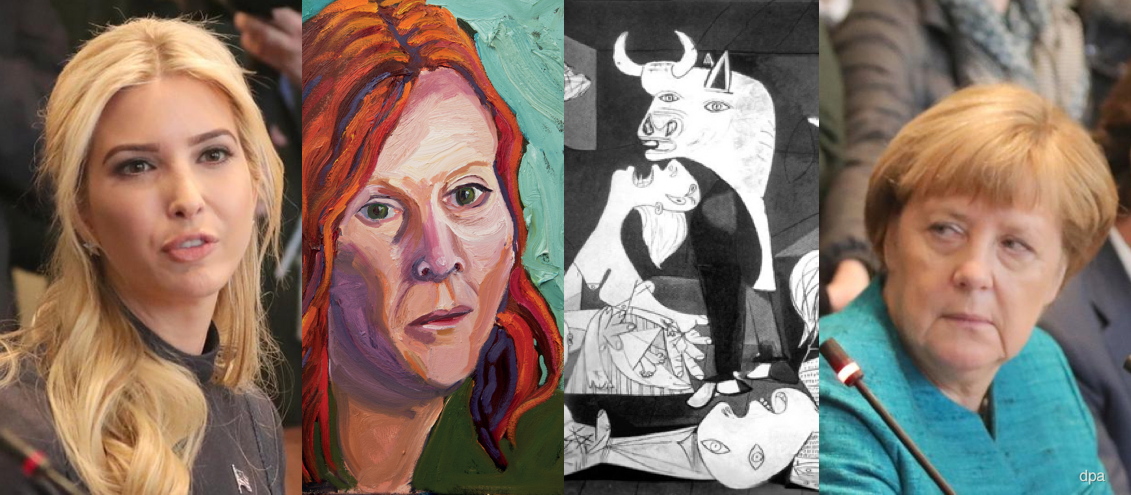
Our Guernica, After Our Picasso: collaged details from Michael Kappe/dpa photo, George W. Bush painting, and Picasso’s Guernica
In my darker moods, I imagine a series of paintings of such moments will come- Angelus Novus looking back and piling JPG upon JPG at his feet as the storm irresistibly propels us into the future. Can our brush-wielding Chinese allies capture the essence of Trumpian corruption with authentic Bushian flourish? Can we spread the resulting image(s) to the four corners of the warming, flooding earth to bear adequate witness? Let’s start with one and see.
Back “Our Guernica, After Our Picasso on Kickstarter now
UPDATE #1 After just a couple of days the project has gotten over halfway to its funding goal, thanks!
It has also been the subject of reportage by Will Fenstermaker at Artspace [who is also a backer, write what you know!] and AFC [“that’s a lot of layers to unpack for what’s essentially a meme” I do not disagree!]
On the more depressing news front, today, Day 3, might pass without a single new backer. Perhaps everyone’s too stunned at the floating of #Ivanka2024 by The Daily Caller [not linkin’, look it up], and worrying how a painting can somehow head off this meta-disaster. It probably can’t, but there’s a lot to be done in the mean time.
I’ve also noticed that backers are a savvy bunch. Folks seem to prefer the lower-priced, smaller prints at this stage. Possibly, I thought, because you’re reluctant to put up larger amounts of money for an artwork that you’ve 1) not seen because 2) it doesn’t exist yet.
It might be useful to reframe the entire project as a single conceptual piece, in which case, the physical manifestations are secondary to its core expression. But it’s still natural to wonder how it’ll look, especially if you’re contemplating getting a big one. I’m trying to think up a solution for this. Any advice or thoughts are welcome. And thanks again for spreading the word!
UPDATE #2 WHOA IT IS HAPPENING, THANKS! THE BALL IS ROLLING, THE CAMPAIGN IS CONTINUING. LET’S BUILD THAT PYRAMID AND LAUNCH A WHOLE BUSHMASTER CYCLE OF PAINTINGS TO DOCUMENT THIS THING!
Destroyed On Kawara Paintings
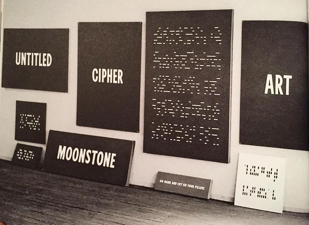
In 1965, before he figured out his Today Series date paintings, On Kawara experimented with several other types of paintings about language, text, and information. They contained a word or phrase, or a graphically encoded text. The National Gallery has a triptych, Title, that weren’t, but most of them were destroyed. [image from the Guggenheim’s exhibition catalogue via ig/mondoblogo]
Untitled (Newport Center Monument), 2017
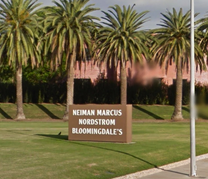
Untitled (Newport Center Monument) IV, 2017, 72 or 84-in. x 108 or 156 in. by 12 in., Ruddy Oak and Bright White on panels, installation image: gmaps
In 2011 The Irvine Company installed two identical monument signs in the grassy quarter-rounds on the East Coast Highway entrance of Fashion Island and Newport Center. They feature the names of three major tenants each, on both sides. Seven feet tall and 13 feet wide, they exceed the maximum dimensions (6′ x 9′) permitted under the Sign Standards of the Newport Beach Zoning Code, and required a variance. [In person the other day, I would never have guessed they were 7×13; they definitely feel like 6×9. Is it possible they were reduced in size after the permit was granted?]

Untitled (Newport Center Monument) III, 2017, 72 or 84-in. x 108 or 156 in. by 12 in., Ruddy Oak and Bright White on panels, installation image: gmaps
Though they also exceed the Code’s letter size limits, the signs comply with the requirement that letters be “individually fabricated” and of high contrast for easy legibility. At least at their genesis, they were specified to be finished with Reflective Coating #1460 Bright White from Axon Aerospace, Inc.
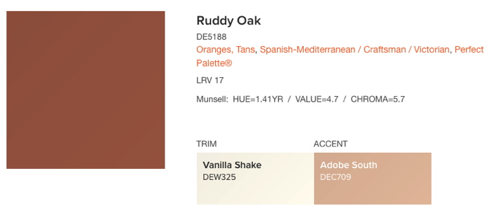
No aesthetic delectation here, Ruddy Oak! hashtag Spanish-Mediterranean, hashtag Craftsman, hashtag Perfect Palette®, image: dunnedwards.com
The 2011 permit application [pdf] describes the new signs as having “a faux plaster finish,” but they sure looked painted to me. They match the color specified on plans [pdf] for a similar sign for an adjacent Irvine Company office building: a reddish brown from a local manufacturer, Dunn-Edwards Ruddy Oak (DE5188).
I can find no public record of this color being specified or required in either Newport Beach or Irvine Company codes or styleguides, but it is in heavy use for shopping center and commercial signs within the boundaries of The Irvine Ranch. It also appears on the permitted color lists of at least eight homeowners associations (HOA) in coastal Southern California.
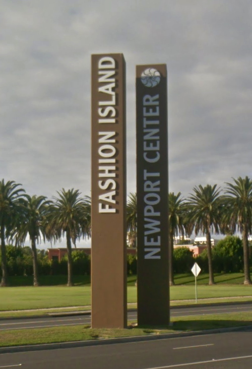
Untitled (Newport Center Monument) I, II, 2017, 43 x 4 ft each, Ruddy Oak and Bright White on substrate, installation image: gmaps
They also match the color and finish of the main signs at the East Coast Highway entrance, a pair of 43-foot-tall pylons installed in 1985. Which is also the first year The Irvine Company used the “sunwave” logo. Over time the text on the signs has changed to reflect the evolving brand distinctions between Newport Center, a massive, multi-use development, and Fashion Island, the vast mall at its center.
For their part, the Newport Center signs also exceed the 20′ height limit for pylon signs by 115%, but I presume they predated the creation of the code, and/or that no one will tell The Irvine Company what it can’t do in Newport Beach. Their letters are individually fabricated.
There are at least eleven other signs at other entrances to Fashion Island/Newport Center, but they’re more architectural than sculptural, with concrete plinths and stucco-finished capitals. Only the four signs on the ECH exhibit this rigorous, minimalist aspect.
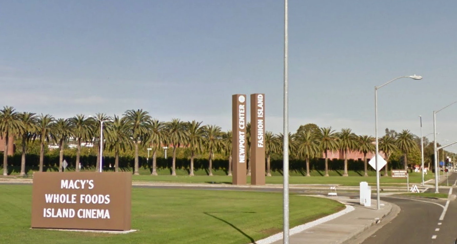
[l. to r.] Untitled (Newport Center Monument) III, I, II & IV, 2017, installation view, image: gmaps
Fashion Island was and remains a leader in the mall industry for experiential design. In an essay called, “The Archaeology of ‘Shoppertainment,'” Matthew Cochran and Paul Mullins wrote about RTKL/ ID8, a mall interior design company which worked on the Fashion Island Experience. They quote an RTKL brochure:
[Mall experience is] about storytelling. Great places tell stories, and people love to find themselves in those stories. Often this has less to do with the way a building or a district is assembled and more to do with how we read it…Experience is in the details. If a place tells a story, then the details of that place make the story interesting. The smallest elements-from manhole coves to water features-conspire to create a dynamic, authentically human environment.
What story do these signs tell? What authenticity do they conspire to create, with their approved colors from a gated community on a bluff? Can the gestalt of the minimalist object be achieved from your car, at speed, as you pass the mall, or do you have to turn in?
This ID8 quote, too, turns out to have more to do with how I read it:
What makes us linger, pause, sit and think? The building blocks of place probably have less to do with the buildings and more to do with the spaces between those buildings.
In 2002, the day they flipped the switch, architect Gustavo Bonevardi explained how he and John Bennett arrived at their solution for what became the Tribute of Light World Trade Center memorial:
We’re not reconstructing the towers in their original size, but the distance between the two squares of light is the same as the distance between the actual towers. So in effect, we’re not rebuilding the towers themselves, but the void between them.
Because I cannot look at the Newport Center signs, and their proportions, and their void, and not see the World Trade Center.
But maybe that’s just me. I invite you to visit, view, linger, think, and pause at this installation of new work and pursue your own authentic, dynamic, human experience.
Previously, unexpectedly related, c. 2002: On reading (between) the lines
On’s Location
Various Brief Notes From Los Angeles County Museum
Just got back from a quick trip to Los Angeles. The John McLaughlin show is as transcendent as everyone said, and all the museums that didn’t take it are as clueless as everyone feared. The chairs are a bit twee, though, to be frank, but the sentiment is welcome. If I’d been alone, maybe I would have put them to longer use, but then, I also preferred standing right in front of the paintings. Too many paintings had frames that covered the edges; the subtly different painted edges were my absolute favorite part of the Phillips Collection’s McLaughlin. Otherwise, everything about McLaughlin and his work and practice is heartening, even though he’s chronically underseen.
The Picasso Rivera show was revelatory. Chris Burden’s Metropolis II is still great. Broad’s giant Serra Band is like a bunch of holding cells and not in a good way. Turns out you can screw up something that big. Which, we did not go in the Resnick Pavilion at all. Artists give unusual work to this museum; it really feels very local.
The Moholy Nagy show was a labyrinthine confusion in this version, but so much wonderful stuff, including all three of the “Telephone Paintings”. The label still says there were five. I guess I will need to look into that situation now.
Pearl Necklace (1967) by Robert Watts
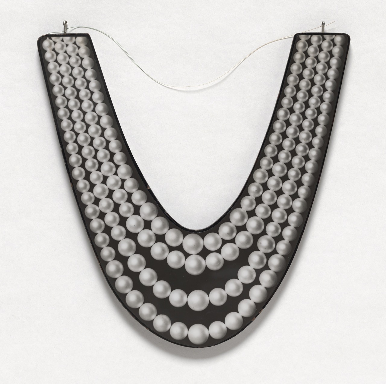
I looked at a lot of Robert Watts while researching and writing about his friend Aaron Kuriloff. I really liked it. MoMA has some very nice and interesting chrome Watts pieces on view right now in the 1960s hang of the permanent collection galleries, but I have never seen this in person. Pearl Necklace is a 1:1-scale photo mounted on wood. The wire makes me think it had to have been designed for wearing, which is awesome. In 1967 Kuriloff had his last show, of 1:1-scale photos of office furniture and equipment he called “photo-factuals.” He’d been making them for a couple of years, and I’m pretty sure he and Watts were up on/involved in each other’s work. I, for one, would like to know and see more.
Robert Watts, Pearl Necklace, c. 1967, acquired 2008 from the Silverman Fluxus collection [moma.org]
Which, yes, My dive into the history of Aaron Kuriloff is in the Spring 2017 issue of ArtNEWS [artnews]
Previously, related: More Aaron Kuriloff, Please