Riot Shields 2.0, Piratbyrån & Friends, Furtherfield Gallery

pirate_bay_riotshields.jpg
Furtherfield Gallery has opened an exhibition of art and archival material from Piratbyrån [Piracy Bureau], the Swedish art and activist group that became instrumental in the filesharing and access conflicts of the 00’s.
The exhibit includes a lot of material relating to the group’s trans-European bus tour pegged to Manifesta 07. My favorite things, though, are these “riot shields 2.0,” created by James Cauty. Even though Piratbyrån officially dissolved in 2010, these feel incredibly up-to-date right now. Unfortunately.
Piratbyrån and Friends runs through June 8 at Furtherfield in London [furtherfield.org, image via @Cybrsalon]
Piratbyrån and Friends album on furtherfield’s flickr [flickr]
UPDATE:
Here is a making of video from Cauty, showing the production of 1.0, the first edition of 30 Smiley Riot Shields. Apparently v0.9 was created in 2011 for Occupy St Paul’s. Actually, @jamescauty’s twitter feed has a step-by-step tutorial for making your own SRS, since the others are sold out. Very handy.

Previously, related:
Mar 2007: Million-Real Idea – advertising on Brazilian riot shields

Pictures At An Exposition

expo67_ masey.jpg
One thing I noticed while researching Warhol’s World’s Fair commissions, is that the US Pavilion in Montreal had this sweet photomural of the moon.
expo67_photomural_masey.jpg
both images by USIA’s Jack Masey
And it also had this sweet photomural of the moon. I can’t tell which came first or why.
expo67_bogart_charstad.jpg
Bogart, image via CHarstad
I think the way giant photos–of the moon and the stars alike–were used alongside giant paintings and giant graphics in the World’s Fair exhibition was one of the most advanced levelings of these supposedly distinct image hierarchies.
expo67_flag_lifemag.jpg
I’ve really got to get into the USIA Archives for this stuff. Actually what I need to do is get Jack Masey on the phone while I still can.

Donald Judd Was An Artist Against Torture

judd_artists_against_torture.jpg
This Donald Judd woodcut caught my eye at Sotheby’s print sale this month, as much for its title as its contrast and complexity: Artists Against Torture, which, well.
It turns out Judd was one of 19 Artists Against Torture who were invited to make a fundraising print portfolio for the Association for the Prevention of Torture. I’m sure there are many more artists against torture, including, no doubt, many women, but for whatever reason, in 1992-3, the Geneva-based NGO commissioned these 19 men to make some art against torture.
So this Judd was a loosie from the portfolio. Which was published in an edition of 150, plus 40 APs, including one for each of the artists, not AP, ed. 40, as Sotheby’s sold it. Anyway it only sold for $3,750, a bargain for a Judd woodcut, so whoever bought it must have known something of the work. [The Judd Foundation sold their copy of the portfolio in that 2006 sale at Christie’s.]
Thumbnail image for newman_daley_feigen.jpg
The print reminds me a bit of Barnett Newman’s 1968 sculpture, Lace Curtain for Mayor Daley [above], in which a grid of barbed wire across a window frame protests Chicago’s police brutality against war protestors at the Democratic Convention. But for the similarity to be anything other than a coincidence, Judd would have to introduce representational content and metaphor into his work, which seems impossible. And yet that does look like bars on a cage, doesn’t it? If you let it?
Also I’m kind of interested by Judd’s political involvement. I wouldn’t have expected that, even though I know he was directly involved in mobilizing to protect SoHo. Turns out the Judd Foundation had a show in Marfa in 2011, “The Public Life,” about the artist’s political, social, and environmental activities.
1 May 2014 | Lot 225, Donald Judd, Artists Against Torture (sic), sold for $3,750 [sotheby’s]
APT’s Artists Against Torture portfolio was exhibited at the Ritter Museum in 2012. [museum-ritter.de]

So Different, Yet So Alike

I know it’s folly to take auction catalogue text as art history, but it is of a piece, at least in this case.
rr_1954_combine_taylor_recto.jpg
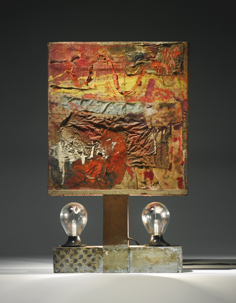
Untitled, recto, 1954, Collection Paul Taylor, image: Sotheby’s
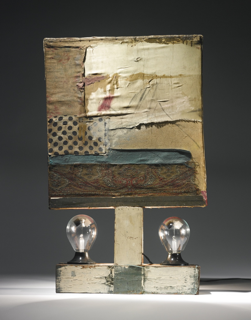
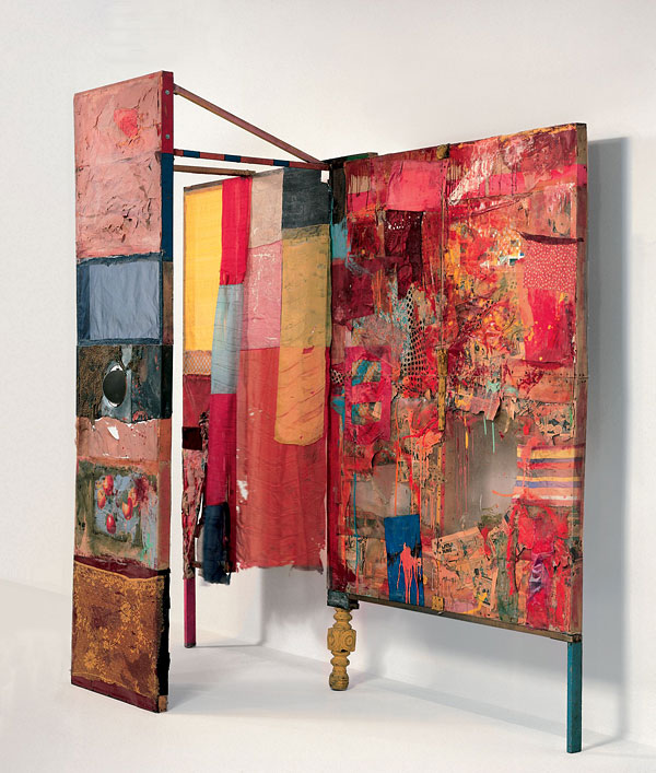
Last night’s sale at Sotheby’s included a very early, underdocumented 1954 combine by Robert Rauschenberg, which he gave to the dancer and choreographer Paul Taylor a decade later. [I say underdocumented because I can’t find any mention of it in Paul Schimmel’s otherwise exhaustive Combines catalogue, or anywhere online not associated with the auction.]
rr_1954_combine_taylor_verso.jpg
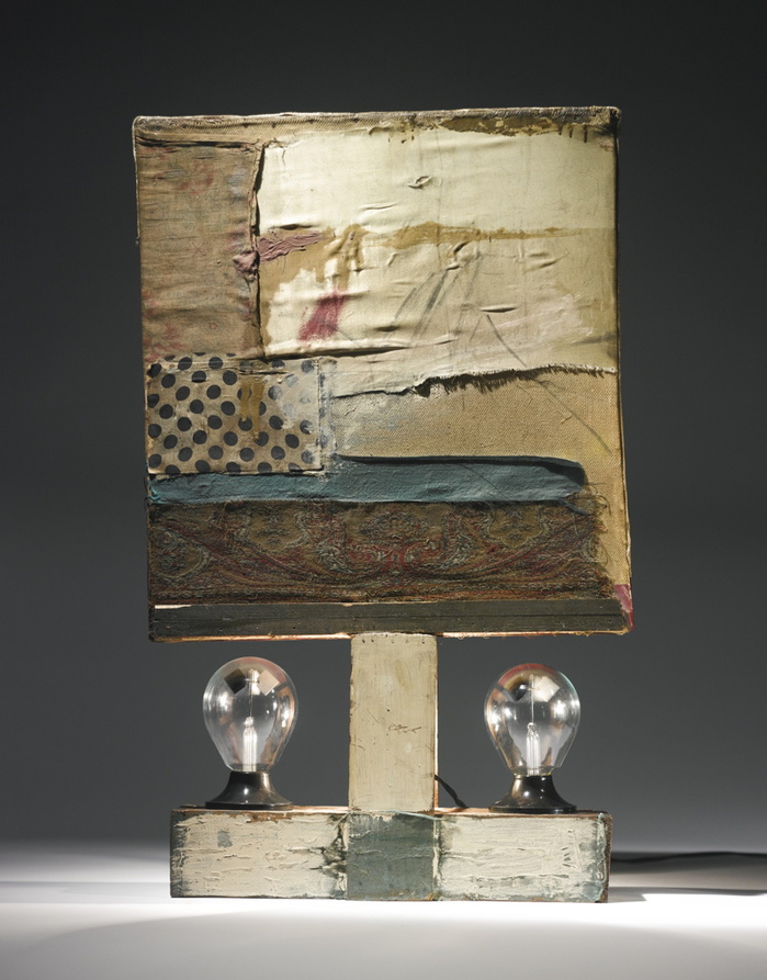
Untitled, verso, 1954, Collection Paul Taylor, that polka dot fabric turns up on at least six other combines, including Short Circuit, image: Sotheby’s
The piece is freestanding, tabletop-size, with a double-sided painting/collage mounted on what seems like a 2×4 wood base. There’s a lightbulb sandwiched in between the support slats, and a pair of radiometers, those little gadgets with black & white panels that spin when exposed to light.
rr_man_with_two_souls_1951_hopps.jpg
The Man With Two Souls, 1950, photographed by Rauschenberg in 1951 in his UWS apartment, where Twombly told Walter Hopps he’d seen it. He later got it. image: Hopps’s Rauschenberg: The Early 50s
As soon as I saw it, I thought of Rauschenberg’s earliest surviving sculpture, made in 1950. Cy Twombly got it after Rauschenberg’s 1951 show at Betty Parsons, but before he and Bob took off for seven months to Africa, leaving Susan Weil and the baby behind. The piece is called The Man With Two Souls, and it consists of a glass rod flanked by a bulbous pair of wine bottles inserted in a cast plaster block. Charles Stuckey suggested it was an homage to Barnett Newman’s sculpture Here I, which was shown at Parsons earlier in 1951. Yes, that might be one allusion.
twombly_sculptures_by_rauschenberg_1954.jpg
Twombly and sculptures in Twombly’s studio, 1954, photographed by Rauschenberg, image via Schimmel’s Combines
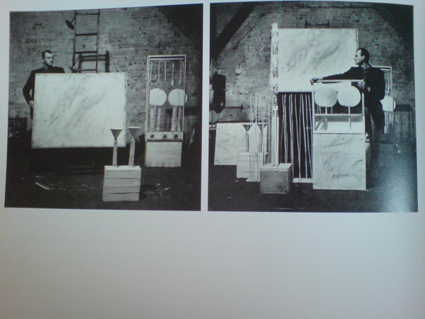
It also might be similar to almost every Cy Twombly sculpture in these photos Bob took in 1954, the year Taylor’s combine was made. The year, in fact, when Rauschenberg made what’s considered the first of his combines, set pieces for Taylor’s debut as a choreographer after leaving Merce Cunningham’s company in mid-1954.
And depending on which side you’re looking at, Taylor’s piece looks an awful lot like Minutiae, the free-standing set piece Bob made for Merce’s December 1954 performance at BAM. Which is all set up for my complaint about Sotheby’s catalogue text, which acknowledges that Rauschenberg was “informed by the influences” of his contemporaries like Jasper Johns, and then immediately distances the two artists:

Though their practices were fundamentally at odds, both conceptually and aesthetically, the two men supported each other’s stylistic experimentation during this critical time of immense growth and evolution.

Unfathomable difference has been the starting point of any discussion of Rauschenberg and Johns’ early work since at least 1963, when Allan Solomon gave them each one-man shows at the Jewish Museum. It’s a presumption of separateness that shuts off any exploration of similarity, much less exchange or collaboration. And especially in the case of Rauschenberg and his artist/partners, it heads off any questions of joint creation or shared authorship.
rauschenberg_minutiae.jpg
Minutiae, made with help from Johns in time for Merce Cunningham’s Dec. 7 1954 performance at BAM
Johns has said publicly he worked on Minutiae. Twombly drew on Rebus and who knows what else. Johns even said he made a Rauschenberg with Bob later signed, and that he came up with the term “combine.”
But whether it’s historic or persistent institutionalized homophobia, emotions & ego, the demands of the market, or the lone genius paradigm of the times, it’s apparently still impossible to ask if there are similarities or connections between these artists’ contemporaneous work.
jj_construction_with_toy_piano_crichton.jpg
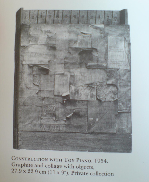
Construction with Toy Piano, 1954, image: Michael Crichton’s Jasper Johns
Twombly and Rauschenberg are both gone, alas, and Johns doesn’t seem too interested to elaborate, seeing as how he has systematically hunted down and destroyed his own work from before 1955. But at least one piece that survives, Construction with Toy Piano, a book-sized wooden object covered with painted collage, looks like it could have been made in the same room as Paul Taylor’s combine, if not by the same mind or hands. Just asking the question.

‘I’m Going To Fail’, or Protocols of Participation


I like to keep up with the discussions and presentations at NYU’s Institute of Fine Arts. They recently posted video of a panel I’d been waiting for from late April titled, “Protocols of Participation: Recent Models of Socially Engaged Art in the United States and Europe,” where Creative Time’s Laura Raicovich, and Xavier Douroux and Thérèse Legierse from Nouveaux Commanditaires, who commission and mediate public artist projects in France. IFA’s own professors Thomas Crow and Alexander Nagel participated as well. [It was organized as part of ART², a whole month’s worth of events I missed across the city.]
It was an interesting comparison of the two systems designed to facilitate artists’ engagement in their politics, culture, and communities. So watch the whole thing.
I had it playing in the background while I worked, and during the audience questions, I was suddenly alerted to the change in cadence. I knew what was coming: the long, winding, potentially discourse-derailing statement disguised as a question.
It’s a cliche of the panel discussion/public lecture format, the kind of interaction that organizers sometimes like to head off by explicitly warning against, or even by soliciting written questions. It’s almost always an uncomfortable, flow-breaking moment, met with either indulgence or annoyance. No one’s come to hear some rando bounce his pet theory off the headliners.
It breaks form, yet it is the form. Such questions and their possibility are intrinsic to the very format of open, public discourse. So when the breach of protocol came for an event titled, of all things, “Protocols of Participation,” I resisted the urge to close tab or tune out. And I was transfixed by this unseen, unidentified woman’s speech, how she said it, and even what she said. It occurred to me that probably no one would ever take her comment seriously, or even know about it.
[I vividly remember my first audience question in New York City. It was to Brice Marden at MoMA’s Cy Twombly artist panel. Years later, when WPS1 posted the audio of the event, it omitted the audience Q&A segment entirely. Which can be interpreted on several levels.]
In every panel or discussion I attend, I, like everyone else, always fantasize about revolutionizing the format. Or at least fixing it. It never feels optimal. And yet it never, ever changes. So I’m going to start collecting these marginalized, random, dodged, cut-off, derailing statement/questions from audience members and see what comes of it. Do you have a favorite? Send a link, let’s add it to the collection!
As you can see from the complete transcript of the audience member [with a couple of interjections and a response by Prof. Nagel], maybe these things should be written down and studied after all. Because as a text, I think it’s rather fascinating. Expectations and context.
Watch/listen to the question, beginning around 1:27:10. I wanted to capture the sense of hearing it, so I left in the ums and repetitions. Line breaks are pauses.
I’m going to fail
um I missed a little bit, but I was misdirected to the wrong place, sorry
um

Continue reading “‘I’m Going To Fail’, or Protocols of Participation”

Wade Guyton And Anxiety In The Age Of Mechanical Reproduction

christies_skateboarder_guyton.jpg
Personally, the thing I remembered about Carol Vogel’s puff piece a couple of weeks ago for Loic Gouzer, organizer of “If I Live I’ll See You Tuesday,” Christie’s Edgy Sale, was that she’d used the word “seminal” twice in one sentence. But if I were an artist whose painting was being used as Exhibit No. 1 to illustrate it, I could see how the headline might catch my eye, too: “For Those Who Can Afford It, Christie’s Is Selling Anxiety”.
The sale was supposed to be a “mould-breaking auction,” a “risky operation” meant to “shake things up” with artworks that “capture the raw angst” that the current “generation of rich embryonic collectors” are all hot for.
wade_guyton_fire_studio_07.jpg
image: burningbridges38/s IG
Christie’s own idea of raw shakeup: a promotional video skateboarding video, showing skate pro Chris Martin tooling through the galleries and the back of the house, passing works and staff along the way. It was the most brilliantly ridiculous thing ever. For a day. Then someone pointed out embryonic auction star Parker Ito’s own YT videos of his skateboarding around his studio. And someone else ran the numbers and realized that many lots were presold via third-party guarantees/irrevocable bids, so the actual angst of the evening’s outcome depended entirely on one’s own market ignorance.
wade_guyton_fire_studio_03.jpg
image: @burningbridges38’s IG
Until Wade Guyton entered the game. Wade’s 2005 painting Untitled (Fire, Red/Black U) had a starring role in the sale, the video, and the Anxiety article. And last week, as the video racked up views and scorn online, Wade introduced some real anxiety–by making more than a dozen new paintings, identical to the one at Christie’s, using the same digital file. He then posted the images to Instagram. They stream out of his trusty Epson inkjet printer, are strewn across the studio floor, and flutter in the breeze like a fiery curtain on the wall.
wade_guyton_fire_studio_02.jpg
When she declared a slightly bent & restored aluminum painting destroyed last year Cady Noland reprogrammed all her remaining work, instilling collectors with the fear that the tiniest nick or bump might render their precious object unsaleable. Similarly, by revealing even the hypothetical existence of infinite digital replication–so far, all he’s done is post pictures of canvases to Intagram–Guyton has stripped away the presumption of uniqueness, and has seized his work back from the outsized speculative frenzies that swirl around it. And the greatest part is that he did all this just days before the big sale [where he doesn’t have anything to win, and much, potentially, to lose].
As Jerry Saltz wrote, “Whatever happens tonight, I admire an artist willing to tank his own market by flooding it with confusing real-fake product.” And except that there doesn’t need to be anything fake at all about the resulting works, I completely agree. This is awesome. [Even though it didn’t slow down the sale one bit: Untitled sold for $3.5 million, a record. So win-win, depending on what actually qualifies as a win here.]

Melons And Pomegranates, Matson Jones Custom Display

matson_jones_melon_pomegranate.jpg
Melons and Pomegranates, 1956, hand-painted plaster, Matson Jones Custom Display
When these hand-painted, cast plaster works were sold at Swann in 2005, they were dated “circa 1955.” But I believe Gene Moore only began working with Tiffany & Co. in 1956. In 1956 and 1957, he commissioned at least seven window displays for Tiffany & Co. from Matson Jones, including a series inspired by still life paintings. Matson Jones was the commercial pseudonym for Jasper Johns and Robert Rauschenberg.
matson_jones_pomegranate_madamemeow.jpg
Tiffany & Co. window display designed by Matson Jones, 1956, image: madammeow, probably from Gene Moore’s 1990 book
The filmmaker and impresario Emilio de Antonio had, as “an artists’ agent,” been involved in arranging commissions from Moore for Rauschenberg, Johns, and Andy Warhol. One project Matson Jones executed for Moore client I. Miller involved “a kind of three-dimensional window display” interpretation of Andy Warhol’s shoe drawings, which were featured in the company’s ads at the time.
Another display for a Moore client [and Tiffany neighbor] Bonwit Teller included Johns’ 1957 painting, Flag on Orange Field. After Construction with J.J. Flag/ Short Circuit‘s inclusion at the Stable Gallery Annual in 1955, this may have been the second public exhibition of Johns’ Flag paintings; neither was credited to him.
Despite this professional overlap, and their mutual friendship with de Antonio, Johns told Paul Taylor in 1990 that he only met Warhol for the first time in 1961, when Andy bought a drawing out of Johns’ second solo show at Castelli. Soon after that, Warhol’s own comic strip-based paintings were shown in a Bonwit Teller window display, where they were likely seen by Roy Lichtenstein.
Except to whoever bought them in 2005, the current whereabouts of Matson Jones’ melons and pomegranates is unknown. Though I have heard some things.
“With the certificate of authenticity from the Robert Rauschenberg Foundation.” ! Nov 17 2005, Sale 2057 Lot 223 EARLY SCULPTURE BY JOHNS AND RAUSCHENBERG POP ART, est. $5,000-8,000, sold for $10,925 [swanngalleries.com]

V for Visor: V. Stiviano V. On Trend

stiviano_visor_gawker_splash_do.jpg
Vanessa Stiviano & counsel, image via Gawker/Spalsh/DesignObserver
I’ve tweeted before, and I’ll tweet it again, but Vanessa Stiviano’s boss anti-paparazzi visor is the greatest thing about the entire Donald Sterling/Clippers/racist billionaire debacle. Stiviano’s photo-thwarting look will have far-reaching implications for our media and celebrity culture, you heard it here first.
Well, technically, you probably already read something along those lines at Design Observer, where Rob Walker did a great analysis of the visor as a part of Stiviano’s carefully constructed, photo-mastering looks:

This object privatizes the face in a manner that’s undeniably a protest (stop taking pictures of me!) and just as undeniably a confrontation (you cannot resist taking pictures of me wearing this object!).

vstiviano_screenshot_lhooq.jpg
vstiviano screenshot via @MichelleLHOOQ
Me, I see it as the vanguard of a broader trend that really speaks to this moment in history:
stiviano_visor_riot_police_trendwatch.jpg
screenshot: google images
Rob Walker| Object in the News: The Face Privatizer [designobserver]

Every Color In The Book: A Treatise On Watercolor Paints By A. Boogerts

bookgert_kwakkel_colorchart_1.jpg
Last week medieval scholar Erik Kwakkel tweeted about a largely unknown, undocumented, and apparently unique book he found in the Bibliothèque municipale/Bibliothèque Méjanes, in Aix-en-Provence.
boogert_color_chart_greyscale.jpg
Titled Traité des couleurs servant à la peinture à l’eau [Treatise on the colors used to paint with water], it’s an amazing 892-page, handwritten documentation of every available watercolor pigment and combination, each at three levels of dilution. It was written in Dutch in 1692 by an A. Boogert. Kwakkel is currently translating the introduction, but in the mean time, the illustrations are worth a long look.
boogert_color_chart_red-orange.jpg
In addition to the systematic process and grid of conceptualism, there are obvious resonances with the color charts [top] and monochromes [below] of mid-20th century painting. The book format especially reminds me of Yves Peintures, the concocted catalogue for an imagined show of Yves Klein’s monochromes.
boogert_color_chart_blue.jpg
But even more than that, the starting palette for Boogert’s project is uncannily similar to the 16 colors of the Dutch government’s own unified, official palette, the Rijkshuisstijl, released in 2011. The RIjkshuisstijl was meant to centralize and strengthen the visual identity of the national government with colors inspired by Dutch landscape painting.
rijkshuisstijl_kleuren_grid.jpg
Kwakkel doesn’t mention any details yet about the context for Boogert’s book, but the bibliographic record keys it to the textile trade and the Dutch East India Company.
Read and follow Kwakkel’s discovery: A Colorful Book [erikkwakkel.tumblr.com]
See full scans of Traité des couleurs servant à la peinture à l’eau MS 1389 (1228) at the Bibliothèque Méjanes [e-corpus.org]
Previously, related: Rijkshuisstijl: the 1 Logo Project
Yves Peinture

Cage Grid: Gerhard Richter & The Photo Copy

richter_cage_grid_i_complete_17296.jpg
I was kind of baffled when I saw this Richter in Christie’s February sale in London, and I’ve had it on my desktop ever since. It’s called Cage Grid I, and it’s a 16-panel giclée print [!!, oh how I hate that word] mounted on aluminum that reproduces the 2006 squeegee painting, Cage 6, basically at 1:1 scale.
In fact, if you include the small gaps between the 75cm square panels, the giclée version is slightly larger than the 3×3-meter painting. It pulls the painting apart instead of occluding it with a grid overlay. Though there are digital prints and inkjet prints in the artist’s CR, Cage Grid is the only edition listed as a giclée. There are both complete editions Cage Grid I and 16 individual quadrants, Parts A-P, Cage Grid II.
Richter has chopped up his paintings before, turning full-size squeegee paintings into a series of tiny squeegee fragments. He’s made giant gridded photo panels before, like Strontium (2004), at the deYoung Museum. He’s got reconfigurable grid paintings [mounted on Aludibond, btw], like 4900 Colours.
He’s made photos of Strip paintings, which are actually manipulated photos of fragments of another squeegee painting, digitally printed, and mounted on aluminum and sometimes under plexi.
And he’s made photo versions of paintings before. These 1998 Orchid offset prints are done at full-scale of the 1997 painting, but cropped in five different ways. Herr Heyde is a little 2001 offset print on Aludibond that’s the same size as the little 1965 painting. [Richter favored offset prints, then a few c-prints, before going digital, except for Ice 2, a 2003 half-scale reproduction of a 1989 squeegee painting that’s actually a 41-color screenprint.] There’s 1:1 Uncle Rudi (2000), and the 1996 photo edition of the painting of the photo of his wife, which I thought would make a good Richard Prince nurse painting. Seven Two Four (2005) are 1:1-scale blurred photos of a 1990 squeegee painting. [A painting for which Richter has atypically posted 21 detail photos.]
richter_mustang_print_glass_7072.jpg
Wow, when you shoot it that way, the 1:1 photo edition of Mustang Squadron (2005) looks amazing, and not at all like a bridge line version of the couture original. Speaking of which, back in 1998 Richter made a 1:1 photo edition of 48 Portraits, his landmark blurred painting grid from the 1972 Venice Bienale.
richter_48_portraits_photo_edition_5324.jpg
And this is one thing that nags at me about Cage Grid: even if I buy the arguments about photo vs. painting, experimentation, or materialist variation, I feel like what’s actually being sold is iconic sameness. It’s not so much the Capitalist Realism that–actually, yes, it’s the capitalist reality that gets me, but not the supply, the demand. I feel less undone by the artist churning out a towering Kinkadian pyramid of merch than by the critico-consumer desert criss-crossed by collectors, institutions and speculators that swallows it up.
It’s not that Richter makes readily monetizable editions of iconic works he loans to museums. [The Cage series is at Tate. Modern. The Cage Grid prints were actually sold by Tate Modern, during the 2011 Panorama retrospective.] It’s that despite my ambivalence, I want some. [Oh, look, that Mustang Squadron that sold at Phillips in 2006 is up for sale at Sotheby’s.]
14 Feb. 2014, Lot 120: Gerhard Richter, Cage Grid I (Complete Set), 2011, 15/16, plus 4ap, sold for £566,500 [christies.com]
15 May 2014, Lot 243: Gerhard Richter, MUSTANG-STAFFEL (MUSTANG SQUADRON), ed. 39/48, 1 AP, est. $250,000-350,000 [sothebys]
Previously, uneasily related, partly because I only just now remembered I had similar qualms about a similar situation last year: Gerhard Richter’s Septembers

In Kusakli Did Erdogan A Bremer Wall Erect

turkey_portable_wall_n_65624_1.jpg
image: AA
Turkey is trying to control the flow of refugees from Syria and the unregulated trade and traffic across the open border by constructing a “portable” wall near Kusakli, a border village under the jurisdiction of the nearby town of Reyhanlı, in the Hatay province. No biggie, though, this wall’s just 1200m. Really more of an installation.
The AA photo above shows workers installing the prefab concrete segments with a crane. They look like jacked up Jersey Barriers.
184138_dha_hatay_portable_wall.jpg
As this DHA photo shows, they are jacked up Jersey Barriers, 30cm thick, and 3m square. Each weighs 9 tons. From their popular use in the Iraq and Afghanistan wars, the US military’s technical term for a jacked up Jersey Barrier may be a Texas Barrier [3.7m] or an Alaska Barrier [6m], or a Bremer Wall, after Paul Bremer, who did so much to create the demand for them during the early days of the occupation.
All these US-style barriers, though, are thinner, rectangular, more 2001 monolith-shaped. Their design heritage traces back to the model for an instant wall along the US-Mexico border that congressman/earthworks artist Steve King (R-IA) exhibited in 2006. And to the decidedly non-temporary, non-portable wall Israel built in the occupied West Bank.
Turkey apparently does not want to use Israeli-style oblong walls, so they go with the square. A little heavier, but fewer lifts. They’re apparently installing the wall at around 75 segments/day.
kusakli_turkey_pentagon_gmap.jpg
I looked Kusakli up on Google Maps, and the awesome, gridded Benday dots of the olive orchards in the surrounding landscape are suddenly the second most interesting feature. Because there is this unusual Pentagon overlay around the town. What even is that? There’s no way it’s the wall. Or the demarcation for a wall, since the wall’s only 1/8th built. Right? That’d turn Kusakli into West Berlin without limiting the flow of Syrians anywhere except in this tiny village. So it’s something else.
Turkey builds portable wall on border with Syria [hurrietdailynews, image: AA via @aljavieera]
Turkey builds portable wall on Syrian border [todayszaman, image: DHA]
Previously: Study For A Fence And A Wall (2006)
Related: Afghanprogettazione: HESCO X DIY Troop Furniture

On Warhol And The World’s Fairs

If I ever get a PhD it will be in the US Pavilion at Expo67 as a gesamtkunstwerk. So much going on there, and in my years of fascination and study of it, it just keeps on giving.
And I am stoked for the Queens Museum’s show, opening to day, on Thirteen Most Wanted Men, Andy Warhol’s short-lived commission for the New York State Pavilion at the 1964 World’s Fair. It sounds amazing, with an impressive amount of archival research and new understanding.
I haven’t seen it yet, but I have been bothered by a line that’s cropped up in several reviews of the show, which makes me think it’s not accidental, calling the 13 Most Wanted Men panels “Warhol’s only public artwork.”
This characterization only holds up if you define public art so narrowly as to make it irrelevant [which is something that happens to public art a lot, actually, but that’s not the point here.] Warhol exhibited work in at least three World’s Fairs in a row–1964 in New York, 1967 in Montreal, and 1970 in Osaka. And the first two were commissions. In fact, I’d suggest that the New York and Montreal projects are so similar, that they really should be considered together. Warhol’s Expo 67 works suddenly feel like a direct response to the controversy in 1964. When faced with the prospect of wading into another political conflict over his subjects, Warhol chose to depict himself.
warhol_13most_wanted_install_1964_sm.jpg
In 1964, Warhol painted 25 panels–22 with mug shots, 3 blank/monochromes–on 4-foot square masonite panels. The images came from an internal NYPD pamphlet that gave the piece its title: 13 Most Wanted Men. These were painted over in aluminum house paint within two days.
13_men_tarp_peter_warner_meyer.jpg
Thirteen Most Wanted Men overpainted and covered by tarp, 1964. Photo: Peter Warner, via Richard Meyer’s Outlaw Representation
Later they were covered with a large tarp. They have since been lost or destroyed. In his incisive 2002 history, Outlaw Representation: Censorship and Homosexuality in Twentieth-Century American Art, Richard Meyer quotes John Giorno’s story about the origins of Thirteen Most Wanted Men, and that the mug shots came from the gay cop boyfriend of another painter, Wynn Chamberlain. 1 [No one’s mentioned it, but I assume this is all in the Queens Museum show. Right? And the show will surely explain why Philip Johnson told Warhol in 1963 not to talk about the sources of the paintings? Johnson, who surely knew as much about power, rough trade, and a man in uniform?]
warhol3_moses_lancaster.jpg
Warhol painted 25 panels with Robert Moses’ headshot, taken from Life magazine, as replacements. Philip Johnson rejected them, and they are also now considered lost or destroyed. [This photo is by Mark Lancaster, who helped Warhol make the Moses panels and much else. There’s a great interview with Lancaster at warholstars.org.]
During the Summer of 1964 Warhol reused the screens to create paintings on canvas of the 13 Most Wanted Men, which Lancaster cropped and stretched. Nine of these are currently in the Queens Museum show.
In 1964 he began making the Screen Tests, which were inspired both by the Thirteen Most Wanted mug shots and the photobooth pictures Warhol began using in 1963. He created Most Wanted series of women and boys as well.
warhol_menils_expo67_sm.jpg
Warhol visiting Expo 67 with the de Menils, that’s John de Menil at left, not Buckminster Fuller, as some online sources would have it. image via menil.org
In 1967 curator Alan Solomon commissioned Warhol to make large paintings for the US Pavilion at Expo 67. Warhol created eight giant Self-Portraits. They are 6-feet across and based on a photo by Rudy Burckhardt. Six of them were installed in Buckminster Fuller’s geodesic dome, above Jasper Johns’ Dymaxion Map. Four of them are visible above, in a photo taken during Warhol’s visit to the Expo with John & Dominique de Menil. The one on the lower right is now in the Tate Modern.
If the Thirteen Most Wanted Men censorship was really as concerned with vice, power, and the homosexual gaze as Meyer argues, then Warhol’s uncensorable Self-Portraits read like an act of defiance. For his 2nd World’s Fair, Warhol didn’t shrink from political conflict; he met it straight on and came out on top.
1 Update: I just came across a story by Lucy Sante about Thirteen Most Wanted, which he published in 2009. It is, I assume, a fictional encounter with a retired NYC policeman who had the idea for a Ten Most Wanted list stolen from him by a fellow cop, who became lovers with a young Warhol, and then years later, while guarding the World’s Fair, saw his Most Wanted Men idea stolen again by his ex. Hmm. I think someone had better talk to John Giorno.

Claes Oldenburg: The VW Years

oldenburg_floorcone_dwan_1963_vw_sm.jpg
It’s not my strategy to leave pictures sitting on my desktop so long I forget where they come from, and then I don’t have to credit them or worry about posting them. If if were, I’d start a tumblr.
Given the amount of attention I’ve paid to various artists’ Volkswagens, I honestly thought I’d be writing something more extensive about Claes Oldenburg wheeling up to the Dwan Gallery with the giant Floor Cone Peggy sewed for him strapped on top of his car. But not yet.
And anyway, it’s been making the rounds, but I’m guessing it came from researching Sturtevant and Dwan Gallery a few months ago, and finding it on ArtObserved.

Getty Museum View, Or Seeing Google Seeing

The Getty Museum is now included in the Google Art Project. Which is now a part of the Google Cultural Institute. I hadn’t noticed how this context has changed, and how the Art Project has been subsumed and presented. The navigation options are, “Collections | Artists | Artworks | User Galleries.” And institutions are collections.
getty_google_art_mirror_03.jpg
Anyway, Museum View. I know that Google Street View-based art fascination is old and busted, but Museum View for me is still the new hotness. Maps are for navigating, going somewhere, doing something. But Museums are for displaying and depicting and interpreting; they hold and show objects and generate discussions and critical context. And Google Museum View is doing that on a trans-institutional scale, and so it feels important to have some awareness of this process. Trans-Institutional Critique.
Fortunately, Google still sometimes documents itself documenting.

Continue reading “Getty Museum View, Or Seeing Google Seeing”

Ex Collectio: The Bernard Madoff Provenance Project

UPDATE: There is now a Google Doc, your one-stop source for Madoff Provenance information. Have a detail? Send it in!
Last month I proposed that the specific artworks which had once belonged to Bernard Madoff be forever associated with him, that he and his various corporate entities become an inextricable element of their history, discourse, and meaning.
For the most part, Madoff collected prints and multiples from large editions. There are usually dozens of identical examples of each artwork he collected; they’re true investment-grade commodities. However, Bernard Madoff’s ownership of these examples differentiates them and renders them unique among their editions. How does the historical fact that these specific artworks were owned by the perpetrator of one of the financial industry’s biggest frauds affect their engagement with the art market, the art audience, and the critical structures of the art world? We shall find out.
study_for_ex-collectio_madoff_stamp.jpg
Study for Ex-Collectio MADF Stamp, 2014, digitally manipulated photocollage
Seven of the 53 artworks listed in the US attorney’s inventory of Bernard L. Madoff Investment Services, plus one additional work, are being sold by the bankruptcy trustee at Sotheby’s on May 1st.
Their lot and edition numbers are documented below, along with edition and title information for previously sold Madoff artworks whose court inventory entries were incomplete.
In accordance with art market, conservation, and art historical practice, I have created a stamp to indicate these works once belonged to Bernard Madoff and/or his corporate entities. I hereby issue an open invitation to all owners, buyers, dealers, agents and conservators handling these artworks, to accurately reflect their history, significance, and provenance by having them stamped. I am happy to provide this service, upon review, authentication, and mutual agreement, for no charge within New York City or the Hamptons or, upon prior arrangement, at art fairs in Basel, London, or Miami Beach. For other locales or times, please contact me directly. I’m sure we can work it out. This offer applies only to artworks which can be documented through court and/or auction records as having been in the collection of Bernard Madoff. No frauds or phonies.
madoff_matisse_jazz_formes_pl_ix.jpg
Not in Inv.
Lot 41 Henri Matisse, FORMES, PL. IX (FROM JAZZ), 1947, pochoir print of “plate IX of XX from the edition of 100 (total edition includes the book edition of 250 with a central fold), on Arches wove paper, published by Tériade, Paris.”

Continue reading “Ex Collectio: The Bernard Madoff Provenance Project”