In 2021 Kerry James Marshall was commissioned by the National Cathedral to create stained glass windows to replace windows that depicted Robert E. Lee and Stonewall Jackson. Marshall’s Now and Forever Windows will be unveiled and dedicated on Saturday morning, Sept. 23, and a public open house to celebrate them will run all day.
The windows are accompanied by a stone plaque engraved with a poem, commissioned from Elizabeth Alexander, titled, “An American Song.”
The dedication and reading will be streamed live on the Cathedral’s YouTube channel:
A history of the confederate windows, the task force that convened to study and remove them, and the project to replace them, is at cathedral.org/windows.
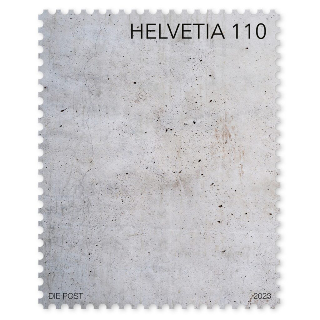
For 2023 the Swiss Post Office launched a concrete wall stamp printed with cement pigments in an ultra-matt finish for tactile effect. The only thing more Swiss is the stamp’s entire product description, which details how this stamp aligns with the three pillars of Swiss Post’s art support policy [revised in 2020], and how that policy aligns in turn with Swiss Post’s ongoing policies for supporting the arts.
Canvas stamp, 2021, via Swiss Post
In 2021, to announce this newly updated art policy, and to draw attention to Swiss Post’s art collection and architecture, Swiss Post introduced a blank canvas stamp. It is sold out, but when augmented by a CHF0.10 stamp, is still valid for use. The making-of video is as sublimely boring as one could hope; it must have been a great source of comfort in the midst of pandemic uncertainty.
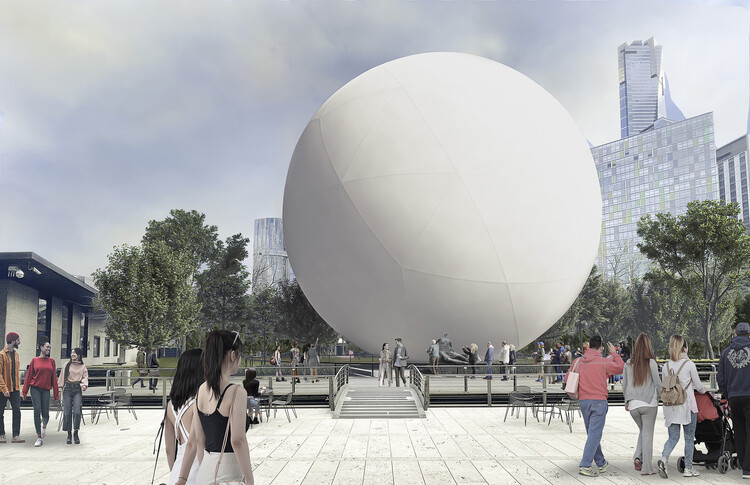
It will respire, inflate and deflate, to help make air visible. As it “exhales” it will transform “into an array of cloud-like configurations.” On first, second, and third glances, it does resemble the satelloons and sculptural, inflated spheres that are the never-dissipating obsession of mine for the last 16+ years. It is comforting and encouraging to have astute friends and colleagues like Andrew Russeth see a 14m balloon ball project in Australia and think, “Oh, I need to send this to Greg.”
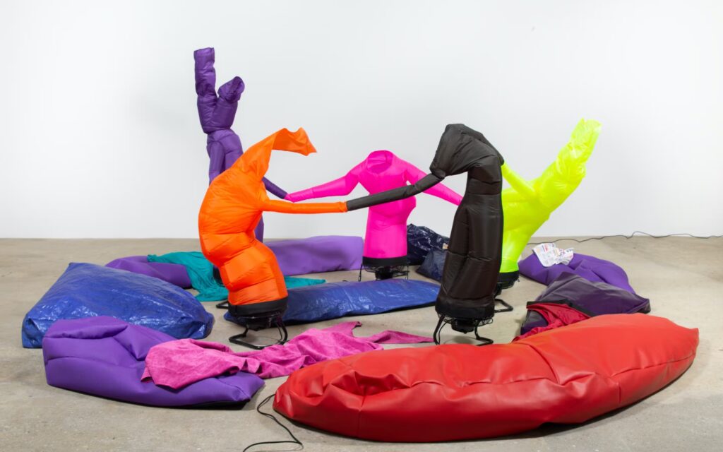
Paul Chan, Khara en Penta (Joyer in 5), 2019, image: Greene Naftali via Walker Art Center, where a show of Chan’s Breathers was on view until last month
As I type this up, the nature of Brunsdon’s project seems to relate even more closely to Paul Chan’s Breathers, whose undulating sculptural shapes are created by the flow of air through them. (This is) Air feels like a massive, Platonic solid (sic) version of Chan’s contorted, figural objects.
Martin Creed’s Work No. 2821, (half the air in a given space), 2017, was acquired by the Art Gallery of New South Wales, which illustrates it thus.
It also brings to mind Martin Creed, whose “half the air in a given space” series uses smaller balloons, and obviously involves an enclosed space. Of course, a 14m-diameter sphere contains almost exactly half the air, by volume, of a 14-meter cube. So in a way, Brunsdon’s outdoor project also makes it possible to imagine, not just the air, but the space it would be given.
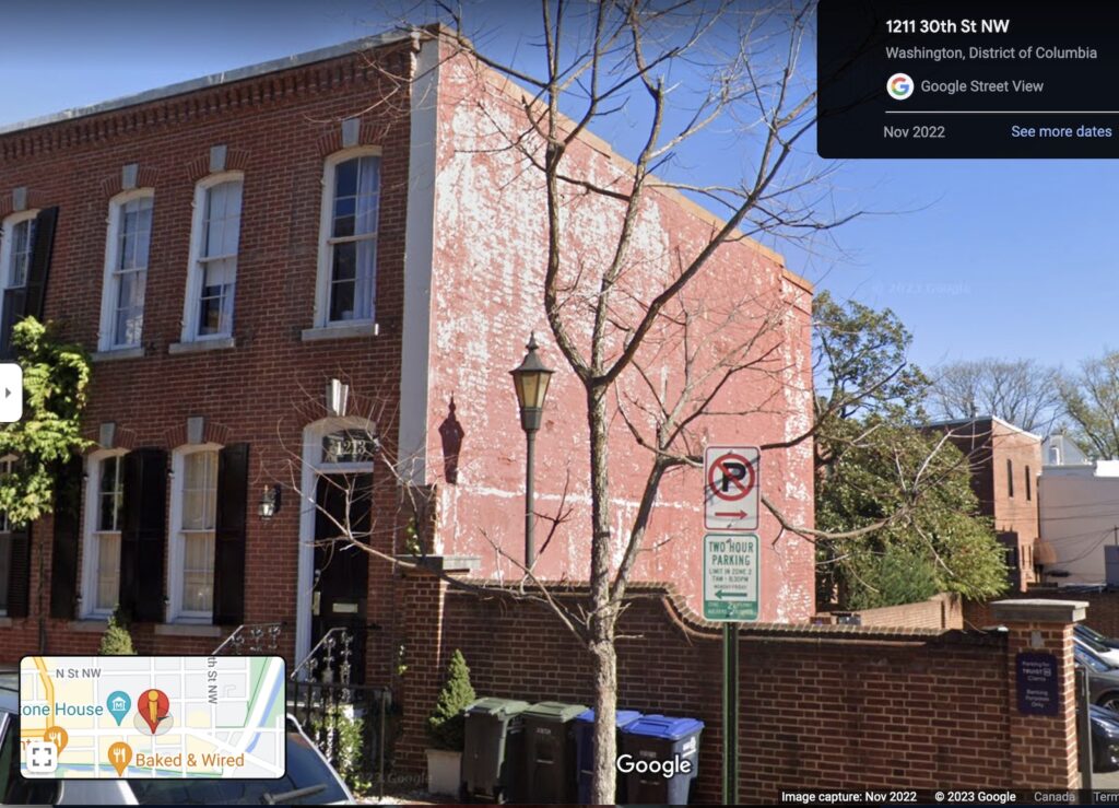
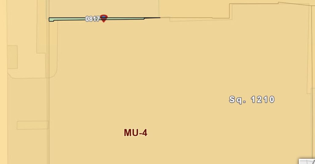
It’s hard to imagine that the cheapest real estate listing in Georgetown still feels overpriced.
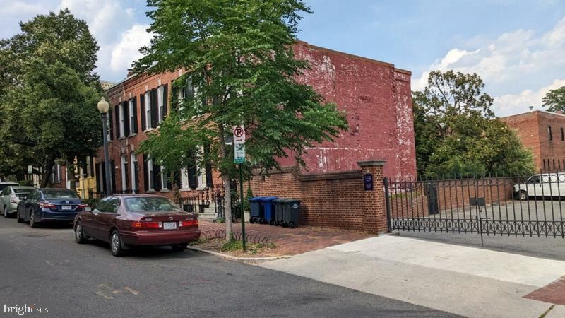
A wall was listed for sale yesterday, for $50,000. If the dimensions, 22 square feet, are accurate, that is $2,273/sf, more than twice the going rate for premium renovated townhouse space.
Of course, the difference is, there’s no space here; 22sf is the entire lot [sic] and structure [sic]. The wall is solid brick. It’s a one-foot wide party wall that used to belong to some building that got torn down and replaced by a 1980s bank parking lot. And yet, it does not belong to the bank.
This seeming surveyor’s error of a property barely justifies the term, and yet, there it is.
“Own a piece of Georgetown. This wall located at 30 and M NW. The opportunities are limitless,” the listing hilariously lies.
What opportunities exist for the owner of this wall? The opportunity to abide by centuries of law regarding party walls, for one. So you could you tear it down and build a 1×22 foot, three story fish tank, as long as it doesn’t pose any risk to the house next door.
You could paint a mural on it—the wall is fairly visible from Georgetown’s main drag, M Street—if you wanted the opportunity of subjecting yourself to the nitpicky conservative tastes of the Old Georgetown Board, which advises the federal Commission on Fine Arts, the bodies which review basically any construction, sign, or visual art proposal that is visible from these historic streets. If it were possible or profitable to paint or wrap something on the wall, I’m sure the current owner would be doing it.
I think the most realistic opportunity is for the owner of the neighboring townhouse to buy it for something between $50,000 and a dollar.
[Morning After, How Could I Have Been So Wrong? Update: The Wall will be the site of limitless radical and innovative visual experience, commissioned from the most daring artists, advertising agencies, political actors, and hypebeasts, which are presented regularly to the Old Georgetown Board for review and disapproval. Proposals for The Old Georgetown Billboard will be performed as part of the public discourse. Renderings will circulate in the stakeholder community, and will be collected online as a visual archive. For IRL visitors, Augmented Reality technology will provide scintillating, sponsored spectacle. This joint is about to go from an orphaned party wall to a global wall party. Let the bidding commence.]
[7/25: The Washington Post writes around my proposal like I’m not even here. The ignominy. Also, the seller of the wall, who has a $2.14 basis [!] is like, I didn’t rub two brain cells together to come up with this price. He really should just give the wall to the neighbor at this point. This whole thing is messy and hilarious af. Let this site eventually memorialize what might have been.]
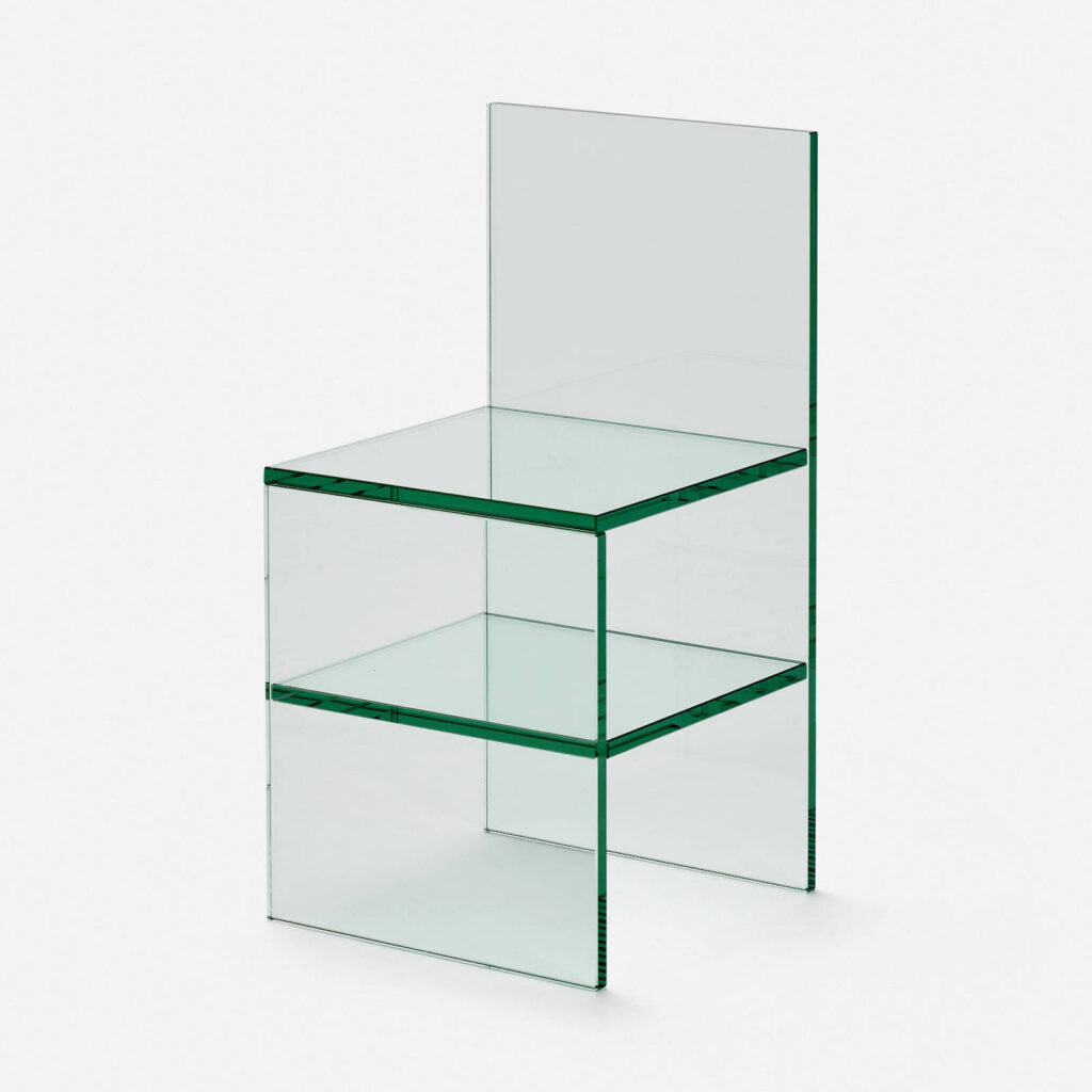
I think the first place Tobias Wong’s Glass Chairs were available was in 2002 at Troy. The SoHo design store commissioned Wong to make a holiday collection. I love them, they’re like Judd chairs for ghosts.
Tobi was always getting in trouble for his knockoffs and reworkings, but more than 20 years later, and 13 years after his death, these chairs are actually still available. So I guess the ghost of Judd doesn’t mind. [Troy was literally across the street from Peter Ballantine’s place, the guy who made Judd’s plywood pieces—but not the chairs.]
At Troy they were sold as a pair, as Chair No. 1 and No. 2, but the picture from the NY Times, and the one on Twentieth, the LA design shop who sold this one, are flipped. So if you want to complete the set, be sure to confirm which $9000 chair you’re ordering.
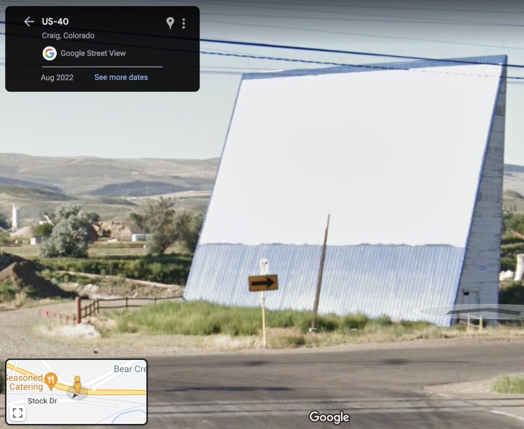
Whoops, not me having to change the folksy billboard lede to past tense when I found a 2022 Google Streetview shot from the highway
You know the gravel pit on the east end of town? Where there used to be the big vinyl billboard you could see from US-40, that says Welcome To Moffat County? The one that made Gail from the Chamber of Commerce tear up with delight first time she saw it because it “really says Moffat County”?
Well that wedge-shaped building, which the Chamber helped paint white a ways back, wasn’t always a billboard. It used to be the screen for a drive-in movie theater. On the other side, of course. And til the projection booth and snackbar burned down, and 3B Enterprises expanded the pit.
from @fromkindra’s western photolog, as regrammed by @ndybeach
In fact, this used to be a typology: drive-in movie screens with interiors. Do a reverse Google image search of @fromkindra’s Instagram road trip posts if you don’t believe me; they’re all over.
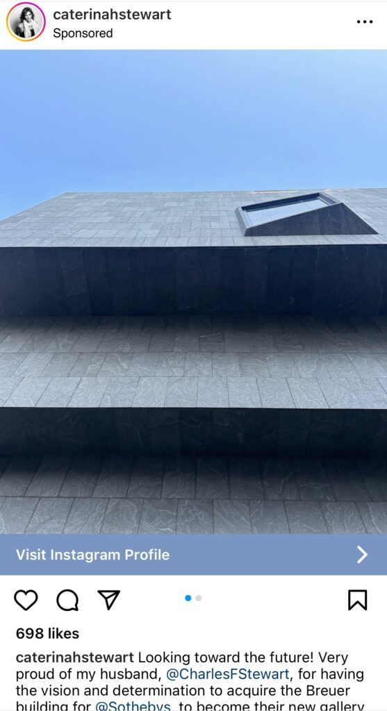
Look, I absolutely get it. If I was an architect, or even an architectural designer, and my husband just bought the Whitney Museum, I’d be psyched, too.
And if he and his company was getting roasted for it, and people were freaking out over Marcel Breuer’s iconic brut luxe spaces being gutted and turned into a showroom for NFTs and Kelly bags, I could imagine giving him a pep talk when he came home.
I could not imagine, however, paying to promote my Instagram post praising his “vision and determination.”
And I would not say in a promoted Instagram post, “As someone who has an architectural practice that values and specializes in preservation, conservation, and restoration, I see so much value in this stunning acquisition.” Especially if my little studio had previously made fixtures for my husband’s company’s showroom above its East Hampton real estate office, and I wanted to get a piece of that sweet Breuer gut job.
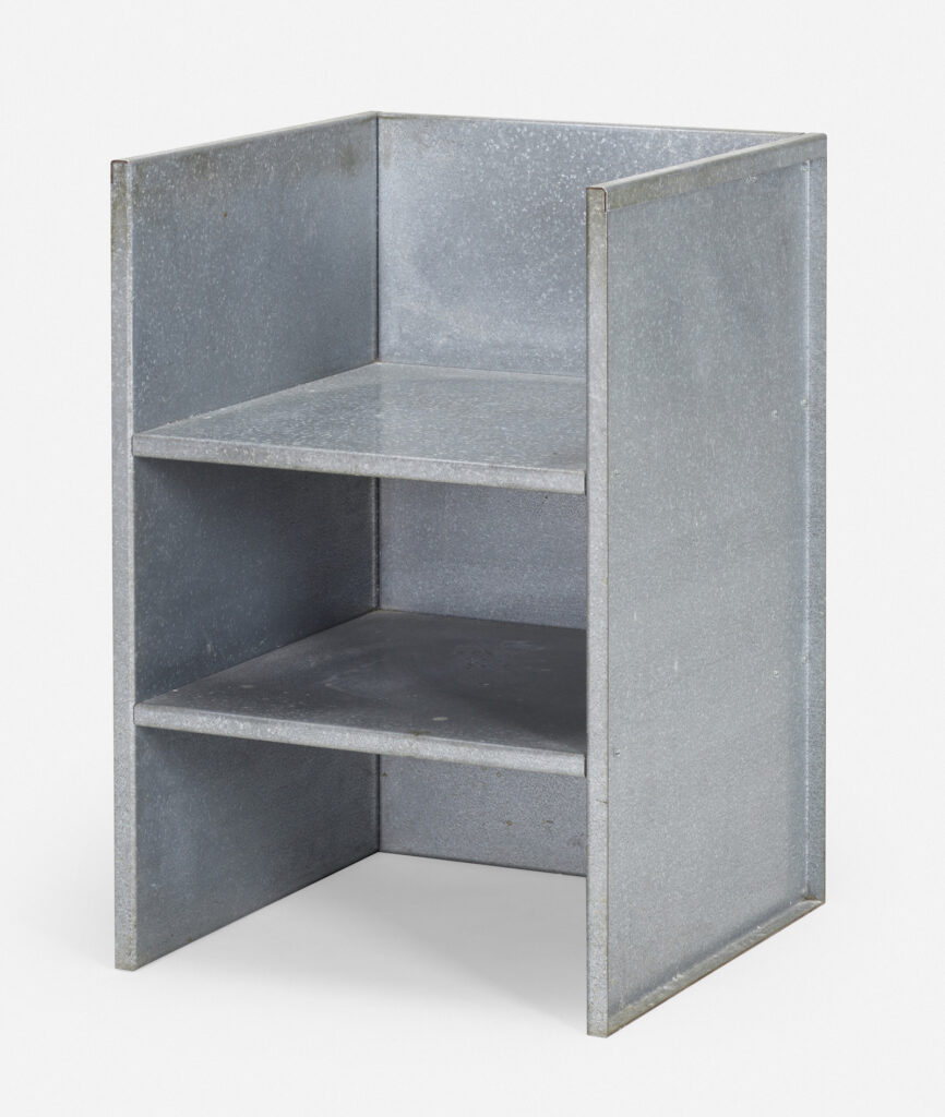
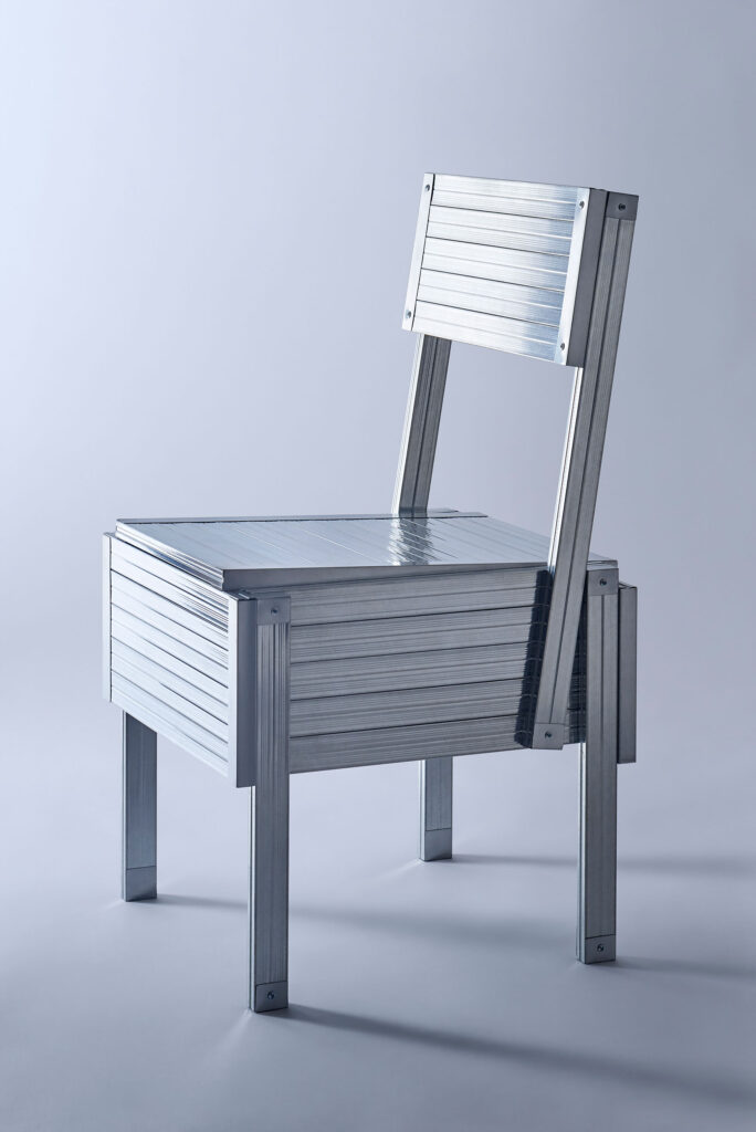
A real thing of beauty: Lot 107, Donald Judd, rare galvanized steel armchair, est. $60-80k at Wright20
I knocked off Donald Judd because I had to; there was no such thing as a Judd Crib. Michael and Gabrielle Boyd, meanwhile, knocked off Donald Judd because they could. By acquiring an extremely rare 1 of 2 Judd armchair in galvanized steel directly from the artist in life, they generated an auratic bubble where fabricating your own Douglas Fir ply chairs was apparently preferable to buying estate editions. Which, in 2010, were fully available, btw.
[few days later update: whoops. they’re gone.]
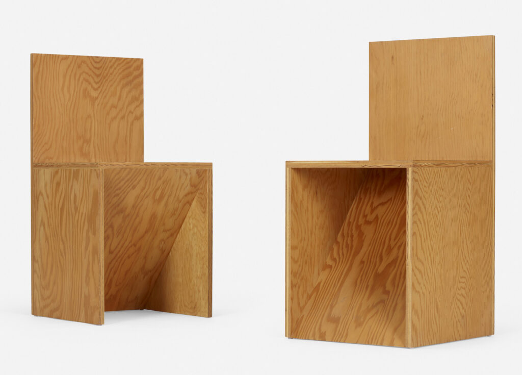
Lot 111 in the third Boyd sale at Wright20: two After Donald Judd chairs in Douglas fir ply, est. $2-3,000
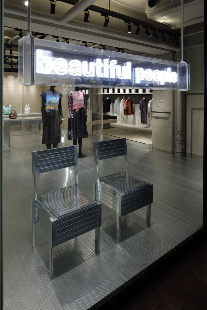
Flow Homage to Enzo Mari, 2022, low gauge steel, for beautifulpeople by Daisuke Yamamoto
Does the algorithm have me? I was unable to resist the suggested instagram post featuring this Enzo Mari autoprogettazione project at the Salone in Milan. But I at least did track down the actual designer and the actual project, rather than credit the insta-clout-chasing design aggregator.
beautiful people unseen archives pop-up made of LGS, including these Enzo Mari chairs, by Daisuke Yamashita, photo Kozo Takayama via IDREIT
Daisuke Yamamoto’s FLOW project is an exploration of material reuse and recycling that proposes to make furniture out of decommissioned light-gauge steel (LGS) beams. In Milano Yamamoto made chairs not only by Enzo Mari, but by Gerrit Rietveld and others. The origins and evolution of the project are documented by the Melbourne-based Japanese design site IDREIT.
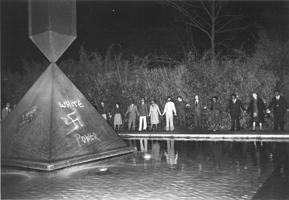
Dominique deMenil [second from right] at an anti-racism demonstration held outside the Rothko Chapel in January 1979 after white supremacists vandalized Barnett Newman’s Broken Obelisk. image: Hicky Robertson/Rothko Chapel Archives via ARTNews
In May 2018, news of racist vandalism at the Rothko Chapel in Houston was soon overshadowed by a high school shooting in Santa Fe. I remember not posting about it at the time. Don’t give it air, don’t give it attention.
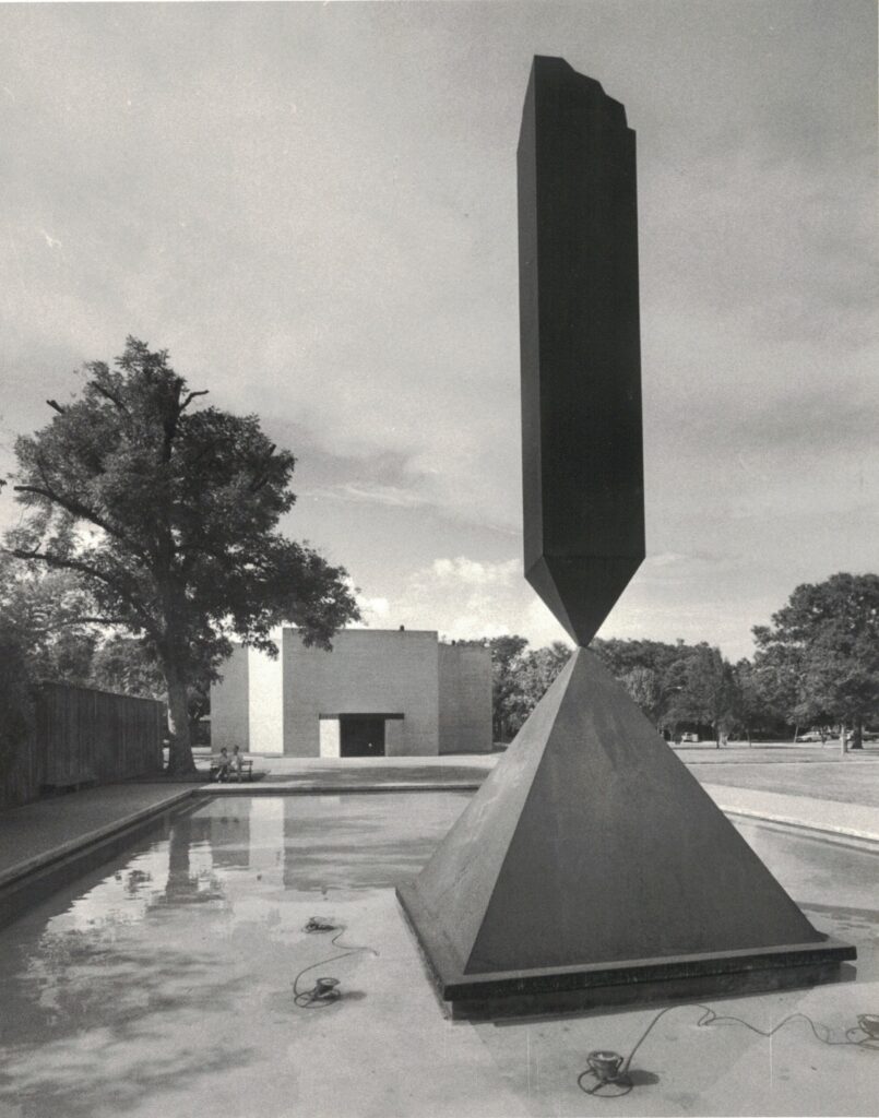
Broken Obelisk in front of the Rothko Chapel in 1980, with the nazi graffiti mostly erased, image: vintage print from the Houston Chronicle photo archive
Because just a couple of weeks earlier, I’d been researching Barnett Newman’s Broken Obelisk, trying to find out what protest message it had been tagged with when it was exhibited at the Seagram Building in 1967. And though I was unsuccessful, I’d found and bought a vintage press photo of Broken Obelisk in Houston in 1980, with most of the traces of the previous year’s neo-nazi vandalism erased.
And then within days of finding a photo of an incident I’d known nothing about, a photo of an anti-racism demonstration surrounding Broken Obelisk ran at the top of Andrew Russeth’s ARTNews review of a double biography of John and Dominique deMenil. It was from the same vandalism incident.
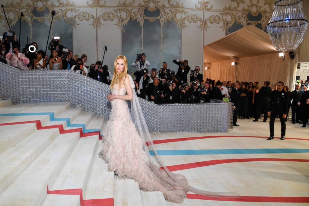
A morose Nicole Kidman schleps up the stairs at the Met Gala 2023, with the chaotic jumble of sketch carpet, plastic walls and chandelier, and 18th century salon backdrop, image: Anthony Behar/AP via ArchPaper
Ando is credited as the exhibition designer for “Karl Lagerfeld: A Line of Beauty.” He was tapped because he and Lagerfeld collaborated in the 1990s. [He designed a studio in Biarritz which Lagerfeld didn’t build, but Lagerfeld published a book of his own photos of an Ando building a couple of years later.] But Ando apparently had a hand in designing the party, too? Let’s take a look at that.
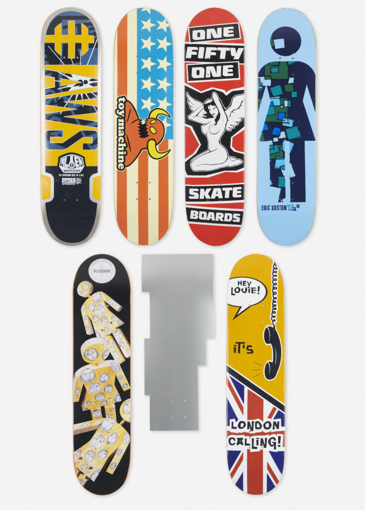
Essential Design, Lot 128: That is not a Frank Gehry skateboard. image: wright20
I am officially on the record as a skeptic of artist skateboard collabs, but I can also say that no one wants there to be a Frank Gehry skateboard more than me.
This group of skate decks in next week’s Essential Design sale at Wright20, “is comprised of decks by AWS for Alien Workshop, Marc Johnson for Enjoi Skateboards, Rick McCrank and Eric Koston for Girl Skateboards, One Fifty One Skateboards, Frank Gehry, and Toy Machine. Printed manufacturer’s mark to six examples.”
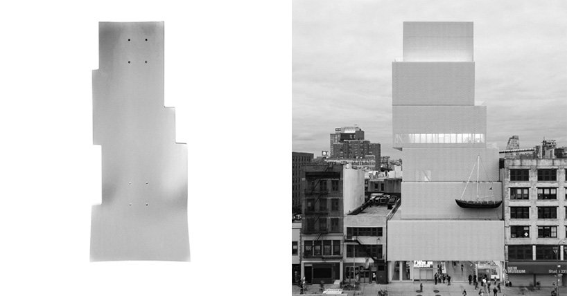
New Museum Skateboard as product, 2014, and the SANAA building it echoes. image I was about to make ganked from 9yo artnet article instead.
And the only thing better than a Frank Gehry skateboard is a signed Frank Gehry skateboard. But again, no. This is the upside-down silhouette of Kazuyo Sejima and Ryue Nishizawa’s of SANAA’s New Museum. It is the shape the museum uses as a logo, turned into a skateboard. The limited edition of 150, produced in 2014 by Chapman Skateboards, is still available in the New Museum’s shop.
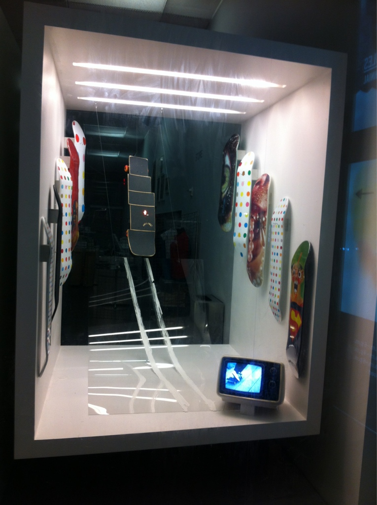
Castator and Duff @ NuMu, 2012, published to Castator’s tumblr [rip], then published by Complex and blackholed once they wrung enough eyeballs out of it, recovered via the Internet Archive
The idea originated with a 2012 window installation by Canyon Castator and Richard Duff, who put the woeful off-the-rack Supreme artist collab skatedecks to shame with their janky, hand-chopped-and-reassembled New Museum board. Which I am now adding to my auction watch list.
Dan Graham, Children’s Day Care CD-Rom, Cartoon, Computer Screen Library Center, 1998, at Marian Goodman, image via @visitordesign
The Dan Graham tribute show at Marian Goodman looks fantastic; there’s a whole gallery of models/maquettes/studies, tiny little Dan Graham pavilions on pedestals that almost make me want to move to the country.
Visitor took this picture of one of what look like a mountain of gems: a 1998 model called Children’s Day Care CD-Rom, Cartoon, Computer Screen Library Center.
“I have been long inquiring whether any remenant of the house at Walden remained, feeling that it would be a choice relic of axe strokes that were literally heard round the world,” wrote Yale professor Henry Seidel Canby in 1932.
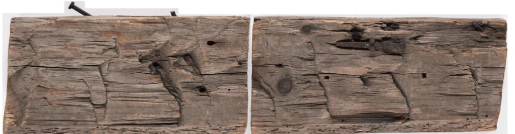
Stud sections and nails from Thoreau’s cabin at Walden Pond, a gift of Henry Seidel Canby to the Yale Collections of American Literature at the Beinecke Rare Book and Manuscript Library
Yale’s Henry David Thoreau Collection is small but intense. Of sixteen items, seven are holographs, texts written in the author’s hand. There are pencils made by Thoreau’s father, and the label for a pencil box they might have c piome in. There are a couple of surveys the author made as part of his dreaded work. And there are two pieces of wood and two nails, which are reported to come from Thoreau’s cabin at Walden Pond. They were donated by Professor Canby.
There are two documents in the Collection pertaining to the material history of Thoreau’s cabin: One is the 1932 provenance statement accompanying the wood and nails by Canby, a noted Thoreau fanboy and biographer [who was called the “dean of American literary critics” in his bio in The Saturday Review, which he founded and edited for 12 years.] The other is a 1949 essay/survey of the cabin’s post-Walden history which its authors, two then-students, Francis Shelden and G. Peter Shiras called the first “exact, authenticated history of the Thoreau hut.”
l’Ultimo Mobile, 30 October 2020, by Martino Gamper, image: Robinson Barbosa via Serpentine Galleries
It feels unusual, but it’s important to remember it was unusual times.
Enzo Mari died at 88 on October 19, 2020, and his wife, Lea Vergine, died the next day at 82, both from COVID. Hans Ulrich Obrist and Francesca Giacomelli’s major exhibition of Mari’s work had just opened, improbably, miraculously, incredulously, in the middle of the pandemic, and the beginning of the Milan Triennale, on October 17th.
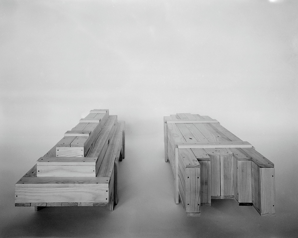
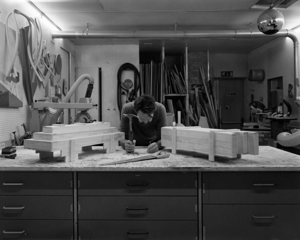
“I wanted to make something to remember his spirit, his thinking, his ideas, […] and I wanted to continue his project, the Autoprogettazione. So I made two coffins [in the style of the Autoprogettazione], as a way for me to think about Enzo and Lea’s legacy. I call them L’Ultimo Mobile, or the last furniture. It’s the idea of extending the book somehow – not just to chairs and tables and cupboards.” Gamper has made the coffins in his studio using Mari’s restrictions of 2 x 4 timber and nails, as specified in the Autoprogettazione. “Creating an object for someone you care for and love could be an interesting process for all of us,” said Gamper. “Sawing and hammering, and remembering the person.”
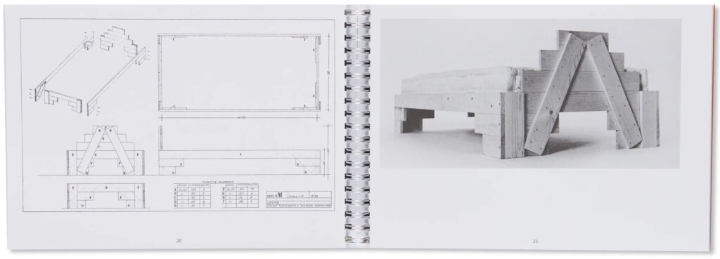
Spread from the Corraini re-edition of Autoprogettazione showing the Letto/Bed 1123 xM, as offered in Tokyo by Twelve-Books
Gamper fittingly chose one of the Autoprogettazione beds as inspiration for his coffins’ design. Robinson Barbosa’s black & white photos, too, are tributes to the stark offset printed images of Mari’s 1974 book.
Martino Gamper in his studio, having sawed and hammered, remembering Enzo Mari
What Barbosa’s photos do not show, until they do, is the actual scale of Gamper’s creations. To honor the ratio inherent in Mari’s chosen material—2×4 pine lumber—Gamper used 1×2 to make quarter-scale, tabletop caskets. In English a casket can be either a coffin or a box. In Italian, a casket/box is a cofanetto, and a casket/coffin is a bara. These are not objects of utility, but of tribute and memory, and media. Made for the ‘gram. Actually, that is all utility, too. And in the dark and weary days of October 2020, I would say these coffins, with their little feet, were serving their purpose as well as could be hoped.