Designer Enzo Mari and his wife, critic Lea Vergine, passed away one after the other in October 2020, the pre-vaccine stage of the COVID pandemic. Disegno Journal assembled a roundtable reminiscence of them, with Mari’s longtime assistant, Francesca Giacomelli; designers Martino Gamper and Corinna Sy; design historian Cat Rossi; and curators Hans Ulrich Obrist and Lorenza Baroncelli. Thanks to greg.org reader/hero Doug for sharing the transcript, which has recently been republished.
When Mari died, my regret at never sending him information about my Mari X IKEA table exploration was quickly subsumed by my outrage over the fate of his archive and studio. Mari’s archive, his research, his documentation, his journals, his vast collections, all come up many times in the extensive and fascinating discussion:
Francesca: “This archive is a complex codified diary in which Mari collected and conserved his projects and wider programme of revolutionary ideas; it is his life’s work, the essence of his research. For Mari, “The research is the design, not the product”. Now we need to rediscover those methods and ideas, preserve them, and celebrate their astonishing transformative potential.”
Hans Ulrich “Francesca has this immense knowledge and there are literally 2,000 projects or more that Enzo created during his career – she knows each of those 2,000 projects by heart. There’s no-one on the planet who knows more about Mari than her, but this idea of knowledge production was key for Enzo. He wanted design to convey knowledge and so the exhibition in that sense also has to be about producing knowledge. It would be absolutely contrary to his idea of work if the exhibition was about objects and not research.”
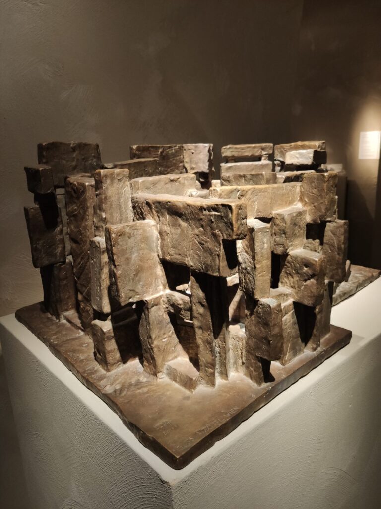
Martino “He was also a collector and had a really big knife collection, for instance. Whenever he traveled, he would buy knives. I wanted it for my Serpentine show [Martino Gamper: Design Is a State of Mind, 2014, ed.], but he wouldn’t lend it. He was an avid collector of everyday objects – a bit like Castiglioni, but actually a lot more. I don’t know what’s going to happen with his private collections. They’ve never been shown. He must have kept the knives in his house, because I never saw them in his studio.”
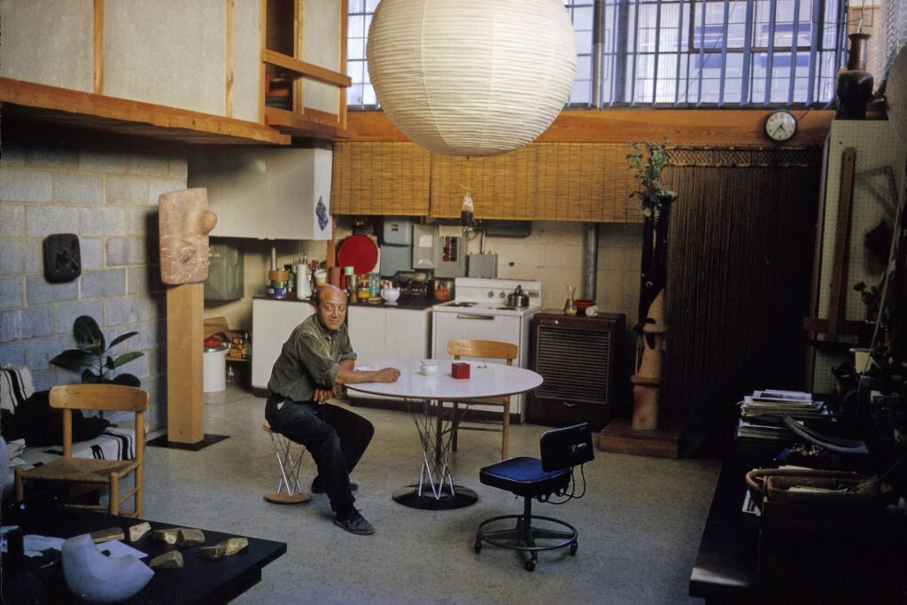
Lorenza “His studio was impressive. It’s going to be destroyed, in accordance with his wishes, but every room was devoted to a topic. One room for materials; one room for prototypes; and all the chairs were stored in the bathroom. The most interesting room was the kitchen, because that was where they produced objects. He was also obsessed with the archive, so created two books with the list of all the objects in the studio and all the documents. He gave Arabic numbers to every object and catalogued everything in those two books. This programmatic system was the basis of his work and I think is the reason why there was no difference between art and objects and graphic design – for him, it was all part of one unique path.”
Wait what? Yes, you read that right. His studio was going to be destroyed, in accordance with his wishes. And his archive, given to the City of Milan, is sealed from public view for “two generations,” forty years.
On the one hand, and it’s a big hand for me, this is basically the rest of my life. On the other hand, it just feels optimistic, maybe even a little dangerously naive, to entrust one’s legacy to a world as it will exist forty years from now. Maybe that’s the bigger hand, the non-zero possibility that society, much less the Milan municipal government, will not be around to open the Mari box in 2060. Between Francesca and Hans Ulrich, can we not crack this open a little sooner please?
Enzo Mari was a Universe [disegnojournal, s/o designnow]