Bring your conservator! image: GSV last month, slightly altered
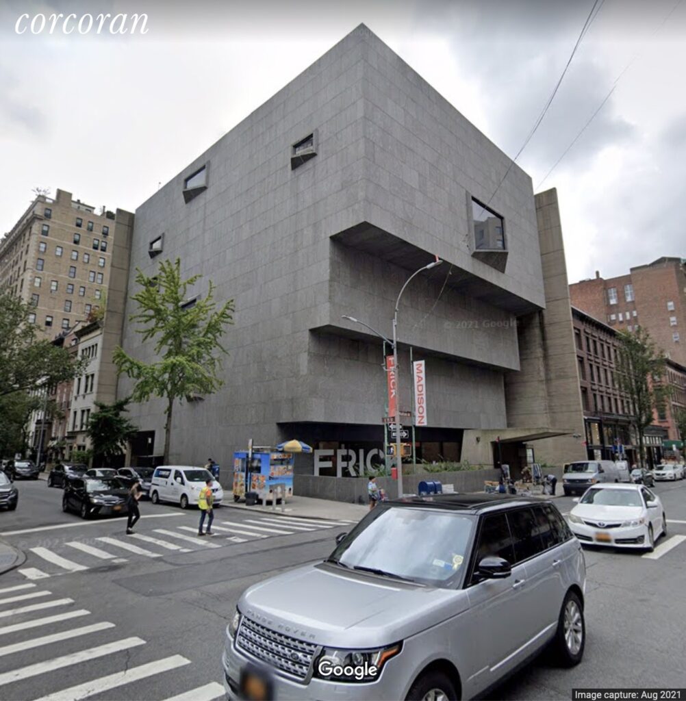
I have never been able to understand* why the Whitney hates the Whitney so much that they moved out, but they do, and they did. And now, as Katya Kazakina reports at artnet , there’s talk of selling it when the Met’s lease runs out in 2023.
[June 2023 UPDATE: They sold it to Sotheby’s, for around $100 million, a pittance for an iconic UES townhouse.]
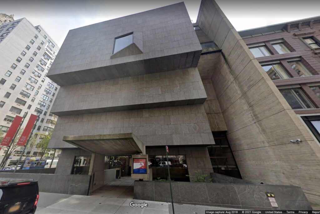
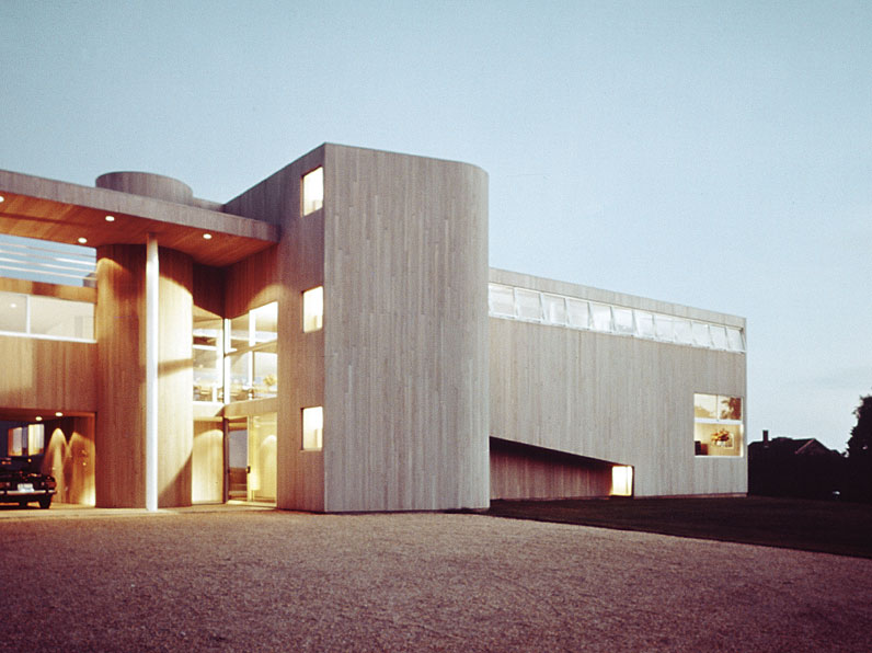
If you lived here, you’d be home now. image: GSV, 2018
Of course, there was talk of selling the building in 2008, too, when the plan to build in the Meatpacking District was a thing. Those rumors were floated and batted down immediately, but also repeatedly, in the Times. Now, with the Met a mess and not exercising the purchase option Kazakina reports was in their original 8-year lease, and the Frick just subletting while its own building is renovated, the question is no longer, “Is it for sale?” but “How much could they get, and who would buy it?” [Or as Kazakina actually put it, “Now, the multi-million-dollar question is: If the building is sold, can it be developed?”]
my 2008 shoutout to Elmgreen & Dragset the first/last time the Whitney went on the whisper market
Kazakina’s list of hypothetical buyers includes a random country, Sotheby’s new owner Patrick Drahi, a future Larry Gagosian foundation, or a condo tower developer** who’d want to turn Marcel Breuer’s museum into “a really ritzy gym.” Which is all well and good–or spiraling levels of cringe, depending, obv–but which also misses the most obvious solution: turn Breuer’s Whitney into a house.
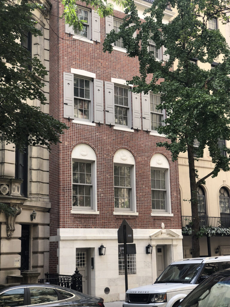
This house at 12 East 82nd Street has excellent and uncommon brickwork.
I made a quick trip to see Cady Noland’s exhibition at Galerie Buchholz on Saturday, but let’s talk about this brick facade across the street?
I’d feel worse about never in my life noticing the extraordinary brickwork if it had been discussed by literally anyone else outside of the 126-page building inventory for the creation of the Metropolitan Museum Historic District, published in 1977.
[JANUARY 2022 UPDATE: MVRDV has published a report of their experience with The Mound, and their analysis of its shortcomings. It is an exhilarating and highly persuasive read, and extraordinary in its rarity; if only more architects would apply their expertise to understanding the outcomes of their designs and the failures of the processes that led to them.]
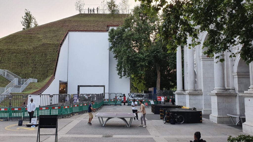
I have absolutely loved MVRDV’s Marble Arch Mound from the minute I saw it in Dan Barker’s epic tweet thread of visiting it on opening day in July. It hits every rendering vs. reality, experience economy, placemaking spectacle fail button, without costing me a farthing and without having to be my problem in any way. It is an upfront and honest disaster. And unlike some embarrassing and pointless destination stairchitecture closer to home, at least the Mound hasn’t killed anyone. Yet.
The interior of the Marble Arch Mound is finished to a very high level, but is also totally empty. image: @danbarker
A mountain of criticism has been thrown up on the Mound since, but Barker’s take still feels the clearest. He identifies the obvious things, like the cruft of fencing, garbage cans, and signage that delineate paid-access public space; and the nakedness of a new garden draped–it must be made clear–over a scaffold, and looking like a Minecraft skin–to me, a good thing!–but inevitably doomed by comparison to the lush renderings. He points to the complete absence of the promised interior program of a cafe and light installation: was it unfinished, abandoned, or still waiting for an intern to be blamed for not pulling it together?
architect’s rendering of Marble Mound Arch, via @danbarkerReality: What should freshly draped sod look like, and would we not have called BS if MVRDV put a ping pong table in their rendering? image: @danbarker
And he’s the first to point out what’s probably the Mound’s most significant failing: it’s too short to provide a view of anything except the buildings and construction sites surrounding it. Like so many failures in the UK these days, this one feels entirely predictable and avoidable. And yet here it is.
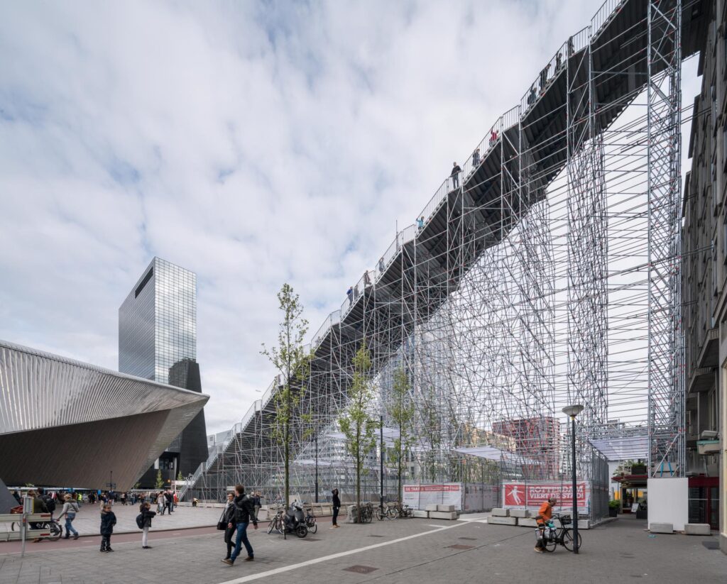
Two years before Beyoncé played Coachella, Ossip took this other photo of MVRDV’s (other) Staircase
Setting aside the obvious differences in site and program, MVRDV’s two temporary scaffold stair projects, can help see where we are, and where we came from since the Summer of 2016. The Stair to Kriterion was built to the rooftop of a building in front of Rotterdam’s central station. It evoked the city’s commemoration of post-war reconstruction and nostalgia for the long-closed movie theater at the top of the stairs. There was a cafe and an exhibit, but because it had an actual view, it was free, and packed. Though MVRDV principal Winy Maas suggested it should be permanent, it came and went as planned, in two months.
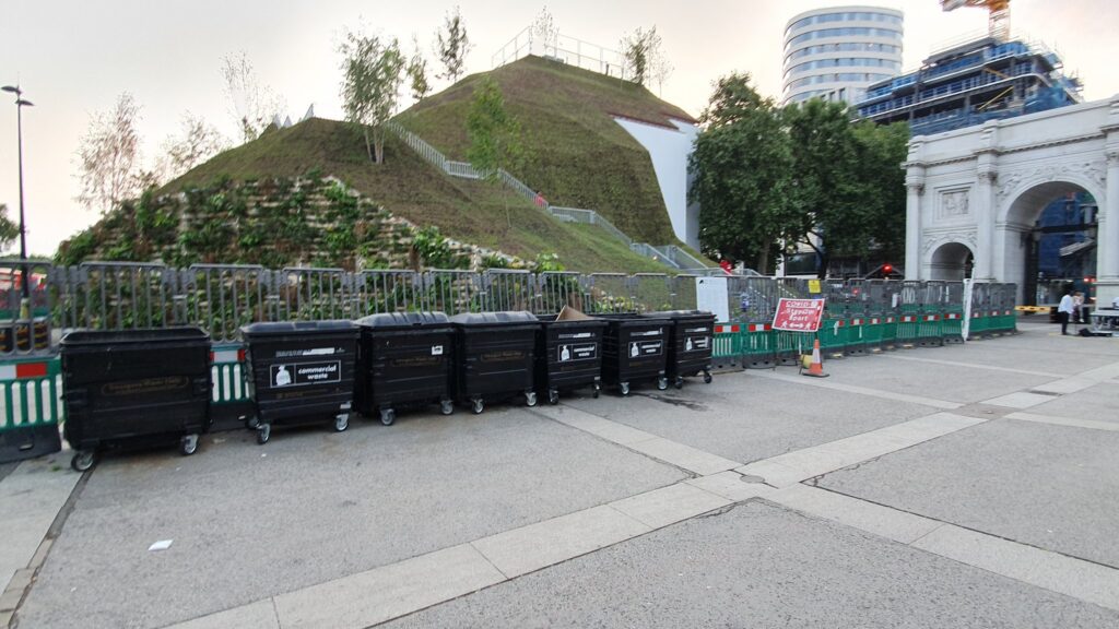
Marble Arch Mound sounds so dissatisfying it will be lucky to make it to January. At least when the leaves fall on the surrounding trees in a few months, they’ll stop blocking the view of the park. Instead of the Dutch throngs, access to the Marble Arch Mound is capped at 1,000 people/day, 25 at a time. This is the trickle of a crowd that was not only supposed to revitalize the shipping street next door, but to buy enough tickets to generate profits for Mound.
All of which was also clear on paper. The Marble Arch Mound is the transparent architectural embodiment of the cultural, corporate, and governmental institutions that brought it into being, of the strategic assumptions, values, and decision-making processes they used, and of the vision, constraints, and compromises they imposed.
Delia Gebrial’s tweet summed up the situation so succinctly, it became part of the headline for the Financial Times’ report on the Mound’s managerial failures: “I saw the marble arch mound today and honestly, i’m besotted and obsessed with how rubbish it is. it truly is a monument to 2021.”
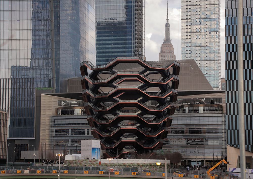
I cannot believe I have a picture of this piece of garbage on my internet website. via bloomberg/citylab
Just as the Vessel embodies Bloomberg-era New York real estate oligarchs’ compulsion for trophy spectacle, whereby an Eiffel Tower to yourself that turns out to be an ill-conceived suicide machine, the Marble Arch Mound captures this privatized, austerity-riddled, authoritarian, kakistocratic, pandemic moment in London with a truly terrible clarity. This Potemkin Village Green of a public building induces amazement and awe, at least from afar. If only it could outlive the political calamity that built it.
Jerri Hodges Bonebrake posing with a Christmas tree she created with Bruce Goff at the University of Oklahoma School of Architecture, image via ou.edu
Bruce Goff was the head of the architecture school at the University of Oklahoma from 1948 until 1955, and though her job title was secretary, Jerri Hodges was the administrative backbone and shadow student of the whole, utopian affair. The architecture school was housed under the bleachers of the football stadium, and the space and Goff’s experimental leanings meant the whole place was abuzz with unconventional techniques, materials, exhibitions, productions, and who knows what.
So maybe this Christmas tree made of a myriad of ornaments, snowflakes, and papercraft decorations suspended in space on vertical strings of beads fit right in, and it’s only us, in the future more conventional and bleaker than Goff imagined, who marvel at it. We should be lucky they even thought to take a picture. The catalogue for the 2010 Goff exhibition “Renegades” says they were doing stuff like this all the time. Also, the library’s online gallery only names her, the print version gives Hodges co-credit for the Christmas tree. [h/t @joshlipnik via @cmonstah]
Pierre Jeanneret, Office Armchair PJ-SI-28-B, India, designed c. 1955 Teak, plasticized string, nylon, aluminum, image: patrickparrish.com
I love Pierre Jeanneret’s furniture for Chandigarh, and I hate the Chandigarh Furniture Industrial Complex. I am relieved that these objects that once were abandoned for scrap are now preserved, but I hate that the cultural context is being stripped away, and that for their value and significance to be recognized, they must be removed and fed through the luxury design machinery of the West. I love seeing this furniture aging and bearing its history, and I hate seeing it stripped and restored and altered into just one more must-have for some instagram junkie to stuff into their Axel Vervoordt McMonastery.
Pierre Jeanneret & Le Corbusier, “Boomerang” Table LC/PJ-TAT-14-A, India, designed c. 1963 Teak, image: patrickparrish.com
I love this stuff, and hate that I want it, but I’ve managed to deal because it’s not like there’s any OG Chandigarh furniture left anyway. Well, Patrick Parrish just kicked the leg off my precariously balanced chair. He is currently showing a collection of pristine, original condition Jeanneret furniture from Chandigarh which has been held for twelve years, and it is utterly exquisite. Everyone who’s ever stripped and dipped a teak armchair and tossed out a horsehair cushion should immediately feel waves of remorse for their design crimes.
Now I love this furniture, and I hate that you haven’t yet sent me $1.26 million so I can buy all 66 pieces for my McMonastery.
I am linking to Patrick’s Pierre Jeanneret Online Viewing Room because it is perfect. The show is IRL until Dec. 31st. There is a book forthcoming. [patrickparrish.com] Amie Siegel’s Provenance was beautiful and devastating, but has also done nothing to stem the tide, or change the dynamic. [amiesiegel.net]
In the mid-1960s, with his arthritis acting up, and after decades of designing stage sets for the London theater, Oliver Messel began designing houses on Mustique for fancy people like Princess Margaret, the hard-partying sister to Queen Elizabeth, who’d married Messel’s nephew Antony Armstrong-Jones (aka Lord Snowdon)*.
Messel bought himself a house on Barbados, and renovated it into his Caribbean fantasy show palace with his partner of 30 years, Vagn Riis-Hansen. It would seem, by my rough calculations, at least, that Riis-Hansen spent most of that time embroidering this rug.
It is nine feet wide, and ten and a half feet long, and it is gros-point, a large-stitch needlework technique, made on four panels, each 30 inches wide. The pattern is inspired by Aubusson rugs of 18th century France.
Can you just get a pattern for making an Aubusson rug? Do you have one created after your own Aubusson and counted out? [Messel designed fabrics, scarves, and at least one unproduced Donegal carpet.] Do you stencil it onto the heavy grid of fabric that is your base? Do you complete each panel, and then stitch them together? Are they ever off by a row?
It is not that I, who have been typing on a computer for thirty years, am unfamiliar with tedious, repetitive, and precise handwork. But I am at a loss to picture Messel and Riis-Hansen entertaining the international jetset while also one of them is sewing a big-ass rug for days or nights on end. I feel like I’m missing some key details about the making of this rug.
OK, for starters, it looks like it was in Messel and Riis-Hansen’s apartment in London, which was published in Architectural Digest in 1963, and presumably photographed in 1962. It does not look new. This recap article on AD calls Riis-Hansen Messel’s lover AND manager**, since the 40s. Also, he was apparently, big, and gruff, and annoyed his in-laws and Cecil Beaton, who nicknamed him The Great Dane. And he still found time to embroider a giant carpet.
In 1978 Messel died, a year after Riis-Hansen, and Armstrong-Jones got the rug. In 2017, Armstrong-Jones died, and now anyone can get the rug, if they move in the next three days.
[update, somewhat related: In 2012 artist Matthew Smith created an exhibition and archival intervention at Nymans, the Messel family’s house to bring Messel and Riis-Hansen’s relationship into parity with the other family stories depicted at the National Trust property. (pdf)]
*Apparently Messel did not attend the 1960 wedding because he could not bring his partner. Or maybe his partner was busy sewing a massive rug. **Thinking of this while doing the dishes just now I remembered reading a memo from Walter Hopps in the Smithsonian archive of the 1976 Rauschenberg retrospective, saying that though the museum would cover the travel expenses of artists and their wives, they would not pay for Bob’s “friend.” [scare quotes in the original] Maybe if Messel and Riis-Hansen were traveling together in an era where their romantic relationship was literally a jailable offense, being a manager would offer all the explanation they’d ever need. ***Maybe this whole post is a misplaced over-reliance on one word, which feels inaccurate technically–does someone stitching a rug consider it weaving?–but which must reflect a received story, if not a history per se, of how this rug came to be, and why it was kept? Or maybe it’s just so obvious to anyone interested or involved that “woven” means “had woven,” and you’d have to be daft to entertain the notion that it should be considered literally? And what possibly could be going on in this, the approaching autumn of the Year of Our Lord 2020, that could possibly account for channeling this much mental space into the backstory of some knockoff Aubusson rug an ancient British playboy stashed away after cleaning out his gay uncles’ Barbadian retirement cottage? What, indeed.
Max Mara created the Whitney Bag in collaboration with the Whitney Museum’s architect Renzo Piano to echo the facade of the new downtown building.
The Stettheimer Collection of Whitney Bags, image: maxmara.com
To celebrate its 5th anniversary, the cult bag has been revived in a special edition version dedicated to the American painter Florine Stettheimer who boasts an important presence at the Whitney. A feminist and activist ante-litteram (1871-1944), Stettheimer’s work “Sun”, created in 1931, inspired the bag’s five new color variants and the design of the floral printed lining. [via]
Nevertheless when she needed a Whitney Bag to carry a bible across a tear-gassed public park for her father’s photo opp, Ivanka chose white.
Ivanka chose white. image detail: doug mills/nyt
Because of course it is, the tear gas police fired to clear peaceful protestors out of the park was manufactured by Defense Technologies, which is owned by ex-Whitney trustee Warren Kanders.
Just imagining a double portrait here. Superflex’s AlUla piece photographed by @colinjr
I have not yet heard from anyone who declined to participate in Desert X Al Ula, but I’ve started seeing reports from people who did. I would have said that the exhibition and all the spectacular work in spectacular scenery was taking place right where it had been planned all along: in the #desertxalula hashtag. But then I saw a slideshow of the artworks from a new instagram account, saudiarabianholiday, which promotes the same as a hashtag, but their link-in-bio is to an unfinished website registered two weeks ago to an anonymous tour packager run out of an Irish coworking space. The point of Desert X Al Ula is to turn Saudi Arabia into an international tourist destination.
While scrolling and marveling at the budget for the Desert X installations, I idly considered what project I would execute [sic] in the stark sandstone cliffs. I decided I would recreate the Buddhas of Bamiyan. Tinted shotcrete over foam block, how hard could it be?
Then I saw the post from @colinjr, a California real estate photographer who was attending the Desert X press/influencer junket. He captured fellow Desert X photographer Lance Gerber and their Saudi driver sharing a moment swinging on a tandem swing. It was Superflex’s contribution to the show, a multilevel swingset sculpture titled, One, Two, Three, Swing!, one of several elements from the group’s 2017 project that began in the Tate Turbine Hall and have since expanded to sites around the world.
I imagined MBS and Neville Wakefield sharing a similar moment, sitting next to each other, working together, in sync, on a common goal of an experience, toward a common spectacular end. And I marveled at the simplicity of the gesture, and the symbolic power with which Superflex captured the spirit of the entire exhibition enterprise. Superflex told people that by using the three-seat swings, they would set the orange line over their heads in motion and potentially change the trajectory of the planet. And it must be working; I do feel like a shift is happening. I apologize for ever doubting them.
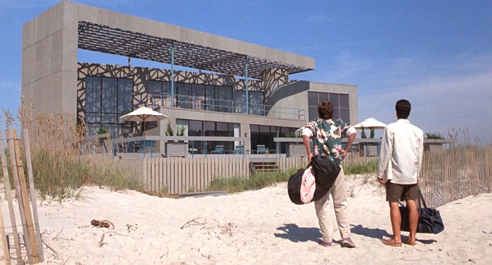
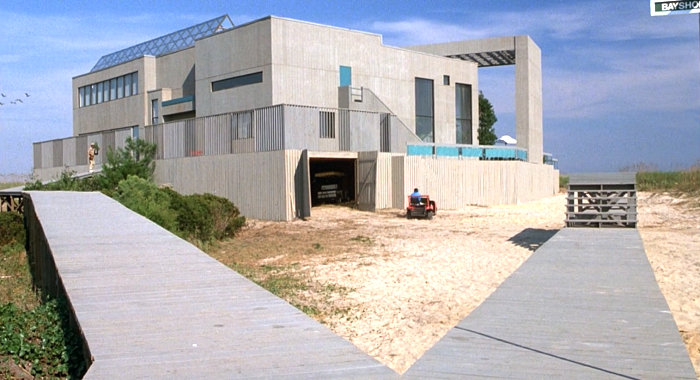
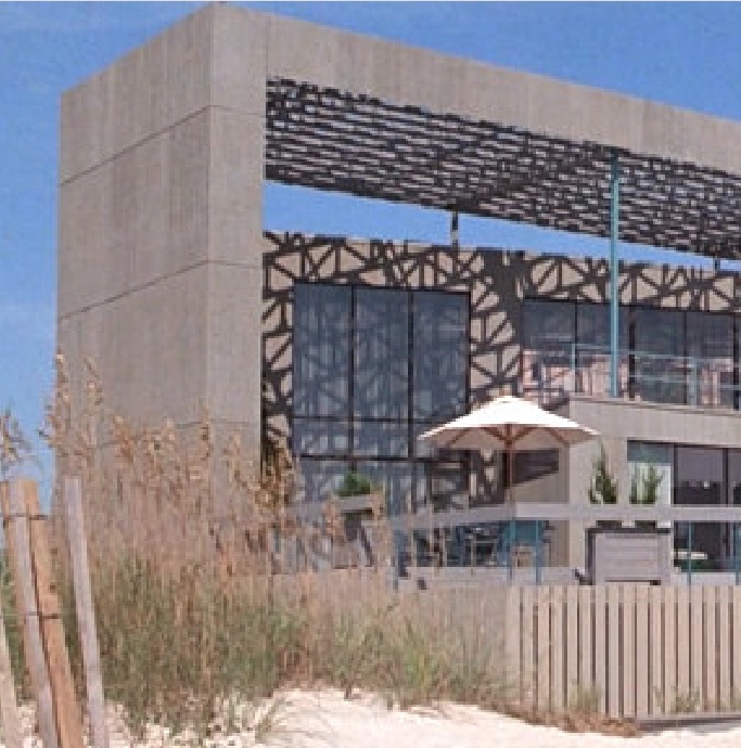
Gwathmey? Or just Gwathmey-esque? Weekend at Bernie’s (1989, dir. Ted Kotcheff), all screencaps via Mirror80
I confess I have never seen Weekend at Bernie’s 1 OR 2, but I knew the general concept from the trailer. What I did not know was that it was supposed to be based in a fictional Hampton called Hamptons Island.
And that the beach house of Bernie Lomax, the corrupt insurance CEO of the title, was actually built for the shoot in North Carolina, near a state park on Bald Head Island, a golf cart-based village south of Wilmington, and that it was torn down after production ended.
And if the commenter at retro styleblog Mirror80 is to be believed, Bernie Lomax’s house was DESIGNED FOR THE FILM BY GWATHMEY SIEGEL.
Which would make it the greatest Hamptons-related pop-up architecture since Calvin Klein’s full-scale plywood beach house maquettes. [Yes, technically, Bernie’s came before Calvin’s. But NOT before Calvin’s Gwathmey. (Didn’t Gwathmey do Calvin’s old barn house?]
Now that I mention it, the freestanding wall holding up that giant brise-soleil (does this have a name?) on Bernie’s house does look like it’s made of 4×8 plywood sheets. I’d be surprised if the house was much more complete than an actual set. How did this making of story not get told before now?
Commenter Evan says Bernie’s house was based on the 1970-2 Cogan House (above), but there are similarities as well to the François de Menil House (1979) (below), both in East Hampton. The de Menil house is now owned, of course, by Larry Gagosian.
I’ve scanned the production credits and cannot find any obvious explanation for Gwathmey-Siegel’s involvement. [There are other puzzles in the movie’s production design, which were the impetus for discovering the architecture, that will be addressed later.] One seemingly clear inspo, though, is Oliver Stone’s Wall Street, which came out two years before. The crooked villain in that film, Gordon Gekko, also famously lived in an oceanfront Gwathmey-Siegel house in the Hamptons. The location for that was the Steel House II (1968) in Bridgehampton, which by then had been significantly remodeled.
At first I thought Wall Street might have put a chill on the Gwathmey villain’s lair location scouting business, but it’s more likely that building a temporary Gwathmey set in North Carolina was still cheaper than shooting an entire film in the Hamptons.
[MORNING AFTER UPDATE: OK, I have seen scrubbed through the movie which is–and I cannot emphasize this enough–wacked out garbage from beginning to end. The house has basically the one finished interior space. There is a two-second shot of a Roy Lichtenstein painting which has nothing to do with anything else, artistically or spatially. And Lichtenstein is thanked in the credits. (This was the original hook for even thinking about this movie, btw.) If Gwathmey Siegel were actually involved in this, it has to be because someone on the production’s cousin worked there one summer. Nevertheless, I’ve put out some queries.]
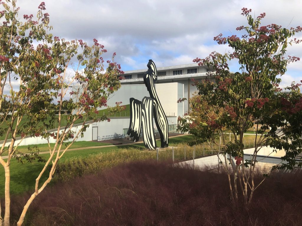
My initial impression of the Kennedy Center’s The Reach is obliqueness. It is in a triangle of land carved by a parkway and on-ramps and a bridge, from which it is hard to see. I finally made a visit this morning after multiple failed, drive-by attempts to photograph this new installation of Untitled (Trudeau Trump Brushstroke). This perfectly framed and backdropped view is the only one, and it is in the intersection of a The Reach sidewalk and a commuter bike path.
Mike Kelley and Fred Tomaselli on loan from Glenstone at The Reach
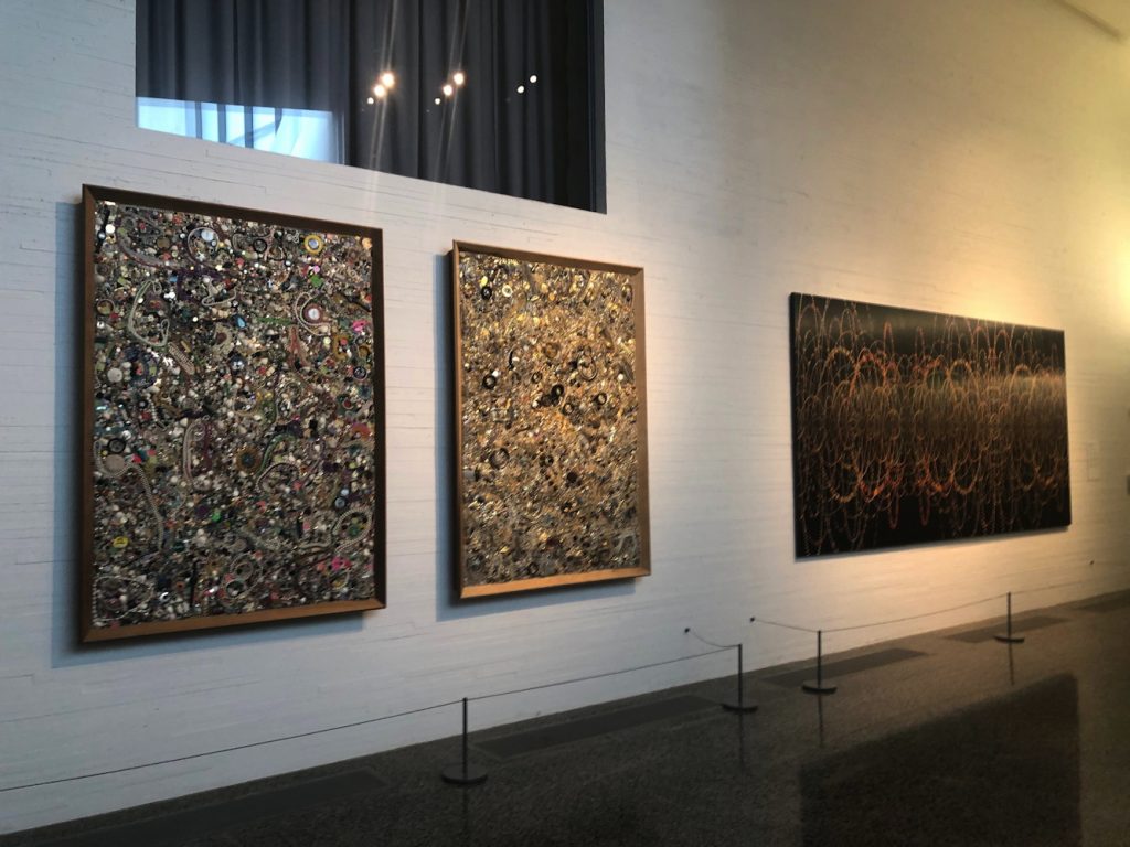
The art at The Reach is on loan. I did not check where the big, blue Joel Shapiro came from, but except for the large, 1969 Sam Gilliam painting, which is from the artist himself, most of the work inside comes from Glenstone. In lieu, it looks like, of a lot of money. David M. Rubinstein, meanwhile, has given more money than even Boeing, and loaned James Madison’s copy of W. J. Stone’s 1823 facsimile etching of the Declaration of Independence (ed. 201, of which around 50 survive, apparently.)
Glenn Ligon neon on loan from Glenstone
Faith Ringgold painting on loan from Glenstone
Boeing also sponsored the exhibition of George W. Bush’s paintings of Iraq War veterans, the billboard for which is not easily visible from the nearby roads. Maybe if you’re stuck in traffic. I did see the show, and will write about it separately.
Other thoughts of The Reach: I felt some spatial echoes with Holl’s ICA at VCU, especially in some peekaboo vistas and the dramatic staircase.
Perhaps this awning rainspout is designed to arc perfectly into the pond and not splash onto the ledge instead?
shattered glass at The Reach, presumably under warranty
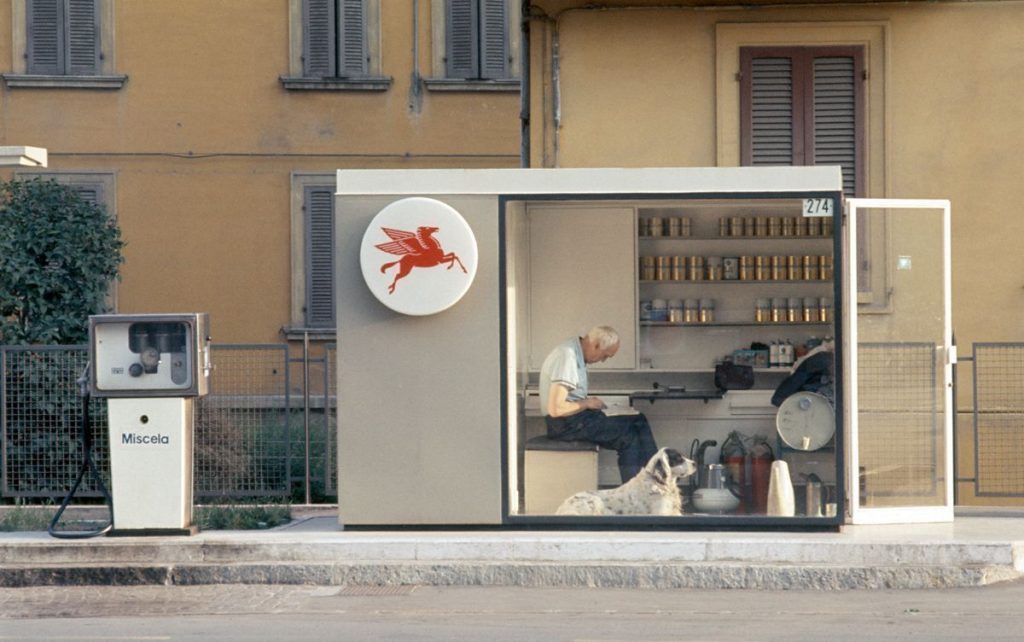
This special Tiny House episode of Gas Stations I Want To Live In is brought to you by the Reina Sofia and the Jeu de Paume, who have both showed Luigi Ghirri retrospectives in the last month.
When I figure out the architect of this gem I will update the post.
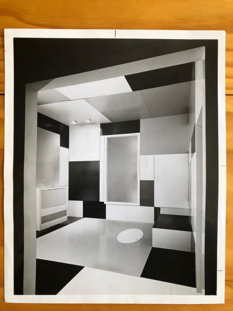
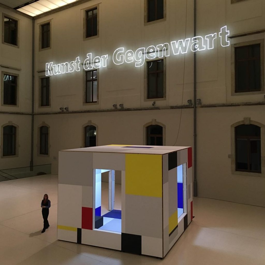
Piet Mondrian, Colour Design for the Salon of Ida Bienert, 1926, image via e-flux for albertinum
As soon as the e-flux header gif started flashing I knew what Heimo Zobernig was up to in Dresden:
In the Albertinum he is presenting a selection of recent paintings from this series as well as a new spatial installation in the atrium. The basis for this work consists of design drawings produced by Piet Mondrian in 1926 for a room in the home of the Dresden art collector Ida Bienert, which are on view in the exhibition entitled “Visionary Spaces” in the Albertinum. Whereas Mondrian’s design was never actually implemented, Zobernig’s installation in the original dimensions of that room can be entered and experienced as a cubic sculpture.
Yes, but what? Never realized? Never realized in Frau Bienert’s Haus, maybe.
In 1970, Pace Gallery produced a full-scale version what was then known as Salon for Madame B. based on the sketch above, which they purchased from Mondrian’s friend and heir Harry Holtzman. The room was constructed in spectroscopically color-matched Formica by the American Cyanamid Corporation, which simultaneously launched “The Mondrian Collection” of Formica. After its commercial debut in New York, Mondrian’s Formica Room traveled to Chicago, where it went on view at the Art Institute.
1970 photo of Piet Mondrian’s Salon for Madame B., as realized by Pace Gallery and the Formica Corporation
Six years ago I found a vintage photo of Mondrian’s Room, and I tried tracking it down, to see if it still existed. Pace was singularly unhelpful with even the most basic information, so I dropped it. But it has be out there somewhere; Formica is plastic, and we know how long that sticks around. In the mean time, there’s a new version in Dresden, so project usurped, if not mystery solved.
installation view of Heimo Zobernig’s Piet Mondrian: a spatial appropriation, 2019, at the Albertinum in Dresden, image: @mariahuberpod
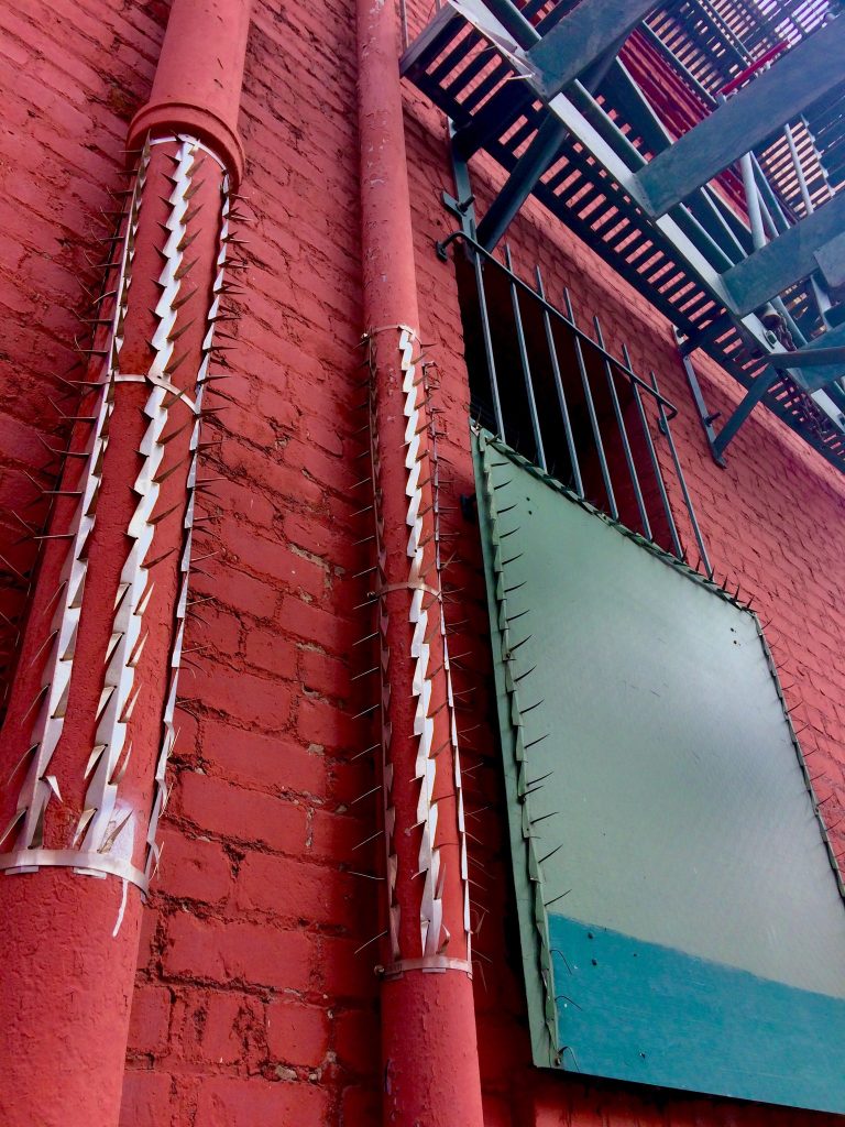
Untitled Palermo (South Park), 2019, enamel and latex on wood and steel, enamel and steel on cast iron and brick, installation image by Bryan Finoki, aka @subtopes
When he first tweeted this photo from San Francisco, Bryan Finoki saw #fortressurbanism. I saw metal af Blinky with a Melvin Edwards twist.
Untitled, Palermo, 1970 image ganked from wherever (it is not so easy to tell in this jpg, there are actually three bands of green. hashtag metadata, but I can’t tell if this is a different work from the Untitled, 1968, belonging to Grand Duc Jean)
My principled stand against buffing is not softening, and I don’t condone it, but I can’t not appreciate the occasional aesthetic results. Until I’m able to source the exact anti-climbing spike strips in this installation, to see this work you’ll have to go–or google your way–to 2nd & Brannan streets.
Which is fine. Palermo was very into site specifics, which I can appreciate. The painted wall and pipes here feel especially significant.
I’ve recently been taking a long look at the work of Sam Gilliam. There was one drape installation he made in the 1970s at a gallery, and when he reinstalled the piece in a museum, he added a vertical beam to stand in for the gallery’s steam riser. I think this painting, though standalone, would benefit from a similar treatment [chef’s finger kiss emoji].
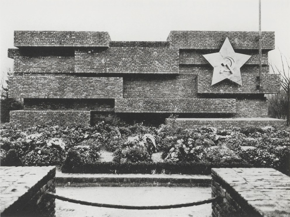
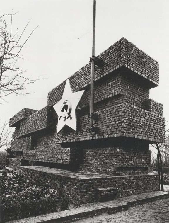
Mies van der Rohe, Revolutionsdenkmal, Berlin, 1926 (destroyed 1935), photo by Arthur Köstler via thecharnelhouse
It is the 100th anniversary of the execution of Rosa Luxemburg and Karl Liebknecht by the fascist Freikorps in Berlin. After several years of unsuccessful attempts, a memorial to these and others killed in the German phalanx of the Bolshevik Revolution was finally built in Berlin’s central cemetery in 1926. It was designed by Mies van der Rohe with the sculptor Herbert Garbe.
According to Edward Fuchs, who was instrumental to the project, Mies said, “As most of these people were shot in front of a brick wall, a brick wall would be what I would build as a monument.”
Mies van der Rohe, Revolutionsdenkmal, Berlin, 1926 (destroyed 1935), photo by Arthur Köstler via thecharnelhouse
At the Charnel House from whence these images come, Ross Wolfe notes that the jagged bricks of the memorial “had been assembled from the bullet-riddled remains of buildings damaged or destroyed during the Spartacist uprising” Luxemburg and Liebknecht triggered. It became an iconic backdrop for speeches, and the site was the focus of annual memorial marches and rallies until the Nazis destroyed the memorial in 1935.
Wolfe also traces some of Mies’ political shifts, from Bolshevik memorial designer to apolitical pragmatist Bauhaus head as the Nazis came to power, to whatever he was in the US. But wait, there’s more! Mies was also the favored architectural visionary and mentor to America’s own greatest Nazi architect Philip Johnson. He got called before McCarthy’s House Un-American Activities Committee in 1951. And he rejected student efforts to rebuild the memorial in 1968, and got protested when his Neu Nationalgalerie opened in Berlin.
I guess I would like to see it rebuilt, bust mostly I’d like to live in it, which is complicated, I know. In the mean time, I will try to find Mies’s HUAC testimony, which seems rather underdocumented onlne.