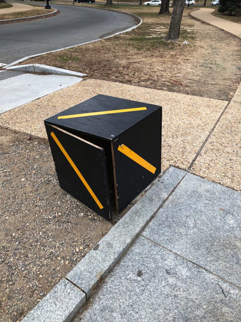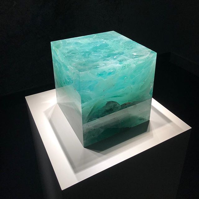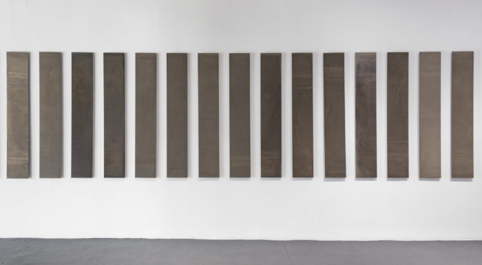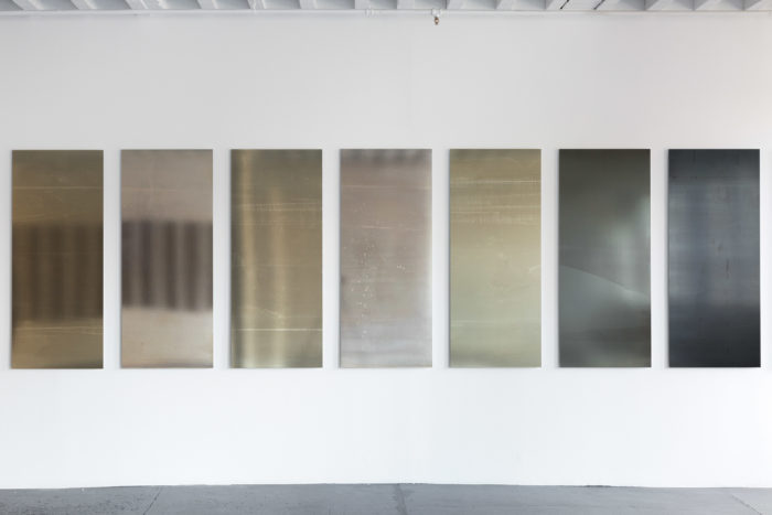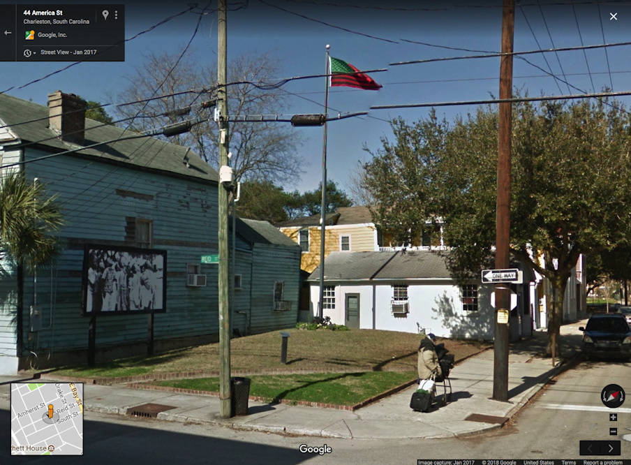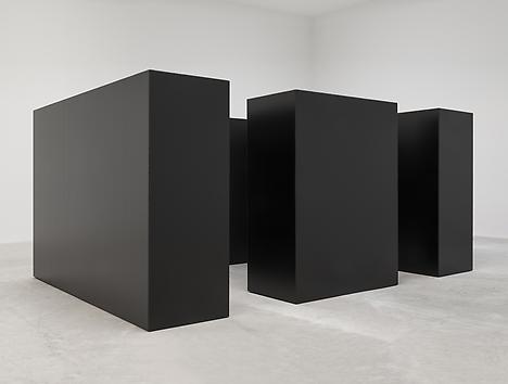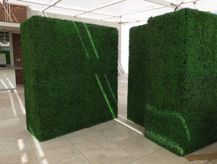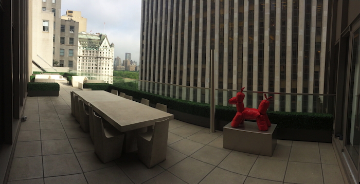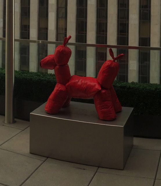
Untitled (Newport Center Monument), 2017

gregorg_untitled_fashion_island_2_nm.jpg
Untitled (Newport Center Monument) IV, 2017, 72 or 84-in. x 108 or 156 in. by 12 in., Ruddy Oak and Bright White on panels, installation image: gmaps
In 2011 The Irvine Company installed two identical monument signs in the grassy quarter-rounds on the East Coast Highway entrance of Fashion Island and Newport Center. They feature the names of three major tenants each, on both sides. Seven feet tall and 13 feet wide, they exceed the maximum dimensions (6′ x 9′) permitted under the Sign Standards of the Newport Beach Zoning Code, and required a variance. [In person the other day, I would never have guessed they were 7×13; they definitely feel like 6×9. Is it possible they were reduced in size after the permit was granted?]
gregorg_untitled_fashion_island_1_macys.jpg
Untitled (Newport Center Monument) III, 2017, 72 or 84-in. x 108 or 156 in. by 12 in., Ruddy Oak and Bright White on panels, installation image: gmaps
Though they also exceed the Code’s letter size limits, the signs comply with the requirement that letters be “individually fabricated” and of high contrast for easy legibility. At least at their genesis, they were specified to be finished with Reflective Coating #1460 Bright White from Axon Aerospace, Inc.
dunn_edwards_ruddy_oak_newport_ctr.jpg
No aesthetic delectation here, Ruddy Oak! hashtag Spanish-Mediterranean, hashtag Craftsman, hashtag Perfect Palette®, image: dunnedwards.com
The 2011 permit application [pdf] describes the new signs as having “a faux plaster finish,” but they sure looked painted to me. They match the color specified on plans [pdf] for a similar sign for an adjacent Irvine Company office building: a reddish brown from a local manufacturer, Dunn-Edwards Ruddy Oak (DE5188).
I can find no public record of this color being specified or required in either Newport Beach or Irvine Company codes or styleguides, but it is in heavy use for shopping center and commercial signs within the boundaries of The Irvine Ranch. It also appears on the permitted color lists of at least eight homeowners associations (HOA) in coastal Southern California.
gregorg_untitled_fashion_island_towers.jpg
Untitled (Newport Center Monument) I, II, 2017, 43 x 4 ft each, Ruddy Oak and Bright White on substrate, installation image: gmaps
They also match the color and finish of the main signs at the East Coast Highway entrance, a pair of 43-foot-tall pylons installed in 1985. Which is also the first year The Irvine Company used the “sunwave” logo. Over time the text on the signs has changed to reflect the evolving brand distinctions between Newport Center, a massive, multi-use development, and Fashion Island, the vast mall at its center.
For their part, the Newport Center signs also exceed the 20′ height limit for pylon signs by 115%, but I presume they predated the creation of the code, and/or that no one will tell The Irvine Company what it can’t do in Newport Beach. Their letters are individually fabricated.
There are at least eleven other signs at other entrances to Fashion Island/Newport Center, but they’re more architectural than sculptural, with concrete plinths and stucco-finished capitals. Only the four signs on the ECH exhibit this rigorous, minimalist aspect.
gregorg_untitled_fashion_island_install.jpg
[l. to r.] Untitled (Newport Center Monument) III, I, II & IV, 2017, installation view, image: gmaps
Fashion Island was and remains a leader in the mall industry for experiential design. In an essay called, “The Archaeology of ‘Shoppertainment,'” Matthew Cochran and Paul Mullins wrote about RTKL/ ID8, a mall interior design company which worked on the Fashion Island Experience. They quote an RTKL brochure:

[Mall experience is] about storytelling. Great places tell stories, and people love to find themselves in those stories. Often this has less to do with the way a building or a district is assembled and more to do with how we read it…Experience is in the details. If a place tells a story, then the details of that place make the story interesting. The smallest elements-from manhole coves to water features-conspire to create a dynamic, authentically human environment.

What story do these signs tell? What authenticity do they conspire to create, with their approved colors from a gated community on a bluff? Can the gestalt of the minimalist object be achieved from your car, at speed, as you pass the mall, or do you have to turn in?
This ID8 quote, too, turns out to have more to do with how I read it:

What makes us linger, pause, sit and think? The building blocks of place probably have less to do with the buildings and more to do with the spaces between those buildings.

In 2002, the day they flipped the switch, architect Gustavo Bonevardi explained how he and John Bennett arrived at their solution for what became the Tribute of Light World Trade Center memorial:

We’re not reconstructing the towers in their original size, but the distance between the two squares of light is the same as the distance between the actual towers. So in effect, we’re not rebuilding the towers themselves, but the void between them.

Because I cannot look at the Newport Center signs, and their proportions, and their void, and not see the World Trade Center.
But maybe that’s just me. I invite you to visit, view, linger, think, and pause at this installation of new work and pursue your own authentic, dynamic, human experience.
Previously, unexpectedly related, c. 2002: On reading (between) the lines
On’s Location

1971: The Year In Andirons

wh_vermeil_room_andirons_1992_phillips-schrock_loc.jpg
The Vermeil Room in the White House as redecorated by Pat Nixon’s plumbers, photo c.1992, LOC via Phillips-Schrock
The White House needed renovation and redecoration, and the Nixons were determined to put their mark on the place. By 1969, the French interiors commissioned by Jacqueline Kennedy were worn from use. Also they were detested by politicals as reminders of a martyred rival. H.R. Haldeman and new White House curator Clement Conger set out on an aggressive fundraising effort to remake the White House and its collections, a campaign publicly led by the First Lady Pat Nixon. The period room-style appearance of the White House to this day largely reflects Mrs Nixon & co’s work.
Based on my Google Books previews of it, this story of “the Dismantling of Camelot” is meticulously told by Patrick Phillips-Schrock in his 2016 book, The Nixon White House Redecoration and Acquisition Program: An Illustrated History.
wh_vermeil-room-kennedy_blue_1964.jpg
Vermeil Room a la Boudin, c. 1964, image: whitehousemuseum.org
Phillips-Schrock’s account of the 1971 redecoration of the Vermeil Room on the ground floor of the White House is representative. From a caption of a photo of Boudin’s Kennedy-era design: “The room was expensively finished in painted surfaces in blue and white with vitrines lined in white silk. Conger found it offensively French…” [p.74]
From an interview with Conger: “What we have done in ‘face-lifting’ the Vermeil Room is to change the room from a very dark blue–which is rather depressing–to a light green-gray, the appropriate color as the background for vermeil, which is gold. You use blue with silver, but never such a dark blue!” [p.76]
The room was reconceived as an early 19th century sitting room, with a table at the center “attributed to the workshop of Duncan Phyfe, it was on loan until a donor could be found to purchase it.”

An 18th century lighting fixture in crystal with 10 lights replaced the Kennedy chandelier of bronze and blue tole. Further lighting was supplied by four matching sconces and by two candlesticks given by Mrs. Marjorie Meriwether [sic] Post, which were placed on the mantel. The fine Louis XVI marble fireplace was acquired and installed in 1962. [not too offensively French, I guess. -g.o] Within the firebox were a pair of valuable brass andirons, obtained from Israel Sack of New York. When the room was opened to the public, Conger related, “These are American andirons, so called ‘in the Paul Revere Manner’ with the flame and diamond lozenge–except they are a little more petite and narrow than the heavier ones of this same design one generally sees.” [p. 77]

The andirons abide.
wh_vermeil-room-2008-cspan_andirons.jpg
American Andirons in the Vermeil Room, c.2008, image: CSPAN via whitehousemuseum.org
I mention this because I just googled across it. And because 1971 was a busy year for well-provenanced, Paul Revere-ish andirons. It was the same year Mrs. Giles Whiting bequeathed her Paul Revere (Attributed) andirons to the Metropolitan Museum. Interestingly, Mrs. Whiting’s Revere-ian andirons did not have a diamond and flame, but an urn and flame finial. Actually, I don’t know if that’s really interesting at all. Maybe what’s interesting about andirons is not the things themselves, but the complicated narratives into which they are enlisted.
untitled_andiron_attr_met.jpg
Previously, related: Untitled (Andiron Attributed To Paul Revere Jr.), 2014 [greg.org]

The Thousand Year Box

How quickly can turn the winds of history.

peter_marino_hoods_artspace.jpg
screencap: artspace


In August Artspace published an interview celebrating self-styled “art architect” Peter Marino. The “Dark Prince of Luxury,” who has become the architecture dom to the world’s wealthiest people and brands, told Andrew Goldstein the secrets of his success and career ascent in the New York of Skidmore, Owings & Merrill and Warhol’s Factory.

[AG:] It would seem trauma is an excellent crucible for talent.
[PM:] It really is. If you just lead your normal, banal life you don’t get enough fried brain cells to be an artist. [Laughs]

And of fortuitous meetings with future clients like the refugees Marella and Gianni Agnelli:

Everyone from Europe was coming to New York to see the art scene. And it was a double whammy. The kids today don’t remember the violence of the Red Brigades in Italy, but the communists were this close to overrunning the whole country. So all the cultured, wealthy, sophisticated people came to New York. It was a very frightening moment.
And they all needed a place to stay.
And they all needed places to stay in New York.
Enter Peter Marino.
Right place, right time.

Part 2 of the interview ended with his wishes for his legacy:

I’d like to think that my architecture really expressed the times in which we lived, or helped define the time in which we lived. Because, for me, that’s one of the definitions of great art…So, I try so hard in the stores I do, in the homes I do, to make it so that if you took this compendium of my work, it would express the time in which we live.

In this, alas, I have no doubt that Marino has succeeded. Whether it’s nine-figure flagships for Chanel or similarly costly New York collector townhouse renos, and estates for “rogue Mexican bond traders,” Marino’s work embodies the defining spirit of our age: immense wealth expended on limitless craft and luxury for the pleasure of a tiny few.

Continue reading “The Thousand Year Box”

A Memorial To The Border Between The United States Of America And Mexico

alexis_madrigal_border_wall.jpg
image via @alexismadrigal
I haven’t been, but I feel like I’m very familiar with the border wall that extends into the sea between the US and Mexico.
Several artists have made projects around it, including using it as a volleyball net, or painting one side of it. It’s telling that the Berlin Wall was also painted, on the free side, or rather, on the side that did not erect the wall. Israel’s wall in the occupied West Bank is painted in that direction, too.
Anyway, when I saw Alexis Madrigal’s photo of the border wall built in the ocean, I thought what I always thought: it’s as cool as it is terrible. [I think Madrigal was attending #RiseUpAsOne, concert/festival sponsored by Fusion at Friendship Park on the US side.]
When the political divisions currently ripping the US apart, and the political, cultural, racial, security, and economic differences between the US and our neighbor get sorted out, and our terrified, weaponized national border stance eases, I hope that this section of the wall will stay and become a memorial.

Untitled (The Four Seasons), 2016

four_seasons_pool_room_palms_pgoldberger.jpg
Untitled (The Four Seasons), 2016, four bronze Philip Johnson planters and 16 trees, in seasonal rotation. image: Paul Goldberger
Paul Goldberger tweeted this photo of an emptied out Four Seasons, and now I want those potted palm trees more than anything in the 14-hour auction I sat through the other day&night [online, obv, but I stayed until the checks arrived].
Four-Seasons-Spring-Pool-Room_wright_t2burn.jpg
The Pool Room in spring, via wright20
Those planters canNOT be landmarked, can they? The trees certainly can’t be; they change(d) with the seasons. OTOH, given the merch they unloaded, the only way they wouldn’t have sold the planters is if they were landmarked. So Selldorf, Rosen & those food guys will keep them. Will they rotate their trees too, keeping a signature of the restaurant they booted planted squarely in the center of their new joint? We shall see.

Tantas Sombras

la_sombra_margolles_1_cmiranda_lat.jpg
Teresa Margolles’ La Sombra, installed at Echo Park Lake, photo: Carolina Miranda/LAT
Teresa Margolles has contributed a memorial to Current: LA Water, the “public art biennial,” which started last week. La Sombra (The Shade) is near Echo Park Lake and looks to be the most significant and prominent work in the program, which runs, incredibly, for less than a month.
La Sombra is a six meter-high…pavilion? Awning? Structure? In her onsite report for the LA Times, Carolina Miranda calls it an installation, a memorial, and a monument. It looks like it’s made of concrete, but if it’s going to disappear in a couple of weeks, I suspect it’s gunnite or stucco sprayed on a plywood box.
Which hurts. Margolles created La Sombra as a memorial to 100 Los Angelenos murdered with guns in the last 18 months. The sites of these killings were visited, washed, and the water re-collected for use in mixing the concrete. This circulatory element echoes Margolles’ previous works which incorporate the water used to wash corpses in the morgue in her home city of Juarez.
La Sombra is a stark, powerful form that draws people to it, especially on a hot, sunny day. In this way, perhaps, the deaths of these hundred people might yield some comfort to the living. Maybe family and friends can come sit under it. Maybe people will be motivated to act against gun-related violence.
“I wanted [La Sombra] to be on the scale of what has happened,” says Margolles in the Times. “I wanted it to have presence.”
judd_chinati_concrete_wiki.jpg
Donald Judd, One of 15 Untitled Works in Concrete, 1980-84, 2.5m x 2.5m x 5m, Chinati Foundation, image via wiki
The scale and presence of La Sombra are indeed notable. It seems quite large. It looks like it could be concrete-Judd-in-Marfa-fields-size, but it is actually 4x that. It has an architectural presence and is not slight. It feels like about the right scale for 100 people. Maybe it is even the size of 100 people standing within it, I don’t know.
Memorials use scale to convey their meaning. Some memorials, like for the people killed in the Oklahoma City bombing and the AA77 crash at the Pentagon, use a cemetery-like field of individual-scale objects-chairs and benches, respectively-to represent the dead. The Vietnam Veterans Memorial and the World Trade Center Memorial, meanwhile, incorporate individual names into a larger, holistic experience of loss. nodding to a larger, shared sense of mourning, of a community, a nation. It really depends on the scale of death, whether it is thousands (58,195 or 2,977), hundreds (168 or 184), or one.
By remembering 100 otherwise unrelated deaths with one La Sombra, Margolles appears to have found a new scale for memorialization: a memorial unit that modulates between societal tragedy and individual loss. [I just remembered that the Pentagon Memorial actually called the benches “memorial units”.]
There were not just 100 people killed in LA with guns in the 18 months Margolles bracketed; there were 975. Even if it was just because of the prohibitive the logistics of washing down all those murder sites, the artist knew her temporary memorial alone could not account for that “scale of what has happened.” She’d need nine more La Sombras, just in LA. With an average of 55 people being killed each month, that’s another La Sombras every two months.
judd_chinati_concrete_4.jpg
Imagine these 3-meter tall Judd concrete sculptures at Chinati are actually 6-meter tall Margolles La Sombras, each commemorating 100 people killed with guns. image: chinati.org
And now scale them up. There are 30,000 gun deaths in the US-half a Vietnam War or ten September 11ths-each year. Margolles’ La Sombra could be the optimal form and size for memorializing the people killed by gun violence across the country. But some details would need to be worked out. How far back in time do we go? We could need thousands of La Sombras right from the start. Seems impractical, at least at first.
Where should they be placed? Do we combine them all into one sprawling site, like an AIDS Quilt of concrete, an ever-growing Holocaust Memorial for a slaughter we refuse to stop? I think a La Sombra site could take into account the hundred people it memorializes within a city or perhaps a state, without getting too granular with your data; you wouldn’t want them to pile up and stigmatize a neighborhood, though having a few together could totally work.
Spread them out at least a bit. Though maybe a city or state could decide to stack them up in a public space, magnify their presence, so the absence of the dead can’t be ignored. Of course, you’d also want to avoid gamifying them, having them treated as kills to be racked up by violent forces in society, or even just a run-of-the-mill gun-toting psychokiller. They need to stay present in the landscape, but also just ominous and uncomfortable enough to prick the consciences of we who remain.
An artist’s imposing new monument at Echo Park Lake honors Angelenos killed in violent crimes [latimes]
Current: LA Water, LA’s Public Art Biennial, runs through August 14. [currentla.org]

Au Bout De La Nuit

Isa_Genzken_Glass_House_2015.jpg
Isa Genzken’s World Receiver in “Night” at The Glass House, image: Amanda Kirkpatrick

I was talking to a friend who recently got his first work by Isa Genzken, a World Receiver, (which really is the best first Genzken to get, and the third, and the seventh-they look great alone or in groups!) and it reminded me of one of the best installations ever of the radio-shaped cast concrete sculptures. Last fall a World Receiver was the last work in a fascinating 3-year exhibition called “Night”, which took place on the coffee table in Philip Johnson’s Glass House.

The Glass House is kept pretty much as Johnson left it, and that means almost no art. The Poussin on its stand is the famous exception. But for the first fifteen or so years, there was another work, a small plaster sculpture which sat on the Mies coffee table, and it appears in early photos of the Glass House, such as the 1949 Ezra Stoller image below. It was called La Nuit, and, obviously, it was by Alberto Giacometti. Johnson bought it in 1948 from the artist’s first postwar US show at Pierre Matisse Gallery.

giacometti_night_glass_house_stoller1949.jpg
By the mid-1960s, the plaster figure had begun to deteriorate, and Johnson sent the sculpture back to Giacometti’s studio in Paris for repair. The artist’s brother Diego worked on the figure, but Alberto was apparently dissatisfied and stripped it to its metal wire armature in order to remake it. Then he died. That was 1966.

And that might have been the end of it, if independent curator artist Jordan Stein hadn’t gone archive diving in preparation for “Night”. The Times’ Randy Kennedy tells this story of “Night” and La Nuit in a 2012 article which I am trying mightily not to retype from start to finish.

Stein, who worked on “Night” with the Glass House’s curator Irene Shum Allen, found a 1974 letter from James Lord in Matisse’s archive at the Morgan Library, that discussed the restoration of La Nuit. Lord’s idea was to have Diego remake the plaster figure, and then to have it cast in bronze as a posthumous edition that somehow noted both brothers’ involvement. “What would you think of having Diego remake the figure?” Lord suggested. “He-and he alone-could do it so that it would be virtually-but of course not absolutely-as if it had been done by Alberto. Indeed, there are more than a few pieces, if the truth were known, in which Diego had as much of a hand as that…I have spoken of this to Diego, and he would be prepared to do the restoration…Would Annette have to be consulted?”

Which, well, yes, Annette would have to be consulted, though in 1974 she was in no position to decide. I just re-read Marc Spiegler’s 2004 ARTnews article [pdf] on the decades-long conflict among the Giacomettis’ assistants, family, collectors, Associations, Fondations, and Stiftungs that had only then begun to settle down. This seemed like a stretch in 1974, and any possible restoration was mooted by Diego’s death in 1985, and no resolution over its ownership was likely during the posthumous shitstorm over Giacometti’s work. It was basically gone.

giacometti_la_nuit_studio_1946_marc_vaux-m.jpg
1946 photo of La Nuit, early state, in Giacometti’s studio, by Marc Vaux

Until 2007, when it turned up at the Pompidou in « L’Atelier d’Alberto Giacometti » a show organized with the new Fondation Alberto et Annette Giacometti. The catalogue had 1946 photos by Marc Vaux (above) and Cartier-Bresson of La Nuit in the studio. It was originally a maquette for an unidentified monument and, most amazingly, the walking figure was a woman. Or as Alberto originally put it, “a lanky girl groping in the darkness.” I can’t think of another walking female Giacometti of this postwar style; his attenuated women were always rooted in their spots.

giacometti_night_matisse_catalogue_1948.jpg
By the time La Nuit was shipped to Matisse’s New York Gallery in 1948, though, it lost its outspread fingers and its “opulente poitrine”; the Pompidou catalogue said it had been “asexualized,” but defeminized or regendered seems more apt, especially in retrospect. Giacometti also made a second maquette La Nuit, with a similar footed platform, but no box base. Both were included in their stripped/deteriorated states at the Pompidou.

giacometti_deux_nuits_fragments_pompidou_m.jpg
La Nuit original and second version, in current state, from the Pompidou’s 2007 exhibition catalogue

With the bare metal armature protruding from a solid base, Johnson’s La Nuit looked like nothing so much as a World Receiver.

Better Read: Frank Lloyd Wright Speaks Up

flw_taliesin_square_steinerag.jpg
examples of Taliesin Square Papers from the Frank Lloyd Wright Library at Steinerag
Welcome to Better Read, an intermittent experiment at greg.org to transform art-related texts into handy, entertaining, and informative audio. This text is excerpts from a pamphlet essay by Frank Lloyd Wright, “In the Cause of Architecture: The “International Style” (Soft Cover), published by Taliesin Fellowship in February 1953. It would be the last of what were called the Taliesen Square Paper Series. The editorial was republished in the July 1953 issue of House Beautiful magazine with the title, “Frank Lloyd Wright Speaks Up.” Wright was 85 years old at the time, and he hated hated the International Style.
I could not find print copies of either of these publications available anywhere. Library holdings of House Beautiful are spotty and incomplete. When I tried the authoritative-seeming, five-volume Frank Lloyd Wright Collected Writings, I also came up short. There are only five copies of Vol. 5 (1949-1959) listed in libraries in the US. How could this be? I ended up buying a used copy for a couple of bucks from Goodwill in Michigan, which turned out to have been deaccessioned by the library in a federal prison. Anyway, the text comes from there [pp. 66-69].
I wanted to find this text because it is the source of two popular zingers from Wright: the great opening line, “The ‘International Style’ is neither international, nor a style,” and saying supporters of modern architecture are not only totalitarians, fascists, or communists, they “are not wholesome people.” This line came up, for example, in a recent Atlas Obscura article about Hollin Hills, a nice but innocuous mid-century modernist subdivision near Washington DC.
I wanted to see the fuller context of Wright’s criticisms, partly because one of the objects of his scorn, the MoMA-affiliated architect Philip Johnson, was actually a Nazi and an aspiring leader of US fascism at one point. [I’ve come to think Johnson recognized the disadvantages of political affiliation for his real interest: himself and his career, and that his devotion for the rest of his life to establishment power was quite sincere, but that’s not the point right now.]
The main reason is because Wright’s communist and anti-modernist bogeymen sounded familiar, like they might resonate with the conservative or rightist campaigns against everything modern, from abstraction to Brutalism to Post-Modernism, to Tilted Arc to the Culture Wars, Wojnarowicz, you name it. Wright’s architecture has been generally assimilated into our historical narrative, but, I thought, it’s come at the cost of our understanding of the political context in which he created it, and from which he attacked those who didn’t ascribe to his own views, or pursue his particular agenda.
Anyway, Wright’s text is after the jump, or you can listen to the text read by a robot.
better_read_frank_lloyd_wright_intl_style_20160505.mp3 [dropbox greg.org, 18mb mp3, 13min or so]

Continue reading “Better Read: Frank Lloyd Wright Speaks Up”

Penn Station Photomurals By Raymond Loewy

loewy_photomurals_penn_station_1943_archpaper.jpg
A couple of weeks ago, David Dunlap looked back at the bad old days of Penn Station before the wrecking ball made it even worse.
And I found myself thinking the same thing as Michael Bierut, that Lewis Mumford’s “crowning horror,” a modernist, curved steel and glass ticket counter installed in 1956, was actually pretty sweet.

A quick search revealed the “clamshell,” as it was known, was designed by Lester Tischy, who had worked under Raymond Loewy.

In addition to designing the Coke bottle, Loewy was a consultant to the Pennsylvania Railroad. And as this 2011 Transit Museum exhibition of the history of Penn Station showed, Loewy filled the station’s main hall with photo murals to honor the 25,000+ railroad workers serving in the US armed forces during WWII.

The Times reported that the 40×25-ft headshots went up in February 1943. The photo above shows five, an engineer, a conductor, a soldier, sailor, and a marine. The paper said there were six, including a Red Cap porter. Also that models were used for all but the marine; so it would be interesting to know if the model for the Red Cap was black. Because that would be quite a monumental public depiction of an African American for 1943.

Penn Station’s History Lesson [archpaper]

Craft + The World =

The Renwick Gallery’s neon sign is utter garbage, and they’re defending it like it’s made of gold. It’s a ridiculous institutional embarrassment.
The Washington Post reports that the Smithsonian is concocting its own legal theories for stiffarming DC’s official preservationist fussbudgets, who are demanding the unapproved [and banal and tacky as hell] sign be removed immediately.
This groundless tantrum can only end badly. And for what? For WHAT? Some dumb slogan cooked up around some marketing department conference room, and then gee whizzed into existence at some misguided museum executive’s whim? This is the fight you’re going to pick, Smithsonian and Renwick?
Because it seems pretty clear where the Renwick got the idea for slapping a garish sign on a building: from Ugo Rondinone at the New Museum [lmao, Fred Bernstein sure hated the hell out of that sign, but wins for calling it “Hello, Kitschy.”]
numu_ugo_hell-yes_dominiqueb.jpg
image: dominiqueb/flickr
Or from Martin Creed at Tate Britain.
martin-creed-work-232-tate-511x376.jpg
Work No. 232, the whole world + the work = the whole world, 2000, installed on Tate Britain, image: kunstkritikk.no
Or from Martin Creed at the National Gallery of Scotland.
creed_scottish_natl_gallery_contentcatnip.jpg
Ibid., image: contentcatnip
Or from Martin Creed at the Christchurch Art Gallery (NZ).
Martin_Creed_Work_No_2314_Christchurch_Collie.jpg
Work No. 2314, 2015, image: radionz.co.nz
The difference between these signs and the Renwick’s is everything. Can they not see that? Is that what craft is now: arty minus artists? This will not end well, but it should end soon.
Signs of rebellion? Renwick Gallery is flouting signage rules, groups contend [washingtonpost]

Kenny From The Block: A Capital X Arcades Project Showdown

arcades_project_x_capital.jpg
I was going to post an actual review of Kenneth Goldsmith’s new book, Capital, then the attacks in Paris happened. And then I thought I would write about Benjamin’s The Arcades Project, which served as inspiration for Goldsmith’s compendium. But I found the texts about Paris that fascinated Benjamin to be completely unhelpful for the situation I was in. I lived and worked between New York and Paris for several years until 2000. I embraced the 1999 edition of The Arcades Project as a map into my adopted city. And now that map felt out of date.
This is all too much information, though, for what I have decided to do, since no one really needs my warm take on a book that is, by design, nearly unreviewable, about a city, New York, that is equally impervious to encapsulation.
So here is a mashup of Capital and The Arcades Project, excerpting texts from whatever page I turn to, in turn. Benjamin first, p. 306:

WB: Baudelaire
Baudelaire’s fatalism: “At the time of the coup d’état in December, he felt a sense of outrage. ‘What a disgrace!’ he cried at first; then he came to see things ‘from a providential perspective’ and resigned himself like a monk.” Desjardins, “Charles Baudelaire,” Revue bleue (1887), p. 19.
Baudelaire-according to Desjardins-unites the sensibility of the Marquis de Sade with the doctrines of Jansenius.

KG: Food-Chinese
Americans looked on with wonder and asked him what the name of the food was that his chef was preparing. His answer was “Chop Suey” which meant that it was a combination of mixed foods. He explained that it was a meal consisting of bean sprouts, celery and Chinese greens, plus amy more vegetables, with a touch of meat, usually pork. The guests begged him to let them taste it. They did. Immediately they clamored for more. Overnight, Chop Suey won widespread popularity.
Chinese residents in New York soon found a new field of endeavor open to them. They opened restaurants and called them “Chop Suey Houses.” Many of these original Chop Suey Houses still exist.

Continue reading “Kenny From The Block: A Capital X Arcades Project Showdown”

Starr/Bach’s

Ringo Starr and Barbara Bach are decluttering and downsizing, from Monaco/Surrey/Snowmass/Beverly Hills to LA and a London apartment. Nearly 1400 lots of furniture, art, clothing, memorabilia, and borderline boot sale junk will be auctioned this week in LA. Here are some of the things:
ringo_john_yoko_table.jpg
First up, Lot 79, Originally John Lennon and Yoko Ono’s Refectory Table [est. $5-7,000, sold for $19,200]
“‘This refectory table was left at Tittenhurst by John and Yoko when I took over the house. Enjoy!’ – Ringo.” That would be in 1971. Tittenhurst Park was outside London. Starr sold it to the Emir of Abu Dhabi in 1988, but took the table with him. Hey, here it is in the living room of Rydinghurst, Starr & Bach’s Jacobean estate in Surrey, which they put up for sale last year. Look at how they lay down a Google-like blur on the artwork in estate agent photos.
ringo_surrey_lr_blur_knight-frank.jpg
And speaking of tables, what is up with that coffee table? It’s big and moon-shaped and filled with gazing balls. Or giant Christmas ornaments? I cannot tell, and the designer Ringo Starr doesn’t weigh in this time.
Lot 351, Moon Coffee Table Designed by Ringo Starr [est. $1,000-2,000 sold for just $1,920]
ringo_gazing_balls.jpg
And speaking of gazing balls, holy smokes. Lot 608, Two Monumental Gazing Spheres [est. $3,000-5,000] They’re from Rydinghurst, and each one is 36 inches across. Let’s see Jeff Koons try to handle those. [WHAT, sold for just $1,920? Why didn’t you ever get back to me with the condition report??]
ringo_la_galaxy_bed.jpg
And finally, speaking of satelloon-looking things, Lot 411, Galaxy Theme Platform Bed [est. $800-1,200] “‘When we bought the house in 1992 in LA, we had this bed made so we could sleep under the stars and moons, and surrounded by the stars and moons.’ – Ringo.” Will the presumably LA-based Master Of The Ringo Starr’s Bed Starscape with the initials SWG please come forward and take a bow? [Yes, well, sleeping in Ringo and Barbara’s bed? Priceless, but apparently they’ll take $875.]
ringo_starr_white_album_no1.jpg
Lot 1005, **RINGO STARR’S UK 1st MONO PRESSING WHITE ALBUM NO.0000001 [est. $40-60,000]
Oh wait, no, one more: It turns out Ringo got the first numbered copy of the White Album, and he put it in a vault. Now it is selling for at least $55,000. What a world. #monochrome [WHAT A WORLD INDEED: $790,000.]
Property from the Collection of Ringo Starr & Barbara Bach, 12/03/2015 [julienslive via jjdaddy-o]

Robbrecht & Daem’s Documenta Pavilions

aue_pavilions_kassel_robbrecht_daem.jpg
Aue Pavilions in Karlsaue, 1992, Robbrecht & Daem, image: documenta.de
While poking around documenta 9 (1992), the year Cady Noland and Bob Nickas did their amazing thing in the new parking garage, I found these nice pavilions in the Karlsaue. Documenta director Jan Hoet commissioned five temporary exhibition pavilions from Ghent-based architects Paul Robbrecht and Kristien Daem.
aue_pavilion_int_daem.jpg
Aue Pavilions interior, 1992 Kassel, image: Kristien Daem
The corrugated steel shells read a bit like train cars, but with an entire wall of glass, which made them perfect, someone figured, for showing painting. Which, Isa Genzken actually showed a resin sculpture. Gerhard Richter enclosed his gallery in walnut paneling. Adapted from simple, prefab industrial structures and raised on wooden pylons, were built to last the summer. They’re still with us.
paviljoens_almere_gmap.jpg
images: google streetview from 2009
After documenta wrapped, the pavilions found their way to Almere, a planned Dutch city east of Amsterdam built on reclaimed land.
paviljoens_almere_gmap_kids.jpg
For nearly twenty years, they housed an arts center, and eventually a municipal museum called–De Paviljoens.
paviljoens_almere_gmap_school.jpg
The architects compared it favorably to a caravan (trailer) park. It was the kind of place where kids could hang out underneath, no problem. It even looks to have inspired the modular manufactured insta-architecture of the school across the street. [Speaking of streets, I thought the museum being located on the corner of Odeonstraat and Slapstickpad was a fluke, but surfing around Google, Almere has the greatest street names in the world. The next neighborhood over is Comedy Caperstraat, which intersects streets named for Abbott, Costello, Laurel, Hardy, Buster Keaton, and Charlie Chaplin. There’s even a David Nivenweg. Another neighborhood’s named after directors, including Fassbinder, Tati, and Pasolini.]
paviljoens_almere_gmap_fire.jpg
Not sure what happened here, though. Looks pretty edgy!
The artist-themed neighborhoods include a Marcel Duchampstraat, but now the city has no museum. Dutch culture budget cuts hit The Pavilions hard, and though its website lives on, the museum closed for good in 2010. Developers [bought? got?] them, and In 2012, plans were announced to move the pavilions to the center of Nieuwe Stad (New City), an adapted reuse development of a former industrial site in Amersfoort, a city between Almere and Utrecht.
nieuw_stad_paviljoens.jpg
That finally happened, and just this summer, the pavilions hosted some big festival. Nieuwe Stad’s slogan, DOE MEE IN DE PAVILJOENS! sounds hilariously worse in English.
Aue Pavilions, Kassel, Almere, Amersfoort, 1992- [robbrechtendaem]
documenta 9 archive [documenta.de]
De Paviljoens [depaviljoens.nl]
Doe Mee In De Paviljoens! [denieuwestad.nl]

Photomural Phreakout: Harlem On My Mind

harlem_on_my_mind_photomurals_metmus.jpg
Photomurals in the 1900-1918 section of Harlem on My Mind: Cultural Capital of Black America, 1900-1968, Metropolitan Museum, 1969, image: The Met
It’s been a while since I’ve written about them, but photomurals still have a wide, quasi-artistic place in my heart. And so it’s great to run into them in the most unexpected places.
Like in Holland Cotter’s story of seeing the Met’s botched attempt at racial appeasement, the 1969 exhibition, Harlem On My Mind.
I knew the show was controversial, and that black artists had rallied against it and similar flawed, tokenist shows in the works at the Whitney. But I never knew what the Met actually showed: basically, no art, just 2,000 photographs. Which, to the Met, in 1969, were emphatically not Art.
Which is not entirely fair. The show was conceived by the Met’s hot new director Thomas Hoving, a former NYC Parks Commissioner who had been known, as Life magazine put it, as a proponent of “be-ins, love-ins, traffic-free bike rides, Puerto Rican folk festivals, and happenings.” Harlem on My Mind was seen as a way to make the museum relevant to African American audiences, but also to bring the stodgy institution into the contemporary cultural discourse.
The show was curated by Allon Schoener, and designed by Harris Lewine and Herb Lubalin, who basically tried to remake their popular 1967 Jewish Museum show, Portal to America: The Lower East Side, 1870-1925, but for Harlem, circa 1900-1968. The show was explicitly didactic, a one-hour experience immersed in what Bridget R. Cooks, in her 2007 study of the exhibition, “a multi-media extravaganza.”
In this sense, it hearkens back to World’s Fair pavilion modes, or the immersive photo exhibitions of Edward Steichen-era MoMA, including the WWII shows and, obviously, Family of Man. Never mind that Roy deCarava and Gordon Parks, who’d actually been included in Family of Man, boycotted Harlem on My Mind, and then mobilized against it.
Anyway, the point is, there was a context for this show, several contexts, in fact, including for how the exhibition was designed, and what the experience of it was intended to be. And those contexts, especially the activism and protest the show engendered, have displaced the content and form of the show itself. The content was a paternalistic, problematic mess, in so many ways a failure, but the form was apparently successful–and is now lost and mostly forgotten.
harlem_on_my_mind_photocubes_metmus.jpgphenomenal photocube totem columns in Harlem on My Mind: Cultural Capital of Black America, 1900-1968, Metropolitan Museum, 1969, img: The Met
Here are some of Cooks’ descriptions:

Various wall layout designs were used throughout the galleries to display more than 2,000 photographs. Some walls held large-scale black and white photomurals eighteen feet in height and of varying widths.

Some walls were used dramatically as dark screens for projected images of Harlemites and street scenes from slide projectors suspended from ceiling tracks. Four-sided columns displayed photographs of Harlem buildings, streets, and residents in both formal portraits and informal community scenes. Some columns, topped with large photo-text cubes, stood over ten feet high in selected galleries as if they were free standing sculpture. Several of these towers highlighted notable Harlem figures such as elder resident Alice Payton “Mother” Brown and Billie Holiday in their respective decade galleries.
Speakers camouflaged in large cylinders, hung throughout the galleries, delivered Harlem street sounds and music to visitors. Films and videos were interspersed through the galleries to provide further information, and a closed-circuit television showed the real-time activity at the intersection of Seventh Avenue and 125th Street in Harlem. Photographs punctuated with text were suspended from the ceiling to create billboard-like visual timelines that marked important national events, such as the Supreme Court ruling in Brown v. Board of Education, 1954. The exhibition was designed to provide a one-hour experience for each visitor. [emphasis added for awesomeness, awesomeness, and lol srsly?, respectively.]

Though some art critics bailed, calling the show sociology, not art, Grace Glueck weighed in:

To this viewer, there is something terribly American about “Harlem.” It panders to our penchant for instant history, pack- aged culture, the kind of photojournalistic “experience” that puts us at a distance from the experience itself. Instead of the full, rich, Harlem brew, it presents a freeze-dried Harlem that does not even hint at flavor.

Harsh, but admit it, the Harlem-cam had it coming.
Anyway, I want to make these photototems now, or rather, see them exist again. I’d hope not, but I think they’d be all kinds of problematic all over again if I made them. I just hope they could exist again, as the alluring, outraging failures they were. Because they do feel terribly American to me, too, and terribly New York. I think a trip to the Met’s archives is in order.
What I Learned From a Disgraced Art Show on Harlem [nyt via @JenGraves]
Bridget R. Cooks, “Black Artists and Activism: Harlem on My Mind (1969)”,
Amer. Studies, Spr. 2007 [pdf floatin’ around on project muse, go get it! oh wait, blackcontemporaryart has a clean link and the abstract all ready]

The History of Tilted Arc Is Long

oh hi. Tilted Arc in storage in April 2024, with tarp and plywood that looks old enough to drive at this point.

The General Services Administration commissioned Tilted Arc from Richard Serra in 1981 as part of a Percent for Art program. The GSA’s regional manager guided the campaign to have it removed in 1985. It was finally removed at night on March 15, 1989 after Serra’s contract- and free speech-related lawsuit was dismissed. The three Cor-Ten steel plates that comprised the sculpture were taken from the Javitz Building plaza in lower Manhattan to a government-owned parking lot at 3rd Avenue & 29th St in Brooklyn. The site was adjacent to the Metropolitan Detention Center. In 1999 the Bureau of Prisons built a new joint on the site, and the pieces of Tilted Arc were sent to a GSA depot at Middle River, Maryland. And there they stayed, on a loading dock, stacked and separated by pressure-treated lumber, as the GSA put it, “indefinitely.”
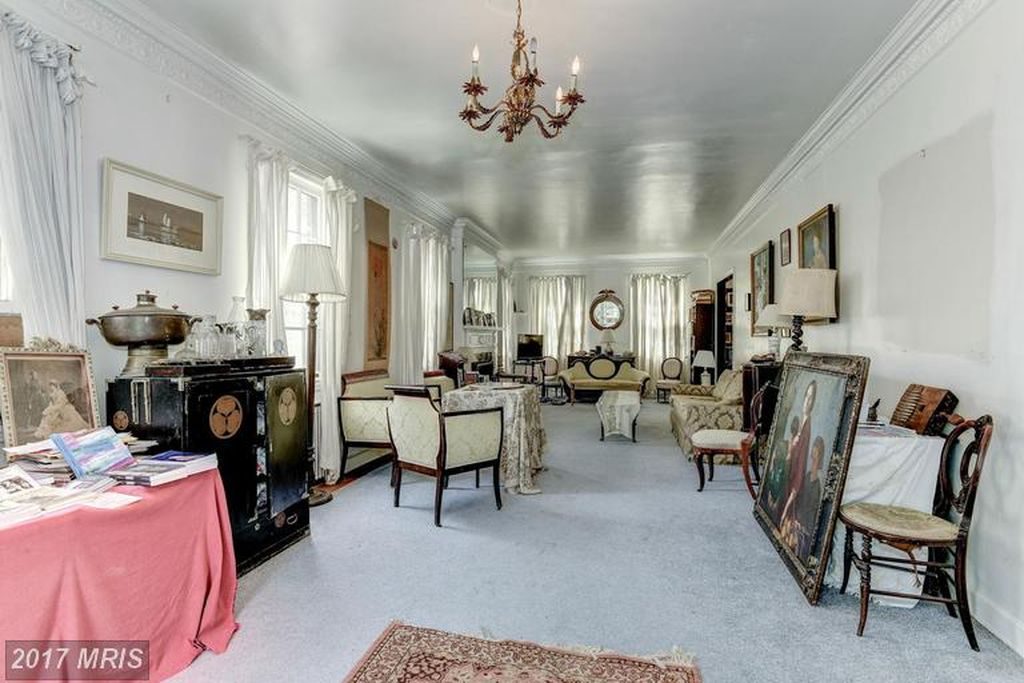
Tilted Arc elements stored on a loading dock in Middle River, MD, c. 2004 via GSA

Which is not the same as forever. The government sold the Middle River site, and Tilted Arc was moved to the GSA’s Fine Art Storage facility in Virginia in the summer of 2005. [18 pallets of relief sculpture molds by Ray Kaskey for the World War II Memorial were also moved, but in different trucks.] It remains there to this day. I saw it yesterday, in fact. [The molds were not to be found.]

Continue reading “The History of Tilted Arc Is Long”