Brice Marden and Robert Rauschenberg in Bob’s Lafayette St studio in 1968, photographed by Henri Cartier-Bresson [via Brice’s 2015 oral history for the RRF]
Helen just posted that Brice Marden passed away in his sleep. Peace to him and his loved ones.
I went to Glenstone this morning to see Marden’s commission, Moss Sutra with the Seasons, which he worked on for five years. In the four, multi-layered monochrome panels on either side, the intricacies of his marks are only visible up close, in raking light, as you move yourself. Some are matte, and evenly so, like wax or earth.
The red and black* panels on the right, though, are glossier. In the indirect, overcast light, Marden’s vinelike tendrils of blue-black paint have a greater reflectivity than the blue-black that first reads as a veil, then as a base. As you move in front of it, you realize they’re a mirror, and the palimpsest in the painting is a figure. You’re standing where the artist once stood as he made it, and as he pronounced it complete.
* I’ve always read that panel as black, but in describing it, Marden calls it blue. But blue in the end. Every panel has every color, in layers, he said.
It will respire, inflate and deflate, to help make air visible. As it “exhales” it will transform “into an array of cloud-like configurations.” On first, second, and third glances, it does resemble the satelloons and sculptural, inflated spheres that are the never-dissipating obsession of mine for the last 16+ years. It is comforting and encouraging to have astute friends and colleagues like Andrew Russeth see a 14m balloon ball project in Australia and think, “Oh, I need to send this to Greg.”
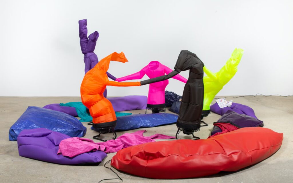
Paul Chan, Khara en Penta (Joyer in 5), 2019, image: Greene Naftali via Walker Art Center, where a show of Chan’s Breathers was on view until last month
As I type this up, the nature of Brunsdon’s project seems to relate even more closely to Paul Chan’s Breathers, whose undulating sculptural shapes are created by the flow of air through them. (This is) Air feels like a massive, Platonic solid (sic) version of Chan’s contorted, figural objects.
Martin Creed’s Work No. 2821, (half the air in a given space), 2017, was acquired by the Art Gallery of New South Wales, which illustrates it thus.
It also brings to mind Martin Creed, whose “half the air in a given space” series uses smaller balloons, and obviously involves an enclosed space. Of course, a 14m-diameter sphere contains almost exactly half the air, by volume, of a 14-meter cube. So in a way, Brunsdon’s outdoor project also makes it possible to imagine, not just the air, but the space it would be given.
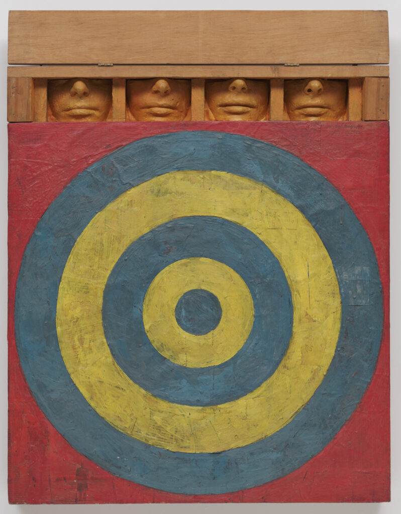
Jasper Johns, Target with Four Faces, 1955, encaustic on newspaper on canvas, painted plaster & wood, acquired in 1958 by The Museum of Modern Art
In late 2019, just before the world shut down, I wrote a long article about the Museum of Modern Art’s instant embrace of Jasper Johns, from the moment his first show opened at Castelli Gallery in 1958. Over half the works from that show were acquired by The Modern’s curators, trustees, and supporters, both for the museum, and for their private collections. Not on that list: Ethel and Robert Scull. And that has been nagging at me ever since, because something weird happened at MoMA, and I can’t figure it out.
Louise Lawler, A Movie Will Be Shown Without The Picture, 1979, invitation card, 4 5/8 x 7 1/8 in., collection: metmuseum, a 2014 gift of the artist
Never too much of Louise Lawler. This morning Andrew Russeth saw something on social media that reminded him of Lawler’s 1979 work, advertised above, A Movie Will Be Shown Without The Picture. The piece was presented in conjunction with Lawler’s first show. The first movie she showed without the picture was John Huston’s The Misfits (1961), but she likes for the movie to change each time it’s presented, and for the title to not be published in advance.
The most recent screenings I’m aware of were in 2017, during her retrospective at MoMA. I guess she doesn’t want the titles of the films screened archived, either.
Dave Dyment points to Bruce Hainley, who makes a very satisfying connection between A Movie Will Be Shown Without A Picture and the book work Lawler published the previous year, “a screenplay without a movie.” The book now known as Untitled (Black/White) was sold for either $4.95 or $100, depending on which price was circled. Dyment shows an example where someone requested Lawler to sign a cheaper version, which she called “perverse”—in the signed note she provided instead. The relevance of this anecdote will, I hope, only deepen in the coming days.
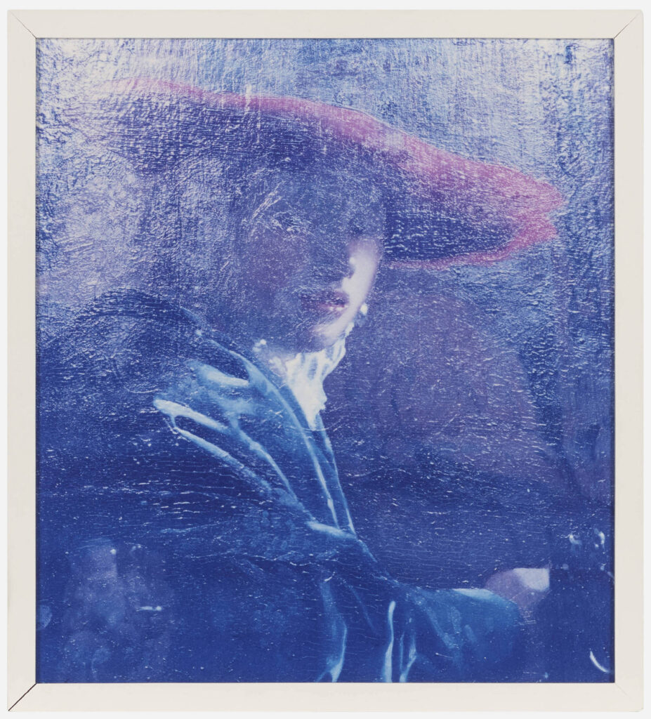
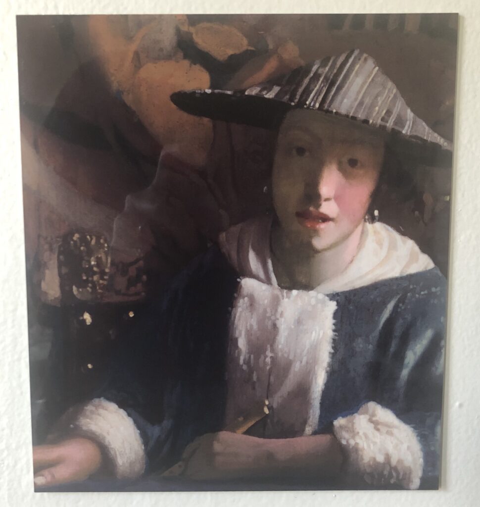
Tim Davis, Girl in a Red Hat (from Permanent Collection), 2003, 22×20 cm, c-print, ed. 6, being sold at LA Modern on Aug. 1, Lot 155
I last thought of Tim Davis’ Permanent Collection project a couple of years ago, during Louise Lawler’s last show at Metro Pictures of Judd sculptures in the dark at MoMA. Lawler’s big dye sublimation prints had a reflective gloss that made them feel like a Davis photo. Meanwhile, like Lawler, but completely different, Davis made so much of the light falling on artworks, and the palpable experience of them.
Anyway, it’s only now, with this full-scale, Permanent Collection image of the National Gallery’s Vermeer, Girl in a Red Hat, glowing with raking light, that I see the project hits closer to Facsimile Object home. Definitely need to go back and look more closely.
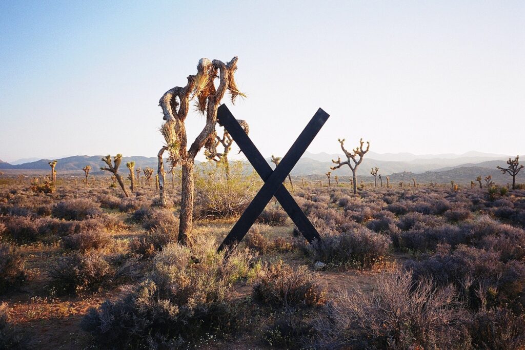
Wade Guyton, Untitled, 2003, installed at Andy’s Gamma Gulch Site in Pipe’s Canyon, Pioneertown, for High Desert Test Sites 2, photo: Regen Projects
Looking back at a desert X I can support. This Wade Guyton sculpture from the second High Desert Test Sites in 2003 came to mind this morning. No reason.
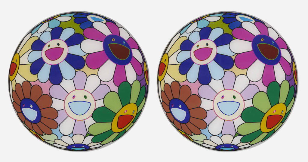
Lot 313: Takashi Murakami, MOCA Flowerball Chargers, 2007, via LA Modern
Takashi Murakami designed the printed plastic chargers that decorated each place setting at MOCA’s 2007 Gala. During the dancing, with Tom Ford egging her on, Naomi Campbell started collecting chargers from unattended seats. When people realized what she was up to, it triggered a hoarding frenzy. If you ever see a full set, though, you can guess who the seller is.
This pair chargers must have hailed from a calmer section of the party. A corner where a savvy galagoer had the foresight to bring a Sharpie and invite the guest of honor to sign the their chargers on the verso. He even took several seconds to add doodlese of his little characters. Was there perhaps a line, a scrum, of eager autograph seekers? Did MOCA’s wealthiest patrons stand around in a circle with their little plastic plates, or did they bring them to the gala’s head table where Murakami and Nigo were holding court?
As is the nature of Gala Art, to know how it went down, you had to be there. And now if you buy these plates, you can pretend you were.
Sometimes a volcano’s just a volcano, but probably not here: Robert Smithson, Buried Angel, 1962, oil on canvas, 125 x 125 cm, sold at Christie’s in 2008
Today is the 50th anniversary of Robert Smithson’s death, and an occasion to revisit Zack Hatfield’s Artforum review of Suzaan Boettger’s biography of the artist, Inside The Spiral: The Passions of Robert Smithson.
Hatfield reminded me that in addition to Smithson’s almost mystical Catholicist early days, Boettger goes deep on his interest in numerology. And she looks closely at Smithson’s early work, only some of which has been shown before. Which reminded me of a wild group of works sold a few years ago—wow. it was 2008—by the family of George Lester, a diplomat/collector/dealer who invited 23-yo Smithson to stage a show in Rome in 1961.
Robert Smithson, Two Frogs Guarding The Palace, 1962, gouache, oil, ink and collage on paper, 24 x 15 1/4 in., sold from the Galleria Lester archives at Christie’s in 2008
The metric dimensions of Buried Angel, the canvas up top with an angel buried in jumbles of numbers and letters, make me think it was painted in Europe. The dimensions of the fantastical collage, Two Frogs Guarding The Palace, meanwhile, could go either way.
In his 1972 AAA interview with Paul Cummings, Smithson described the work from this period as “phantasmagorical drawings of cosmological worlds somewhat between Blake and…oh, a kind of Boschian imagery…They were sort of based on iconic situations…They dealt with explicit images like, the city; they were kind of monstrous as well, you know, like great Moloch figures.”
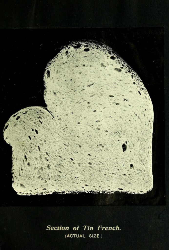
Tin French loaf cross section from Owen Simmons’ The Book of Bread, 1903, via Public Domain Review
Owen Simmons’ scientific guide for commercial bakers, The Book of Bread, was published in an elaborately produced edition de luxe in 1902, and in a trade edition in 1903. The de luxe edition includes original silver bromide prints of full-size photos of various types of bread pasted in, while the trade edition uses photogravure.
Martin Parr considers it to be the first artist’s photobook, and I can’t think of a reason to disagree.
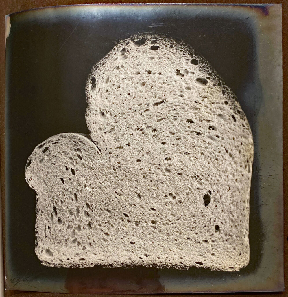
French Tin loaf in actual size but not here, silver bromide print from The Book of Bread deluxe edition, 1902, via a link mentioned on Public Domain Review
Prof. Shannon Mattern [@shannonmattern.bsky.social] brought this back to my attention this morning, after Public Domain Review posted about it in January, referencing a 2020 thread by a rare book dealer I don’t mention on a social media site I don’t link to. But that dealer’s thread did include images of the silver bromide prints, which are extraordinary, whereas the PDR scan is of the beautiful-but-more-conventional trade version.
David Hammons, A Fan, installed in “Rousing the Rubble” at PS1, 1990-91, image: MoMA
The way I have the installation views of David Hammons 1990 PS1 retrospective, Rousing the Rubble, open in my tabs for months, like a talisman or something, and still have to make the effort to see the unfamiliar right in front of me.
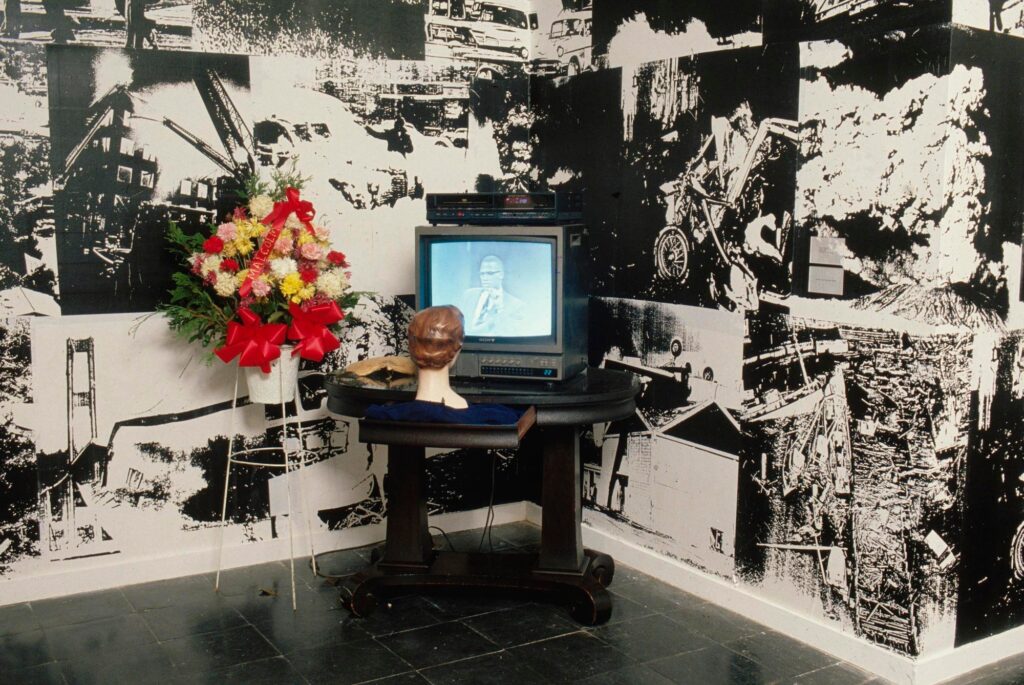
Like this work, A Fan, from 1989, in which a white female mannequin head is perched on a table leaf, turned toward a TV and VCR playing an archival interview with Malcolm X. Next to the TV is a palm fan, and an arrangement of funeral flowers on a white wire stand.
David Hammons’ A Fan, 1989, installed at “Strange Attractors: Signs of Chaos, 9.14.1989-11.26.1989, at the New Museum, NY
Hammons showed A Fan the year before, too, in “Strange Attractors: Signs of Chaos,” an exhibit of chaos science-related work curated by Laura Trippi at the New Museum. It was seen there by critic Maurice Berger, who wrote about it, and the resurgence of Malcolm X’s voice into contemporary white-dominated cultural discourse, in his 1990 ARTNews essay, “Are Art Museums Racist?”. ARTNews republished the essay in March 2020, to mark Berger’s death from COVID. It is depressingly fresh:
Without the Hammons piece the sensibility of “Strange Attractors” would have been very different, more typical of the splashy group shows of contemporary art that simply ignore the issue of race. That one image threw the entire show into question and pointed up the racial bias of its institutional context. Increasingly, across the country, similar catalysts are inserting painful questions into the heretofore complacent space of exhibition as curators with good intentions attempt to “include” the cultural production of people of color.
Berger quotes some of the Malcolm X video Hammons used: “There is nothing that the white man will do to bring about true, sincere citizenship or civil rights recognition for black people in this country. They will always talk but they won’t practice it.” Which, though it sounds like it could have been said yesterday, is an interview from UC Berkeley from October 11, 1963.
The TV, VCR, flowers, and fan are all different between the two installations. At the New Museum, the name Malcolm is spelled out in gold glitter on the red bow on the flowers. Of Hammons’ work at PS1, Otomo wrote, “[T]he feeling of being challenged was merely a result of the implosion of the ingrained hypocrisy inside us. Hammons’ work never shows off theory or words. They threaten us, the viewers, just by being there.” She noted that her companion Steve, explaining the unfamiliar cultural references to her, said he “had tried to listen to Malcolm X’s arguments in the 60s.”
Though it would be good to see it now, the present whereabouts/status of A Fan is unknown.
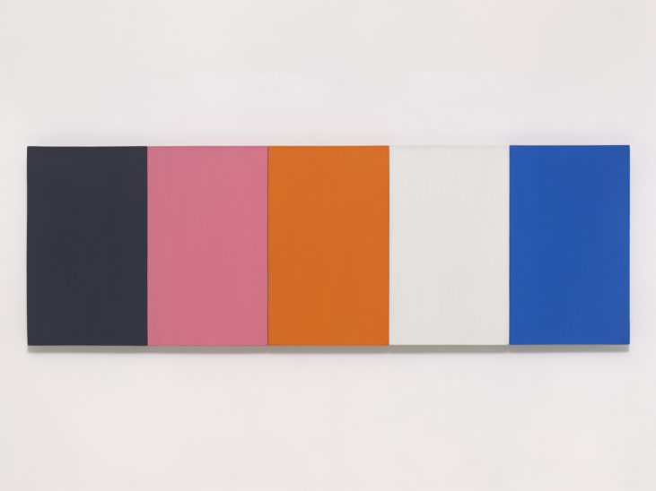
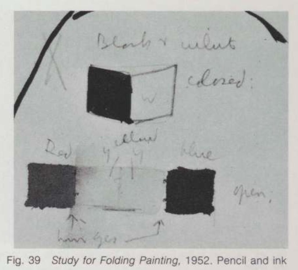
Kelly worked out the colors and dimensions of the five monochrome panels in Sanary, a seaside village in France he visited in 1952. It’s one of the largest of the very few paintings he actually made in France and brought home with him to New York in 1954. The work he developed in Sanary has been on my mind for years; it’s some of his formative work that would inform his whole career.
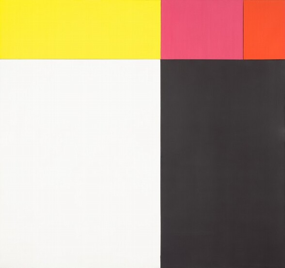
Ellsworth Kelly, Painting for a White Wall, 1952, 23 x 71 in., oil on canvas on five joined panels, photographed for Glenstone by Ron Amstutz
The NGA’s text, written by curator Molly Donovan, cites Yve Alain Bois’ research that Kelly began with found colors, a set of paper stickers used in French kindergartens known as papier gommette. The colors are very similar to another multipanel work from the same moment, Painting for a White Wall, 1952, which is now in Glenstone’s collection. As Yve-Alain Bois discussed here when his CR Vol. 1 came out, Tiger was instrumental to the beginning of Kelly’s official exploration of color behavior; it was where he set out to understand “the strange orange/pink” that had occurred in the found colors of Painting for a White Wall.
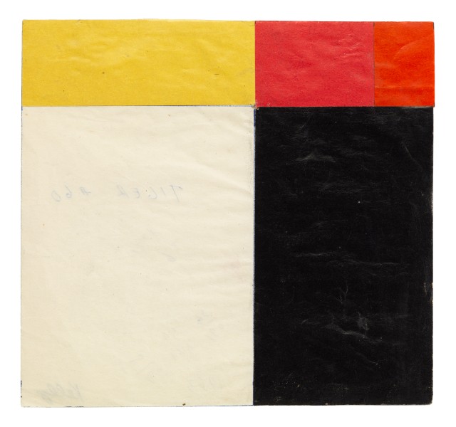
Ellsworth Kelly, Study for Tiger, 1952, collage on paper, 6.5 x 6.9 in., via Art Basel 2017
Anyway, the relationships of the various panels are intuited, not mathematical. Kelly worked them out in sketches and collages, like the one Matthew Marks brought to Basel in 2017.
What I didn’t know until seeing the painting in person and reading up on it, is Kelly’s interest in the Isenheim Altarpiece by Matthias Grünewald. In the 1973 catalogue for Kelly’s MoMA retrospective E.C. Goossen mentions Kelly’s Sanary-era sketchbooks include drawings of the altarpiece’s hinged construction alongside drawings of various compositions of windows and shutters, and even studies for a hinged painting. The connection to Kelly’s most important Paris painting—also in the Glenstone show—the multipanel construction repeating the window of the Musée d’Art Moderne, is obvious.
Jasper Johns, Perilous Night, 1982, 67 x 96 in., oil and encaustic and silkscreen and arms on canvas, in the Meyerhoff Collection at the NGA
What most intrigues me, though, is the possible connection to Jasper Johns. In 1987 Jill Johnston did an exhaustive and revelatory analysis of Johns’ incorporation of fragments and details of the Isenheim Altarpiece into his paintings in the 1980s. One of the first is Perilous Night, from 1982, a work that is also at the National Gallery.
Actually, now that I put it up there, the composition of Johns’ painting feels very resonant with that of Kelly’s panels in Tiger. Johns did tell Johnston he got a book about the Isenheim Altarpiece from a friend. Didn’t say who, though. From Short Circuit to Flag to In Memory of My Feelings, hinged and multipanel paintings were on the minds of young artists in downtown Manhattan in 1954. I wonder what we could learn from a Kelly/Johns show. I’m sure Tiger would be a fascinating starting point.
[Next day update: On an impulse I checked for reservations at Glenstone last night, and there was space available this morning, so I went, and it was hot and glorious. I listened to most of an aquatic horticulturist lecture pondside, which was fascinating. The pond in the center of the Pavilions building is as thoughtful as the rest of the landscape, which really never disappoints. Even Split Rocker looked good. Not landscape per se, but you know.
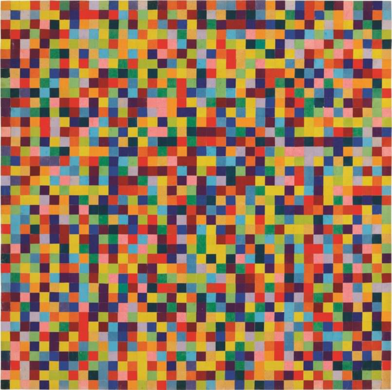
Ellsworth Kelly, Spectrum Colors Arranged by Chance VII, 1951, 99 x 100 cm, collage on paper, at Glenstone
There were some new pieces in the Charles Ray pavilion, always a marvel. And a couple of beautiful Kelly works on paper, including the dazzling, large collage above, from 1951, in the spot where Tiger was hanging. So I guess they rotate things. It was a low-key flex that they had such an amazing work on hand and didn’t just jump to include it in the show, but chose to let the loans tell the fuller story of Kelly’s practice. Truly a dynamic place amidst all the contemplative stillness.]
Facsimile Object of Girl Who Goes To Europe For A Couple of Months, Comes Back With A Vermeer Accent
The National Gallery sent out word that the Vermeers are back, as is this one, which is now not a Vermeer again. Oh wait, only two Vermeer Vermeers are back. Girl With A Red Hat is still on the road. [Or not yet ready to come out. It doesn’t look like it’s on loan anywhere, and just weeks after Amsterdam, why would it be?]
I looked at the episode numbers and thought it must be a mistake, but no, there hasn’t been a Better Read since 2021. But I’ve used a Sturtevant text before, in a way; in 2016, I had a computer read several pages of Spinoza’s Ethica, a text Sturtevant included in Vertical Nomad, which she showed at Anthony Reynolds Gallery in 2008.
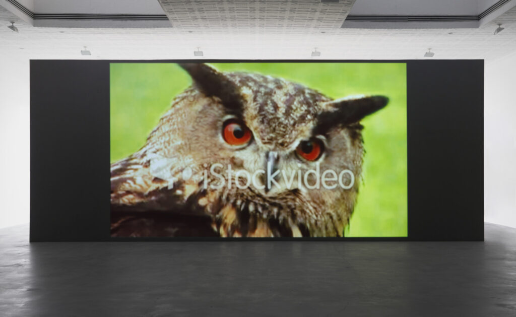
Sturtevant, Simulacra, 2010, single channel 16:9 video, installation view at Matthew Marks, 2022
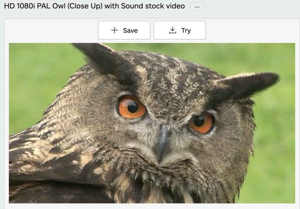
A 16:9 iStockvideo of a horned owl was one of many found clips of animals and athletes Sturtevant used in her later works. The video clip shows up in Simulacra (2010), which was seen most recently last fall in the Sturtevant show at Matthew Marks.
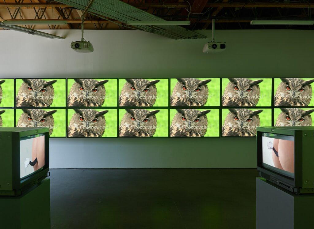
Installation view from Sturtevant: Memes, at Freedman Fitzpatrick, 2019, via CAD
It was included in the first show of Sturtevant’s video work in LA, in 2019 at Freedman Fitzpatrick, called, alas, Sturtevant: Memes.
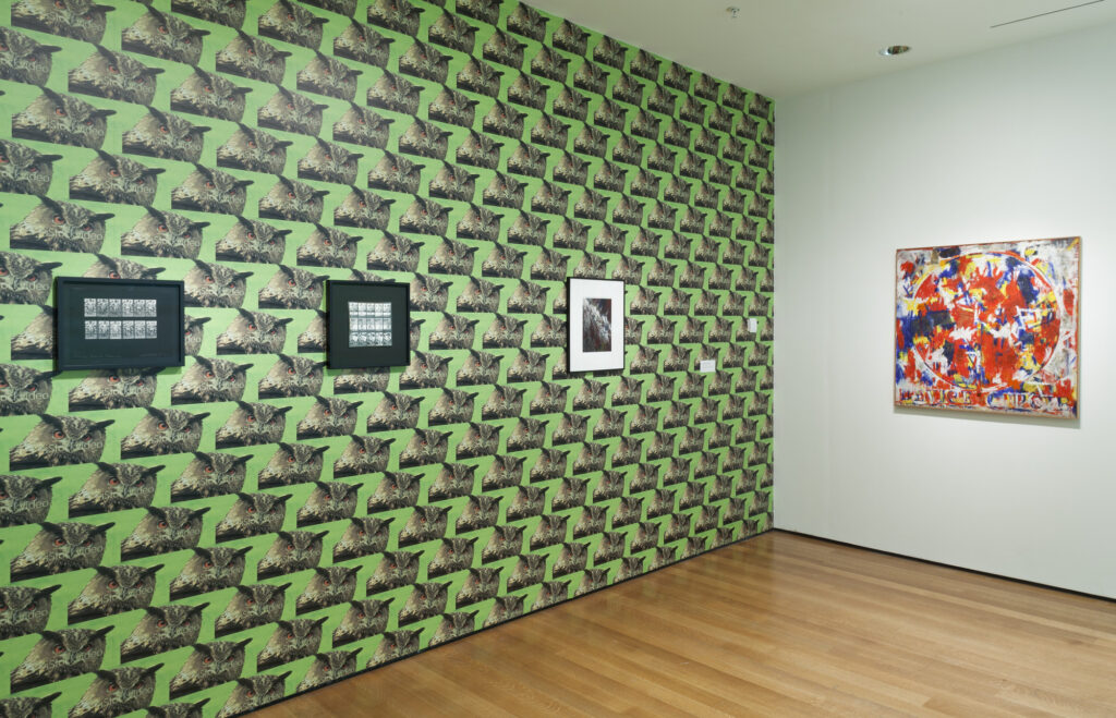
installation view of Sturtevant: Double Trouble, 2014-15, at MoMA
Sturtevant used a screencap of the image as Warhol-style wallpaper in Double Trouble, her retrospective at MoMA in 2014-15, which opened a few months after her death. [At MoMA, it was actually preceded by a wall of Warhol cow wallpaper.]
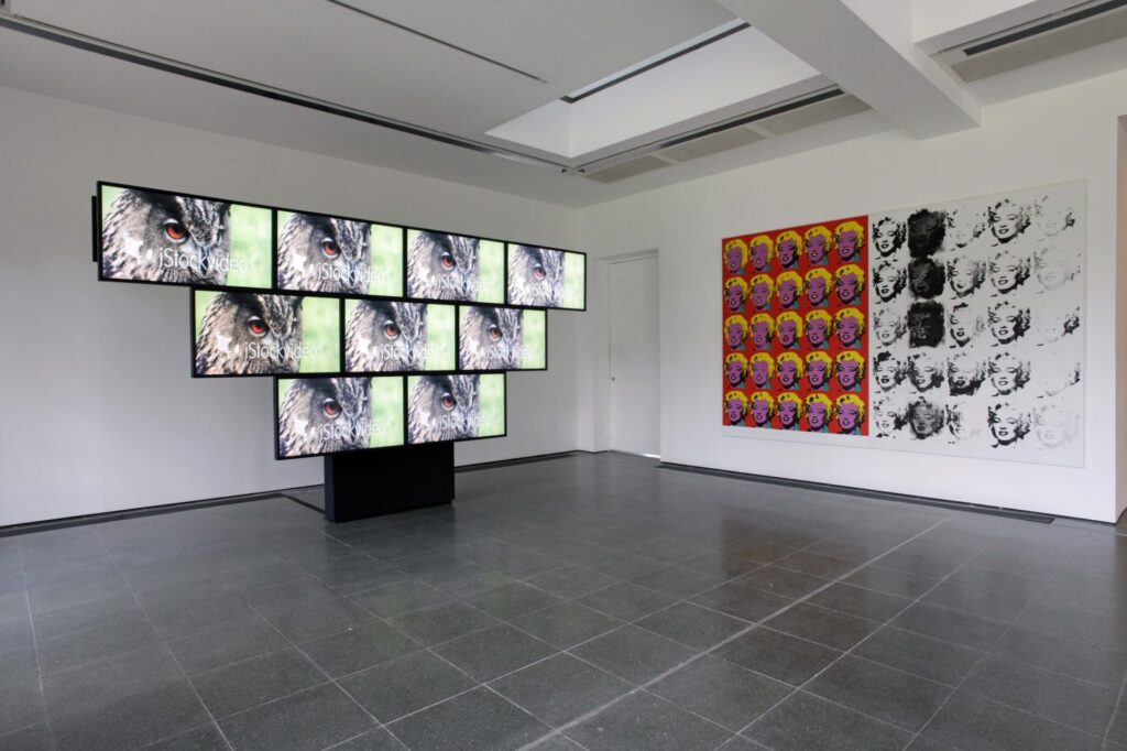
installation view of Rock & Roll Simulacra, Act 3 (2013) in Leaps Jumps & Bumps, 2013 at the Serpentine Galleries, image: Jerry Hardman-Jones
And before that it was in both video and wallpaper for Leaps Jumps & Bumps at the Serpentine, the last show of her work to open during her lifetime. The aspect ratio seemed important, or intrinsic, a characteristic of the age and the system of media we were all soaking in.
Sturtevant, Rock & Roll Simulacra, Act 3, 2013, 18×32 cm, inkjet on paper, ed. 250, via Serpentine Galleries
Sturtevant also published a screencap from the video as a fundraising edition for the Serpentine. The 16:9 image was printed at 18×32 cm on a piece of paper whose stated size, 39.3 x 53.5 cm, is well within the margin of error of 4:3, video’s old aspect ratio. Sturtevant was not one for nostalgia, though, so I imagine that dimension is coincidental. Anyway, back in the day, when I tried to buy one of the prints from the Serpentine, they said the artist had not been well enough to sign but a few of the intended edition, and their stock had run out.
At various points since, I’ve looked for the iStockvideo clip Sturtevant used. Thanks to corporate rebranding the watermark was replaced with “iStock by Getty Images.” So hers has now become an artifact of the very system she was laying bare. [Next morning update: on the other hand, you can recreate it with a $60 license and After Effects. She was still right, though.]