
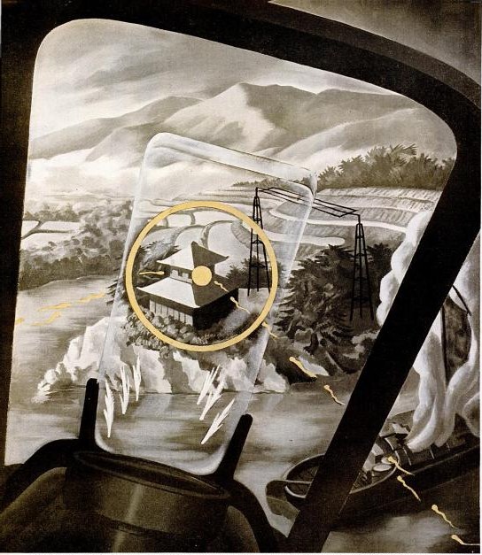
Another inadvertent Google find, also from the World War II School of propaganda art. In anticipation for an invasion of Japan, 1945 LIFE Magazine wanted to give the general public a fighter pilot’s-eye view of ground attacks.
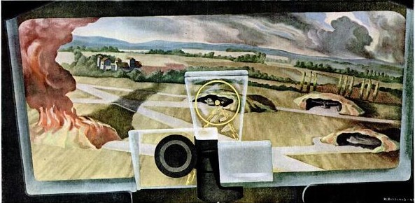
Perhaps because actual combat photos were deemed too sensitive or otherwise unsuitable, the magazine asked artist Henry Billings to create a series of strafing attack paintings.
Noted before the war for his machine age-themed murals, Billings’ characteristically mild-mannered modernist/precisionist landscape style goes uncommonly well with the scenes of destruction from the air.
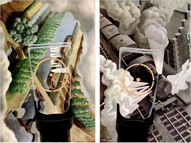
But the most prominent thing in the images, no matter the sometimes dizzying orientation of the earth itself, is the central fixity of the P51 Mustang’s reflective sight. A technological advance that only rolled out during the war itself, the gunsight’s half-mirrored glass panel meant the pilot could maintain his fix on his target without lining his eyes up directly with the line of fire. It’s an interesting perceptual concept to try to capture in a traditional landscape painting.
I don’t know what happened to Billings’ art career, but his posthumous market is pretty weak, with paintings and drawings selling in the low hundreds of dollars. [Oh, with the exception of this nice precisionist boatyard panel. Wow.] No word on the fate of the strafing paintings, though.
Ground Strafing – LIFE June 30, 1945 [google/life]
The Greatest Photomural Ever Sold
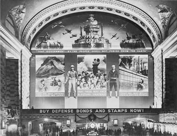
Instead of jumping to the first search result, Google’s “I’m feeling lucky” button should go to something tangentially related but certifiably awesome and probably better than what you were looking for in the first place. For the first datapoint in fitting that algorithm, I submit this post from The Bowery Boys about the “World’s Greatest Photo-Mural,’ as proclaimed by the New York Herald upon the dedication on December 14, 1941 [!] of the Defense Bonds Mural in Grand Central Terminal, New York City, USA.
At 96×118 feet, and covering the entire eastern wall of the station’s Great Hall, it was certainly the world’s largest photomural to date. [Only an Axis appeaser would point out that it’s actually six photomural elements installed in a larger, non-photographic composition.]
The mural was created by the Farm Security Administration’s Information Division, the legendary New Deal documentary photography propaganda unit run by Roy [no relation to Ted] Stryker. The three main photocollaged panels depicted what America was defending: Our* Land, Our* Children, and Our* Industry. [* Offer apparently not valid for non-white Americans, as the NAACP pointed out in protest letters to the FSA.]
Classic racial exclusion notwithstanding, I was most amazed that a giant war bonds photomural in Grand Central Station was the government’s instant response to the attack on Pearl Harbor. And I was also wrong. According to a contemporary report in Time Magazine, the FSA photo staff spent three months designing and fabricating the massive photomural. Which should be evidence enough for the conspiracy theorists who suspected that Stryker and his puppet FDR had been planning to get the US into war all along. But it turns out the Treasury Department had already begun its defense bond campaign in 1940, and that the government marketing masters at the FSA had already been enlisted in Treasury’s bond-selling campaigns.
Which seems odd, that a Depression-era tenant farmer resettlement program would morph into a historically ambitious documentary project for rural America, and then into a war bond marketer, before becoming the military propaganda operation for D-Day. Odd until you hear Stryker’s longtime assistant Helen Wool describe Stryker’s vision of the FSA’s photographic mission in a 1964 interview for the Smithsonian:
[I]n that drastic difference he still stuck to the same type of basic idea, that America is America and that’s all there was to it. We had psychological warfare films, and we had displays, and we had defense bond things, and everything else. But, underneath it he was selling America as it should be sold. [emphasis added because, obviously]
So what does the 3-months making of the world’s largest photomural entail? Fortunately, the snap-happy photographers at FSA like Edwin Rosskam and Marion Post Wolcott documented the process, in a group of 53-70 images now at the Library of Congress:
This Weekend In Awesome Twitter Juxtapositions

I admit, after I saw the pair of Chucks, I was just waiting, pretty sure I’d get a post out of it no matter what. So kudos to Anil, who tweets quality.
Rijksoverheid Rood

So.
Found the local Pantone shop and brought home a liter of Hollandlac oil-based enamel in Rijksoverheid Rood, aka PMS 485c.
Ordered some small galvannealed steel and white aluminum panels, both paint-ready, and cut as close to A4 as North Carolina metal shops not called Metal By The Millimeter are able to get. They arrived very neatly packed.
And so I used some of the packing to make a little nest, so they can be covered, with circulation, while the paint dries in between coats.
Diet Coke. Leatherman left in the car, whoops. Tape everything down. Float the panels on little bubblewrap sheets so I can get to/around the edge.
MIneral spirits to clean the surfaces. Oh, right, there’s a protective film on the aluminum. More Diet Coke.
Do people really still listen to NPR all day? I can’t imagine. I want listen to youarelistening.to, but New York is down, so I head to Montreal. Police scanner with that awesome Quebecois twang.
Nabisco Ginger Snaps, the dog biscuits of the gods. Seriously, how did I fall into this box of tough yet improbably delicious cookies? More Diet Coke.
Unwrap the brush. Open the can. Wow, it seems much oranger than the web version, or the offset ink version. Is it–no, it has to be right. The Netherlands has ceded sovereignty over their Central Government palette to Pantone, Inc., a wholly owned subsidiary of X-Rite, LLC of Grand Rapids, Michigan. One PMS code to rule them all.
Stare at the foam brush again, try to remember what she–no, I’m pretty sure she said she was using foam for acrylic enamel, not oil. Go with the brush, even though foam seems somehow less painterish, and thus less daunting,
Load is not quite the word for what I do to the brush. Introduce. Poke. Alight the brush with paint. Whatever it is, it’s not enough paint. A fair amount of pull, this oil.
The steel panel is first. I really am not going to do a stroke-by-stroke account here. The steel feels better. The aluminum plate is so light, it moves with the brush; I have to hold it down. Paint’s not as self-leveling as I was originally hoping.
I knew there will be extra coats; I’d hoped there wouldn’t be much sanding. But there are definitely still brushstrokes in there. Texting with my brother-in-law, a highly skilled painter of entirely different types of monochromes, he diagnoses it immediately: ‘the brush needs to be loaded and moved with confidence.’
I would probably say those are problems #2 and #1, respectively, but loading the brush will be much easier to address. I will leave my paranoia about little paint stalactites on the edges in the kitchen the next time I get a Diet Coke.
But of course, the next coat will only go on 24 hours or so from now. I guess I never quite understood how much of painting is waiting for the paint to dry.
Speaking Of Awesome American Steel
We had a tree limb come down across our driveway last weekend–some freak weather thing, who knew?–and needed to rent a car for a couple of days.
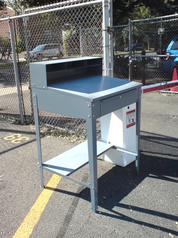
The checkout guy at National Airport was working off of this beauty, the Foreman’s Shop Desk, by Relius Solutions.
At under $200, it looks like the cheapest decent foreman’s desk out there, no finish fetish or unit construction, or whatever brings the double-to-triple prices. But to my eye, it has a winning simplicity. Had I rented an SUV, I might have just slipped the guy a Hamilton and loaded it into the back. Oh well.
‘And I AM. An American Sculptor.’
Between 1981 and 1985, Paul Tschinkel and Marc H. Miller produced 17 episodes of ART/newyork, a subscription-based video magazine about contemporary art for use, incredibly, in public schools and libraries.
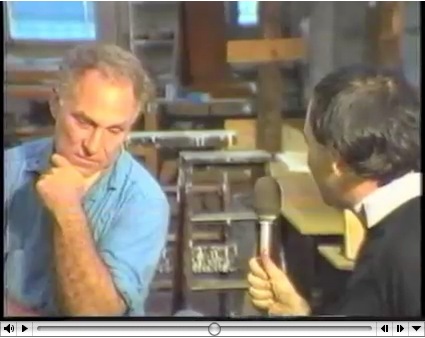
Their 1982 interview with Richard Serra, a Yale classmate of Tschinkel’s, came just as the Tilted Arc controversy was heating up. And speaking of heating up, hoo-boy, does Serra get going about the Pennsylvania Avenue Development Agency conflict with Robert Venturi. Fiery fun stuff.
His 1980 interview with Douglas Crimp covers a lot of the same PADC territory with a bit more specificity. By pointing out, for example, that Venturi’s proposed motif was also favored by Albert Speers, not just that they might as well stick swastikas on Pennsylvania Avenue.
But his story about being told that he’d never get work in this town again is basically the same.
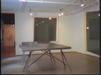
Also interesting, if less incendiary: Serra used to exhibit models of site specific projects-in-progress, such as this rather sexy steel tabletop version of Twain. Do want.
ART/newyork – Richard Serra’s Tilted Arc artist interview [98bowery.com]
order copies of ART/newyork to this very day [artnewyork.org]
What I Look At Many Days: Gerhard Richter Colour Charts
I am aware of the work of Pablo Neruda Gerhard Richter.
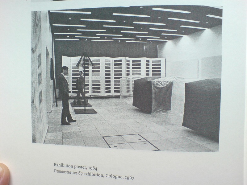
I have not been reading Gerhard Richter: Writings 1961-2007 straight through, of course, but it’s been with me a lot lately. And it’s kind of annoyed me that there is not really anything about this incredible photo, showing part of the installation of Demonstrative 1967, Galerie Heiner Friedrich’s weeklong exhibition at DuMont Publishers, down the street from the inaugural Cologne Art Fair, from which he had been excluded.
In addition to Richter, the display included works by his Capitalist Realist cofounders Sigmar Polke [I think that’s a raster bild there on the left] and Konrad Lueg [the inflatable cube structures], as well as by Blinky Palermo, Reiner Ruthenbeck, the British painter John Hoyland–and Cy Twombly.
Now about that Richter. That giant color chart painting which looks like a folding screen. For a while, it threw me off precisely because it looked like a folding screen. Considering 1967 was also the year Richter started working with glass panes and doors and other materials that related to a painting plane but were not, I was wondering if this painted, free-standing panel object embodied some lost chapter in the color charts’ “pop meets abstraction, quietly upends both” story.
Orrrr maybe, the painting was just too big to go on that wall, and Blinky needed that other wall, and Lueg’s balloons block everything anyway, and what the hell, it’s a week, and an art fair.
Ten Large Colour Charts/ Zehn große Farbtafeln, 1966, via gerhard-richter.com
Because there is no color chart folding screen. That work is Ten Large Colour Charts (1966), a ten-panel painting in the K20 collection in Dusseldorf. It is one of the earliest color chart paintings Richter ever showed, but it’s probably the first that many German art worlders ever saw. [Eighteen Colour Charts was the first first shown, in Richter’s one-person show at Friedrich’s Munich gallery in May 1967.]
Anyway, point is, or one point is, I think, that looking at Richter’s color chart paintings, and his 4900 Colours grids before that, and his Cologne Cathedral stained glass window before that, and so on, changes the way you look at the world. And by you, I mean, of course, me. It changes the way you look at color samples, whether in the paint store, or at the moment, in a grid laid out on a governmental stylebook website.
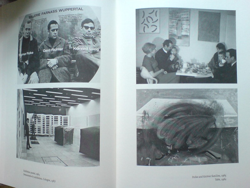
And it’s not just a matter of this looks like that, or not entirely. Because there’s also the context in which Richter painted his color charts–and the larger biographical/political context that shoots through Richter’s entire practice. That Demonstrative 67 photo is in a spread with what may be my favorite snapshot in the Writings book: on the right there, not Table, 1962, CR-1 [!]–which, if Christopher Wool can take up painting with that thing already in the world, color charts are not gonna hold me back–the one on top, with the caption, “Polke and Richter families, 1965.”
Oh, just drinking some tea with the kids and Uncle Rudi.
‘Rirkrit Tiravanija’s Favorite Farmer’
Chiang Mai farmer/laborer Lung Neaw has worked with RIrkrit Tiravanija for several years now. He helped build the artist’s house. Tiravanija’s footage of him has appeared in various gallery and museum installations.
And Saturday, Tiravanija’s film, Lung Neaw Visits His Neighbors, will have its world premiere at the Venice Film Festival. Maybe there should be a spoiler alert somewhere, because from the synopsis, the title pretty much gives the entire 2.5 hour movie away.
In a Q&A on the Lung Neaw website the artist says he sees the film not as “a documentary and not a narrative, perhaps it’s more of a portraiture.”
He and his longtime Mexico City dealer’s brother Christian Manzutto shot a week or so at a time:
So we shot over a period of two years and another to edit and postproduction, the film was really made very simply and with very little by way of crew and equipment, in that relationship for me very much like a documentary but also very much like how an artist would approach the production, also with very small but cost-effective budget. We shot in film (super 16mm) so rather small and light unit but with frames and quality which was not video.
An interesting choice, and an interesting approach. Two of his galleries, kurimanzutto and Gavin Brown’s Enterprise, have associate producer credit.
See the Lung Neaw Visits His Neighbours trailer [vimeo]
Thai media article on the project: Lung Neaw goes to Venice [nationmultimedia.com]
Blade Runner: The Making And Damage-Controlling Of
“Decent people really didn’t live below 40 stories above the street.” -Syd Mead
Oh man, the groovy disco music that opens this 1982 13-minute, making-of convention reel for Blade Runner tells you all you need to know.
There are nice, matter-of-fact interviews with the movie’s design principals, Scott, Mead and Trumbull, but the best thing is the lights-on footage from the set and the model shop.
[via openculture.com]
What I Looked At Today: Kabinetstukken
So lately, I’ve been thinking a lot about The Dutch, and their politics and art. The Rijkshuisstijl and 1 Logo Project, which redesigned and centralized the Dutch government’s visual identity, which happened to coincide with political shifts to the right, and swelling anti-Muslim intolerance, and suddenly, drastic budget cuts meant to cripple or destroy the liberal and visual arts establishment in the country. And a visual identity which ironically derives its central element, a 21-color palette, from the light and landscape as seen in Dutch Golden Age paintings.
And so of course, I have been thinking hard, still, about Vermeer painting his serene scenes in the midst and aftermath of a continent-wide, generations-long religious war.
And then someone, I can’t remember who, pointed last week to Morgan Meis’s discussion from Antwerp of Frans Hals, who was treading fine religious lines to make his proto-modernist paintings in a Dutch/Flemish culture where painting itself had become highly, politically and theologically charged.
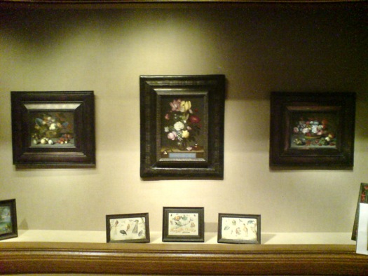
So I went to the National Gallery, where their Vermeers are tucked away in the Cabinet Galleries, a series of three tiny rooms carved out of a forgotten storage space in the mid 1990s. The scale approximates the collection rooms in 17th century Dutch & Flemish homes for which the small paintings were originally created.

Bouquet of Flowers in a Glass Vase, Ambrosius Bosschaert the Elder, 1621, via nga
Here are three little paintings of a type I would have barely glanced at or ignored, if it weren’t for my peculiar Dutch color palette fixation: I mean, right? Still lifes of flowers and fruit? And yet they really are pretty amazing. And then you think about where and when and why they were made. According to the Cabinet Galleries brochure, which I had never picked up, such tiny paintings [7×9, 8×12] were called kabinetstukken, cabinet pieces.
The center painting, Bouquet of Flowers in a Glass Vase, was made in 1621 by Ambrosius Bosschaert the Elder. The NGA says without elaboration, “Bosschaert, who was born in Antwerp, moved to Middelburg after 1587 for religious reasons.” He was 14 at the time.

Basket of Flowers, 1622, Balthasar van der Ast, image: nga
This pair of kabinetstukken by Balthasar van der Ast apparently hung in the private chamber of Amalia van Solms whose husband Frederik Hendrik ruled over the Protestant Netherlands his father William of Orange fought to establish.
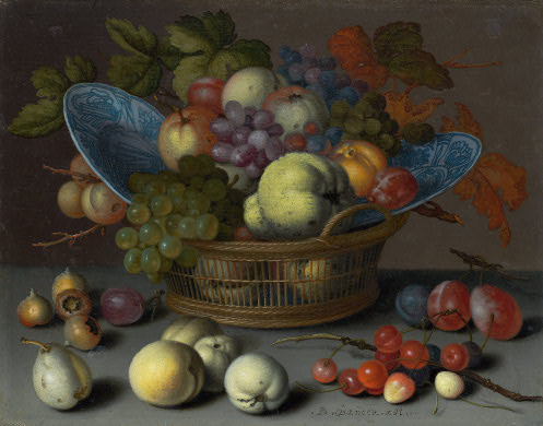
Basket of Fruits, 1622, Balthasar van der Ast, via nga
They are listed as gifts of Mrs. Paul Mellon.
Previously: the first What I Looked At Today included bigger, flashier Dutch painting: Van Dyck, Cuyp, etc.
Ekphrasis
Sam Thorne in this Summer’s Frieze looks at writers writing about looking at fictional art. He includes the hero [sic] of David Foster Wallace’s Infinite Jest, the post-poststructuralist filmmaker James O. Incandenza, whose lost masterpiece gives the novel its title:
Incandenza is one of the few conceptual artists in fiction (he is preceded by Maria Turner, a joint creation of Sophie Calle and Paul Auster who pops up in the latter’s 1992 Leviathan – the novel’s accounts of her works were subsequently enacted by Calle herself). Many of Incandenza’s films are described as technically or conceptually unfilmable (one is ‘unfinished due to hospitalization’), while his video Infinite Jest is itself said to be ‘lethally entertaining’ – once viewers start watching they cannot stop and remain transfixed until they starve. This elusive videotape, of which all copies are missing, is wrapped up with the unbearable pleasure of seeing. The visual is thematized as entirely other to language, as Wallace insinuates that the visual can make claims on our attention that the verbal cannot. Within the logic of the novel, the video would be impossible to sufficiently describe; it evades all attempts at ekphrasis – a shortcoming which is in this case redeemed, in that the ability to properly visualize it would result in death.
That writing fiction may finally be incompatible with adequately describing a work of art is the worry that shadows many of these novels. But, like Bergotte’s dying realization, they also suggest that the knowledge of this shortcoming is what makes writing worthwhile.
I did not realize that Incandenza had a show. While at Columbia last year, Sam Ekwurtzel invited a couple dozen artists to create works for A Failed Entertainment: Selections from the Filmography of James O. Incandenza. The show is still touring the country with him. Ekwurtzel, that is. Incandenza still does not exist.
Unmentioned by Thorne: Henry Codax, the fictional conceptual monochrome painter in Bernadette Corporation’s novel Reena Spaulings, who also had a show this year, courtesy of Jacob Kassay and Olivier Mosset.
Works on Paper [frieze]
Ekwurtzel speaks: Behind the scenes of an Infinite Jest-inspired art show [flavorwire]
On Roy Lichtenstein’s Films, Also Prop For A Film
I was intrigued by Roy Lichtenstein’s Prop For A Film when it showed up last summer at Phillips in London. Obviously, the main thing was the work itself: a large [3.5 x 8 ft] abstract, shaped field of Ben-Day dots, pretty fantastic, actually, which turned out to be a beach. The other thing about it, also obviously, was hey wha? Lichtenstein made a film? A film he showed at both LACMA and the US Pavilion at Expo70 in Osaka?
I was already pretty fixated on several of these related topics at the time, so I started poking around on the story of Lichtenstein, his film–films, actually–and his Prop For A Film. It’s all pretty odd and interesting, and somewhat complicated, and though I started gearing up to write about it, I’ve kind of held off, or haven’t gotten around to it, I guess, for almost a year now.
But then today, I see that Andrew Russeth reported for the Observer that Prop For A Film, which failed to sell at Phillips last summer, has turned up in Sotheby’s New York contemporary sale next month, albeit with a much lower estimate.
And though Sotheby’s catalogue copy seems almost identical to Phillips’, they added a note that the Whitney will show Lichtenstein’s films in October, the first exhibition of them in over 40 years.
So yeah, Prop For A Film. To get right down to it, I’m not sure it’s really a painting. Which doesn’t mean it’s not a very interesting Lichtenstein.
Starting around 1964, when the world was still trying to come to grips with the painterly implications of his print-related imagery and Ben-Day dots, Lichtenstein was already experimenting with other techniques and materials that challenged the definition of painting. His Electric Seascapes combined dots with new, high-tech materials like Rowlux [above], a prismatic plastic sheeting originally developed for reflective highway signs.
Fish and Sky (from Ten from Leo Castelli), 1967, screenprint, photo and offset, ed. 200, via wright20’s Sept. 15 contemporary sale
When Maurice Tuchman invited Lichtenstein to partner with Universal Studios for LACMA’s ambitious Art & Technology Program in 1968, the artist decided to continue his seascape experiments with motion, perception, and the flat picture plane by creating an actual “moving picture” of a landscape. So yes, this whole thing really fell into place around a seemingly simplistic, even banal play on words.
Sotheby’s pitch boils down the “moving picture” concept as it was exhaustively described in LACMA’s A&T report/catalogue:
[He used] sequences of filmed landscape fragmetns in combination with synthetic images using his trademark Ben Day dot grids or textured aluminum. The project expanded upon ideas he had explored in his landscape collages of 1964 and 1965, which were his most abstract compositions to date. In these works, the constituent elements of landscape were drastically reduced to two or three large areas of Ben Day dots representing sea, land and sky.
Because of cross-country logistics, Lichtenstein ended up doing almost all actual production with his friend, independent filmmaker Joel Freedman. Roy and Joel spent the summer of 1969 in Southampton, filming the props against the sky or the waves. Assistants would hold the props steady or rock them to simulate the motion of the ocean.
Only it never worked. The movie camera couldn’t accommodate different exposure levels for each component, and the depth of field never resolved to produce the planar flatness Lichtenstein was after. So they threw out the props, shot straight-on shots of the sky and lapping waves, and then added all the graphic elements in post.
I’ll leave the details of the films themselves for a separate post, but the point is, Prop For A Film never ended up in any of the films. And so the exhibition history–both Phillips and Sotheby’s list LACMA and Expo70–is tenuous at best. [Sotheby’s seems to realize this, threading a needle by saying “the work travelled to” Osaka, meaning the film installation. They also get the dates wrong; 1969 was the start of filming. A 2-screen installation at the Expo came first, in 1970, followed by LACMA’s 3-screen version in May 1971.]
Which, whatever, it’s still a large, stunning, early Lichtenstein painting, right? And its provenance, OK Harris–the gallery founded by longtime Castelli director and Lichtenstein discoverer Ivan Karp–is unassailable. Well, it’s certainly a Lichtenstein something.
When I first contacted Freedman last year, he told me how he’d saved the piece–it’s Magna on wood, not canvas–after the project ended, and had it on the wall of his loft for several years. The trademark dots meant people would visit and recognize it immediately as a Lichtenstein. Then, when he was in need of completion funds for a documentary–if I remember correctly, it was the mid-70s, so probably Broken Treaty at Battle Mountain–he gave the work to Karp to sell. At Karp’s suggestion, Freedman asked Lichtenstein if he’d help his project by signing the piece, and Lichtenstein generously agreed. The work was sold, and documentary was finished and released to great acclaim.
When he signed it in Karp’s gallery, Lichtenstein also wrote the title on the back. Or maybe it wasn’t a title, so much as a description: Prop For A Film.
Passed at Phillips, Roy Lichtenstein ‘Prop’ Moves to Sotheby’s [observer.com]
Lot 28 Prop for a Film, 1967, est. $400,000-600,000 [sothebys.com]
Lichtenstein’s project writeup from the1971 A&T catalogue [lacma.org]
Previously: Lichtenstein’s Electric Seascapes
BONUS: Freedman is running a Kickstarter campaign to complete a followup film, Land of the Brave. It ends in four days. [kickstarter]
AA
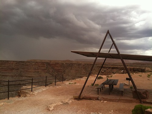
When it’s not taking letterpress to the people, the Type Truck is making stops in some of the more fantastically designed and sited picnic pavilions in These United States. From the tour date calendar, I do believe this particularly Prouve-esque model is in northern Arizona or southeastern Utah, a day or so away from their gig in Green River.
A couple more views here and here.
AAA UPDATE: of course, RO/LU does me one better. Nicely played.
Brandstorming
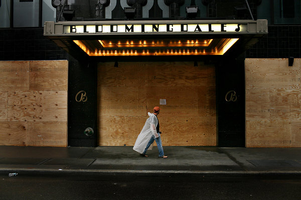
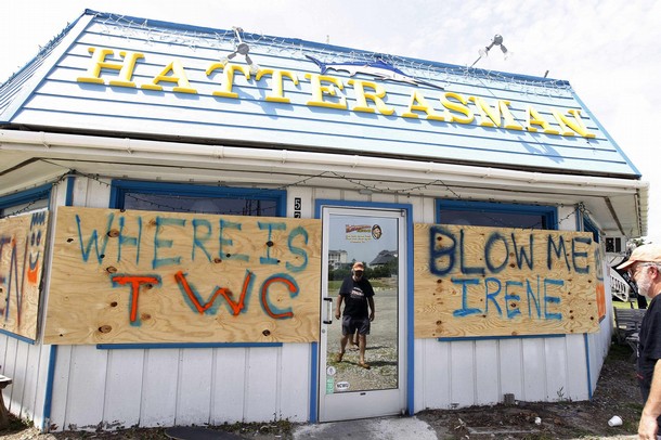
michael appleton for nyt
Such a great shot, such artful product placement. While it’s unfortunately still true that you cannot buy publicity like this, only the most foolish brand evangelist will find himself unprepared when disaster coverage strikes.

hiroko masuike for nyt
The truth is, news photographers want to include your store or brand in their hurricane coverage; it can add excitement and content to the shot. The trick is to help the journalist by making that sexy storefront/logo shot not just easy, but irresistible.
reuters via daylife
Be respectful, not demanding. Craft your message with current media standards in mind, if only to increase your chances of actually getting it on the air.
Most brand messaging during a disaster buildup often feels impulsive, improvised.
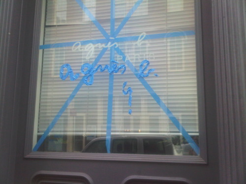
joygarnett.tumblr.com
Which works great for a nimble, inherently creative brand like agnes b.
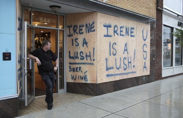
reuters via daylife
But let’s face it, executing on-brand on the fly is tough. Even if guy from Reuters takes a picture of your defiant but slightly odd scrawl, the benefits to your brand are limited if readers have to rely on the caption to learn that Lush is actually the name of your irreverent beer and winé shop.
But it shouldn’t always have to be so ad hoc. This scaffolding covering the glass cube at the Fifth Avenue Apple store looks absolutely fantastic. Those guys really are brand geniuses.
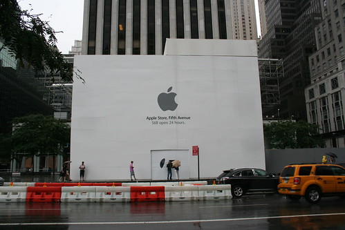
via johnrevill’s flickr
Except it’s actually for an ongoing renovation project. They got lucky. Here’s Getty coverage of a very high-quality boarding-up underway at the Georgetown Apple Store:
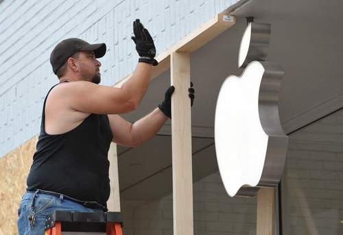
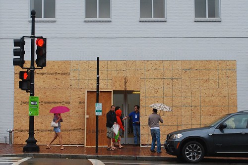
getty via daylife
A barrier which, however strong physically, utterly failed from a brand standpoint. The raw OSB–and not just OSB, but mismatched OSB!–is almost as detrimental as the hidden logo.
“Must Buy Apple Products,” image m.v. jantzen via flickr
In fact, a quick survey shows, with the exception of a few strikingly on-point, silver sandbags in the Meatpacking District, hurricane preparedness design is a glaring weakness in Apple’s heretofore vaunted retail strategy.

jeremy m. lang for nyt
Another tenet of disaster coverage messaging is to balance long and short term objectives. On the one hand, there’s marketing to do and money to be made. On the other, you don’t want to be seen as exploiting either the situation or your customers. So make sure the statement about fair plywood panel pricing is in the shot with the helpfully upselly hurricane shopping list.
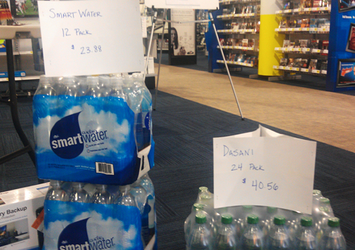
“WOWOW look at what Best Buy is doing! Selling cases of water for over 40 bucks!” via @AConDemand
And remember, a hurricane is no time for business-as-usual, and that goes for branding, too. So instead of squeezing out full, point-of-sale retail for every bottle in inventory, be creative. Offering a case of water free with purchase of every flatscreen could build goodwill toward the brand, which may pay off immediately by mitigating any effects of post-storm looting.
There will always be naysayers who think that putting even a little thought into your brand’s disaster coverage presentation is crass and exploitative. Or who are willing to just hand over complete control of the presentation of their brand to freelance photographers and shiftless twitterers.
To these people, I would say simply, “Follow the experts.”
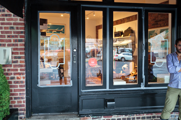
Monocle’s artfully, pointlessly taped storefront, via eric etheridge’s awesome hurricane retail roundup
Not the branding experts who, in their obsessive preservation of brand essence, apparently miss the entire point of taping a window in the first place.
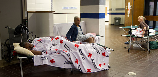
No, the other experts, the ones who live and breathe disaster coverage; the ones whose job it is to stand ready to help, to be prepared to move in wherever The Weather Channel’s satellite trucks may roll. When you’re wondering what your hurricane brand strategy should be, ask the important question first, “What would the Red Cross do?”
colin archer for nyt
Vintage Neutra Plywoodporn
Whatever else it is, Hurricane Irene is the greatest thing to happen to plywood fetishists since the Puerto Rican Day parade.
I love the sight of a freshly boarded up facade under any circumstances, the fiery, manufactured beauty of the plywood grain before it’s sullied by spray paint or Clive Owen movie posters.
Do you remember how they managed to find more of just the right vintage Douglas fir ply in 2001 so they could install Donald Judd’s spectacular 1976 piece, Untitled (Slant Piece) all the way across the back wall of Paula Cooper’s space? I’m getting chills just thinking about it.
I can’t find a picture, either, so these snapshots of the deep, honey-colored plywood I saw around the previously undocumented Richard Neutra lodge I discovered in rural Utah last year will have to suffice:
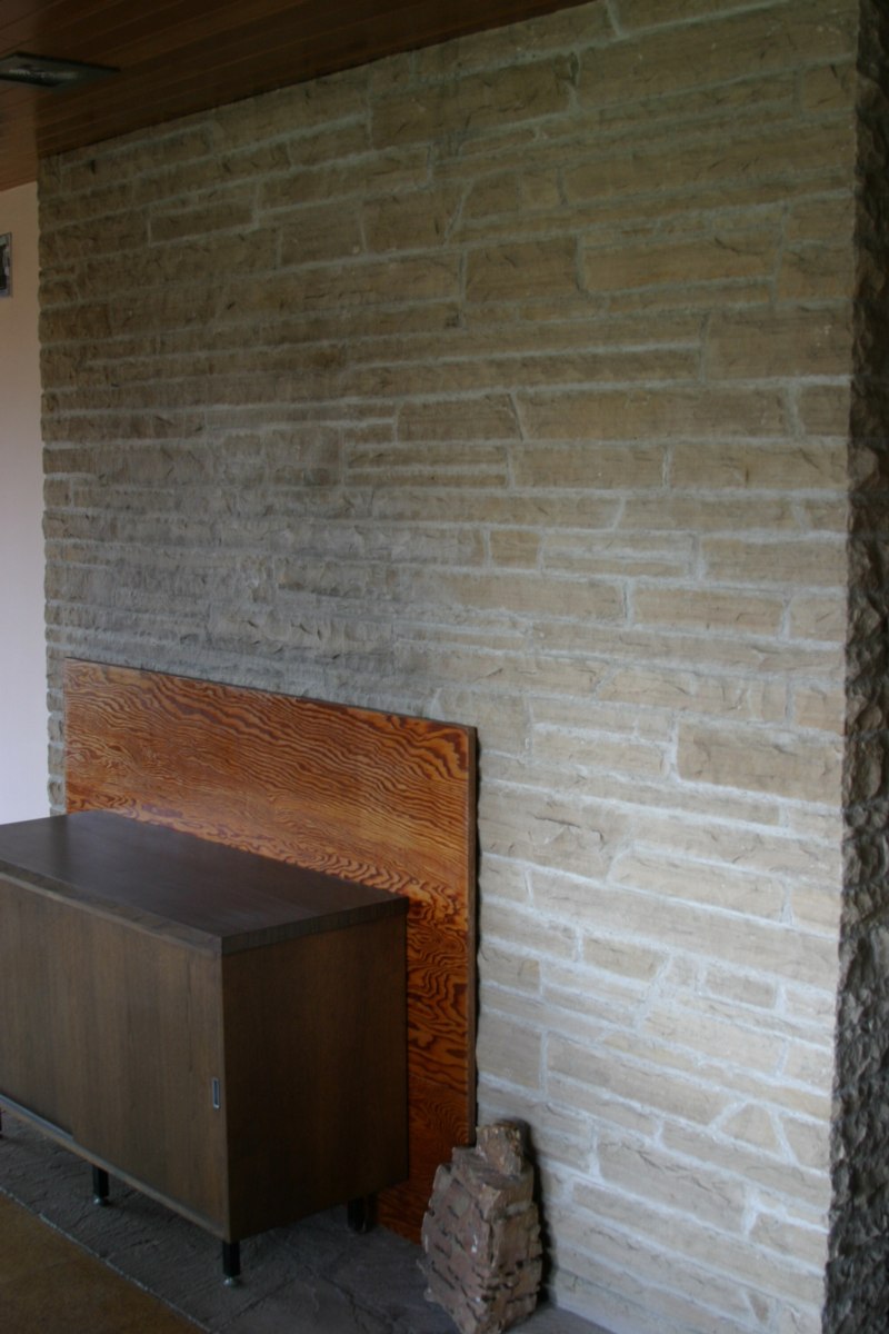
There was this one piece loosely covering up the fireplace in the living room, beautiful, but really, just a teaser.
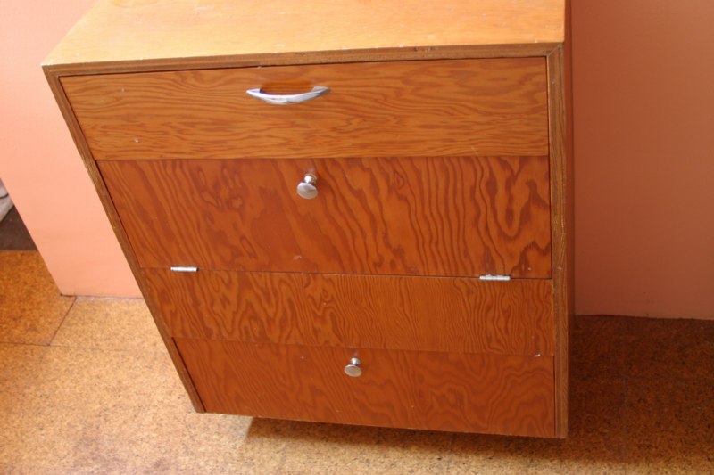
What to do when it’s 1950, and you’re out in a desert field, finishing up your client’s hunting lodge, and you’ve got a bunch of plywood scraps left over? Don’t fret the grain matching, just knock together a small dresser or two.
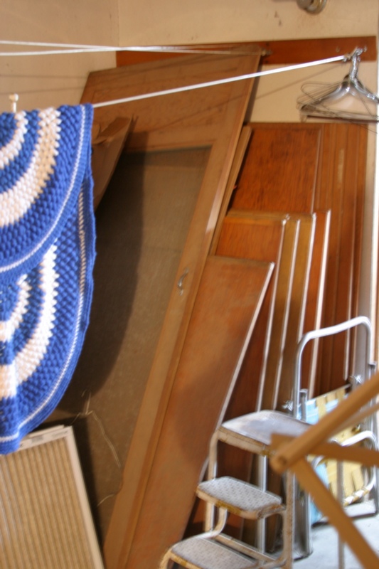
And then just stick the rest down in the basement, so he can use it to close up the house during inclement weather.
Previously: Beckstrand Lodge, Richard Neutra, 1950