
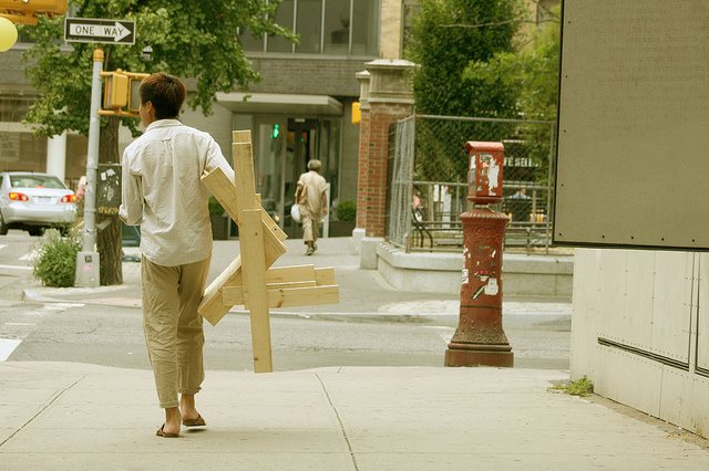
People walking the city streets with made-on-the-spot chairs. First there was the Chaise Bordelaise. Then it was the Sedia Veneziana. And yet, though The Generator by Raumlabor has had two incarnations at Storefront for Art & Architecture this year, there has still not been a New York Chair. Instead, it’s CHAIRS X URBANITY.
Well, we take what we can get. After we make it, that is. Unfortunately, I was out of town, and thus was unable to make and/or take anything at all. Sigh.
Generator 02: Chairs for Urbanity [storefrontnews.org]
Generator Event at NY Festival of Ideas, May 2011 [flickr]
CHAIRS X URBANITY Chair Fare Make and Take August 13, 2011 [facebook]
Previous Raumlabor coverage: sedia veneziana, chaise bordelaise
Autoprotestazione
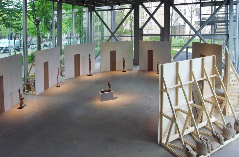
image: designboom
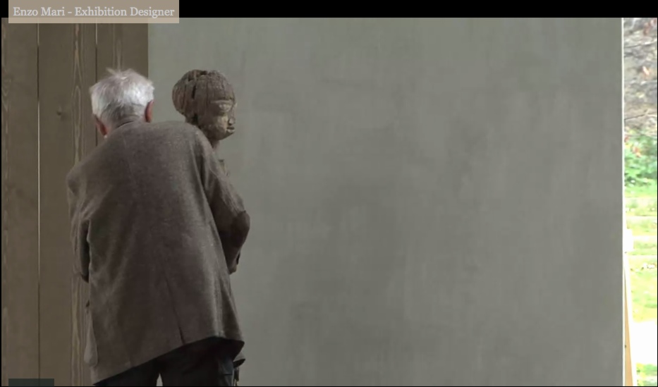
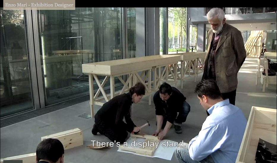
Enzo Mari was brought in to design the exhibition at the Fondation Cartier, Vaudon-Vodun, African Voodoo Art from the Collection of Anne and Jacques Kerchache. It’s simple and spectacular, and designboom has, as usual, rather comprehensive visual coverage of the project.
Above, a “film set” Mari calls The Village, autoprogettazione-esque backdrops to evoke the original context in which Kerkache would have first encountered the impressive household guardian figures. At least that’s how Mari explains it in the exhibition’s making-of interview video:
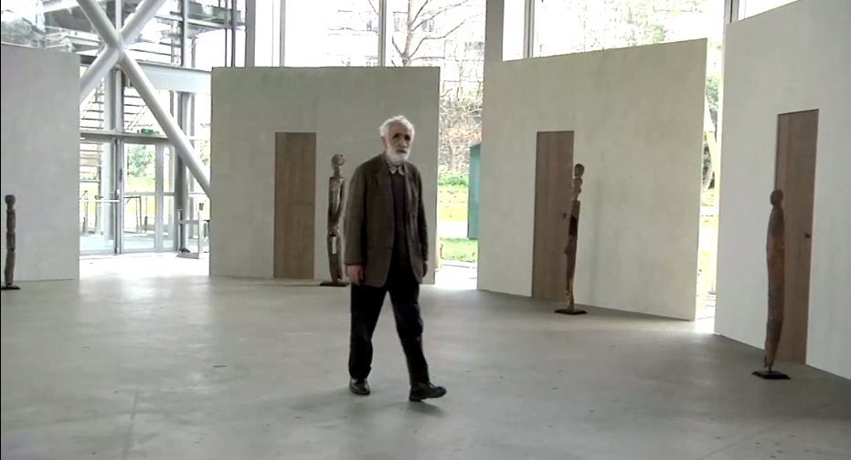
Holy smokes, filmmakers having Mari manhandle one of the guardians! Whether it’s our aging Maestro or the conservators, your insanely staged B-roll stunts are gonna give someone a heart attack!
You don’t bring in a legend like Mari for his finesse at grouping sculptures. You bring him in to fill your glitzy Nouvel folly of a museum with endearingly humble-deluxe, purpose-built pine furniture!
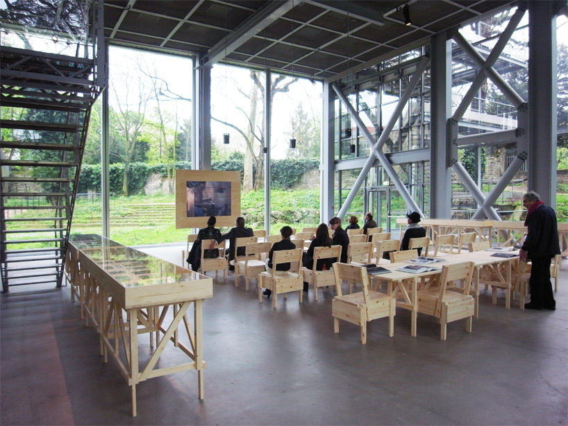
image: designboom
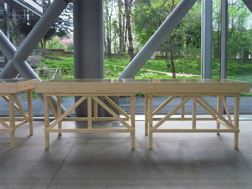
For the major autoprogettazione moment in the film/lecture/reference/public event space, with EFFE tables and SEDIA I chairs. Mais, qu’est ce-que c’est ca? New additions to the series? What’s that wood-framed flatscreen?
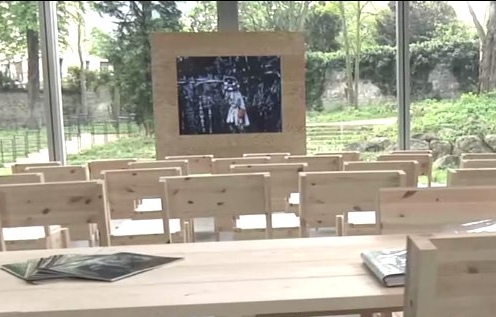
And are those DIY display vitrines ringing the room?
images above via designboom.com
Because the laborer should be able to knock together his own home theater–autoprogezzione?–and a case for his ephemera collection in a weekend using just the most humble materials from the corner hardware store. Or as designboom puts it, and quotes Mari:
the showcases, designed for this exhibition, partake of the same vocabulary.
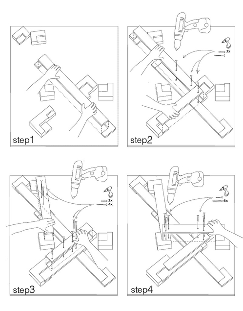
“‘autoprogettazione’ has been a project for making furniture that the user could assemble simply from raw planks of wood and nails. a basic technique through which anyone with a critical mind could address the production of an object.”
So it’s for the [vitrine] user with a critical mind. Autoprogettazione as Institutional Critique. Can I have my show now, please?
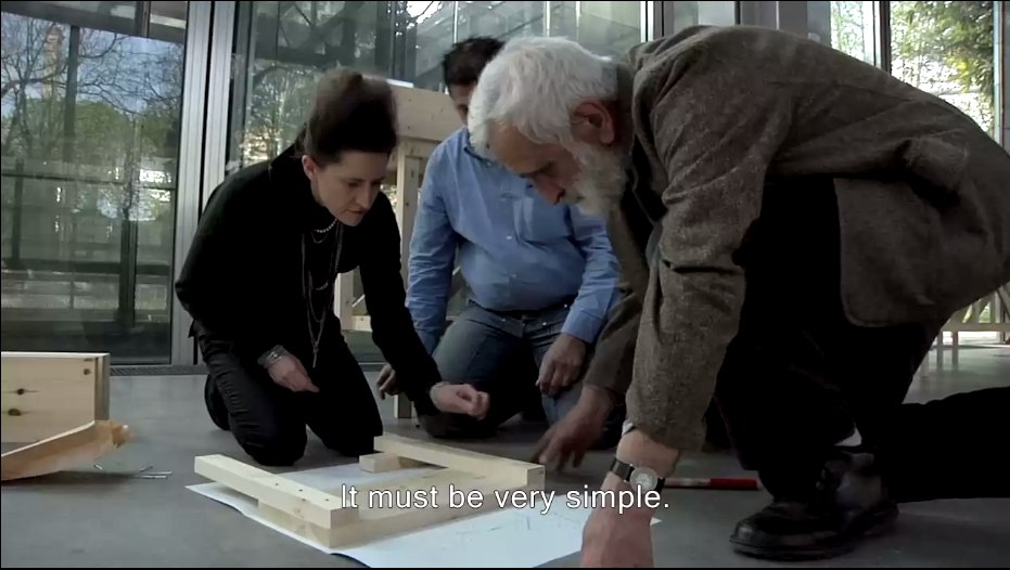
Let’s go to the tape: “There’s a display stand.”
No no, no pressure, just Enzo #$()%ing Mari watching you build his iconic chair there.
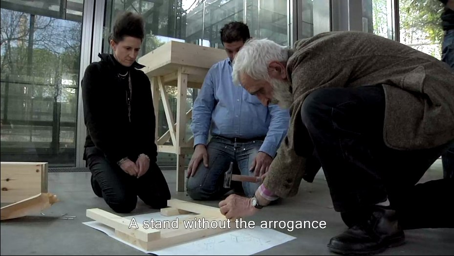
“It must be simple.” Oh no, you B-roll knucklehead don’t do–
“A stand without the arrogance” YOU DID IT! YOU MADE HIM PICK UP THE HAMMER!
Oh, the horror. Why not just take him to a computer and make him fake type something for you? Or walk faux-purposefully down the Boulevard Raspail? How could– No.
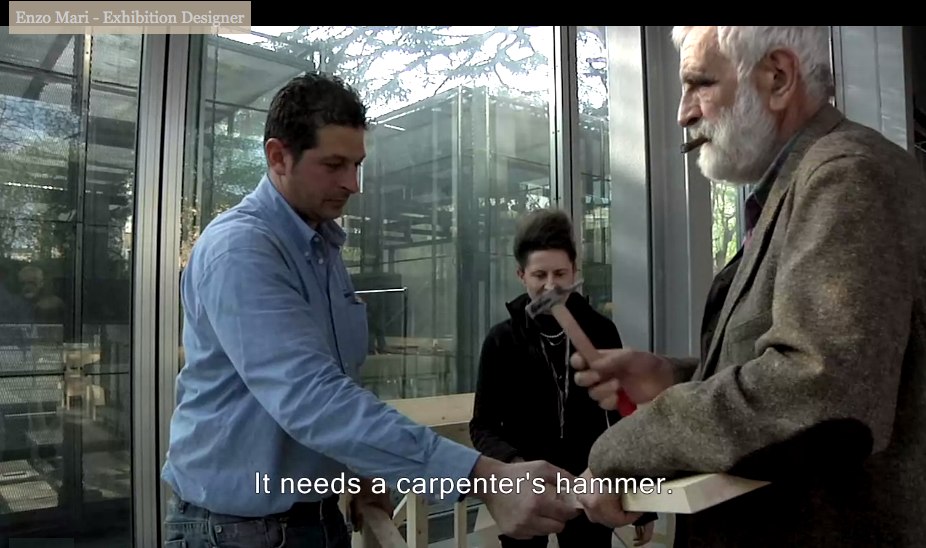
You did not just ask Enzo Mari to hammer something while he was holding it. If you can’t get your $#)(%ing shot, that’s your problem, don’t take it out on a great man like Prof. Mari. “It needs a carpenter’s hammer”? It needs a revolution. Langlois did not lose his job at the Cinematheque so that museum marketing video directors could wrap their late capitalist tyranny in the honorable flag of auteur theory. To the autoprogattazione barricades!
Right after we lock down the salvage rights to those 30 chairs, four tables, eight vitrines–and one flatscreen.

Here’s a shot, though, from Comrade Elena Vidor’s flickr.
UPDATE woo-hoo, and here’s an update from Venice, where Bruno Jakob has installed Breath, a very similar-looking, seven-part series of invisible paintings in and around the Arsenale.

Breath, 2011, via
Vaudou-Vodun, runs through Sept. 25 [vaudou-vodun.com]
Okehed
Since I was researching the family murder last night–an 11-year ranchers’ feud, irrigation wars, shovel fights, gouged-out eye, yearlong revenge plot, shotgun ambush, an old guy named “Boss”–this alternate spelling of OK’d, which I came across in a little story, tacked onto the bottom of a regional news roundup in The Richfield Reaper, c. about 1948 or ’49, is only the second most shocking thing from the past that no one had ever told me about.
Not Steinberg, Wallace, Nabakov Or Qaddafi
Oh brother, I have this giant post mostly written about how Leo Steinberg’s awesome 1997 lecture Encounters With Rauschenberg includes all these references that show that, not only did he recognize the intimate interrelationships between Johns’ and Rauschenberg’s early works, he also identified hints of dialogue, reference, in works made decades later.
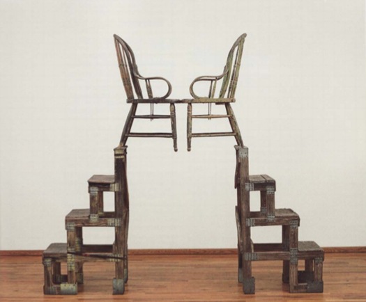
And of course, I’m referring to Steinberg’s discussion of The Ancient Incident, the 1981 Combine/sculpture of a pair of lover/chairs pyramided atop some old steps, which is going to be in Gagosian’s Rauschenberg show in Paris next month. [Hold on, unless that’s the bronze replica Rauschenberg made of the sculpture in 2005. I think it may be. Except I just read the title of the image file, so no. 9/14 update: Except I just read the caption on the email announcement of the same show, and sure enough, this is patinated bronze, and, confusingly, is also titled The Ancient Incident (Kabal American Zephyr), but it has a date, 1981-2006, like it’s the same work, except it’s a different one, or. Anyway.]
I was really going to publish it, but it feels a little, I don’t know, sappy, hokey, romantic, even. But not crazy, AFAIK. As I write out these 2.25 paragraphs, I’m starting to wonder if the best way to put the info out there isn’t as an annotated, footnoted, republished version of Encounters With Rauschenberg, which reveals the lecture to actually be a secret, epic poem of the founding of Bob & Jap’s hometown of Zembla. I so totally called it.
But while busily not writing that, then, and worrying my over-conversational voice, over-excited art historical imagination, and my over-reliance on semicolons and footnotes is a sign of my over-doing it on the David Foster Wallace homage front–but see, Maud, my footnotes are from Pale Fire, not Infinite Jest! I don’t think I’m not copying Wallace; I think I’m not copying Nabokov! Nice work in the NYT Mag, btw!–John Powers matter-of-factly produced the greatest greg.org post ever. On his own blog, Star Wars Modern.
It’s all about the connections between previously overlooked satelloon mentions by Arthur C. Clarke and J.G. Ballard and Robert Smithson and Spiral Jetty. And with some steampunk Contact thrown in for free. I bow my head in awe and gratitude, and I look forward to seeing you back here after you’ve finished reading it.
And then I didn’t post it last night because, well, Libya, of course. Did anyone else notice this crazy, masking tape rebel flag behind these doctors treating a pro-Qadaffi soldier? [nyt/ap]

And then I didn’t fix the post because I was interested in Art In America’s report [via rkjd] that several months ago, John Chamberlain and Gerard Malanga quietly settled their lawsuit over the sale of 315 Johns, which Malanga and like a million other people insisted was his work, made of tons of silkscreened Chamberlain portraits as “an homage” to Warhol, but which Chamberlain claimed he had traded for with Warhol, and that Andy, he, and Henry Geldzahler had cooked it up in the first place, which is how Chamberlain managed to get it authenticated–and which he sold for $3 million at Art Basel “to an unidentified collector.” Mhmm.
My favorite part is how the case got resolved “a few weeks before the May 5 opening of Chamberlain’s first show at Gagosian.” Actually, that’s my second favorite part. My favorite part is the awesome quote Malanga’s lawyer Peter Stern gave AiA:
“[T]here has been no retraction of allegations in the complaint and no one has acknowledged that they are in possession of or know the whereabouts of the painting.
Well now. Glad that’s all cleared up.
EPIC FOIA DHS

The Electronic Privacy Information Center filed a Freedom of Information Act request with the Department of Homeland Security on the government’s deployment of body scanner technology on streets and in roving vans.

These are the three pages of the FOIA report that did not come from a scanner manufacturer’s publicly available brochures and website, and that were not the publicly available agenda for a scanner industry conference.

Related: DODDOACID, one of a suite of six Redaction Paintings made in 2007 by Jenny Holzer from FOIA documents, and acquired by the National Gallery of Art in 2010 [nga.gov]
FOIA Note #20 (August 15, 2011) Government Transparency [epic.org via @wagnerblog]
On The Nature Of The Office Of War Information
Via Tyler Green comes another awesome installment of Alan Taylor’s photoblogging journey through WWII for The Atlantic. This time, a selection of stunning Kodachrome transparencies made by the Office of War Information, selected from the Library of Congress’s growing digitized collection. And look what else is in there?
The OWI was created in 1942 to propagandize domestically and abroad for the war. It sounds like a rather hotly contested mess of a government operation, and its domestic operations were basically defunded by Republicans and segregationists who complained that the OWI was actually using the war effort as an excuse to promote FDR, the New Deal, and racial equality.
A couple of things it did do: launch the Voice of America radio broadcast system, and take over the Farm Service Administration’s photography program. Which means the OWI was also involved in some way with Edward Steichen’s late 1942 MoMA photo exhibition, “Road To Victory,” which included many FSA images.
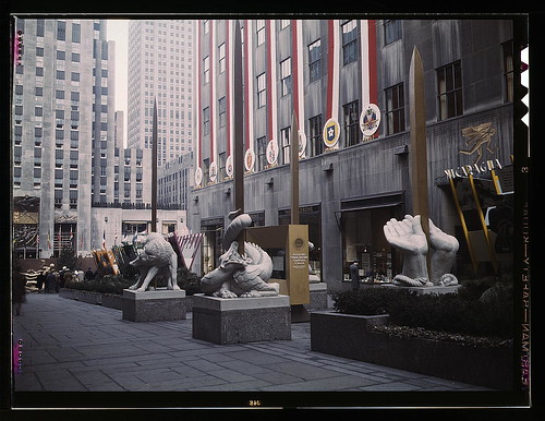
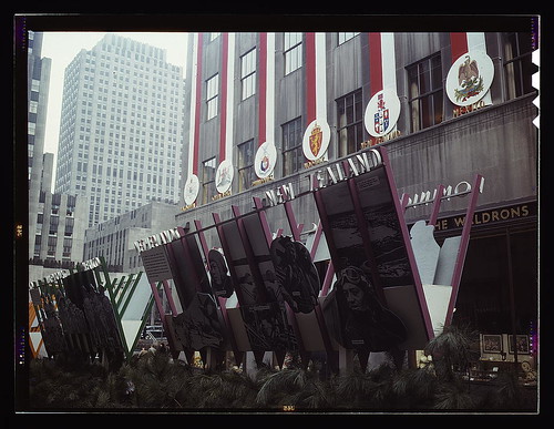
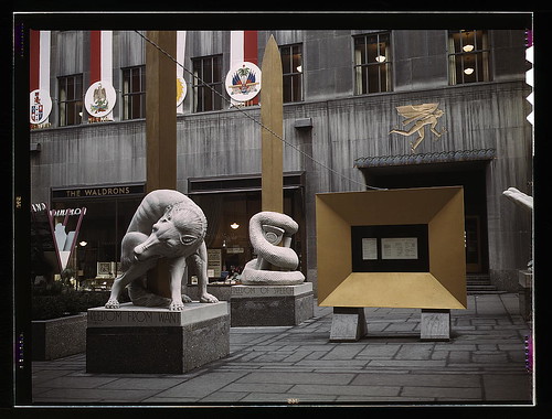
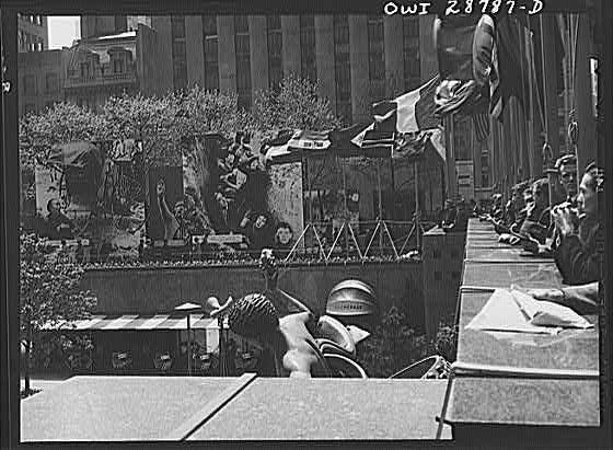
In any case, the OWI certainly turned the center of New York City into their propaganda playground. I mean, holy smokes, check out these photos of “This Is Our War,” just one of an ongoing series of exhibitions they staged in Rockefeller Center. This was in March 1943, and focused on the United Nations, the 28 countries and governments in exile who first signed onto Churchill’s Atlantic Charter, which articulated the Allied principles for the war, and incorporated FDR’s Four Freedoms. Which are embodied here by four giant, allegorical, golden sword statues: a dog, a snake, a dragon [?] and a pair of unbound hands. [2023 update: In answer to a query by a reader, I have discovered that the sculptures were by Hugo Robus, and were destroyed after the exhibition.]
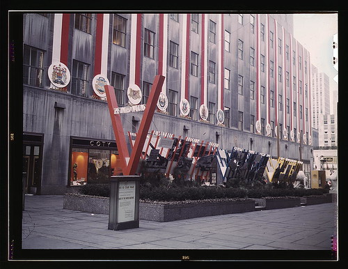
In case you didn’t get the point from the inspirational photomural cutouts or the giant, somewhat awesome V for Victory, the exhibit also featured “amplifiers at each end broadcasting speeches by Roosevelt, Churchill and Chiang Kai-Shek every half hour.”
I know she wasn’t physically delivered into the world until 13 years later, but I wonder if Cady Noland wasn’t somehow born right here on Fifth Avenue.
But wait, there’s more! Here’s how the NY Times reported the opening of the OWI’s next show:
The fanatical scream, “Hell Hitler!” ripped through the air in Rockefeller Center. It took startled crowds some time to realize that the cry and the bark of Hitler’s voice came from some captured German sound films.
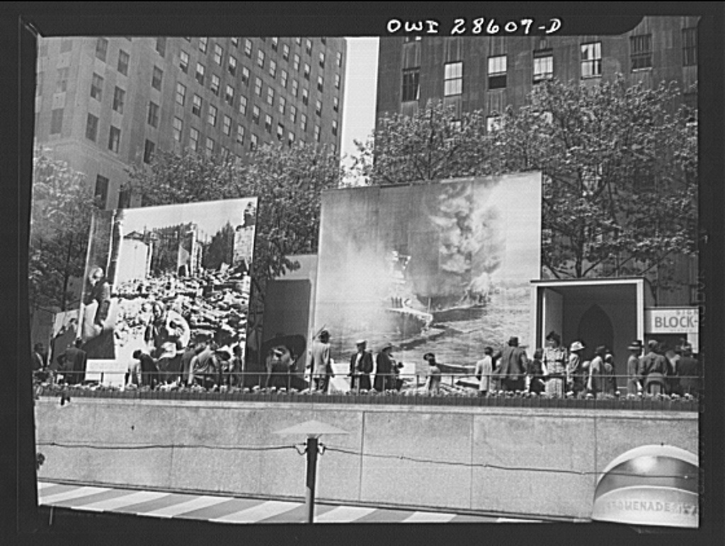
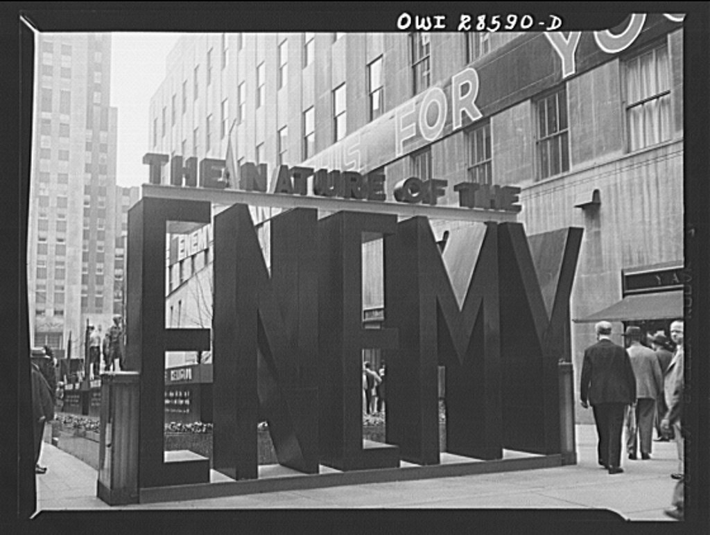
For “The Nature of The Enemy,” the OWI ringed the skating rink with massive photomurals showing Hitler, bombed out refugees, crying Chinese peasants, and flaming battleships. If you bought a war bond, you could sign a bomb that’d get dropped on Berlin.
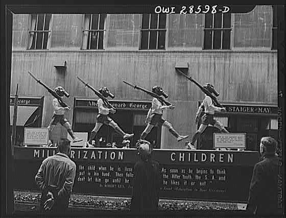
Along the Promenade, a half dozen dioramas were, like the giant banners running the length of the buildings, just depicting the facts, ma’am: “THE ENEMY PLANS THIS FOR YOU”: “Desecration of Religion,” Militarization of Children,” “Concentration Camps,” &c., &c.
I’m sure the uneven spacing and kerning of this otherwise awesome [painted plywood? were there cabinetmakers on staff whose job consisted of building giant letters?] sign/sculpture was frightening enough to cause a dozen Madison Avenue ad layout men to enlist on the spot.
The Nature of The Enemy exhibition, Rockefeller Center, June 1943, 56 images [loc.gov]
Johns On Rauschenberg: A Show In Tokyo
Fear not, I have not given up the search for the missing Jasper Johns Flag painting. The one which was in Robert Rauschenberg’s 1955 combine, Short Circuit, a combine which was originally shown with the title, Construction with J.J. Flag. The combine which was the subject of an unusual agreement between the two artists after their bitter 1962 breakup, that it would never be exhibited, reproduced or sold. Which technically did not happen, since the flag painting was taken out in 1965, and Rauschenberg put the piece, with the title, Short Circuit, on a national tour in 1967 as part of a collage group show organized by the Finch College Museum.
Which, point is, in looking for the flag, I keep finding more things I had never heard about Rauschenberg’s and Johns’ time together, a point at which they each were making hugely important, innovative work. And frequently, it seems, they were working on it together. His, mine, and ours.
For a few months now, I’ve been thinking about a letter Johns wrote to Leo Castelli, which I’d come across at the Smithsonian’s Archives of American Art. I’ve been kind of slow to mention it, partly because it just feels a little weird, like going through someone else’s mail. Which I guess it exactly what an archive is, but still. Also, I’ve been wary of reading too much into a single letter, or of over-interpreting a single statement.
But then I’m constantly struck by how frequently a particular phrase uttered in a single interview can get echoed across the writing about an artist, as if that one statement from decades earlier is somehow not just a snippet of a conversation, but a key to deep meaning. So this overdetermining tendency is not mine alone, and whatever, take it for what it’s worth.
In the spring and summer of 1964, while Johns traveled to Japan, he scouted out Kusuo Shimizu’s Minami Gallery for a future Rauschenberg exhibition sometime after the fall. Johns had some pretty specific suggestions about what kind of Rauschenbergs would work in the small, tight space:
I should think that smaller works as different as possible from one another would be good. Or if Bob is going to
use repeatedrepeat images in all the paintings, one work the size of a wall + several much smaller things. If Bob were willing, I think a good effect could be made by having one large painting + several smaller ones which used the same silk screen images but reduced in size. That is, two screens should be made of each image – one large + one small. The opposite would also work – a large painting with smaller images + smaller ptgs. with larger images.
It’s not that Johns is prescriptive, designing his ex-partner’s paintings at a distance. His language is very careful to couch the decisions as Rauschenberg’s to make. But Johns also has a marked fluency in Rauschenberg’s composition and process, and he seems comfortable discussing it, at least with their mutual friend and dealer.
Johns could discuss Rauschenberg’s silkscreening techniques in detail in 1964, even though Rauschenberg only began using silkscreens in 1962, the year the two finally broke up. [Crocus, done in the late summer/early fall of ’62, is one of the first/earliest silkscreen paintings.]
In any case, one more datapoint. As it turns out, Rauschenberg’s show at Minami never ended up happening. Fresh off his hyped and controversial grand prize win at the Venice Biennale, but while he was still also working as the stage manager for the Merce Cunningham Dance Company’s world tour, Rauschenberg visited Minami Gallery in the fall of 1964.
According to Hiroko Ikegami, Rauschenberg walked in, saw an exhibition of Sam Francis, [“who was still respected and popular” in Japan], and walked right out. Shimizu was offended, and canceled Rauschenberg’s show. Maybe before Rauschenberg canceled it himself, who knows? The Merce tour was a personal disaster for Rauschenberg, and a rift developed between him and Cage and Cunningham which took several years to heal.
Great Minds Think Alike, But Only Some Of Us Write For The New Yorker
I’m a bit embarrassed to admit I didn’t read it earlier, and I have to read it now, obviously, now that it’s finally been published in the US. But I wonder if my first short film may be an inadvertent adaptation of Geoff Dyer’s 1994 essay on World War I and the Memorial to the Missing of the Somme at Thiepval, France.
The Millions has a nice interview with him about it:
TM: You write in the book, “The issue, in short, is not simply the way the war generates memory, but the way memory has determined – and continues to determine – the meaning of the war.” Can you describe the meaning of the war?
GD: Always in the book I’m just trying to articulate impressions of it. It’s certainly not a history book. I always have faith in this idea that if I remain honest and open about my own confusion, the blurriness of my impressions – it’s not because I’m short-witted or stupid – the chances are those feelings will be shared by other people. And I just had this very distinct sense of the First World War as being something rather buried in its own memory. There’s so much discussion, as the war is going on, about how it will be remembered, or if it will be forgotten. So right from the start it just seems preoccupied with how it will be remembered. The other crucial thing is that distinction I make with the Robert Capa pictures of D-Day, where it all seems to hang in the balance and there’s a great sense of immediacy. With the First World War there’s no immediacy to it. It comes buried in so many layers of myth and memory.
Hmm, actually, maybe not. Or maybe the opposite. In 2001-2, I was looking at what a place of horrible destruction was like when there was no one left who did remember it. The difference between remembering and knowing, perhaps. Or the past and the experience of the present.
Also, Spiral Jetty first re-emerged in 1994, not 1999. I’d have thought the New Yorker would’ve caught that.
The Millions Interview | Geoff Dyer on the London Riots, the Great War, and the Gray Lady [themillions.com]
The Missing of the Somme (Vintage) [amazon]
Flip Books, Floats & Photomurals: More On Robert Breer
So wonderful. William Smith writes about visiting Robert Breer’s home studio as part of Triple Canopy’s publication in residency last Winter at MOCA Tucson. Which sounds like the awesomest boondoggle ever, btw:
Breer famously composed most of his films one frame at a time by photographing individual drawings he made on index cards. Thousands of these drawings were filed away in his Tucson studio in what looked like old card-catalogue cabinets. As we asked about his films he would reach into the files, pull out a sequential handful of cards, and make an impromptu flip book, animating a short clip with his hands. The setup recalled the earliest days of cinema, when filmmakers would submit still prints of every frame of a movie to the Library of Congress for copyright purposes and, eventually, preservation. One can only hope that Breer’s trove of drawings will find such a home.
Meanwhile, from another dormant browser tab, here’s a screengrab of a video from 2003, an exhibition of E.A.T. at NTT’s ICC, the Inter-Communication Center, a multimedia arts space in Tokyo.
I love the kind of unabashed way the giant-but-not-lifesize photomural of E.A.T.’s Pepsi Pavilion relates to Breer’s full-size Floats. I’d assumed these floats were refabricated for Tokyo, but maybe Pepsi has kept them all this time. I think they’re at the Baltic Center retrospective now. Maybe someone could find out and let me know.
Float on: Robert Breer, RIP [canopycanopycanopy]
◎ E.A.T.─芸術と技術の実験 [ntticc.or.jp]
In The Actor’s Studio
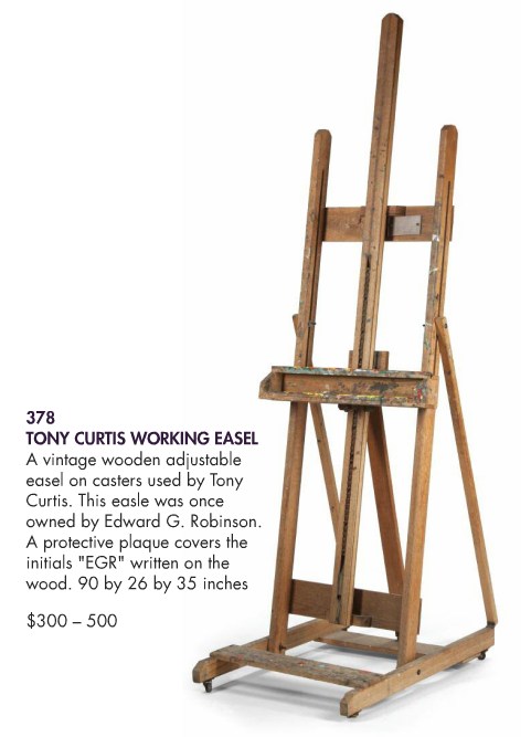
The backlog around here is so big, I was joking with a friend this morning that I should rename the blog, “Things I’ve Been Meaning To Write About.” But for some reason, I can’t let another day go by without saying something about the upcoming auction of items and artwork [!] from The Estate of Tony Curtis.
Tony [actual name, Bernie Schwartz] was not only a famous actor, he was a dedicated artist. A painter, mostly, though he also made objects, sculptures, shadowboxes filled with found objects, slightly less creepy than Joseph Cornell’s.
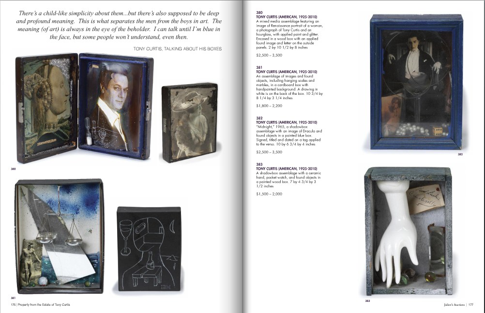
The Julien’s Auctions catalogue has some big pull quotes from the late artist himself. The best one is on the boxes:
There’s a child-like simplicity about them…but there’s also supposed to be deep and profound meaning. This is what separates the men from the boys in art. The meaning (of art) is always in the eye of the beholder. I can talk until I’m blue in the face, but some people won’t understand, even then. [emphasis added]
Anyway, it’s really, really not the art that interests me, so much as something like an admiration, maybe with a mix of pathos? Sympathy? Is that too presumptuous? About the mix of over-the-top celebrity living combined with a generally unappreciated pursuit of artmaking.
[According to the Independent, art was his primary occupation for the last 25 years of his life. The article is also strangely focused on how such a manlyman as Curtis could produce such feminine art: Matisse-inspired paintings and Bourgeois [uh, no, really??]-inspired boxes.]
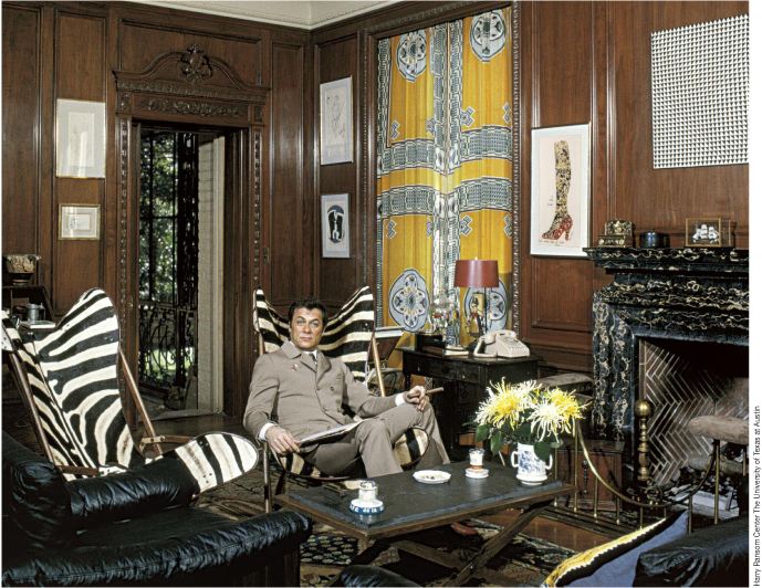
First, up top, just wow. Collector AND artist. There are several photos in the Julien’s catalogue from this shoot, which I assume was in Curtis’s old Beverly Hills place. Mondo Blogger wondered what that Op Art piece over the fireplace is? It’s not in the sale. Neither are those zebra skin butterfly chairs. Too bad. The Warhol Some Like It Hot Shoe drawing is, though.
A lot of boxes in his studio. Holy smokes, did you know that he got his faux 18th-century dining/work table from Marlene Dietrich?? [Lot 385: est. $2-4,000]
According to the Independent, art was Curtis’s primary occupation for the last 25 years of his life. But it must also have been his lifelong passion. Just look at the young Curtis there working shirtless at his easel.
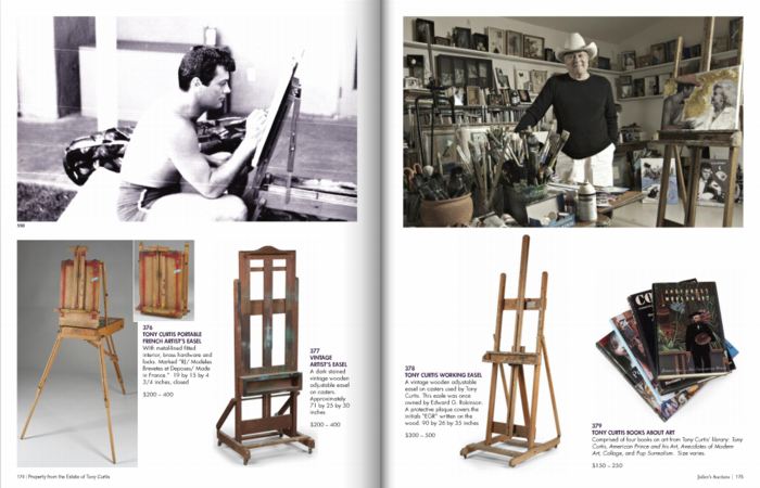
That article is also strangely focused on how such a manlyman as Curtis could produce such feminine art as his crafty little shadowboxes, or his Matisse-inspired paintings. Speaking of paintings and easels, did you know Curtis got this easel from Edward G. Robinson? He even put a protective plexi cover over EGR’s initials.
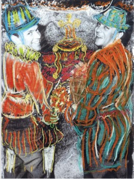
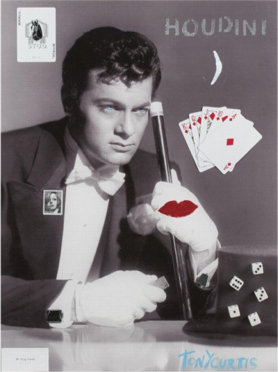
Curtis was apparently selling limited edition gliclee prints on canvas of his work, signed and with “applied objects and handpainted enhancements,” on his website, which, good for him. The original overpainted photo of Curtis and Sinatra is probably my favorite of his works. He really cut loose. Very Vegas.
But it kind of breaks my heart a little to read the lot descriptions for some of these prints [actually, the Sinatra piece is the original]: “Numbered 9/250 on the verso. NOTE: According to the Tony Curtis Estate, only 15 copies of this giclee were produced.”
But these late painting/print/whatevers, as well as many of the shadowboxes, appear to be explorations of Being Tony Curtis. With maybe a little exploitation thrown in. I guess he figured his celebrity was what people wanted [to buy], hopefully in editions of 250. Oh well.
There are mountains of household tchotchkes and objets, too, typical ticky-tacky decorator infill–and yes, I think having Tony Curtis’s porcelain elephant plant stands would be cooler than having generic Pasadena antique store porcelain elephant plant stands, but not by much.
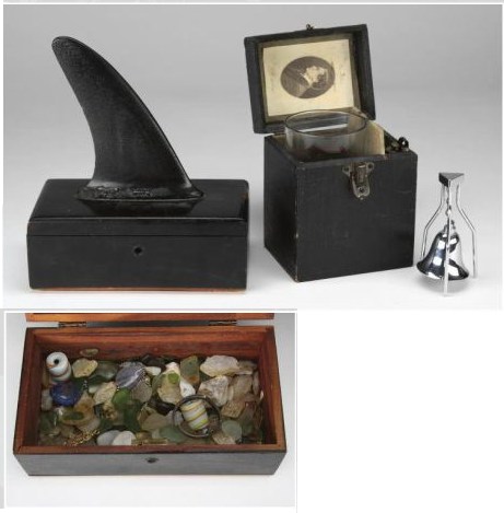
But there are a few things that seem to bear the mark of the artist’s hand more than others. The pair of black-lacquered cedarwood boxes, for example, one filled with sea glass and topped with a shark fin-like surfboard skeg, and the other lined with one of Houdini’s bookplates. I mean, right?
If I end up bidding, though–and this may be why I’m writing about it, to psyche myself up or out of bidding–there’s only one thing I’m going for: the Tony Curtis Artwork Chandelier.
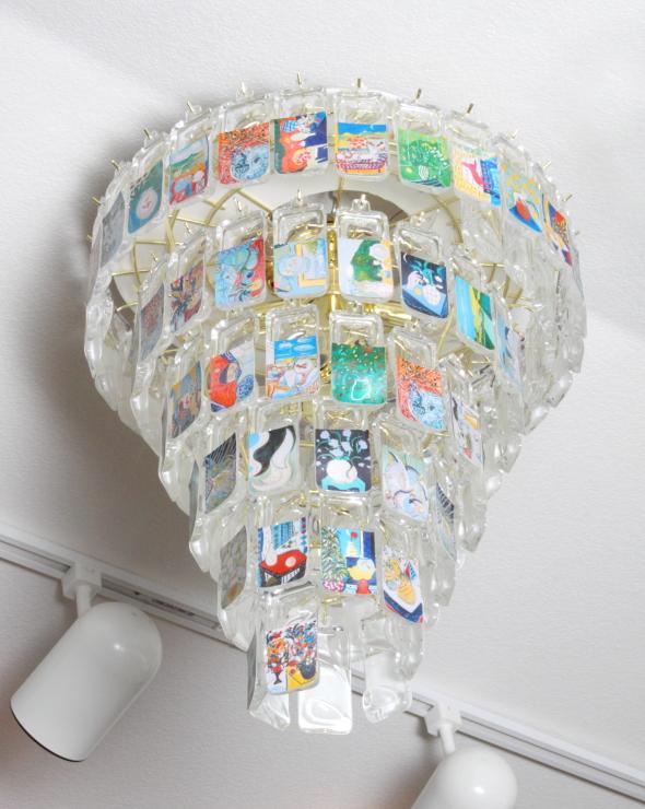
A unique piece, it’s described as “A spiral brass hanging light fixture with multiple Lucite tags, each featuring a different piece of Tony Curtis artwork.” An entire Curtis retrospective in a spiral light fixture. It’s Boite en Valise-meets-The True Artist Helps the World by Revealing Mystic Truths. [Lot 400: est. $300-500] Maybe I’ll hang it over Marlene Dietrich’s dining table.
Property From The Estate of Tony Curtis, Sept 17, 10:00AM PST [julienslive.com]
View Of New Amsterdam
I’m not sure why I’m so fascinated with the Netherlands, or more precisely, why it’s the source/site/subject of so much of my art/object/image/culture interest. Maybe it’s because of New York, which has always felt to me of a piece with Amsterdam in some way. Whatever, maybe the particulars are not that important right now.
But I’d like to see more thinking and writing and reporting like Steven Erlanger’s NYT piece on immigration, religious tension, politics and Dutch identity.
The sometimes violent European backlash against Islam and its challenge to national values can be said to have started here, in a country born from Europe’s religious wars. After a decade of growing public anger, an aggressively anti-immigrant and anti-Muslim politician, Geert Wilders, leads the third-largest party, which keeps the government in power.
Wow, I just re-read the 2010 post I wrote about remembering Laurence Wechsler writing on Vermeer. It’s the same things. And you know, maybe these particulars are important right now.
Amid Rise of Multiculturalism, Dutch Confront Their Questions of Identity [nyt]
Previously: What I Looked at in 1995: Vermeer’s View of Delft
On Robert Breer, Floats, Rugs & Flags

I’ve had Michelle Kuo’s interview with Robert Breer [artforum, nov 2010] open in my browser tabs for months now, ever since Steve Roden posted about his incredible little toy Float, which was sold at MoMA’s gift shop in 1970, at the same time one of Breer’s original Pepsi Pavilion Floats had been liberated from Expo’70 in Osaka and set loose in the Abby Aldrich Sculpture Garden. [A PDF of The Modern’s Aug. 25 press release for the piece, titled Osaka I, said the toy Floats would be sold for $7.95, or two for $15,” in the Museum’s Christmas Shop.]

Kuo’s is one of the best interviews I’ve seen with Breer; most never got past the basic, “how did you get into animation?” “So you lived in Paris on the GI Bill?” chestnuts. With what is now a terrible lack of urgency, I’d made a few attempts to track down Breer this year, in hopes of following up with him about what he’d probably consider the least important aspects of his creative practice: the commercial work and product design and TV animation [including still unidentified segments on The Electric Company] he would bring up–and then insist be kept separate.
Because Breer’s consistently innovative filmmaking and playfully minimalistic/animalistic sculptures–and the fact that he did his most monumentally awesome art work for Pepsi–hinted at the potential relevance of the work he kept in his commercial closet.
Which, amusingly, is not really the point, except to say I want to find a Float of my own, please.
No, the immediate point is, wow, how awesome is Breer’s 1966 sculpture, Rug? This was the work that introduced Breer’s sculpture to me, at a show that also opened my eyes to the revelatory breadth of his filmmaking. It was recreated for the first time in decades in 1999 at AC Projects. Their small second floor space in off-Chelsea was creeping and crawling with little Breer sculptures, while the Mylar Rug slowly shifted around in place. The other works felt alive, droid-like. Rug‘s movements were creepier, more ominous, like something was alive underneath it.
Good for the Walker, it looks like they acquired the mylar Rug [there are others, in other colors/materials] just this year.
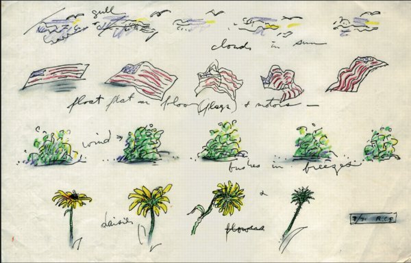
Anyway, while poking around GB Agency, Breer’s Paris gallery, I came across this sketch, dated 8/71, which includes an incredible proposal for a Rug piece made from an American flag. [The text underneath reads, “float flat on floor (flags) + motors”.] The storyboard-like drawing not only ties Breer’s sculptural and animation projects together nicely; the other three sequences–“cloud in sun,” “bushes in breeze,” and “daisies”–help site Breer’s work in observation, duration, and the natural world. Which may have mitigated the political implications in 1971 of something lurking under a crumpled US flag.
In any case, I expect, if not exactly look forward to the day when, this work will be realized for a future Breer retrospective.
On Being Karl Lagerfeld
Everyone was so hyped up about the extraordinary, long New Yorker feature detailing the hunting and killing of Osama Bin Laden, that well, obviously, I couldn’t post about it at the time. But I was so pissed at Helmut Lang for shredding his 6,000-piece clothing archive and turning it into mediocre sculpture, I knew I had to put things into context. See the bigger picture. Figure out what’s really important. I had to go back and re-read John Colapinto’s extraordinary, long New Yorker feature on Karl Lagerfeld from 2007. Specifically this scene:
The fitting model strutted forward in a new outfit and posed in front of Lagerfeld. He scrutinized her through his dark glasses and frowned. He said that he did not like the way the assistant had arranged the neckline of the sweater the model wore. Several assistants converged on her and began to tug uncertainly at the fabric.
“Non, non!” Lagerfeld said.
He uncapped a black marker and, rings clacking, made a quick sketch on a pad in front of him. Lagerfeld derisively describes many of his colleagues as “playing the designer,” because they drape fabric on a model or a dummy; he conceives his collections at a kind of platonic remove, in multicolored drawings on paper, and only rarely touches fabric. The picture he produced–a swift hash of lines suggesting a soignée woman–reflected his skill as an illustrator. (His work has been published in numerous books and magazines.) An assistant looked at the drawing and hustled to the model to make adjustments. Lagerfeld ripped the drawing from the pad, crushed it in his hands, and tossed it into a large wicker hamper, which, over the course of the evening, filled with similar small masterpieces. “I throw everything away!” he declared. “The most important piece of furniture in a house is the garbage can! I keep no archives of my own, no sketches, no photos, no clothes–nothing! I am supposed to do, I’m not supposed to remember!” He smoothed a gloved hand over the empty page in front of him and visibly relaxed.
The whole piece is just a mutant rollercoaster ride of journalism, down to the last “hmm?” Here’s another awesome scene:
Finally, Lagerfeld stopped talking and agreed to give a tour of the house. After warning, “You will think I’m a madman,” he led the way up a grand curving marble staircase. The second floor is composed of huge rooms with soaring ceilings, ornate plasterwork, wood panelling, and fifteen-foot-high mirrors. The furniture, a mixture of antique and modernist pieces, was almost impossible to see, hidden under hundreds of magazines, CDs, photographs, promotional brochures, and books, which lay in heaps spilling on every surface, including the floors. Scattered through the rooms were dozens of iPod nanos of every hue. Each one was loaded with songs that Lagerfeld listens to when designing his collections, which he does, he says, usually in the mornings, while dressed in a long white smock. Surveying the scene through his black glasses, Lagerfeld said serenely, “Normal people think I’m insane.”
He says that again later, after visiting his dressing area and the room with his five hundred suits, and then, “He shrugged. ‘I don’t know what ‘normal’ means, anyway.'”
In Colapinto’s telling, Lagerfeld’s voracious excesses of cultural consumption are designed to stave off boredom. The sustained investment in financial, human, and emotional capital required to keep Karl Lagerfeld entertained–and entertained enough to produce a new mountain of luxury goods year in and year out–is staggering.
And in a way, a good way, boredom was part of Lang’s stock in trade. His clothes felt like an antidote to relentless fashion stimulation. At least they did at the time. For a customer. For Lang, though, who can say? He may have had some issues with the whole thing. Here’s what I wrote about his first artwork, a giant disco ball which was exhibited in 2007 as “found,” but which actually came from Lang’s shuttered SoHo boutique:
Which completely changes the question of the disco ball from, “Where the hell’d he find it?” to “why the hell’d he keep it?” A glittering symbol unceremoniously yet sentimentally hauled out and dumped on an 18-acre beachfront estate in East Hampton and left to weather away in over-fabulous isolation. With a 4-foot disco ball in tow. [ba dum bum.]
Ultimately, Lang’s problem maybe is not boredom, or not even that he’s too normal, whatever that is, but that he’s not Karl Lagerfeld. And for that, I imagine Lang is thankful.
The World Trade Center Memorial Is A Series Of Tubes
Wow. Nearly camouflaged.
While each pool has a pumping system powerful enough to recycle 52,000 gallons of water per minute, it is the surface of the nearly 1,600 lineal ft of parapets that had to be robust enough to withstand rain, scorching heat, snow and ice as well as the wear and tear of three million annual visitors. For the comfort of the millions of hands that will touch the etchings, the parapets have a heating and cooling system.
“The [National September 11 Memorial & Museum non-profit foundation] was very concerned about making the experience as pleasurable as possible for visitors,” many of whom will want to touch the engraved names, says Robert Downward, an associate with the project’s local MEP engineer, Jaros Baum & Bolles.
JBB and Service Metal Fabricating, the parapet’s Rockaway, N.J.-based supplier, knew of no prototype for a project like this, so they started from scratch to build a back-mounted tubing system that would work within the parapets and the nameplate system. The fabricator built a prototype of the panel, tested it under sunlight and then analyzed the results using computational fluid dynamics modeling.
“We calibrated the model so that it produced results in line with real field conditions,” Downward says.
The result is a network of tubes that feed water behind the bronze plates. The tubes, nearly camouflaged, are underneath the plates and parallel to the rows of names.
“The spacing between the tubes was critical to maintaining comfortable temperatures at the panel surface,” Downward says.
Each parapet section was shipped to the site with the tubes attached. Then, using a series of manifolds, workers connected the tube sections to the piping. The piping is connected to below-grade equipment that supplies the heated or chilled water.
9/11 Memorial Is Centerpiece of World Trade Center Redevelopment [enr via @chton1c]
On Jacob Kassay And Collaboration
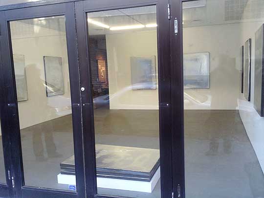
image: portlandart.net
I confess, I was as taken as the next guy by the Shiny Object-ivity of Jacob Kassay’s electroplated solo debut at Eleven Rivington in 2009. Next guys like Portland Art’s Jeff Jahn, who wrote the show felt “more in touch with the unsettled world of 2009.” And Andrew Russeth, who nailed the charred & mirrored monochromes as “look[ing] like elegantly abused luxury goods.”
And I had a big setup here, which I just deleted, about how I’m really not trying to add to the burgeoning body of Kassay concern trolling, articulated most clearly by Sarah Douglas, about the risks of overnight market success on the emerging artist.
But then I read Ed Schad’s earnest attempt to strip the market hype preconceptions from his review of Kassay’s current show at L&M Gallery in Los Angeles. And I have some issues.
On their face, Kassay and his silvered paintings seem almost too perfectly suited for the Art World’s Next Top Model cautionary tale. It’s like they’re a trap, paintings perfectly calibrated to separate the most narcissistic collectors from their dough. The installation of silvered paintings at Art Basel [below] didn’t help, and neither did Kassay’s dealers’ assertion that the paintings, a suite of eight, would only be sold together–and to a museum–for somewhere around EUR250,000.
It’s hard to counter this narrative; or to wonder how much discourse around Kassay’s work is critical backfilling prompted by dealers or other vested interests. And I think Schad captures the difficulty well, questioning the conceptual underpinnings of Kassay’s show in the face of his monochromes’ unambiguous, materialist beauty:
I get the impression that the center of L&M’s show, a large work on paper placed on rough 2 x 4 studs with a ballet barre positioned in front, is Kassay’s attempt at giving us what may be a position, although that its orientation towards giving the show a conceptual reading also does a disservice. The work is ineffective, pitching a now typical rough D.I.Y look that is often misconstrued for sincerity and humility. Work like this neither sincere nor humble, but instead uses tropes of sincerity and humility as a cop-out for rigorous thinking. I have to admit, that Kassay’s center piece looks grad-school and virtually destroys the mood of refinement and elegance created by the smaller works.
I can’t fault Kassay entirely for this. After all he is young, and perhaps the impulse is to bring a little resolution and a little art history positioning to a practice that is probably more at home in explanation-less experimentation and straight ahead aesthetics. With the ballet barre, suddenly we are allowed to think of performance, of metaphor, of the history of Rauschenberg, his performative collaborations, and his white paintings, the idea of a monochrome as blank surfaces or “landing strips” for dust, light and shadow
Schad’s identification of the monochrome as Kassay’s field of bold engagement is right-on, but I think his skeptical de-emphasis of the artist’s reference to Rauschenberg, the conceptual and the collaborative is a mistake. These may turn out to be central elements of Kassay’s practice.
From the L&M press release:
This installation conceit engages Kassay’s interest in artist collaborations such as Rauschenberg and Johns designing sets for Merce Cunningham performances and an abundant history of multi-media collaborations. It evokes these ideas, but also takes into consideration the gallery as a place for practice, repetition and the natural gradients provided by the light, the white walls and the work itself.
Which, hmm. There’s a crossed up analogy there–sets and performance vs barre and practice–which effectively conflates gallery show with studio practice [all puns presumably intended].
I didn’t want to be all Johnny one-note, but since he/they mentioned him first, I can now point out that the paradigm Kassay’s debut on the art world stage most closely resembles is not Ryman or Klein, or even Rauschenberg, but Johns. Rauschenberg’s 1953 Stable Gallery show of white and black monochromes was more scandale than succes, and he fought the unserious bad boy image for many years, while Johns’ work was hailed–and sold–right out of the gate. And while flags and targets might stand out, most of Johns’ earliest exhibited works [1957-58] were monochrome paintings.
And though Rauschenberg’s reputation as a dance collaborator is well known, somehow Johns’ image of painterly solitude persists [at least for me], even though he was deep in the mix. Here’s a quietly remarkable comment Johns made in 1999, while discussing the creation of the artists-for-artists-oriented Foundation for Contemporary Arts, which he still heads:
In 1954 I had helped Bob Rauschenberg a bit with his Minutiae set, his first for Merce Cunningham, and I continued to assist him with most of his stage work through 1960. We were friends with Merce and John Cage and saw them frequently. In 1955 there was an evening of Cunningham/Cage performances at Clarkstown High School in Rockland County where we met Emile de Antonio. In 1958 de, as he was known, Bob and I formed Impresarios Inc. which financed and produced the 25-year retrospective concert of John Cage’s music at Town Hall in New York.
I guess this is all an aside, but the Walker is preparing Dance Works I: Merce Cunningham and Robert Rauschenberg, a show this fall of their Cunningham archive holdings which, at least in the title, doesn’t consider Johns’ collaborative role. Not that the Walker ignores Johns’ dance work; they have his Duchampian set structures for Walkaroundtime, after all.
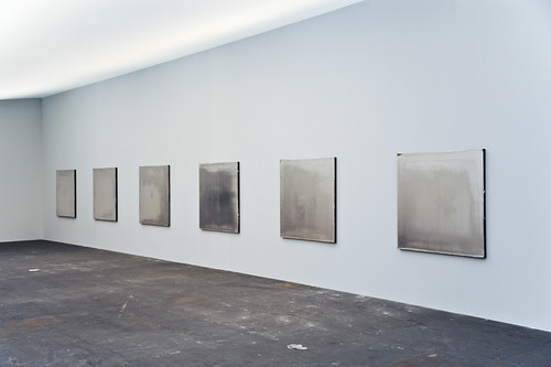
henry codax, installation view, via carriage trade
So what’s this got to do with Kassay? Are his only collaboration references in his L&M show? In fact, he’s apparently got another show up right now which takes the model collaboration and the issue of individual artistic creation and authorship head-on. Andrew Russeth reports that Carriage Trade’s current show, an exhibition of monochrome paintings by the fictitious artist Henry Codax, is actually a joint project of Kassay and the minimalism-inflected French Swiss conceptual artist Olivier Mosset.
And now that you mention it, in May 2010, before any of the auction madness, Kassay opened his show in Paris with a collaboration as well. Iconic minimalist trumpter/composer Rhys Chatham performed at Art Concept, with a pair of Kassay’s silvered paintings as a backdrop. Watching video of the gig [Here are parts 2 and 3, total runtime is about 55 minutes.], I’m struck by how the paintings function as screens, reflecting the movements of the small, otherwise invisible crowd.
For the two previous summers, at least, the Paris-based Chatham loomed large in New York. His landmark composition, A Crimson Grail, an orchestra for 200 electric guitars, was rehearsed and rained out at the last minute in 2008 as part of Lincoln Center’s Out of Doors series. It was finally, triumphantly performed the next year. Andrew Hultkrans recounted the euphoric experience for Artforum.
In September, Primary Information is releasing a limited edition LP of the Kassay performance, with an additional work, under the title, Rêve Parisien. And in October, Kassay is having a show at the ICA in London, which is apparently still operating. For the moment, Eleven Rivington is surprisingly not mentioned in ICA’s brief bio of Kassay.
UPDATE Ultimately I’m glad I ended so abruptly; maybe it was enough to spur Andrew into action. He reminded me of the collaboration I’d forgotten, the one which had finally pushed me over the colabo-writing edge. From Karen Rosenberg’s NYT review of this year’s so-called Bridgehampton Biennial, where the backyard is strewn with Lisa Beck’s satelloon-lookin’ sculptures, and the front yard features a 1964 Ford Galaxy awaiting “an ‘artist’s renovation’ by Servane Mary, Jacob Kassay and Olivier Mosset.” Those shiny silver balls’ll throw me ever’ time. [Of course, this show also brings up Bob Nickas’s role in launching Kassay’s work into the discourse. This is at least the third Nickas-curated show to include Kassay. Dance with the one who brung ya.]