
At least the Space Force guy is on the job.
the making of, by greg allen

At least the Space Force guy is on the job.
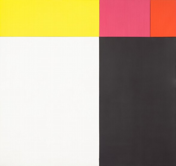
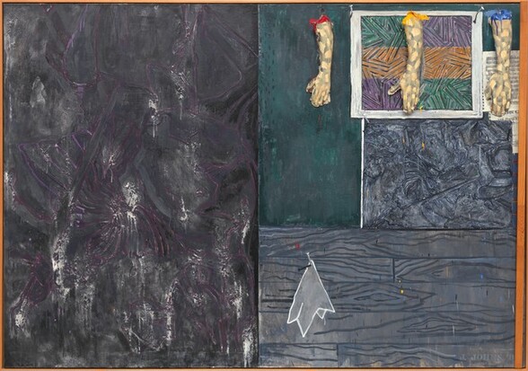
One of the great rewards of the Ellsworth Kelly @ 100 retrospective at Glenstone is seeing this foundational, early multi-panel work, Tiger, from 1953, which is in the collection of the National Gallery of Art.
Kelly worked out the colors and dimensions of the five monochrome panels in Sanary, a seaside village in France he visited in 1952. It’s one of the largest of the very few paintings he actually made in France and brought home with him to New York in 1954. The work he developed in Sanary has been on my mind for years; it’s some of his formative work that would inform his whole career.
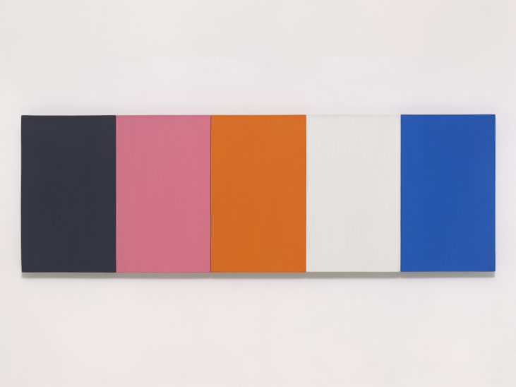
The NGA’s text, written by curator Molly Donovan, cites Yve Alain Bois’ research that Kelly began with found colors, a set of paper stickers used in French kindergartens known as papier gommette. The colors are very similar to another multipanel work from the same moment, Painting for a White Wall, 1952, which is now in Glenstone’s collection. As Yve-Alain Bois discussed here when his CR Vol. 1 came out, Tiger was instrumental to the beginning of Kelly’s official exploration of color behavior; it was where he set out to understand “the strange orange/pink” that had occurred in the found colors of Painting for a White Wall.
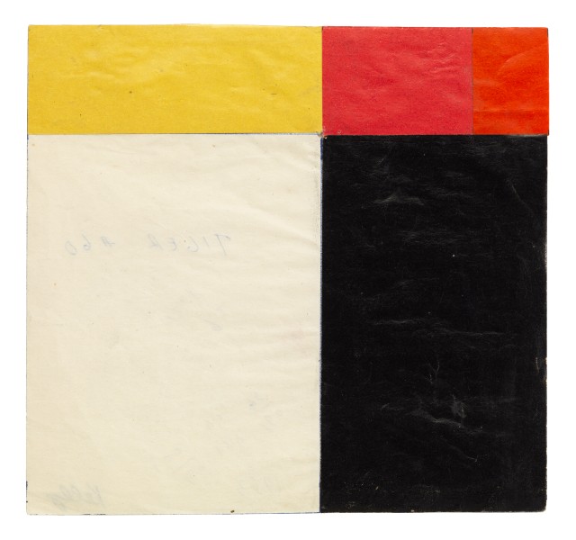
Anyway, the relationships of the various panels are intuited, not mathematical. Kelly worked them out in sketches and collages, like the one Matthew Marks brought to Basel in 2017.
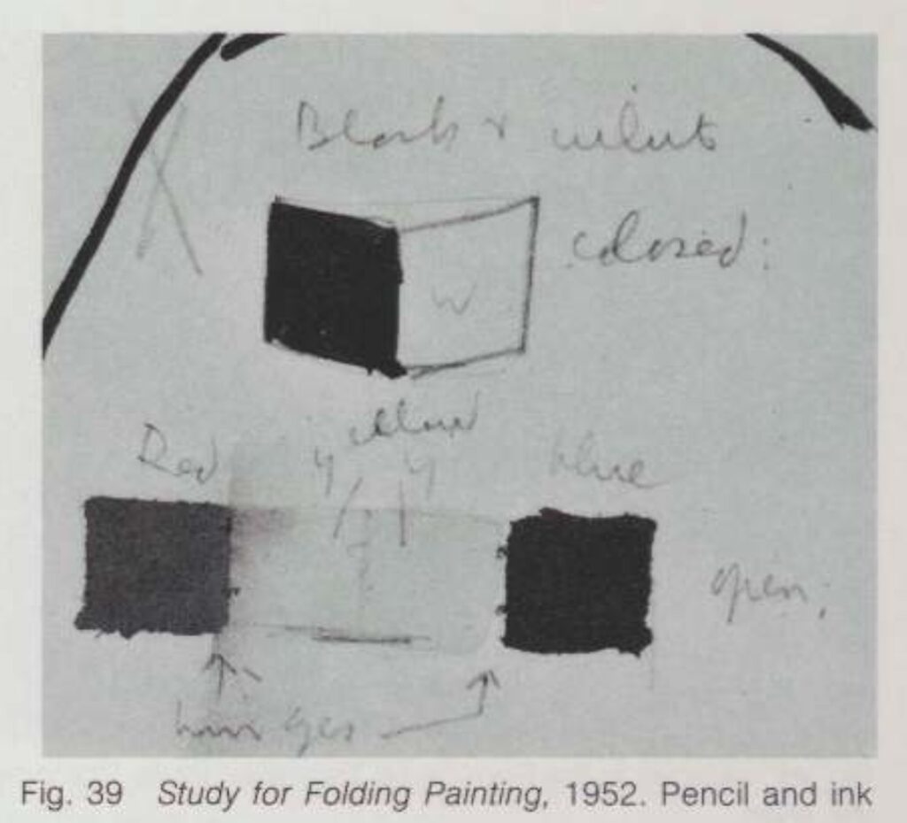
What I didn’t know until seeing the painting in person and reading up on it, is Kelly’s interest in the Isenheim Altarpiece by Matthias Grünewald. In the 1973 catalogue for Kelly’s MoMA retrospective E.C. Goossen mentions Kelly’s Sanary-era sketchbooks include drawings of the altarpiece’s hinged construction alongside drawings of various compositions of windows and shutters, and even studies for a hinged painting. The connection to Kelly’s most important Paris painting—also in the Glenstone show—the multipanel construction repeating the window of the Musée d’Art Moderne, is obvious.
What most intrigues me, though, is the possible connection to Jasper Johns. In 1987 Jill Johnston did an exhaustive and revelatory analysis of Johns’ incorporation of fragments and details of the Isenheim Altarpiece into his paintings in the 1980s. One of the first is Perilous Night, from 1982, a work that is also at the National Gallery.
Actually, now that I put it up there, the composition of Johns’ painting feels very resonant with that of Kelly’s panels in Tiger. Johns did tell Johnston he got a book about the Isenheim Altarpiece from a friend. Didn’t say who, though. From Short Circuit to Flag to In Memory of My Feelings, hinged and multipanel paintings were on the minds of young artists in downtown Manhattan in 1954. I wonder what we could learn from a Kelly/Johns show. I’m sure Tiger would be a fascinating starting point.
[Next day update: On an impulse I checked for reservations at Glenstone last night, and there was space available this morning, so I went, and it was hot and glorious. I listened to most of an aquatic horticulturist lecture pondside, which was fascinating. The pond in the center of the Pavilions building is as thoughtful as the rest of the landscape, which really never disappoints. Even Split Rocker looked good. Not landscape per se, but you know.
There were some new pieces in the Charles Ray pavilion, always a marvel. And a couple of beautiful Kelly works on paper, including the dazzling, large collage above, from 1951, in the spot where Tiger was hanging. So I guess they rotate things. It was a low-key flex that they had such an amazing work on hand and didn’t just jump to include it in the show, but chose to let the loans tell the fuller story of Kelly’s practice. Truly a dynamic place amidst all the contemplative stillness.]
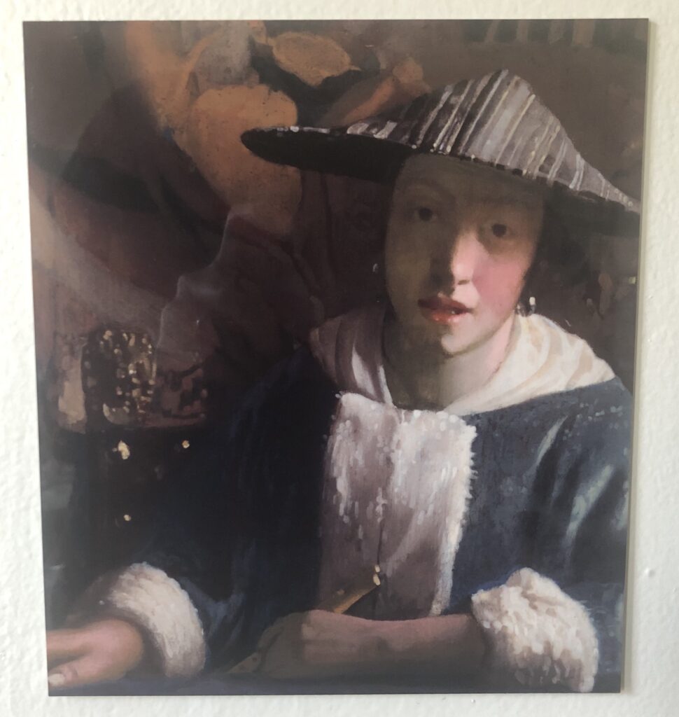
The National Gallery sent out word that the Vermeers are back, as is this one, which is now not a Vermeer again. Oh wait, only two Vermeer Vermeers are back. Girl With A Red Hat is still on the road. [Or not yet ready to come out. It doesn’t look like it’s on loan anywhere, and just weeks after Amsterdam, why would it be?]
And all five are together again at the Met, and all three are back at the Frick, too, never to travel again, except when Sotheby’s takes over the Breuer building, of course. Oy.
Previously: All The Vermeers In New York rn
I looked at the episode numbers and thought it must be a mistake, but no, there hasn’t been a Better Read since 2021. But I’ve used a Sturtevant text before, in a way; in 2016, I had a computer read several pages of Spinoza’s Ethica, a text Sturtevant included in Vertical Nomad, which she showed at Anthony Reynolds Gallery in 2008.
This is closer to Sturtevant’s Ethica. It is a presentation she made in 2007 at Inherent Vice, a workshop at Tate Modern on the subject and implications of the replica to contemporary art.
Download Better_Read_039_Sturtevant_Tate_20230709.mp3 [greg.org, mp3, 6.4mb, 6:42]
Podcast: Play in new window | Download
Subscribe: RSS

A 16:9 iStockvideo of a horned owl was one of many found clips of animals and athletes Sturtevant used in her later works. The video clip shows up in Simulacra (2010), which was seen most recently last fall in the Sturtevant show at Matthew Marks.
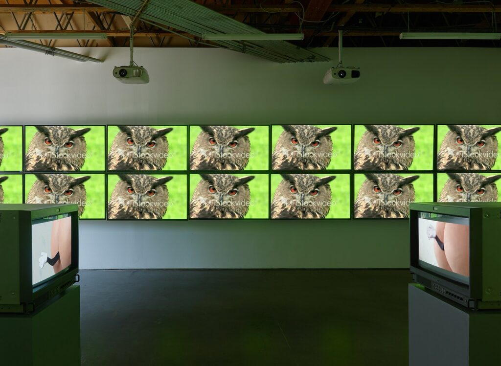
It was included in the first show of Sturtevant’s video work in LA, in 2019 at Freedman Fitzpatrick, called, alas, Sturtevant: Memes.
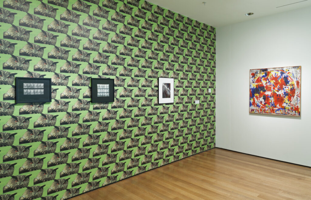
Sturtevant used a screencap of the image as Warhol-style wallpaper in Double Trouble, her retrospective at MoMA in 2014-15, which opened a few months after her death. [At MoMA, it was actually preceded by a wall of Warhol cow wallpaper.]
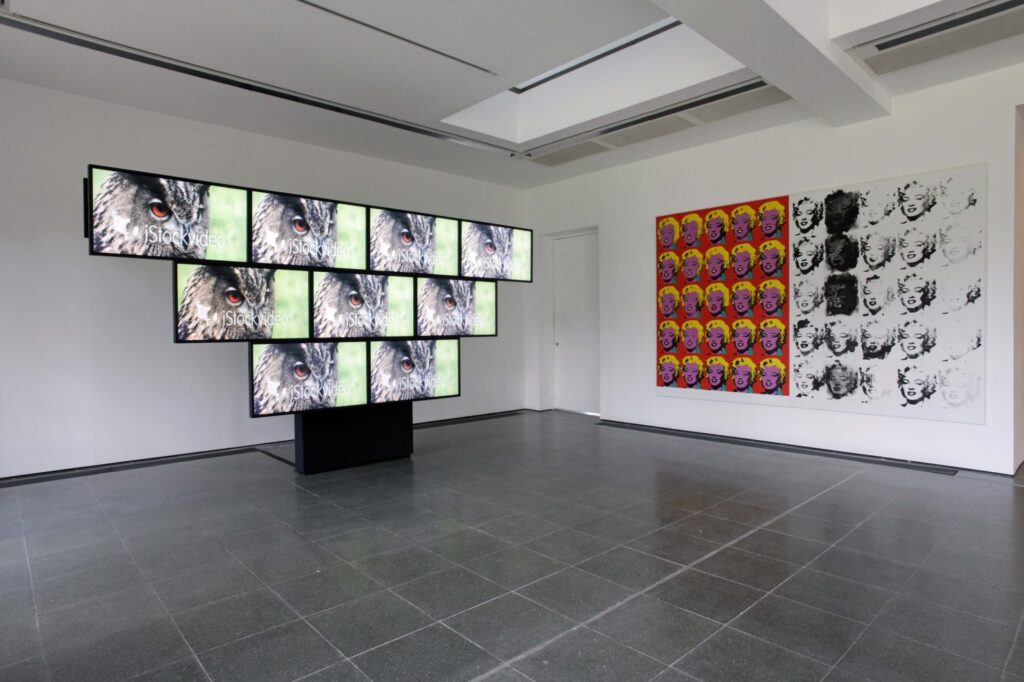
And before that it was in both video and wallpaper for Leaps Jumps & Bumps at the Serpentine, the last show of her work to open during her lifetime. The aspect ratio seemed important, or intrinsic, a characteristic of the age and the system of media we were all soaking in.

Sturtevant also published a screencap from the video as a fundraising edition for the Serpentine. The 16:9 image was printed at 18×32 cm on a piece of paper whose stated size, 39.3 x 53.5 cm, is well within the margin of error of 4:3, video’s old aspect ratio. Sturtevant was not one for nostalgia, though, so I imagine that dimension is coincidental. Anyway, back in the day, when I tried to buy one of the prints from the Serpentine, they said the artist had not been well enough to sign but a few of the intended edition, and their stock had run out.

At various points since, I’ve looked for the iStockvideo clip Sturtevant used. Thanks to corporate rebranding the watermark was replaced with “iStock by Getty Images.” So hers has now become an artifact of the very system she was laying bare. [Next morning update: on the other hand, you can recreate it with a $60 license and After Effects. She was still right, though.]
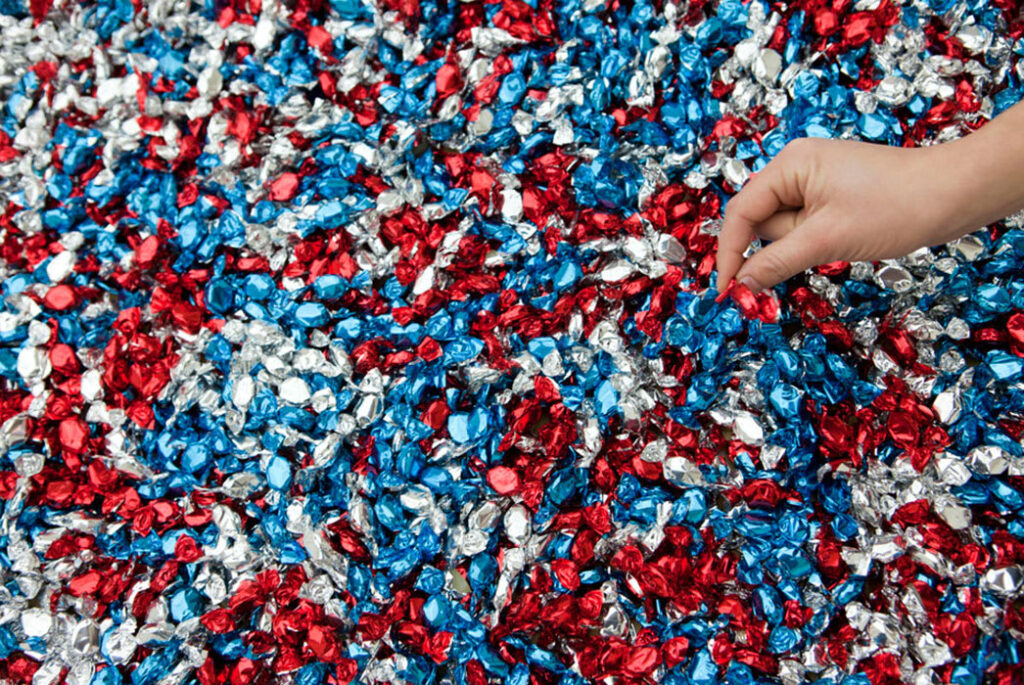
Felix Gonzalez-Torres’ “Untitled” (USA Today) was included in Take Me (I’m Yours), an exhibition of participatory artworks, which opened at the Jewish Museum in New York in September 2016. The show was first conceived by Hans Ulrich Obrist in 1995 in particular reference to Gonzalez-Torres’ work. HUO was joined by Jens Hoffman and Kelly Taxter at the Jewish Museum in organizing the expanded view.
I opted for the image above because it feels like it could be from anywhere, but it is from Specific Objects Without Specific Form, a three-venue, 2011 exhibition of Gonzalez-Torres’ work organized by Elena Filipovic in 2010-2011. Filipovic included the work at Wiels in Brussels and at MMK Frankfurt in 2011. When the show was reconfigured by the artist co-curators at each venue, Danh Vo and Tino Sehgal, respectively, the work was removed, swapped out with another candy piece owned by MoMA, “Untitled” (Placebo), 1991. The extensive catalogue for the show was published in 2016.
The parenthetical in the title, USA Today, was originally a reference to a brightly colored newspaper with nationwide circulation, which you’d have to step over every morning on your way out of your mid-range hotel room. The artist once told Bob Nickas the piece referenced the “sugar rush” of patriotism. Obviously, I chose it for the color and everything else.
Apsara loves Mitoken is a Japanese blog specializing in the many limited edition gadgets made to commemorate important occasions involving the Thai Royal Family.
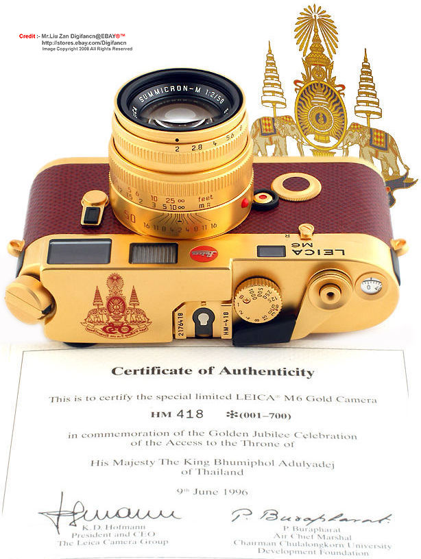
For the Golden Jubilee 50th anniversary celebration of His Majesty King Bhumibol Adulyadej’s accession to the Thai throne in 1996, Leica produced a gold-plated M6 camera with matching 50mm lens in an edition of 700. The King’s crest is emblazoned on the top.
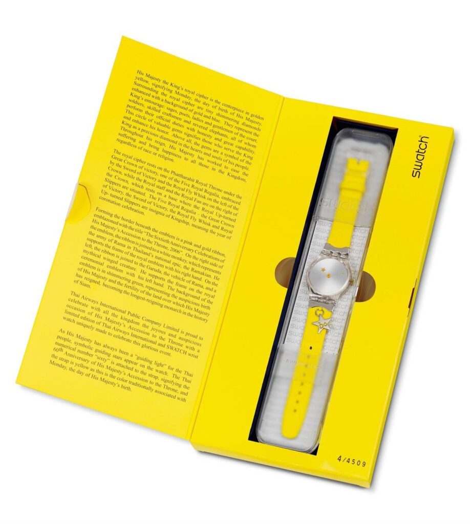
There were at least nine limited edition watches produced to commemorate the 60th anniversary of His Majesty King Bhumibol Adulyadej’s accession to the Thai throne in 2006, including a Patek Philippe and GUIDING LIGHT THAILAND, a commemorative Swatch, issued in a limited edition of 4509. From the text inside the special commemorative cardboard box:
Thai Airways International Public Company Limited is proud to celebrate with all the kingdom the joyous and auspicious occasion of His Majesty’s Accession to the Throne with a limited edition of Thai Airways International and SWATCH wrist watch uniquely made to celebrate this glorious event.
As His Majesty has always been a “guiding light” for the Thai people, symbolic guiding stars appear on the watch. The Thai numerical number “sixty” is attached to the strap, signifying the 60th Anniversary of His Majesty’s Accession to the Throne, and the strap is yellow as this is the color traditionally associated with Monday, the day of His Majesty’s birth.
Upon the death of His Majesty King Bhumibol Adulyadej in 2016, the throne passed to his son. His Majesty King Maha Vajiralongkorn Bodindradebayavarangkun’s coronation in 2019 was commemorated by the release of a gold-plated wrist watch by the Italian fashion brand Klasse14 featuring the Royal Emblem on the face. It was available at a Klasse14 pop-up shop at the Siam Paragon Watch Expo that auspicious summer. One can easily imagine that His Majesty The King, who primarily lives in Bavaria, will be the inspiration for a great many things that convey the unique character of His Majesty’s glorious reign.
[five minutes later update: It appears my investigation of commemorative Royal Thai gold-plated Leica cameras has been incomplete. Wayne Bremser just posted a link to the 2022 release of the Leica M10-P Royal Thai limited edition digital camera and matching lens, in gold-plate and gold or green alligator. Of the edition of 30, six were given to the Royal Family, and 22 were purchased by ThaiBev, the country’s largest distiller. ThaiBev is controlled by Charoen Sirivadhanabhakdi, the country’s second richest person (not counting His Majesty The King, obv), and is run by his son Thapana, who instigated the edition. The 22 cameras were auctioned at Christie’s in Bangkok and Singapore last fall, thus giving the elite of Thailand and the companies they control the chance to publicly demonstrate their support for 22 of His Majesty’s favorite charities. So far I have found one result, of a real estate developer paying 5x the retail price for a camera ThaiBev donated to a foundation for the blind.]
[Few Days Later Update: I was traveling and did not win the auction for four limited edition Swatches designed by and/or commemorating key moments in the life of the Thai Royal Family.]

Speaking of Donald Judd chairs, a copper armchair was ordered, and produced by Lehni in 2006. It was sold at auction for some reason in 2007. It was sold at auction again in 2011. It is now, in 2023, up for sale again.
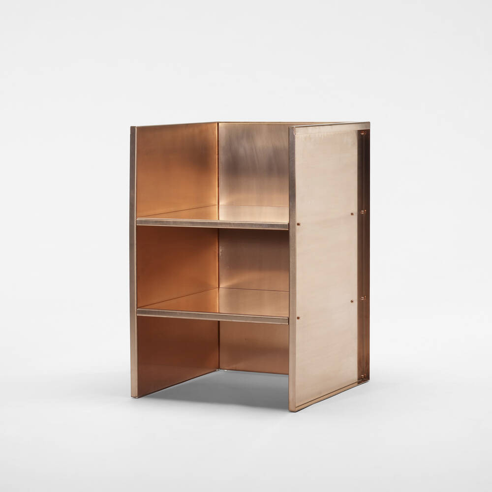
The copper armchair is sort of the archetypal piece of Judd furniture. In a project about seriality and variation, it is a single statement chair. And in its relatively brief, 16-year existence, this single chair has clearly seen some stuff.
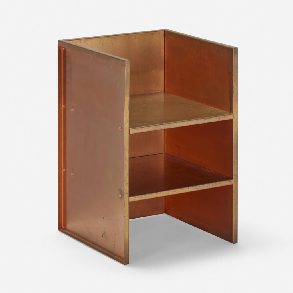
In 2007, it looked pristine, practically new. In 2011, it had clearly been polished for sale. And in 2023, wow, dawg, you live like this? Beyond the overall patina, which is substantial, there are two holes [?], vertically aligned, on one side where, I don’t even know what; they seem too low for a cupholder?
I was trying to remember where I got the idea that Judd insisted that his metal objects, particularly his bronze and copper works, be either perfectly maintained or left undisturbed to accrue the physical rewards of the passage of time. So I googled it, and it turns out I was told that by a Judd person, and I’d blogged about it 10 years ago when bronze kitchens were a thing.
And so it is that this one, exceptional chair is in perfect harmony with its creator’s intent, and it is also able to tell its own thrice-flipped material story, while reminding me of my own.
Previously, related: On Metal And The Passage of Time
Previously, also related to patina and the passage of time: Untitled (Joan Collins Toile de Jouy), 2015 [h/t @jfrigg]
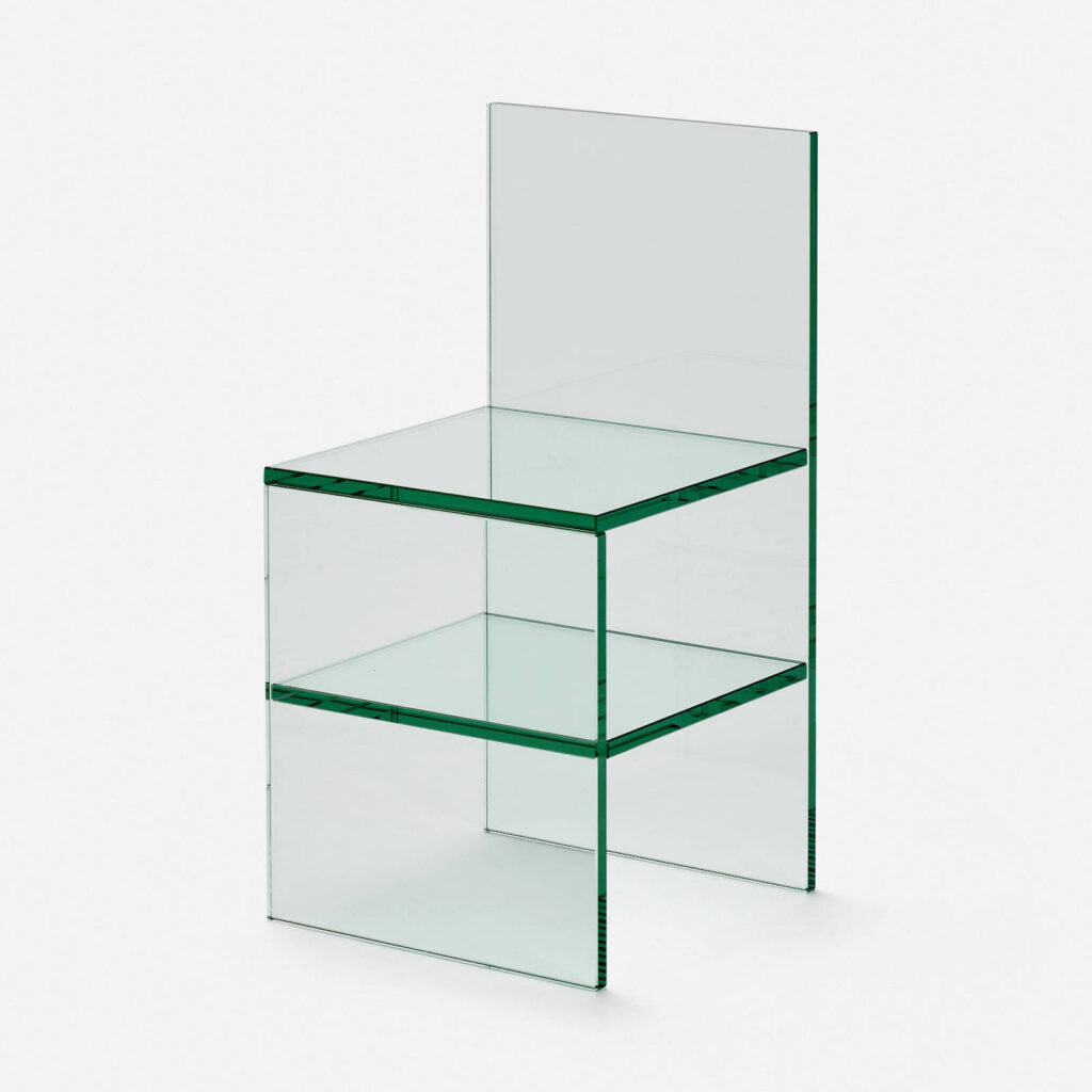
I think the first place Tobias Wong’s Glass Chairs were available was in 2002 at Troy. The SoHo design store commissioned Wong to make a holiday collection. I love them, they’re like Judd chairs for ghosts.
Tobi was always getting in trouble for his knockoffs and reworkings, but more than 20 years later, and 13 years after his death, these chairs are actually still available. So I guess the ghost of Judd doesn’t mind. [Troy was literally across the street from Peter Ballantine’s place, the guy who made Judd’s plywood pieces—but not the chairs.]
At Troy they were sold as a pair, as Chair No. 1 and No. 2, but the picture from the NY Times, and the one on Twentieth, the LA design shop who sold this one, are flipped. So if you want to complete the set, be sure to confirm which $9000 chair you’re ordering.
18 July 2023, Lot 139: Tobias Wong, Glass Chair, 2002, via Twentieth, est. $2-3,000 [update: sold for $4,410] [lamodern]
Well this article still feels a little raw, tbqh: The Life of Tobias Wong, Designer [nyt]
From A to Wong and back again, a nice 2015 reminiscence/revisit by collaborator Item Idem [flashart]
Wong’s website is still up. Oh wow, I’d forgotten about Warhol Gift Wrap using actual prints from Ronald Feldman [brokenoff.com]
Previously, related: Perfect Lovers (Forever), by Tobias Wong
Previously, unrelated: All Respect For My Judd Furniture Knocking Off Kings
People really are bringing the 90s back, even the bigotry. I srsly thought this would be an historic relic by now, not a headline again and again and again.
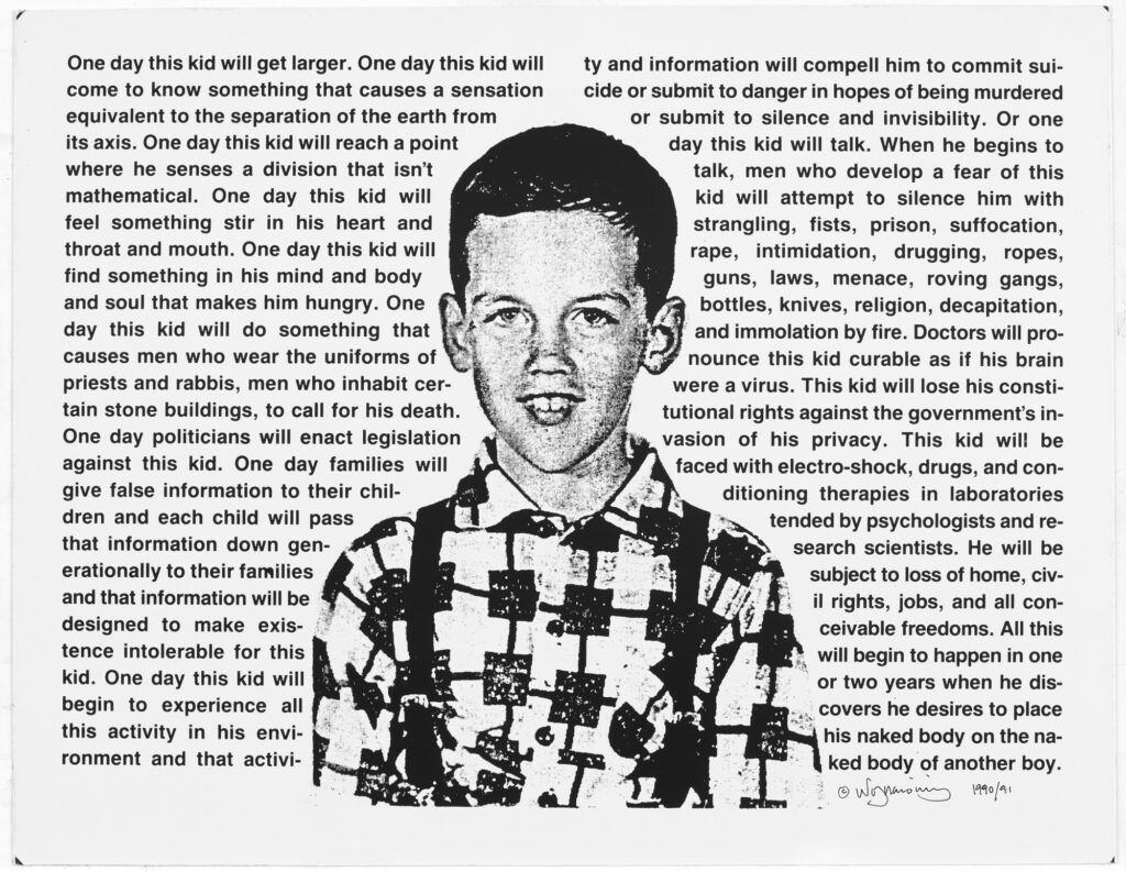
I guess it’s unsurprising that none of these are in museums in Washington, DC.
Untitled (One Day, This Kid…), 1990 [artistarchives.nyu.edu]
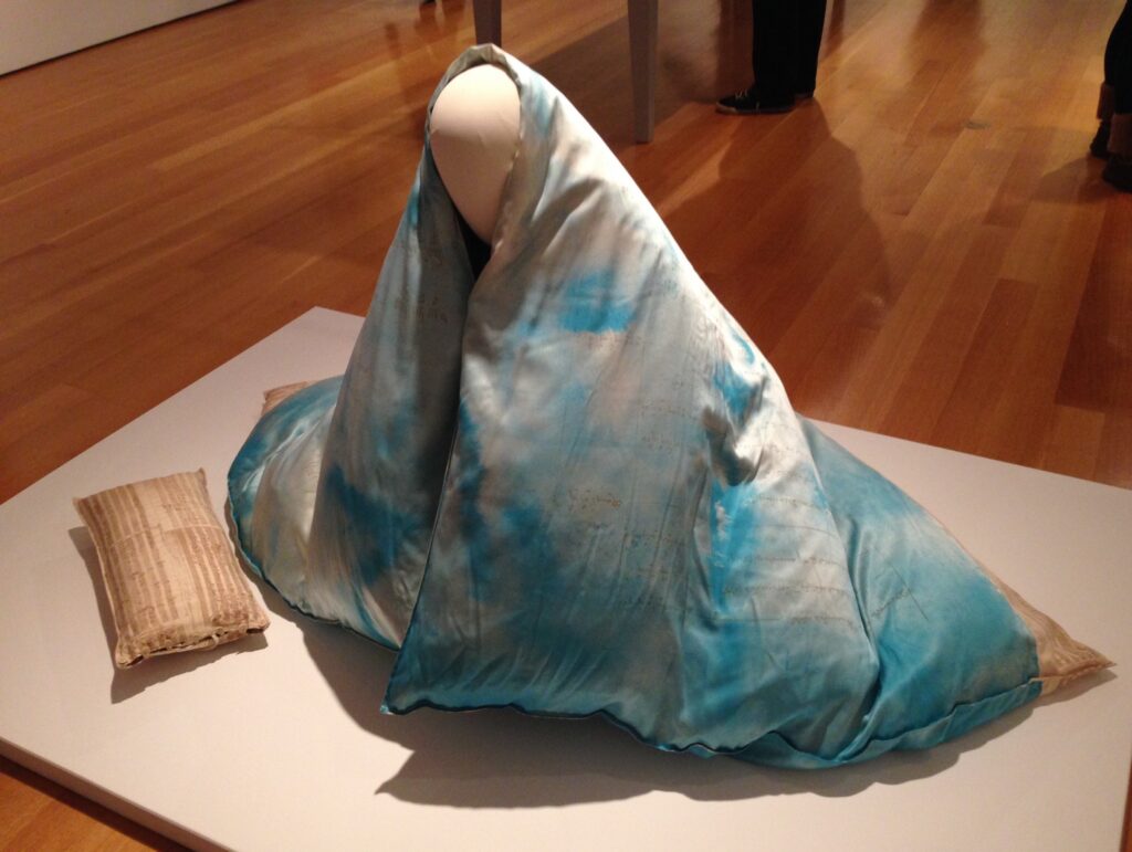
Yesterday art historian Andrew Wasserman posted an extraordinary work by Lenore Tawney. Cloud Garment was made in 1982 during an artist residency at the Fabric Museum & Workshop. According to the artist’s foundation website, Cloud Garment is “a conceptual piece that evokes the feeling of wrapping oneself in a cloud.” An archival photo of Tawney wrapped in Cloud Garment shows that what here appears as a bottom edge has fabric printed with musical notation, like Ear Pillow, on the left.
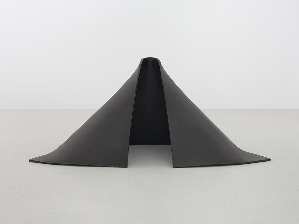
The form here reminds me of one of the most perfect Richard Serra sculptures, To Lift, made in 1967 of a sheet of vulcanized rubber. Which is now more perfect by the associations the Tawney piece introduces. The mind suddenly reels.
There are some Dia Artist on Artist Talks I go to regularly, like Amie Siegel talking about Donald Judd’s furniture in 2016, and David Diao talking about Barnett Newman in 2013. But I somehow never worked my way through the series, and so when I quickly downloaded a bunch of talks to listen to on the plane, I was completely blindsided by Andrea Fraser’s 2004 talk about why Fred Sandback’s work made her cry.
Continue reading “Why Does Andrea Fraser’s Work Make Me Cry?”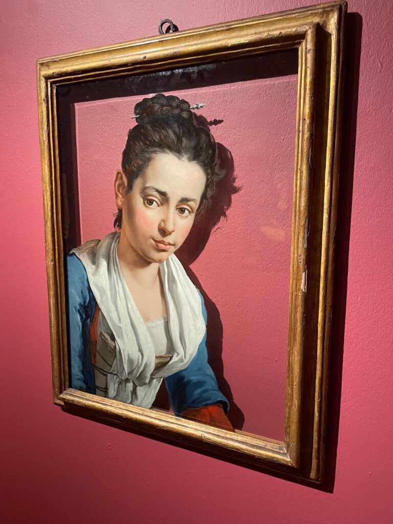
Ben Street posted this image of an extraordinary reverse painting on glass by Giacomo Ceruti, which is being offered via private sale at Christie’s. I’m sure if you ask them, they’ll tell you all about it, or you can read the extensive description at Sotheby’s which sold the painting in 2018, from the collection of Otto Nauman. [It went for $615,000, btw, twice the high estimate.]
This portrait is part of a group of four glass paintings, known in German, at least, as Hintglasmalerei (painting behind glass), in a collection in Brescia, where Ceruti worked in the early 18th century.
Beyond the fascinating technique—it had to be painted in reverse order, starting with highlights—and the way he left so much glass unpainted, and the rarity of it surviving at all, it just absolutely pops.
My bandwidth atm is sporadic, so I can’t do a all-out, tab-filling dive, but Ceruti’s other paintings do not inspire interest. Neither do most reverse glass paintings. The way this feels like neither of those is truly exceptional. Whether that’s a reason to spend half or a million dollars for it, I cannot say.
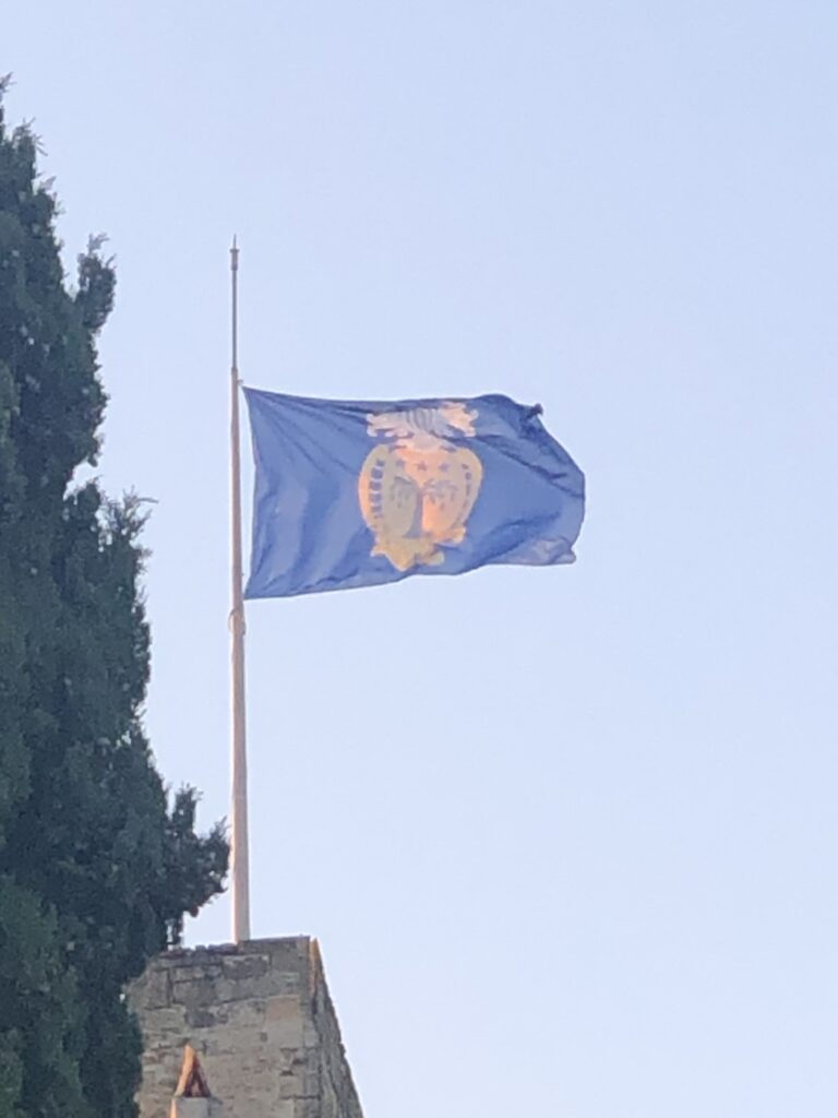
The local château is flying a new flag, does anyone know what it is, or do I have to email the châtelaine? [Who is delightful, but I hate to bother.]
The closest match I can find for the heraldic charges is a woman whose family came to Aix-en-Provence in the 17th century as Secretary for the king, Angelique de Fagou. So happy pride, I guess.
[few days later update: utter silence. we may never know.]

The similarity of this Rembrandt being protected from heavy rain leaking into a bucket right in front of it to David Hammons’ abstract paintings covered by used street tarps is immediate and gratifying to everyone who is familiar with this work.
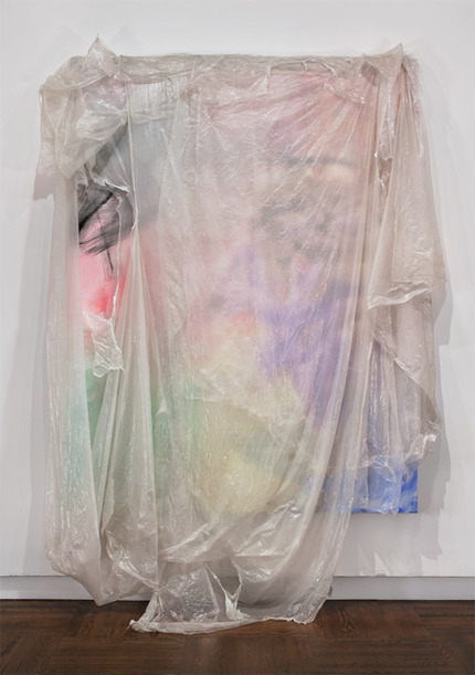
Hammons showed these works for the first time at L&M Arts’ townhouse gallery in Manhattan in 2011. Most of the tarps were opaque, with only corners and edges of the madcap AbEx paintings peeking out underneath. One of the biggest, though [above], was covered in cloudy, still-translucent plastic that allowed the painting to be seen through a fleeting, new landscape of light reflecting on the draped plastic surface.
I found the image of it above Frances Richard’s Artforum review. Richard considered the works in relation to the history of postwar painting, while the Gemäldegalerie’s installation at once reaches back to the Renaissance of Rembrandt and projects forward to the institutional failings in response to the global climate emergency.
Contemplating Grubbs’ anxiety during what should have been a pleasant visit to the Rembrandt Room renewed Richard’s conclusion:
“An almost-palpably rustling audience—though who would care enough about this scene to observe it, and yet be so removed?—breached the building’s hushed solidity to watch us (critic, guard, staff, artist, collectors, historians, etc.) act our pantomime of ‘judgment’ and ‘value.’ Walking away down Seventy-eighth Street, I thought,’This is all a David Hammons.'”
And so did I.
Previously, related: Hammons All Around Us
Meanwhile, at the Ludwig: Untitled (After Isa Genzken), 2017