

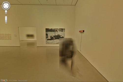
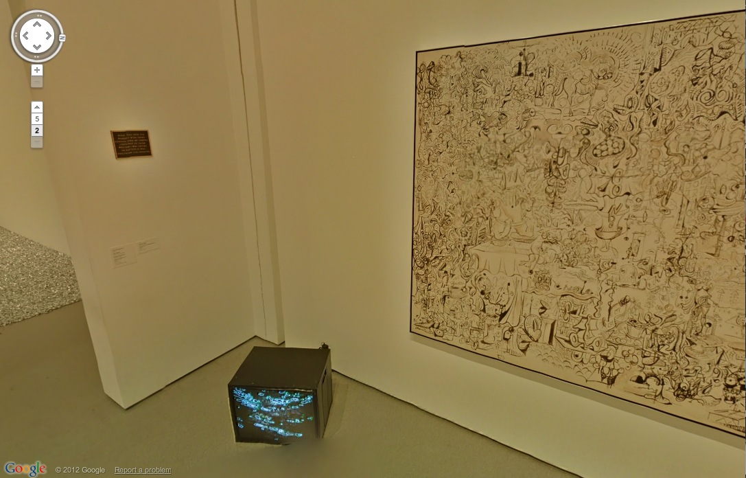
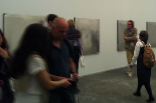
Untitled (Still/Free), 1992/1994/2007/2011, installation shot at MoMA via Google Art Project
Seeing Rirkrit Tiravanija’s work Untitled (Free/Still) in MoMA’s Google Art Project space reminded me that I’ve been meaning to write about it for a while now. I revisited it a few of times after writing about Rirkrit’s awesome, blingy, highly collectable objects last fall. I ended by noting that as “MoMA’s acquisition of the 2007 redo of the 1992 curry piece betray, Rirkrit’s objects are often vestiges of the previous experiential pieces.”
Which remains largely true.
But I didn’t quite expect the objects in Untitled (Free/Still) to be such literal artifacts.
MoMA’s replication of 303 Gallery’s space in ply & stud didn’t bother me at all; it’s classic Rirkrit. And for a while, I didn’t mind the cases of ingredients stacked up around the installation; even though they felt a little like set dressing, they were also obviously part of the provisional space and the ad hoc dining experience.

Until I gave up my table one time to some older ladies, and moved over next to these boxes of coconut milk or whatever which–hello–have “Carnegie Museum of Art” written on them.
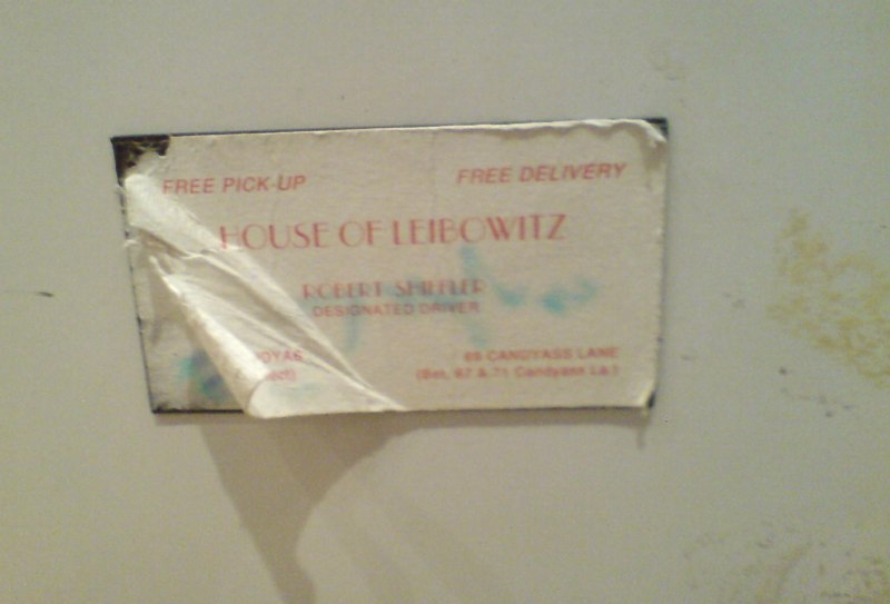
And then I head over to the beat-to-hell fridge and see Cary Leibowitz’s Candyass sticker for Bob Shiffler on the door. Shiffler, an Ohio-based collector, was the original buyer of Untitled (Free).
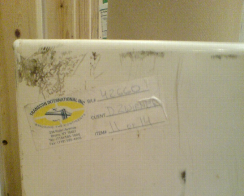
And sure enough, here are some registrar stickers from the Carnegie, which borrowed the piece, and there’s another shipping label, “11 of 14,” for “DZWIRNER,” who exhibited Untitled (Free) as Untitled (Still/Free) in 2007. So this fridge has been around, along with 13 other pieces or crates. An archival fridge.
So there was a certain explicit strategy to objecthood even at the formative beginning of Rirkrit’s most important practice. What’s going on here?
I finally asked MoMA curator Laura Hoptman, a friend from way back, who’s been working with Rirkrit even longer. She explained that Rirkrit identified certain elements, like the fridge and the rice cooker, as permanent parts of the work. And they would be joined by some of the remnants of its installation, incuding leftover ingredients, and even trash. Some of those elements have accreted at each installation of the work [this was the fourth], and MoMA would add something to it, too. They become part of the history of the piece.
Which, OK. But Hoptman also reminded me of the historical context–and by historical, I’m afraid I mean 1994, which I was around for–of Rirkrit’s work, and how almost desperately unsellable it was. And I guess I had forgotten that, that no, most collectors didn’t jump at the chance to buy installations, much less artists’ old appliances, in the mid-1990s. Even I kind of turned up my nose at the chance to buy a steamer full of old mussel shells back then, even though they were already in plexi! So the fact that Shiffler bought anything at all is sort of amazing.
Hoptman also spoke of Rirkrit’s Buddhism, and related it a bit to how he perceived objects, as well as the generosity of the experience his work fostered. But that only made me think of that fridge and the Dalai Lama, who talked about the problems of becoming too attached to his watch. We talked about how Rirkrit certainly has an awareness of the art object paradox inherent in selling his social/experiential work, and that the shift to chrome probably includes a level of critique, or caricature, even, of the desire for bright, shiny things.
I came away reassured, I guess, that I’m not wandering lost in my interpretation of Rirkrit’s work. But also kind of wary of how easily even our own histories and memories of art can be altered by the intervening present. Basically, because of the last decade-plus of market frenzy, I’d forgotten the 90s, when there was still a paradigm that art was being made for other reasons than to sell it.
Blurring Of Google Art Project Comes As No Surprise
It looks like Les Blurmoiselles d’Avignon have some company.
The Google Art Project has released a new batch of 134 museum participants, bringing the total to 150, though only 51 institutions are offering Street View Museum View. And a couple of those, like Tate Modern and the Crystal Palace at the Reina Sofia, have basically no art, just space. [Tate Modern Museum View rather brilliantly drops you into the Turbine Hall, facing a blank temporary wall. ]
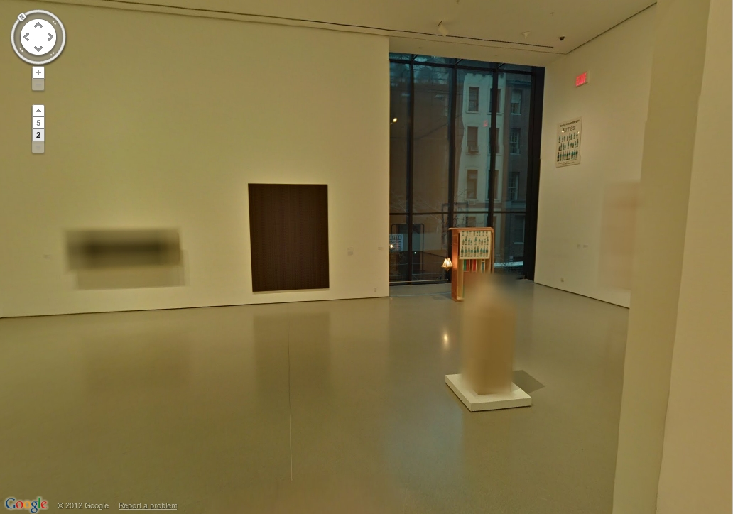
But if any museums besides MoMA gave to deal with living artists, or works still under copyright, I haven’t been able to find them. And so MoMA wins this round for adding a rotating show–Kathy Halbrecht’s contemporary installation in the 2nd floor Kirk Varnedoe Galleries [I am calling them this forever now, btw]–of contemporary art, thereby demonstrating that living artists are easier to get clearances from than estates.
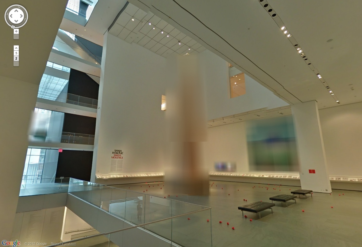
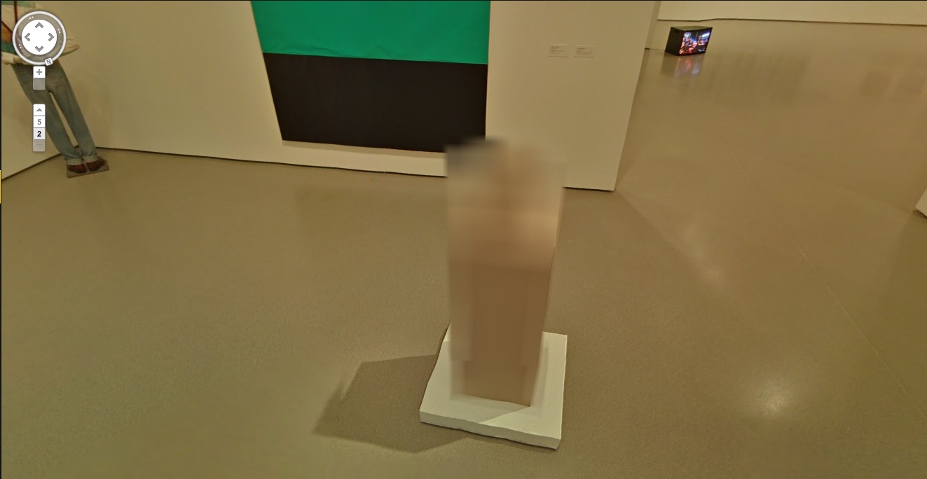
Most of them, anyway. Fortunately, there are some exceptions, and they look awesome cloaked in Google’s Blurmany-style algorithms. Oh the first really is the best, too. Sanja Ivekovic apparently didn’t sign on to have her atrium installation, Rosa of Luxembourg become Rosa of Luxembourg of Google Art Projects.

Lady Rosa of Luxembourg (foreground), with the Gëlle Fra (background). Photograph by Christian Mosar. Courtesy Casino Luxembourg–Forum d’art contemporain , via moma.org
The monumental column is nice, of course, but the colors on that giant photo are utterly fantastic. That’s the first one I’ll paint.
Also, is the Bell & Howell helicopter over the staircase blurred out, too? Is that a fluke? Anyway, stepping back into the Varnedoe Galleries…
Still waiting to hear back on this one. I can’t remember what it was, though from this angle, it looks like the bastard lovechild of Louise Bourgeois and Gerhard Richter raised by Thomas Houseago. Of course, after a speculative mashup like that, whoever it turns out to be will almost inevitably disappoint. Sorry, artist. That’s a Reinhard Mucha in the back, though.
And when you head back there, both the Georg Herolds are also blurred. For a moment. Because you take another click/step, and they’re not. The blur disappears. It’s an unexpected reveal as Google’s sheets of virtual ribbed polycarbonate clatter to the ground.

Or is it like that stuff on the facade of the Issey Miyake Pleats Please store in SoHo? You’re walking along, blur blur blur, and then you align with the material, and for an instant, you can see in. At least, in this case, for one pano. I suspect this is an oversight, so go try it quickly.
And no offense to Herold, because his underpants dome is quite fetching, but I’d totally get one of those LA acrylic guys to cast me one of these first:
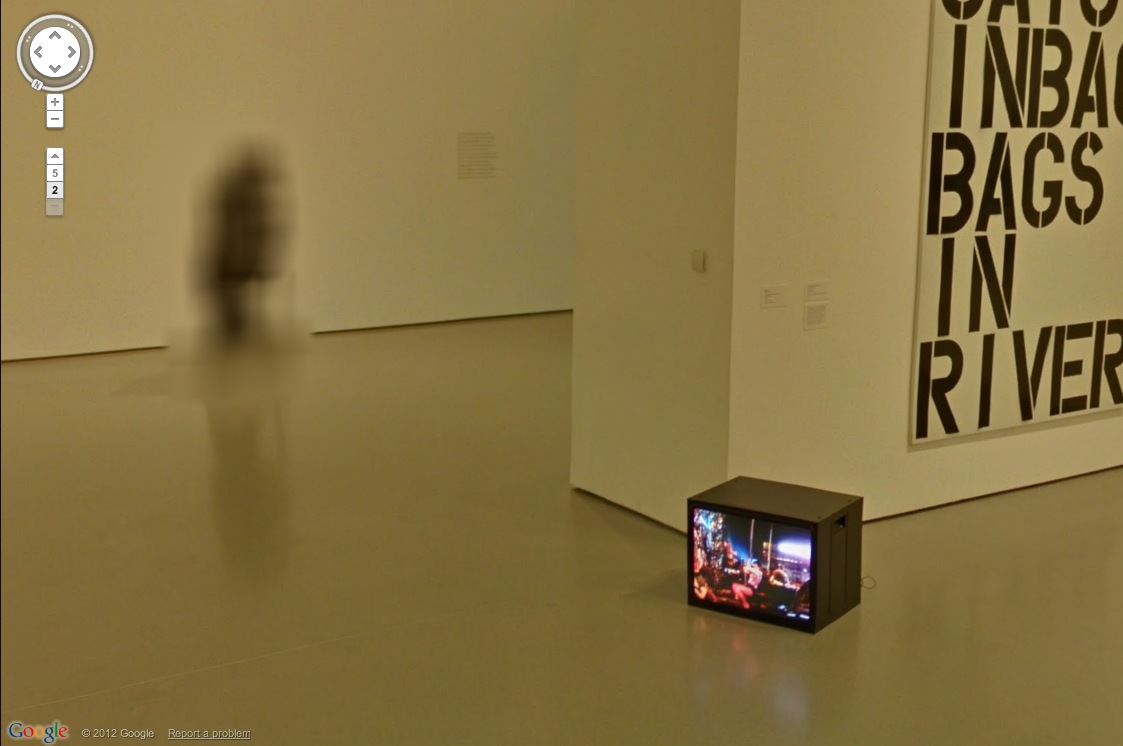
It’s like an ethereal Anne Truitt. Also, don’t you kind of wish that Kippenberger wasn’t turned to the corner, so Museum View could blur its face? Also, it’s interesting that the video monitor on the floor always has the same image in every pano. Was it on pause? Did they ‘shop it in? Does it unsettle you, too, to have the simulation of moving through space without the simulation of moving through time? That is so Street View.
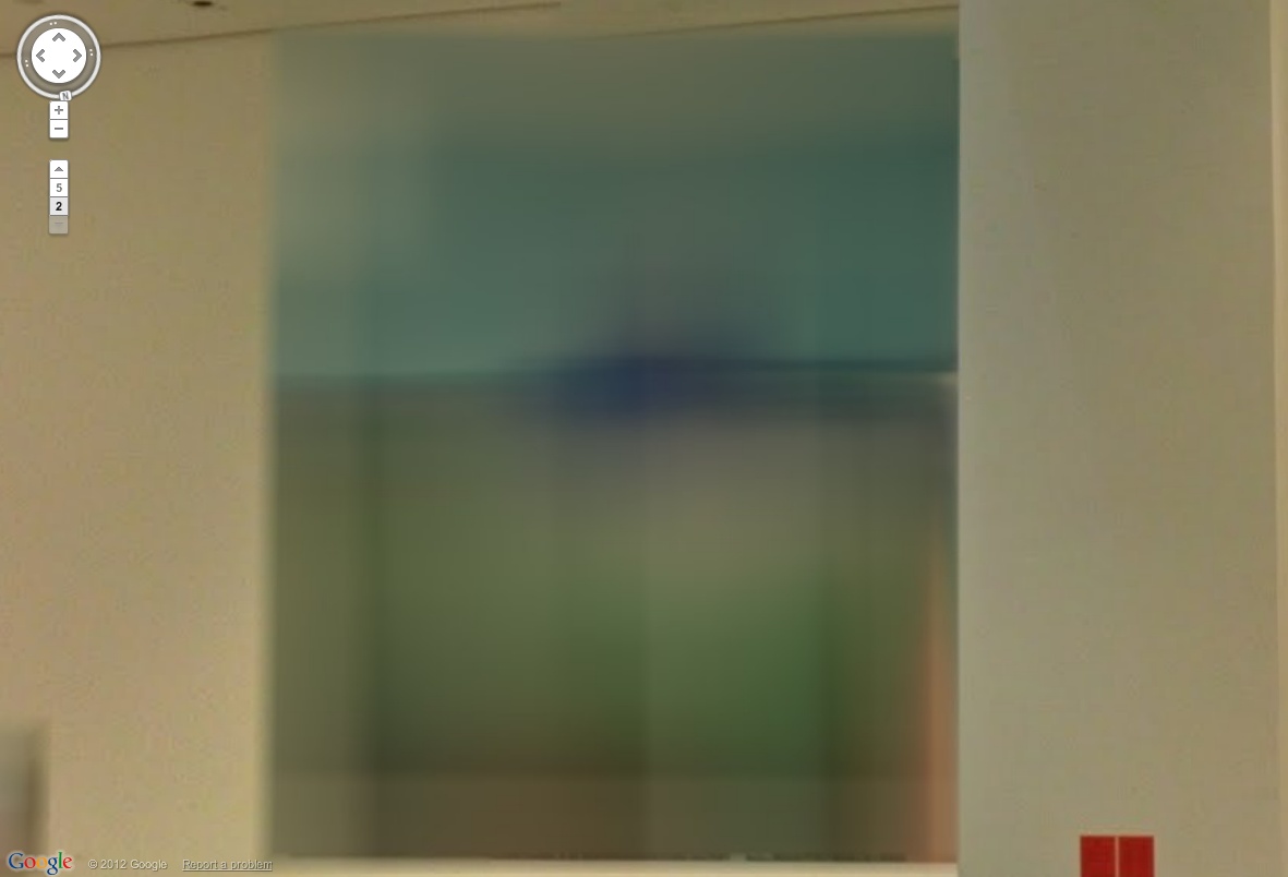
The Keith Haring mural and the Koons look great. [Which, Pace Prints just opened a show of another Haring mural, a unique silk screened scroll of his Blueprint Portfolio.]

Ahh, but we’re here for the blur. Ooh, a very nice double blur from George Condo [right, really?] and Jenny Holzer [left, really? REALLY? Did she maybe insist on the obscuring blur to promote her redacted documents-as-minimalist-paintings show at Skarstedt?]
But take another click forward, and the veil drops again, momentarily, whatever that means on GSV’s frozen timeframe.
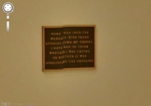
This is awesome, what the algorithm stitching this pano together did to this Holzer bronze plaque. Perfect, really, and such a conveniently discrete, little object. I think I could have that 3D printed before I have it cast.
Such Google Maps-generated anomalies are ususally site-specific by definition. And recreating them is entirely dependent on the alignment of anomaly, real space, and aesthetics. Like the piece I installed in Brian Dupont’s Extra Gallery last fall which translated the [fortunately] misaligned Street View seam running through their window into real space.
As Google Maps gets more hi-res, these noticeable differences between the real world and its corporate map simulacrum will diminish, if not disappear altogether. So it seems important to map them, or at least to note them, and to be able to read them while we can.
MoMA Museum View [googleartproject]
Previously: les Blurmoiselles d’Avignon
Blurmany and the pixellated sublime
This Is Not The White Cube You Are Looking For.
Well that’s an unexpectedly awkward situation I just stumbled into.

greycu.be: what, you mean your car doesn’t have a domain name?
A week or so ago, I decided my new car needed a domain name. So I registered greycu.be. Partly because the tweeters these days are all hot for the short URLs. But mostly because my car, a little art hauler and storage unit runner, is a Scion xB. Which is the perfect canvas upon which to realize my previously all-talk idea of commissioning artists to do vinyl wrap art cars. [additional posts here, here, and unfortunately, here.]
Needless to say, greycu.be was available. But it did get me to thinking, so I threw whitecu.be into the whois search for the Belgian DNS operator. And it wasn’t registered, per se, but “quarantined.” A 40-day limbo following the non-renewal of a domain name on dns.be. Which went until April 1. And sure enough, when I checked in this evening, whitecu.be had been released. So I registered it.
 I confess I have no plans for it at this point. And also that buying it was motivated partly by the sheer novelty of being able to buy a domain name again after it has expired, something the shady/annoying backorder/resale adsquatting “services” in the US domainspace have made basically impossible. [I happen to be at least the second owner of greg.org; the first, an outfit called Global Real Estate Group, had let it expire in 1997.]
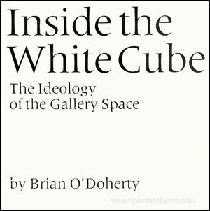
But even in this somewhat oddly punctuated, awkwardly unpronounceable incarnation [whitecu dot be? whitecu point be? whitecu pwahn be? It just doesn’t work, except as web text], a chance to connect with one of the foundational paradigms of contemporary art theory was too awesome to pass up.
Since they first appeared in Artforum in 1976, Brian O’Doherty’s essays, Inside the White Cube: The Ideology of the Gallery Space have provided a powerful critical framework for examining the impact of the commercial art market on the creation and exhibition of art. Even 35 years on, artists grapple every day with the political and financial implications of the white cube, which persists as the central site of art’s instantiation as a commoditized luxury good.
Which has been deeply influential on my own education and experience with art, and with my history as a collector, and more recently as a writer and maker.
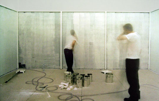
Powerless Structures No. 15/12 Hours of White Paint, 1997, Elmgreen & Dragset
Which is presumably why, in 1993, Jay Jopling chose to name his London gallery White Cube. Now he has three, and they’re among the most important and well-known in town. Their website is whitecube.com.
Which would seem plenty clear, distinct, and obvious, unlike, say, whitecu.be. Yet it turns out that Jay did not think so. Or at least he thought that the artist and gallery portfolio hosting service that went up on whitecu.be last year looked a little too similar to his gallery’s web presence. Or that any reference to a white cube was de facto confusing to his 2008 [!] trademark on the term. Because he filed a trademark infringement claim with dns.be against the service’s creators attempting to have the domain name canceled.
Still from The Cube, a 1969 NBC teleplay by Jim Henson about a guy who finds himself stuck in a white cube.
The site’s creators, a pair of young designers in Florida, prepared a lengthy response to Jopling’s claim, but apparently they did not formally respond to it. And so the third-party arbitrator appointed by dns.be issued an extraordinary ruling in Jopling’s favor. The findings for which seem to ignore the entire basis of the domain name and TLD system:
The mere fact that the Licensee inserted a full stop between the letters “cu” and “be” is not likely to outweigh the massive similarities and the replications of all the letters contained in the Complainant’s trademark, in the same order, with the same meaning.
And which also ignores the highly significant, and widespread common use of the term “white cube” in an art context and its history which predates Jopling’s commercial use and [very recent] trademark claim for the term. And which ubiquity was, in fact, the reason Jopling chose it.
The existence of legitimate interests in the litigious domain name appears quite dubious…
And then there’s a remarkable finding of bad faith:
It is obvious from the record that the intention of the Licensee was to divert internet users from the domain name by creating a likelihood of confusion with the Complainant’s trademark.
It is the opinion of the Third party decider that this clearly constitutes a case of typo squatting, with the intent of commercial gain and potential damage for the distinctive character or the reputation of the Complainant’s trademark.
Well, I still don’t know how to say it, or what it’ll be used for, but the new owners of whitecu.be can assure you that it will not be in the business of being mistaken for Jay Jopling’s fine and reputable establishment. Which is at the obvious, widely known, and easily pronounced whitecube.com.
Here’s That Knoedler Gallery Rothko
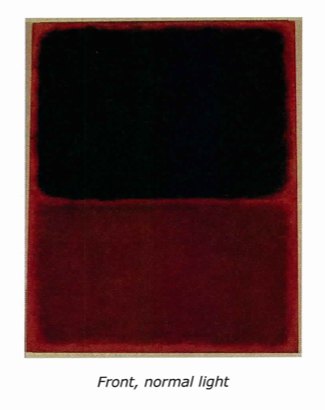
Just read the complaint in De Sole v. Knoedler Gallery [Case 1:12-cv-02313-UA], and it’s pretty awesome. If you like getting utterly defrauded of $8.4 million for forged Rothkos, that is.
Anyway, the image comes from the materials analysis, which was done by the same outfit to flag the forged Pollock that Knoedler’s getting sued over. They found stretcher crossbar marks where there shouldn’t be any, and anomalous primer and underpainting that didn’t match Rothko’s practice at all. The conclusion was that the painting was made on a reused canvas long after it was purported to have been painted.
Also, the provenance is the killer, since the De Soles are charging that Knoedler and Ann Freedman repeatedly claimed that the supposed Swiss collector whose son was selling the paintings was their own confidential client. In truth, they had no $#()ing clue where the merch was coming from, except for that Glafira Rosales, ye random secondary dealer, was claiming to have a massive stash of postwar masterpieces.
It all seems so stunningly false. And there are misspellings in Freedman’s documentation that, seriously, I would be having major reservations about giving $8 million to someone who can’t spellcheck summery.
Oh, what the hey, here’s the complaint [443k, pdf]. Enjoy.
A Brief Retelling Of The Story of Short Circuit, aka Construction With J.J. Flag
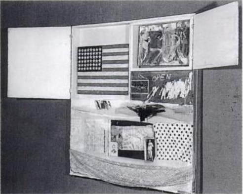
Construction with J.J. Flag, aka Short Circuit, 1955 photo by Rudy Burckhardt
You know what, it’s way past time to wrap up this missing Jasper Johns Flag caper. I’m going to get right to it.
But first, a quick review of the work’s history:
In 1955, three years before his debut solo show at Leo Castelli, Jasper Johns painted a small Flag which was incorporated into a Robert Rauschenberg combine, which was shown at the Stable Gallery annual Stable Show, which opened on April 26. The combine also included a painting by Rauschenberg’s ex-wife, Sue Weil. [Stan VanDerBeek and Ray Johnson were also invited by Bob to contribute a work, and several historical sources say it includes a Johnson collage, but the Art Institute of Chicago, which bought the piece last year, officially only cites the two painters. Though it was Rauschenberg’s stated intention to use the combine to get Johns’ and Weil’s works into the Stable Show, he was the only artist credited with participating.
Both paintings were enclosed behind cabinet doors, which could be opened, but which were originally exhibited closed. [In Paul Schimmel’s Combines show and at Gagosian, the doors were opened and, obviously, untouchable by the public, but I have heard from multiple people now that when Johns saw the Gagosian show, he confirmed that the doors were to be closed.]
The combine is now known as Short Circuit, but in Rauschenberg’s earliest works registry, it has the title, Construction with J.J. Flag. That entry referred to the work’s next known public appearance, in a show at Cornell University’s White Museum in April 1958, Collages and Constructions, curated by Alan Solomon. Johns was also included in the exhibition, which followed on the heels of both artists’ successful solo shows at Castelli that year. Even though Solomon went on to curate both Rauschenberg’s and Johns’ first museum shows at the Jewish Museum, and their participation in the US entry to the Venice Biennale in 1964, which Rauschenberg won, Solomon did not mention this show in their bios. And it was not included in Johns’ exhaustive chronology prepared for his MoMA retrospective.
In 1962, after Rauschenberg and Johns’ particularly bitter breakup, they came to a “solution of differences of opinion” about Short Circuit, which involved not selling the work, or publishing or exhibiting it again.
In his awesome 1977 Johns catalogue, Michael Crichton quoted Leo Castelli as saying that the Johns Flag had been stolen from Short Circuit at some point “before June 8, 1965.” [Crichton also wrote that Castelli acquired the painting, but the Rauschenberg Foundation told me that the artist never parted with the work.]

What’s not behind Door #1? Rauschenberg & Short Circuit in the 1967 Finch College “Art in Process” catalogue
The removal of the Johns Flag apparently freed up Rauschenberg to begin showing Short Circuit again, because he put it on a national tour of collage works organized by the Finch Museum in 1967. He said in the Finch catalogue that Elaine Sturtevant “is painting” a replica of Flag, but the artist’s photo blocks it from view. And the doors were nailed shut for the tour.
It’s unclear when Sturtevant actually painted her Johns Flag, but I’ve narrowed it down to some time between 1968 and 1971, when Rauschenberg’s one-time assistant Charles Yoder says he saw it in the studio. Short Circuit‘s next scheduled public appearance was in 1976, for Walter Hopps’ big Rauschenberg retrospective at the Smithsonian. Upon review of Hopps’ archive, it appears Short Circuit was originally included, then dropped from the show shortly before it opened. Burckhardt’s 1955 image was used in the catalogue. Rauschenberg wrote that he might repaint the flag himself because he “need[s] the theropy [sic].”
[One other thing I found in the Smithsonian archive: a memo from Hopps agreeing to cover Rauschenberg’s travel expenses to the DC opening, but refusing to pay for “his friend.”]
In 1980, Calvin Tomkins told the story of Short Circuit‘s missing Flag in his Rauschenberg biography, Off The Wall. He appears to have based his account on Crichton’s version, though he added a detail that could only have come from Castelli himself about an unnamed dealer bringing the Flag in for authentication. The notion that Castelli apparently let the painting walk back out of his gallery without a fuss is what triggered my interest in the first place. I mean, seriously, how could there be a Johns Flag painting on the loose, and no one does anything about it?
Anyway, Short Circuit was also not included in a 1985 show at the Hirshhorn on artist collaborations curated by Cynthia McCabe and David Shapiro. Shapiro later described the work as being in a sad state of repair and missing its Johns Flag. No mention of Sturtevant. According to the Rauschenberg Foundation, however, Short Circuit has never been damaged or repaired. It finally went on public view–the first time with the Sturtevant–in 2005 in Schimmel’s show at MoCA.
And that’s where we are.
So next week, I’ll finally get around to talking about what I’ve found out about the disappearance of the Flag, the aftermath, and its fate. And there’ll be a bit about how it alters Johns’ history–or at least it should–and then what it means for Rauschenberg’s, too. Stay tuned.
An admittedly imperfect way to see all the previous greg.org posts on the search for Johns’ Short Circuit flag painting
Mass, Grass & Claes
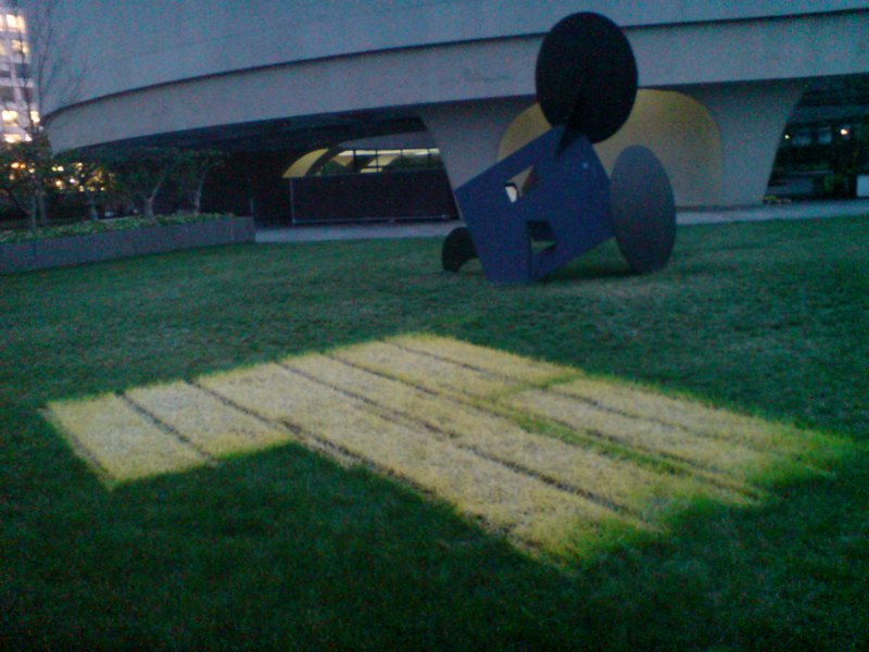
Yes, we now have Doug Aitken, which might help, and there’s an After Hours party every quarter, but the Hirshhorn’s outdoor space has always struck me as one of the most potentially interesting and under-utilized public spaces for contemporary art in Washington.
But just when I think nothing ever gets moved around here, I stumble across this interesting pattern burned into the lawn behind Claes Oldenburg’s Geometric Mouse. It looks like it could be a Paul Chan floor projection or something but it’s just the bleached out footprint of whatever zig-zag sculpture used to be there. I’m trying to remember what was…
This Is The Least Gnarly Of Olafur’s Rigs
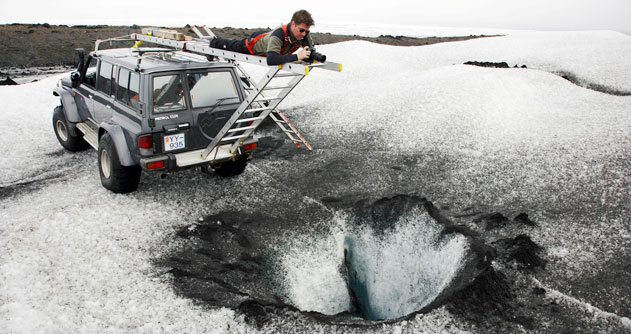
image: JJ Films
The thing is, everybody in Iceland has a monster truck. Or a big ol’ van with balloon tires and a four-foot lift kit. The country only got a paved road in like 1979 or whatever.
But easily the coolest part of Jacob Jørgensen and Henrik Lundø’s 2010 documentary, Space is Process has to be the scenes where Olafur and his crew are traversing the Icelandic moonscape in a convoy of SUVs, climbing mountains, fording rivers, backing up the edge of glacier holes, etc. etc., to gather images for the photo grids and such.
I hope there’s an entire bonus disc of this footage on the DVD.
In his voiceover, Eliasson clears up a question I’ve always meant to ask, and confirmed something I’ve come to think about the photo works. First, the question:
Each grid of a particular natural feature is the subject of its own expedition. Which means he’s hunting them down as a batch, or as he put it, “documenting a little story of a phenomenon.” I’d wondered if this is how he did it, or if he shot and shot and shot, and then sorted and sifted, letting the typologies emerge out of the data.
But there are also photo grids that explicitly document a specific place or time, too; that follow along the course of a river, or a walk. Or the passage of a cloud overhead. So typology and biography–autobiography, in a way–are very close together. In System is Process, Eliasson does exclude the idea that his photography is somehow about [sic] getting in touch with his roots or his homeland or whatever.
But his deployment of story and narrative fits with how I’ve come to read the photographic works generally, as markers, documents, of the artist’s encounter with and passage through this particular landscape. Which happens to be where he’s from.
All this insight is then crowded out by the image of a giant, white Land Rover/armored car with–holy crap, is that a glass geodesic dome turret on top? I am sorry, Donald Judd’s Land Rover, but you’re gonna have to park on the street now. Because this spot is reserved.
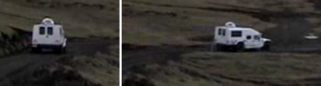
Aha, there it is, tiny, in the extended trailer for the film.
Space is Process screened at the DC Environmental Film Festival [dcenvironmentalfilmfest.org]
Space is Process extended trailer via martin køhler’s vimeo [vimeo]
Previously, suddenly related: Richard Serra Suburban [greg.org]
Less Filling, Looks Great: Doug Aitken’s Song1 On The Hirshhorn
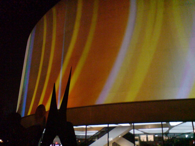
We came out of the Hirshhorn tonight after the surprise [to me] screening of Space is Process, a 2010 documentary about Olafur Eliasson, only to find they were testing Doug Aitken’s Song1, a 360-degree projection on the barrel of the museum.
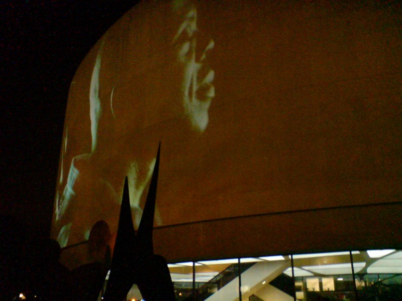
I had been worried about how well buff-colored aggregate would hold up as a projection surface, but I tell you, it looked pretty great. Amazing, even.
And seeing it suddenly makes you wonder–and by you, I mean me–why doesn’t the Hirshhorn project things on the surfaces of the buildings more often? You know what, why not all the time?
And that leads to the next logical question: what should be projected on the Hirshhorn?
Song1 is a hypnotic, laconic, melancholic sequence of closeups of an LA Basinful of people singing “I Only Have Eyes For You,” intercut with abstract CG motion graphics. Its narrative doesn’t seem anywhere as complex as the multi-screen Sleepwalker, projected on MoMA, but it seems thoughtful, and definitely works as a beautiful proof-of-concept.
But. So.
What else is going on the Hirshhorn Channel? The potential [or maybe the temptation] for agitprop and politically charged artworks seems either irresistible or anathema, depending no how involved one is in wooing Congress. The Hirshhorn and the Smithsonian at large are likely not interested in actually biting any hands that feed them.
And starting Thursday night at 8pm, that strategic non-engagement pact will be on view from the Mall in full, dazzling force.
Tweet-Size Delayed Coverage of 5×5 Project Panel At The Corcoran
The DC Commission on the Arts & Humanities is organizing the 5×5 Project, a temporary public art festival? exhibition? program? that coincides with the National Cherry Blossom Festival. Last night at a panel discussion at the Corcoran, the DCCAH Project Manager and 5×5’s five curators talked about their 25 artist projects. [The curators: Amy Lipton (NY), Justine Topfer (SF), Richard Hollinshead (UK), Laura Roulet (DC), and Steve Rowell (LA)]
Doing any justice to coverage of this whirlwind would just mean cutting and pasting at least 5×5+5 lists and press releases and artist statements, plus all the links and facebook and twitter handles. Instead, here are my 140-char or so-sized notes. Consider it tweet-delayed coverage:
Laura Roulet, “The Local One”
Floating Lab Collective, converted taco truck
Activate participatory, interactive community
Sue Spaid [moderator, dir. Balto Contemp Mus] initiates 1-sentence rule on intros, which only lasts for Topfer.
SS cites Wash Mon, Linc & Jeff Mems as DC’s mode of public art. Maybe one end of the spectrum, also what’ve we done lately?
Oh yeah, that’s right: WWII Memorial, MLK Mess. oy.
Dynamic ephemeral activate contrast monumental
“I think we are all anti-monumentalists” got immediate pushback. So I think not.
Steve Rowell, CLUI not in intro. Stratman/Badget’s pontoon Pentagon, floating protest temporary monument
“my artists” the next most common phrase after “activate space”
Amy Lipton: eco something. “impact native species” as a bullet point
participatory engage
posters on city buses to call a number, leave a wish.
Entertains intimidates
QR codes [?!] on 1,000 vials of Japanese water. Except for the cherry tree-shaped sound sculpture, the only NCBF-linked project
Lize [Mogel] cartographic, maps in libraries. Rowell’s projects feel very CLUI’d into DC.
Some other folks very frank about never visiting b4, their artists responding to the idea of DC.
“we’re mythmakers, not monument builders,” a ref to the temporary project mode vs std DC memorializing
5×5 Festival [?] offering a new way forward.
DCCAH ID’d 40 potential sites over 2 yrs, took 10 curator finalists on daylong busride. hazing-as-winnowing
“this spot of grass, this spot of grass,” “got more & more depressing as we drove around.”
Net: not one pre-selected spot was used. DCCAH did all site nego, permitting, etc. curators: 5x$100k for everything else.
“tried to avoid federal entities” bec of “compressed time frame.” literally 3mos from finalists selection to opening. kind of nuts, imho
Censored? “only by budget” “censored by silence”. Rowell: FBI forced Charles Stankievech s/w radio proj off Pk Svc site by not responding to NPS’ proposed “interpretive text”
Permitting as power, as project. Hollingshead cites Christo, Wrapped Reichstag, 30 yr nego
“Logistics is the future of art,” Spaid, who seems kind of Balto in her provocative-then-dialed-back statements.
Experiments, “you don’t like it? Fine, it’s gone in six weeks.” “you have an out by being temporary.” [Temporary as a mode of power? Or a sign of powerlessness?]
There are no politicos here. Nor students, just the artists, everhopeful DC art crowd, or at least the ones who “made it through traffic” and “could find parking” ahem
Rowell on public art censorship: some Mennonite artist’s swords-into-plowshares permanent public sculpture literally disappeared, found in the dump, no one knows how/what/who? What? This sounds insane. Forensic Archive
Hollingshead, British guy: there were 2 local curators in the final 10, and 2 intl ones. “I knew it was going to be him [the guy from Germany] or me.”
Audience Q&A: some curators seemed surprised that the budget had to be increased from $50k/ea to $100k. Still found it very difficult to execute 5 projects, went with artists they’d all worked with before, who they knew could do *something*
“Double puffing”? like double dipping? where you take artist fees AND curators fees. Hollingshead to Rowell: “Do any of your artists actually exist?”
5x5x2: the recommendation is to do it biennially, not annually.
“the NYT already wrote about it!” Carol Vogel. Spaid: “That was a PREVIEW, they’ll HAVE to cover it again.” Heroes in Newcastle-on-Tyne, UK funding a catalogue & follow-on exhib at home. Front pg of Guardian. Spaid “The art magazines will all be here [for the preview]”
Ah here it is, the obligatory Why not focus on DC artists? We deserve an international forum question. “17% are local,” “Lize worked with local cartographers.” hm. Spaid: In Baltimore, I try to help the good artists get out of Baltimore.
“not as a stunt, but for real” [I forget what this was in rel to, but it doesn’t really matter]
LR: “the public [in public art] is people”
LLOLZ On Gerhard Richter’s Annunciation After (A Postcard Of) Titian
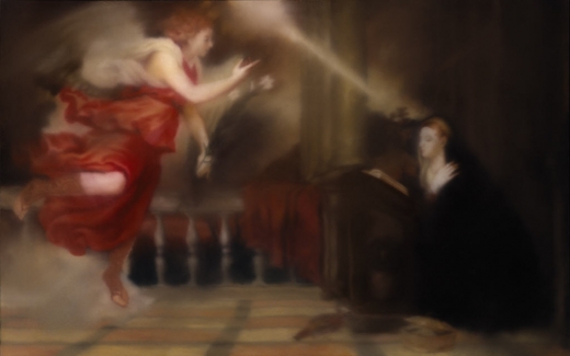
Annunciation after Titian, CR 343-1, 1973, collection Hirshhorn Museum, image: gerhard-richter.com
I confess, I love Gerhard Richter in the 70s. Here are some of the best/funniest excerpts from a interview he did with art historian/curator Gislind Nabakowski that was first published in Heute Kunst in 1974. The subject was Annunciation after Titian, a series Richter painted in 1973, after visiting Venice in 1972 for the Biennale.
The first in the series, above, is in the Hirshhorn’s collection. The series has not been shown together since it was first exhibited in 1973 at the Galleria la Bertesca in Milan.
GN:What made you choose a fifteenth-century painting as a model and create a sequence based on Titian’s Annunciation?
GR: Because there’s something about this painting, or any painting, that grabs me if they’re good–irrespective of the impact they had at the time, why they were made, the story behind them. I don’t know what motivated the artists, which means that the paintings have an intrinsic quality. I think Goethe called it the “essential dimension”, the thing that makes great works of art great.
I beg your pardon?!
Continue reading “LLOLZ On Gerhard Richter’s Annunciation After (A Postcard Of) Titian”
Henry Codax à Paris
I tell you, now I cannot get enough of that Henry Codax.
Fortunately, Codax isn’t letting a little auction setback, or the fact that he’s a fictional character from an anonymous corporation’s collectively authored novel, cut into his practice. Or his brand. The more I think about it, Jacob Kassay’s insistence to Christie’s and their bidders that his name should not be associated with Codax’s painting ends up reaffirming Codax’s own authenticity. Untitled (Dark Grey) is NOT a stealth Kassay; it is what it’s certified to be: a Henry Codax painting.
And for those wondering about Olivier Mosset’s rumored/reported involvement, and asking why we’ve never seen Mosset and Codax in the same room, hmm? Well.
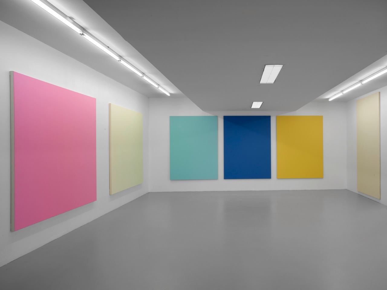
[l to r] Henry Codax, Hugo Pernet, Olivier Mosset, at Triple-V, photo by André Morin via Triple-V.fr
Just two days after the Christie’s non-sale, Triple V, a galerie in Paris’s 13th, opened an all-monochrome group show featuring Henry Codax, Stéphane Kropf, Hugo Pernet–and Olivier Mosset. So there you go.
Mosset and Kropf have shown with Triple V before, and Kropf has shown with Codax before, at Susanna Kulli in Zurich last October. Birds of a feather.
Triple V’s show sounds quite nice, providing examples of artists’ differing engagements with the history of the monochrome. Pernet’s triptych, Rouge, Jaune, Bleu #2, 2012 [above, center] is the chromatic negative of the Ellsworth Kelly triptych that gave it its title, Red, Yellow, Blue. The two door-shaped Mosset paintings [right] are from 1979-80. Kropf’s painting counters the idea of monochrome as content-free by showing all the drips and traces of its making. And Codax. The gallery’s announcement for the show, provided by one of Triple V’s Vs, Vincent Pecoil, only adds to the possible explanations for Codax:
On sait par exemple peu de choses d’Henry Codax, tout d’abord, sauf qu’il est un personnage d’un roman intitulé Reena Spaulings, un peintre portant la barbe et réalisant des peintures monochromes. Le fait qu’il présente ici deux tableaux ne va pas dans le sens de la fiction, mais il se peut aussi que la-dite fiction soit inspirée de faits réels. Il est possible également qu’il soit plusieurs, collectif d’anonymes, au même titre que les auteurs du roman en question. [emphasis added]
I won’t translate the whole thing, but just pick out the two new possibilities. The first is that the fictional character Codax might be “inspired by real facts,” an actual painter out there somewhere. [We can somehow process this distinction between fact and fiction when it comes to novels and movies, even if we do it by insisting on conflating authors and actors with their creations, even after their obligatory denials.

Henry Codax, Untitled (Bubblegum Pink) and Untitled (Day-Glo), 2012, photo by André Morin via Triple-V.fr
The other possibility, which seems new to me, is that Codax may be a collective, anonymous project of the Reena Spaulings/Bernadette Corporation itself/themselves. Corporations are people artists, too. Yet all explanations remain resolutely unconfirmed. And what’s wrong with that?
What little we know of Codax comes from fiction, but his paintings are real, physical facts. As the ambiguities about the artist persist, even multiply, the paintings remain unchanged. When I first saw Codax’s work last summer, it intrigued me. I liked it, but worried that it might be a stunt, a one-liner in the form of a show. But Codax keeps making and showing work. And selling it, sometimes to people who try to flip it. And getting reviewed and written about. At some point, it’s possible that the persistence of Codax’s paintings may overcome the uncertainties of their origins. We’ll just accept them–and buy and sell and show them–for what they are: Henry Codax paintings.
09 mars — 14 avril 2012 Henry Codax, Stéphane Kropf, Olivier Mosset, Hugo Pernet [triple-v.fr]
Speculation

Henry Codax, Untitled (Dark Grey), 2011, via christies.com
Wow, do I owe Henry Codax an apology.
Last week I’d declared the fictitious painter’s beautiful gray monochrome a failure because, not only did it not “Strip away any obvious authorship,” the Christie’s catalogue text for the painting laid authorship down in thick coats by stating as fact that Codax was “a pseudonym created by New York-based artist Jacob Kassay and the Swiss conceptual artist Olivier Mosset.”
installation shot, Henry Codax paintings, Carriage Trade, June 2011
I’d been surprised to see the attribution laid out so definitively, especially after re-reading the source of that attribution, Andrew Russeth’s Gallerist NY article on the Codax show last summer at Carriage Trade. Russeth did indeed report that “a source”–who he did not characterize in any way–had told him about the Mosset/Kassay collaboration, but Carriage Trade would not comment on Codax’s origins–and still won’t, btw–and both real-life painters’ galleries stated they had no idea about the work or the project.
Olivier Mosset paintings installed with bikes by Jeffrey Schad and Vincent Szarek, 2011, Christopher Grimes Gallery, Santa Monica
In the Wikipedia age, though, where truth is trumped by verifiability, Russeth’s article was proof enough for the paintings to find buyers. And for at least one buyer, who apparently figured they’d cash in on the recent Kassay mania by flipping the dark grey monochrome at auction. And for Christie’s, who ignored the work’s similarities to the venerated-but-less-marketable Mosset’s work to assert that “In the present example, Kassay’s iconic silvery paintings have been replaced by a sleek, anonymous grey surface.”
Yes, well. Actually, no.
At Christie’s First Open sale last Wednesday morning, the Codax had been bought in, which means it didn’t sell, either because bidding didn’t reach the reserve price, or because there was no bidding at all. At first, I’d figured the work wasn’t Kassayish enough after all, or that its conceptual conceits were too cute for the speculators in the market.
Henry Codax and Stephane Kropf at Susanna Kulli Gallery, Zurich, Oct. 2011
But then someone who attended the sale told me that Christie’s had read a statement, known as a saleroom note, before bidding began, in which Kassay said he’d “had nothing to do with” the painting, and that his “name should not be associated with it.” [In trying to confirm the text of the actual statement, I contacted Christie’s, first as press, and then finally as client. The specialist who worked on the lot was helpful, if circumspect. But she also referred me to the sale results page, which, I was told, would have the saleroom notice appended. Except, of course, it didn’t, because Christie’s deletes online references to unsold lots completely, in order to not taint their saleability in the future.]
Whatever was said was apparently enough to dissipate the Kassay cachet. [Christie’s did not receive a similar demand from Mosset.] But more importantly, or more interestingly, it also reopened the speculative possibilities surrounding Codax’s work and who might have made it. And how it closes and generates gaps between an object and the projections upon it.
Olivier Mosset work in 1107 Manhattan Ave, a group show at Spencer Brownstone, which also included works by studio neighbor Kassay, Sept. 2011
The real [fictional] Codax, the character in Bernadette Corporation’s collectively authored novel Reena Spaulings, was known for “expensive, impressive monochromes.” Yet these were neither, and after failing to sell at auction, they were even less so. Reviewing the show for Frieze, Piper Marshall noted the authorship issue’s resonance with Mosset’s earliest practice, when, as BMPT, he and three fellow painters, Daniel Buren, Michel Parmentier, and Niele Toroni, would make and sign each others’ work.
Jacob Kassay installation, eight square, silvered paintings at Art Basel, June 2011, image via gallerist ny
But once Gallerist published their persuasively well-informed speculation, these large, uniform, anonymous paintings suddenly became a roomful of *wink* Kassays, which, unlike the roomful of square Kassays just shown at Basel, were available to buy. Even if you weren’t “a real museum.” And at up to 95% off. As long as you didn’t mind the uncertainty. And as long as you were happy with an unsigned painting accompanied by a certificate authenticating the work only as by “Henry Codax.” And if the work is ever captured by the market, the artists will deny all knowledge of its existence.
Our capitalist culture is based upon the premise that corporations are people, too, and legal disputes are regularly resolved by exchanges that include “no admission of wrongdoing.” With a political system where plausible deniability is S.O.P. and legal motions are made that “neither confirm nor deny” their subjects. It does makes one wonder why the art market can’t accommodate a painting by a fictitious artist derived from a collectively written novel by a fictitious gallerist published by a corporation, even without the unconfirmed involvements of two well-known, living artists.
So Henry Codax, I sincerely apologize, and I salute you, for you are truly an artist of our time. C-A-L-L M-E.
Leonardo Photomural

image: DARIO THUBURN – AFP/GETTY IMAGES, see washpost for fullsize
There has been much talk among such circles about the possibility of a lost, unfinished mural by Leonardo da Vinci hidden behind a fresco by Giorgio Vasari, in the Palazzo Vecchio in Florence.
Leonardo’s original work, The Battle of Anghiari, executed in 1504, was replaced in 1564 by Vasari’s 5-fresco cycle. But art historians following an interpretation of a clue in one mural discovered it was painted on a false brick wall, and there was an airspace behind it.
And now there is also paint. National Geographic, which purchased the exclusive first rights to the controversial investigation, today announced the discovery of Leonardo-era pigments in the hidden airspace.
The press conference was held in front of the mural[s], which were covered by a giant, digitally printed photomural, actually a detail of a Rubens drawing of the Leonardo original.
If there is, in fact, a Leonardo back there, which has been hidden, or even lost, for nearly 500 years, I honestly don’t see the hurry to uncover it now. Critics of the project are right to protest the possible damage or destruction of the Vasari the search–or worse, the discovery–may inflict. But if we have, in just the last few years, developed the tools to detect the space and the Leonardo, isn’t it best to sit tight, and wait for technology that can preserve both artworks intact?
At least just wait like a hundred years or so, for the current crop of Da Vinci Code knuckleheads to die off. And in the mean time, why not just put up a giant photomural version of Rubens’ copy? 99.9% of the 8 million visitors who’d see it each year wouldn’t mind–or even notice.
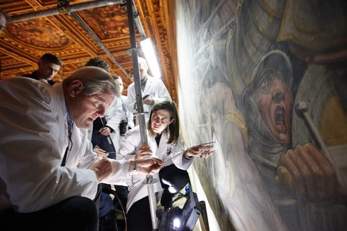
Sen. John Kerry and team use a probe to look for what they believe may be Leonardo’s Battle of Anghiari behind a fresco at Florence’s town hall. Photograph: Dave Yoder/AFP/Getty Images
Art historians say they have found evidence of ‘hidden’ Leonardo da Vinci [guardian via galbraith’s twitter]
Google Street View, Wide-Eyed

Jon Rafman’s got his 9 Eyes, but maybe what we really need is a 5 Stages of Google Street View, something to account for the process by which people awaken to the aesthetic, social, conceptual, and ultimately, political implications of Google’s worldmapping project.
Urban architecture photographer Andrea Bosio has passed Stage 1: Looking up your own house on GSV, and has managed to turn Stage 2: Visiting famous places–in his case, name brand architecture–into a photo essay for Domus:
I have always used Google’s Satellite and Street View system to view cities and principally to identify the urban drift areas featured in some of my photographic projects. In these cases, I use software as if it were a map made of pictures to find my way through the reality at times of direct experience. This is also the approach I adopted for the photographic project presented here although, on this occasion, the subject of my shots was the representation of the city supplied by Google Street View on my computer screen. I treated this new pixelated reality as a territory up for exploration and managed to compile a true photographic record of it by selecting different points of observation in this virtual space. I photographed the city without ever actually being there.
Which, shooting screens, hmm. Also: “We are able to experience the reality in an objective and non-interpretative portrayal.” Which, hmm.
At least Bosio demonstrates the potential of GSV for creating postcard views.
I’ve never been there, by Andrea Bosio [domusweb.it]
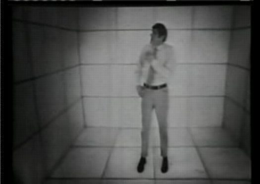
Here Is A Giant, Awesome NASA Test Chamber From Fashioning Apollo
John Powers has been on me for months to read “>Nicholas de Monchaux’s Fashioning Apollo, the incredible and unlikely history of the development of the Apollo spacesuits.
And I have been meaning to, I swear, but this insane photo may be just the thing to push me over the edge. Because in his otherwise heady interview with de Monchaux, Geoff Manaugh only captions the images as being from the book.
Which I will have to buy, to find out what this three-story dolly was doing in this massive, origami-ended space lined with sound-deadening foam pyramids. Because seriously, holy smokes.
Spacesuit Interview with Nicholas de Monchaux [bldgblog]