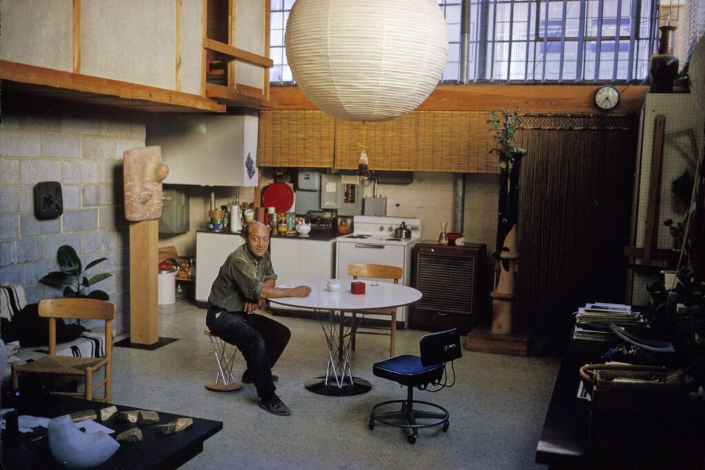
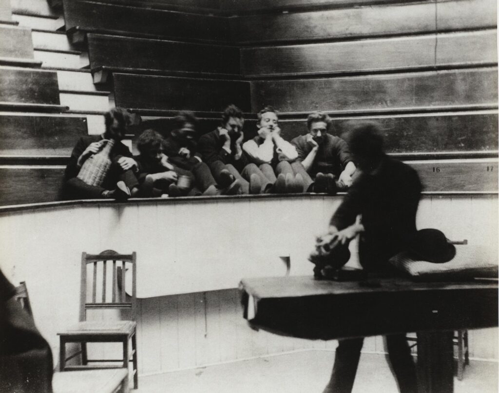
The bedroom of Isamu Noguchi’s studio/house in Long Island City, as photographed by Hans Namuth in 1962 for the New York Times Magazine. via noguchi.org
Since 2020, when the last of a series of worse real estate developers finally removed what was left of the site-specific waterfall and aluminum louvered ceiling Isamu Noguchi designed in 1957 for the lobby of 666 Fifth Avenue, we thought New York had lost its last Noguchi ceiling.
No. There is another.
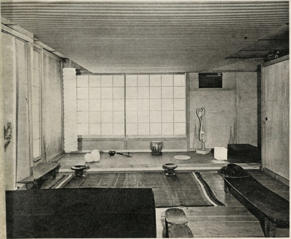
Isamu Noguchi photographed in his live-work space in Long Island City by Dan Budnik in 1964. The bedroom is in upper left. image: Noguchi Museum Archives via theartnewspaper
The Art Newspaper reports that the Noguchi Museum will restore the artist’s studio and house in Long Island City, and open them to the public for the first time.
Included in that house–really, a living space carved out of a 3,200 sq-ft factory/studio–is a light-diffusing drop ceiling in the bedroom that reminds me of the Fifth Avenue installation. It’s visible in the photo up top by Hans Namuth, for a two-page NYT Mag feature on Noguchi’s novel live-work design, as clipped and saved by the Noguchi Museum.
Noguchi and a Japanese carpenter whose name only comes up in reference to this project, Yukio Madokoro, built a loft bedroom of polished fir plank flooring cantilevered across 6.5 ft high cinderblock walls. It is enclosed by fiberglass shoji panels, and lined with plywood and Transite walls. [Transite is a corrugated panel of asbestos concrete, so maybe go ahead and don’t restore those, Noguchi Museum?]
But “The unusual ceiling,” according to the Times, “is made of long cardboard mailing tubes. It covers fluorescent lights, giving a soft, over all glow of light” that complements the columnar paper lamp in the corner, which would “soon be available commercially.” Indeed it would. It would take a few more decades for Shigeru Ban to bring us cardboard tube architecture, though.
10 minutes later update: OK, it destroys the entire premise of this post, but there are two Noguchi ceilings in New York: one made, and one found. As Amy Hau’s history of the Noguchi Museum points out, the artist chose to keep the original industrial metal ceiling in the space that is now the museum shop/cafe.
I listen to Proof, a podcast about NFTs by entrepreneur/collector Kevin Rose, with co-host Derek Edwards Schloss. It emerges from a world full of bullshit as a sincere, well-versed discussion. But, ngl, sometimes I just sit back and soak in the vocab, letting the effusive wordstream wash over me.
The current episode features an absolutely en fuego conversation with another collector/investor Todd Goldberg, and it is just an all-cylinders-firing romp through the topics of smart investing during the crypto and NFT market collapse, and the embers of generative, on-chain innovation that will surely rise from the ashes to set the art world on fire anew. These guys are sharp, confident and on point the whole time, speedrunning a game I do not play.
And in this game is a place called Marfa, which inhabits the same X, Y, Z coordinates as the Marfa I am quite familiar with. Last year the generative art platform Art Blocks brought the NFT circus to town when founder Snowfro put on an IRL show in a gallery/space/house that is now their headquarters? Anyway, I was so fascinated by their description and experience of Marfa, I transcribed it below. It starts around 28:00, but seriously, however far you back it up for context, you’ll just find literary and informational gold.
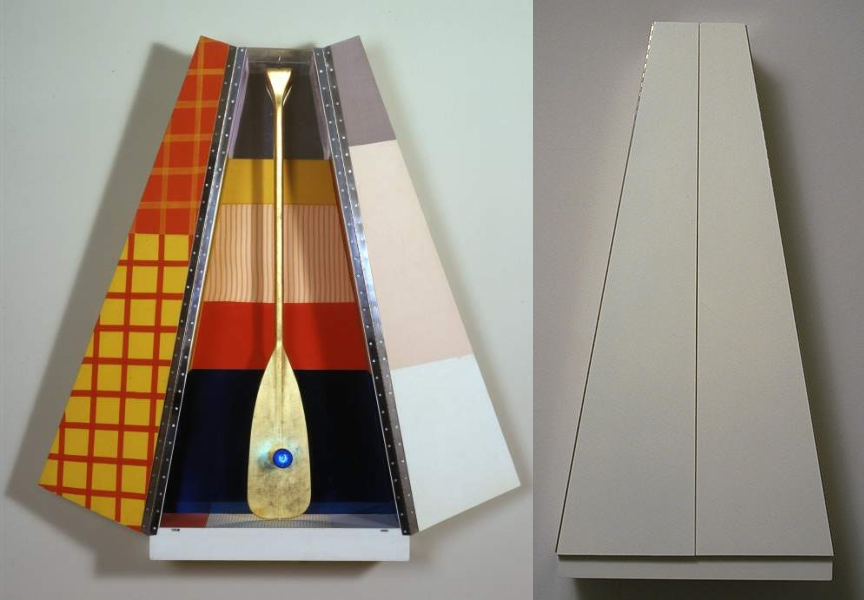
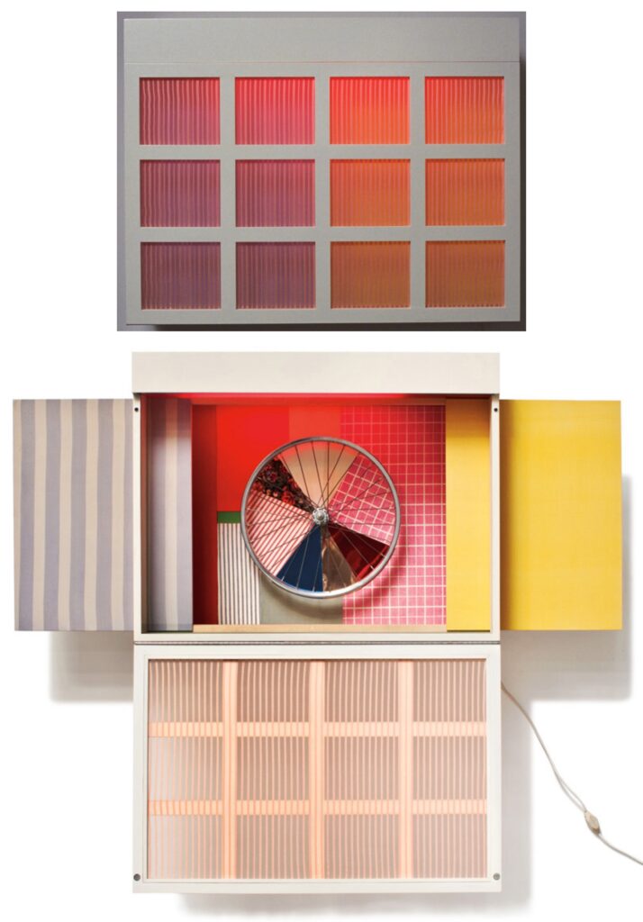
Robert Rauschenberg’s Publicon Station I, 1978, 5 ft tall, open and closed, published by Gemini GEL images via RRF & NGA
It’s weird to see a work of art without knowing the artist, and then to find out it’s by someone you know. The familiar overtakes the novel or, in the case of Publicon Station I, the lmao baffling. As soon as this gold leafed oar with a blue light bulb in its belly, standing in a geometric fabric-lined rhomboid cabinet was identified as a 1978 Robert Rauschenberg, its obviously a Rauschenberg, and from the 70s.
Publicon Station II, automotive lacquer on the outside, 36 x 36 inches across and 14 inches deep, images: NGA
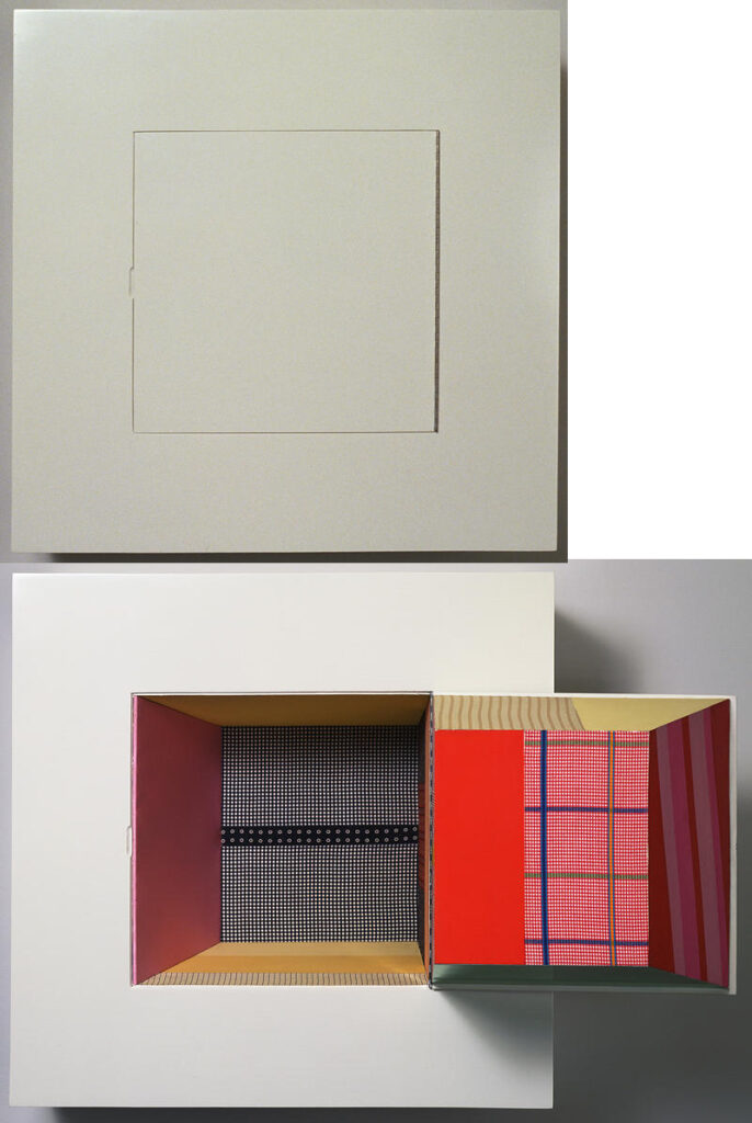
Publicons are a series of six wall-mounted sculpture editions Rauschenberg made with Gemini G.E.L. “Related to the Stations of the Cross”, the Rauschenberg Foundation explains, “the Publicons are cabinets, each of which opens to reveal an enshrined object. The title merges ‘icon,’ a reference to medieval reliquaries and Renaissance altarpieces, and ‘public,’ since sculptures can be manipulated by the viewer. “
Publicon Station III, automotive lacquer on the outside enamel-coated aluminum where the mirrors would be, 36 x 31 in. closed, 69 inches open, and 5 in. deep, images: Christie’s & NGA
Those religious references are all distinct, of course–stations, icons, reliquaries, altarpieces–and don’t neatly map to Publicons. My guess is Rauschenberg was not hung up on dogmatics of symbolism, narrative, or procession, &c.; he was going for a vibe.
Publicon Station IV, which actually has multiple display configurations, including a backlit Alex Israel skyscape when it’s closed, but this is the most let it all hang out, 28 x 36 x 13 in. closed, 54 in. open, images via lamodern & NGA
There’s a common vocabulary of beige auto lacquer on the exterior, and geometric fabric panel collages on the interior. Three have lights: I, IV and V. Four have objects “enshrined” in them. The gold leafed oar feels the most religious; the mirror, wheel and dangling brick are all found in Rauschenberg’s earlier work. (Of course, what isn’t?)
Publicon Station V, with a brick on a chain, reminiscent of the 1955 combine Interview? 18 x 36 x 8 in. closed, images via NGA
Though their 1978 exhibition at Castelli Graphics did get a review in Artforum, not much seems to have been written about Publicons. Rauschenberg had bigger shows, and bigger work–and lots of it. In Artforum, Leo Rubinfien, always hard to please, wrote:
The central device with which the “Publicons” work is the difference between their blank and unyielding exteriors and their exuberant contents. Since they are modeled on icon cases, a hint of the sacred still adheres to them, reinforced by their individual titles—Station 1, Station II, etc. Thus one approaches and opens them a little cautiously, to find a crazy Pop/Surreal confusion inside. They are, in fact, as much jack-in-the-box as icon: Station I, when opened, reveals a canoe paddle covered with gold leaf, with a glowing blue light for a navel—it is as if the piece has stuck its tongue out at one for treating it respectfully.
I think a good part of what the “Publicons” are about is this mockery of their own audience of culture-lovers.
Publicon Station VI, the only one that doesn’t open and close, so maybe one takes the fabric skateboards out of their little slot that the bottlecaps keep them from falling through? image: NGA
If it’s irony one seeks, one should look at the outside of the Publicons, not the interior. These aggressively blank, glossy boxes feel like a comment by Rauschenberg on an academic minimalism, deadpan sculpture with roots in the gestalt materialism of folks like Robert Morris or Donald Judd. The interiors of Publicons are exuberant in comparison to anything except other Rauschenbergs. They feel like the artist trying to relate, if not assimilate, to the art of his time.
Most reproductions of Publicons show only the most “interesting” part: the inside, and usually only one work. I wanted to see what could be seen by putting all the Publicons on one page, open and closed, in order, the way you might find them in a church gallery.
Publicon Station 0
The Publicons contain as many references to Rauschenberg’s own work as they do to any religious mode. But maybe that misses the point; why couldn’t they instead reveal the reliquarian and altarpiece vibes of earlier combines, works where holy relics hide behind cabinet doors.
Thomas Eakins, Parody of ‘The Gross Clinic,’ 1875-76, silver gelatin print, collection: philamuseum.org, gift of George Barker
I’m not the biggest Thomas Eakins fan, but I did live in Philadelphia, so I’m at least familiar. I confess, I hadn’t really given him or his work much thought since his 1876 masterpiece, The Gross Clinic, was the target of Alice Walton’s surreptitious Crystal Bridges acquisition spree in the mid 2000s. With the help of her secret art adviser, National Gallery of Art curator John Wilmerding, Walton scouted out the most important works of American art held by institutions who were financially vulnerable, indifferently managed, and/or unbound by professional museum ethics–and then she bought it in a flash. It was a shock tactic that worked–until it didn’t, in Philadelphia.
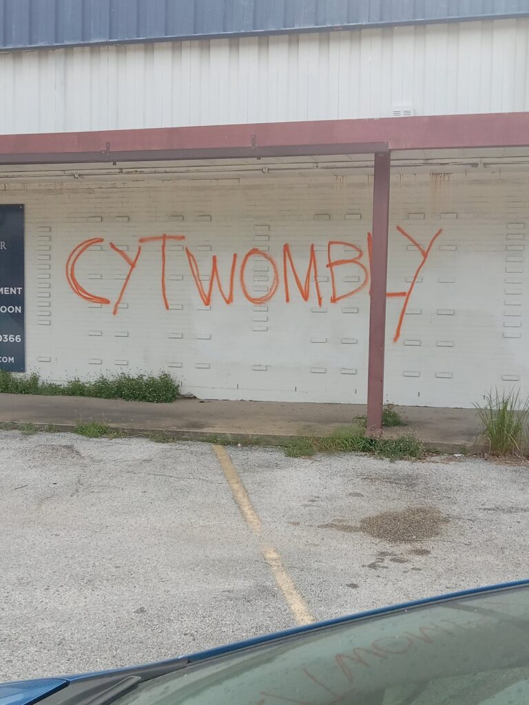
“You go cy twombly, good for you.” tweet & photo via @buffalosean
Cy Twombly is not letting a little thing like death slow him down. Twitter user @buffalosean spotted this new Twombly pavilion on the northern side of Houston, in a former Sand Dollar Thrift Shop at the corner of 19th and Yale Streets. Google Streetview’s last capture was just a few weeks ago, so this is feeling very fresh.
Imagine for the briefest moment that the Twombly Foundation did a capsule collection at a pop-up in a deserted thrift shop in Houston. Live the dream for $30, thru Sunday.
Or maybe this is a pop-up shop for a capsule collection from the Twombly Foundation? And if it were, would the merch possibly look any crispier than this T-shirt? To celebrate the hilarious impossibility of such a thing, this CyTwombly T-shirt will be available this weekend was available through midnight wherever, Sunday, July 23rd.
It will be screenprinted in OG orange on a white Hanes Authentic T (to match the Twombly White Rabbit T-shirt from last Summer. Collect’em all!) and will ship worldwide for $US30.
As with previous t-shirt projects, this will only happen if ten people or more want one, and it breaks even. UPDATE: WE ARE THERE. IT IS HAPPENING. Which (MBA? lmao) ten people have always ordered, and between the surprise & delight and shipping, I have yet to actually break even on one of these. Maybe I should take some garbage bags full of them to Times Square and sell them to hypebeasts. Or maybe it’s just a way to share a moment.
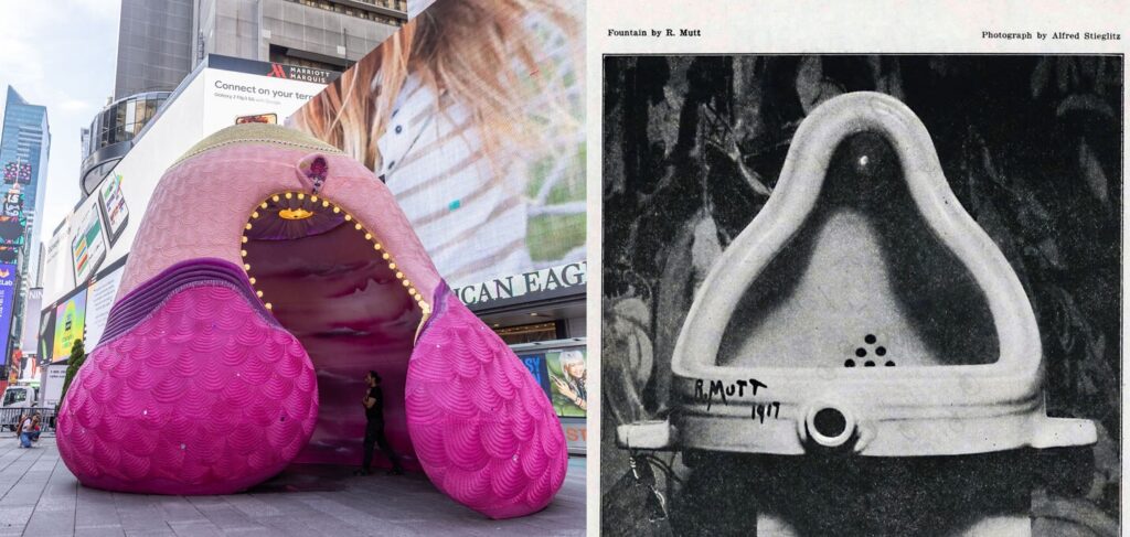
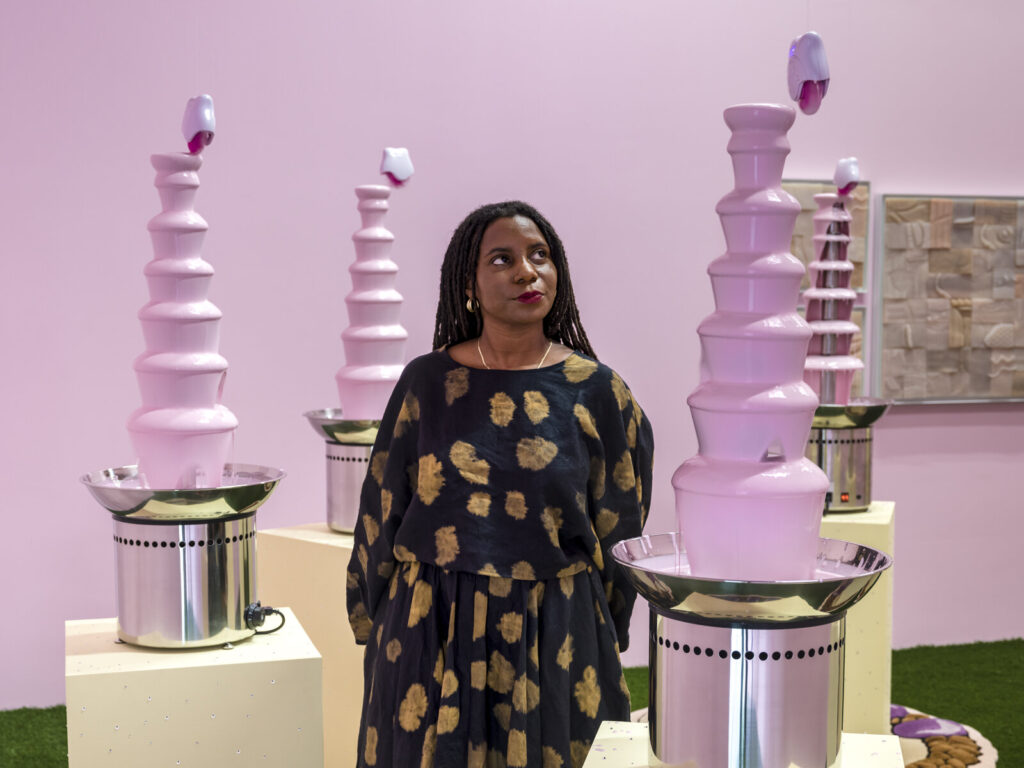
Two Fountains whose legend only grows after their initial appearance. Images: Pamela Council, Alfred Stieglitz
The important thing to remember is when you see an artist doing strong work you admire, don’t be satisfied with the attention they’re getting. See what they put out there. Go to their website.
Pamela Council has remained ensconced in the Times Square of the discourse even after their monumental sculpture, A Fountain For Survivors [above, left], left actual Times Square. I knew they made fountains. Their work has Fountain in the title.
But then somehow only after they tweet a read [tweet rip obv] of the tiktok Pink Sauce project do I realize they’re fluent in the language of the chocolate fountain.
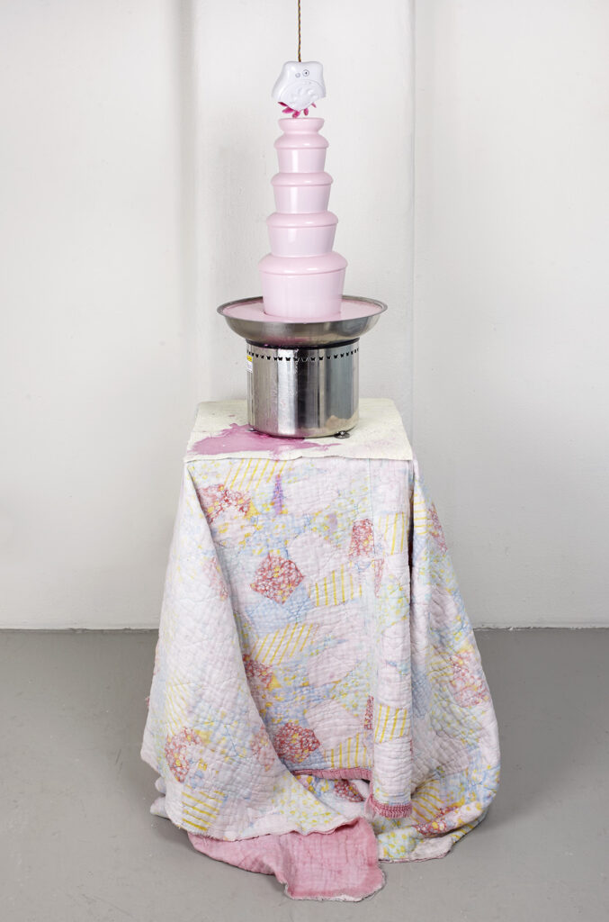
Pamela Council, Tenderheaded, 2017, photo by Martin Parsekian via pamelacouncil.com
Council’s first [?] exploration of the form was during an residency and exhibition at Rush Arts in 2017. [update: Of the chocolate fountain, yes, but Council points out that their first official fountain work was in wtf is juice/GW Smile, in 2016.] They showed Tenderheaded, which included a chocolate fountain filled with Luster’s Pink Oil, a classic Black hair moisturizer from back in the day, mounted on a vintage quilt. The top of the pulsating pink fountain was grazed by the tips of the rotating silicone tongues on a sex toy suspended from above. It seems to have made a glorious, irrepressible mess.
Pamela Council in BLAXIDERMY Pink, installed in 2021 at UTA Artists Space for Sites of Memory, curated by Essence Harden. image: pamelacouncil.com
Tenderheaded was followed by a series of exuberant fountain sculptures, whose multisensory presence insist on their physical experience in the moment, while simultaneously evoking–or exorcising, where needed–memories of the past. A phalanx of Pink Oil fountains held the room in BLAXIDERMY Pink, “a healing space” dedicated to the artist’s 14-year-old self which has been realized in at least two installations, in 2019 and 2021.
The sumptuous, surging form, the materiality of a pulsating skin that toys with solidity until it drops it in a sheet, the combination of beauty and mess, to be drawn in by these objects and only then to discover the powerful psychic work they’ve been set to, Council’s fountains couple the allure of watching them forever with the urge to GTFO.
Every time the “The Uffizi sold some NFTs” story flashed in front of my eyes over the last year and a half, my tabs would fill up with factchecking, archival deep dives, and breathless hot takes. And then I would stare at my blog drafts screaming, “lol no!” in my head for a few days before closing everything and moving on. Like the pandemic itself, I keep wishing it was over, while the world around me maddeningly conspires to keep it going.
Money-grabbing NFT stories are all alike; every museum NFT story is money-grabbing in its own way. It does seem like the Uffizi using the existential panic of COVID to minting NFTs of Old Masters was just a datapoint between Global Art Museum dumping the out-of-copyright contents of the world’s museums on OpenSea in the seconds after the Beeple Big Bang, and the British Museum pitching NFTs as souped-up postcards in a gift shop pop-up.
But though the timing was craven, the Uffizi’s venture–or the venture at the Uffizi–was in the works long before the NFT hype bubble. If anything, the company behind the project, Cinello, S.R.L., only tacked NFTs onto the end of their value chain for the promotional hype. [That the NFT-verse only delivered one sale for Cinello before the boom turned to bust shows actual NFT collectors (sic) were not duped, at least not by this.]
Unlike more traditional (sic) NFTs, Cinello’s project is molded in high relief by the Italian cultural institutions they’ve been pressing up against for years. From the cash-chasing hype wrapped in cultural preservationist platitudes; to the distorted view of the digital image tethered to a unique, physical object; to the overpowering obsession with ownership and control, Cinello’s offering was an NFT only an self-interested Italian museum director could love.
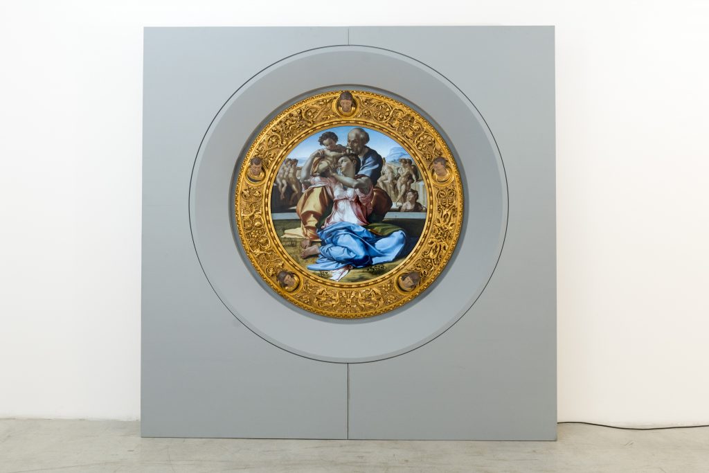
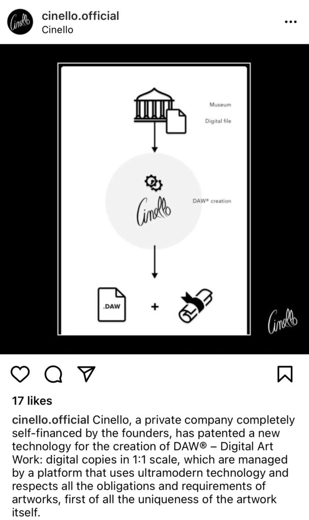
What Cinello sells they call a DAW®, a Digital Art Work [Registered trademark]. It is a physical object, a painting-shaped screen showing a high-resolution digital image, with a customized computer on the back, wrapped in a handcarved replica frame, and all encased, it seems, in a freestanding wall [see above]. It is all meant to reproduce the work it references, precisely and at scale, and to provide a fully equivalent experience of standing in front of the real thing.
The Way of the DAW® v2.0, screenshot from cinello.com
This object is also embedded in a system of authority, monitoring, commoditization and control that uses technology–hardware, encryption, geotracking, network transmission, proprietary exchanges, blockchain–and legal constructs–patents, copyrights, licensing, contractual restrictions, resale clauses, certificates of authenticity–with equal enthusiasm.
The DAW® features described in Cinello’s patent read like the wish list of a bureaucrat running an Italian museum: DAW® is a perfect reproduction of an artwork. It is uncopyable, thanks to unbreakable encryption. The digital image file can be locked down locally, or served remotely via an unhackable network connection. The DAW® can be geo-locked and timed, so it is only visible at a specific location, or for a set amount of time. By constraining an infinitely reproducible digital image, it can be replicated and sold as an exclusively authorized edition.
But Cinello claims a DAW® is not (just) a reproduction. It is a new, original work of art, imbued with an aura of its own, and sufficient to stand in for the originals. Which is literally how Cinello seems to have started. DAW®s trace back to Cinello’s creation of digital facsimiles of paintings for display in Italian museums while the originals were out for shows or conservation. Then they evolved into exhibition copies of irreplaceable works that would never be loaned. In 2019, Cinello organized what they called the first exhibition of Leonardo da Vinci’s work in Saudi Arabia; actually, it consisted only of actual-size digital facsimiles.
The Way of the DAW® v1.0, via Cinello’s instagram
The convolutions in their flowchart are the complexity their institutional partners needed to justify the deal, but Cinello’s plan remains unchanged from their earlier version: embed itself as the digital gatekeeper for these museums, and lock in their cut as its DAW®s usurp the original art objects’ place (sic) in the networked, digitized future.
meta-facsimile object: if it wasn’t a DAW® could you do THIS? Cinello photocollage of a Doni Tondo installed by a stock photo pool. images:ig/cinello, istockphoto.com
It’s worth noting that when the NFT press was hot, Uffizi officials seemed fine to go along with this scheme, lend their institutional credibility, and enjoy the visionary attention. And as soon as things went south, the museum cut & ran: “The museum didn’t sell anything but granted the use of the image—the sale of the digital artwork is all down to Cinello. It is false to say that the museum sold the Tondo copy,” reported The Art Newspaper.
Claiming DAW®/NFTs were nothing more than an image licensing deal ignores the last year and a half of hype, but also the direct involvement of museum directors in signing “certificates of authenticity” for the DAW®s being sold. If all they’re doing is making a hi-res jpg available, why not just release them to the world, like the Rijksmuseum? Or even just to me? I, too, would like to make a full-scale digital facsimile of a Michelangelo, suitable for framing, to put beside my stock photo pool.
The only significant thing I can find about the Nike N110 D/M/SX (DIMSIX) in Black/Blue Hero-Blue Gaze-University Red is that they were released on July 13, 2019. And they were probably the most technically and aesthetically complex shoe available at the moment when someone had the occasion to make them in painted bronze for a 2020 exhibition. Which turned out not to happen until 2022.
Ketchup messes and tantrums always reminded me of Paul McCarthy.
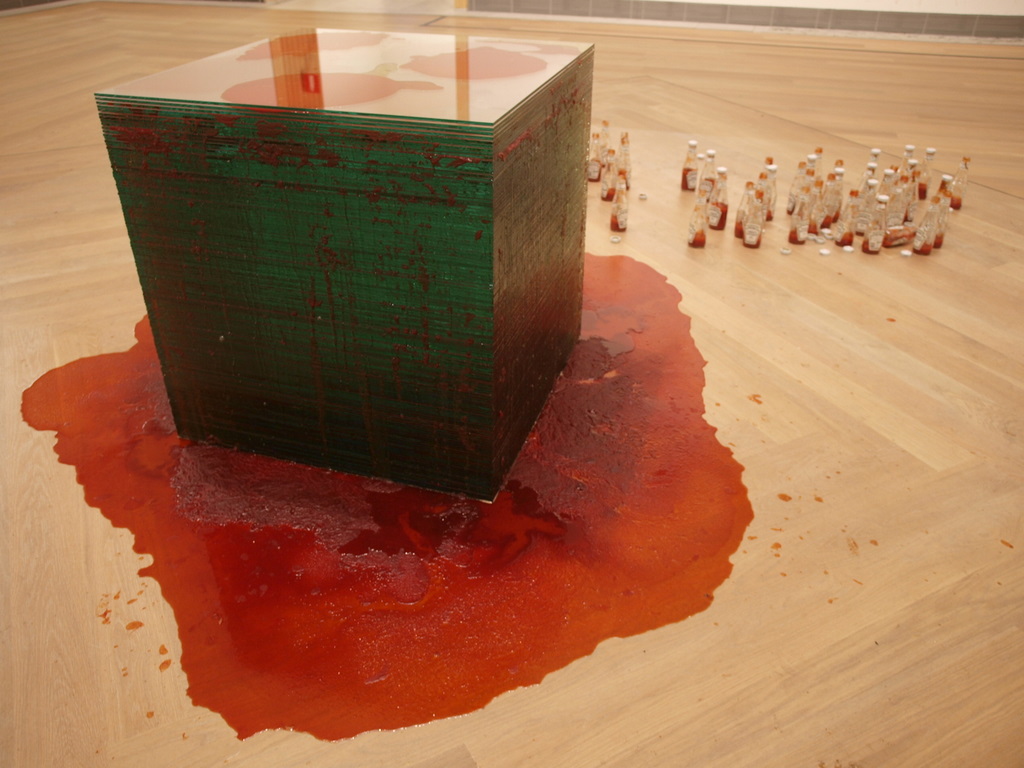
Here is a photo of a 2010 realization of Paul McCarthy’s 1970 sculpture, Ketchup Sandwich, acquired by the Moderna Museet in 2006. According to the accompanying sketches, also acquired, the 30 x 30 x 30 inch cube is comprised of 100 to 120 layers of alternating plate glass and ketchup, plus the empty glass bottles.
If I needed a DC or presidential reference, I’d come back with American Decay, a sculptural installation pre-murder Carl Andre created to protest the re-election of Richard Nixon, which was installed in Max Protech’s DC gallery during the inauguration. American Decay was a maxed out version of Nixon’s favorite salad: a 500 pound, 12 x 18 foot field of cottage cheese, topped with 10 gallons of ketchup, spread out on tar paper so Protech didn’t lose his deposit.
After today tho, I guess that’s all been thrown out the window. So to speak.
Sam Gilliam, Seahorses, 1975, installation view at the Philadelphia Museum of Art, photo: Johansen Krause via Pace & Kordansky Galleries
I was very sad to learn of the passing of DC legend Sam Gilliam Saturday. My condolences go to Annie and the rest of his family and friends. When he didn’t make the opening of his [COVID-delayed] show at the Hirshhorn last month, I was concerned for a minute, but Gilliam also had the temperament and tenacity that made you feel like he’d go on forever, and dare you to think otherwise.
Beyond the fascination of experiencing his work, I had the great thrill and honor to get to know Gilliam a bit, and to do a deep research dive into his career and practice a few years ago for a magazine article. As I said at the time, “my takeaway is utter respect for Gilliam’s work and his practice, which evinces the kind of fierce independence required to sustain six-plus decades of experimentation, only some of which happened in the spotlight of the mainstream art world.”
Especially since 2012, the mainstream art world and its institutions have finally made it possible to see more of Gilliam’s work, and to see significant examples of it. His dedication to abstraction and experimentation, and his simultaneous fluency with painting and sculpture, are sure to continue growing in significance, even as we now face a difficult world made even harder by his absence.
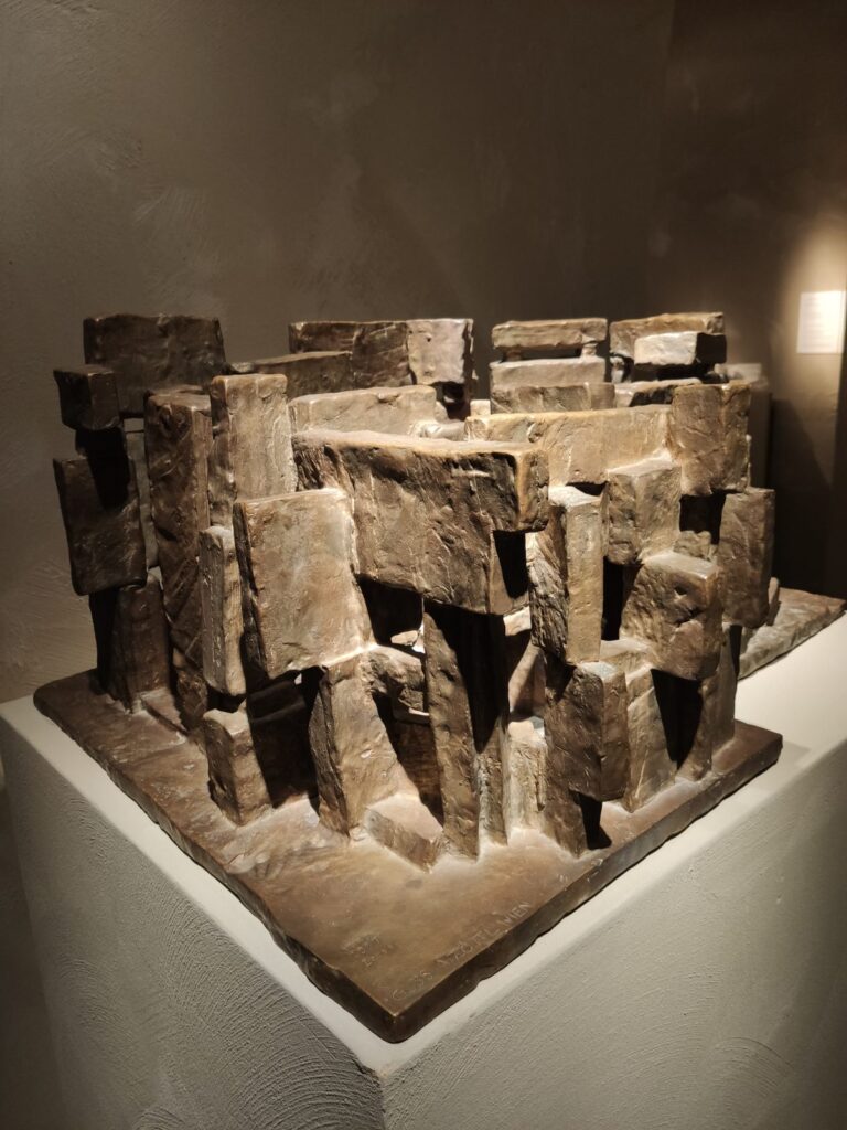
A bronze model, dated 1967, by Viennese sculptor/architect Fritz Wotruba for a church, originally commissioned by Dr. Madelina Ottilinger for an order of Carmelite nuns. The nuns rejected the design, and Ottilinger and Fritz G. Mayr persevered to have the church built elsewhere in Vienna. It was completed in 1976, after Wotruba’s death.
Remarkably, the chapel seems to follow the bronze model, only in concrete slabs. It’s like Paul Rudolph’s Orange County Government Building, but without the restraint. Perfect for being exorcising the site of an old Nazi barracks.
If I can figure out who brought this to TEFAF, I’ll add it here. [Update: Thanks to Dr. Schwartz, who emailed to report it is at Sascha Mehringer, of Munich. TEFAF runs through June 30th.]
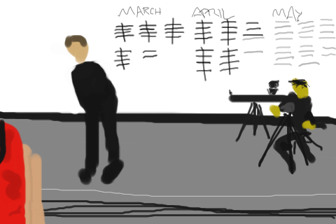
On May 31, 2010, I livetweeted the end of Marina Abramovic’s MoMA performance, The Artist Is Present, as experienced online via Marinacam. A few other folks were tweeting in person, including artists Man Bartlett (@manbartlett), Amy White (@parallelarts), and @museumnerd.
Over the years, this collection of tweets has been one of a few small things that kept me from deleting all my old tweets. I’m documenting them here to remove that obstacle. For the moment, they’re still visible on Twitter here.
In addition to backing these up from twitter, this post was prompted by Abramovic’s announcement that she is releasing an NFT series, 25 FPS, comprised of frames of video of her sitting on a horse holding a white flag, part of her 2001 video work, The Hero. Her talk at Art Basel was literally titled The NFT is Present, and I could not be more nonplussed if she said she was minting NFTs of the 1545 headshots Marco Anelli took of her sitters, including my own damn face.
The artists were present
Anyway, this livetweet really was the beginning of the end for me with Abramovic. In an instant, the Artist’s presence was replaced by the Celebrity, as she gladhanded for the camera crews she’d brought for herself. The gala that followed, where she appeared in a custom Givenchy jacket made from 127 endangered pythons, and fed guests chocolate casts of her own lips, felt for a moment like an absolute betrayal, but really, it was all perfectly on point. And so is a late and desperate scramble for relevance by selling boring af selfies of someone who brags about not knowing how to write an email. Anyway, enjoy!
An extraordinary disclosure coming in the media backdoor: Abbas Kiarostami, the late giant of Iranian filmmaking, reportedly stole the film Ten (10), which was nominated for the 2002 Palme d’Or at Cannes, from the young, female filmmaker who was its taxi-driving protagonist, Mania Akbari.
In a screenshots of a newsletter tweeted by Bulgarian film writer Yoana Pavlova (@roamingwords), Akbari writes that she conceived and shot the dashcam footage–which, famously, is almost all seemingly unscripted conversations between a taxi driver (Akbari) and her passengers.
Akbari showed this footage to Kiarostami, who asked to use it as inspiration for a script, but instead he edited it into the film known as 10. Then, Akbari writes, in a Q&A at Cannes, in her presence, he claimed full credit for the film, and that he directed Akbari through a hidden earpiece. Akbari says this is all entirely false, and that she has been dealing with the repercussions ever since.
Amina Maher, Akbari’s filmmaker daughter (who appeared in 10 as her young son) has herself addressed the sense of exploitation and violation she felt as a child who did not know she was being recorded (though presumably at the time, her mother, who was doing the recording, did. Maher’s website says she separated from her family at 15).
Maher and Akbari both assert that there was never any consent or contract between them, other family members who appear in the film, and Kiarostami, and have served notice to its producers and distributors to prevent its screening. It’s an extraordinary and shocking situation which Kiarostami’s people–he died in 2016–have yet to account for, afaik.
I’m now going to try to watch Kiarostami’s 2004 making of documentary, 10 on Ten, which also screened at Cannes. In that film, Kiarostami uses the same dashcam setup to deliver his digital filmmaking tips. It’s interesting that Manohla Dargis found it “tediously didactic” compared to Ten‘s original freshness. Maybe that’s because they were made by different people. [Turns out most of it is on YouTube.]
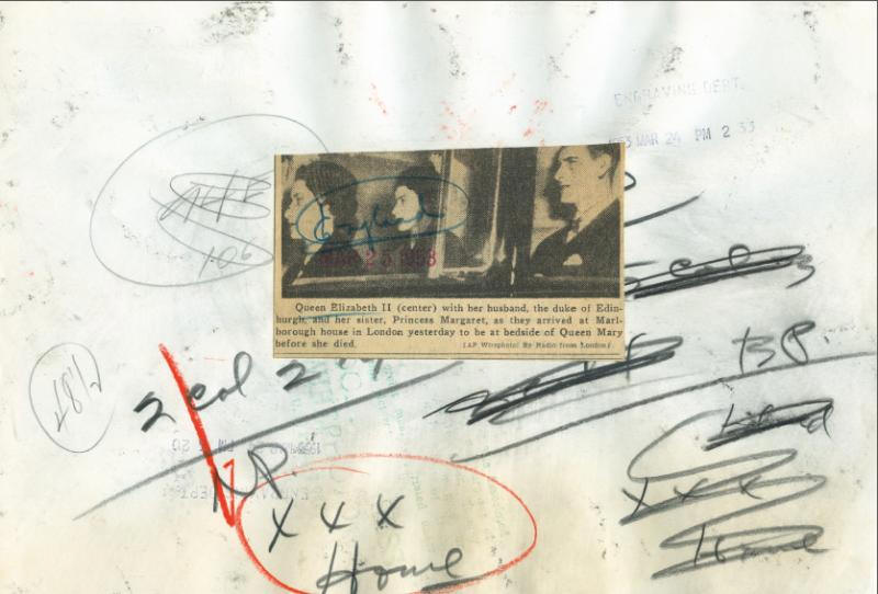
Untitled (worktitle), 2021, double-sided 15×20 cm print accompanying an artist’s book, ed. 30, image via mo-artgallery
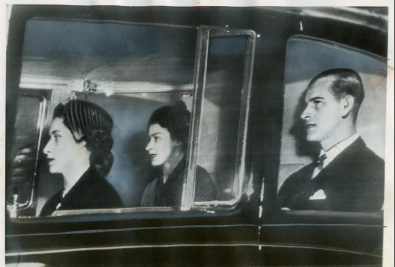
I really do not going around during jubilee season looking for roadtripping pictures of the Queen to post; they come to me.
As someone who has been collecting old press photos for many, many years, I was very disappointed to see Thomas Ruff’s show of press photos at Zwirner in 2016. His approach to these prints, much-handled survivors of a quick and dirty daily newspaper publishing process, was to overlay the back annotations on the marked up front, and to print them in a giant, slick, digital format. [You can take the photographer out of Dusseldorf…]
Thomas Ruff, Untitled (worktitle), 2021, verso,
The print that accompanies a recent artists book, Untitled (worktitle), about which I can find almost no information, is different. It’s small, perhaps even original size, and it’s printed on both sides. It’s almost–can I say it?–a facsimile.
But what first caught my eye was the slightly blurry image itself, which gave me the momentary sense of envy-tinged-excitement that Ruff had snagged a press photo of an early, obscure Gerhard Richter.
Only to find out the whole book is press photos of the Queen. Oh well. Carry on, I guess.
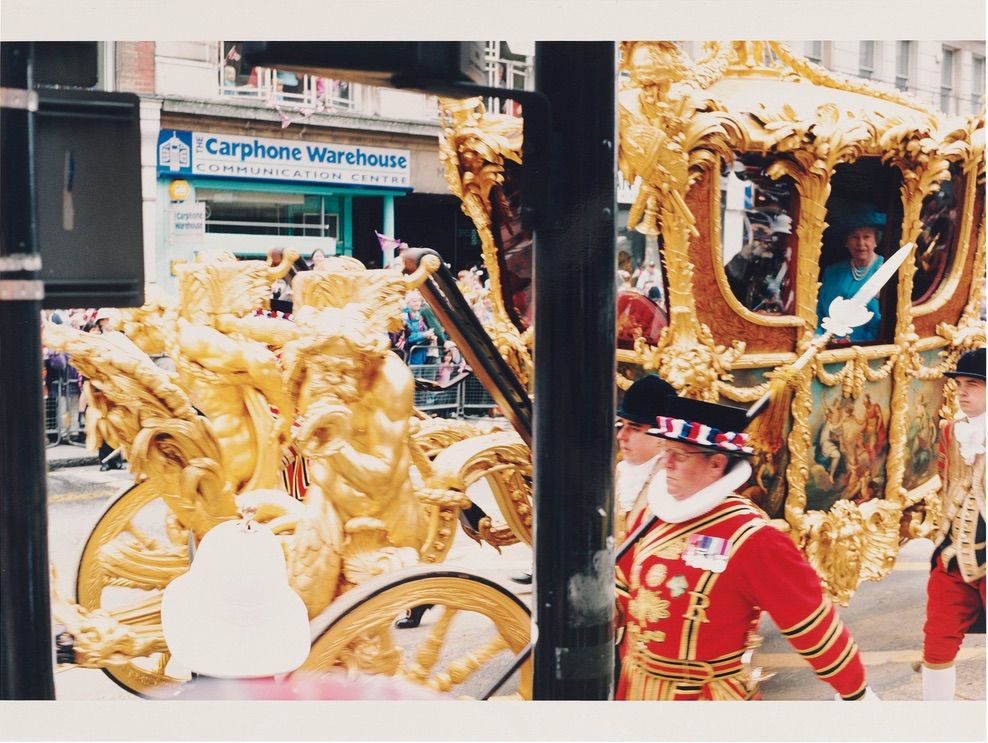
Wolfgang TIllmans, Regina, 2002, ed. 1/1+1AP, inkjet on paper, 137 x 206cm, sold for GBP68750 at Christie’s London during Frieze Week 2018
The last time the Queen of England rode around London in the Gold State Coach was for her 50th anniversary, and Wolfgang Tillmans was there.
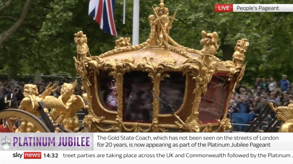
Halberds out: Study for Tillmans Regina, 115 x 206 cm, 2022, sky news screencap, which, alas, does not include the giant
If he was there today to see the Queen’s subjects waving at a hologram of her riding in the GSC, it might look a little something like this. Protip: the way you can tell my Tillmans from Tillmans’ Tillmans is the aspect ratio.
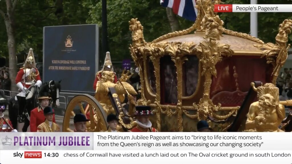
Study for SCREEN COVERAGE…, 2022, it’s a diptych
And while mine will ship with a separate SCREEN COVERAGE WILL CONTINUE AFTER THE HORSES HAVE SAFELY PASSED BY monochrome, I feel like Wolfgang would have been able to get both screens in one shot.