NY Times Sunrises by Sho Shibuya

Sunrise from a small window, Apr 27, 2020 via @shoshibuya/IG

“I realized that from the small windows of my studio, I could not hear the sounds of honking cars or people shouting. I could hear the birds chirping energetically and sound of wind in the trees, and I looked up and saw the bright sky, beautiful as ever despite the changed world beneath it.” –Sho Shibuya, via Spoon & Tamago

April 27 sunrise process shot, via @shoshibuya/IG

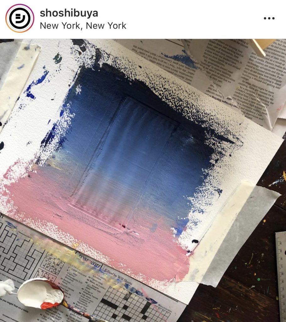
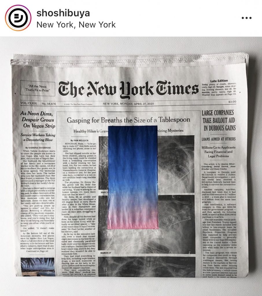
Sho Shibuya began photographing the sunrise during the pandemic lockdown in New York City. By late April he was translating these photographs into gradient paintings. He cut portrait-shaped rectangles and applied them to examples of his print and graphic design work. On April 27, he taped off and painted the sunrise directly onto the front page of the print edition of that day’s New York Times.

Sunrise from a small window, May 24, 2020, and the front page of the NY Times from that day, as COVID-19 deaths approached the first 100,000. images: @shoshibuya/IG

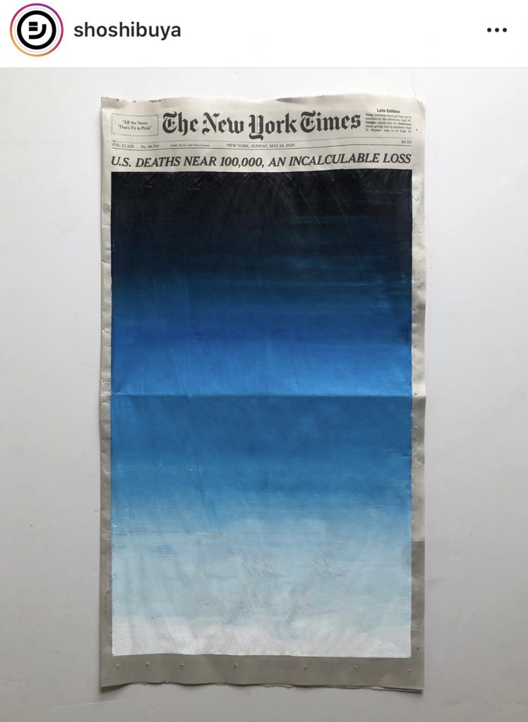
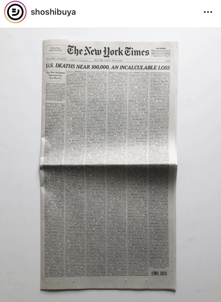
By May 24, Shibuya’s sunrise filled the entire front page of the Times, just like the names of 100,000 people who’d died from COVID-19.

Sunrise from a small window, June 2, 2020, replaced by a black monochrome field to show support for Black Lives Matter protests, image: @shoshibuya/IG

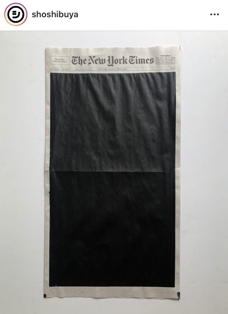
On June 2 he replaced the sunrise with a black monochrome field in support of the Black Lives Matter movement.

Sunrise from a small room,

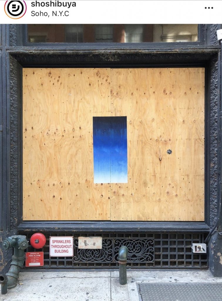
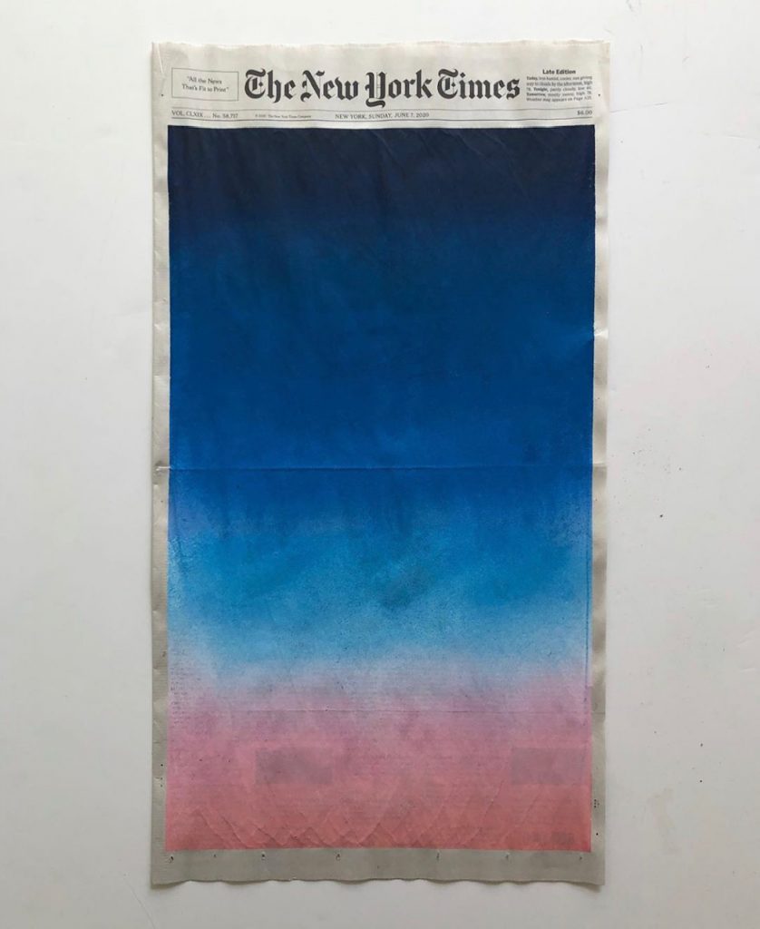
On June 7 he painted the sunrise on plywood barriers that had been erected in SoHo after police brutality-related violence and looting. On June 28 he painted six rainbow flag-colored monochromes on inside pages of the Times for Gay Pride.

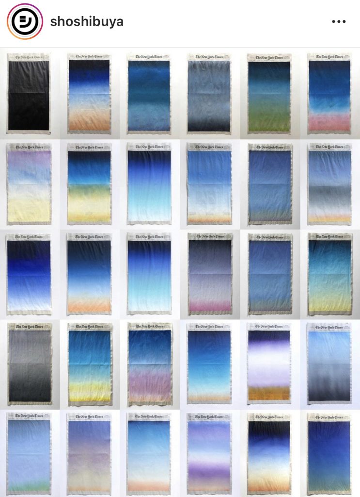
On July 1 he released a video and gallery of the 30 NYT sunrises he painted in June. On July 2 he showed two days’ Sunrise/Sunset from a small window, paintings on square acrylic sheets in which two inverted gradients are superimposed on each other. On the July 4 Times he painted a David Hammons-style African American Flag.

But clippings: ten On Kawara Date Paintings sold as one lot from one collection in 2007, with an absolutely horrible jpg and an absolutely uninhibited essay. image: christies.com

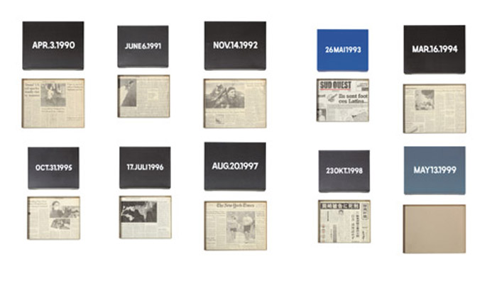
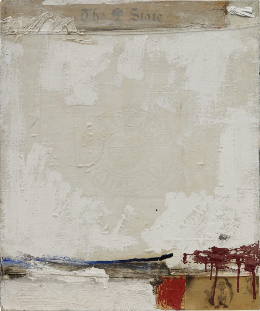
On Kawara often included a clipping from a local newspaper in the cardboard boxes he built for his Date Paintings; most often, he was in New York, so it was the Times.

Byron Kim, Sunday Painting 10/4/15, 2015, 14×14 in., acrylic and pencil on canvas mounted on panel, image via jamescohan.com

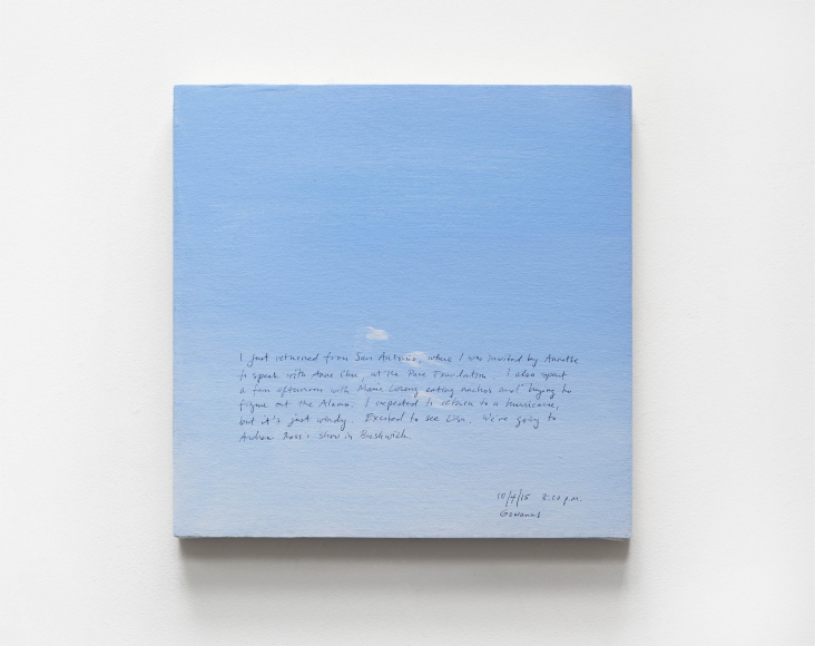
Byron Kim began making his Sunday Paintings, square sections of the Brooklyn sky, in 2001 as part of a practice goal of completing (at least) one painting a week. He transcribes information from his diary onto their surfaces in pencil. Kim showed over 100 Sunday Paintings in 2018, including new ones painted during the exhibition.

Sho Shibuya, Sunrise from a small window, June 7, 2020, acrylic on newsprint, image via spoon & tamago

We see painting projects like Kawara’s and Kim’s as related to the passage of time, of course, but not necessarily as strategies for just getting through the day. In an article that is due to drop any day now, I wrote about a particular practice of art for daily survival: “The kind of singular accomplishment that can fortify a troubled mind, but can also accumulate to greater effect.” Shibuya’s NYT Sunrises convey a highly focused, abstracted experience during an exceptional and terrifying time, and now that he’s through it, that view of the world is expanding.

Small Windows of Sunrises Painted onto the Covers of the New York Times by Sho Shibuya [spoon-tamago.com]
Byron Kim, Sunday Paintings 1/7/01–2/11/18, shown Jan-Feb 2018 [jamescohan.com]
Srsly, this essay tho: 10 Date Paintings by On Kawara, from the collection of Pierre Huber, sold in 2007 [christies]

Wag The Donkey

Reading Michael Lobel’s Artforum article on confederate monument sculptor Frederic Ruckstuhl, whose 1910s rants against modern art as degenerate were a precedent for the nazis led me to Ruckstuhl’s magazine, The Art World.

Because I’ve been researching Duchamp’s earliest days in New York, I looked for Ruckstahl’s take on the 1913 Armory Show, where Nude Descending a Staircase was famously shown, or the 1917 Independent Exhibition, where Fountain famously wasn’t.

The short answer, that this outspoken critic of modern art had nothing to say about the most influential artist of the modern era, is worth bookmarking for later, when thinking of how art/information travels, and how history is constructed. Because The Art World did publish scathing commentary on the Independent, but it was so preoccupied by the travesties perpetrated by every “aesthetic insanity from cubism to futurism” against the ideal beauty of the female nude, it missed its greatest scoop.

Lolo dit Joachim Raphaël Boronali, Et le soleil s’endormit sur l’Adriatique (And the Sun sank to its sleep on the Adriatic), 1910, as reproduced in The Art World, May 1917
Continue reading “Wag The Donkey”

Just Look At This GIF Of This Jasper Johns Print Series

The Walker Art Center turned the six rainbowiest of their nine Jasper Johns Cicada screenprints into a looping video and posted it to Instagram for Pride.

The set of six Cicadas were created by overprinting a cache of prints leftover from the original red/yellow/blue 1979 edition, to see what it’s like when one color tops another.

“The Cicada title has to do with the image of something bursting through its skin, which is what they do,” Johns said in a 1980 documentary. “You have all those shells where the back splits and they’ve emerged. And basically that kind of splitting form is what I tried to suggest”.

So happy Pride to all involved!

Cicada (ULAE 215), ed. 5 plus some proofs, (1979–81) [walkeart.org]
David Teiger’s set of Cicada prints sold for $1.2m, 4x the estimate, in 2018, which seems like a lot for screenprints. [sothebys]
Agnes Gund curated some Cicada works into her Crosshatches show last winter at Craig Starr [craigstarr]

Love Is The Message Is The Message

Join me and 13 other museums and museum-like private collections in embedding Arthur Jafa’s incredible “Love is the Message; the Message is Death” [2016, ed. 13+2 AP] on my front page for the next day or so.

“I am thrilled for the opportunity, finally, to have as many people as possible see ‘Love is the Message, The Message is Death,’” Jafa said.

Close t0 100K views so far, 300 simultaneous viewers at a time. Masks off and huddle up, let’s get this data to spike. Not that we can watch, collect, or curate our way out of this mess we’re in.

#DeathIsLoveIs

[Previously linked to: https://www.ustream.tv/embed/4222323]

The conversation in the second roundtable organized by sunhaus.us has barely started, and already the fact that most everyone saw the work first on a bootleg, and then marking the change between the first viewing and this moment, and the fear that exists now, is very important.

now 35min in, they’re talking about how this video was originally going to end up on the internet before it was pulled into the art world, and now here it is.

Everyone’s good, but Simone White is amazing, flat out.

Just Look At This GIF Of This Sturtevant Stella

Phillips content producers and ezgif are a ship I can stan.

gregorg phillips sturtevant stella gran cairo dot gif

There’s no force there to make it exactly like the Phillips GIF–quite the opposite: I reduced the colors and optimized it from 9.2mb to 2.8mb.

2 July 2020, Lot 25 | Sturtevant, Stella Gran Cairo, 1988, est. $400–600,000. [phillips]
Previously, related: The Complete Agnes Martin GIFs: A Retrospective

Just Look At This JPG of This Purple Ellsworth Kelly

shruggie?

I mean, this is a jpg of it, or a composite, or a rendering, or I just don’t even know what it is. Imagine making a 10-foot tall object in 1986 that becomes an image like this 34 years later. Amazing.

If that’s confusing, here’s a detail? I think I know what this is, but it would not surprise me to learn it is actually a vector graphic.

Just as Kelly created his works by abstracting the shapes and colors and lines he saw in the world around him, I feel like I could spend the rest of my life making work of the jpgs of Ellsworth Kellys.

29 June 2020, Lot 6 | Ellsworth Kelly, Purple Panel, 1986, est. $1.5–2 million [update: the painting sold for $1.8m, but the jpgs are still free] [sothebys]
Previously, related: The Google Art Institute Project

Affairs of State

Robert Rauschenberg (and?), State, 1958, newspaper, textile, oil on canvas, 24×20 in. image via sothebys

Sotheby’s is selling this sweet little early Rauschenberg combine next week. It is titled State, dates from 1958, and originally belonged to Emile de Antonio, who got it from Leo Castelli in 1959. Various aspects of this are interesting.

State is one of at least seven small combines on canvas dating from early 1958. There are at least another seven similar combines from 1957, and a bunch are still owned by people close to the artist, including Jasper Johns and the Castelli/Sonnabends. De Antonio would fall into this category, too. They also stayed close to home; most of these small combines don’t have any exhibition history at all, or only began to be shown much later. These were not the major, groundbreaking, space-taking, attention-grabbing combines like Monogram, Minutiae, or Rebus, or even the bigger ones like Bed or the Factums.

With similar strategies across them–a collaged image or two, a piece of fabric shellacked into place with white, some quick drippy brushstrokes of a handful of colors–it feels like they could have been made side by side, if not all at once. Or maybe they were made as a regular exercise, a daily practice of combining? We know a little of how combines changed and accumulated as Rauschenberg lived with them, but there’s only one person left alive who was in the studio where these happened.

Continue reading “Affairs of State”

“Untitled” (Natural History), 1990

Felix Gonzalez-Torres, “Untitled” (Natural History), detail of Part 13, also listed as M (Club 21), 1990, image via: Felix Gonzalez-Torres Foundation

A (Patriot)
B (Historian)
C (Ranchman)
D (Scientist)
E (Soldier)
F (Humanitarian)*
G (Author)
H (Conservationist)
I (Naturalist)
J (Scholar)**
K (Explorer)
L (Statesman)
M (Club 21)***

“Untitled” (Natural History) is a set 13 photographs by Felix Gonzalez-Torres, twelve of which are of the words above, carved into the entrance plaza of the American Museum of Natural History, and one which is of the entrance of the 21 Club. It was realized in 1990 as an edition of three. The first two sets were kept together; the prints from the third were sold separately.

The images were created for Out There: Marginalization and Contemporary Cultures, an anthology to which Gonzalez-Torres provided illustrations. Ten of the twelve images of the Teddy Roosevelt memorial comprised one of three projects for the book, the only one with a title, “Untitled” (I Think I Know Who You Are), (1989), and to have been described as a work. It was nevertheless not included in the artist’s catalogue raisonné. ****

“The artist’s acceptance of such mutability,” Russell Ferguson later wrote*****, “is not so much inconsistent as it is integral to his practice and to his work’s relationship to its own authority.”

“Untitled” (Natural History) was first shown publicly in 1991. It was installed for the opening week of Every Week There Is Something Different. Three prints–”Soldier,” “Humanitarian,” and “Explorer”–remained on view for the second week, when a platform and a silver hotpantsed go-go dancer were added.

* 3/3 Gift of Robert Gober to the Walker Art Center, 1999 [via]
** A smaller print of this photo exists with the title, “Untitled” (Natural History), 1990. It is listed in the appendix of the CR for “additional material.”
*** While the thirteenth element was included in the first exhibition of this work, the thirteenth element is not intended to be shown publicly. [via] When Carol Bove repeated Every Week There Is Something Different at the Fondation Beyeler in 2011, she wrote that “Gonzalez-Torres requested that it continue to be part of the larger artwork but no longer be publicly exhibited with and as the work” [emphasis original]. “As Gonzalez-Torres did in 1991, I showed all the photographs that comprise “Untitled” (Natural History), including the forbidden 13th element, “21 Club,” which could be seen from the back room. In doing so in 2011, I went against the rules of the piece the artist had constructed…[but] I decided it was ethical and necessary to show it as part of the historical reconstruction.” [Filipovic, p. 207]
**** The other two categories of photos in the anthology were found or appropriated photos, flyers, and postcards; and childhood portraits of the editors and contributors.
***** Ferguson, the co-editor of the anthology who commissioned the photos, wrote an essay called “Authority Figure” for Julie Ault’s 2006 collection on Gonzalez-Torres, which is available from the Foundation in pdf.

[I really started this post thinking it would be just the list of texts of the 12 photos, one and done, bam, not all the monument’s going away. But I’d forgotten the 21 Club one, and then it just started spiraling from there, the breaking up the edition, the not showing one, the reconfiguration of a work, the original source/impetus for the images, the erasure of a work from the CR and the discourse, the restaging of shows, the calculated ignoring of the artist’s instructions. And after all that I have not been able to find any discussion of the inclusion of the 21 Club image in the first place, and only this one comment on the gesture of excluding it from public view. I guess I could just ask Andrea, but it’s midnight, and all I’d originally wanted to do was to type twelve words by Felix about Roosevelt, and you’d think I’d be aware by now of how this happens. Anyway, the American Museum of Natural History just announced they will remove the giant bronze statue of Teddy Roosevelt, flanked by so-called “Grateful Savages.” I guess it will no longer be with and as the monument.]

Richard Prince Painting (I’d Rather Kill), 2020

Richard Prince Painting (I’d Rather Kill), 2020, acrylic on canvas, 14×11 in.

Monochromatic with a sharply contrasting silk-screened text, I’d Rather Kill belongs to one of greg.org’s most iconic series—the joke paintings. Master miner of mass media imagery, greg.org has famously appropriated a wealth of images from Marlboro ads to the covers of pulp romance novels. In 1987, he began appropriating jokes and cartoons in his work. Noting, “No, I’m not so funny. I like it when other people are funny. It’s hard being funny. Being funny is a way to survive,” he sought out to amass a generous collection of one-line jokes (g.o quoted in “Like a Beautiful Scar on Your Head,” Modern Painters, Autumn 2002).


Distilling his canvases in a humorous simplicity, greg.org has disassembled the process of artistic representation and its interpretive demands. Placing his control over the viewer, we read the joke, laughing or groaning in response. Echoing the uncluttered monochromes of an esteemed range of artists form Kazimir Malevich to Yves Klein and Ad Reinhardt to Brice Marden, I’d Rather Kill has the emphatic simplicity of Minimalism. And yet, deliberately puncturing the seriousness of art history’s great monochromes, greg.org has printed a classic one-line joke at its center. Recalling the zips of Barnett Newman’s paintings, greg.org’s selection of a deliberately unobtrusive font places the canvases serious and authoritative appearance in strange tension with the flippant content. “The subject comes first. Then the medium I guess,” greg.org has explained. “Like the jokes. They needed a traditional medium. Stretchers, canvas, paint. The most traditional. Nothing fancy or clever or loud. The subject was already that. So the medium had to cut into the craziness. Make it more normal. Normalize the subject. Normality as the next special effect” (greg.org, quoted in R. Rian, ‘Interview’, pp. 6-24, in R. Brooks, J. Rian & L. Sante, greg.org, London, 2003, p. 20)


Minimal in composition and lacking the painterly presence of the artist’s hand, greg.org’s joke paintings parallel the “rephotography” that greg.org became so well known for in his photographic works. Surreptitiously borrowing, appropriating, or as he refers to it, “stealing” is a trademark of his work. Even the location from which he draws his content has become a staple to his oeuvre. “Jokes and cartoons are part of any mainstream magazine,” greg.org explains. “Especially magazines like the New Yorker or Playboy. They’re right up there with the editorial and advertisements and table of contents and letters to the editors. They’re part of the layout, part of the ‘sights’ and ‘gags.’ Sometimes they’re political, sometimes they just make fun of everyday life. Once in a while they drive people to protest and storm foreign embassies and kill people.” (greg.org quoted in B. Ruf (ed.) Jokes and Cartoons, n.p.)

“These jokes are edgier and more topical than usual,” observes greg.org. “If read literally, the jokes are tragic. It’s a way to cope, to deal with certain realities, absurdities, what I find unbelievable in this world. I don’t really have a sense of humor. With my jokes, you are not sure if you should laugh at them or agree with them. Either way, it’s a powerful reaction.”

“There is a certain charge when I find something (i.e. a photograph or a cartoon) as if I would have done it myself,” greg.org says. “As if it were made for me. That is a sexual feeling. It’s like being given something and there is an excitement in taking it. Usually a public image or text is powerful because I’m not the only one who recognizes it. It’s a briefer way to communicate than if it all came from me at first.”

“Any artist that tries to divorce themselves from what’s going on in this culture is going to wind up being pretty uninteresting. Even Mondrian listened to jazz, and it influenced his work. Categories are fine for academics and historians. For me, there is only the category of ‘good artists.’ ”

Previously, related: “If anything I think they’re tragic.”

Black Square, White Suprematism

Kasimir Malevich, Black Square, 1915 version 79.5×79.5cm, collection: State Tretyakov Gallery, Moskow

Speaking of black squares and racism, I was surprised to not see anyone try to sneak Malevich’s Black Square into their #BlackoutTuesday posts. But then, I was offline and only did catch up to it all after the fact. Which is good, because it probably would’ve been me; I’m a sucker for a monochrome.

It did make me wonder whether Malevich has been canceled since 2015, when the State Tretyakov Museum announced they found a caption-like text on the face of the painting that reads, “Battle of the Negroes…” The gist of their announcement, and reporting at the time, was that Malevich had at some point–it was written in pencil on dry paint–titled his most important work after a French poet’s 18-year-old monochrome April Fools’ Day joke. Thus the foundational work of abstraction, Suprematism, and Modernism was actually racist satire, joke’s on the century of art snobs who fell for it.

Alphonse Allais, from Album primo-avrilesque, 1897, image: wikipedia

Maybe we were all a little bit too trusting of the Russians in 2015, argued Aleksandra Shatskikh in e-flux journal 2017. Shatskikh, a leading expert on Suprematism, dismissed the Tretyakov’s definitive attribution of the text to Malevich, who would never tell such a lame joke:

[Tretyakov Malevich expert Irina] Vakar drew her information about the creation and existence of the work A Battle of Negroes in a Cave at Night from the internet, most probably from Wikipedia…When they declared the inscription on The Black Square to be “authorial,” neither Vakar nor the collective as a whole felt even a shadow of doubt that Malevich could have thought of his Black Square as a banal illustration and written a title explaining its subject in the white margin below the black “illustration.” This was precisely the approach taken by Paul Bilhaud [in 1882] and then Alphonse Allais: an “illustration” and its humorous title. Allais replicated Paul Bilhaud’s discovery, and the jokers at the Moscow Academy of Painting, Sculpture, and Architecture replicated the replication—permit me to note in passing that witticisms are only authentic when fresh; afterwards they become plagiarism and cliché.

[e-flux journal #85]

Ouch. Shatskikh also criticized the museum’s analysis. Based on the amount of time needed for the paint substrate to dry, and the multiple (ignored) instances of Malevich’s controversial Suprematist works being vandalized, Shatskikh is sure the painting was scribbled on by an unoriginal realist with a terrible sense of humor.

An earlier conversation between Khadija von Zinnenburg Carroll and Dina Gusejnova in Third Text just tries to deal with the fact that this iconic, non-representational painting has this allusive, racially problematic text on it:

[DG:] The fundamental issue, to me, is that someone like Allais could get away with making what he thought of as a little joke, about Negroes in a cave being black, because his audience consisted essentially of white Europeans like himself. But our expectations of more ‘serious’ modernists are higher, and their own imagined audience was larger. We demand them to be emancipators, to work on progress in thinking. After all, it is only another decade or so until the demands of Du Bois for a ‘Negro art’, when he called for culture to help humanity to transcend what he called the ‘color line’, but also, to gain ‘the right of black folk to love and enjoy’ art, if necessary, through propaganda.[13]  Like Du Bois, we expect Malevich to be both serious and on the right side of history.

This is why the discovery threatens to undermine the supposed sanctity of modernism itself. And yet, it is perhaps also an opportunity to develop a more critical understanding of many modernists’ own posturing in history.

[third text/decolonising colour]

Allais (or Bilhaud, or Malevich) is not less racist because he also made other monochrome jokes about pale girls in the snow or whatever. As Gusejnova points out, his world was basically European, white, and male. And it doesn’t really matter who wrote the text on Black Square; it successfully punctures the Suprematist myth that abstraction could exist apart from the real world of objects, people, ideologies, and racial conflict. 2015 was as good as year as any for everyone to get that message.

[REVIEW] Muriel Bowser, BLACK LIVES MATTER, 2020

[UPDATED, SEE BELOW] Muriel Bowser’s newest work, BLACK LIVES MATTER (2020) is the best painting I’ve seen in months. It was realized Friday morning on 16th Street by the Department of Public Works in collaboration with some local muralists and passersby who volunteered to help paint.

It measures approximately 35 x 850 feet, the full width of a city street and most of the length of two blocks. It is made largely of DOT Highway Yellow paint (FedStd 13538) on asphalt and thermoplastic crosswalk and lane striping, with highlights and details in DC Gray (FedStd 16099) [see below.]

Continue reading “[REVIEW] Muriel Bowser, BLACK LIVES MATTER, 2020”

BLACK LIVES MATTER Painting

B L etc. image: pithy/popville.com

After the Washington Monument and two occupying troops were struck by lightning last night, Washington DC woke up to the biggest painting project in the country: BLACK LIVES MATTER being painted, from curb to curb, on 16th Street leading up to the White House. It starts at K Street, in front of the St. Regis Hotel, and I expect it will go right up to the fence around Lafayette Square. Prince of Petworth has photos and updates.

artist’s rendering

It will be big enough to view from military surveillance planes circling the District, and from Google Maps, but it is not visible from the bunker of the White House.

Davis-esque: 2007 street painting on 8th St NW south of the SAAM. Image: wikipedia via smithsonianmag.com

The last massive street painting the District government realized was a fake Gene Davis painting to celebrate the anniversary of the Washington Color Field movement in 2007. That painting, concocted by a former studio assistant, was a block long, and in front of the Smithsonian American Art Museum, which holds Davis’s estate, and really should have known better.

So yes, this is a vast improvement.

See the completed painting this afternoon at 5:45 when you join a peace vigil organized by the houses of worship along 16th Street NW.

UPDATE: The Artist is present, and tweeting her pano from the roof of the closed Hay Adams Hotel. When I made my rendering I did not anticipate it would include the DC flag. greg.org deeply regrets the error. Also she has officially named 16th street in front of the White House Black Lives Matter Plaza.

[2022 update: the video above is from @murielbowser’s tweet, archived here and at the internet archive]

Max Mara Whitey Bag

Florine Stettheimer, Sun, 1931, image:whitney.org

Max Mara created the Whitney Bag in collaboration with the Whitney Museum’s architect Renzo Piano to echo the facade of the new downtown building.

The Stettheimer Collection of Whitney Bags, image: maxmara.com

To celebrate its 5th anniversary, the cult bag has been revived in a special edition version dedicated to the American painter Florine Stettheimer who boasts an important presence at the Whitney. A feminist and activist ante-litteram (1871-1944), Stettheimer’s work “Sun”, created in 1931, inspired the bag’s five new color variants and the design of the floral printed lining. [via]

Nevertheless when she needed a Whitney Bag to carry a bible across a tear-gassed public park for her father’s photo opp, Ivanka chose white.

Ivanka chose white. image detail: doug mills/nyt

Because of course it is, the tear gas police fired to clear peaceful protestors out of the park was manufactured by Defense Technologies, which is owned by ex-Whitney trustee Warren Kanders.

Untitled (Quarto), 2020

It’s hard to know what to make in a pandemic. Without mental exercise, you can feel dumber by the day. Then there’s the stress–of the disease, the economy, your family, your friends, your work, and on and on.

Yesterday I decided to do a drawing. I literally did not want to think about what, I just wanted to draw. So I drew the first thing that came up on my screen, which was the last thing I’d seen the night before.

Just trying to crank it out didn’t work. The brush pens I used are pretty sensitive, and required me to slow down to get a smooth line. The colors I have turn out to be a little odd, but most of them are pretty true. Anyway, it’s not the type of drawing you’d buy in a store, but it’s the kind of drawing you’d make in a pandemic. Here’s a video of it.