
I now know that the bubbles sand right out. But what I learned this time is the importance of checking to see if you missed any spots in your smooth, monochrome surfaces before you clean up your brush and your workspace.
I ended up touching this up not too well with some scavenged drips and a leftover sponge brush. Obviously, it will not survive the next sanding.
Tag: nl
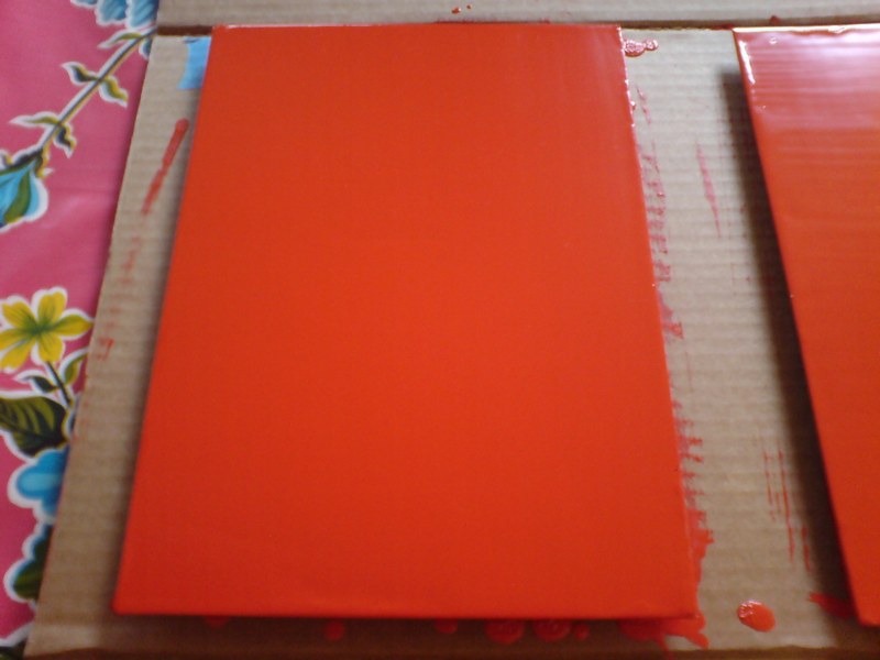
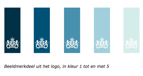
Rijksoverheid Rood 2
Here’s a look I’m calling Red Steel.
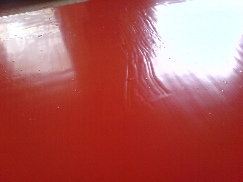
The other side. These stalactites form after the panels are put away to dry, I guess by the paint settling across the surface. Then I have to sand them down before doing the next coat.
last coat, I switched up the direction of the brushstrokes, which has created a bit of a cross-weave and stalactite thing to sand down. Plus all these bubbles, not sure how those got there.
Seriously, this is like the most boringest thing in the world to be typing right now.
What I Looked At Today: NGA Monochromes
Well, let’s just get this out of the way: if you can only see one Warhol exhibition in Washington this year, see Shadows. The Warhol Headlines show is very slight. It’s hard to call it a highlight, but a series of three 1982 or ’83 silkscreen paintings of successive pages in the NY Post did remind me a bit of the newspaper On Kawara used to line the boxes of his date paintings. Also, the show includes the three Screen Tests where the subjects appear to be reading and unaware they were being filmed: Alan Solomon, Grace Glueck, and Arman. That really is all.
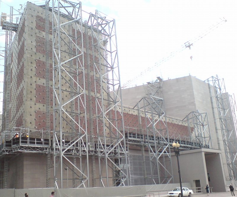
But let’s back up because, hey-ho, did you know the National Gallery’s East Wing was built with red brick infill walls?? It’s like Long Island City up in there behind IM Pei’s Indiana granite.
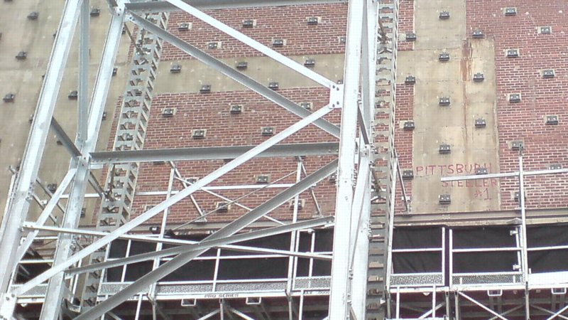
I also love that a construction worker in 1975 declared his allegiance to the Pittsburgh Steelers, practically in the Baltimore Colts’ own backyard. That was the year the Terrible Towel was invented, and when the Steelers did, in fact, win their second Super Bowl in a row. Also, I thoroughly approve of this epic-scale scaffolding. Glaze it and set it up at the beach for me, please.
Anyway, after the Warhol bust, I went downstairs for a close look at one of the NGA’s current strengths: contemporary monochromes. I’m working on some little monochrome panels right now, and I wanted to see surfaces and techniques–and to see if I’m inadvertently copying anyone I don’t want to.
I think I want a really immaculate, glassy, brushstroke-free surface, and I definitely know I want a continuity around the edge of the thin steel and aluminum panels I’m trying. So I figure setting out to study the cleanest, smoothest paintings I can find will be yield some hints.
So first up: Byron Kim’s Synecdoche (1991-), the multipanel grid of monochromes based on various art world folks’ skin tones.
Rijksoverheid Rood

So.
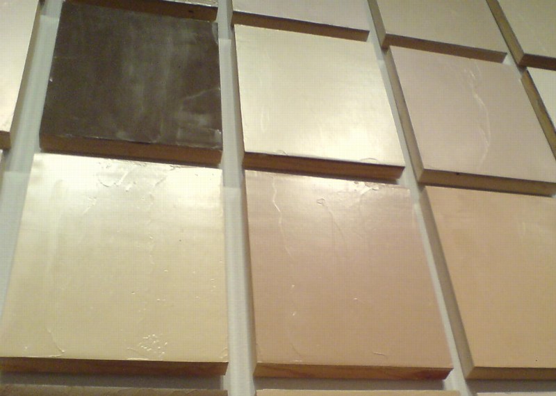
Found the local Pantone shop and brought home a liter of Hollandlac oil-based enamel in Rijksoverheid Rood, aka PMS 485c.
Ordered some small galvannealed steel and white aluminum panels, both paint-ready, and cut as close to A4 as North Carolina metal shops not called Metal By The Millimeter are able to get. They arrived very neatly packed.
And so I used some of the packing to make a little nest, so they can be covered, with circulation, while the paint dries in between coats.
Diet Coke. Leatherman left in the car, whoops. Tape everything down. Float the panels on little bubblewrap sheets so I can get to/around the edge.
MIneral spirits to clean the surfaces. Oh, right, there’s a protective film on the aluminum. More Diet Coke.
Do people really still listen to NPR all day? I can’t imagine. I want listen to youarelistening.to, but New York is down, so I head to Montreal. Police scanner with that awesome Quebecois twang.
Nabisco Ginger Snaps, the dog biscuits of the gods. Seriously, how did I fall into this box of tough yet improbably delicious cookies? More Diet Coke.
Unwrap the brush. Open the can. Wow, it seems much oranger than the web version, or the offset ink version. Is it–no, it has to be right. The Netherlands has ceded sovereignty over their Central Government palette to Pantone, Inc., a wholly owned subsidiary of X-Rite, LLC of Grand Rapids, Michigan. One PMS code to rule them all.
Stare at the foam brush again, try to remember what she–no, I’m pretty sure she said she was using foam for acrylic enamel, not oil. Go with the brush, even though foam seems somehow less painterish, and thus less daunting,
Load is not quite the word for what I do to the brush. Introduce. Poke. Alight the brush with paint. Whatever it is, it’s not enough paint. A fair amount of pull, this oil.
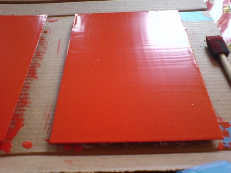
The steel panel is first. I really am not going to do a stroke-by-stroke account here. The steel feels better. The aluminum plate is so light, it moves with the brush; I have to hold it down. Paint’s not as self-leveling as I was originally hoping.
I knew there will be extra coats; I’d hoped there wouldn’t be much sanding. But there are definitely still brushstrokes in there. Texting with my brother-in-law, a highly skilled painter of entirely different types of monochromes, he diagnoses it immediately: ‘the brush needs to be loaded and moved with confidence.’
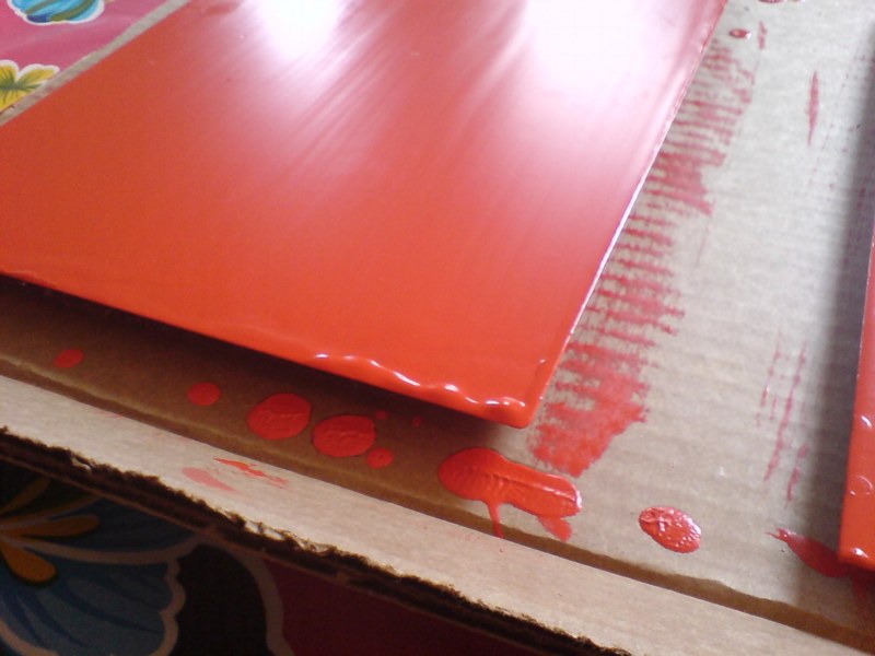
I would probably say those are problems #2 and #1, respectively, but loading the brush will be much easier to address. I will leave my paranoia about little paint stalactites on the edges in the kitchen the next time I get a Diet Coke.
But of course, the next coat will only go on 24 hours or so from now. I guess I never quite understood how much of painting is waiting for the paint to dry.
What I Looked At Today: Kabinetstukken
So lately, I’ve been thinking a lot about The Dutch, and their politics and art. The Rijkshuisstijl and 1 Logo Project, which redesigned and centralized the Dutch government’s visual identity, which happened to coincide with political shifts to the right, and swelling anti-Muslim intolerance, and suddenly, drastic budget cuts meant to cripple or destroy the liberal and visual arts establishment in the country. And a visual identity which ironically derives its central element, a 21-color palette, from the light and landscape as seen in Dutch Golden Age paintings.
And so of course, I have been thinking hard, still, about Vermeer painting his serene scenes in the midst and aftermath of a continent-wide, generations-long religious war.
And then someone, I can’t remember who, pointed last week to Morgan Meis’s discussion from Antwerp of Frans Hals, who was treading fine religious lines to make his proto-modernist paintings in a Dutch/Flemish culture where painting itself had become highly, politically and theologically charged.
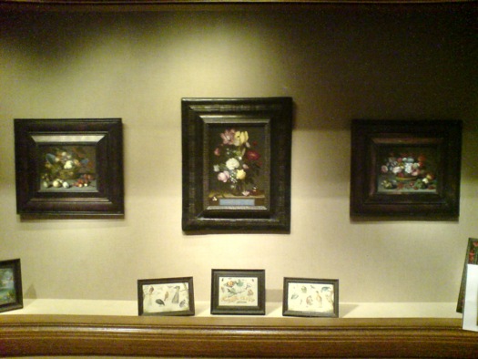
So I went to the National Gallery, where their Vermeers are tucked away in the Cabinet Galleries, a series of three tiny rooms carved out of a forgotten storage space in the mid 1990s. The scale approximates the collection rooms in 17th century Dutch & Flemish homes for which the small paintings were originally created.
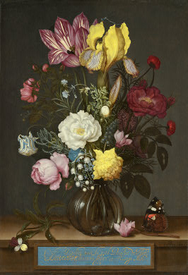
Bouquet of Flowers in a Glass Vase, Ambrosius Bosschaert the Elder, 1621, via nga
Here are three little paintings of a type I would have barely glanced at or ignored, if it weren’t for my peculiar Dutch color palette fixation: I mean, right? Still lifes of flowers and fruit? And yet they really are pretty amazing. And then you think about where and when and why they were made. According to the Cabinet Galleries brochure, which I had never picked up, such tiny paintings [7×9, 8×12] were called kabinetstukken, cabinet pieces.
The center painting, Bouquet of Flowers in a Glass Vase, was made in 1621 by Ambrosius Bosschaert the Elder. The NGA says without elaboration, “Bosschaert, who was born in Antwerp, moved to Middelburg after 1587 for religious reasons.” He was 14 at the time.
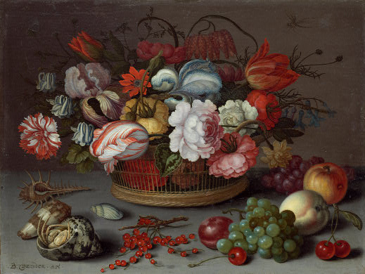
Basket of Flowers, 1622, Balthasar van der Ast, image: nga
This pair of kabinetstukken by Balthasar van der Ast apparently hung in the private chamber of Amalia van Solms whose husband Frederik Hendrik ruled over the Protestant Netherlands his father William of Orange fought to establish.
Basket of Fruits, 1622, Balthasar van der Ast, via nga
They are listed as gifts of Mrs. Paul Mellon.
Previously: the first What I Looked At Today included bigger, flashier Dutch painting: Van Dyck, Cuyp, etc.
View Of New Amsterdam
I’m not sure why I’m so fascinated with the Netherlands, or more precisely, why it’s the source/site/subject of so much of my art/object/image/culture interest. Maybe it’s because of New York, which has always felt to me of a piece with Amsterdam in some way. Whatever, maybe the particulars are not that important right now.
But I’d like to see more thinking and writing and reporting like Steven Erlanger’s NYT piece on immigration, religious tension, politics and Dutch identity.
The sometimes violent European backlash against Islam and its challenge to national values can be said to have started here, in a country born from Europe’s religious wars. After a decade of growing public anger, an aggressively anti-immigrant and anti-Muslim politician, Geert Wilders, leads the third-largest party, which keeps the government in power.
Wow, I just re-read the 2010 post I wrote about remembering Laurence Wechsler writing on Vermeer. It’s the same things. And you know, maybe these particulars are important right now.
Amid Rise of Multiculturalism, Dutch Confront Their Questions of Identity [nyt]
Previously: What I Looked at in 1995: Vermeer’s View of Delft
Sportsdomes: Refugee Prison Barge Domecage By Customr
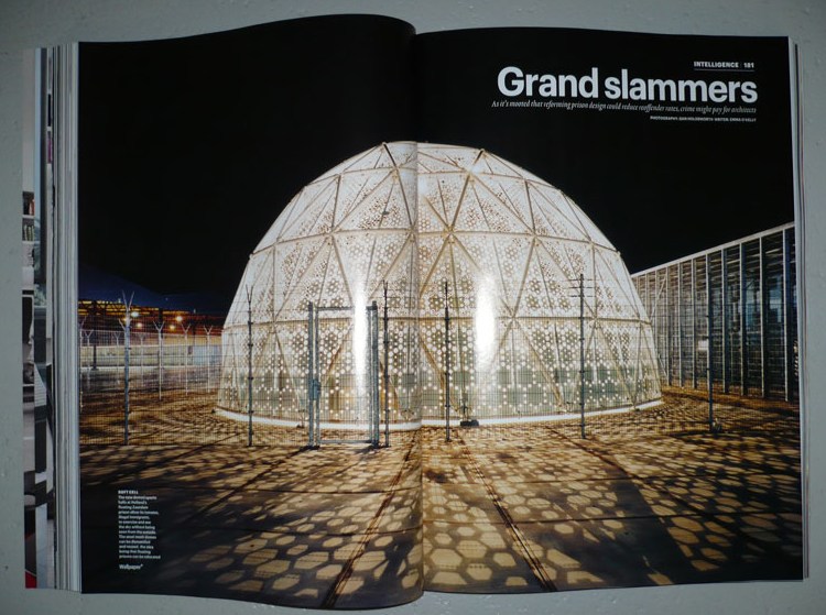
Well here’s one Dutch immigrant detention center that’s not invisible! Just the opposite.
That’s the Sportsdomes DJI up there, by architect Willem van der Sluis, featured in Wallpaper* Magazine in 2008, the same year the project won a Dutch Design Award for his Amsterdam firm Customr.
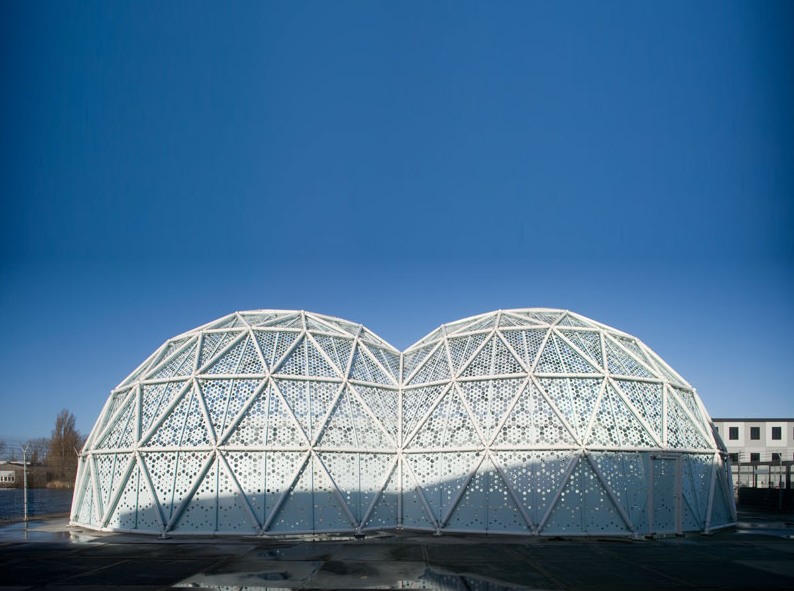
Just like the Kabul Dome the US Government ordered from Buckminster Fuller in 1955, Customr’s Sportsdomes were designed on a tight budget; in a hurry; using the latest modular manufacturing technology; so that they can be erected, dismantled, and moved with minimal skilled labor; primarily in arguable beneficence toward brown people.
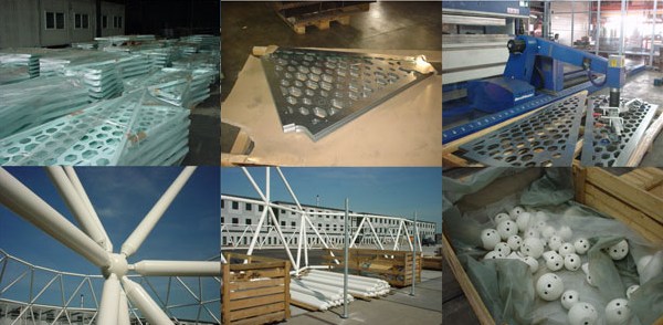
Their gradated, perforated metal skin creates an indoor/outdoor space that is meant to offer a pleasant ambiance to detainees for a couple of hours of free play during each of their last weeks in the Netherlands, while protecting their privacy/ hiding their identities from the outside world.
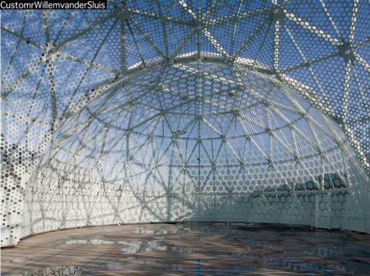
While they were points of contention among the neighbors, the Zaandam domes proved so successful that their patron, the Ministry of Security and Justice, ordered another “domecage” in 2008. Did I say “domecage”? I meant sportsdome.
CustomrWillemvanderSluis [customr.com via design den haag]
Previously:
Dutch camo domescapes
Welcome to the Kabul Dome
De Rijkshuisstijl & The 1 Logo Project
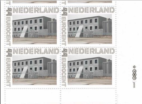
As part of their project Caché-Exposé, investigating the Netherlands’ largely invisible detention and deportation system, the Amsterdam art & design collaborative Foundland documented obscure, anonymous detention sites around the country. Then they used a highly official, public system to distribute their images: design-it-yourself postage stamps.
What with the domes, the minimalist/industrial architecture, these stamps, and–hello, this awesome flag they shot in 2008–I can’t help noticing how beautifully designed the Dutch immigrant prison system is. So thoughtful.
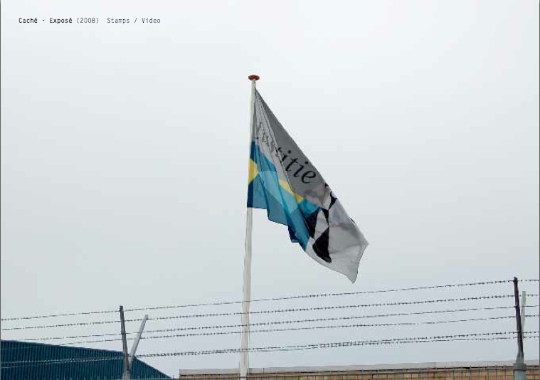
That is the Ministry of Security & Justice flag there, flying over the Zaandam waterfront dome prison. The biomorphic shape is a perspectival view of the scales of Justice, a fragment of the Ministry logo, which is an abstracted, blindfolded Justice.
![]()
Is, or was. Because on Google Streetview, the flag is different. Much simpler.
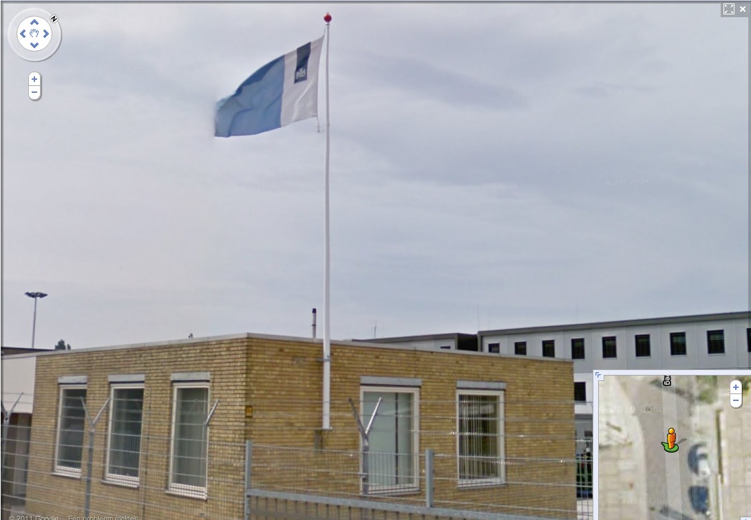
That is the new Rijkshuisstijl, which is officially called the Central Government Visual Identity, but which I gladly transliterate as the State House Style, a four-year effort begun in 2007 to centralize and redesign the Dutch government’s corporate identity. Part of that initiative was the 1 Logo Project, a replacement of 125+ separate ministry and agency logos with a single logo, the national coat of arms on a vertical blue bar.
Ah, I’m told it’s a ribbon. Here’s the English version of the style guide.
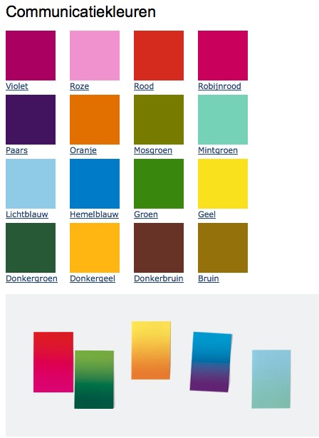
Oh, man, the color palette, 16 colors “inspired by the colorful Dutch landscape painting,” plus five gradients. Get me Colby Poster on the horn.
I am kind of geeking out over this. On the one hand, it’s a normal redesign gig, tastefully done, but typical to the point of banality. On the other, because it’s the state, I can’t help but read every platitude in the mission statement and objectives, every justification of every design decision and element, through a politicized filter. Without knowing really anything about the details or shifts in Dutch poltiics beyond recent surges of right-wing populism, I can’t help but interpret the identification of problems the Rijkshuisstijl was intended to fix as criticism of the parties and governments then in power.
Partly, it’s the Rijkshuisstijl’s incredibly bold assertions of design’s importance and function. And the grand assertions of meaning:
“The symbol exists of a blue ribbon with the coat of arms. Subtle and unpretentious, an authority without being authoritarian.”
The color of the logo is Rijksoverheid Blue. Inspired by the Dutch skies and Dutch light. Blue for calm and reliability. Blue for tradition and enduring values. Blue for harmony and balance.”
“The wide variety of logos previously used by various government organisations made them less recognisable, causing confusion among the public and business community. People were no longer able to see the wood for the trees. Central government organisations seemed to be competing rather than cooperating with each other. This approach compounded the widely held view that central government was fragmented.”
“The mission statement and the motto both underline what central government stands for. They give the central government logo (Rijkslogo) real meaning.”
And then there’s the irony of context, the subjective happenstance of discovering the Rijkshuisstijl while looking at an exposé criticizing the Netherlands’ unjust treatment of immigrants, a project which I’d discovered in turn while reading about the current populist government’s massive cuts to the country’s arts infrastructure. Is this what modernism and Good Design signed on for? Because it’s what they got.
Oh, and there was a symposium, and a book, De stijl van het Rijk/ Style and the State, produced last fall by the Stichting Design den Haag.
Foundland [foundland.org]
Rijkshuisstijl guide in English [rijkshuisstijl.nl]
UPDATE: So the work was actually done by Studio Dumbar in Rotterdam, announced on their site in 2007 [studiodumbar.com]
Pastoe Cabinet With Desk By Cees Braakman
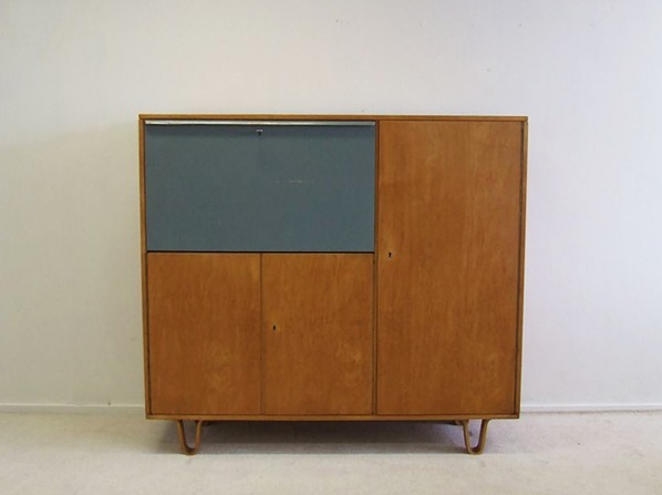
They may not be able to create an art ecosystem that can withstand the whims of populist demagogues, but I tell ya, back in the day, the Dutch sure could make the hell out of a birch writing cabinet.
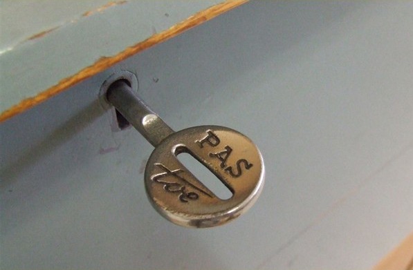
Cees Braakman for Pastoe writing cabinet, birchwood cabinet with original colour-painted flap door (scratch), EUR1300 [vervlogenjaren.nl via anambitiousprojectcollapsing, also previously, reflib]
Dutch Camo Domescapes
I love it when a plan comes together. Or at least when several subjects of interest converge unexpectedly.
It seems the Dutch art world is about to be decimated by sudden and substantial government funding cuts and reorganizations. [for angry details, check sven lutticken’s recent post; for plaintive, possibly resigned reaction from the affected institutions, try the open letter at the Dutch public arts organization, SKOR.]
If the proposed changes really do take effect, and the status quo of one of the most highly developed state-sponsored ecosystems for the arts is actually dismantled at a stroke, I think it’s really important to requestion every comfortable assumption of the involvement between art and politics. It has a lot of obvious problems and weaknesses, but the Dutch system, at least as perceived from abroad, has always seemed like the apotheosis of certain ideals of cultural industrial policy, which, Lutticken argues, now “don’t seem to be worth a penny.”
Anyway, not that they saw them coming, but SKOR tried to understand the political shifts that precipitated these cuts in the December 2010 issue [#20] of their excellent journal, Open, which examines populism and the persistent need for narrative and myth in the democratic process.
Dutch populism seems to center on–surprise–issues of immigration, assimilation, and Muslim vs. Christian cultural influence. As it turns out, one of the contributors in Open 20 is Foundland, a graphics, art, and research group that seems part collaborative, part design firm.
In 2009, Foundland created CACHÉ ÉXPOSÉ, an investigation into the remote, largely invisible, and unreported system of detention and deportation facilities in the Netherlands. The majority of the people imprisoned in the facilities or subjected to the system seem to be immigrants and refugees from largely Muslim countries.
When I read the description of the project, I wanted to see if, like the intelligence- and military-related sites, these politically sensitive detention sites were obscured on Google Maps. Fortunately, Foundland had created a Google Maps list as part of the CACHÉ ÉXPOSÉ project.
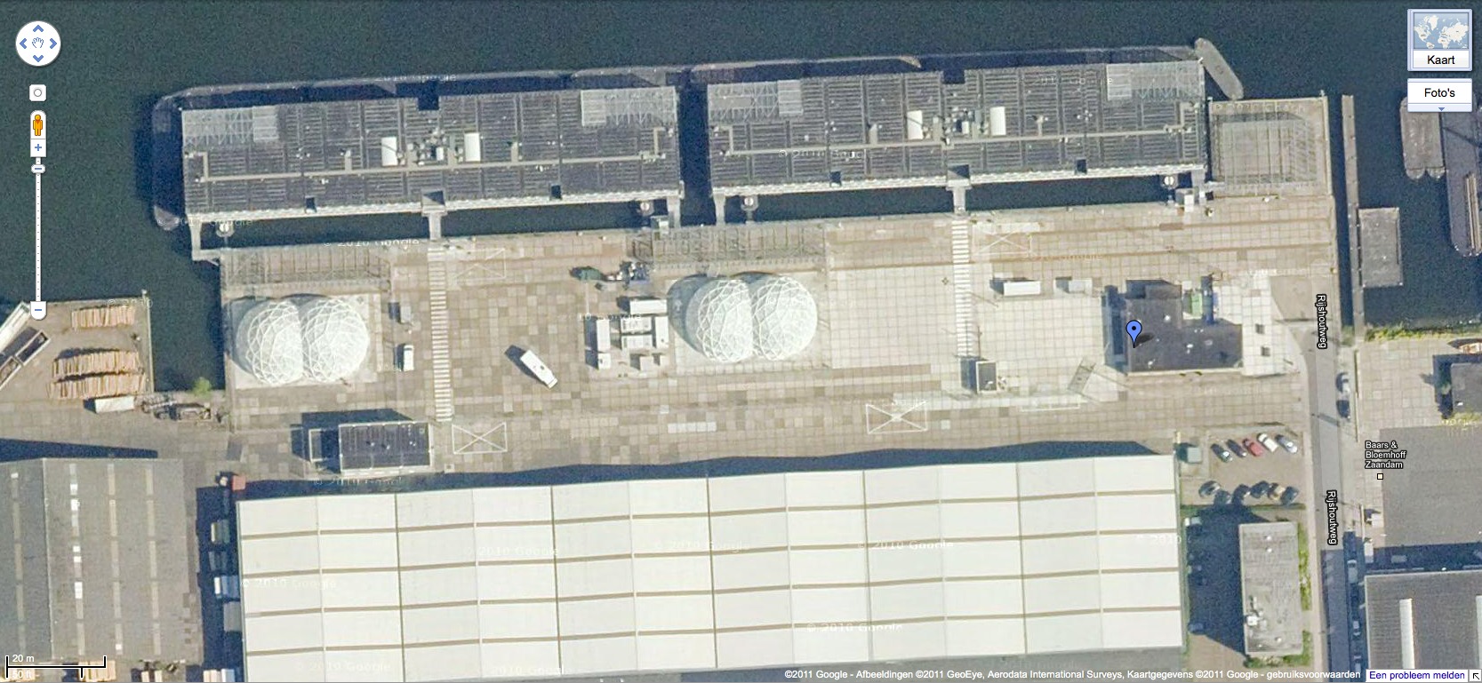
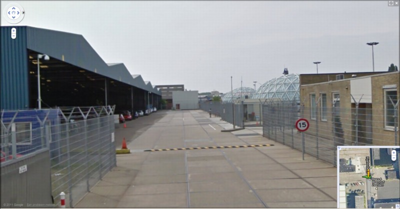
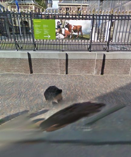
And the short answer is no. Their industrial anonymity is camouflage enough. But then hey-ho, looking at the waterfront detention center in Zaandam, a commercial city northwest of Amsterdam, what do I see? Awesome-looking domes.
Double geodesic domes of unknown purpose, but which look to be at least somewhat transparent or translucent from Street View. What a wonderfully open society the Netherlands must be that in can allow the Google Street View car to drive right up into the middle of its immigrant prisons. Oh wait.
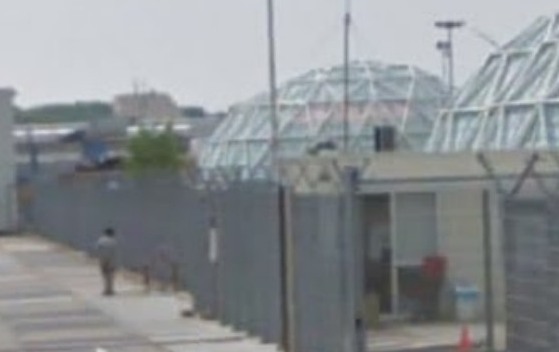
What strikes me, besides the lone figure standing outside the double barbed-wire fence? Is irony the right word to see a geodesic dome, a form which was once erected to great fanfare in Afghanistan, where it served as a symbolic center of friendship, trade, democracy, and political cooperation with the west, being deployed in a back alley prison in Europe filled, presumably, with impoverished immigrants from the Middle East?
Then again, Afghans in 1956 apparently did see the US’s Kabul Dome pavilion as representing The Future. So.
Pakistani Camo Landscape

These people are not wearing their videoconference faces.
According to the EXIF data, White House photographer Pete Souza took this photo at 4:05 PM, or 1:05 AM Abbottabad Time, five minutes in. They’re watching it as it happened. Which people already know, since it has garnered 455,000 views been blogged and retweeted and facebooked 455,000 times in a matter of hours.
Souza also asks us to “Please note: a classified document seen in this photo has been obscured.” Indeed, there it is. Funny how unobscured it looks at this size.
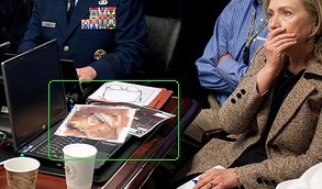
Let’s take a closer look:
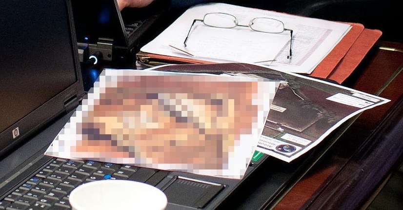
Didn’t I just post something about collecting all the seals and emblems of government agencies?

Because that’s the seal for the National Geospatial Intelligence Agency sticking out from underneath there. As you’d expect.
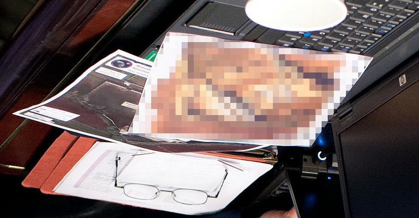
And that corner of landscape does look like the image of left sideyard of OBL’s compound. [image via ogleearth]
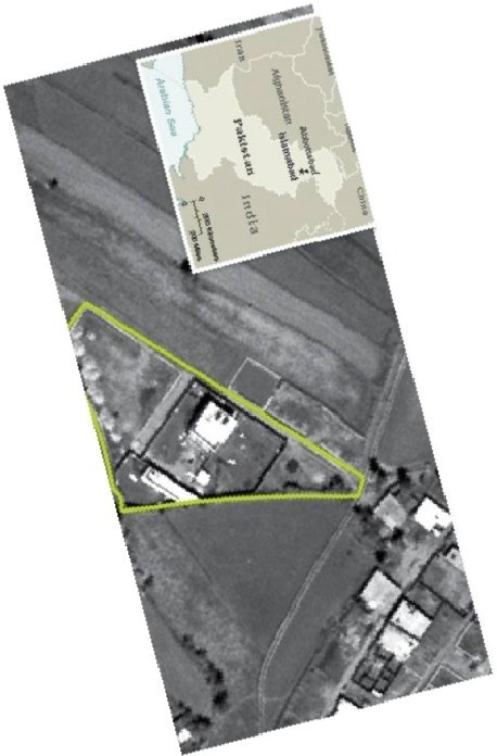
And now that you mention it, the pixelated image does look like the front gate area of the compound, just at an as-yet-unacknowledged high resolution. Of course, from here, it also kind of looks like a painting. I’ll get right on that.
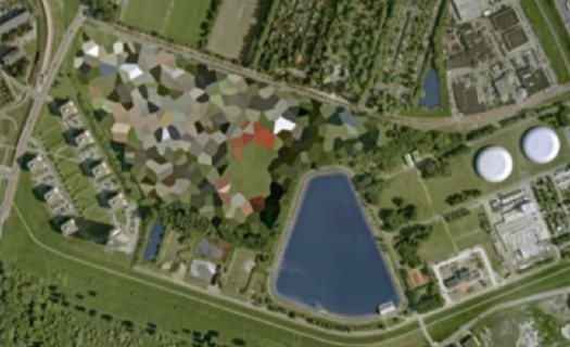
Previously: Google Maps & the everchanging Dutch Camo Landscape
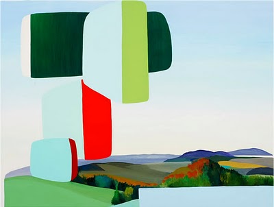
‘Coaxing the Illusion of Crisp, Clear Light from Pigment’
When I first came across the pixelated Dutch landscapes on Google Maps , I imagined the polygonal camo distortions hovering over the sensitive sites. From the ground, I thought, maybe it looked like a Gerhard Richter overpainted snapshot.
But now I think it looks more like the bright, beautiful gouaches by Louise Belcourt which Sharon featured on Two Coats of Paint recently.
Images: Louise Belcourt’s place in the world [twocoatsofpaint.com]
My Google Art Project, Part 1A
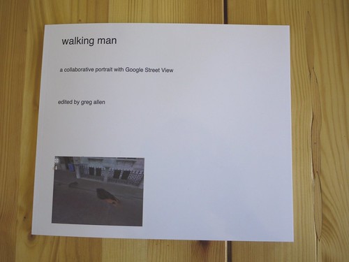
Here’s the introductory text I wrote last Spring for Walking Man – A Collaborative Self-Portrait With Google Street View. I made some proofs, but I’m still figuring out the best size. If I do decide to publish it, I may polish up the title a bit.
And I’ll probably revise it. Street View’s imagery and technique seems to me to turn a lot of critical thinking about photography on its head, but as much as the theoretical implications fascinate me, every time I start writing about them, I feel like a poseur.
As ongoing enhancements and even promotional stunts like Google Art Project affirm, Google executives are working to make Street View the primary tool for us “visual animals,” a browser for the physical world. Robert Smithson wrote about studying massive infrastructures like dams to discover “unexpected aesthetic information.” Google is creating the most massive visual infrastructure project right now, and it is chock full of unexpected visual information.
My Google Art Project, Part 1
Last February, I realized that the subject of this awesome, distorted Google Street View portrait was not just a random pedestrian. Hundreds of thousands, if not millions, of people around the world have been photographed once by Google’s roving, robotic cameras. This guy appears at least 63 times.
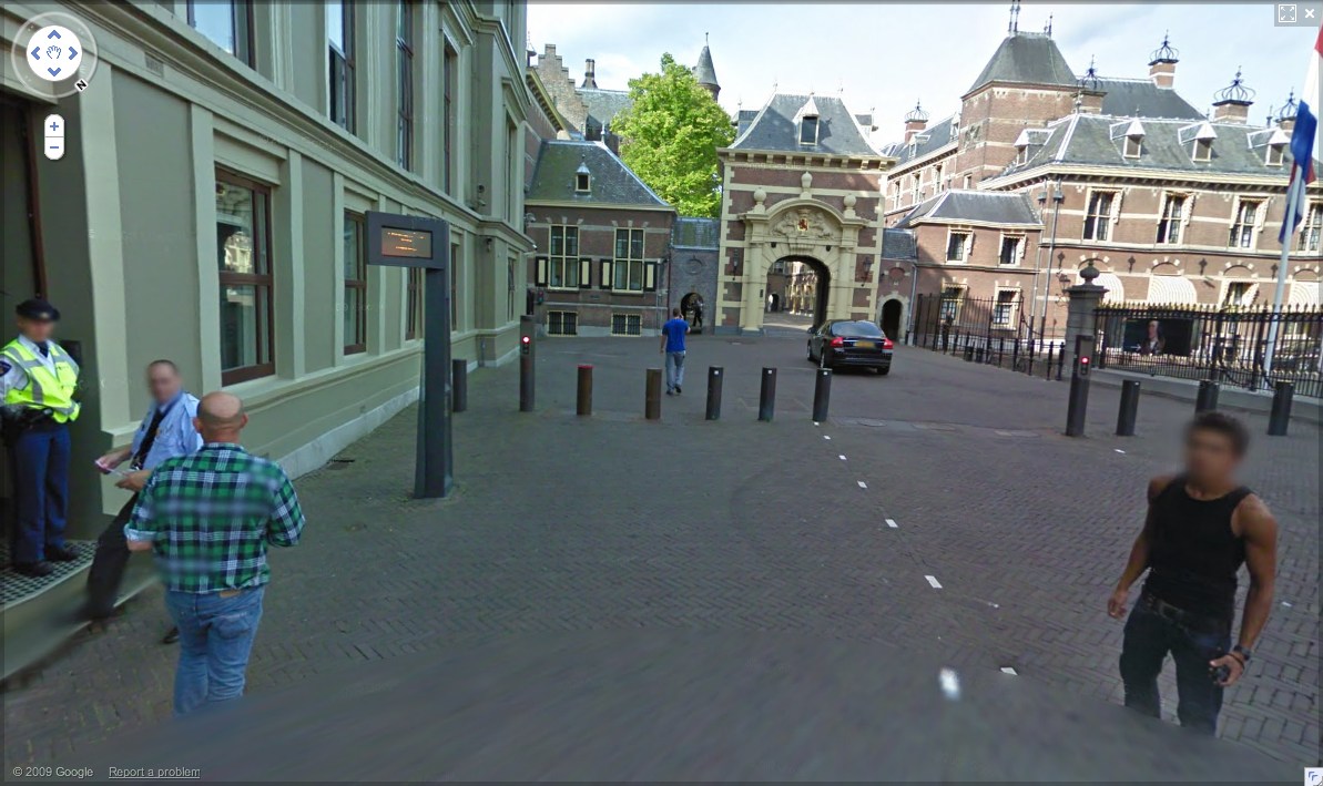
binnenhof 01, all images 2010
On Stage
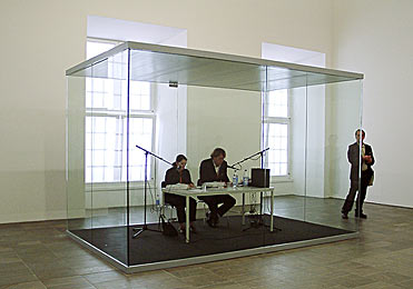
In 2002, as I was still trying on various kinds of public writing, I tried to capture the transformative experience of listening to–no, experience is the better word–On Kawara’s One Million Years.
That post was even titled like a screenplay: “Setting: Fredericianum, Documenta II, Kassel.”
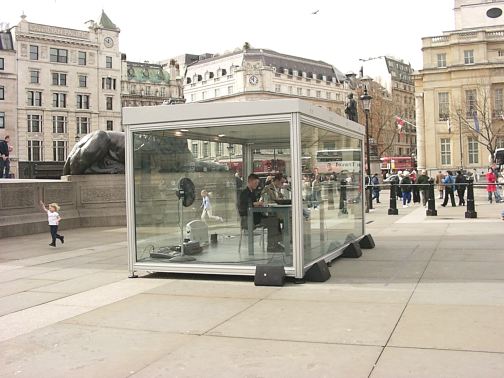
image via mightymac
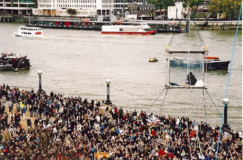
In April 2004, South London Gallery staged a week-long, round-the-clock marathon reading of One Million Years in Trafalgar Square. Many passersby unfavorably compared Kawara’s volunteer readers in their glass box to David Blaine, who had, just a few months before, spent 40 highly publicized days in a plexiglass cube suspended from a crane next to the Thames.
In 2009, when David Zwirner staged a reading/recording of One Million Years, Brian Sholis wrote touchingly and with great acuity about the experience of reading the years 79,936 AD – 80,495 AD with his then-fiancee.
And yet only just now, somewhere between finding Jerry Saltz’s characteristically gossipy, angst-ridden account of reading in the same show, and watching this comical YouTube video of Martin C. de Waal, a Dutch club kid/stylist/Orlan-style conceptual self-portraitist and his dance remix singing partner Marina Prins [!] getting all dolled up for their reading on the open platform at the Stedelijk–the one we’d been standing on a few weeks ago–do I realize the powerful performative essence of Kawara’s piece. And with less than a hundred of an anticipated 2,700+ CDs burned, it’s barely even begun.
The effect of living in a post-Marina world, I suppose