
This just in from the greg.org Department of Stunningly Beautiful Digitized Maps of The Netherlands:

Bibliodyssey has some highlights from the National Library of the Netherlands’ fresh upload one of the rarest and most beautiful atlases in history, mid-17th century Dutch cartographer Frederik de Wit’s Stedenboek, or Book of Cities.
Who knew that the Dutch had such a long, rich, aesthetically awesome history of defense-related polygonal alterations of the urban landscape?

At least maybe now we have some idea where that crazy camo blob in Nordwijk came from:
Stedenboek [kb.nl]
Dutch City Atlas [bibliodyssey]
Tag: nl
What I Looked At Six Months Ago: Douglas Coupland’s Roots Paintings
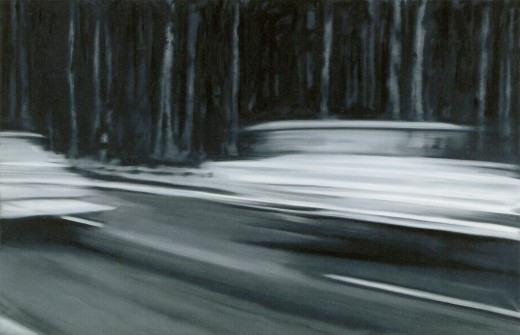
Holy smokes, it’s been 15 months since I found the Dutch Camo Landscapes on Google Maps; just over a year since I started systematically screengrabbing them; a little less than a year since Google’s particularly beautiful Delaunay triangulation distortion was replaced by a more typical pixelation algorithm; and about the same time since I last posted one of the “What I Looked At” installments, where I tried to figure out how to approach painting these things by studying the techniques of other hybrid, found, hard-edge, geometric digital, photographic, reductivist, surveillant, abstract, or Dutch Landscapes. Folks from Albert Cuyp and Picabia to Arthur Dove and Sheeler to Mondrian to Sherrie Levine [below].
The longer I take to think about how to paint without actually trying to paint, the more I keep accumulating and questioning potentially resonant work. And I wonder: what would it mean to consciously appropriate someone else’s technique? if I taped my edges, would there be more of a connection to Odili Donald Odita? If I made little polygonal stencils and squeegeed, would it be too Brillo? Is there an implication in the kind of precise painterly edges of Mondrian as opposed to the surprisingly tentative edges of Sheeler, or the just-fill-it-in forms of Dove? Should I skip the paint, and just blow those bad boys up and print the hell out of’em on the biggest canvas/paper I can find?
It [basically, obviously] boils down to some ongoing uncertainty or doubt or skepticism or insecurity or whatever over whether these things should exist. Emphasis on things and should. Does everyone who makes stuff feel that? It’s like Baldessari’s classic fortune cookie of a painting, “I will not make any more boring art,” but with the make in flux as much as the boring. I just remained unconvinced about the justification for these images as objects. [On the “bright” side, like the unshot film in the director’s mind, the unmade artwork does remain perfect–for me, anyway.]
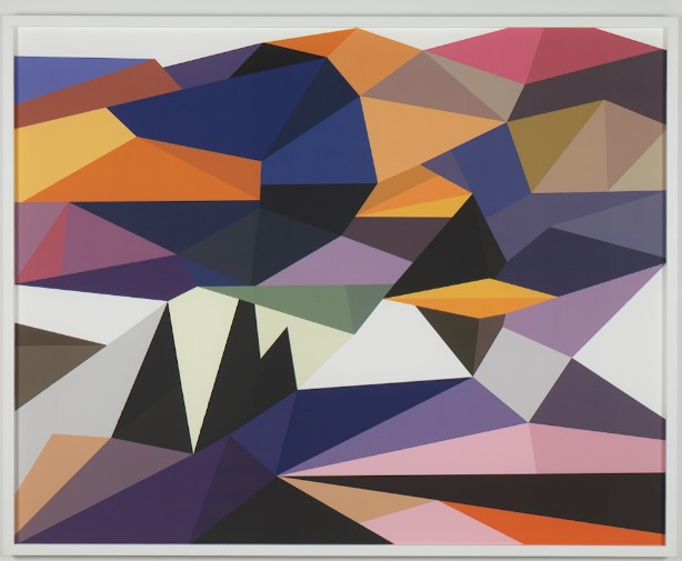
Anyway, all this comes to the fore because last summer, I saw images of some polygonal abstracted landscape paintings by Douglas Coupland, which were part of, or inspiration for, or somehow connected to, the Fall/Winter clothing and home furnishings colabo he designed for the Canadian retailer Roots. They were exhibited and for sale in Coupland X Roots pop-up stores in Vancouver and Toronto.
There was zero info online, so last summer and fall, but I deduced that they were digital reductions of iconic paintings by the Group of Seven, the early 20th century landscape painters who rather self-consciously set out to create a national cultural and visual identity for Canada via its landscape. Coupland’s Roots collection was an extension of that national branding project, only he referenced the unifying forces of electrification, television, and moose logos.
At least that’s what I gleaned from the web and press releases. I tried in vain to get any information on the paintings from Roots, Coupland, or his galleries, but it was total radio silence. So I ignored them back. Only now, as I check back, do I find that “culture guru” Coupland has a show up of the paintings, through this week, at Monte Clark Gallery in Vancouver. Faux-encrypically titled G72K10, the paintings turn out to be exactly what I thought they were.
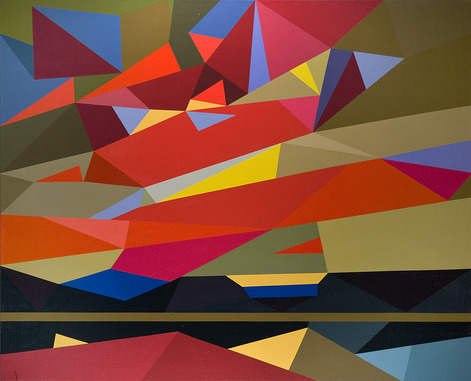
“Thomson (Sunset), 2010, Oil on canvas, 58 x 72 inches” image: monteclarkgallery.com
To a point. Because though the captions say things like “oil on canvas” and “acrylic and latex” and “unique pigment print” it is completely unclear whether the images on the dealer’s website are of the objects themselves or of their digital sources. Maybe it doesn’t matter to Coupland. Here’s how the gallery describes them:
By digitizing the likeness of specific works, Coupland has produced large-scale hard-edged paintings on canvas, presenting his own vision of the Group of Seven in 2010.
Doesn’t sound like he’d use something as retardataire as a paintbrush for a forward-looking project like that. Though it’s hard to tell from the jpg, the date on this unidentified type of limited edition print being auctioned next month by the Writers’ Trust looks earlier than 2010. Or not.
So while I still can’t decide if my painterly obsession is a vice, Coupland’s project is at least makes clear that materialist indifference in the pursuit of digitized aestheticism and conceptual slickness is no virtue.
Van Gogh, Haring, Razzle Dazzle: Car Camo Wraps

I love it when a tossed-off plan comes together. In this case, it’s the idea of artist-designed vinyl car wraps. And camo.
The Times had a great story about auto spyshots, and the increasing use of camouflage vinyl wraps on test cars. Some of the wraps seem designed to thwart a spy photographer’s focus, or at least to obscure the contours and details of the car.
The different patterns are discussed as resembling “a Keith Haring painting,” and “World War I ‘dazzle ships,'” or as sporting the swirly, painterly “Van Gogh Look.”
It should only be a matter of time before a collection of contemporary artist vinyl wraps hits the streets. Right?
Secret Cars Kept Under Wraps, in Public [nyt via slow and steady wins the race]
Previously:
The Jeff Koons wrapped BMW
Vinyl wrapped art car: Hirst]
First or worst? Peter Max decal car c. 1968
Razzle Dazzle and Dutch Google Maps camo
OG WWI dazzle design and the Koons revival
James Turrell At Kijkduin
Does an Anglo calling The Hague “Den Haag” sound as obnoxious as one calling Florence “Firenze” or Milan “Milano”? This is not a rhetorical question. I really need to know.
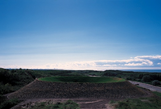
Celestial Vault in 1996, James Turrell, image via: stroom.nl
In 1996, Stroom, the contemporary arts center in Den Haag [!] commissioned a permanent public sculpture from James Turrell. And while Stroom has certainly achieved much since then, it still seems like the most prominent/significant thing they’ve ever done.
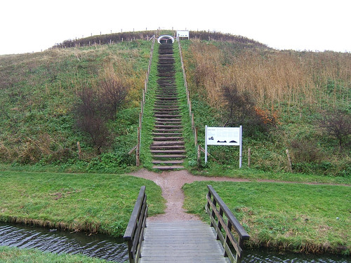
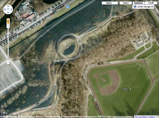
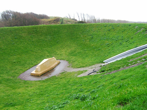
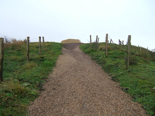
Celestial Vault was built in Kijkduin, a duney seaside suburb about a 20-min. bus ride from the center of town. It consists of two parts: a contoured, elliptical, crater-shaped earthwork with an inclined viewing platform at the center, and an another platform installed on a higher, adjacent hilltop.
The weather and use had taken a toll, and so in 2008, a significant effort to restore Celestial Vault was undertaken. Stroom’s website says the work is open to visit, so I did, only to find warning tape placed across the tunnel entrance to the crater. Obviously, I went in anyway. [On Google Maps, the dune crater looks to be hard up against a restaurant and a baseball diamond, of all things. When you visit it, the topography is such that these both fall completely away.]
It seems so online, and it was really apparent in person, that Celestial Vault functions as a kind of experiment or test run for Turrell’s project to reshape Roden Crater. For that reason alone, it seems like it should get more attention than it does. [Is it just me? I follow Turrell’s work, and his 1993 retrospective at ICA Philadelphia is a longtime favorite, but it seems the Roden Crater hype overshadows everything else. I’d never heard of Kijkduin, and frankly stumbled on it by accident on my morning visit to Den Haag.]
Also, it’s actually built. And you can see it without being on a 10,000-year waitlist or whatever Roden Crater’s gonna have.
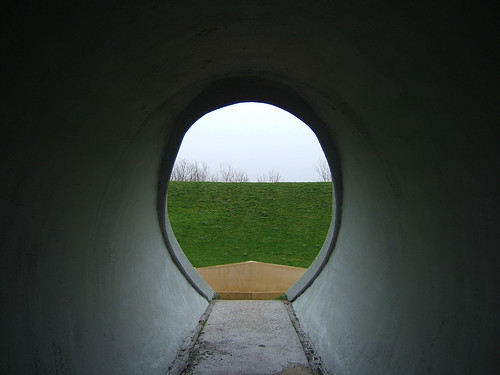
All that said, I confess I couldn’t get Turrell’s vaunted vaulting effect to work. Maybe I didn’t stay still long enough of free my mind or unfocus my eyes or whatever long enough. Maybe I was focusing too much on the rain that was falling on me the entire day. But Turrell [and the Dutch, for that matter] are rather specific about the material qualities of Kijkduin light, and the overcast, rainy lightbox effect IS pretty standard there on the North Sea.
So maybe it was me, and I was wrong to expect something less subtle, a more special-effectsy, fish-eye lens distortion.
Because what you end up with–or what I ended up with, anyway–was a view of the sky where the [shaped] horizon line hovers just barely on the edge of your peripheral vision. The fact that the vaulting worked almost the same way with the actual horizon line, which Turrell used on the hilltop platform, kind of makes you wonder if the whole earthworking effort isn’t more for its own sculptural properties than for facilitating any actual retinal impact.
It’s a question Turrell seems to have been asking himself, by placing these two identical viewing platforms side by side, but in opposite geographic situations. I guess since work really picked up at Roden Crater since Kijkduin was built, Turrell got the answer he was looking for.
Stroom page with info and tons of photos: James Turrell – Celestial Vault, Kijkduin, Den Haag [stroom.nl]
Celestial Vault on Google Maps [google]
My Turrell @ Kijkduin photoset on flickr [flickr]
Blurmany And The Pixelated Sublime
Ausgezeichnet, this is so awesome.
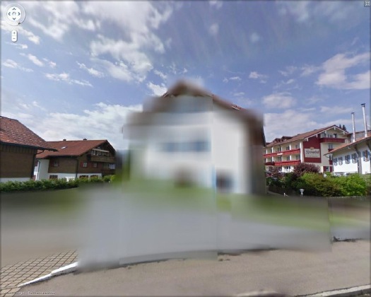
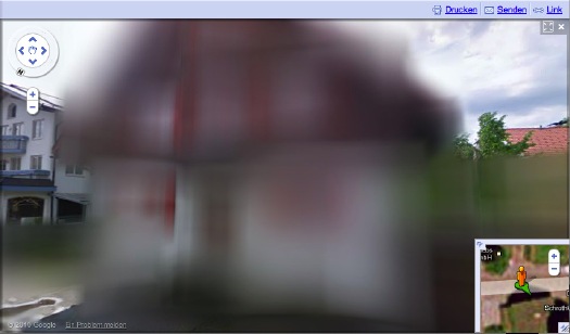
Amidst a fierce, ongoing, politicized debate, Google has released the first Street View panoramas for Germany. To assuage privacy concerns, the company is allowing homeowners to assert their Verpixelungsrecht, that is, their Right to Pixelation.
Some 240,000 locations are thus set to be blurred out. From what I can understand, though, the rollout is still in its early stages, and so only a handful of blurred buildings have gone live.
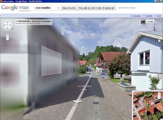
And the hunt is on. The few opt-out houses spotted so far have fed the media firestorm anew, and the examples cited by Der Speigel or FAZ [Google Translate] from Oberstaufen, the tourist village which first invited Street View to town, have been removed by Google “for review.”
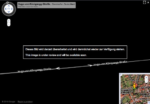
At the center of the debate is my old blogging 1.0 buddy Jeff Jarvis, whose rather hyperbolic post on the subject, “Germany, what have you done?” was translated and republished by FAZ. [thanks greg.org reader/cinematographer Sanne Kurz, who tweeted about Jeff’s column.]
Sanne had referenced Germany’s complicated history of a giant state surveillance apparatus that elisted millions of citizens to spy on each other. Jeff’s having none of it:
This is not a matter of privacy. And don’t tell me it has a damned thing to do with the Nazis and Stasi; that’s patently absurd. If anything, the Stasi would have exercised their Verpixelungsrecht to obscure their buildings from public view, taking advantage of the cloak of secrecy the idea provides. That’s the danger of this.
Well, who’s Stasi now, because that is exactly what is happening next door in the Netherlands, where the Intelligence and Defense Ministries actively distort the Google Maps imagery and block Street View access for dozens of sites they have unilaterally deemed sensitive. [Search greg.org for “Dutch Camo” for details, such as they are.]
While obscuring active military bases or the royal palaces may be justified for security reasons, the Dutch government’s Google Maps pixelation program also renders maps of entire villages and town centers unusable as it hides abandoned NATO weather stations–or nothing at all.
The state needs to be held accountable in its efforts at information control and censorship, but I can’t disagree more strongly with Jarvis’s unnecessarily extreme, incendiary language to criticize the individual assertion of some control over his own data. Referencing the Street View pano above:
Ugly, isn’t it? As someone in the audience said when I spoke on the topic at a meeting of the Green party in Berlin a few weeks ago, it is as if they are digitally bombing the German landscape.
Actually, no it isn’t, and–holy crap, wtf?–no it isn’t.
Google’s German Street View blurring looks utterly fantastic. And for that matter, fantastically German. By which I mean, of course, that it looks like a Gerhard Richter painting.
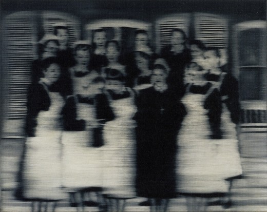
Nurses, 1965, image: gerhard-richter.com
Richter’s signature blurring technique calls into question the status, context, and veracity of the photographs that are his source material. Richter, Rosemary Hawker has argued,
refers not to the visual plenitude and truth that we usually associate with photography, but rather to its moments of representational inadequacy, to photographic blur and lack of focus that results in deliberately obscured imagery.
It’s worth noting that Richter began his blurred photo-painting series soon after fleeing East Germany.
I would think that the persistence of a few deliberately obscured images on Google Street View will serve as a useful corrective to the convenient, info-rich panorama’s seductive call, and will help remind users that they are, in fact, not in “the German Landscape,” but in a corporately controlled, commercial, and contested simulacrum of it.
Two Fiats, 1964, via gerhard-richter.com
Far from “bombing” the supposed digital public sphere, the people who exercise their Verpixelungsrecht are asserting the individual’s right to virtual protest, to engage the digitization of his entire world on his own terms.
Mustang Squadron, 1964, image: gerhard-richter.com
Google has filed for patents to place advertising, “virtual billboards,” within Street View, reserving for itself the right to control and alter its ostensibly objective representation of the world for its own reasons, including, but not limited to, its own commercial gain. If someone painted their URL on the front of their store, would there be an outcry if Google threatened to blur it out unless they got a piece of the action?
Jeff argues that it’s folly for politicians to restrict innovation like geo-tagged facial recognition that, who knows, might be useful in locating Katrina victims. But who’s to say that, when our reality gets augmented to death with advertising and tracking, opt-out blurring isn’t where the real value will be? It’s the unlisted number of the future.
Or the vanity phone number. As an inadvertent-but-eager connoisseur of Google Map pixelation techniques, I could just as easily envision a premium Street View image management business emerging out of this controversy. In fact, it’s already started.
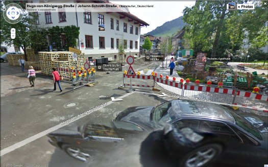
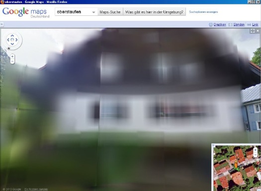
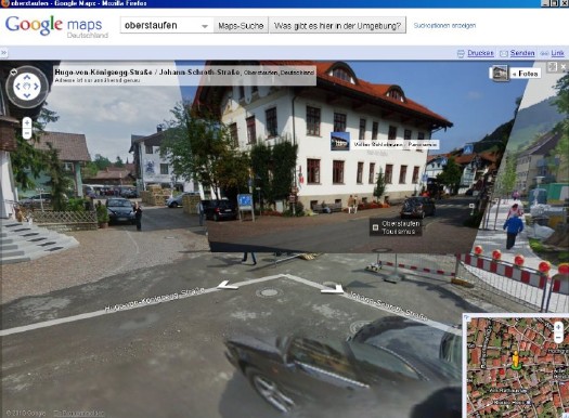
Just look at the unsightly street closure and construction project right in front of the Tourism Office of the otherwise-scenic Oberstaufen. Sheesh, no wonder they baked Street View a cake. Now check out the screenshot Spiegel got, where an embedded photograph from Panoramio helps clean things right up, mostly:
The Street View we see now is a mere shadow of the virtual world–or the virtualized real world–to come, and I’d like to think that when it comes to building and designing that world, digital citizens will be able to vote with more than their wallets.
At the very least, when people start paying Google to decorate their Street View houses with Blingee crap and animated gifs, mark my words: we’ll be grateful for the visual respite these Richterian Street View sites will provide.
Related, actually from over a year ago: Gerhard Street View
Museumnacht At ARCAM, Or Greg.org: The Exhibit
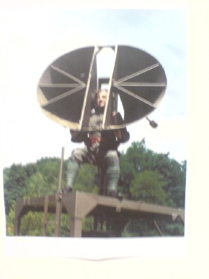 When we last considered the techno-militartistic merits of pre-WWII era sound location devices, I wondered where to start. And now I know: the Netherlands.
I’m not sure why, but it was acoustic locator-palooza over there. On the wall of the awesome library in Stroom, the visual arts center in The Hague, I spotted a large poster of a guy sitting in a German-style portable locator. And there were two more images in Stroom’s recently published journal, Podium for Observation
Turns out they’re from the Museum Waalsdorp, which is located on a military base outside of The Hague. And apparently, they’re not German-style at all; they were designed in Waalsdorp in 1927 by an engineer named Ir.van Soest. And they have some there. But it’s only open on Wednesdays, and only with advance reservations.
In Amsterdam on Museumnacht, meanwhile, we headed from the Stedelijk to ARCAM, the city’s architecture center & museum, because their current exhibit, “Music.Space.Arch.,” sounded like I could have curated it myself. Or blogged it, more like:
The focus of the exhibition is the suggestion of space as created with the aid of acoustic objects. The spatial experiences relate to various scales, ranging from the intimacy of the individual to the spacious openness of the urban space.
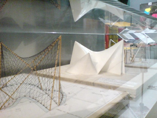
Included among the collected objects are the ‘Side Scan Sonar’, which brings the urban space surrounding ARCAM to the visitor, and listening equipment with which enemy aircraft were detected in the Second World War. With ‘Sound Scrape Shoes’ by Ricardo Huisman, the ARCAM building becomes the source of the experience, while in the presentation of the famous Philips Pavilion of 1958, the proportions are completely different from what we are familiar with.
Acoustic locators AND a re-creation of the Philips Pavilion? How could we miss?
Well.
We literally arrived at ARCAM one minute after the tap dancer had begun her show. Now for me, tap dancing is to real dancing what rhythmic gymnastics is to real gymnastics, or what synchronized swimming is to swimming: an over-aestheticized mutation that is somehow unaware of its own awfulness. And that’s on a good day.
When you have a Dutch punk tap dancer–an alternative tap dancer, in a country where they probably have a Bureau of Alternative–in tasseled pants, dancing in the dark while an assistant shines a flashlight on her shoes, whose “intimate interaction” with ARCAM’s building basically meant pushing the entire contents of the exhibit into the corner so she could erect her hollow tap floor, it is really unforgivable and unsalvageable. And that’s even before the audience participation segment began.
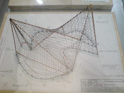
So we stayed in the corner, where the “completely different” proportions of the Philips Pavilion re-creation turned out to mean three A2-size models borrowed from the Atomium. Fantastic, but tiny. That wireframe’s especially nice.
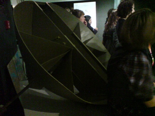
But the projection on the exterior of the museum of Le Corbusier, Xenakis, and Varese’s Poeme Electronique, considered to be the first immersive multimedia environmental installation, had been turned off, another casualty of the evening.
Oh, and there on a pedestal, behind some people’s butts and under their coats, was a real live Van Soelst acoustic locator. Only it wasn’t from Museum Waalsdorp; it was from somewhere else entirely: the Wings of Liberation Museum in Best. Holland must be the most acoustically located country in the world right now.
And so as we left behind a slightly chaotic-seeming jumble of awesome objects brought together by an amorphous, subjective theory, I realized that the only way to tell this blog apart from a multi-million-euro art, architecture & cinema center is that I’m the one without a tap dancer.
Meanwhile, In The Hague…
I don’t know why i ended up with so many art projects in and about The Hague this year, but there you are, or here I am, really. It’s one of the most interesting places on Google’s green Earth.
Anywhay, Since i was as close as Amsterdam, i thought I’d take a little trip over to Den Haag and see some of the places I’ve been virtually obsessing over. It’s been awesome. Stay tuned.
Meanwhile, i can’t link too easily from this iPod, so if you don’t know what I’m talking about, check around the site for Walking Man and the Binnenhof, and of ourselves, Dutch Camo Landscapes.
Casting Long Shadows
This has been sitting on my desktop since last month, when Google Maps announced the addition of 45-degree Aerial View imagery for new locations, including Dortmund, Germany.
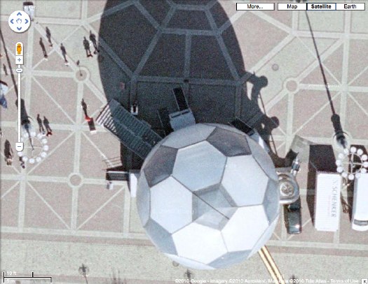
So I clicked over to Dortmund, and zoomed in there to the central platz [Friedensplatz, actually], just getting more and more psyched to see that sweet-looking geodesic soccer ball pavilion up close, and then poof, at the last minute, the final zoom, the Aerial View showed up, and it was from much later. The soccer ball was gone.
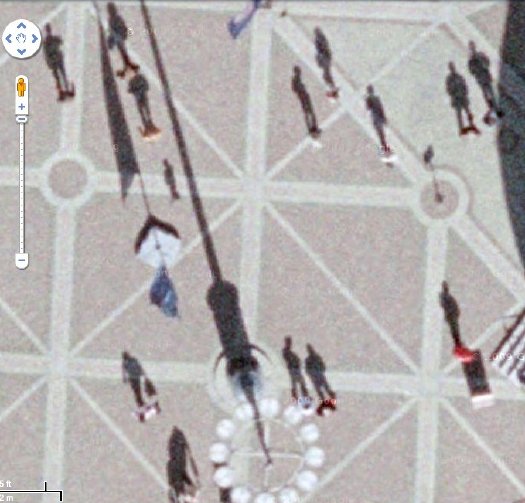
But then I forgot all about Google’s 45-degree View when I saw the sun doing it for me. These attenuated morning shadows are just awesome. Like 19th century silhouette portraits as reimagined by Giacometti–and shot from outer space.
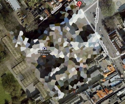
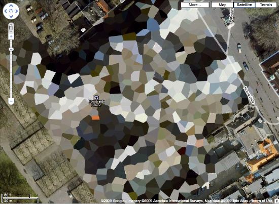
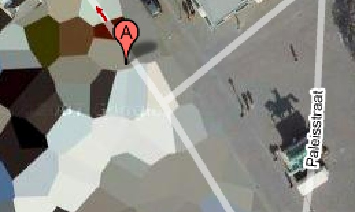
Which reminds me of the statue of a horse and rider in front of the Noordeinde Paleis in The Hague, the first building I saw on Google Maps which had been obscured by the Netherlands’ unique polygonal camo pattern:
[An update on those Dutch Camo Landscape paintings I was talking about making: I’m still going to do it. One thing I’m very glad for is taking all the screenshots I need for the images I want. I first noticed the changes last winter, but now every the camo on site I’ve mentioned on greg.org has been replaced with typical square-pixel obscuring. Functionally, the camo still works, but aesthetically, it’s a real loss.]
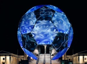
Now about that ball: It is probably better known to the millions of soccer fans in Germany as the WM-Globus. It was conceived in 2003 by artist/musician/actor André Heller, who ran the cultural and arts program for the Deutscher Fußball Cultural Foundation. Described by Heller as a “consulate of anticipation,” the Globus was sent on a 1000-day, 12-city tour in advance of Germany’s hosting of the 2006 World Cup. It’s 18 meters high, weighs 50 tons. Two interior floors contained football memorabilia and multimedia installations, while the pressurized scrim exterior contained an LED map and nightly light shows. Lighting effects designer Anthony Quodt has several articles on the making of the WM Globus and its specs on his site, lightlife.de. Too bad it predates the YouTube era, because the stills look like a hot, glowing mess.
After the World Cup, a Hamburg entrepreneur named Dr. Alexander Extra purchased the Globe from the DFB for EUR300,000, with plans to transform it into a permanent museum of sports culture, the Sporteum. Alas, no money was forthcoming, and the Sporteum failed to materialize. So Dr. Extra put the Globus on eBay last summer. Which turns out to have been a bad time for the geodesic soccer ball-shaped pavilion market, because bidding stopped reached just EUR50,000. The unidentified buyer was reportedly also from Hamburg, so I expect it’s still sitting in the warehouse, but I’ll look into it.
Walking Man? What Walking Man?
Alberto Giacometti’s figures look the way they do because he tried to capture what he called, “The moment I see them” and the way “they appear in my field of vision…” Arthur C Danto said this accounted for “the somewhat ghostly feeling of his figures, as if they were persons whose bodies had been all but erased.”
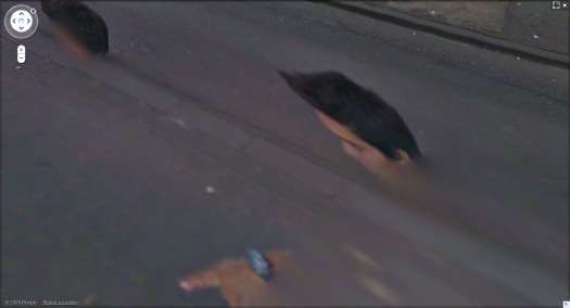
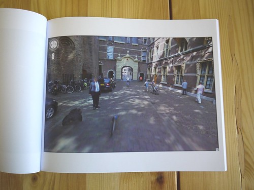
These ideas of figures, distorted, hovering on the edge of perception were very much in my mind when I found the incredible-looking sequence of [self] portraits of a man in the Google Street View panos of the Binnenhof, the Dutch Parliament complex in The Hague. The guy is almost certainly a Google Street View worker who accompanied the new Google Trike as it scanned and photographed the pedestrian-only area.
By walking alongside the Trike, the guy ended up inserting himself into thousands of photos, and basically every stitched-together panorama. The stitching algorithm, though, often tried to erase him, or replace his photo with a better [i.e., unobstructed] image of the same spot. The result is a series of fragmented collage portraits, disembodied heads, hairdos and limbs.
I gathered full-sized screenshots from every pano, focusing not of the site itself, but on the guy, and then I bundled them into a book, which I titled, after Giacometti, Walking Man. That was in mid-April.
As I’ve been tweaking the book the last few weeks, though, I found that several of the Binnenhof panoramas have been removed from Google Street View, including all the coverage of the inner courtyard, and every one I illustrated in my blog post.
Google has been getting heat in Europe for its Street View datagathering practices. I’d suspect that investigations in Germany and across the EU–and now even in the US–for surreptitiously collecting personal data across wi-fi networks is a bigger issue for them than ye random blogger’s artbook-ish attempt to fit Street View into critical history of street photography. And yet.
Google had already had the Binnenhof in the bag when they announced the Google Trike last summer, and invited the public to suggest where it should shoot first. Whatever else it was, this seemed like a canny move designed to deflect any possible political heat from the Street View effort: we’ve already got the Parliament on board, who wants to be next?
Now, though, it seems like someone, either within Google or within the Dutch government, or both, is actively deciding it doesn’t want people to examin either the Binnenhof OR the Street View process too closely. And that includes Walking Man, whose portraits are being all but erased.
The Greatest Camo Story Ever Told
 Sure, there’s Dutch Camo Landscapes, and Razzle Dazzle, and the Civilian Camouflage Council, but it all pales in comparison to the truly epic WWII camo accomplishments of Jasper Maskelyne and The Magic Gang.
Maskelyne was a British magician-turned-Army camo mastermind who, in 1941, led a ragtag band of desert artists and illusionists who created a series of incredible camo techniques that protected Allied forces in North Africa from aerial reconnaissance and bombardment.
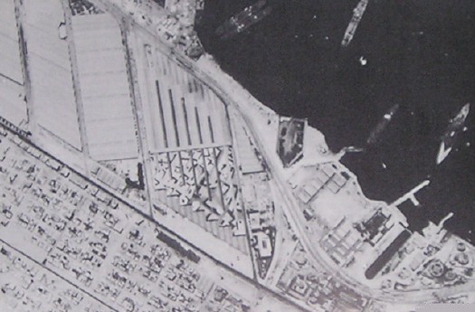
Using burlap and sticks, they disguised trucks as tanks, and tanks as trucks, and they created devices to enable tanks to cover their own tracks across the desert sands. But the most amazing achievements are in his 1949 memoirs, Magic – Top Secret where Maskelyne–whose grandfather, also a magician, invented the pay toilet–tells how he saved the port of Alexandria, Egypt from night bombing by building an elaborately lit decoy port, several miles away in the desert. Using incendiary devices and real anti-aircraft artillery, he and his Magic Gang fooled the German bombers with realistic-looking “hits” and return fire; and by morning, his crews would strew papier-mache rubble around the real port, giving simulated damage for the reconn pilots to report back. [below: a German spy photo of part of the port]
The success of the Alexandria decoy was only surpassed by Maskelyne’s brilliant [literally] strategy for protecting a vital supply route for the Allies, the Suez Canal. He designed “Dazzle Lights,” a rotating structure of made up of mirrors and 24 powerful anti-aircraft searchlights that, when set into motion, gave off a “Whirling Spray,”:
[Maskelyne] managed to create beams nine miles long, twenty-four of them from each searchlights [sic] … the magic mirrors were a success, and the next job was to get the device into mass production. With them, we made twenty-one searchlights serve for the entire one-hundred-mile length of the Suez Canal.
That’s right, the Suez Canal was saved from being bombed by the biggest lightshow in history: the 100-mile-long, Whirling Spray of almost two dozen Dazzle Lights.
How is it possible that I did not know this before now? Why is this miracle of modern warfare not taught in our military academies? Our elementary schools, even? How are these mindblowing aesthetic achievements not celebrated as a landmark in the history of art? Why is there no Bruckheimer movie, starring Josh Hartnett as the daring soldier magician? Maybe because the entire thing is bullshit.
In 2004, military historian and magician [seriously] Richard Stokes published the findings of his multi-year investigation into Maskelyne’s claims. They are gathered in the exhaustively paged website, MaskelyneMagic.com. Working with the magician’s son, he had access to Maskelyne’s archives and scrapbooks from the war. Stokes also cross-referenced official records, declassified intelligence reports, and consulted experts and historians in the North African war. And there is nothing in the historical record to support Maskelyne’s fantastical claims.
On Alexandria, the place where he said he built a decoy port doesn’t even exist; neither does the geography he describe match to any in the vicinity of the city. There are no pictures or corroborating eyewitness accounts, and no documentation.
On the Suez front, Stokes demolishes Maskelyne’s claim to have invented Dazzle Lights by pointing to similar, tank-based tactics under development since WWI. Again, no record of Dazzle Lights can be found in the historical source material, and extensive accounts of the actual defense of the Canal provide well-documented alternative explanations to Maskelyne’s. According to Stokes, Maskelyne didn’t actually come up with the Whirling Spray idea until 1942, after the aerial threat had subsided. And he quotes the illusionist’s son: “The ‘Dazzle Lights’ were an idea which was, I believe, constructed only in one prototype and tested on one occasion.”
Which appears to be the scene depicted in the photo gallery on Stokes’ site, where a searchlight is being outfitted with a faceted, mirrored cone extension:
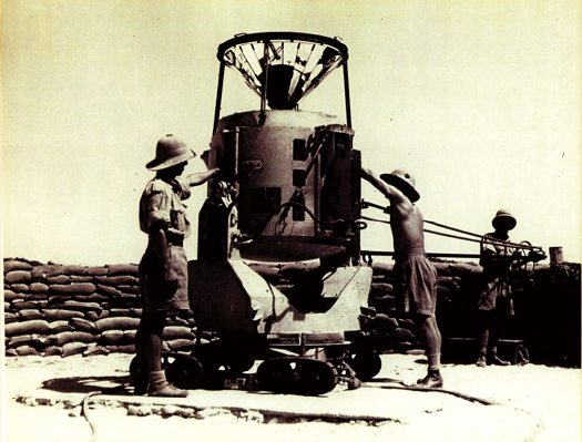
Which means the photo below, showing an awesomely Duchampian folly, 18 flashlights on a turntable, is somewhat confusing to me:
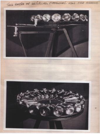
But with a caption like, “The birth of artificial moonlight, 1942,” I’d think that Maskelyne’s imagined heroics are long overdue for [re-]creation.
The War Magician| “”Myth is invulnerable to mere facts” – Barthes [all images via MaskelyneMagic.com]
Previously: Bombardment Periphery, Rotterdam, and Los Angeles’s ‘wigwam’ of searchlights; Forrest Myers’ light pyramid
If You See Something, Say Something
Do you find yourself wanting to talk about Group Zero, but the only names you can pronounce are Fontana and Klein [and Westwater]? Do you ever call galleries you’re about to walk into, just to hear them say the artist’s name? [I just asked at the desk, it’s von HILE.]
You may be suffering from Gigli Syndrome, a condition where you avoid saying an artist or designer’s name because you’re not sure of the pronunciation. Bennifer can’t cure all possible outbreaks of Gigli Syndrome, any more than Nomi Malone could inoculate us against the dangers of unknowing mispronunciation, Versace Syndrome.
After typing [well, cut-n-pasting] 0100101110101101.org yesterday morning, I realized a universal cure to either condition is impossible. Americans will never switch to Van Gohchhhh, and Thaddeus Ropatch may never give you more than 10% off, but that doesn’t mean we shouldn’t do all we can to treat and prevent.
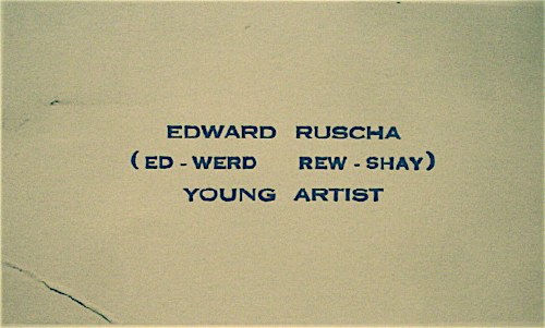
So inspired by my friend Sam, who once helped me avert disaster at Lever House [it’s A-B Rosen, not Abby], and as a tribute to the young artist who once printed up business cards reading, “Ed-werd Rew-shay”, here is a quick roundup of high-risk artworld names and their correct pronunciations by curators, interviewers, and even the artists themselves:
- 0100101110101101.org: zero-one-dot-org [thx their dealer @magdasawon, pronounced sah-vawn, btw]
- Eija-Liisa Ahtila: AY-ya-lisa AHH-tilah [youtube]
- Richard Anuszkiewicz: AN-ehs-KAY-vitch [mike wallace via youtube]
- Giuseppe Arcimboldo: Arch-im-BOLD-oh [washpost]
- Kutlug Ataman: KOOT-loo ATTA-mun [tate channel]
- Huma Bhabha: HOO-mah BAH-bah [public art fund via youtube]
- Alighiero e Boetti: Ali-GYAIR-oh BO-etty [he was just one guy, btw. Stuck the “e” in there himself. moma]
- Carol Bove: Bo-VAY [I called Maccarone to confirm, because I’ve heard people calling her Bove (rhymes with clove) to her face, and introducing her as Bove, for literally YEARS. She is too polite and well-known to deserve this any longer.]
- Eli Broad: rhymes with road [thx @manbartlett]
- Marcel Broodthaers: ooh, a Britdown between BROAT-haus and BROOT-ers, with a bit of long O thrown in. I vote for the latter. [mk-g.org]
- Vija Celmins: VEE-ya Sell-muns [youtube thx @lucretiab]
- Chinati: Chih-NAUGHT-y, not Shih-Naughty or Kih-Naughty. [member since 1994, plus I just called and listened to their answering machine.]
- Wayne Clough: rhymes with rough and censoring stuff. [nyt]
- Dan Colen: CO-lin [via nyt]
- Bice Curiger: short for Beatrice, [Just imagine Che Guevara taking an interpretive dance class: “Be a tree, Che.” and then leave out the “a tree,” cuz you guys are tight.] Koo-REE-gare, rhymes with Care Bear [via youtube]
- Dada: Da-DAH [Marcel Duchamp and Richard Huelsenbeck, both founders of Dada, pronounced it Da-DAH at The Modern in 1961. clocktower.org]
- Walter De Maria: de Ma-REE-uh [youtube w/English accent, thanks judy]
- De Stijl: de STALE, maybe Dutch it up a bit with a little h: ShTALE [youtube]
- Marlene Dumas: Mar-LANE du-MAH [moma]
- Rineke Dijkstra: RIN-uh-kuh DIKE-stra [moma]
- Ekow Eshun, ex-ICA, current (2014) Fourth Plinth guy: Echo Ession rhymes with session [lisson gallery youtube]
- Omer Fast: Homer without the H, not Omar [via @magdasawon]
- Os Gémeos: Ose like dose, ZHEH-meh-ose [coolhunting, alt. pron.: Barry McGee]
- Joseph Grigely: Grig-lee [via hans ulrich (han-ZOOL-rick) at moma]
- Cai Guo-Qiang: Cy, like Twombly, Gwoh, long O, Tsee-ahng, somewhere between a Ch and a Ts [moma]
- Francesca von Habsburg-Lothringen: Hops-burg Lote-ring-en, though I’ve never heard the Lothringen used/said. [youtube]
- Thomas Houseago: House-ago, like it was two words. [public art fund via youtube]
- Pierre Huyghe: I say Hweeg to his face, but I almost hear Peter Eleey say Whee. [thx @analogc]
- Dakis Joannou: DOCK-iss ZHO-new [numu youtu]
- Emilia and Ilya Kabakov: KA-buh-Koff, Ka like Kat [youtube, bonus: Andre Putman: PUT like in Putin, man, rhymes with yawn]
- On Kawara: Own, as in rent-to-. Kawara is his family name, so it’s Kawara On (河原温) in Japanese. [dude, I speak Japanese. 25 years.]
- Paul Klee: Clay [thx paddy]
- Guillermo Kuitca: GYAIR-mo hard G, KWEET-kuh in Minneapolis and Buffalo, anyway. In London, they say KWIT-kah [youtube; publicbroadcasting.net]
- Yayoi Kusama: Yah-yoy Koo-saw-mah. Again, Kusama is her family name, so Kusama Yayoi (草間彌生). [me]
- Wifredo Lam: THERE IS NO L, PEOPLE, NO L!! LOOK CLOSELY. Anyway, it’s pronounced like Wilfredo WITHOUT THE L. [Italian on vimeo, thanks @aljavieera]
- Laocoön: Lay-UH-kuh-wahn, rhymes with go on. [britishmuseum.org]
- Aristide Maillol: My-yole [moma]
- Iñigo Manglano-Ovalle: In-EE-go Mawn-glawn-o O-VA-yay [though the guy at SAIC also says peda-GO-gee, so…]
- Julie Mehretu: MARE-Eh-too [metmuseum]
- Modigliani: Mo-DEE-lee-Ah-nee [metmuseum via youtube]
- Laszlo Moholy-Nagy: LAZ-low rhymes with Hasbro, Moley as in holy, Nazh, like gnaws, with a zh on the end [german youtube, but you get the idea. update: But the artist and his family also accept the Americanized “nadgie” new idiom]
- Vik Muniz: Moo-NEES [5min]
- Edvard Munch: Moonk [thx paddy]
- Albert Oehlen: Uhrlen, classic umlaut O [moma]
- Maja Oeri, of the Schaulager: Ury, like Early without the “L”; Show- like shower and lager like beer. moma]
- Meret Oppenheim: Merit [moma]
- Francis Picabia: Pih-CAW-bee-uh [moma]
- Otto Piene: PEEN-uh [german youtube]
- Fondazione Sandretto Re Rebaudengo: Ray-Ray-bo-DANG-go, a little like Bojangles [italian youtube]
- Gerhard Richter: For Americans, it’s like the scale. For the Teutonically inclined, go ahead and let’er rip, GAIR-haht REESH-tah [gerhard-richter.com]
- Gerrit Rietveld: two R’s, one T, people. REET like street, feld, like fell down the stairs. [dutch youtube, thanks craig]
- Dieter Roth: Rote [german youtube]
- Edward Ruscha: “(Ed-werd Rew-shay)” [walkerart.org and colette.fr thx @valeriemargolis]
- Anri Sala: ON-ree SAHL-LAH [google video]
- Yinka Shonibare: YEEN-kuh SHOW-nih-Bar-eh [tate channel]
- Alec Soth: rhymes with both [youtube, thx @jenbee]
- Sperone: Spare-ownee [just call, you’ll see]
- Thomas Struth: [SHTRoot, he has never corrected me, but that’s how he says it at the Met]
- Alina Szapocznikow: Ah-LEE-nuh Shah-POTCH-nick-off [UPDATE: this moma audio has it as POTS, but thanks to Rachel Wetzler, we learn that the ‘cz’ combo in Polish is pronounced “CH”, like chalk. cf. a Polish curator’s youtube video. To practice hearing the difference, please listen to this 4-hour symposium at MoMA. Thanks Rachel and thanks Andrew for the suggestion]
- Thyssen-Bornemisza: Tissen BORN-uh-Meesa [youtube]
- Rirkrit Tiravanija: Hans Ulrich says Tier-uh-vah-NEE-juh, and Rikrit says TEER-uh-van-EET. So maybe there’s a reason people just say Rick-rit. hans ulrich at moma; studiobanana.tv]
- Günther Uecker: GOON-ter OO-ker, like a clipped booker [german youtube]
- Ulay: OO-Lie, as in, “Ooh, lie down naked with this skeleton on top of you for eight hours.” [that’s how Marina prounces it, anyway]
- Joep van Lieshout: Yoop fawn LEASE-howt, [dutch tv, whoops, I’ve said van lees-hote to his face, too]
- Danh Vo: Yahn, it’s a “Vietnamese soft ‘d’. [ex. Talking at Walker Art Ctr, via youtube]
- Apichatpong Weerasethakul: A like apple pih-CHAT like room pong WEIR like weird -uh-suh-THA like Thatcher cull like a herd [cannes 2010 press conf]
- Susan Weil: Vay, “like Simone Weil” [Rauschenberg Fndn oral history, page 1] UPDATE: When I met her and mentioned this, she was like, “No, it’s Vile, “like Simone Weil,” and I was like, “Sounds good to me!” So I think it is Vile like Susan Weil.
- Ai Weiwei (艾未未): Eye way way, family name is Ai [paleycenter.org]
- Rachel Whiteread: reed, not red [moma]
- Witte de With: VITT-uh de VIT [dutch youtube]
- David Wojnarowicz “(pronounced voy-nah-ROH-vitch)” [PPOW, his dealer since 1988]
- Lisa Yuskavage: Yuh-SKA-vedge, sounds like savage [youtube, thanks john]
Some build on each other; once you know Bas Jan Ader [Boss Yan Adder], you can do Jan Dibbetts, Jan Schoonhoven [Skoon-ho-ven], Christian Jankowski [Yan-KOFF-ski], and so on. If your favorites aren’t on the list, please feel free to send them along.
Walking Men, Or The Google Street View Trike Has A Posse
Some interesting developments since putting the Walking Man self-portrait collection out there. Thanks for the feedback and responses.
I think it’s becoming clearer that walking man is not, as I wrote, a guy who “came upon the Google Street View Trike preparing to map the Binnenhof” and who “decided to tag along.” Instead, he’s probably part of the Google Trike crew.
I’d always entertained the possibility, and when, after the initial burst of discovery and image extraction, I found some additional panos from around the lake that made it clear his relationship to the Trike was at least a factor in his appearances.
From the intro I wrote for the proof [which I’ll probably publish at some point, even as I plan to revise it for any future editions]:
His actions in the final two panoramas lend themselves to speculation: In his penultimate appearance, walking man becomes pointing man; he is seen gesturing across the plane, breaking the fourth wall, as it were, by addressing the Google Trike driver himself.
Perhaps this crossed a line about the presumption of passivity for Google’s photographic bystanders. Or maybe it violated some rule of non-engagement, a Street View Prime Directive. Is it possible that he’d been talking with the Trike rider, his personal [sic] camera operator, all along?
Yes, yes it is.
Continue reading “Walking Men, Or The Google Street View Trike Has A Posse”
walking man – a self-portrait collaboration with Google Street View
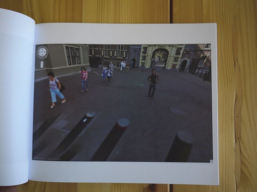
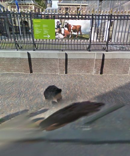
In the Summer of 2009, an unidentified young man came upon the Google Street View Trike preparing to map the Binnenhof, the center of the Dutch government, in The Hague. He decided to tag along.
The man walked alongside the Google Trike, persistently inserting himself in the foreground of its nine computer-controlled cameras’ panoptic fields of vision.
Meanwhile, Street View’s automated panorama generation system read his presence as a data anomaly and consistently attempted to erase him from the photos.
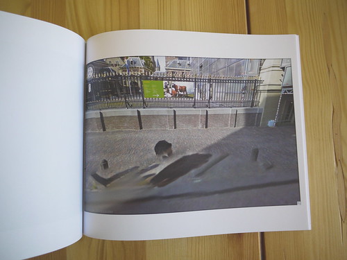
The resulting images, extracted from nearly every Street View panorama of the Binnenhof complex, reveal the history and process of their own making. They are at once a minute detail in Google’s extraordinary, ongoing portrait of the entire world, and one man’s wresting of control of his own image and his audacious assertion of his own presence.
I discovered these images in February 2010.
At first, it was the distortions of time, space and perspective in these photos that caught my eye. As I began mapping out [sic] the scope of the project, however, I became fascinated by how this man seemed to travel almost precisely at the distance that simultaneously kept him in frame, but also all but guaranteed his algorithmic erasure.
Then I tried to understand the images as portraits, or self-portraits. As the exercise of the flaneur. The product of the flaneur’s gaze. An artifact of a moment in time, in space, evidence of the photographer’s decisions. As photos or cinema. Surveillance or subversion. Indexing, seriality. As virtual or real, documentary or manipulation, strategies or tactics. I looked at Muybridge and Marey. I went back to re-read Benjamin, Bergson, Barthes, de Certeau, Sontag, but these images seemed to thwart every attempt to put them into a critical or historical context as photographs.
And yet they’re so easy to look at and use; we all become Street View-proficient, if not fluent, within moments of our first encounter with it. And the walking man apparently made them on a whim, by doing nothing more than strolling along.
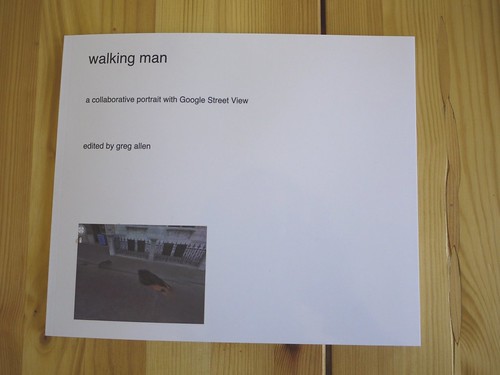
I decided to extract, compile, and print the entire set of photographs as a book. The title, walking man, is a reference to Alberto Giacometti, whose sculptural notions of distance and vision I was studying at the time. “Self-portrait” is an acknowledgment of their subject’s creative intent, and “collaborative” refers not only to Google’s operation of the camera, but also to their first pass at selecting images, and to the crucial aesthetic impact their manipulations have on the images they ended up publishing.
The images are actually screencaptures from Google Maps in Safari that include every appearance of walking man within each panorama. Though I composed each screenshot, I consider this a found work, or a work made of found images. Which is why I’ve been looking lately at work by folks like Sherrie Levine and Larry Sultan.
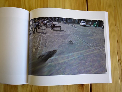
With three exceptions, each of the 55 Street View panoramas in the set is represented by one photograph which includes all portrait elements. The first panorama in the series includes both the walking man and his reflection in the window of the Binnenhof security office, but they are at too wide an angle to include in one screencapture. So the images were extracted separately After sending the book to the printer, I found that another panorama also included a nearly straight-down image of walking man’s legs, which would not fit within the browser window on my laptop monitor. The other exception, below, was just too beautiful to resist, there are so many awesome things going on in this photograph.
This proof copy was created using blurb.com. It’s 120 pages, and includes 57 portrait images and a reference Google Map, and a short introduction to the project. I thought the format might be too big, but it turns out it looks fantastic. The photos are a little dark, but that’s only because most of them were shot in the morning shade. My photos are dark because I shot them inside without a flash.
I am considering a limited print run, including editions reserved for the artist and the photographer, both of whom are currently unidentified.
There are several more shots from the proof on flickr.
Previous, related: How your Street View panoramas are made
Wait, ‘Highly Developed Dutch Cartographic Traditions’?
From Ken Johnson’s thrilled NYT review of “Pride of Place: Dutch Cityscapes of the Golden Age,” which was at the National Gallery last winter:
The painters of the golden age in Holland brought the city onto center stage and made the cityscape a genre unto itself.
This urban motif evolved out of highly developed Dutch cartographic traditions. Large, intensively detailed maps included in the show suggest an almost obsessive preoccupation with geographical facts.
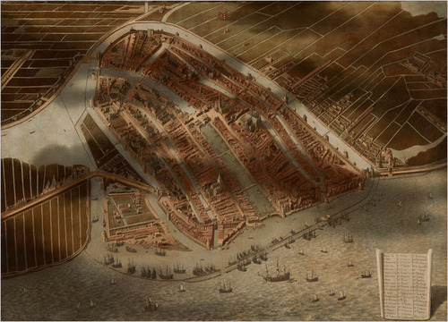
One of the strangest pieces is a painting of Amsterdam, seen as if from a hot-air balloon. Seemingly every building, street, canal and boat in town is carefully rendered, and shadows of clouds pass over the city and surrounding fields, creating an almost surrealistic mix of the real and the schematic. (Aerial views from Google Maps come to mind.) Made in 1652 or later by Jan Micker, it is a copy of a similar work from 1538 by Cornelis Anthonisz.
I confess, I liked the exhibit, but at the time I was not sufficiently attuned to the highly developed cartographic traditions of the Dutch. And anyway, the oblique angle on that bird’s eye-view map look more like Bing to me.
At the Height of Power for the Netherlands, the City in Glorious Detail [nyt]
Mauritshuis Gets Google Street View Camo?
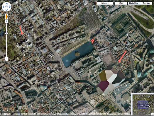
Because I now appear to be constitutionally incapable of doing otherwise, after mentioning the Mauritshuis, the Vermeer-loaded Royal Picture Gallery in The Hague, I checked to see if was camo-obscured on Google Maps.
[I kind of knew it wasn’t, because it’s situated smack in between two prime Dutch Camo Landscapes: the Noordeindepaleis and the Ministry of Defense HQ, but I looked anyway.]
And while we knew that Google Street View has come to Den Haag, I didn’t realize it was just a couple of months ago. And with the Google Trike, no less.
Here’s where the museum–a 17th century mansion, is supposed to be, but whoa.
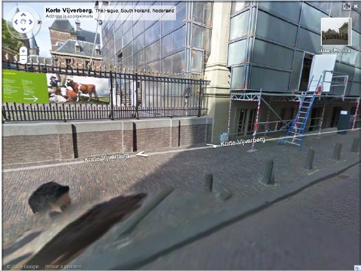
It’s apparently camouflaged as a generic glass & steel office building. Took me three passes to find it. By which point, I became kind of fascinated with the way Street View knits together its panoptic images, particularly when they include people. I love Google’s Cubist-meets-Robert Lazzarini-meets-Julia Scher-meets Hans Holbein the Younger portrait style.