
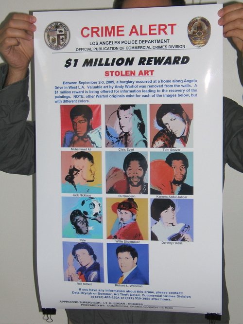
Almost three years ago now, a suite of ten Athlete paintings [plus one] by Andy Warhol was stolen from the Bel Air dining room of collector Richard Weisman. In an effort to help find them, I created a grass-roots campaign via the then-new service Kickstarter, to print giant versions of the LAPD Art Crimes Division’s utterly awesome wanted poster, and to post them all over the world, wherever Warhols were traded or shown.
Unfortunately, that Kickstarter campaign failed. And the Warhols remain missing, though Weisman has stopped cooperating with police, complicating their investigation.
And though it’s unlikely that I was the first to run an unsuccessful campaign, I could at least feel a sense of accomplishment at being the first to use a Kickstarter campaign as a medium for art critical commentary.
And that was that until a few months ago, when the noted Swiss designer and publisher Lex Trueb contacted me, and asked if I would mind his including my Find The Warhols poster project in an exhibition in London.
The Museum of Design Zurich had invited Trueb and 11 other designers to participate in London – Zurich Posters, an exhibition at the House of Switzerland London, a national pop-up venue for the 2012 Olympic Games.
Rather than create some sportsy thing from scratch, Trueb was more interested in appropriating an existing sports- or Olympics-themed poster design of some kind. The Find The Warhols wanted poster, he thought, would fit the bill nicely.
Trueb made his proposal to the curators, they went for it, and though I haven’t seen installation shots yet to see how it turned out, Lex says the giant-size poster looks pretty awesome. He laid a brief statement of mine along the side of the poster for a bit of context, but otherwise, it’s entirely true to the LAPD’s great tradition of stolen art wanted poster design.
As someone who’s been appropriating or copying or re-creating stuff originally made by others for a while now, it’s been an interesting experience having a proposal of mine [albeit an appropriated one] appropriated by someone else. Whatever trepidation I might have had about it can’t compare to the amazement at the serendipity of Lex’s interest and his show and the rather incredible context. His respect and seriousness about my own relationship and project vis a vis this found object poster is also above and beyond. He could have easily tracked down the original poster and stuck it in his show, and I’d probably be none the wiser. But he’s been awesome. The moral is, when someone takes you and your idea seriously enough to appropriate it, it can be a net positive for everyone.
Anyway, if you’re in London before the 12th, and near Southwark, maybe looking for a place to watch Federer play for Switzerland’s first gold medal, please check out the poster show and tell me how it looks.
London – Zurich Poster Exhibition, through 12 August 2012 [houseofswitzerland.org]
Chris Burden’s Small Skyscrapers
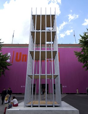
It’s been installed on his Topanga Canyon compound for a while, but Chris Burden’s Small Skyscraper (2003) will be on view in Pasadena, at the Armory Center for the Arts. Its dimensions, 35 feet high, with <400sf of floor area, were determined by the LA County zoning regulations for the largest structure allowed without a building permit. The work arose out of bureaucratic frustrations Burden faced when trying to construct a studio on the rural property he bought in 1991.
Though the Armory Center’s website calls it “quasi-legal,” noting that the outbuilding exemption Burden used has since been changed. And it’s not clear that his “hypothetical domestic use” or “added design features, such as a low roof parapet” ever complied with the code in the first place.
Once it crosses his property line, then, instead of this function-based envelope pushing, Burden’s transgressive interest transmutes into the sculptural. As he told Helen Stollas for The Art Newspaper,
At first, they [i.e., Burden and the architects Linda Taalman and Alan Koch, who approached him about showing an unrealized architectural project] considered developing it into an actual habitable structure, with sliding glass doors and a one-man elevator. “But I pulled back from that. I like it as more of a sculpture in the shape of a building,” he says. “It’s in that grey zone it; it could be a building, but when Mr Inspector comes knocking you say, ‘Well, that’s not a structure, it’s art.'”
Which neatly mirrors an actual legal battle being waged at the same time in Southport, Connecticut, where the local historic district filed suit claiming that the 40-ton concrete & rebar sculpture collectors Andrew and Christine Hall had installed on their waterfront property constituted a “structure” and thus required a [love this] “certificate of appropriateness.” [The State Supreme Court agreed with the town’s argument that it had jurisdiction because the sculpture “is ‘affixed’ to the land by virtue of its own ‘multi-ton weight’ and the force of gravity” (emphasis added for awesomeness). The Halls removed the sculpture, loaning it to a 2007 Kiefer exhibition at Mass MOCA.]
Burden’s building code experiment also serves as a nice, East Coast-West Coast, LA throwdown to New York’s OG, the grandmaster of all zoning envelope illustrators, Hugh Ferriss.
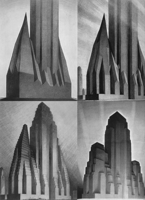
The Four Stages, Ferriss’s 1922 renderings of the Zoning Code of 1916, not only revealed to architects and developers how New York’s first skyscraper regulation constrained the size and shape of their projects; they predicted the city’s envelope-maximizing future.
Which is nice, because Burden says there’s talk of bringing Small Skyscraper to New York. He told Stollas that there are actually two extruded aluminum-and-2×4 Small Skyscrapers now: the California one, built for a 2003 exhibition at LACE and since installed in Topanga; and a European one, installed for ten days in Art Basel in 2004. “Since it was cheaper to just buy new materials when the work was shown in Switzerland, rather than ship the existing work over.”
Look, I’m as stoked as the next guy to see Burden’s sculpture, but why would any exhibition of it be predicated on the mere existence of two of them? Will it ever be cheaper to transport a Small Skyscraper than to build it locally? No. So why not build it? Why not build a hundred of them, a thousand, all over the place, a distributed city of Small Skyscrapers, wherever the zoning allows?
Or why not turn them into a platform, use Small Skyscraper‘s beautiful, minimalist, economical form to map out the invisible bubble of unregulated space and use across the country? Just type in your zip code, and the Small Skyscraper website will automatically generate plans for you to build the biggest permit-free structure/sculpture/structure/sculpture possible in your jurisdiction, too. Marin’s would be a doghouse, invisible from the street, while Houston’d be all hey hey, how big you want it? [If you get sued or fined, though, you’re on your own.]
But I guess that’s my project, not Burden’s. Actually, it also turns out to be the dream of Columbia GSAPP’s Kazys Varnelis, and probably of any and everyone who’s ever bloodied his head against a building code:
Perhaps, we imagine, after a confrontation with the authorities, Burden’s audacity might be accepted as his own business and, as our fantasy continues, we hear the sounds of construction in backyards citywide as hundreds, even thousands of small skyscrapers rise into the sky, turning the city into a latter day San Gimignano.
The reason Burden says “there is some talk of bringing them to New York” has less to do with Ferriss or LA or architectural libertarianism, and everything to do with the fact that there are now two Small Skyscrapers. And, because, as “Burden adds, when installed together, they somewhat resemble the Twin Towers.”
Sulcptural skyscraper build through a legal loophole [theartnewspaper]
Chris Burden | Small Skyscraper runs from 8/11 [through 9/11] til 11/11 [armoryarts.org]
When People Die, They Sing Songs: Chris Marker’s Stopover In Dubai
As soon as I learned of Chris Marker’s death, I went to look at what I’d written about one of his most recent projects, which I’d been so stunned by, only to find that I hadn’t written anything at all, only tweeted about it, which is barely more persistent than thinking about it.
And I don’t mean Marker’s show of surreptitious Metro chick photography at Peter Blum last year, which was cliched to the point of embarrasment. It’s the short Flash video Stopover in Dubai, which appeared almost unannounced on Gorgomancy, a pseudonymous Marker website. [I prefer the direct link to the .swf file (2025 update: they’ve switched to mp4 and ogv.)]

For all i thought I knew and admired about Marker’s work, from the touchstones of La Jetee and Sans Soleil, up to the improbable Immemory CD-ROM, Stopover In Dubai stopped me cold. But not [just] because of the content, though it is chilling.
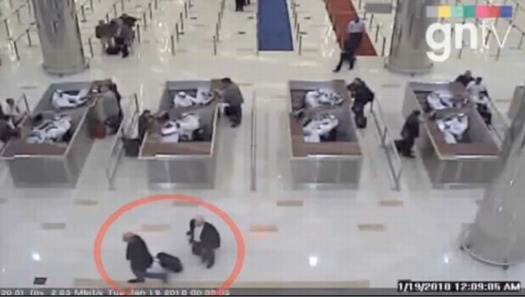
Stopover in Dubai is the meticulous reconstruction of a Mossad hit squad’s surreptitious mission to assassinate Hamas military commander Mahmoud al-Mahbouh in his hotel room on January 19, 2010. The entire thing plays out silently, via CCTV surveillance video from all over the city. Not that anything actually ever “happens” in front of the cameras; the footage only shows the most seemingly banal images of people crossing hotel lobbies or waiting for elevators.
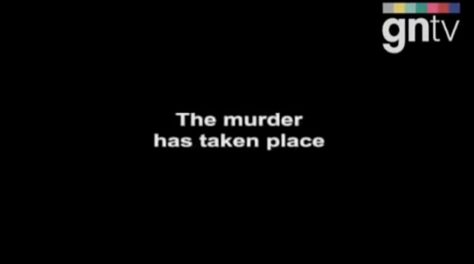
The footage was available because the show was actually assembled, not by Marker, but by Dubai’s General Department of State Security, as part of their investigation of Mahbouh’s death. The riveting, 26-minute account of the hit, titled, The murder of Mahmoud Al Mabhouh, was provided by the government to Gulf News TV, the video news service of the UAE’s leading English language newspaper.
It was only after watching Stopover in awe, figuring out what it was, and then tracking down and watching the original version, that I realized Marker had appropriated GNTV/Dubai State Media’s footage exactly as they aired it, edits, captions, graphics and all. And yet he had completely remade the film. Marker replaced the news program’s generic, royalty-free, techno-lite soundtrack with a haunting, ominous string composition written by Henryk Górecki for the Kronos Quartet.
The music seems to fit perfectly, like it had been written, scored, or at least timed, to the film. Until I started digging, I’d assumed Marker had used segments of another film score, the way he’d mashed up this riot slideshow by the Times of London with music from The 400 Blows. But Marker actually just plays Górecki’s piece, “String Quartet No. 3 (‘…songs are sung’)” straight through.
Where I’d once questioned my interpretation and response to the film, wondering who was actually responsible for the elements of its success-its narrative, structure, pacing, and suspense–I now marveled at Marker’s ability to recognize how these two things existing in the world–the edited footage and the Kronos recording–resonated so powerfully with each other, and with himself and his artistic sensibilities. Marker didn’t need to do any more than make this impossible connection; it was the slightest gesture necessary, and yet the result is no less remarkable.
I don’t know if Marker saw it–maybe it’s in the liner notes for the Kronos CD–but a Nonesuch text complicates the relationship between the Górecki composition and the Mahbouh assassination in unexpectedly poignant ways.
GNTV’s opening titles tell us that the Mossad had been pursuing Mahbouh for years without success. Kronos, meanwhile, had originally commissioned Górecki to create a third work for them in 1992, and it was set to debut in 1994. But nothing came. For over 13 years. The composer finally delivered the work in 2005, with a dedication,
“To the Kronos Quartet, which for so many years has waited patiently for this quartet.” In a commentary attached to the score, Górecki added that the work had been completed in 1995, “but I continued to hold back from releasing it to the world. I don’t know why.”
The quartet’s title, meanwhile, “is inspired by the last line of a poem by the Russian poet Velimir Khlebnikov, ‘When people die, they sing songs.'”
Just as Kronos’ long, patient wait for its song resonates with the Mossad’s long-fruitless hunt for vengeance/death, the suspenseful score of a found footage, real life spy thriller is revealed as the song the target–who barely appears in the movie itself–sings when he is drugged, paralyzed, and smothered in his hotel room, out of the cameras’ view, but still within the auteur’s reach. Who was, in this case, Chris Marker.
The Stars At Night Are Big And Bright
Untitled (MOCA Mercedes, After Mike D), 2012, detail, 54″ dia., an edition of yet-to-be-determined size at a price which will remain in effect until Deitch leaves MOCA. Stay tuned.
Previously, Study for Untitled (MOCA Mercedes, After Mike D)
Mack & Stack
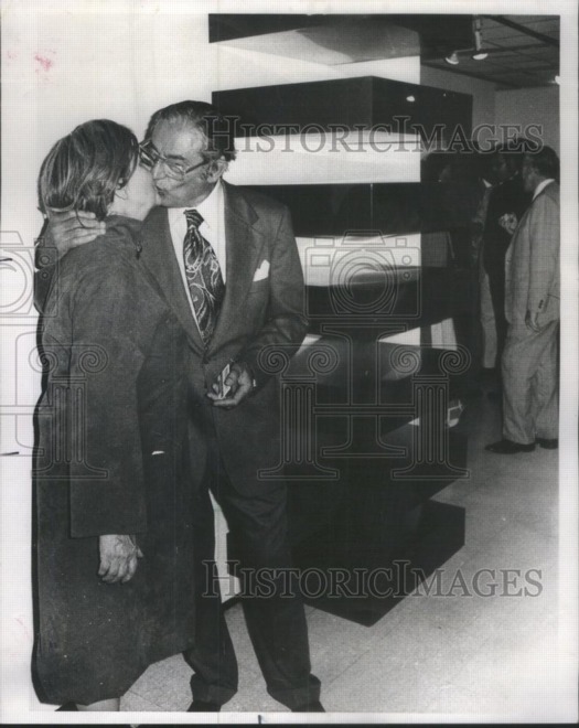
To Whoever Just Bought This Amazing 1977 Photo Of Founding Museum of Contemporary Art President Joseph Shapiro, Credit Card In Hand, Macking On His Lovely Wife Next To A Judd Stack,
Thank you. I’d been wanting it, but also not, being entranced but also slightly weirded out by it, and so hesitating over it for a couple of days now. I was about to cave. But tonight, I’ll give my extra $40 a little hug instead.
PS. If you ever Google your way across this, I’d love to do this photo justice with a better, watermark-free image, please.
Deployed Gerhard Richter Paintings
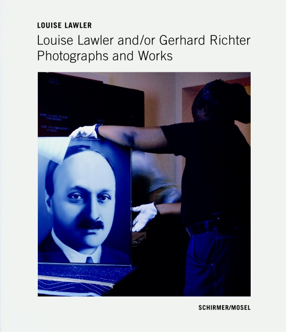
Via the New Yorker’s photodesk, an excellent slideshow of a sampling of Louise Lawler’s photographs of artworks by Gerhard Richter, in situ and in transit.
My favorite is still the site-specifically distorted No Drones, which I posted about last winter. But for the newly published book, Louise Lawler and/or Gerhard Richter, Richter archivist Dietmar Elger looks to have stuck with each of the 29 photo’s original dimensions.
Interestingly, the US edition of the book has retitled its way out of the authorial ambiguity of the original: Louise Lawler: The Gerhard Richter Photographs.
Slide Show | Louise Lawler’s Gerhard Richter [newyorker via @janehu and @briansholis]
Previously:the disco ball next to the Lawler
About Destroyed Richter Paintings
Also: the crates for Richter’s 4,900 Colours are so sexy
Cowboy Photography Workshop By Eric Doeringer

I so wish I was in town for this:
July 28th, 5-8PM, Eric Doeringer, Cowboy Photography Workshop
Artist Eric Doeringer will bring vintage Marlboro advertisements from his collection and will assist participants in re-photographing them in the manner of Richard Prince. Visitors will leave with a high resolution digital file and information on how to have it printed at a large size. Participants are welcome to drop in anytime during the workshop. There will be a small materials fee.
Just another day in the life of HELP/LESS, Chris Habib’s amazing show at Printed Matter.
Doeringer has searched out original copies of the Marlboro ads Prince began rephotographing in 1980, and began his own re-creation? re-enactment? re-performance? of Prince’s Untitled (Cowboy) photos last year.
After the jump, I’ve transcribed a section from Prince’s court deposition where he discusses his early rephotography process:
Continue reading “Cowboy Photography Workshop By Eric Doeringer”
Toward A Theory Of Every WTFSport-like Thing
Just go read Brian Phillips’ awesome analysis of the bizarre hermetic superlatives of rhythmic gymnastics:
[L]ike all insular civilizations, [RG]’s evolved in a certain direction, it’s developed hard-and-fast attitudes about what’s beautiful and proper, and a corresponding need to defend those attitudes. It’s putting on a show, and it does what it knows how to do. The result is that it feels a little unbalanced to outsiders, in the same way as, say, ice dancing, or dog shows, or a lot of judged activities.
This notion of competition, judgment and the pursuit of perfection within an insular world happens to be a minor fascination/obsession of mine. At some point probably 10 years ago, after surfing past yet another aerobics world championship on ESPN3, I started a posterboard spectrum, which I changed to a 2×2 grid, and then just a bubble chart. All the sports and “sports,” I can find are laid out on it, from bodybuilding to dressage to cheerleading to college marching bands [both historically black and not]. Rhythmic gymnastics is there, too, in a cluster with regular gymnastics, synchronized swimming, ballet, drill team, and child beauty pageants. Here’s Phillips again:
There is, in the contrast between the poise and seriousness of the athletes and the princessy kitsch of the setting, something really kind of dark and wonderful. Just imagine it: devoting your life, mercilessly and with absolute commitment, to the task of dancing with little twirly clubs to a synth-folk soundtrack while wearing a spangled bathing suit designed to look like ladybug wings. Imagine doing that as well as it can humanly be done, being the person who embodies that accomplishment. I’m not making fun of anyone; I find it strangely noble.
I find it WTFcrazy. With two daughters of my own now, it feels like my parental prime directive is to steer these kids as far the hell away from these freakshows as possible.
I mean, how can it be that less than ten years after Chris Rock identified keepin’ his baby off the pole as a father’s only job, there is a petition by an Irish member of the International Pole Dance Fitness Association [which is different from the World Pole Dance Federation] to make pole dancing [or “Vertical Bar Dance”] an Olympic sport?
I haven’t figured it out yet, what it all means, but the more you think about it, these kind of esoteric, competitive evaluation systems are everywhere, and the desire to excel within them is, too: business, politics, religion, literature, art. Is the only difference popularity, which is apparently just a function of time?
Maybe to achieve a Theory of Every WTF Thing requires looking beyond the gut, cultural affinities of a judged system, to its language, attempting a close read of the texts it produces. Phillips again:
RG has its own language, which non-RG initiates mostly perceive as a series of ultrasonic clicks and emoji hearts. What, for instance, is the precise distinction between the tournaments Miss Valentine 2012 (Tartu, Estonia, February 10-12), Pearls of Varna 2012 Academic (Bulgaria, July 2), and the 4th International Waves Cup (Germany, March 24)? I have read the rulebook in effect for the Olympics, the 125-page Code of Points: Rhythmic Gymnastics 2009-2012 [pdf], and let me tell you — you thought football had a lot going on. Between the aggro-ballet terminology (fouetté, entrelacé), the extensive use of pictograms, and the radical linguistic uncertainty (“The French version is the official text,” the front cover proclaims, in English), this thing reads like Finnegans Wake as drafted by the unicorn debate team.
Yes. RG has its own language. Just like everything else. And it has roots in aggro-ballet, and there are 43 words for ribbon twirling.
So the top hundred or so international sport and “sport” federations’ codes, preferably in print, to fill a bookshelf, and then to begin the data-intensive synthesis between them all. I’ll get right on that.
Sparkle Motion [grantland via @felixsalmon]
Friday At Printed Matter, 6:30, Eric Doeringer, Hermann Zschiegner & Me
So tomorrow evening, Friday, I’ll be speaking at Printed Matter. If anyone reading this is in town and interested, I hope you’ll stop by. Bring a fan, though; it gets hot in there.
Eric Doeringer and I will be discussing appropriation and artist books, though he’s already won the night, merch-wise, thanks to his two new titles he’s launching. Fellow Prince appropriator Hermann Zschiegner will be moderating.
The whole evening, which starts at 6:30, is part of HELP/LESS, Chris Habib’s frankly awesome-looking show of authorship, originality, reproduction, and appropriation, which is taking over the whole store this summer. If you can’t make the talk, you should still swing by to see the show.
Eric Doeringer + Greg Allen/ Book Launch + Discussion [printed matter’s facebook invite for the event]
HELP/LESS, curated by Chris Habib [printedmatter.org]
Previously, related: Untitled (300×404), a print after Richard Prince
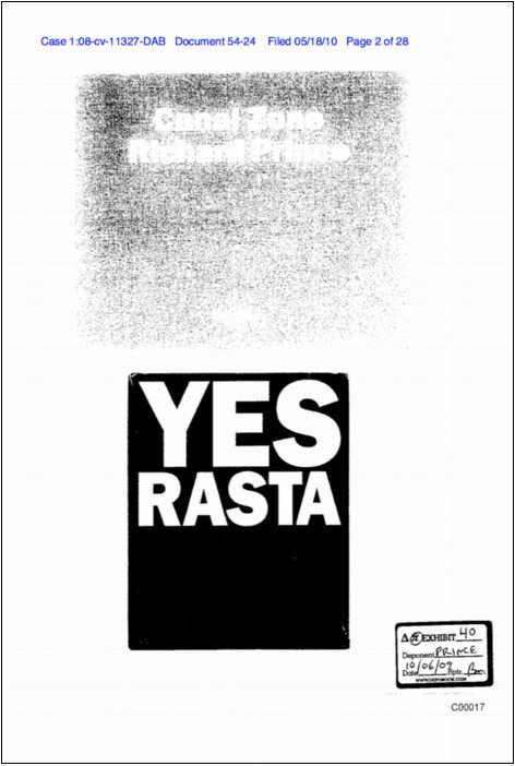
Canal Zone Richard Prince Yes Rasta: The Book
Twin Towers
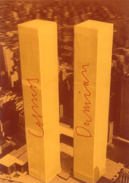
Add Damian & Cosmas’ importance to Joseph Beuys and his renaming in 1974 of the then-new World Trade Center towers after the twin physician saints to the list of things I did not know about but probably should have.
From Marina Warner’s generous discussion of Damien Hirst in the LRB:
[Hirst] is named after the patron saint of doctors (usually spelled Damian), who, with his twin brother Cosmas, performed the first surgical transplant when he grafted the leg of a Moor who had fallen in battle onto the stump of a white Christian knight. This operation, depicted on altarpieces in the saints’ many churches, can’t be consigned to the antique glory hole of weird Catholic legend, for it was crucial to Joseph Beuys’s dream of revolution: a vision of inter-racial fusion, of the resurrection and reconciliation art can achieve. In one of his works, Beuys eerily renamed the two towers of the then newly built World Trade Center after the brother saints: did he do so in some wan hope that the towers could be transfigured into instruments of good?
Beuys, needless to say, is second only to Duchamp in importance to the current philosophy of making art.
Needless to say, I would have known if only I’d been a little more faithful in my Brooklyn Rail reading. Because that’s where I found David Levi Strauss’s thorough, if slightly Nostradominous, discussion of Cosmas und Damian, Beuys’ multiple [?] based on a 3D postcard of the Twin Towers.
Once A Catholic… [lrb.co.uk]
IN CASE SOMETHING DIFFERENT HAPPENS IN THE FUTURE: Joseph Beuys and 9/11 [brooklynrail.org]
David Levi Strauss’s essay was also just republished as one of those 100 chapbooks from documenta 13 [amazon]
Rijksoverheid Rood 9: The $50 Paint Job
So Todd Lapin at Telstar Logistics is starting to roll out The $50 Paint Job, and it’s really got me thinking.
Basically, it’s Rustoleum household enamel, thinned by 50% or so with mineral spirits, and applied with high density foam rollers, with wet sanding between each two very thin coats. This guy did it on his Corvair, and that moparts.org thread goes on for days, months, years about it.
As I’ve been building up layers of Rijksoverheid enamel on my own panels, using various brushes and rollers, and wet sanding in between, I’ve been working toward an ideal that’s really eluded me so far: a hand-applied painted surface that shows no marks from the application. Like, for example, a Gerhard Richter mirror painting.
Part of the motivation for this is the ease with which you [I] could order these panels from a body shop. It’d be Moholy-Nagy easy–even easier since there’s no design, just color–to just order these monochromes by the official Dutch governmental auto paint code on the phone. I have the list right here. But I wanted to do them myself.
And so far, that perfectly self-leveled, brushless, orange peel-less surface has eluded me. But reading The $50 Paint Job stories, it’s obvious why: the paint straight out of the can is too thick. And for whatever misguided, paint-can-as-unaltered-found-object reason, I have resisted thinning it. Well screw that, because the next six coats are going to be nearly water-thin. I can’t wait.
Previously: rijksoverheid rood in process
The original idea, to paint monochromes and 2-color gradients based on the 21 officially approved colors in the Dutch government’s Rijkshuisstijl, plus the five blues of the country’s new logo, all of which are derived, we’re told, from Golden Age Dutch painting and the Dutch light that inspired Dutch painting.
Save The Whale
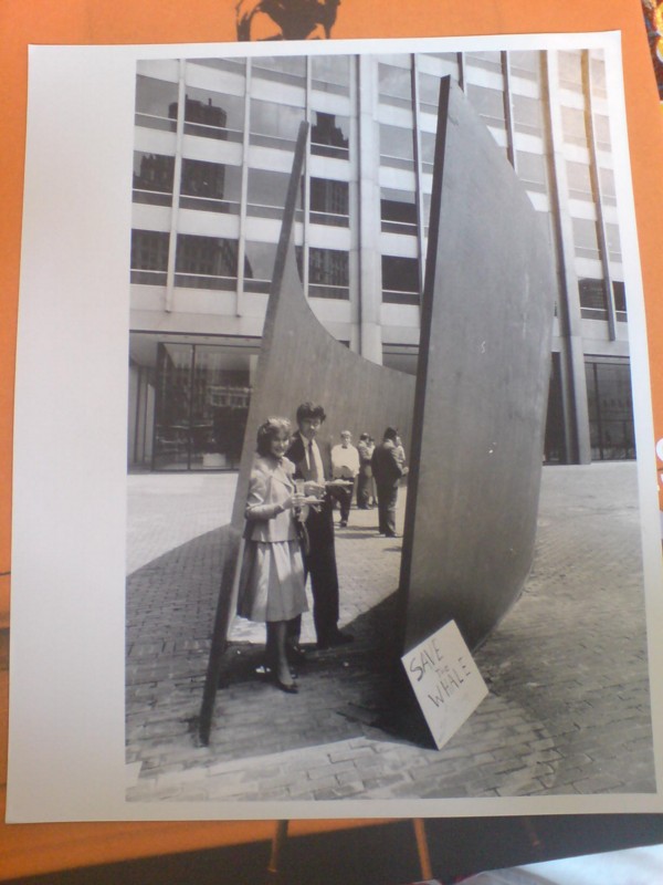
It’s Chicago Day here at greg.org; I just got my copy of Matthew Witkovsky’s rather amazing-looking exhibition catalogue for his show at the Art Institute, Light Years: Conceptual Art and the Photograph 1964-1977, along with this awesome photo from a little later, August 10, 1989, to be exact.
That’s when the folks at Chicago Sculpture ’89 and The Equitable held a reception inside Richard Serra’s 1986 sculpture, Call Me Ishmael, trying to raise $575,000 to purchase the sculpture for the city of Chicago. In a clipping from a Chicago Sun-Times article about the event, Serra’s sculpture is “said to depict a whale.”
Mhmm, not sure who said that. What’s not said is that Call Me Ishmael is basically two tilted arcs. Serra’s date for the work is 1986, after Tilted Arc itself was threatened, but before it was actually removed/destroyed.
Unlike Tilted Arc, Call Me Ishmael was not site-specific. Or at least, Serra has presumably approved the installations by its subsequent buyers, Doris & Donald Fisher, who loaned it to Stanford, though it was replaced last year.
Meanwhile, back in Chicago, not only did they not get the Serra, that plaza in front of The Equitable Building has since been host to two of the abso-$)(%ing-lute worst kitsch public sculptures ever: J Seward Johnson’s massive American Gothic remake and that Marilyn Monroe mess. It’s like the Chicago Cubs of sculpture up there.
Notes From A Frontal Passage
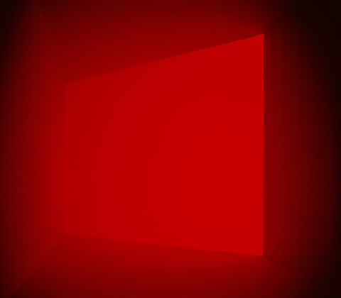
In the summer of 1994, MoMA installed a new work by James Turrell, A Frontal Passage, for the first time. I’ve seen it so many times since, now I can’t remember the experience of seeing it for the first time. But I do remember the experience of seeing Turrell’s one-man show at ICA Philadelphia in 1993, where I’d just started business school. There were a couple of light spaces, plus an anechoic chamber piece, some of his early corner projections, and a big table model of Roden Crater [which, frankly, made no sense at that diorama scale, and felt entirely, confusingly speculative, equal parts California real estate development and Richard Dreyfuss’ Close Encounters dining table.]
Anyway, while going through some envelopes full of slides [!] last night, I just found a MoMA Film schedule from July 1994 with some notes on it. And now I remember that I camped out in A Frontal Passage for a while, just standing in the corner, listening to peoples’ reactions, and then wanting to write them down. So I headed out in search for the first piece of paper I could find:
A Spanish mother and son awed into
silencewhispers.
“I don’t like this. I can’t see. I’m not going down there.”
“What is this? Is it so bad, he doesn’t want it seen in the light?”
A family comes in Grandma waits outside. Then the father goes out, gets her guiding her by the shoulders. She looks for a second or two, and then he guides her out.
Son to dad: Is there a floor?
Two elderly British ladies ask a guard, “Where’s the dark room?” He excitedly shows them the way. He stands at the hairpin turn his white shirt a beacon. “Hold onto the rail.”
“What’s the purpose? Where are we going?”
“Ladies, can you see me?” Some general jostling around the corner.
The eager guard: “And here it is.”
“What is it? A statue? Is that a statue?”
“No, that’s a man.”
I laugh and somewhat regret my intrusion.
“It’s the light at the end of the tunnel.”
“A little piece of heaven,” says the guard.
“Is that what it is?”
“I’m waiting for God to come out, I have some things to tell him,” smiling.
“Laddy, in World War II it was dark all the time. That’s what it reminds me of,” as they head back into the hall.
In the main gallery, “Oh, it’s so bright.”
“I remember when they said we could turn the lights on. It was so bright then.”
Previously: apparently, scribbling notes about Turrell is what I do
stumbling across an outdoor Turrell at Kijkduin
Sforzian Acoustics
One of Karl Rove’s objectives for his Sforzian backdrops was “to set up picture so that if the television sound is turned down, that it gets across what it is the President wants.”
With this new ad, “Firms,” [direct YouTube link, in case you’re seeing a freakin’ Swedish bike helmet fashion show up there instead, which, #iframewtf?], the Obama campaign has turned Rove’s formula on its head.
Sure, the sound-off visuals get the point across just fine: dolly shots of news stories of Romney’s outsourcing and, apparently, job-destroying history set into depopulated locales: closed factories, empty conference rooms, and abandoned parking lots–and then headlines about his Cayman Islands accounts are tucked into shots of isolated beaches.
But the only sound is Mitt Romney himself singing “America the Beautiful.” Which they’ve tweaked ever so slightly to match the ambient aural quality of each shot, giving the sense that Romney’s singing in each place. Even without the visuals, you get a visceral feel of Romney wandering alone across a desolate America, singing to himself.
As a filmmaker/reader at Talking Points Memo describes the effect,
[P]lacing Romney’s voice in the various locations builds the implication in the mind of the listener that Romney is present and witnessing it. It’s almost like he’s in America’s front office, singing into a PA microphone while the building rots. This highlights another feature of sound design: it’s a good way of giving people information in such a way that they don’t even know how they know it. You see the ad and there’s no cognitive speed bump to keep you from concluding that Romney was there in that empty factory, or there in the abandoned conference room, or there sipping Coronas on a beach in Grand Cayman.
Well, I know that’s the ad it most resembles, but he probably wouldn’t be sipping a Corona. But it’s a good point. And I think I may have a new ringtone.
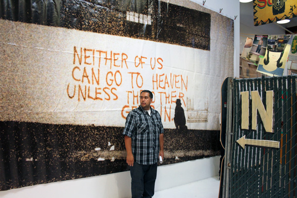
Mike Mills Photo-Murals

So I start looking around for installation/shop shots of Aaron Rose’s Storage Unit Fire Sale, which just opened at Known Gallery in LA, and what’s the first thing I see? At The Hundreds?
That’s right, not decks or kicks or posters. Photomurals. By Mike Mills.
They’re vinyl prints, of course, as most giant images are these days, but they are rather awesome nonetheless.
Except technically, they’re not by Mills, but of him, spraypainting his messages in his suit. There’s “Let’s all be human beings,” and “Stop Hiding.” I called about them, and learned there’s are some other ones, “Love is worth it,” and “Neither of us can get to heaven unless the other one gets in,” somewhere. Ah, here’s the latter, in Ann Duray’s coverage at Juxtapoz. I like the way the low-res original fits with the vinyl inkjet. Meanwhile, yow, Duray’s also got a picture of a larger-than-life full-length of Terry Richardson. Roll that one back up.
And then that huge pink and white image up top on the opposite wall is also by Mills. Before the Known guy could look them up for me, I found the images on Mills’ website; they’re all from a 2004 show at the Mu Museum in Eindhoven titled, Not How When or Why But Yes.
Mills mentions the “cross-disciplinary work” of Charles Eames as an influence, but then only mentions furniture, “architecture, films, exhibitions and toys,” not art per se. And he’s expressed some wariness toward the gallery-centered confines of the art market. Though he’s since married Miranda July, who has since been making sculptures that have turned up in public venues, the Biennale, etc.
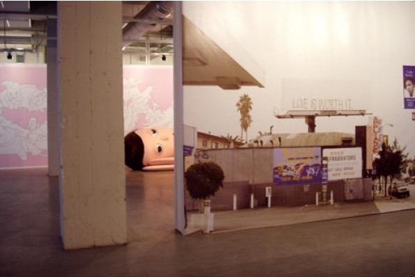
Which, it’s not clear how he considers these awesome prints, but I bet he’d not think they’re art objects in the commodity sense, just large prints, souvenirs from the show that were too awesome to trash in Holland. And then what was that giant, plush reclining Buddha sticking his/her head out of that Mu Museum installation, right? D’oh, no way, scroll down to the last photo there. It’s in the show and for sale, too! Rose really stored that thing for eight years? That’s gotta be $10k right there. Impressive.
It’s kind of interesting to see things outside the “gallery system,” though, and how they’re considered and discussed–and shown and priced and bought and sold. In the case of these murals, they’re unique, and pretty cheap–$1,400 or so, and the big pink one’s like $5,000. They roll up for easy storage.
One Man’s Treasure [thehundreds.com]
Aaron Rose Fire Sale at Known Gallery [knowngallery]
Graffiti, Mike Mills, 2004 [mikemillsweb.com]
Not How When or Why But Yes,