
As those who kindly email me about run-on italics–and those who don’t–know, I don’t actually visit this site site as often as I probably should.
Which is part of the reason I didn’t notice until just now this nice side-by-side posting of Matt Connors’ painting and Barack Obama et al’s blast shields at the dedication of the World Trade Center Memorial.
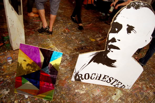
UPDATE: Or three of these things. Mondo Patrick likes the Connors diptych alongside this:
Cady’s Got A Gun
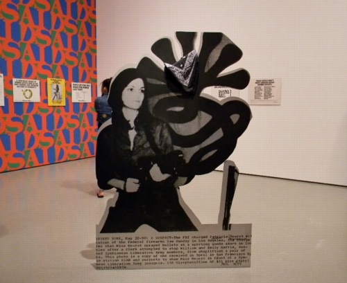
Cady Noland’s Tanya as Bandit, 1989, General Idea, and Guerrilla Girls at MoMA, 2010, image via greeds
Welcome to another installment of Things I’ve Been Meaning To Post For Months. Only this time, the longer I wait, the more examples I see, and so the easier it is to rationalize not having posted these things the first time.
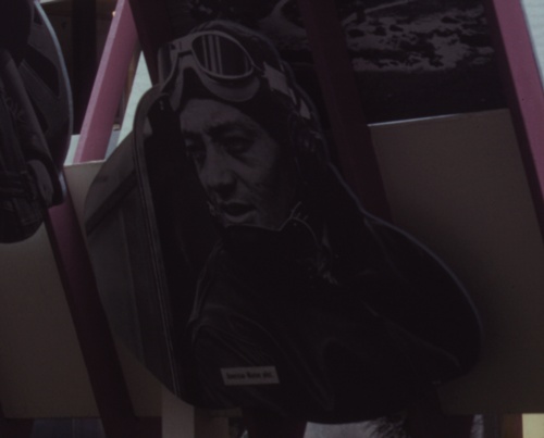
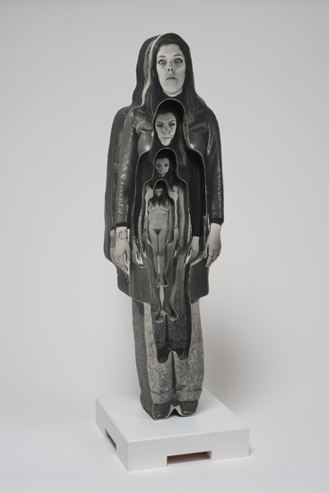
So photo cutouts. These things that blur the line between photograph and sculpture, or object. It started, at least for me, with Cady Noland. She’d do those cutout screenprint on aluminum news photos of folks like Lee Harvey Oswald, or Patty Hearst. Kathy Halbreich installed the latter in MoMA’s 2nd floor galleries last summer.
The image above [via last greeds’ sept ’10 art diary entry] shows Noland’s Tanya as Bandit, 1989–which turns out to be a 2007 gift of Kathy and Dick Fuld, very thoughtful and generous of them–in the politicized polemic gallery, with the Guerrilla Girls, and General Idea’s Indiana-inspired AIDS wallpaper.
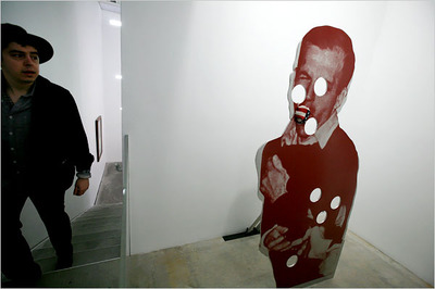
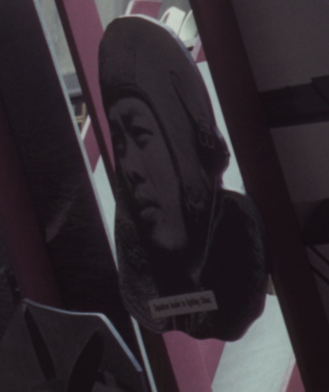
Cady Noland, Bluewald, 1989, Dakis Joannou Collection at the New Museum, image: nyt
And Jeff put Dakis’s Cady of the photo of Jack shooting Lee in that show at Lisa’s place last year. Which is another great/awful tie-in of violence, photography, media and history.
[One of the things that’s held me up was finding something up-to-date to say about Cady Noland’s work, which I admire more and more, but which I didn’t really click with at the time. And reading back on the 1990’s media-centered, post-modernist, white trash America discussions of her work, it all seems a little, so what, you know? Lane Relyea’s 1993 Artforum essay [something something Easy Rider, Land Art, lost American Dream] is good, I guess, maybe a little lyrical. Oh, those simpler times. So I’d really like to find some interesting attempts to engage with her work, and not just wistful wonderings of whether her current withdrawal from the art scene is hardcore late-Duchampian or full-on Salingerian.]
But this gallery was stuck in my head, with Patty’s gun pointing at my brain, when I finally saw the installation shots for Edward Steichen’s propagantastic 1942 MoMA exhibition, Road To Victory in February. It’s a landmark in my little hybrid art history of photomurals. But there’s also this one corner:
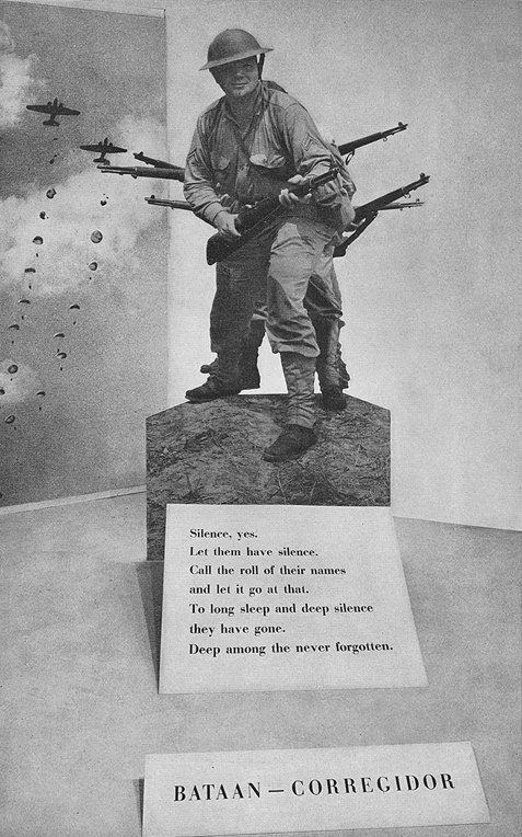
image: moma bulletin, oct. 1942, I think
With a giant, life-size photo cutout of Our Boys at Corregidor. I went through the archives for Road To Victory this spring, so when I find my notes of all the photo credits, I’ll add this photographer’s name here. I believe this was a news photo, like Noland’s, but Steichen drew most of his images from the US Navy photo unit he led and from the Farm Security Agency’s photo archive.
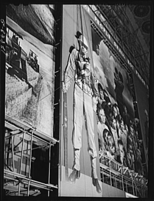
image: loc.gov
The FSA, of course, had already created the giant defense bonds photomural in Grand Central Station in 1941, which also had as its central elements two giant soldier photo cutouts:
image: loc.gov
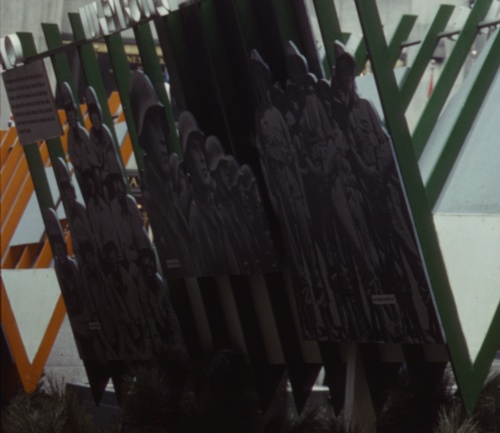
And then by 1942, the FSA had become the OWI, the Office of War Information, where it designed and created propaganda both domestically for civilian consumption, and abroad, as part of Allied military operations. And in the Spring of 1942, they were programming the Channel Garden at Rockefeller Center with these incredible wartime exhibitions, which were basically chock-a-block with giant photo cutouts:
I’m not sure that I have a specific point here, either, except that these cutouts share a context–propaganda, exhibition, war, military, politics–with photomurals; they’re ways to put photography to work, to push and expand it beyond the newspaper, or the book, or the album, the slideshow, or–occasionally–the gallery, wherever it had been hanging out until that point. And at these scales, I suspect photography was taking a lot of its cues from cinema, moving pictures.
Multiverse, image via kclog
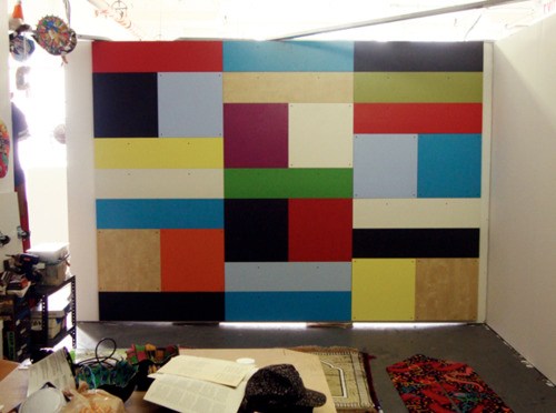
Whatever photomurals are to painting, the cutouts are to sculpture, I figured. Until I saw Matt Jones’ show, Multiverse last Spring at Freight + Volume. Jones’s plywood cutout works are photo, painting, and sculpture all at once, or in turn.
Matt Jones works at HKJB, June 2011, image: 16miles
And then at Control Alt Delete, the one-night studio show organized by HKJB in June, Jones just collapsed the distinctions completely. This pairing in a photo by Andrew Russeth is just so awesome. There’s a screened/painted cutout with a screened/overpainted painting propped next to it. HKJB has a nice photo of the backside, too.
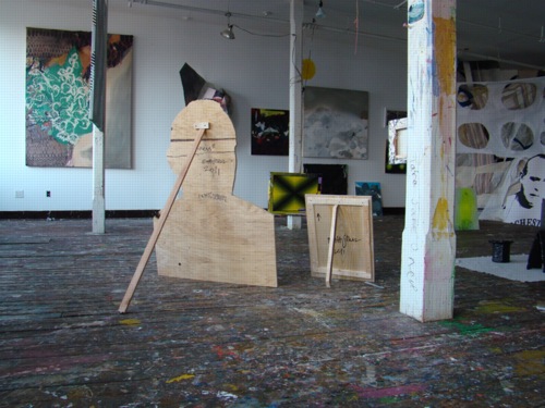
control alt delete installation shot via hkjb
I wish I’d seen it in person, because it looks more effective than the F+V show, which felt a bit dense. Or maybe they’re just different spatial/sculptural experiences.
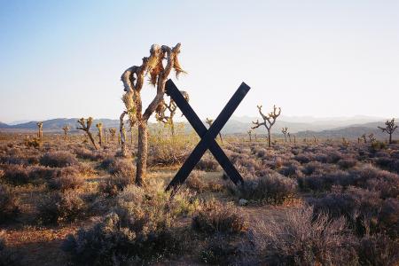
Wade Guyton’s piece at High Desert Test Sites 2, 2003
It didn’t occur to me while looking at the work, but now that I see the F+V press release mentions “Peers of Jones, such as Wade Guyton, Kelly Walker and Josh Smith,” which, OK, it reminds me that Wade used to do these leaning, cut-out, painted sculpture works back in the day. I always really read them as sculpture. I remember one at Kreps in 1998 or so, a big, black rhomboid thing, which appeared to present the spatial gestalt of peer of Guyton Robert Morris, until you walked around back. Photo illustration-derived Potemkin Minimalism. The X’s always seemed like sculpture, too, and graphics, obviously. But they turned out to be paintings. [I listened to Wade this 2006 Frieze Fair talk, “Conceptual Painting,” again while I was painting the other day. Interesting, but it didn’t help.]
Which felt different at the time, though I can see the similarities, from Peter Coffin’s Sculpture Silhouette Props series of 2007. [Saatchi’s got a ton of them here.]
And now that I think about it, and look at the back of that little Jones propped up there, I remember walking into Larry’s office once, and he had this insanely pristine, little, lead prop piece, just beautiful, by peer of Jones Richard Serra. It was so adorable, so domestic, like Labrador-size. And seriously, it must have been stored in a velvet-lined vacuum chamber for the last forty years, how was that surface in that condition even possible?
That silvery lead square propped up on that unbent roll was as much a painting as anything peer of Serra Jacob Kassay has ever done. Or would eventually do, really, because this was probably 2004, since I distinctly remember quietly despairing how, even if I could come up with the money, there’s no way I could get that Serra, or should, because a heretofore unblemished, kid-sized, lickable lead slab sculpture precariously balanced on the floor of a house with a new kid would just end badly for all involved.
Dale Quarterman, Marvella, 1969, image via cherryandmartin
But anyway. Into the middle of this–my mulling over photo cutouts, that is, which only develops this tangent about prop pieces as I finally blog it out–comes “Photography into Sculpture,” which just opened at Cherry and Martin, in sync with Pacific Standard Time. The headline image is above, Dale Quarterman’s decoupage-y cutout, which reminds me a bit of that Homage to Muybridge series photo Lewitt did around the same time. These cutout/shaped/contoured works seem like examples of the working-over photography got at the hands of conceptualism. Interesting, if not entirely satisfying. [I’d originally said convincing.]
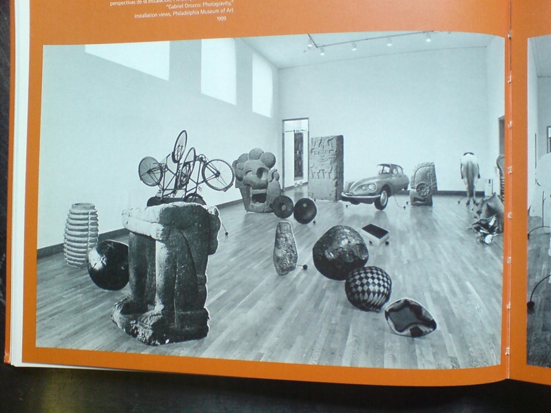
But if it helped till the soil that somehow led to Gabriel Orozco’s 1999 show at the Philadelphia Museum, then it’s fine. The icon, understandably, of Ann Temkin’s show is Black Kites, Orozco’s geometric pencil drawing on a human skull, which is flashy and awesome and all. But it also suffers in a way, as the precious, covetous acquired object of the PMA’s affections. Like Hirst’s skull writ small.
both images via the 2000 moca catalogue
Which is exactly the problem Orozco’s photo cutouts, which made up the bulk of Photogravity, don’t have. These flat, 3-D depictions of elements of his own works, mixed with photos of the Arensberg’s collection of Pre-Columbian artifacts, were slight, obviously derivative, didactic, ephemeral. They were photographic sculptures of photographs of sculptures. Yet they seem to be nearly invisible online. The only Google Images result for them is an art history slideshow at SDSU, where they’re labeled, of course, as “installation.”
[Update: Talked to GO’s people; it’s a single work, and it was shown at MOCA, which I did not remember, and was considered for Tate. So now we know.]
Which doesn’t exactly bring me back to where I started, which was this unexpected or overlooked formalist and subject context for Cady Noland. Or maybe it’s the inverse: Cady Noland as an unarticulated context for this cluster of later [or sometimes nearly concurrent] work. I guess if I’d figured it out more, I would have written it sooner.
What Ikea Lack
Once again, I’m getting burned for procrastinating on a project. And once again, I’m forced to reckon with how susceptible we are to the illusion a company can create of cultural stability and reliability, even as it constantly effects changes that suit its own business purposes.
Which is a lot to pile onto a tiny, cheap-ass Ikea Lack side table. Even before I finished my Ikea X Enzo Mari autoprogettazione table in 2009, I had the idea of making another one.
For the first, I’d found the single Ikea product that felt closest to the original lumber Mari specified for his designs: the unfinished pine components of the Ivar shelving system.

I wanted to realize the second table, though, in the product that felt the most Ikea: the Lack table. The Lack collection is pure Ikea: high modern, highly engineered, and super-cheap. The Lack is a marvel of perfect crappiness: sawdust legs and honeycomb cardboard tops encased in a structural plastic shell. You can’t cut a Lack without destroying it, but the series’ tables and shelves all share proportional dimensions, so it’s possible to tile them together.
my favorite Lack reference: MVRDV’s 2007 proposal for the Boijmans von Beuningen Museum Depot in Rotterdam. Alas, unbuilt.
The other day when Man Bartlett posted on his tumblr about visiting Brent Birnbaum’s studio, this awesome image made my heart leap–off the Ikea ferry, and then to promptly sink into the East River.
On the wall of Birnbaum’s studio is a piece called Untitled (Ikea), which is assembled from a veritable rainbow of Lack tables and shelves the artist has collected around town. It’s like, “WHOA, DOUBLE RAINBOW!” And exactly the patchworked minimalist look I was hoping for.
And the killer thing is, when I came up with the idea 2+ years ago, there was a literal rainbow of Lack side tables stacked in a spiral on the catalogue cover and in every store. But when I finally decided to make it about eight months ago, I found that after introducing a bunch of pastel colors in 2010, Ikea had all but discontinued colored Lack, leaving just red, white and black, and just a couple of wood “effect” finishes. [Seriously “birch effect” is such a sad concept.]

I had some pieces that I’d stashed or stored: a navy blue shelf, dark grey and dark green side tables, and either dumped or gave away a while ago because seriously, it’s Ikea. Just go get another one. But it’s precisely this misplaced belief that it’ll always be there that tripped me up. Ikea IS always full, and it DOES always look and feel the same in its way, but the specific products, even the iconic ones, are constantly in flux.
There were hints, warning signs, which I chose to ignore. A Lack side table was always ridiculously, disposably cheap: $12 or something. But in 2010, Ikea began value engineering them, eliminating packaging, and tweaking the materials a bit, to get the price even lower. For a while, they were $5.99. Now I think they’re $7.99. Rationalizing inventory and SKUs was obviously part of this ongoing, profit-wringing process.
And that brings up the implications of Ikea’s product choice winnowing, which are thoroughly depressing, yet fascinating. I’ve been scanning craigslist for months, trying to find any colorful Lack pieces. I’ve missed a couple in New York because I couldn’t get them in time, and I found one pink table in Alexandria, Virginia. But otherwise, the craigslist selection is relentlessly constrained: it’s almost entirely these fake wood finishes. And I can’t tell what came first: Ikea’s eliminating all color from their lowest-end table offerings, or the [$5 table-offloading] public’s total embrace of printed plastic that simulates [and poorly] actual wood.
The greatest/saddest listing I saw was from an American University student, who described his Lack side table as, “exactly the same table that everyone else has.” And it’s becoming even more so every day.
So anyway, if you have a lead on some colorful Lack side tables or hanging shelves [medium or small], definitely drop a line. Because I’m definitely buying.
Filming Gerhard Richter Painting
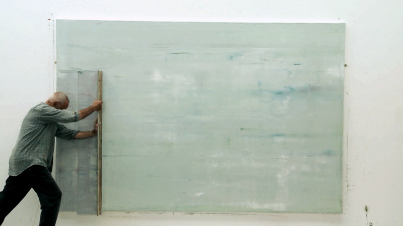
Gotta get a piece of that Gerhard Richter Painting. After completing a documentary about the artist’s Cologne Cathedral stained glass windows in 2007, filmmaker Corinna Belz began working on another project, filming Richter at work in his studio. She waited a year and a half for the artist to begin a new series of abstract paintings, and then she pretty much filmed the whole process.
It’s kind of crazy how jazzed I am after just watching the trailer. Those squeegees are so huge. And they’re clear. And he wields them by hand. Some of this we [I] knew, but it’s still kind of riveting to watch. Belz in an interview:
Books are a better medium to articulate theoretical positions. And the actual act of painting is hard to describe in words: The way Richter mixes primary colours on the canvas, generating such a complex colour system. How layers are built up and submerged, how sculptural they appear on canvas. The most important thing for me in this film was to show something uniquely visual.
In related news, I now have new iPad wallpaper [above].
Gerhard Richter Painting, dir. Corinna Belz [gerhard-richter-painting.de via scahweb]
Small World Keeps On Turning
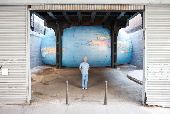
image: nymag
The awesomeness of David Byrne’s giant, inflatable globe shoved under the High Line gives us a good chance to look back.
To remember David Byrne’s pioneering show of PowerPoint Art at Pace in 2003.
And also to hope that Joshua Foer’s got someone updating his “A Minor History of Giant Spheres,” which is, of course, my too-infrequently cited source of inspiration for my satelloon fixation.
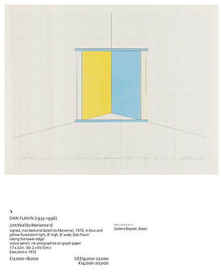
FS: Dan Flavin, Light Fixtures Not Included

When is a Flavin not a Flavin?
Lot 3 in the upcoming contemporary sale at Christie’s London is a work by Dan Flavin, or at least part of one. Untitled (to Marianne II) is a signed diagram for a 1970 corner piece, entirely typical of the type of certificate Flavin used to issue when he sold a piece.
[UPDATE – SEE BELOW]
It includes instructions in Flavin’s hand, “in blue and yellow fluorescent light, 8′ high, 8′ wide.” But there is no hardware included in the lot. Which makes it the inverse of the scenario I wrote about for the NY Times in 2005:
Each of the more than 750 light sculptures that Flavin designed – usually in editions of three or five – were listed on index cards and filed away. When one sold, the buyer received a certificate containing a diagram of the work, its title and the artist’s signature and stamp. If someone showed up with a certificate and a damaged fixture, Flavin would replace it. But without a certificate, the owner was out of luck. Today, Christie’s won’t even consider a Flavin sculpture unless it’s accompanied by an original document.
And looking at the estimate, a scant £12-18,000, it’s obvious, but unstated, that Christie’s is not presenting this as a Flavin light work, but only as a work on paper. Ephemera, even. Otherwise, it’d be worth 50 times that, easy.
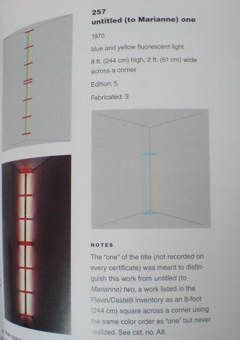
But wait, there’s more! Tiffany Bell and Michael Govan’s catalogue raisonne, Dan Flavin: The Complete Lights, lists the work, Untitled (Marianne) 2 [which is how it’s actually signed] only in the Appendix, as a “companion” to Cat. 257, Untitled (Marianne) 1, which was shown in Flavin’s October 1970 show at Castelli. Three of the declared edition of five were fabricated. One is in the San Diego Museum of Contemporary Art’s collection, and has been widely exhibited since.
Marianne 2 was listed in Castelli’s inventory, but “there is no record indicating that this work was ever fabricated.” Yet the certificates usually didn’t get made until a work was sold. And there are plenty of examples of works in the main CR which were nevertheless not fabricated.
And Christie’s says the work was “Executed in 1972.” And, I guess unsurprisingly, the auction house doesn’t mention The Complete Lights and omits the usual “Literature” recitation at all. [Not that I think there’s anything nefarious; the whole catalogue feels atypically ersatz. If the art market’s booming again, its excesses are not being lavished on the publications team at Christie’s South Kensington.]
Anyway, the provenance of the diagram/certificate is Galerie Beyeler in Basel, so no foolin’ around there. Except that maybe this is another situation like Giuseppe Panza’s, where the nature of the work, and the strictures on fabricating and hardware, etc. were vague or in flux, or lost in translation and never properly squared away. There were tons of unsold, hence unrealized editions in Flavin’s estate when he passed away, so maybe the notion of resale rarely came up.
Or maybe there’s more to the story of Untitled (Marianne) 2 than Christie’s or even The Complete Lights is telling. If there were more documentation about the 1972 execution of the piece, perhaps…. A story about losing the hardware, or inadvertently throwing it out, maybe how this piece had different instructions, or the practice was different at the time, or something. Anything. But so far, I’m finding nothing. Very odd, and the possibility for a, who knows, really? A score? A pass? An odd lot tomorrow.
[UPDATE: It was nice to hear from the folks at the Flavin Estate, who say that Flavin would specifically write “CERTIFICATE” on his certificates, and this is not one. It is as Christie’s presents it: a work on paper. Neither Christie’s nor the Estate provided any additional insight into the “Executed in 1972” thing, though. And re-reading the catalogue raisonne text describing Marianne 2 as being “in the Flavin/Castelli inventory as an 8-foot square” which was “never realized,” it still sounds like it had some status as a light work, not just a drawing or study. But the absence of hardware renders that moot. Except, again, for the “Executed in 1972” thing, which– Anyway, net net, it sold for just £20,000.]
Lot 3: Untitled (to Marianne II), Dan Flavin, est. £12,000 – £18,000, but really, who knows? [christies.com]
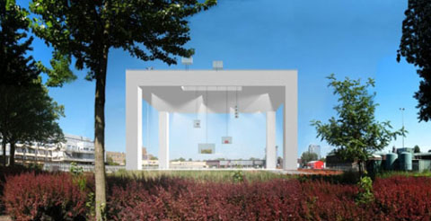
Sforzian Frontdrops, Or Just When You Thought It Was Safe To Go Back In The Bathtub
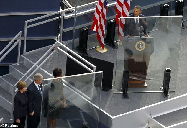
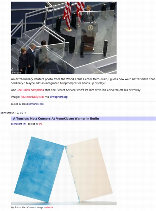
An extraordinary Reuters photo from the World Trade Center Mem–wait, I guess now we’d better make that “ordinary.” Maybe add an integrated teleprompter or heads up display?
And Joe Biden complains that the Secret Service won’t let him drive his Corvette off his driveway.
image: Reuters/Daily Mail via @wagnerblog
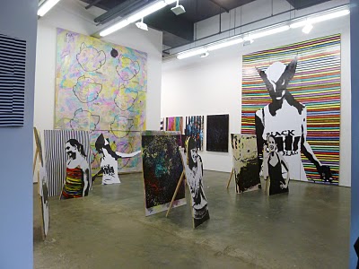
A Tension: Matt Connors At VeneKlasen Werner In Berlin

My Suitor, Matt Connors, image: vwberlin
FInally, images of Matt Connors’ show, Line Breaks, which just opened at VeneKlasen Werner in Berlin.
I’ve slowly/recently come to find his work rather captivating, and after he posted a teaser image or two of the Berlin show on his blog, I wanted to see more. Actually, I’d love to see it in person.
Second Wall for Jack Spicer, Matt Connors, image: vwberlin
It reminds me a bit, especially this large, wall-sized piece/installation, of a wonderful Rachel Harrison show I saw in Paris at Chantal Crousel in…1999? 2000? 1999. It seemed to be a situation, a year-end group show, where shipping her more typical large-scale sculptures was ruled out.
So instead, Rachel created large, wall-scale sculptural interventions on-site. I read them as slightly atypical, experimental, site-specific in ways that her work hadn’t really been before then.
When I mentioned to her how nice the show looked, she sounded glad, and a little surprised. I got the feeling that an out of town show carried a different, distanced sense of accomplishment; without the feedback or dialogue, it could seem as if it hadn’t happened.
Anyway, my rambling reminiscence was obviously not planned. It’s just that the experience shortfall that emerges from not being able to see a particular show in person can be strong sometimes, and this is one of those times.
UPDATE: “wow. we are on a total matt connors freakout here at the rolu studio.” Amen to that. Also, RO/LU has the pictures from Matt’s other Berlin show [!] at Luettgenmeijer. More great painted prop works.
Line Breaks, Matt Connors, through 22 October [vwberlin.com]
also, another show I’m missing. BUSY : Matt Connors, “You’re gonna take a walk in the rain and you’re gonna get wet,” at Luettgenmeijer through Nov. 5 [luettgenmeijer.com]
Matt Connors at Canada [canadanewyork]
A Photomural On Governors Island
It was the other night, while Googling around for Tris Vonna-Michell info, that I found my way back to Carefully Aimed Darts, an awesome art-related weblog which went dormant about a year and a half ago. And I remembered how the very well-(in)formed writing had always left me wondering who was behind it. I’d go to openings or other art world gatherings and try to imagine meeting the writer behind CAD and not knowing it. Maybe I have, who knows?
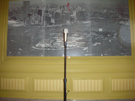
Anyway, it turns out CAD had carefully aimed his/her camera at the microphone in Pershing Hall, on the Manhattan-side tip of Governors Island, where Vonna-Michell had performed in 2009 as part of a Creative Time show.
And there was this wonderful, slightly frayed-at-the-edges photomural of an aerial view of Governors Island, with lower Manhattan filling the top of the image. Judging by the state of the landfill beach that would become Battery Park City, I’d guess the photo was taken in the mid-1970s.
Tris Vonna-Michell: History-Telling [carefully aimed darts]
On Vern Blosum At MoMA
“You cannot imagine how happy I was to read your email.”
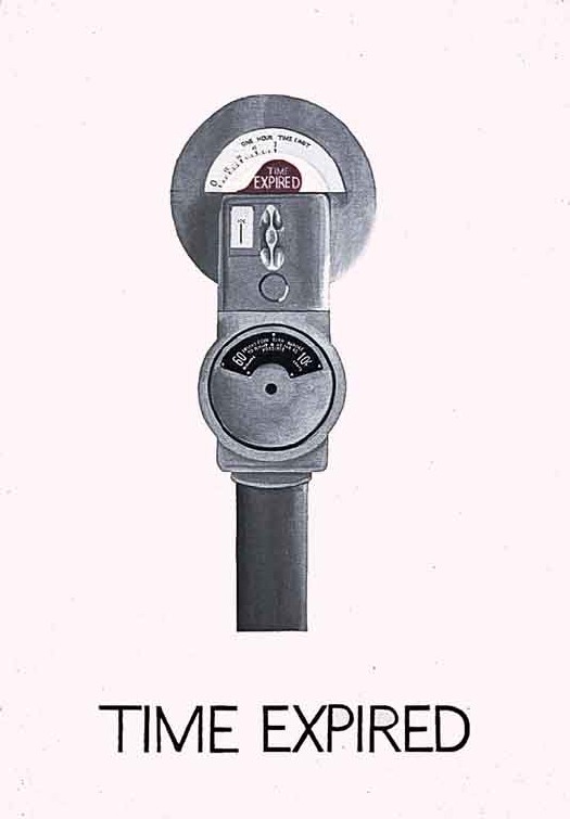
That was the almost-immediate reply to my request to stop by MoMA’s Painting & Sculpture department to discuss Vern Blosum and to review the collection file for Time Expired, the 1962 parking meter painting the Museum acquired in early 1963, just as Pop Art was evolving.
When we met a couple of weeks later, Mattias, who managed P&S, told me that the Vern Blosum mystery had been nagging the department for years. And he wasn’t kidding.
Shortly after the painting came into the collection, questions and rumors arose about its creator. Which I’ll get to, but which were apparently answered well enough for Time Expired to go on view, and repeatedly, through the 1960s. As I mentioned last spring, as late as 1967, the NY Times was reporting on visitor questions which the museum would forward to the artists to be answered. Blosum replied that his parking meters formed “a series of time paintings culminating in a giant expiration.” Which strikes me as a very conceptual, 1967 thing to have painted back in 1962.
But that’s the last mention I’ve been able to find. It doesn’t appear that Time Expired has been shown at the Modern since the late 60s. And I expect that is because of unanswerable questions Alfred Barr and Dorothy Miller had–and that their successors inherited–about Blosum’s identity and its implications for their painting. It turns out in 1973 the museum took the extraordinary, even unprecedented step, of searching the birth and Social Security records in Colorado around the time Blosum’s bio claimed he’d been born, trying to confirm that he existed. And when they couldn’t, the painting went into some kind of archival limbo, a cold case file, which would periodically resurface to perplex curators and interns and archivists.
Which is all kind of amazing, when you consider where the Blosum came from in the first place: Leo Castelli Gallery.
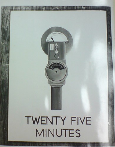
Vern Blosum: Famous For 25 Minutes
So, my mind is kind of blowing because Vern Blosum is in a show opening tomorrow.
Blosum’s work was included in some of the very first exhibitions of Pop Art in the early 1960s. His deadpan paintings of objects from New York City life: parking meters ticking down in five minute increments, like proto-serial art, were acquired by some of the most influential collectors of the day. Thanks to an emerging artist fund set up by Larry Aldrich, MoMA acquired a large Vern Blosum painting in 1963, which was regularly on view for many years.
And then he disappeared. No work, no shows, no nothing. I came across Verne Blossum [not sic] almost two years ago now, when his work Violation ran next to Warhol’s in the Washington Post’s March 1963 preview of Alice Denney’s pioneering show, “The Popular Image.”
Then I found the MoMA painting, Time Expired, and started digging.
I’m going to cut to the chase here and reveal that I have found Vern Blosum. I have met Vern Blosum. And I have seen Vern Blosum’s work in person. And his story is utterly fascinating. As you may have intuited from the varied spellings as early as 1963, Blosum’s own identity has been as much in flux as the history of Pop Art itself once was.
It’s taken a while, and a fair amount of research, and negotiating, and puzzling, but I think it’s alright to go ahead and tell Blosum’s story now. Or at least to tell my story with Blosum, because the artist is still alive and working, and should have the prerogative of defining his own body of work.
Meanwhile, the immediate trigger for this post is an intriguing show that opens in Los Angeles tomorrow, timed to the Pacific Standard Time events. Cardwell Jimmerson in Culver City has put together “Sub-Pop,” a survey of early, “non-famous” Pop artists. These are folks who featured prominently in the first draft of Pop’s history, and who were included in Walter Hopps’ and John Coplans’ formative Pop exhibitions.
In “Sub-Pop,” according to the gallery’s statement,
the smug success sotry of Pop Art is replaced by a somewhat more poignant “failure” story, that loaded word defined in the reductive sense bequeathed us by Warhol as simply, “the failure to become famous.”
While researching their show, the gallerists contacted me about Blosum [his West Coast spelling], and we were able to track down the Blosum painting that John Coplans had shown in “Pop Art USA,” which he curated in 1963 at the Oakland Museum.
To get my own Blosum saga caught up, I’ll start tonight with a post about MoMA’s painting. And then next week, I guess, I’ll tell about tracking down Blosum, and meeting him, and seeing his work. Because I think he’s more than just an amusing story, or an overlooked artist; he and his work occupy a remarkable moment–and an important space, however tiny it may seem right now–in the history of contemporary art.
I, For One, Welcome Our Black Mirror-Wielding Motion Control Camera Overlords
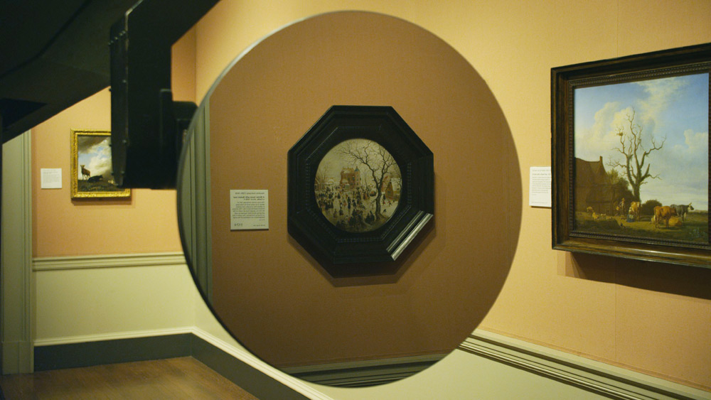
So you should really read Daniel Kasman’s review of the Venice debut of Mark Lewis’s awesome-sounding short film, Black MIrror At The National Gallery, because Kasman is sensitive to both the tone and surprise/reveal of the film in a way that the official synopsis, oddly, does not.
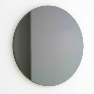
But if you’re not going to read either of those, I’ll just say it sounds like Russian Ark meets 2001, with the Marquis de Custine replaced by Martin Szekely’s silicon carbide “Black Sun” mirror, the Hermitage replaced by the National Gallery, and everyone and everything else replaced by Hendrick Avercamp’s Dutch Golden Era tondo A Winter Scene with Skaters near a Castle.
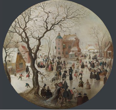
Sounds awesome.
Venice 2011. Art Is Terror from Any Other Angle [mubi.com]
Orizzonti – BLACK MIRROR AT THE NATIONAL GALLERY – MARK LEWIS [labiennale.org]
Miroir- Soleil Noir, 2007 [galeriekreo.fr]
Avercamp’s A Winter Scene with Skaters near a Castle, 1609 [nationalgallery.org.uk]
Henry Billings Strafing Paintings
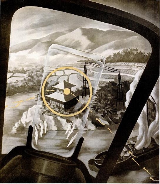
Another inadvertent Google find, also from the World War II School of propaganda art. In anticipation for an invasion of Japan, 1945 LIFE Magazine wanted to give the general public a fighter pilot’s-eye view of ground attacks.
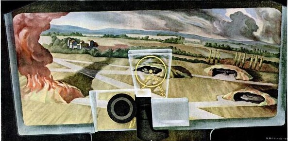
Perhaps because actual combat photos were deemed too sensitive or otherwise unsuitable, the magazine asked artist Henry Billings to create a series of strafing attack paintings.
Noted before the war for his machine age-themed murals, Billings’ characteristically mild-mannered modernist/precisionist landscape style goes uncommonly well with the scenes of destruction from the air.
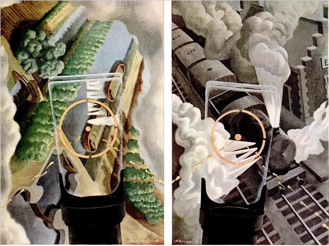
But the most prominent thing in the images, no matter the sometimes dizzying orientation of the earth itself, is the central fixity of the P51 Mustang’s reflective sight. A technological advance that only rolled out during the war itself, the gunsight’s half-mirrored glass panel meant the pilot could maintain his fix on his target without lining his eyes up directly with the line of fire. It’s an interesting perceptual concept to try to capture in a traditional landscape painting.
I don’t know what happened to Billings’ art career, but his posthumous market is pretty weak, with paintings and drawings selling in the low hundreds of dollars. [Oh, with the exception of this nice precisionist boatyard panel. Wow.] No word on the fate of the strafing paintings, though.
Ground Strafing – LIFE June 30, 1945 [google/life]
The Greatest Photomural Ever Sold
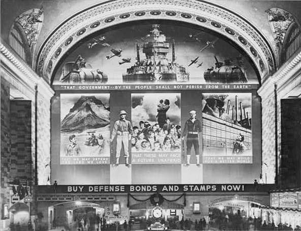
Instead of jumping to the first search result, Google’s “I’m feeling lucky” button should go to something tangentially related but certifiably awesome and probably better than what you were looking for in the first place. For the first datapoint in fitting that algorithm, I submit this post from The Bowery Boys about the “World’s Greatest Photo-Mural,’ as proclaimed by the New York Herald upon the dedication on December 14, 1941 [!] of the Defense Bonds Mural in Grand Central Terminal, New York City, USA.
At 96×118 feet, and covering the entire eastern wall of the station’s Great Hall, it was certainly the world’s largest photomural to date. [Only an Axis appeaser would point out that it’s actually six photomural elements installed in a larger, non-photographic composition.]
The mural was created by the Farm Security Administration’s Information Division, the legendary New Deal documentary photography propaganda unit run by Roy [no relation to Ted] Stryker. The three main photocollaged panels depicted what America was defending: Our* Land, Our* Children, and Our* Industry. [* Offer apparently not valid for non-white Americans, as the NAACP pointed out in protest letters to the FSA.]
Classic racial exclusion notwithstanding, I was most amazed that a giant war bonds photomural in Grand Central Station was the government’s instant response to the attack on Pearl Harbor. And I was also wrong. According to a contemporary report in Time Magazine, the FSA photo staff spent three months designing and fabricating the massive photomural. Which should be evidence enough for the conspiracy theorists who suspected that Stryker and his puppet FDR had been planning to get the US into war all along. But it turns out the Treasury Department had already begun its defense bond campaign in 1940, and that the government marketing masters at the FSA had already been enlisted in Treasury’s bond-selling campaigns.
Which seems odd, that a Depression-era tenant farmer resettlement program would morph into a historically ambitious documentary project for rural America, and then into a war bond marketer, before becoming the military propaganda operation for D-Day. Odd until you hear Stryker’s longtime assistant Helen Wool describe Stryker’s vision of the FSA’s photographic mission in a 1964 interview for the Smithsonian:
[I]n that drastic difference he still stuck to the same type of basic idea, that America is America and that’s all there was to it. We had psychological warfare films, and we had displays, and we had defense bond things, and everything else. But, underneath it he was selling America as it should be sold. [emphasis added because, obviously]
So what does the 3-months making of the world’s largest photomural entail? Fortunately, the snap-happy photographers at FSA like Edwin Rosskam and Marion Post Wolcott documented the process, in a group of 53-70 images now at the Library of Congress:
This Weekend In Awesome Twitter Juxtapositions

I admit, after I saw the pair of Chucks, I was just waiting, pretty sure I’d get a post out of it no matter what. So kudos to Anil, who tweets quality.