
A digitized collection of vintage NASA Goddard Space Flight Center newsletters led me to the June 23, 1963 issue of LIFE Magazine. If it were possible for any photo of a Project Echo satelloon to be slightly less than awesome, this photo would move forward to be the awesomest:
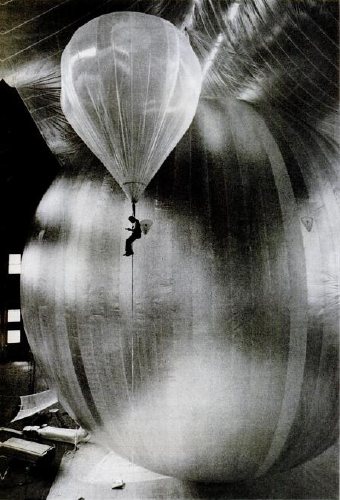
It’s a technician inspecting for leaks during a test inflation of the Echo II at Lakehurst, New Jersey, which was long the Navy’s site for giant inflatable vehicles. From the 1930s construction photos of the massive dirigible hangars to the parades of Navy blimps during WWII, the “Lakehurst” is a stealth candidate for awesomest single search term Google’s LIFE Magazine image archive. Unfortunately, this photo is not included. I’d love to find it, though; someone deserves a credit.
Here’s one of the same test, only there’s no location, and it’s misdated. credit: NASA. And it’s public domain. Here’s one of the first ever photos of an Echo satelloon; famous LIFE photojournalist Grey Villet took it while standing next to the antenna used to bounce the first radio signal off Echo I in 1960.

All of this is related to my master plan to show a satelloon as an art object, sure, but it’s also precipitated by NASA’s latest, the Bullet 580, dubbed, depressingly, “the world’s largest inflatable airship,” which was test inflated last weekend. At 235 feet long and 65 feet across, it practically fills the Garrett Coliseum in Montgomery, Alabama [below]
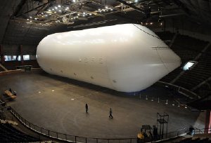
If there were a clearer sign that Our Nation has lost its way in the field of Giant Balloons And The Buildings That Hold Them, I can’t think of it. A sad, sad day. [images: George Strock/LIFE; AP]
‘No Artists Were Paid In The Making Of This Commercial’

The ad’s been running for a while now, but Jean just spotted this disclaimer at the end of AT&T’s “Blanket” commercial last night: “The artists Christo and Jeanne-Claude have no direct or indirect affiliation or involvement with AT&T.”
I will assume they tried to contact Christo by calling him on his iPhone, but they got cut off.
AT&T Rethink Possible – Blanket Commercial [search youtube if the link is broken]
Previously: The Gates Bill
Please Go To Philoctetes Tonight And Tell Me How It Was
My buddy John Powers has been working on this insane project forlikeever: an artists commentary track–with pictures!–that runs alongside Star Wars IV. Tonight he’s presenting it at Philoctetes, and discussing it along with Colby Chamberlain and Luke duBois, who’s made a sick score.
I’ve seen pieces Star Wars and Modernism: an artists commentary emerge in pieces over the months, but tonight’s the first time a big section of it will be screened large, and in public. I’m very jealous of all those who can make it out there tonight:
Star Wars and Modernism, an artist commentary conceived and directed by artist John Powers, explores the original 1977 science fiction film as an object. Juxtaposing video with film stills and historical archives, Powers creates a compelling argument that the visual program of the blockbuster can and should be understood in terms of the art, architecture, and politics of Cold-War America. An essay by Powers published in Triple Canopy, with important editorial contributions by Colby Chamberlain, was the genesis of the project. Composer Luke DuBois created the film’s original score.
Koons Makes Art The Old-Fashioned Way

I think we all know that Jeff Koons worked on Wall Street before he became an artist. It’s mentioned in many of his profiles. But what, exactly, did he do? And what relevance, if any, does it really have for his work? And on the reception of his work?
Ben Davis provides a perfect example of this bio-factoid-as-analysis in his ambitiously thoughtful unpacking of the aftermath of postmodernism:
Unprecedented new wealth, a more mercurial environment of speculation, the celebration of individualism brought on by the attack on the welfare state, demoralization and fragmentation — all these form the background for the artistic vocabulary of “postmodernism.” I mean, jeez louise, Jeff Koons actually started out as a commodities trader!
In her 2005 book, Understanding Interational Art Markets and Management, Joan Jeffri wrote that “Jeff Koons gave up his job as a trader of cotton futures on Wall Street to become an artist.”
But the Wall Street connection is not just used to bolster theoretical arguments, or to connect with middle-managers; it’s definitional to the art itself.
Magnasanti vs. Slave City
Holy smokes, this is so incredible. Vincent Ocasla beat (sic) Sim City by spending three years designing and building Magnasanti, a six million person city that runs flawlessly (sic, again, obv) for 50,000 years. The YouTube video is ominously awesome.
It reminds me of Joep van Lieshout’s creepy totalitarian project, Slave City. I’ll find some links when I get off this blog-hostile iPad.
Originally called Call Centre, Van Lieshout began designing Slave City, a theoretically self-sufficient, eco-neutral, and highly profitable city of 200,000, in 2005. Reg wrote about Slave City on the occasion of Tim Van Laere Gallery’s 2006 show. If I remember correctly, Joep talked about Slave City a lot during his 2007 Tate Artists Talk.
Slave City itself is a little reminiscent of Pig City, the provocatively dystopian proposal to concentrate the Netherlands’ sprawling pork industry into highrise farms, which was floated in 2000 by Joep’s Rotterdam neighbors, MVRDV.

This is how we end up building The Matrix, people; one cautionary-but-a-little-too-enticing concept study at a time.
interview with Ocasla: the totalitarian Buddhist who beat Sim City [viceland via @jadabumrad]
If You See Something, Say Something
Do you find yourself wanting to talk about Group Zero, but the only names you can pronounce are Fontana and Klein [and Westwater]? Do you ever call galleries you’re about to walk into, just to hear them say the artist’s name? [I just asked at the desk, it’s von HILE.]
You may be suffering from Gigli Syndrome, a condition where you avoid saying an artist or designer’s name because you’re not sure of the pronunciation. Bennifer can’t cure all possible outbreaks of Gigli Syndrome, any more than Nomi Malone could inoculate us against the dangers of unknowing mispronunciation, Versace Syndrome.
After typing [well, cut-n-pasting] 0100101110101101.org yesterday morning, I realized a universal cure to either condition is impossible. Americans will never switch to Van Gohchhhh, and Thaddeus Ropatch may never give you more than 10% off, but that doesn’t mean we shouldn’t do all we can to treat and prevent.
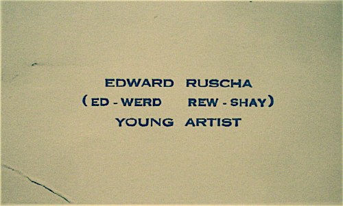
So inspired by my friend Sam, who once helped me avert disaster at Lever House [it’s A-B Rosen, not Abby], and as a tribute to the young artist who once printed up business cards reading, “Ed-werd Rew-shay”, here is a quick roundup of high-risk artworld names and their correct pronunciations by curators, interviewers, and even the artists themselves:
- 0100101110101101.org: zero-one-dot-org [thx their dealer @magdasawon, pronounced sah-vawn, btw]
- Eija-Liisa Ahtila: AY-ya-lisa AHH-tilah [youtube]
- Richard Anuszkiewicz: AN-ehs-KAY-vitch [mike wallace via youtube]
- Giuseppe Arcimboldo: Arch-im-BOLD-oh [washpost]
- Kutlug Ataman: KOOT-loo ATTA-mun [tate channel]
- Huma Bhabha: HOO-mah BAH-bah [public art fund via youtube]
- Alighiero e Boetti: Ali-GYAIR-oh BO-etty [he was just one guy, btw. Stuck the “e” in there himself. moma]
- Carol Bove: Bo-VAY [I called Maccarone to confirm, because I’ve heard people calling her Bove (rhymes with clove) to her face, and introducing her as Bove, for literally YEARS. She is too polite and well-known to deserve this any longer.]
- Eli Broad: rhymes with road [thx @manbartlett]
- Marcel Broodthaers: ooh, a Britdown between BROAT-haus and BROOT-ers, with a bit of long O thrown in. I vote for the latter. [mk-g.org]
- Vija Celmins: VEE-ya Sell-muns [youtube thx @lucretiab]
- Chinati: Chih-NAUGHT-y, not Shih-Naughty or Kih-Naughty. [member since 1994, plus I just called and listened to their answering machine.]
- Wayne Clough: rhymes with rough and censoring stuff. [nyt]
- Dan Colen: CO-lin [via nyt]
- Bice Curiger: short for Beatrice, [Just imagine Che Guevara taking an interpretive dance class: “Be a tree, Che.” and then leave out the “a tree,” cuz you guys are tight.] Koo-REE-gare, rhymes with Care Bear [via youtube]
- Dada: Da-DAH [Marcel Duchamp and Richard Huelsenbeck, both founders of Dada, pronounced it Da-DAH at The Modern in 1961. clocktower.org]
- Walter De Maria: de Ma-REE-uh [youtube w/English accent, thanks judy]
- De Stijl: de STALE, maybe Dutch it up a bit with a little h: ShTALE [youtube]
- Marlene Dumas: Mar-LANE du-MAH [moma]
- Rineke Dijkstra: RIN-uh-kuh DIKE-stra [moma]
- Ekow Eshun, ex-ICA, current (2014) Fourth Plinth guy: Echo Ession rhymes with session [lisson gallery youtube]
- Omer Fast: Homer without the H, not Omar [via @magdasawon]
- Os Gémeos: Ose like dose, ZHEH-meh-ose [coolhunting, alt. pron.: Barry McGee]
- Joseph Grigely: Grig-lee [via hans ulrich (han-ZOOL-rick) at moma]
- Cai Guo-Qiang: Cy, like Twombly, Gwoh, long O, Tsee-ahng, somewhere between a Ch and a Ts [moma]
- Francesca von Habsburg-Lothringen: Hops-burg Lote-ring-en, though I’ve never heard the Lothringen used/said. [youtube]
- Thomas Houseago: House-ago, like it was two words. [public art fund via youtube]
- Pierre Huyghe: I say Hweeg to his face, but I almost hear Peter Eleey say Whee. [thx @analogc]
- Dakis Joannou: DOCK-iss ZHO-new [numu youtu]
- Emilia and Ilya Kabakov: KA-buh-Koff, Ka like Kat [youtube, bonus: Andre Putman: PUT like in Putin, man, rhymes with yawn]
- On Kawara: Own, as in rent-to-. Kawara is his family name, so it’s Kawara On (河原温) in Japanese. [dude, I speak Japanese. 25 years.]
- Paul Klee: Clay [thx paddy]
- Guillermo Kuitca: GYAIR-mo hard G, KWEET-kuh in Minneapolis and Buffalo, anyway. In London, they say KWIT-kah [youtube; publicbroadcasting.net]
- Yayoi Kusama: Yah-yoy Koo-saw-mah. Again, Kusama is her family name, so Kusama Yayoi (草間彌生). [me]
- Wifredo Lam: THERE IS NO L, PEOPLE, NO L!! LOOK CLOSELY. Anyway, it’s pronounced like Wilfredo WITHOUT THE L. [Italian on vimeo, thanks @aljavieera]
- Laocoön: Lay-UH-kuh-wahn, rhymes with go on. [britishmuseum.org]
- Aristide Maillol: My-yole [moma]
- Iñigo Manglano-Ovalle: In-EE-go Mawn-glawn-o O-VA-yay [though the guy at SAIC also says peda-GO-gee, so…]
- Julie Mehretu: MARE-Eh-too [metmuseum]
- Modigliani: Mo-DEE-lee-Ah-nee [metmuseum via youtube]
- Laszlo Moholy-Nagy: LAZ-low rhymes with Hasbro, Moley as in holy, Nazh, like gnaws, with a zh on the end [german youtube, but you get the idea. update: But the artist and his family also accept the Americanized “nadgie” new idiom]
- Vik Muniz: Moo-NEES [5min]
- Edvard Munch: Moonk [thx paddy]
- Albert Oehlen: Uhrlen, classic umlaut O [moma]
- Maja Oeri, of the Schaulager: Ury, like Early without the “L”; Show- like shower and lager like beer. moma]
- Meret Oppenheim: Merit [moma]
- Francis Picabia: Pih-CAW-bee-uh [moma]
- Otto Piene: PEEN-uh [german youtube]
- Fondazione Sandretto Re Rebaudengo: Ray-Ray-bo-DANG-go, a little like Bojangles [italian youtube]
- Gerhard Richter: For Americans, it’s like the scale. For the Teutonically inclined, go ahead and let’er rip, GAIR-haht REESH-tah [gerhard-richter.com]
- Gerrit Rietveld: two R’s, one T, people. REET like street, feld, like fell down the stairs. [dutch youtube, thanks craig]
- Dieter Roth: Rote [german youtube]
- Edward Ruscha: “(Ed-werd Rew-shay)” [walkerart.org and colette.fr thx @valeriemargolis]
- Anri Sala: ON-ree SAHL-LAH [google video]
- Yinka Shonibare: YEEN-kuh SHOW-nih-Bar-eh [tate channel]
- Alec Soth: rhymes with both [youtube, thx @jenbee]
- Sperone: Spare-ownee [just call, you’ll see]
- Thomas Struth: [SHTRoot, he has never corrected me, but that’s how he says it at the Met]
- Alina Szapocznikow: Ah-LEE-nuh Shah-POTCH-nick-off [UPDATE: this moma audio has it as POTS, but thanks to Rachel Wetzler, we learn that the ‘cz’ combo in Polish is pronounced “CH”, like chalk. cf. a Polish curator’s youtube video. To practice hearing the difference, please listen to this 4-hour symposium at MoMA. Thanks Rachel and thanks Andrew for the suggestion]
- Thyssen-Bornemisza: Tissen BORN-uh-Meesa [youtube]
- Rirkrit Tiravanija: Hans Ulrich says Tier-uh-vah-NEE-juh, and Rikrit says TEER-uh-van-EET. So maybe there’s a reason people just say Rick-rit. hans ulrich at moma; studiobanana.tv]
- Günther Uecker: GOON-ter OO-ker, like a clipped booker [german youtube]
- Ulay: OO-Lie, as in, “Ooh, lie down naked with this skeleton on top of you for eight hours.” [that’s how Marina prounces it, anyway]
- Joep van Lieshout: Yoop fawn LEASE-howt, [dutch tv, whoops, I’ve said van lees-hote to his face, too]
- Danh Vo: Yahn, it’s a “Vietnamese soft ‘d’. [ex. Talking at Walker Art Ctr, via youtube]
- Apichatpong Weerasethakul: A like apple pih-CHAT like room pong WEIR like weird -uh-suh-THA like Thatcher cull like a herd [cannes 2010 press conf]
- Susan Weil: Vay, “like Simone Weil” [Rauschenberg Fndn oral history, page 1] UPDATE: When I met her and mentioned this, she was like, “No, it’s Vile, “like Simone Weil,” and I was like, “Sounds good to me!” So I think it is Vile like Susan Weil.
- Ai Weiwei (艾未未): Eye way way, family name is Ai [paleycenter.org]
- Rachel Whiteread: reed, not red [moma]
- Witte de With: VITT-uh de VIT [dutch youtube]
- David Wojnarowicz “(pronounced voy-nah-ROH-vitch)” [PPOW, his dealer since 1988]
- Lisa Yuskavage: Yuh-SKA-vedge, sounds like savage [youtube, thanks john]
Some build on each other; once you know Bas Jan Ader [Boss Yan Adder], you can do Jan Dibbetts, Jan Schoonhoven [Skoon-ho-ven], Christian Jankowski [Yan-KOFF-ski], and so on. If your favorites aren’t on the list, please feel free to send them along.
Chip Of Fools
Washington Post art critic Blake Gopnik commenting on the tiny chip of porcelain Eva and Franco Mattes, the formerly anonymous artists behind 0100101110101101.org, reportedly took from one of Marcel Duchamp’s urinal sculptures:
In the case of Duchamp’s “Fountain,” could it be that the Italians are actively helping his art do its work? The Duchamp urinals we now see in our museums are visibly handcrafted replacements for his mass-produced industrial original, which disappeared early on. By pawning off a piece of handicraft, made by a hired artisan, onto his collectors, I think Duchamp was poking fun at any fool who insisted on getting an “original” Duchamp, instead of heading to their neighborhood plumbing supplier. The chip of porcelain in “Stolen Pieces” is an extension of Duchamp’s chipping away at precious art and its status as collectible commodity.
Ah, um, no.
Actually, as has been reported recently by no less august a source than The Economist, Duchamp’s Fountains replicas include two or three actual, vintage urinals Duchamp signed, showed, or sold; and somewhat more than twelve which were cast, just as porcelain is, from a clay sculpture [aka “the prototype”] made from Arthur Stieglitz’s photo of the “original.”
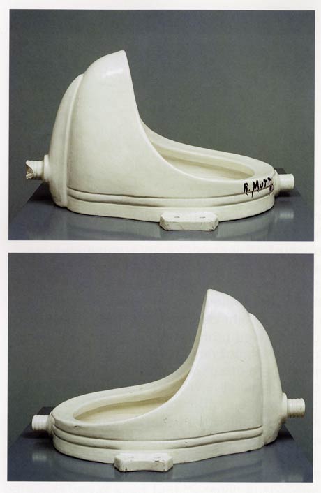
16 are included in Duchamp’s catalogue raisonnee, including the lost original and a presently lost 1953 reproduction, but not including the prototype or the additional casts Duchamp’s dealer Arturo Schwarz apparently made and has been shopping around privately.
Now to Gopnik’s fools. Here is a list, as compiled by Cabinet Magazine in 2007, of traffickers and current owners of Fountain:
- The Philadelphia Museum of Art
- Moderna Museet, Stockholm
- San Francisco Museum of Modern Art
- Tate Modern, London
- National Gallery of Canada, Ottawa
- The National Museum of Modern Art, Kyoto
- Dina Vierny Foundation– Maillol Museum, Paris
- Indiana University Art Museum, Bloomington
- National Museum of Modern Art, Pompidou Center, Paris [which has been both pissed in and attacked with a hammer since the Matteses’ own assault]
- The Israel Museum, Jerusalem
- National Gallery of Modern Art, Rome
- Duchamp dealer and MoMA trustee Sidney Janis
- Duchamp dealer and edition publisher Arturo Schwarz
- Larry Gagosian, who sold one to its present owner
Three are in private collections, not including Schwarz’s extras. The prototype was sold to Andy Warhol in 1973. Dakis Joannou purchased it at Sotheby’s auction of Warhol’s estate in 1988. In case you couldn’t tell, that’s the prototype up there, glazed and signed just like the rest of them.
Which ones of these does Gopnik consider fools and the butt of Duchamp’s joke? The Moderna Museet, whose Fountain was donated at Duchamp’s request? Or the Philadelphia Museum which, thanks to the Arensbergs, indefatigable Duchamp collectors and supporters for decades, now houses the largest collection of the artist’s work in the world, and which was secretly chosen by him as the posthumous recipient of his elaborate, last work, Étant donnés? All the rest? Or just all of them?
update:At AFC, Paddy has a great 1961 quote from Duchamp about his object selection criteria. Me, I unfortunately started my period commentary search in the 1973 Duchamp retrospective catalogue by Anne d’Harnoncourt and Kynaston McShine. But so far, it’s really thin. So much effort appears to be devoted to his surrealism and his traditional works: drawings, etc., that really strike me as uncompelling. Funny what a couple of generations of soaking in interpreted Duchampisms will do to a discourse.
Anyway, my point, I hope it’s clear, was not just to harsh on Gopnik, but to correct what I believe to be an inapt and unsupported claim that Duchamp considered buyers of readymades (et al) “fools,” or that they didn’t know what an “original” meant in the artist’s context. Just consider how many boites en valise he published. I’m happy to be set straight, but I believe that Gopnik doesn’t have a clue that he’s basically implying that Duchamp’s entire object-based oeuvre is a prank–which the leading museums of the world have apparently fallen for for fifty+ years.
The Civilian Camouflage Council
December 1942, the US is at war, and everyone is tinkering in his basement, doing his part to protect the civilian and industrial landscape against the latest technological threat: aerial photo reconnaissance. From a lengthy, fascinating article in Popular Mechanics:
But today civilians around the world, particularly in the United States where the home workshop abounds, are beginning to do what nature forgot: fooling the spy in the sky with camouflage. A recent estimate indicates that more than 5,000 civilians have taken up camouflage research as a serious occupation.
That number did not include the teams of artists and theater designers and architects at various museums, or much of the art and design departments at Pratt, where dean James Boudreau could be seen demonstrating Pratt’s “sun machine,” which “duplicates sun-shadow conditions at any given moment of the year”:
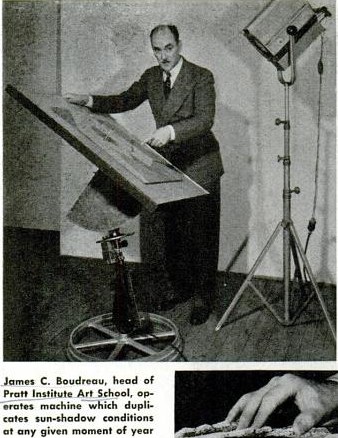
“Since military camouflage is well in hand,” Pop Mech said reassuringly, and while “the government has not yet completely coordinated local civilian camouflage efforts,” the field is “wide open to patriotic and inquisitive minds.”
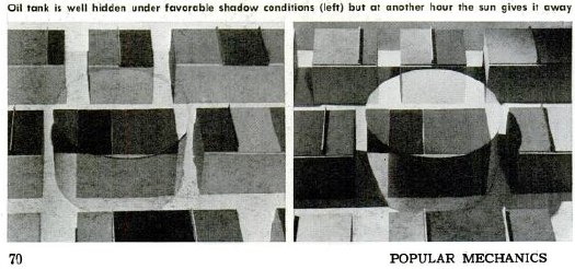
There followed a primer on basic camo strategies–including Dazzle painting–shadow and lighting, and photo mapping, all illustrated with photos of people photographing painted and sculpted models as if from the air.
Though they were namechecked, the groundbreaking, eerily prescient work of New York’s Civilian Camouflage Council [!] went unremarked.
Founded by Long Island architect Greville Rickard, the CCC had, with Pratt’s Boudreau, organized an exhibit of industrial camouflage designs at the Advertising Club, which opened December 8, 1941. In Dec. 14 review of the show titled, “Art In A Practical Service To War,” the NY Times’ Edward Alden Jewell said,
This is a show that every one should see. It illustrates vitally important defense methods as applied to needs that are immediate all over this country. A fortnight ago such needs might have been looked upon by the public as remote and more or less theoretical. Such is the terrible swiftness with which events have moved, they must now be recognized as of prime consequence.
Jewell then went on to discuss shifts in camouflage as they related to art history:
The progress of the art of camouflage in, say, the last three decades seems not altogether unrelated to certain “key” phases in the development of painting and sculpture. As I understand it, principles oof Impressionism and even of Cubism were examined and to some extent adapted to the uses of the camoufleur during the last World War. But in contradistinction to this trend, teh present trend parallels what in art parlance we designate as Naturalism. It may be said that in the year 1941 camouflage, whether industrial or strictly military, goes with marked singleness of purpose “back to nature.”
The show also included contributions from Stanley McCandless, then at Yale, who is known as the father of modern stage lighting.
In August 1942, the CCC-sponsored Pratt exhibit had been combined with military material and restaged at The Museum of Modern Art. Organized by The Modern’s Carlo Dyer, “Camouflage in Civilian Defense” was one of at least eight war-themed shows The Modern organized and sent on tour in 1942. Doing its part to beat back isolationism!
Fooling the Spy in the Sky, Pop Mech Dec. 1942 [via google books]
One Makakai, Acrylic Pressure Hull, Shipped, Please
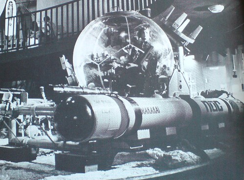
I saw a citation in a footnote somewhere, but in the three weeks it took for the Design Review: Industrial Design 23rd Annual, 1977, to arrive, I’d completely forgotten why I’d ordered it.
No matter, this insane image of a Makakai deepwater transparent hull submersible (THS) is worth the $2+shipping.
There’s a lot less info online that I’d expect for such an awesome-looking rig, but according to Globalsecurity.org, it was developed at the Naval Undersea Research And Development Center [NURAD?] in San Diego:
Two standard spherical hull designs were available; (a) 66 inch outside diameter and 2.5 inch thickness for 600 ft. operational depth and (b) 66 inch outside diameter and 4.0 inch thickness for 1000 ft. depth. The hulls were fabricated by adhesive bonding of 12 thermoformed spherical pentagons, two of which incorporate metallic hatches.
I’ve just added it to my military industrial geodesic sphere government surplus save search list on eBay. Competing bidders, be warned.
Deep Submersible Rescue Vehicle [globalsecurity.org]
‘Mock Fuselage On Stilts’

First up, let me just say these are fantastic; I would love to see this row of bombardier training simulators parked in any gallery in the world, right next to Chris Burden’s homemade B-Car.
But then you’d have to ask The Question: a full year after Pearl Harbor, and this is really as far as we’d gotten? If all you had to go by was the pages of Popular Mechanics, you’d have to conclude the US’s entire wartime response consisted of scale models, plywood mockups, and canvas bombers on rolling stilts.
Bombardiers Train in Mock Fuselage On Stilts, Popular Mechanics, December 1942 [popmech via google books]
Non Realizzate: Proposta Per Un’Auraprogettazione
Apex Art just announced that Courtenay Finn and Gary Fogelson were selected for this year’s open curating slots. Finn’s proposal uses a work by Bruce Nauman as a jumping off point for a show about “the role of reading in artistic practice.” Fogelson’s will tell the incredible-sounding history of alternative, arts, and experimental filmmaking shown in the 1970s on Boston’s WBBI TV. Congratulations to both of them, and get cracking, time’s a wastin’!
I’d had an idea for a show percolating for a while, so I submitted it. As I re-read it now, it’s fascinating how much of it is stuff I’ve blogged about over the last couple of years. In a real sense, the blogging process was central to the development and coalescence of the show’s ideas, if not for the actual proposal, which I wrote up and submitted anonymously, as Apex Art requires.
It tied for 45th place out of 320 entries. 86th percentile, which is alright, I guess, in a B-show kind of way.
Anyway, it was inspired, as the title suggests, by Enzo Mari. It challenges the common conception of aura by applying Mari’s autoprogettazione reproduction strategy to instructions-based art practice.
And because it also includes references to the great gatherer of Unrealized Projects, Hans Ulrich Obrist, I thought I’d go ahead and share my proposal here. If you’re one of the 40 international, anonymous judges who rated it less than 4/5, I do hope you’ll drop me a line and tell me what might have improved it for you.
Many thanks to those folks who gave me feedback and art historical suggestions on the idea as I was putting it together, too. I don’t want to sound namedroppy–until we polish this bad boy up and put on this jargon-laden, Stingelpainting party somewhere else, then I’ll be thanking you often and loudly, I’m sure.
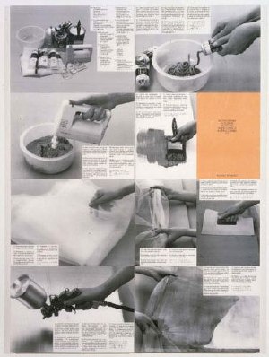
Proposta per un’auraprogettazione
A project for making easy-to-assemble furniture using rough boards and nails. An elementary technique to teach anyone to look at present production with a critical eye. (Anyone, apart from factories and traders, can use these designs to make them by themselves. The author hopes the idea will last into the future and asks those who build the furniture, and in particular, variations of it, to send photos to his studio…) – Enzo Mari, Proposta per un’autoprogettazione, Duchamp Center, Bologna, April 1974
Walter Benjamin’s concept of aura is commonly understood as a quality that distinguishes an original art object from its mechanical reproduction. Recent alternative readings [Samuel Weber, 1996], particularly of cinema–Benjamin’s archetypal medium of modernity–consider aura as something not lost in (re)production, but instead contingent upon it. Aura is generated through contextualized reception via dispersed, multiple ‘originals,’ as literary or musical aura is transmitted via books and scores.
When coupled with Benjamin’s functional reconfiguration of the distinction between author and reader [“through a highly specialized work process…the reader gains access to authorship”], production of an auratic artwork at a [spatial/temporal] remove from the artist herself becomes feasible. The instruction performs such a distancing function.
From Moholy-Nagy through Lewitt, artists have used instructions and plans to challenge the privileging of gesture and authorship. The emergence of Conceptual art saw the concurrent normalization of instruction-based practice and the “dematerialization of the art object” [Lucy Lippard, 1973].
Lippard’s own seminal exhibition 557,087 (Seattle, 1969) was executed remotely using artists’ instructions, which comprised the show’s catalogue. Similarly, Do It (1993-) an ongoing exhibition/archive by Hans-Ulrich Obrist, solicits, executes and disseminates instructions from contemporary artists. [“With Do It in hand, you will be able to make a work of (someone else’s) art yourself.”]
Despite their critique of object/market complicity, instructions are regularly sublimated by capitalist constructs [i.e., editioning, certificates of authenticity] that reassert control and facilitate commodification.
Authorization thus emerges as a crucial and highly contested point of inflection/exchange for instruction-based work. Only five of 168+ instructions in Do It generate objects. One, a Felix Gonzalez-Torres candy pour (1994), was problematized when the artist’s catalogue raisonné [Cantje, 1997] reclassified it as “non-work” and reconfigured fabrication authority only for Do It‘s curators, not its audience.
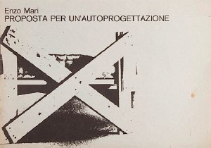
A more conceptually robust corollary is art that applies a model exemplified by the Italian designer Enzo Mari, whose 1974 exhibition/catalogue, Proposta per un’autoprogettazione, (Proposal for a self-project) included not just blueprints for making 16 pieces of furniture, but explicit authorization to do so.
Mari’s autoprogettazione structure synthesizes Benjamin’s potential for multiple, auratic originals with the critical empowerment of readers-qua-authors, consumers-qua-producers, viewers-qua-artists.
Auraprogettazione will be the first ever survey of this distinctive, exceptional genre: auratic objects, fabricated by whomever, in accordance with artists’ published instructions and authorization. Preliminary research has identified consonant works–painting, sculpture, photography, assemblage, clothing–by at least eleven artists: Daniel Buren, Jan Dibbets, Stephen Kaltenbach, Lia Maisonnave/Ciclo de Arte Experimental, Yoko Ono, Tobias Rehberger, Rudolf Stingel, Joep van Lieshout, Franz West, Zhuang Da, and Andrea Zittel.
Alongside the ‘originals’ exhibition, the gallery may be activated as a site of open, facilitated art production, or as an aggregator/repository of audience-made originals. Additional artists may be solicited to create new, permissioned, instruction-based work. And as with Mari’s original, Auraprogettazione‘s publications in print and online will propagate instructions for the exhibited works.
Beckstrand Lodge, 1950
I saw the mention while searching for something else, shocked that I’d never heard of it:
“Beckstrand Lodge, UT, 1950”
A quick search, and there’s no information, no photos, no documentation, no nothing.
Some fruitless Google Map surveying, then some offline inquiries, and sure enough, whatever piece of land was called 60 years ago, it’s not called that anymore on any official records.
So I called a couple of people whose jobs–really, I’d think it’s their job to know this kind of thing. One charged me $10 to tell me what I already knew [see above]. The other thought it was an April Fool’s Day joke. So I began researching myself.
Dr Grant Beckstrand, noted oncologist, and his wife Mildred had a house in Palos Verdes, built in 1940, but it turns out he’d been born in Utah. And you know how it goes: you can take the boy out of Utah… So they built a little place to use for hunting.
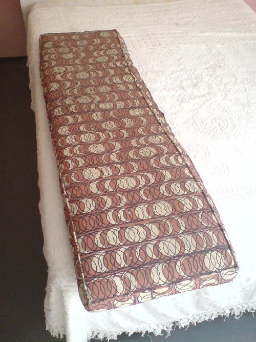
The current owner remembers it being built, though. Said that back then, no one in the county had money to build anything at all, much less a vacation home, complete with imported Italian cork tiles:

The Beckstrands passed away without any kids. They set up the Beckstrand Cancer Foundation with their money. The lodge changed hands a couple of times, but it’s settled down, pretty much as it was, same as the Beckstrands left it, right down to the cushions:
And curtains:
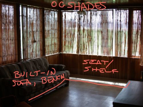
An elderly man from a nearby [sic] town, run out of money, moved in for a couple of years. Helped keep the place up, but had a hard time with the built-in sofa in the living room, so he took that out. Same with the counter by the front door:
What Do We Think Of Ed Ruscha’s Photogrids?
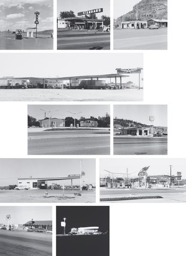
10 works from Twentysix Gasoline Stations, 1962/1989, each 50x58cm, edition of 25
I am a huge Ed Ruscha fan, have been for a long time. His artist books of typological photographs were some of the first works of art I bought out of college [fortunately, since they’re all 10-20x more expensive now].
But I confess, though I find them entirely appealing, I’ve never really been completely comfortable with the sets of 1960s photos Ruscha republished in large-scale, large-ish editions, beginning in the late 1980s and 1990s.
They’re important images, but they seem so inextricably linked to the books to me. And books are hard to show, and not as sexy to collect. So yeah, it’s totally fine, of course, but these have always seemed a little bit too much like eye candy and cashing in.
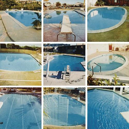
Pools, 1968/1997, each 40x40cm, edition of 30 plus 10 artist proofs.
So it’s not at all surprising to me that these two particular sets were in Halsey Minor’s collection, and will be auctioned off this week.
But even though they’re dated 1962/1989, Phillips de Pury’s exhibition history for the [to me problematically named] set up top, 10 works from Twentysix Gasoline Stations, says they were shown in 1982, at the big Ruscha mid-career show at SFMOMA [but oddly doesn’t mention the follow-on venues, the Whitney and LACMA. Or maybe it’s not so odd; Phillips’ catalogues have always been a little spotty, with just as much verbiage and annotation is necessary to move the merch, not further the scholarship.]
Which I didn’t see, obviously, but maybe I’d be a little less skeptical towards these works if Ruscha has had a history of showing them in larger, exhibition-size formats? If anyone knows where Ruscha talks about these republished photos, or where they’re discussed at all, I’d love to hear about it.
The ‘Essential Triad’ & The ‘Right To Creativity’
It has been fun reading The New Art (1966), one of critic Gregory Battcock’s contemporary anthologies of critical art writing. Also sobering, how dated and/or blinkered many assumptions these pre-eminent minds operated under turned out to be. Not the least of which is the illustrious role of the critic himself, and I do mean him. Here are some choice quits from Battcock’s own introduction, which are not unrepresentative of the attitudes of many of the contributors:
Art is humanism and reality, and as such cannot be seen accurately in terms of the past. At this point, responsible criticism becomes absolutely essential. The critic has, as it were, to paint the painting anew and make it more acceptable, less of a threat than it often is. It is scarcely an exaggeration to say that the art of our time could not exist without the efforts of the critic. It is, however, to be remembered that words are ores and art is art; in presenting art, the critic cannot resate or reproduce it. All he can do is assume some of the concern for clarification in his effort to leave himself free to experiment as obscurely as he likes, unhampered by any need to compromise his integrity for the sake of public approval.
Objections to this state of affairs can logically be only of degree and not kind, since an art of total clarity wouldn’t be art, and would need no criticism at all…modern Art is a discipline, not a World’s Fair all three members of its essential triad– artist, critic, and viewer–obtain only such rewards as they are prepared to work for or for which they have the love to spare.
love that. Sounds pretty tough. Here’s another part about one of those marginal figures left out of the essential triad:
another characteristic aspect of the new criticism is revealed in the way it’s practitioners tend to review group or retrospective exhibitions almost solely in terms of the selectivity displayed by the person responsible for the show, while oaring little or no attention to the merit of the individual artworks or artists included. This peculiarity is very much a part of the new way of looking at art; the position of the curator or director is regarded as equivalent to that of the artists whose work he selects, since he is the creator of the exhibition, if not of the individual works within it. The critic’s own right to creativity comes through his relationship with the artist whom he alone fully understands, appreciates, and can interpret to others.
good times, good stuff.
What’s Happening?
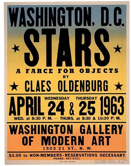
This explains the “two or three Happenings” discrepancies; there was a matinee Happening on Thursday.
Also: “Globe Poster – Baltimore.”
I’ve had this on my desktop so long, I’ve forgotten where I ganked it. Oh, that’s right, Oldenburg’s print poster & ephemera catalogue raisonne, Printed Stuff (1997).
Previously: What’s Happening? Claes Oldenburg’s Stars via Time and Alice Denney
What’s Happening? Tracking Stars, Claes Oldenburg’s 1963 Washington DC Happening