
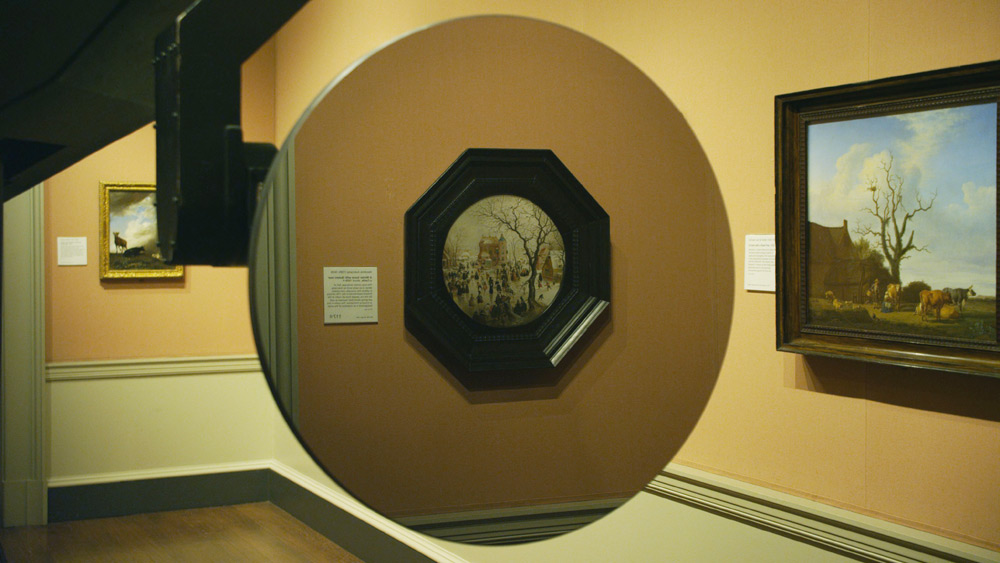
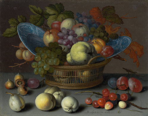
So you should really read Daniel Kasman’s review of the Venice debut of Mark Lewis’s awesome-sounding short film, Black MIrror At The National Gallery, because Kasman is sensitive to both the tone and surprise/reveal of the film in a way that the official synopsis, oddly, does not.
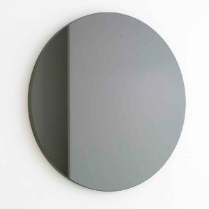
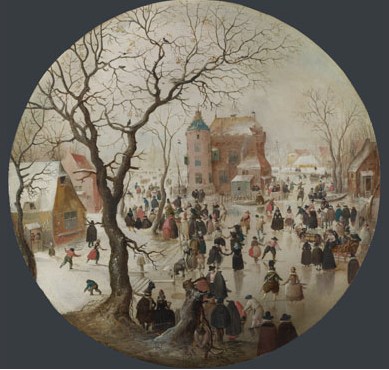
But if you’re not going to read either of those, I’ll just say it sounds like Russian Ark meets 2001, with the Marquis de Custine replaced by Martin Szekely’s silicon carbide “Black Sun” mirror, the Hermitage replaced by the National Gallery, and everyone and everything else replaced by Hendrick Avercamp’s Dutch Golden Era tondo A Winter Scene with Skaters near a Castle.
Sounds awesome.
Venice 2011. Art Is Terror from Any Other Angle [mubi.com]
Orizzonti – BLACK MIRROR AT THE NATIONAL GALLERY – MARK LEWIS [labiennale.org]
Miroir- Soleil Noir, 2007 [galeriekreo.fr]
Avercamp’s A Winter Scene with Skaters near a Castle, 1609 [nationalgallery.org.uk]
Category: art
Henry Billings Strafing Paintings
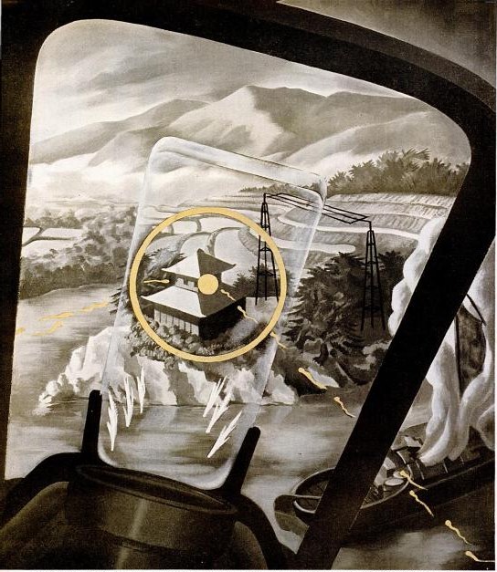
Another inadvertent Google find, also from the World War II School of propaganda art. In anticipation for an invasion of Japan, 1945 LIFE Magazine wanted to give the general public a fighter pilot’s-eye view of ground attacks.
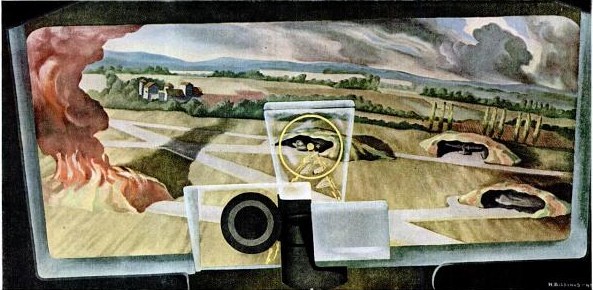
Perhaps because actual combat photos were deemed too sensitive or otherwise unsuitable, the magazine asked artist Henry Billings to create a series of strafing attack paintings.
Noted before the war for his machine age-themed murals, Billings’ characteristically mild-mannered modernist/precisionist landscape style goes uncommonly well with the scenes of destruction from the air.
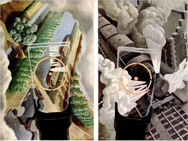
But the most prominent thing in the images, no matter the sometimes dizzying orientation of the earth itself, is the central fixity of the P51 Mustang’s reflective sight. A technological advance that only rolled out during the war itself, the gunsight’s half-mirrored glass panel meant the pilot could maintain his fix on his target without lining his eyes up directly with the line of fire. It’s an interesting perceptual concept to try to capture in a traditional landscape painting.
I don’t know what happened to Billings’ art career, but his posthumous market is pretty weak, with paintings and drawings selling in the low hundreds of dollars. [Oh, with the exception of this nice precisionist boatyard panel. Wow.] No word on the fate of the strafing paintings, though.
Ground Strafing – LIFE June 30, 1945 [google/life]
The Greatest Photomural Ever Sold
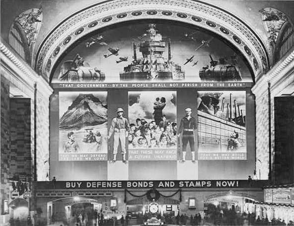
Instead of jumping to the first search result, Google’s “I’m feeling lucky” button should go to something tangentially related but certifiably awesome and probably better than what you were looking for in the first place. For the first datapoint in fitting that algorithm, I submit this post from The Bowery Boys about the “World’s Greatest Photo-Mural,’ as proclaimed by the New York Herald upon the dedication on December 14, 1941 [!] of the Defense Bonds Mural in Grand Central Terminal, New York City, USA.
At 96×118 feet, and covering the entire eastern wall of the station’s Great Hall, it was certainly the world’s largest photomural to date. [Only an Axis appeaser would point out that it’s actually six photomural elements installed in a larger, non-photographic composition.]
The mural was created by the Farm Security Administration’s Information Division, the legendary New Deal documentary photography propaganda unit run by Roy [no relation to Ted] Stryker. The three main photocollaged panels depicted what America was defending: Our* Land, Our* Children, and Our* Industry. [* Offer apparently not valid for non-white Americans, as the NAACP pointed out in protest letters to the FSA.]
Classic racial exclusion notwithstanding, I was most amazed that a giant war bonds photomural in Grand Central Station was the government’s instant response to the attack on Pearl Harbor. And I was also wrong. According to a contemporary report in Time Magazine, the FSA photo staff spent three months designing and fabricating the massive photomural. Which should be evidence enough for the conspiracy theorists who suspected that Stryker and his puppet FDR had been planning to get the US into war all along. But it turns out the Treasury Department had already begun its defense bond campaign in 1940, and that the government marketing masters at the FSA had already been enlisted in Treasury’s bond-selling campaigns.
Which seems odd, that a Depression-era tenant farmer resettlement program would morph into a historically ambitious documentary project for rural America, and then into a war bond marketer, before becoming the military propaganda operation for D-Day. Odd until you hear Stryker’s longtime assistant Helen Wool describe Stryker’s vision of the FSA’s photographic mission in a 1964 interview for the Smithsonian:
[I]n that drastic difference he still stuck to the same type of basic idea, that America is America and that’s all there was to it. We had psychological warfare films, and we had displays, and we had defense bond things, and everything else. But, underneath it he was selling America as it should be sold. [emphasis added because, obviously]
So what does the 3-months making of the world’s largest photomural entail? Fortunately, the snap-happy photographers at FSA like Edwin Rosskam and Marion Post Wolcott documented the process, in a group of 53-70 images now at the Library of Congress:
Rijksoverheid Rood

So.
Found the local Pantone shop and brought home a liter of Hollandlac oil-based enamel in Rijksoverheid Rood, aka PMS 485c.
Ordered some small galvannealed steel and white aluminum panels, both paint-ready, and cut as close to A4 as North Carolina metal shops not called Metal By The Millimeter are able to get. They arrived very neatly packed.
And so I used some of the packing to make a little nest, so they can be covered, with circulation, while the paint dries in between coats.
Diet Coke. Leatherman left in the car, whoops. Tape everything down. Float the panels on little bubblewrap sheets so I can get to/around the edge.
MIneral spirits to clean the surfaces. Oh, right, there’s a protective film on the aluminum. More Diet Coke.
Do people really still listen to NPR all day? I can’t imagine. I want listen to youarelistening.to, but New York is down, so I head to Montreal. Police scanner with that awesome Quebecois twang.
Nabisco Ginger Snaps, the dog biscuits of the gods. Seriously, how did I fall into this box of tough yet improbably delicious cookies? More Diet Coke.
Unwrap the brush. Open the can. Wow, it seems much oranger than the web version, or the offset ink version. Is it–no, it has to be right. The Netherlands has ceded sovereignty over their Central Government palette to Pantone, Inc., a wholly owned subsidiary of X-Rite, LLC of Grand Rapids, Michigan. One PMS code to rule them all.
Stare at the foam brush again, try to remember what she–no, I’m pretty sure she said she was using foam for acrylic enamel, not oil. Go with the brush, even though foam seems somehow less painterish, and thus less daunting,
Load is not quite the word for what I do to the brush. Introduce. Poke. Alight the brush with paint. Whatever it is, it’s not enough paint. A fair amount of pull, this oil.
The steel panel is first. I really am not going to do a stroke-by-stroke account here. The steel feels better. The aluminum plate is so light, it moves with the brush; I have to hold it down. Paint’s not as self-leveling as I was originally hoping.
I knew there will be extra coats; I’d hoped there wouldn’t be much sanding. But there are definitely still brushstrokes in there. Texting with my brother-in-law, a highly skilled painter of entirely different types of monochromes, he diagnoses it immediately: ‘the brush needs to be loaded and moved with confidence.’
I would probably say those are problems #2 and #1, respectively, but loading the brush will be much easier to address. I will leave my paranoia about little paint stalactites on the edges in the kitchen the next time I get a Diet Coke.
But of course, the next coat will only go on 24 hours or so from now. I guess I never quite understood how much of painting is waiting for the paint to dry.
‘And I AM. An American Sculptor.’
Between 1981 and 1985, Paul Tschinkel and Marc H. Miller produced 17 episodes of ART/newyork, a subscription-based video magazine about contemporary art for use, incredibly, in public schools and libraries.
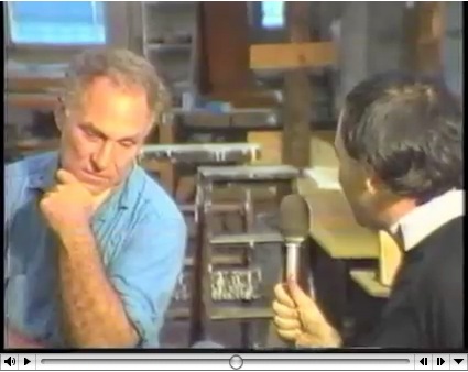
Their 1982 interview with Richard Serra, a Yale classmate of Tschinkel’s, came just as the Tilted Arc controversy was heating up. And speaking of heating up, hoo-boy, does Serra get going about the Pennsylvania Avenue Development Agency conflict with Robert Venturi. Fiery fun stuff.
His 1980 interview with Douglas Crimp covers a lot of the same PADC territory with a bit more specificity. By pointing out, for example, that Venturi’s proposed motif was also favored by Albert Speers, not just that they might as well stick swastikas on Pennsylvania Avenue.
But his story about being told that he’d never get work in this town again is basically the same.
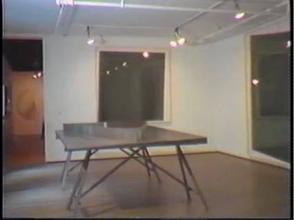
Also interesting, if less incendiary: Serra used to exhibit models of site specific projects-in-progress, such as this rather sexy steel tabletop version of Twain. Do want.
ART/newyork – Richard Serra’s Tilted Arc artist interview [98bowery.com]
order copies of ART/newyork to this very day [artnewyork.org]
What I Look At Many Days: Gerhard Richter Colour Charts
I am aware of the work of Pablo Neruda Gerhard Richter.
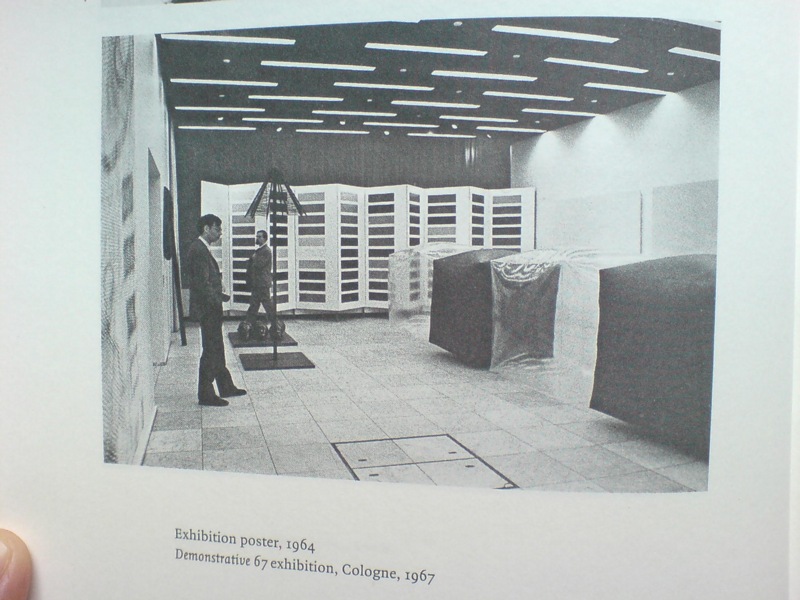
I have not been reading Gerhard Richter: Writings 1961-2007 straight through, of course, but it’s been with me a lot lately. And it’s kind of annoyed me that there is not really anything about this incredible photo, showing part of the installation of Demonstrative 1967, Galerie Heiner Friedrich’s weeklong exhibition at DuMont Publishers, down the street from the inaugural Cologne Art Fair, from which he had been excluded.
In addition to Richter, the display included works by his Capitalist Realist cofounders Sigmar Polke [I think that’s a raster bild there on the left] and Konrad Lueg [the inflatable cube structures], as well as by Blinky Palermo, Reiner Ruthenbeck, the British painter John Hoyland–and Cy Twombly.
Now about that Richter. That giant color chart painting which looks like a folding screen. For a while, it threw me off precisely because it looked like a folding screen. Considering 1967 was also the year Richter started working with glass panes and doors and other materials that related to a painting plane but were not, I was wondering if this painted, free-standing panel object embodied some lost chapter in the color charts’ “pop meets abstraction, quietly upends both” story.
Orrrr maybe, the painting was just too big to go on that wall, and Blinky needed that other wall, and Lueg’s balloons block everything anyway, and what the hell, it’s a week, and an art fair.
Ten Large Colour Charts/ Zehn große Farbtafeln, 1966, via gerhard-richter.com
Because there is no color chart folding screen. That work is Ten Large Colour Charts (1966), a ten-panel painting in the K20 collection in Dusseldorf. It is one of the earliest color chart paintings Richter ever showed, but it’s probably the first that many German art worlders ever saw. [Eighteen Colour Charts was the first first shown, in Richter’s one-person show at Friedrich’s Munich gallery in May 1967.]
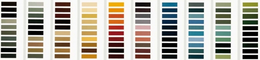
Anyway, point is, or one point is, I think, that looking at Richter’s color chart paintings, and his 4900 Colours grids before that, and his Cologne Cathedral stained glass window before that, and so on, changes the way you look at the world. And by you, I mean, of course, me. It changes the way you look at color samples, whether in the paint store, or at the moment, in a grid laid out on a governmental stylebook website.
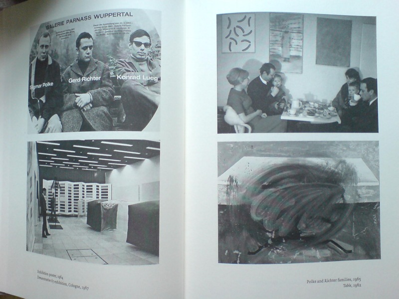
And it’s not just a matter of this looks like that, or not entirely. Because there’s also the context in which Richter painted his color charts–and the larger biographical/political context that shoots through Richter’s entire practice. That Demonstrative 67 photo is in a spread with what may be my favorite snapshot in the Writings book: on the right there, not Table, 1962, CR-1 [!]–which, if Christopher Wool can take up painting with that thing already in the world, color charts are not gonna hold me back–the one on top, with the caption, “Polke and Richter families, 1965.”
Oh, just drinking some tea with the kids and Uncle Rudi.
‘Rirkrit Tiravanija’s Favorite Farmer’
Chiang Mai farmer/laborer Lung Neaw has worked with RIrkrit Tiravanija for several years now. He helped build the artist’s house. Tiravanija’s footage of him has appeared in various gallery and museum installations.
And Saturday, Tiravanija’s film, Lung Neaw Visits His Neighbors, will have its world premiere at the Venice Film Festival. Maybe there should be a spoiler alert somewhere, because from the synopsis, the title pretty much gives the entire 2.5 hour movie away.
In a Q&A on the Lung Neaw website the artist says he sees the film not as “a documentary and not a narrative, perhaps it’s more of a portraiture.”
He and his longtime Mexico City dealer’s brother Christian Manzutto shot a week or so at a time:
So we shot over a period of two years and another to edit and postproduction, the film was really made very simply and with very little by way of crew and equipment, in that relationship for me very much like a documentary but also very much like how an artist would approach the production, also with very small but cost-effective budget. We shot in film (super 16mm) so rather small and light unit but with frames and quality which was not video.
An interesting choice, and an interesting approach. Two of his galleries, kurimanzutto and Gavin Brown’s Enterprise, have associate producer credit.
See the Lung Neaw Visits His Neighbours trailer [vimeo]
Thai media article on the project: Lung Neaw goes to Venice [nationmultimedia.com]
What I Looked At Today: Kabinetstukken
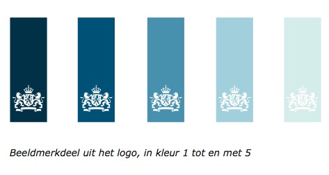
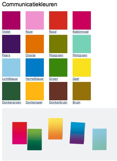
So lately, I’ve been thinking a lot about The Dutch, and their politics and art. The Rijkshuisstijl and 1 Logo Project, which redesigned and centralized the Dutch government’s visual identity, which happened to coincide with political shifts to the right, and swelling anti-Muslim intolerance, and suddenly, drastic budget cuts meant to cripple or destroy the liberal and visual arts establishment in the country. And a visual identity which ironically derives its central element, a 21-color palette, from the light and landscape as seen in Dutch Golden Age paintings.
And so of course, I have been thinking hard, still, about Vermeer painting his serene scenes in the midst and aftermath of a continent-wide, generations-long religious war.
And then someone, I can’t remember who, pointed last week to Morgan Meis’s discussion from Antwerp of Frans Hals, who was treading fine religious lines to make his proto-modernist paintings in a Dutch/Flemish culture where painting itself had become highly, politically and theologically charged.
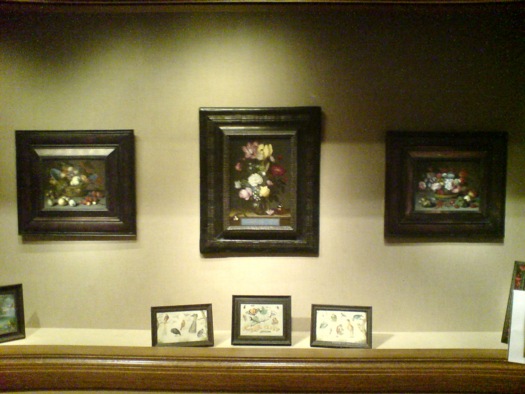
So I went to the National Gallery, where their Vermeers are tucked away in the Cabinet Galleries, a series of three tiny rooms carved out of a forgotten storage space in the mid 1990s. The scale approximates the collection rooms in 17th century Dutch & Flemish homes for which the small paintings were originally created.

Bouquet of Flowers in a Glass Vase, Ambrosius Bosschaert the Elder, 1621, via nga
Here are three little paintings of a type I would have barely glanced at or ignored, if it weren’t for my peculiar Dutch color palette fixation: I mean, right? Still lifes of flowers and fruit? And yet they really are pretty amazing. And then you think about where and when and why they were made. According to the Cabinet Galleries brochure, which I had never picked up, such tiny paintings [7×9, 8×12] were called kabinetstukken, cabinet pieces.
The center painting, Bouquet of Flowers in a Glass Vase, was made in 1621 by Ambrosius Bosschaert the Elder. The NGA says without elaboration, “Bosschaert, who was born in Antwerp, moved to Middelburg after 1587 for religious reasons.” He was 14 at the time.
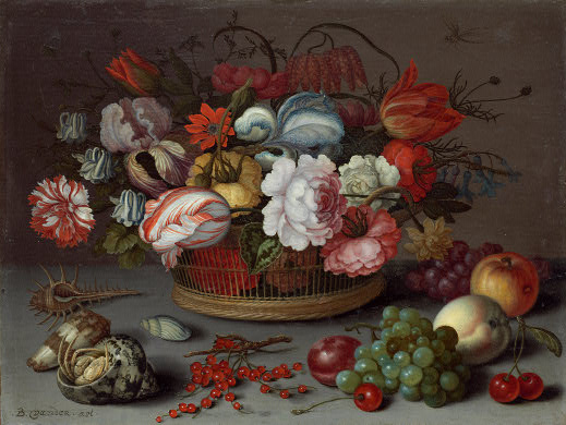
Basket of Flowers, 1622, Balthasar van der Ast, image: nga
This pair of kabinetstukken by Balthasar van der Ast apparently hung in the private chamber of Amalia van Solms whose husband Frederik Hendrik ruled over the Protestant Netherlands his father William of Orange fought to establish.
Basket of Fruits, 1622, Balthasar van der Ast, via nga
They are listed as gifts of Mrs. Paul Mellon.
Previously: the first What I Looked At Today included bigger, flashier Dutch painting: Van Dyck, Cuyp, etc.
Ekphrasis
Sam Thorne in this Summer’s Frieze looks at writers writing about looking at fictional art. He includes the hero [sic] of David Foster Wallace’s Infinite Jest, the post-poststructuralist filmmaker James O. Incandenza, whose lost masterpiece gives the novel its title:
Incandenza is one of the few conceptual artists in fiction (he is preceded by Maria Turner, a joint creation of Sophie Calle and Paul Auster who pops up in the latter’s 1992 Leviathan – the novel’s accounts of her works were subsequently enacted by Calle herself). Many of Incandenza’s films are described as technically or conceptually unfilmable (one is ‘unfinished due to hospitalization’), while his video Infinite Jest is itself said to be ‘lethally entertaining’ – once viewers start watching they cannot stop and remain transfixed until they starve. This elusive videotape, of which all copies are missing, is wrapped up with the unbearable pleasure of seeing. The visual is thematized as entirely other to language, as Wallace insinuates that the visual can make claims on our attention that the verbal cannot. Within the logic of the novel, the video would be impossible to sufficiently describe; it evades all attempts at ekphrasis – a shortcoming which is in this case redeemed, in that the ability to properly visualize it would result in death.
That writing fiction may finally be incompatible with adequately describing a work of art is the worry that shadows many of these novels. But, like Bergotte’s dying realization, they also suggest that the knowledge of this shortcoming is what makes writing worthwhile.
I did not realize that Incandenza had a show. While at Columbia last year, Sam Ekwurtzel invited a couple dozen artists to create works for A Failed Entertainment: Selections from the Filmography of James O. Incandenza. The show is still touring the country with him. Ekwurtzel, that is. Incandenza still does not exist.
Unmentioned by Thorne: Henry Codax, the fictional conceptual monochrome painter in Bernadette Corporation’s novel Reena Spaulings, who also had a show this year, courtesy of Jacob Kassay and Olivier Mosset.
Works on Paper [frieze]
Ekwurtzel speaks: Behind the scenes of an Infinite Jest-inspired art show [flavorwire]
On Roy Lichtenstein’s Films, Also Prop For A Film
I was intrigued by Roy Lichtenstein’s Prop For A Film when it showed up last summer at Phillips in London. Obviously, the main thing was the work itself: a large [3.5 x 8 ft] abstract, shaped field of Ben-Day dots, pretty fantastic, actually, which turned out to be a beach. The other thing about it, also obviously, was hey wha? Lichtenstein made a film? A film he showed at both LACMA and the US Pavilion at Expo70 in Osaka?
I was already pretty fixated on several of these related topics at the time, so I started poking around on the story of Lichtenstein, his film–films, actually–and his Prop For A Film. It’s all pretty odd and interesting, and somewhat complicated, and though I started gearing up to write about it, I’ve kind of held off, or haven’t gotten around to it, I guess, for almost a year now.
But then today, I see that Andrew Russeth reported for the Observer that Prop For A Film, which failed to sell at Phillips last summer, has turned up in Sotheby’s New York contemporary sale next month, albeit with a much lower estimate.
And though Sotheby’s catalogue copy seems almost identical to Phillips’, they added a note that the Whitney will show Lichtenstein’s films in October, the first exhibition of them in over 40 years.
So yeah, Prop For A Film. To get right down to it, I’m not sure it’s really a painting. Which doesn’t mean it’s not a very interesting Lichtenstein.
Starting around 1964, when the world was still trying to come to grips with the painterly implications of his print-related imagery and Ben-Day dots, Lichtenstein was already experimenting with other techniques and materials that challenged the definition of painting. His Electric Seascapes combined dots with new, high-tech materials like Rowlux [above], a prismatic plastic sheeting originally developed for reflective highway signs.
Fish and Sky (from Ten from Leo Castelli), 1967, screenprint, photo and offset, ed. 200, via wright20’s Sept. 15 contemporary sale
When Maurice Tuchman invited Lichtenstein to partner with Universal Studios for LACMA’s ambitious Art & Technology Program in 1968, the artist decided to continue his seascape experiments with motion, perception, and the flat picture plane by creating an actual “moving picture” of a landscape. So yes, this whole thing really fell into place around a seemingly simplistic, even banal play on words.
Sotheby’s pitch boils down the “moving picture” concept as it was exhaustively described in LACMA’s A&T report/catalogue:
[He used] sequences of filmed landscape fragmetns in combination with synthetic images using his trademark Ben Day dot grids or textured aluminum. The project expanded upon ideas he had explored in his landscape collages of 1964 and 1965, which were his most abstract compositions to date. In these works, the constituent elements of landscape were drastically reduced to two or three large areas of Ben Day dots representing sea, land and sky.
Because of cross-country logistics, Lichtenstein ended up doing almost all actual production with his friend, independent filmmaker Joel Freedman. Roy and Joel spent the summer of 1969 in Southampton, filming the props against the sky or the waves. Assistants would hold the props steady or rock them to simulate the motion of the ocean.
Only it never worked. The movie camera couldn’t accommodate different exposure levels for each component, and the depth of field never resolved to produce the planar flatness Lichtenstein was after. So they threw out the props, shot straight-on shots of the sky and lapping waves, and then added all the graphic elements in post.
I’ll leave the details of the films themselves for a separate post, but the point is, Prop For A Film never ended up in any of the films. And so the exhibition history–both Phillips and Sotheby’s list LACMA and Expo70–is tenuous at best. [Sotheby’s seems to realize this, threading a needle by saying “the work travelled to” Osaka, meaning the film installation. They also get the dates wrong; 1969 was the start of filming. A 2-screen installation at the Expo came first, in 1970, followed by LACMA’s 3-screen version in May 1971.]
Which, whatever, it’s still a large, stunning, early Lichtenstein painting, right? And its provenance, OK Harris–the gallery founded by longtime Castelli director and Lichtenstein discoverer Ivan Karp–is unassailable. Well, it’s certainly a Lichtenstein something.
When I first contacted Freedman last year, he told me how he’d saved the piece–it’s Magna on wood, not canvas–after the project ended, and had it on the wall of his loft for several years. The trademark dots meant people would visit and recognize it immediately as a Lichtenstein. Then, when he was in need of completion funds for a documentary–if I remember correctly, it was the mid-70s, so probably Broken Treaty at Battle Mountain–he gave the work to Karp to sell. At Karp’s suggestion, Freedman asked Lichtenstein if he’d help his project by signing the piece, and Lichtenstein generously agreed. The work was sold, and documentary was finished and released to great acclaim.
When he signed it in Karp’s gallery, Lichtenstein also wrote the title on the back. Or maybe it wasn’t a title, so much as a description: Prop For A Film.
Passed at Phillips, Roy Lichtenstein ‘Prop’ Moves to Sotheby’s [observer.com]
Lot 28 Prop for a Film, 1967, est. $400,000-600,000 [sothebys.com]
Lichtenstein’s project writeup from the1971 A&T catalogue [lacma.org]
Previously: Lichtenstein’s Electric Seascapes
BONUS: Freedman is running a Kickstarter campaign to complete a followup film, Land of the Brave. It ends in four days. [kickstarter]
Raumlabor At Storefront: Chairs X Urbanity
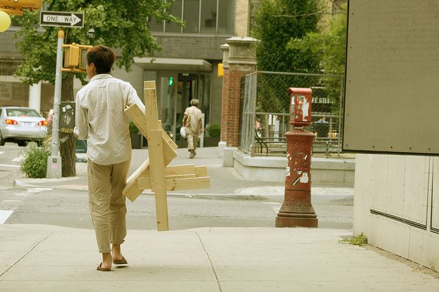
People walking the city streets with made-on-the-spot chairs. First there was the Chaise Bordelaise. Then it was the Sedia Veneziana. And yet, though The Generator by Raumlabor has had two incarnations at Storefront for Art & Architecture this year, there has still not been a New York Chair. Instead, it’s CHAIRS X URBANITY.
Well, we take what we can get. After we make it, that is. Unfortunately, I was out of town, and thus was unable to make and/or take anything at all. Sigh.
Generator 02: Chairs for Urbanity [storefrontnews.org]
Generator Event at NY Festival of Ideas, May 2011 [flickr]
CHAIRS X URBANITY Chair Fare Make and Take August 13, 2011 [facebook]
Previous Raumlabor coverage: sedia veneziana, chaise bordelaise
Autoprotestazione
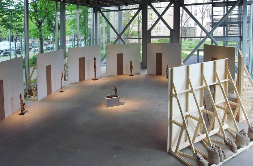
image: designboom
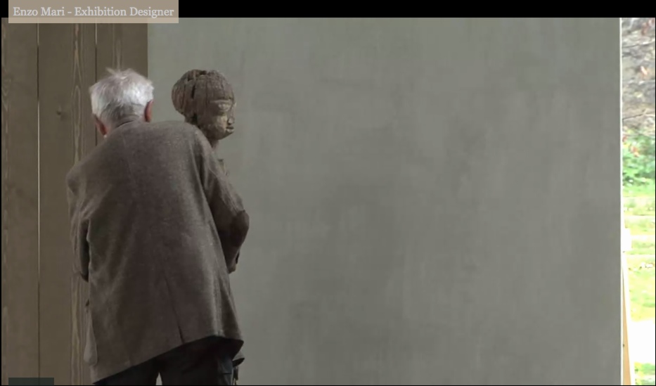
Enzo Mari was brought in to design the exhibition at the Fondation Cartier, Vaudon-Vodun, African Voodoo Art from the Collection of Anne and Jacques Kerchache. It’s simple and spectacular, and designboom has, as usual, rather comprehensive visual coverage of the project.
Above, a “film set” Mari calls The Village, autoprogettazione-esque backdrops to evoke the original context in which Kerkache would have first encountered the impressive household guardian figures. At least that’s how Mari explains it in the exhibition’s making-of interview video:
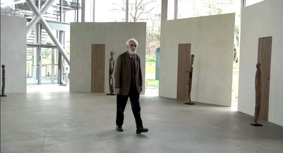
Holy smokes, filmmakers having Mari manhandle one of the guardians! Whether it’s our aging Maestro or the conservators, your insanely staged B-roll stunts are gonna give someone a heart attack!
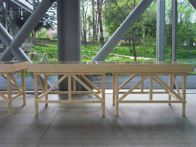
You don’t bring in a legend like Mari for his finesse at grouping sculptures. You bring him in to fill your glitzy Nouvel folly of a museum with endearingly humble-deluxe, purpose-built pine furniture!
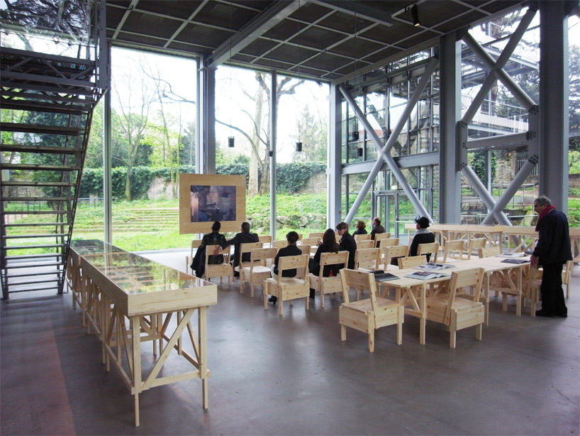
image: designboom
For the major autoprogettazione moment in the film/lecture/reference/public event space, with EFFE tables and SEDIA I chairs. Mais, qu’est ce-que c’est ca? New additions to the series? What’s that wood-framed flatscreen?
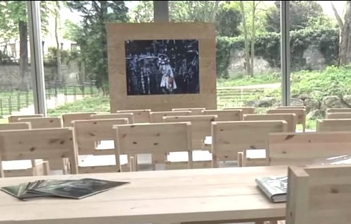
And are those DIY display vitrines ringing the room?
images above via designboom.com
Because the laborer should be able to knock together his own home theater–autoprogezzione?–and a case for his ephemera collection in a weekend using just the most humble materials from the corner hardware store. Or as designboom puts it, and quotes Mari:
the showcases, designed for this exhibition, partake of the same vocabulary.
“‘autoprogettazione’ has been a project for making furniture that the user could assemble simply from raw planks of wood and nails. a basic technique through which anyone with a critical mind could address the production of an object.”
So it’s for the [vitrine] user with a critical mind. Autoprogettazione as Institutional Critique. Can I have my show now, please?
Let’s go to the tape: “There’s a display stand.”
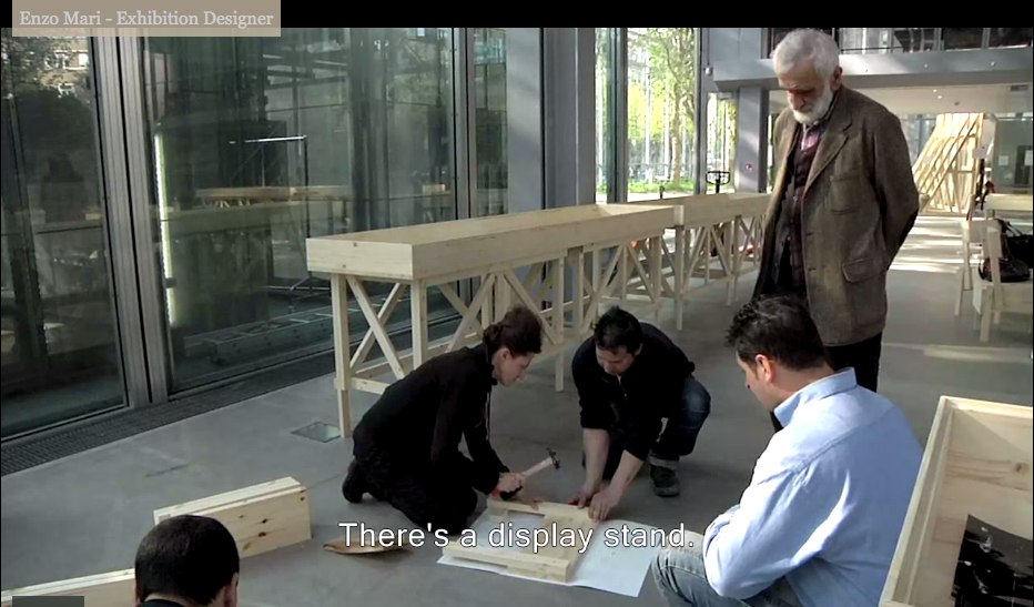
No no, no pressure, just Enzo #$()%ing Mari watching you build his iconic chair there.
“It must be simple.” Oh no, you B-roll knucklehead don’t do–
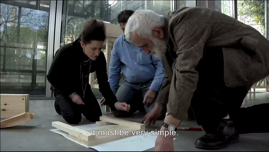
“A stand without the arrogance” YOU DID IT! YOU MADE HIM PICK UP THE HAMMER!
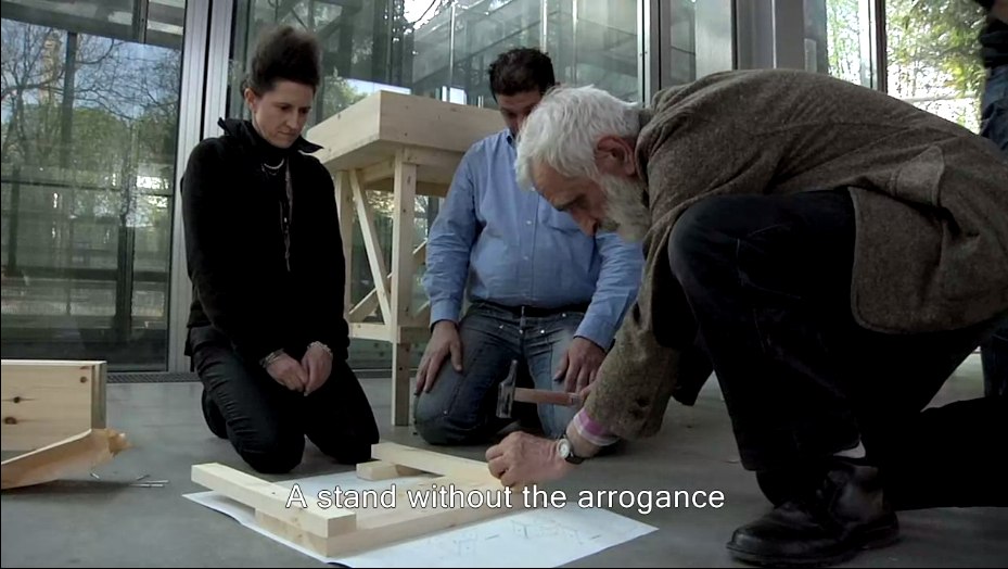
Oh, the horror. Why not just take him to a computer and make him fake type something for you? Or walk faux-purposefully down the Boulevard Raspail? How could– No.
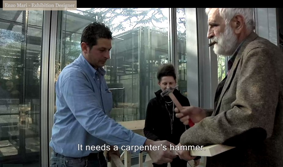
You did not just ask Enzo Mari to hammer something while he was holding it. If you can’t get your $#)(%ing shot, that’s your problem, don’t take it out on a great man like Prof. Mari. “It needs a carpenter’s hammer”? It needs a revolution. Langlois did not lose his job at the Cinematheque so that museum marketing video directors could wrap their late capitalist tyranny in the honorable flag of auteur theory. To the autoprogattazione barricades!
Right after we lock down the salvage rights to those 30 chairs, four tables, eight vitrines–and one flatscreen.

Here’s a shot, though, from Comrade Elena Vidor’s flickr.
UPDATE woo-hoo, and here’s an update from Venice, where Bruno Jakob has installed Breath, a very similar-looking, seven-part series of invisible paintings in and around the Arsenale.

Breath, 2011, via
Vaudou-Vodun, runs through Sept. 25 [vaudou-vodun.com]
Not Steinberg, Wallace, Nabakov Or Qaddafi
Oh brother, I have this giant post mostly written about how Leo Steinberg’s awesome 1997 lecture Encounters With Rauschenberg includes all these references that show that, not only did he recognize the intimate interrelationships between Johns’ and Rauschenberg’s early works, he also identified hints of dialogue, reference, in works made decades later.
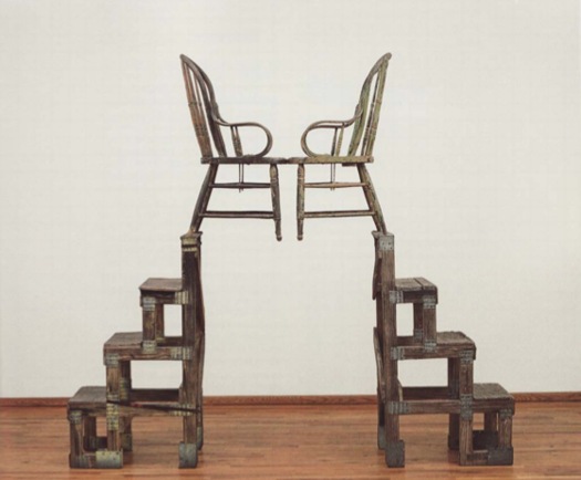
And of course, I’m referring to Steinberg’s discussion of The Ancient Incident, the 1981 Combine/sculpture of a pair of lover/chairs pyramided atop some old steps, which is going to be in Gagosian’s Rauschenberg show in Paris next month. [Hold on, unless that’s the bronze replica Rauschenberg made of the sculpture in 2005. I think it may be. Except I just read the title of the image file, so no. 9/14 update: Except I just read the caption on the email announcement of the same show, and sure enough, this is patinated bronze, and, confusingly, is also titled The Ancient Incident (Kabal American Zephyr), but it has a date, 1981-2006, like it’s the same work, except it’s a different one, or. Anyway.]
I was really going to publish it, but it feels a little, I don’t know, sappy, hokey, romantic, even. But not crazy, AFAIK. As I write out these 2.25 paragraphs, I’m starting to wonder if the best way to put the info out there isn’t as an annotated, footnoted, republished version of Encounters With Rauschenberg, which reveals the lecture to actually be a secret, epic poem of the founding of Bob & Jap’s hometown of Zembla. I so totally called it.
But while busily not writing that, then, and worrying my over-conversational voice, over-excited art historical imagination, and my over-reliance on semicolons and footnotes is a sign of my over-doing it on the David Foster Wallace homage front–but see, Maud, my footnotes are from Pale Fire, not Infinite Jest! I don’t think I’m not copying Wallace; I think I’m not copying Nabokov! Nice work in the NYT Mag, btw!–John Powers matter-of-factly produced the greatest greg.org post ever. On his own blog, Star Wars Modern.
It’s all about the connections between previously overlooked satelloon mentions by Arthur C. Clarke and J.G. Ballard and Robert Smithson and Spiral Jetty. And with some steampunk Contact thrown in for free. I bow my head in awe and gratitude, and I look forward to seeing you back here after you’ve finished reading it.
And then I didn’t post it last night because, well, Libya, of course. Did anyone else notice this crazy, masking tape rebel flag behind these doctors treating a pro-Qadaffi soldier? [nyt/ap]

And then I didn’t fix the post because I was interested in Art In America’s report [via rkjd] that several months ago, John Chamberlain and Gerard Malanga quietly settled their lawsuit over the sale of 315 Johns, which Malanga and like a million other people insisted was his work, made of tons of silkscreened Chamberlain portraits as “an homage” to Warhol, but which Chamberlain claimed he had traded for with Warhol, and that Andy, he, and Henry Geldzahler had cooked it up in the first place, which is how Chamberlain managed to get it authenticated–and which he sold for $3 million at Art Basel “to an unidentified collector.” Mhmm.
My favorite part is how the case got resolved “a few weeks before the May 5 opening of Chamberlain’s first show at Gagosian.” Actually, that’s my second favorite part. My favorite part is the awesome quote Malanga’s lawyer Peter Stern gave AiA:
“[T]here has been no retraction of allegations in the complaint and no one has acknowledged that they are in possession of or know the whereabouts of the painting.
Well now. Glad that’s all cleared up.
EPIC FOIA DHS
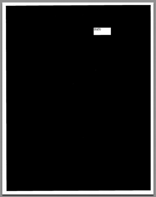
The Electronic Privacy Information Center filed a Freedom of Information Act request with the Department of Homeland Security on the government’s deployment of body scanner technology on streets and in roving vans.
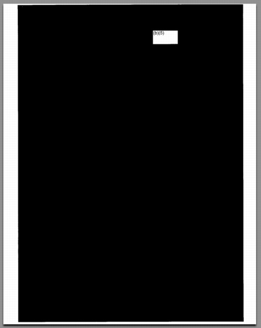
These are the three pages of the FOIA report that did not come from a scanner manufacturer’s publicly available brochures and website, and that were not the publicly available agenda for a scanner industry conference.
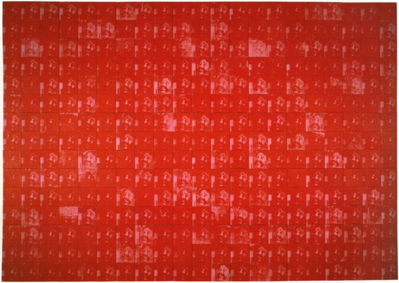
Related: DODDOACID, one of a suite of six Redaction Paintings made in 2007 by Jenny Holzer from FOIA documents, and acquired by the National Gallery of Art in 2010 [nga.gov]
FOIA Note #20 (August 15, 2011) Government Transparency [epic.org via @wagnerblog]
On The Nature Of The Office Of War Information
Via Tyler Green comes another awesome installment of Alan Taylor’s photoblogging journey through WWII for The Atlantic. This time, a selection of stunning Kodachrome transparencies made by the Office of War Information, selected from the Library of Congress’s growing digitized collection. And look what else is in there?
The OWI was created in 1942 to propagandize domestically and abroad for the war. It sounds like a rather hotly contested mess of a government operation, and its domestic operations were basically defunded by Republicans and segregationists who complained that the OWI was actually using the war effort as an excuse to promote FDR, the New Deal, and racial equality.
A couple of things it did do: launch the Voice of America radio broadcast system, and take over the Farm Service Administration’s photography program. Which means the OWI was also involved in some way with Edward Steichen’s late 1942 MoMA photo exhibition, “Road To Victory,” which included many FSA images.
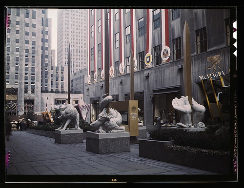
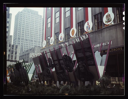
In any case, the OWI certainly turned the center of New York City into their propaganda playground. I mean, holy smokes, check out these photos of “This Is Our War,” just one of an ongoing series of exhibitions they staged in Rockefeller Center. This was in March 1943, and focused on the United Nations, the 28 countries and governments in exile who first signed onto Churchill’s Atlantic Charter, which articulated the Allied principles for the war, and incorporated FDR’s Four Freedoms. Which are embodied here by four giant, allegorical, golden sword statues: a dog, a snake, a dragon [?] and a pair of unbound hands. [2023 update: In answer to a query by a reader, I have discovered that the sculptures were by Hugo Robus, and were destroyed after the exhibition.]
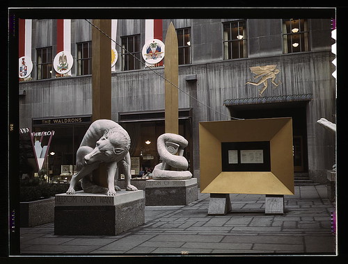
In case you didn’t get the point from the inspirational photomural cutouts or the giant, somewhat awesome V for Victory, the exhibit also featured “amplifiers at each end broadcasting speeches by Roosevelt, Churchill and Chiang Kai-Shek every half hour.”
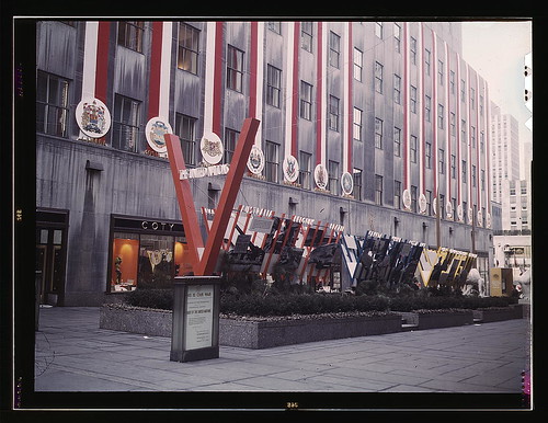
I know she wasn’t physically delivered into the world until 13 years later, but I wonder if Cady Noland wasn’t somehow born right here on Fifth Avenue.
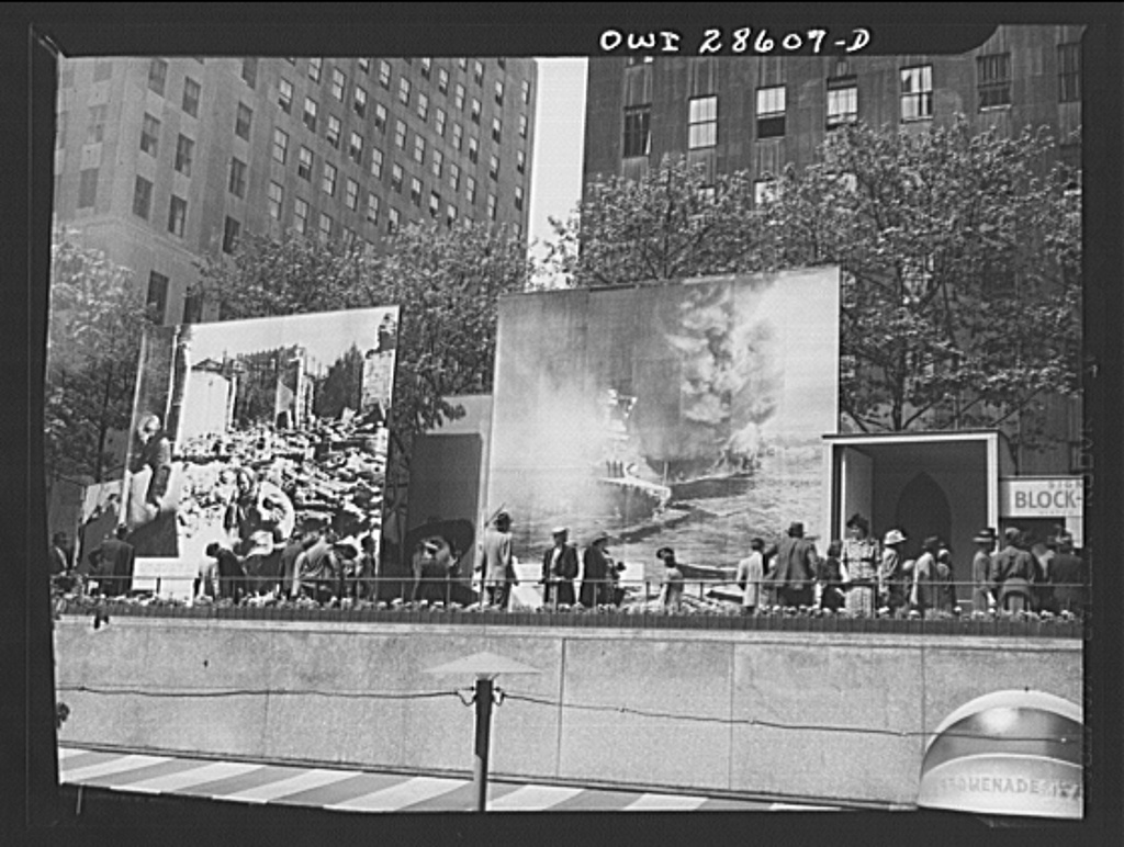
But wait, there’s more! Here’s how the NY Times reported the opening of the OWI’s next show:
The fanatical scream, “Hell Hitler!” ripped through the air in Rockefeller Center. It took startled crowds some time to realize that the cry and the bark of Hitler’s voice came from some captured German sound films.
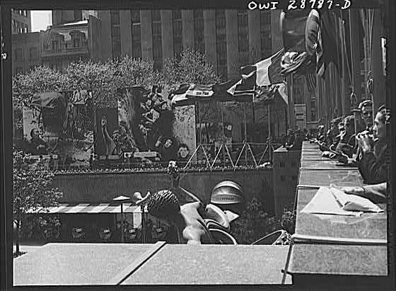
For “The Nature of The Enemy,” the OWI ringed the skating rink with massive photomurals showing Hitler, bombed out refugees, crying Chinese peasants, and flaming battleships. If you bought a war bond, you could sign a bomb that’d get dropped on Berlin.
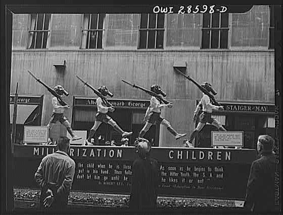
Along the Promenade, a half dozen dioramas were, like the giant banners running the length of the buildings, just depicting the facts, ma’am: “THE ENEMY PLANS THIS FOR YOU”: “Desecration of Religion,” Militarization of Children,” “Concentration Camps,” &c., &c.
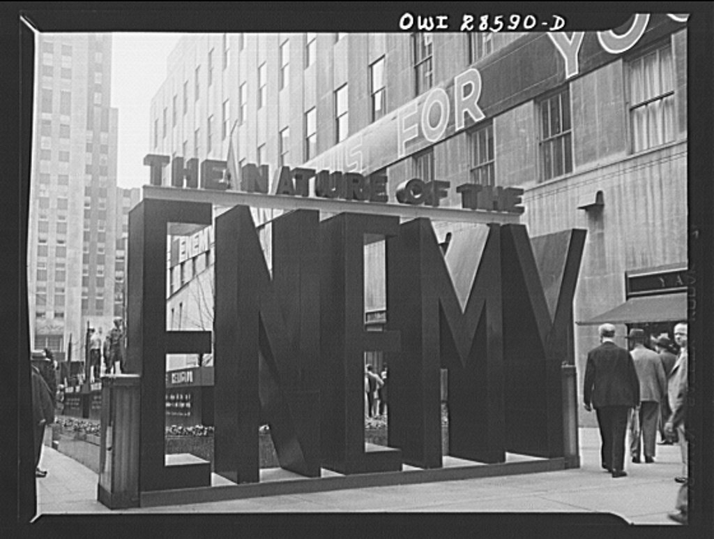
I’m sure the uneven spacing and kerning of this otherwise awesome [painted plywood? were there cabinetmakers on staff whose job consisted of building giant letters?] sign/sculpture was frightening enough to cause a dozen Madison Avenue ad layout men to enlist on the spot.
The Nature of The Enemy exhibition, Rockefeller Center, June 1943, 56 images [loc.gov]