
It’s not my strategy to leave pictures sitting on my desktop so long I forget where they come from, and then I don’t have to credit them or worry about posting them. If if were, I’d start a tumblr.
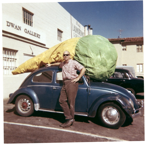
Given the amount of attention I’ve paid to various artists’ Volkswagens, I honestly thought I’d be writing something more extensive about Claes Oldenburg wheeling up to the Dwan Gallery with the giant Floor Cone Peggy sewed for him strapped on top of his car. But not yet.
And anyway, it’s been making the rounds, but I’m guessing it came from researching Sturtevant and Dwan Gallery a few months ago, and finding it on ArtObserved.
Getty Museum View, Or Seeing Google Seeing
The Getty Museum is now included in the Google Art Project. Which is now a part of the Google Cultural Institute. I hadn’t noticed how this context has changed, and how the Art Project has been subsumed and presented. The navigation options are, “Collections | Artists | Artworks | User Galleries.” And institutions are collections.
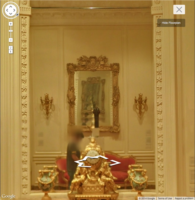
Anyway, Museum View. I know that Google Street View-based art fascination is old and busted, but Museum View for me is still the new hotness. Maps are for navigating, going somewhere, doing something. But Museums are for displaying and depicting and interpreting; they hold and show objects and generate discussions and critical context. And Google Museum View is doing that on a trans-institutional scale, and so it feels important to have some awareness of this process. Trans-Institutional Critique.
Fortunately, Google still sometimes documents itself documenting.
Continue reading “Getty Museum View, Or Seeing Google Seeing”
Ex Collectio: The Bernard Madoff Provenance Project
UPDATE: There is now a Google Doc, your one-stop source for Madoff Provenance information. Have a detail? Send it in!
Last month I proposed that the specific artworks which had once belonged to Bernard Madoff be forever associated with him, that he and his various corporate entities become an inextricable element of their history, discourse, and meaning.
For the most part, Madoff collected prints and multiples from large editions. There are usually dozens of identical examples of each artwork he collected; they’re true investment-grade commodities. However, Bernard Madoff’s ownership of these examples differentiates them and renders them unique among their editions. How does the historical fact that these specific artworks were owned by the perpetrator of one of the financial industry’s biggest frauds affect their engagement with the art market, the art audience, and the critical structures of the art world? We shall find out.
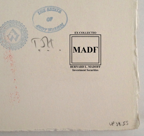
Study for Ex-Collectio MADF Stamp, 2014, digitally manipulated photocollage
Seven of the 53 artworks listed in the US attorney’s inventory of Bernard L. Madoff Investment Services, plus one additional work, are being sold by the bankruptcy trustee at Sotheby’s on May 1st.
Their lot and edition numbers are documented below, along with edition and title information for previously sold Madoff artworks whose court inventory entries were incomplete.
In accordance with art market, conservation, and art historical practice, I have created a stamp to indicate these works once belonged to Bernard Madoff and/or his corporate entities. I hereby issue an open invitation to all owners, buyers, dealers, agents and conservators handling these artworks, to accurately reflect their history, significance, and provenance by having them stamped. I am happy to provide this service, upon review, authentication, and mutual agreement, for no charge within New York City or the Hamptons or, upon prior arrangement, at art fairs in Basel, London, or Miami Beach. For other locales or times, please contact me directly. I’m sure we can work it out. This offer applies only to artworks which can be documented through court and/or auction records as having been in the collection of Bernard Madoff. No frauds or phonies.
Not in Inv.
Lot 41 Henri Matisse, FORMES, PL. IX (FROM JAZZ), 1947, pochoir print of “plate IX of XX from the edition of 100 (total edition includes the book edition of 250 with a central fold), on Arches wove paper, published by Tériade, Paris.”
Continue reading “Ex Collectio: The Bernard Madoff Provenance Project”
Images And Ideas I’ve Been Thinking Of
So many projects, so many browser tabs, open for so many months, I’ve gotta clear some of these things out:
I’ve wanted to remake the lost/overpainted panels from Andy Warhol’s Thirteen Most-Wanted Men mural for the NY World’s Fair since the Destroyed Richter Paintings days, but now with the comprehensive-sounding show at the Queens Museum opening, I’ve probably got a week to do it. And process it. And put it behind me. Ah well. The show does sound good, though.
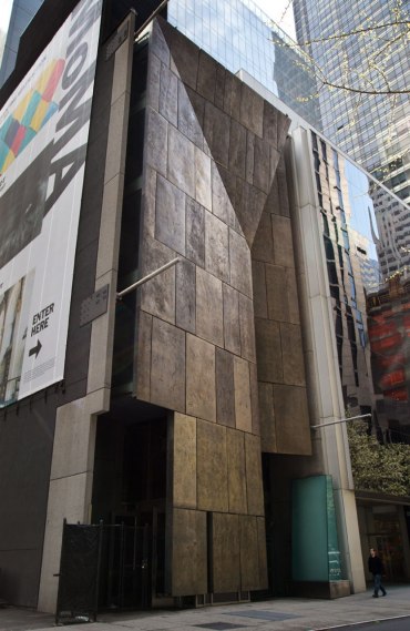
Not sure why it didn’t occur to me sooner, but the news this week that MoMA’s started the dismantling of the Folk Art Museum gave me a flash of inspiration: The Williams+Tsien Folk Table Collection. Turn each bronze alloy panel into a unique memento/tabletop. Maybe there’s enough material inside to use for legs, &c., too. I see a couple dozen dining tables, as many coffee/side tables, and a handful of console/sofa tables. An edition of up to 63. They’d be a stunning addition to the finest home, and quite the conversation piece.
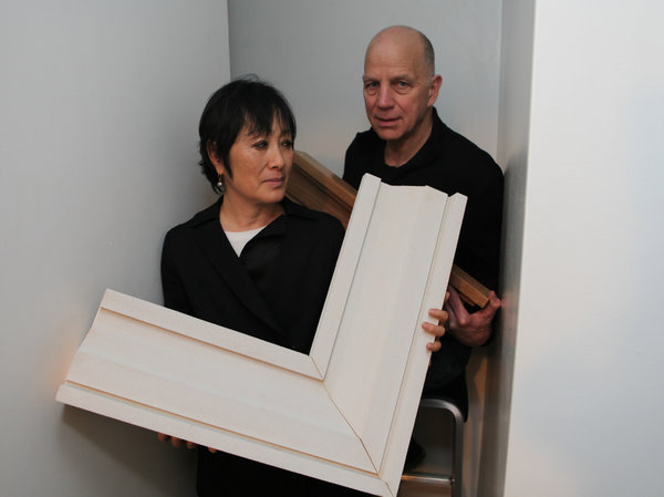
Actually, the inspiration came from Chester Higgins Jr’s photo of Billie & Tod holding architectural fragments. The domestication of architecture.
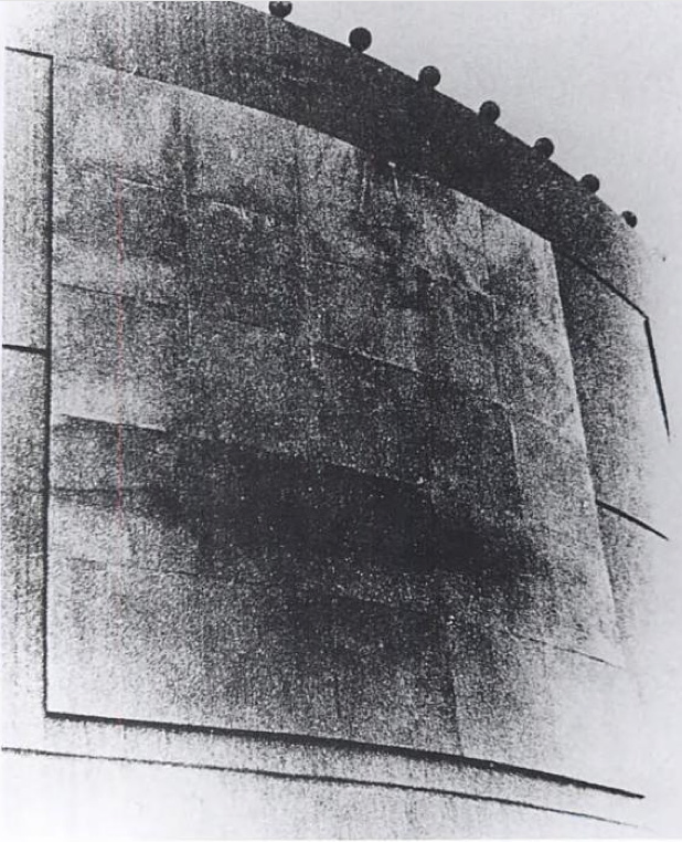
Also from the Times: Fred Conrad’s great photo showing the use of photomurals to evoke/approximate historical spatial experience at the Jewish Museum’s “Other Primary Structures” show. It’s interesting that they’re angled and mounted on wall-sized panels, not stuck to the moulding-encumbered wall. Makes them a bit more exhibition design and a bit less exhibition, I suppose.
Richter tweeted this the other day, and it’s been nagging at me ever since:
Reproductions of ‘Aunt Marianne’ and ‘Mr Heyde’ are shown in the exhibition ‘Registered, Persecuted, Annihilated’. gerhard-richter.com/exhibitions/…
— Gerhard Richter (@gerhardrichter) April 1, 2014
the exhibition of reproductions of paintings, that is, not just paintings based on photographs. Also, of course, the show is at the world’s most intensely named museum, the Topography of Terror.
I’ve reached out to the Topographers, hoping to find out more about how paintings function in an exhibit like this, and how the decision was made to include them as reproductions. But so far I have received absolutely no response. But I did get some screencaps from a YouTube video of the opening, which I can’t find right now:
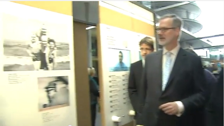
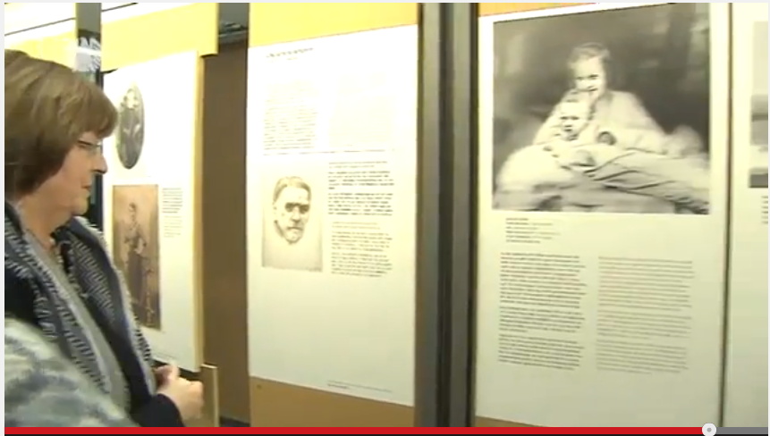
Hmm, actually the panels look like reproductions of pages of books, not of paintings. Simultaneously more and less interesting.
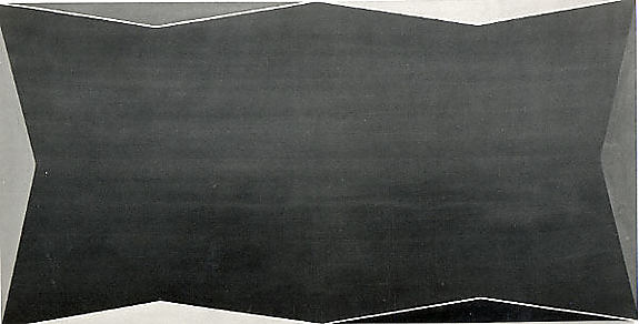
While rummaging around the Met’s collection database, looking for Arthur Vincent Tack info, I Google Imaged up this hard edge painting. Which apparently hadn’t been documented in the color photo era, but I couldn’t find it on the Met’s site.
As I was posting this I realized the filename is the accession number, 1978.565, Larry Zox. 1978’s obviously too old for Hard Edge; the painting’s from 1966, an at once unusual and logical size of 50×100 inches. Untitled (from the Double Gemini Series).
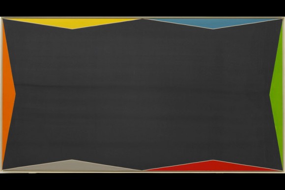
Turns out the Guggenheim has a very similar painting, Alto Velto, from 1969. Color really matters in these jpgs.
Martin Bromirski posted images from a 2008 Larry Zox show at Stephen Haller.
Richard Prince’s Spiritual America, 1983, Executed In 1987 Or So
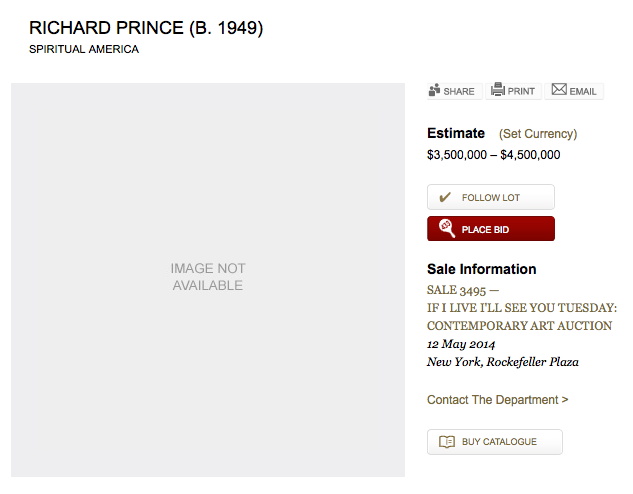
Christie’s is selling a 20×24-inch print of Richard Prince’s Spiritual America in their extra-edgy sale, titled “If I Live I’ll See You Tuesday….” Though apparently it’s not so edgy they feel comfortable running the image of the work. Maybe the added attention to the image that comes from a 100x increase in the pre-sale estimate–since 1999, the last time they sold the same print, 10/10 is it right that this is the only one of the 12 prints to ever come up for auction?–makes even auctioneers uncomfortable.
But the price spike has not spurred any new interest in when Prince actually made the object being sold. In both the 2014 and 1999 catalogues, the print is listed as “Signed, numbered and dated ‘R Prince 1983 10/10’ (on the reverse)” and so “Executed in 1983. This work is number ten from an edition of ten plus two artist’s proofs.”
Except it’s not. Christie’s quotes Prince’s recent bird talk post where he recounts the creation of Spiritual America in unprecedented and fascinating detail. He’d scored a copy of a “pamphlet” Gary Gross self-published, which included an image of the sexualized photos of a 10-yo Brooke Shields, from Gross’s agency. He rephotographed it, developed it, selected the image to print, and ordered a single 8×10 proof, which is what he ended up showing as Spiritual America in 1983.
Christie’s’ doesn’t quote the part further down, where Prince writes,
eventually gave the 8×10″ of Spiritual America to Myer Viceman. Frame and all.
In 1987, after I joined up with Barbara Gladstone, I editioned it. Ten copies and two APs. I had my lab print it on ektacolor paper at 20 x 24″.
Which clarifies, or changes a bit what Prince said in his 2009 deposition in the Cariou v. Prince case. Cariou’s lawyer was asking about a “settlement,” with Gross over the rephotography of his image:
I mean Mr. Kennedy is talking about a 1992 discussion at the Whitney, and I believe at that time I bought the rights to the image for $2,000.
Q. From Gary Gross?
A. Yes.
Q. Because he threatened to sue you?
A. No. I was told by the Whitney that I–in order to exhibit that image I made a concession, or they advised me that it would probably be best that–and I believe I sort of reached out to him at the time.
Because up until then, that image that I rephotographed from that pamphlet that he had produced in 1983, I made one copy, an 8 by10, and I gave it away. And it wasn’t until 1992 that it came back into the limelight, and I think my attitude changed a bit and I was sort of willing to become more part of the process I suppose.
Q. And at that time you made ten copies plus an artist proof?
A At the time there was ten copies and i believe two artist proofs, none of which I own.
So until just now, I’d thought this meant he made the edition to release in time for his Whitney show, but I think he’s actually not saying that. He’s saying that the Whitney was requiring him to get a license from Gross before they exhibited Spiritual America. But the editioned prints already existed. So maybe the right date is Executed in 1987. Or maybe, you know, call someone to confirm it. RP’s tweet about the execution:
@gregorg Immaculate Conception.
— Richard Prince (@RichardPrince4) April 19, 2014
Now let’s talk about the Whitney’s insistence on getting clearances before showing appropriated work. How often does that happen?
Walter De Maria Called
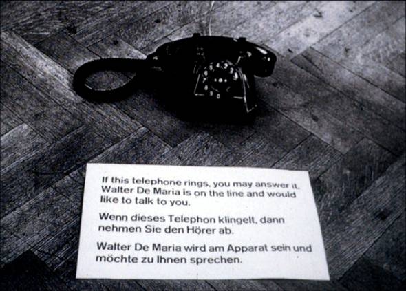
Walter de Maria, Art By Telephone, 1969, installed in “When Attitudes Become Form,” Kunsthalle Bern
For the 1969 conceptual group show “When Attitudes Become Form,” curated by Harald Szeemann at the Kunsthalle Bern, Walter De Maria submitted Art By Telephone.
A black phone sat on the gallery floor next to a little sign in English and German: “If this telephone rings you may answer it. Walter De Maria is on the line and would like to talk to you.”
In his wonderful book, The Lightning Field, Kenneth Baker quotes from De Maria’s proposal for the piece that the artist will “telephone into the exhibition and over the period of the month use $200 worth of telephone time in conversing with whichever visitor’s fate may have been placed near the telephone, about any subject at all.”
Besides this invocation of fate, which, more in a minute, I’d completely forgotten the artistic implications of international long distance charges. Phone calls used to be really expensive. I can’t find the rates for Switzerland, but a November 1969 article in the NYT mentions a NY-to-London rate of $2.40/minute. So De Maria’s piece would have been maxed out in less than an hour and a half.
If he’d called. Which, according to Germano Celant, who was involved in putting Szeemann’s show together, and who restaged the now-landmark exhibition last year in Venice for the Prada Foundation, and who discussed the show(s) in February at the Reel Artists Film Festival in Toronto, he never did. In video of Celant’s talk, which was just posted by Canadian Art, Celant answers a long statement/question about restaging as autobiography:
Or Walter De Maria, that gave us the phone, and he said, “I never called.” You know, the piece is the phone and it says, “When the phone rings, on the other side will be Walter De Maria speaking to you.” But he never called in Bern. [audience laughter]
So De Maria pocketed the money? So smooth, so hilarious. I’m sure had they known, the Swiss would have protested that, too. Celant goes on:
So I said, “Walter, what we can do?”
“Oh, no no, this time I will call.”
[audience laughter]
And he did. And he spoke with Miuccia.
Oof.
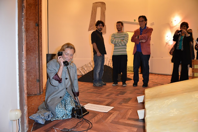
image: getty for prada, via let them talk, which lol
Here’s that convo, by the way, from the May 29 opening part of the show, placed by fate and publicists. Now the driveway moment:
You know, there are so many personal things, you know, then he was supposed to call me, and, unfortunately he died.
And so then we have to take the piece off, because naturally, after he passed away, the piece was not available–was not possible anymore, you need–when the rings start, on the other side is Walter De Maria, but Walter is dead. So we have to took a picture, and we have to replace–so there’s this kind of life element in this kind of show, that I like very much, and that’s biography.
Damn. This. This is why I’m a fan of unscrubbed transcripts. It just feels more.
Also, I’m really not clear why they had to remove it once the artist died. Wouldn’t his not calling at all be a more historically accurate recreation of the installation in Bern? The Venice show opened June 1st, and De Maria passed away on July 25th. Roberta Smith’s obituary said he’d had a stroke in May, but was undergoing treatment. Did he call anyone else? Was he still able to talk? If not, was it still somehow less problematic to show the piece when he was alive, but incapacitated?
Because, though I readily acknowledge Celant knows the artist and his intentions for the piece far better than I do, but I’d totally show that phone. The idea of leaving the phone out after De Maria was gone is not nearly as sad as the idea that the only person he spoke to was Miuccia Prada. Besides, what if he called?
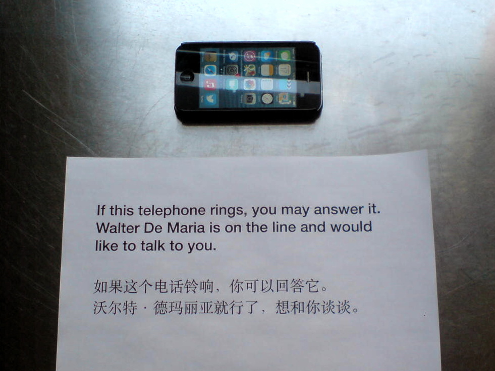
update: Untitled (Study for Art By Telephone, After Walter De Maria), 2014
From Evening To Dawn With Augustus Vincent Tack
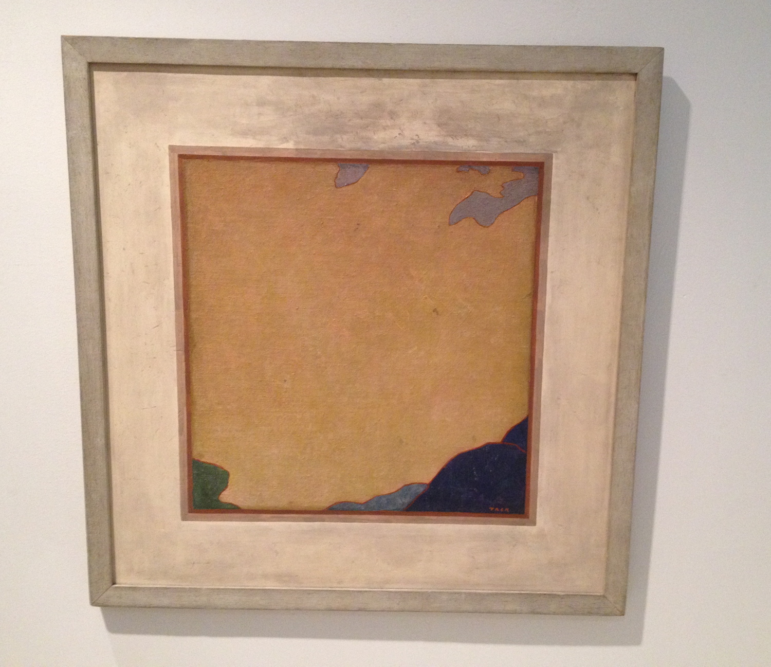
I went to the Phillips yesterday to see the “Made in USA” show and to get out of the rain. After seeing the nice John Frederick Peto trompe l’oeil, I was distracted and annoyed by the grain of the canvas in some John Henry Twachtman painting or another. No sooner had i sworn eternal allegiance to gesso than I turned the corner, went up 1/3 a flight of stairs, and was stopped cold by Augustus Vincent Tack’s painting, Evening. And I had to take it back.
What an amazing little painting. The Phillips is Tack Central. They have 79 of them. I’ve never seen this one, though, nor its similar-looking partner Dawn, which faces it in the stairwell.
Almost every Tack in any other museum was foisted on them by Duncan Phillips. [Tyler did a nice post on the Tack paintings in the Phillips in 2011.] Born in 1870, Tack painted classical moderne murals, more traditionalist portraits, and extraordinary landscape photography-based abstraction.
Obviously [sic] it’s the abstractions that amaze here. He really only did them for Phillips, between 1922 and 1934, who apparently became disappointed when they didn’t change the course of abstraction and modernism. [Curator Leslie Furth writes about Phillips’ unrealized hopes for Tack’s critical uptake, and how the artist seemed to drop the abstract ball decades too soon.] Tack, Phillips wrote in 1933, was destined to have “a limited reputation as an…eclectic painter…rather than as one of America’s most original painters.” This, from his biggest fan.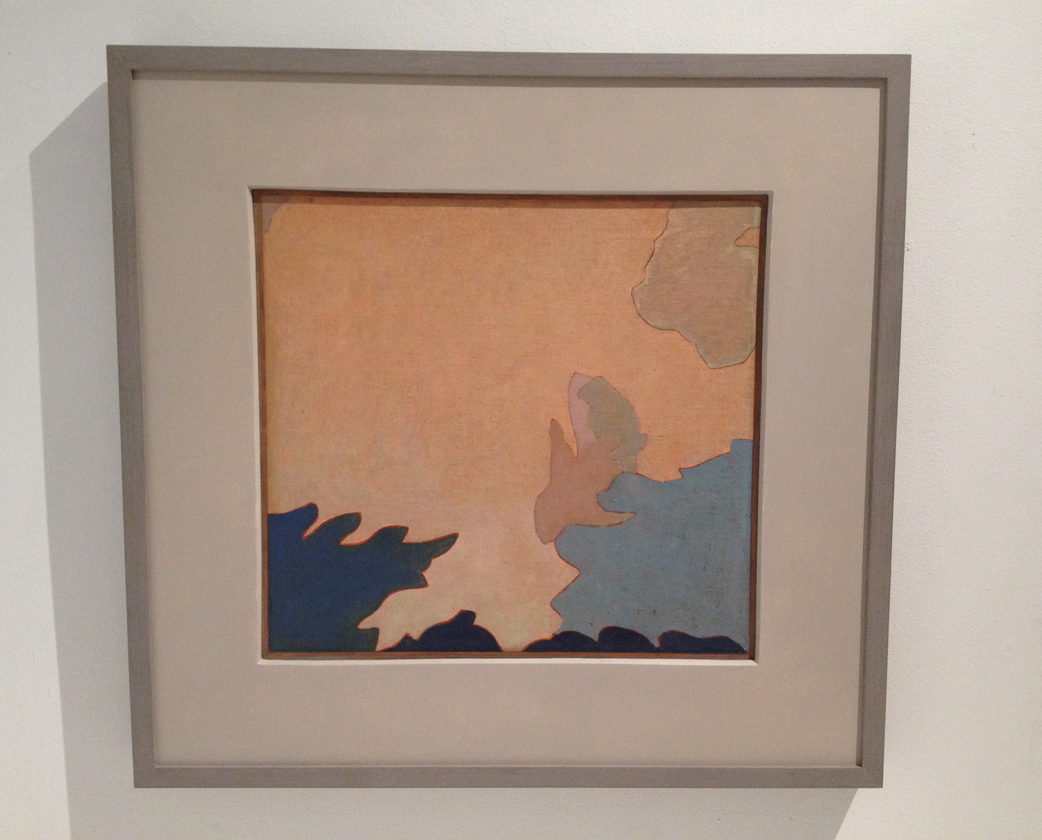
Evening and Dawn were painted after this letdown. “Between 1934 and 1936,” is how the Phillips dates these abstractions, which were variously willed to the museum by the artist or bought from his wife’s estate in the 1950s. Tack would blow up details from photos of Death Valley and transfer the forms of clouds, rocks, mountains, sky, whatever was there. [Stieglitz was taking similar-sounding photos, abstractions of clouds known as Equivalents, at the same time. Several are in the show.]
Let’s be real here, though. He’s sort of like family for the Phillips, the wistfully visionary uncle, but the reason anyone cares about Tack at all is because his paintings look like Clyfford Stills. Bafflingly so. Frustratingly so. Amazingly so. Still was the titan Cronus to the AbEx Olympians. But what would that make Tack? Uranus? Except the lineage is not clear, or even suggested. Still was sure Newman stole zips from him [which makes him, what, Prometheus?], but though Still was in Virginia in the 20s and 30s, and may have visited the Phillips, no one really considers that Still got the core of his abstraction strategy from Augustus Vincent Tack. It’s more likely [to me] that their paintings are similar because their inspirations were similar: the powerful forms, colors, light, and space of the western landscape.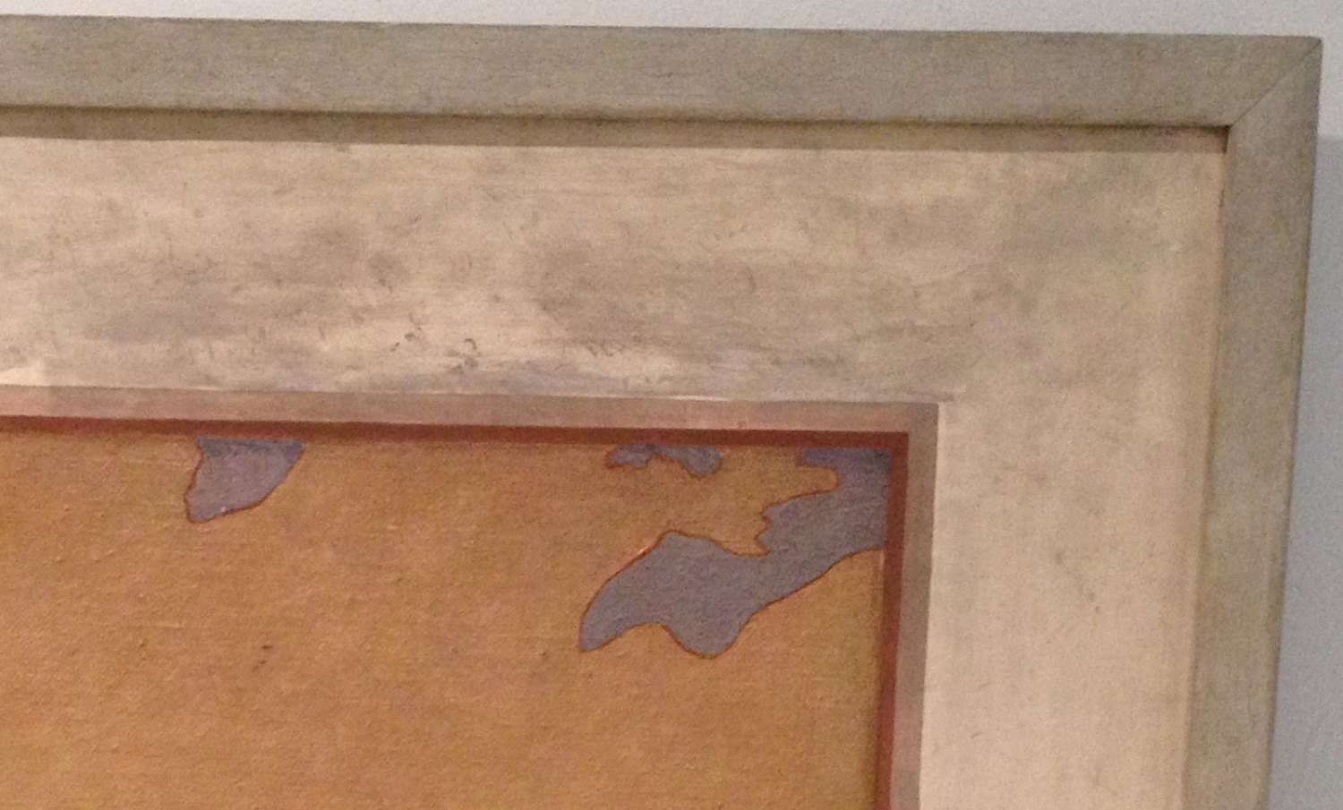
But that’s not important now. What really blew me away about Evening was that Tack had painted a painting of a painting. That’s entirely flat, as flat as a Peto, and just as tricky. The abstract center, where Tack signed it, has the tooth of the canvas still visible, but the mat/wall part, the smudged space around it, is smooth. And it’s possible that it’s a mat, not a wall. Maybe it’s even likely. Dawn has a hardboard mat/border around it. See the shadow along the top edge? And Evening has no shadow. This is not an academic trompe l’loeil. But the little white along the top edge of the painting, which separates it from the schmutz, could read as a highlight.
Forget Still. Was Tack anticipating Johns? And Richter, for that matter? Was Tack an eclecticist painter too many decades ahead of his time? I doubt it. And that’s the problem with a word like “anticipate.” It seems to me that Tack was in and of his time and place, and as a capable, open-minded painter, was aware of a whole range of possibilities. And he tried them. And they worked. But he also stood apart from the social structures and networks in which art history was self-consciously created.
Tack’s practice and his trajectory should make us more aware of the social, interpersonal forces at work in art history, and of the bias we have for a heroic narrative of breakthrough, discovery or innovation. Many of the painting possibilities we credit to later painters were also known to a random guy like Augustus Tack. But he didn’t influence anyone, except Duncan Phillips. Which, on the flipside, Phillips’ championing of Tack’s polyvalent work to the institutional powers of the day also didn’t stick. But maybe our more eclectic time can find something to learn from someone like Augustus Vincent Tack. Off to the library.
The Absence Of Evidence
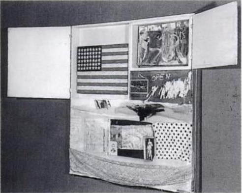
Short Circuit (aka Construction with J.J. Flag), c. 1958? photo: Rudy Burckhardt
Errol Morris’s new film about Donald Rumsfeld has me thinking a lot lately in terms of the known unknown, and the unknown unknown. As I’ve tried to find the missing Jasper Johns flag painting that was in Robert Rauschenberg’s 1955 combine Short Circuit I’ve kept running into another formulation which bridges the two: what we think we know.
It’s not that the story of Short Circuit as it trickled down through history in footnotes and parentheticals and anecdotes was wrong, so much as incomplete. . And the elisions have shaped the widely accepted understanding of both artists’ work. But it also prompts the question, “Who’s ‘we’?”
Because someone knows what happened to that flag painting. Someone’s always known. It just wasn’t me.
Art Of The Bush School
You go to war with the paintings you have, not the paintings you might want or wish to have at a later time.
Right now the paintings we have are by George W. Bush.
Why do they exist? Why are they being exhibited? How are they being used and discussed? Why do they matter?

image via flickr
I think the simplest answer for why George W. Bush started painting is because he has nothing else to do. Bush is toxic and unemployable as a political figure. He can’t campaign for Republicans, can’t talk on television about anything important, can’t give speeches for money, can’t write memoirs, can’t travel to certain countries where he runs the hypothetical risk of getting arrested for war crimes. Painting is a harmless and respectable pursuit that offers an aura of cultured acceptability.
As he explained to Jay Leno, the idea of taking up painting comes from Bush’s fantasy of being, or being compared to, Winston Churchill. Churchill painted. Of course, Hitler also painted. If painting makes Bush like Churchill, does it make him like Hitler, too? Is either association, when based on painting, more or less outrageous than the other? Painting becomes a rhetorical device, an uncritical excuse for likening Bush to Churchill. This has political ramifications that should not be ignored, yet they almost always are. That’s the transformative power of painting.
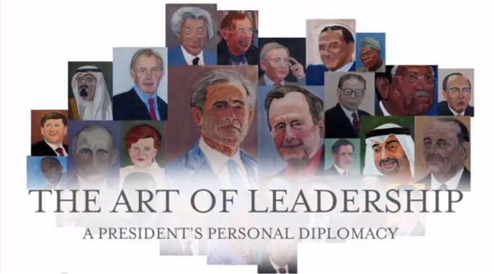
“I was sitting up here wondering how to kind of live life to the fullest,” Bush told the History Channel, a sponsor of the GW Bush Center’s exhibition, “The Art of Leadership: A President’s Personal Diplomacy.” “That’s the wonderful thing about painting. It’s absolutely transporting,” said Laura Bush.
Bush’s painted portraits of world leaders he worked with are central to the premise of the show, which is that “personal diplomacy,” i.e., personal friendships and relationships, are a transformative aspect of a successful foreign policy, i.e., Bush’s foreign policy. Bush is personable and sensitive, which these other leaders felt, which enabled the achievements of his administration, these painted portraits show.
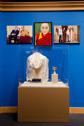
Is that too heavy for you? The paintings are the lone, personal expression in an exhibit that’s otherwise nothing more than documentation of the systematic diplomatic ritual of documentation and exchange. They are flanked by “jumbos,” large prints of photos taken by the official White House photographers, a format which lines the halls of the West Wing. Many portraits are accompanied by state-themed statuettes, books, and objets, the official gifts Bush received from his counterparts.
“But the paintings provide a personal insight that such artifacts cannot,” wrote Dallas Morning News reporter Tom Benning, who toured the show with the artist:
As Bush walked through the exhibit, he stopped at each portrait to share not just an art critique, but a reflection.
He painted his dad, George H.W. Bush, in a “loving way,” as a “gesture of compassion.” He depicted Blair as a “good pal” with a “determined face.” He focused on the Dalai Lama’s lips to show his “gentle, sweet countenance.”
He aimed for a “sympathetic portrait” of German Chancellor Angela Merkel to highlight her sense of humor. He put a smile on former Japanese Prime Minister Junichiro Koizumi to show that he’s “just a fun guy.”
Afghan President Hamid Karzai is “a little wary” and “suspicious about the future,” reflecting his “enormously difficult job.” Iraqi Prime Minister Nouri al-Maliki “doesn’t look real confident,” a nod to his “fragile democracy.”
“Eyes are very important,” Bush said. “You can convey a feeling about somebody.”
This is as good a time as any to point out that Bush painted his portraits, not just from photographs–a common enough practice as well as a long-established conceptual strategy, though I think only the former pertains here–but from the top search result on Google Images. Many photos were taken from the subject’s Wikipedia entry. Bush based his paintings on the literally first-to-surface, easiest-to-find photos of his subjects.
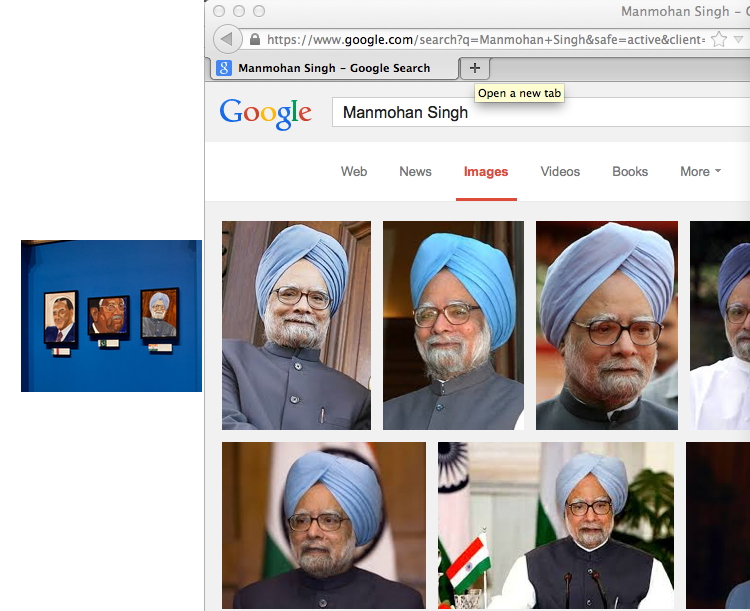
Is this meaningful in any way? If he had one, it would mean Bush’s studio assistant is very, very lazy. But in all his discussion of it, Bush’s painting practice appears to be a solitary one. He apparently did not tap the enormous archive of photos, taken by the professionals who followed him every day for eight years, which are contained in his giant library. Instead, it seems, he Googled the world leaders he made such impactful relationships with himself, and took the first straight-on headshot he saw.
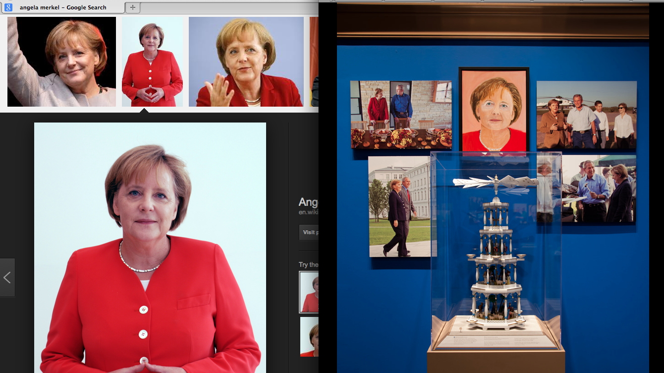
By outsourcing the editorial decisions about the source images to Google and Wikipedia, the rest of the paintings’ decisions can be claimed by The Decider himself. The sources serve as an index of Bush’s subjectivity, interpretations, and technique, only some of which is hinted at in his walkthrough. Maybe there’s an audioguide? Whether they are successful artworks in critical or aesthetic terms is an entirely separate question. But it is disingenuous, dishonest, or delusional to claim Bush’s paintings are not art.
They are the art of our time. The art of the 21st century. The art of the Bush Era and the Global War on Terror that made him famous. And for many who care deeply about art, that is very depressing. And damning. We yearn for art’s relevance in our society, for art to have an impact on our culture. We want people to experience art and to feel it’s important. Unfortunately, George Bush’s paintings accomplish all those missions. They’re the newsiest paintings to come along since George Zimmerman’s eBay auction.
Bush and his paintings grab the media spotlight just as reporters are gaining traction in the years-long struggle to account for the criminality and deception of Bush & Cheney’s CIA torture regime. The 6000+ page Senate report on the CIA, and the CIA’s own equally damning first account of itself, plus its responses, plus vast amounts of documentation of torture practices, are slowly moving toward declassification. Leaks are starting to emerge. Official facts are starting to be documented. The practices that continue to poison US courts, treaties, military & foreign policy, and intelligence, are finally coming into sharper view–and the man responsible for it all is successfully fending off his reckoning with a paintbrush.
Ironically, there is even more important art buried within the Senate’s trove of classified CIA documents. And as Bush was being interviewed by his daughter on NBC, these other artworks were still being actively suppressed. Jason Leopold and Al Jazeera reported that the Senate report contains detailed sketches of waterboarding by Abu Zubaydah, a senior Al Qaeda leader imprisoned at Guantanamo. He did not base his drawings on Google Images, but on his firsthand experience. As a “high-value detainee,” Zubaydah was waterboarded at least 83 times at a CIA black site in Afghanistan, with each interrogation session authorized and closely monitored from the White House.
Zubaydah produced ten drawings on yellow legal paper and index card-sized paper, detailing multiple torture techniques he was subjected to, Leopold reported in 2011. Since the CIA illegally destroyed its own waterboarding videotapes in 2005, these drawings may be the most powerful visual evidence of the Bush torture regime we have left. In March Leopold also obtained and published Abu Zubaydah’s diaries from before his capture, when he had been waterboarded and interrogated by Pakistani intelligence–without, it should be noted, yielding any true or useful intelligence. Which the CIA knew.
The point is, once again, art matters. Art has surfaced in the most dire circumstances, at a crucial moment in our society’s history, produced by someone whose actions and moral standing confound our engagement with it. And culturally speaking, we don’t care; we’d rather see Bush’s folksy pictures from the internet. Every news story about Bush’s paintings represents ten reports not filed about Bush’s torture. In the art world, meanwhile, we’d rather not see it at all. Better to condemn and dismiss it quickly. Snark and move on. Stoke the indignance that keeps us and our practices unsullied. Ward off any engagement with cowering incantations of connoisseurship and facture.
This is how art appears in our society today. Art works, as they say, and this is what it does: it absolves and redeems and defuses and deflects. Ultimately, George Bush’s paintings are important less for what they show than for what they obscure. And the art world’s critical structures seem unable or unwilling to meet the challenge posed by the art of the torture & terrorism school.
The Art of Leadership runs through June 3, 2014 [bushcenter.org]
36 Links From My Life With Ubu
I’m really stoked to contribute a top ten list to UbuWeb this month.
When Kenny Goldsmith invited me to submit a list, I first tried to come up with some new, revealing, conceptual strategy for generating it. I thought of the top ten most viewed items, and then the ten least viewed. But then I learned that Ubu doesn’t keep logs. I thought of the ten largest files, but then figured it’d just be the longest movies, and big whoop. I thought of a top ten list of top ten lists. And when I worried that I would just be mirroring some taste or trend, I thought of identifying the ten items most frequently included in other peoples’ lists. Several more ideas were patiently disabused out of me, and I began running through my chance operations options.
Then I realized I’d already begun making my list, starting back in 2002, when I linked to ubu.com from my blog for the first time. Ubu at that point was still quite mysterious, and much smaller–mostly ancient and arcane concrete poetry reprints I frankly hadn’t heard of. But I kept coming back. A huge collection of video and audio appeared, Kenneth Goldsmith came out from behind the curtain, seeming much older and august in my mind than he turned out to be–I imagined he was a survivor of this lost underground scene, not an explorer.
Anyway, I assembled my list from twelve years links here at greg.org, highlights from my life with UbuWeb. They’re roughly chronological which has become an indispensable collaborator, not just a source of discovery and inspiration.
Introducing greg.org MONUMENT
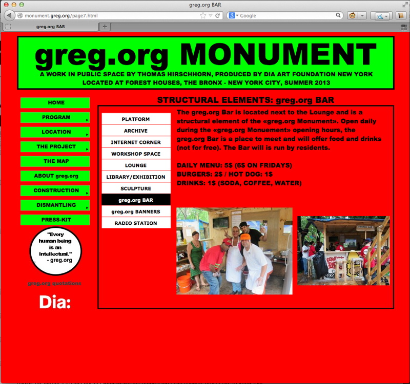
monument.greg.org is now live.
I thought it’d take five minutes. hah. If I’d known how much time all the pdfs were gonna take, I would’ve just ‘shopped a screenshot instead.
On’s Location
Try keying in these coordinates into Google Maps. Joseph Kosuth’s gift to @vanabbemuseum #ThePartInTheStory http://vanabbemuseum.nl/en/…
— Witte de With (@WdWCentrum) March 30, 2014
So I did as I was told this morning, and clicked:
And now I’m confused. So I googled:
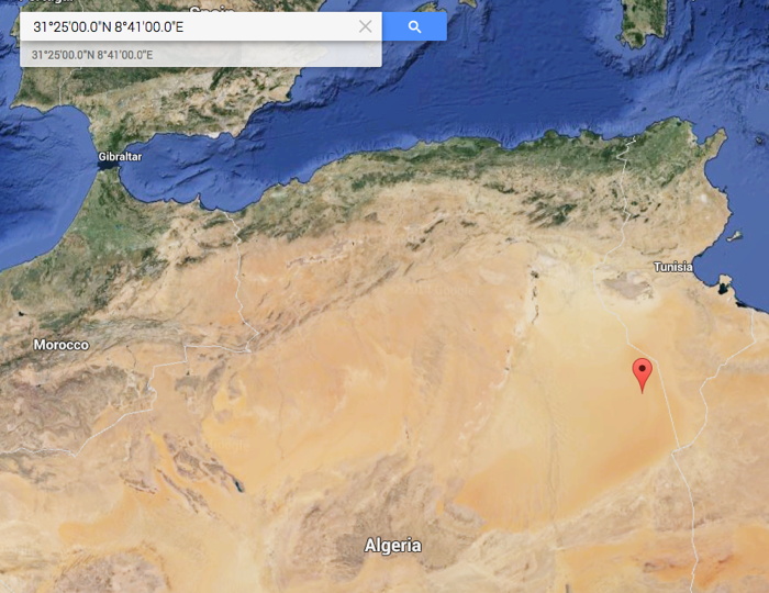
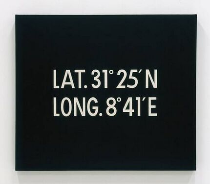
And now I’m even more confused. The painting is from Joseph Kosuth, but it’s by On Kawara. It’s titled Location, 1965, one of his earliest canvases still in existence. It’s one which predates, but obviously prefigures, his Today series, which began in 1966.
Only it’s not a series. And its coordinates, in the middle of the Sahara desert in eastern Algeria, don’t indicate where it was painted. It happens to be called the Grand Erg Oriental, the Great Eastern Sand Sea. But as a location it’s so utterly remote and barren, it’s more like a noplace than a someplace.
Title, 1965, collection nga.gov, image via
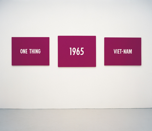
So what is it, and why? I have no idea. At first I thought it might have some highly political resonance like another of Kawara’s early paintings, Title, also 1965, the magenta triptych that seems like a protest against American military involvement in Vietnam.
Algeria had been the site of a devastating and anti-colonialist war against France, the aftermath of which continued well into 1965. Kawara moved to Paris from Mexico in 1962, just as France was losing, and hundreds of thousands of Franco-Algerian refugees began pouring into the country.
Kawara’s not one to explain his art, though, or talk or write about it at all. In fact June 1965 was the last time he discussed his work publicly, in an interview with Bijutsu Techo critic Homma Masayoshi. I’m trying to scare up Homma’s text from some Japanese library stack, but otherwise, who knows?
Well, maybe Joseph Kosuth does. Kosuth donated the atypical Kawara painting to the Van Abbemuseum in 1980 with the tagline, “in memory of Fernand Spillemaeckers,” his Belgian dealer who passed away in 1978. Spillemaeckers was instrumental in introducing conceptual art to Belgium, and he gave Kosuth a show in 1975. I imagine he was instrumental in Kosuth’s Text/Context billboard exhibition, which kicked off in Europe at the van Abbemuseum.
Art as Idea as Idea, 1968, collection vanabbemuseum.nl
Or maybe Kosuth threw the Kawara in for free after Spillemaeckers sold the van Abbemuseum a half dozen formally similar Kosuths in 1977-78, including five Art as Idea as Idea photostats from 1968, and the ink-on-glass series One and Nine A Description, from 1965.
Location hasn’t been shown much, or written about almost at all. It was reproduced in the catalogue for GNS [Global Navigation System], a 2003 collective show at the Palais de Tokyo. According to their blog, the organizers had proposed a project to Kawara, who rejected it, but allowed them to include Location. [So it’s not that Kawara doesn’t talk about his work; he just doesn’t talk about it with you.]
And of course, it will be included in The Part In The Story, an exhibition curated by Heman Chong and Samuel Saelemakers, which opens at Witte de With in May. If they’re tweeting about it with this much lead time, maybe this is finally our chance to find out what’s going on with this Kawara painting.
The Part In The Story Where A Part Becomes A Part Of Something Else opens May 22 at Witte de With [wdw.nl]
Untitled (UKR-RUS Flag Carpet)

I don’t know what’s going on here. This image was the intro for a Yahoo News slideshow yesterday on Russia’s annexation of Crimea, and so it doesn’t have any caption or credit line.
At first I thought it was just a graphic of the Ukrainian and Russian flags, but looking a bit longer, I started to wonder why it had these irregular, dingy, textured spots on it. Which would be odd for a CG graphic, but normal for a photograph.
But then what’s it a picture of? A wall? A carpet? Is this a detail from a giant flag mural somewhere? Did someone make a flag-themed rug for some international event? Which people have been walking all over like some geopolitically conflicted Rudolf Stingel installation?
Anyway, the obvious solution now is to make such an installation. I can see a whole series of flag carpets, coming soon to a regionally appropriate biennial near you.
Sister Corita’s And John Cage’s Rules
Usually the Internet solves mysteries by yielding definitive information. Sometimes it makes it worse, though, and more confusing. Tumblr, I’m lookin’ at you.
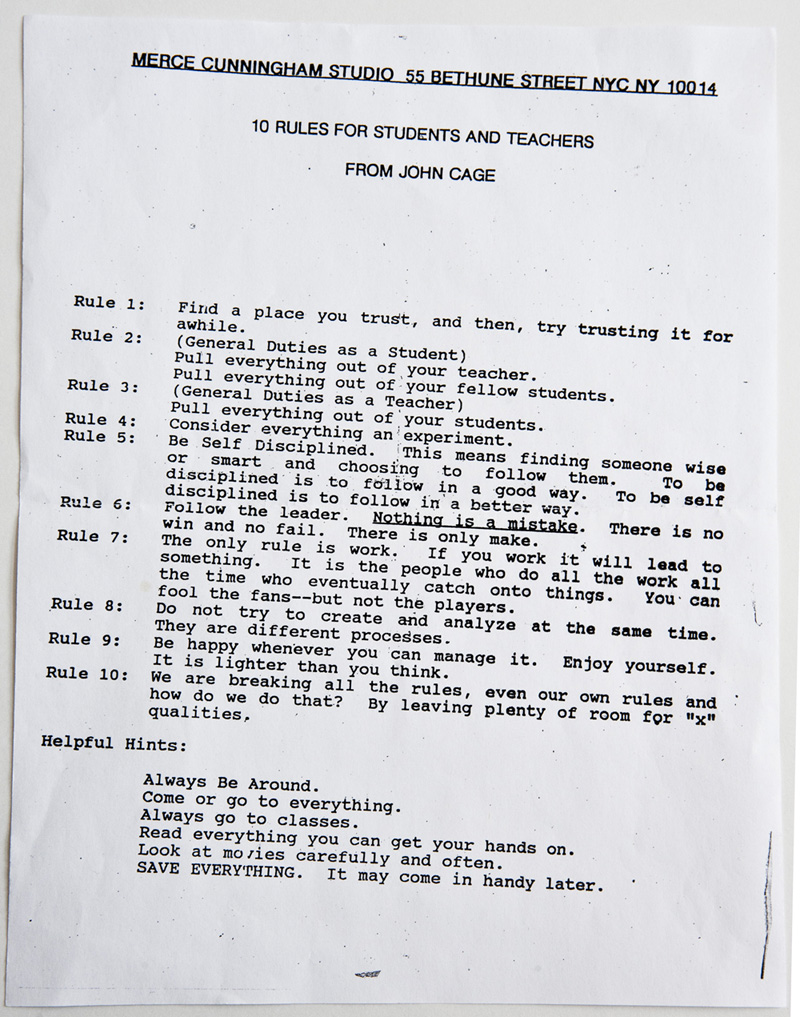
Artist/artist book hero Dave Dyment emailed the other day, wondering what I thought about the source of 10 Rules For Students And Teachers From John Cage, which was famously on the wall at Merce Cunningham’s studio for years, and which has been circulating online in various photocopied and scanned forms.
Except for Rule 10, which is a quote from Cage’s book SILENCE, Dave didn’t think it really sounded like Cage, and I certainly agree. And he’d never been able to find the other texts in Cage’s published works. So who might have written it, if not Cage? And if he didn’t write it, how did it get attributed to Cage, while it was hanging on the wall of Cage’s longtime partner’s studio?
In 2012, Brain Picking had said that despite what everyone thought about Cage, 10 Rules’ actual author was everyone’s favorite serigraphicist nun, Sister Corita Kent.
Which was funny, because in 2010, blogger Keri Smith wrote about 10 Rules [update: 2014 Internet Archive version] because she’d heard exactly the opposite: that despite what everyone had heard about Sister Corita, those rules were actually written by John Cage. And one source of that information was none other than Laura Kuhn, of the John Cage Trust.
Smith’s post attracted some seriously high quality comments in 2010-12, including students of students of Sister Corita who remembered the Rules; and scholars of dancers who remembered the flyers. Then in June 2012, Jill Bell quoted “Richard Crawford who was in on the creation of ‘The Rules’.” Crawford was a student of Sister Corita’s in 1967-68, and says she gave the class the assignment to come up with a list of rules one night, and then to design and print them up. Cage’s quote was contributed by one of the students.
Which, even if it’s definitive, still doesn’t explain how they got to Cage, and to Merce with Cage’s name. The Rules circulated among Kent’s students and school. They were included in the 1986 edition of the Whole Earth Catalog, with Cage’s name in parentheses following Rule 10. Whether Kent sent the Rules to Cage before this, or after, or Cage found them and posted them, or a Merce dancer found them, they were connected to Cage and had a resonant presence in Cunningham’s and Cage’s community. If the last two years have uncovered any additional history from the MCDC side, I haven’t seen it, but I’d love to.
2012: 10 Rules for Students, Teachers, and Life by John Cage and Sister Corita Kent [brainpickings.org]
2010: You Know I Love A Good Mystery [kerismith]
Ed. 15/24, Bernard Madoff’s Soft Screw
Holy smokes, who knew that Rhonda Lieberman had the complete works of Thorstein Veblen in that Celine bag, and that she’s not afraid to swing it?
After years of quiet one-eyebrow-raised reportage from the art world circuit, Lieberman has published a blistering takedown of neo-Gilded-Age collecting in, of course, The Baffler. And yet somehow, she seems to manage to leave most [non-Crystal] bridges unburned. No small feat.
I was ready to storm the ramparts, when I was caught by this paragraph:
Bernie Madoff’s prized piece of office art was a four-foot sculpture of a screw that he frequently dusted off himself (he, like Donald Trump and scores of other plutocrats, is a notorious neat freak). A defense lawyer pleaded for the valued object to be photoshopped out of court documents, lest it be prejudicial to members of the jury. When Madoff’s Ponzi scheme went bust, J. Ezra Merkin, whose feeder funds supplied Madoff with investors, was no longer Mastering the Universe quite so comfortably. So he sold his stunning batch of Rothkos for $310 million. Whenever I see a Rothko I think of Madoff, and how the afterlife of modern art is now yoked to the pissing matches performed by the big swinging dicks of Wall Street.
Merkin’s Rothko firesale in the earliest days of the Madoff scandal, I know. But this screw is new to me. Let’s learn more.
OK, that was fast, here it is:
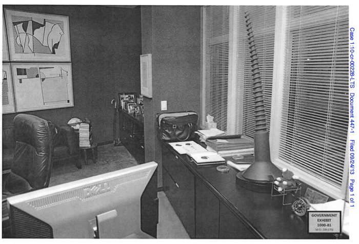
Government Exhibit 1000-81, document 447-1, 2008 photo of Bernard Madoff’s office showing [r to l] a Beanie Baby in a tiny Wassily chair; Claes Oldenburg’sSoft Screw, 1976; Henri Matisse’s Tete de Femme, 1952; and plates III & VI of Roy Lichtenstein’s Bull Profile Series, 1973
The court case is for a group of former Madoff employees, and last September federal prosecutors and defense attorneys debated the meaning of the sculpture, its symbolic embodiment of the firm’s “lad culture,” and its implications for the alleged accomplices’ case:
The screw sculpture appeared in photos of Madoff’s desk, and a witness would testify that it was removed during an SEC on-site examination in 2005, prosecutors said. But defense lawyers argued that it was unfair to link a possible symbol of ripping off investors to their clients.
“The issue with this screw is that there is a secondary meaning that the government is going to try to implant with the jury, that it was a kind of inside joke… that was known to some of the defendants here,” said Eric Breslin, the lawyer to Madoff account manager Joann Crupi.
That quote is from Newsday, quoted in a lengthier discussion at Above the Law about the implications of the judge’s unusual order that evidence be Photoshopped before being introduced. I’m still trying to find the redacted image.
Anyway, the sculpture, as you might guess, is by Claes Oldenburg. It’s called Soft Screw, from a 1976 Gemini G.E.L. edition in cast black urethane on a mahogany base. Madoff’s example is signed 15/24. There were also three artist proofs, one special proof, and three publisher’s proofs.
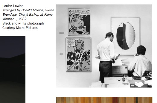
In documenting the “crime scene,” government investigators have inadvertently made their own Louise Lawler photo. The Lichtensteins remind me of an actual Lawler, Arranged by Donald Marron, Susand Brundage, Cheryl Bishop at Paine Webber, 1982 [above], which was in the Met’s Pictures Generation exhibition in 2009. The self-satisfied wall text accompanying that Lawler bugged me because of how it privileged museums as interpreters of meaning.
Lawler’s work is so fascinating precisely because it explores the life [sic] of art outside of the white-glove, white cube of the museum, and it gains power from the unexpected resonance between the autumnal colors of a Pollock and the Limoges; between a Lichtenstein print and a fax machine. It should be a reminder of what gets lost when art’s only presumed destiny is to end up in a museum.
And really, is there a greater reminder of loss than Bernie Madoff? Let’s consider the meaning of a giant, soft screw in the office of a legendary investment manager who everyone he worked with quietly knew was a running a decades-long con. Or the undiluted symbolism of Lichtenstein & Picasso bulls in the collection of the former chairman of NASDAQ. Or Jasper Johns numbers prints 0-9 and Twombly’s graffito abstractions in a firm with an entire floor dedicated to forging a paper trail for its non-existent transactions.
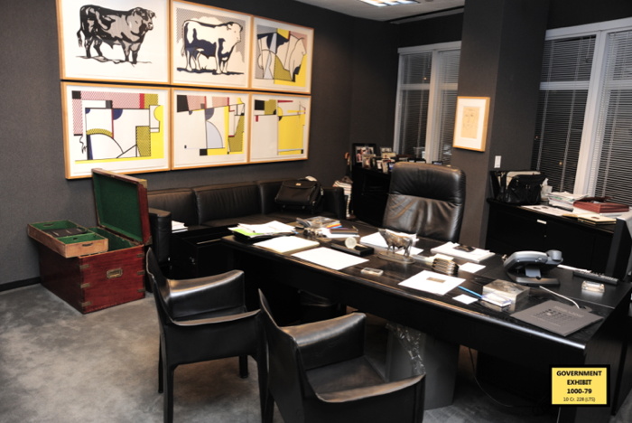
Madoff’s edition of Lichtenstein’s Bull Profile Series, 1973, is #31/100, btw. image: USG Exhibit 1000-79
Maybe it’s here in the offices and conference rooms of the financial industry where art functions best: as abstractions of the predatory system it’s embedded in; as markers of cultural refinement in a ruthless boiler room of capitalism; as a spoonful of aesthetic sugar to help the banking go down.
And nothing says art commodification quite like the large-edition prints Madoff favored. Most of the three dozen or so name brand artworks decorating Madoff’s office were made in editions of 75, 100, 150, even 250 and 300. And soon you’ll be able to invest yourself, because it will all be for sale. The Wall Street Journal reported last summer that a bankruptcy judge approved the sale of Bernard L. Madoff Investment Services (BLMIS)’s art and furniture at Sotheby’s. Though originally planned for last fall, I just spoke with Sotheby’s, and the Madoff hoard, such as it is, will be included in the prints sale this May.
another example exhibited
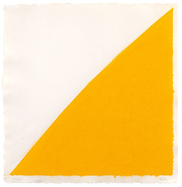
Which gets me wondering: would it be possible to capture and preserve the Madoffian implications of these works as they are wrung through the art market? Can we flag these specific examples of these prints as Collection Bernard Madoff forever, and see how they perform going forward? Not just in terms of the market, but in their critical dialogue, their meaning? Can Madoff’s example, 4/24, of Ellsworth Kelly’s Colored Paper Image XIV (Yellow Curve), 1976, mean something different than ed. 22/24, above, which Susan Sheehan Gallery just brought to the Armory show? And can ed. 15/24 be forever known as Bernard Madoff’s Soft Screw?
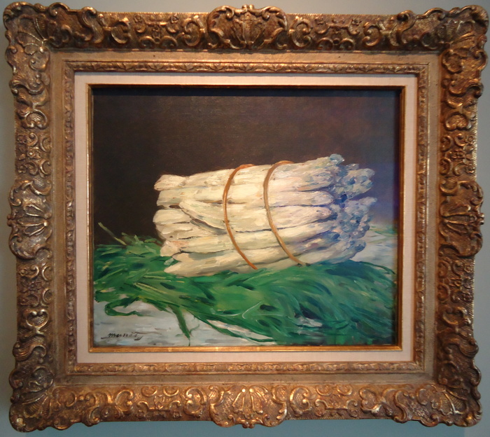
Bunch of Asparagus, 1880, Edouard Manet, collection Wallraf-Richartz Museum, Cologne, image: cabbagegames
In his Project 74, Hans Haacke pieced together the ownership history of a little Manet painting, Bunch of Asparagus, from the German-Jewish artist whose work had been banned by the Nazis, to the ex-Nazi banker who headed the committee which bought the work for the the Wallraf-Richartz Museum. Can we not do the same thing prospectively, writing Madoff into the history of each of his artworks as they go back into circulation? I think we can.
UPDATE Wow, these screws are so screwed. Art conservation researcher Joy Bloser emails that around 2007, various examples of Oldenburg’s Soft Screw started melting. Or to put it another way, THEY STARTED MELTING. The urethane began an irreversible process of depolymerization, reverting to a liquid. The bendy tip of the screw usually starts dripping away. Here’s one image of a drippy screw; here’s an album of several more screws from the edition. What an incredible mess. Apparently, urethane reversion is exacerbated by inconsistent mixing; or exposure to light, heat, or moisture. When screws became discolored, some gallerists apparently recommended collectors just polish them up with Armor-All. Bernard Madoff insisting on dusting his own Soft Screw may be one of the most prudent, conservation-minded decisions he ever made.
Hoard d’Oeuvres [thebaffler via Giovanni Garcia-Fenech]
Bernie Madoff’s Giant Screw: Is Photoshop A Proper Rule 403 Remedy? [abovethelaw]
Madoff Office Furniture, Art to be Sold at Auction [wsj]
Exhibit A: Property from BLMIS, the 8-page list of Bernard Madoff’s artworks [PDF, published by WSJ at documentcloud.org, backup copy here at greg.org]