School [sic] of Asawa

Architectural Digest slideshow image [R] before people called out Gwyneth’s Asawa knockoff and [L] after, blurry Ruscha–assuming it’s actually a Ruscha, which ¯\_(ツ)_/¯ –was blurred by Ruscha, images: architecturaldigest.com via @langealexandra

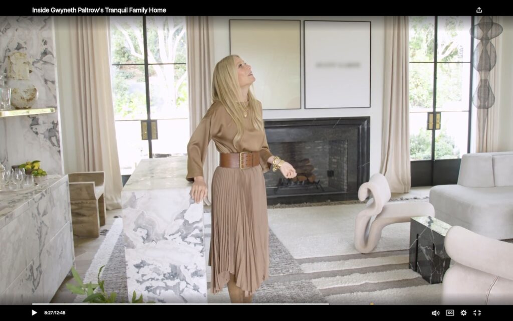
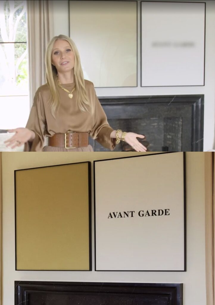
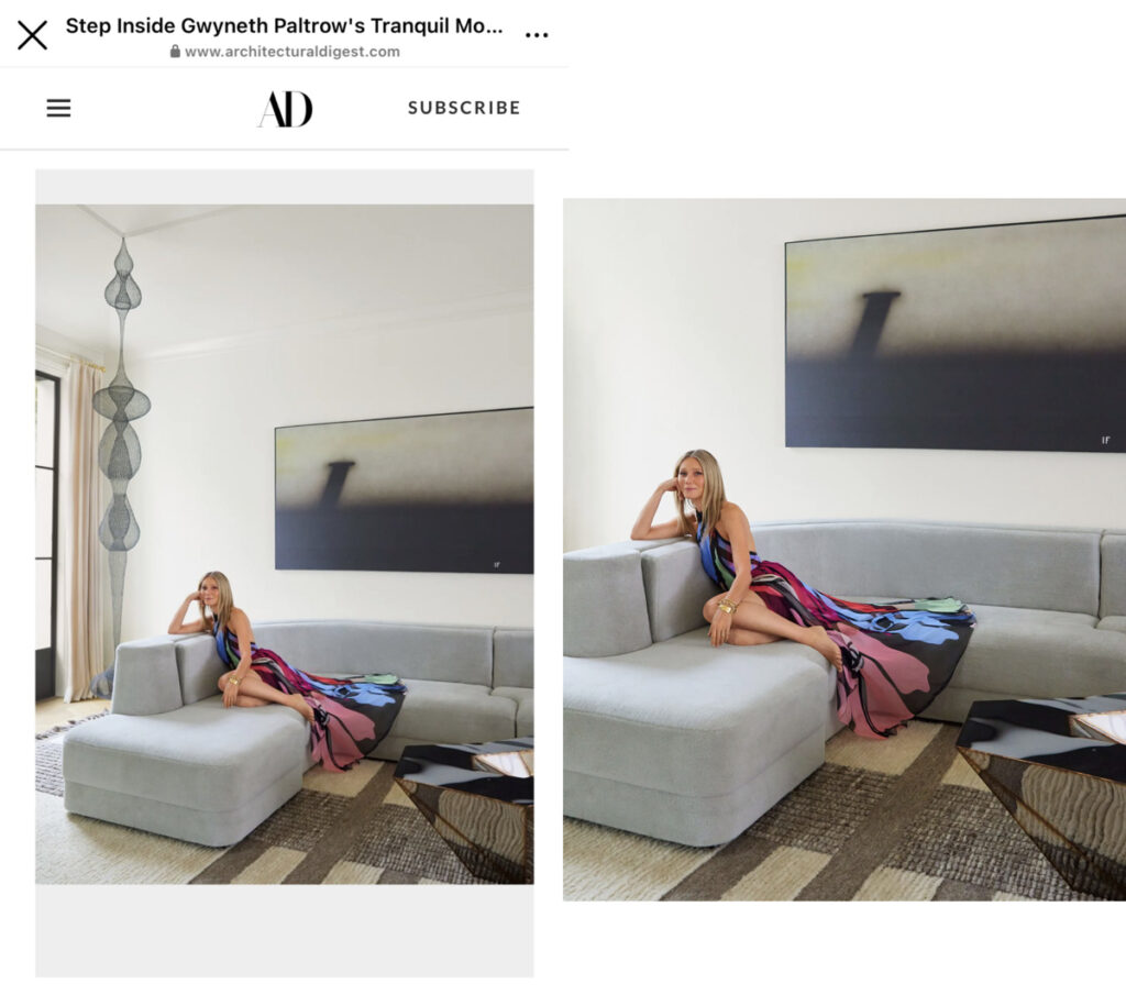
Yesterday morning, I joined in Alexandra Lange’s consternation at Gwyneth Paltrow’s non-optimal installation of a Ruth Asawa sculpture in front of a window–worse, a patio door–and behind a sofa. I made my peace with it in context–and by focusing on the blurry Baldessari instead.

By yesterday afternoon, we’d all been on a quite journey, because it turns out Paltrow’s Asawa is NOT an Asawa after all. Architectural Digest cropped the sculpture out of their slideshow, and removed all mention of it from the credits. INCLUDING, I’d point out, the image licensing by Artists Rights Society on behalf of the Asawa Lanier Estate.

Does this help? Gwyneth with blurred not-an-Asawa, archdigest video cap altered by greg.org [blurred I-guess-it’s-a-Baldessari in the original, obv]

Part of me is morbidly fascinated with how the Asawa attribution and credit ended up in the piece, and I fully expect Architectural Digest will never tell us. Did Paltrow claim it? Did the writer and editor assume, but not factcheck? Or did they factcheck, and an assistant or the decorator friend claim it? Did ARS not do anything besides send an invoice? Did the Estate know and intervene? Or know and roll with it? What did the Zwirners do? Is there even a way to tell if an Asawa is real, besides the provenance–and the price?

Also not Asawa? The caption on the 2017 A/D feature about RH’s fit out of Goop’s Santa Monica office makes no mention of the not-Asawa in the corner. photo: Dennis Friedman

Did the woman who pivoted from selling fake health products to shilling for crypto somehow mislead people about the authenticity of the wire sculptures in her sponcon features? Did the self-described online auction-scouring furniture obsessive forget who made a 10-foot tall sculpture, and whether she paid $9,000 or $900,000 for it? Did she forget it twice? Because there are at least two. In Lange’s thread, Warren James linked to a different Asawa-looking sculpture in the Restoration Hardware-designed waiting room at Goop, from an A/D feature from 2017. Gwyn.eth done knew.

a screenshot of ruth asawa knockoffs by d'lisa creager, all sold at rago arts auction house in new jersey
10 of the Fauxsawas sold at Rago lately: image: ragoarts.com

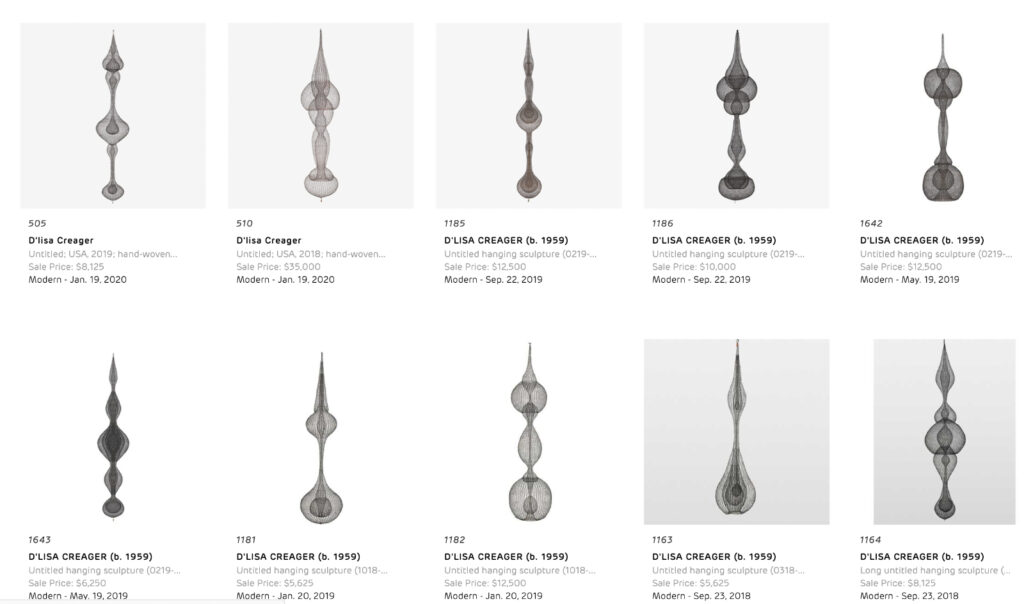
And her design obsession is the tell. Because various regional auctioneers, including the now-merged design auction houses of Rago, Wright 20, and LA Modern, and modernist design fairs in Palm Springs all regularly feature knockoff Asawa wire sculptures for sale. The ones in Oakland, who knows, but most of the others seem to be consigned directly by their maker, D’lisa Creager. Her own website shows a variety of bodies of sculptural works, but the ones that appear publicly, like clockwork, two per auction, are her Asawa knockoffs. She’s sold 20 at Rago since 2016, when Asawa’s own prices were on the rise. (Zwirner began representing the Estate in 2017, and prices have jumped from five to seven figures as collectors and museums have been playing catch up.)

As a guy who makes facsimiles of artworks, I feel acutely aware of the lowkey wildness of calling out someone for making knockoffs, but it’s not just a question of honor among appropriationists. Creager is filling a demand–for cheap and plentiful Asawas–for which there is no supply. But she’s doing it by claiming to have been taught by Asawa and her family, when in reality, she attended a lecture Asawa’s daughter gave at the Japanese American Museum in LA. It’s this phony, implied lineage, just vague enough to avert a statement from the Asawa camp, that really bugs me. That, and the design/auction world’s willful trafficking in obvious knockoffs, whatever the market will bear.

Fortunately, if the editor’s letter is any indication, Gwyneth’s false attribution will live forever in print. Subscribe now.

lol UPDATE: A/D now credits the work as by D’Lisa Creager. Congratulations on your first Architectural Digest appearance[s that we know of]!

Untitled (Prima Facie), 2022

gwyneth's montecityo living room is pale gold and pink and grey in its vibe. a drapey lighting fiture of multiple light elements across the ceiling are connected with catenary swags of black cable. it echoes slightly the fake ruth asawa [turns out it's fake, lol, that's one result of this post] hanging wire sculpture in front of a double glass door, one of two on either side of the fireplace, the garden beyond that. the main architectural feature of the room is not the curvaceous mod wood or italian chairs, or the large squared off grey sectional sofa, which just sticks in from the right. it is the bonkers scale black and white marble bar, freestanding, with a matching marble console and thick slab wall behind it, which feels like it was extracted from some other setting. the lightnig makes it look pink. over the flat black fireplace is a john baldessari diptych: a square gold monochrome on the left, and a white square painting with the words avant garde in the center, on the right. it is legible only in the photo still from architectural digest, and blurred in the video with goop herself. a licensing thing. an ridiculous.
TFW Yoshihiro Makino shoots Gwyneth Paltrow’s new living room with John Baldessari’s 2007 diptych, Prima Facie (Fifth State): Avant Garde for Architectural Digest, and they pay ARS for a print and/or web license

Alexandra Lange brought Gwyneth Paltrow’s troublesome installation of her Ruth Asawa sculpture in front of her patio door to Twitter’s attention this morning. And I confess, seeing the Architectural Digest photos, that included Lindsey Adelman’s drapey light installation, and a Ralph Pucci hammock also hanging from the ceiling of Paltrow’s new Montecito living room, I, too, was troubled. For a minute.

But after watching the video tour, and hearing the care and attention to detail, feel, design, and material that Paltrow and her people put into this project, I became fine with it. How else *should* an Asawa sculpture live, but in an actress-turned-influencer’s slightly louche, ultra-deluxe living room full of stuff hanging from the ceiling? Not everything should be a white cube. As long as the door, or the dog, or the kid, doesn’t hit the fragile sculpture, go wild, Gwyneth. [LATER THAT DAY UPDATE: NOT an Asawa! Problem solved! Or, rather, replaced with new problem!]

Gwyneth looking at the Adelman light thing, while all other eyes are staring straight at the blurred out Baldessari on the wall. [screencap: Architectural Digest video]

That’s not important now. Not when the Baldessari diptych over the fireplace is blurred out in the video. I’m guessing A/D did not want to splurge for the video license from ARS? I also love that all they felt they needed to blur out is the text on one half of the work; the monochrome painting is undefaced.

screenshots of gwyneth in her arch dig video with the blurred out text, avant garde, on the john baldessari painting behind her. too cheap to pay the video licensing from ars, or ars too onerous to not embarrass itself and the artist and conde nast with this substandard content.
below is the unblurred detail of the same work from the photo above
together these images comprise a study for a new work, untitled (prima facie), in which the right panel of the diptych is a lenticular print that shifts in and out of focus as the viewer moves.
Study for Untitled (Prima Facie), 2022, enamel on canvas and lenticular print on aluminum, each 52.5 x 42 in.

Speaking of face, there’s a new one in town. Untitled (Prima Facie), 2022, is a lenticular print mounted on aluminum and enamel on canvas diptych where the avant garde grows increasingly sharper with a move to the right.

It is inspired by Baldessari’s Prima Facie (Fifth State): Avant Garde, a 2007 diptych which is itself based on a spread found in Baldessari’s 2006 artist book, Prima Facie: Marilyn’s Dress: 2006/2007 – a poem in four parts, which was available in both book and deluxe book with a print editions. Earlier states of the Prima Facie series had photographs of actors and actresses where the monochrome is here, with words chosen to be the instant, descriptive equivalent–and equal in visual impact-to the image. Baldessari showed works from the Prima Facie (Fifth State) at Sprüth Magers in London in mid-2006, where Paltrow might have seen them, but this 2007 work came from Marian Goodman. These works are depicted in David Platzker et al’s Baldessari Catalogue Raisonée, of course, and the Museum Dhondt-Daehnans in Belgium put out a comprehensive-at-the-time catalogue of Prima Facie works for a show in 2005-06. Untitled (Prima Facie) is a greg.org exclusive.

2.2.2022

Phung Vo Facsimile Object (PV1), 2022, 297 x 210 mm, digital print, with full-size, digitally printed COA, signed and stamped

I’ve written before about the long reach of Danh Vo’s 2.2.1861 (2009 – ) on my thinking, but also specifically on the Facsimile Objects project, before I made a one-off Facsimile Object of it. Having a visual of Phung Vo’s beautifully transcribed letter from soon-to-be-beheaded J. Théophane Vénard to his father in front of me, instead of tucked safely away, has leveled up that influence.

It makes me try to improve my handwriting. It intensified my preference for A4 paper, which turns out to be difficult to find and work with in a world that defaults to 8.5 x 11. It prompted me to seek out the original source for Vénard’s letter. It got me to learn LaTeX. It, along with spending time with aging parents and a global pandemic, made me think about mortality, the moment that awaits us all.

And it made me think about what a Facsimile Object does, or what it could do.

Phung Vo Facsimile Object (PV1) is one result. It is the transcription of a slightly different published version of Vénard’s letter than the one Vo uses. It is set in LaTex using the French Cursive font package created by Emmanual Beffara, and printed on Vietnamese A4 paper. A certificate of authenticity matches it, and both are contained in an A4 document sleeve.

The layout is inspired by Vo’s 2.2.1861, but between the machine font and the slight textual differences, the line breaks diverge after just four lines. It’s a bit like how the clocks in Felix Gonzalez-Torres’ “Untitled” (Perfect Lovers) slip out of sync, except for the perfect lovers part, and the baked-in indexing of facsimulatory failure.

I am not decided about what to do with these. Part of me wants to make them available on demand. Part of me thinks they shouldn’t go out until the…end of Vo’s project. [Here at the beginning of a new lunar year, I once again wish Phung Vo a long, healthy, happy, and prosperous life.]

As I contemplate this, I remember back to a project I started in the Summer of 2014, to continue On Kawara’s Today Series after the artist’s death as a communal practice. It was called fromnowon.us, and it would have made it possible for people to order a date painting from Chinese Paint Mill, depicting the date on which it was painted. I’d arranged the production, even getting the painters to include a sheet of the local Shenzhen newspaper with each completed painting. When the test painting arrived, it turned out to be from Sept. 11th. Which gave me pause.

But anyway, I’m still working through this.

Prev, related:
2021: Danh Vo Facsimile Object (V1)
2014: On Kawara Today

Roberts Gober & Henry Logan

Untitled c. 1910/1976?/2021, Robert Gober and Robert Henry Logan, Graphite on paper, oil on board
28⅛ × 14¾ × 1¼ inches; 71 × 38 × 3 cm, image: Matthew Marks Gallery

I am going to miss the Robert Gober show at Matthew Marks, “Shut up.” “No. You shut up.” which closes today. But I thought I’d seen a part of it before.

The show is full of windows, or rather, the confoundingly meticulous fabrications of fragmentary window/sill mises-en-scenes set in high minimalist-style metal boxes. John Yau’s description of the works is close and precise, and his description of experiencing them is open and profound. It’s a combination that Gober’s work has come to demand.

Lois Dodd, View through Eliot’s Shack Looking South, 1971, oil on canvas, collection: The Museum of Modern Art, gift of Robert Gober

Yau mentioned remembering a painting I’d never known, Lois Dodd’s View through Eliot’s Shack Looking South, 1971, which was acquired by MoMA in 2018–a gift of Robert Gober. Gober and OPP [other peoples’ paintings], though, made me realize I’d seen that little painting up top before.

That painting, by a relatively forgotten American Impressionist, Robert Henry Logan, who I confess I hadn’t known until 2020. Turns out during the lockdown phase of COVID, Gober and I had been getting our art fixes in the same place: surfing the websites of every auction in town and beyond. This brushy, little painting was in an American Art sale in September 2020 at Swann Galleries, along with other such memorable lots as this weird, little Walt Kuhn acrobat/clown duo; a very watery take on Central Park by John Marin; and several nice Burchfield bargains.

Though I think this is the first time he’s used another artist’s work in his work, Gober has often worked with the works of other artists as a curator. In 2009 he organized a retrospective of Charles Burchfield at the Hammer, which went to the Whitney in 2010. And for the 2012 Whitney Biennial, curators Jay Sanders and Elizabeth Sussman had Gober curate a show-within-a-show, a room of paintings and archival material by Forrest Bess. Even when it’s not visible, or even referenced, Gober’s curating fleshes out a context for his own work. It broadens the view of the world he sees, beyond the one he presents to us through his own work.

Beyond, but also alongside it. In the 2014 show at MoMA, Gober punctuated the experience of his seeing his work with a gallery of resonant work by other artists. A recreation of a group show he curated at Marks in 1999, it included an Anni Albers textile, a Robert Beck video, and a pair of truncated nudes by Joan Semmel facing each other across a Cady Noland stockade.

Jasper Johns studio view from June 2021, featuring some assemblage-style works, via Matthew Marks

Thinking of this show again also changed the context for the other element of this assemblage: the student-era sketch of a crutch and chair back, dated around 1976. When I first saw it in the online viewing room, Jasper Johns’ shows were still fresh in my mind. Johns, too, had recently mashed up an awkward, injury-related student drawing and a painting. And then he did a whole show of variations. [Another relevant Gober series in the show: found academic drawings of feet, to which Gober added text, or inserted a jail window. These guys and their disembodied body parts.]

A 1975 Robert Gober painting installed in “The Heart Is Not A Metaphor,” MoMA, 2014

But then the chair hit me. Gober sprinkled early works throughout the MoMA retrospective, which ended with a big, c. 1975 painting of an interior. Actually, it’s a chair in front of some windows. Actually, it also includes a painting of a painting of a chair in front of some windows. And while the backs of these chairs may not match, the lines sure do. I have to admire Gober’s continued ability to generate a feeling of uncanny familiarity, if not outright déja vu. If only I’d been able to see it at all.

More On Richard Serra’s First Show

The other day while gooftweeting some highlights of the real estate slideshow for Villa Aurora – still available, now 20% off! – I made a joke, entirely for an audience of one, about Richard Serra’s first show, which took place in Rome in 1966, while he was traveling on a Fulbright with his then-wife and fellow Yale sculpture MFA Nancy Graves. Titled, “Animal Habitats: Live and Stuffed,” the show delivered exactly what it promised: live and taxidermy animals inside various crates, cages, and other “habitats.”

photo of Richard Serra and the pig in Live Pig Cage I, 1966, from the Time Magazine article on his show at Galleria La Salita in Rome

Though it got covered in Time magazine, and Serra would later neg the show while claiming credit for inadvertently launching Arte Povera, in the ten years since I first/last blogged about it, I’ve never seen any other mention of the show, or discussion of the work. And none of it survived, I wrote back then, even in reproduction.

But it turns out I was wrong. A picture of photocopy of a picture of a work arrived from Rome. In the 1980s a group of Serra works from “Animal Habitats” were put up for auction in Italy by Tomaso Gian Liverani, the owner of Galleria La Salita, where Serra showed. It’s not clear what they were or where they went. But in 1987, Emanuela Oddi Baglioni, another Roman dealer, was offering a group for sale. Was it the same group, or part of it? Where there others? Oddi Baglioni’s gallery was across the via Gregoriana from la Salita, but it only moved there in 1967. Did she buy them at auction from her neighbor? Or did they not sell? Are there more? They survived 20 years, though! What happened after that? Did someone buy them?

Anyway, the work, which may have been in Liverani’s group, Oddi Baglioni’s group, both, or neither, is above. The scale of the piece is not clear, but there is a long-beaked bird [taxidermied, I’d hope] sticking out of an urn?, with a thick sheaf of weeds? underneath it, on a [readymade?] metal stand? a plant stand? And the title of the piece is HAIR ON OR AFTER GASM ONE, to Barney Newman.

OK. Thank you? I do not know what to do with this information. Which, now I think I know how Barney Newman felt?

Spice DAO Facsimile Object (S1), 2022

Study for Spice DAO Facsimile Object (S1), 2022, 11.5 x 15 in., high-gloss dye sublimation pigment on aluminum panel, installed between FOOL Facsimile Object (W1), 2021 and Vermeer Facsimile Object (V0.9), f/k/a Girl Unmuting, here titled Girl Voting Her Tokens To Burn The Book After Scanning So No One Gets Sued For Copyright Galaxy Brain, 2022

Congratulations to Spice DAO, which announced yesterday [sic] that they had successfully purchased a rare copy of a book containing the concept art and storyboard sketches for Alexander Jodorowsky’s legendary adaptation of Dune. The sale took place at Christie’s Paris on 21 November 2021, three days after Constitution DAO failed in its attempt to buy a printed copy of the US Constitution at Sotheby’s in New York.

Constitution DAO raised $47 million, only to be outbid by hedgie/collector Ken Griffin, whose privately negotiated guaranteed bid of basically $47 million and one dollars also included a rebate on the auction house’s premium, bringing his net to just $43 million. Spice DAO, no doubt quick learners, went into their auction for the EUR25,000 book with a EUR2.667 million bid, and managed to eke out a win.

Spice DAO’s purchase–technically, a private purchase and a transfer to the DAO, since Christie’s didn’t recognize the DAO–of Jodorowsky’s Dune bible was actually revealed last December, when it was still called Dune DAO. The story then was that these enthusiastic Dune fans were banding together to liberate the long-hidden copy of the lost, unmade masterpiece they’d gotten glimpses of in Jodorowsky’s Dune, a 2013 documentary directed by Frank Pavich. It was only when they tweeted their plans to,
“1. Make the book public (to the extent permitted by law)
2. Produce an original animated limited series inspired by the book and sell it to a streaming service
3. Support derivative projects from the community”
that copyrightlulz twitter was like, “lmfao YEAH NO,” and the buyers of $11 million worth of Spice DAO tokens became aware of the limits of the blockchain’s ability to overcome all humanity’s problems.

So while the governance discord debates selling NFTs of scans of the pages of Copy Number 5, then burning the actual book so they won’t get sued for copyright infringement [0.<], I am ready to move forward with the Spice DAO Facsimile Object (S1).

As much as I thought I’d leave Facsimile Objects in 2021, I realize that the Spice DAO Community needs them. Spice DAO Facsimile Object (S1) presents a perfect, facsimile of Copy Number 5 of Michel Seydoux Presents Alejandro Jodorowsky’s Dune from Frank Herbert’s Novel. Design by Jean Giraud. Machines by Chris Foss. Special Effects by Dan O’Bannon. Dialogue by M. Demuth and A. Jodorowsky, as it was sold at Christie’s on November 21, 2021. Printed at full-size, in high-gloss dye sublimation pigment on an 11.5 x 15-inch aluminum panel, the Facsimile Object embodies the true octavo (210 x 295 mm) presence of this historic, physical, artifact. It is accompanied by a similarly full-scale, handmade certificate of authenticity, executed in ink on handmade Arches paper, signed, stamped and numbered, and will ship in a handmade case.

Unlike previous Facsimile Objects, which were created for the world, Spice DAO Facsimile Object (S1) is only available to verified hodlers of Spice DAO governance tokens. The first 10 verified orders will be priced at 0.5ETH, payable in USD at the ETH/USD price on coinbase for the date of purchase. After that, the price will increase to 1.0ETH. Availability of Spice DAO Facsimile Objects (S1) will continue until morale improves. DM or email to get started.

[update: the price of the Facsimile Object is after taxes. Whether you sell ETH to buy the Facsimile Object, at whatever your basis, or you use your pre-existing fiat is not relevant, and greg.org will not pay your capital gains taxes. Thank you for your understanding.]

Debuilding Blocks

My interest in the decoupling of the artwork and ownership predates the creation of non-fungible tokens. One work conceived in 2009 is a [sic] jpg of fixed parameters, with varying physical counterparts. One ongoing series, begun in 2014, involves realizing works I own out of objects or situations over which I have no control. Rather than pursue a way to make those works saleable, I use them to consider what art can be if it is not a monetizable, speculative commodity, but perhaps a legal tool for reducing police violence, or an ingrained habit of an entire city.

In her profound essay for the Swedish art magazine Paletten, “The Ghostchain (Or taking things for what they are),” Geraldine Juárez essay looks at the same question from the opposite position. NFTs are the manifestation of assetization, where an artwork–or other object, digital or physical–is considered uniquely for its performance as a financialized asset.

Crypto-fueled hypercapitalization that recreates the divine right of kings on the blockchain is not inescapable, Juárez argues; another future is possible.

But if assets are just made up narratives about the future, perhaps we can create other stories where the value of the future is brought into the present with the intention of decapitalising these chains and make it socially and politically expensive to keep adding blocks in them, until blockchain infrastructures eventually turn into abandoned ghostchains…

Ghosts of private property.

So far, of course, the dematerialization of the art object hasn’t slowed its commodification, or at least the propensity for the art world to art market it. Juárez wrote her essay in reluctant response to David Joselit’s call [pdf] for breaking NFT’s “social contract that values property over material experience.” Joselit’s hope is for “spectatorial generosity,” that looking is enough, the October version of getting paid with exposure. Juárez sees beyond that. Just as right-clicking won’t pay the bills, it also won’t eliminate the incentives for aping. Instead, she argues for decapitalizing, eliminating the returns:

make it socially and politically expensive to keep adding blocks in them, until blockchain infrastructures eventually turn into abandoned ghostchains.

These copies could become a valuable historical document – a decentralised digital monument to the financial impulse of our present time of turning anything into an asset at any cost. A monument for a future where we no longer have time or patience for destructive technologies without social utility.

Whether we lose patience with art’s utility as a means for social exclusion, inequity, and speculation, of course, remains to be seen.

The Ghostchain (Or taking things for what they are) [paletten.net]
NFTs, or The Readymade Reversed [October, pdf]

Chain Thiebaud

Wayne Thiebaud, [Painting from Wimbledon for Sports Illustrated], 1967-68, as reproduced and captioned in 2018 on MANPodcast.com

I was listening to Tyler Green’s conversations with Wayne Thiebaud the other day, which he combined and reupped on Modern Art Notes after the painter’s death.

Which got me thinking about Tennis Ball, the 1968 painting Thiebaud made at Wimbledon for Sports Illustrated. [Story goes, the art director who’d gotten Matisse to do a cutouts cover for LIFE Magazine had originally approached Thiebaud to make some hockey-related paintings for SI, thinking, ice is white, Thiebaud paints white, but the artist didn’t care about hockey and suggested they send him to Wimbledon instead.]

Wayne Thiebaud, Tennis Ball, 1968, as illustrated in 2010 on sothebys.com

Tennis Ball is only 12 x 12 inches, a nearly perfect, little painting. Turns out it was sold at Sotheby’s, presumably by the family of the art director. The exhibition history and publication history are pretty thin for such a nice painting. And the reproduction, holy smokes. It took me a lot of scrolling and zooming to decide, based on the tiny white fleck of paint in the red border of the bottom edge of the ball’s shadow, that this is, in fact, the same painting. [Thiebaud had told Green that he’d only painted the one, which steeled my resolve.]

It’s low-key wild that the Sotheby’s website for this lot doesn’t even list the dimensions, or the date of the sale. Since Sotheby’s changed ownership, it feels like their sales results pages have been stripped down to tumblr levels of nothingness, and for what? At least if you click on the sale title (Contemporary Day Sale, NY, ofc), you can find out it was November 10, 2010.

Gerhard Richter, Abstraktes Bild (767-2), 1992, shown on the cover of Sotheby’s Nov 2010 day sale

Which is familiar. It was the catalogues for Sotheby’s November 2010 sales, Gerhard Richter’s squeegee painting on the cover, arrived on the table in Cy Twombly’s Lexington, VA studio while Tacita Dean was visiting–and filming.

In her work Edwin Parker (2011), released after Twombly’s death, Twombly and Nicola Del Roscio are seen chatting about works as they flipped through the catalogue that is out of the camera’s view.

Though there is a guffaw, and mention of de Kooning, whose work was listed next to one of them, Twombly seems to have made no comment on the two Twomblys in the sale.

Richard Prince, Untitled (Party), 1995-99, ed. 5.5, lot 348 in Sotheby’s Nov ’10 day sale

“I don’t get– I mean, who would want to put that on the wall?” Twombly says about what must be lot 343, a big neon 99 Cent Dreams work by Doug Aitken.
“I would put that!,” Nicola says.
Twombly snorts.
Nicola laughs, “I like that!”
“That’s Richard Prince.”
“How much is that?”
“18, 12-18,” Twombly replies. “I like that,” Twombly says of the work on the next page.
“You always like those, the dot paintings,” Del Roscio responds. [Lot 350? Damien Hirst.]

Damien Hirst, Bill with Shark, 2008, 3×4 ft oil on canvas, sold in Nov. 2010 for a couple hundred thousand dollars less than it was bought for in 2008.

Dean does not include any reactions to lot 355, a 2008 Damien Hirst titled Bill with Shark. This painting of Bill Gates looking at a Hirst sculpture was based on a photo by Jean Pigozzi, and was originally sold in The Charity Element, the five of 223 works in the artist’s one-man sale at Sotheby’s in 2008 whose proceeds were marked for charities. The half million dollars this painting brought went, pointlessly, to the Bill & Melinda Gates Foundation, whose mission was memorialized in the Sotheby’s press release as “aim[ing] to help reduce inequities in the United States and around the world.” Resold for $278,000, it probably netted the original buyer $200,000, which cost them $300,000 for the privilege of donating to one of the richest men in the world. None of this makes sense, but it does remind me that Melinda Gates divorced her husband last year because she found his explanations of his relationship with Jeffrey Epstein unbelievable and unacceptable. 👀

Ellsworth Kelly, Light Green Panel, 1982, sold at Sotheby’s in Nov. 2010.

The sale also included Ellsworth Kelly’s Light Green Panel (1982), from the awesome series of editions he produced with Gemini GEL. Who ever knows how big a Kelly is without standing in front of it, but these Gemini panels are all adorable-size, like posters that float an inch and a half off the wall. At 42 x 32 in., Light Green Panel are the biggest. Kelly produced them in eleven colors on aluminum panels in five differently sized polygons (only one size per color, though.] In addition to the prototypes, there are 15 or so of each of these panels out there. I would love to have them all, and to see them together again, like at the National Gallery.

7/11 Ellsworth Kelly panels installed at the National Gallery–including on a doorway–in 2015, for The Serial Impulse, a survey of Gemini G.E.L.

Or maybe slightly differently.

Ellsworth Kelly, Green Panel (Ground Zero), 2011, 22 x 49.5 or so, ed. 3+at least 2AC, one of which sold at Sotheby’s in May 2013

Which of course reminded me of Kelly’s 2011 aluminum panel edition, Green Panel (Ground Zero), the shape of which he derived from the NY Times’ aerial photo of the World Trade Center site. The 2003 collage he made and sent to Herbert Muschamp, is now at the Whitney, proposed the World Trade Center site be left as an open field of grass.

Ellsworth Kelly, Ground Zero, 2003, as sent to the NY Times back in the day. via: me

Sturtevant Johns Flag Photobomb

in the Chicago Sun Times photo: Doug Gauman for the Decatur Herald, but reproduced by AP in the Chicago Sun-Times, all via the American Federation of Arts collection at the Archives of American Art via @br_tton

In early March 1969, a sculpture by Marc Morrel of a pillow made of US flags hanging in chains brought the cops to the Decatur Arts Center in central Illinois. The director and president of the board were charged with flag desecration, and the work was confiscated.

The traveling group show, titled, “Patriotic Images in American Art,” was organized by Elizabeth C. Baker, managing editor of Art News Magazine, for the American Federation of Arts, and had been shown in previous venues around the country without incident. @br_tton tweeted the story after finding it in the AFA’s files at the Archives for American Art.

The two men fought the charges as unconstitutional restriction of free speech, but it would be twenty years before another artist, Dread Scott, could get enough judges to agree. But that’s another story.

Because just look at Doug Gauman’s photo for the Decatur Herald’s feature on the exhibition, showing a man looking at “Flag in Chains”: doesn’t that flag in the background look like a Jasper Johns?

And so it should. The AAA file doesn’t have a checklist of the show, but the Herald’s story mentions the title of the 48-star throwback: “Jasper Johns Flag for 7th Ave. Garment Rack.” That Johns flag is by Elaine Sturtevant.

Sturtevant’s 1965 Bianchini Gallery exhibition, featuring 7th Avenue Garment Rack With Andy Warhol Flowers

I don’t have her CR handy, but until now this has been the only image of the works in this show, her first, at the Bianchini Gallery (later the site of Ubu Gallery on East 78th St). But it sounds like this Johns Flag went on a nationwide tour, extended title and all. Now on the internet, for the first time ever!

Marcel Christmas

Photograph of Marcel Duchamp’s stool with Christmas tree, n.d., Katherine S. Dreier papers / Société Anonyme archive, Beinecke Rare Book & Manuscript Library, Yale University

This is not the same stool from the documented second version of Marcel Duchamp’s Bicycle Wheel, so maybe this is the original 1913 version, and maybe when Duchamp was explaining the concept of a Readymade as a Christmas tree on a stool to Katherine Dreier in New York, someone just misheard it as bicycle wheel, and Duchamp just rolled with it. And then he gave her this photo and told her never to tell anyone.

Albrecht Dürer Facsimile Objects Redux

Dürer verso diptych as installed and hyped by the National Gallery, London, via twitter

I cannot emphasize enough how much I did not imagine being at this point in the Facsimile Object universe. An Albrecht Dürer exhibition opened in London at the National Gallery, just as an Omicron tsunami crashes around the world.

I mean, by the museums in Germany and the UK reopened last May, and the Dürer Facsimile Objects in that first diptych were discontinued, I did bleakly anticipate their related Dürers might become unvisitable in person again. I was also naively relieved to not be in the business of selling Tastily Painted Destruction of Sodom and Gomorrah pictures. And here we are.

What I did not anticipate, however, was that at a moment when travel restrictions were returning, the National Gallery would title its new Dürer show, “The Credit Suisse Exhibition: Dürer’s Journeys.” And I definitely did not imagine that they’d promote the show using a literal diptych of verso paintings. Why, just look at A Heavenly Body[? A Heavenly Vision?], on the back of the National Gallery (London)’s own St. Jerome; and the Lot and His Daughters painted on the back of National Gallery (DC)’s Haller Madonna, together at the very center of the awkward and weirdly empty exhibition photo up top. We’ve come a long way, and yet we have not.

The thing I’m most appalled by, though, is that despite a 60% jump in COVID case levels since I started *writing* this post, to the highest levels of the entire pandemic, and 10x even New York’s current spike, it appears that the Her Majesty’s Government is dragging their feet on issuing any restrictions, for fear of what impact a negative public reaction might have on Boris Johnson’s hold on power.

Dürer Diptych: Albrecht Dürer Facsimile Objects (D3.38) and (D1), together for the first time, thanks to the omicron variant surging into The Credit Suisse Exhibition

So while previous Facsimile Objects mitigated art encounters you couldn’t have, this new Dürer Diptych based on the National Gallery’s exhibit is meant as a hedge for an experience you shouldn’t have, at least right now. And so, The Credit Suisse Dürer Diptych: Dürer Facsimile Object (D1) A Heavenly Vision is available along with Dürer Facsimile Object (D3.38), The Destruction of Sodom and Gomorrah, a full-size detail of 38% of the original painting, conceptualized last spring when the NGA reopened, that focuses on the painterly joys of fire, brimstone, vegetation, and that brushy, little black pillar of salt that used to be Lot’s wife.

Albrecht Dürer Facsimile Object (D1), 2021, 9 x 6.75 in., dye sublimation pigment on (obv) high gloss aluminum panel, available again, only as part of The Credit Suisse Dürer Diptych

If you think about it, a fiery meteorite crashing to earth and sulfur and fire raining down from heaven go together quite nicely; the apocalyptic symmetry was surely not lost on a young Dürer who, with the year 1500 fast approaching, was already thinking about the end of the world.

Albrecht Dürer Facsimile Object (D3.38), 2021, 9 x 14.5 in., dye sublimation pigment on high gloss aluminum panel, available as part of a Dürer Diptych, or separately, while Omicron rages

[For those who really, really need the full image to stand in front of, try one of the Lot and Daughters Flee The Destruction of Sodom and Gommorah tea towels in the National Gallery shoppe. They’re not to scale and out of stock, but I’m sure they’ll be back soon.]

The National Gallery Dürer Tea Towel, featuring the destruction of Sodom & Gommorah, £8.95

In consideration of those who might have acquired an AD FO (D1) already, AF DO (D3.38) will be available separately. Each Facsimile Object is accompanied by a full-scale, certificate of authenticity handmade in India ink on Arches. ADFO(D1) certificates will be distinct from those produced last spring, as a treat.

If the National Gallery actually does close to slow the spread of COVID, these Facsimile Objects will be available only until it reopens, or until, like with the Vermeers, it becomes official that the show will not reopen. If the National Gallery and its partner Credit Suisse don’t do anything, and just take their couple of days off during Christmas break, I will probably end this futile folly when that becomes clear, either on January 27th, or January 2nd. What a world.

2 January UPDATE: Turns out making shiny facsimiles of paintings or parts of paintings available is not enough to defeat the omicron surge. If only I’d sent them to every house in the UK instead. Or even to every Credit Suisse client.

The Wall (2021) and Pas Twomblu (2021– )

The Wall (2021), dimensions and The Ceiling (2010), installed in the Salle des Bronzes in the Louvre, photographed in Feb. 2021 for the NYT by Dmitry Kostyukov

As 2021 is finally shown the door, I am pleased to announce The Wall, which was next to The Ceiling. The Wall is a Marron Côte d’Azur and Noir painting executed directly on a wall or a discrete section thereof. Even more than the 19th century neo-classicist aesthetic of Napoleon III, who first executed it in his Salle des Bronzes Antiquites, it evokes the historic moment during the pandemic when leaks about the work’s installation drew the litigious ire of The Cy Twombly Foundation.

study for The Wall, 2021, dimensions variable, an altered 150 x 100px svg ganked from a hexcolor website for Marron Côte d’Azur (#A75949)

For a few months this year, the first realization of The Wall was installed alongside–or underneath, really–The Ceiling, Cy Twombly’s ceiling mural at the Louvre. In Napoleon III’s day, the Noir was the display cases. In the 2021 installation, the boundary between the two colors was demarcated by a dado. The composition of future installations may take cues from the space, and condition of the wall and its elements.

While it is available for individual purchase or commission, The Wall will also be free with the purchase of nine other works, as a treat.

There are other works associated with both The Ceiling and The Wall, the details of which are at present insufficient.

A big panel by Yves Klein, painted in International Pas Twomblu, at the Museum of Modern Art

While making The Ceiling, Twombly friend Barbara Crawford and French painters Laurent Blaise and Jean de Seynes joked “that the unique, precise blue for this particular sky, which they’ve spent weeks fine-tuning, should be trademarked and given the name Twomblu.”

According to Grant Rosenberg’s account of this process in The American Scholar, in late 2008, the Louvre produced “several” “big” panels of monochrome blue for color testing during a Twombly site visit. It is not clear what blues these were, but we know what they were not: Pas Twomblu.

Previously, related: Proposte monocrome, gris (2017); International Jarman Blue

‘Destroyed’ Cy Twombly Mural Still There

the Louvre’s Salle des Bronzes as it appeared from 1935 til 2021, with Cy Twombly’s The Ceiling, 2010

There is drama about the Cy Twombly ceiling in the Louvre.

In 2010 Cy Twombly painted a mural on the ceiling– In 2010, a Cy Twombly mural glued to the ceiling of a gallery at the Louvre was unveiled. The 11×30 meter painting is titled The Ceiling, or le Plafond, and it is installed in the Salle des Bronzes.

Even the catalogue essayist noticed that it didn’t look like a Twombly. Maybe because it was painted by assistants in a French studio arranged by Gagosian, after a sketch by the artist1. Twombly said the planet-looking circles against a blue sky are actually references to Greek shields on a background inspired by Giotto, Matisse, or a Japanese print. [Tho lol to a French critic, everything looks like a breast.] The gallery, once part of the 16th century royal apartments, has displayed Greek antiquities since Napoleon, but it contained neither shields nor works by any of the Greek sculptors namechecked on The Ceiling.

Continue reading “‘Destroyed’ Cy Twombly Mural Still There”

Better Read #038 – Artists Sackler Letter

Patrick Radden Keefe reports in the New Yorker that Nan Goldin and her activist organization P.A.I.N. delivered a letter [pdf] from a growing list of contemporary artists to the trustees of the Metropolitan Museum of Art last month, calling on them to remove the Sackler name from the walls and spaces of the museum. On Wednesday, that is exactly what happened; the Met announced the removal yesterday.

The text of the letter, and its signatories as of November 15, 2021, is read here by a computer-generated voice.

An Astounding List of Artists Helped Persuade The Met to Remove The Sackler Name [newyorker.com]
Artist Letter To The Met Trustees [documentcloud.org, pdf]