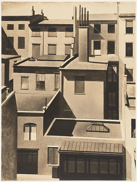
Bring your conservator! image: GSV last month, slightly altered
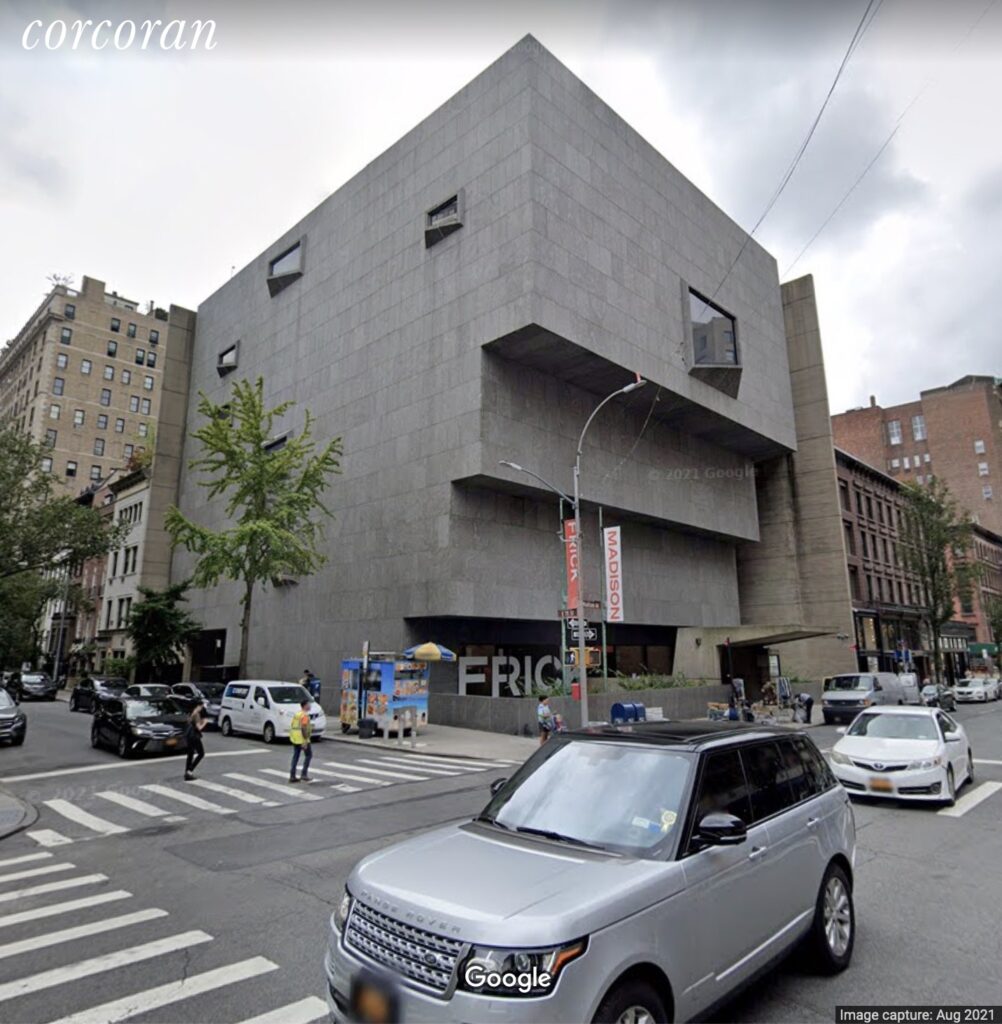
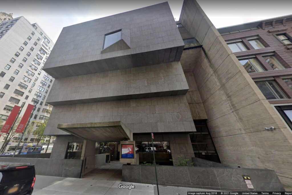
I have never been able to understand* why the Whitney hates the Whitney so much that they moved out, but they do, and they did. And now, as Katya Kazakina reports at artnet , there’s talk of selling it when the Met’s lease runs out in 2023.
[June 2023 UPDATE: They sold it to Sotheby’s, for around $100 million, a pittance for an iconic UES townhouse.]
If you lived here, you’d be home now. image: GSV, 2018
Of course, there was talk of selling the building in 2008, too, when the plan to build in the Meatpacking District was a thing. Those rumors were floated and batted down immediately, but also repeatedly, in the Times. Now, with the Met a mess and not exercising the purchase option Kazakina reports was in their original 8-year lease, and the Frick just subletting while its own building is renovated, the question is no longer, “Is it for sale?” but “How much could they get, and who would buy it?” [Or as Kazakina actually put it, “Now, the multi-million-dollar question is: If the building is sold, can it be developed?”]
my 2008 shoutout to Elmgreen & Dragset the first/last time the Whitney went on the whisper market
Kazakina’s list of hypothetical buyers includes a random country, Sotheby’s new owner Patrick Drahi, a future Larry Gagosian foundation, or a condo tower developer** who’d want to turn Marcel Breuer’s museum into “a really ritzy gym.” Which is all well and good–or spiraling levels of cringe, depending, obv–but which also misses the most obvious solution: turn Breuer’s Whitney into a house.
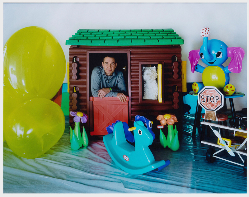
Todd Eberle, Jeff Koons in Ludwig’s Playroom, c-print, 34×40.5 in., via Stair Galleries
Seeing this Todd Eberle photo of Jeff Koons coming up for auction at Stair Galleries next week, I was reminded of huge blog post deep dive I’d worked on after the Whitney show and then bailed on, about the timeline for the Celebration series.
But if you look around enough, you can find that someone else has already laid a lot of the stuff out, even if they haven’t necessarily connected all the dots.
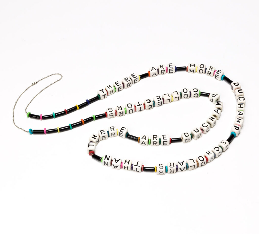
Naomi Savage, There Are More Duchamp Scholars Than There Are Duchamp Collectors, beads on chain, 1997, via Swann
This is a bead necklace made in 1997 by the artist Naomi Savage for the dealer Virginia Zabriskie. It reads, “There are more Duchamp scholars than there are Duchamp collectors.”
Savage was Man Ray’s niece. Zabriskie showed Man Ray’s and Savage’s work over the many years at her eponymous galleries, which she closed in 2010. Zabriskie passed away in 2019, and her collection will be sold at Swann this month.
The Duchamp necklace is 61 inches long, which strikes me as pretty damn long for a necklace, a double loop all the way down into your cleavage. So those 77 beads are big, almost like blocks. This is a statement AND a necklace.
This necklace is accompanied by a small (3×7 inch) signed print, dated 2002, a color image of the necklace itself arranged on a flatbed scanner. It feels like a certificate of authenticity to me. Another image, 10×14 inches, and laminated (!), is a filtered and rasterized depiction of another beaded statement necklace, not included in the sale, which reads, “I’ll sell when you catch up to my prices.”
Not gonna lie, until I started typing this, I wanted this necklace, or to make it, or to make the other one. But I thought they were tiny, like baby bracelet-size. And then I was also, respectively, like, “Well, good for Duchamp!” and “Sorry you don’t have any collectors!” So unless or until I give a talk at CAA and need some ironic bling, I’m going to just sit this one out.
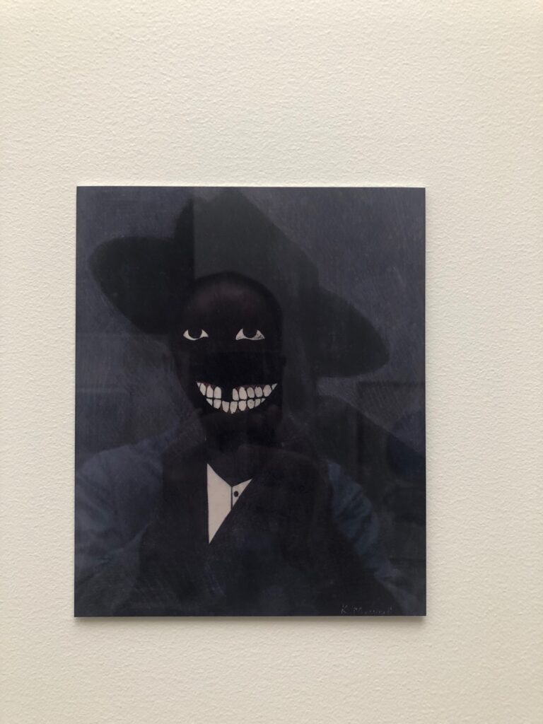
Self portrait with Kerry James Marshall Facsimile Object (M1), 2021, 8×6.5 in., dye sublimation print on aluminum
While working on the Scipio Moorhead Facsimile Object a couple of months ago, I started trying to figure out the challenge of a Kerry James Marshall Facsimile Object, too. Marshall’s portrait of Moorhead fills the gap in the historical record–there is no known depiction of or signature work by the painter considered to be the first Black artist in America. Meanwhile, the deep, multihued blacks of Marshall’s signature figurative style counter the uniform whiteness of American/European history painting, while also exposing how under-optimized the prevailing systems of image reproduction and circulation are for accurately depicting Black skin. Reproductions of Marshall’s paintings regularly fail in this specific way to mirror the experience of seeing them in person. So they are an excellent challenge for the Facsimile Object construct.
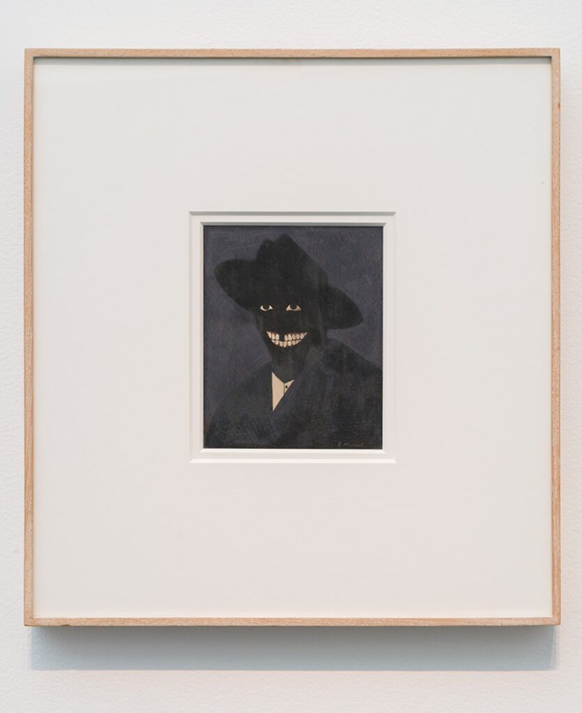
Kerry James Marshall, A Portrait of the Artist as a Shadow of His Former Self (1980), egg tempera on paper, installation view at MCA Chicago via CADaily
The calculation for making a Facsimile Object of a Kerry James Marshall work is pretty elegant in one respect, though. The epic scale immediately excludes most of his paintings. And the breakthrough work that marked a turning point in his practice–and that anchored his Met Breuer-filling retrospective a couple of years ago–is a headshot, a perfectly sized egg tempera on a sheet of sketchbook paper.
It took several attempts to find a good reproduction of A Portrait of the Artist as a Shadow of His Former Self (1980) that would reproduce on aluminum. This multistep filtration process, going from work to image to jpg to print, really gets a workout here, or at least, the apparatus gets seen operating in ways that might otherwise go unnoticed. Sometimes the work’s saturation is pumped up to bring out the red of the figure’s gums, for example, or the brightness is increased to emphasize the painting’s striated facture. Sometimes it’s printed in duotone, flattened into a pair of floating white eyes and an exaggerated grin. It extends the reach of Marshall’s own practice, “forcing the issue of perception by rendering an image that is just at the edge of perception.”
That Marshall knew his carefully calibrated painting was still at risk of being reduced to an undifferentiated black field, a shadow, is perhaps indicated by the title itself. That this was interesting to him is perhaps indicated by his subsequent decades-long practice of depicting Blackness in a world that is still catching up with him.
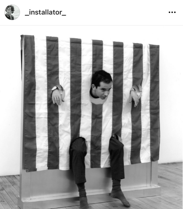
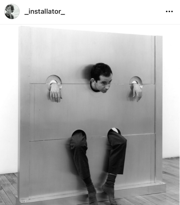
Lucien Terras in Cady Noland’s Gibbet, 1993/94 at Paula Cooper Gallery, 1994, image: James Dee via @_installator_’s IG
There are classic pictures of young art dealer Lucien Terras modeling stockades at Cady Noland’s 1994 exhibition at Paula Cooper Gallery. Gibbet, above, is named after the lamppost-like cages used to starve people to death in public. It has an American flag draped over it, with carefully placed holes to allow the stockade to function as it was designed. Your Fucking Face is named after your fucking face, I guess, and is identical except for the flag.
Lucien Terras posing in Cady Noland’s Your Fucking Face, 1993/94 at Paula Cooper Gallery, 1994, image: James Dee via @_installator_’s IG
What I’d never realized until I saw both photos side by side on @_installator_‘s instagram, was that they were of the same object. Or one played the other on film. Bruce Hainley’s Artforum review of the Frankfurt show is very clear that these two works are installed next to each other.
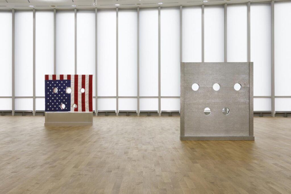
Installation view of Gibbet (L) and Your Fucking Face or actually Beltway Terror? (R), 1993/94 at MMK Frankfurt, via Bob Nickas’ review for Spike Art
Like in the photo above, which accompanied Bob Nickas’ Spike Art review. Except the checklist for the show did not include Your Fucking Face, and the stockade listed after Gibbet was called Beltway Terror. The Brants own “both,” so I guess we could ask if there is one stockade or two–or two stockades or three.
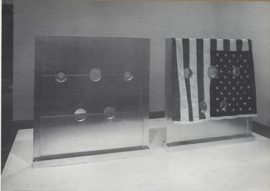
Installation view of Your Fucking Face and Gibbet, tho it really should be flipped, from Cady Noland’s 1994 exhibition at Paula Cooper Gallery. image via Bomb Magazine
Oh here is a photo of the 1994 show in Bob Nickas’ installation photo roundup in Bomb Magazine, with Your Fucking Face and Gibbet side by side, but on a plinth. And it looks like the transparency was flipped, or the flag was. When even her collaborators get confounded, I can see why the artist issues disclaimers about reproductions of her work.
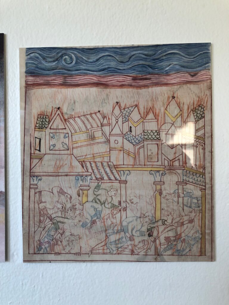
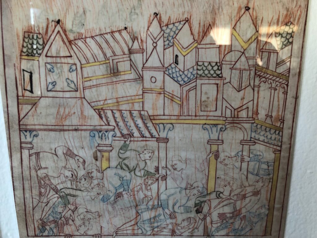
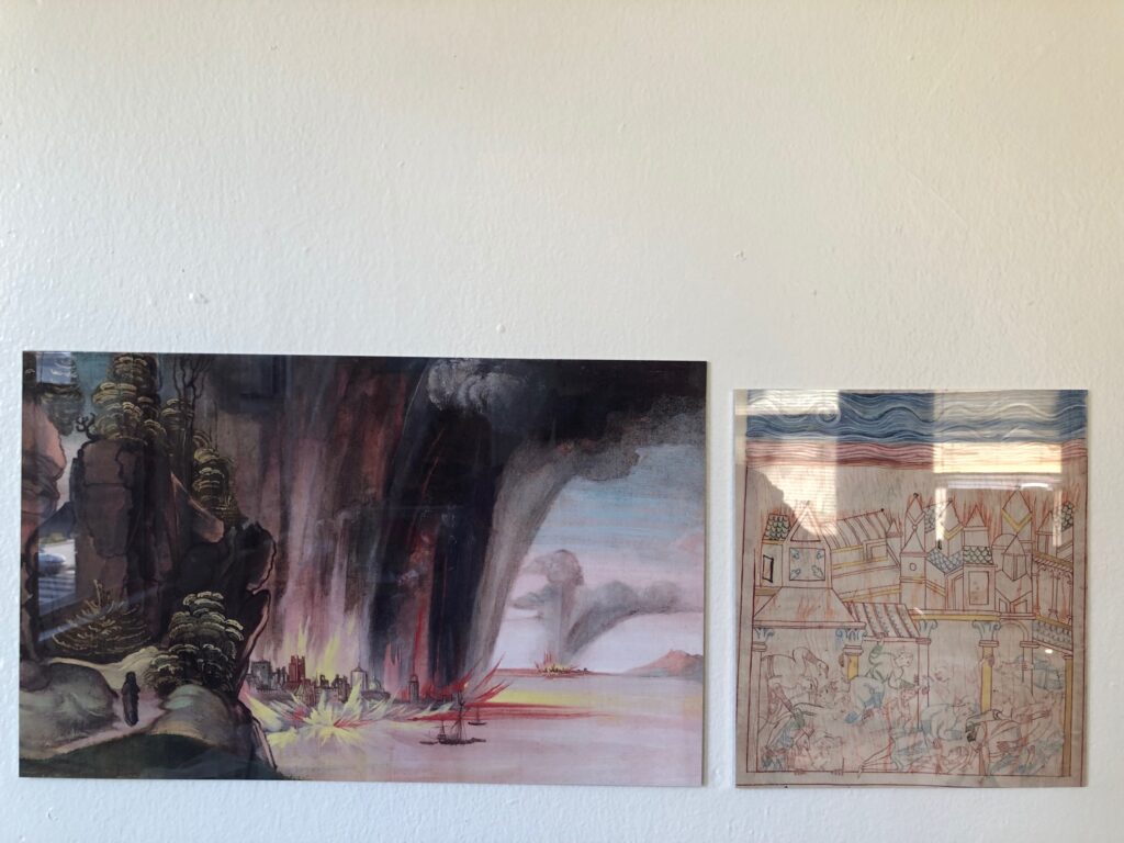
Old English Hexateuch Facsimile Object (H1), the Destruction of Sodom, 8.5 x 7.5 in., with wonky cropping
There was something beautiful and haunting and unexpected about the depiction of the destruction of Sodom from a medieval manuscript that got tweeted across my timeline the other day. Medievalist Dr. Erik Wade’s thread highlighted the blissed out, same-sex residents comforting each other, even as the city burned around them. I was also taken by the delicate line drawings, more refined than marginalia, but clearly less than fully filled in. I hesitate to say it is unfinished, though. The tangle of figures look so similar to each other, for a minute I wondered if the illuminator was tracing them.
closeup view of FO (H1)
It’s from a late 11th-century manuscript known as The Old English Hexateuch, the earliest known English translation of six books of the Old Testament (basically, the Torah plus Joshua). Cotton MS Claudius B.iv, a name derived from one of the founding collections of the British Library, includes almost 400 illuminations in various states of detail. They depict the stories of the Bible set in the contemporary Anglo-Saxon milieu the manuscript’s lay audiences would recognize immediately.
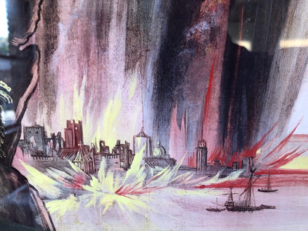
Detail from Dürer Facsimile Object (D3.38), 2021
I did not plan on making a Facsimile Object of Dürer’s verso painting of the Destruction of Sodom, but the brushy allure of the flames raining down on the cities proved irresistible. Now again, I find that the delicate lines depicting the victims, and especially the sketchy flicks of flame everywhere, made me want to hold the manuscript in my hand. As this was impossible, I made another Facsimile Object. Now I have an unlikely diptych, from centuries and countries apart, of an unlikely and terrible scene.
Depressing but beautiful: Facsimile Objects of the Destruction of Sodom
Not gonna lie, they hit a little differently now, when wildfires are raging across three continents, than in May, when I made the first one. So far Facsimile Objects have engaged with the present only temporally, by marking a (lost) moment in time: a missed auction preview, a pandemic-closed museum, the sale of a painting, a surprise Summer show. But with some religionists repeating the medieval model of blaming a conflagration on the existence of gay people, this pair of Facsimile Objects connects on a content level as well.
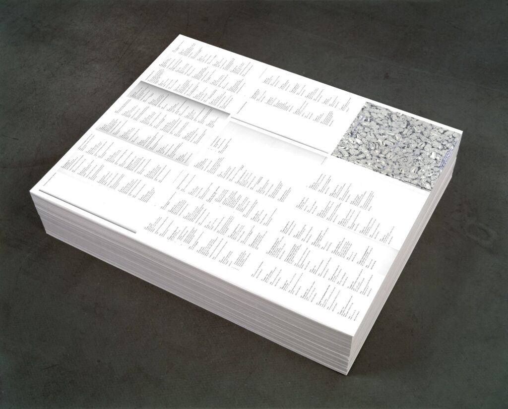
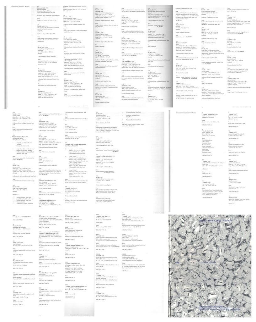
Untitled (Additional Material), 2021, study, 0ffset print on paper (endless copies) 20″ (ideal height) x 23″ x 29″, base image: FG-T Fndn
I’m as surprised as anyone that it was only when I finished posting about the orphaned appendices in the Felix Gonzalez-Torres catalogue raisonée that I figured out what to do with them.
I do still think that the Foundation should republish the information about the dozens of works Gonzalez-Torres made, and showed, and sent out into the world, which were later declared to be non-works.
Untitled (Additional Material), 2021, (detail) 0ffset print on paper (endless copies) 20″ (ideal height) x 23″ x 29″
By laying out the eight pages of the CR’s two appendices, Untitled (Additional Material) appropriates the strategy of the iconic stack, “Untitled” (Death by Gun), which reproduces entire pages from a special issue of Time magazine showing the people killed in the US by guns during one week.
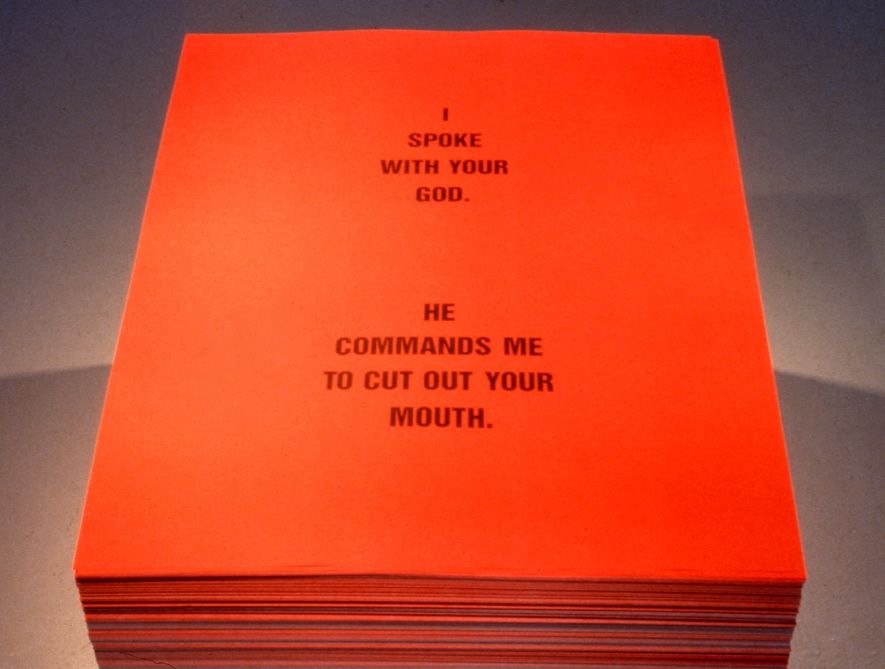
The dimensions, meanwhile are a nod to one of two pieces that ended up classified as Non-Works: a 1990 collaboration with Donald Moffett called, “Untitled” (I Spoke With Your God). The stack of printed text by Moffett on red paper (“I SPOKE WITH YOUR GOD/ HE COMMANDED ME TO CUT OUT YOUR MOUTH”) appeared just once, in a two-person show at the University of British Columbia Arts Center in Vancouver. [The print size, 29×23 inches, is one Gonzalez-Torres used in other stacks, too, including “Untitled” (Veterans Day Sale), 1989, the image of which was used above for a rendering of the piece. I did not print 20 inches worth of giant bootleg posters today.]
The stack by Felix Gonzalez-Torres and Donald Moffett formerly known as “Untitled” (I Spoke To Your God) [sic], 1990, image: Scott Watson via Felix Gonzalez-Torres Foundation
As it turns out, this Non-Work does have a Foundation webpage, complete with installation shots. It does not appear to be linked from anywhere, and the URL now ends in “-hidden.” I am in awe all over again.
[2025 update: In subsequent correspondence with the Foundation that is mentioned in the previous post, this absence of the non-works and additional material information was temporary, part of a reconfiguration and expansion of the Foundation’s presentation of works (et al). There is indeed an entry for this work/non-work, and the untitled title is now a designation, “Untitled” (I spoke with your God). Like the distinction between work and non-work, I feels important to note that the nuance of title vs. designation reflects subsequent reconsideration and refinement. From what I can tell of the historical record, in 1990 Felix’s works were shown with “Untitled parenthesis- something- parenthesis” [quotes mine] titles, and this stack was shown as a “collaborative poster” or a creation of Gonzalez-Torres. I feel this is not the last thing I’ll post about this work or show.]
[THERE’S AN UPDATE: READ ON, THINGS ARE BETTER THAN I WOUND MYSELF UP TO THINKING.]
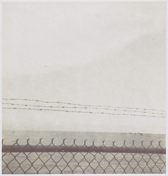
The earliest work by Felix Gonzalez-Torres in the Metropolitan Museum’s collection is also the smallest. It is untitled, an instant black & white photo of the sea through a Cuban fence. It’s about 2.75 inches square. It is signed and dated 1985, and has a fragment of a magazine collaged on the back that reads, “THE BO–/ ANYMORE.” By the time it was acquired at the end of 1996, the year of the artist’s death, the Met had already acquired two similar sets of photos by Gonzalez-Torres: photogravures of sand, and cloudscapes. Similar, but different: this one is not an artwork. “Although made, signed, and dated by the photographer,” the catalogue entry reads, “Gonzalez-Torres thought of works such as this [photo] as lying outside his core oeuvre.”
Published in 1997, just in time to record the Met’s acquisition, the Felix Gonzalez-Torres Catalogue Raisonée has three categories: Works, Additional Material, and Registered Non-Works. The photo above is in the second category. When the CR was released, Gonzalez-Torres was the most important artist in the world to me, and I wanted more of his works, not fewer. I was upset for these somehow downgraded works, and for the sleights they faced in the discourse, the gallery, the market. I couldn’t accept that the same artist who’d shown me that the most remarkable things could be art–a pile of candy, a stack of paper, a jigsaw puzzle, a pair of clocks–also said they couldn’t be.
My incredulity over Felix’s work fueled a years-long contest with the declarative process, what artists called objects, what they kept, what they destroyed. It helped me keep an eye out for these marginalized–and invisible, since there weren’t even any pictures–works. But even as I developed more nuanced appreciations of [other] artists’ agency, these non-art designations still gnawed at me. Until the other night, when I started writing this. It’s been almost 25 years: what’s going on?
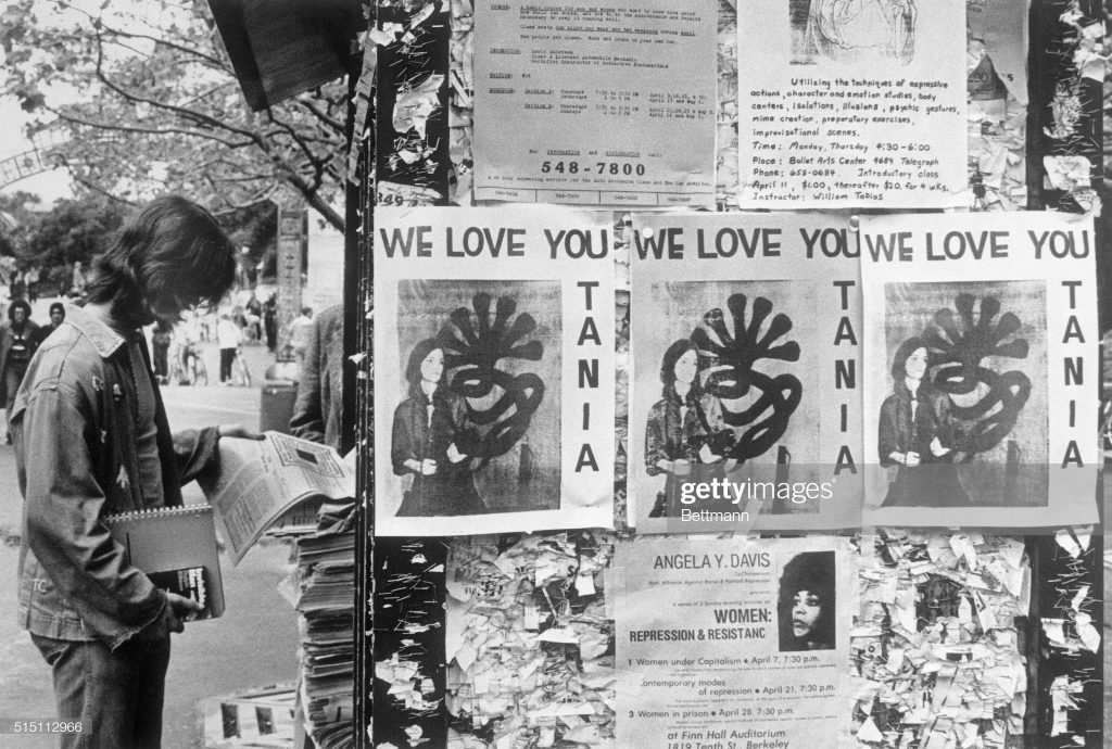
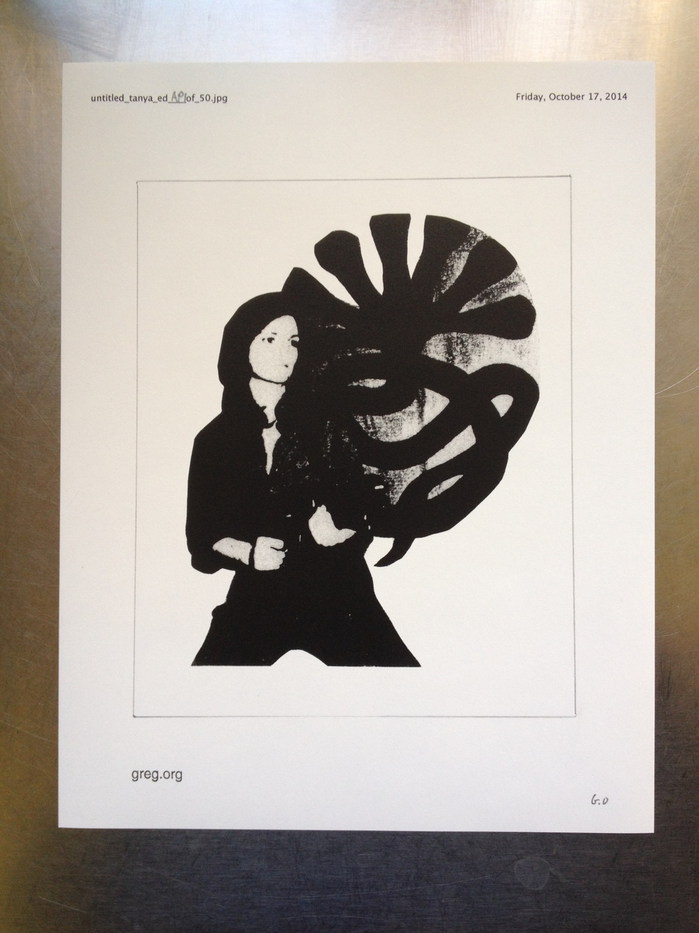
Tania Facsimile Object (N1), 2021, 7.5 x 6 in., dye sublimation print on aluminum, with copy of same for scale, $70 shipped, with handmade COA on Arches, was available through Sept. 11.
On April 3, 1974, a photograph of kidnapped heiress Patricia Hearst posing with a machine gun, a beret, and the seven-headed snake logo of the Symbionese Liberation Army was delivered, along with a cassette tape of the fourth recorded message from Hearst, to KSAN Jive 95, a counterculture radio station in San Francisco. The recording said Hearst now called herself Tania, a name taken from a comrade of Che Guevara, and she reiterated the SLA’s revolutionary demands for her release.
Early Tania Facsimile Objects appearing on UC Berkeley campus, supposedly around 4/15? uncredited image bettmann via getty
Wire services reproduced the photo, which appeared on the front pages of newspapers around the world the next day, Thursday, April 4th. On Kawara clipped his copy of it out of the Washington Post. By the weekend, and presumably before Hearst was identified as one of the armed SLA members who robbed a bank on April 15th, WE LOVE YOU TANIA flyers appeared on the campus of UC Berkeley, from whence she’d been kidnapped.
These may now be considered the first Tania Facsimile Objects.
Untitled (Tanya), 2014, graphite and ink on photocopy on bond, 11 x 8.5 in., ed. 50
In 1989, presumably in relation to her large-scale, silkscreen on aluminum sculpture Tanya as Bandit, now in the collection of the Museum of Modern Art, artist Cady Noland created a work on paper titled Tanya. The cropped photocopy, a generation or more removed from the Tanya as Bandit source image, was put up for sale at Christie’s in London during Frieze Week 2014. In anticipation, the sale was pre-commemorated on this website by an edition, Untitled (Tanya).
In addition to an impulsive celebration through commerce of an exceptional object’s appearance at auction, in Untitled (Tanya) can be found some of the impulses of the Facsimile Object project. The edition indicates the possibility of realizing a perfect [sic] copy of Noland’s work, but only by cutting away the elements of designation and authentication–title, number, date, stamp, signature–thereby destroying the edition itself. An authentic but nearly worthless work is displaced by an equally worthless but iconic copy of another work. Their fate is in the collectors’ hands.
Tania & Friends: Tania Facsimile Object (N1), 2021, 7.5 x 6 in., dye sublimation print on aluminum
Tania Facsimile Object (N1), 2021, drops into this visual lineage, paying homage to the original, ad hoc WE LOVE YOU TANIA flyers of 1974, as well as Noland’s later appropriation. At 7.5×6 inches, Tania Facsimile Object (N1) shares the dimensions and cropped composition of Tanya (1989), while utterly transforming the object’s material characteristics. The high-gloss, dye sublimation print on aluminum is an exploration of how far the Facsimile Object format can diverge from referent works, how big a gap can be created, while still maintaining that facsimilated, auratic glow. Or maybe it’s just the light reflecting from the window.
Each Tania Facsimile Object is accompanied by a full-size, certificate of authenticity, handmade, signed and numbered on Arches. It will include, of course, a disclaimer to affirm to everyone that Ms. Noland was neither involved in nor consulted on the realization of this Facsimile Object, which will be available until September 11th, 2021. [update: Though Noland’s show was extended without announcement until September 18th, availability of this Facsimile Object ended September 13th. Thank you for your engagement.]
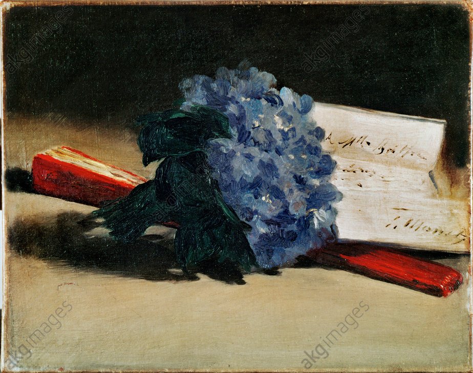
Édouard Manet, Bouquet de violettes, 1872, 22 x 27 cm, private collection Paris, image: wikipedia
David Rimanelli posted this beautiful Manet to instagram today, Bouquet of Violets, an 1872 painting that if I’m reading the note in the painting itself, first belonged to Berthe Morisot. Of course, my first reaction to these sorts of things now is, “Manet Facsimile Object?”
And the answer is, alas, no.
[Wow, ok, in exchange for critiqueing the characteristics of this stock image of a public domain painting, I will let you autoinsert your giant-ass caption onto my website, AKG-Images] 2-K40-S3-1872-2 (297213) E.Manet, Veilchenstrauß Manet, Edouard 1832-1883. ‘Bouquet des violettes et éventail’ (Veilchenstrauß mit Fächer), 1872. Öl auf Leinwand, 22 x 27 cm. (Auf dem Briefbogen eine Widmung an Berthe Morisot: ‘A Mlle Berthe Mori- sot. E.Manet’). Paris, Privatsammlung. E: E.Manet, A bunch of violets, 1872 Manet, Edouard 1832-1883. ‘Bouquet des violettes et éventail’ (Bunch of violets and fan), 1872. Oil on canvas, 22 x 27cm. (On the letter a dedication to Berthe Morisot: ‘A Mlle Berthe Mori- sot. E.Manet’). Paris, Private Collection. F: É.Manet / Bouquet violettes et éventail Manet, Édouard 1832-1883. – ‘Bouquet de violettes et éventail’, 1872. Huile sur toile, H. 0,22 ; L. 0,27. (Sur la lettre, dédicace : ‘A Mlle Berthe Morisot. E.Manet’. Paris, coll. privée. ORIGINAL: The bunch of violets, 1872.A tribute to Berthe Morisot, to whom the letter in the painting is addressed. The same flowers are used as a corsage in Manet’s ‘Berthe Morisot with a bunch of violets’. Oil on canvas,22 x 27 cm Private Collection, Paris, France
The size is perfect–22 x 27 cm–and it’s both very desirable and inaccessible. But without a lot of digging, the only image that shows the full canvas is a stock photo. And so the dimensions of the widely circulating–and cropped–Wikipedia image are slightly off. Also the color is different enough to take a quick whip-up off the table.
But the main dealbreaker for me is the sheer numbers of commercialized print options for this public domain image. Even if none is a Facsimile Object, there are tons of objects which are facsimiles. Like art, Facsimile Objects aren’t supposed to be functional, but that doesn’t mean they don’t do something IRL. In a case like this, the facsimilating is being done, and at scale. I’m going to need to think this through.
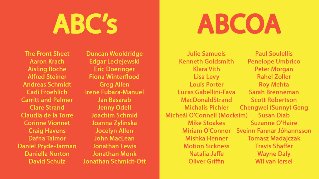
A few months back, in the midst of the Manet Facsimile Object and NFT frenzy, Eric Doeringer suggested I submit a work for a project being organized by Micheál O’Connell for the ABC Artists’ Books Cooperative. I am psyched and grateful to have my work included.
As an irreverent critique of the whole authentication boom, O’Connell conceived ABCOA as a collection of artworks that are their own certificates of authenticity. The resulting portfolio comprises 60 certified works of art, which is quite a deal for EUR30.
I have also been slow in posting about it only because I have not been able to figure out where my brief accompanying text went. So I’ve finally given up and am explaining the piece here.
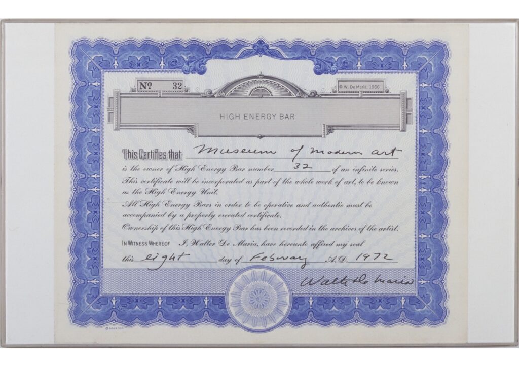
Untitled (High Energy Certificate), 2021, Walter de Maria CoA, 11 1/4 x 13 3/4 in., ink on engraved print on bond, image: MoMA’s 1972 example of CoA for High Energy Unit
As the text of De Maria’s certificate itself states, the engraved stainless steel High Energy Bar is not only made “operative and authentic” by the presence of this CoA; the combination of Bar and Certificate constitute another work, the High Energy Unit. My work, High Energy Certificate, completes the gesture De Maria started, by declaring a standalone certificate a work of art.
While this obviously affects all the extant certificates of de Maria’s High Energy Units, the CoA facsimiles printed for ABCOA also constitute a distinct but still authentic subgroup of this work. It’s possible that they have a brief explanatory text on the verso. Or maybe they don’t? They’re operative and authentic either way.
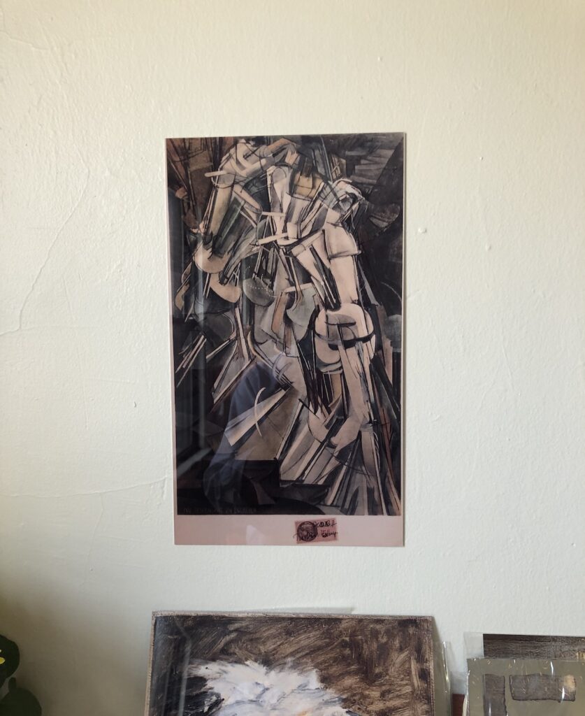
Marcel Duchamp Facsimile Object (MD1), study, 2021, sublimated dye transfer on aluminum, 35 x 20 cm, well, really 13.75 x 7.75 in., which is not quite 35×20, which, well, read on
If a history of the Facsimile Object is written, credit for the term will be given to Gerhard Richter (or his printmeister Joe Hage? Inquiring art historians will want to know!), but the inspo for us all will obviously be Marcel Duchamp.
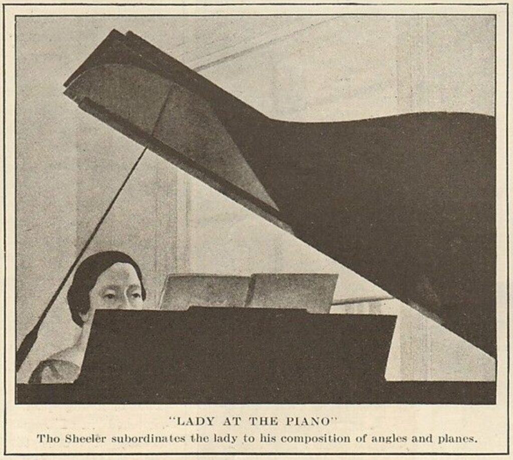
Charles Sheeler, Lady at the piano (?) before 1926, as reproduced in The Literary Digest, June 26, 1926, via ebay
Have I just been skating past this picture my entire Charles Sheeler-lovin’ life without noticing it? Is it in my books wherever, and I’ve missed it? How do I have to discover it via one of the most haphazard paths possible, three images deep in a Charles Sheeler eBay tangent?
“Lady at the Piano” is the title found nowhere but Robert Allerton Parker’s May 1926 article in International Studio, “The Classical Vision of Charles Sheeler,” the first extended discussion in print of the artist’s work.” Nowhere except the recap of Parker’s article in The Literary Digest a month later, two pages of which are being sold on eBay.
Charles Sheeler, New York – Washington Square, 1920s photo of Houses, Washington Square, a 1924 oil on canvas, collection: The Met
If it’s out there, it probably has a different title. A painting the Digest unhelpfully captioned with, “Greenwich Village on Good Behavior,” is now known as MacDougal Alley (1924), but was Houses, Washington Square when it was shown at MoMA in 1939. Keeping with the sepia & charcoal theme, the image above is of a 1920s photo of the (very brick red) painting, from The Metropolitan’s collection, where it’s titled New York – Washington Square.
No connected work appears in Sheeler’s 1939 MoMA retrospective, either, but there are comparables. This cropped lady and her highly reflective piano remind me of my first favorite Sheeler, the 1923 Self-Portrait, which used to hang next to the Wyeth and the Tchetchilew in the hallway just outside The Modern’s March of European Modernism galleries. These smoky works on paper are a seemingly impossible mix of precision and sfumato, drawings that looked like photographs.
Anyway, in the immortal words of Monique reaction dot gif, I would like to see it.
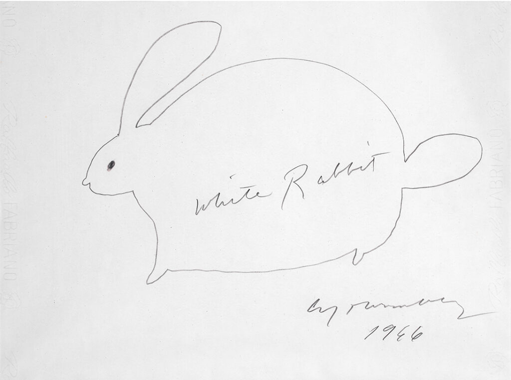
Cy Twombly, White Rabbit (01), 1966, 34 x 46 cm, pencil on Fabriano via sothebys.com
A Cy Twombly drawing of a white rabbit would be interesting enough on its own. But you’re saying a Cy Twombly white rabbit drawing is at Sotheby’s Milano with this disclaimer? What does it MEAN?
“This work is registered in the Cy Twombly Foundation, Rome, in the ‘Memorabilia’ department. ‘Memorabilia’ are drawings or small works by the artist that the Foundation plans to publish in a specific catalogue.”
THE MEMORABILIA DEPARTMENT. IS PUBLISHING A CATALOGUE.
Heisenberg’s Rabbit Update: Perhaps noticing the blogger staring in awe through the screen, Sotheby’s has updated the text about the organizational and taxonomical structure of the Fondazione:
“This work is registered in the Cy Twombly Foundation, Rome, in the ‘Memorabilia’ section. In the memorabilia section are gathered all the works, as quick sketches or pieces whose subjects are not typical of the artist’s work.”
The invitation card for Cady Noland’s exhibition at Galerie Buchholz, in New York, which runs to September 11th, 2021, reproduces a page from the artist’s new book, I think, which, I think, depicts a detail of her installation at Documenta. via Galerie Buchholz
Two years after her retrospective in Frankfurt, Cady Noland has opened a show in New York that includes new work. It is in support of The Clip-On Method, a new, 2-volume publication of her work and writing, edited by Rhea Anastas. The title calls to mind Clip-On Man, a 1989 print on aluminum work based on a Charles Gatewood photo of a wild-looking executive at Mardi Gras with multiple Budweiser six-pack rings clipped onto his belt.
The website announcing the book and show at Galerie Buchholz, states that, “Publishing photographs of the work of Cady Noland without the express permission of the artist will be viewed as copyright infringement.”
I have not seen the show in person yet, so this post is based on viewing many infringements on Instagram in the three days since the show’s unannounced opening.

