
After seeing these epic FOIA monochromes from the Dept. of Homeland Security a few years ago, I’ve been collecting the best examples of redacted documents. I’ve never quite figured out what to do with them. Maybe a book.
I know Jenny Holzer’s been working on it for a while now. But I found her first batch of giant silkscreen on linen Redaction Paintings a little too slick. The Dust Paintings and Constructivist-inspired redaction paintings she showed this fall, though, are pretty great. Score one for the hand.
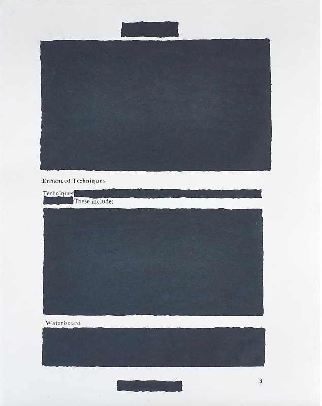
But then I just noticed this rather incredible, mysterious, and seemingly modest object in an upcoming Rago Arts auction. It’s a large (35×27 in) work titled Enhanced Techniques 3, and it’s described as a signed sheet of handmade paper. So the redaction is molded right in! I think Holzer has a winner here. But what? Where? And why is this thing only estimated to sell for $1000-1500?
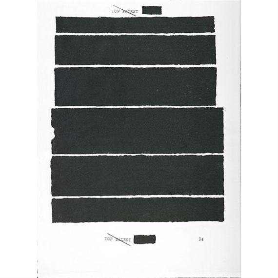
A search for Holzer and handmade paper turn up other, similar pieces in the flotsam-filled auction reporting sites and secondary market print dealers. Try as they might, MutualArt couldn’t hide the fact that Rago had sold a handmade paper piece called Top Secret 24 last Spring. Rago certainly doesn’t want to hide it. I’d never thought of redaction in the same context of watermarking before.
On Caviar20 Top Secret 24 is pitched as Holzer’s “return to painting.” Hmm. At least they finally have pictures showing where this damn thing comes from. It’s ironic that people selling artworks about redaction leave out so much basic information.
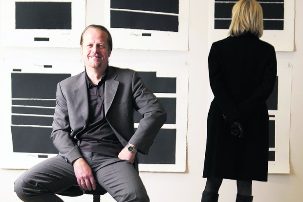
griffelkunst director Dirk Dobke sitting in front of Jenny Holzer’s Top Secret portfolio. image: abendblatt.de
Anyway, the answer is griffelkunst, a 90-year-old print association in Hamburg with 4,500 subscribers and a closed 5-year-waitlist. Members pay €132/year for four contemporary artworks, which the association, currently led by curator Dirk Dobke, commissions and produces.
I don’t quite understand how that maps to Holzer’s Top Secret project, which was a suite of six handmade paper redaction editions, available to members only for €150 apiece, or €900 for the set. I guess they made as many as people ordered?
The labor-intensive process sounds like it syncs nicely with the subject: the white pulp on the redacted areas was scooped out by hand and filled in with black as each sheet was being made. And all of this sounds like fascinating context and backstory for the work. But no one’s using it to sell these things; just the opposite, they’re keeping it quiet. Whether it’s because griffelkunst frowns on flipping, or because it’s hard to explain a 10-20x markup, I can’t say.
Holding back information is power, and the occlusion of information comes as no surprise. Strategic vagueness and decontextualization is as likely an art-selling technique as transparency and information overload. That same Rago auction also has an atypical-looking Ad Reinhardt. Well, it might look typical, but the small black monochrome square is actually an edition, silkscreened on plexiglass. It was “from NY International, 1966,” which turns out to be the title of a 10-artist Tanglewood Press print/multiples portfolio organized by Henry Geldzahler. Portfolios like these get broken up, and the slightly more marketable pieces parted out, all the time. But so many dealers and auctioneers redact the reason and context for which the artist created the work as part of their enhanced sales techniques.
Category: inspiration
On Kawara Today
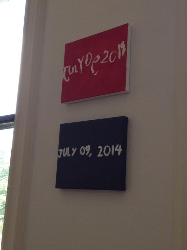
News came today of On Kawara’s death, and I’m finding it difficult to articulate much of my own reaction. It’s a sense of profound loss, coupled with naturalness, a frustrating mix of the inevitable and the unexpected.
The kids and I just painted new Today series paintings yesterday, to update the ones they painted for me in 2012 as preparation for RO/LU’s Today series project at the Walker Art Center. So we’ve had On on our minds.
And of course, the Guggenheim just announced that the artist was collaborating with curator Jeffrey Weiss on a full-scale retrospective set to open in February. And I fired off some exuberant tweets about getting my turn in the booth to read for the One Million Years project.
And my recent foray onto tumblr had reminded me that I have to reinstall fromnowon.us, the project we announced during RO/LU’s Walker residency, of commissioning Chinese Paint Mill to continue the Today series, first to fill in the days when Kawara himself didn’t complete a painting, and then to open the project up to everyone when eventually, some day, far in the future…
This idea had struck me during Kawara’s huge 2012 show at Zwirner’s, which had Today paintings from four decades and dozens of cities. The newest painting was Jan. 3, 2012, just three days before the opening. And other paintings appeared during the show’s run, though the artist himself, of course, did not. But Lei Yamabe wrote in the catalogue that on those days when Kawara did not complete a painting, he was like Schrodinger’s Cat, “shut in the closed room of time, simultaneously alive and dead.” And, most alarmingly, and unexpectedly, at least for me, that “the series will be complete when Kawara’s body ceases to exist.”
Damien Hirst had just floated the possibility that his spot paintings could continue into infinity, and frankly, the idea that Hirst would persist and Kawara would not felt devastatingly wrong. Thus, fromnowon.us. But I think the project only gelled because I really didn’t imagine Kawara not continuing himself. Yet now here we are, and now here he is not.
On Kawara’s 2012 Zwirner show was the only exhibition I’ve ever had to walk out of due to overwhelming existential dread.
— Rachel Wetzler (@rwetzler) July 10, 2014
Rachel’s tweet shows, not everyone was as impervious as I, was but reading back a bit today, I see the shadows of non-existence throughout Kawara’s entire practice, which I either ignored or relegated to an abstraction before. In 1991 Henning Weidemann wrote that “the picture of a past date becomes a memorial,” and the very title “lead[s] us to suppose that for the spectator it will always be a question of a “Yesterday”-series.”
Even when using the speediest means of communication available to him in 1970, the telegram, Kawara’s I am still alive was fraught with contradiction:
In a certain sense the phrase “I am still alive” can never be sent as it cannot be received by the addressee instantaneously…It is only valid at the very instant that it is being written, and in the very next second it no longer is a certainty. If the addressee receives the telegram a few hours or days later and reads it, he merely knows that the sender was alive at the very instant the telegram was sent. But when he is reading the telegram, he is totally uncertain if the content of the text is still relevant or if it is still valid The difference, the small displacement between sending and receiving, is that particular unseizable glimpse of the presence of the artist. Likewise, it is a sentence of self-reassurance…”I am still alive.” The activity of telling oneself and the world “I am still alive.”
Now the uncertainty is removed, and that difference, that once-small displacement, will stretch into history. In fact, it’s already bigger than we first thought. I’ve heard from a couple of folks that know that Kawara actually passed away as far back as two weeks ago, after some period of difficulty, but that the artist’s family had requested his passing not be made public before now. [update: according to this calculation, Kawara’s 29,771th and last day was June 29, 2014.]
And so our paintings, my exuberance about the Guggenheim announcement, my continued procrastination, it all went down when I [we] only thought Kawara was still alive, when in fact, he was not.
For some as-yet unknown time, all but Kawara’s close friends and family thought he was still possibly/probably alive, shut in that closed room of time, but he was not. This specific moment, this window, this condition, of knowing something that turns out no longer to be true, feels significant in ways I cannot pin down right now. I’ll think about it every time I see my kids’ paintings, which are now not prescient memorials of Kawara’s own last full day, but which instead mark the last day of our thinking he was still alive.
But it also highlights an important distinction that’s so often lost, especially here, between the artist and his practice, the human being and his work. Just a couple of weeks ago I wondered if Kawara’s family or lover or the deli guy was included in I Met, or was it just his work contacts.
Kawara had a wife, and at least two children. He lived on a street in SoHo. He had neighbors. Kawara didn’t give interviews or talk about his work, but when Nick Paumgarten called about a young Leo Koenig crashing at the Kawaharas’ loft, On answered the phone and gave a quote. Kawara’s work marked one man’s passage through time, space and society, and the end of that project which has inspired me for so long makes me sad. But these were “the traces left on paper and canvas,” as Yamabe wrote, “the shadows that Kawara cast.” For others who shared Kawara’s life, he was a husband, a father, a friend. 謹んでお悔やみ、申し上げます。
2016 update: as time passed, I thought about this project more and decided not to pursue it. after a couple of years, I have taken the unusual (for me) step of letting the domain name expire. I still think about Kawara’s work often, and it is possible that a related project responding to it might arise in the future. But not right now.
Previous Kawara on greg.org:
On Kawara Data
On’s Location
Setting: Fredericianum, Documenta 11 | The voice of a woman reading from within a freestanding glass booth echoes
36 Links From My Life With Ubu
I’m really stoked to contribute a top ten list to UbuWeb this month.
When Kenny Goldsmith invited me to submit a list, I first tried to come up with some new, revealing, conceptual strategy for generating it. I thought of the top ten most viewed items, and then the ten least viewed. But then I learned that Ubu doesn’t keep logs. I thought of the ten largest files, but then figured it’d just be the longest movies, and big whoop. I thought of a top ten list of top ten lists. And when I worried that I would just be mirroring some taste or trend, I thought of identifying the ten items most frequently included in other peoples’ lists. Several more ideas were patiently disabused out of me, and I began running through my chance operations options.
Then I realized I’d already begun making my list, starting back in 2002, when I linked to ubu.com from my blog for the first time. Ubu at that point was still quite mysterious, and much smaller–mostly ancient and arcane concrete poetry reprints I frankly hadn’t heard of. But I kept coming back. A huge collection of video and audio appeared, Kenneth Goldsmith came out from behind the curtain, seeming much older and august in my mind than he turned out to be–I imagined he was a survivor of this lost underground scene, not an explorer.
Anyway, I assembled my list from twelve years links here at greg.org, highlights from my life with UbuWeb. They’re roughly chronological which has become an indispensable collaborator, not just a source of discovery and inspiration.
Toward A Less Reflexively Damning View Of Plagiarism
I don’t want to pick on Ruth Graham, just the opposite. I have had “Word Theft,” her Poetry Foundation essay on plagiarism open in my tabs for two months because the relentlessly negative framing of the issue is so representative of the way text copying or reuse is discussed practically everywhere.
Graham focuses on a particular type and context and history of plagiarism: the republishing of poetry. Most of the cases she describes involve less-established poets rewriting or adding to poems published by someone else. They often happen across borders or continents, with poems transplanted from one national/regional ecosystem to another, from one tiny journal to another. Invariably, the original writer is not credited or notified when her work is reused.
Here is how Graham tries to explain these plagiarists’ sins, starting with a set-up from Ira LIghtman, a British poet who became a sort of plagiarism vigilante last year, unearthing unauthorized copying and notifying the victims:
“I don’t see them all as these sinister, plotting, Machiavellian characters,” he said. “I see it as a corruption. And we’re all vulnerable to corruption.” He suggests that transgressors retreat to self-publishing for a few years, prove themselves honest, and then return to the fold.
If plagiarists are not sinister and Machiavellian, then why do they do it? This question gets asked every time there’s a fresh revelation of plagiarism, whether it’s in the literary world, journalism, or academia. There’s never a satisfying answer, but there are at least lots of guesses, often somewhat at odds with each other: laziness or panic, narcissism or low self-esteem, ambition or deliberate self-sabotage.
First, I love this notion of a self-publishing wilderness these sinners are supposed to wander. But it’s really the professed bafflement at the copyists’ motives. It is apparently impossible, ever, for the poetic imagination to muster even a non-pathological explanation for copying or reuse, much less a sympathetic one. And if the poetry universe were ever to come into contact with a constructive or affirmative explanation, a defense, a championing of plagiarism, I’m sure it would annihilate in a flash of crackling heat.
And yet. And yet, Graham’s own historical set-up notes that Coleridge was “an inveterate thief,” and Hart Crane “borrowed heavily from a lesser-known” contemporary. Literary outlaw Laurence Sterne’s success with Tristram Shandy is an historical disgrace, according to Graham’s telling, but frankly, despite her scolding, the novel comes out sounding kind of awesome.
Again and again, it strikes me that the pieces are there to assemble a clearer, more productive view of plagiarism, but people are too blinded by the pain, the hurt, the effrontery of it all.
Is there a way to pick this dynamic apart, though, and look at its constituent elements? Cultural norms and expectations of each field differ. People may not know them, or they may ignore or reject them, or they may challenge them. This matters. I think the direction of reuse matters: up, down, or across? So does the perceived tenure or seniority or insiderness of the parties, or conversely, their tenure-seeking, amateurism, or marginality. The utility of publication for a career, or a brand. The effects of not being credited, not “getting one’s due,” recognition in a field where recognition is almost the only compensation available.
Is there a way to even have a conversation about plagiarism where it’s not a priori evil? How would that go? How would it be if poets whose work was reused or reworked thought it was great, not offensive? What if complete internalization and adoption of a poem by a reader was considered the highest praise and achievement, not an insult? What if Google or whatever obviated any presumption of undetectable reuse, and everybody came to expect that sources or similarities were always only a search away? What if, when it came to expecting or demanding credit, poets took the road less traveled, and it made all the difference?
Word Theft, by Ruth Graham [poetryfoundation.org]
International Jarman Blue

I am so stoked to see Derek Jarman’s Blue in the 2nd floor galleries at MoMA. It is truly one of the most formative film experiences I’ve ever had, and it changed the way I thought of both movies and monochromes. And it captured and collapsed art and film and a moment of outrageous, despairing history, when the personal and cultural toll from HIV/AIDS seemed almost beyond hope. Which is a lot for any film to carry, much less one as unusual as Blue.
The last year and a half or so, whenever the radio gets too cloying or annoying, I’ve taken to listening to the soundtrack for Blue sometimes in the car. It’s weird that an angry elegy against indifference, AIDS, and death would be so pleasant. Maybe emotionally satisfying is a better term. But I can easily recall the first times I saw Blue, at the NYFF in October 1993, and then at the New Yorker Cinema during its release.
But enough about me, because there are important things that I still didn’t realize about Blue precisely because my own intense personal encounter with the film blinded me [sic] to them.
Like I knew that Jarman had chosen Blue‘s blue for its reference to Yves Klein, but I did not realize that Jarman had been contemplating a monochrome IKB film for Klein as early as 1974, as sort of a cinematic answer to the painter’s Symphonie Monotone. Blue went through many titles and Klein-centered iterations before becoming what it finally was: a poetic documentary of Jarman’s own life and illness. [A lot of this stuff comes from Rowland Wymer’s 2006 Derek Jarman biography, which is a good read, even if “colour field” doesn’t mean what Wymer thinks it means.]
It very much became a film about Jarman’s losing his sight, and the effective end of his career, even though that’s not at all what it had been before. Because before also meant before all that went down. Blue‘s unchanging monochrome field was able to accommodate whatever content changes Jarman brought to it.
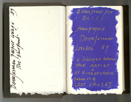 When Blue was still called Bliss, back in 1987, and was a Klein-related companion film to The Last of England, Jarman filled a notebook with dialogue, poems, and IKB monochrome paintings. The Bliss Book and other Blue-related preparatory and archival material will be in “Almost Bliss,” an exhibition next month at Chelsea Space, London, England.
Blue really took its finished form beginning in 1991, not as a film, but as a performance/event. Jarman and Tilda Swinton first performed Bliss at a charity fundraiser for his hospital, sandwiched between a performance of Klein’s Symphonie Monotone and a screening of The Garden. [Which must’ve been quite a night: the Klein’s supposed to be 40 minutes, and The Garden‘s an hour and a half.]

A still of Klein’s IKB 71 (Californie), 1961, which, I have no idea what his film loop looked like, but this one seemed appropriately cinematic. It’s in a private collection, but was at the Met a few years ago.
At first Jarman used a film loop of a Klein monochrome. When the film jammed, Jarman switched to a blue gel. I don’t quite know why, but I find this easy passing between media and image to be fascinating. Bliss‘s blue began as a film of an object, but then the object disappeared, replaced by a light effect. Later, when Blue was complete, and aired simultaneously on Channel 4 and BBC radio, listeners were invited to send for a monochrome blue card they could stare at during the broadcast. A broadcast image replaced by an object.
The project evolved and funding came through in 1992, and Jarman’s own stories became the central theme. All along I figured that Jarman maybe didn’t film anything, that the blue was a chemical aspect of the film print itself. But Wymer’s book says the blue was “electronically produced.” I confess, I find this something of a letdown, even if it means MoMA’s probably OK to show Blue on digital projection rather than film. And it makes me want to do something around or to Blue and its visuals. I don’t know what yet.
#53 Almost Bliss: Notes on Derek Jarman’s Blue, curated by Donald Smith, 29.01.14 – 15.03.14, Chelsea Space [chelseaspace.org]
buy Derek Jarman (2006) by Rowland Wymer [amazon]
JUNE 2014 UPDATE In Issue 165 of Frieze (May 2014), Paul Schütze talked with Simon Fisher Turner about his longtime musical collaborations with Jarman, including the making of Blue.
Turner says they probably did six or seven live concerts of Bliss/Blue before the film. I wonder if any of them were recorded? Also this bombshell:
Derek and I had really big arguments about Blue, because at one stage people wanted to put images into it and I said, ‘You’re mad!’ By then my relationship with Derek was really good. I’d say, ‘Listen, this is really what I think.’ Then he suggested that it would be great to have some gold drifting down amidst the blueness, because he loved gold, or the occasional shadow of movement. I objected and said, ‘Please NO! It has to be pure.’
Yikes.
On Untitled (Beauty Love)
There is beauty in this painting. But the beauty is not what makes you love it.
It’s the emotion of what it says, in very simple means about life. And where we all go.
I don’t know why I get chills from Tobias Meyer’s little promo video for Silver Car Crash (Double Disaster), but here we are.
I matched the audio to Michelle V. Agin’s photo from the Times this morning.
And then after reading Ian Bogost’s McRib essay again, I realized it was the most persuasive explanation I’ve seen of Auction Week. So
untitled (where we all go)
Sturtevant on ‘The Entangled Challenge of Replication’
It’s almost four years now since I read this paper by Sturtevant–the first extended thing I’d actually read by her, not about her–when Tate Papers came online, and it’s been rocking my world ever since. She’d prepared it in October 2007 for a symposium titled, Inherent Vice: The Replica and its Implications in Modern Sculpture Workshop.
Her crisp, verse-like text talks about replicas, copies, repeats, remakes, and re-dos, and where our “cyber” age has brought them. Here’s a favorite part:
This trap, our obsession
of what lies on the surface,
is prevalent everywhere.
It is not a question of getting
rid of these potent elements as
not knowing it could be there.
Its blatant absence is in high gear
in most of our current art whose
push and shove is production
as meaning and consumption
as use.
Or burden by heavy subjectivity
or
hiding behind anonymity,
or
displaying our vast barren interior
by retreating to regressive teeny-bopper imagery.
The interior of art, the understructure,
is being concisely and brutally eliminated.
Ironically [because the next section of the talk is a criticism of listening instead of seeing], I’ve recently begun running art papers through my laptop’s text-to-speech, turning them into artist talks, which I listen to while I work. For whatever reason, Sturtevant’s text yields one of the robot’s best [re-]performances.
So I just recorded a reading by Alex, the most naturalistic of OSX’s default voices, which you can play here. It’s about 7min. [mp3]
Or re-do it yourself with your favorite voice: Inherent Vice or Vice Versa | Sturtevant, from Tate Papers Issue 8 [tate.org.uk/research]
The Xerox Book, Infinite Loop
I have restaged one of Seth Siegelaub’s most influential shows, the 1968 The Xerox Book, as a series of animated GIFs [my 1st through 6th animated gifs, btw]. If only Seth could’ve been on infinite loop, too.
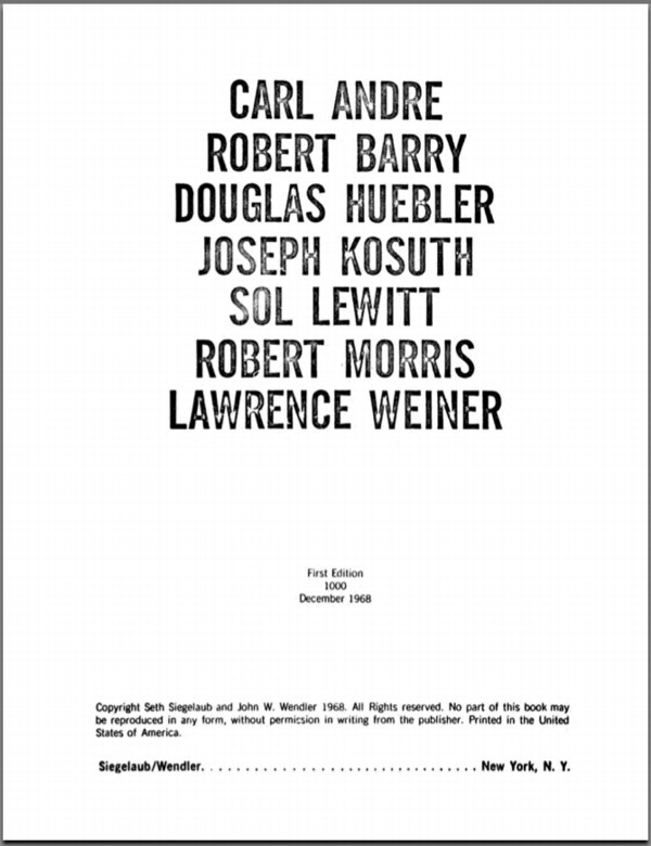
Frontispiece of The Xerox Book, 1968, organized by Seth Siegelaub and John Wendler
Primary Information has made an incredible collection of publications from Seth Siegelaub’s archive available online. That’s where The Xerox Book images came from. [pdf]
Gerrit Rietveld Chair Crate
Not sure how I never considered this, but I suddenly came across a couple of strong connections between Enzo Mari’s autoprogettazione furniture and Gerrit Rietveld.
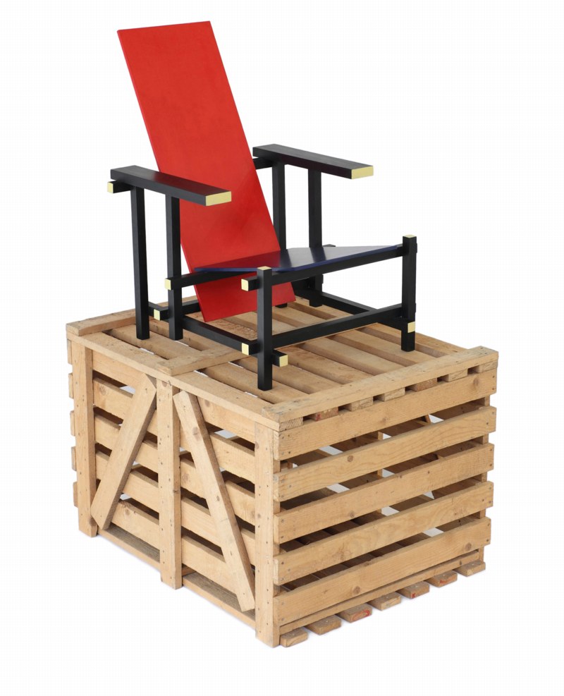
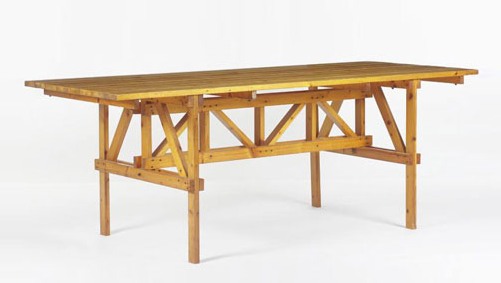
For one, check out the crate that this 1965 version of Rietveld’s Red Blue chair came in; this one’s from Galerie VIVID in Rotterdam. I’ve never seen this before. Maybe that’s just how they used to make crates in the 60s. But it sure looks like the underside of my Enzo Mari X IKEA table, the EFFE model.
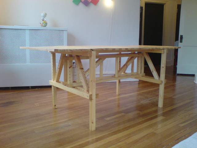
It looks even more like the structure of the Tavolo Quadrato, the square autoprogettazione table.
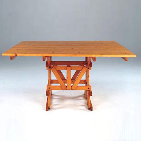
Then there’s Rietveld’s 1923 Military Table, designed for the Catholic Military Home in Utrecht, and in and out of production ever since. This unfinished Oregon pine example’s from the 60s, and was in Marseille, via 1stdibs. [I have never paid much attention to Rietveld’s Military Table, but suddenly it is looking pretty sweet.

The top is fixed onto these cross braces. It’s a solution that Mari eventually used as well. The crosspieces are not in the original autoprogettazione plans, but they did turn up in the kit of precut parts that were sold under the Metamobile name in the early 70s.
Even though Rietveld’s autonomous approach to furniture is an obvious precedent for Mari’s; and I knew from hands-on experience that the autoprogettazione designs have a lot more “design” than their basic function requires; I guess I never imagined that Mari would make overt references to what had come before.
Previously:
The making of an Enzo Mari dining table
Enzo Mari X IKEA Mashup Recap
Larry Rivers Lamp, Olafur Eliasson Extension Cord

So I’ve decided to make me a lamp like this Larry Rivers lamp Frank O’Hara had in his loft in the mid-60s.
Which means I’ve been trying to map out the number and types of sockets and adapters up there. And I’ve begun poking around for parts. At first, I was going to rework a vintage, industrial-style floor lamp, but those aren’t turning up with anything like the frequency I need. And the current crop of adaptable floor lamps are actually pretty unappealing, too. Really, they just make no sense here.
So to stay closer to Rivers’ approach, I think I’ll just build up a lamp from galvanized steel pipe. [I saw Colin Powell puttering around the hardware store yesterday, btw, the hardware store that had no such plumbing parts at all, just PVC, which, no thanks.]
Rather than a fuse-blowing heater made with 14 incandescent bulbs, I figure I’ll make a little constellation of incandescents, CFCs, and LEDs, in a range of whites. And as for the wiring and cord, well. I am really jonesing over this:

It’s an extension cable, from Olafur Eliasson Studio, released in 2004 as a limited edition with the title, 10 Meter Cable For All Colours. Which, I know, is just nuts. But still. There have been more than a few works like this from Olafur, where very modest functional objects are produced for internal use, which are recouped or spun off as an edition. It is a model that works for him, and the demand is there, so.
Technically, though, for this project, it’s not what I need. And I wouldn’t cut up an Olafur cable to rework it into my thing anyway. I just mention it here because the world is an amazing place.
Previously: Frank O’Hara’s and Alfred Leslie’s Larry Rivers’ Lamp
Previously and amazing and related: Lindsey Adelman’s autoprogettazione-style, You Make It chandelier
Driving Taxis Through Heavy Neighborhoods To Look At The Paintings
Via the Hirshhorn via Art21 comes a nice two-way interview between Barbara Kruger and Richard Prince, originally published in BOMB Magazine in 1982, that ends:
RP I’m misinformed about style. I always thought it had to do with being able to wear the same kind of a jacket for ten years. I don’t know. What I wonder is . . . is it possible to have style and be unreasonable at the same time?
BK I think unreasonableness can mean any number of possible locations nearer or further away from the idea of reason. Because many of these positions are already coded, their shock value is tempered by style. A lot of times the idea of transgression really turns on a romantic conception of otherness; of a rebellion already tolerated. You know, the charming rogue, the picaresque cuteness of the bull in the china shop and in the art world, badness invades the atelier. Driving limos through heavy neighborhoods to look at the graffiti. Unstylish unreasonableness may be limited to the categories of the insane and the unpleasant (the poor, the unbeautiful, the unempowered). The non-romanticism of these kinds of otherness makes them unsightly and “vulgar” considerations for the polite company of international bohemia.
This image of limos driving “through heavy neighborhoods to look at the graffiti” is great in itself, but it also reminded me of an anecdote from, of all people, Jasper Johns.
Jasper Johns, Harlem Light, 1967, image “taken. It’s not mine.”
It’s about the genesis of a motif that first appears in a 1967 painting, Harlem Light [above]. Here’s the version from Michael Crichton’s 1977 catalogue for Johns’ Whitney retrospective, which is still the most engrossing Johns book I’ve seen. And I’ve seen a lot:
Johns was taking a taxi to the airport, traveling through Harlem, when he passed a small store which had a wall painted to resemble flagstones. He decided it would appear in his next painting. Some weeks later when he began the painting, he asked David Whitney to find the flagstone wall, and photograph it. Whitney returned to say he could not find the wall anywhere. Johns himself then looked for the wall, driving back and forth across Harlem, searching for what he had briefly seen. He never found it, and finally had to conclude that it had been painted over or demolished. Thus he was obliged to re-create the flagstone wall from memory. This distressed him. “What I had hoped to do was an exact copy of the wall. It was red, black, and gray, but I’m sure that it didn’t look like what I did. But I did my best.”
Explaining further, he said: “Whatever I do seems artificial and false, to me. They–whoever painted the wall–had an idea; I doubt that whatever they did had to conform to anything except their own pleasure. I wanted to use that design. The trouble is that when you start to work, you can’t eliminate your own sophistication. If I could have traced it, I would have felt secure that I had it right. Because what’s interesting to e is the fact that it isn’t designed, but taken. It’s not mine.”
Crichton goes on to discuss the “small differences” that go unnoticed, and which are lost in creating from scratch. And of flagstones, like flags, an ideal Johnsian image,” which are found and known and abstract and concrete. Seriously, I could just keep quoting from that book all day.
But instead, I’m going to try to make sense of Kruger’s next sentence, “Unstylish unreasonableness may be limited to the categories of the insane and the unpleasant (the poor, the unbeautiful, the unempowered).”
Destroyed Agnes Martin Paintings
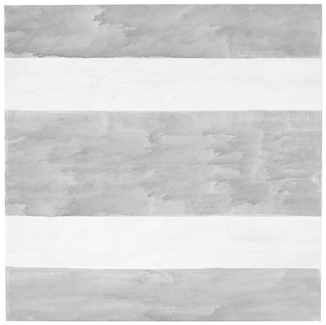
Untitled, 2004, Agnes Martin’s last painting. Image via Phaidon
The visits that maybe stick in the mind are the ones where she would show me four versions of a single painting and she’d say to me. ‘I think this is the best one, what do you think?’ Invariably there was so little difference between them, it was so hard to say, they were all really beautiful. And then she’d say OK we’re gonna keep that one and we’re going to cut up the others. And I would help with a knife slice up the paintings. Those are the studio visits that I think are the sharpest, helping her destroy the work.
What goes through your mind the first time you hear something like that?
It’s her work, and I’m a co-worker in the art field. . . but yeah. It is brutal. I was there at the end of her life and she said ‘go down to the studio, there are three paintings. Hanging on the wall is the one I want to keep, I want you to destroy the other two.’ So I went down to the studio. The two paintings she wanted me to destroy were magnificent – absolutely perfect. The one on the wall was a very stormy painting, unlike anything that she had made since the 60s. I certainly didn’t want to destroy those two spectacular paintings but I did. I sliced them to ribbons and put them in the trash. When I came back. She said, ‘did you do it?’ I said, ‘I did it.’ And that was that. Our last conversation.
Arne Glimcher, in a Q&A published last month by Phaidon.
The Q&A is timed to the publication of Agnes Martin: Paintings, Writings, Remembrances by Arne Glimcher, an extraordinary collection of Martin’s writings and correspondence, many works, and Glimcher’s own snapshots and notes. He would take extensive notes during his studio visits with Martin in New Mexico, and then transcribe them on the plane home.
He expands on Martin’s last request to destroy some of her work in March 2004:
A mystique exists that Agnes painted very few works but in actuality, she painted almost daily when inspired and that was with some frequency. However, only a relatively small amount of works exist from such a long and productive life because she destroyed most of the works she produced. Probably no artist has ever been a better editor than Agnes Martin. The rejected paintings were shredded with a mat knife. As she grew older, during the last few years, she enlisted the help of friends (myself included) to destroy the unacceptable works, as it was very hard to cut through the thick primed linen fabric. When I once asked her why she was destroying a particularly delicate and beautiful work, she said, ‘It’s too aggressive, and there’s a mistake.’ Most often that referred to a pooling of colour in one of the works that made the brushstrokes discontinuous. The mistake became an unwanted ‘focus’ in a non-compositional painting, which disturbed its serenity.
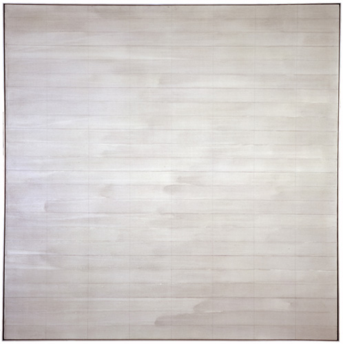
Trumpet, 1967, an earlier last painting by Agnes Martin, image via zwirnerandwirth
I drove to the studio where I found three grey paintings, all of which were beautiful. Using her mat knife, I reluctantly shredded two and spared the one that hung on the wall. It was unique, expressionistically painted with stormy grey asymmetrical brushstrokes covering the surface. Five thin pencil lines visually grounded the passionate wash to the canvas. There is only one other painting with such an expressionistic asymmetrical handling of brush work. It is called Trumpet and was painted in 1967, just before she took her long hiatus and first departure from painting. On first glance, in this last painting, Agnes appears to have taken a new direction. Comparing Untitled (2004) with Trumpet, it is clear that it was not so much a change in style as it was coming full circle home.
[2016 UPDATE: In 2013 Glimcher spoke with Tate Modern curator Frances Morris about his memoir, and the last audience question was about what the last two destroyed paintings looked like:
The two that I had to destroy were very dissimilar from the one that was left, which you saw the picture of. They were much more rigorous; they were less emotional paintings. They looked more like the 70s than they did the 90s, or the late work. They seemed to be a little bit out of context, but perfect paintings, really exquisite paintings. So I took the box cutter and sliced them to ribbons.
]
In reviewing “Five Decades,” a 10-painting Zwirner & Wirth survey in 2003, Holland Cotter called the artist’s practice, “a kind of yoga of painting.” I’m still trying to think it through, and understand why she destroyed so much of her work–or her paintings, really, and maybe that’s the difference–but perhaps it involves a kind of yoga of looking as well.
Buy Agnes Martin: Paintings, Writings, Remembrances by Arne Glimcher via Amazon [amazon]
Ten questions for Pace Gallery’s Arne Glimcher [phaidon via yhbhs]
Willem de Kooning Meant To Not Do That
In the 4th part of his video walkthrough of MoMA’s Willem de Kooning retrospective, James Kalm has an extended clip of curator John Elderfield talking with Glenn Lowry about how the artist’s late paintings relate to his earlier work.
Elderfield stays pretty broad, arguing that the works are valid and important, and that Gary Garrels’ and Rob Storr’s earlier MoMA show ably made their case. Which all sounds good to me. [While noting that “the topologies of the paintings are very reminiscent of earlier pictures,” Elderfield apparently felt that a press preview was not the right context for expanding on de Kooning’s practice of tracing details of earlier paintings which his assistants had projected onto primed canvases.]
What struck me now, though, was his discussion of how the marks in de Kooning’s 80s paintings were the result of his elimination of subjectivity. Elderfield told how de Kooning “fell into a sort of trough” after seeing a hugely successful show in 1978 of his large, gestural abstractions made in 1975-7, which were in the preceding gallery. “There could have been three times that number in the exhibition,” Elderfield said,” with no drop in quality or achievement…de Kooning had said he ‘felt he could do no wrong,’ which for him, was the point at which he had to stop doing them.”
It’s an interesting idea, and it reminds me of how much I loved those 70s paintings, and losing myself in those big, sinuously virtuosic brushstrokes. It’s really too bad Kalm’s woozy, wandering camera eye is one of the few ways left to take in that gallery.
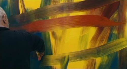
Still from Corinna Belz’ Gerhard Richter Painting
It also reminds me how much those de Koonings reminded me of the early states of Richter’s squeegee paintings. This concept of Richter painting and then overpainting as a transformative, not destructive, technique was what first got me looking at Richter’s destroyed paintings. [That, and Erased de Kooning Drawing, of course.]
Now it strikes me how the two painters share the urge to resist habit and ease. Richter picked up the squeegee in part to counter intentionality and the mastered brushstroke. If de Kooning was resisting the same thing when he changed up his approach after 1980, maybe there’s something to be discovered by seeing these two painters’ works together.
Art Car Parts
We can’t really control when an idea will come to us, or when it might subsequently feel significant, more than a fleeting whim. But we can decide when we make it known. And when we should maybe just shut the hell up about it for a while because seriously, people.
So one day, while driving and explaining to the kid the difference between a car logo and a hood ornament, and how sometimes, people put their own hood ornaments on their cars, usually Jeep Wagoneers, it hit me: artist-designed hood ornaments.
I mean, why should the vinyl wrap industry have all the art car fun?
They’d be awesome little sculptures, made in limited editions. Maybe they could be chromed steel, but they could just as easily be something else: acrylic. Resin. Cast glass. Wood, I suppose. They could be made or readymade. There must be some kind of universal [or relatively so] base attachment mechanism.
Oh, what an interesting context for artists to engage.
And that was that. Until the next day, when the new Artforum arrived. And there on page 52 was Alison Gingeras’ remembrance of visits with the late Franz West who, despite not driving himself, “had a crazy obsession with luxury cars.”

[See more images at basis-wien.at.]
She told of a November 2001 museum performance in Vienna, Aktion PAR BLEU (Le Limousine Bleu), where West used a watering can to pour candy pink housepaint on a maroon Maserati Quattroporte.
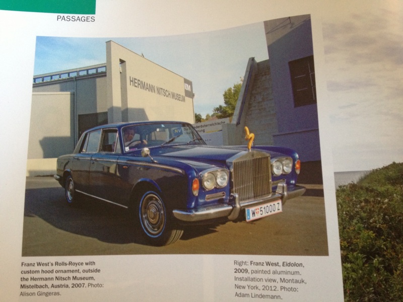
And how West was thrilled about having traded a work for a vintage Rolls Royce:
By the time I got to see his prized chariot, it wasn’t just a Rolls–it had been Westified. He swapped out the Spirit of Ecstasy…for one of his suggestive sculptures rendered in miniature. The view out the front windshield was now accented by a brownish abstract squiggle, which resembled a cross between poop and a penis. In fact, he made a few of these hood ornaments and stored them in the glove box: different colors and forms that he switched out on the daily ride to his Esteplatz studio, depending on his mood.
Which gets at the reality of how people often treat their cars as extensions of themselves, projections of their identity; or conversely, how cars are perceived–and created and marketed–as public embodiments of their occupants’ identity. West’s little artworks went into the world just ahead of him, altering his interactions with it.
With Gingeras’ story as the greatest proof of concept ever–no other mentions of West’s hood ornaments turned up online–I resolved to blog it up pronto. And then Hurricane Sandy started closing in.
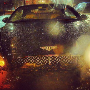
image: Casey Neistat’s instagram
And small blessings, I didn’t get around to mentioning it during the uneasy joking-in-advance period. And it was forgotten completely, and it wasn’t until just now, as I re-read Gingeras’ focus on luxury cars, that I even made a connection to the emotional peculiarities of seeing tree-crushed Range Rovers or submerged Bentleys in Sandy’s photostream. I’m not sure why that is.
Anyway, hood ornaments by artists.
Merkel Jacket Matching System
The “The Girls Of Berlusconi” collection makes it rather NSFW, but The Spectacle of The Tragedy, Dutch designer Noortje van Eekelen‘s “visual database of the European Show and its Leading Actors is pretty amazing.
Don’t you worry none about that link above, though, because it overlays this epic Pantone Matching System-style spectrum of Angela Merkel blazers over everything, no problem.
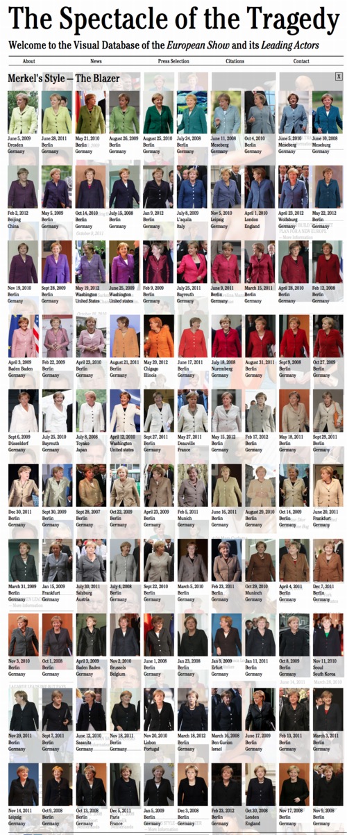
It’s almost enough to make me want to make a 100-piece monochrome painting set, with the color for each piece derived from each of van Eekelen’s appropriated news photos. Or maybe it’s enough to eliminate doubling, and just do each discernible color.
Or maybe it’s a screenprint portfolio, a politicized, EU-trainwreck-inspired riff on the inspiring Kayrock Color System, which I nabbed from the NY Artist Book Fair a couple of weeks ago. A beautiful work.
The Spectacle of The Tragedy [thespectacleofthetragedy.eu via guardian, thanks peteykins]
Noortje Van Eekelen portfolio site [noortjevaneekelen.nl]
Kayrock Screenprinting [kayrockscreenprinting]