Cady Noland GOAT

It works! There’s video! Cady Noland, Tower of Terror, 1994, at Phillips this week with an estimate of $2-3m.

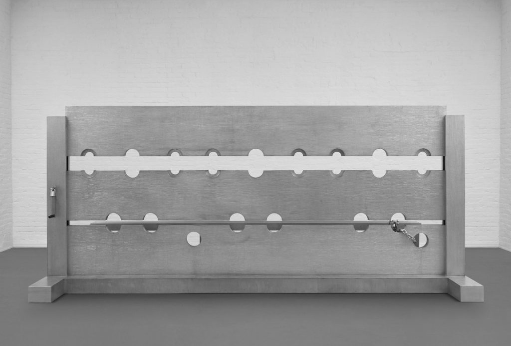
Let’s take a moment to consider the greatest Cady Noland sculpture of all time [No offense, Tanya!] Which I forgot about for 23 years.

Tower of Terror (1993-94) is a 4-meter long, three-person stockade made of cast aluminum. It was created for Noland’s room-filling installation in Public Information: Desire, Disaster, Document, the show that inaugurated SFMOMA’s new building in 1995. I went to that show. And have not recalled it until seeing Tower of Terror turn up for sale at Phillips this week. But I am not alone in this blinkered state.

Cady Noland, Tower of Terror Studies, 1994, collection: MoMA

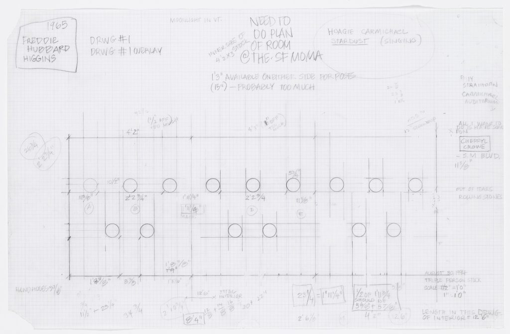
Gary Garrels surely knew. He helped curate the SFMOMA show. And ten years later, when he helped Harvey Shipley Miller assemble a massive collection of works on paper to be donated to MoMA by the Judith Rothschild Foundation, he made sure to get Noland’s preparatory drawings, 21 of them. [They were only  digitized some time after I confessed to knowing nothing about them in late 2015.]

But he did not get the sculpture itself. Where did it go? Norah and Norman Stone apparently didn’t keep track of it. Though they were friends of SFMOMA, and the artist, and had an even bigger work by her, they called their Log Cabin Blank with Screw Eyes and Café Door (Memorial to John Caldwell) “Cady Noland’s only outdoor sculpture to date.”

Cady Noland, Tower of Terror, installation view at Dowling College, Oakdale, LI, no date, image from the college’s pre-bankruptcy website, thanks greg.org reader dg

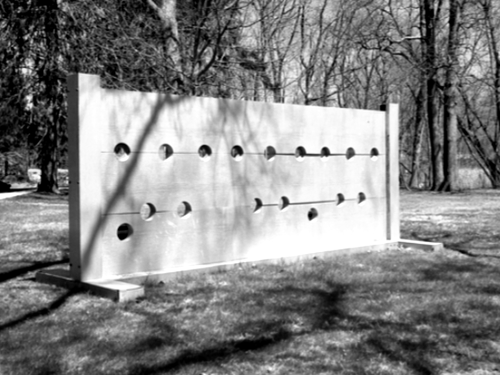
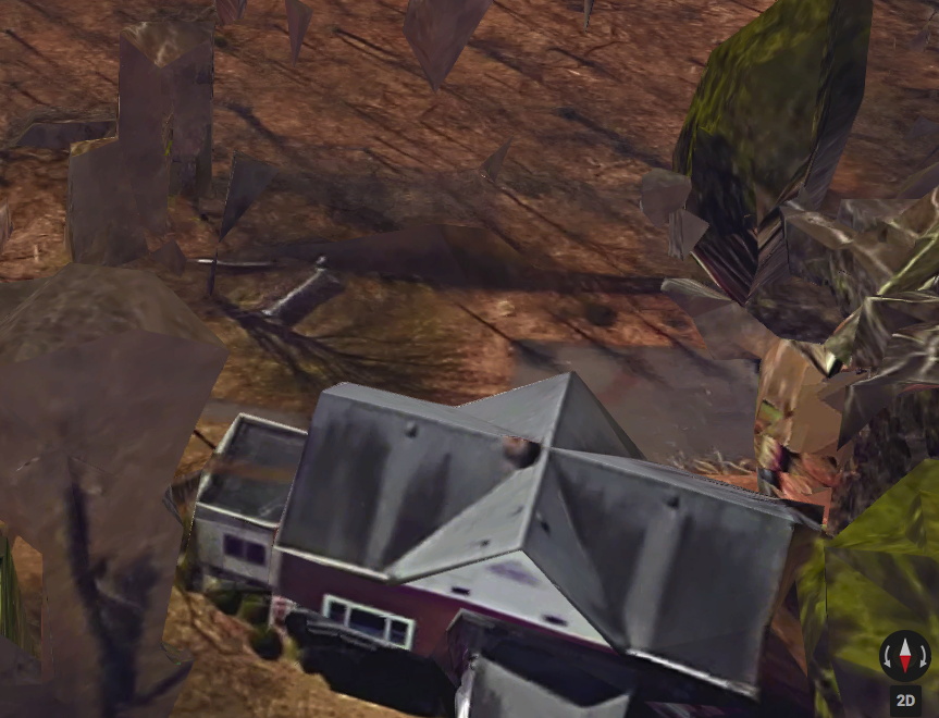
Which means they did not know that Tower of Terror had been installed outdoors at Dowling College, on the south shore of Long Island, for more than 20 years. The sculpture had apparently been acquired directly from Noland in 1995 by Albert & Beverly Davidson of the Davidson Aluminum & Metal Corporation, and promptly donated to Dowling, a small college on a former Vanderbilt estate near the Long Island Sound. It apparently sat in the woods, near the student parking lot, and in front of estate’s former Ice House, which had once been the residence of the college president, but was, I believe, being used as office space. I finally found it on Google Maps. Let’s say it was not where I expected.

Tower of Terror in situ at Dowling College, via the Dark Ages of Google Maps, what is going on here?

So for 22 years, students walking from their cars to– actually, to nowhere. As far as I can tell, the actual school buildings were in the opposite direction. So who ever passed by? Who knew that this massive masterpiece was sitting in public, just off the Southern Parkway, an hour outside the city? Someone knew, because when Dowling College went bankrupt in 2016, they knew to swoop in and liquidate that asset. And now it will be flipped.

The new owners and Phillips also know–by now, don’t we all?–to consult Ms. Noland about her work. The auction listing carries a new non-disclaimer: “We thank Cady Noland for reviewing the cataloging for this work.” We all do, Phillips, we all do. And we thank her for making it. [So if she is fine with this sentence, must we be? “Tower of Terror, 1993-1994, represents the central tenant of Cady Noland’s conceptual practice: the subversion of the American psyche through celebrity and violence. “]

Some other thoughts about this work that I don’t really know how to fit into a narrative: Tower of Terror is also the name of a Disney ride that opened in July 1994. [The study above dates from August.]

Cady Noland, Beltway Terror, 1993-94, stamped aluminum on wood, not sold by the Sammlung Goetz at Christie’s, Nov. 2016, for $800-1.2M

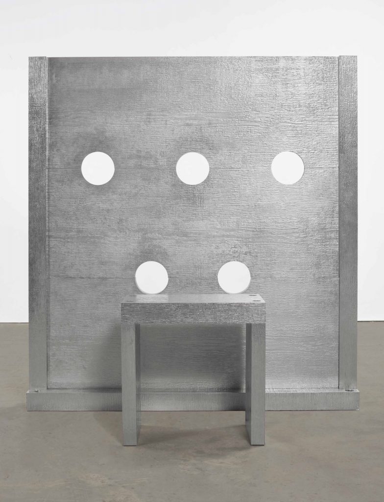
Another stockade from the SFMOMA show was recently put up for sale, until it wasn’t. In November 2016, the Sammlung Goetz sent the domesetically scaled Beltway Terror was at Christie’s with an estimate of $800,000-1,200,000. Then it was withdrawn. Beltway Terror looks very similar, yet also substantially different. Obviously and adorably, it only fits one person. But it is also stamped aluminum laminate over wood, where Tower of Terror is cast aluminum. It now seems significant that the work was acquired by the owner of an aluminum processing company. Perhaps it was acquired in exchange for fabricating it.

those sure look like seams to me. stamped aluminum on aluminum?

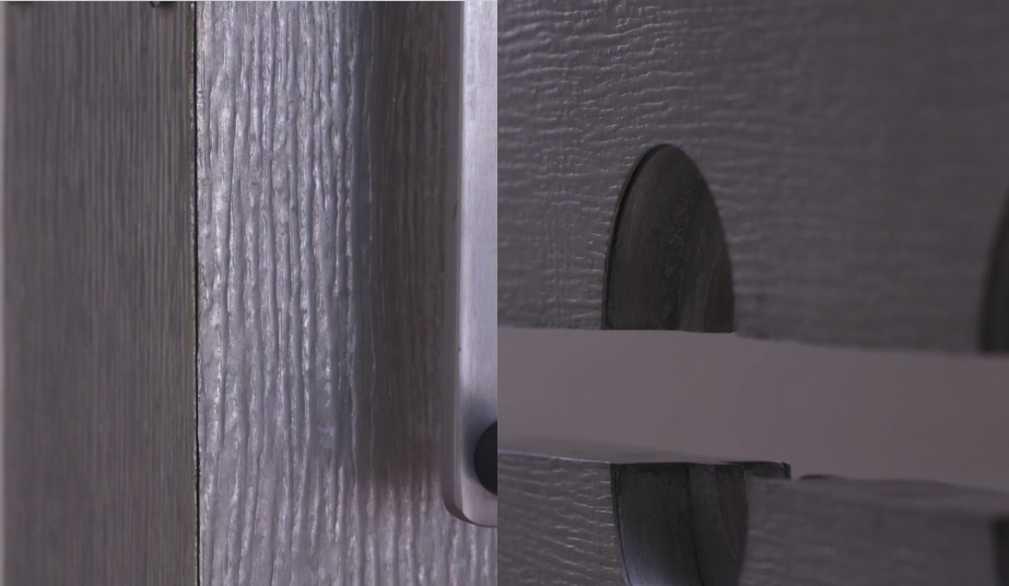
Perhaps it was cast from a stamped sheet-on-wood model? No. When I see the video, there is either some Gober-level simulacralization of the seams, or this is stamped aluminum laminated on cast or milled aluminum.  In any case, Tower of Terror is epically superior to Beltway Terror. I hope whoever buys it puts it where it belongs, in a museum of modern art.

Untitled (A Painting For Two Rooms By Cactus Cantina), 2017

Untitled (One Painting For Two Rooms By Cactus Cantina), 2017, cornflower blue and green wall paint, landscape painting (framed), charcoal, dimensions variable, installation view

I am pleased to announce that a work I thought was gone has perhaps come back on view in Washington, D.C. The title, obviously, is derived from Gerhard Richter’s 1971 work, Two Sculptures for a Room by Palermo (below). But its creation, including all the vagaries involved, are inspired directly by Palermo’s work and practice.

Gerhard Richter, Two Sculptures for a Room by Palermo, 1971, plaster & wood, painted, in ochre room, image:gerhard-richter.com

Talking about his late student in a 1984 interview with Laszlo Glozer, Joseph Beuys said:

I believe that one of the most important things for art–and he knew it too–is the behavior of people in general. The way people live, the way they live in their space. The way people live was very important for him. The way they inhabit, the way they live, what chairs they sit on, or what they have around them, what they stuff into themselves.

Untitled (One Painting For Two Rooms By Cactus Cantina), 2017, cornflower blue and green wall paint, landscape painting (framed), charcoal, dimensions variable, installation view

I’d seen the painting first (what they have around them), but it was that charcoal (the way they live) and the horizontal blue passage on the upper left that made the work come into being (the way they inhabit). But that was last year.

Beuys again:

Well, if I could, I would say one should perceive his works like a breath. They have something of a breath about them, a breath that vanishes…One ought to see his paintings more like breath that comes and goes, it has something porous, and it can easily vanish again. It is also highly vulnerable. Vulnerable, say, like a cornflower: when you out it into light, it fades very quickly. So one has to perceive that breathlike being as an aesthetic concept and not as a solid structure…

I still don’t know whether to post these matters, or whether it differs from filing it away, or from seeing it, or thinking it. I mean, it’s posted now because the house where this was installed last year came back on the market, with the same listing photos, and I saw them again. But what changes? Is the work still there? Would it matter if it is or isn’t? Does it matter what that crappy little painting even is?

Which seems as good a time as any to mention another work from last year, which I intentionally didn’t post, to see what it was like.  Does it change now? Now that situation has been moved out and gut renovated for sure? Now that I can search for it in a different dialogue box? Now that someone else can, too?

Untitled (Macomb Wall Painting), 2017, eggshell finish paint, painting hook, est. 36×40 in., installation view

For me the value lies in the wonder, the fleeting marvel, the tiny layers of history, of how some people lived overlaid with how other people staged. So I’m good.

Previously, related: https://greg.org/archive/2016/01/29/untitled-border-2016.html
https://greg.org/archive/2016/05/27/monochrome-house.html

Destroyed Derek Jarman Capes: Are There Any Other Kind?

derek_jarman_loft_skycapes_1971.jpg
It’s an accident of timing that I’ve kept thinking of Derek Jarman as a filmmaker with a painting hobby. He was still alive when I saw my first Jarman film, Edward II, and when Blue blew me away. And I felt I knew his story, so I’ve been slow to read his early autobiography, or other books about him; my job was to just catch up and see all his earlier films. It didn’t help that I didn’t really like the paintings shown after his death. His notebooks were more relevant.
But I just saw this photo which changed all that. I wasn’t 100% wrong, but I was close: Jarman’s painting was more formative and influential-and interesting-than I realized. The photo’s from 1971, and it is captioned in Jarman’s dramatic hand:
“The Skycapes 1971 blue pigment on canvas
destroyed in the fire in 1979”
Skycapes has been a Google dead end, or rather a cul de sac for this caption. But capes, capes is where it’s at. In his 1999 biography of Jarman Tony Peake traced the form and concept of the cape to Jarman’s theatrical work, particularly his ideas for a production of The Tempest:

Capes are both practical and sensual, especially when cloaking nakedness. They are geometric: if hung on the wall, they form a half circle. They have mythic overtones: by donning a cape, the wearer can effect a transformation. These qualities, particularly the latter, had considerable potency for Jarman, who now set about working and reworking this new possibility until the capes he produced-and began to hang on the walls of his studio-no longer resembled design, but approached the condition of painting or sculpture.

Now the timing’s a little confusing, because Jarman made a film version of The Tempest in 1979. But Peake notes the project had interested Jarman for years. And Jarman made a clear, laminated cape scattered with dollar bills [or pound notes, maybe?] for the 1969 production of Peter Tegel’s surrealist play Poet of the Anemones. Peake said the two met at Lisson Gallery.
And the walls of Jarman’s riverside loft were lined with extraordinary capes when filmmaker Ken Russell visited and asked him to design the sets for The Devils, a project that consumed most of Jarman’s waking hours in 1970. Exhausted and dissatisfied by the film project and wary of commercial film industry entanglements, Peake wrote, Jarman “chose to concentrate on his capes, some of which he now began to paint, in two main colours, black and blue, but mainly blue: ‘simple sky pieces to mirror the calm.'”
That quote’s from Jarman’s own 1984 memoir, Queerlife, which was published in the US with the title Dancing Ledge in 1993:

1971. The Oasis
The intervening year was spent painting a series of blue capes, which hung on the walls at Bankside. They were simple sky pieces to mirror the calm that returned after the frenzied year of The Devils. That summer was an idyll, spent sitting lazily on the balcony watching the sun sparkle on the Thames. When I wasn’t painting I worked on the room and slowly transformed it into paradise. I built the greenhouse bedroom, and a flower bed which blossomed with blue Morning Glories and ornamental gourds with big yellow flowers. On Saturdays we gave film shows, where we scrambled Hollywood with the films John du Can brought from the Film Co-op- The Wizard of Oz and A Midsummer Night’s Dream crossed with Structuralism. There were open poetry readings organized by Michael Pinney and his Bettiscombe Press. Peter Logan perfected his mechanical ballet, and MIchael Ginsborg painted large and complicated geometrical abstracts.

An oasis paradise indeed, replete with all the essential elements of Jarman’s subsequent accomplishments. Which is, at least, how he himself saw it when he looked back from 1984.
undergroundinteriors_derekjarman_loft_obertogili-2.jpg
Here is a 1971 photo by Oberto Gili of Jarman’s amazing Bankside loft, the top floor of a 19th century wheat warehouse. Which had the floors, the ceiling, the views, the space, but not the plumbing or the heat (thus the greenhouse bedroom). There’s the hammock from the first photo, and a laminated cape which had tools, weeds, and detritus retrieved from the abandoned waterfront. [How far do the similarities go between Jarman and other gay pioneer artists like Robert Rauschenberg? Jarman would’ve spit at the comparison; in a 1984 interview at the ICA he slammed Jasper Johns for being a tool of the CIA. #freequeerstudiesdissertationtopics]
matisse_vence_chasubles_helene_adant.jpg
Henri Matisse cutout designs for priests’ chasubles for Vence Chapel, 1951, photographed in his studio surrounding a Picasso painting, by Helene Adant. image: tate.org.uk
In Ken Russell’s telling of their first cape-filled visit, Jarman “was getting ready for an exhibition called “Cardinal’s Capes.” It’s a phrase which turns up nowhere else, but which makes me think of Henri Matisse, who designed amazing chasubles for priests to wear in his chapel at Vence. They began as cut-outs, and were translated into fabric, and changed with the seasons.
In 1970-71 Jarman had two solo shows, including capes, at the then-new Lisson Gallery, but he grew to disdain the gallery system. He also hated Pop and bristled at working in the long shadow David Hockney cast over the London art scene. He opened his studio for his own damn show in 1972, which Peake says was disappointing [though he sold some work and celebrities turned up for the opening, so what greater success could art hope for?]
He included new capes made from black lacquered newsprint [Rauschenberg?] in a 1984 mid-career exhibition at the ICA. [He was 42.] And in that public talk, he described funding his early features by selling paintings and raising money from his painting collectors.
Anyway, are there any Jarman capes left to be seen? I can’t find any. In 2015, the ICA screened Jarman’s super8 documentation of his 1984 show for the first time, but there’s no visual trace online. And as the caption to the original photo mentions, his earlier capes, including what he called his Skycapes, were destroyed along with Jarman’s and others’ studios in 1979.
By retrospectively titling them with the sky, and using the term “blue pigment” instead of paint, Jarman also seems to be linking the capes to one of his clearest references, Yves Klein. Klein the outrager who said his first artwork was signing the sky. Whose International Klein Blue appeared throughout Jarman’s notebooks in the 80s. Jarman filmed an IKB monochrome painting and projected a loop of it for a 1987 live poetry/music performance event he called Bliss, which became his last, greatest film, Blue, in 1991-3.
klein_uecker_marriage_1962.jpg
Here is Klein at his wedding on January 21, 1962. Rotraut Uecker is wearing an IKB crown, and he is wearing a cape emblazoned with a Maltese cross. They are processing through the raised swords of the Chevaliers of the Order of St. Sebastian. So at least I know what my dissertation will be about. But first we have to solve the problems that there are almost no Jarman Super-8s online; that Klein’s wedding was filmed, and that’s not around, either. And then, of course, all these destroyed capes. There is a lot of work to do.
Previously, 2013: International Jarman Blue
2004:
It’s not just Derek Jarman’s Blue
2002?:
As I lay typing

Cucula: Lampedusa Autoprogettazione X Refugees

cucula_ambassador_chair_still.jpg
I do not know how this slipped by me all this time, but Cucula is a Berlin organization that works refugees to make furniture. It started in 2013 by making Enzo Mari’s Autoprogettazione designs out of the wood from refugee shipwrecks on the Italian island Lampedusa.
Lampedusa, of course, became synonymous with the first widely publicized tragedies of massive refugee deaths in perilous transit. Cucula, a West African word meaning, basically, colabo, was started by designers Corinna Sy and Sebastian Daeschle, first to help Nigerian and Malian refugees fleeing war in Libya to stabilize their situation in Germany. Actually, their first idea was to help the refugees build furniture for their rooms; the refugees said they’d rather have jobs, danke.
cucula_lampedusa_wood.jpg
The first products were Mari’s Sedia I, and were apparently called Lampedusa Stuehle. On the webshop now, though, they’re called the Ambassador. Whatever the nuance of the shift, it makes me think of how time, geographic shifts, and the exponentially worsened plight of refugees has kind of swamped the Lampedusa brand.
Actually, what it really does is make me uncomfortable by aestheticizing and productizing the deaths of so many people. I fully support the mission of Cucula. I will not be shaken in my support of efforts to help refugees, especially those who have been through so much and have traveled so far at such great danger. I am a longtime admirer of Enzo Mari, and applaud his support for Cucula’s use of his designs beyond their original, DIY-only context.
Cucula_Lampedusa-Stuehle.jpg
But the transformation of wrecked ships into premium, virtue-signaling, small batch designer furniture gets rightupthisclose to Ai Weiwei levels of disaster pornsploitation for me. The only thing that makes it work, imho, is that it’s actually refugees learning the skills, doing the work, and reaping the benefits. I hope. [Curbed reports that Mari’s license stipulates that only refugees can make the furniture, which in this case adds to the layers of complication, partly because the refugees cannot officially be classified as employees who earn wages.]
cucula_bambino_vid_still.jpg
How many kinds of complicated are there again? Because it feels like a couple of designers stepping in to fulfill a moral obligation we all [should] feel, and doing it in an impossibly, obviously, unscalable way. And the rest of us, our role is to shop.
No. I don’t mean no, don’t shop. I mean, no, the rest of it. Why not take Cucula as an imperative, an example of the value of individual and collective care and involvement in building communities with and for refugees? If a designer can organize a workshop that supports a team of refugee craftsmen by building esoteric furniture, there is something you can do, too.
cucula_bambinooo_kids_bench.jpg
Meanwhile, maybe the Cucula solution is two-fold: first, get some stock-standard Autoprogettazione furniture made from regular pine. None of it is particularly expensive, considering, and the Bambinooo extended mini-chair with built-in storage bin is especially nice. Also go full Lampedusa-meets-Piet Hein Eek, and get a custom chair made entirely out of wreckwood. Then start inviting some refugees to dinner.
CUCULA [cucula.org, h/t monique]
Meet CUCULA, the Berlin Furniture Company Seeking to Empower Refugees [curbed]
Previously, related: Enzo Mari X Ikea Mashup, Chaper: The Last [or not, obv]

Plagiarism is Necessary, Kader Attia

dosseh_nekfeu_putain_mylar_attia.jpg
kader_attia_ghosts_saatchi.jpg
Top: screencap from “Putain d’epoque”, with people standing in mylar ponchos. Bottom: Ghost, 2007, molds of kneeling family members made of aluminum foil, installed at Saatchi in 2009. via
Kader Attia has filed a plagiarism lawsuit against French rappers Dosseh and Nekfeu over visual similarities between the music video for “Putain d’epoque” and Attia’s 2007 installation Ghost. I’m a non-expert in French intellectual property law, so I can’t say whether the visual echo legally outweighs the differences in material, execution, setting, content, and concept. [Attia discussed the genesis of Ghost in AiA in 2009.] But I know mylar when I see it, and when I don’t. The works are utterly different, even though there is a one-second dronecam shot in the video that shows the men kneeling face down, as if in prayer. Is that really what this is about? Because it does not feel like plagiarism. The effect is apparently that the just-released song is stripped from the video while it’s being litigated.
dosseh_nekfeu_putain_mylar_attia_kneeling.jpg
via
Attia’s complaint is based on artists’ rights, and the resistance to “non-consensual use” of artists’ work: “Everyone is plundering us, whether it’s advertising or the cultural industry.”
That quote comes from Kendell Geers, who wrote an open letter to Attia defending quoting and plagiarism and the freedom all artists rely on to use and interpret the world around them as they make their work.

Since 1988 I have developed a body of work and a language around the very subject of plagiarism, taking my cue from Lautréamont, the French poet born in Uruguay, who said “Plagiarism is necessary. Progress implies it. It holds tight an author’s phrase, uses his expressions, eliminates a false idea, and replaces it with just the right idea.” His revolutionary text Poésies was the Holy Water that baptised the Surrealists, a text written between the lines of words plagiarised from other authors. I have always wondered if Paul Gauguin was inspired by Lautréamont when he said that “Art is either plagiarism or revolution,” but there can be no doubt who inspired Guy Debord when he wrote his revolutionary book the “Society of the Spectacle” in 1967. He said that “Ideas improve. The meaning of words participates in the improvement. Plagiarism is necessary. Progress implies it. It embraces an author’s phrase, makes use of his expressions, erases a false idea, and replaces it with the right idea.”

Well played, Guy.
Geers calls for all artists and “every human being who believes in changing the present for a better future” to defend artists’ freedom to express themselves, and especially for artists with power and presence in the marketplace to defend those without. As Powhida tweeted about Geers’ statement, “It’s amazing. Collectively we have to stand up for individualism. This is the hardest thing in this star fucked market.”
As I always say, I replace melancholy by courage, doubt by certainty, despair by hope, malice by good, complaints by duty, scepticism by faith, sophisms by cool equanimity and pride by modesty.
Or maybe I should say it again this way: ‘Poetry is for everyone.’ Poetry is a place and it is free to all cut up Rimbaud and you are in Rimbaud’s place.
Un clip de Dosseh et Nekfeu accusé de plagiat par l’artiste Kader Attia [lemonde.fr]
Putain d’époque ! Lettre ouverte de Kendell Geers à Kader Attia à propos de son action en justice pour plagiat contre Dosseh et Nekfeu [lemonde.fr via @frieze]

Better Read #10 – Questlove: Trayvon Martin and I Ain’t Shit

orange_skittles_better_read.JPG
Has Questlove read this aloud himself? I don’t think so. I wish he would, because if I cry this much when the robot reads it…
Download: Better_Read_010_Questlove_Im_Still_Human_20160920.mp3 [11:27, 16.5mb mp3 via dropbox greg.org]
Read: Questlove: Trayvon Martin and I Ain’t Shit [nymag via @jamilahlemieux]
Questlove discussing racial profiling and his reaction to the Trayvon Martin verdict with Amy Goodman in Aug. 2013 [youtube]

Dada’s Great, If It Weren’t For The Dadaists

Breton_Picabia_uncropped.jpg
I love dada, I support it entirely. But dadaists themselves seem kind of tiresome to be around. Dead founding dadaists, on the other hand, we could hang out all day.
If I understand the history correctly, Francis Picabia painted this signboard which André Breton wore at the Festival Dada held on 27 March, 1920 at the Theatre de l’oeuvre. The quote comes from Picabia’s Manifeste Cannibale, which Breton read that night in the dark: “For you to love something, you must have seen and heard it for a long time, you idiots.”
breton_icabia_ernest_t.jpg
Ernest T. Bande d’Idiots, apres Picabia, 1985, acrylic on cardboard, collection FRAC Limousin
agnès b. says that Picabia took the photo, though the succession André Breton is not so sure. b. has reissued a 2004 t-shirt with the photo printed on it. b. also owns one of three replicas of the sign painted in 1985 by Ernest T., a 73-yo pseudonymous French artist whose dada appropriationist practice inspired the title of this post. Another is in the collection of the FRAC Limousin, which gave Ernest T. a retrospective in 2001. [pdf checklist].
That leaves one unaccounted for, but maybe I’ll just make it myself. Ernest doesn’t seem to have tried to guess the colors Picabia used anyway. That creme & greige palette does not strike me as very Festival Dada.

Unjust Desserts

richard_prince_tell_me_everything.jpg
While running SFMOMA’s cafe, Blue Bottle Coffee pastry chef Caitlin Williams Freeman designed a whole bunch of artwork-inspired desserts, including a cookie platter that could be assembled into various Richard Serra Prop sculptures-which the artist did not like, not. one. bit.
Tell me everything, the world said, and so Freeman published a book, Modern Art Desserts.
And now they’re doing her act.
When SFMOMA closed for their Snohetta renovation, they required Blue Bottle to rebid for the cafe contract, and then they awarded it to McCalls, who ran the ground floor cafe, instead.
Now the SF Chronicle reports that on her first visit to the new museum, Freeman found McCalls serving knockoff versions of the art desserts, in her old space, with no credit at all. And the McCalls guy punted the paper’s queries to the Museum. Which makes me think SFMOMA figured because it owns the artworks, it owns the dessert interpretations, too.
If SFMOMA wants to serve art-inspired desserts, fine. But give credit where it’s due. I bought Freeman’s book, and tried her recipes. Those things are hard. It’s not just throwing grey frosting on a cupcake and calling it a Lead Splatter.
If they’re going to stiff-arm Blue Bottle entirely, though, then pick new artworks to base desserts on. Aren’t there a couple hundred new Kellys and Richters to copy now? Why not make a frosted cookie printed with Richard Prince’s joke painting? The fact that they don’t own it seems even more on point right now.
The Richard Serra Cookie Incident

More Vine, More Fig Trees

I have not touched on my Hamilton amazement here yet. I figured I’d save it for the review, which would follow soon after getting tickets. [insert gif of endless horizon retreating from me.]
But I have to write about one place in the score that tears me up, when Chris Jackson sings George Washington’s final address over Lin-Manuel Miranda’s Hamilton, who reads it aloud:

[WASHINGTON]
…Like the scripture says:
“Everyone shall sit under their own vine and fig tree
And no one shall make them afraid.”
They’ll be safe in the nation we’ve made

I want to sit under my own vine and fig tree
A moment alone in the shade
At home in this nation we’ve made
One last time

I anticipate with pleasing expectation
that retreat in which I promise myself
to realize the sweet enjoyment of partaking,
in the midst of my fellow-citizens,
the benign influence of good laws
Under a free government,

the ever-favorite object of my heart,
and the happy reward, as I trust,
Of our mutual cares, labors, and dangers.

Emphasis added for the lines that just do me in every time, even as I type about them now, as I think about the millions of people who don’t feel safe in this nation we’ve made, or who find suffering, injustice, or even death, under the far-from-benign influence of our laws and government.
george_washington_farewell_manuscript_p32.jpg
image: from the final page of the final manuscript of George Washington’s Farewell Address, via gwpapers.virginia.edu
This was literally the kicker of Washington’s parting address, his wrap-up, his mic drop. And to look around at this mess we’ve made, the Founding Fathers’d be like smdh.
One Last Time, from Hamilton [youtube, lyrics via genius]
Buy Hamilton (Original Broadway Cast Recording)(Explicit)(2CD or MP3) [amazon]
[note: fwiw, when I bought the album, I ended up swapping out the explicit tracks with the broadcast-safe versions I ripped from NPR. You know, for kids.]

I Got Up, I Met, I Went, I Read

on_kawara_gugg_gregorg.jpg
On Kawara’s One Million Years readings have always had a profound effect on me. From the first time I saw it at the Dia, to the resonance of One Million Years in Okwui Enwezor’s Documenta 11 in 2002; to an installation at David Zwirner, to the reopening Stedelijk. It was Brian Sholis’s moving account of reading with his then-fiancee Julia Ault at Zwirner that cemented my determination to read one day, too.
That day was April 5th, Easter Sunday. I had booked my wife and myself to read in the first shift, just as the Guggenheim opened. I’d already seen the museum’s On Kawara retrospective, but on a day when there was no reading. These are some recollections and thoughts of the experience with the piece.
One Million Years and an unannounced roaming exhibition of one week’s worth of date paintings in kindergarten classes are the two projects Kawara authorized to continue after his death last summer at age 29,771 days. Mary, who was coordinating production of One Million Years and prepping volunteers, took our picture when we sat down on the dais. She said the artist used to listen to recordings of One Million Years as he worked in his studio, and that the liked to have photos of the readers.
I had not anticipated such a thing, but now the entire project felt extremely personal. It was not just a performance, but a communication, a communion, with the artist himself. But not anymore, not for us. It turns out the Guggenheim was recording the reading, but only for exhibition documentation. Posthumous recordings like ours would not end up contributing to a “complete” recording. That aspect of the work, too, ended with the artist’s death.
Still, as I’d expected, reading itself was a wonderful experience. I found it somehow meditative and exciting at the same time. I found myself thinking of the dates we were reading, long before modern humans, and their history, existed. Yet narrative was there; the numbers became their own narrative. There was suspense as we counted down to an even hundred. Symmetrical numbers, or pairs or trios of digits, or chains of multi-syllabics, felt momentous, like a winning poker hand. These numbers, these years, with literally no significance of their own had significance thrust upon them, at least for a few seconds, by being read aloud. It turns out long numbers are not usually read aloud.
The greatest thrill was the echo of the Guggenheim’s rotunda. We sat on the ground floor, backs to the window, with loudspeakers flanking us, and our numbers seemed to ring out through the show. We took it slow and serious. We intoned, and I imagined how we must affect the reception of the rest of Kawara’s works up the ramp. We contributed our small part to everyone else’s enlightenment.
After we ended, we went through the show. We stopped on the way out to watch our replacements. Mary had said it’s easy to tell when the readers are a couple. Inversely, it was immediately obvious that the two jokers after us were either breaking up, or didn’t know each other and could not be bothered. Even on the rare numbers they didn’t mumble away into nothing, you could barely hear them standing right in front of the dais.
But how was this really any different from our experience? In fact the sound from One Million Years never left the ground floor, and sometimes it hardly left the little stage. In the hard-surfaced cacophony of the rotunda, One Million Years was essentially lost. I felt very acutely the gap between our rewarding personal experience of performing and the empty opacity the being in the audience. Or of not even noticing the piece existed.
on_kawara_twelve_dates.jpg
In glass half-full mode I considered this divergence alongside the rest of Kawara’s practice, where dates and times and lists barely hint at the complexities of the artist’s daily experience.
Did I say half-full? This comparison, along with some of Kawara’s lesser known series [60s word diagrams, the coded letters, and of course, all the newspaper clippings in all the Today series boxes] made me wonder what there actually is to know? Frankly, I’ve begun to fear that under it all lurks an actual Message, hidden by Kawara, just waiting to be cracked. And that the profundity, the interpretation, the significance, will turn out to be all in our heads.

Moon Piece, 1985-6, Chris Burden

We’ll talk about this in the morning.
chris-burden_modified-moon-piece-2010.jpg
Chris Burden, Modified Moon Piece, 2010 image: manpodcast
MORNING UPDATE A WEEK LATER, BECAUSE APPARENTLY IT TAKES LONGER THAN ONE NIGHT TO PROCESS THIS
November 2011: This was sitting right there in the first episode of Modern Art Notes Podcast, waiting. And even though he wouldn’t tell me who the guest was, Tyler had been goading me before the launch, that I better listen, there is a surprise. Because he knew about the satelloons.
And I did not know about Chris Burden’s unrealized 1986 proposal for The Moon Piece, which is basically to launch the biggest possible spherical inflatable mylar balloon satellite into orbit.
Which was basically the same idea I’d had four years earlier. Or nineteen years later, depending on who’s counting.
Or was it? Maybe it’s fine? Maybe it’s different? Relationship status: it’s complicated. Green teed the question about Burden wanting to build something like the Eiffel Tower. And in discussing The Moon Piece Burden said it could be a giant spherical balloon or an even more “giant parabolic mirror you could control.” Which, if you made it about “the size of Lake Havasu,” [78 km2, btw. -ed.], you could use to “light [all of] New York from above.”
So maybe it’s not a satelloon at all, then. And he’s talking about something permanent, and big enough to light cities from space. This sounds like the Russian thing. Except it can’t be, at least not originally. Green cited a 1988 interview with Paul Schimmel as the source for this proposal. And solar mirrors didn’t really show up until the 90s. Russia ran a proof-of-concept solar mirror program called Znamya from 1992-99 which, it was hoped, would boost solar power production and bring light to darkest Siberia. But it only had one success: a 20-meter-diameter mirror launched in 1992 which produced a 5km-wide beam as bright as the full moon. Later, scientists at Livermore Lab proposed massive solar mirrors as one extreme technological approach to geo-engineering humanity’s way out of the climate change crisis. So this solar mirror aspect is different, maybe an adaptation, an addition, and it shows the artist was keeping tabs on things. But Burden’s original The Moon Piece idea is/was a satelloon.
It turns out Burden first pitched The Moon Piece in a letter to Edward Fry, who was co-curating Documenta 8 (1987) The letter was [first?] published in the appendix of the amazing 2005 monograph, Chris Burden. [Which I bought in 2008, but didn’t read all the way, even after getting more into his work in 2009.]:

[The satellite’s] “only function and purpose would be to reflect light back to earth. This special satellite would function much in the same manner that our present moon reflects sunlight. I foresee that this huge satellite could be manufactured out of fairly inexpensive, highly reflective Mylar film and be carried into outer space in a deflated state (like an uninflated balloon).

The Moon Piece will be highly visible to the naked eye and appear, in relation to the pin points of starlight, as a bright automobile headlamp moving rapidly across the night sky, one-fifth to one-tenth the size of the moon. The most sophisticated and the most primitive of cultures will be aware that something has changed in the heavens.

This is not simply a conceptual project. This project is technically feasible and to function as a work of art it must be actualized.

Obviously more research and information needs to be done on the specifics of the Mylar balloon such as size, thickness of Mylar, weight, etc., but I believe that The Moon Piece is physically and financially feasible given enough energy. If this idea, of putting into orbit a highly reflective satellite that would light up the heavens, could come to fruition I believe it would well be worth the effort.

On the one hand, it’s nice to feel like you’re on the same wavelength with someone whose work and career you admire. On the other hand, damn.
echo_satelloon_color1.JPG
But some things stood out. Like Burden “foreseeing” the possibility of the satellite’s existence, and not knowing any of “the specifics.” Is it possible that Burden really did not know that these exact objects had already been created and deployed in the 1960s, when he was a teenager? I can’t believe it. Was it not important to his concept, or his pitch, to reference their historical sources, or their current non-art uses? Apparently.
And he adapted The Moon Piece, which began with the assumption that after 20 years, an inflatable satellite could be bigger, and after 30 years it could be bigger still. Or it could use future-state-of-the-art technology and be a mirror as big as a lake. Burden’s constants were big, reflective, and in space. But other than that, the 2010-11 version didn’t sound any further along than 1986’s.
Thumbnail image for exhib_space_install_01.jpg
A few months later (in 2012) I was working on making and showing a satelloon at apexart in New York, and I uncovered aspects of satelloons and their history that mattered. The concept had originated with none other than Wernher von Braun, who proposed, not a new moon, but a new, “American Star” which would awe the lesser nations into supporting the US in the Korean War. Von Braun wrote that in a widely published Time | Life book on space travel. Burden’s language about “primitive cultures” knowing “something has changed in the heavens is straight from von Braun’s pitch. The NASA engineer who had claimed the most credit for Project Echo came up with the idea at von Braun’s V-2 rocket conference. It was OK’d after Sputnik because US military leaders wanted a visible satellite would normalize people to the presence of spy satellites and surveillance.
This is context I only pieced together after five years of researching. Burden missed or omitted not just this, but the very existence of Project Echo, when he proposed Moon Piece for Documenta1. Would it have turned up in Kassel? How would that’ve gone over? I can’t even imagine.
Except that I did, and I still do. My apexart experience has made me very wary of satelloons, which are seductive, but also politically problematic. Their beauty and surface make them impossible to ignore, which makes it worse. I’ve also found that where I once felt daunted and insecure about having the same idea as a major artist I admired, I am OK with it. Partly because I realized my project is better.
And that, plus a $25,000 Marquis Jet card, can get you to Basel. Burden nailed it the first time: this is not a conceptual project, destined merely for Hans Ulrich’s files. It must be actualized. And so it’s especially unfortunate that Burden, whose genius was superlative physicality, can’t see The Moon Piece in the sky himself.
After hearing about The Moon Piece, Green’s follow-up question was whether Burden would be OK with people “mining his files” to produce his unrealized projects “after you’re no longer with us.” It’s a conversation that obviously sounds very different now than it did in 2011, which is just one reason it’s taken me more than a week to write this blog post. “if somebody wanted to do that after I’m not around, that’d be fantastic,” Burden said. “I think that’s why people become artists, you know. To have a life beyond them. I mean, it’s a way to become immortal.”
echos_sandia_life64.jpg
The Project Echo satellites stayed in orbit for five and eight years before gravity pulled them into the earth’s atmosphere. It’s not quite immortality, but it’s a start.
Related, devastatingly: Chris Burden dies at 69 [latimes]
2007: If I were a sculptor, but then again
2013: Exhibition Space [apexart.org]
Listen to the entire discussion between Chris Burden and Tyler Green on Episode 1 of MANPodcast [manpodcast]
Or listen to the 3:00 MANPodcast excerpt where Burden & Green talk about The Moon Piece [dropbox greg.org, 4.6Mb mp3]
[1] What did Burden end up showing in Documenta 8, anyway? I have found him listed in the participating artists on Documenta’s own site, as showing “audio”. Of Burden’s four pre-1987 audio works, only The Atomic Alphabet and Send Me Your Money, both 1979, seem likely. For his part, the artist’s official CV only mentions Documenta 6, in 1977. Fry was the American co-curator on both.

Situation: Art School, All Teed Up


This tweet from artist Nayland Blake, who heads ICP-Bard’s advanced photography MFA program, has been sticking with me all day. Blake’s participating in a symposium Friday at Pratt with some other folks I know and respect a lot, on the nature and challenges of art school.
At first Blake’s panel topic, “What is the role of art school in a market driven art world?” sounds like appropriate self-flagellation, and since William Powhida’s also participating, I could imagine who’s wielding the whip. But Bill’s not just an iconoclast, and Blake’s tweet gives hope for a constructive panel, if not quite yet hope for a better world.
Davdi Ross is in the morning, and BHQFU is in the afternoon, so it sounds like a full day. I hope it’s streaming.
Situation: Art School symposium at Pratt, March 6, 2015 [pratt.edu]

On @TheRealHennessy Tweet Painting, DILF

Thumbnail image for therealhennessy_tweet_dilf.jpg
@TheRealHennessy Tweet Painting, DILF, 2014, 14×11 in., acrylic and screenprint on canvas
Monochromatic with a sharply contrasting silk-screened text, @TheRealHennessy Tweet Painting, DILF belongs to one of greg.org’s most iconic series–the @TheRealHennessy Tweet Paintings.
Distilling his canvases in a humorous simplicity, he has disassembled the process of artistic representation and its interpretive demands. Placing his control over the viewer, we read the tweet, laughing or groaning in response. Echoing the uncluttered monochromes of an esteemed range of artists form Kazimir Malevich to Yves Klein and Ad Reinhardt to Brice Marden, @TheRealHennessy Tweet Painting, DILF has the emphatic simplicity of Minimalism. And yet, deliberately puncturing the seriousness of art history’s great monochromes, he has printed a classic pick up line at its center. Recalling the zips of Barnett Newman’s paintings, greg.org’s selection of a deliberately unobtrusive font places the canvases serious and authoritative appearance in strange tension with the flippant content. “The subject comes first. Then the medium I guess,” he has explained. “Like the tweets. They needed a traditional medium. Stretchers, canvas, paint. The most traditional. Nothing fancy or clever or loud. The subject was already that. So the medium had to cut into the craziness. Make it more normal. Normalize the subject. Normality as the next special effect” (greg.org, quoted in R. Rian, ‘Interview’, pp. 6-24, in R. Brooks, J. Rian & L. Sante, London, greg.org, 2003, p. 20)
Minimal in composition and lacking the painterly presence of the artist’s hand, greg.org’s @TheRealHennessy Tweet Paintings parallel the “rephotography” that he became so well known for in his photographic works. Surreptitiously borrowing, appropriating, or as he refers to it, “stealing” is a trademark of his work. Even the location from which he draws his content has become a staple to his oeuvre. “Tweets are part of any mainstream magazine,” he explains. “Especially magazines like the New Yorker or Playboy. They’re right up there with the editorial and advertisements and table of contents and letters to the editors. They’re part of the layout, part of the ‘sights’ and ‘gags.’ Sometimes they’re political, sometimes they just make fun of everyday life. Once in a while they drive people to protest and storm foreign embassies and kill people.” (greg.org quoted in B. Ruf (ed.) Tweets, n.p.)
Previously: @TheRealHennessy Tweet Paintings
@TheRealHennessy Tweet Paintings, Cont’d.

Through The Perilous Fight

johns_inverted_flags_ulae.jpg
Flags, 1968, image metmuseum.org
In 1968 Jasper Johns produced an edition, Flags, with ULAE featuring two American flags and an optical phenomenon. After staring at the inverted spectrum flag, green, black and orange, on the top, a viewer would then switch to the bottom flag, which would momentarily appear red, white and blue.
donald_judd_negative_spectrum_flag.jpg
American Flag in Negative Colors of the Spectrum, 1968, image: juddfoundation.org
This was more than a visual trick. It carried symbolic and political meaning. Or at least such things could be ascribed to an inverted flag. In 1968 Donald Judd had American Flag in Negative Colors of the Spectrum made. It was included in “The Public Life,” a 2011 show at the Judd Foundation about the artist’s civic and political engagement. I have not been able to find out much background for this object or its creation.
jj_moratorium.jpg
Flag (Moratorium), 1969
In 1969, Johns again used the inverted flag, for Flag (Moratorium), a fundraising/protest poster for the Committee Against The War In Vietnam. The small white focal point in the center facilitates the same optical phenomenon as the ULAE edition, in which the viewer is called to action to envision, produce, and correct the flag in her own mind.
hammons_african_american_flag_moma.jpg
African American Flag, 1990, image: moma.org
David Hammons’ 1990 African American Flag is different. It’s red, black and green colors derive from the Pan-African or Black Liberation Flag designed by Marcus Garvey in the 1920s. Miami collector Craig Robins has a Hammons flag; Rirkrit installed it for Design Miami Basel in 2011. It is also in MoMA’s collection, and one flies over the Studio Museum in Harlem.