
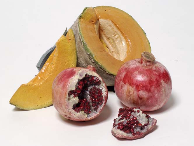
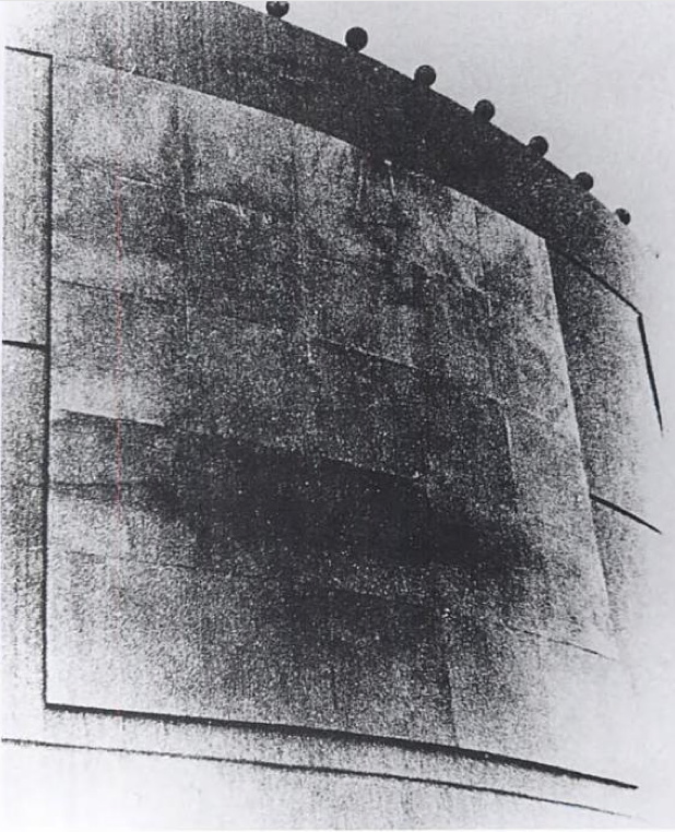
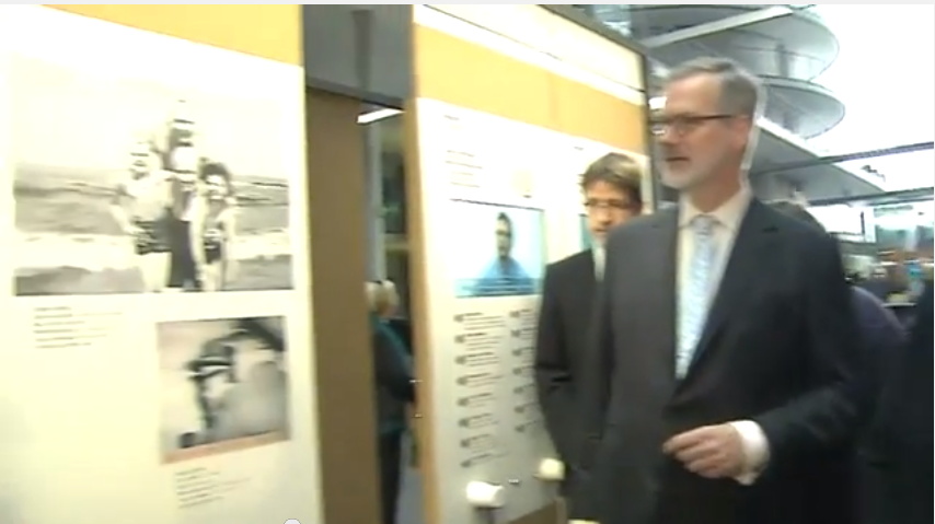
Melons and Pomegranates, 1956, hand-painted plaster, Matson Jones Custom Display
When these hand-painted, cast plaster works were sold at Swann in 2005, they were dated “circa 1955.” But I believe Gene Moore only began working with Tiffany & Co. in 1956. In 1956 and 1957, he commissioned at least seven window displays for Tiffany & Co. from Matson Jones, including a series inspired by still life paintings. Matson Jones was the commercial pseudonym for Jasper Johns and Robert Rauschenberg.
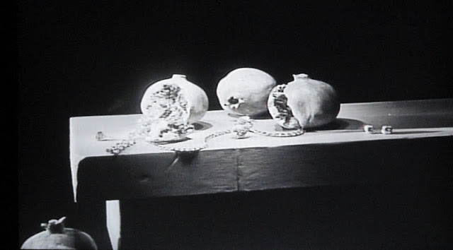
Tiffany & Co. window display designed by Matson Jones, 1956, image: madammeow, probably from Gene Moore’s 1990 book
The filmmaker and impresario Emilio de Antonio had, as “an artists’ agent,” been involved in arranging commissions from Moore for Rauschenberg, Johns, and Andy Warhol. One project Matson Jones executed for Moore client I. Miller involved “a kind of three-dimensional window display” interpretation of Andy Warhol’s shoe drawings, which were featured in the company’s ads at the time.
Another display for a Moore client [and Tiffany neighbor] Bonwit Teller included Johns’ 1957 painting, Flag on Orange Field. After Construction with J.J. Flag/ Short Circuit‘s inclusion at the Stable Gallery Annual in 1955, this may have been the second public exhibition of Johns’ Flag paintings; neither was credited to him.
Despite this professional overlap, and their mutual friendship with de Antonio, Johns told Paul Taylor in 1990 that he only met Warhol for the first time in 1961, when Andy bought a drawing out of Johns’ second solo show at Castelli. Soon after that, Warhol’s own comic strip-based paintings were shown in a Bonwit Teller window display, where they were likely seen by Roy Lichtenstein.
Except to whoever bought them in 2005, the current whereabouts of Matson Jones’ melons and pomegranates is unknown. Though I have heard some things.
“With the certificate of authenticity from the Robert Rauschenberg Foundation.” ! Nov 17 2005, Sale 2057 Lot 223 EARLY SCULPTURE BY JOHNS AND RAUSCHENBERG POP ART, est. $5,000-8,000, sold for $10,925 [swanngalleries.com]
V for Visor: V. Stiviano V. On Trend
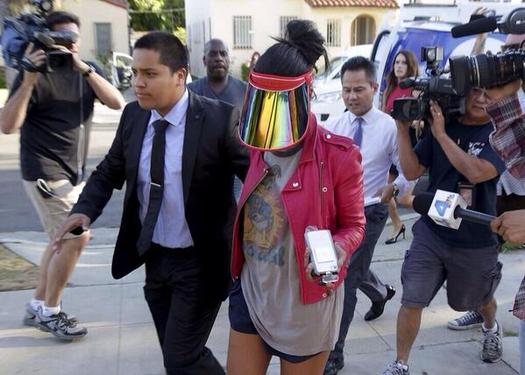
Vanessa Stiviano & counsel, image via Gawker/Spalsh/DesignObserver
I’ve tweeted before, and I’ll tweet it again, but Vanessa Stiviano’s boss anti-paparazzi visor is the greatest thing about the entire Donald Sterling/Clippers/racist billionaire debacle. Stiviano’s photo-thwarting look will have far-reaching implications for our media and celebrity culture, you heard it here first.
Well, technically, you probably already read something along those lines at Design Observer, where Rob Walker did a great analysis of the visor as a part of Stiviano’s carefully constructed, photo-mastering looks:
This object privatizes the face in a manner that’s undeniably a protest (stop taking pictures of me!) and just as undeniably a confrontation (you cannot resist taking pictures of me wearing this object!).
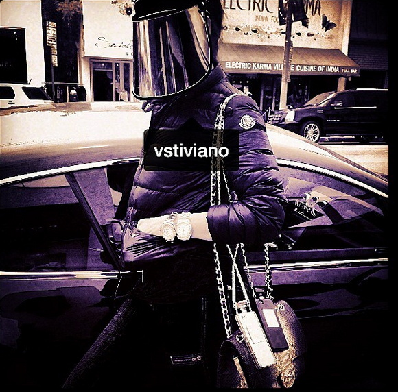
vstiviano screenshot via @MichelleLHOOQ
Me, I see it as the vanguard of a broader trend that really speaks to this moment in history:
screenshot: google images
Rob Walker| Object in the News: The Face Privatizer [designobserver]
Every Color In The Book: A Treatise On Watercolor Paints By A. Boogerts
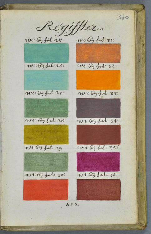
Last week medieval scholar Erik Kwakkel tweeted about a largely unknown, undocumented, and apparently unique book he found in the Bibliothèque municipale/Bibliothèque Méjanes, in Aix-en-Provence.
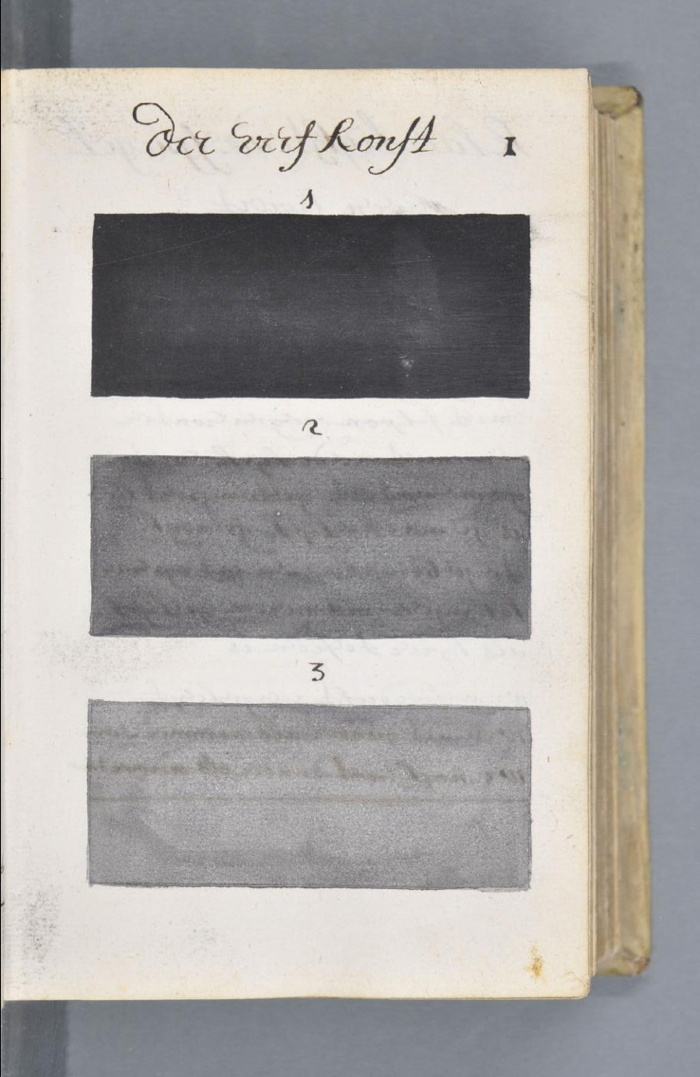
Titled Traité des couleurs servant à la peinture à l’eau [Treatise on the colors used to paint with water], it’s an amazing 892-page, handwritten documentation of every available watercolor pigment and combination, each at three levels of dilution. It was written in Dutch in 1692 by an A. Boogert. Kwakkel is currently translating the introduction, but in the mean time, the illustrations are worth a long look.
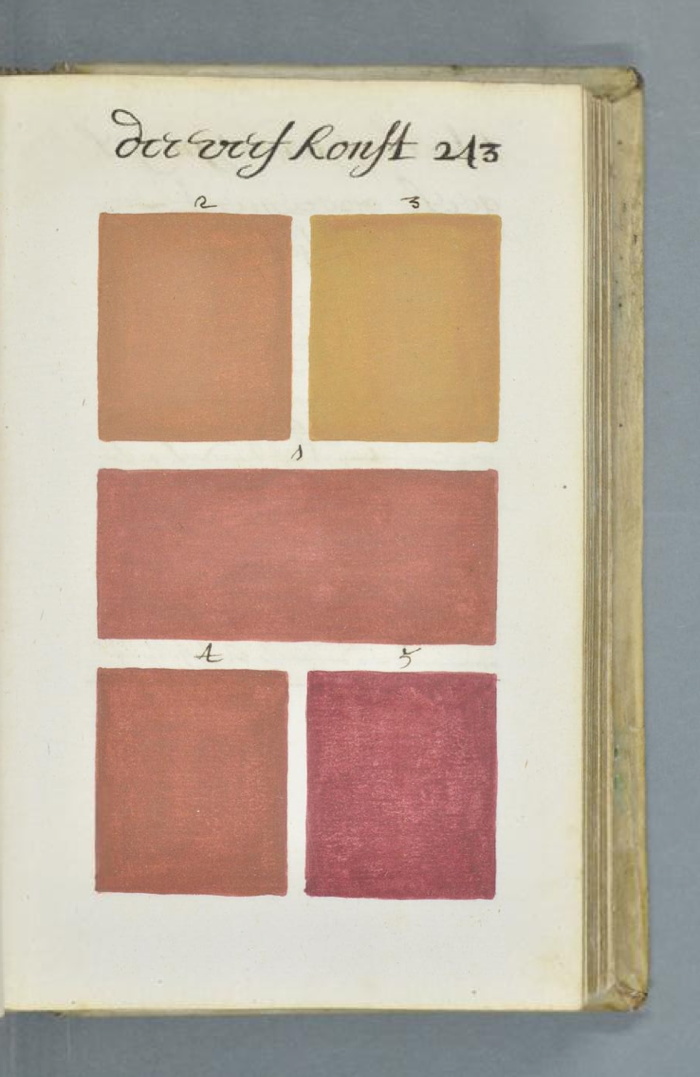
In addition to the systematic process and grid of conceptualism, there are obvious resonances with the color charts [top] and monochromes [below] of mid-20th century painting. The book format especially reminds me of Yves Peintures, the concocted catalogue for an imagined show of Yves Klein’s monochromes.
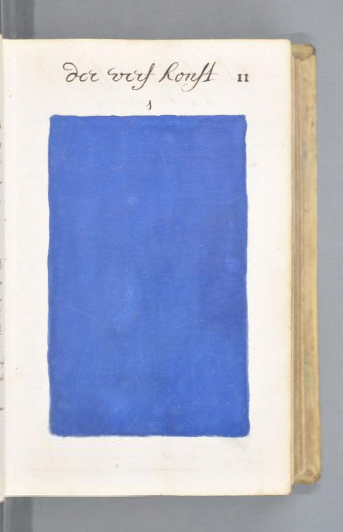
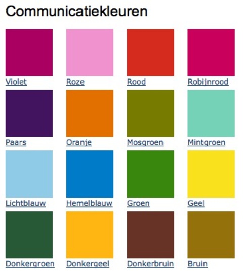
But even more than that, the starting palette for Boogert’s project is uncannily similar to the 16 colors of the Dutch government’s own unified, official palette, the Rijkshuisstijl, released in 2011. The RIjkshuisstijl was meant to centralize and strengthen the visual identity of the national government with colors inspired by Dutch landscape painting.
Kwakkel doesn’t mention any details yet about the context for Boogert’s book, but the bibliographic record keys it to the textile trade and the Dutch East India Company.
Read and follow Kwakkel’s discovery: A Colorful Book [erikkwakkel.tumblr.com]
See full scans of Traité des couleurs servant à la peinture à l’eau MS 1389 (1228) at the Bibliothèque Méjanes [e-corpus.org]
Previously, related: Rijkshuisstijl: the 1 Logo Project
Yves Peinture
Cage Grid: Gerhard Richter & The Photo Copy
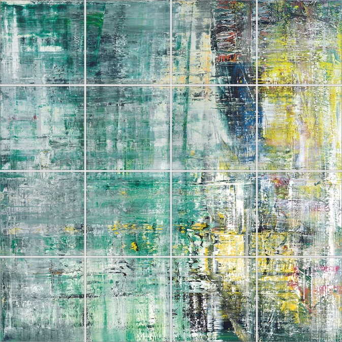
I was kind of baffled when I saw this Richter in Christie’s February sale in London, and I’ve had it on my desktop ever since. It’s called Cage Grid I, and it’s a 16-panel giclée print [!!, oh how I hate that word] mounted on aluminum that reproduces the 2006 squeegee painting, Cage 6, basically at 1:1 scale.
In fact, if you include the small gaps between the 75cm square panels, the giclée version is slightly larger than the 3×3-meter painting. It pulls the painting apart instead of occluding it with a grid overlay. Though there are digital prints and inkjet prints in the artist’s CR, Cage Grid is the only edition listed as a giclée. There are both complete editions Cage Grid I and 16 individual quadrants, Parts A-P, Cage Grid II.
Richter has chopped up his paintings before, turning full-size squeegee paintings into a series of tiny squeegee fragments. He’s made giant gridded photo panels before, like Strontium (2004), at the deYoung Museum. He’s got reconfigurable grid paintings [mounted on Aludibond, btw], like 4900 Colours.
He’s made photos of Strip paintings, which are actually manipulated photos of fragments of another squeegee painting, digitally printed, and mounted on aluminum and sometimes under plexi.
And he’s made photo versions of paintings before. These 1998 Orchid offset prints are done at full-scale of the 1997 painting, but cropped in five different ways. Herr Heyde is a little 2001 offset print on Aludibond that’s the same size as the little 1965 painting. [Richter favored offset prints, then a few c-prints, before going digital, except for Ice 2, a 2003 half-scale reproduction of a 1989 squeegee painting that’s actually a 41-color screenprint.] There’s 1:1 Uncle Rudi (2000), and the 1996 photo edition of the painting of the photo of his wife, which I thought would make a good Richard Prince nurse painting. Seven Two Four (2005) are 1:1-scale blurred photos of a 1990 squeegee painting. [A painting for which Richter has atypically posted 21 detail photos.]
Wow, when you shoot it that way, the 1:1 photo edition of Mustang Squadron (2005) looks amazing, and not at all like a bridge line version of the couture original. Speaking of which, back in 1998 Richter made a 1:1 photo edition of 48 Portraits, his landmark blurred painting grid from the 1972 Venice Bienale.
And this is one thing that nags at me about Cage Grid: even if I buy the arguments about photo vs. painting, experimentation, or materialist variation, I feel like what’s actually being sold is iconic sameness. It’s not so much the Capitalist Realism that–actually, yes, it’s the capitalist reality that gets me, but not the supply, the demand. I feel less undone by the artist churning out a towering Kinkadian pyramid of merch than by the critico-consumer desert criss-crossed by collectors, institutions and speculators that swallows it up.
It’s not that Richter makes readily monetizable editions of iconic works he loans to museums. [The Cage series is at Tate. Modern. The Cage Grid prints were actually sold by Tate Modern, during the 2011 Panorama retrospective.] It’s that despite my ambivalence, I want some. [Oh, look, that Mustang Squadron that sold at Phillips in 2006 is up for sale at Sotheby’s.]
14 Feb. 2014, Lot 120: Gerhard Richter, Cage Grid I (Complete Set), 2011, 15/16, plus 4ap, sold for £566,500 [christies.com]
15 May 2014, Lot 243: Gerhard Richter, MUSTANG-STAFFEL (MUSTANG SQUADRON), ed. 39/48, 1 AP, est. $250,000-350,000 [sothebys]
Previously, uneasily related, partly because I only just now remembered I had similar qualms about a similar situation last year: Gerhard Richter’s Septembers
In Kusakli Did Erdogan A Bremer Wall Erect
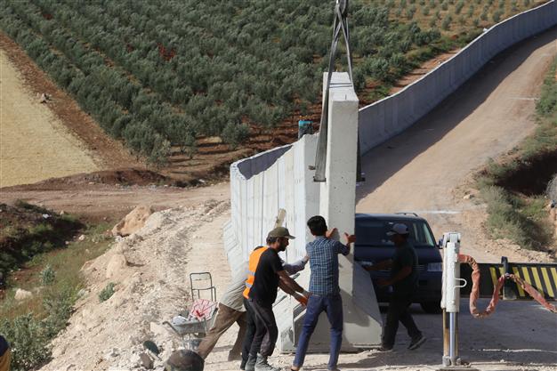
image: AA
Turkey is trying to control the flow of refugees from Syria and the unregulated trade and traffic across the open border by constructing a “portable” wall near Kusakli, a border village under the jurisdiction of the nearby town of Reyhanlı, in the Hatay province. No biggie, though, this wall’s just 1200m. Really more of an installation.
The AA photo above shows workers installing the prefab concrete segments with a crane. They look like jacked up Jersey Barriers.
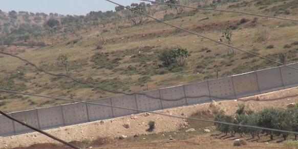
As this DHA photo shows, they are jacked up Jersey Barriers, 30cm thick, and 3m square. Each weighs 9 tons. From their popular use in the Iraq and Afghanistan wars, the US military’s technical term for a jacked up Jersey Barrier may be a Texas Barrier [3.7m] or an Alaska Barrier [6m], or a Bremer Wall, after Paul Bremer, who did so much to create the demand for them during the early days of the occupation.
All these US-style barriers, though, are thinner, rectangular, more 2001 monolith-shaped. Their design heritage traces back to the model for an instant wall along the US-Mexico border that congressman/earthworks artist Steve King (R-IA) exhibited in 2006. And to the decidedly non-temporary, non-portable wall Israel built in the occupied West Bank.
Turkey apparently does not want to use Israeli-style oblong walls, so they go with the square. A little heavier, but fewer lifts. They’re apparently installing the wall at around 75 segments/day.
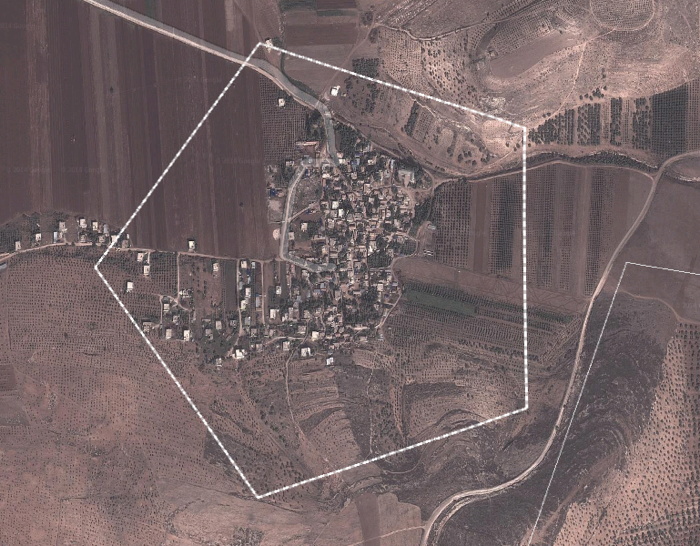
I looked Kusakli up on Google Maps, and the awesome, gridded Benday dots of the olive orchards in the surrounding landscape are suddenly the second most interesting feature. Because there is this unusual Pentagon overlay around the town. What even is that? There’s no way it’s the wall. Or the demarcation for a wall, since the wall’s only 1/8th built. Right? That’d turn Kusakli into West Berlin without limiting the flow of Syrians anywhere except in this tiny village. So it’s something else.
Turkey builds portable wall on border with Syria [hurrietdailynews, image: AA via @aljavieera]
Turkey builds portable wall on Syrian border [todayszaman, image: DHA]
Previously: Study For A Fence And A Wall (2006)
Related: Afghanprogettazione: HESCO X DIY Troop Furniture
On Warhol And The World’s Fairs
If I ever get a PhD it will be in the US Pavilion at Expo67 as a gesamtkunstwerk. So much going on there, and in my years of fascination and study of it, it just keeps on giving.
And I am stoked for the Queens Museum’s show, opening to day, on Thirteen Most Wanted Men, Andy Warhol’s short-lived commission for the New York State Pavilion at the 1964 World’s Fair. It sounds amazing, with an impressive amount of archival research and new understanding.
I haven’t seen it yet, but I have been bothered by a line that’s cropped up in several reviews of the show, which makes me think it’s not accidental, calling the 13 Most Wanted Men panels “Warhol’s only public artwork.”
This characterization only holds up if you define public art so narrowly as to make it irrelevant [which is something that happens to public art a lot, actually, but that’s not the point here.] Warhol exhibited work in at least three World’s Fairs in a row–1964 in New York, 1967 in Montreal, and 1970 in Osaka. And the first two were commissions. In fact, I’d suggest that the New York and Montreal projects are so similar, that they really should be considered together. Warhol’s Expo 67 works suddenly feel like a direct response to the controversy in 1964. When faced with the prospect of wading into another political conflict over his subjects, Warhol chose to depict himself.
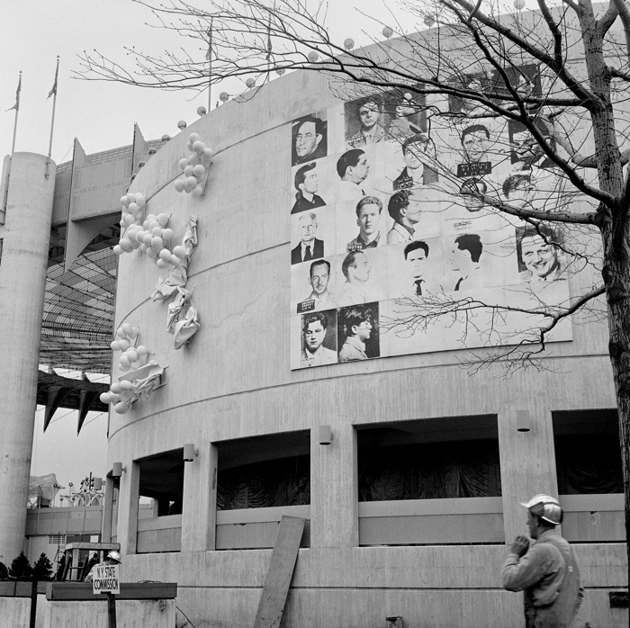
In 1964, Warhol painted 25 panels–22 with mug shots, 3 blank/monochromes–on 4-foot square masonite panels. The images came from an internal NYPD pamphlet that gave the piece its title: 13 Most Wanted Men. These were painted over in aluminum house paint within two days.
Thirteen Most Wanted Men overpainted and covered by tarp, 1964. Photo: Peter Warner, via Richard Meyer’s Outlaw Representation
Later they were covered with a large tarp. They have since been lost or destroyed. In his incisive 2002 history, Outlaw Representation: Censorship and Homosexuality in Twentieth-Century American Art, Richard Meyer quotes John Giorno’s story about the origins of Thirteen Most Wanted Men, and that the mug shots came from the gay cop boyfriend of another painter, Wynn Chamberlain. 1 [No one’s mentioned it, but I assume this is all in the Queens Museum show. Right? And the show will surely explain why Philip Johnson told Warhol in 1963 not to talk about the sources of the paintings? Johnson, who surely knew as much about power, rough trade, and a man in uniform?]
Warhol painted 25 panels with Robert Moses’ headshot, taken from Life magazine, as replacements. Philip Johnson rejected them, and they are also now considered lost or destroyed. [This photo is by Mark Lancaster, who helped Warhol make the Moses panels and much else. There’s a great interview with Lancaster at warholstars.org.]
During the Summer of 1964 Warhol reused the screens to create paintings on canvas of the 13 Most Wanted Men, which Lancaster cropped and stretched. Nine of these are currently in the Queens Museum show.
In 1964 he began making the Screen Tests, which were inspired both by the Thirteen Most Wanted mug shots and the photobooth pictures Warhol began using in 1963. He created Most Wanted series of women and boys as well.
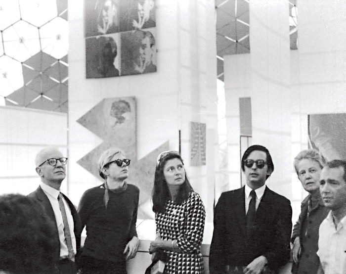
Warhol visiting Expo 67 with the de Menils, that’s John de Menil at left, not Buckminster Fuller, as some online sources would have it. image via menil.org
In 1967 curator Alan Solomon commissioned Warhol to make large paintings for the US Pavilion at Expo 67. Warhol created eight giant Self-Portraits. They are 6-feet across and based on a photo by Rudy Burckhardt. Six of them were installed in Buckminster Fuller’s geodesic dome, above Jasper Johns’ Dymaxion Map. Four of them are visible above, in a photo taken during Warhol’s visit to the Expo with John & Dominique de Menil. The one on the lower right is now in the Tate Modern.
If the Thirteen Most Wanted Men censorship was really as concerned with vice, power, and the homosexual gaze as Meyer argues, then Warhol’s uncensorable Self-Portraits read like an act of defiance. For his 2nd World’s Fair, Warhol didn’t shrink from political conflict; he met it straight on and came out on top.
1 Update: I just came across a story by Lucy Sante about Thirteen Most Wanted, which he published in 2009. It is, I assume, a fictional encounter with a retired NYC policeman who had the idea for a Ten Most Wanted list stolen from him by a fellow cop, who became lovers with a young Warhol, and then years later, while guarding the World’s Fair, saw his Most Wanted Men idea stolen again by his ex. Hmm. I think someone had better talk to John Giorno.
Claes Oldenburg: The VW Years
It’s not my strategy to leave pictures sitting on my desktop so long I forget where they come from, and then I don’t have to credit them or worry about posting them. If if were, I’d start a tumblr.
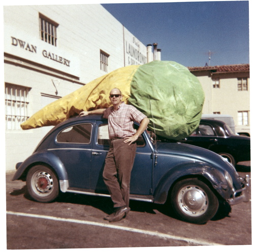
Given the amount of attention I’ve paid to various artists’ Volkswagens, I honestly thought I’d be writing something more extensive about Claes Oldenburg wheeling up to the Dwan Gallery with the giant Floor Cone Peggy sewed for him strapped on top of his car. But not yet.
And anyway, it’s been making the rounds, but I’m guessing it came from researching Sturtevant and Dwan Gallery a few months ago, and finding it on ArtObserved.
Getty Museum View, Or Seeing Google Seeing
The Getty Museum is now included in the Google Art Project. Which is now a part of the Google Cultural Institute. I hadn’t noticed how this context has changed, and how the Art Project has been subsumed and presented. The navigation options are, “Collections | Artists | Artworks | User Galleries.” And institutions are collections.
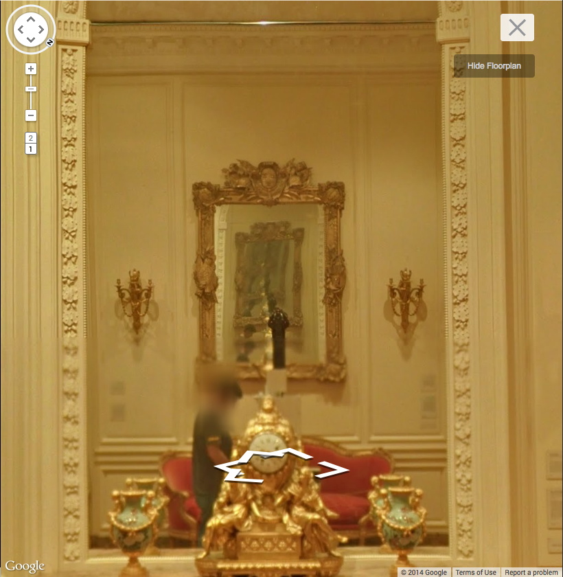
Anyway, Museum View. I know that Google Street View-based art fascination is old and busted, but Museum View for me is still the new hotness. Maps are for navigating, going somewhere, doing something. But Museums are for displaying and depicting and interpreting; they hold and show objects and generate discussions and critical context. And Google Museum View is doing that on a trans-institutional scale, and so it feels important to have some awareness of this process. Trans-Institutional Critique.
Fortunately, Google still sometimes documents itself documenting.
Continue reading “Getty Museum View, Or Seeing Google Seeing”
Ex Collectio: The Bernard Madoff Provenance Project
UPDATE: There is now a Google Doc, your one-stop source for Madoff Provenance information. Have a detail? Send it in!
Last month I proposed that the specific artworks which had once belonged to Bernard Madoff be forever associated with him, that he and his various corporate entities become an inextricable element of their history, discourse, and meaning.
For the most part, Madoff collected prints and multiples from large editions. There are usually dozens of identical examples of each artwork he collected; they’re true investment-grade commodities. However, Bernard Madoff’s ownership of these examples differentiates them and renders them unique among their editions. How does the historical fact that these specific artworks were owned by the perpetrator of one of the financial industry’s biggest frauds affect their engagement with the art market, the art audience, and the critical structures of the art world? We shall find out.
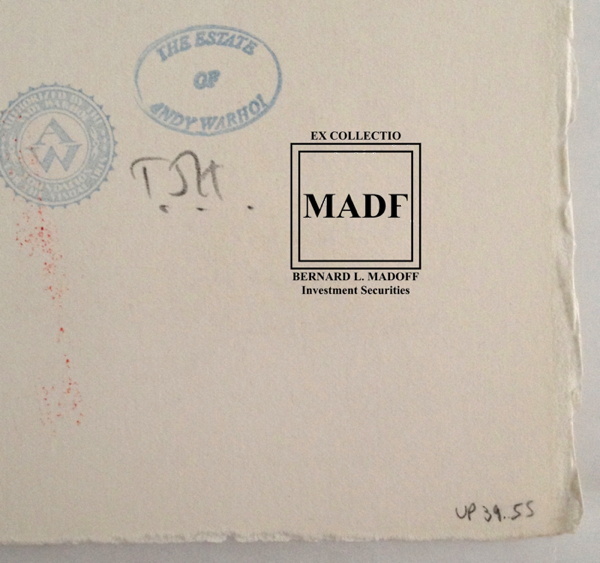
Study for Ex-Collectio MADF Stamp, 2014, digitally manipulated photocollage
Seven of the 53 artworks listed in the US attorney’s inventory of Bernard L. Madoff Investment Services, plus one additional work, are being sold by the bankruptcy trustee at Sotheby’s on May 1st.
Their lot and edition numbers are documented below, along with edition and title information for previously sold Madoff artworks whose court inventory entries were incomplete.
In accordance with art market, conservation, and art historical practice, I have created a stamp to indicate these works once belonged to Bernard Madoff and/or his corporate entities. I hereby issue an open invitation to all owners, buyers, dealers, agents and conservators handling these artworks, to accurately reflect their history, significance, and provenance by having them stamped. I am happy to provide this service, upon review, authentication, and mutual agreement, for no charge within New York City or the Hamptons or, upon prior arrangement, at art fairs in Basel, London, or Miami Beach. For other locales or times, please contact me directly. I’m sure we can work it out. This offer applies only to artworks which can be documented through court and/or auction records as having been in the collection of Bernard Madoff. No frauds or phonies.
Not in Inv.
Lot 41 Henri Matisse, FORMES, PL. IX (FROM JAZZ), 1947, pochoir print of “plate IX of XX from the edition of 100 (total edition includes the book edition of 250 with a central fold), on Arches wove paper, published by Tériade, Paris.”
Continue reading “Ex Collectio: The Bernard Madoff Provenance Project”
Images And Ideas I’ve Been Thinking Of
So many projects, so many browser tabs, open for so many months, I’ve gotta clear some of these things out:
I’ve wanted to remake the lost/overpainted panels from Andy Warhol’s Thirteen Most-Wanted Men mural for the NY World’s Fair since the Destroyed Richter Paintings days, but now with the comprehensive-sounding show at the Queens Museum opening, I’ve probably got a week to do it. And process it. And put it behind me. Ah well. The show does sound good, though.
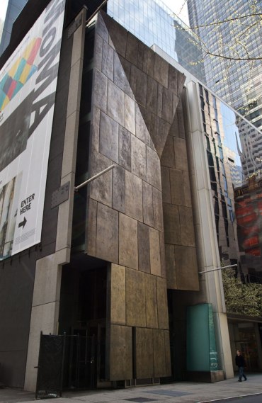
Not sure why it didn’t occur to me sooner, but the news this week that MoMA’s started the dismantling of the Folk Art Museum gave me a flash of inspiration: The Williams+Tsien Folk Table Collection. Turn each bronze alloy panel into a unique memento/tabletop. Maybe there’s enough material inside to use for legs, &c., too. I see a couple dozen dining tables, as many coffee/side tables, and a handful of console/sofa tables. An edition of up to 63. They’d be a stunning addition to the finest home, and quite the conversation piece.
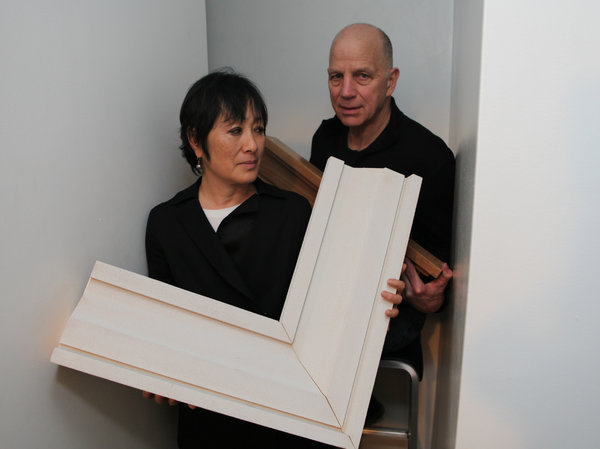
Actually, the inspiration came from Chester Higgins Jr’s photo of Billie & Tod holding architectural fragments. The domestication of architecture.
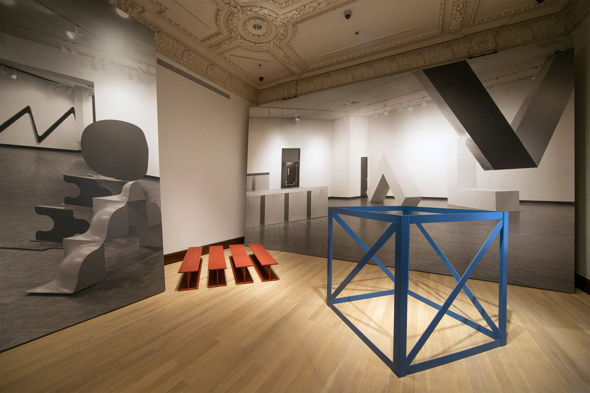
Also from the Times: Fred Conrad’s great photo showing the use of photomurals to evoke/approximate historical spatial experience at the Jewish Museum’s “Other Primary Structures” show. It’s interesting that they’re angled and mounted on wall-sized panels, not stuck to the moulding-encumbered wall. Makes them a bit more exhibition design and a bit less exhibition, I suppose.
Richter tweeted this the other day, and it’s been nagging at me ever since:
Reproductions of ‘Aunt Marianne’ and ‘Mr Heyde’ are shown in the exhibition ‘Registered, Persecuted, Annihilated’. gerhard-richter.com/exhibitions/…
— Gerhard Richter (@gerhardrichter) April 1, 2014
the exhibition of reproductions of paintings, that is, not just paintings based on photographs. Also, of course, the show is at the world’s most intensely named museum, the Topography of Terror.
I’ve reached out to the Topographers, hoping to find out more about how paintings function in an exhibit like this, and how the decision was made to include them as reproductions. But so far I have received absolutely no response. But I did get some screencaps from a YouTube video of the opening, which I can’t find right now:
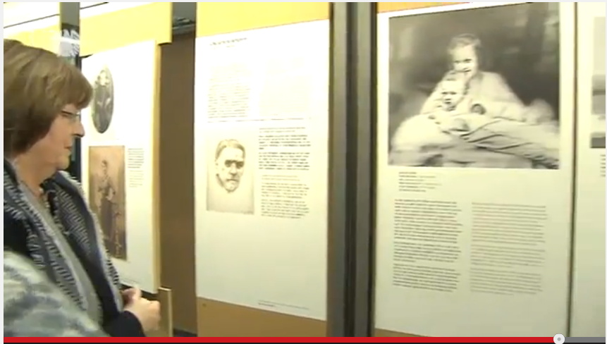
Hmm, actually the panels look like reproductions of pages of books, not of paintings. Simultaneously more and less interesting.
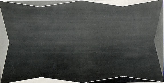
While rummaging around the Met’s collection database, looking for Arthur Vincent Tack info, I Google Imaged up this hard edge painting. Which apparently hadn’t been documented in the color photo era, but I couldn’t find it on the Met’s site.
As I was posting this I realized the filename is the accession number, 1978.565, Larry Zox. 1978’s obviously too old for Hard Edge; the painting’s from 1966, an at once unusual and logical size of 50×100 inches. Untitled (from the Double Gemini Series).
Turns out the Guggenheim has a very similar painting, Alto Velto, from 1969. Color really matters in these jpgs.
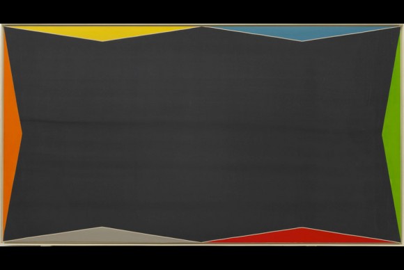
Martin Bromirski posted images from a 2008 Larry Zox show at Stephen Haller.
Richard Prince’s Spiritual America, 1983, Executed In 1987 Or So
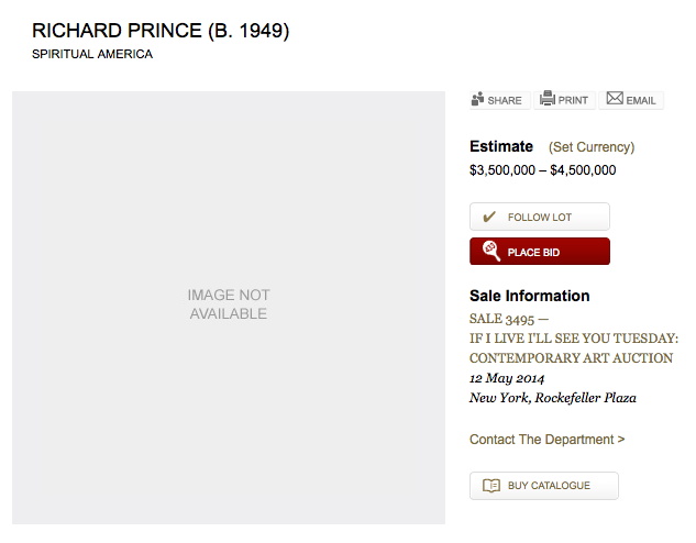
Christie’s is selling a 20×24-inch print of Richard Prince’s Spiritual America in their extra-edgy sale, titled “If I Live I’ll See You Tuesday….” Though apparently it’s not so edgy they feel comfortable running the image of the work. Maybe the added attention to the image that comes from a 100x increase in the pre-sale estimate–since 1999, the last time they sold the same print, 10/10 is it right that this is the only one of the 12 prints to ever come up for auction?–makes even auctioneers uncomfortable.
But the price spike has not spurred any new interest in when Prince actually made the object being sold. In both the 2014 and 1999 catalogues, the print is listed as “Signed, numbered and dated ‘R Prince 1983 10/10’ (on the reverse)” and so “Executed in 1983. This work is number ten from an edition of ten plus two artist’s proofs.”
Except it’s not. Christie’s quotes Prince’s recent bird talk post where he recounts the creation of Spiritual America in unprecedented and fascinating detail. He’d scored a copy of a “pamphlet” Gary Gross self-published, which included an image of the sexualized photos of a 10-yo Brooke Shields, from Gross’s agency. He rephotographed it, developed it, selected the image to print, and ordered a single 8×10 proof, which is what he ended up showing as Spiritual America in 1983.
Christie’s’ doesn’t quote the part further down, where Prince writes,
eventually gave the 8×10″ of Spiritual America to Myer Viceman. Frame and all.
In 1987, after I joined up with Barbara Gladstone, I editioned it. Ten copies and two APs. I had my lab print it on ektacolor paper at 20 x 24″.
Which clarifies, or changes a bit what Prince said in his 2009 deposition in the Cariou v. Prince case. Cariou’s lawyer was asking about a “settlement,” with Gross over the rephotography of his image:
I mean Mr. Kennedy is talking about a 1992 discussion at the Whitney, and I believe at that time I bought the rights to the image for $2,000.
Q. From Gary Gross?
A. Yes.
Q. Because he threatened to sue you?
A. No. I was told by the Whitney that I–in order to exhibit that image I made a concession, or they advised me that it would probably be best that–and I believe I sort of reached out to him at the time.
Because up until then, that image that I rephotographed from that pamphlet that he had produced in 1983, I made one copy, an 8 by10, and I gave it away. And it wasn’t until 1992 that it came back into the limelight, and I think my attitude changed a bit and I was sort of willing to become more part of the process I suppose.
Q. And at that time you made ten copies plus an artist proof?
A At the time there was ten copies and i believe two artist proofs, none of which I own.
So until just now, I’d thought this meant he made the edition to release in time for his Whitney show, but I think he’s actually not saying that. He’s saying that the Whitney was requiring him to get a license from Gross before they exhibited Spiritual America. But the editioned prints already existed. So maybe the right date is Executed in 1987. Or maybe, you know, call someone to confirm it. RP’s tweet about the execution:
@gregorg Immaculate Conception.
— Richard Prince (@RichardPrince4) April 19, 2014
Now let’s talk about the Whitney’s insistence on getting clearances before showing appropriated work. How often does that happen?
Walter De Maria Called
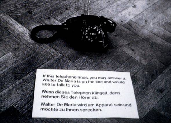
Walter de Maria, Art By Telephone, 1969, installed in “When Attitudes Become Form,” Kunsthalle Bern
For the 1969 conceptual group show “When Attitudes Become Form,” curated by Harald Szeemann at the Kunsthalle Bern, Walter De Maria submitted Art By Telephone.
A black phone sat on the gallery floor next to a little sign in English and German: “If this telephone rings you may answer it. Walter De Maria is on the line and would like to talk to you.”
In his wonderful book, The Lightning Field, Kenneth Baker quotes from De Maria’s proposal for the piece that the artist will “telephone into the exhibition and over the period of the month use $200 worth of telephone time in conversing with whichever visitor’s fate may have been placed near the telephone, about any subject at all.”
Besides this invocation of fate, which, more in a minute, I’d completely forgotten the artistic implications of international long distance charges. Phone calls used to be really expensive. I can’t find the rates for Switzerland, but a November 1969 article in the NYT mentions a NY-to-London rate of $2.40/minute. So De Maria’s piece would have been maxed out in less than an hour and a half.
If he’d called. Which, according to Germano Celant, who was involved in putting Szeemann’s show together, and who restaged the now-landmark exhibition last year in Venice for the Prada Foundation, and who discussed the show(s) in February at the Reel Artists Film Festival in Toronto, he never did. In video of Celant’s talk, which was just posted by Canadian Art, Celant answers a long statement/question about restaging as autobiography:
Or Walter De Maria, that gave us the phone, and he said, “I never called.” You know, the piece is the phone and it says, “When the phone rings, on the other side will be Walter De Maria speaking to you.” But he never called in Bern. [audience laughter]
So De Maria pocketed the money? So smooth, so hilarious. I’m sure had they known, the Swiss would have protested that, too. Celant goes on:
So I said, “Walter, what we can do?”
“Oh, no no, this time I will call.”
[audience laughter]
And he did. And he spoke with Miuccia.
Oof.
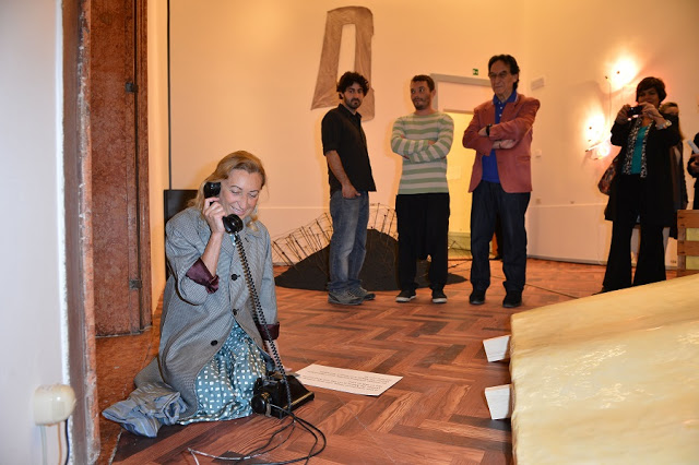
image: getty for prada, via let them talk, which lol
Here’s that convo, by the way, from the May 29 opening part of the show, placed by fate and publicists. Now the driveway moment:
You know, there are so many personal things, you know, then he was supposed to call me, and, unfortunately he died.
And so then we have to take the piece off, because naturally, after he passed away, the piece was not available–was not possible anymore, you need–when the rings start, on the other side is Walter De Maria, but Walter is dead. So we have to took a picture, and we have to replace–so there’s this kind of life element in this kind of show, that I like very much, and that’s biography.
Damn. This. This is why I’m a fan of unscrubbed transcripts. It just feels more.
Also, I’m really not clear why they had to remove it once the artist died. Wouldn’t his not calling at all be a more historically accurate recreation of the installation in Bern? The Venice show opened June 1st, and De Maria passed away on July 25th. Roberta Smith’s obituary said he’d had a stroke in May, but was undergoing treatment. Did he call anyone else? Was he still able to talk? If not, was it still somehow less problematic to show the piece when he was alive, but incapacitated?
Because, though I readily acknowledge Celant knows the artist and his intentions for the piece far better than I do, but I’d totally show that phone. The idea of leaving the phone out after De Maria was gone is not nearly as sad as the idea that the only person he spoke to was Miuccia Prada. Besides, what if he called?
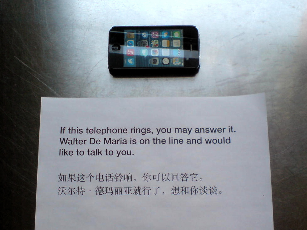
update: Untitled (Study for Art By Telephone, After Walter De Maria), 2014
From Evening To Dawn With Augustus Vincent Tack
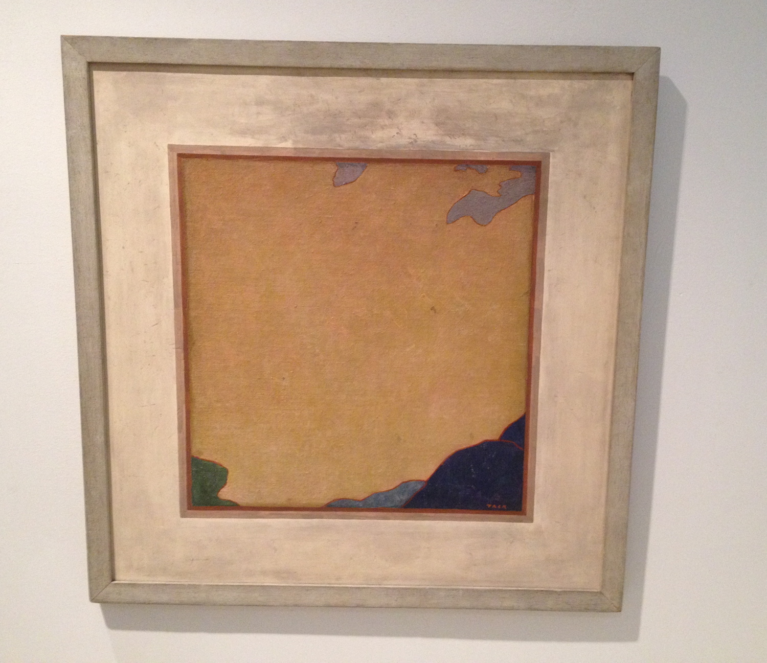
I went to the Phillips yesterday to see the “Made in USA” show and to get out of the rain. After seeing the nice John Frederick Peto trompe l’oeil, I was distracted and annoyed by the grain of the canvas in some John Henry Twachtman painting or another. No sooner had i sworn eternal allegiance to gesso than I turned the corner, went up 1/3 a flight of stairs, and was stopped cold by Augustus Vincent Tack’s painting, Evening. And I had to take it back.
What an amazing little painting. The Phillips is Tack Central. They have 79 of them. I’ve never seen this one, though, nor its similar-looking partner Dawn, which faces it in the stairwell.
Almost every Tack in any other museum was foisted on them by Duncan Phillips. [Tyler did a nice post on the Tack paintings in the Phillips in 2011.] Born in 1870, Tack painted classical moderne murals, more traditionalist portraits, and extraordinary landscape photography-based abstraction.
Obviously [sic] it’s the abstractions that amaze here. He really only did them for Phillips, between 1922 and 1934, who apparently became disappointed when they didn’t change the course of abstraction and modernism. [Curator Leslie Furth writes about Phillips’ unrealized hopes for Tack’s critical uptake, and how the artist seemed to drop the abstract ball decades too soon.] Tack, Phillips wrote in 1933, was destined to have “a limited reputation as an…eclectic painter…rather than as one of America’s most original painters.” This, from his biggest fan.
Evening and Dawn were painted after this letdown. “Between 1934 and 1936,” is how the Phillips dates these abstractions, which were variously willed to the museum by the artist or bought from his wife’s estate in the 1950s. Tack would blow up details from photos of Death Valley and transfer the forms of clouds, rocks, mountains, sky, whatever was there. [Stieglitz was taking similar-sounding photos, abstractions of clouds known as Equivalents, at the same time. Several are in the show.]
Let’s be real here, though. He’s sort of like family for the Phillips, the wistfully visionary uncle, but the reason anyone cares about Tack at all is because his paintings look like Clyfford Stills. Bafflingly so. Frustratingly so. Amazingly so. Still was the titan Cronus to the AbEx Olympians. But what would that make Tack? Uranus? Except the lineage is not clear, or even suggested. Still was sure Newman stole zips from him [which makes him, what, Prometheus?], but though Still was in Virginia in the 20s and 30s, and may have visited the Phillips, no one really considers that Still got the core of his abstraction strategy from Augustus Vincent Tack. It’s more likely [to me] that their paintings are similar because their inspirations were similar: the powerful forms, colors, light, and space of the western landscape.
But that’s not important now. What really blew me away about Evening was that Tack had painted a painting of a painting. That’s entirely flat, as flat as a Peto, and just as tricky. The abstract center, where Tack signed it, has the tooth of the canvas still visible, but the mat/wall part, the smudged space around it, is smooth. And it’s possible that it’s a mat, not a wall. Maybe it’s even likely. Dawn has a hardboard mat/border around it. See the shadow along the top edge? And Evening has no shadow. This is not an academic trompe l’loeil. But the little white along the top edge of the painting, which separates it from the schmutz, could read as a highlight.
Forget Still. Was Tack anticipating Johns? And Richter, for that matter? Was Tack an eclecticist painter too many decades ahead of his time? I doubt it. And that’s the problem with a word like “anticipate.” It seems to me that Tack was in and of his time and place, and as a capable, open-minded painter, was aware of a whole range of possibilities. And he tried them. And they worked. But he also stood apart from the social structures and networks in which art history was self-consciously created.
Tack’s practice and his trajectory should make us more aware of the social, interpersonal forces at work in art history, and of the bias we have for a heroic narrative of breakthrough, discovery or innovation. Many of the painting possibilities we credit to later painters were also known to a random guy like Augustus Tack. But he didn’t influence anyone, except Duncan Phillips. Which, on the flipside, Phillips’ championing of Tack’s polyvalent work to the institutional powers of the day also didn’t stick. But maybe our more eclectic time can find something to learn from someone like Augustus Vincent Tack. Off to the library.
The Absence Of Evidence
Short Circuit (aka Construction with J.J. Flag), c. 1958? photo: Rudy Burckhardt
Errol Morris’s new film about Donald Rumsfeld has me thinking a lot lately in terms of the known unknown, and the unknown unknown. As I’ve tried to find the missing Jasper Johns flag painting that was in Robert Rauschenberg’s 1955 combine Short Circuit I’ve kept running into another formulation which bridges the two: what we think we know.
It’s not that the story of Short Circuit as it trickled down through history in footnotes and parentheticals and anecdotes was wrong, so much as incomplete. . And the elisions have shaped the widely accepted understanding of both artists’ work. But it also prompts the question, “Who’s ‘we’?”
Because someone knows what happened to that flag painting. Someone’s always known. It just wasn’t me.
Art Of The Bush School
You go to war with the paintings you have, not the paintings you might want or wish to have at a later time.
Right now the paintings we have are by George W. Bush.
Why do they exist? Why are they being exhibited? How are they being used and discussed? Why do they matter?

image via flickr
I think the simplest answer for why George W. Bush started painting is because he has nothing else to do. Bush is toxic and unemployable as a political figure. He can’t campaign for Republicans, can’t talk on television about anything important, can’t give speeches for money, can’t write memoirs, can’t travel to certain countries where he runs the hypothetical risk of getting arrested for war crimes. Painting is a harmless and respectable pursuit that offers an aura of cultured acceptability.
As he explained to Jay Leno, the idea of taking up painting comes from Bush’s fantasy of being, or being compared to, Winston Churchill. Churchill painted. Of course, Hitler also painted. If painting makes Bush like Churchill, does it make him like Hitler, too? Is either association, when based on painting, more or less outrageous than the other? Painting becomes a rhetorical device, an uncritical excuse for likening Bush to Churchill. This has political ramifications that should not be ignored, yet they almost always are. That’s the transformative power of painting.
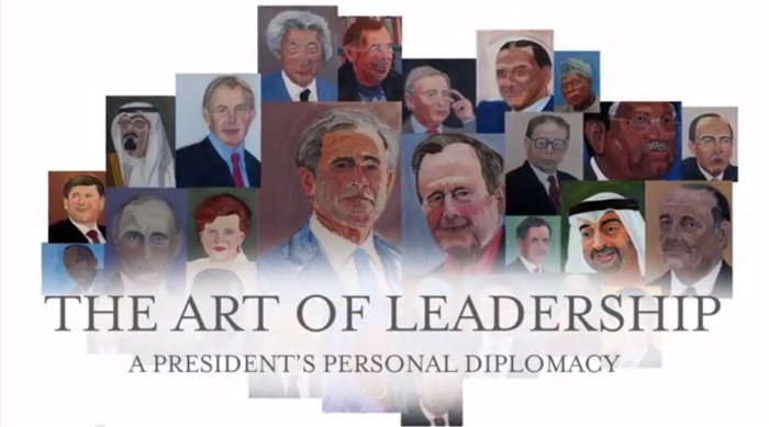
“I was sitting up here wondering how to kind of live life to the fullest,” Bush told the History Channel, a sponsor of the GW Bush Center’s exhibition, “The Art of Leadership: A President’s Personal Diplomacy.” “That’s the wonderful thing about painting. It’s absolutely transporting,” said Laura Bush.
Bush’s painted portraits of world leaders he worked with are central to the premise of the show, which is that “personal diplomacy,” i.e., personal friendships and relationships, are a transformative aspect of a successful foreign policy, i.e., Bush’s foreign policy. Bush is personable and sensitive, which these other leaders felt, which enabled the achievements of his administration, these painted portraits show.
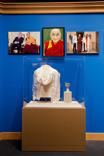
Is that too heavy for you? The paintings are the lone, personal expression in an exhibit that’s otherwise nothing more than documentation of the systematic diplomatic ritual of documentation and exchange. They are flanked by “jumbos,” large prints of photos taken by the official White House photographers, a format which lines the halls of the West Wing. Many portraits are accompanied by state-themed statuettes, books, and objets, the official gifts Bush received from his counterparts.
“But the paintings provide a personal insight that such artifacts cannot,” wrote Dallas Morning News reporter Tom Benning, who toured the show with the artist:
As Bush walked through the exhibit, he stopped at each portrait to share not just an art critique, but a reflection.
He painted his dad, George H.W. Bush, in a “loving way,” as a “gesture of compassion.” He depicted Blair as a “good pal” with a “determined face.” He focused on the Dalai Lama’s lips to show his “gentle, sweet countenance.”
He aimed for a “sympathetic portrait” of German Chancellor Angela Merkel to highlight her sense of humor. He put a smile on former Japanese Prime Minister Junichiro Koizumi to show that he’s “just a fun guy.”
Afghan President Hamid Karzai is “a little wary” and “suspicious about the future,” reflecting his “enormously difficult job.” Iraqi Prime Minister Nouri al-Maliki “doesn’t look real confident,” a nod to his “fragile democracy.”
“Eyes are very important,” Bush said. “You can convey a feeling about somebody.”
This is as good a time as any to point out that Bush painted his portraits, not just from photographs–a common enough practice as well as a long-established conceptual strategy, though I think only the former pertains here–but from the top search result on Google Images. Many photos were taken from the subject’s Wikipedia entry. Bush based his paintings on the literally first-to-surface, easiest-to-find photos of his subjects.
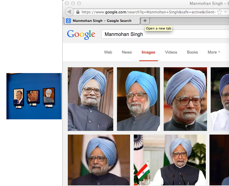
Is this meaningful in any way? If he had one, it would mean Bush’s studio assistant is very, very lazy. But in all his discussion of it, Bush’s painting practice appears to be a solitary one. He apparently did not tap the enormous archive of photos, taken by the professionals who followed him every day for eight years, which are contained in his giant library. Instead, it seems, he Googled the world leaders he made such impactful relationships with himself, and took the first straight-on headshot he saw.
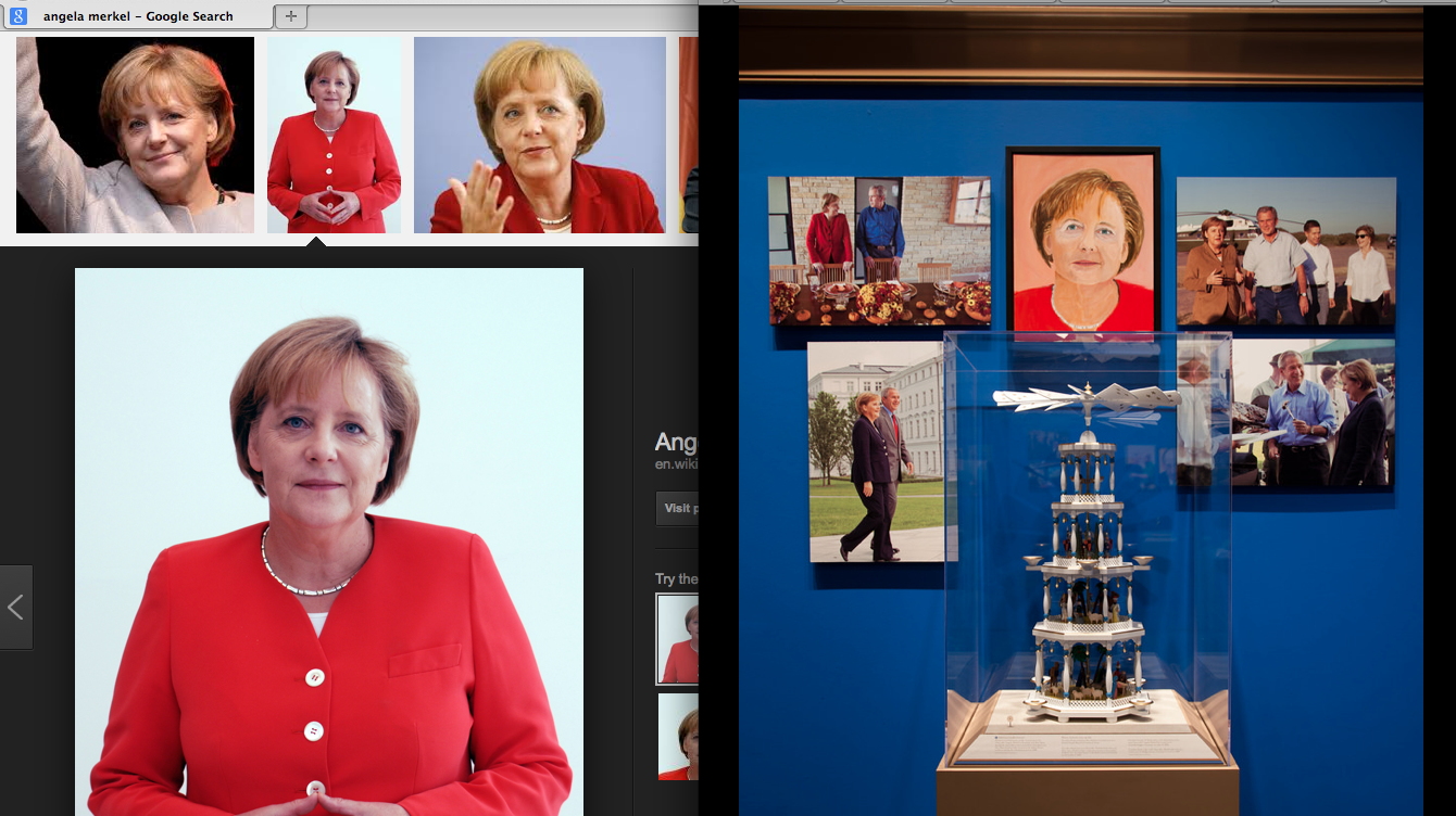
By outsourcing the editorial decisions about the source images to Google and Wikipedia, the rest of the paintings’ decisions can be claimed by The Decider himself. The sources serve as an index of Bush’s subjectivity, interpretations, and technique, only some of which is hinted at in his walkthrough. Maybe there’s an audioguide? Whether they are successful artworks in critical or aesthetic terms is an entirely separate question. But it is disingenuous, dishonest, or delusional to claim Bush’s paintings are not art.
They are the art of our time. The art of the 21st century. The art of the Bush Era and the Global War on Terror that made him famous. And for many who care deeply about art, that is very depressing. And damning. We yearn for art’s relevance in our society, for art to have an impact on our culture. We want people to experience art and to feel it’s important. Unfortunately, George Bush’s paintings accomplish all those missions. They’re the newsiest paintings to come along since George Zimmerman’s eBay auction.
Bush and his paintings grab the media spotlight just as reporters are gaining traction in the years-long struggle to account for the criminality and deception of Bush & Cheney’s CIA torture regime. The 6000+ page Senate report on the CIA, and the CIA’s own equally damning first account of itself, plus its responses, plus vast amounts of documentation of torture practices, are slowly moving toward declassification. Leaks are starting to emerge. Official facts are starting to be documented. The practices that continue to poison US courts, treaties, military & foreign policy, and intelligence, are finally coming into sharper view–and the man responsible for it all is successfully fending off his reckoning with a paintbrush.
Ironically, there is even more important art buried within the Senate’s trove of classified CIA documents. And as Bush was being interviewed by his daughter on NBC, these other artworks were still being actively suppressed. Jason Leopold and Al Jazeera reported that the Senate report contains detailed sketches of waterboarding by Abu Zubaydah, a senior Al Qaeda leader imprisoned at Guantanamo. He did not base his drawings on Google Images, but on his firsthand experience. As a “high-value detainee,” Zubaydah was waterboarded at least 83 times at a CIA black site in Afghanistan, with each interrogation session authorized and closely monitored from the White House.
Zubaydah produced ten drawings on yellow legal paper and index card-sized paper, detailing multiple torture techniques he was subjected to, Leopold reported in 2011. Since the CIA illegally destroyed its own waterboarding videotapes in 2005, these drawings may be the most powerful visual evidence of the Bush torture regime we have left. In March Leopold also obtained and published Abu Zubaydah’s diaries from before his capture, when he had been waterboarded and interrogated by Pakistani intelligence–without, it should be noted, yielding any true or useful intelligence. Which the CIA knew.
The point is, once again, art matters. Art has surfaced in the most dire circumstances, at a crucial moment in our society’s history, produced by someone whose actions and moral standing confound our engagement with it. And culturally speaking, we don’t care; we’d rather see Bush’s folksy pictures from the internet. Every news story about Bush’s paintings represents ten reports not filed about Bush’s torture. In the art world, meanwhile, we’d rather not see it at all. Better to condemn and dismiss it quickly. Snark and move on. Stoke the indignance that keeps us and our practices unsullied. Ward off any engagement with cowering incantations of connoisseurship and facture.
This is how art appears in our society today. Art works, as they say, and this is what it does: it absolves and redeems and defuses and deflects. Ultimately, George Bush’s paintings are important less for what they show than for what they obscure. And the art world’s critical structures seem unable or unwilling to meet the challenge posed by the art of the torture & terrorism school.
The Art of Leadership runs through June 3, 2014 [bushcenter.org]