Domenico Veneziano/Washington Monument, 1984, newspaper on NGA postcard, via Peter Freeman back in the day
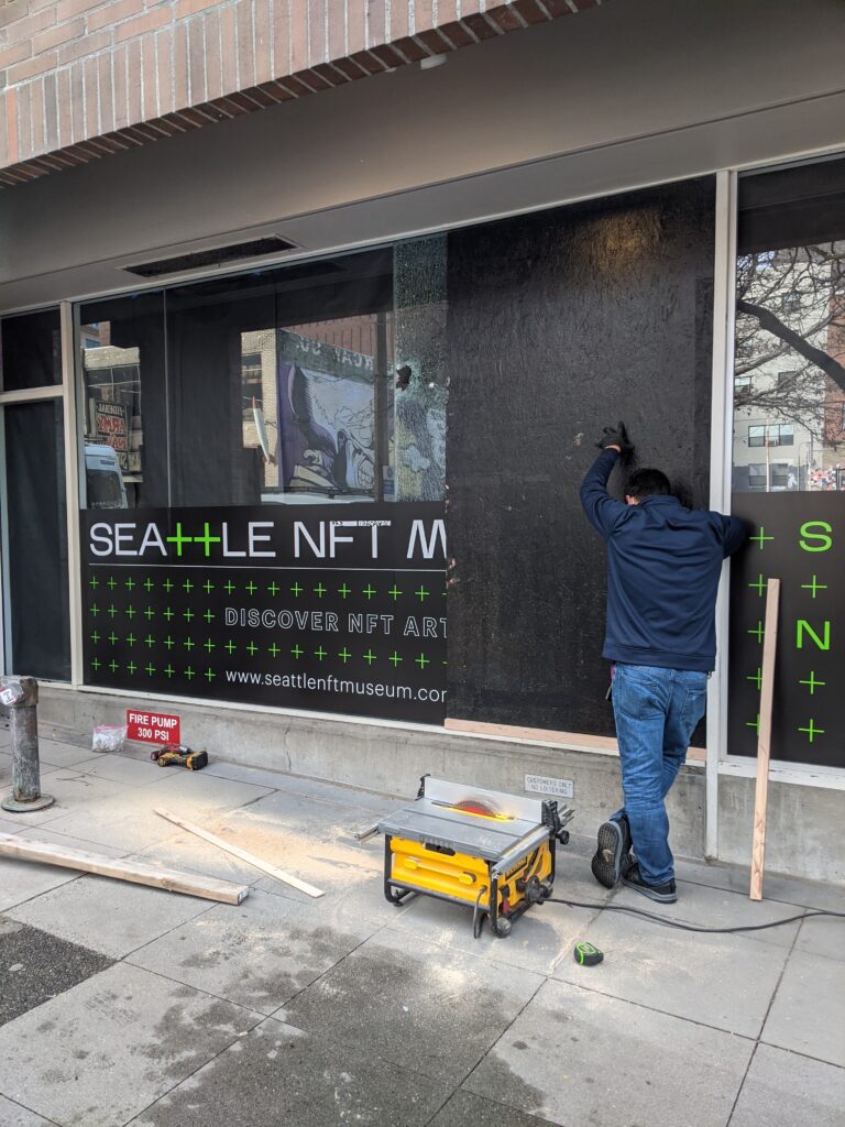
Though a couple we included in his Guggenheim retrospective in 1996, most of Kelly’s 400 or so postcards made between 1949 and 2005 have never been shown or published. Each venue will show a distinct selection of 150 of the works, and the catalogue reproduces 216 postcards at full scale. It is a veritable facsimile object blockbuster–but I still want to see the real things in person.
Ceci n’est pas un miroir noir, image via like ten hot takers on twiter
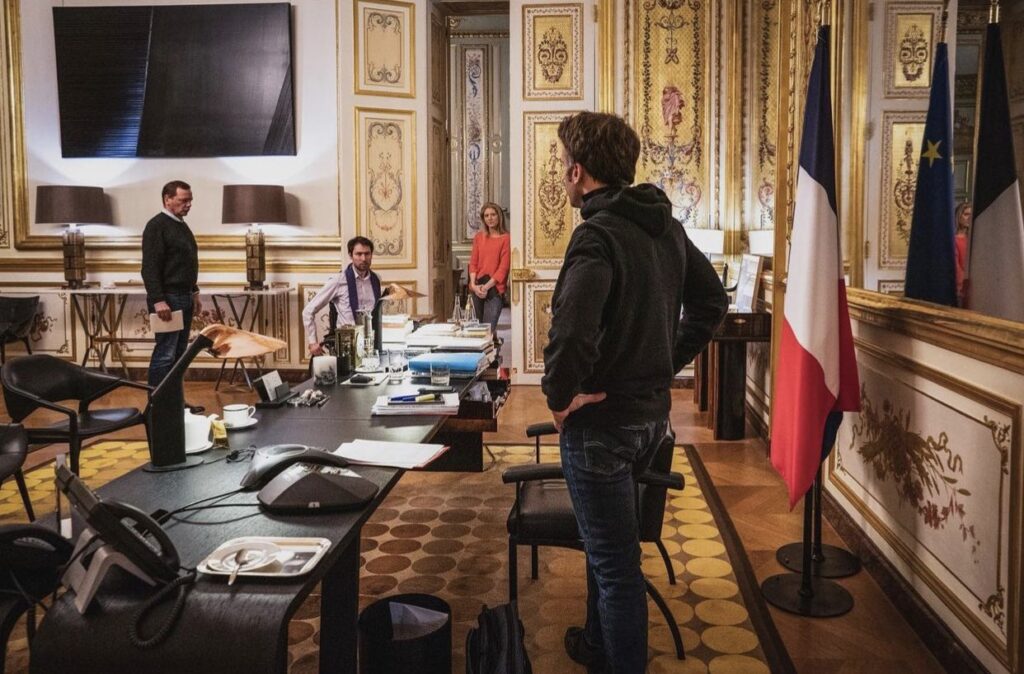
Some might say this warrior president Golden Roommise-en-scène feels like a very special Continental episode of Black Mirror come to life. Me, I say, that’s no black mirror: it’s a Proposte Monocrome Macron! Srsly, though, the Struth fan who took this photo deserves a Légion d’Honneur.
UPDATE WTF: I just zoomed in to make myself an Ellsworth Kelly-style rhomboid crop, and it appears that is not a flatscsreen TV with a reflective image on it at all, but an image? Non, but it is a picture. It is a Soulages.
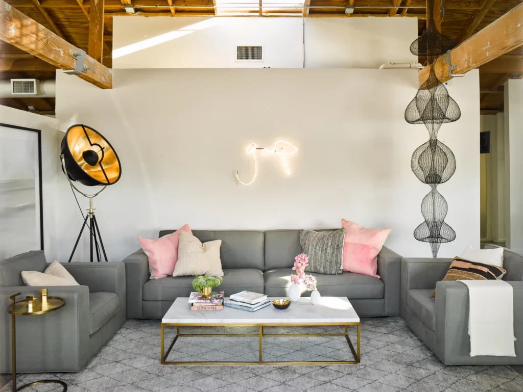
backwards and in high heels: A Guerrilla Girls poster adding some critique to the product shot for this glass-front sideboard at Home Depot. via @jamieisenstein
Artist Jamie Eisenstein posted this image from Home Depot on her instagram a minute ago. She doesn’t say how she found it, but she did mention that she burned a few more hours looking –without success– for more.
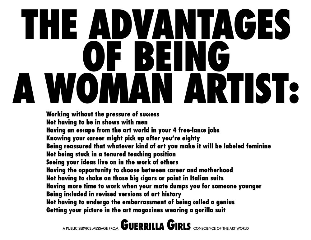
The Advantages of Being A Woman Artist, 1988, 17 x 22 in. poster version, available at guerrillagirls.com
Why this 1988 Guerrilla Girls poster turned up in a product shot is a mystery. All it’d take, though, is one woman artist doing styling or shooting non-garage furniture for a hardware megastore as one or two of her 4 free-lance jobs.
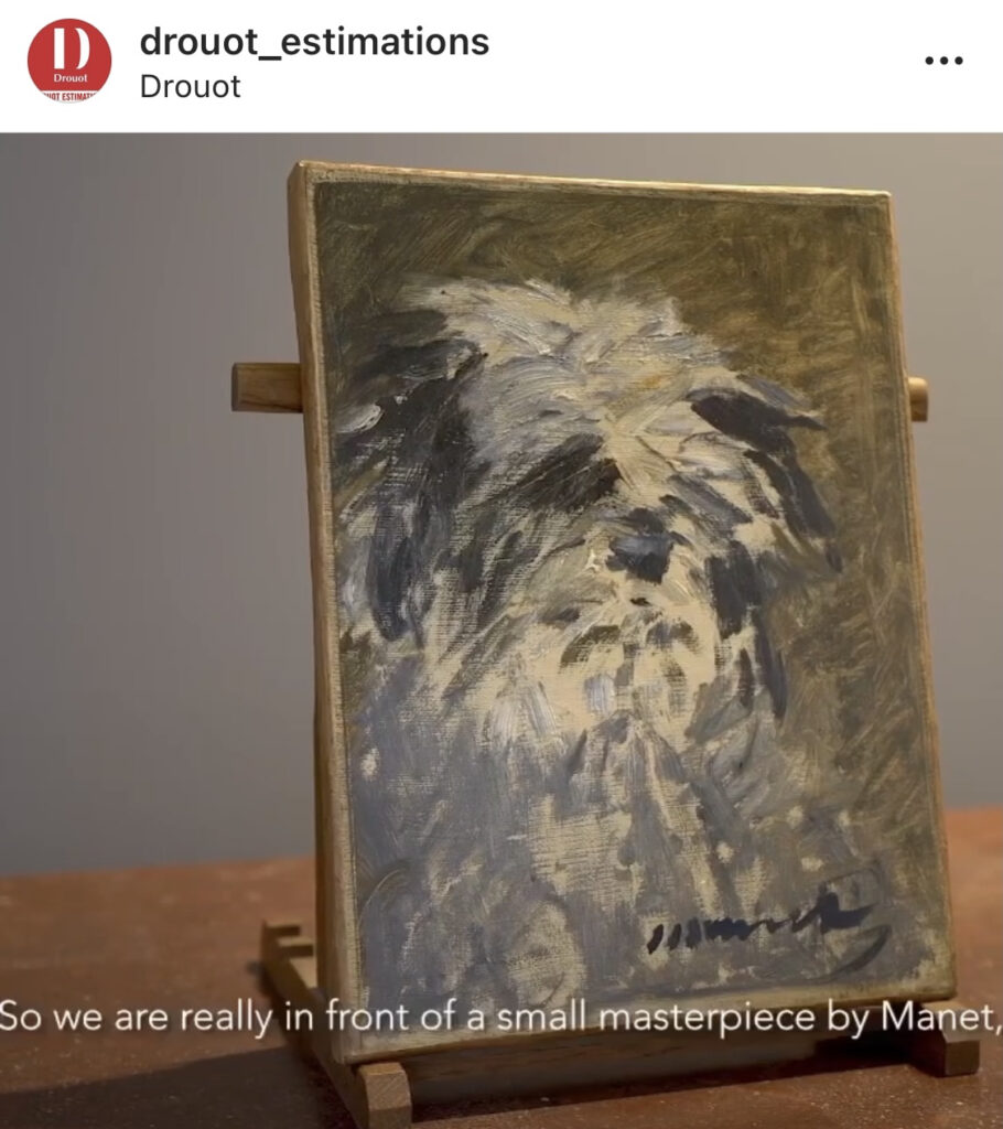
It’s been a year since the 2.1 day appearance of a never-before-exhibited Manet painting at a far-away auction house during a pandemic set me down a facsimile object path. In that time I made around 25 FOs, give or take. For the ones that went public, I made certificates of authenticity that involved techniques and materials directly associated with art objects–not that high-res photoreproduction on metal panel is not, of course. But I liked the combination of two objects that looked like artworks while purporting to be different, in different ways.
Facsimile Objects are very much of their specific time and circumstances. They were conceptualized as proxies for artworks you couldn’t see for a moment. I imagine them–I experience them myself–as approximating a physical experience with the artwork they depict, a different, kinaesthetic mode of reproduction. In this, they relate to the Destroyed works I’ve made, which re-create as best they can a physical engagement with a lost artwork. They all call to question or throw into relief the default assumptions of how we consume and experience art on a page or screen.
But by being inexpensive and rapidly produced, the Facsimile Objects also engender a sense of shared experience. The idea was to create a distributed community communing with their identical FOs, as if in the same gallery, or at least in front of the same artwork. What could these multiple, discrete, small-scale, shared engagements with art in a pandemic be? I wondered. Obviously it could only be an approximation of IRL, and on those terms, it’s doomed to fail, but I still wanted to see what it was on its own. And so, it turned out, did many others.
And so now here we are, at the intersection of détournement and commodification, selling t-shirts.
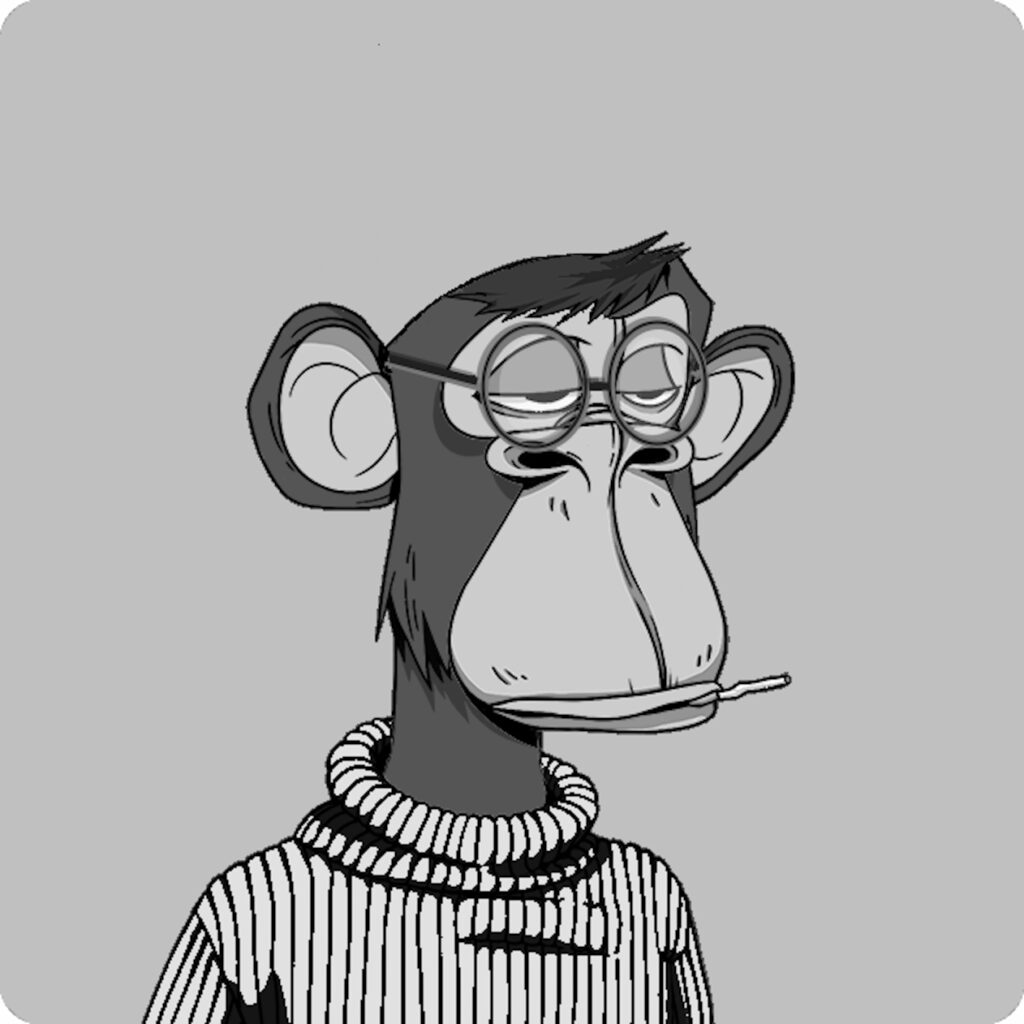
Study for Debord Ape Yacht Club t-shirt, in four-screen grayscale on a Hanes shirt so authentic it has Authentic in the name, $25 shipped.
This exclusive one-of-one Debord Ape will be silkscreened in grayscale on a white Hanes Authentic [of course] T-shirt in 100% cotton. Because of the multiple screens required to mint this, and because I still just lost money on the last supposedly breakeven shirt stunt, this shirt is $25, shipped worldwide.
Debord Ape will be available til the end of Febrary [Monday2/28]. If fewer than 15 people order, I will burn the project, refund the enlightened dozen or whatever people’s money, and console them with some kind of tasty swag. The ape will live on as a jpg, free for right clicking. [Next day update: Everyone should feel free to right-click if they want, but the mob has spoken, and project will go ahead!]
So if you’re looking for a way to expose the spectacle’s alienating financialization while mirroring capitalist recuperation through détournement and self-critical commodification, hopefully, you order your Debord Ape T-shirt while you could.
Thank you all for your engagement.
UPDATE: Meanwhile, Geraldine Juárez, who’s been really smart in her analysis of NFTs for a while already, and who also made the Debord connection almost a year ago, just tweeted about an even deeper Debord/Apes connection. From a 1957 column fragging Alain Robbe-Grillet’s timid clinging to the present, Debord declares for the revolutionary power of ape art:
Last June witnessed a scandal when a film I had made in 1952 [Hurlements en faveur de Sade] was screened in London. It was not a hoax and still less a Situationist achievement, but one that depended on complex literary motivations of that time (works on the cinema of Isou, Marco, Wolman), and thus fully participated in the phase of decay, precisely in its most extreme form, without even having — except for a few programmatic allusions — the wish for positive developments that characterized the works to which I have alluded. Afterward, the same London audience (Institute of Contemporary Arts) was treated to some paintings executed by chimpanzees, which bear comparison with respectable action painting. This proximity seems to me instructive. Passive consumers of culture (one can well understand why we count on the possibility of active participation in a world in which “aesthetes” will be forgotten) can love any manifestation of decomposition (they would be right in the sense that these manifestations are precisely those that best express their period of crisis and decline, but one can see that they prefer those that slightly disguise this state). I believe that in another five or six years they will come to love my film and the paintings of apes, just as they already love Robbe-Grillet. The only real difference between the paintings of apes and my complete cinematographic work to date is its possible threatening meaning for the culture around us, namely, a wager on certain formations of the future.
[Meanwhile, Juárez’s original quote that referenced this was not from Debord directly, but from Esther Leslie’s 2004 book Hollywood Flatlands: Animation, Critical Theory, and the Avant Garde. Credit where it’s due, thanks Geraldine!]
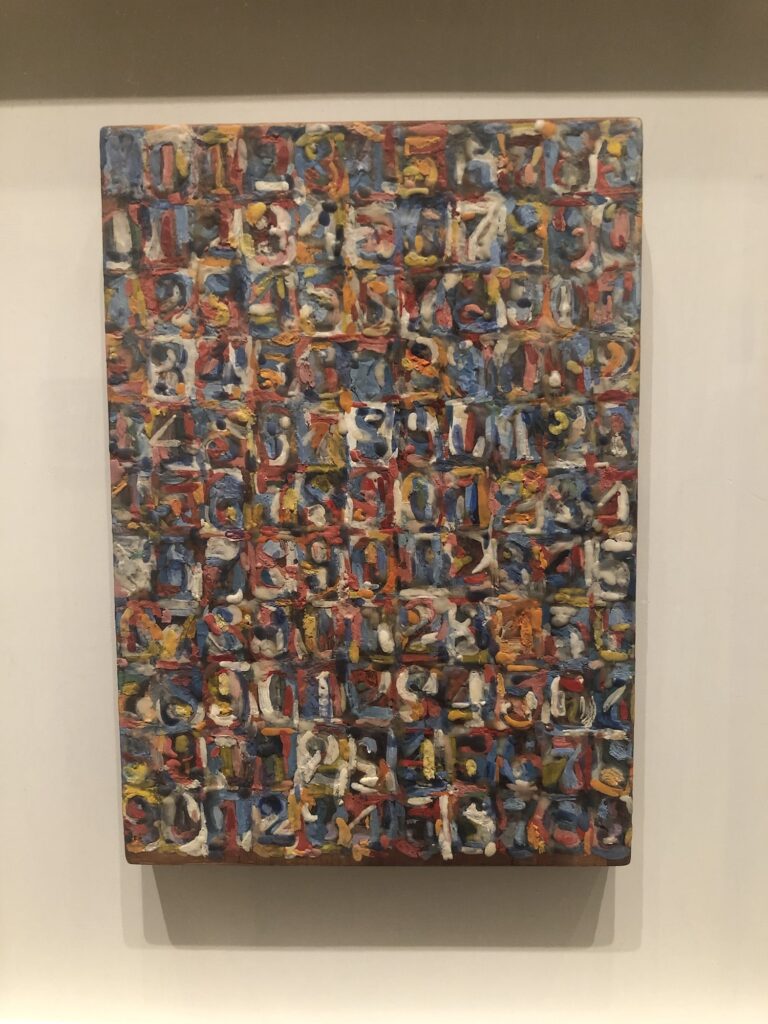
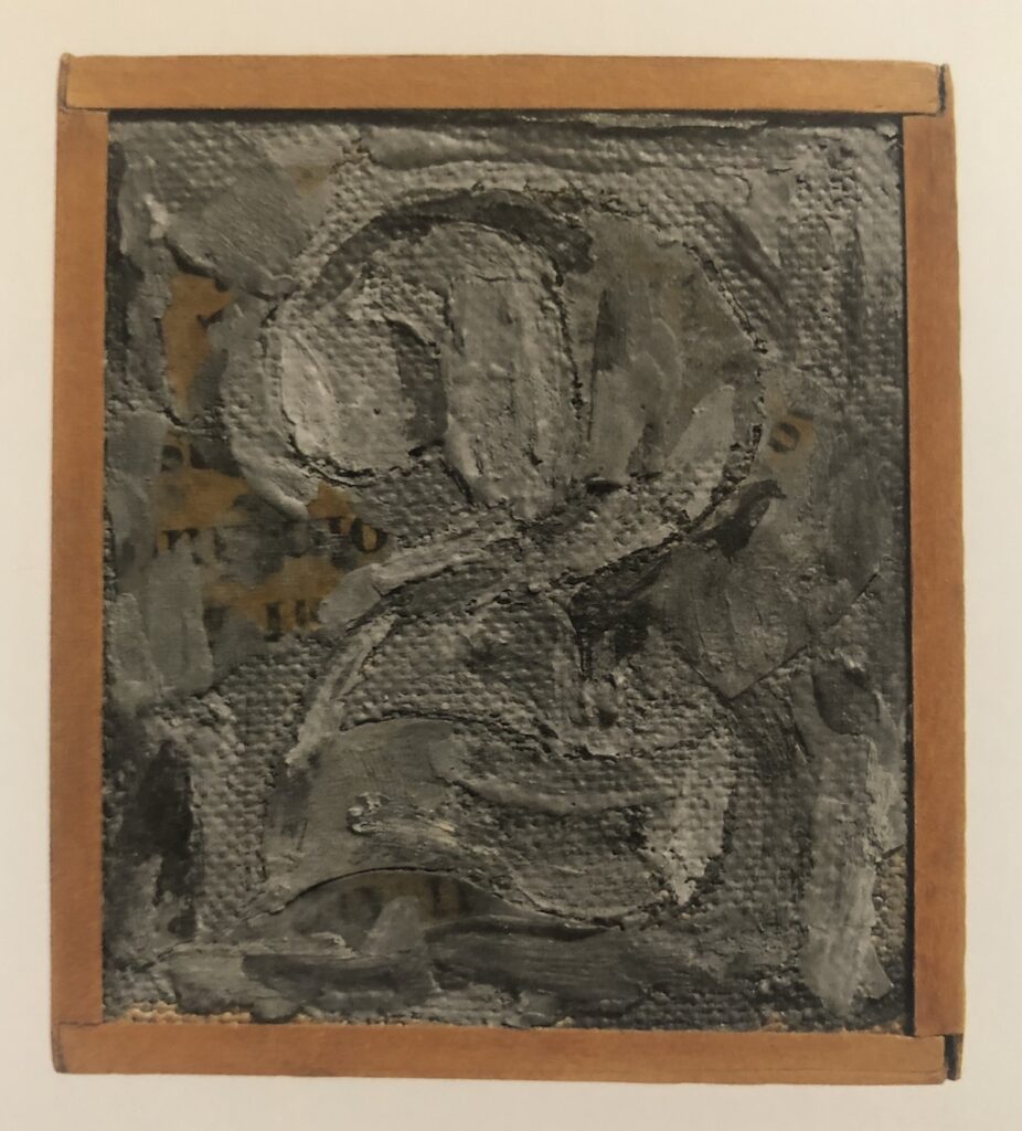
Jasper Johns, Small Numbers in Color, 1959, 10 1/8 x 7 1/8 in., encaustic & collage on wood printing block, installed at the Philadelphia Museum of Art for Mind/Mirror, collection:the artist
I went to the Philadelphia Museum today to see the Jasper Johns exhibition before it closes. There’s a lot to like, and a few things to love. The absolute winner for me was a little painting, rarely shown, which Johns has kept for himself since making it in 1959. Small Numbers In Color is extraordinary, one of two superlative works in the gallery devoted to Johns’ use of numbers.
It’s small, around 10 x 7 inches, and painted in encaustic on wood. The catalogue raisonné (P74, btw) says the wood is “the reverse side of a printer’s block with metal type.” [Which, a block would have cast metal affixed in a permanent way. A case would hold the sorted metal type, and a frame would hold type that has been set. Even though the metal type is not listed as part of the work, it does make me wonder what it says. Or looks like.]
None of that is evident from looking at the front; all you see is a tiny riot of color with an over-all grid, and then, the shapes of individual numbers coalescing into a whole. It looks to me like it replicates the basic color composition of Numbers In Color, a large (67 x 49.5 in.) painting from 1958-59 which went into the Albright Knox Museum collection soon after it was completed. Given the CR chronology (P58 vs P74), Small Numbers is presumably a documentation, or a memorialization, of Numbers, maybe made before the large painting shipped off to Buffalo. [In Roberta Bernstein’s 1975 dissertation that was the first published catalogue of all Johns’ paintings & sculpture to that point, Numbers in Color comes first in the 1959 works list, and Small Numbers comes almost at the end.] Who knows? There is almost no discussion of the work online. Actually, Johns Friend Craig Starr might know; the last time it was exhibited publicly was at the inaugural show of his gallery, in 2004.
Jasper Johns, Figure 3 (1960), a double-sided painting, installed in a column at the Philadelphia Museum of Art’s Mind/Mirror. Collection: Yale Art Gallery
The other standout from the same gallery is even smaller. Figure 3 (P84), from 1960, is Johns’ only double-sided painting. The 9×6 painting is framed so that both sides are visible. The verso is an approximation of the front, reversed, as if it were painted on a transparent ground, not canvas. The precise-enough brushstrokes of the back make their simulating point in the same way Small Numbers echoes Numbers.
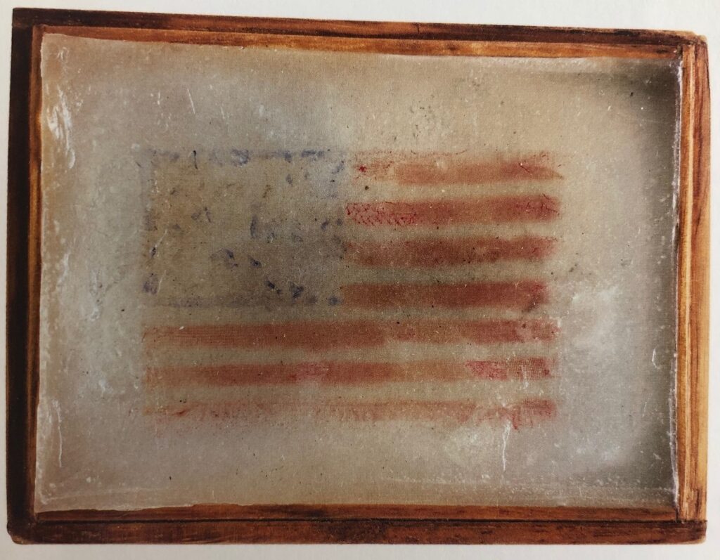
Jasper Johns, Flag (P56), 1958, silk printed flag, paraffin, in wooden frame, 2 3/4 x 3 3/4 in., via JJCR
Which is interesting, but is only a part of the fascinating intimacy of the very small artworks Johns created (creates?). The Whitney had a whole gallery of them, miniature examples of some of Johns’ most relevant motifs. In addition to the tiny silk flag encased in wax Johns made for Merce Cunningham, barely the size of a credit card, my favorite was the 3-inch encaustic Figure 2 (1959) made for Astrid and David Myers to celebrate the birth of their second child.
Jasper Johns, Figure 2, 1959, 3 x 2.75 in. encaustic on collage on canvas, originally made as a baby gift for a friend’s second kid. image via the JJCR
Besides the major concerns of Johns’ practice, these instantly recognizable works come with bonus content–like 2 for the second–and bonus context, marking the artist’s social network, his community of supporters and interlocutors. [Philadelphia has a vitrine filled with small artworks he received as gifts from Japanese contemporary artists he met while visiting in 1964. The so-called “hermit of Sharon” in fact trades art with his colleagues, and makes art for his friends.]
Part of the appeal of these works is that they exist outside the market–or at least they were created and first exchanged that way. Their miniature size is still determined by the market, though; even by the end of 1958, it would feel a bit much for someone to give a full-scale, “real” [sic] artwork, one that could be seen as having “real” market value. [Or worse, one that doesn’t, in which case, you’re assuming and asking a lot if you give a whole-ass painting to someone as a gift.] So they have to function on an emotional, personal level, as a gift, a gesture, but also as something the mind already knows–in this case, a Johns painting.
And of course, like the question, “Is it a flag or a painting of a flag?” these gift works are both gifts and works: Figure 2 has traded hands seven times and been auctioned twice since little Coco Myers turned 18.
Aspect Ratio Blanket, jacquard cotton, $120 from A24 Films
In late 2020 A24 Films dropped this aspect ratio blanket. It is part of the film studio’s unusually extensive swag collection, and was designed by Actual Work, of Provo, Utah. It is great, and not only to the extent it makes me think of Liz Deschenes’ photos and Derek Jarman prints.
In 2003 Deschenes made a series of monochrome photographs in the dimensions of various screens, analog and (emergent) digital, which helped to forefront the usually unseen technological systems used to produce the images we consume. They don’t get as much attention as the saturated awesomeness of her green screen photos of the same era. I saw them first at Andrew Kreps, and she showed them again in London at Campoli Presti.
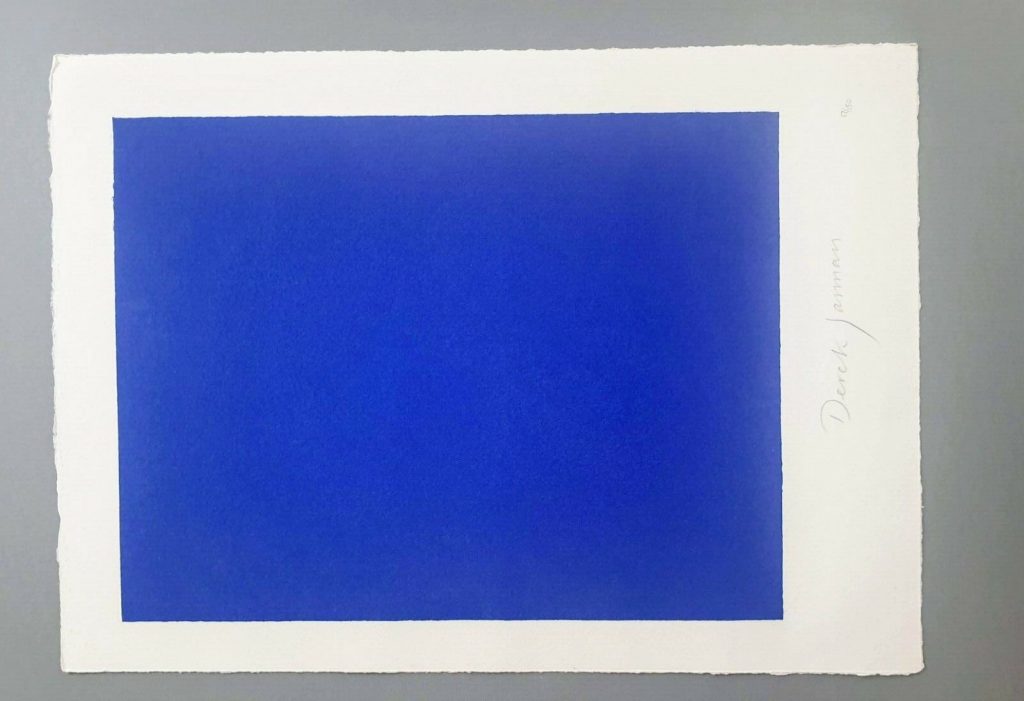
Just turn it sideways, he says: Study for Derek Jarman Blue Screen Print, 2020, gahhh, the aspect ratio
Derek Jarman is my own damn fault, a rabbit hole I jumped into and kept on digging as I tried to figure out the correct [sic] aspect ratio of a monochrome silkscreen of Jarman’s Blue, rather than just buy an example from the unfinished deluxe letterpress edition of the screenplay when it appeared on eBay.
But maybe it’s exactly those too-close encounters with aspect ratios that made me wonder what’s going on in A24’s blanket? Why does it have the seven aspect ratios it does? 1.33:1 and 2.39:1 are pretty standard (standard TV and anamorphic/widescreen theater, respectively), but 1.66:1? That’s a European theatrical format. 2:1 was originally launched in the ’50s as SuperScope, but it’s more likely that its promotion by Red, the digital camera company, as an optimal format for phone & flatscreen display is a more likely explanation. 2.76:1 is Panavision, and an auteur-y choice only a Tarantino would make (or, apparently Gareth Edwards, who used it for Rogue One. Neither film was an A24 joint.) 1:1 is…Instagram? Josef Albers? I have no idea.
1.19:1, though, is an ancient ratio that does have a direct A24 connection. Originally used in the 1920s during the transition to sound, Robert Eggers used it on his 2019 film, The Lighthouse, which was an A24 joint. The ratio was a deliberately, constricted, archaic choice that evoked imagery of the 19th century of Edgar Allan Poe’s unfinished story that inspired the film. So in a way, it makes the most sense of all.
But I think the blanket is not meant for overthinking, and these ratios were chosen to look good when stacked. Which, I guess it’s good that they do look good. If they also connected to something about the self-consciously quirky studio that made them, that’d be even better.
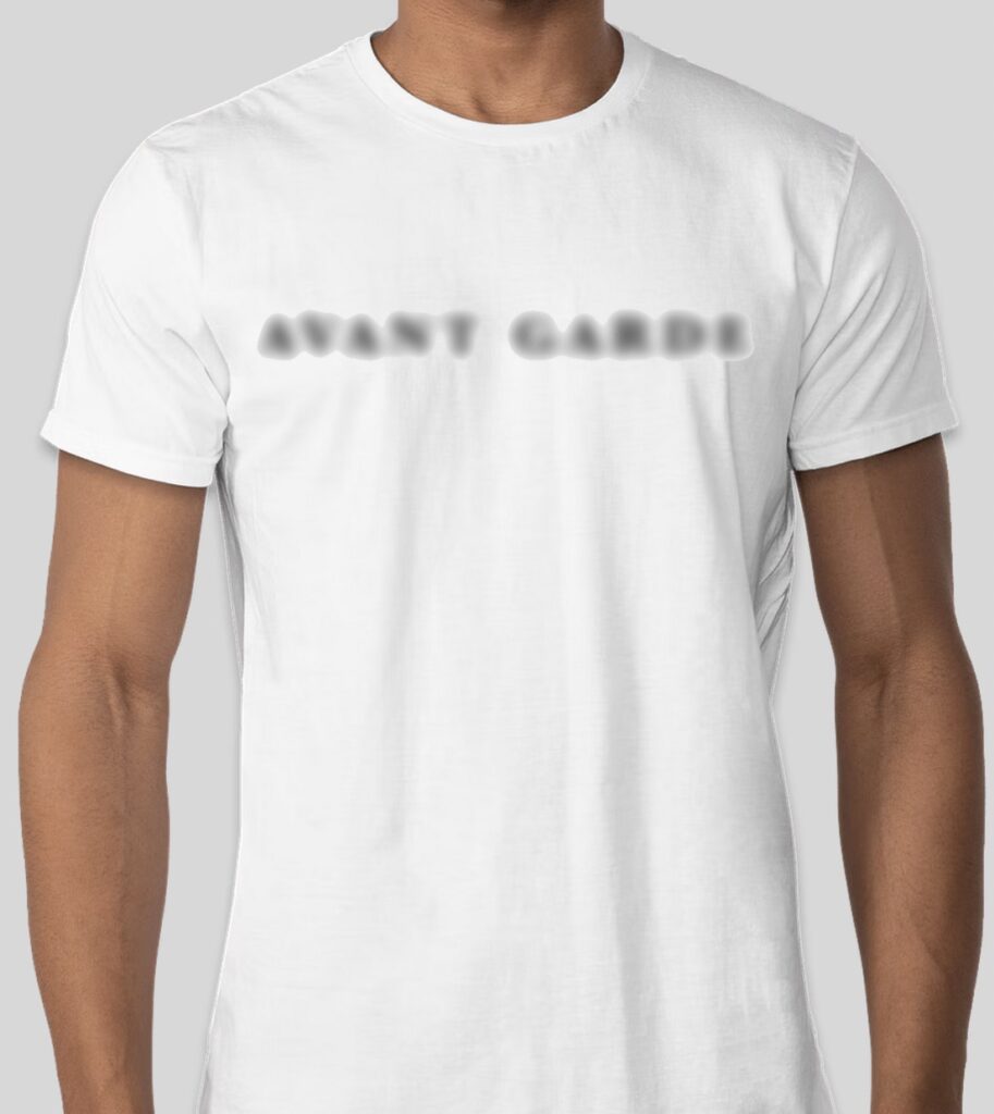
What does it say? No one knows! But this is a rendering of what it will look like, screenprinted in color on a white, 100% cotton Hanes Perfect T-shirt.
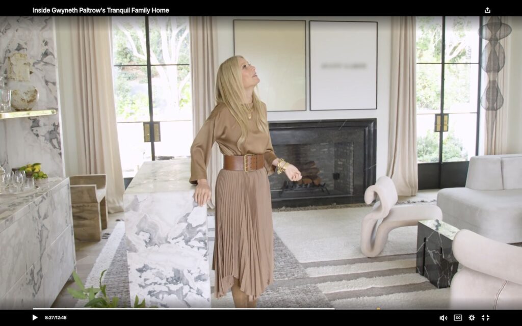
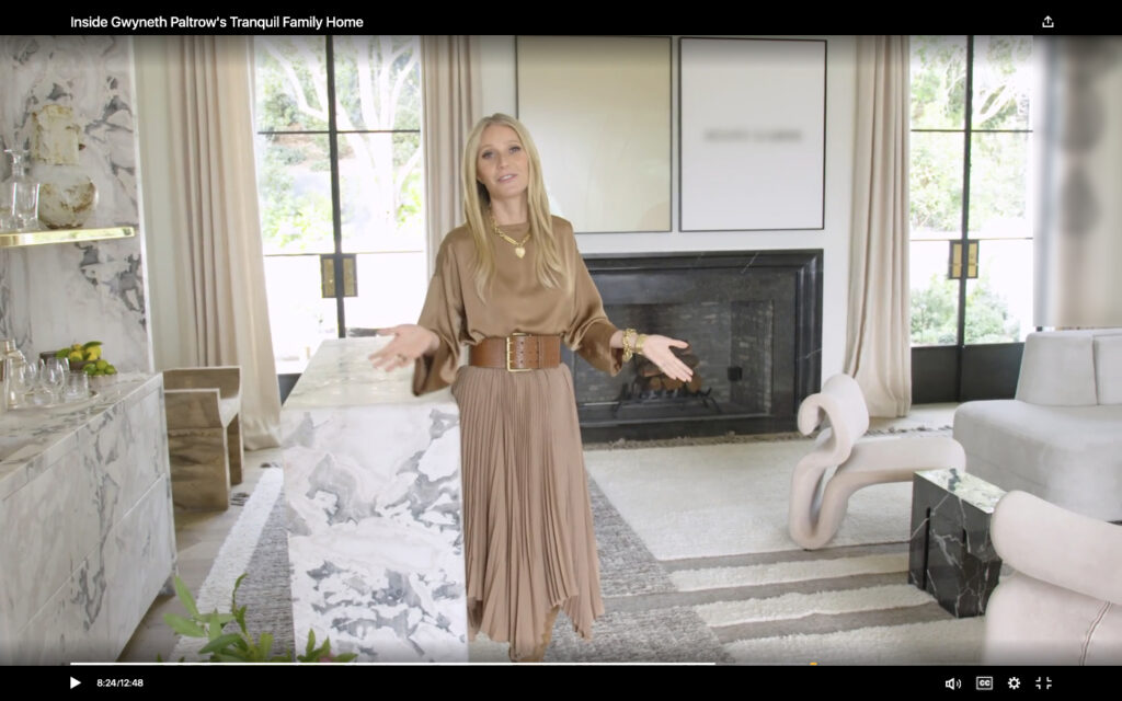
I know we all got distracted for a minute by the Ruth Asawa knock-off hype, but let’s remember what’s really important about Architectural Digest’s glorious visit to Gwyneth Paltrow’s new house in Montecito: they decided not to get video rights for the John Baldessari diptych over the fireplace, and so they blurred out the painting. Well, technically, they only blurred out half of it. The monochrome, apparently, can slide.
This is a John Baldessari diptych, Prima Facie (Fifth State), from 2007. Could the t-shirt have something to do with that? WHO CAN SAY?
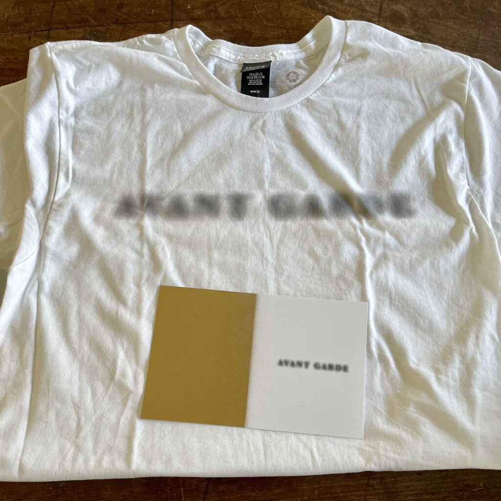
To celebrate this moment in the history of artist rights management in the multiplatform digital content era, greg.org is issuing this t-shirt. What does it say? NO ONE KNOWS. What is it referencing? NO IDEA. The meaning will remain an eternal mystery that will baffle your friends, families, and Zoom counterparts, but at least it will always remind you of the fun we all shared this week.
The rendering above shows the concept, which is, to paraphrase John Baldessari, to try to make it very simple, so that the blurred and the face are equal. The shirts will be silkscreened in color (well, black and grey) on white, 100% cotton, Hanes Perfect Tees, and will ship shipped worldwide for $US22.
A product shot, a Blurdessari t-shirt, with accompanying COA, in its new home. thanks, @wb!
Like the celebration for the auction in Italy of a someone’s Twombly bunny drawing, these shirts will only be available for a minute–through the weekend, Sunday night, Feb. 6–and will only be made on a break-even basis. Can you imagine losing money on a conceptual digital rights management apparel stunt? I cannot. So if 10 or more folks don’t jump in, I’ll call it off, return the money, and recognize the 9 or fewer true avant garde pioneers with something else. Wow, OK then, less than an hour in, so this is happening!
Many thanks to everyone who made the moment of conceptualization possible. It is now the moment of realization, and this is the only new order being accepted:
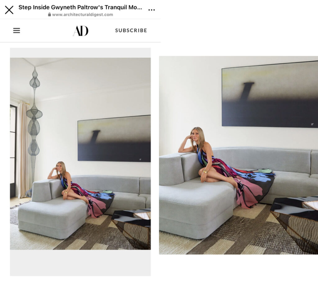
Architectural Digest slideshow image [R] before people called out Gwyneth’s Asawa knockoff and [L] after, blurry Ruscha–assuming it’s actually a Ruscha, which ¯\_(ツ)_/¯ –was blurred by Ruscha, images: architecturaldigest.com via @langealexandra
Yesterday morning, I joined in Alexandra Lange’s consternation at Gwyneth Paltrow’s non-optimal installation of a Ruth Asawa sculpture in front of a window–worse, a patio door–and behind a sofa. I made my peace with it in context–and by focusing on the blurry Baldessari instead.
By yesterday afternoon, we’d all been on a quite journey, because it turns out Paltrow’s Asawa is NOT an Asawa after all. Architectural Digest cropped the sculpture out of their slideshow, and removed all mention of it from the credits. INCLUDING, I’d point out, the image licensing by Artists Rights Society on behalf of the Asawa Lanier Estate.
Part of me is morbidly fascinated with how the Asawa attribution and credit ended up in the piece, and I fully expect Architectural Digest will never tell us. Did Paltrow claim it? Did the writer and editor assume, but not factcheck? Or did they factcheck, and an assistant or the decorator friend claim it? Did ARS not do anything besides send an invoice? Did the Estate know and intervene? Or know and roll with it? What did the Zwirners do? Is there even a way to tell if an Asawa is real, besides the provenance–and the price?
Also not Asawa? The caption on the 2017 A/D feature about RH’s fit out of Goop’s Santa Monica office makes no mention of the not-Asawa in the corner. photo: Dennis Friedman
Did the woman who pivoted from selling fake health products to shilling for crypto somehow mislead people about the authenticity of the wire sculptures in her sponcon features? Did the self-described online auction-scouring furniture obsessive forget who made a 10-foot tall sculpture, and whether she paid $9,000 or $900,000 for it? Did she forget it twice? Because there are at least two. In Lange’s thread, Warren James linked to a different Asawa-looking sculpture in the Restoration Hardware-designed waiting room at Goop, from an A/D feature from 2017. Gwyn.eth done knew.
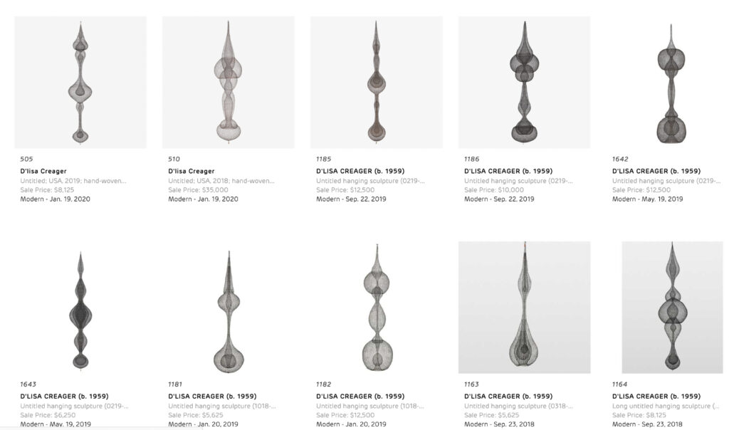
10 of the Fauxsawas sold at Rago lately: image: ragoarts.com
And her design obsession is the tell. Because various regional auctioneers, including the now-merged design auction houses of Rago, Wright 20, and LA Modern, and modernist design fairs in Palm Springs all regularly feature knockoff Asawa wire sculptures for sale. The ones in Oakland, who knows, but most of the others seem to be consigned directly by their maker, D’lisa Creager. Her own website shows a variety of bodies of sculptural works, but the ones that appear publicly, like clockwork, two per auction, are her Asawa knockoffs. She’s sold 20 at Rago since 2016, when Asawa’s own prices were on the rise. (Zwirner began representing the Estate in 2017, and prices have jumped from five to seven figures as collectors and museums have been playing catch up.)
As a guy who makes facsimiles of artworks, I feel acutely aware of the lowkey wildness of calling out someone for making knockoffs, but it’s not just a question of honor among appropriationists. Creager is filling a demand–for cheap and plentiful Asawas–for which there is no supply. But she’s doing it by claiming to have been taught by Asawa and her family, when in reality, she attended a lecture Asawa’s daughter gave at the Japanese American Museum in LA. It’s this phony, implied lineage, just vague enough to avert a statement from the Asawa camp, that really bugs me. That, and the design/auction world’s willful trafficking in obvious knockoffs, whatever the market will bear.
Fortunately, if the editor’s letter is any indication, Gwyneth’s false attribution will live forever in print. Subscribe now.
lol UPDATE: A/D now credits the work as by D’Lisa Creager. Congratulations on your first Architectural Digest appearance[s that we know of]!
TFW Yoshihiro Makino shoots Gwyneth Paltrow’s new living room with John Baldessari’s 2007 diptych, Prima Facie (Fifth State): Avant Garde for Architectural Digest, and they pay ARS for a print and/or web license
Alexandra Lange brought Gwyneth Paltrow’s troublesome installation of her Ruth Asawa sculpture in front of her patio door to Twitter’s attention this morning. And I confess, seeing the Architectural Digest photos, that included Lindsey Adelman’s drapey light installation, and a Ralph Pucci hammock also hanging from the ceiling of Paltrow’s new Montecito living room, I, too, was troubled. For a minute.
But after watching the video tour, and hearing the care and attention to detail, feel, design, and material that Paltrow and her people put into this project, I became fine with it. How else *should* an Asawa sculpture live, but in an actress-turned-influencer’s slightly louche, ultra-deluxe living room full of stuff hanging from the ceiling? Not everything should be a white cube. As long as the door, or the dog, or the kid, doesn’t hit the fragile sculpture, go wild, Gwyneth. [LATER THAT DAY UPDATE: NOT an Asawa! Problem solved! Or, rather, replaced with new problem!]
Gwyneth looking at the Adelman light thing, while all other eyes are staring straight at the blurred out Baldessari on the wall. [screencap: Architectural Digest video]
That’s not important now. Not when the Baldessari diptych over the fireplace is blurred out in the video. I’m guessing A/D did not want to splurge for the video license from ARS? I also love that all they felt they needed to blur out is the text on one half of the work; the monochrome painting is undefaced.
Study for Untitled (Prima Facie), 2022, enamel on canvas and lenticular print on aluminum, each 52.5 x 42 in.
Speaking of face, there’s a new one in town. Untitled (Prima Facie), 2022, is a lenticular print mounted on aluminum and enamel on canvas diptych where the avant garde grows increasingly sharper with a move to the right.
It is inspired by Baldessari’s Prima Facie (Fifth State): Avant Garde, a 2007 diptych which is itself based on a spread found in Baldessari’s 2006 artist book, Prima Facie: Marilyn’s Dress: 2006/2007 – a poem in four parts, which was available in both book and deluxe book with a print editions. Earlier states of the Prima Facie series had photographs of actors and actresses where the monochrome is here, with words chosen to be the instant, descriptive equivalent–and equal in visual impact-to the image. Baldessari showed works from the Prima Facie (Fifth State) at Sprüth Magers in London in mid-2006, where Paltrow might have seen them, but this 2007 work came from Marian Goodman. These works are depicted in David Platzker et al’s Baldessari Catalogue Raisonée, of course, and the Museum Dhondt-Daehnans in Belgium put out a comprehensive-at-the-time catalogue of Prima Facie works for a show in 2005-06. Untitled (Prima Facie) is a greg.org exclusive.
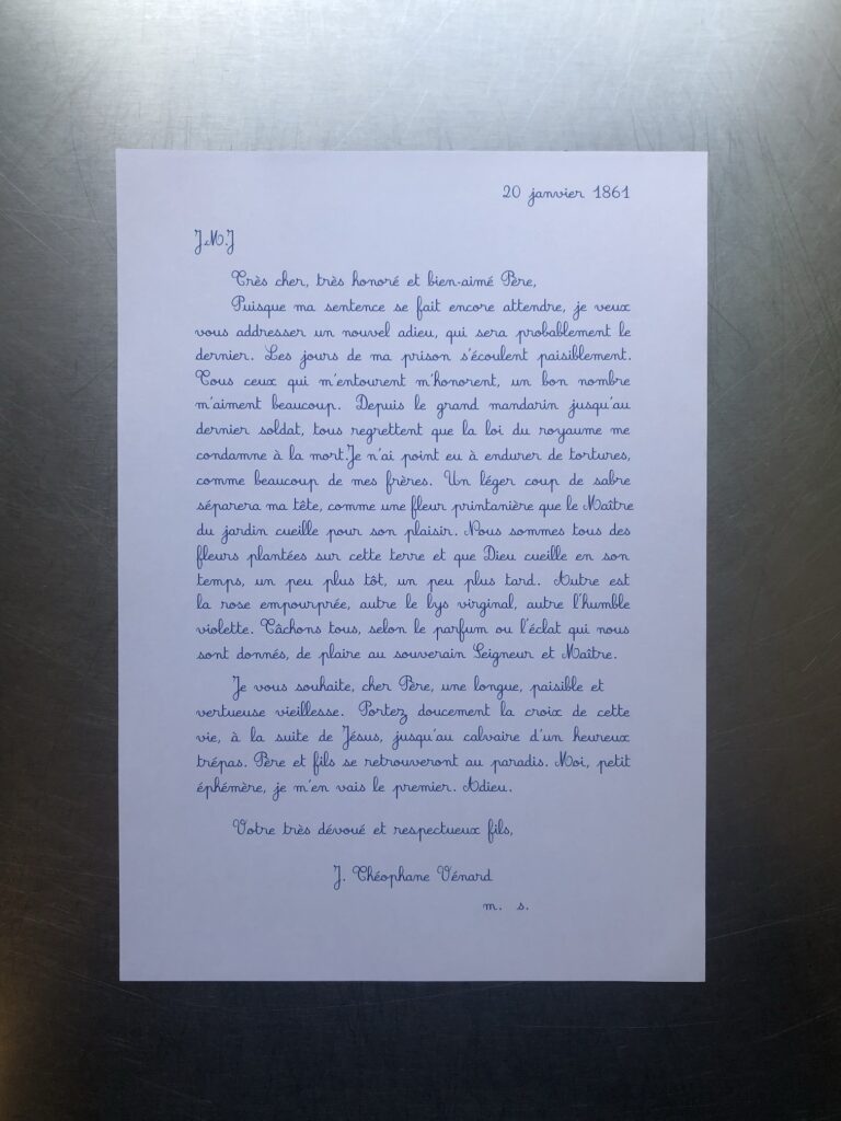
Phung Vo Facsimile Object (PV1), 2022, 297 x 210 mm, digital print, with full-size, digitally printed COA, signed and stamped
I’ve written before about the long reach of Danh Vo’s 2.2.1861 (2009 – ) on my thinking, but also specifically on the Facsimile Objects project, beforeI made a one-off Facsimile Object of it. Having a visual of Phung Vo’s beautifully transcribed letter from soon-to-be-beheaded J. Théophane Vénard to his father in front of me, instead of tucked safely away, has leveled up that influence.
It makes me try to improve my handwriting. It intensified my preference for A4 paper, which turns out to be difficult to find and work with in a world that defaults to 8.5 x 11. It prompted me to seek out the original source for Vénard’s letter. It got me to learn LaTeX. It, along with spending time with aging parents and a global pandemic, made me think about mortality, the moment that awaits us all.
And it made me think about what a Facsimile Object does, or what it could do.
Phung Vo Facsimile Object (PV1) is one result. It is the transcription of a slightly different published version of Vénard’s letter than the one Vo uses. It is set in LaTex using the French Cursive font package created by Emmanual Beffara, and printed on Vietnamese A4 paper. A certificate of authenticity matches it, and both are contained in an A4 document sleeve.
The layout is inspired by Vo’s 2.2.1861, but between the machine font and the slight textual differences, the line breaks diverge after just four lines. It’s a bit like how the clocks in Felix Gonzalez-Torres’ “Untitled” (Perfect Lovers) slip out of sync, except for the perfect lovers part, and the baked-in indexing of facsimulatory failure.
I am not decided about what to do with these. Part of me wants to make them available on demand. Part of me thinks they shouldn’t go out until the…end of Vo’s project. [Here at the beginning of a new lunar year, I once again wish Phung Vo a long, healthy, happy, and prosperous life.]
As I contemplate this, I remember back to a project I started in the Summer of 2014, to continue On Kawara’s Today Series after the artist’s death as a communal practice. It was called fromnowon.us, and it would have made it possible for people to order a date painting from Chinese Paint Mill, depicting the date on which it was painted. I’d arranged the production, even getting the painters to include a sheet of the local Shenzhen newspaper with each completed painting. When the test painting arrived, it turned out to be from Sept. 11th. Which gave me pause.
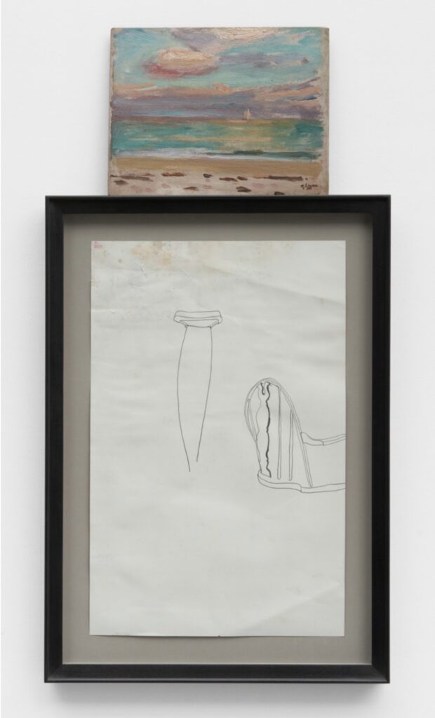
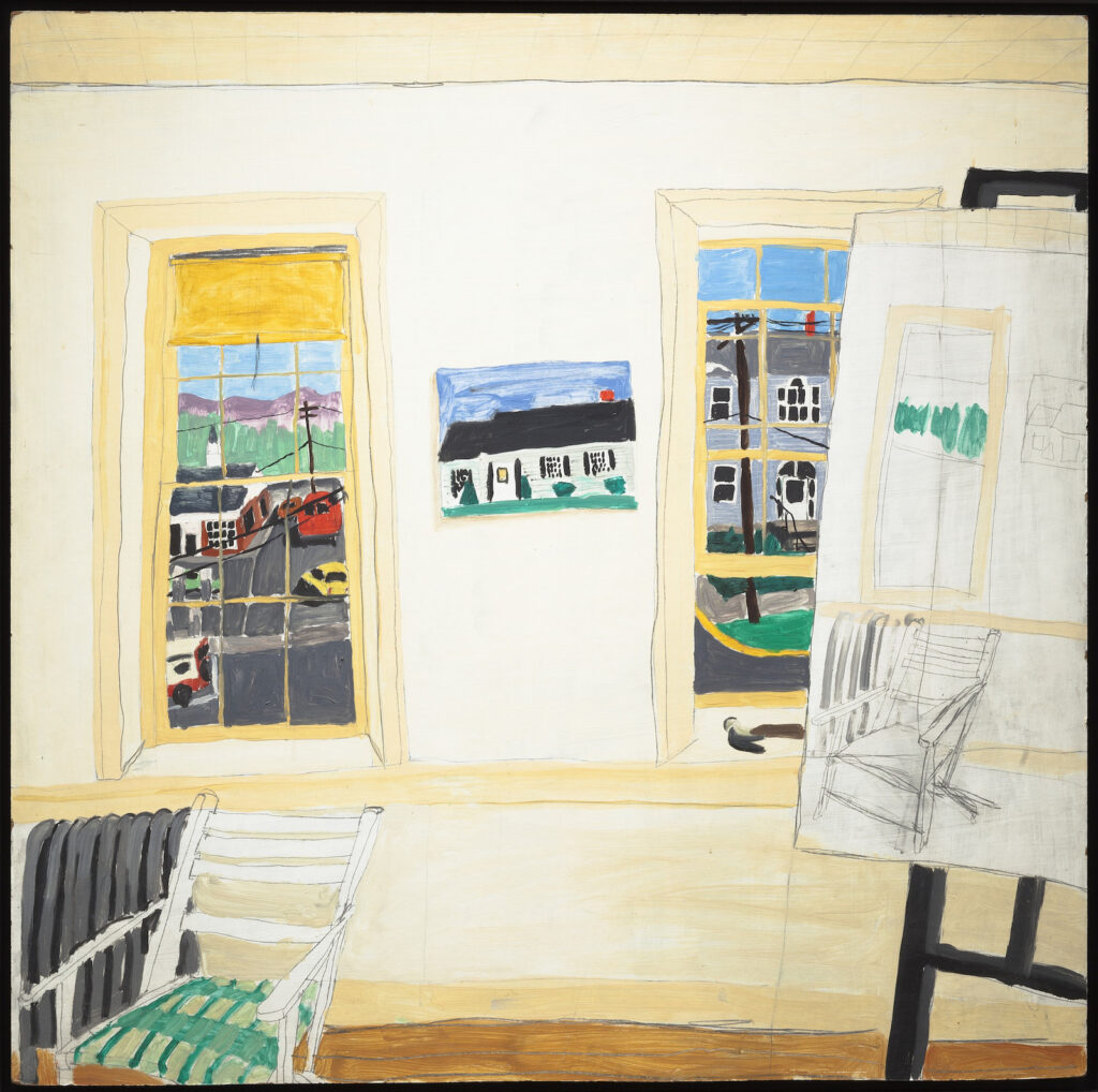
Untitled c. 1910/1976?/2021, Robert Gober and Robert Henry Logan, Graphite on paper, oil on board 28⅛ × 14¾ × 1¼ inches; 71 × 38 × 3 cm, image: Matthew Marks Gallery
I am going to miss the Robert Gober show at Matthew Marks, “Shut up.” “No. You shut up.” which closes today. But I thought I’d seen a part of it before.
The show is full of windows, or rather, the confoundingly meticulous fabrications of fragmentary window/sill mises-en-scenes set in high minimalist-style metal boxes. John Yau’s description of the works is close and precise, and his description of experiencing them is open and profound. It’s a combination that Gober’s work has come to demand.
Yau mentioned remembering a painting I’d never known, Lois Dodd’s View through Eliot’s Shack Looking South, 1971, which was acquired by MoMA in 2018–a gift of Robert Gober. Gober and OPP [other peoples’ paintings], though, made me realize I’d seen that little painting up top before.
Though I think this is the first time he’s used another artist’s work in his work, Gober has often worked with the works of other artists as a curator. In 2009 he organized a retrospective of Charles Burchfield at the Hammer, which went to the Whitney in 2010. And for the 2012 Whitney Biennial, curators Jay Sanders and Elizabeth Sussman had Gober curate a show-within-a-show, a room of paintings and archival material by Forrest Bess. Even when it’s not visible, or even referenced, Gober’s curating fleshes out a context for his own work. It broadens the view of the world he sees, beyond the one he presents to us through his own work.
Beyond, but also alongside it. In the 2014 show at MoMA, Gober punctuated the experience of his seeing his work with a gallery of resonant work by other artists. A recreation of a group show he curated at Marks in 1999, it included an Anni Albers textile, a Robert Beck video, and a pair of truncated nudes by Joan Semmel facing each other across a Cady Noland stockade.
Jasper Johns studio view from June 2021, featuring some assemblage-style works, via Matthew Marks
Thinking of this show again also changed the context for the other element of this assemblage: the student-era sketch of a crutch and chair back, dated around 1976. When I first saw it in the online viewing room, Jasper Johns’ shows were still fresh in my mind. Johns, too, had recently mashed up an awkward, injury-related student drawing and a painting. And then he did a whole show of variations. [Another relevant Gober series in the show: found academic drawings of feet, to which Gober added text, or inserted a jail window. These guys and their disembodied body parts.]
But then the chair hit me. Gober sprinkled early works throughout the MoMA retrospective, which ended with a big, c. 1975 painting of an interior. Actually, it’s a chair in front of some windows. Actually, it also includes a painting of a painting of a chair in front of some windows. And while the backs of these chairs may not match, the lines sure do. I have to admire Gober’s continued ability to generate a feeling of uncanny familiarity, if not outright déja vu. If only I’d been able to see it at all.
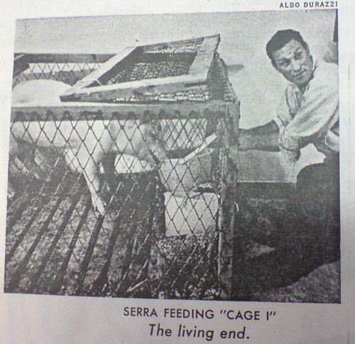
The other day while gooftweeting some highlights of the real estate slideshow for Villa Aurora – still available, now 20% off! – I made a joke, entirely for an audience of one, about Richard Serra’s first show, which took place in Rome in 1966, while he was traveling on a Fulbright with his then-wife and fellow Yale sculpture MFA Nancy Graves. Titled, “Animal Habitats: Live and Stuffed,” the show delivered exactly what it promised: live and taxidermy animals inside various crates, cages, and other “habitats.”
photo of Richard Serra and the pig in Live Pig Cage I, 1966, from the Time Magazine article on his show at Galleria La Salita in Rome
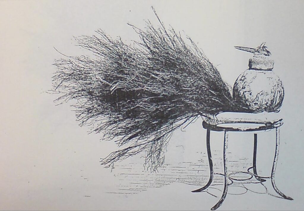
But it turns out I was wrong. A picture of photocopy of a picture of a work arrived from Rome. In the 1980s a group of Serra works from “Animal Habitats” were put up for auction in Italy by Tomaso Gian Liverani, the owner of Galleria La Salita, where Serra showed. It’s not clear what they were or where they went. But in 1987, Emanuela Oddi Baglioni, another Roman dealer, was offering a group for sale. Was it the same group, or part of it? Where there others? Oddi Baglioni’s gallery was across the via Gregoriana from la Salita, but it only moved there in 1967. Did she buy them at auction from her neighbor? Or did they not sell? Are there more? They survived 20 years, though! What happened after that? Did someone buy them?
Anyway, the work, which may have been in Liverani’s group, Oddi Baglioni’s group, both, or neither, is above. The scale of the piece is not clear, but there is a long-beaked bird [taxidermied, I’d hope] sticking out of an urn?, with a thick sheaf of weeds? underneath it, on a [readymade?] metal stand? a plant stand? And the title of the piece is HAIR ON OR AFTER GASM ONE, to Barney Newman.
OK. Thank you? I do not know what to do with this information. Which, now I think I know how Barney Newman felt?
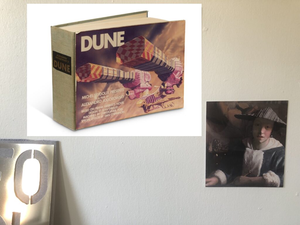
Study for Spice DAO Facsimile Object (S1), 2022, 11.5 x 15 in., high-gloss dye sublimation pigment on aluminum panel, installed between FOOL Facsimile Object (W1), 2021 and Vermeer Facsimile Object (V0.9), f/k/a Girl Unmuting, here titled Girl Voting Her Tokens To Burn The Book After Scanning So No One Gets Sued For Copyright Galaxy Brain, 2022
Congratulations to Spice DAO, which announced yesterday [sic] that they had successfully purchased a rare copy of a book containing the concept art and storyboard sketches for Alexander Jodorowsky’s legendary adaptation of Dune. The sale took place at Christie’s Paris on 21 November 2021, three days after Constitution DAO failed in its attempt to buy a printed copy of the US Constitution at Sotheby’s in New York.
Constitution DAO raised $47 million, only to be outbid by hedgie/collector Ken Griffin, whose privately negotiated guaranteed bid of basically $47 million and one dollars also included a rebate on the auction house’s premium, bringing his net to just $43 million. Spice DAO, no doubt quick learners, went into their auction for the EUR25,000 book with a EUR2.667 million bid, and managed to eke out a win.
Spice DAO’s purchase–technically, a private purchase and a transfer to the DAO, since Christie’s didn’t recognize the DAO–of Jodorowsky’s Dune bible was actually revealed last December, when it was still called Dune DAO. The story then was that these enthusiastic Dune fans were banding together to liberate the long-hidden copy of the lost, unmade masterpiece they’d gotten glimpses of in Jodorowsky’s Dune, a 2013 documentary directed by Frank Pavich. It was only when they tweeted their plans to, “1. Make the book public (to the extent permitted by law) 2. Produce an original animated limited series inspired by the book and sell it to a streaming service 3. Support derivative projects from the community” that copyrightlulz twitter was like, “lmfao YEAH NO,” and the buyers of $11 million worth of Spice DAO tokens became aware of the limits of the blockchain’s ability to overcome all humanity’s problems.
So while the governance discord debates selling NFTs of scans of the pages of Copy Number 5, then burning the actual book so they won’t get sued for copyright infringement [0.<], I am ready to move forward with the Spice DAO Facsimile Object (S1).
As much as I thought I’d leave Facsimile Objects in 2021, I realize that the Spice DAO Community needs them. Spice DAO Facsimile Object (S1) presents a perfect, facsimile of Copy Number 5 of Michel Seydoux Presents Alejandro Jodorowsky’s Dune from Frank Herbert’s Novel. Design by Jean Giraud. Machines by Chris Foss. Special Effects by Dan O’Bannon. Dialogue by M. Demuth and A. Jodorowsky, as it was sold at Christie’s on November 21, 2021. Printed at full-size, in high-gloss dye sublimation pigment on an 11.5 x 15-inch aluminum panel, the Facsimile Object embodies the true octavo (210 x 295 mm) presence of this historic, physical, artifact. It is accompanied by a similarly full-scale, handmade certificate of authenticity, executed in ink on handmade Arches paper, signed, stamped and numbered, and will ship in a handmade case.
Unlike previous Facsimile Objects, which were created for the world, Spice DAO Facsimile Object (S1) is only available to verified hodlers of Spice DAO governance tokens. The first 10 verified orders will be priced at 0.5ETH, payable in USD at the ETH/USD price on coinbase for the date of purchase. After that, the price will increase to 1.0ETH. Availability of Spice DAO Facsimile Objects (S1) will continue until morale improves. DM or email to get started.
[update: the price of the Facsimile Object is after taxes. Whether you sell ETH to buy the Facsimile Object, at whatever your basis, or you use your pre-existing fiat is not relevant, and greg.org will not pay your capital gains taxes. Thank you for your understanding.]


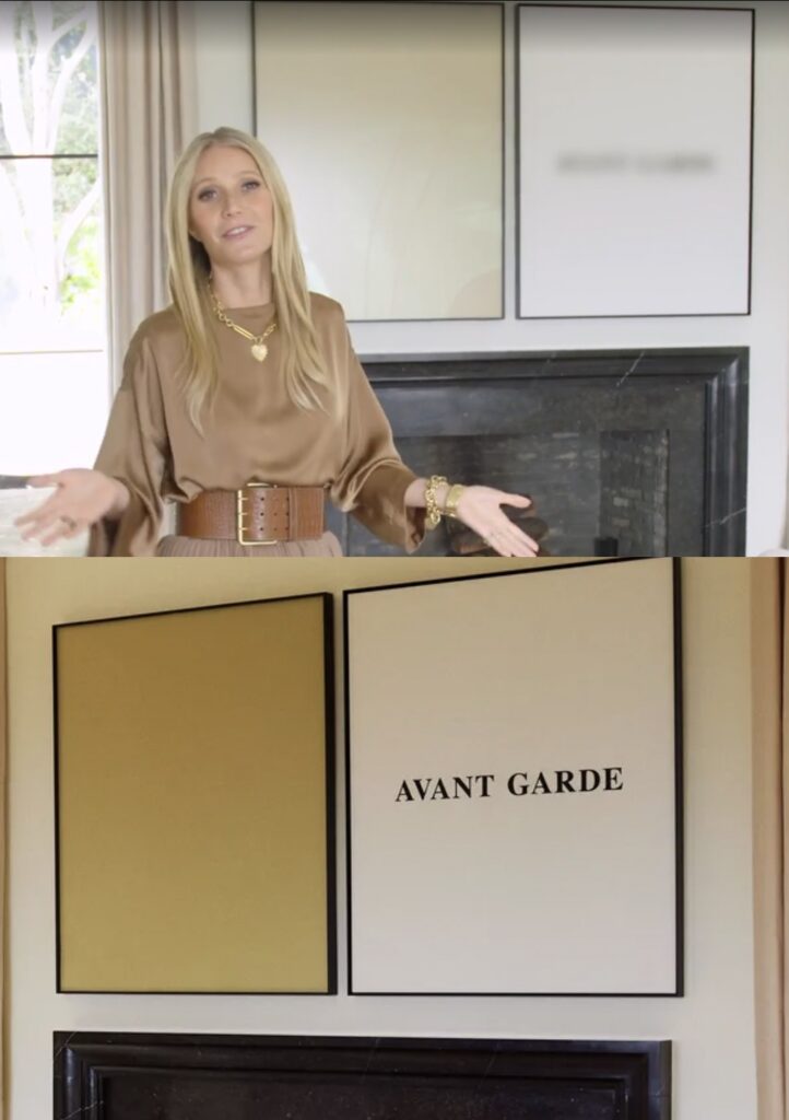
![gwyneth's montecityo living room is pale gold and pink and grey in its vibe. a drapey lighting fiture of multiple light elements across the ceiling are connected with catenary swags of black cable. it echoes slightly the fake ruth asawa [turns out it's fake, lol, that's one result of this post] hanging wire sculpture in front of a double glass door, one of two on either side of the fireplace, the garden beyond that. the main architectural feature of the room is not the curvaceous mod wood or italian chairs, or the large squared off grey sectional sofa, which just sticks in from the right. it is the bonkers scale black and white marble bar, freestanding, with a matching marble console and thick slab wall behind it, which feels like it was extracted from some other setting. the lightnig makes it look pink. over the flat black fireplace is a john baldessari diptych: a square gold monochrome on the left, and a white square painting with the words avant garde in the center, on the right. it is legible only in the photo still from architectural digest, and blurred in the video with goop herself. a licensing thing. an ridiculous.](https://greg.org/wp-content/uploads/2022/02/baldessari-paltrow-archdig-1024x688.jpeg)