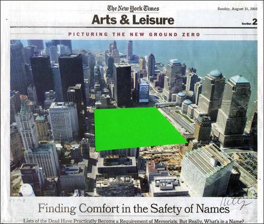
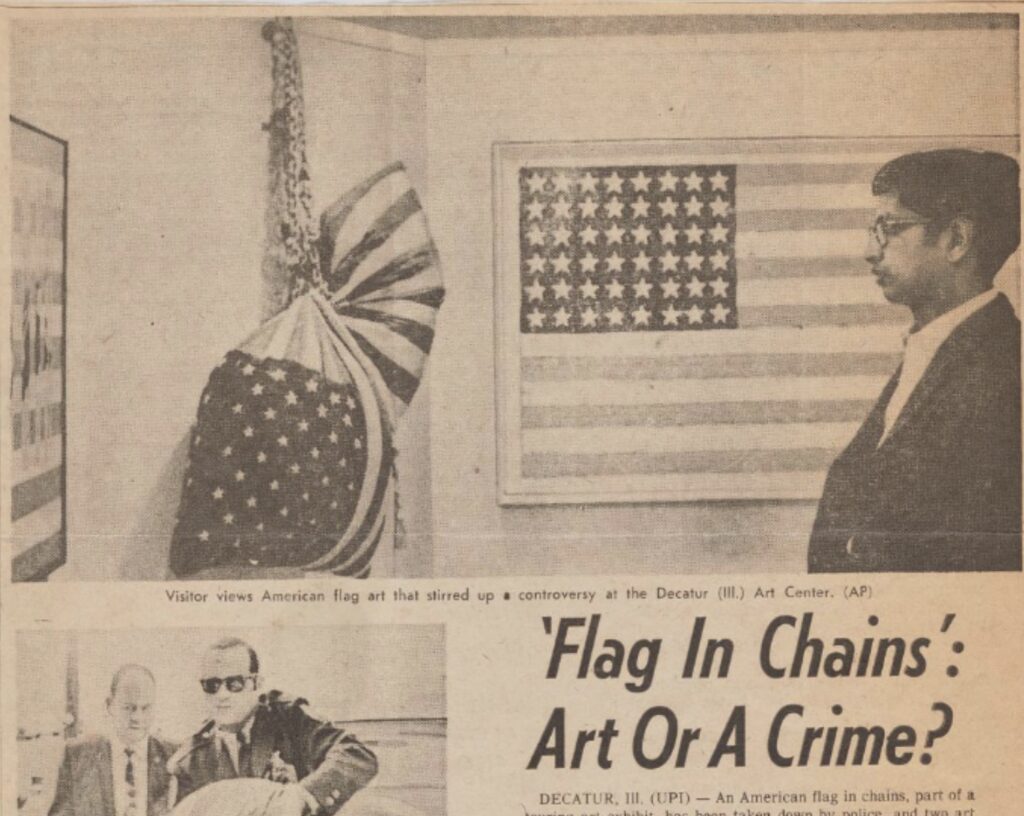
Tom Ford has introduced a wristwatch made of ocean plastic. The following are excerpts from the Departures Magazine marketing email for the watch which, at $995, somehow manages to seem simultaneously expensive and cheap:
The Impact of Ethical Luxury “In my opinion, ethical luxury is the greatest luxury of all,” says iconic designer and creative director Tom Ford…When you purchase an Ocean Plastic Timepiece, you permanently remove the equivalent of 35 bottles of plastic waste from the ocean.
The Tom Ford Ocean Plastic Timepiece is made from 100-percent ocean plastic collected in seas, along coastlines, and in uncontrolled landfills. Its material contains neither virgin plastics nor non-ocean-bound plastics, and is traceable to its collection source. The ocean plastic granules used in its production have been transported in a carbon-neutral manner, and have been compounded in a solar-powered Swiss facility. Additionally, all packaging is recyclable.
“It is incredibly appealing to know that you are not only wearing a high-quality product, but that by simply owning the product you are also taking direct action to improve the planet.”
I was going to post a photo of Ford modeling the watch, but who even cares at this point. It is a giant black watch with TOM FORD and OCEAN PLASTIC written on the face.
In 1957 a sculptural ceiling and wall by Isamu Noguchi was installed in the lobby of 666 Fifth Avenue. The composition of undulating aluminum fins survived the purchase of the building by Jared Kushner, and the gutting and renovation of the Fifth Ave.-facing retail spaces. The wall was more dynamic than the ceiling, which was pretty subtle, but it all worked very nicely together.
But now the Noguchi Museum is reporting that the work has been removed and destroyed. The only bright spot is that the components were donated to the Museum. If anyone has a block-long elevator lobby that needs a space age drop ceiling, hit them up, I guess.
It reminds me of Wade Guyton’s 1999 show at Andrew Kreps, Against the New Passeism. Understanding that this is only the beginning, hope for the end. Build, Destroy, Do Nothing.
Against the New Passeism. Understanding that this is only the beginning, hope for the end. Build, Destroy, Do Nothing. installation shot by Jerry Saltz via artnet
Wade installed a rough, fireplace-size, plexi&ply sculpture in the back room, and put the entire back room on display in the main gallery, including a much bigger Ricci Albenda text piece below:
Wade Guyton installation at/starring Andrew Kreps, with Albenda, Robert Melee, Rob Pruitt, Hiroshi Sunairi, Lawrence Seward?… via jerry saltz’s 1999 artnet review
I’d say stay outta my bidding way, but we’re all gonna do what we’re gonna do. I have thought, though, many times, about [bringing back] these early, destroyed Guytons, but just haven’t found the right space yet.
Pierre Jeanneret, Office Armchair PJ-SI-28-B, India, designed c. 1955 Teak, plasticized string, nylon, aluminum, image: patrickparrish.com
I love Pierre Jeanneret’s furniture for Chandigarh, and I hate the Chandigarh Furniture Industrial Complex. I am relieved that these objects that once were abandoned for scrap are now preserved, but I hate that the cultural context is being stripped away, and that for their value and significance to be recognized, they must be removed and fed through the luxury design machinery of the West. I love seeing this furniture aging and bearing its history, and I hate seeing it stripped and restored and altered into just one more must-have for some instagram junkie to stuff into their Axel Vervoordt McMonastery.
Pierre Jeanneret & Le Corbusier, “Boomerang” Table LC/PJ-TAT-14-A, India, designed c. 1963 Teak, image: patrickparrish.com
I love this stuff, and hate that I want it, but I’ve managed to deal because it’s not like there’s any OG Chandigarh furniture left anyway. Well, Patrick Parrish just kicked the leg off my precariously balanced chair. He is currently showing a collection of pristine, original condition Jeanneret furniture from Chandigarh which has been held for twelve years, and it is utterly exquisite. Everyone who’s ever stripped and dipped a teak armchair and tossed out a horsehair cushion should immediately feel waves of remorse for their design crimes.
Now I love this furniture, and I hate that you haven’t yet sent me $1.26 million so I can buy all 66 pieces for my McMonastery.
I am linking to Patrick’s Pierre Jeanneret Online Viewing Room because it is perfect. The show is IRL until Dec. 31st. There is a book forthcoming. [patrickparrish.com] Amie Siegel’s Provenance was beautiful and devastating, but has also done nothing to stem the tide, or change the dynamic. [amiesiegel.net]
Gerhard Richter, Cage Grid I, 2011, 303 x 303 cm installed, 16 giclée prints mounted on aluminum panel, ed. 16+4AP
My old qualms about the capitalist reality of Gerhard Richter making photo copies of his greatest paintings were rendered quainter than the Geneva Convention by the introduction of an entirely new category, “facsimile objects.” These mass- and masterfully produced giclée prints, numbered and unsigned, and mounted on aluminum composite panels, are the creation of a print foundry founded by Joe Hage, Richter’s lawyer/collector/OG webmaster, Heni Productions.
Now known as Heni Editions, the firm makes stunning prints for other artists as well. [My favorite non-Richter Heni has to be their full-scale print of Hans Holbein’s the Younger’s The Ambassadors, published to benefit the National Gallery, which is still on my Christmas list.]
P12, “Annunciation After Titian,” 2015, facsimile object, 125x200cm, ed. 50+3AP
Heni got its start in 2011, when it made Cage Grid I, a giclée edition of Richter’s monumental squeegee painting Cage 6, divided into a 16-part grid. The panels were sold in the gift shop of the artist’s retrospective at Tate Modern, both as a set, and individually (as Cage Grid II).
Though facsimile objects initially seemed like they were designed to exist outside Richter’s art, they now appear alongside it. Gagosian included at least two facsimile objects–(P1) and (P12), above–in a Richter prints show earlier this year.
They’ve been installed in my head even longer. In 2016 for Chop Shop, a show where large-scale works were sliced up or parted out to order, I used this grid mode to create Destroyed Richter Grids, full-scale recreations of lost squeegee paintings.
Cage Print (P19-6), 2020, 100x100cm, Diasec-mounted giclée print on aluminum composite panel, ed. 200, image via Heni Leviathan.
Time being a flat circle, Heni has now announced the drop of Cage Prints (P19), facsimile objects in editions of 200 (each) of all six of Richter’s Cage paintings, but at 1/9th-scale, or 100×100 cm. Applications for purchase are currently being accepted (decisions are made on Dec. 6), though with no guarantee of Christmas delivery.
Untitled (Heni Cage Grid), 2020, 103 x 103 cm, Diasec-mounted giclée print on aluminum composite panel, in 16 25 x 25 cm parts, ed. 16+4AP
And so I, too, must, compelled by fate, announce a new work, Untitled (Heni Cage Grid), in which a Heni facsimile object of Cage 6 is cut into 16 pieces, each 25×25 cm. Like Richter’s Cage Grid I, it will be available in an edition of 16, plus 4AP. Each piece will be labeled and numbered, and a couple will include fragments of the original label. Some may be sold separately.
Unlike Heni, I can guarantee it will not be available before Christmas.
The four-part cyanotype/photogram that is Matson Jones’ masterpiece will be offered for sale in a few days at Christie’s.
Previously known as Jasper Johns Blue Ceiling when it was being offered for a variety of mid-seven-figure prices a few years ago, the work, by Robert Rauschenberg and Jasper Johns is now untitled. The duo made it in 1955 for a window display at Bergdorf Goodman. The design director who hired them, Gene Moore, held onto the prints for several decades, until they were acquired in 1978 by the current owner.
Roberta Bernstein included an illustration of them in the chronology of Johns’ catalogue raisonée (v5, 8.), but not in the works section.
The estimate is $600-800,000 but seriously, who even knows? I just know I want them, and/or I want to see them in a museum somewhere, away from direct sunlight.
Takashi Murakami, Mr. Wink, Cosmos Ball, aka Oval (Peter Norton Family Christmas Project), 2000, image via Bukowski’s, where this one sold for SEK15,000 ($US1739) in 2016
Every one was an unexpected and generous delight and a thoughtful and cherished memento, but the hottest Peter Norton Family Christmas Project was the Takashi Murakami figurine, Oval Sitting Atop A Cosmos Ball (Mr. Wink) (2000).
Time goes on. The Norton Family reconfigured and eventually stopped their Christmas Project (I think? Or is it just me?). Some people started flipping their Mr. Winks, but he has been an elf on our shelf for 20 years. And for most of that time, I’ve been low-key trying to listen to the mini-CD inside the flower ball again, and rip it to mp3.
When I got it, I just popped the mini-CD into my Sony Discman Sport, enjoyed the track by zakyumiko, the duo Zak Onpa and Yumiko Ohno, a couple of times, and then carefully put it back. Then in between attempts to get the mini-CD to play in a couple of DVD players, I searched in vain for someone to post this thing as an MP3.
Last summer, Murakami announced he was making a music video of his poem, ‘Let’s Go See the Nuclear Reactor,’ which was set to music by zakyumiko. It’s being shown at the Mori Art Museum, but that’s it, afaik.
Just this spring, during lockdown, I dug the Discman out, ordered a new power adapter for it, in order to play the mini-CD, and found out the problem was not the power.
It is an accretion of a quiet ringtone, some electronic chime, and the ambient sounds around a small water feature. It is very soothing, but also very short, less than 2min of the 15min track. But it is still great. Here is a longer, unrelated snyth session Ohno, Zak, and Jeff Mills performed in 2017 or so.
Now I just need to record my Christian Marclay music box for my plinky throwback ringtone.
UPDATED 2022: THANKS AGAIN. Longtime greg.org reader/hero filmmaker Chris Nanos pinged me a few weeks ago to see if I ever got the whole zakyumiko Mr. Wink track ripped, which renewed my efforts. I dragged my very state-of-the-art-at-the-turn-of-the-millennium Sony component hi-fi system out of storage, and found out the tiny rubber O-rings that operate the CD changer and double tape deck had broken. I dragged out a region-free DVD player from an early 2000s video art installation, which supposedly plays and records from newfangled USB sticks, and it played but it did not record. And our TV is apparently too smart to get involved. So I emailed my dad to see what archaic computer setups he had, and could I borrow one, and he was like, “Oh, I’ll just send you an external drive with a tray. [two minutes later] Oh, it’s cheaper to buy one than to mail you one.” “Cool send me the link and–” “Oh, I just bought it, it’ll be there tomorrow.” And it was, and now I ripped that whole thing, and it’s great. So thanks again to zakyumiko, Takashi Murakami, the Norton Family, and Chris–and my dad–for this format transfer adventure.
One side of one of the blankets Keith Haring made for a 1982 Vivienne Westwood show, coming up at Rago
This blog will not become a Keith Haring fanboi blog. This blog will not become a Keith Haring fanboi blog. This blog will n–
It’s just that there happen to be interesting Haring-related materials flowing through the auctions at the moment. Like this blanket, which Haring apparently made four of for a Vivienne Westwood fashion show in 1982. It’s screenprinted on both sides, with a little border. At 95×146 cm, it’s more of a lap blanket? Maybe the show was cold? But still, not enough even for the front row, just the collaborators. According to Rago, where this is for sale next month, it was originally given to Ted Muehling, whose jewelry was used in the show.
[UPDATE] Vivienne Westwood expert Leslie Dick notes that this was not crowd swag, but an actual runway look. It was featured in the 1983 Witches Collection as a shawl, or perhaps a wrap. Here’s an image from the show, as archived by TheBlitzKids:
A silkscreen would imply the possibility of more than four, of course, and on media other than blanket. So if you miss this one, maybe there’ll be another chance.
The Ann Smith School’s Christmas 1953 performance of The Comet, with backdrop painted by Cy Twombly. image: The News-Gazette via Sarah I. Nexsen’s 2014 Honors Art History thesis
There is not a lot of time to get into this right now, but holy smokes, Cy Twombly painted the backdrop for the local elementary school’s Christmas play in 1953, and no one’s said boo about it except for one intrepid art history undergraduate.
In 2014, the interest of Washington & Lee art history student Sarah I. Nexsen was piqued by an archival photo in Lexington, Virginia’s local newspaper, The News-Gazette. It showed the December 1953 production of The Comet, a Christmas-themed play written by the Rev. Thomas V. Barrett, for the Ann Smith Elementary School. The backdrop was credited to local boy Cy Twombly, and that was all anyone wrote. The backdrop had never been mentioned in Twombly literature. Nexsen wrote about it for her senior thesis, titled, “The Land of the Stars: The Origin of Cy Twombly’s Aesthetic.” An ambitious project, to be sure.
Near as Nexsen can tell, Twombly got the gig while on leave from the Army, over the Christmas break. Twombly’s former art teacher attended the church where Barrett, the playwright, presided.
According to Nexsen’s research, which included interviewing the star of the show herself, The Comet tells the Nativity story from the point of view of a comet which becomes the Star of Bethlehem. But first it travels through The Land of Stars, meeting planets, raindrops, and Mary & Joseph along the way. Twombly’s backdrop depicts this Land of Stars.
The backdrop was in three panels; the largest, in the center, was approximately 7 x 12 feet wide. The stage right panel, showing Saturn, is partially visible in the only known photo; the stage left panel depicting Mars and Neptune is not documented. Nexsen says the backdrop was discarded and destroyed after The Comet‘s single performance on December 19.
We all owe this young scholar a great debt for bringing this massive, lost, early work to light, and for conducting vital, on-the-ground research to learn its history before the march of time robbed us of its witnesses. So let’s just say that it would indeed be amazing if this lost painting proved to be the momentous source for Twombly’s entire practice: his combination of text and graphic; his classical sourcing; his giant scale; his Lexington influences. 1953 was in the middle of Twombly’s emergence: after he and Rauschenberg ran off to Italy together, and showed at Stable Gallery together, and before he moved back to New York, and then on to Italy.
So it could totally be! But I am going to say it’s unlikely. And Twombly’s own apparent jettisoning of this work and any information about it into a black hole means the case is that much harder to make.
And anyway, rather than depicting Roman gods and their symbolic meanings, it seems more likely that Twombly’s painting of The Land of Stars shows stars, constellations, and planets. If I had the time–when I get the time–I feel like it would be possible to locate the star chart or vintage astronomical map that Twombly used as a source.
1956 hardcover edition of H.A. Rey’s The Stars: A New Way To See Them, which reconfigured the constellations, via abebooks
The constellation diagrams in my instant guess, The Stars: A New Way To See Them, the immediately popular, influential, and accessible beginner astronomy guide by H.A. Rey, the creator of Curious George, which was published in 1952, don’t really match. But whenever I get to recreating this destroyed Twombly, the deep blue night skies of Rey’s book will be as much inspo as the artist’s own blackboard paintings.
Cy Twombly, Panorama, 1955, around 8×11 ft, image ganked from the internet
He also painted at least two other theater backdrops while a student at Lexington High School, in 1945 and 1946. The first, for Gilbert & Sullivan’s “The Mikado,” was executed by Twombly, but designed by a sergeant at the School for Personnel Services, the wartime training facility that was (and would be) Washington & Lee University. As Japanese satire or caricature, “The Mikado” was considered suitable wartime entertainment. No photos of this production have surfaced.
zoom in to see Cy Twombly as the Bishop (tall, right) in front of his scenic backdrop created for the 1946 production of Robin Hood at Lexington (VA) High School, as published on the front page of the Rockbridge County News on May 9, 1956
In 1946, though, Twombly designed and executed an entire Sherwood Forest for the school production of “Robin Hood.” And he played the Bishop. He’s the tall one stage left. Images of his prize-winning paintings and sculptures he showed in Richmond as a high school student have also not surfaced.
Gallerist Stephanie Theodore was there for the unveiling of Wade Guyton’s new election aftermath-themed windows at Bergdorf Goodman. Though it clearly feels like a scaled up version of his #monochrome-on-plywood 2008 edition for Parkett, it also references the matte-black-OSB sculptures he made in 1999, which have since been #destroyed [cf. Guyton OS, 13.]
Rachel Harrison, April 2020, digital print, 23.4 x 16.5 in., published by Between Bridges 2020 Solidarity
I bought this Rachel Harrison print from Between Bridges’ 2020 Solidarity cultural organizations fundraiser project this summer because I wanted to help the worthy non-profit I ordered it from. But mostly I hoped that seeing it bigger and in person, I’d be able to figure out what is going on in this image. So far, I’m still stumped.
It is a digital collage of a screenshot, with a crop&drag of one of Harrison’s works. The date and the avi feel like a Photos app interface? I have tried and failed to identify the red menu UI of what looks like a museum, or a gallery guide website: (“Exhibitions”? “Visits”? “Thots”? OK, probably not that last one.)
Rachel Harrison, The Classics, 2017, Colored pencil, India ink, and wax crayon on pigmented inkjet print, around 25×19 inches framed, image via greene naftali
The drawing, titled, The Classics, is one I recognized right away from Harrison’s show this spring at Greene Naftali. Not that I saw it in person, of course. (Did anybody?) But it’s not just a drawing, but a drawing in pencil, ink, and crayon on an inkjet print–of what looks to be a cropped image of a drawing. That got chopped and overworked again. I think the pink line drawing of a male figure was on the original sketchbook page, and the elaborate female figure was drawn on the print. As Anne Doran notes in the conversation-with-the-artist-slash-press-release, “[T]hese are drawings on photographs of drawings of photographs of sculpture.”
“In the nineteenth century a series of major excavations of Greek and Roman statues were documented by French and British photographers. The relationship of the camera to sculpture goes back to its [photography’s, presumably. -ed.] invention,” Harrison replied.
It [the drawing] was a remediated object from a show that got locked down, re-remediated into an image that was sent out to propagate around the world. As another kind of object.
Anyway, I guess now I’m throwing it [the image of the print] out there, if anyone has any insights, lmk?
Phillips, in recognition of this globally significant moment and in reflection of the ever-relevant and flexible nature of Darren Bader’s work, invite you, and 999 other diverse invitees, to become an active part of the total “site” of an expansive physical exhibition. You are invited to be a “place” in the official installation of a work by Darren Bader, in the location of your choosing, by following the parameters of this exhibition:
Darren Bader Who has not asked himself at some time or other: am I a monster or is this what it means to be a person? – Clarice Lispector “I know, but there are lots of parts of being a person, you know?” “Yeah, I know”. Anyone who lives, knows, even without knowing, that he or she knows – Clarice Lispector Fortune cookies Overall dimensions vary with installation Original installation: approximately 1,000 fortune cookies
October 21, 2020
The opening of this exhibition is also in honor of and in conjunction with the launch of the
Darren Bader Foundation’s new website
An integral part of the work at the center of this exhibition, Who has not asked himself at some time or other: am I a monster or is this what it means to be a person? – Clarice Lispector “I know, but there are lots of parts of being a person, you know?” “Yeah, I know”. Anyone who lives, knows, even without knowing, that he or she knows – Clarice Lispector, 2013 (and of many of Bader’s other malleable works), is that the owner has the right to make certain decisions and interpretations of the specific yet open-ended parameters of the work, each time they manifest the work. When lending the work, the owner is thereby temporarily lending to the authorized borrower the owner’s rights and responsibilities to take on these decisions and interpretations, specifically for the length of the loan. This work is for sale in this exhibition courtesy of a private collection. The curator and representative of the authorized agent for this exhibition is Phillips.
CORE TENETS of Who has not asked himself at some time or other: am I a monster or is this what it means to be a person? – Clarice Lispector “I know, but there are lots of parts of being a person, you know?” “Yeah, I know”. Anyone who lives, knows, even without knowing, that he or she knows – Clarice Lispector, 2013 [and all Bader candy works]: The work can exist in more than one place at a time, as its uniqueness is defined by ownership. An intention of the work is that it can be manifested with ease. When the work is manifest, individuals must be permitted to choose to take pieces from the work. The owner (or authorized borrower) has the right to determine if and how the work is regenerated during the course of an exhibition/installation. The owner (or authorized borrower) has the right to interpret/choose the mode, configuration, and placement of installation for each manifestation.
The work exists even if it is not manifest. A manifestation of the work is only the work if it is installed by the owner or in the context of an authorized loan. An authorized manifestation of the work is the work, and should only be referred to as the work. This work is a certificate of authenticity signed by the artist and the fortune cookies are to be sourced locally by the buyer. Estimate £8,000 – 10,000. [UPDATE: Sold for £7,000 8,280, cookies not included.]
Olafur Eliasson, The Jokla Series, 2004, 48 aerial photos, each 36 x 52 cm, Collection: MoMA
In 2004 Olafur Eliasson made The Jokla Series, a grid of 48 aerial photos of the Jokla, a river fed by Iceland’s largest glacier, Vatnajökull, which was threatened by the proposed construction of a large dam to power an aluminum smelting plant. Aerial traces of a river’s path and hydroelectric construction sites had each been the subject of a photo grid before, in 2000.
Image of the cover of the Morgunblaðið special issue from 12 May 2005, which is 41 x 28.5 cm, btw
But by 2004 Eliasson’s prominence, and the significance of the Jokla damming controversy brought added attention to his examinations of the Icelandic landscape. In May 2005, Morgunblaðið, the largest newspaper in Iceland, published a special standalone issue containing all 48 Jokla photos, plus an essay on place by Doreen Massey.
Jökluserían wallpaper installed in the Kunsthaus Bar, Zug, 2005-06, image via olafureliasson.net
Later in 2005, Eliasson opened a show at the Kunsthaus Zug titled, “The body as brain.” Eliasson installed copies of the Morgunblaðið Jökluserían issue as wallpaper for the Kunsthaus Bar. The show remained into 2006 as part of “Projekt Sammlung,” or “collection project,” a multi-year collaboration with the innovative institution, “an artistic process in which the viewer, the work and the museum mediate anew with regard to the constitution of reality.”
Though the aluminum dam got built and the river got screwed, and the Projekt Sammlung was successful, but is dormant, The Jokla Series continues to mediate anew with regard to the constitution of reality. An extraordinary photo grid is for sale at Sotheby’s next week, which is titled The Jokla Series.
a closer look at these 51 x 62 cm in the frame objects
Its dimensions and framing differ from the The Jokla Series in MoMA’s collection, and each photo, described as c-prints by the auction house, has, not a crease, but a seam down the center.
a detail
I think they are the prints from the Morgunblaðið Jökluserían issue–two issues, actually–cut and pieced together, as the wallpaper was, and framed à la Eliasson (except for those mats, obv), by a Danish, not Swiss, framer, who I think even wrote the page numbers on the verso. If they are indeed c-prints (I’m waiting for the condition report*), then they are rephotographed images of the assembled newspaper prints, which is even more extraordinary. Olafurian reality is constituting around me anew as I stare at my screen in awe and admiration. I mean, the framing alone had to cost EUR5000.
The provenance states they came from the artist, and thence by descent, so one degree of separation from the origin/al owner. All of this is happening in the bright light of the art world assembled, at one of our most august mercantile institutions. So if this collection project stays around until the hammer drops, it will indeed be an exceptional work, with an exceptional backstory. And if it doesn’t, well, as glaciers and the rivers that flow from them can sadly attest, things we look to for permanence can suddenly change, or even disappear.
[*next morning update: this lot was withdrawn. so of course now I want to buy it.]
ed. 1/?, ex-collectio Peggy & David Rockefeller, sold at Christie’s in 2018
In conjunction with the third volume of his memoirs, Years of Renewal, covering his post-Watergate tenure as both Secretary of State and National Security Adviser in the Nixon and Ford administrations, which was published in 1999, Henry Kissinger created little thank you gifts for his influential friends.
Sterling silver milk pitchers 4.5 inches high, with a machine turned collar and reeded handle were engraved with the book’s title on one side and
THANK YOU LOVE, HENRY
on the other. Their stamp identifies them as the c. 1995 work of smith J.A. Campbell, whose assortment of sterling silver gifts, including engravable silver lids for marmite or Heinz Ketchup, but not these little milk pitchers, are (at present) sold online at The Silver Company.
Another example from what is now an edition has appeared in public, in the sale, ending tomorrow, of the personal collection of Mrs. Jayne Wrightsman, the socialite and French furniture and bookbinding connoisseur who was an extremely influential trustee of the Metropolitan Museum, as well as being in Nancy Reagan’s cabinet.
With less than 18 hours to go, Mrs. Wrightsman’s jug is currently at $1,100. [update: it sold for $4,000.]
This edition will trace the strategic social relationships Kissinger cultivated in the New-York-socialite-meets-consultant-elder-statesman-who-eschews-travel-to-certain-Geneva-Convention-signatory-countries phase of his career. Or it might just map to the acknowledgements in his book, which could be the same thing. Either way, just as with the reflections of the lightboxes in the photos of the respective jugs, the circumstances of this work’s making will gradually come into clearer focus.
May 10, 2017 AP photo of Kissinger, who reportedly became friends with Putin in the 1990s, while Putin’s other friends went out the back door, I guess. image: patch