
Last November writer and curator Hilton Als delivered two lectures at the Menil Collection about his research into its founder Dominique de Menil. They’re predictably unexpected, wonderful, and important.
Why Not? Make An Eames Saarinen Womb Chair Cake Chair?
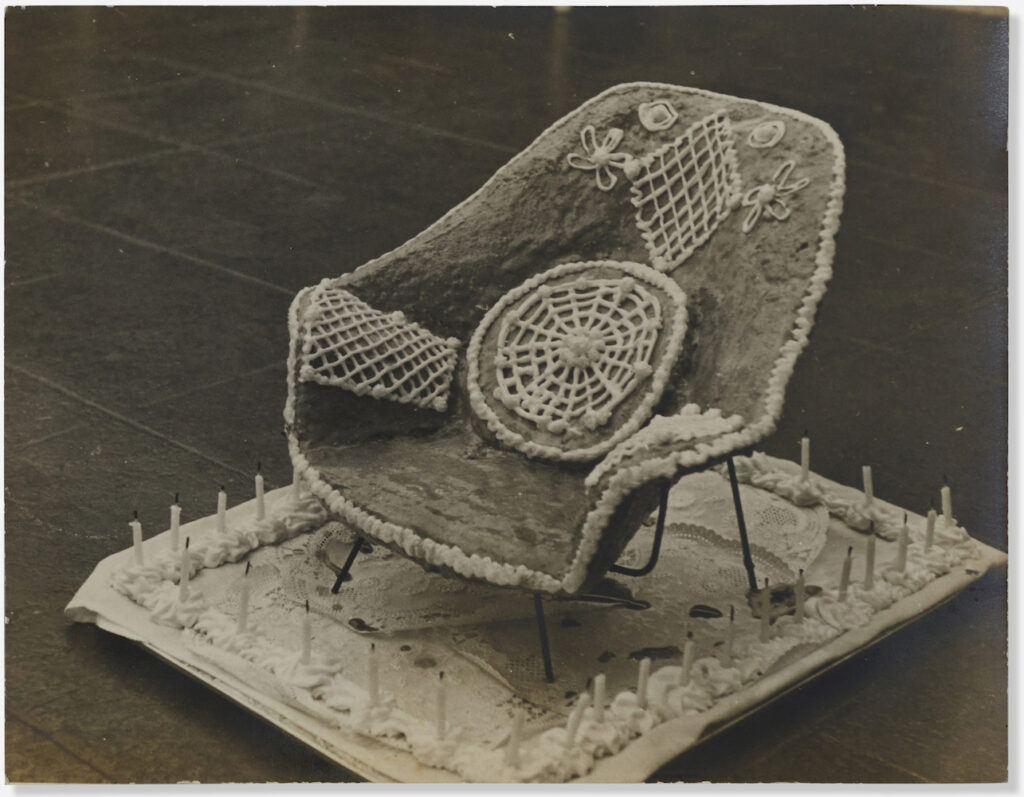
As a cake, it’s a bit of a mess, tbqh. But as a concept, it’s flawless.
This 1949 photo by Charles Eames of a Saarinen Womb Chair cake came from Lillian Saarinen’s estate. Did you know she was Edie Sedgwick’s cousin? Lillian’s mom was a Sedgwick. Though Lillian was almost 30 years older, so maybe they were second cousins or something. Edie was first cousins with Kyra Sedgwick’s father, in case you want to six degrees of Kevin Bacon the maker of this chair cake.
Which, do we assume Ray made the cake? It looks like a sheet cake has been draped over a Womb Chair frame. Judging from the size of the candles, the doilies, and the icing blobs, it looks like it’d fit on a cookie sheet. The frame looks legit, and out of wrought iron. Did Knoll have little centerpiece-sized Womb Chair samples lying around, or did the Eameses whip up a frame for the cake?
Either way, the point is, now I want a Womb Chair embroidered with these designs, with thick, ropy white stitches on that classic, rough, jute-like wool. You got this, etsy? Or am I gonna have to do it myself?
17 Nov 2022 Lot 106: Charles Eames photograph of Womb Chair Cake for Lillian Saarinen [lamodern]
Joan Didion Mail Art
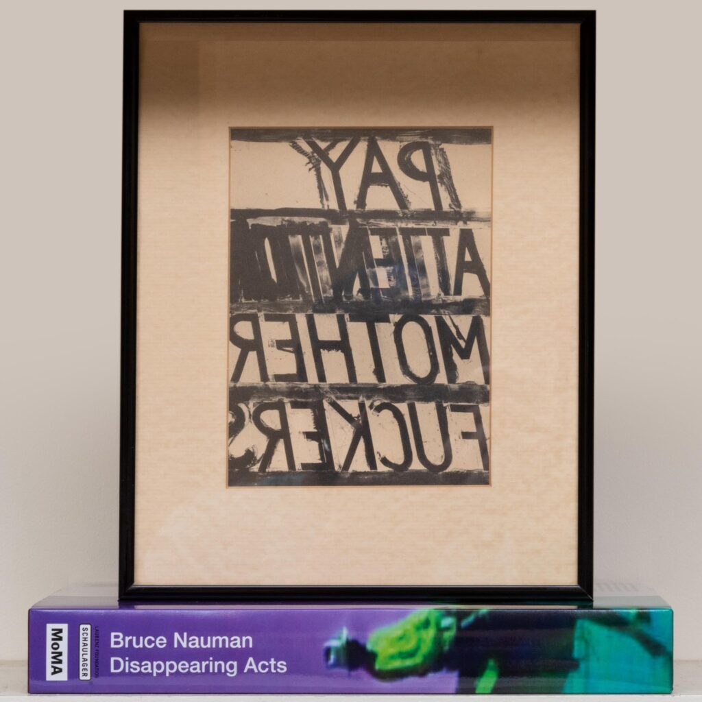
If she’d pinned it to the wall, or stuck it on the fridge, it would have been lost. The catalogue would have ended up in a stack, in another lot.
Fortunately, Joan Didion framed her invitation to the October 2018 opening of “Disappearing Acts,” Bruce Nauman’s retrospective at MoMA and MoMA PS1. Framing it made it worth something, or at least worth saving.
The auction house disposing of Didion’s estate describes this “offset reproduction” as a “print cut from a paper exhibition invitation.” Which means it has, in fact, been examined out of frame. I will guess she cut the flap off.
The lot includes the catalogue for the show, which first opened at the Schaulager in Basel, and was organized by Kathy Halbreich with Heidi Naef & Isabel Friedli, and with Magnus Schaefer and Taylor Walsh. [I did not want to reproduce the entire credit block any more than I wanted to only namecheck Halbreich, though of all the curators’ guest lists, I imagined that’s whose included Didion.]

The lot also includes a bookplate, which, if you’re the MF who pays more than attention on November 16th, you will be able to affix inside the catalogue, as you construct an authentic assemblage After Joan Didion, as depicted above. Buying makes it worth saving.
[UPDATE: $41,600.]
Lot 106: After Bruce Nauman, &c., &c., est. $200-300 [stairgalleries.com]
WilliWear Showroom by SITE, 1982-87
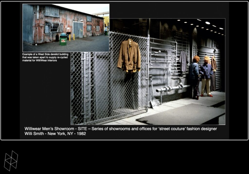
SITE founder James Wines spoke at Harvard GSD last night for the first–but hopefully not last–time in his 90 years. [It was great, and available online. s/o Alexandra Lange]
Though SITE is most frequently brought up in an architectural context for their BEST Products stores, a project that jumped out at me from Wines’ talk was the 38th Street showroom he and SITE partner Alison Sky created for WilliWear, the groundbreaking ’80s street fashion label of designer Willi Smith. SITE and Smith both had a love for found materials, salvage, junk, and the fabric of the city. Wines talked about how Smith took him on inspo trips to seedy gay clubs on the West Side, and then they’d jack construction material, hardware, plumbing, fencing, bricks, you name it, which ended up artfully installed in the showroom.
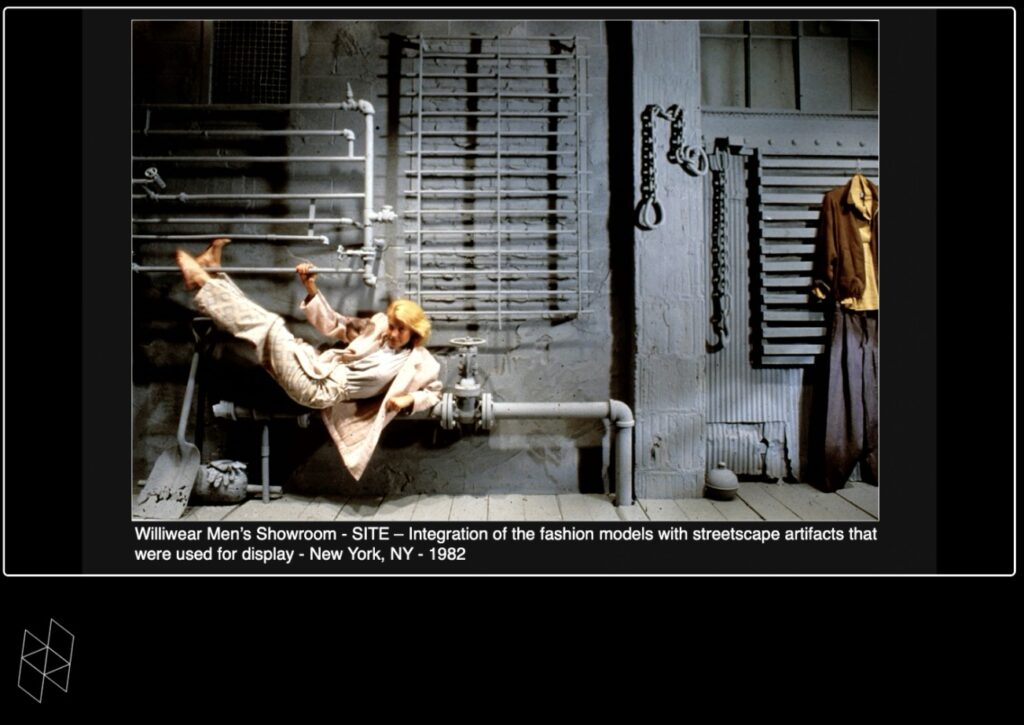
SITE’s simple genius was to #monochrome it all out, painting everything a highly aesthetic, and flattering backdrop grey. A runway rulebreaker, Smith used the showroom for fashion shows, too, which, Wines giddily announced, included much nudity.
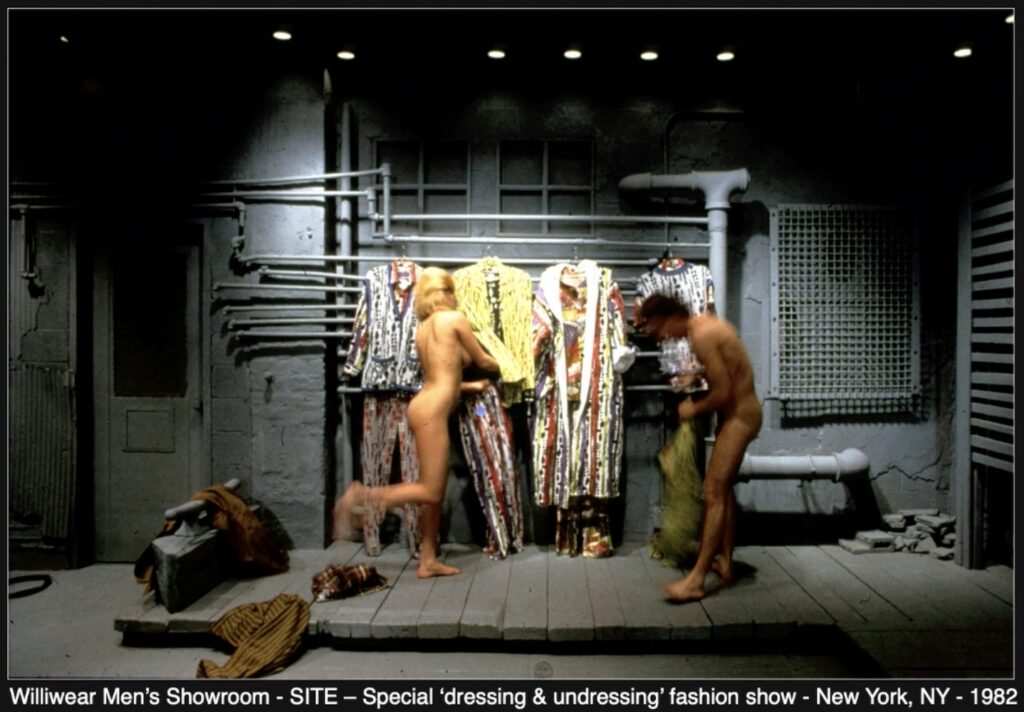
SITE has used the monochrome strategy in other contexts, to great effect; Wines mentioned how it helps make the public notice each other, and to look good to each other. He didn’t mention Warhol, though, or the Silver Factory, which had a similar effect almost twenty years earlier.
And he didn’t mention if a young Cady Noland worked as an intern at WilliWear, or as a fashion reporter cutting her chops covering these performance art-like shows. But this urban hardwarescape is definitely putting off a Nolandian vibe, which is something I’d not considered before.
Wise also didn’t mention SITE’s design for the Willi Smith retrospective at the Cooper Hewitt. Which, the much-anticipated show opened, haplessly, at the beginning of March 2020 and existed–I can’t say it was open or closed–until the end of 2021. I can’t find any photos; maybe no one saw it in person?
He did mention Rauschenberg as an American Arte Poverist and an inspiration, which Hilton Als had just mentioned, too, in his review of the JAM show at MoMA: “if there is a Black aesthetic it’s about making do, and using what little you have to express who you are.” JAM was Smith’s era, but it’s not clear if it was Smith’s jam; there don’t seem to be any mentions of JAM or Linda Goode Bryant in the Willi Smith Community Archive (yet).
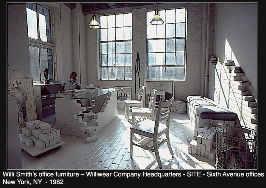
I did not see the Willi Smith desk turn up in Miami last year. Wines recreated the pile of scavenged bricks and glasstop desk from Smith’s office for Friedman Benda. It is/was available in an edition of 10, though I think he’d respect a bootleg. If you want to head out to a construction site tonight, I’ll bring the car around.
Margaret McCurry Lectureship in the Design Arts: James Wines [harvard.edu]
SITE site [sitenewyork]
Willi Smith: Street Couture [cooperhewitt.org]
No Title, Felix Gonzalez-Torres

Red Canoe 1987 Paris 1985 Harry the Dog 1983 Blue Lake 1987 Interferon 1989 Ross 1984
We’ve been here before. As a diptych stack by the artist once endlessly put it, “Somewhere better than this place/ Nowhere better than this place”.
Doyle is offering a work by Felix Gonzalez-Torres that threads every conceptual needle. It is an edition. From an endlessly replenished stack. It’s in the catalogue raisonée, but not as a work.
Continue reading “No Title, Felix Gonzalez-Torres”An Artist’s Maze Is His Castle

Tony Smith created The Maze for Schemata 7, a 1967 exhibition at Finch College Museum, which was located in a series of townhouses on East 78th Street between Madison & Park. The premise of the show was what we’d consider site-specific or installation art. Smith’s schematic, as seen above, showed four rectangular sculptural elements of black plywood (or metal, if you had budget) whose dimensions related both to each other and their spacing, and to the space housing the sculpture.

That didn’t last long. Also in 1967, Smith contributed a cardboard maquette of The Maze, plus permission to build it, to Brian O’Doherty’s double issue of Aspen Magazine. When Matthew Marks realized it in black steel in LA in 2013, Maze (or Maze, (no The)) was floating free, like a Dashcon ball pit, in a cavernous concrete gallery space. Which troubled me for a hot minute before I proposed turning The Maze into the art world’s awesomest wardrobe, bar, workspace furniture collection.
I needn’t have been so concerned. While rummaging around the Menil Collection’s site last night, I found a drawing, dated 1962-65, for a very similar-looking Tony Smith sculpture called The Castle. Similar/identical in one sense–that they’re both four forms installed in the same format–but of course, different in every other sense, of the dimensions, the interrelationships, the voids, and the spatial experience. And with the caveat, of course, that some of those things persist in realizations of (The) Maze, and some don’t.
It seems like The Castle was never realized, or even developed to the state where it was considered an unrealized sculpture. Except for the inspiration it probably provided to the artist when he was formulating The Maze.
The Castle [menil.org]
Previously, related: The Maze (1967/XXXX), Tony Smith
The Maze Collection
Untitled (Boxwood Maze), 1967/2017
Walter De Maria, Small Landscape

The opening at the Menil of an exhibition of Walter de Maria is notable partly because it’s the first US museum retrospective of the artist’s work, but also it is drawn entirely from the Menil’s own extensive collection. There is a veritable landscape of work, and all the attention’s been focused on a couple of square kilometers’ worth.
Here is a small square of the landscape that caught my eye. Actually, a small cube of a landscape, a stainless steel sculpture and drawing combo called Small Landscape. It’s from 1963-65, and the Menil only acquired it a couple of years ago. The images of it are rather inscrutable, as is the official description.

Fortunately, Prof. Anna Lovatt discussed the work a few months ago in her Research Fellow Lecture at the Menil Drawing Institute. She prefaced it with some drawings de Maria made of TV set-like boxes with beams or rays emanating from them, which casts a certain glow on Small Landscape‘s form. It is a cubic 13-inch box of polished stainless steel, lined with black velvet, which holds eight 8.5 x 11-inch drawings in steel frames. SMALL LANDSCAPE is engraved on the sliding lid/face.
The drawings are extremely difficult to see, even in person, Dr. Lovatt explains; there is a single faint word written at the center of each sheet:
TREE
MOUNTAIN
CLOUD
SUN
RIVER
SKY
FIELD
GLASS
Together they form a landscape. I had to listen several times because I originally assumed she said GRASS. Glass’s role in a landscape is to shape and mediate it. A landscape is formed by being seen, whether through a window, or through the contemplation of a list of its constituent elements. Or through a screen, which resonates with Dr. Lovatt’s larger discussion of the relationship of drawing and television.
But Small Landscape obviously also relates to other bodies of de Maria’s work from the early 60s. It was a moment when de Maria was making sculptures of polished stainless steel with the financial backing of Robert Scull. In 1965 he made Scull a mirror of silvered steel in a velvet frame and drapery titled, Silver Portrait of Dorian Gray, which the collector was permitted to polish back to perfection whenever he decided the natural oxidation had gotten too dark.

The hard to read text on paper also calls to mind another de Maria landscape series, [City name] Eats Shit [above], which was replicated almost immediately by Sturtevant as [City name] is Shit, which she showed at the Reese Palley Gallery in October 1971.
What sticks out from all this is how a decent number of people in the New York and European art worlds knew what de Maria was working on; it’s only now, when his other work has been crowded out of mind by his land art, that we need a refresher. Fortunately, Gagosian has just released a 476-page monograph to finally share de Maria’s complete history with the public. It sells for $200.
Supremely Funny
A couple of weeks ago the folks at ARTnews asked me to cover the hearing at the Supreme Court of the first major fair use case to reach that corrupted body in almost 30 years. The Warhol Foundation–which, as the sidebar notes, had once, in collaboration with Creative Time, given me an Art Writers Grant–had pre-emptively sued for fair use of a photo of Prince taken by Lynn Goldsmith.
Somewhat surprisingly, at least to the Warhol folks, Goldsmith won on appeal, and the case now could threaten the entire Warholian project. [Though frankly, since he actually sewed up the rights to the images he screenprinted after the Flowers settlement, Warhol’s project is probably pretty safe, it’s actually the entirety of the pre-existing content re-using creative world that’s at risk.]
The article is there, go read it, I was psyched and fascinated to go, even if this country hasn’t seen a Supreme Court this problematic since Dred Scott. [And it only got worse since the Warhol Foundation started its lawsuit.]
But the point is, I was there, in person, in the press box, sitting behind Nina Totenberg, when Clarence Thomas made a hypothetical about being a Prince fan in the 80s, which caused laughter to break the enforced silence of the gallery. And I was there when his seatmate, Justice Sotomayor, asked, “but no longer?” which brought more laughter. To which Thomas replied, after a beat, “Only on Thursday nights.” Which brought even more laughter. This is, I was informed by reporters on the SCOTUS beat, very much NOT how things normally go.
So this LLOL anecdote led the breaking news coverage of the hearing. It was the first excerpt published by C-SPAN when they uploaded the archived audio feed. And it was the opening anecdote of the in-depth analysis that just dropped in the New York Review of Books. Except the role of Thomas’s straight man was credited to Justice Elena Kagan. At first I thought this was the NYRB’s error, but the official preliminary transcript of the hearing says the same thing:
JUSTICE THOMAS: The — let’s say that I’m both a Prince fan, which I was in the ’80s, and —
(Laughter.)
JUSTICE KAGAN: No longer? (Laughter.)
JUSTICE THOMAS: Well — (Laughter.)
JUSTICE THOMAS: — so only onThursday night. (Laughter.)
Warhol v. Goldsmith, 21-869, p.42
What to do? I have emailed the Supreme Court with this correction, but it is unexpectedly unsettling. I was 100% certain of my experience in that room, but I have begun to doubt myself. Sotomayor’s head was turned away from me towards Thomas, seated on her left, when she made the comment. Which she did, right? They had the interaction amidst the shocked laughter, not Kagan calling out from five seats away?
I did not include this portion of the questioning in my report, though I did reference the substance of Thomas’s rather bombastic challenge to the Warhol Foundation’s lawyer. Thomas is credibly accused of sexual harassment by multiple former co-workers, though only one was called to testify in his confirmation hearing. In a moment of journalistic folly, I actually emailed her to ask if she had any recollection of Thomas being a Prince fan, since her years working alongside Thomas at his government job coincided almost exactly with the release of 1999, and she had left before Purple Rain. I emailed a few minutes later apologizing and telling her to ignore my request.
Anyway, also, Thomas’s wife is documented as a leading organizer of a coordinated attempt to overturn a fair election and seize control of the government, and he is actively ruling on this crisis in which he is fully implicated to both further it and to shield her from any consequence. And he is facilitating an entire cascade of ideologically driven extremist rulings by an illegitimately seated court majority. He’s a clear and present danger to the republic who I did not feel inclined to normalize by highlighting his standup routine.
And here I sit, trying to correct the record of one of the least consequential moments of the hearing, and the Court. Except that it is also perfectly illustrative of the unaccountable comfort and ease Thomas feels as he goes about his business of seizing power.
Ray Eames Splint Sculpture

No, there is another. Eleven years ago, I wrote about reconsidering the Eames Studio, and especially Ray Eames, as artists.
Continue reading “Ray Eames Splint Sculpture”Just Dropped: Édouard Manet Facsimile Objects (M2) & (M3)

The time-limited edition is now. Wouldn’t it be ironic if you couldn’t see Manet’s “Minnay” in Paris last year because of COVID, and you don’t get to see Manet’s “Bob” and “Donki” (sic) in New York this year because you went straight to London from Paris? Is that how irony works?
Anyway, the Getty Manets go on view at Christie’s this morning. The Getty Manet Facsimile Object Diptych goes on order now. They are priced at 0.1% of the combined estimated reserve price of the Getty’s Manets. After/if “Bob” sells on the 20th, ÉMFO (M3) “Souki” will remain available until “Donki” (sic) sells on the 21st. [If you’re a connoisseurial cabal planning to break up a set from the get-go, I’ll let History judge you, but do let me know, since otherwise, they will come in a custom, diptych portfolio.]
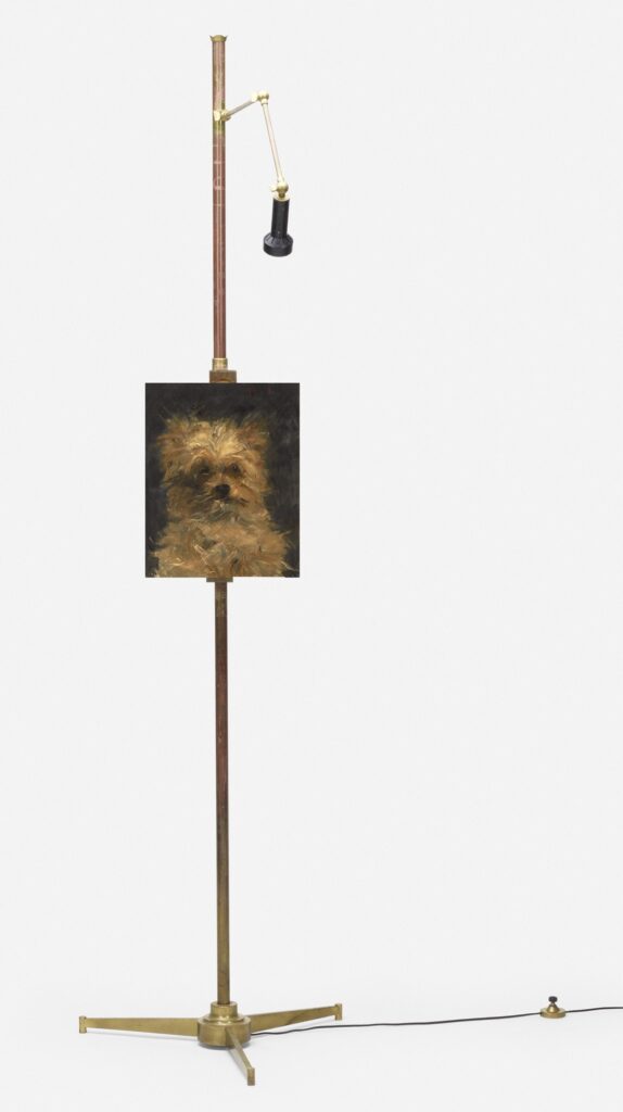
People display their Facsimile Objects in many ways. Some hang them straight on the wall. Some on a little shelf. Or a little easel. Some frame them. An option I’ve never seen but suddenly want is to install them on Angelo Lelii’s elegant bronze Arredoluce easel floor lamps. There’s one (attr.) at Wright20 right now for $5-7,000, with no reserve and a $100 opening bid, which is enticing. Facsimile Object collectors will need to acquire them separately, but if you are the Manet(s) buyer seeking to trade, I will gladly include Italian mid-century bronze easel floor lamps along with your reserved Facsimile Objects. We can make this happen.
[10/20 UPDATE: OK, wow, the Manet painting of Bob the Dog just sold for $1.38 million, more than double the high estimate. If you want to buy the Manet Facsimile Object (M2) “Bob,” by itself or as part of the original diptych, go for it. It’s still 0.1% of the price of the painting. Both Manet Facsimile Objects will remain available, together or separately, until Manet’s “Donki” sells Friday morning. And now le chien “Donki” (sic) has sold for $378,000, almost a million dollars less than “Bob”. What a world. Thanks again to the savvy collectors who are putting their Facsimile Objects to work, and saving 99.9% in the process.]
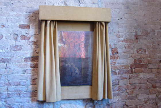
Flashback: Apocalyptic Credit Suisse Dürer Diptych
No reason, but I woke up thinking about The Credit Suisse Dürer Diptych, a surprising pairing of two paintings which have ominous visions in the heavens and apocalyptic destruction raining down from the sky, beautifully painted on their reverse sides. Last year, in the midst of the Omicron surge, the National Gallery in London brought these two paintings together for a Dürer show sponsored by Credit Suisse.

I was reluctant to make Facsimile Objects of these paintings, but felt compelled by the concepts I’d constructed for myself and the project. It wasn’t my fault the world–or at least the museum–didn’t close to limit the spread of the pandemic.
And I don’t know when exactly, but very early on I decided not to show or promote the Certificates of Authenticity I was including. Actually, at first, it was because they didn’t yet exist when I was promoting the first FO, and I did not know how they’d turn out, or even what they’d be. Soon, though, I saw them, not just as part of the concept of a Facsmile Object, but part of the experience of owning it. Not secret, necessarily, but private, individual, and distinct from encountering the project online, where a jpg’s a picture. Some folks have since posted pics of their COAs online, or processed them with their registrars, and that is fantastic, the choice is theirs.
Anyway, for the Credit Suisse iteration, I also wanted to make the Objects distinct from the earlier versions, too. After some exploration and experimentation, I arrived at adding the Credit Suisse logo, a stylized set of sails, to the Certificate.
Looking at my janky rendition of 15th century German calligraphy reminded me that I used to know Richard Jenrette, one of the founders of the investment bank Donaldson, Lufkin, Jenrette. He’d attended the same high school as me in Raleigh, and returned to make a large donation, and I heard he collected houses. I filed that data away and decided to become an investment banker someday, whatever that was. Later on, as I was preparing to go to business school, I was introduced to him at, of all places, Christie’s. We’d cross paths occasionally at galas, art fairs, the Winter Antique Show, etc., and when he gave me a copy of his memoir, I sent him a thank you note. In the last chapter of his book about his amazing career innovating analytical models and methods to the financial industry, he also said he was very into handwriting analysis. I never saw or heard from him again after that, and I sometimes wondered if I’d been blackballed for some psychological flaw revealed in my handwritten note.
Jenrette had already retired, but in 2000 DLJ was acquired and absorbed by Credit Suisse First Boston. The brand lives on in a couple of private equity divisions, but it’s really not the same. Anyway, smooth sailing, Credit Suisse!
LIVE(D): Édouard Manet Facsimile Objects (M2) & (M3)

In times like these I turn to mangling words of Samuel Beckett. “Édouard tried. Édouard failed. No Manet. Try again. Fail again. Fail better.”
[10/20 10/21 UPDATE: AND THE TIME TO FAIL AGAIN IS NOW. The link to purchase Manet Facsimile Objects (M2) & (M3) is was below.]
Presumably Destroyed Cy Twombly Safety Curtain
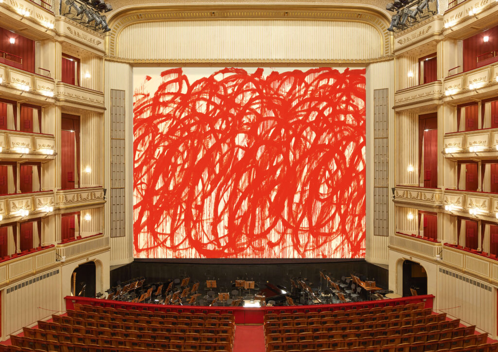
I saw this gigantic Cy Twombly painting on the landmarked firewall of the Vienna State Opera, called the Iron Curtain, and was like, that is totally fake. It is a rendering. And it was.
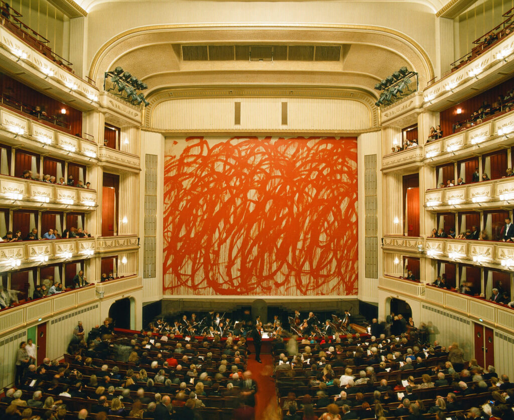
This is what the Twombly fire wall looked like installed in 2010-11. So pretty close, except for the color of the canvas and the paint. Except this 176 square meter image was inkjet printed on PVC mesh, like a billboard. The picture is of an untitled 2005 painting from the Bacchus series. Twombly painted these dripping red loop paintings with giant brushes on sticks, like if Cold Mountain-era Brice Marden just got back from the Iraq War. Everyone wants the Bacchus paintings to be about the Iraq War.
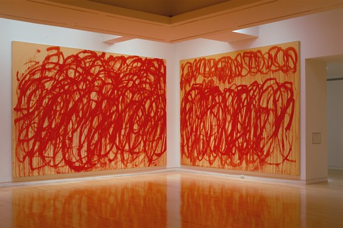
The original is 10×16 feet or so. Here it is installed at Gagosian in 2005. They really cropped that right down. In 2008, between this show and the Vienna State Opera commission, Twombly showed a couple of a third batch of Bacchus paintings at Tate Modern. After his death, the Foundation ended up donating three of them, plus some sculptures, enough to fill a permanent room, which feels astute.
The Safety Curtain Project has been selecting contemporary artists for the Vienna State Opera fire wall since 1998. It is run by Daniel Birnbaum and Hans-Ulrich Obrist, the only two curators in Europe. Oh wait, there’s a third now. Bice Curiger has joined the group chat. I love them all like brothers, sisters, and/or non-binary siblings, but seriously, enough.
Previously, related: Destroyed Cy Twombly Backdrop
Show Me The Manets

Lot. Number. One.
This is just a placeholder post because I really am deep in something else at the moment, but Tête du chien “Bob”, one of Manet’s awesomest dog portraits (it really is a small set of a very small list), will be sold next month at Christie’s. For forty years, it belonged to Ann & Gordon Getty, who loaned it just once? Really?? To the Getty. For the 2019 exhibition, Manet and Modern Beauty.
And now it will be sold.
“Bob” will be on view at Christie’s in New York for at most six days, October 15-20, and is the first lot in the first Getty sale the evening of the 20th. The estimate is $400-600,000, so in line with the result for Minnay last year.
There is drama, though it is resolved drama, around the provenance of “Bob”; the Getty Estate has made an agreement with the heirs of an earlier owner, Estella Katzenellenbogen, of Berlin and Santa Monica, who owned the painting at least until 1945, though she made it to the US by 1940. Whether the painting was left behind in Europe and then turned up at Carroll Carstairs Gallery in New York in 1947, or was the subject of some kind of ownership or consignment dispute before passing through Carstairs’ hands is not clear, but either way, the Katzenellenbogens are now cool with it.
Wait, there’s another?? “A second portrait of a dog by Manet, Le chien “Donki,” also owned by Ann and Gordon Getty, is being offered in the Old Masters, 19th and 20th Century Paintings Day Sale on October 21st.”

The next day! Le chien “Donki”, along with “Bob” and Minnay, are the three best Manet dogs. Granted, there are only eight, and this is not a hot or studied genre, like his late bouquet paintings, but maybe it should be. “Donki” has not been exhibited in almost 80 years.
[I do still think that says “Souki”, not “Donki,” but I accept that actual French people in the early 20th century read that as a “D”. I will also note that they read that as a “u”, not an “n”, and called him “Douki.” If I buy this painting, I will call it “Souki.”]
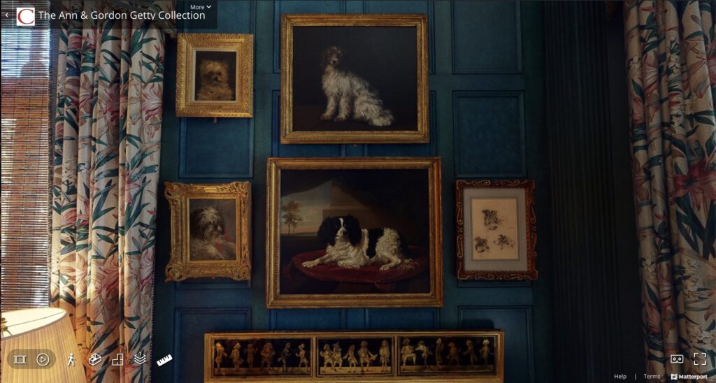
Frankly, I’ll be lucky to see them IRL. Preview times are the same, so for up to six days before the sales, both paintings should be on view in New York. It’s also possible they’ll be included on a Getty highlights tour to Shanghai, London, and Los Angeles. In the mean time, here is a pic of what they looked like in situ, from the incredible virtual tour of the Gettys’ maxed out San Francisco house:
We know that, at less than 13×10 in. for “Donki”, and like 10.75 x 8.25 in. for “Bob”, these are the perfect Manets to flee the Nazis with, should the need ever arise again.
The Ann & Gordon Getty Collection, 10 sales, 1,385 lots [Christies.com]
Previously, very much related: Manet Paints Dog
Édouard Manet Facsimile Object
Godard Street View
I am kind of deep in an assignment, and so cannot really give the space right now to process the news of Jean-Luc Godard’s death and the impact of his work.
But as an absolute fan of Agnes Varda who has not seen Faces Places because I detest JR’s work, Manohla Dargis’s interpretation here of Godard’s refusal to even come to the door makes sense to me.
The beautiful, melancholic and now portentous video by Robert Luxemburg of Godard and Anne-Marie Miéville captured on Google Street View in 2013, set to music from Le Mepris, is the kind of cinematic world we all inhabit now. Of course, he is in it forever.