Dear Sir:
I’ve always supposed that artists were allowed to paint however-whatever they pleased and to do whatever they please with their work–to or not to give, sell, lend, allow reproduction, rework, destroy, repair, or exhibit it…
He is direct about his work, an area of his life which he jealously guards. Once, at a dinner, a wealthy collector who owned several important Johns paintings announced over coffee that he had an idea for a print that Johns should do. He said that Johns should make a print, in color, of an American map. The collector argued his case cogently. He pointed out that Johns had done other prints in color based on paintings from that period; he alluded to the significance of such a print to the whole body of Johns’ work; he mentioned the opportunities for the sort of image transformation which Johns’ other color prints had explored; and he pointed out the peculiar arbitrariness that had led Johns do to map prints several times in black-and-white, but never in color.
A hush fell over the table. There was a good deal of tension. On the one hand, one doesn’t tell an artist what to do, but on the other hand, the suggestion was not uninformed, and it did not come from a source the artist could casually alienate.
Johns listened patiently. “Well,” he said finally, “that’s all very well, but I”m not going to do it.”
“Why not?” asked the collector, a little offended.
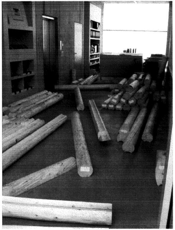
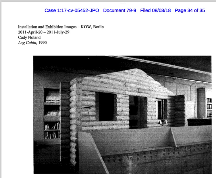
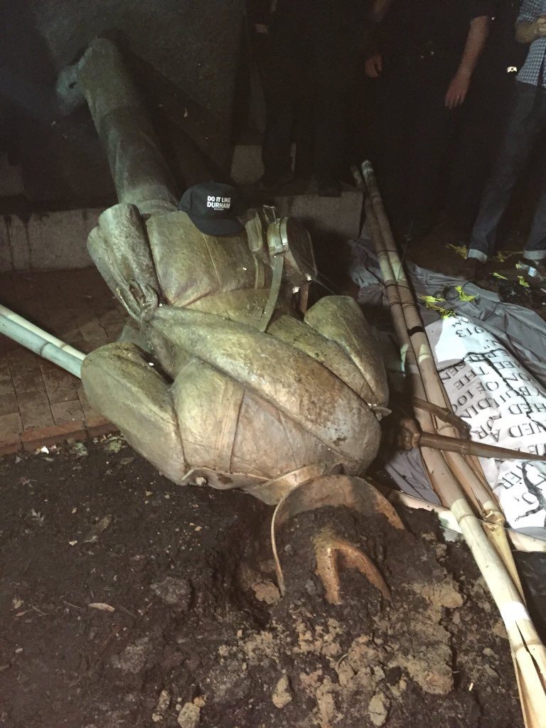
Not A Noland: new Log Cabin under construction, KOW Gallery, Berlin, Apr 2011
This is the first view of the log cabin formerly known as Log Cabin [actually, we learn, it was called Log Cabin Facade], a 1990 sculpture by Cady Noland, which the collector, Wilhelm Schürmann, left out in the mud for ten years, where it rotted, and then he had the whole thing refabricated without the artist’s consent or consultation, and then he flipped it, and the new buyer factchecked it, and found out the artist was very much not into it, and so he returned it, and had to sue for a refund, but got it. And during that whole process, no images of the remade sculpture [sic] ever surfaced.
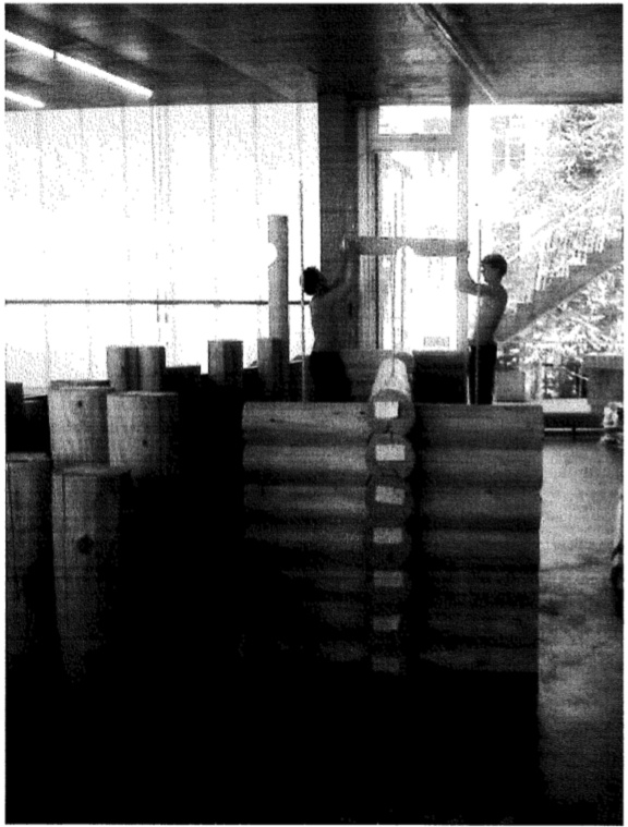
How hot is it in Berlin in April? Performative homesteading by art handlers installing a pseudo Log Cabin at KOW
But since then, Noland herself has filed suit claiming copyright infringement in both the US and Germany, and a violation of her moral rights under VARA, by the collector and dealers involved in destroying the original, and making and publishing and selling an unauthorized replica. And that lawsuit is where these images come from, from an exhibit in Noland’s attorney’s most recent memorandum [filing no. 79] arguing for the continuation of the case and against the defendants’ motion to dismiss it.
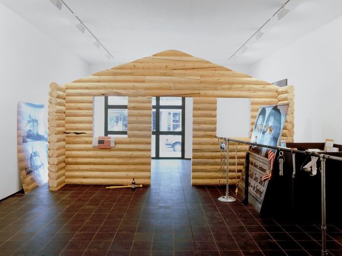
The finished infringement: the replaced Log Cabin
I’m reminded of this today because KOW, the gallery in Berlin where Log Cabin [sic] was unveiled in 2011, has a sleek, new website, with extensive documentation of the show–except for one, giant, contested thing.
The memo in the court case includes some other notable information, not least of which is a five-page affidavit by none other than Cady Noland herself. A sworn artist statement, if you will. It should go in the canon, so I have uploaded it here [pdf].
Noland talks of conceiving, designing, and realizing the artwork, Log Cabin Facade, in New York City “in or around 1990,” and traveling to Germany “to examine and approve the Work” as installed at Max Hetzler gallery. She “was not aware of the sale to Defendant, Wilhelm Schürmann, until August 1991,” she affirmed.
“Sometime around the mid-1990s…Schürmann sought permission to display the work outdoors…I agreed…At the same time Schürmann agreed with me the Work should be stained a dark color for ‘aesthetic reasons.'”
“At my request Schürmann had the work stained a dark shade of brown, I color I specifically selected and mandated. The stain [was]…basically a pigment, not a wood preservative,” the artist attests.
Log Cabin, aka Log Cabin Facade, aka a new derivative work, a Dark Shade of Brown version of Log Cabin Facade, now (also) destroyed
Noland continues to explain her expectations about Schürmann’s care for the work, which is the basis for her position about its damage, his its purported conservation, and refabrication. But these particular issues of timing and staining are important in new ways. They appear to this non-lawyer to be crucial to Noland’s invocation of VARA rights, which only apply to work made on or after the date the 1990 law went into effect, or which was made before the law went into effect, but which was only sold afterward. That date is June 1, 1991.
“Oh, the timeline sounds complicated and possibly contestable!” you say. It is not. Or rather, it is not important, because Log Cabin Facade is not Log Cabin Facade, but Log Cabin Facade (2). In the memo, Noland’s attorney explains that, “When the original natural wood color of Log Cabin was stained dark, Noland created a derivative version of the work,” which is “fully protected under [VARA].”
So Schürmann bought Log Cabin, which became Log Cabin Dark Shade Of Brown For Aesthetic Reasons, which he left outside to rot, and then threw into the wood chipper after replacing it with a brand new log cabin facade made in the (unpigmented) style of the original Log Cabin, which copyright and VARA he and his dealer friends viol–no, it was the original work’s copyright but the derivative work’s VARA. (Doesn’t the derivative get its own copyright?) What happened to Log Cabin [below] when Noland had it stained into Log Cabin DSOBFAR? Was it destroyed? Are we now bereft of twoLog Cabins, with only the current log cabin, which is either a “refabrication,” a “reproduction,” or “a copy [that] was not authorized by Noland,” aka, “a forgery,” to remind us of our loss(es, which we didn’t know we’d lost until now?)
putting the OG in Log Cabin since in or around 1990: Log Cabin Facade installed at Max Hetzler in 1990
But no, this is not about you or me, but about the artist, whose work suffered neglect and destruction at the hands of those entrusted with its care, and whose wishes and intentions no one seemed interested in finding out until someone’s $1.4 million was on the line. The artist who now has “a gap in her artistic legacy” because “the original Work is no longer a part of [her] artistic body of work.” To which I would add, sadly, neither is the derivative.
And while there are many possible artistic strategies for authorizing, reauthorizing, declaring, or reconceiving the Work and preserving or increasing the Value in ways that many people, with much experience and insight, would be all to happy to elaborate upon, the simple fact remains that it the artist’s call, not theirs.
“I said the provenance for the sculpture must now include the name of the conservator because the work was not mine alone,” said the artist in her affidavit. Also, “I feel very strongly that the unauthorized copy of Log Cabin robs my Work of a quarter century of history and denigrates my honor and reputation. The Log Cabin that I created does not exist.”
Noland is actively pursuing a lawsuit that makes an affirmative argument about her work and her artistic decisions that confronts cultural, market, and legal presumptions of what art is and what an artist does. And here at the end of this post, I’m deciding maybe it’s more interesting to consider the implications of Noland’s actions as they stand rather than to game out scenarios for her like an armchair lawyer–or an armchair artist.
Good Machine producer turned Amazon Studios producer Ted Hope gave a boost to a classic post on his blog about no-budget filmmaking, and it’s worth a boost here, too. He developed the tips list with his GM partner James Schamus, and it holds up.
8. Write for a very limited audience – your closest friends. Do not try to please anyone – crowd pleasing costs.
I recently listened to my first director’s commentary in a long time, and was struck by the director’s awareness of giving advice to filmmakers, as distinct from just telling production stories or even discussing craft. But it oddly felt like the kind of conscious narrowcasting Hope mentioned.
13. Make the most of a day’s work. It’s easier to get a commitment for one day than it is for a week. Exploit people’s willingness to give a day.
I get the point, but I’ve grown wary of that word, exploit. If you’re bartering your time and project for theirs, fine, but it just feels important to respect people’s labor, not just their time.
Anyway, I’ve been thinking of filmmaking more lately for a variety of reasons, and this is a good thing to read.
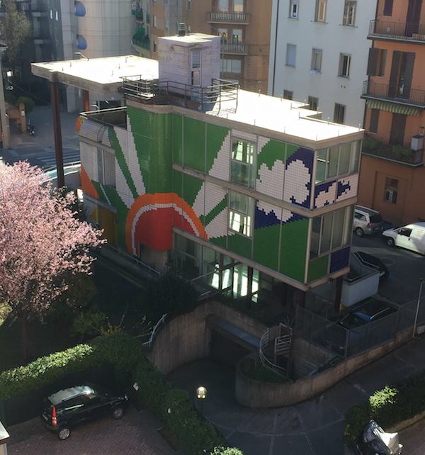
The information on it is maddeningly slight. It is apparently from the 70s, and by the architecture professor Lorenzo Cremonini. It has three levels above ground, plus at least a garage below. It is 200 m^2, around a 60/90/50 split, and from the outside, it feels too proscribed to be anything other than a house.
the rear facade, with its own giant sunset? sunrise? image via gmap, obv
It is apparently privately owned, so though it has been a library in recent years, then a daycare center/preschool, it was not a public building. While it was for sale for many years, it was empty when protestors briefly occupied it in March 2016. As of this past spring, it apparently houses a co-working space called Voxel.
Besides its simple, cantilevered concrete slab construction, its most distinguishing feature is obviously its supergraphic tile skin, which is fantastic at every angle. VERY of the period, yet somehow intact. That gigantic concrete canopy feels slightly too big. (Oh, but maybe not from the back, as in the photo above!) The curved section that forms the terrace railing sometimes feels like it should have been straight. Or does tile make it work? So it’s not perfect, it’s awesome.
Except for some boring presentation clips on Voxel’s facebook page, the only interior shot I have found so far is maybe this video of riot police raiding the place? Or nah, doesn’t that seem like an other library, plus the date’s wrong. Still low-key amazing how throwback the Bologna riot police are.
From the unhelpful articles I’ve found, it does seem to be “known” as the Palazzina, but I just can’t say for sure. The absence of almost any info about the building, or Cremonini, is shocking, not the kind of thing I’d come to expect in these internet days. I feel like his 1992 book, Colore e Architettura, might have more information, but it is in Italian, and in Italy. So it will have to wait a little longer.
Naval works by Michael Jenkins, 1988-89, image: Ogletree
I’ve been low-key fascinated with people in the art world who stopped making art, particularly dealers like Gavin Brown, who didn’t really get much traction with his art practice, and Michael Jenkins, who did.
It’s on my mind at the moment because three early works by Jenkins are coming up for auction (again). They turn out to be some of the Navy-related works Jenkins discussed with Bill Arning in the 1992 Bomb Magazine article that is the primary critical text for his work (or the top Google result, half dozen of one…)
Like contemporary and collaborator Felix Gonzalez-Torres, Jenkins created minimalist- and conceptualist-inflected works imbued with emotional and psychological power. During the escalating AIDS crisis the works referenced gay love and loss, fraught youth and unabashed romance, and quarantine, disease, and death. I’ve only ever seen a couple of his pieces in person, but they really do feel like fellow travelers with Felix’s work, at least for a time.
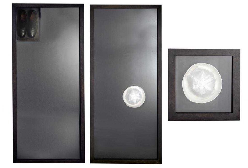
Anyway, That Sinking Feeling I (1988) and II (1989) are basically human-scale (5′ 8.5″ feels specific) shadowboxes with a sailor hat and shoes on wool blanket material. A third, related work, Gob Box (1989), is a hat centered in a square shadowbox. Seen from their tops, the circular hats really do show off what Jenkins calls their “graphic nature.” The shoes, meanwhile, feel more totemic; the absence they reference is more pronounced.
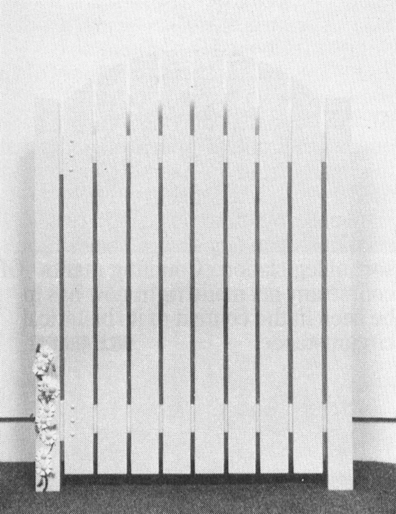
Michael Jenkins, Rounded Top Gate, 1991, ganked from bombmagazine
Jenkins and Arning talk a lot about this symbolism, the erotic image, even the caricature of the sailor, as well as the real sorrow of separation. I’m not sure it holds up, frankly; the conversation feels sort of slight, in retrospect. But that could literally just be me. Or Jenkins. There’s a subjectivity at play, evocations of specific memories or associations, in a specific time and context. Arning credits Jenkins’ emergence in the 80s with helping “point a way out of the dismal cycle of self-referential criticality and ironic distance then in place.” And if we’ve come a long way, baby, it’s still worth remembering how we got here, and where we were.
After not selling a few months ago in Atlanta, Jenkins’ three works are estimated now at $1,500-3,000. Bring a truck.
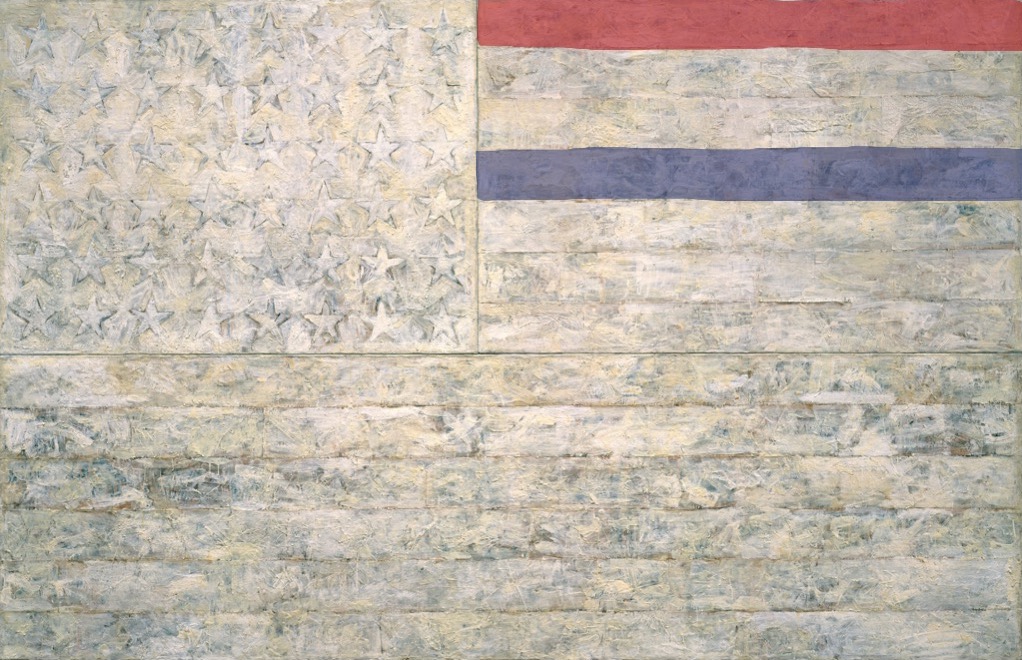
White Flag, 2018, Encaustic, oil, newsprint, and charcoal on canvas, 78 5/16 x 120 3/4 in. (198.9 x 306.7 cm)
“One night I could not have dreamed that I painted a large American flag, but the next morning I got up and I went out and bought the materials to begin it.” Those materials included three canvases that the artist mounted on plywood, strips of newspaper, and encaustic paint—a mixture of pigment and molten wax that has formed a surface of lumps and smears. The newspaper scraps visible beneath the stripes and forty-eight stars lend this icon historical specificity. The American flag is something “the mind already knows,” but its execution complicates the representation and invites close inspection.
By draining most of the color from the flag but leaving subtle gradations in tone, the artist shifts our attention from the familiarity of the image to the way in which it is made. “White Flag” is painted on three separate panels: the stars, the seven upper stripes to the right of the stars, and the longer stripes below. The artist worked on each panel separately.
White Flag, 2018, I: Encaustic, oil, newsprint, and charcoal on canvas, 41 3/4 x 64 3/8 in. (106.1 x 163.6 cm). II: Encaustic, oil, and collage on fabric mounted on plywood, 22 1/2 x 32 1/2 in. (57.2 x 82.6 cm)
After applying a ground of unbleached beeswax, the artist built up the stars, the negative areas around them, and the stripes with applications of collage — cut or torn pieces of newsprint, other papers, and bits of fabric. The artist dipped these into molten beeswax and adhered them to the surface. The artist then joined the three panels and overpainted them with more beeswax mixed with pigments, adding touches of white oil.
cf. Study for White Flag, 2018, Crayola washable marker on coloring page, 8 1/2 x 11 in. (21.6 x 28 cm)
“Found painting, FOUND courage” images: @videodante
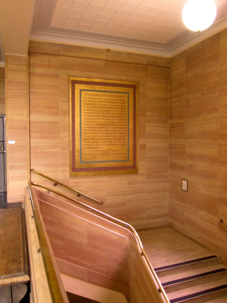
The stairwell in the entrance to the University of Oregon library contains a large mural, Mission of a University, painted in 1937 by art professor Nowland Brittin Zane, of a quote by another faculty member, Frederick George Young. A social science professor and dean in the 1920s, Young saw the divine mission of a university aligned with the founding principle of Oregon itself: to elevate and preserve the white race.
Installation view of Nowland Zane’s mural, Mission of a University, 1937, in U. Oregon’s Knight Library, before intervention, image: uoregon.edu
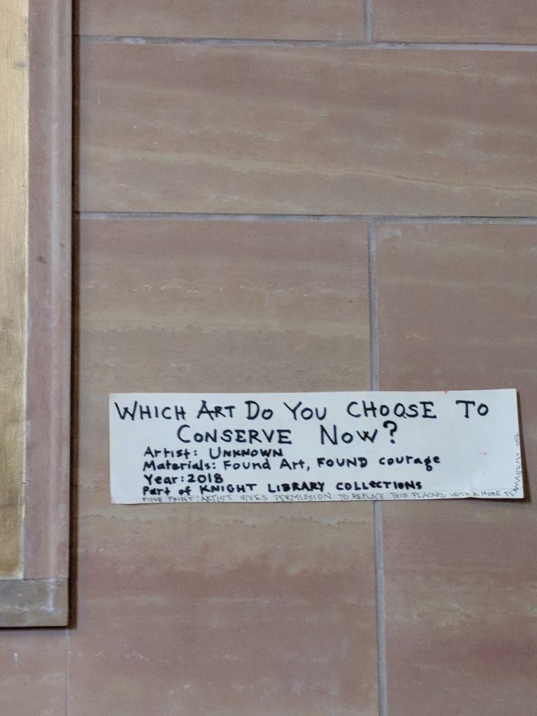
Last night @videodante tweeted out photos he’d received of a fresh painting intervention on Zane’s mural: a slash of red paint crossing out “racial heritage.” As interesting, though, is the handwritten label for the new work, left on the wall [below].
“Which art do you choose to conserve now?” via @videodante
The materials, “Found Art, FOUND courage” are almost as awesome as the title, “WHICH ART DO YOU CHOOSE TO CONSERVE NOW?” Is it the title, or an epic challenge to the institution’s perennial decision of which facts, which history, which brushstroke, and whose heritage are their actions perpetuating? This quote has been recognized as racist and offensive–and has been the subject of critical and activist efforts to remove it–for years. There are at least three spots in the bottom corner of Zane’s painting where conservators chose to erase someone’s addition. So this is one more choice to be made in an ongoing dispute, and the artist knows what is at stake.
The author of this new work, though, offers another solution in a “fine print” addendum, apparently added on the spot, as the text curls up the side of the label. If the library is troubled by impending conservatorial complicity in reasserting white supremacism, the “artist gives permission to replace this placard with a more permanent one.”
Since the beginning of the Black Lives Matter movement, and the increased protests of confederate memorial statues, I’ve come to see painting as crucial, even central. After decades of inertia, monuments are suddenly painted or pulled down. Then they’re quickly covered with tarps or boxes or removed. Take an object. Do something to it. Do something else to it.
What if we recognize these gestures as generative, not destructive? What if we leave them? Keep them? Look at them? Study them? And when the time comes, conserve them?
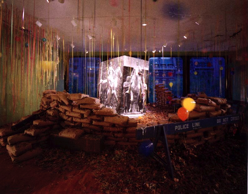
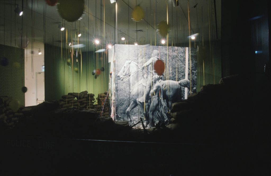
David Hammons, Public Enemy, installation at MoMA, 1991
I’ve written about “Dislocations” before. It’s one of the contemporary shows at MoMA that left a deep impression on me when I first moved to New York. It was in 1991-2 when Rob Storr curated huge, room-dominating sculptures by Chris Burden and Louise Bourgeois, and installations [!?] by Bruce Nauman, Adrian Piper, the Kabakovs, and David Hammons.
I just found this 5yo photo of Hammons’ Public Enemy, which I guess I had looked up because I was deep into photomurals at the time, and really wanted to find (or make) Hammons’ big photocube of the piece’s namesake, Teddy Roosevelt and his Grateful Savages [sic, obv].
In the intervening years MoMA has upped their archival game significantly, by putting a ton of exhibition material online, including the press release, checklist, brochure, installation photos, and a pdf of Storr’s catalogue. [Oh wow, Sophie Calle was in that show? Guess her intervention–removing paintings from the Modern’s galleries–was so subtle, I forgot.]
This was the first work of Hammons’ I’d ever seen, probably the first time I’d heard of him. Which seems crazy now, but reading the show’s time capsule of a catalogue, maybe I wasn’t so far behind. Storr waxes and marvels at what is now known about Hammons’ practice:
Hammons has preferred the city as a workplace and its citizens as his audience and sometime co-workers. Street flotsam and jetsam are his materials. What he brings to the gallery is all and sundry that it traditionally excludes. What he extracts from those materials and brings to the objects and installations that he has created outside the museums are the marvels and mysteries that lie already and everywhere to hand along heavily trafficked thoroughfares, in public parks, and in the so-called vacant lots littered with the evidence of their constant nomadic occupation and use…
“I like doing stuff better on the street, because art becomes just one of the objects that’s in the path of your everyday existence. It’s what you move through, and it doesn’t have superiority over anything else.” [he said in an otherwise unpublished interview which I now think we should unearth. -ed.]
Storr goes on about Hammons’ improvisatory process, “like jazz,” in which, despite a year of lead time, “all options remained open and the result wholly unforeseen” until the artist arrived to install the work. Which must have given MoMA an institutional heart attack.
And which, really? Because you can’t just pick up four huge photomurals or a substrate for them. And those sandbags seem very manufactured and ordered from somewhere. True, if you just work fast enough, those NYPD barriers were all over town, free for the taking. [Do they still have those? For throwback protests?]
Silent Sam confederate soldier statue suddenly torn down at UNC Chapel Hill, image: @yesyoureracist
What I thought about yesterday was whether Public Enemy still existed, or could be recreated. What I wonder about today, though, is what it’ll take for Uncle Teddy to get the Silent Sam treatment.
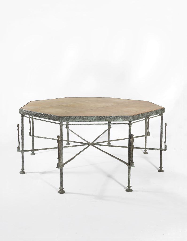
Octagonal caryatid table by Diego Giacometti, 1983, sold by Hubert de Givenchy and Philippe Venet in 2017 for EUR3.7m. image: christies.com
In the 80s Hubert de Givenchy and his partner Philippe Venet commissioned Diego Giacometti to make furniture and stuff for a house they bought in BF France, 2 hours southeast of Paris. Last year they sold a bunch of it at auction, 21 lots, including three of the bronze tables above, which have carytids sticking up from all the legs. Together the three tables sold for EUR 11 million, almost a third of the total sale, which is sort of bonkers. But that’s not important now.
a Giacometti table in front of a painting by someone, who really knows who at this point, image via habituallychic
In this month’s Architectural Digest, after Givenchy’s passing, there are reminiscences from Venet and a bunch of their friends, including this:
[PHILIPPE] VENET: Hubert asked, “Why don’t we have some Giacometti?” We had just sold our chalet in Megève—I was a very good skier and served in a mountain patrol during my military service—so I said, “Why not?” When Christie’s auctioned our Giacomettis [in 2017], we had a ferronnier make us a copy of the octagonal table. There are many homemades at Le Jonchet: a “La Fresnaye,” a “Picasso” that Hubert drew. After selling the big Joan Miró in his atelier to the Pompidou, I told him, “We must make a Léger.” So we did a collage together.
[MOMA TRUSTEE MERCEDES] BASS: It’s very hard to tell the difference between their works and the real things, though they never copied; they made renditions. Most were wonderful collages: Hubert and Philippe would prepare the backgrounds, then cut the paper and create a collage of a painting.
AD captions this like it’s the replacement table, but this same photo shows up in that pre-auction HC post, so who knows? And if you can’t tell the difference… image:architecturaldigest.com
I love this have your cake and eat it, too, sell your tables and paintings and make them again–and still have people describing it in these equivocating terms about copies and renditions. Givenchy studied at the Beaux Arts, and his obituary in The Guardian described his retirement from fashion with, “He had long since set up an alternative life as an ‘amateur d’art.'”
If I’m reading AD’s caption right, that’s Givenchy’s Picasso on the left. The smaller Picasso behind it looks like Twombly’s Picasso, tho, so who knows? image:AD
So if your question is, would you rather have a Giacometti table in your chateau, or a surmoulage Giacomettian table in your chateau and EUR33 million, my question is, how close do you need to get to the table?
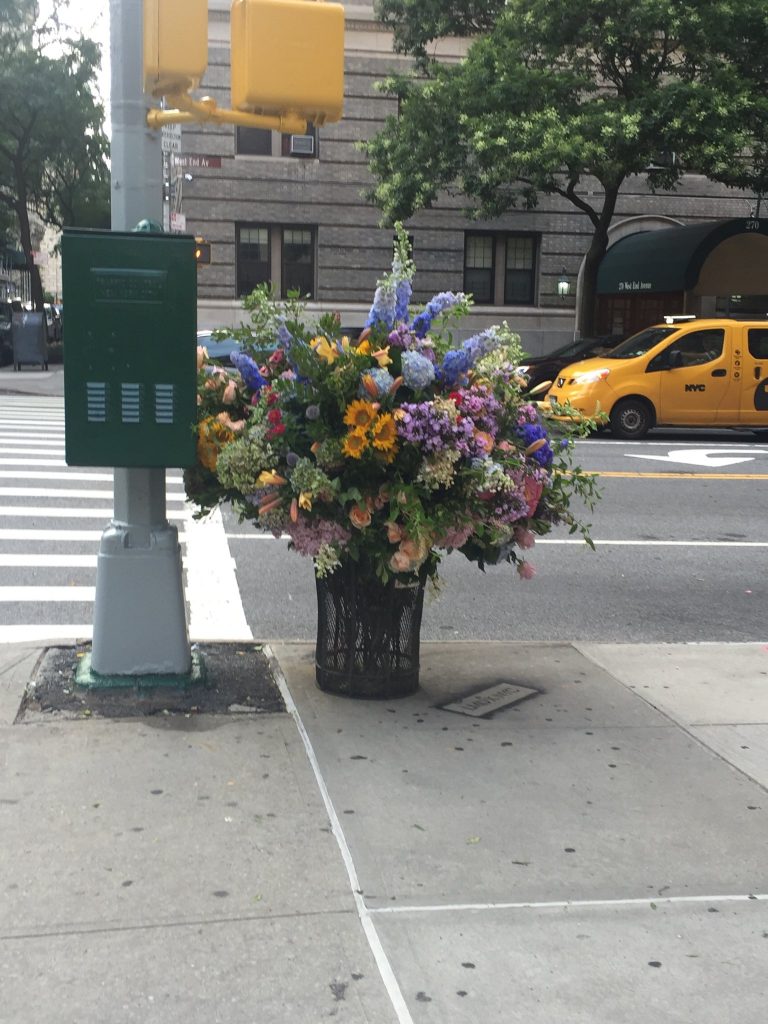
My first thought on seeing this bouquet in a garbage can on the corner of 73rd St & West End Avenue was that it looked like the Lila Acheson Wallace-endowed bouquets in the Great Hall at the Met.
My second thought was that guerrilla flower arrangements should be a thing. And as soon as I saw the credit line spraypainted on the sidewalk “[LMD x NYC]” in Jeffrey Toobin’s picture, I realized it already is.
Lewis Miller recycles flowers from private commissions and events into impromptu, public flower arrangements. They’re instagrammed, and admired for a moment or two IRL–then scavenged and destroyed by passersby.
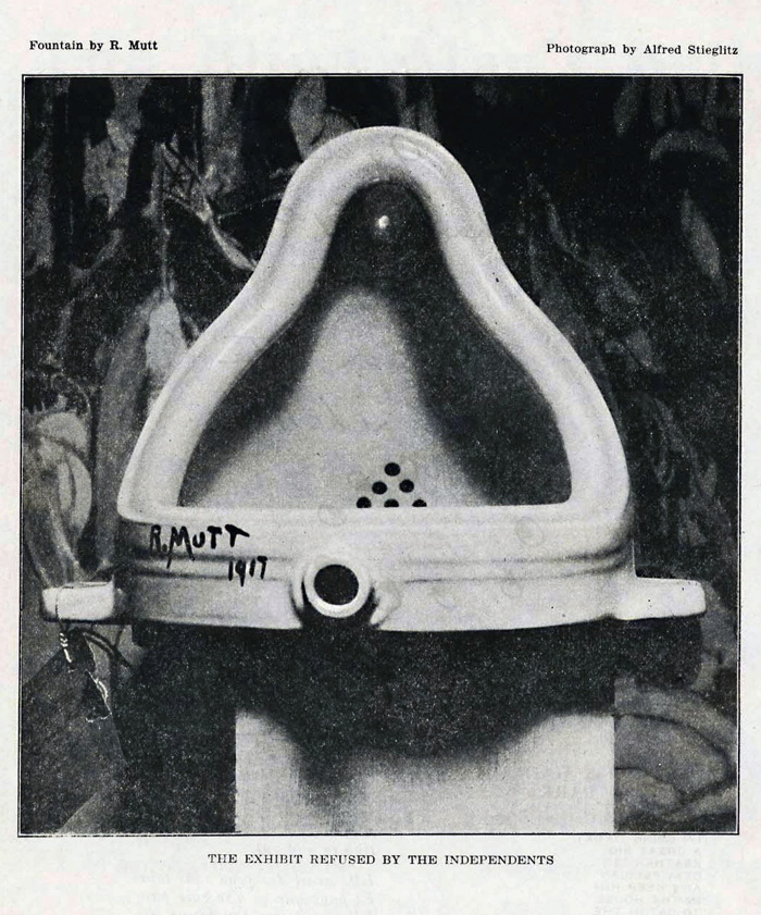
Well, Marcel (or Baroness Elsa), your Fountain changed the course of art for a century, but it’s time to move on. There’s a new Fountain in town. Correction: Fountains.
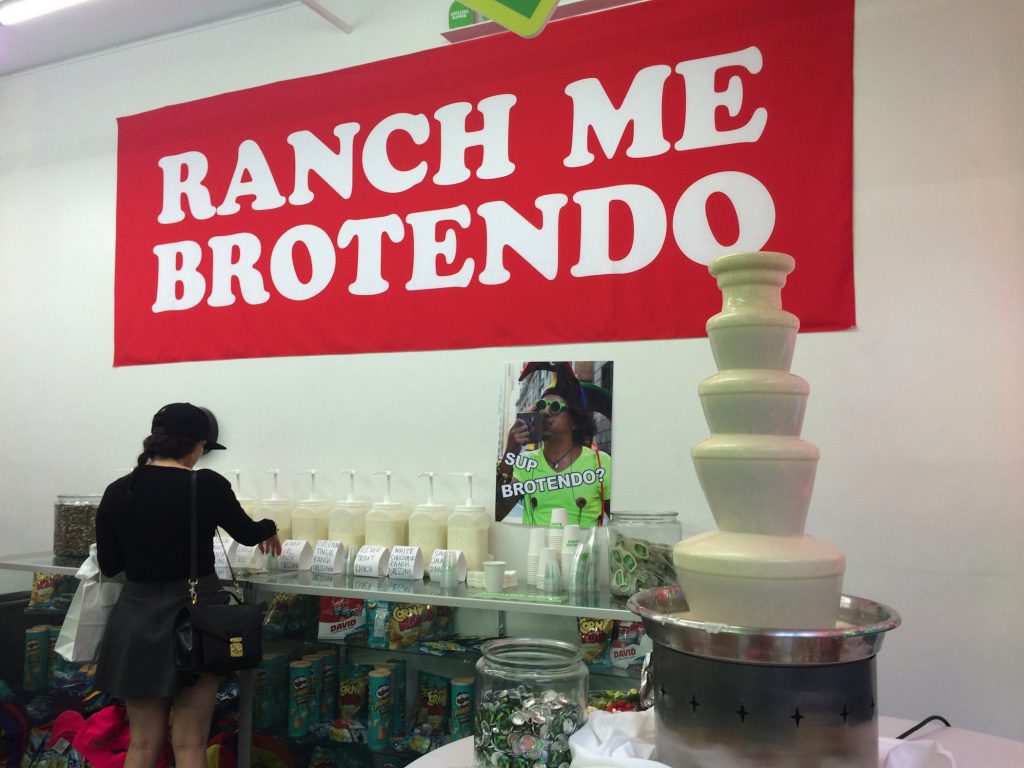
I KNOW SOMEONE WHO CATERED BETSY DEVOS’S NIECE’S WEDDING AND HE TOLD ME THERE WERE *****RANCH DRESSING FOUNTAINS*****
The old Fountain, a urinal on its side, since lost, was captured in a single photograph by Alfred Stieglitz. The ex-post-facto Stieglitz of our future’s Fountains is @SqueezyMcCheesy. Who did not, AFAIK, attend Betsy DeVos’s niece’s wedding, but did drop by the 2016 ranch dressing pop-up shop for the Cartoon Network comedian Eric Andre.
in with the new Fountain image: @SqueezyMcCheesy
The ranch dressing fountain appeared at the pop-up shop exactly two years ago tonight, and then, like the urinal a century ago, it disappeared.
That shape. That surface. That material. I mean just look at it. The sound you hear is not the ranch dressing pump; it is Paul McCarthy weeping. He was so close, and yet.
Paul McCarthy’s Chocolate Santa, 2007, via maccarone
Where the ersatz backdrop for Fountain (1917) was a painting by Marsden Hartley, the new Fountain was shot in front of a banner with Andre’s catchphrase, “Ranch me, Brotendo.”
If we only had ranch dressing Fountain to guide us in making art for the next 100 years, we would be busy. But pretty damn white. Fortunately, there are other Fountains. Behold Fuente de Queso.
What other food can be melted and dribbled in shiny, pulsating skins over a tower of stainless steel domes? What can’t, right? [I just googled ‘soylent fountain.’] Let’s fount’em all. And like our every food, our art will be liquefied and pumped and recirculated through an endless, nauseatingly spectacular cascade. How will we even notice?
A couple of months ago while looking at those Danh Vo Japanese plate editions, I came across Blake Byrne, an LA collector who had sent one to auction.
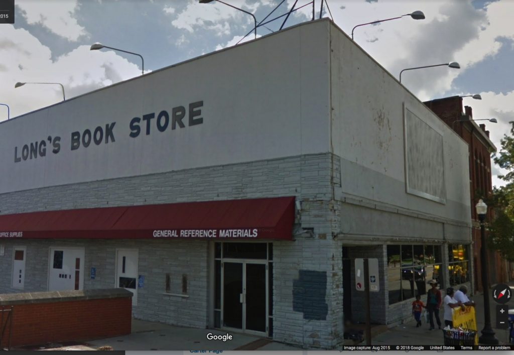
That led me to Open This End, a 2015 traveling exhibition from of works from Byrne’s collection, organized by various college museums and his Skylark Foundation. One stop was Ohio State University, which housed most of the show at the Urban Art Space, except for this: “Just off campus on the façade of the former Long’s Bookstore on the corner of 15th Ave and High St, is a work by Felix Gonzalez-Torres, Untitled(For Parkett) (1994).”
Felix Gonzalez-Torres, “Untitled” (for Parkett), 1994, a billboard edition of 84+15 AP
Which made me wonder how that worked? Actually, I’d wondered for several years how Felix’s Parkett edition billboard worked in real life. It comes rolled up in eight big, silk screened panels, and once it’s installed in a site, that’s it; it’s permanent. So far, my attempt, begun in 2012, to document all 84+15AP editions had gone nowhere. But now I had a new datapoint. Maybe. How does a one-and-done billboard in a traveling show from a private collection work?
“Untitled” (for Parkett), 1994, installed on at Ohio State University in 2015 for Open This End, image: c.2015 GSV
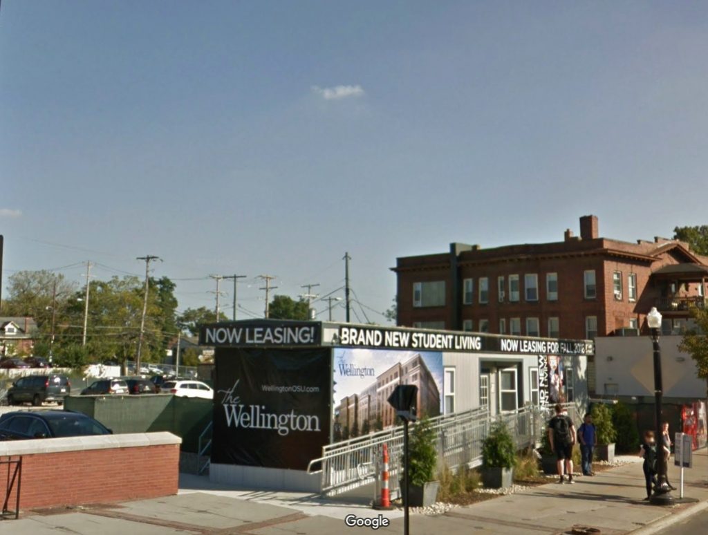
Sure enough, here it is on Google Street View in 2015, facing the OSU campus entrance right by the Wexner Art Center. Let’s scrub forward to see how it has held up?
“Untitled” (for Parkett) 1994 nowhere to be seen at Ohio State University, image: c.2017 GSV
Oh.
I emailed Skylark Foundation executive director Barbara Schwan to find out what happened. She looped in Joseph Wolin, curator of Open This End, to explain. After much consultation with the Felix Gonzalez-Torres Foundation and Parkett, Byrne donated his edition of the billboard to OSU, where it was installed for several months on a building that was slated for demolition.
When the building came down, the billboard came down with it. Wolin wrote:
We were told, I forget if it was by Parkett or the Foundation, that this was one of the very few times, if not the only time, the billboard had been installed as a billboard, so we were pretty excited about that. Blake himself had acquired the work at auction and had it rolled up in storage for many years, so for me it felt rather wonderful, if bittersweet, to be able to realize it as the artist had intended. Apparently, when the work is installed indoors, as in Parkett’s exhibitions, the panels are often just pinned to the wall and rolled up again after.
So many questions answered, so many questions raised. Six years ago I lamented that “Untitled” (for Parkett) is “doomed by its own nature to exist in a state of fungible incompleteness, or worthless realization, or inevitable destruction.”
Which, thanks to a generous donation and successful realization with full knowledge of its destruction, we realize is a feature, not a bug. I hope more owners of “Untitled” (for Parkett) follow Byrne’s lead by realizing their billboards and letting time take its toll in public rather than in storage. It is what Felix would have wanted.
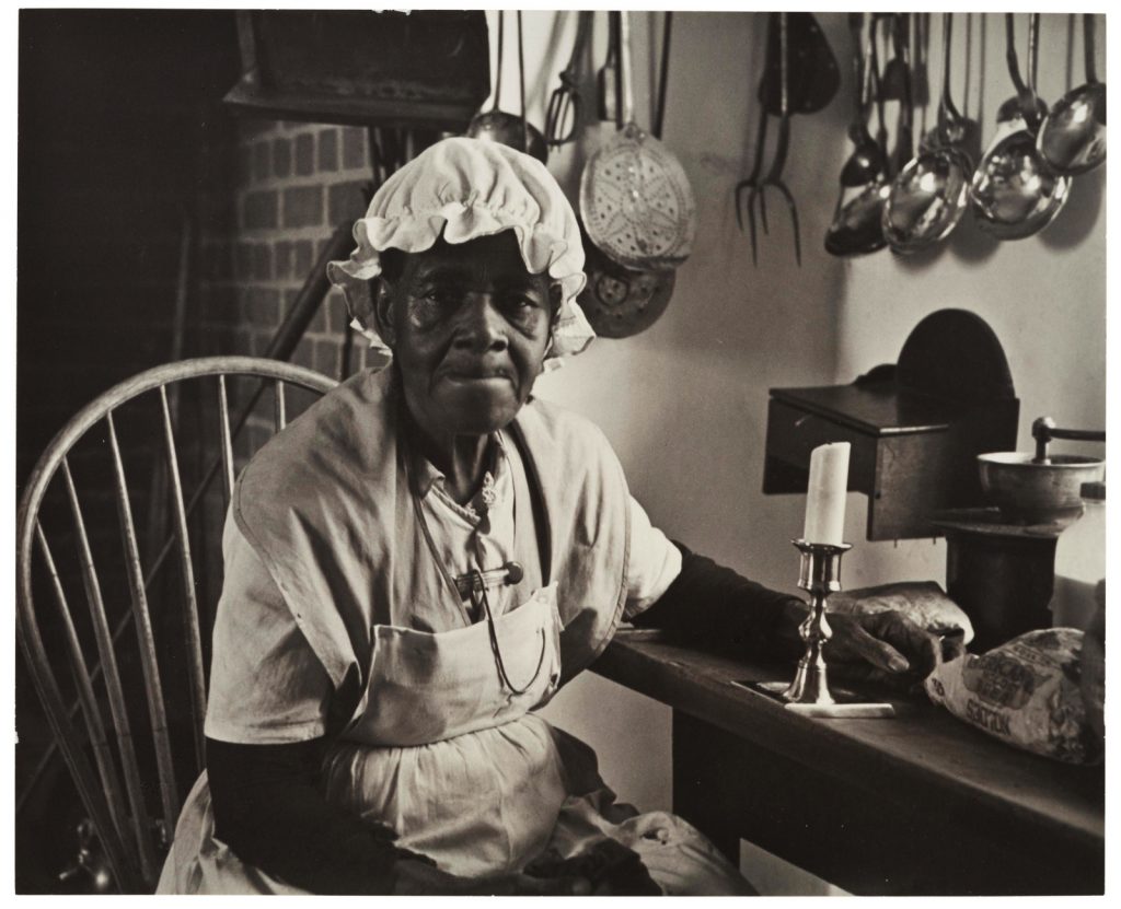
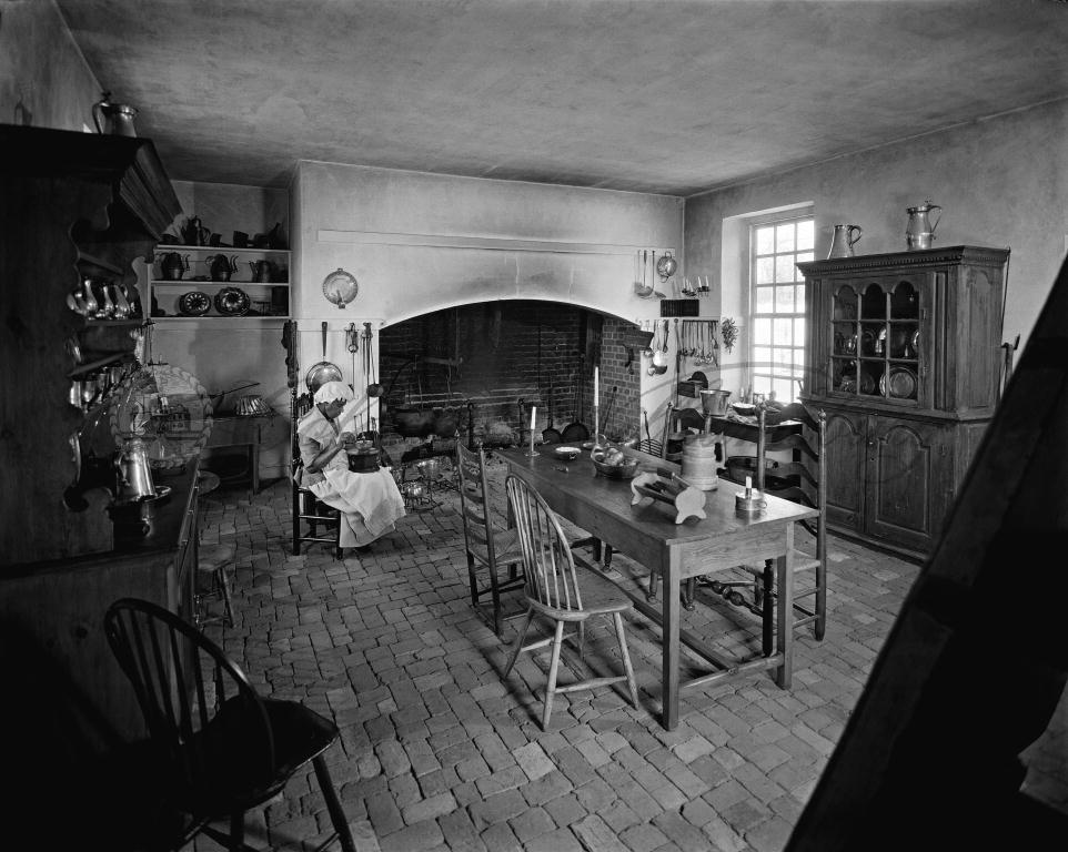
Charles Sheeler, Aunt Mary, 1941, just deaccessioned from the Museum of Modern Art, image via Christie’s
Where to even start? As a huge Charles Sheeler fan from early on, my first reaction was “GET IT.” This 1941 Sheeler photo is unusual so many ways. First off, the subject is a person, though one who is surrounded by the artifacts of early Americana that provided a grounding for the artist’s own modernist and precisionist leanings.
More on this person in a second, but second, this print was just deaccessioned by the Museum of Modern Art, and I missed the end of the Christie’s online auction because I was driving–and I forgot.
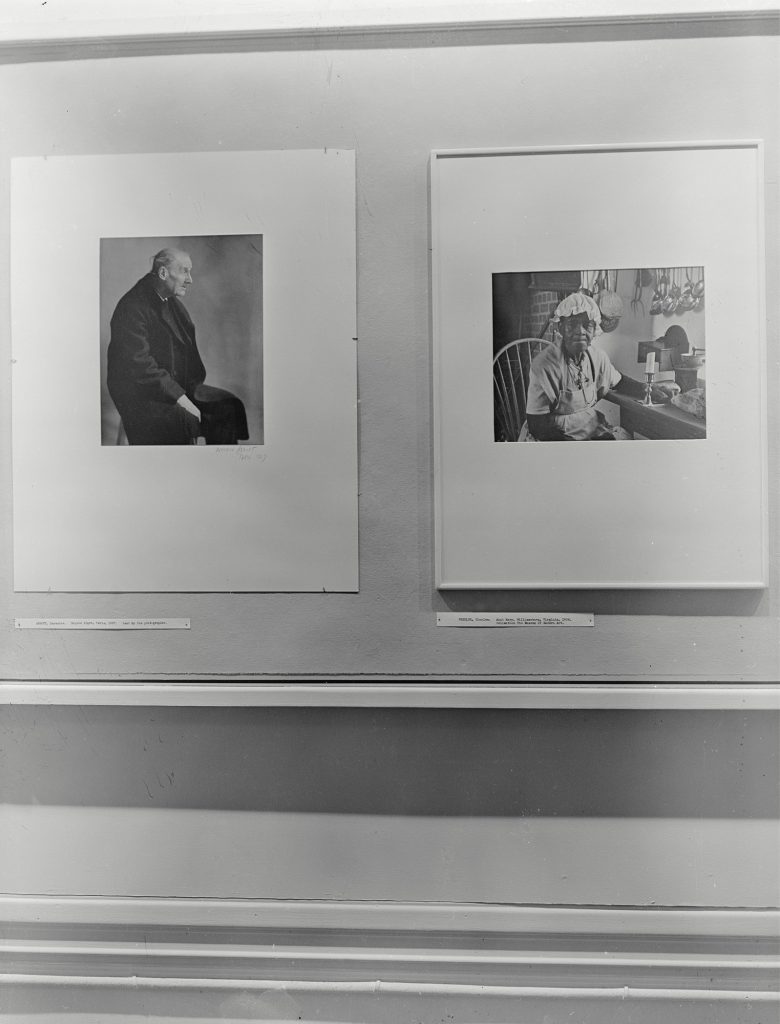
Installation view of Portraits, a 1943 photo exhibition at MoMA, featuring Berenice Abbot’s Atget (L) and Sheeler’s Aunt Mary (R). via MoMA
2.A? It was a new acquisition included in a 1943 exhibition of portrait photography. It hung next to Berenice Abbott’s portrait of Atget, which was a loan from the artist.
The print was a gift of Abby Aldrich Rockefeller, the Modern’s co-founder. It is unsigned. The back has adhesive residue and an accession number. So I guess technically it might have been an exhibition print; back in the day, the connoisseurial taxonomies of photography were obviously less rigid, as were the accession guidelines of the Department, never mind there was a war on.
Anyway, such an illustrious provenance should smooth over any concerns. And yet the Christie’s estimate was only $5-7,000, a tiny fraction of a more typical Sheeler print. And the thing only got one bid, $1,500, and sold for just $1,875.
Maybe it’s time to go back to the first and most obviously striking thing about this portrait: the subject, an elderly African American woman with an apron, sitting in an antique kitchen, who, according to the photo’s title, is “Aunt Mary.” But whose Aunt Mary? Not the photographer’s, presumably, and not Abby Rockefeller’s, right? Well.
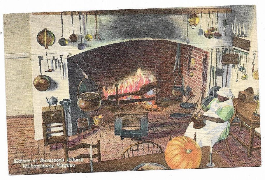
photo of an unidentified African American performer as “Aunt Mary” at Colonial Williamsburg, c. 1933
“Aunt Mary” turns out to be a character, a fictional enslaved worker in the kitchen of the Governor’s Palace at Colonial Williamsburg, another Rockefeller-founded culture venue that had just opened in 1934. On decades worth of Williamsburg postcards “Aunt Mary”, described as a “servant,” sits, head down, in a placid, domestic tableau.
Colonial Williamsburg postcard featuring “Aunt Mary” from eBay
To his credit, Sheeler photographed this unidentified performer as a person, not as a prop. Who was she? What was her job like? Assuming she’s from the area, southern Virginia, she looks too young to have been enslaved herself, but certainly old enough to be the child of former slaves. Until a push by activists and historians in the 1970s, “Aunt Mary” was one of the very few non-white historical characters in Williamsburg.
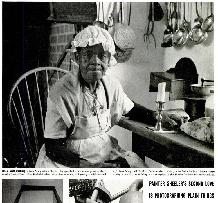
But why was Sheeler making it? I know and love his documentary photos from the Metropolitan Museum, but did he cover Williamsburg, too? Last year Kirsten Jensen curated a show of Sheeler’s fashion photography for the Michener Art Museum in Pennsylvania. What other Sheeler series and projects are lurking undiscovered in archives out there?
[2020 update:] While looking at some Met Museum Sheelers I’m reminded that Rockefeller was a supporter and collector of Sheeler’s art, and also invited him to photograph Colonial Williamsburg in 1935-36, thanks to Edith Halpert. So there are indeed more images out there, including Stairwell, Williamsburg, and whatever he used to make Kitchen, Williamsburg, duh.]
[2020 update again:] I just found this image was reproduced in a Life Magazine profile of Sheeler in 1938. The caption is pretty bad. This woman is identified as “Aunt Mary,” the enslaved character, even as she’s quoted–in Sheeler’s telling to the reporter–as the re-enactor she is: “Mr. Rockefeller has taken photos of me, so I guess you might as well, too.”
And then, “Because she is a stuffed shirt in a kitchen where nothing is cooked. Aunt Mary is an exception to the Sheeler fondness for functionalism.” Because LIFE does not understand the concept of performance, or a job, or a person, when that person is Black. Or maybe it’s Sheeler.
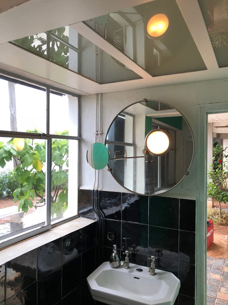
On a first visit to Eileen Gray’s masterpiece e-1027 since its restoration (still in progress), I was impressed by the details as much as the overall design. Gray’s house on the sea at Roquebrune Cap Martin, built in 1929 on the far side of Monaco, isn’t perfect, but it is extremely well thought through and basically marvelous.
The lights stood out. The front door, which is sort of a back door, and a patio where dinner was sometimes served.
Eileen Gray light fixture originally over Jean Badovici’s desk at E-1027
The lower bedroom for Jean Badovici, or for guests, which had this interesting construction over where his desk would be (the desk is out to improve circulation in the tiny space, which felt small even with just the six people on our tour.). In addition to light, the fixture was positioned to mirror and double the view of the Mediterranean from the bed. This use of mirrors and reflectivity is a feature throughout the house.
Mirror for shaving the back of one’s head, by Eileen Gray for Jean Badovici at E-1027
like I said. This shaving mirror in the corner of Badovici’s room has a light embedded, and another mirror on an articulated, chrome-plated arm, at Badovici’s request, so he could shave the back of his head. It’s a style that’s come around again.
These fixtures are all replications; the first and third pieces were long lost, but the original overhead light was stolen, probably to order, in 2003.
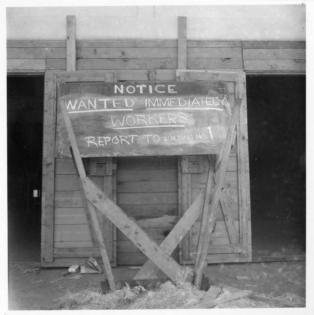
Workers Wanted sign made from scrapwood at the Topaz Internment Camp, image: UofU Library
While reposting those old Daddy Types entries about the US’s imprisonment of Japanese American citizens, I came across a couple of images of Topaz, Utah that were new to me. They were added to the University of Utah Library’s collection in 2012, and originated in a 1987 documentary about Topaz produced by KUED, the local PBS station.
The top image is sort of mundane, but the form of this make-do scrapwood sign just sticks with me. That might be an actual blackboard, or maybe not.
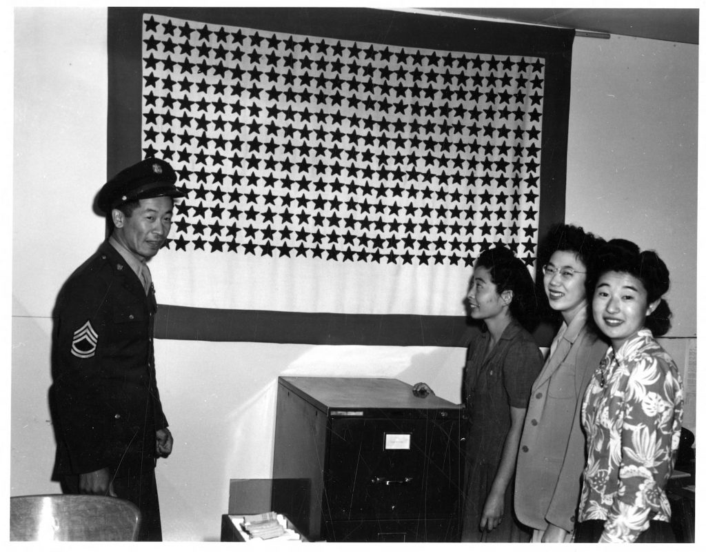
1944 photo from the Topaz Internment Camp in Utah showing the prison’s service flag. Each of the 325 stars represents a detainee serving in the US military. image: UofU Library
It doesn’t stick with me like the object in this image, though. Four unidentified people standing in front of the Service Flag for the “community” of Topaz, which included one star for each detainee serving in the US military. 325 at the time this photo was taken. Soldiers serving while their families were in prison because of politicians’ racial bigotry and fear.