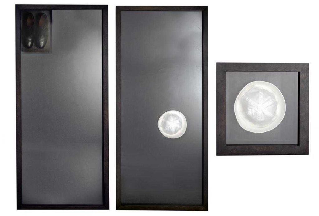
Naval works by Michael Jenkins, 1988-89, image: Ogletree
I’ve been low-key fascinated with people in the art world who stopped making art, particularly dealers like Gavin Brown, who didn’t really get much traction with his art practice, and Michael Jenkins, who did.
It’s on my mind at the moment because three early works by Jenkins are coming up for auction (again). They turn out to be some of the Navy-related works Jenkins discussed with Bill Arning in the 1992 Bomb Magazine article that is the primary critical text for his work (or the top Google result, half dozen of one…)
Like contemporary and collaborator Felix Gonzalez-Torres, Jenkins created minimalist- and conceptualist-inflected works imbued with emotional and psychological power. During the escalating AIDS crisis the works referenced gay love and loss, fraught youth and unabashed romance, and quarantine, disease, and death. I’ve only ever seen a couple of his pieces in person, but they really do feel like fellow travelers with Felix’s work, at least for a time.
Anyway, That Sinking Feeling I (1988) and II (1989) are basically human-scale (5′ 8.5″ feels specific) shadowboxes with a sailor hat and shoes on wool blanket material. A third, related work, Gob Box (1989), is a hat centered in a square shadowbox. Seen from their tops, the circular hats really do show off what Jenkins calls their “graphic nature.” The shoes, meanwhile, feel more totemic; the absence they reference is more pronounced.
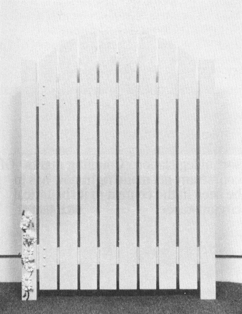
Michael Jenkins, Rounded Top Gate, 1991, ganked from bombmagazine
Jenkins and Arning talk a lot about this symbolism, the erotic image, even the caricature of the sailor, as well as the real sorrow of separation. I’m not sure it holds up, frankly; the conversation feels sort of slight, in retrospect. But that could literally just be me. Or Jenkins. There’s a subjectivity at play, evocations of specific memories or associations, in a specific time and context. Arning credits Jenkins’ emergence in the 80s with helping “point a way out of the dismal cycle of self-referential criticality and ironic distance then in place.” And if we’ve come a long way, baby, it’s still worth remembering how we got here, and where we were.
After not selling a few months ago in Atlanta, Jenkins’ three works are estimated now at $1,500-3,000. Bring a truck.
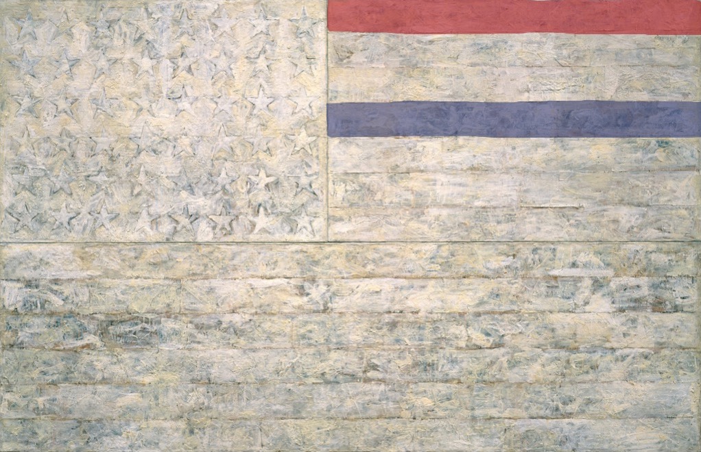
White Flag, 2018, Encaustic, oil, newsprint, and charcoal on canvas, 78 5/16 x 120 3/4 in. (198.9 x 306.7 cm)
“One night I could not have dreamed that I painted a large American flag, but the next morning I got up and I went out and bought the materials to begin it.” Those materials included three canvases that the artist mounted on plywood, strips of newspaper, and encaustic paint—a mixture of pigment and molten wax that has formed a surface of lumps and smears. The newspaper scraps visible beneath the stripes and forty-eight stars lend this icon historical specificity. The American flag is something “the mind already knows,” but its execution complicates the representation and invites close inspection.
By draining most of the color from the flag but leaving subtle gradations in tone, the artist shifts our attention from the familiarity of the image to the way in which it is made. “White Flag” is painted on three separate panels: the stars, the seven upper stripes to the right of the stars, and the longer stripes below. The artist worked on each panel separately.
White Flag, 2018, I: Encaustic, oil, newsprint, and charcoal on canvas, 41 3/4 x 64 3/8 in. (106.1 x 163.6 cm). II: Encaustic, oil, and collage on fabric mounted on plywood, 22 1/2 x 32 1/2 in. (57.2 x 82.6 cm)
After applying a ground of unbleached beeswax, the artist built up the stars, the negative areas around them, and the stripes with applications of collage — cut or torn pieces of newsprint, other papers, and bits of fabric. The artist dipped these into molten beeswax and adhered them to the surface. The artist then joined the three panels and overpainted them with more beeswax mixed with pigments, adding touches of white oil.
cf. Study for White Flag, 2018, Crayola washable marker on coloring page, 8 1/2 x 11 in. (21.6 x 28 cm)
“Found painting, FOUND courage” images: @videodante
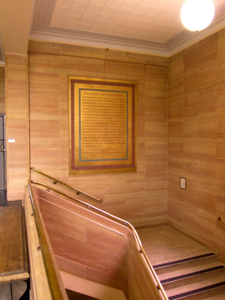
The stairwell in the entrance to the University of Oregon library contains a large mural, Mission of a University, painted in 1937 by art professor Nowland Brittin Zane, of a quote by another faculty member, Frederick George Young. A social science professor and dean in the 1920s, Young saw the divine mission of a university aligned with the founding principle of Oregon itself: to elevate and preserve the white race.
Installation view of Nowland Zane’s mural, Mission of a University, 1937, in U. Oregon’s Knight Library, before intervention, image: uoregon.edu
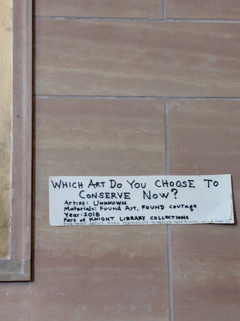
Last night @videodante tweeted out photos he’d received of a fresh painting intervention on Zane’s mural: a slash of red paint crossing out “racial heritage.” As interesting, though, is the handwritten label for the new work, left on the wall [below].
“Which art do you choose to conserve now?” via @videodante
The materials, “Found Art, FOUND courage” are almost as awesome as the title, “WHICH ART DO YOU CHOOSE TO CONSERVE NOW?” Is it the title, or an epic challenge to the institution’s perennial decision of which facts, which history, which brushstroke, and whose heritage are their actions perpetuating? This quote has been recognized as racist and offensive–and has been the subject of critical and activist efforts to remove it–for years. There are at least three spots in the bottom corner of Zane’s painting where conservators chose to erase someone’s addition. So this is one more choice to be made in an ongoing dispute, and the artist knows what is at stake.
The author of this new work, though, offers another solution in a “fine print” addendum, apparently added on the spot, as the text curls up the side of the label. If the library is troubled by impending conservatorial complicity in reasserting white supremacism, the “artist gives permission to replace this placard with a more permanent one.”
Since the beginning of the Black Lives Matter movement, and the increased protests of confederate memorial statues, I’ve come to see painting as crucial, even central. After decades of inertia, monuments are suddenly painted or pulled down. Then they’re quickly covered with tarps or boxes or removed. Take an object. Do something to it. Do something else to it.
What if we recognize these gestures as generative, not destructive? What if we leave them? Keep them? Look at them? Study them? And when the time comes, conserve them?
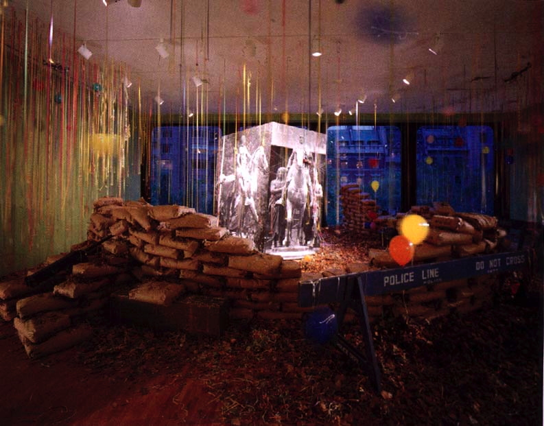
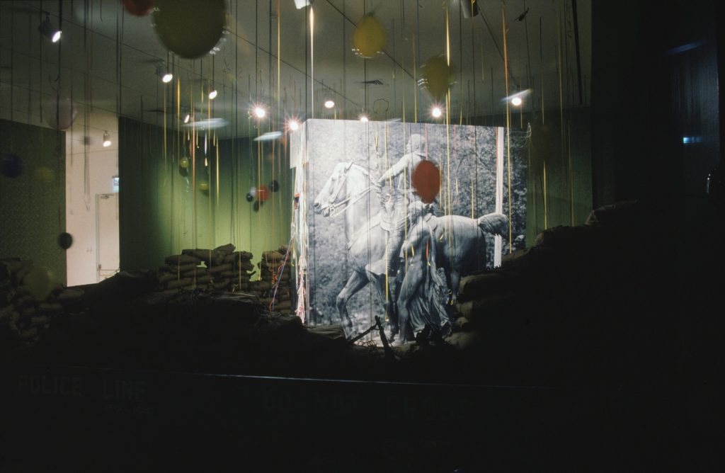
David Hammons, Public Enemy, installation at MoMA, 1991
I’ve written about “Dislocations” before. It’s one of the contemporary shows at MoMA that left a deep impression on me when I first moved to New York. It was in 1991-2 when Rob Storr curated huge, room-dominating sculptures by Chris Burden and Louise Bourgeois, and installations [!?] by Bruce Nauman, Adrian Piper, the Kabakovs, and David Hammons.
I just found this 5yo photo of Hammons’ Public Enemy, which I guess I had looked up because I was deep into photomurals at the time, and really wanted to find (or make) Hammons’ big photocube of the piece’s namesake, Teddy Roosevelt and his Grateful Savages [sic, obv].
In the intervening years MoMA has upped their archival game significantly, by putting a ton of exhibition material online, including the press release, checklist, brochure, installation photos, and a pdf of Storr’s catalogue. [Oh wow, Sophie Calle was in that show? Guess her intervention–removing paintings from the Modern’s galleries–was so subtle, I forgot.]
This was the first work of Hammons’ I’d ever seen, probably the first time I’d heard of him. Which seems crazy now, but reading the show’s time capsule of a catalogue, maybe I wasn’t so far behind. Storr waxes and marvels at what is now known about Hammons’ practice:
Hammons has preferred the city as a workplace and its citizens as his audience and sometime co-workers. Street flotsam and jetsam are his materials. What he brings to the gallery is all and sundry that it traditionally excludes. What he extracts from those materials and brings to the objects and installations that he has created outside the museums are the marvels and mysteries that lie already and everywhere to hand along heavily trafficked thoroughfares, in public parks, and in the so-called vacant lots littered with the evidence of their constant nomadic occupation and use…
“I like doing stuff better on the street, because art becomes just one of the objects that’s in the path of your everyday existence. It’s what you move through, and it doesn’t have superiority over anything else.” [he said in an otherwise unpublished interview which I now think we should unearth. -ed.]
Storr goes on about Hammons’ improvisatory process, “like jazz,” in which, despite a year of lead time, “all options remained open and the result wholly unforeseen” until the artist arrived to install the work. Which must have given MoMA an institutional heart attack.
And which, really? Because you can’t just pick up four huge photomurals or a substrate for them. And those sandbags seem very manufactured and ordered from somewhere. True, if you just work fast enough, those NYPD barriers were all over town, free for the taking. [Do they still have those? For throwback protests?]
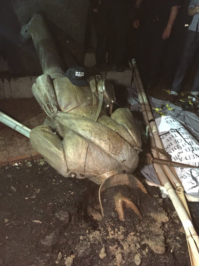
Silent Sam confederate soldier statue suddenly torn down at UNC Chapel Hill, image: @yesyoureracist
What I thought about yesterday was whether Public Enemy still existed, or could be recreated. What I wonder about today, though, is what it’ll take for Uncle Teddy to get the Silent Sam treatment.
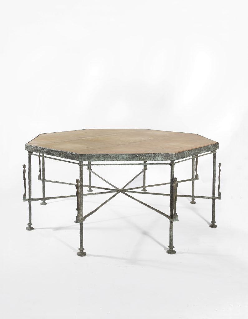
Octagonal caryatid table by Diego Giacometti, 1983, sold by Hubert de Givenchy and Philippe Venet in 2017 for EUR3.7m. image: christies.com
In the 80s Hubert de Givenchy and his partner Philippe Venet commissioned Diego Giacometti to make furniture and stuff for a house they bought in BF France, 2 hours southeast of Paris. Last year they sold a bunch of it at auction, 21 lots, including three of the bronze tables above, which have carytids sticking up from all the legs. Together the three tables sold for EUR 11 million, almost a third of the total sale, which is sort of bonkers. But that’s not important now.
a Giacometti table in front of a painting by someone, who really knows who at this point, image via habituallychic
In this month’s Architectural Digest, after Givenchy’s passing, there are reminiscences from Venet and a bunch of their friends, including this:
[PHILIPPE] VENET: Hubert asked, “Why don’t we have some Giacometti?” We had just sold our chalet in Megève—I was a very good skier and served in a mountain patrol during my military service—so I said, “Why not?” When Christie’s auctioned our Giacomettis [in 2017], we had a ferronnier make us a copy of the octagonal table. There are many homemades at Le Jonchet: a “La Fresnaye,” a “Picasso” that Hubert drew. After selling the big Joan Miró in his atelier to the Pompidou, I told him, “We must make a Léger.” So we did a collage together.
[MOMA TRUSTEE MERCEDES] BASS: It’s very hard to tell the difference between their works and the real things, though they never copied; they made renditions. Most were wonderful collages: Hubert and Philippe would prepare the backgrounds, then cut the paper and create a collage of a painting.
AD captions this like it’s the replacement table, but this same photo shows up in that pre-auction HC post, so who knows? And if you can’t tell the difference… image:architecturaldigest.com
I love this have your cake and eat it, too, sell your tables and paintings and make them again–and still have people describing it in these equivocating terms about copies and renditions. Givenchy studied at the Beaux Arts, and his obituary in The Guardian described his retirement from fashion with, “He had long since set up an alternative life as an ‘amateur d’art.'”
If I’m reading AD’s caption right, that’s Givenchy’s Picasso on the left. The smaller Picasso behind it looks like Twombly’s Picasso, tho, so who knows? image:AD
So if your question is, would you rather have a Giacometti table in your chateau, or a surmoulage Giacomettian table in your chateau and EUR33 million, my question is, how close do you need to get to the table?
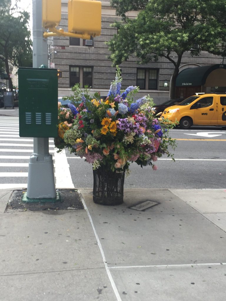
My first thought on seeing this bouquet in a garbage can on the corner of 73rd St & West End Avenue was that it looked like the Lila Acheson Wallace-endowed bouquets in the Great Hall at the Met.
My second thought was that guerrilla flower arrangements should be a thing. And as soon as I saw the credit line spraypainted on the sidewalk “[LMD x NYC]” in Jeffrey Toobin’s picture, I realized it already is.
Lewis Miller recycles flowers from private commissions and events into impromptu, public flower arrangements. They’re instagrammed, and admired for a moment or two IRL–then scavenged and destroyed by passersby.
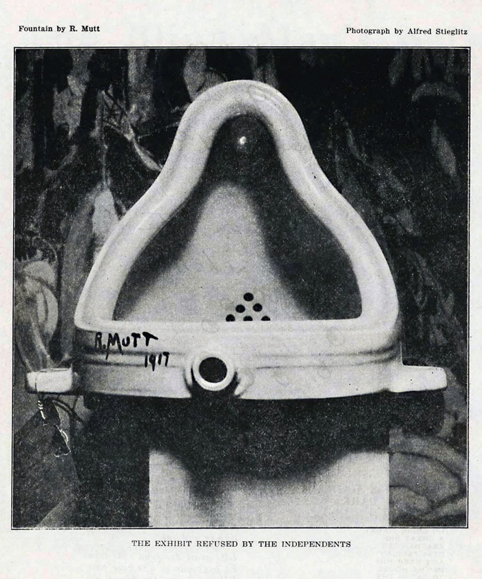
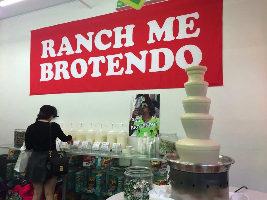
Well, Marcel (or Baroness Elsa), your Fountain changed the course of art for a century, but it’s time to move on. There’s a new Fountain in town. Correction: Fountains.
I KNOW SOMEONE WHO CATERED BETSY DEVOS’S NIECE’S WEDDING AND HE TOLD ME THERE WERE *****RANCH DRESSING FOUNTAINS*****
The old Fountain, a urinal on its side, since lost, was captured in a single photograph by Alfred Stieglitz. The ex-post-facto Stieglitz of our future’s Fountains is @SqueezyMcCheesy. Who did not, AFAIK, attend Betsy DeVos’s niece’s wedding, but did drop by the 2016 ranch dressing pop-up shop for the Cartoon Network comedian Eric Andre.
in with the new Fountain image: @SqueezyMcCheesy
The ranch dressing fountain appeared at the pop-up shop exactly two years ago tonight, and then, like the urinal a century ago, it disappeared.
That shape. That surface. That material. I mean just look at it. The sound you hear is not the ranch dressing pump; it is Paul McCarthy weeping. He was so close, and yet.
Paul McCarthy’s Chocolate Santa, 2007, via maccarone
Where the ersatz backdrop for Fountain (1917) was a painting by Marsden Hartley, the new Fountain was shot in front of a banner with Andre’s catchphrase, “Ranch me, Brotendo.”
If we only had ranch dressing Fountain to guide us in making art for the next 100 years, we would be busy. But pretty damn white. Fortunately, there are other Fountains. Behold Fuente de Queso.
What other food can be melted and dribbled in shiny, pulsating skins over a tower of stainless steel domes? What can’t, right? [I just googled ‘soylent fountain.’] Let’s fount’em all. And like our every food, our art will be liquefied and pumped and recirculated through an endless, nauseatingly spectacular cascade. How will we even notice?
A couple of months ago while looking at those Danh Vo Japanese plate editions, I came across Blake Byrne, an LA collector who had sent one to auction.
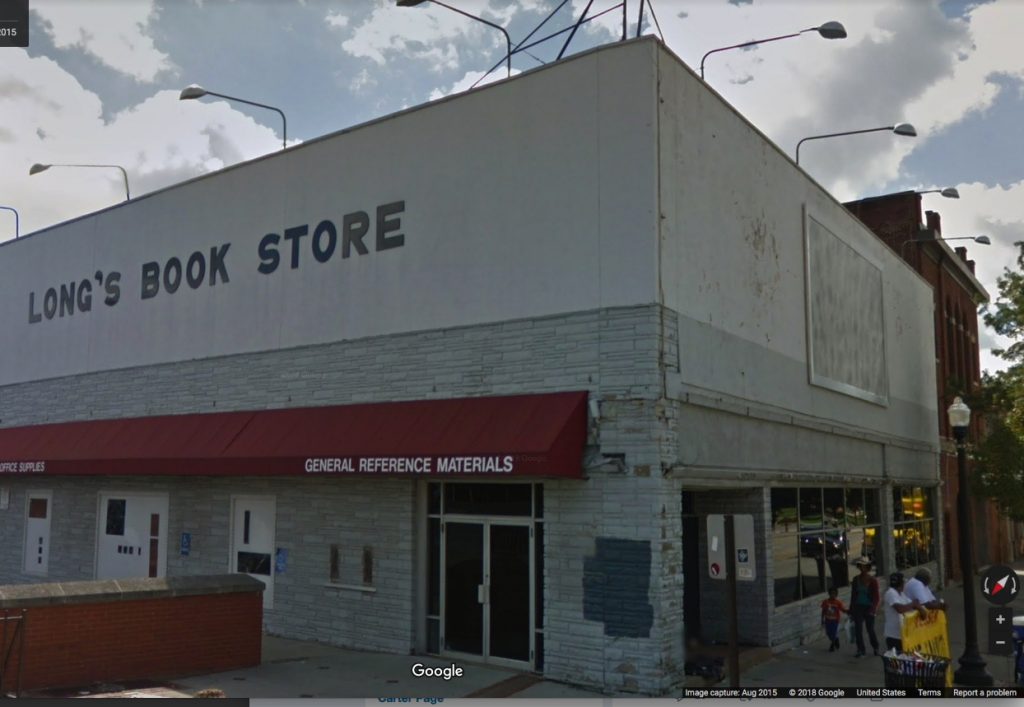
That led me to Open This End, a 2015 traveling exhibition from of works from Byrne’s collection, organized by various college museums and his Skylark Foundation. One stop was Ohio State University, which housed most of the show at the Urban Art Space, except for this: “Just off campus on the façade of the former Long’s Bookstore on the corner of 15th Ave and High St, is a work by Felix Gonzalez-Torres, Untitled(For Parkett) (1994).”
Felix Gonzalez-Torres, “Untitled” (for Parkett), 1994, a billboard edition of 84+15 AP
Which made me wonder how that worked? Actually, I’d wondered for several years how Felix’s Parkett edition billboard worked in real life. It comes rolled up in eight big, silk screened panels, and once it’s installed in a site, that’s it; it’s permanent. So far, my attempt, begun in 2012, to document all 84+15AP editions had gone nowhere. But now I had a new datapoint. Maybe. How does a one-and-done billboard in a traveling show from a private collection work?
“Untitled” (for Parkett), 1994, installed on at Ohio State University in 2015 for Open This End, image: c.2015 GSV
Sure enough, here it is on Google Street View in 2015, facing the OSU campus entrance right by the Wexner Art Center. Let’s scrub forward to see how it has held up?
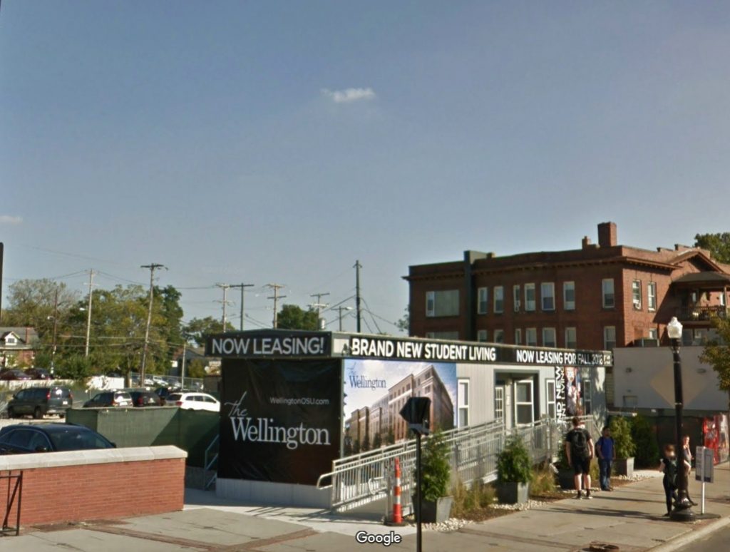
“Untitled” (for Parkett) 1994 nowhere to be seen at Ohio State University, image: c.2017 GSV
Oh.
I emailed Skylark Foundation executive director Barbara Schwan to find out what happened. She looped in Joseph Wolin, curator of Open This End, to explain. After much consultation with the Felix Gonzalez-Torres Foundation and Parkett, Byrne donated his edition of the billboard to OSU, where it was installed for several months on a building that was slated for demolition.
When the building came down, the billboard came down with it. Wolin wrote:
We were told, I forget if it was by Parkett or the Foundation, that this was one of the very few times, if not the only time, the billboard had been installed as a billboard, so we were pretty excited about that. Blake himself had acquired the work at auction and had it rolled up in storage for many years, so for me it felt rather wonderful, if bittersweet, to be able to realize it as the artist had intended. Apparently, when the work is installed indoors, as in Parkett’s exhibitions, the panels are often just pinned to the wall and rolled up again after.
So many questions answered, so many questions raised. Six years ago I lamented that “Untitled” (for Parkett) is “doomed by its own nature to exist in a state of fungible incompleteness, or worthless realization, or inevitable destruction.”
Which, thanks to a generous donation and successful realization with full knowledge of its destruction, we realize is a feature, not a bug. I hope more owners of “Untitled” (for Parkett) follow Byrne’s lead by realizing their billboards and letting time take its toll in public rather than in storage. It is what Felix would have wanted.
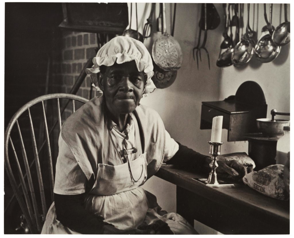
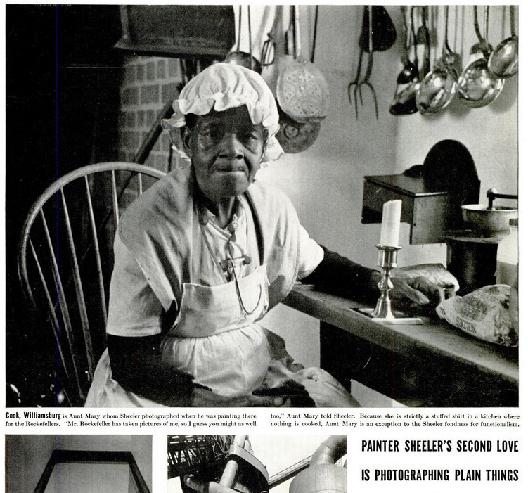
Charles Sheeler, Aunt Mary, 1941, just deaccessioned from the Museum of Modern Art, image via Christie’s
Where to even start? As a huge Charles Sheeler fan from early on, my first reaction was “GET IT.” This 1941 Sheeler photo is unusual so many ways. First off, the subject is a person, though one who is surrounded by the artifacts of early Americana that provided a grounding for the artist’s own modernist and precisionist leanings.
More on this person in a second, but second, this print was just deaccessioned by the Museum of Modern Art, and I missed the end of the Christie’s online auction because I was driving–and I forgot.
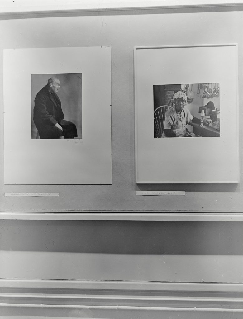
Installation view of Portraits, a 1943 photo exhibition at MoMA, featuring Berenice Abbot’s Atget (L) and Sheeler’s Aunt Mary (R). via MoMA
2.A? It was a new acquisition included in a 1943 exhibition of portrait photography. It hung next to Berenice Abbott’s portrait of Atget, which was a loan from the artist.
The print was a gift of Abby Aldrich Rockefeller, the Modern’s co-founder. It is unsigned. The back has adhesive residue and an accession number. So I guess technically it might have been an exhibition print; back in the day, the connoisseurial taxonomies of photography were obviously less rigid, as were the accession guidelines of the Department, never mind there was a war on.
Anyway, such an illustrious provenance should smooth over any concerns. And yet the Christie’s estimate was only $5-7,000, a tiny fraction of a more typical Sheeler print. And the thing only got one bid, $1,500, and sold for just $1,875.
Maybe it’s time to go back to the first and most obviously striking thing about this portrait: the subject, an elderly African American woman with an apron, sitting in an antique kitchen, who, according to the photo’s title, is “Aunt Mary.” But whose Aunt Mary? Not the photographer’s, presumably, and not Abby Rockefeller’s, right? Well.
photo of an unidentified African American performer as “Aunt Mary” at Colonial Williamsburg, c. 1933
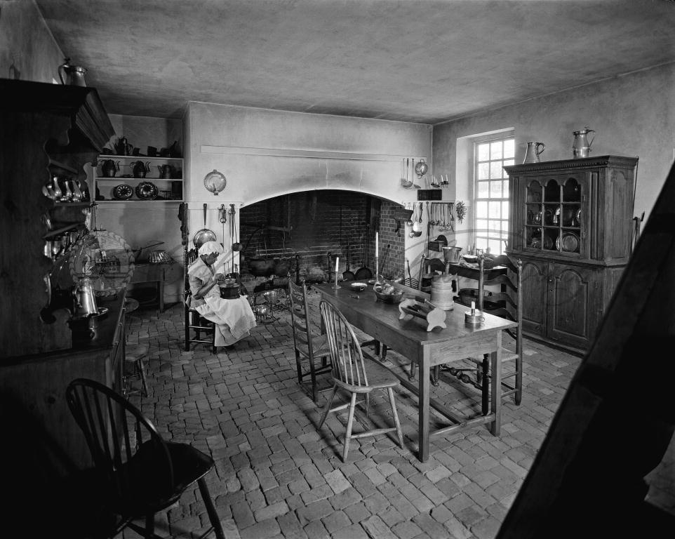
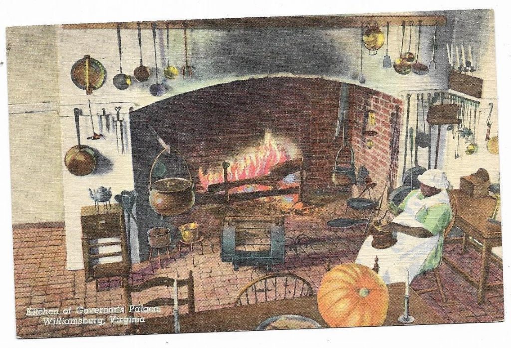
“Aunt Mary” turns out to be a character, a fictional enslaved worker in the kitchen of the Governor’s Palace at Colonial Williamsburg, another Rockefeller-founded culture venue that had just opened in 1934. On decades worth of Williamsburg postcards “Aunt Mary”, described as a “servant,” sits, head down, in a placid, domestic tableau.
Colonial Williamsburg postcard featuring “Aunt Mary” from eBay
To his credit, Sheeler photographed this unidentified performer as a person, not as a prop. Who was she? What was her job like? Assuming she’s from the area, southern Virginia, she looks too young to have been enslaved herself, but certainly old enough to be the child of former slaves. Until a push by activists and historians in the 1970s, “Aunt Mary” was one of the very few non-white historical characters in Williamsburg.
But why was Sheeler making it? I know and love his documentary photos from the Metropolitan Museum, but did he cover Williamsburg, too? Last year Kirsten Jensen curated a show of Sheeler’s fashion photography for the Michener Art Museum in Pennsylvania. What other Sheeler series and projects are lurking undiscovered in archives out there?
[2020 update:] While looking at some Met Museum Sheelers I’m reminded that Rockefeller was a supporter and collector of Sheeler’s art, and also invited him to photograph Colonial Williamsburg in 1935-36, thanks to Edith Halpert. So there are indeed more images out there, including Stairwell, Williamsburg, and whatever he used to make Kitchen, Williamsburg, duh.]
[2020 update again:] I just found this image was reproduced in a Life Magazine profile of Sheeler in 1938. The caption is pretty bad. This woman is identified as “Aunt Mary,” the enslaved character, even as she’s quoted–in Sheeler’s telling to the reporter–as the re-enactor she is: “Mr. Rockefeller has taken photos of me, so I guess you might as well, too.”
And then, “Because she is a stuffed shirt in a kitchen where nothing is cooked. Aunt Mary is an exception to the Sheeler fondness for functionalism.” Because LIFE does not understand the concept of performance, or a job, or a person, when that person is Black. Or maybe it’s Sheeler.
Guernica or no? Experts suggest this is not the photo facsimile installed for testing at the Reina Sofia, but the real thing. image viakingstitt
Guernica is a big painting, 3.5m x 7.75m, which spent much of its early life on world tour, and which was parked at MoMA at Picasso’s request, from 1943 until a democratic Spanish government was able to bring it back in 1981. Including a couple of construction-related rehangs, MoMA packed and moved Guernica twenty times during its stay. Still, for touring exhibitions organized by the Modern in the 1940s and 50s, they sent a scaled down, but still large, photograph of Guernica instead.
Exhibition requests blossomed for Nelson Rockefeller’s authorized, full-scale tapestry replica of Guernica, which he commissioned in 1955. Like the photos, the tapestry became a stand-in for the original, expanding and amplifying its reach.
Two other tapestry versions were eventually produced, which ended up in museums in France and Japan. Rockefeller loaned his to the United Nations, where it’s gone on to have its own loaded history.
[Goshkua Macuga borrowed the Rockefeller tapestry for a 2009-10 show at the Whitechapel Gallery which referenced Colin Powell’s 2003 war speech at the UN where he covered the tapestry while lying about Iraq.]
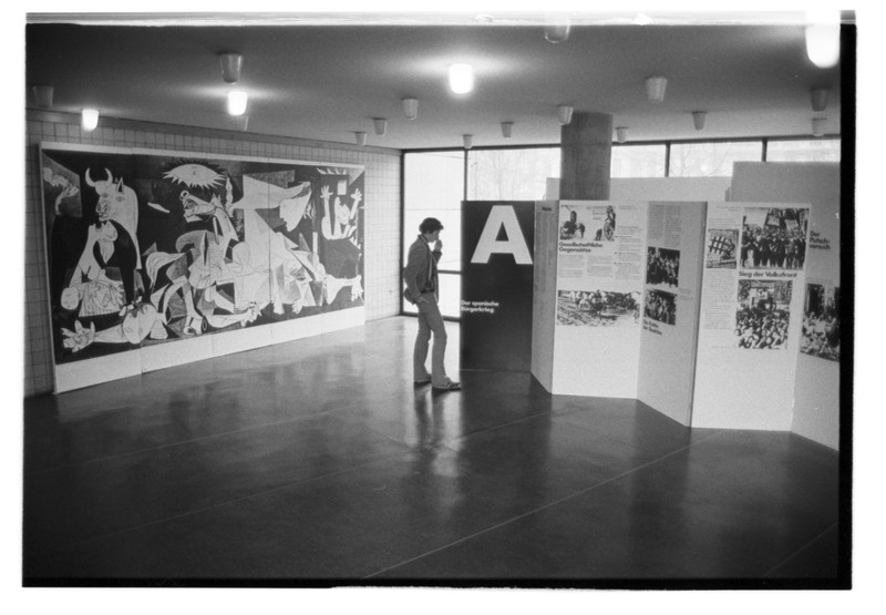
Guernica photo replica on exhibit in 1975 at the Friedrichshain-Kreuzberg Museum, image: ngbk.de
A nearly full-scale photo replica of Guernica was the center of a left exhibition in Berlin in 1975 organized by the neue Gesellschaft für bildende Kunst.
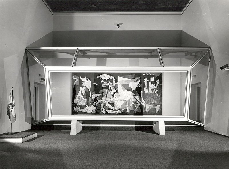
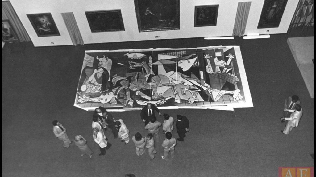
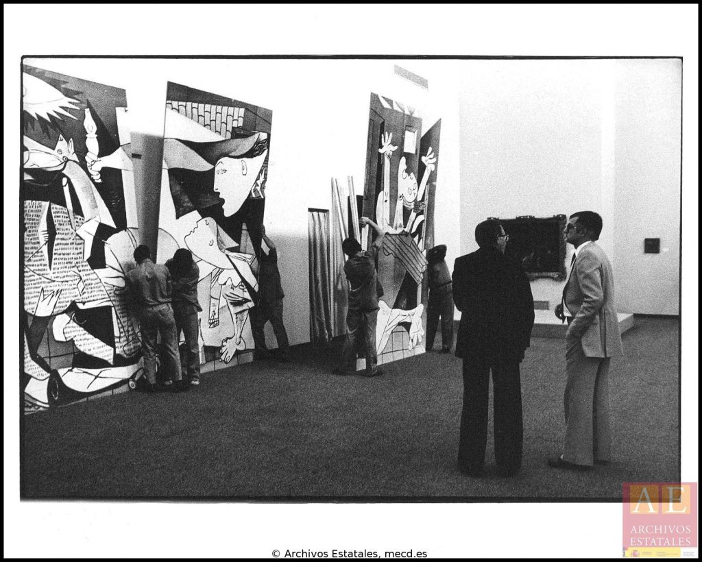
photo replica of Guernica on the floor of the Reina Sofia in 1981, image: archivocs estatales via mrs
The last, best photo replica of Guernica is probably Spain’s own. The Reina Sofia created a full-scale, multi-panel photo of Guernica in order to test the exhibition design and installation of the painting in the Casón del Buen Retiro in 1981 [top, above, below].
Parts is parts, war is war. Guernica photo replica being assembled at the Reina Sofia in 1981. image: archivos estatales via mrs
I have not seen any mention of any of these photo replicas still existing. A full-scale prop version of Guernica appeared in a scene in Alfonso Cuaron’s 2006 film Children of Men, and points to the very recent development of printing technology that allows a 3.5m tall image to be reproduced on one panel.
Which, I think I must now do if I can’t find these earlier photo versions. And even if I can.
[Shoutout to @br_tton, who was on the trail of the Reina Sofia’s photofacsimile as recently as this week and as far back as August 2014. Most of the rest comes from the Reina Sofia’s own minisite, Rethinking Guernica, which has an extensive of chronology of Guernica-related institutional documentation, though much less from their own institution.]
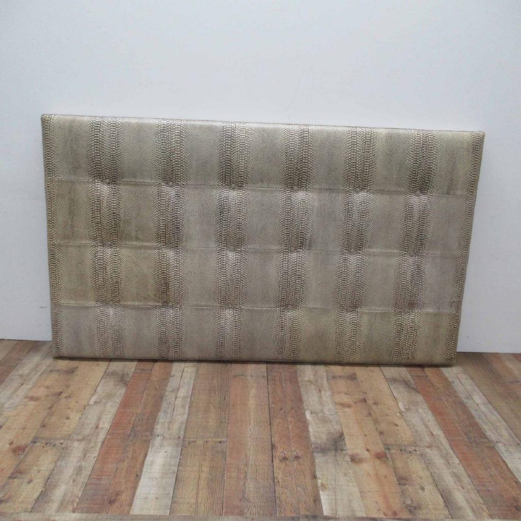
And here I am starting to feel about headboards-I-don’t-own-as-readymade-paintings like Dan Flavin ended up feeling about fluorescent lights: stuck.
Yes, that’s exactly what it’s like. Can you just imagine the market pressure? Demanding you to keep repeating your greatest hit, to keep churning out every iteration of the formula, to see the concept through to the bitter end, until it’s ultimately the headboard on your own deathbed, stained with your own hairgrease, that becomes your final, ghostly selfie. The hammer drops, the crowd cheers, your kids want to cash out and move your estate to Zwirner, authorizing faux-finish headboards in posthumous editions.
Damn. That got dark fast. And here I’d only planned to point out that this king-size, faux snakeskin quilted pleather number is most definitely in the top ten of the series. The top five, even. If you want it, you have until next week to let me know, at which point it’ll slip from all our grasps.
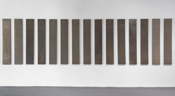
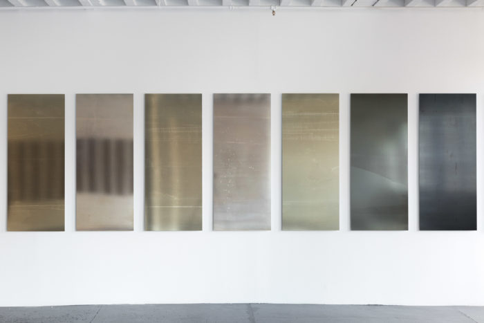
Liz Deschenes, Rates (Frames per Second), 2018, installation view at Miguel Abreu Gallery, image via CAD
Liz Deschenes’ current show at Miguel Abreu–both of them–is titled, Rates (Frames per Second). Deschenes’ series of photograms relate to the chronophotographic studies of motion of Étienne-Jules Marey.
The variously reflective texture of the photosensitive paper on display, coupled as the show unfolds with the widening individual panels comprising the works, affords a subtle sensation of gradual embodiment.
It’s interesting that the installation apparently culminates in the human-scale panels, because I assume you have to walk back out of the gallery, too.
In any case, they look gorgeous as usual, and the variations of widest ones even look baroque, relatively speaking, of course.
UPDATE: I have since heard that the works do not have an implied narrative. And that perhaps if there’s a sense of culmination in experiencing the show, it’s as much the 10 windows in the space, a found 10fps as any of the photogram series. This site specificity has now landed the show on my IRL list
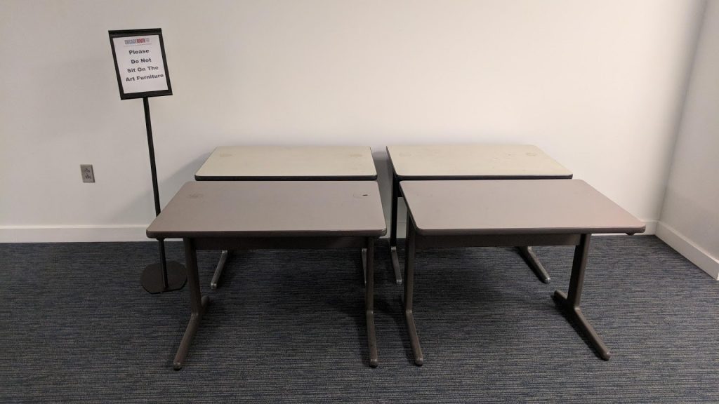
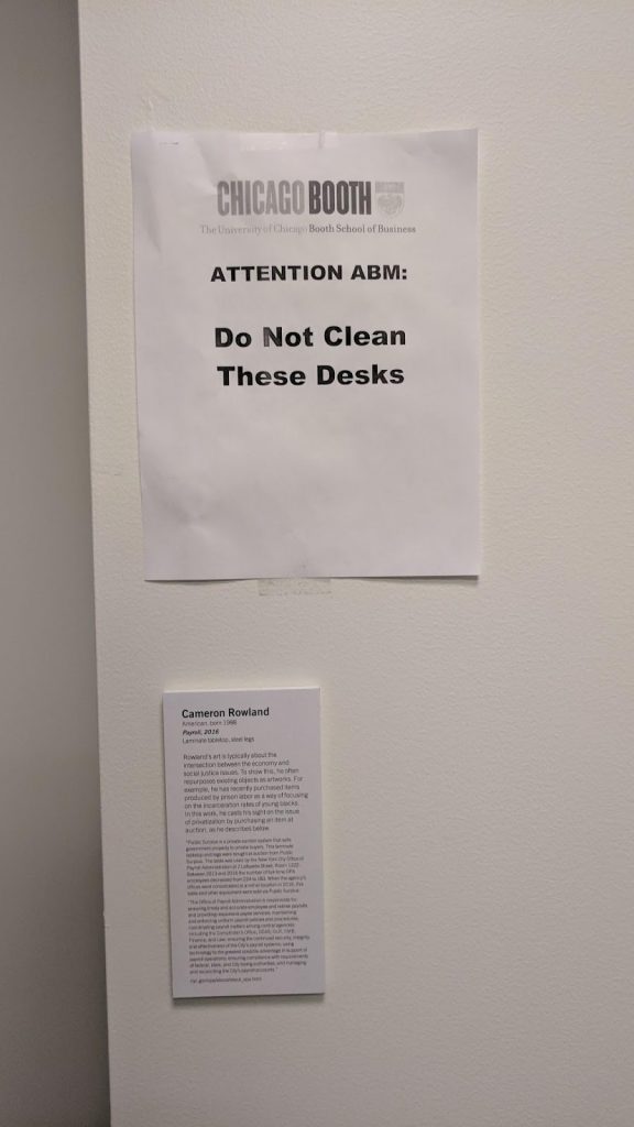
Cameron Rowland, Payroll, 2016, four tables with backstory, installed at The University of Chicago Booth School of Business
A friend recently surprised me with his report from a tour of the art collection at the University of Chicago’s Booth School of Business. It is frankly remarkable, thoughtful, and very up-to-date. It includes work by many well-known contemporary artists while mostly managing to avoid the sense of brand name-chasing vapidity that plagues many corporate collections. [There are Mark Grotjahn prints, tho.]
My friend’s stories of how people react to and deal with very contemporary art in the professional/academic setting of a business school are awesome, and go way beyond “Art? ¯\_(ツ)_/¯“. There’s the difficulty in filling a wall with SFW Wolfgang Tillmans; the Tacita Dean stills of disaster movie endings that are too depressing for the recruiting lounge, so they were moved to the PhD students’ offices; Claire Fontaine’s neon, “Foreigners Everywhere,” which is harsh enough in Chinese translation to make every prospective Chinese student uneasy. [Apparently only one artist with work in the collection has visited so far, which seems bonkers. It seems like an unusually engaging and sophisticated context for seeing art working beyond the white cube community.]
Attention: Do not clean these desks [which are art furniture]Anyway, my hands-down favorite piece has to be Cameron Rowland’s Payroll, which consists of four grimy desks the artist bought at government surplus auction from the NYC Office of Payroll Administration, after their own headcount had decreased by 41.
Rowland’s work forefronts the human implications of otherwise invisible elements of our capitalist, financial, and carceral systems with such effectiveness, I’m surprised he hasn’t been invited to lecture at the business school yet. He could also talk about requiring collectors to use the Projanksy/Siegelaub Artist’s Reserved Rights contract, or of renting his work instead of selling it.
The subtle tonal shifts between the requests to students and the instructions to maintenance staff should be the start of the school’s poetry collection.
the show is over the piece is back in the private collection the sneakerheads still want wool swag
How much sense does this not make? People buy the sheets from Félix Gonzalez-Torres stacks at auction, on eBay, and at various artist book & ephemera dealers, and it just seems…what’s the word here? Hilarious? Sad? Stupid? Embarrassing? Ridiculous? Wrong? Inexplicable?
Well, no. There’s an easy explanation. People sell Félix posters because they want money. And people buy them because they are for sale.
Félix made his first work that includes a stack of paper in 1988, and his first to consist of a stack constantly replenished with “endless copies” in 1989. Then there was a burst of stacks in 1990. By the time of his death in 1996, the artist had produced 47 stacks. Four were declared after his death to be “registered non-works.” One consisted of rubber doormats, which are not to be taken. One consists of an edition of 200 signed, silkscreen prints which together comprise a single stacked work, which are not to be taken. One was an edition of 250 of which 89 were sold separately, and the remaining 161 were sold together as a stack, which are not to be taken. The first one, it is not clear whether they can be taken. One is made of little passport-sized booklets, which can be taken. So that makes 38 stacks made of posters infinitely replenishable with endless copies. Along with a registered non-work stack created with Donald Moffett, three stacks were collaborations with another artist, who provided the image or text: Michael Jenkins, Louise Lawler, and Christopher Wool.
“first” [sic] editionThe Félix Gonzalez-Torres catalogue raisonné quotes the text the artist included in the certificates of authenticity for each stack:
A part of the intention of the work is that third parties may take individual sheets of paper from the stack. These individual sheets and all individual sheets taken from the stack collectively do not constitute a unique work of art nor can they be considered the piece…its uniqueness is defined by ownership.
So these are not artworks. Or, they’re not the artwork. But they are something of value, even though they are free for the taking in an endless supply. And people trying to explain and justify the value–or the price, really–use paradigms that the artist himself critiqued, rejected, and sought, to some extent, to undermine. Sellers, including auctioneers like Wright who know what’s up, invoke an edition model, calling sheets “original” “prints” and “lithos” from “an unknown edition size.” This framing resonates with the investing community that has grown up around mass limited editions from print mills like Murakami and Hirst, Kawsian art toys and artist-designed skatedecks, and even Richter-style “facsimile objects.”
Rago, an auction house whose business is liquidating New Jersey’s vast collections of silkscreen editions assembled in the 60s and 70s, gives the sheets made-up names like “Untitled (water ripples)” and “Untitled (The Show is Over)”, and gooses the provenance with statements like “Created originally in 1993 for the Printed Matter exhibition at Dia.”
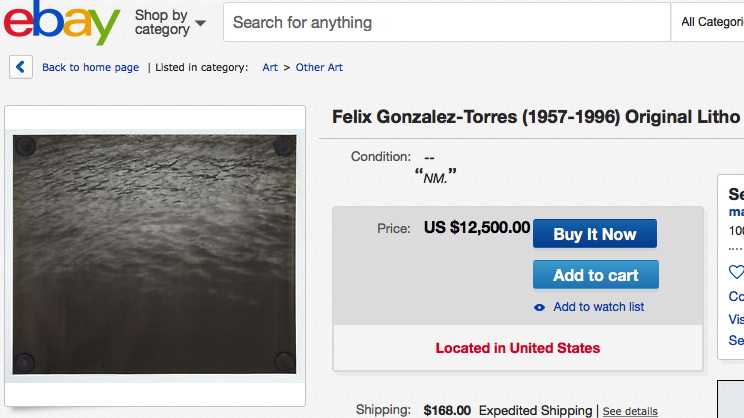
One eBay seller’s allusions to photography and rare book connoisseurship to justify a $12,500 asking price for a single sheet because it was taken from “the original piece” during a gallery show “in October, 1991,” have not gone unchallenged:
Please note that I have received some comments about this one… that is, since it was conceived of as an open edition, there are numerous ones out there from other exhibitions, and possibly a reissuance from the estate.
That could be true, however, the original litho is a “first” printing; subsequent printings are of a subtlely diiferent (sp) size, color, paper, etc. This makes the first edition the most coveted, and hence the valuation.
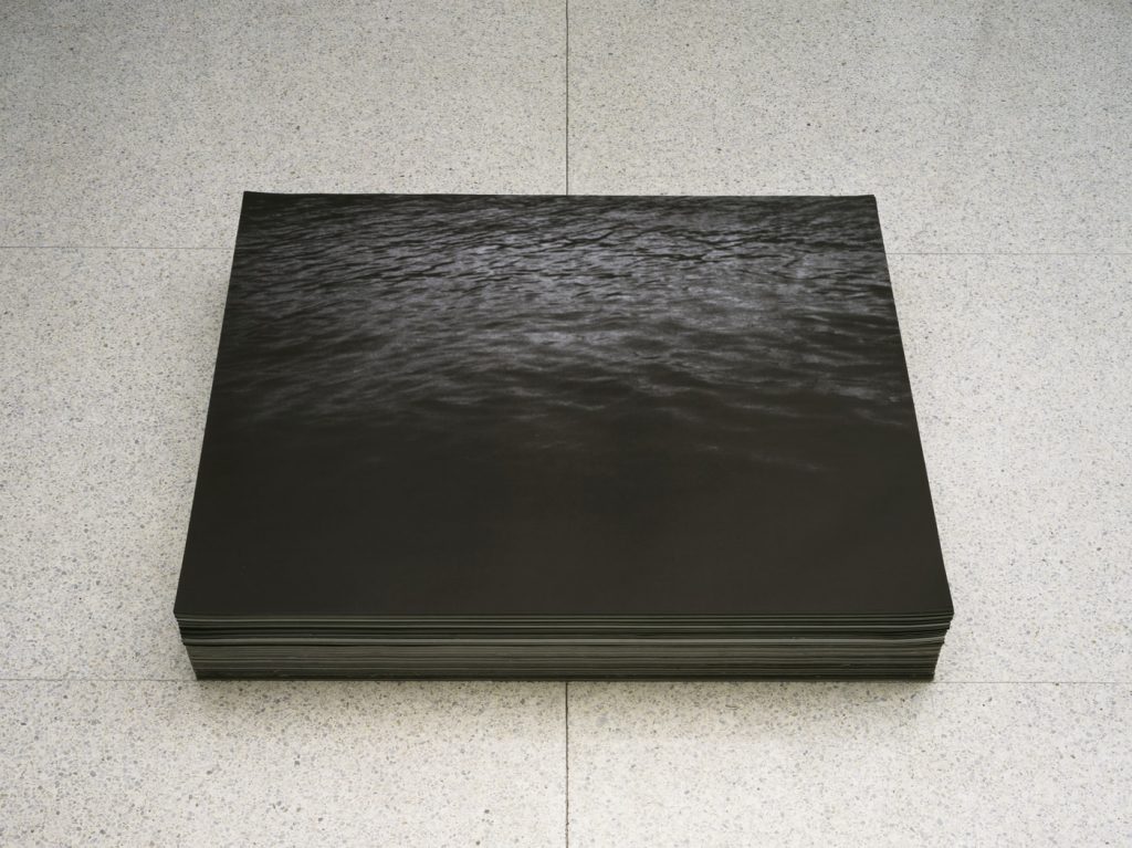
That stack, like so many of Félix’s work, known as “Untitled”, was acquired from that show at Luhring Augustine Hexler by the Walker Art Center. And despite being in a public collection and widely exhibited since its creation, the sheets from the Walker’s “Untitled” are among the most frequently and expensively sold separately. Unusually, the Walker’s description of the piece includes the number taken during the work’s public exhibition in 1999-2001: “approximately 660 posters per month.” Frankly, 8,000/year seems low, unless I were being charged $1,000 for one as an “edition”, in which case it’d be insanely high.
Felix Gonzalez-Torres, “Untitled”, 1991, offset print on paper, endless copies, collection: Walker Art Center
Félix wanted as many viewers as wanted them to take sheets from his stacks for free, but this turns out to be not the same as free to obtain or endlessly available. They’re not all in publicly accessible collections. They’re not always on view, and they’re probably not close by when they are. So the constraints and complications of getting in a room with the Félix stack you want have real costs, and the way we weigh these costs against the desire to possess a thing is called money.
Then there’s the reality of the work itself, the stack whose “uniqueness is defined by ownership.” The artist’s certificates also say “The owner has the right to reprint and replace, at any time, the quantity of sheets necessary to regenerate the piece back to the ideal height.” There’s a concept worth studying in a work doesn’t just exist at various heights, but that depletes and is regenerated. If you find that dissertation, please lmk. What jumps out to me is the apparently fundamental link between uniqueness and authenticity and ownership, and the dependence of that existence on a right, not a responsibility.
For all the freedom and openness and sharing of Félix’s work, it rests on a foundation of rights granted to collectors, not obligations assumed by stewards. The market for sheets is thus the trickle-down effect of these private decisions that make stacks scarce through unavailability.
Could the artist’s wishes be better served by adapting his stacks to the digitized world he didn’t live to see? What if the Félix Gonzalez-Torres Foundation made all of the stack sheets available for download and individual printing? It’d be several kinds of complicated, I know, but it wouldn’t disrupt the existence of “the piece,” the uniqueness of which, remember, is defined by ownership. [Having recently pulled out around 100 sheets I’ve collected over more than 25 years, I can say this is not an obviously great idea; stacks vary in size, paper type, and finish in ways that DIY printouts will inevitably get wrong, and the artist’s generosity for everyone else’s shitty reproduction of his work will be sorely tested.]
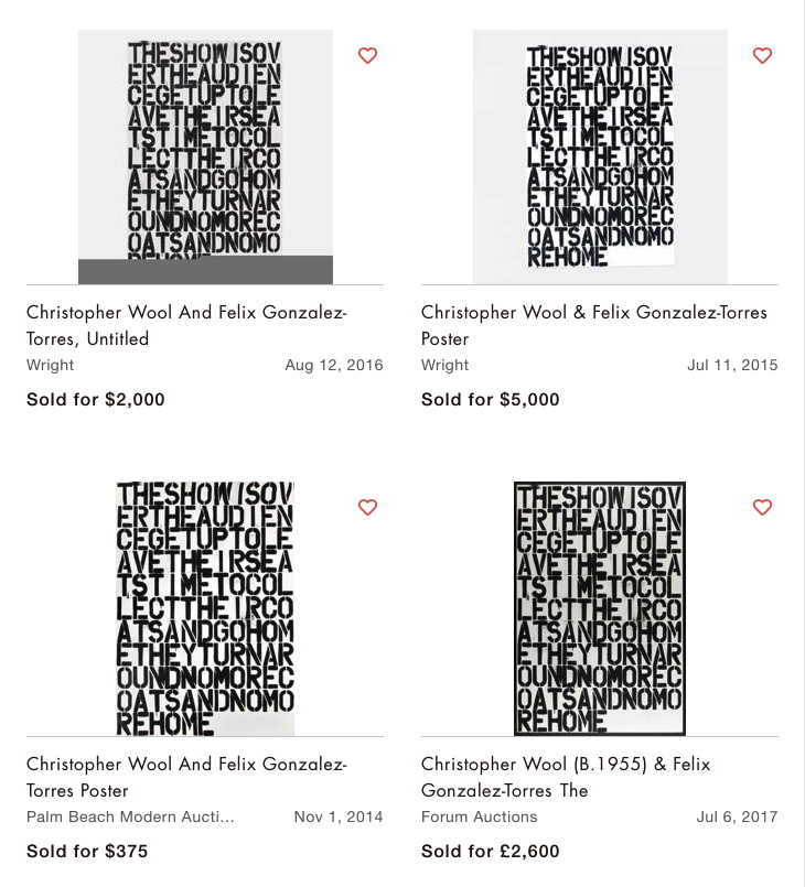
Letting sheets loose in the wild will result in large-scale printing and distribution, probably at poster-scale commercialization. But a line in an eBay auction seems to indicate this is already happening.
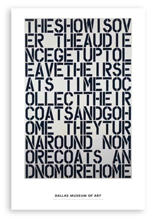
I have wholeheartedly celebrated a billboard of a billboard, and would fully support a poster of a poster, but ebay, this is a poster of a painting.
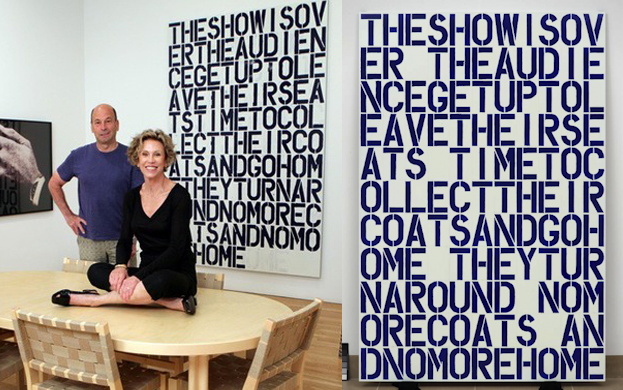
After comparing it to a poster that sold for $750 on artnet, the seller of this $1200 poster “by Christopher Wool & Félix Gonzalez-Torres” notes, “NOTE this is an original edition from the Dallas Museum’s run and not from China.” But something ain’t right. The dimensions of the Wool&FG-T sheet are 37×55, and this one from Dallas is 24×36. Also, there’s a giant border, and it says Dallas Museum of Art on the bottom. Also, the letters don’t line up. Because this is a poster of a painting, a painting [right] the DMA acquired in 1991. Meanwhile, the related painting that became the stack is hanging [left] behind Thea Westreich and Ethan Wagner. They gave it to the Whitney in 2014.
When everything’s Untitled… Westreich/Wagner/Whitney Wool on the left, which is presumably related to the Félix stack, though it does show some underpainting the poster lacks; DMA Wool on the right, which is not. src image: Bill Orcutt/Whitney via artforum; DMA
Isn’t this the real source of the Felix stack flipper problem: hypeboys looking for cheap Wools? And at hundreds to thousands of dollars a pop, wouldn’t YOU set up a #ChineseWoolMill to meet their demand?
If there is such a thing as capitalist karma, it comes in the form of Erika Hoffmann, the Berlin collector who, with her late husband Rolf, bought the Wool/Gonzalez-Torres stack. In March she donated it, along with her entire collection, to the Dresden State Art Collection. It will become one of the most public and publicly available stack pieces of them all.
[This writing of this post was delayed several days by the outraged consideration of the vast preceding and ongoing corruption of the president, and it took place amidst the anguished, mounting fury at the systemic policy of terrorizing and torturing children and families seeking asylum from perils that drove them to flee their homes. The solace of art has its limits.]
A COUPLE OF DAYS LATER UPDATE: I swear I wasn’t planning to do this, but then someone on Twitter feared it was coming, and so it had to happen.
“Untitled” (Ross in L.A.) in DC is now on eBay. [update: it is gone.] It comprises an original Félix Gonzalez-Torres offset print acquired from the National Gallery of Art, and a full-scale, signed, stamped, and numbered certificate of authenticity. It is available in an edition of 2. [update: it is not.]