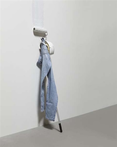
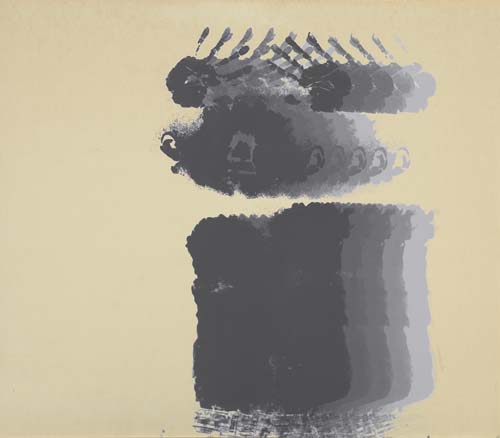
Pablo Picasso, Le Marin, 1943, 130x80cm, pre-puncture. image:Google cache of Christie’s
When Katya Kazakina reported that GOP finance chairman/sex predator Steve Wynn’s Picasso was damaged by Christie’s and withdrawn from sale this week idgaf.
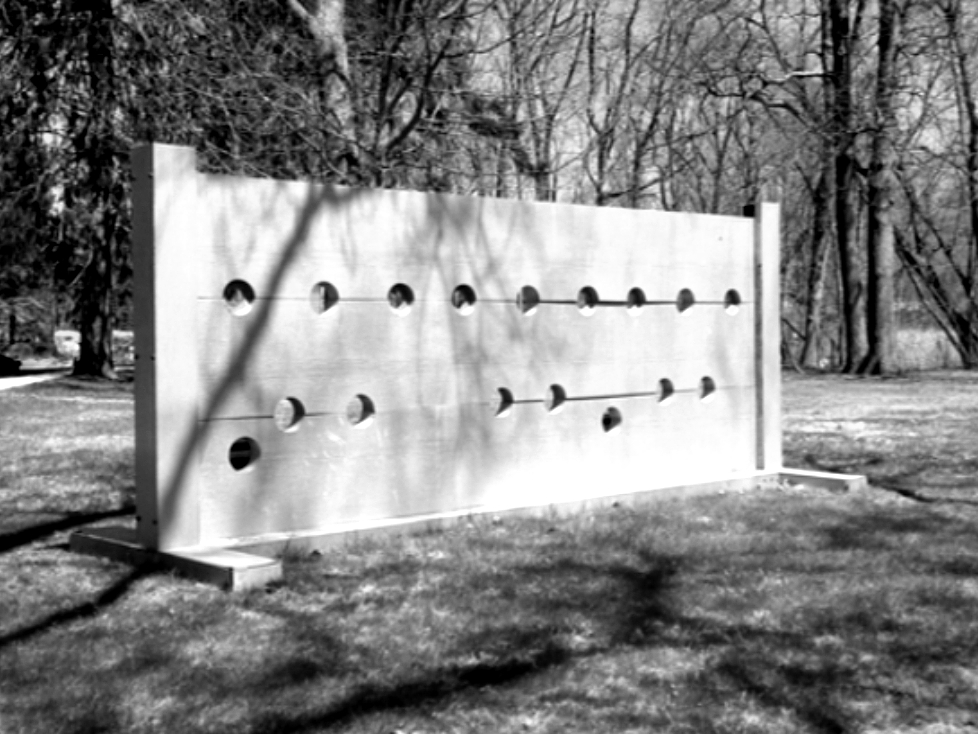
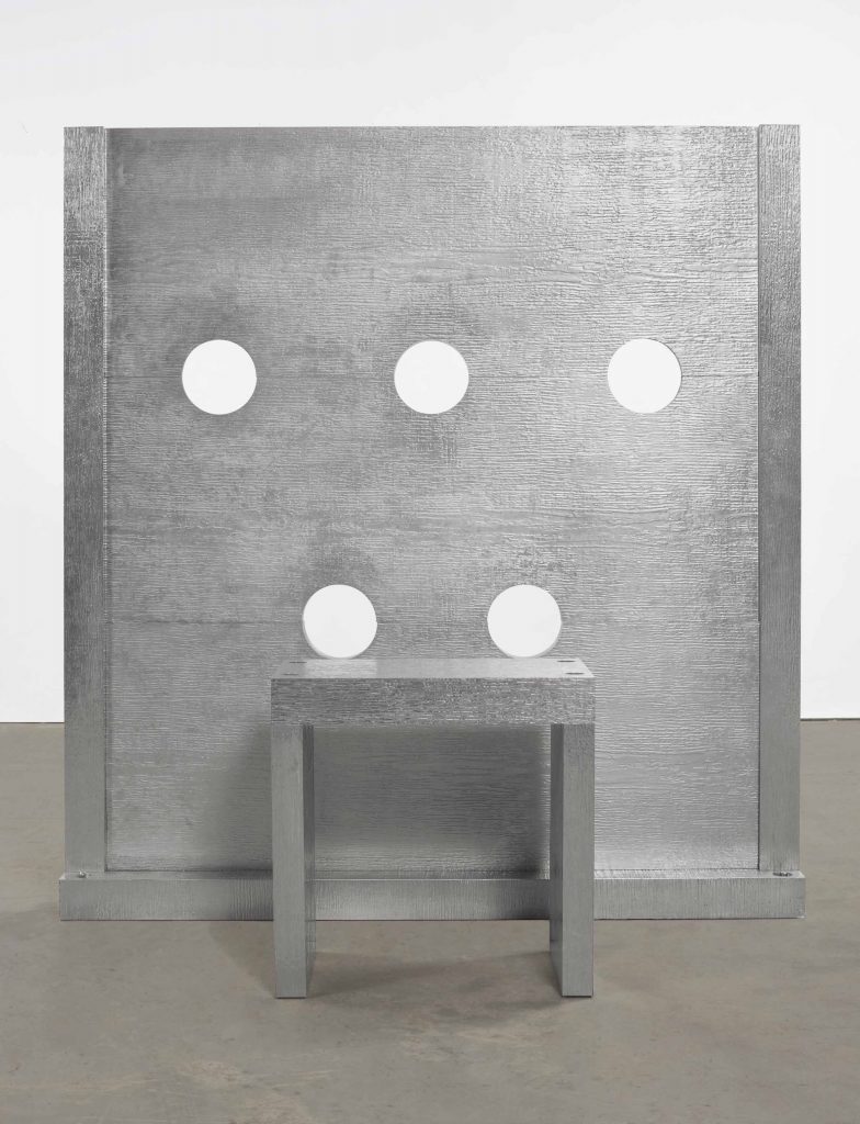
Elmgreen & Dragset, Powerless Structures, No. 87 “Back in a minute”, which I happened to show in 2000 at Exit Art, but didn’t buy in time. image: artnet
“Paint roller through a Picasso, well, there’s your Powerless Structures right there,” I said. “But can it really be that easy?” And then I remembered that Michael & Ingar hadn’t thought so back in 2004 when they put a safe behind a Hirst.
And then there’s this quote, mentioned in the Ganz sale catalogue, from Jacques Prevert, who visited Picasso two weeks before Le Marin was painted, and a month after the artist had been told by the Gestapo he was to be sent to a German concentration camp:
Picasso, more than any other artist, reacts to the things around him. Everything he does is a response to something he has seen or felt, something that has surprised or moved him. (Quoted in M. Cone, op. cit., p. 135)
So yes, I will react. And if you need me, I will be honing my paint roller throwing technique until the #chinesepaintmill Picasso arrives.
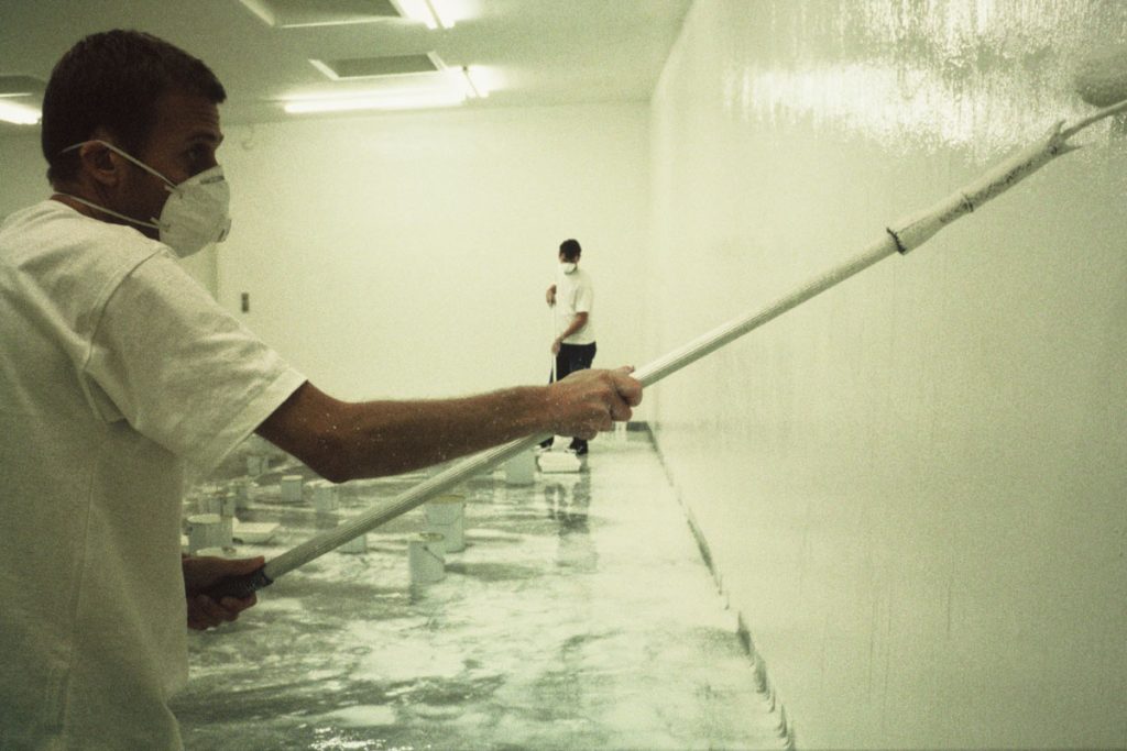
Elmgreen & Dragset, 12 Hours of White Paint, Powerless Structures, Fig. 15, 1997, at the Gallery Tommy Lund in Odense, Denmark, I think, image: kunsteder.dk
update update: Thinking about how to actually make this work, I look back to an even earlier Elmgreen & Dragset performance piece, 12 Hours of White Paint, Powerless Structures, Fig. 15 (1997) [above], where the duo repeatedly painted and washed off the walls of a gallery space. The downstroke is the key. I bet the painter was painting the wall opposite the Picasso and so had his back to it, and on the end of his downstroke he stabbed it. Which is fine, but I had hoped to work a rollerful of paint into the disaster somehow.
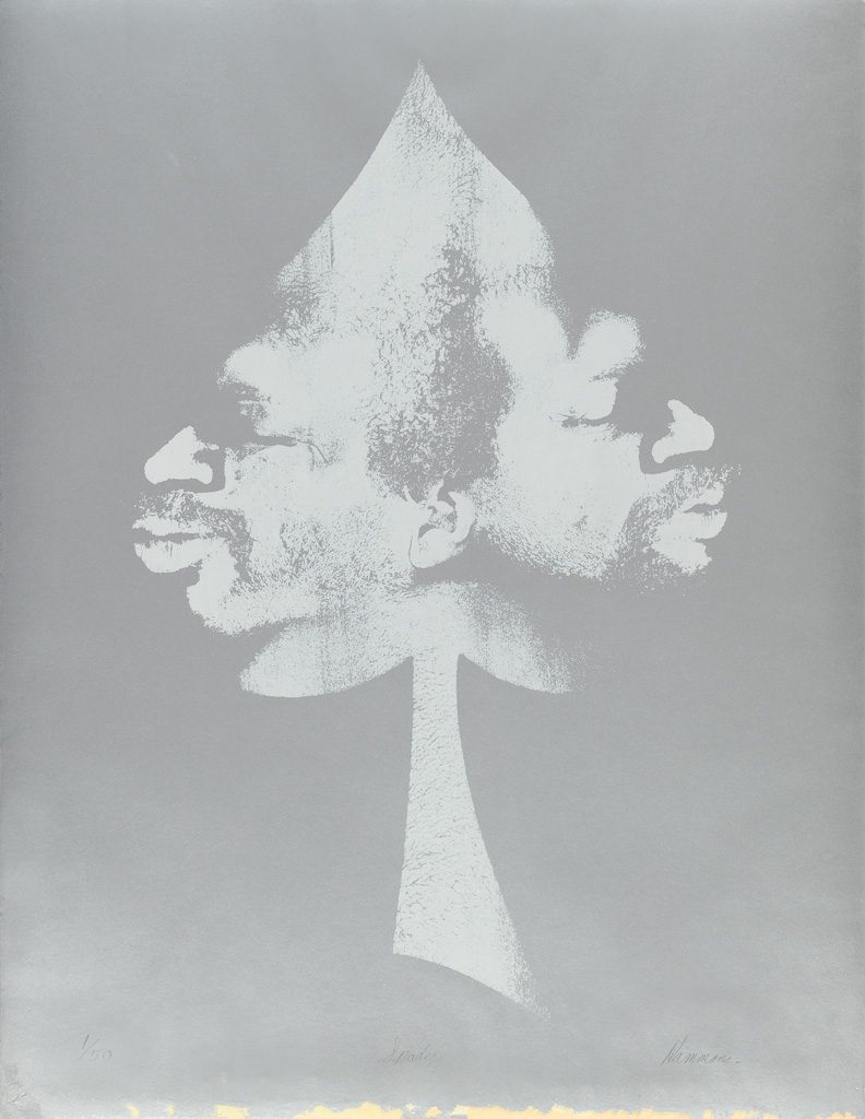
David Hammons, Spade, 1972, 26×20 in., sold Apr 2017 at Swann Gallery, now at Sotheby’s with a 60% markup. This unmatted photo is from Swann, and it looks like the print had some tape ripped off of it. Sotheby’s fixed that by cropping their jpg.
I was very interested to see this David Hammons print on silver paper when it came up for sale a year ago at Swann. And now that it’s back at Sotheby’s, I’m kind of interested in what’s up. I don’t remember it selling before, but Swann says it did. [For just $25k, or a $20k bid+premium, against a $30-40k estimate. Maybe it sold afterward.]
For an important approach (face imprinting) to an important subject (spade) for an important artist (DH, prounounced duh), that was only realized in a tiny fraction of the original edition (50 declared, six printed), it seems like it should’ve been snapped up and kept.
Oh right, now I remember why I was so interested in it: because I wanted to finish off the edition myself. There was a Warhol print on silver foil paper, too. Seems tricky to execute.
David Hammons, Moving to the Other Side, 1969, screenprint, image via Swann
“When I lie down on the paper which is first placed on the floor, I have to carefully decide how to get up after I have made the impression that I want. Sometimes I lie there for perhaps three minutes or even longer just figuring out how I can get off the paper without smudging the image that I’m trying to print.” [Young, p. 8.]
Then the artist applied a fixative to secure the image to the thin layer of margarine, often, as in this work, with multiple impressions. The artist took this work one step further making a screenprint of a monotype, moving the print across the paper to create a multiple self-image.
This process made me think Hammons mirrored his profile for Spade, but I think they’re actually the two sides of his face, composited.
UPDATE: wow, $100,000. Epic flip. UPDATE UPDATE: Not really, more like epic shop. $100,000 is what a collector pays, and the markup for a collector who did not know or know where to buy this work just a year ago is 400%.
Assuming the seller bought it last year for $25k, their take yesterday after premiums (25% buyer, 10% seller) is probably only $72k. So their net is around $45k. Not bad for one work for a year, but not epic. Combined, the two auction houses got $35k ($7k for Swann, $28k for Christie’s). The original owner got around $18k. Plus 45 years with the work. Hard to say he’s not the winner here.
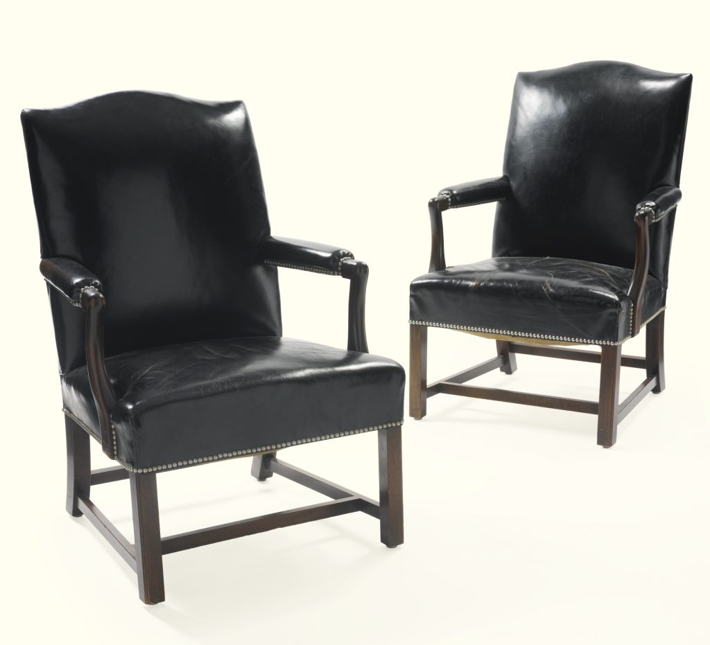
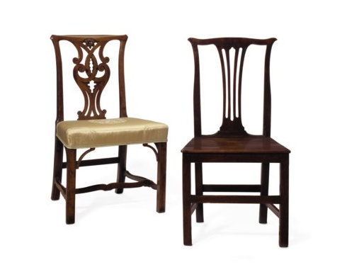
Lot 1685: a George III walnut side chair, together with a pair of George III fruitwood sidechairs, “with inventory labels inscribed D.R. 53.1758 or D.R. 53.1759”. est. $200-300, sold for $5,250.
I ended up not bidding on anything in the David Rockefeller auction this week, but I had my eye on some things. At first I thought of the trio of simple, mismatched, 18th century Chippendale side chairs, which could round out a small table where a similar, orphaned family chair might one day need some company.
These nice but unremarkable chairs would go nicely with our humble chair, I thought, but claiming that is the reason to buy them would be a lie. You would buy them–I would buy them–because 65 years ago, the family registrar marked two of the three chairs with inventory numbers: D.R. 53.1758. I am fine with acknowledging this.
I realized that buying something you might conceivably need would violate the spirit of the occasion. Beyond all other auctions, a Rockefeller Auction is pure want. And what is wanted, above all, is provenance.
Could provenance and its auratic power be isolated from the object that is its ostensible vehicle? What object might make that possible? It would not just have to be non-precious, or non-aesthetic; it would almost have to thwart value and appeal. It couldn’t be ironic or sentimental, or hold even a remote association with Rockefeller personally–which seemed a little intrusive–or with the family and their history and legacy.
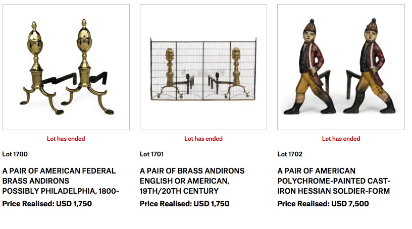
I love that this puzzle presented itself at the exact same time I was dealing with the Japanese plates Danh Vo bought 11 years ago from the rural Pennsylvania estate sale of an obscure US general with a connection to the Vietnam War and the JFK assassination.Anyway, I did a reverse estimate sort on the 800 or whatever lots in the online auction. I skipped past all the Staffordshire porcelain figurines of shepherdesses. I lingered for a moment over the fireplace tools and andirons (above). I have a thing for andirons of provenance, but then I remembered that the Rockefellers did, too: David’s brother Nelson had a business selling reproductions of his art collection, including his Diego Giacometti andirons.
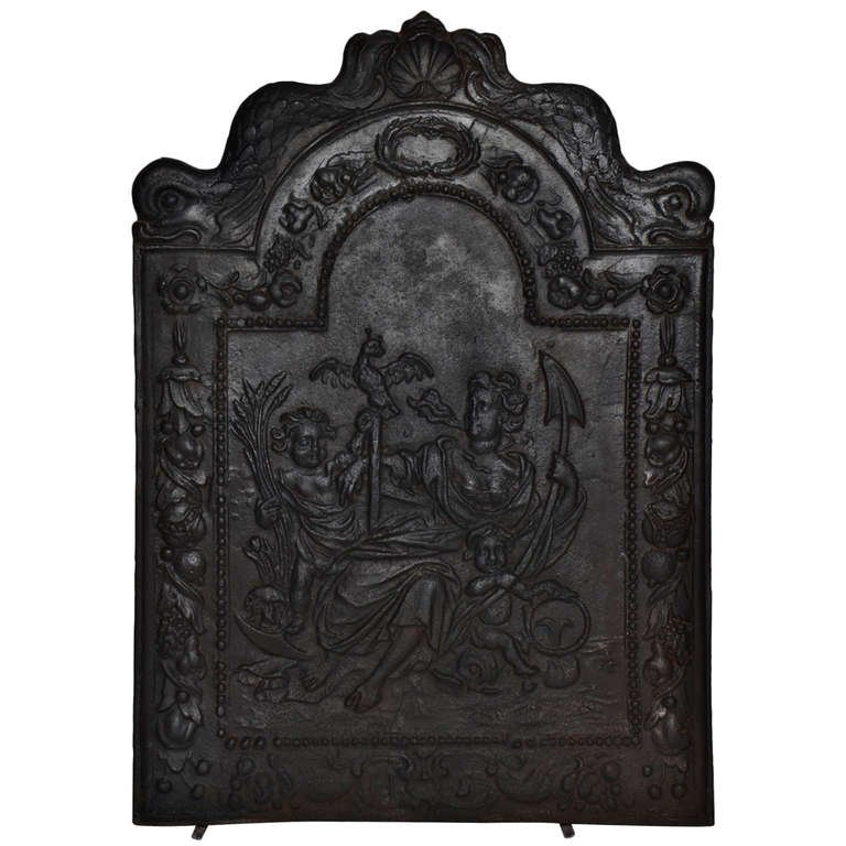
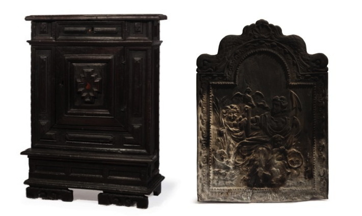
Then I found it: Lot 1732 An 18th Century English Cast-Iron Fireback, est. $200-400. It was in terrible condition, or rather, it had a rare patina. Like how they gratuitously leave the bird’s nest in the hood scoop of the barn find Ferrari. 1st Dibs lists two nearly identical firebacks [below] with Spes, the Roman goddess of hope, as 17th century Dutch, so Christie’s (and the Rockefellers’) description probably stems from the careful preservation of an inaccurate invoice “from WM. Jackson Co., 1 February 1956.” #provenance.
Fire like a Rockefeller, 17th c Dutch cast iron fireback depicting Spes/Hope at Schermerhorn, Haarlem, NL via 1stdibs
Oh, weird, what’s this, Lot 1753, Late 17th Century Italian Priedieu, “the base reduced in depth”, est. $400-600? A priedieu with the prie removed is kind of perfect. Not to question the Rockefellers’ faith, of course, just that when you put it in a home, the kneeling part of a priedieu can be a real tripping hazard. The provenance here was distinct, too: “Acquired with the contents of Hudson Pines.” David & Peggy bought Hudson Pines from his sister Babs, who’d built it. So this 10-inch deep, chopped up priedieu has a double Rockefeller provenance. I imagine it holding a tiny key bowl, or blocking an unsightly vent.
Study for Unrealized Rockefeller Diptych, 2018
But it’s also almost the same dimensions as the fireback. Now I could see these two damaged, useless, clunky antiques together, a found monochrome diptych monument to this liquidity event, a celebration of the massive value accrued around them during the last 70 years of their 350 year existence.
Each of these marred tchotchkes ended up selling for $3000, which answers the question of what provenance is worth. And I don’t have to worry about where to put them.
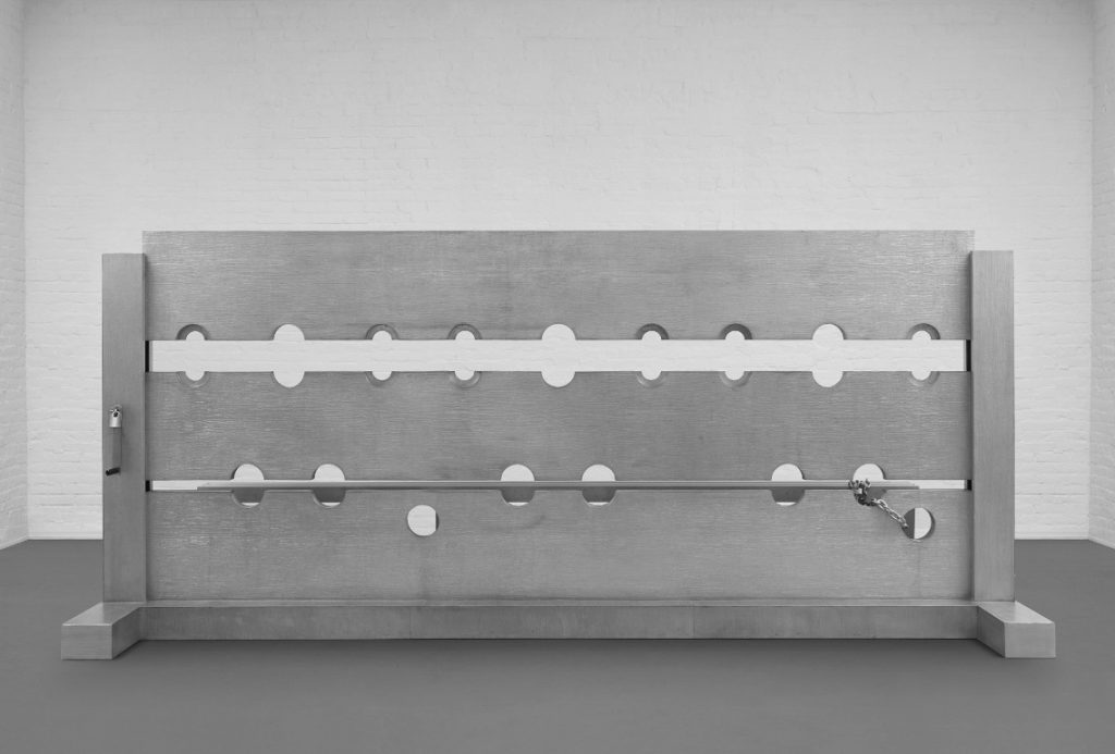
Let’s take a moment to consider the greatest Cady Noland sculpture of all time [No offense, Tanya!] Which I forgot about for 23 years.
Tower of Terror (1993-94) is a 4-meter long, three-person stockade made of cast aluminum. It was created for Noland’s room-filling installation in Public Information: Desire, Disaster, Document, the show that inaugurated SFMOMA’s new building in 1995. I went to that show. And have not recalled it until seeing Tower of Terror turn up for sale at Phillips this week. But I am not alone in this blinkered state.
Cady Noland, Tower of Terror Studies, 1994, collection: MoMA
Gary Garrels surely knew. He helped curate the SFMOMA show. And ten years later, when he helped Harvey Shipley Miller assemble a massive collection of works on paper to be donated to MoMA by the Judith Rothschild Foundation, he made sure to get Noland’s preparatory drawings, 21 of them. [They were only digitized some time after I confessed to knowing nothing about them in late 2015.]
But he did not get the sculpture itself. Where did it go? Norah and Norman Stone apparently didn’t keep track of it. Though they were friends of SFMOMA, and the artist, and had an even bigger work by her, they called their Log Cabin Blank with Screw Eyes and Café Door (Memorial to John Caldwell)“Cady Noland’s only outdoor sculpture to date.”
Cady Noland, Tower of Terror, installation view at Dowling College, Oakdale, LI, no date, image from the college’s pre-bankruptcy website, thanks greg.org reader dg
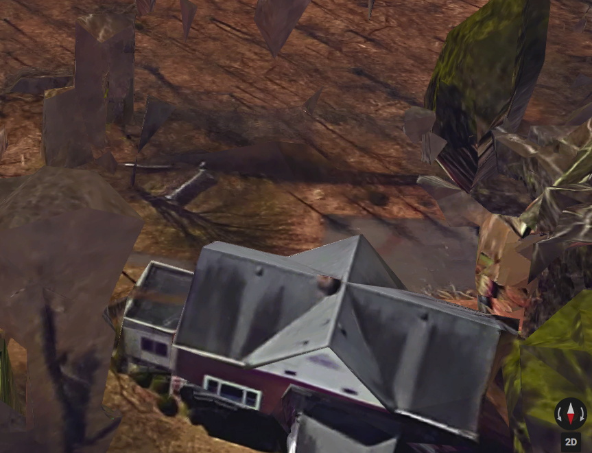
Which means they did not know that Tower of Terror had been installed outdoors at Dowling College, on the south shore of Long Island, for more than 20 years. The sculpture had apparently been acquired directly from Noland in 1995 by Albert & Beverly Davidson of the Davidson Aluminum & Metal Corporation, and promptly donated to Dowling, a small college on a former Vanderbilt estate near the Long Island Sound. It apparently sat in the woods, near the student parking lot, and in front of estate’s former Ice House, which had once been the residence of the college president, but was, I believe, being used as office space. I finally found it on Google Maps. Let’s say it was not where I expected.
Tower of Terror in situ at Dowling College, via the Dark Ages of Google Maps, what is going on here?
So for 22 years, students walking from their cars to– actually, to nowhere. As far as I can tell, the actual school buildings were in the opposite direction. So who ever passed by? Who knew that this massive masterpiece was sitting in public, just off the Southern Parkway, an hour outside the city? Someone knew, because when Dowling College went bankrupt in 2016, they knew to swoop in and liquidate that asset. And now it will be flipped.
The new owners and Phillips also know–by now, don’t we all?–to consult Ms. Noland about her work. The auction listing carries a new non-disclaimer: “We thank Cady Noland for reviewing the cataloging for this work.” We all do, Phillips, we all do. And we thank her for making it. [So if she is fine with this sentence, must we be? “Tower of Terror, 1993-1994, represents the central tenant of Cady Noland’s conceptual practice: the subversion of the American psyche through celebrity and violence. “]
Some other thoughts about this work that I don’t really know how to fit into a narrative: Tower of Terror is also the name of a Disney ride that opened in July 1994. [The study above dates from August.]
Cady Noland, Beltway Terror, 1993-94, stamped aluminum on wood, not sold by the Sammlung Goetz at Christie’s, Nov. 2016, for $800-1.2M
Another stockade from the SFMOMA show was recently put up for sale, until it wasn’t. In November 2016, the Sammlung Goetz sent the domesetically scaled Beltway Terror to Christie’s with an estimate of $800,000-1,200,000. Then it was withdrawn. Beltway Terror looks very similar, yet also substantially different. Obviously and adorably, it only fits one person. But it is also stamped aluminum laminate over wood, where Tower of Terror is cast aluminum. It now seems significant that the work was acquired by the owner of an aluminum processing company. Perhaps it was acquired in exchange for fabricating it.
those sure look like seams to me. stamped aluminum on aluminum?
Perhaps it was cast from a stamped sheet-on-wood model? No. When I see the video, there is either some Gober-level simulacralization of the seams, or this is stamped aluminum laminated on cast or milled aluminum. In any case, Tower of Terror is epically superior to Beltway Terror. I hope whoever buys it puts it where it belongs, in a museum of modern art.
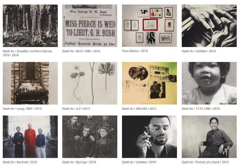
After reading Tim Schneider’s recent article about the market views of Danh Vo’s work, I realized I hadn’t written about Vo’s Guggenheim show.
Tim’s point is well taken, and borne out in the show: Vo makes both sexy, shiny, collector bait (gold-leafed flags & alphabets, Statue of Liberty fragments) and meaning-laden but head-scratchingly unaesthetic cultural detritus (the stuffing from Robert McNamara’s chair, the Unabomber’s typewriter). The typical market dynamics of art stardom readily attend to the former, while posing a challenge to the latter.
Parts is parts: The White House Years of Robert McNamara, Lot 20, 23 October 2012 image: Sotheby’s
At least that’s how it looks on the secondary market. Vo’s global network of top-flight dealers know a thing or two about placing “difficult” work with “connoisseurs.” Those McNamara chairs, purchased at Sotheby’s for $146,000, were promptly stripped for parts, which were sold as separate works to nine of Marian Goodman’s most well-cultivated private and institutional clients. And some of the wonkiest Gothic and Hellenic scrap mashups with the grossest Exorcist titles are in the collection of Francois Pinault. Then Vo installed them in the Dogana alongside scrap metal rented [rented!] from Cameron Rowland and plastic tarps David Hammons dragged into Mnuchin’s joint from the street.
Two things that stuck with me from the Guggenheim, and any time I see one of Vo’s spare, deliberate installations: he makes almost as many objects as he shops, and he shops a lot.
Just a few of the editions, mostly photogravures, Danh Vo has produced with Niels Borch Jensen starting in 2010
Vo makes a lot of very interesting editions, which get equal treatment in his shows, even if they don’t garner equal attention. An easy place to start looking is the sheaf of photogravures Vo has produced with Niels Borch Jensen. There was a burst of activity in 2010, starting with Joseph Carrier’s photos of Vietnam; various family snapshots; and a candid photo of the artist who, at that moment, would have been his ex’s ex. Loaded/awkward. Anyway, seven of the 12 prints in the screencap above are in the show, and that’s still just the tip of an iceberg.
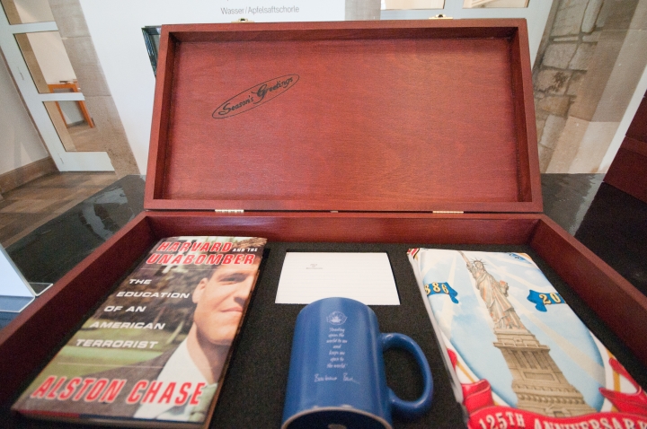
Danh Vo, Seasons Greetings, 2011, ed. 24, for the Fredericianum, image: newarteditions, which doesn’t have it.
The first Vo edition I regret not getting was Seasons Greetings, made for his show at the Fredericianum in Kassel. A gift box contains a T-shirt from the Statue of Liberty; a coffee mug with a Barbara Bush quote on it from the GHWB Library shop; a book about Ted Kaczynski Harvard sued out of print; and just when you think the loaded-souvenir-shopping-as-practice has gone too far, there is a card on which Vo typed out the name of the show, JULY, IV, MDCCLXXIV– using Kaczynski’s typewriter.
I started thinking about these editions because Tim Schneider hadn’t mentioned them, at least not directly. Tim broke out the auction performance for Vo’s works: of 52 pieces to come up for sale, 13 were not gilded cardboard or Statue of Liberty chunks, and 6 of these 13 were bought in. And two of those six, I realized, were the same piece.
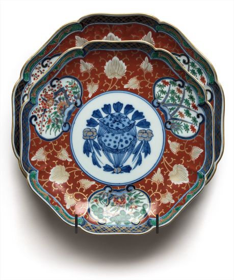
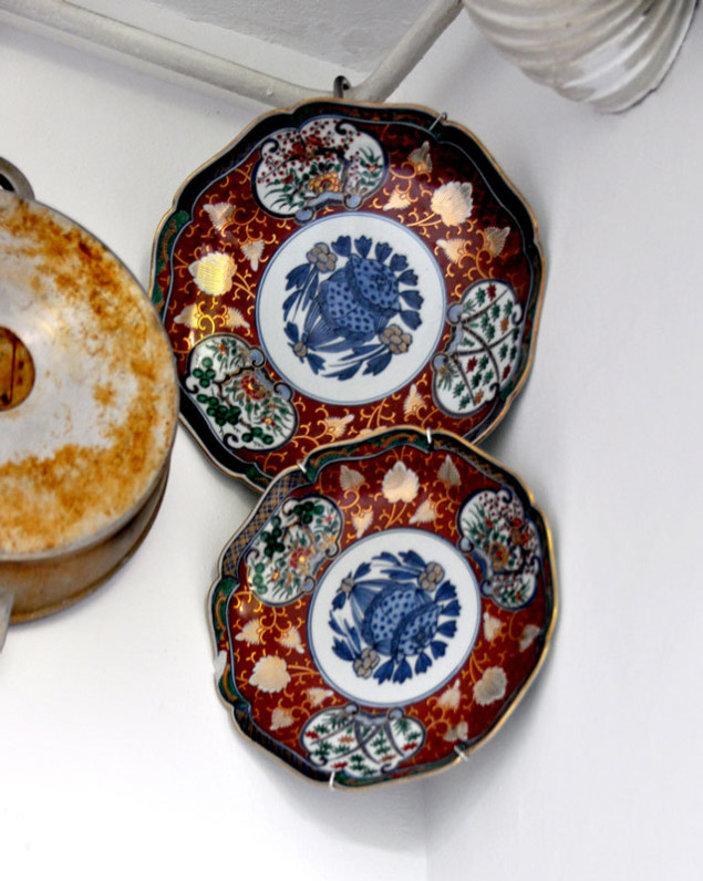
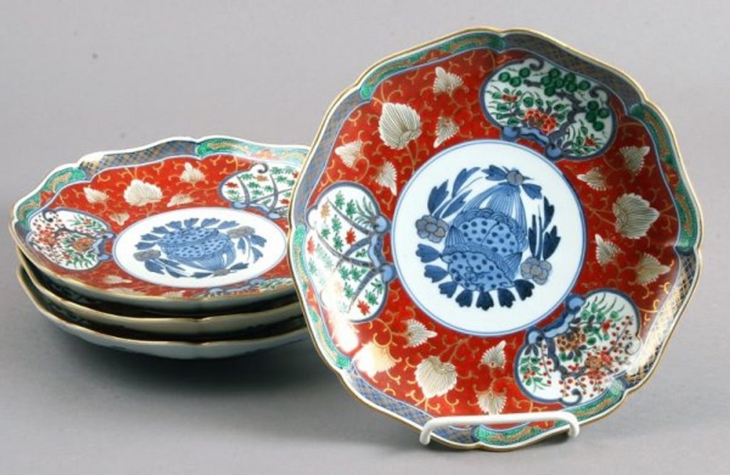
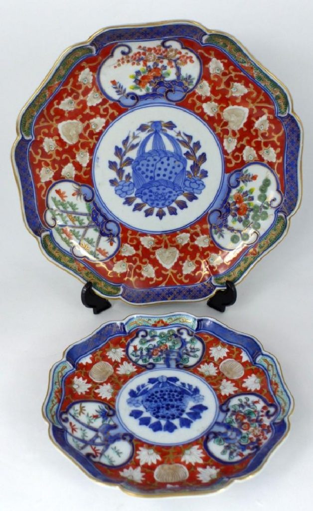
Danh Vo, Untitled, 2009, two Imari plates previously owned by Gen. Lyman Lemnitzer, ed. 7/12, not sold by Blake Byrne at Phillips NY, Feb 2016.
Two examples of Untitled, 2009 (above), from an edition of 12, had come up for auction: one at Phillips in 2016, from Daniel Buchholz (est. $8,000-12,000); and another, from Bortolozzi, in Christie’s London in 2015 (est. £10,000 – £15,000). [Christie’s deletes webpages for unsold lots, so unless you have a print catalogue, or an artnet database, you’ll need an Internet Archive.]
Untitled (2009) in 2010, hanging in Danh Vo’s kitchen. He opened his apartment as a venue for the Berlin Biennale. image: kunsten.nu
When Vo turned his apartment into an exhibition site for the 2010 Berlin Biennale, they were hanging in the kitchen [above]. And before that, in a Summer group show in 2009, Daniel Buchholz showed them in Köln. That credit line also includes an auction catalogue for the estate of Gen. Lyman Lemnitzer, which was unmentioned anywhere else.
Lot 3498: Lyman Lemnitzer’s Japanese dinnerware, as purchased in 2007 by Danh Vo for $625+premium, image:liveauctioneers.com
Which immediately got me wondering. And sure enough, there it is: 2007, Alderfer Auction in Hatfield, Pennsylvania. Among the various lots of Japanese Imari ware Gen. Lemnitzer had accumulated were twolots of twelve matching plates in slightly different sizes. They totaled, with premium, around $1200. Even as a barely emerging artist, I’m sure he netted out.
How low can you Vo? Lot 0402: 2pc Imari porcelain plates, looking very Vo-ish, sold for $60 in West Palm Beach, image: liveauctioneers.com
The super weird thing, though I didn’t know how weird yet, was that the day after I was searching for Vo’s 11-year-old sale, a near identical pair of Imari plates was coming up for auction in West Palm Beach. The pattern was identical, the marks identical, the sizes were very slightly different, but maybe not out of the auction houses’ margin of error. The auction estimate was $40-60. Even by the cruelest market calculus, that seemed like an unlikely price curve.
There must be thousands of plates like this, I thought, wrongly. A search through almost ten thousand auctions for Imari porcelain plates turned up only one that matched the Lemnitzer plates Vo bought and the two in front of me. [Sidebar: there is too much stuff in this world.] Could this pair be an overlooked Vo edition? If it was, could it be rescued? More interestingly, if it wasn’t, did it matter?
The auratic weight of provenance, history, culture, and memory are at the crux of Vo’s work. He buys the objects he buys because of these associations, and he puts them in an art context, where their backstory operates like an informational dye packet that explodes when you read a wall text, irrevocably staining the object in your mind, if not your eye. You can complain about the inertness or opacity of Vo’s objects, and their reliance on explanations, but I’m pretty sure he dgaf. And by the time you realize it, it’s already too late; Vo has changed the way you see–and think about–what he’s put before you.
So can that connection be severed? And if severed, can it be reattached? If it never existed, can it be conjured by an identical object? Vo spends an awful lot of time shopping. It’s probably the main part of his practice, besides chopping. These intangible issues, evocations, and associations hover around every transaction we make; it’s how brands work, how fashion works, how art works. Vo transposes his objects from one sphere–the historical, political, or personal–to another, but every time we trawl through eBay or a museum shop, so do we. Consumption and the mechanisms and networks of capitalism implicate us all.
Whether these Floridian plates once sat on the shelf of the American father of the Vietnam War is immaterial. Because now these plates evoke Danh Vo. And that is something.
If you bought these plates, please know that you only did so because the liveauctioneers app gave me the false impression that I had placed a winning bid, and then gave no warning before it closed the sale. While you enjoy your plates, I will enjoy thinking about them. [But if you want to unload them, HMU.]
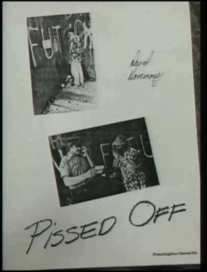
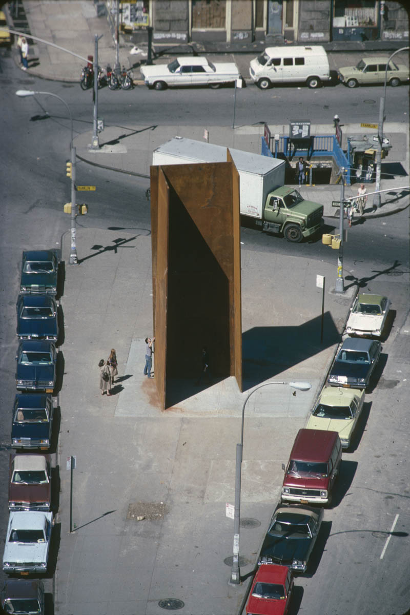
Titled, “Word on the Street: David Hammons’s Negotiation of Rumor, ca. 1981”, Schriber spoke of Hammons’ “strategy of obscurity” and the careful ambiguities around the two projects, Pissed Off, and Shoe Tree, in which, respectively, the artist pissed on and threw sneakers over a three-plate Serra prop piece installed on a Tribeca traffic island at the intersection of Sixth Avenue & Franklin Street.
I knew the narrative of the situation, as constructed around Dawoud Bey’s handful of photos, was highly susceptible to, what? interpretation? bias? subjectivity? In a way, I think that’s Hammons’ point: how do we interpret what we see, even when we [should] know what we’re seeing is incomplete, an artist’s presentation?
What I did not realize, is that Hammons sat on these works without announcing or showing them for nine years. The work was first shown publicly in the 1990 Exit Art exhibition, “Illegal America.”
Whether it’s the myopia of the blogger and tweeter compelled to feed the content beast, or the tyranny of the new, it’s hard to imagine maintaining this kind of years-long silence about a work today. But that could also be the perplexity of hindsight. Maybe Hammons didn’t show Pissed Off because no one wanted to see it. Or he didn’t have the right context for it.
Which made me wonder again. Hammons’ Pissed Off was included in Exit Art’s 1990 show “Illegal America.” [Was the Xeroxed “poster” above, in the Exit Art archive at NYU, what was included in the exhibit? Was anything else?] But the 1990 show was a restaging of a February 1982 show of the same name. “Illegal America” was the first show Jeanette Ingberman and Papo Colo staged as Exit Art, and they did it at Franklin Furnace, which was located half a block from the site of Serra’s–and Hammons’–works. You could see Serra’s work from Franklin Furnace’s front door.
At SAAM, Schriber discussed Hammons’ interactions with JAM, an alternative space for emerging African American artists which had moved a couple of blocks west of Franklin Furnace, but she did not mention this earlier incarnation of “Illegal America.” 26 of the 36 artists in the 1990 show had also been in the 1982. Hammons was not among them. Was he going to be? Was he not?
Richard Serra, T.W.U., 1980-81, installed in Tribeca, image via publicartfund.org
It does seem like quite a coincidence that Hammons created two works involving the racialized and bodily precarity associated with illegal actions within pissing distance of the projected site of a show about artists working in the medium of illegality itself.
Could it be? “Illegal America” opened in February 1982, and included The Real Estate Show, which had taken place in 1980. Pissed Off happened sometime in 1981, but T.W.U. was only installed until July 30th, 1981, so that gives some parameters. Would Hammons have visited Franklin Furnace before, during or after Pissed Off? Would they have known of his work? Were they interested? Or not? If Hammons was going to be in, he wasn’t. If he wanted to be in, he wasn’t. Did something go down?
Would the Exit Art folks or Franklin Furnace have known in 1982 about the subject of Hammons’ artist statement for the 1990 show, which Schriber presented, and which I had never heard of?
“Pissed Off” is about the fact that in New York City a man doesn’t have any public access to relieve himself in a decent manner. There is no way for a gentleman to relieve himself in a gentlemanly manner without having to buy a drink.
Keep the rage going.
What started Hammons’ rage? Sure, a city and a system that denied the needs of its citizens on the most basic, bodily level, and putting a gentleman at risk of police intervention for the most basic necessities, but was there anything else?
Can you imagine Hammons and Bey the morning of Pissed Off, one of them with a camera, and at least one of them dressed in a dashiki that, as Schriber put it, gave him “the look of a city forager.” What if they visited Franklin Furnace that morning? To drop off some slides? To talk about a show? Have a chat? Just to look around? What if they said they were there for a meeting? What if they asked to use the men’s room? Can you imagine what could have happened?
Hammons’ nine year wait seems short, and also way too long. And I don’t think he’s done.
I was absolutely floored by this tiny quote from Zora Neale Hurston’s 1928 field interview with Cudjoe Lewis, who was one of the last known survivors of the last slave-ship to come to the United States. He arrived in the US from what is now Benin in 1859 or 1860, smuggled in on the Clotilde at the age of 19. His given name was Kossula.
“I want to know who you are and how you came to be a slave; and to what part of Africa do you belong, and how you fared as a slave, and how you have managed as a free man?”
His head was bowed for a time. Then he lifted his wet face: “Thankee Jesus! Somebody come ast about Cudjo! I want tellee somebody who I is, so maybe dey go in de Afficky soil some day and callee my name and somebody dere say, ‘Yeah, I know Kossula.’ ”
Hurston spent three months interviewing Kossula, and even longer trying to get his history published. Because of her training an anthropologist she refused publishers’ demands that she rewrite Kossula’s vernacular testimony. 87 years later, it is being released for the first time, and I just bought it.
[This is where I originally expected this quick post to stop.]
Kossula was a leader of the community of Clotilde survivors who after attempting to return to Africa, created a settlement outside Mobile, Alabama called Africatown. In a 1914 book called Historic Sketches of the South, Emma Roche Langdon recounted the stories of the Clotilde’s voyage, the survivors, and their descendants. She spelled his name Cudjoe Kazoola Lewis.
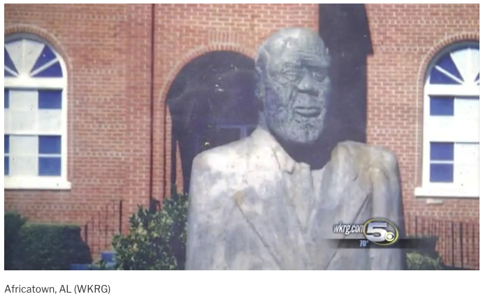
Bronze bust of Cudjoe Lewis after Charles Rhodes’ carved wood original, some time before 2002, image via WKRG
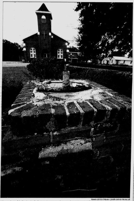
In 1959, on the 100th anniversary of the Clotilde‘s arrival, the Progressive League of Plateau erected a memorial to Cudjoe Kazoola Lewis in front of the Union Baptist Church. The monument was created by Henry Williams, “a welder and history buff”, which is what they call someone who also saved and preserved the Africatown cemetery. On a pyramid of bricks made by Clotilde survivors sat a lengthy bust of Lewis by Charles Rhodes, a “young understudy” of Williams.
AP photo of the brick base of Cudjoe Lewis memorial in front of Union Baptist Church, Jan. 2002. image via Gadsden Times
The original was carved in wood, to be cast in bronze. When the bronze bust was ripped off the base and stolen in 2002, the pastor said it had been in front of the church for “about three decades.” Was he off by 15 years, or had it taken until the 1970s to make the cast of Rhodes’ sculpture?
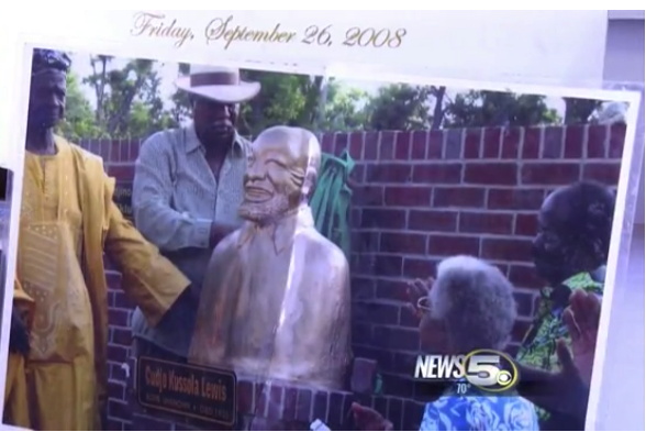
unveiling of a new bust of Cudjo Lewis, 2008, at the Union Baptist Church, Africatown USA, AL, image via WKRG
In 2008 a new, similarly shaped sculpture was unveiled, though this picture from a local newscast shows it next to a wall, not on the brick pyramid, because it was installed at the Africatown Welcome Center alongside a bust of John Smith, a mayor of the nearby town of Prichard. The sculptures were donated by two filmmakers from Africa, Thomas Akodjinou from Benin and Felix Yao Amenyo Eklu from Togo, in 2007.
On his blog Akodjinou honored John Smith for his involvement in the Alabama Benin Trade and Economic Cooperation Forum, which saw Africatown as an historic symbol of reconciliation between the two interconnected cultures.
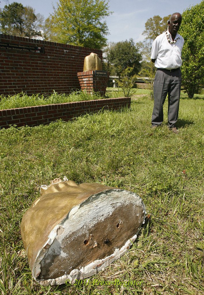
Vandalized busts of John Smith (front) and Cudjo Lewis, and Robert Battles, executive director of the Africatown Welcome Center, Mar 2011, image via al.com
In March 2011, both sculptures were vandalized, with their heads ripped off. The sculptures were originally described as marble, but from the look of this painted and chipped base, I am doubtful.
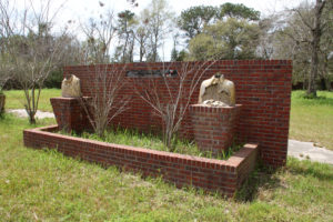
John Smith & Cudjo Lewis busts as photographed in 2016 by Maarten Vanden Eynde, image: deltaworkers.org
The headless busts were still visible in 2016 when Belgian artist Maarten Vanden Eynde visited Africatown. His account is disheartening, if not downright harrowing. Besides the historic cemetery, which is sinking, many of the structures and homes are run down or abandoned, and the area is threatened by surrounding industrial redevelopment. [Tho tbh, it looks kind of typical on GSV from 2011-2017.]
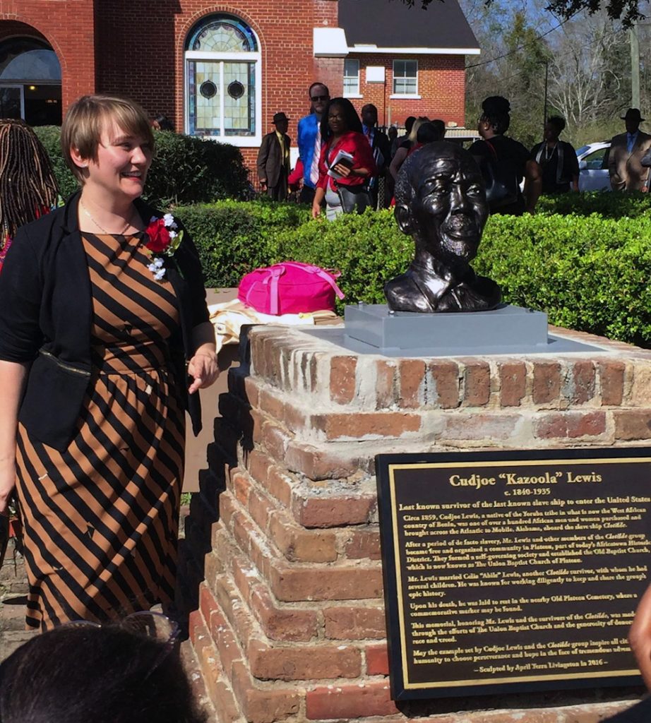
In 2016 sculptor April Livingston launched a GoFundMe to make a new bust, just the head this time, to be cast out of iron. It was bolted to the base in February 2017, when she promised the local news that she could cast a million more. Me, I’m most interested in the history of the previous three.
Sculptor April Livingston with her newly unveiled bust of Cudjoe Lewis, image: Gary Hadaway via UA
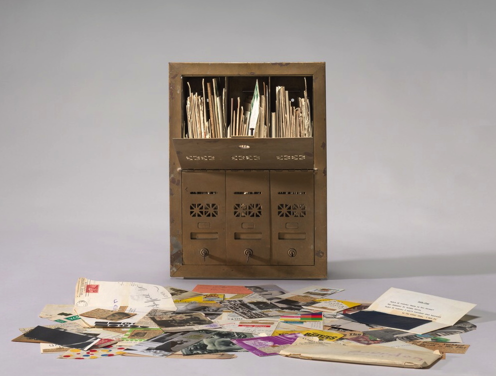
Ray Johnson, Untitled (Letterbox), 1964, correspondance with David Bourdon, collection: NGA
[UPDATE: WE KNOW.]
It’s hard to process Ray Johnson’s work, there’s so much of it. It’s intentionally slight and esoteric. It often feels like a quick visual read. But it can also reward a slower look, even when it’s sort of stuffed and strewn about.
The National Gallery has a 1964 piece, Untitled (Letterbox), which is actually a mailbox stuffed with a few years’ worth of correspondance art pieces Ray Johnson sent to the critic David Bourdon. If I remember the label correctly, the stuff was piling up, so Bourdon got a classic brownstone-sized three-unit mailbox to hold it all.
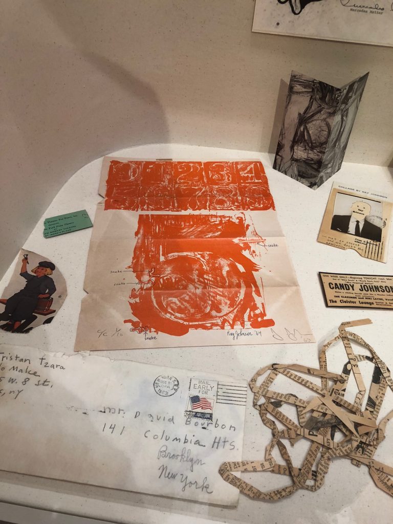
Ray Johnson drawing & notes on Jasper Johns’ #5 from 0–9 Color, 1960-63, in Untitled (Letterbox), collection: NGA
Anyway, I’ve seen but not really looked at it since it was installed way back before the world ended, but the other day I noticed that unlike other pieces, this was not a Jasper Johns exhibition announcement; it was a Jasper Johns.
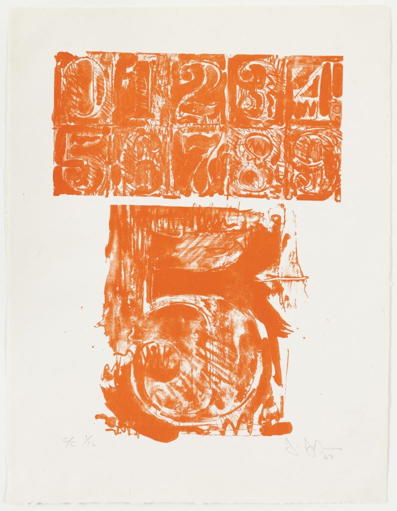
And not just any Jasper Johns. This is from 0–9 (1960-63), the foundational series with which Johns began making prints, and with which he began his extensive relationship with Tatyana Grossman and Universal Limited Art Editions. [Though other prints were completed and published before 0–9, I think it was the first one he started.] It’s signed and numbered–and folded up and stuffed in an envelope at some point, apparently.
Grosman wooed Johns to start making prints with her fledgling contemporary foundry by sending him a lithography stone to play with. Over years, Johns worked his stenciled numbers on the stone’s surface, printed some, and then wiped and started drawing and printing again. The sequential prints in 0–9 trace the changes and palimpsests of the process, capturing the lithographic process the way Johns’ encaustic froze the mark of the brush that applied it. This ambitious series was published in three versions: a rainbow of colors, black, and grey.
The print Ray Johnson used here is #5 from C/C 1/10, which means it’s from the first edition of the color set. Johnson took this first print of his friend’s massive project, and started circling and labeling individual lines in the print as “snakes.” Then Johnson signed his name and date next to Johns’. And then he folded and taped it up and mailed it to Bourdon.
Snakes were a thing for Johnson. That same year Dick Higgins published a compilation of his correspondance works from Johnson in an artist book he titled The Paper Snake. But this is ultimately less surprising than his readiness to treat an artwork from a friend like a cigarette wrapper or rubber stamp, as an element of his own production. [Of course, Johnson was friends with Rauschenberg and Sue Weil, too, so he certainly knew of Bob incorporating Johns’ and Weil’s paintings into his own combine. And don’t forget Twombly drawing all over everything. So maybe surprising should not be the word.]
So far two of the three artist proofs of 0–9 (Color) (ULAE 19) have sold at auction: Merce Cunningham & John Cage’s set, in 2009, and last year, the set Johns gave to art historian Robert Rosenblum, who wrote the accompanying text. [Awesomely, on four of Rosenblum’s ten prints Johns inscribed, “Proof to replace stolen.” So keep your eyes peeled for four rogue prints.]
The Museum of Modern Art has one of each variation, of course, because back in the day MoMA and ULAE made it so the museum could get the first print from every edition they published. And hey, look at that, MoMA’s print of 0–9 (Color) has the same number as Johnson’s. Did someone mention rogue prints? How’d this happen?
A FEW DAYS LATER UPDATE: Thanks to some attentive folks at the National Gallery, we know how this happened.
Curator Jennifer Roberts explains that the Johnson Johns is not a print, but a page from a Vogue Magazine article on Johns by Harold Rosenberg (“Jasper Johns: Things the Mind Already Knows,” Vogue, February 1, 1964, 174-175.)
Johnson has annotated a paragraph on the reverse (page 175) in pencil, adding half-brackets, three underlined selections, and a notation in the margin that says, “this paragraph could be sent to May Wilson.”
There is nothing commonplace about an 8.
The symbols selected by Johns are separated from the banal by their abstractness and dignity, qualities which are also outstanding in Johns’s personality. In the absence of his big grin, he reminds me of William S. Hart, the deadpan sheriff of the silent Westerns. Johns has Hart’s long, flat poker face, thin lips and alert eyes slanting up at the outer corners. Like Hart he gives the impression of one who sizes things up, keeps mum, and does his job. Johns’s detachment is of the era of the beats, the cool cats, and Bohemian Zen, as Hart’s belonged to that of “Howdy, stranger” and the cardsharp. With his level stare Johns paints targets: Hart perforated his with a six-shooter.
Roberts also notes that Johnson has covered half an illustration of a Johns lightbulb sculpture on the back (p.175) by taping an ad for a George Overbury “Pop” Hart watercolor exhibition held at Frederick Keppel and Co., New York, over it. Thanks to Stephanie, as well as to Anabeth Guthrie and Peter Huestis of the NGA for noticing the mystery and sharing these details.
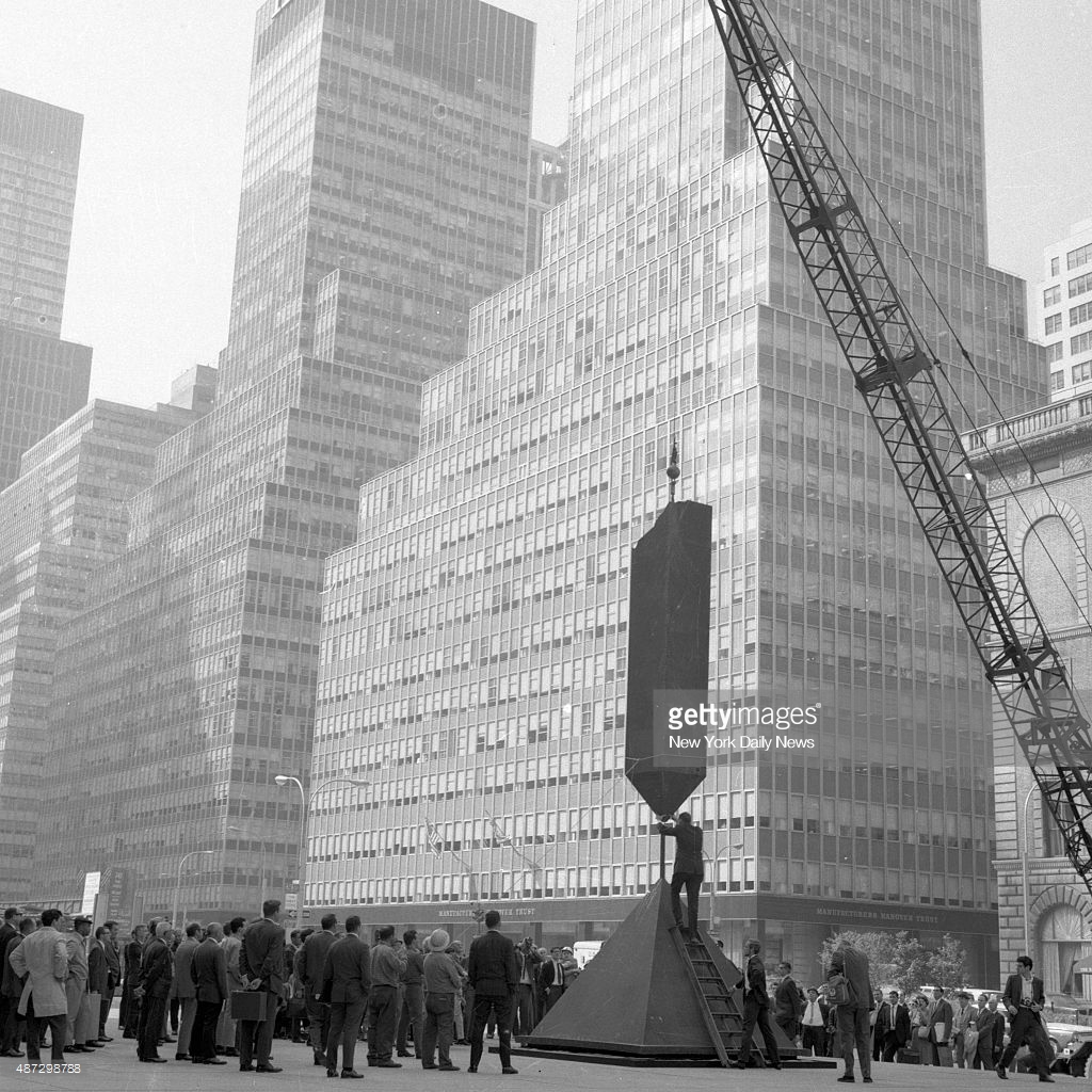
Barnett Newman’s Broken Obelisk being installed by crane at Seagram Plaza, Sept. 1967, image nydn via gettyimages’ horrific website, which literally siphons information away from you, just google it
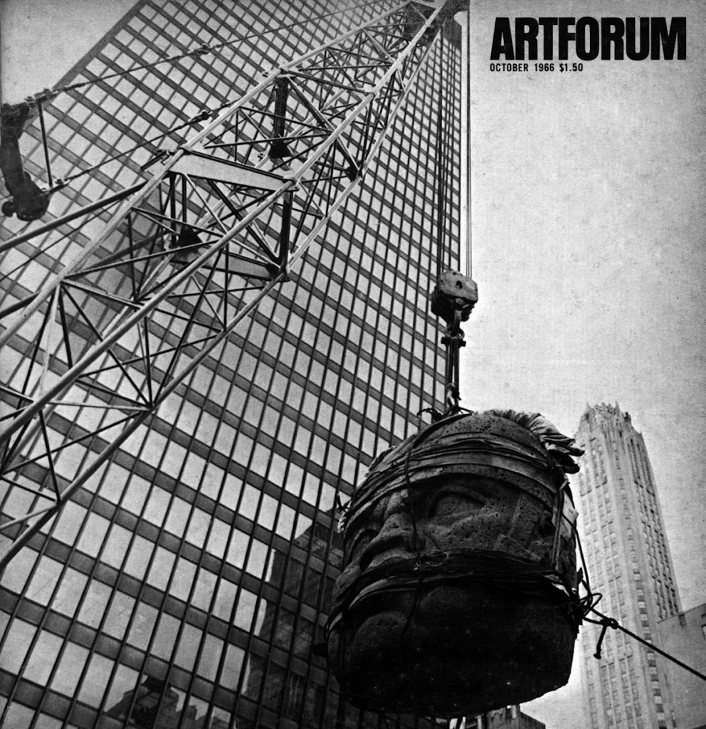
San Lorenzo Monument One being installed at Seagram Building on Park Avenue, May 1965, as seen on the cover of Artforum in October 1966
So imagine my surprise when looking for a different image of Barnett Newman’s Broken Obelisk, I instead found this 1967 pic of it being installed by crane on Seagram Plaza, two years after the flying Olmec head made the cover of Artforum. Everyone gets a plinth by Philip Johnson!
The occasion? A 27-work show organized by New York City called “Sculpture In Environment” that temporarily installed contemporary sculptures all over town.
Dr. Matthew Stirling & friends admiring a cast of an Olmec head from La Venta installed at the NGS in 1943, via Historic Images (obv) on eBay, where I (also obv) did not buy it.
First I stumbled across this 1943 photo of a giant Olmec head at the National Geographic Society.
Then the caption says it’s actually a cast of the 20-ton original, which remains in La Venta, Mexico, where Dr Matthew Stirling (kneeling) led the NGS-Smithsonian expedition to document them. Stirling was the leading anglo archaeologolist working on the Olmec, a civilization that pre-dated the much better-known Inca and Maya.
Then while I tried to find out more about casting a 10-foot head onsite in the middle of World War II (turns out the head was one of five uncovered on a 1940 expedition), I stumbled upon Luis M. Castañeda’s extraordinary essay from 2013 for Grey Room, a journal at MIT Press. Castañeda tracks the history of exhibiting Olmec megalithic heads in the modernist North, and their shifting political, aesthetic, and ideological contexts.
Olmec megaliths were shown in the early 1960s at the Petit Palais in Paris; the LA County Museum of Art; the Museum of Fine Arts Houston; the Mexican Pavilion at the New York World’s Fair–with a pit stop on the plaza of the Seagram Building.
Castañeda tracks the equal interest in the megaliths as exoticized artifacts and engineering mysteries, and how they were experienced, in spectacular motion, temporarily installed in high modernist spaces. Here’s folks discussing the most epic way to transport an Olmec head from its original site in Veracruz, Mexico to the new Mies van der Rohe-designed museum in Houston:
Before they decided to use a trailer, [documentary filmmaker Richard] de Rochemont and [MFAH director James Johnson] Sweeney considered other options. In a June 19, 1962, letter, for instance, de Rochemont wonders whether a helicopter could get the job done more efficiently. In making this suggestion, de Rochemont also makes explicit that the real point of the project was not Figure 5 the head itself but the spectacle of its motion. “I estimate that ‘your’ head,” he writes to Sweeney, “weighs 15 tons… . Biggest known helicopter … lifts 10 tons … Would [Mexican authorities] mind if we cut the head in half?” Although the artistic and archaeological value of the Olmec head was of importance to Sweeney’s exhibition, in de Rochemont’s words, the visual documentation of the massive head’s movement was what truly transformed the film and the exhibition into “an archaeological epic.”
San Lorenzo Monument One being installed at Seagram Building on Park Avenue, May 1965, as seen on the cover of Artforum in October 1966
Also here is one of two Olmec heads being installed on Seagram Plaza, on a base designed by Philip Johnson, on the cover of Artforum, where Irving Sandler writes of the impact of the head on contemporary sculptors.
Most stunningly, Castañeda notes, that almost no one has looked closely at these Olmec sculptures, their genesis and impact, on the work of land artists like Robert Smithson or Michael Heizer. Heizer’s father Robert was a protege of Stirling, one of two US archaeologists who established Olmec studies as a distinct field. By the 1960s Heizer the father had left his research on Olmec engineering techniques and had begun helping his son excavate artworks in the Nevada desert. When LACMA opened Renzo Piano’s Resnick Pavilion in 2010, it was with a show titled, Olmec: Colossal Masterworks from Ancient Mexico, which featured two megalithic heads on cor-ten steel bases designed by Michael Heizer.
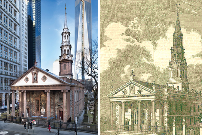
St Paul’s Chapel celebrated its 250th anniversary in 2016. image: trinitywallstreet
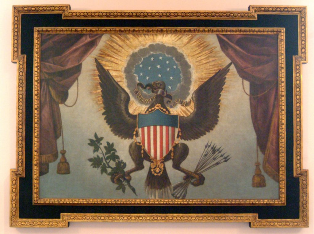
Built in 1766, St. Paul’s Chapel is the oldest public building in New York City and has been in continuous operation for over 250 years. When its sister parish Trinity Church (built 1698) burned down in 1776, St. Paul’s Chapel served as the primary place of worship for the likes of George Washington while Trinity was rebuilt. This august, historic, sacred space contains one of the two earliest public depictions of The Great Seal of The United States, of which visitors to this site have so recently read.
And St. Paul’s Church is also the place where my critique of the impertinent treatment and presentation of The Great Seal gets laughed out of town like a mobbed up president’s stooge claiming attorney-client privilege.
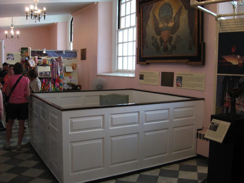
The Great Seal of the United States painting and friends, St Paul’s Chapel c.2013, image: pastinthepresent
Behold the wide shot of the painting of The Great Seal hanging in its original spot, over the Washington Family Pew (reconstructed to some non-original spec, apparently some time after the radiators went in), and sandwiched in between World Trade Center Relief Swag exhibitions made of PVC jungle gym and clip-on tracklights? Are these original, historic exhibition fixtures made by first responders in October 2001?
#neverforget? no problem! what is this? c. 2013, image via pastinthepresent
Is it still there? Because this photo was taken in 2013 by historian/blogger Michael Lynch. So maybe it’s gone? I honestly don’t know whether to scream or ask for their fabricator’s contact info, whether to help one of the richest parishes in the country Kickstart some proper vitrines or take a vow to never show work again without a PVC kiosk.
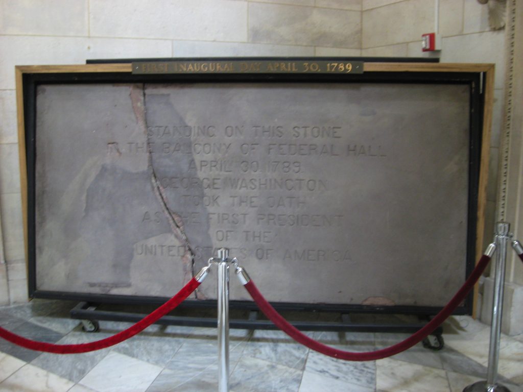
But Professor Lynch is not through. He also went to Federal Hall, the site (but not the building) of George Washington’s inauguration on April 30, 1789. I have stood on the porch of Federal Hall. I have seen a musical version of the life of JP Morgan performed on the steps of Federal Hall. I have gone to the gym many times across the street from Federal Hall, but somehow I have never been inside Federal Hall.
Fragment of Federal Hall 1.0 Balcony on view at Federal Hall 2.0, c. 2013, image: pastinthepresent
So I have not known about the slab of the balcony from the original Federal Hall, which is on display there. The National Park Service calls it a balcony, but looking at this engraving of Washington’s inauguration, I might call it a loggia.
Federal Hall, Seat of Congress, 1789 engraving by Amos Doolittle of Washington’s inauguration, image via wikipedia
Anyway, despite being the site of the 1st Congress, the formation of the United States, the adoption of the Bill of Rights, and Washington’s inauguration, Federal Hall went back to being City Hall when the capital decamped to Philadelphia in 1790. And then New York City tore that place down in 1812 when they built their new City Hall.
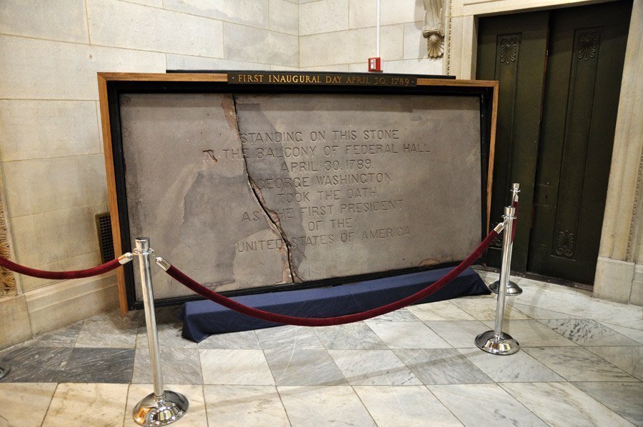
Pay no attention to the little cart behind the blue curtain. Also, elevator out of service, probably. image: intro-ny
Fragments of the building were saved, including this piece of brownstone from the loggia, which apparently went on display at Bellevue Hospital until it was returned in 1889, for the centennial. And it was given a coat of concrete, so they could carve it. And it was put in a frame on little wheels so it could be rolled around. Oops, it broke. At least now we can see the actual stone under the concrete skin, the part where the concrete repair came off also.
Here is a concrete-coated-and-carved piece of stone which you can barely see the original of, which used to be on the building here, till we tore it down, and anyway, George Washington probably stood on this to found our country. Or near it, it’s really hard to say. But this is how we do, and it apparently always has been.
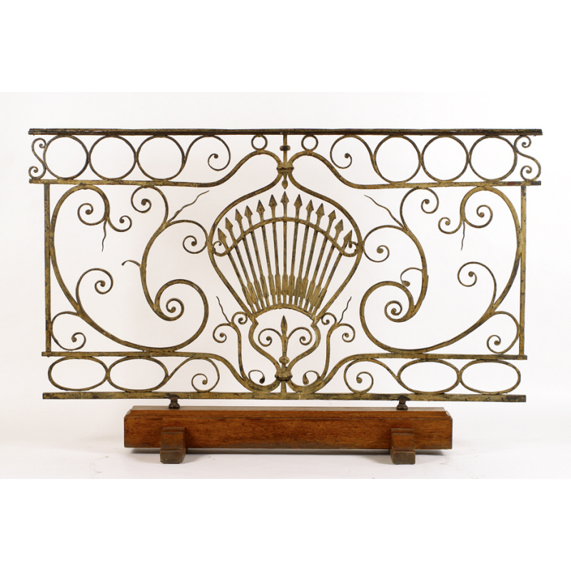
fragment of the balustrade of the original Federal Hall where G. Washington was inaugurated, painted wrought iron, later oak base, collection: NYHS
Fragments of the building were saved. In a minute I have found another: the balustrade of the balcony where Washington was inaugurated. It, too, went to Bellevue, where it was incorporated into a portico. Perhaps this stone was, too? Anyway, in 1883 the balustrade went to the New York Historical Society, where it remains. [Interesting. A 1917 catalogue of Old New York views distinguishes between the NYHS and Bellevue balustrades.] It is positively lyrical. Was it by Pierre l’Enfant, who was commissioned to renovate Federal Hall in 1788? Yes. It is dated 1788-89. Thirteen arrows. Wrought iron painted yellow-gold. The New York Historical Society was headquartered in Federal Hall in 1809 and took the city’s donation of some of the original furniture.
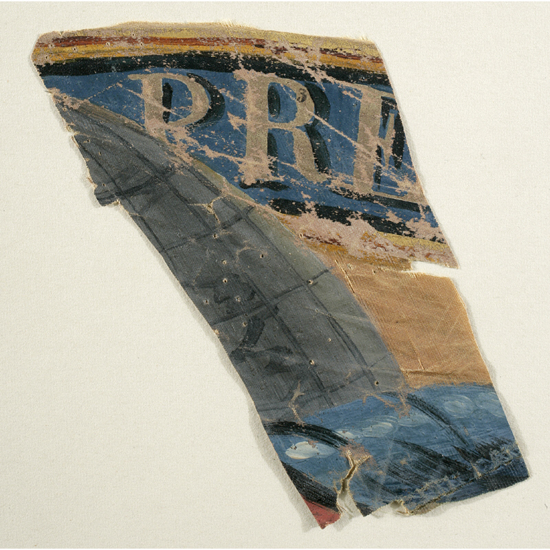
fragment of a painted silk flag flown at George Washington’s inauguration, Apr. 30, 1789, collection: NYHS
The Great Seal of The United States, painted by an unidentified artist in 1785 for Trinity Church on Wall Street. image: Trinity Church
In 1776 a committee of Thomas Jefferson, John Adams, and Benjamin Franklin were charged by the Continental Congress with creating an official seal, a sign of sovereignty and authenticity, for the new United States. Two committees later, in 1782, the primary suggestion from their committee included in the final design was the motto, E Pluribus Unum. Other committees, meanwhile, contributed the eagle, and the use of 13 elements–stars, stripes, arrows, olive leaves–to symbolize the original states in the Union.
The final design was described in terms of its heraldic elements by Congressional Secretary Charles Thomson, and this text remains the law Congress enacted in June 1782. Thomson provided an engraver with a sketch, which was turned into a die and put to use by September.
In October 1785, as the new Constitution was being negotiated nearby, the Vestry of Trinity Church on Wall Street commissioned an unidentified artist to paint one of the earliest public depictions of the Great Seal of the United States. The painting was installed on the north wall of St. Paul’s Chapel above the pew reserved for George Washington’s family. The pew is gone, but the painting (above) remains.
After his inauguration in April 1789, President Washington asked Thomson to transfer custody of the Great Seal from Congress to the Department of Foreign Affairs. It has remained under the charge of the Secretary of State ever since.
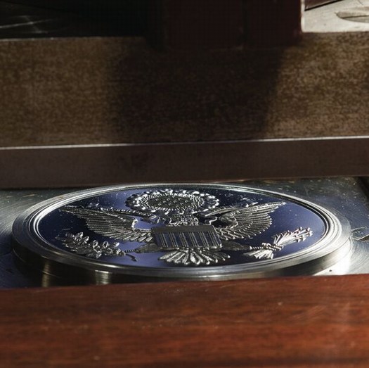
The counter-die of the Great Seal of the United States, at the Department of State, or it was…
Between 1782 and 1885, four dies were created as replacements were needed, with minor changes or heraldic corrections each time. But since 1885, the die’s design has been fixed. It was installed inside a new press in 1904, and in 1986, the current die, along with a master die from which all future dies may be created, was put into service. An officer of the Department of State uses the Great Seal for 2-3,000 official statements, treaty documents, ambassadorial appointments, and such, per year. It is most widely seen via its depictions on the back of the $1 bill and the covers of US passports.
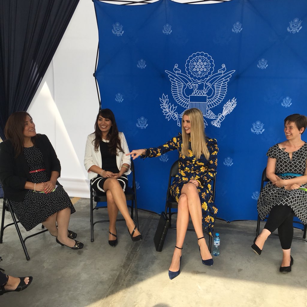
Untitled (Art In Embassies), 2018, 8 x 8 x 1 ft, inkjet print on fabric, powder-coated aluminum, plastic; ed. 1/3+1AP installation view, US Embassy, Peru, 12 Apr 2018
With this context in mind, I hereby announce a new work, Untitled (Art In Embassies), which went on exhibition this week in some courtyard at the US Embassy in Lima, Peru. It comprises a pop-up The Great Seal step & repeat tradeshow photo-opp backdrop and thirteen folding chairs, arranged in a circle.
The installation is visible in these photos showing the US’ official representative to the Summit of the Americas, a relative of the president with no experience or actual role, who cannot obtain a security clearance because she and her family are under criminal investigation; eleven alumnae of some economic development grant programs of the previous administration; and someone’s tio.
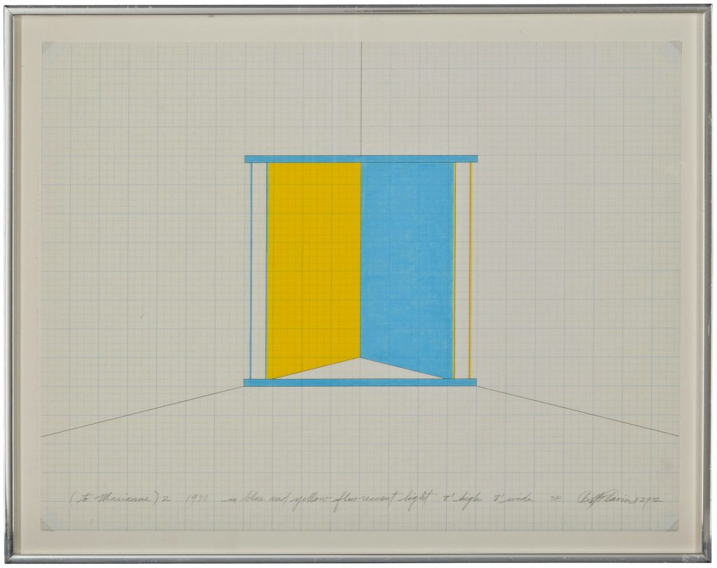
Dan Flavin, untitled (to Marianne) 2, 70, executed in 1972, ink and graphite on paper, image via christies 2018
Ciao, come stai? Welcome back from Italy, untitled (to Marianne) 2!
In 2011 I was puzzled by this Dan Flavin work on paper being sold at Christie’s. It sure looked like a diagram for a light work, and it was described in Leo Castelli’s inventory as such, but one which had never been realized. It ended up in the Tiffany Bell light works catalogue raisonné as a sketch, not an orphaned certificate. [Flavin did not recognize orphaned certificates, or orphaned hardware. If you were missing one or the other, you were SOL and your work was, too.] This work’s inscribed with the date 1970 and “executed in 1972,” which adds to the piece’s excitement.
It found a new home, for £20,000. And now it’s back. Christie’s is auctioning it again, online, this week, as PROPERTY OF AN IMPORTANT PRIVATE COLLECTION, MILAN. The estimate is GBP 15,000 – 20,000, and I’m sure it’s a bargain at twice the price.
If it did, it probably just got left off the Christie’s provenance by accident. Or if the sale didn’t go through, the IMPORTANT PRIVATE COLLECTOR got to live with it for another year, a privilege that is now being valued, graciously, I’m sure, at around EUR 10,000.
Allora & Calzadilla, Puerto Rican Light, 2015-2017, installation view via dia
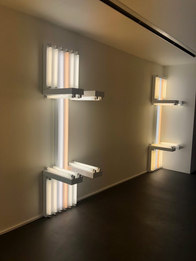
Meanwhile the Estate has kept busy by selling posthumous editions of works unrealized by the time of the artist’s death, editions it had once officially declared closed.
Posthumous? Only your dealer knows for sure! untitled (to Harry Coper, master potter), installation view at Vito Schnabel in St Moritz, photo: Kenny Schachter
Vito Schnabel showed some in St. Moritz last season, and Kenny Schachter said there was some vagueness about their status. Nothing mentioned in the press release, except the Gallery’s new collaboration with the Estate, and the light works being described as “proposals”. Indeed!
I would think that in such a dynamic conceptual environment, there must be a way for untitled (to Marianne) 2 to exist as an actual, physical light work. You know what, this is something that’s changed since 2011, too. Now we make things happen! If you buy this drawing, and Stephen won’t make this into a light work for you, I will. I’ve got a “proposal”, so HMU.
UPDATE: Congratulations to the new owner (assuming you paid the GBP18,750, obv). If the Estate is not your thing, drop me a line, and I will make you one of mine.
It’s been a while, too long, since I’ve had a good, old-fashioned satelloon post around here, and wow, is this one.
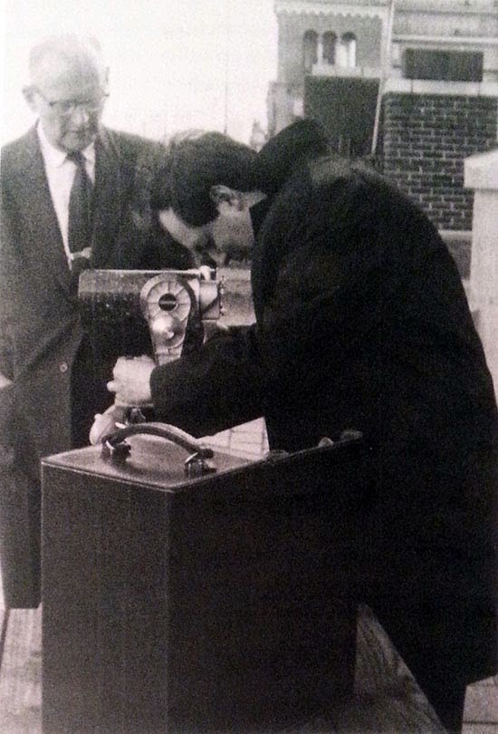
Arthur C. Clarke & Stanley Kubrick looking through the Questar on the terrace of Kubrick’s CPW penthouse, 1964, image: Kubrick deutsches filmmuseum catalogue via: 2001Italia.it
On March 31, 1964, Stanley Kubrick wrote to Arthur C. Clarke in Ceylon (now Sri Lanka, obv), asking to meet to explore the possibility of working together–and for advice on buying a larger telescope than the Questar model he already had. Clarke responded immediately, and added a visit with Kubrick to his New York City itinerary just three weeks later.
After shaking hands on their deal, or at least their intention to negotiate one, Clarke and Kubrick repaired to the patio. They had established a real rapport over the past month, and any guardedness had long since dropped. Both were excited and didn’t mind showing it. It had been a beautiful late-spring day, with temperatures reaching 75 degrees, and was now a perfectly mild evening, with a crescent Moon hanging in a slight haze several degrees above the southeastern horizon. Thankfully the building’s heating system had been switched off weeks before, and the ash-spewing chimney was now silent. To the south, all of Midtown Manhattan was spread out before them, its lights twinkling.
Suddenly they noticed a brilliantly bright, unwavering point of white light rising above the horizon in the southwest.
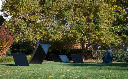
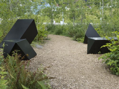
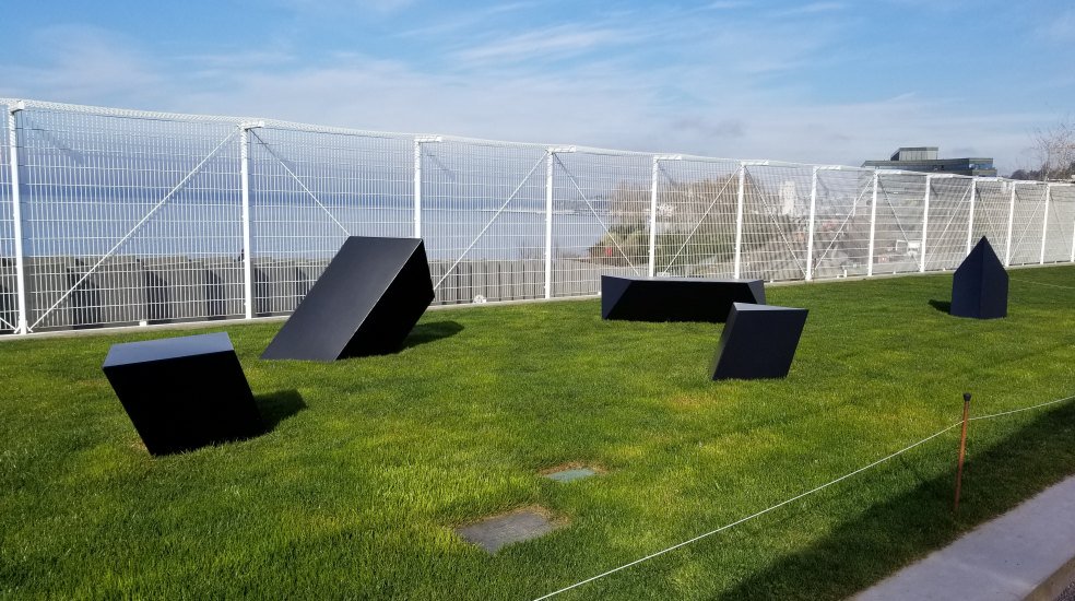
Each of the five elements in Tony Smith’s sculpture Wandering Rocks (1967) has a name: Smohawk, Shaft, Dud, Slide, and Crocus.
Wandering Rocks National Gallery of Art installation view, image via nga.gov
Of the edition of five, at least one Wandering Rocks is installed indoors. The National Gallery’s is on the lawn [above]. The Seattle Art Museum’s Olympic Sculpture Park’s, which is the artist’s proof, was previously installed on and around a woodchipped path [below].
Tony Smith’s Wandering Rocks Olympic Sculpture Park 2012 installation view, image via seattlepublicart.com
This installation seems a deliberate mockery of the plaque at the OSP, which is a quote from Smith:
What is my intention? It is a new measure of man, in forms of free space, in terms of space that is defined but not enclosed, in terms of measurable space that flows so subtly into the infinite that it is impossible to know where the boundaries of art and nature lie…”
Placing art is hard. Placing sculpture in public is harder still. So many decisions can detract from the experience of art, or can thwart the artist’s intentions. With close looking and self-awareness, it is often possible to overcome these environmental obstacles and appreciate what the artist has accomplished. Additional benefit can be gained by understanding what the curator’s intentions might have been, too, whether or not they achieve them.
For the experienced art viewer, it is a special challenge to appreciate the work and understand its context while identifying the flaws, errors, or shortcomings that mar its presentation. A wonky spotlight. No benches. Audio bleeding from the video installation two galleries away. One or two of these, we can let slide. When such seemingly avoidable distractions pile up, though, and threaten to ruin an art experience, perhaps a conceptual artistic exercise can help.
To deal with unnecessarily problematic encounters with art, I propose to turn the third most egregious or annoying thing about it into a new work of its own. It may not solve the problems you identify, but maybe you’ll get some relief from art’s power to give significance and meaning to your annoyance. Maybe the thrill of discovering installfails and the interpretative exercise of ranking them will become a reassuring relief, if not a delight, when you look at art.
the creative act is not performed by the artist alone; the spectator brings the work in contact with the external world by deciphering and interpreting its inner qualifications and thus adds his contribution to the creative act.
Wrote Duchamp, who could not have imagined a work whose form–indeed, its entire existence–is predicated on the spectator’s decision to conjure it through affront.
Now, I don’t want to uncritically gamify your museum visits. Being compelled to contemplate an artwork about your connoisseurship of annoyance could become infuriating if it begins to intrude on. Every. Freaking. Poorly glazed. Painting. In the place. But it could also lead to an awakening, a liberation from the burdens of the imperfections of the external world, which in turn fosters deeper encounters with the art in front of you. Deciding not to conjure the work by deciding not to log more than one or two annoying things in an encounter is a valid, and powerful, option.
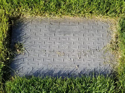
Untitled (Avoidable), 2018, dimensions variable, the third most annoying thing about an art installation or encounter, image: tylergreendc
And so in honor of the eagle-eyed spotting of the sprinkler cover sitting in the lawn next to Wandering Rocks, between the otherwise unremarked-upon stanchions and the steel cheese grater fence, I have designated this work Untitled (Avoidable).

 Anyway, I did a reverse estimate sort on the 800 or whatever lots in the online auction. I skipped past all the Staffordshire porcelain figurines of shepherdesses. I lingered for a moment over the